#This was really fun! I tend to draw with very warm or desaturated colors and soft shades. Changing once in a while is refreshing ✨💪💛💙
Explore tagged Tumblr posts
Text

"I depend on you..." "Do I or do you?"
My take on the "I depend on you" art trend from Twitter✨ Every now and then I want to draw something with bright colors... and blood
#wren draws stuff#artist on tumblr#art#my art#fanart#illustration#saint seiya#saint seiya fanart#knights of the zodiac#kotz#los caballeros del zodiaco#cdz#les chevaliers du zodiaque#i cavalieri dello zodiaco#saori kido#athena saori#pegasus seiya#i depend on you#art trend#tw: blood#tw: bright colors#This was really fun! I tend to draw with very warm or desaturated colors and soft shades. Changing once in a while is refreshing ✨💪💛💙#The blood wasn't meant to be but the original image has a red fill between the characters so... ain't going to lose an occasion like this 😤#I also thought to draw Athena with her Cloth but the illustration would have become too busy considering Seiya God Cloth is already there#So uhm. She's wearing a basic dress with her signature accessories 😅 poetic license of sort if you will#Not a lot to say here tho. Still thinking abt the ending of the Hades Arc and all the events of Next Dimension... 😔😭#Loved Saori being so selfish to go back in time to destroy a sword to save this one dude while changing the whole time-space continuum#and almost dooming the prev gen of Saints 💖 like girl woah you are a menace <- (affectionate)#on a side note. Imagine becoming a Saint to find your sister and you end up with a fucking sword in your 💖 ain't that crazy#Might add later the “adult content” option for violence because of poor Seiya getting a sword in his chest 😬
152 notes
·
View notes
Note
heyo, how do you go about choosing your colors and coloring your more rendered pieces?
I absolutely adore your art and the vibes it gives off btw <3
aw thank you for your kind words! dunno if i’ll be able to answer ur question in a satisfying way cause i honestly dont really . know?? but i’ll try my best to explain at least Some of my thought process (under the cut!)
usually i have a Very Basic idea of what kinda colors i wanna use in a piece, but when i sit down and start working on it i sorta start throwing things at the wall to see what sticks, yknow. i do prefer to like.. start w/ a colorless (or almost colorless) or monochrome sketch and then build up saturation and color variations as i go! to show u what i mean by that, lets look at what my newest drawing looked like at different points of the painting process:

notice how there werent any purples+blues at first! i wanted to fuck around and try to make a funky transition from light to shadow, so i slowly started putting those tones in there

its not the Only type of color palette in exitence ofc, but i tend to favor the ‘warm light + cold(er) shadows + pitch black shadows’ combo uasdhfuishdfu

a thing worth noting is that desaturated colors are your best friend if you wanna make a painting feel more harmonious. i dont really know how to explain it well, but like.. desaturated colors thatre either really close to / are ‘cold’ colors tend to still look cold in a warm light, despite the lack of saturation. in fact, usually its that lack of saturation that lets them coexist w/ the rest of the colors in the light, which are super warm and saturated in this pic, for example:

oh and i mess around w/ different layer blending modes and the like sometimes too!! making my own gradient maps and applying them to some parts of a painting has lead to some very interesting results, theyre always really fun to experiment with
i also really like doing this..... Thing where i’ll add little smudges of more saturated colors here and there. its just a really fun thing to do!! BUT smth that you gotta keep in mind if you ever wanna try doing it is that saturation can also affect a colors value, and values are really really important

notice how in the original version the lil color variations are p noticeable, but when you apply a monochrome filter to it, they dont stand out at all. thats cuz if the saturation significantly affected a colors value, i’d just go ahead and pick a lighter/darker one until it matched the overall value of the area where it was

but overall the way i pick colors is just . i just pick what feels right/what looks good to me, yknow? anyways. hope this was at least somewhat comprehensible!
#also uh#[whispers so quietly you can barely hear it] i have a bunch of process gifs on my patreon in case anyone is interested in that#val.txt#bloodborne spoilers#dark souls spoilers#Anonymous
74 notes
·
View notes
Text
Tutorial/Step-by-step/Tips
I’m not a pro nor my art is perfect But if you are interested or just curious by my coloring process and way to think
Step-By-Step and several tips bellow with my last “Maddie & Danny motherly love” drawing :)
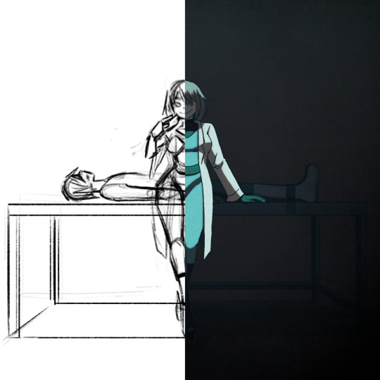
(warning: bad English because i’m not a native) (warning 2: i’m an art nerd so when I begin don’t know when to shut my big mouth, so very very long post and quite messy)
xxx
I use Procreate, but this could work with most software like Photoshop/Paint tool Sai/Clip Studio maybe Krita too Some tips could also be use in traditional arts
Basic knowledge needed: color theory (warm|cold, saturated|desaturated), one digital software Step 1: Sketch Tips: Don’t be shy to try different compositions first and choose the best idea, at first I wanted to draw Danny viewed from above and Maddie looking at the sky hiding the gory parts but it’s didn’t work well, sometimes simplicity is more efficient Tips: Maddie is here right in the middle, looking at the spectator, this composition in general is bad/uninteresting because the dynamic is weak, and the feeling it’s strange and unsetting But it’s very efficient in horror and spooky stuffs where this feeling is wanted (like in the famous “Shinning” ‘s scene with the twins sisters), it’s uncanny I could have draw Maddie very straight and symmetrical to really insist on this unsetting feeling (something way too perfect to be true), but I wanted her to be sultry (like in the song), not looking "death inside" The square format help to insist on this strange feeling too

Tips: Composition is all about contrast, here Maddie is standing up and is build with curvy line of actions, in contrary of Danny who is lying down, and their bodies joined in a cross shape I planned to draw her very cleaned and mocking while a gory scene is behind, I abandoned the « guts out » idea because it was too just distracting, we should see Maddie first and not what on the table Tips: A quick way to check big anatomy problems is to flip your canvas with horizontal/mirror flip, on traditional medium you could flip your paper on a sunny window or a lightbox

Step 2: Lineart Tips: I planned to do a very dark ambiance with little lights, so with my lineart I added heavy/dark shadow on Maddie’s hair, clothes, and the table I don’t recommend it for light or pastel scene
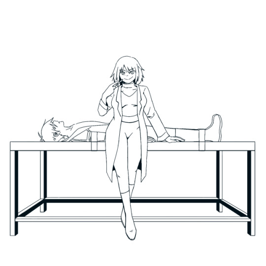
Tips: Often in art, people talk about line weight, but something effective I find is to use thicker (green) line where the shadow will be, and thinner (red) where the light will be

Tips: Avoid joints and interference We tend to do that naturally, but better be conscious of it If your lines are crossing more that 2 times (here on Maddie’s sleeves) or barely touching (Danny’s shoes) the line could be odd and heavy, try to do this as little as possible

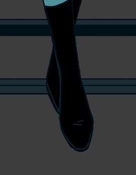
Step 3: Base colors Tips: I already have a Maddie’s palette, but here I really want to give this drawing a cold feeling, so I desaturated her hair and her skin which were warm colors, for her jumpsuit and eyes to really pop out Danny is hidden in the back and is a “furniture” so his colors are very dark, almost blending with the table


Tips: The lineart is painted in dark blue and parts hidden by the black part of her jumpsuit are painted in turquoise
Step 4: Shadows Tips: I use a new layer for the shadows often on multiply but not always (play with your layers modes to find your wanted effect), please try to not use black because nothing in real life is pure black Here I used a dark green shadow, for a cold feeling, if your drawing is warmer use a warmer tone like red or orange You could add a secondary more saturated shadows inside the main shadow, but hey I'm lazy Dark red shadow
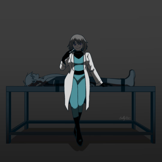
Dark green shadow

Light pink shadow (pastel vibes...)

Step 5: Light Tips: Similar to the shadow try to not use pure white and play with the modes, here I use a cold turquoise light A warm light like yellow/orange/red will give a total different feeling My tips for really making light pop is select shadow layer>invert>fill with light color>mask or clipping mask to set it on the subject>change the layer mode Red light
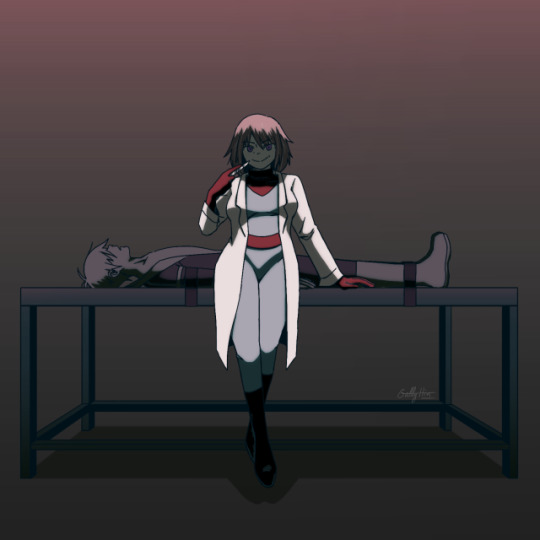
Turquoise Light

Pink Light
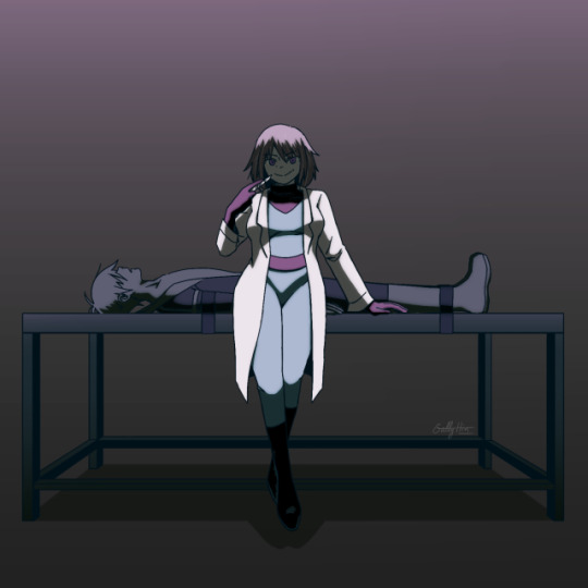
Step 6: Additional contrast Tips: The most important in a drawing are eyes/faces/hands/gestures/light People are naturally attracted to eyes and face, and light It’s one of the reason why I didn’t draw Danny’s eyes (even closed) Gesture and hands give life to a drawing, hands are like a second face so don’t neglect its Tips: I just add a dark layer between Maddie and Danny to make her pop even more, the viewer should see her eyes first and Danny after, like a bad surprise

Step 7: Additional effects Tips: I just play here with layers modes, hue, and general shadows until I have what I wanted Tips: It’s always interesting to give your drawing some texture, a paper-like texture is very common To give is a shaking effect I use here a noise layer (black layer>noise max>overlay mode>blur if necessary
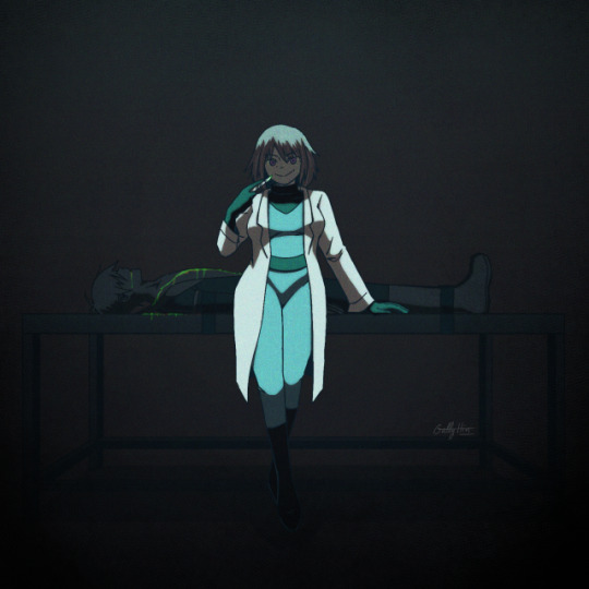
Step ?: Composition - Silhouette Tips: To create strong characters in character design with unique body shape and body languages, professionals fill all the characters in black If a composition is strong, being all black should be enough to understand who this character is, and the story you want to tell Illustrations don’t go as far as characters design art where we really try to make one single character to shine, but this could be useful to check if every elements/characters is interesting enough
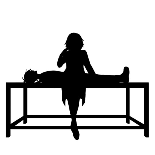
Step ?: Lights - Black and white desaturation Tips: Colors are a combination hue, saturation and light To check the lights, I use a black layer set on hue mode on top of my drawing to desaturated it all, and hide/open this layer regularly This way I could check if the lights are right, if not I adjust the layers (colors, shadows or lights layers) The lights are good when the drawing is self explanatory in B&W, when the parts aren’t blending together in weird way, and when the drawing converts the same feelings as it’s were in colors Bad, her face and Hair are blending together, and her jumpsuit and her belt too
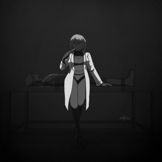
Better
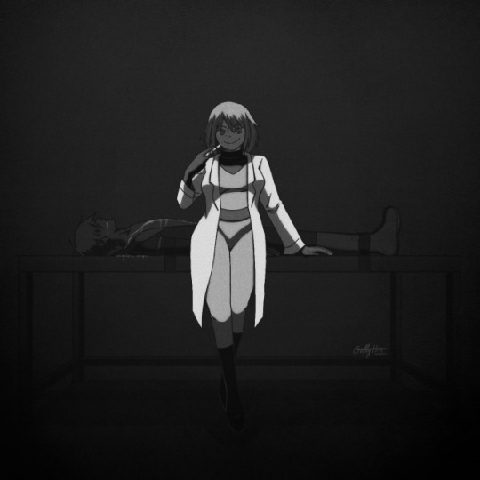
Step ?: Let it’s matured Tips: I always let my drawing several days before posting it on socials medias This way if I’m too tired after finish it, the days after with cleaned eyes I could spot errors easier and corrected its before it’s too late Furthermore you always make progress unconsciously each day by simply living and observing For example I let this drawing 3 days before posting it, but maybe I should have wait 1 week...
Final words: As I said, I’m not a pro, it’s just some useful tips I learned in my art journey and from experience, none of this is « rules » and I don’t use all of these each times (sometimes I forget some tips, sometimes I’m just lazy and don’t want to put too much though on it)
Try, experiment, breaks rules, and be curious Sorry for the big post, like I said I’m an art nerd and I never know when to shut my mouth Hope it could help and have fun \( ^ ▽ ^ )/
Bonus: Step-by-Step gif

9 notes
·
View notes
Photo
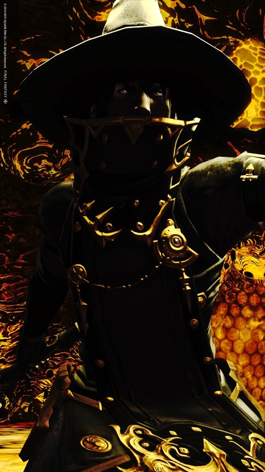
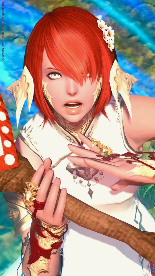
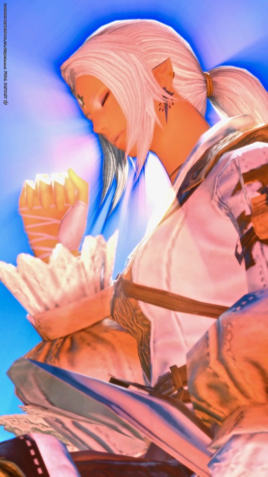
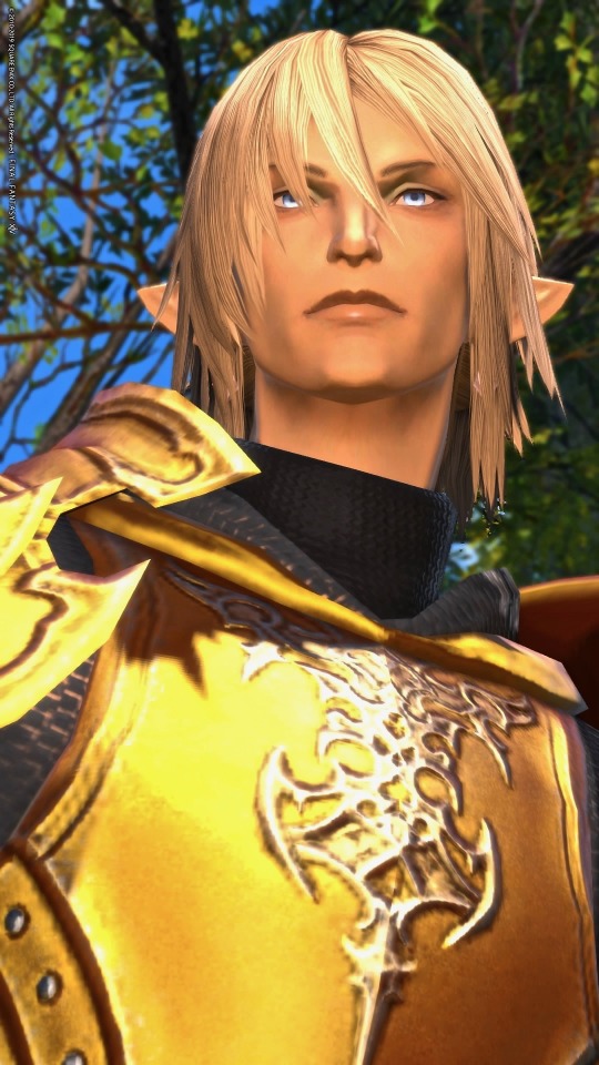
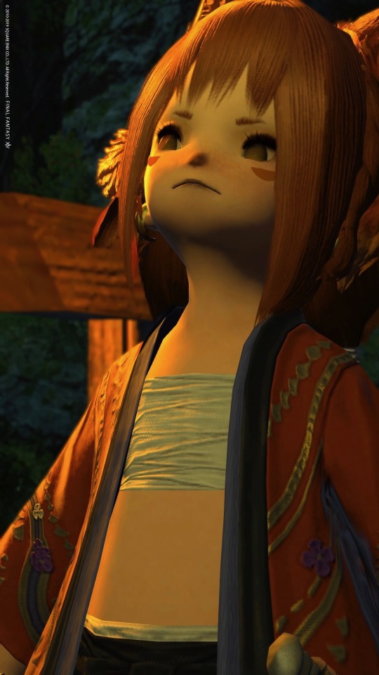
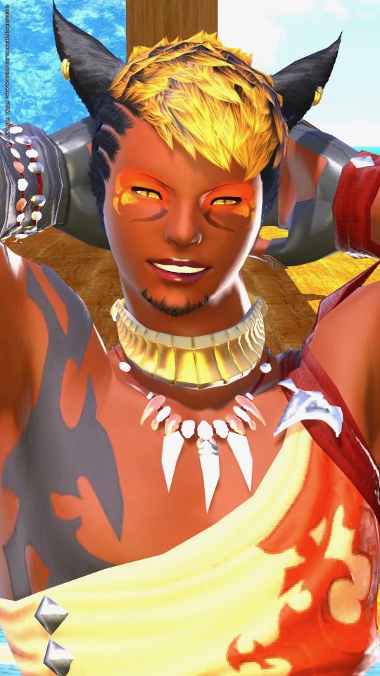
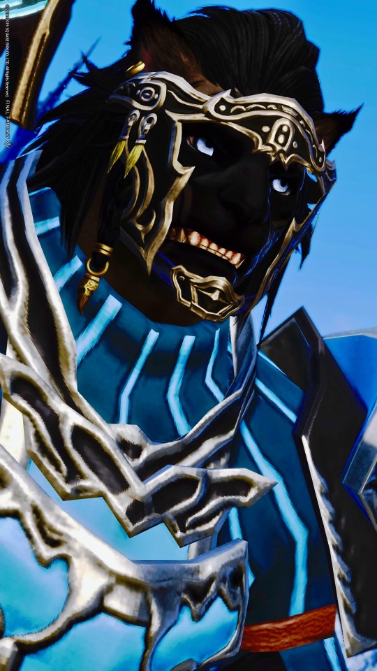
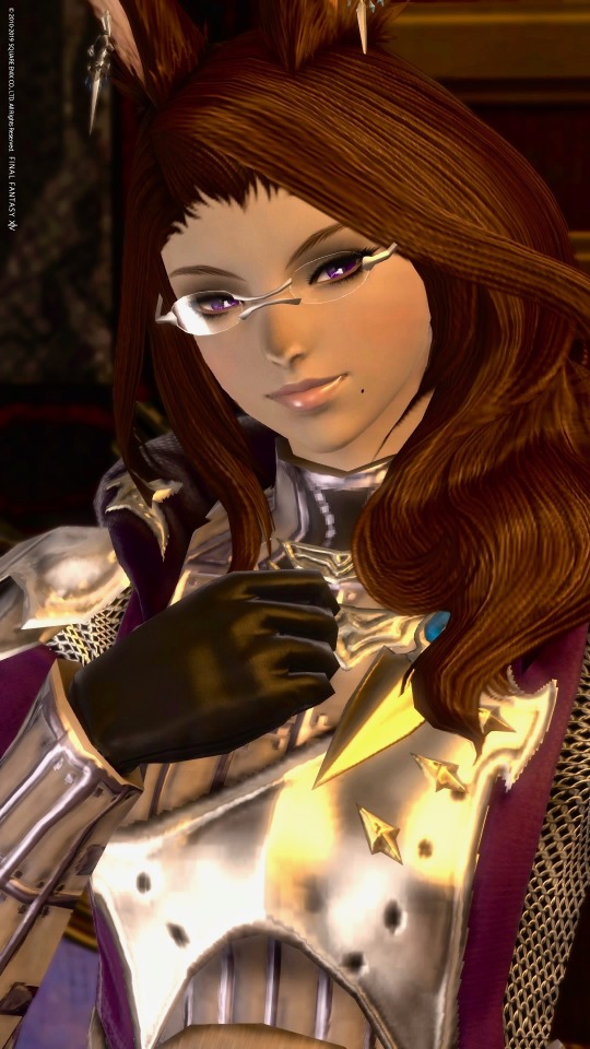
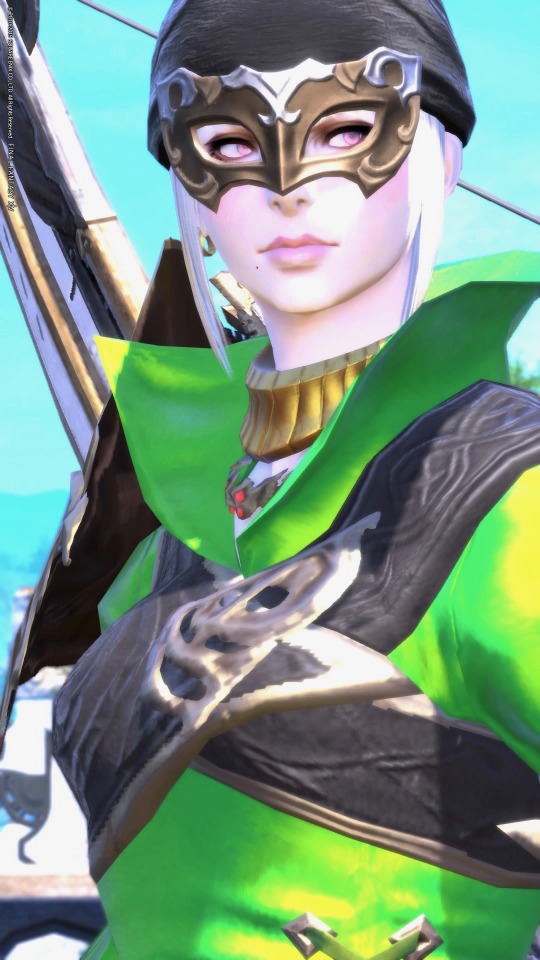
Explanation of design approach and some personality info under the cut.
Essentially, the way I’ve been approaching this I wanted to make each world feel like a self-contained and cohesive team. Nivienne is actually from Lamia and so isn’t designed to mesh with the others, but I use her a lot and have a design strategy for her so she’s included. For team Famfrit as a whole, I wanted to make sure that each personality and design would feel distinct and that the main color for each character would stand out. Most are also pretty obvious lol--black mage is black, red made is red, white mage is white. Areas I went different are gold dragoon (or aurum dragoon if we’re being fancy), purple scholar, green bard, orange ninja, blue warrior.
CENRIC ASHER
My main and a hyur midlander black mage. With him I wanted to push against the concept that hyurs are inherently vanilla or “boring”. Imo there is nothing wrong with designs that look like they could occur in nature, but with him I wanted to do an edgy personal spin in the classic Final Fantasy black mage look where the character is a dark silhouette with glowing eyes, a high collar, and a broad hat. Sometimes he wears other things too but the overall concept ties to that particular look. In personality Cenric is a pretty angsty guy due to having been a con artist who got a lot of people killed with medical fraud. He lies a lot out of fear of the reaction he’d get if his background was known. Possibly a little nuts, thinks he is the son of Nald’Thal and bound to spread death and destruction wherever he goes--striking enemies and allies alike, regardless of his own wishes. Probably actually just has Duskwight heritage. Has pretty hardcore imposter syndrome about being Warrior of Light, but in partial response to having been destitute and outcast for a long time he tries to play into the persona of a powerful, luxurious, mysterious black mage brimming with forbidden knowledge. In reality he is intimidated by most children, can’t whistle, and is a bit of a smartass when he’s not panicking his way through conversations.
J’MOR TIA
My red mage alt, I wanted to do a few experiments with him! One was that Red Mages usually read very sophisticated and swashbuckle-y to me, and I wanted to play more into the rapier as an almost roguish weapon. Very physical. He’s somebody who you initially would not assume is a magic user but who is just as versed and capable on that front as the ivory tower casters haha. I also wanted to make him a combination of ethnically black (contrasting Cenric who is ethnically Arab but weird) and a male miqo’te because I have never seen that combination before. I wanted him to feel very charming and like he has kind of rugged good looks. Just a bit too scruffy for pretty boy. Personality he is probably the most shonen hero of my alts lol. He has stuff he struggles with (he and his sister both wanted to be adventurers but she opted out after taking things way too far in a fight and getting scared of her own power) but doesn’t get stuck in his head nearly as much as some other characters do.
CESAIRE DELAROUX
I futzed with this guy for a while—main inspiration comes from a particular kind of horse called the Akhal-teke.
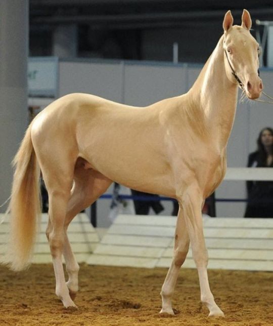
Also because I have seen some really cool and pretty elezen that specifically worked to play up gold as a color scheme, and in this case I wanted to evoke a kind of warm, soft golden light. Originally I was going to make him a contrast to Cenric and make him much paler, but I wound up going that route more with Asklona instead with drawing loose inspiration from certain forms of albinism. I went more gold to make sure Cesaire would stand out visually from Asklona. Another reason for this route is because I want to make a character who looks very light and pure, but in practice has hardcore bloodlust. XD Wanted one case for playing into that possible WoL element haha. I also thought it might be neat to make a character who could serve as a kind of foil to Zenos in many ways and might credibly say yes when invited to be besties. Cesaire is still a mostly heroic guy but I figure he’s a bit like Dexter if that makes sense.
KIYO SHIROGANE
An auri white mage from Hingashi! To me it felt a little odd that the Ruby Princess of Sui-no-Sato has more of a magenta color scheme than red. I wanted to tie Kiyo to Kugane specifically in part because I think the parallels between geomancy and white magic (land, sea, sky) are super cool imo, there are a fair number or Raen au ra in Kugane with less lore exploration, and I wanted to make a character whose past trailed behind her in a clear and interesting way while she travels. So for Kiyo I kind of took inspiration from the idea of a red pearl (pearls often being white as per the horns and scales but then she has vivid red hair) and from the idea of blood tied to injury and medicine. Plus ya know, white magic. I also took light inspiration from candles conceptually. I totally forgot that Shirogane is the housing district also lol so now she has backstory lore that her family had been heavily involved in establishing the area. Kiyo comes from a large and noble family with a ton of political and economic influence, being herself somewhat sheltered and naïve. She is very sincere, playful, outgoing, and does her best to be kind. Very animated!
OSK YASKARET
For Osk, I was essentially going (ʘ_ʘ;;) because I knew that I hadn’t used ANY brown hair so far and it was making so uncomfortable lol. So I thought about what combination would be appropriate, distinct, and striking enough to fit within the cast while also being distinct. Gray and brown feel like chinchilla colors to me and I think are nice in a way that wouldn’t be out of place with rabbits/viera. I wanted dark eyes since again, I hadn’t yet for this group... so dark purple wound up being her main color. Since I was going scholar, I also wanted to keep the sense of intellect and feeling like a healer without being mistakable for astrologian or white mage. I still want to build into her look, but another aspect I wanted to incorporate--saw a lot of people arguing about the inherent sensuality of Viera, so I figured for her I wanted to make her look elegant and sophisticated but more conservative in glamours. I didn’t want her to instantly read like she hopped out of the woods either. Figure she’d have had time to adapt since.
I’m still very much debating backstory and personality or her but am leaning toward her being the offspring of a viera who left the woods while pregnant. I like the idea of Osk wanting to connect with her heritage but feeling somewhat adrift. I also want to incorporate Nym lore because omg I want more Nym in-general. Personality I do think Osk is probably a little bit of a smug bunny but things remain super tenuous.
ASKLONA WANNEYNWYN
Asklona I literally wanted to make a super soft feeling, hyper feminine lady roegadyn because most interpretations I’ve seen have been either harder feminine or tomboyish. Still fun imo, but given the grief some fans heap on femroes I really wanted to show that this kind of look is doable. I usually try to incorporate the black noses on Hellsguard designs (tiger roooooes) while with Seawolves I tend to push either fully into something natural or fully into something unnatural. So ex. the most desaturated option or else just run with blues and greens. Asklona is specifically a bard because it is pretty and fancy imo and I haven’t seen a lot of roegadyn bards in-general. Asklona I mentioned before is modeled off of certain kinds of albinism, but by that I want to make the disclaimer that pink eyes don’t generally occur in people (pale blue or violet is more likely) and that normally there are some eyesight problems that come with the condition as well as ease of getting sunburn. I don’t necessary play into that with Asklona/am going artistic license because I mean final fantasy we can lift swords bigger than we are. I know these things get overlooked a lot though so it seemed worth specifying. My choice to go this route was because I wanted to make myself use more pastels lol and I figured this would be a fun spot to contrast Cenric. I think in backstory Asklona’s father lost his mind to a siren, and Asklona pursuing adventuring as a bard is partly to take revenge and partly in the hopes that she can call her father back with song. Her involvement becomes more complicated over time but I think that’s the general direction. I picked green for her color scheme because it’s a color that feels like it evokes both the woods of Gridania and the sea itself... and because pink is a shade of red and with green being complementary, I figured it would make the pinks stand out a lot. Asklona is tied to Limsa Lominsa and besides looking for outfits that will flatter her body type I am trying to evoke the ocean in her designs. Pirates, sailors, the works. Personality I am still figuring out a bit but I think Asklona is definitely a shameless flirt, can read as insensitive and self-centered at times as she indulges in what makes her happy. She plays herself off as much more shallow than she is and in-general focuses on pursuing pleasure as a way of avoiding heavier issues.
KOKONO KONO
The scrappy daughter of a Doman fox auspice and a Thavnairian lalafell, Kokono saw her mother waste away with homesickness after fleeing the Garlean occupation. She has two brothers, one who returned to Doma while the other remains in Thavnair witht her father. Kokono hates the idea of loving a place so much you would die over it and decided to travel Hydaelyn, causing mischief while indulging a deep-rooted curiosity and love for discovering new places. Has severe commitment issues. Can be prone to swearing and being insensitive because the shocked reactions amuse her a lot, but her heart is ultimately in the right place. I designed her literally to make a lalafell fox because with the dark nose option + werewolf ears it is SO EASY to make tiny canines and I don’t understand why more people don’t do this. Like I could make an elegant white fox lalafell or a yorkshire terrier lalafell or any number of things. We can have itty bitty dogs! And like Kiyo I wanted some background to be evident in her clothes too. I designed her before I picked her backstory and mainly went for rule-of-cute/what would most evoke the red coat of a fox.
SVATOMIR AZORYA
Last of team Famfrit, he’s a Warrior Hrothgar. Very conceptually rough, I’m interested in playing him much more reserved and traditionally masculine in a lot of ways. I think a character in that vein will help balance out against the other Warriors of Light I made for that world. Design goal here was to make him look as wolf-like as possible haha. I think we have plenty of cat people already with Miqo’te.
NIVIENNE LECLAIR
From Lamia, I’ve talked a bit about her before so copypasting that in.
Basically, when I decided to try doing the whole WoL/Emet-Selch fic writing misadventure it was just a personal challenge for funsies. I’d seen other people do some really interesting and impressive stuff using unnamed lady WoLs. Hadn’t really tried something like that myself so I decided to go full improv with it.
Except my instincts tend toward specificity lol, so I scattered details according to what would make for fun scenarios or cute details. I wanted the lady to be a certain level of tall so I went with elezen. I needed to describe a readily portable weapon that would mesh with that sweet, sweet Amaurotine lore, so I made her a summoner. So on and so forth. Very seat-of-the-pants.
Particularly since the fic I have coming up is gonna be bigger, I’m thinking name is okay now lol.
Cenric as my black mage main is a dark, broody guy who doesn’t quite realize he’s nicer and sillier that he gives himself credit. So I decided Nivienne should be much more socially adept (read: not a lameass poser), very mischievous, confident… but lowkey has some heavy shit going on. Girl can be ruthlessly manipulative. Other WoLs of mine have different personalities.
As I was going through fic stuff, I decided I wanted to visually tie to and contrast with Emet-Selch since shipping. He’s got gold eyes and accents on his regalia? She’ll go silver, but her skin will have a more golden tone. He’s got dark hair with a white streak? She’ll have light gray hair, tie into the ruff of his coat. So on and so forth.
Name-wise, I actually fucked up initially by going too on-the-nose. Nivienne is another (more elezen-French) name for Nimue. Given how that story goes I figured it would be fitting here.
As a couple of other notes--color scheme being gray was experimenting to try for a different-but-distinct summoner aesthetic. I wanted to play up horns/third eye concepts (not strictly in the Garlean sense) and create a vibe that wouldn’t feel like white mage, or red mage, or black mage, etc. I also saw people arguing that female casters all end up looking like magical girls, so I wanted to really make sure that she had a different look from that while still being very feminine.
11 notes
·
View notes