#WebSAfe
Explore tagged Tumblr posts
Visit Tumblr Blog
Explore Tumblr blogs with no restrictions, modern design and the best experience.
Last Seen Tumblr Blogs


Fun Fact
130K people were victims of a chain letter scam that affected Tumblr in May 2011.
Text
psa — pls use neurodivergent / dyslexia friendly fonts and high contrast text vs background color choices for low-vision fans interacting with your fanworks!
aka: making your podfic cover art and / or gifsets & text post memes more widely accessible and viewer friendly
-continues below the cut-
okay, hey, hi! thanks-in-advance for reading this long post (lol or skipping to the tldr) ₍^. .^₎Ⳋ ⸜(。˃ ᵕ ˂ )⸝♡
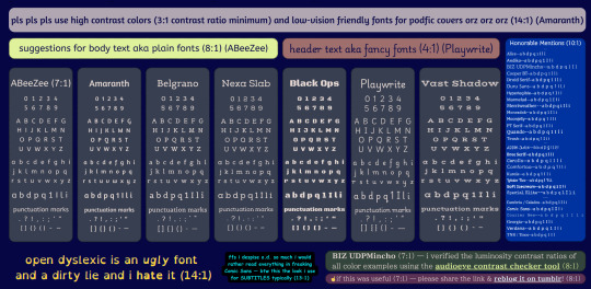
so, first of all! i made a canva poster regarding which fonts i consider to be neurodivergent & dyslexia friendly *in my personal opinion* -- it also has examples of text (foreground) vs immediately surrounding background color choices with luminosity contrast ratios that meet minimum WCAG standards for low-vision web users -- btw there's a plain text list of the fonts included and colors used on the poster near the bottom of this post
-----
-----
so! what do i think makes a font family neurodivergent / dyslexia friendly and / or accessible to low-vision persons?
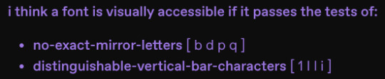
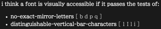
i think a font is visually accessible if it passes the tests of:
no-exact-mirror-letters [ b d p q ]
distinguishable-vertical-bar-characters [ 1 I l i ]
and also very very importantly: i find it at least aesthetically tolerable 😅😉
which btw @staff the default tumblr True Blue color scheme uses a font that fails both of these tests — UPDATE: test failure for every color scheme's default font when using the ios app (side note: we need a dark mode for the queer pride color scheme)
UPDATE: i just tested all color schemes on my chromebook -- Vampire theme has a default font (combined with a tolerable-to-my-eyes low-light compatible color scheme) that passes these readability tests in the chrome browser but i don't know about any of the other browsers *shruggie*
-----
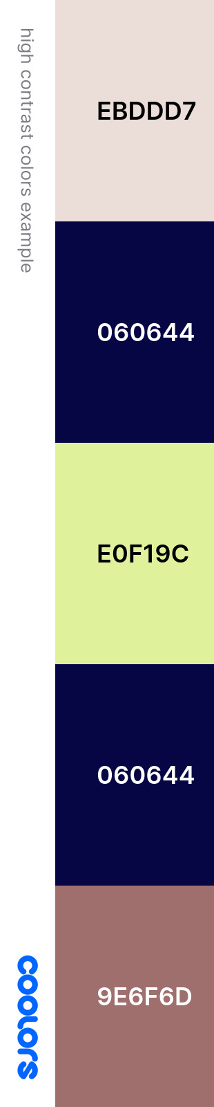
and here's a color palette representation of the color choices i made on the poster with their associated hex codes
-----
some context:
so while i was working on research (motivated by @flamingwell 's post) about ways to make my podfics accessible for hearing-impaired fandom friends, i got to thinking about how i often struggle to read lovingly made podfic covers and painstakingly created fandom-themed gifsets and text post memes here on our beloved hellsite. and so i was inspired to try and raise awareness amongst the podficcers making cover arts and the magicians making gifsets & memes! about webdesign standards regarding visual accessibility
btw! if you're tracking this, my research and experimentation with how i personally can make my podfics more accessible to those with biomechanical and/or neurological hearing challenges is still in progress, but you can read more about what i've learned so far here!
==========
some links:
-----
my preferred browser-based tools for choosing font vs bkgd colors
https://colorable.jxnblk.com -- free & no ads
https://www.audioeye.com/color-contrast-checker -- free & some ads but Very Official lol
https://coolors.co/contrast-checker -- free & no account necessary to use & no ads -- also has a really neat color palette generator tool
https://www.canva.com/colors/color-wheel -- free & no account needed to use & no ads
-----
this tool simulates colorblindness on png / jpeg images
https://www.vischeck.com/vischeck/vischeckImage.php
==========
okay so! if you don't want to interact with the poster just now, or if you would like to be able to c&p an exact font name or color for your own use! here's a plain text list of all the fonts referenced as being low-vision / neurodivergent / dyslexia friendly in my opinion & based on my lived experiences on my poster, as well as the colors i chose to use as examples of high-contrast fonts vs bkgd
p.s. as of 2025.06.19--all but 2* of these fonts are available with a free account on canva.com
-----
my suggested body text aka plain fonts
ABeeZee
Amaranth
Belgrano
Nexa Slab*
honorable mention
Alice
Andika
BIZ UDPMincho
Cooper BT
Droid Serif
Duru Sans
(Atkinson) Hyperlegible
Marmelad
Merriweather
Monradok
Moonjelly*
PT Serif
Quando
Tirosh
my suggested header text aka fancy fonts
Black Ops One
Playwrite US Modern
Vast Shadow
honorable mention
Apple Juice
Bree Serif
Carollo Playscript
Comfortaa
Kurale
Lobster Two
Soft Icecream
Special Elite
my suggested websafe fonts (boring fallback choices, but necessary i guess)
Cambria / Caladea
Comic Sans
Courier New
Georgia
Verdana
Times New Roman / Tinos
-----
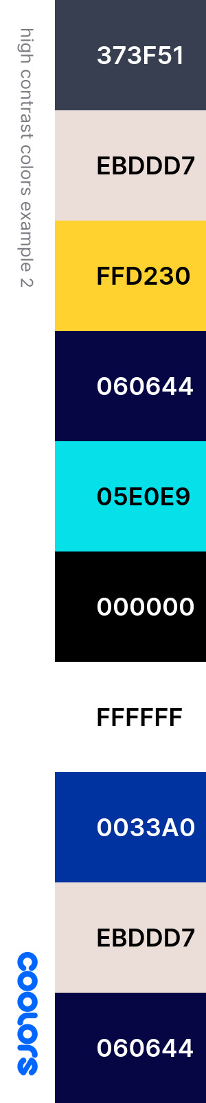
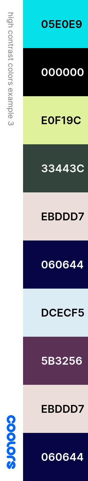
what colors did i use? and their hex codes
the dark blue bkgd #060644 aka ~federal blue~
the pale pink used for main header shape #ebddd7 aka ~champagne pink~
the yellow 'plain fonts' header shape #e0f19c aka ~mindaro~
the pale rose-pink header for 'fancy fonts' #9e6f6d aka ~rose taupe~
the grey bkgd for the text example boxes #373f51 aka ~charcoal~ and the pale pink font #ebddd7 aka ~champagne pink~
the yellow used on the example of how ugly the open dyslexic font is to me #ffd230 aka ~jonquil~
subtitles example: light blue font (usually called cyan in subtitle menus btw) #05e0e9 aka ~robin egg blue~ and black bkgd #000000
the honorable mentions box: blue #0033a0 aka ~egyptian blue~ and the white font #ffffff
the green-ish box #33443c aka ~dark slate gray~ using the pale pink font #ebddd7 aka ~champagne pink~ with the pale yellow link #e0f19c aka ~mindaro~
the purple box #5b3256 aka ~japanese violet~ using the pale pink font #ebddd7 aka ~champagne pink~ with the pale blue link #dcecf5 aka ~alice blue~
-----
a final consideration re font choices: don't be afraid to use Big Font Sizes and Use Up Some Space in your text overlay visual arts! especially for the most important information; WCAG standards recommend 18 point font size for easier readability (or a 14pt bolded font)
-----
TLDR--what i am asking for people to do when designing podfic covers and gifsets (well. really any artwork with a text overlay on an image) is to choose the font color and immediately surrounding background color to have a high contrast ratio (3:1 min for headers and 4.5:1 min for smaller fonts) AND to use dyslexia friendly fonts. pretty pretty please!
and in conclusion: OPEN DYSLEXIC IS AN UGLY FONT AND A DIRTY LIE AND I HATE IT SO MUCH PLS DON'T USE IT I BEG YOU orz orz orz YOU HAVE BETTER OPTIONS — SO. MANY. BETTER. OPTIONS
-----
end post
#accessibility#neurodivergent#neurosparkly#adhd#autism#autistic#audhd#low vision#dyslexia#xk_s_reads#basically. if you are making The Art and it has TEXT overlaying an IMAGE then i say PLEASE pls pls consider this post okay#I MADE A GODDAMN CANVA PRESENTATION ACTUALLY#WCAG = web content accessibility guide#pls use high color contrast ratios between foreground (text) and (the immediately surrounding) background#fonts#custom fonts#websafe fonts#long post#podficcer psa#podfic#podfic cover art#ao3#gifset#gif makers#image id in alt text#hey staff#queer pride#pride 2025#happy pride 🌈#be gay do crimes
9 notes
·
View notes
Text


Hello friend.
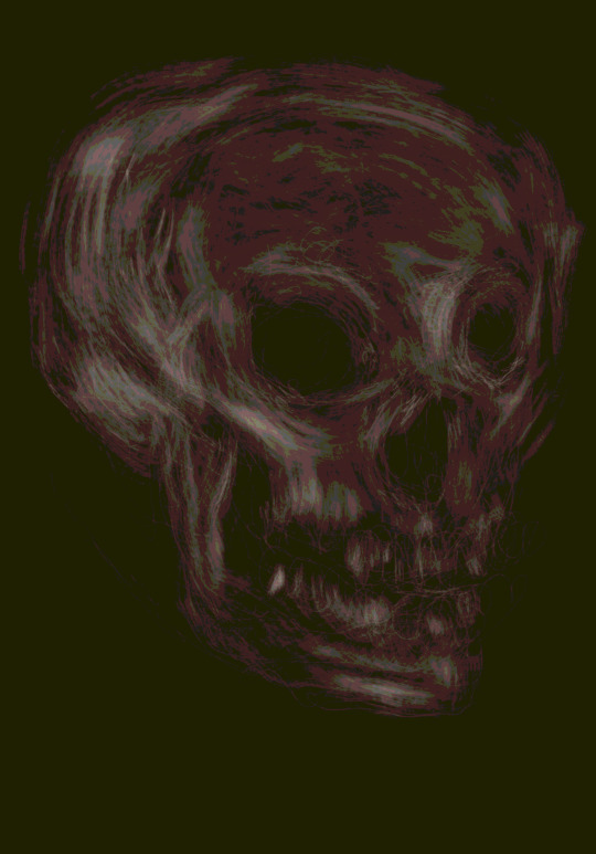
Drew this skull yesterday as a cool down drawing in Procreate, and today I went back to it, to push it more towards to what I want.
I have color processed it in Affinity Designer, and then exported it from there as gifs using the websafe palette, using 16 colors as a personal goal.
After having spent a few weeks on researching, I enjoyed making these as a proof of what I am currently looking for in my design: a lower density in detail, overall.
And I am looking for a pixelated look, like the ones above.
Yesterday, I was annoyed with how limited Photoshop for iPads is in terms of how much control I have over image compression during export and filetypes to export to (even had a few more caustic words for that), but today I realized that I can make do with Affinity Designer. It is a long shot away from the control I am used to, while the latter is also really far away from, say, ImageMagick’s capabilities (which I will test more when having a command line in front of me again). I obviously use what I have, but you won’t see me glorifying a make-do much.
I have a tendency to make drawings face to the left; that way, they seem to be facing me, like someone in front of me, if that makes sense to you. I flipped the skull for a couple of socials, added the first word that came to my mind, as sort of double-homage to both White Wolf RPGs and @plastiboo

Enjoy this image compression of which we see so very few. This looks like a lot of fun coming my way.
#compression#image compression#pixelization#fake digitization#gif#limited palette#websafe colors#graphic design#pixel art#code and canvas
6 notes
·
View notes
Photo

Compressed!
643KB -> 62KB ( 10% )

#doing this on my phone with dither.it since I haven't bothered to add more photos to the queue on my pc lol#win98#I can't use the websafe palette though because I'd have to type in every color one by one#fish
8K notes
·
View notes
Text


mischiefevancito asked: lucy donato & websafe blueberry melt colour palette requests
#911#911edit#911verse#tvedit#911 abc#mine#lucy donato#Arielle Kebbel#the last gif did not work that well because she moved her hair a lot
239 notes
·
View notes
Note
if you were making a syllabus for a comics class, besides the obvious (homestuck, hark a vagrant, a comic from KC green, a comic from ONE), what comics would you say best represent webcomics as a medium/ are needed to represent the medium? I always liked your hitmen for destiny rec and was wondering if you knew anything else like that
if we're talking about representations of the format rather than just examples of good comics, i think the choices would be really different. for one thing i would cut hark a vagrant and kc green comics since, while both good, they "operate" more or less the same as print comics and utilize the internet primarily as a means of distribution rather than incorporating it into the creation process (beyond making colors websafe, when applicable)
as a lowbrow example, jerkcity (or whatever its called now) is a purely web-based creation. the scripts are private chats dumped into microsoft comic chat and generated from pre-made software assets. im not a fan personally, but there are xkcd comics that make conscious use of the web-medium/infinite canvas to create comics that can literally only exist in a web format (homestuck is the same, but on a massive scale which would make it hard to teach in this scenario). bouletcorp (english website dead? huge loss imo) featured quite a few comics that took advantage of readers needing to scroll in order to obtain more information. e.m. carroll's horror works capitalized on the use of scroll and click to induce tension in the reader. dinosaur comics managing to squeeze decades of comedic juice out of clip art dinosaurs arranged in the same layout every day.
i feel like a class about webcomics should be about the comics that differentiate it from the print medium, if that makes sense. manhua would also fit into this but i would choose cutbu as the example bc i love cutbu comics lol. they came back last year just so everyone knows. with a comic called 28th century superfan
60 notes
·
View notes
Text
I realized I'd never made a process breakdown for my pixel art (at least, not one in a long time), so here's one for a test asset for a project I'm working on.
My current software of choice is Aseprite, and I almost exclusively use the pencil brush at 1px and the bucket tool. I use my mouse for everything but the sketch; tablet strokes are too unruly.
Images enlarged x4 for visibility; actual size is in the top right.
Sketch
I tend to start it like any other digital drawing, then scale the sketch down to the size I want the sprite. These aren't usually coloured, but this one wasn't originally intended for pixel art.
Lines & Greyscale blocking
Depending on the sprite, I'll do one or the other of these first, or do them at the same time. This is where I define the basic shapes and values (which parts are light and dark). In this case, I did the lines first and then blocked in the values.
I sometimes work with colour right away, but not usually.


Shading & Anti-aliasing
These are also things I work on simultaneously, usually moving from one area of the sprite to the next. I start by "softening" the internal linework by making it lighter greys depending on how much its meant to blend with the adjacent shape. Next, I block in the shadows and highlights, and add anti-aliasing pixels where I want it to look smoother.
During this step, I often end up making small changes to the shapes and linework as I refine the sprite. Readability is key to a good sprite, and precision is key to readability.


Colours
While on sprites like this I'm not keeping to a super restrictive palette, I do try to use as few colours as possible. I like to use "websafe" colours for the bulk of the sprite, but sometimes I use shades halfway between them for anti-aliasing.
I start by mapping the main gradient I want to use over the grey values. I use the bucket tool with "contiguous" disabled so that every pixel of the same colour is affected. My colour-picking philosophy could get it's own post, so I'm not going to go into detail about that here.
Next, I go over any areas that are meant to be different colours with their own gradients, trying to have at least some overlap with main palette. Finally, I tweak the anti-aliasing where necessary.

And there you have it. Here's the finished sprite at actual size:


Hope you found this helpful!
(Also disclaimer that the project this sprite is for is super early in development and all design elements here are subject to change lol)
#pixel art#art process#art reference#artists on tumblr#pixel art tutorial#Salem's clever art tag#long post
47 notes
·
View notes
Text
I might edit the look of my blog’s theme soon, now that I know about websafe colors and fonts
1 note
·
View note
Text
Starting to dig into dots and points deeper led to the writing of Wassily Kandinsky. Inspired by his observations on the dot on a background, I went and made a few variations with two dots, and observed myself how and what kinds of tensions I could build. I again decided on compressing these images down (after a really shocking amount of data has been used up by my iPad’s really useless sync options, this feels like I am actually stupid for compressing at all; had to turn off what I hope is most of this nonsense, but will keep an eye on that mess: 1.5gb just happening in the background is just wrong).
The grid is three rows, top row is naïvely positioning the second dot, middle row is using golden ratios as guides, bottom row is golden ratios but more organically placed:


Working with the iPad has been a struggle the last hour, but I am working through my ire, for the benefit of myself and my studies: and I am glad that something I picked up from Kandinsky’s “Punkt und Linie” worked out just right using compression: the dots are not numerically perfect circles (because they were in Adobe Illustrator, and I did think of being a fiend and asking people if they can tell which of two overlapping circles was a little less perfect), because, even according to him, absolutes do not exist in nature.
Absolutes don’t exist at all.
This was much more satisfying than I could expect. I am glad I understood that I don’t understand dots at all. I am looking forward to spending more time with putting dots in places.
One odd thing I will need to revisit in the future: while trying to export using websafe colors again, there was an unexpected dithering going from roughly the left bottom up to the middle and then to the right side, tied to the resampling type. Let me show you what I mean:
bilinear

bicubic

lanzcos (separable)

Interesting, right? Not much, not very, just a little. A yin amount of it, if you will.
6 notes
·
View notes
Link
#365TotalProtection#ComplianceFilter#ContentControl#Hornetsecurity#LiveTracking#MalwareDetection#Microsoft365#Office365#Outlook#PGP#S/MIME#SpamDetection#Websafe
0 notes
Text
its been updated, may be forced to change it because everytime i go to my page ill just sit and stare at her and yearn
trying to gif the scene of scully with all the cig lighters for my about me but i keep getting ... distracted.
#also if you're on mobile.... dont look at it#it looks horrible on my phone but i refuse to change it to a more websafe pink rn sorry
4 notes
·
View notes
Photo

eScan's Web Safe feature facilitates safe and hassle-free surfing for a secured virus free browsing experience. eScan Total Security Antivirus available on https://www.crackkart.com/brand/escan #Crackkart #eScan #Totalsecurity #cybersecurity #infosec #websafe #safesurfing #safebrowsing #datasecurity #databreach https://www.instagram.com/p/B6LmxS9FoIr/?igshid=17bpdznejewb6
#crackkart#escan#totalsecurity#cybersecurity#infosec#websafe#safesurfing#safebrowsing#datasecurity#databreach
0 notes
Note
hi emz hope you are good :) I love seeing your gif sets on my timeline they are so beautiful!!! if you were still taking requests for the color palette meme could I request lucy donato & websafe blueberry melt 🫶🏻
thank you for the kind words on my gifs, it's always nice to hear people like what i make. Of course! Hopefully we see Lucy in S9 so we can have more scenes of her! Here is the gifset, I hope you like it.
#ask#compliments on my gifs make me smile so much because i'm usually just v critical of them and then i get :(#it's nice to hear them being appreciated
5 notes
·
View notes
Photo

4 notes
·
View notes
Photo


So this is a bit new! Here are some flags I made, with absolutely no purpose, or meaning behind them! And, if you wanna use them for your flagless identity, go right ahead!
These are totally free to use!
#also they're just using websafe colors so yeah!#accessible!#orphaned flags#yeah that's what i'll call em
29 notes
·
View notes
Photo

oghh.... i was in the squiddy mood
#this looks a LOT darker on mobile and i wish it didnt#hg damn you non websafe colors#splatoon#squidsona#splatoon2#inkling#lollykiwiocs
17 notes
·
View notes