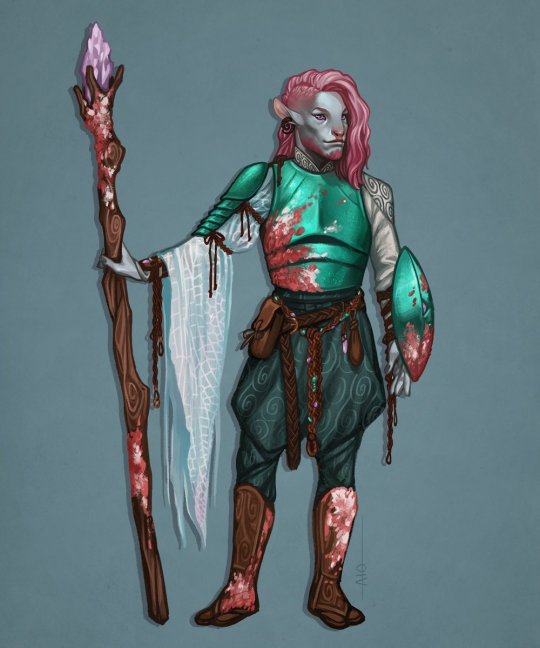
#and also swirly curly hair. fun to draw
Explore tagged Tumblr posts
Visit Tumblr Blog
Explore Tumblr blogs with no restrictions, modern design and the best experience.
Last Seen Tumblr Blogs


Fun Fact
Women make up for the other 50% of Tumblr’s audience.
Text


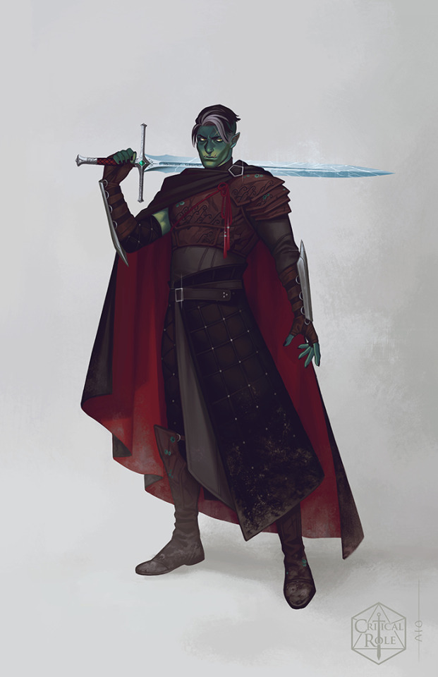
panel redraws YAY ^_^ trying to figure out how to draw this guy............ some kinda messy sketches below cut

#its been like 2 days since I finished isat I'm so unbeliveably attached to siffrin already#actually scary how much I see myself in him#dare I say mySIF? how much I see mysif in him..... hehe...... like their name...............#still don't know how I want to draw siffrin :( still haven't gotten them down. seemingly simple character designs are always the worst to-#figure out how to draw for me. change one little detail oops not the character anymore#however I do know I like to make siffrins hair curlier in the front at least ^_^#because my hairs curly and when I haven't washed/brushed it in a while it gets really frizzy/straighter in the back and siffrins just like-#me fr so I will in fact project this detail onto him#and also swirly curly hair. fun to draw#I HAVE RAMBLED TOO LONG I love you siffrin with my heart and soul#in stars and time#isat#siffrin in stars and time#siffrin isat#squirrel art
124 notes
·
View notes
Text
Okay time to be really opinionated: I think almost the entire TMA fandom writes Michael Distortion wrong.
Every time I read a fic about him people are emphasizing how swirly and elongated he/it is.
What's scary about Michael is that it is essentially the living personification of gaslighting. He makes everything else metaphorically swirly.
Sure there's "nobody would believe you", but most people who meet Michael think he looks angelic. He only looks scary out of the corner of your eye, or if he's feeding you just enough truth to get your guard down. He's fun to draw and describe as a psychedelic nightmare, but he is basically the gaslighting demon. It's a polite young man with curly hair and a beautiful smile who you could absolutely take home to meet your mother.
You only know he's a monster because your lizard brain starts screaming.
On a related note, its portfolio also includes dissociation and hallucinations, and nobody takes enough advantage of that– like, kissing Michael. Lots of people describe kissing Michael as a very physical event with notes of static and that tingling sensation of limbs falling asleep. A good start, but my argument: you feel him smooching your cheek and giving your hand a cute little squeeze, despite the fact that he's across the room ordering a coffee. It feels so real. You can feel his callouses catching at your fingers, but no matter how you flex your hand there's nothing there but air. You don't know if you just want it that badly and your eyes are lying, or what. He brings you a coffee and the sensation vanishes.
I know exactly what that episode about "the man who wasn't there" was because I've experienced it, and nobody utilizes that enough. Have you ever closed your eyes and tried to walk through a room, and been Firmly Convinced there was an object in front of you you were about to run into, despite no evidence of such an object when you open your eyes? It's a little like that. Any sort of relationship with Michael Distortion (not recommended and likely a way it has killed many people) would involve you getting comfortable with the fact that your senses are lying to you at an exponentially increasing rate, like a frog slowly being boiled alive.
Is he there? Is he not? Does it matter? You feel loved. You remember being told good morning and eating a homemade breakfast. Did you actually? Maybe it's a memory from a year ago you only think is from this morning. He's adorable even if his laugh gives you tinnitus. Maybe you've always had migraines. He takes care of you through them. Can you remember what he does to take care of you? ....normal people stuff, probably. Ice packs. You think he brought you ice packs once. You're sitting at a bus stop, going... somewhere, for a reason you're sure, and your body is telling you you're sitting on his lap but you keep checking, tapping with your nails, and the seat is hard metal. Does it matter? Maybe it really is him. You'd prefer if it was him. These cute little hallucinations are his way of showing affection. It's comfortable, even when the city shuts off your water because you only thought you paid your bills. He gives you his coat in the rain, and you laugh together and run through the weather, but when you get home you're holding a stranger's purse full of cash instead of a coat and you have no idea why. It's his idea of affection, though. He says he loves you when you ask about it, anyway, and don't you need the money now?
He's a lovely young man and the only normal thing in a world gone mad. The gloves only come off when it's done playing with its food.
578 notes
·
View notes
Note
I noticed the slight style change in Wars' scarf (from before you actually started LBL and then where we are currently) and so I was wondering.......
What was the og design for your Links? And then how did it change to how it is right now?
I thought that would be an interesting ask, so here you go!
I hope you ready for a big load of yapping Anon cuz I have many things to say about their older designs 🙏
So we’ll start with Sky!

Old design on the left and new design on the right. He had a cape LU style, baggier clothes, and had the loftwing feather attached to his earring. I have the skyloftians wear their loftwing’s feathers because it lets them feel closer to them when they’re separated from them on the surface! The thing about this design was that not only was it impractical, but it was also suuuuper annoying to draw and color. Idk if you read the old comic from before but that helped me know that his loftwing feather was driving me insane haha. The cape as well was super annoying and while baggy clothes fits Sky, it didn’t seem smart for him to have that. He was also 5’0” because I wanted him to be older than twi but shorter than him. When I redid Lbl I thought about what I hated about his design while drawing it and changed it around
I made him 5’5” so I wouldn’t have to make his Zelda super short (she’s 5’3”) and he’s definitely one of the “taller” Links. I put the sailcloth and loftwing feather at his belt so they were out of the way. I also gave him bracers that kept his baggier sleeves out of the way and yeah! Still not the most practical thing ever but this is fiction and idc 🙃I’m a little sad about the loftwing feather tho cuz I always wanted him to have a long feather on his earring since I first designed him but oh well. It’s for my own sanity haha. I still kept his more “comfier” clothes and his lightning scars hehe 😈 so yeah!
The rest of the ramblings are under here:
Minish also underwent a lot of changes:

Older design on the left and newer one on the right.
The old design not bad but it’s kinda plain to me. Being a blacksmith he has an apron and gloves, and I always imagines mc Link with curly hair. I do love his headband and I think it’s super neat, but that’s really it. It’s just plain and when he has no apron it’s even more plain. So I changed it to the newer one!
He still has curly hair and his headband but he has no more apron. His tunic is meant to resemble a Minish but I kept the golden outline for some pizzazz. I gave him back his blue eyes which are very integral to his sprite in mc imo and I changed his nose shape to match his grandpa’s and that’s probably my favorite change about him. I love his nose very much and it makes him look very unique. I kept his gloves but I also added some iron-toed boots just so metal doesn’t break his toes lol. And I always had the square belt buckle on him. It’s very fun exploring different ways to do that swirly belt buckle! I also made his tunic dark green so it’d look better. Overall I love his newer design!

Old on the left, new on the right. Time didn’t change too much but he did enough for me to talk about it! His shirt darkened to match his old tunic, gave him the gauntlets for something interesting to look at, changed his collar shape, and I changed his eye color! This actually happened after I made the newer drawing XD I changed his eye color to match Twi’s :) also I untucked his shirt. Idk why. I thought it’d look better so we’ll see lol.

Twi changed a LOT, and by a lot I mean his colors lol. I had a plan where he was going to be pale with dark brown hair to show that he isolated himself and stayed inside after tp, and lbl helped him heal and he was able to look like he went outside again. Buuuuut I changed it for my own sanity cuz that would’ve been so hard to do well lol. So the newer design has the colors he was going to get in the old lbl. Truthfully the old backstory doesn’t fit what I have in mind anymore anyways so it makes sense for him to be tan in the new one. I also added more battle stuff for him including bracers, that sleeve thing, and actual clothes that match ordon lol. I did keep the Ordona symbol tho cuz it’s cool. But yeah, other than that there wasn’t too much of a change in his actual clothes! I did give him dimples tho :> you just can’t see it

Four changed quiet a bit as well. As least when he’s merged. He used to have armor but I thought giving him a full thing of armor when he was only 14 was kind of odd so I instead took out most of the armor. I also made his colors more neutral cuz I loved the idea that Four’s colors were more white and brown to show the colors merging. But honestly i don’t like the look of it haha 😅 it makes more sense for all of the colors to be on Four anyways since it resembles the colors never fully merging so honestly I miiiight switch the colors… but anyways. I did keep the braid flower thing cuz many liked that as did I, and I changed his eye color to match the actual eye color of the colors. They will change depending on who’s in control! But yeah, change in colors 🙃 might change it again idk. I just don’t like the tan and brown haha.

I went through a whole thing with windy because he was originally gonna be 17 or 18. He was gonna be an adult. But I didn’t like that and changed him to being 14! The issue with that tho was that he looked too old in his old design. The blue lobster and coat that resembled Linebeck’s just didn’t fit him anymore so I decided to lean more into his green tunic and played with colors to get him his new design! Which I love a lot! It’s just a little more boyish with nice colors of sea foam green that I like, and it definitely fits his younger aura. That could easily have something to do with how I drew his face tho haha. The old design had the blue lobster cuz that’s what everyone else was doing and I thought the coat would be a cut homage to Linebeck. Including a gossip stone. Also no boots cuz idk, I like it. Makes it easier on me haha. And his scar is a little less healed in the new design than the old one :) it’s very clear that I decided to do what I wanted to do with his design instead of doing what I thought people wanted, and I love his newer design now. Should be easier to draw too!

Left drawing was the first design of Age, and there’s some things I do kinda like. For starters the cape is very neat and would definitely mark him as a champion, but that’s about all I like haha. His short hair is fine but it doesn’t make sense for him to cut it, the armored pieces are a pain to draw and the colors were hard to work with. So I got rid of the cape cuz I figured it’d be harder to draw and wasn’t super practical, changed the tunic color and his hair color to match canon, and gave him more simple bracers and boots. The thing about Age tho is that I don’t like his design. Same issue with Four honestly. It’s not satisfying and I wish I took the time to play with his design more instead of jumping in, so I might play with his design a bit more, might do something with the cape. But I did add Mipha’s scale to show that they’re a thing <3 and lastly he used to be 5’5” but I didn’t like that so I moved him down to 5’0”. He’s taller than Wild to show that the shrine of resurrection stunted Wild’s height (but honestly my Age did technically use the shrine of resurrection so) but he’s not absurdly taller than him haha. but yeah, i don’t like either of his designs 😔

Wild’s overall design didn’t change too much cuz I did like the champion’s tunic with the Hateno clothes on top of it, but something that I do wish I kept was that his hair can’t grow back on some parts of his head, leaving him bald. I might still keep it but it’ll be very well hidden under that mane of hair haha. I dropped the braid and let his hair flow beautifully in the wind, and smae with Age, changed the hair and tunic color! I wanted him and Age to both have the champion’s tunic so that they know that they’re technically the same :) luckily Wild has a lot of outfits so I can honestly play with the clothes whenever I want hehe.

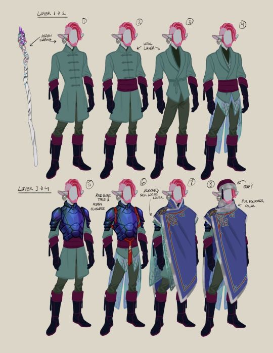
And as you mentioned, Wars went through a lot of change too! Just like Wind I played with some ideas for him cuz I wasn’t vibing with his design. He and Sky are the only ones I had in the older lbl comic so I was able to know what I did and didn’t like about his design! I liked his tunic design for sure, and it’s still there, but the cape was kinda lame to me. It wasn’t fancy, had a bad color, and I hated the overall shape. He has his hat here but he was always going to lose it. So keeping everything else I decided to try to explore the scarf again and tried to find a style I liked. I didn’t want it to be like the game, and I wanted it to look unique to him, and eventually I settled on the big triangle shaped scarf! Makes him look more dynamic and I changed the colors so they’d look better, and I do really like his newer design! He didn’t go through much change, but it was enough to keep me satisfied! I do wish his Diamond clip was on his back like how it is in the game but oh well, I wanted it to look like some sort of Medal of Honor 🤷♀️ my beloved
And that’s about all the big changes! I didn’t include everyone cuz they either didn’t change much or they didn’t have old designs. Like Hyrule did change a bit with his design now having a turtleneck rather than a V-neck, but that’s about it. I don’t think Legend’s design changed at all (I love his design) and Totem and Rift weren’t in the older era of lbl :) I do need to draw refs for them tho augh. Spirit too didn’t change all that much and I don’t have room to include everyone haha. But yeah that’s what changed about them! I like the changes a lot (kind of) and I hope they won’t kill me when I draw the comic :’D I know wolf Link is giving me grief, mostly his colors.
But yeah, thank you for this ask! I love rambling about this stuff!! XD especially comparing old lbl to new lbl :)
63 notes
·
View notes
Text

caduceus lvl.20 redesign i did ages ago but forgot to post
copious amounts of design notes under the cut
tl;dr: my goal with this redesign was to create a coherent design consistent with his previous art, improved enough to hopefully read as lvl.20, but still practical enough to serve as actual adventuring clothes
okay anyways so watch how autistic i can be about caduceus
i wasn't satisfied with caduceus's lvl.20 design. i'm not entirely sure how that design happened. to be fair, critrole designs have never been consistent, but lvl.20 cad abandons nearly every key aspects of cad's design. it drives me batty
why is his hair so straight and pale and dead. why is he draped in so much brown. how do those wing-skirt things work. why does his staff... look like that. like its gonna explode into toothpicks at the first use. why is there honey. why is the gold of his shield so bright. what is the rope on his shoulders for
i mean, who knows what goes on in the critrole art development process. my personal theory is that they continue to design these characters as personal ocs and not as official characters in a huge multimedia franchise, and their personal choices trump all, design considerations be damned. like, i cant really judge. i have the privilege to make whatever choices i want when drawing. i answer to no one. i could tell taliesin jaffe to go fuck himself. yknow. if i wanted to die
regardless, i dont hate everything about the lvl.20 design. i appreciate that it brought back his swirl-patterned pants, but the entire core of his design is so busy with shit that it becomes a problem
i tried to preserve cad's key aspects as much as i could in my redesign, as well as incorporate aspects i enjoyed most from each design. for example, i really like the idea of the goliath beetle armour in lvl.20 cad, but i tinted the black shell towards blue to match cad's signature teal green.

I also tried to create a palette consistent with his previous designs. teal should always be his primary colour, with pink being the most prominent accent. after that, anything thats analogous to those two is gravy. for real, i am begging critrole to at least keep consistent palettes, because this is a problem for most of their designs
my choice to include the red cords is inspired by the winter cad design as well as one of fjord's earlier designs (side note: most of fjord's designs are pretty great; he's the most consistently on-par)
i enjoy drawing aesthetic parallels between connected characters. on that note, the swirly jade earring is a gift from beau :3 because they're fun earring buddies
speaking of cad's winter design, the design sheet showed a lot of asian influence (thats mostly covered by the cloak) and i will take any excuse to add asian influence to a design. the first two tunics below were my main reference for my own tunic choice
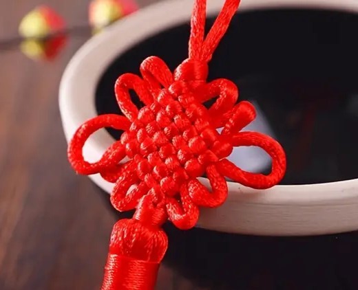
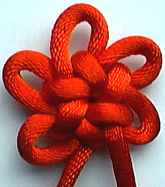
the knots on the cords are specifically chinese knot art. the largest knot at his waist is a plate knot which can symbolize the cyclical nature of life and death, and the knot on his cape is a brocade knot which can symbolize (re)unity. i thought these concepts were in-line with cad's general philosophy and the wildmother's teachings. also, the brocade knot acts as his holy symbol with a crook-shaped pin woven through the cord. i really fuck with holy symbols being integrated into a design rather than just slapped on somewhere
lightning round design notes:
the fraying woven material is witch hair moss, which i imagine could be made very soft and warm. this is my version of the neutral-coloured flynet cape in the fourth design
i brought back the iconic pink lichen
i simplied the staff again. my way of visually portraying a growth in power is that the one wooden hand has transformed into many hands grasping the crystal, which is also a representation of cad widening his social circle and of the nein in general
cad curly hair and beard so important to me
cad wide nose so important to me
final note:
the pose i chose for caduceus was very intentional. while cad looks great in a power pose, i feel like it doesnt suit his character. his power isnt so confrontational. his power is quiet and gentle and humble and inevitable. he doesnt need to show off. he's just chilling. i love this dumb silly man
and for the record, while i consider cad to be the worst lvl.20 design, jester is a guaranteed second place. very tempted to redesign her as well, because mature-but-frilly pirate lolita is right up my alley
26 notes
·
View notes
Text
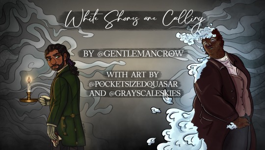
[ID: A drawing of Jon and Martin from the Magnus Archives. Jon is a thin Pakistani person with medium brown skin and long, curly, greying black hair pulled into a ponytail with a purple ribbon. He has a short beard, and heterochromia with one brown eye and one green. They are wearing a dark green tailcoat with gold eye buttons and are looking back over his shoulder with his back towards the viewer. They have white gloves and black pants, in one hand is a candle holder with a lit candle and the other holds a blood-stained handkerchief. They have a serious and stern expression looking back towards Martin. Martin is a fat Black and Filipino man with dark freckled skin and short, curly, reddish brown hair. He has small glitches on his skin, revealing the bones beneath his face. Fog flows off his skin, hair, and jacket. He is wearing a mauve waistcoat over a pale pink undershirt, a warm dark brown workman’s coat, and grey pants. He is looking over his shoulder back at Jon with a longing expression. Behind them both are stylized swirls of fog in shades of grey surrounded by grey mist and pale yellow light in the center of the image. Between the two is the text ‘White Shores are Calling’ in a swirly, handwriting font. Below, in bold, all capital letters font reads ‘By @ gentlemancrow with art by @ pocketsizedquasar and @grayscaleskies. End ID/]
White Shores are Calling
Podcast: The Magnus Archives
Rating: T+
Pairings: Jon/Martin
...Don't say We have come now to the end White shores are calling You and I will meet again... Once upon a time, high atop a lonely, misty cliffside beside the sea, sat a haunted house… But Head Butler Jonathan Sims has neither the time, nor the patience for ghost stories. Head Butler Jonathan Sims has a house to run, and if he had his way the only sordid tales anyone would be spreading about Magnus Manor would be how preternaturally superior the service had been. Head Butler Jonathan Sims is also dying... Though he does not know this just yet, or perhaps he simply cannot, or will not. Either way, the truth becomes impossible to deny the day he coughs up blood and is suddenly able to see the very beautiful and very transparent man petting the ponies in their paddock. The ghost is called Martin, he discovers, and Martin cannot remember how he died or why he is still trapped there, but Jon is the first person who has ever been able to see him in all his years of haunting. Both so close to the veil, but on opposite sides, they reach for each other at the point where darkness shrouds the truth of the greatest mystery of the universe. The End. Together, Jon resolves to unravel Martin's enigmatic past, the secrets of Magnus Manor, and perhaps even Martin himself to free him from his tethers to the mortal world before his own time there runs out.
AUTHOR
@gentlemancrow
Just two crows in a trench coat (Too short to be three) who likes collecting shiny things and making shiny words.
ARTISTS
@grayscaleskies
Gray, they/them, probably a sentient fog cloud who cannot handle anything sad. TMA is fun! I draw a lot and take a while to do it.
@pocketsizedquasar
Hiya! I’m Sahar (they/them) and I’m in love with Crow’s writing, ghostly Martin (particularly making him Super Spooky ™), and sexy Victorian coats. Like. A really egregious amount of Victorian coats, guys.
68 notes
·
View notes
Text
@imperfect-star81: Mashup please? I’m a 5’2 pansexual female. I love music and art. I sing and draw all the time, as well as customize dolls. I have dark brown eyes, brown curly hair that goes past my shoulders, and kinda tan skin. I’m either wearing some form of combat boot or I’m wearing converse or cowboy boots. I don’t really care about physical appearances, they’re more of a plus. As long as you’re beautiful on the inside it doesn’t matter :). But loyalty is a big thing for me. you ain’t loyal? I’m gone.
---
(Thanks for being so patient love! I totally could’ve seen you with Vincent Sinclair, but after some inner debate I ended up settling for Bubs! Matchup under the cut as always)
I match you with Bubba Sawyer

🐓 Bubbie is one whole damn foot and 2 inches taller than you. This, to him, means that everything he can do with relative ease is considerably more difficult for you, since you’re so tiny. That obviously includes walking, so prepare to be carried around on his shoulders or in his arms the second you show a tinge of sleepiness or fatigue
🐓 Oh!! Music!! He loves that too!! Having something in common with you always makes Bubs happy. Show him your favorite songs so you can slow dance out of rhythm together
🐓 Bubba doesn’t need the radio anymore- he’s got you to serenade him! If you start absentmindedly singing while you do your chores, expect all the boys to quietly huddle around you to tune in- especially Bubs. You may even hear him humming along with you if you listen hard enough
🐓 Bubba is quite the artist. He may not be the best at drawing, but of course, sewing is one of his strong points
🐓 You will 100% sway his heart to making you dolls to work on after the very first time you show him your current WIP. Just be sure to share your craft materials, or else you’ll get some freaky figurines that’ll eerily resemble this adorable monstrosity
🐓 Bubs loves making you dolls to cuddle with or customize when he’s working, because he certainly keeps a few you’ve tweaked downstairs to squeeze or admire. As much as he loves all your works, Bubba’s particularly fond of one fixed up in your visage (it’s without question the cutest)
🐓 Because I can’t get over how perfect this is, on the same note, Bubba will always bring you back any action figures or dolls he recovers from victims that you can change up! He even makes the dolls little clothes once you’re done with them, and if you say it’s alright, will do their hair and makeup! He’s just smitten with you and this new hobby
🐓 Bubs always wants to fidget with your curls, they’re so bouncy and swirly and pretty! He also loves nuzzling his face into the top of your head when you give him hugs, and pulling some of your strands over his mouth to make a silly beard
🐓 Bubbie really digs your style- your footwear is so fun and cute, while still being practical. Plus, your big baby’s got some mega footsies. He enjoys comparing how tiny your boots are to his, and always gets all giddy and noisy about it
🐓 Oh, blessed be the saw! One of the obstacles Bubba will constantly face in relationships is his appearance. He has bad days where no matter how much you tell him you love him and that you don’t care about looks, he’ll still be self conscious and shy. Since you’ve been around though, he’s gotten much more confident and less self critical. You’re beautiful enough for two!
🐓 If you aren’t food, you’re family, and there’s nothing more important to the Sawyers than family. There is no force on Earth capable of swaying Bubba’s Texas sized heart- once you have it, you’re stuck with it. In other words, loyalty won’t be an issue with your big cannibal love bug
7 notes
·
View notes