#and bookbinding seems fun
Explore tagged Tumblr posts
Text
So I had an idea....
#adhdanalogbrain#look i need a new hobby#and bookbinding seems fun#these would be printed on The Good Paper#with a sewn binding probably#cost includes materials and padded envelope and shipping#the tool is free but unfortunately paper and stamps are not
19 notes
·
View notes
Text


Царевна by Vodolej
Fun fact: this was supposed to be one of my two projects I for sure completed this Binderary, but I caught a really bad flu, so who knows about the second one. But this turned out exactly the way I wanted 💛
The story is a sort of a fairy tale that one of the characters is telling to himself, so I leaned HARD on that vibe. This is an A6 sewn-boards binding.
👑 I think this is like my first bookbinding project where 100% of art was done by me. Front and back covers are inspired by Russian wooden architecture, the half-title page with the summary has my take on a traditional wooden window frame, and the scene divider is Slavic-ish ornament, all of it having something dragonish in them.
👑 I got really into Slavic calligraphy over this past month, so this seemed like the perfect opportunity to practice my vyaz tangling skills (a key feature of the traditional Slavic calligraphy is that every project has a metric fuckton of custom ligatures (hence the name ‘vyaz’, something knit or tied together), that the calligrapher makes up based on some general principles), so the title, front matter, summary, first and last lines are all done by me in Procreate. This particular style is based on Viktor Pushkarev’s ‘tall vyaz’.
👑 The title is additionally embellished with gold ink that looks absolutely stunning in real life despite my rather shaky brushwork.
👑 The ribbon I used for the spine and ended of the cover was a really lucky random find when I was shopping for linen for an unrelated project. I mean look at it! The featured pairing of the story is literally called ‘scales of gold’, how perfect is that?
👑 I really like working on shorter stories because I feel like I can get away with more unhinged design choices in the short form. Which is why I used Cyrillic uncial font as a body font to really hammer in that ancient manuscript feel. This is one of the tamer varieties of that font, but I decided to go for readability over those really pretty archaic letters that I really enjoy.
👑 The paper is 120 gsm Papier Paille made with bast fibre (straw from flax and hemp) rather than wood pulp, and its suggested use is for wedding invitations and the like, so I was cackling maniacally the entire time I was printing this gleefully obscene story on it.
All in all, VERY happy with how this turned out.
187 notes
·
View notes
Text
Another year, another Fanfiction Writers Appreciation Day!!!! If you are a writer of fanfic, please know just how appreciated you are!! Fandom would be such a different space without your creativity and labors of love. 💜
Holidays are all about making traditions, and the bookbinding friends with @renegadeguild once again came together to bind copies of fics for their authors as a show of our appreciation. This year I had the absolute joy of binding Emergency Help Wanted by the wonderful @piyo-13 and even got to collaborate with her on some of the design elements! It's a Modern AU Jiang Cheng/Lan Xichen fic that starts with a "help wanted" ad.
EMERGENCY HELP WANTED
I lied when I got my job. I told them I had a kid so I could leave early from work to pick him up from daycare, take him to doctor's appointments, and occasionally miss a day when he's sick. Long story short, I'm in too deep. I didn't think it through. Looking to rent a kid for bring your child to work day. Must be a boy ages four to six, longish dark hair, likes soccer. Must also be artistic as the macaroni noodle paintings I made seem a little advanced for his age. Also, I will pay extra for someone willing to play the role of husband when dropping him off. He's a prosecuting attorney who often brings his work home. Message me for further details. Serious inquiries only.
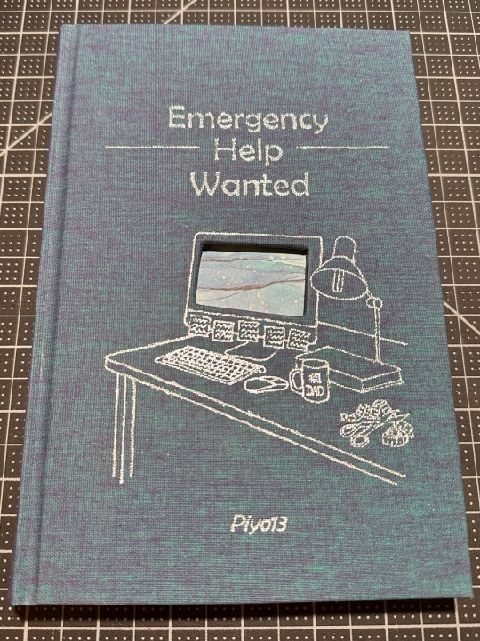
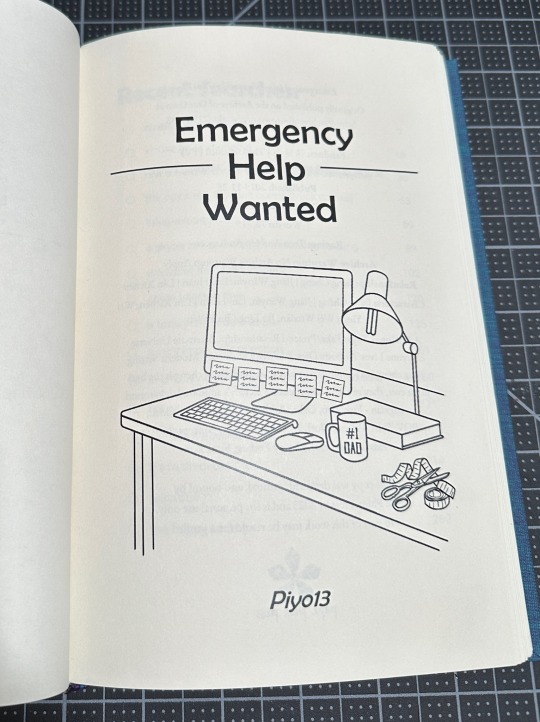
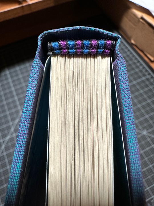
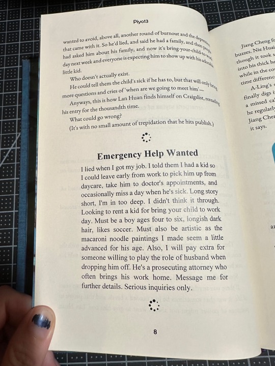
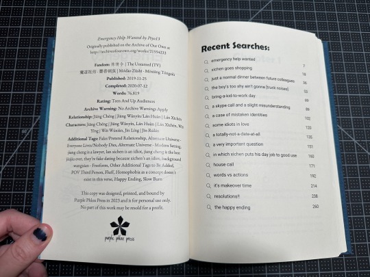
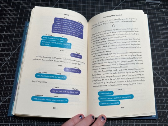
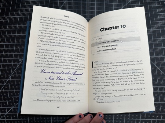
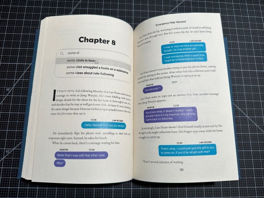
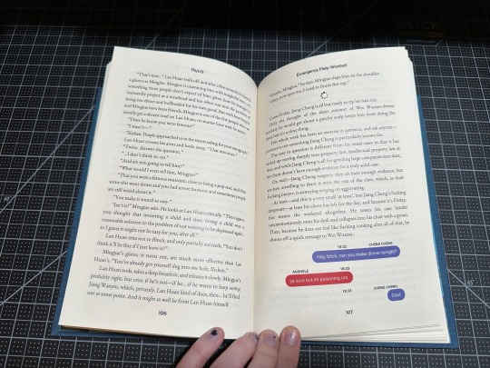
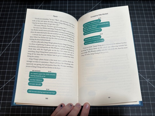
Ok. So. I may have gone a little feral with this one. Online "help wanted" ad spiraled into loading wheel scene dividers, spiraled into fake Google search result headers, spiraled into FULLY committing to those authentic looking text messages. In full color. (There are so many. I typeset in MS Word. It was SO worth it, but god what a struggle at some points.) And don't forget the "recent searches" title page! Or the computer cutout on the cover! (It's bluescreening, just like Lan Xichen through this entire fic!) Also that cover/title page image that I just kept adding details to. (It's supposed to be Lan Xichen's desk, so it simply didn't feel right until it had sticky notes on the computer, #1 dad on the mug, scissors and measuring tape, scribbles on the sticky notes) Did I have a ton of fun designing this one? Perhaps. Couldn't say. Maybe just a tad. (This is a lie I had an ABSOLUTE BLAST!)
Historically, I've waited until I finish at least the typeset before reaching out to the author, but not so with this one! I got the idea for the fake google search results from Piyo's authors notes, teasing the contents of the next chapter. But! Those didn't start until about chapter 4! So I reached out and asked if we could collaborate and I'm forever glad I did! Not only does this have teasers for each chapter, I also got to bounce design ideas off of her, including what shade of blue and purple for the text messages. Because my friends, that is a serious matter and changed SEVERAL times throughout the process.
Also shoutout to all my Renegade friends who gave input and encouragement over the past year while I worked on this (what endpages to use? how to make this shade of green perfectly Nie Huaisang? how do we feel about this text message design? or how about this one?) - I love you all dearly and appreciate you so much for putting up with my nonsense at all times.
Binding details below the cut!
Fandom: The Untamed/Mo Dao Zu Shi
Pairing: Jiang Cheng | Jiang Wanyin / Lan Huan | Lan Xichen
Bookcloth: Aqua/Purple Dubletta from Colophon Book Arts
Endpapers: Craft Consortium Ink Drops - Ocean pack
Textblock paper: short grain cream from Church Paper
Titling: We R Memory Keepers foil quill
Endbands: leather cording core, DMC embroidery floss for the bands
Body Font: EB Garamond
Title Font: Berlin Sans FB
Text Messages: Roboto
Additional fonts: Times New Roman, Kunstler Script, Magis Authentic
Title page image from Rawpixel and designed in Canva
Various computer graphics from The Noun Project
Tumblr insists on eating and doubling text in this section at its own whim, so if there's something missing that you're curious about, feel free to DM me an ask!
#purplephloxpress#adventures in bookbinding#renegadelovesfic24#ficbinding#fanbinding#bookbinding#renegade bindery#ffwad#the untamed#mdzs#xicheng#jiang cheng#lan xichen#emergency help wanted#piyo13#fanfiction writers appreciation day#did I stay up until midnight just to post this as soon as possible? yes I did. yes I am aware there is a queue button.
373 notes
·
View notes
Note
I grew up in a very isolationist and cult-y church that was hypotheically Anglican, but shares more with your anecdotes of mormonism than my friends experiences of Anglicanism, and I genuinely wanna thank you for the stuff you put on the internet, profound stories and shitposts both.
It's a specific and deeply moving sort of comfort to see someone who not only shares experiences and weirdass relationships with religion, but is further along the path of life and has figured out how to look at pieces of it and map them out in words in a way that I can use to explain to others and explore myself.
As someone raised in a dichotomy of utopia and hell and who's very much still struggling with their place in the world outside of that, it's so helpful to see someone who's just A Guy who has odd experiences and spins them into cool stories.
All that to say; you seem like a cool guy, and you make a lotta cool shit, I like reading it and it has made a positive impact on me. This is a long ass ask so I haven't mentioned your original fiction works, but they're also cool as hell and I have more than once considered bookbinding some of them so I have a physical thing that reminds The ADHD that they exist so I can reread them.
I am always a little surprised to see the people who relate to my stories! The exmo group has some sort of community, but the people that leave that just kind of scatter into the wind. It's a little lonely out here. But I'm glad there's more of us.
Thanks for reaching out to me, Eater-of-Lead. I have followed you, and I'm sorry for the delay. Sometimes I hold onto very nice asks extra long because I just like seeing them. But it's also fun to answer them.
81 notes
·
View notes
Text
i found this weird book in my room this morning….i dont remember buying it…..every time i try to read it i get distracted and forget i have it…can someone help me identify this book?
happy halloween!! i wasnt actually planning on posting this today but i managed to finish it just before the hallows eve struck!
for anyone still wondering this is a handmade bookbind of There Is No Antimemetics Division by qntm! this is just a hardcover rebind made from a paperback i bought online so no fancy typesetting here unfortunately. BUT i am happy with the cover design at least
closeup pics and thoughts abt my process below!


i wanted to keep the covers pretty minimalistic to make the book seem more mysterious and to draw more attention to the square window i cut out of the cover boards. fun fact, that square is supposed to represent SCP-055! theres only so much i can do to represent something indescribable, but its not round, so at least i have that

originally i was planning on making the text along the spine white so it would have a sort of disappearing effect against the white fabric, but it didnt really work out so i printed just the shadow of the text instead for a there-not-there look


something i really wanted to try while making this was to paint the edges of the textblock black. i think it came out nicely! it looks neat contrasted to the white cover :p


now the ENDPAPERS!! i had actually imagined the design for these way before anything else. i tried to go for a sort of fractal pattern of fingers like the monster from Fresh Hell. i quite like it in combination with the window on the front cover :3
okay thats all thx for coming with me on my journey ^_^
#scp#there is no antimemetics division#bookbinding#tinad#scp foundation#scp wiki#fifthism#fanbind#ark’s art#one thing i do regret is how small i made the coverboards. that hinge is WAY too big lol#the window also isnt as clean as i would like and the endpapers dont perfectly line up but whateves
141 notes
·
View notes
Text
ITS FINISHED!!! Another bookbinding, this time it’s Phineas and Ferb, Perry-centric Edition >:D

I was hit with a big urge to bookbind ‘When Glass Shatters’ by @local-dragon-haunt and so this book was born!
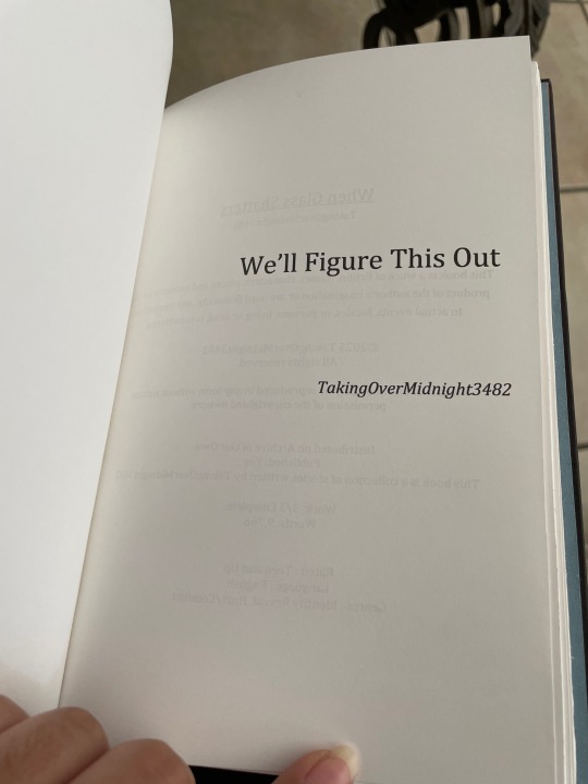

It was going to be a lil too thin for a cover so I ended up also adding in these two lovely fics: ‘We’ll Figure this Out’ by @pftones3482 and ‘If you’ll still have me’ by @woulddieforperrytheplatypus
I actually tried a few new things with this one, including sewing multicolor construction paper onto the textblock itself instead of gluing it on later. I also tried a different stitch as well which was really fun to do! You can see the WIP for this here.
I made my own custom bookend made from scrap fabric, which matched nicely with the cover ^w^
I also couldn’t resist using Perry themed construction paper for this LMAO


I love making ‘false’ copyright pages, it makes it seem so much more real and authentic!
I actually included every oneshot’s summary for this!
30 notes
·
View notes
Text
DIABOLIK LOVERS More, More Blood Vol. 12 Ruki ☽ Animate Tokuten CD ☽ Living A Normal School Life For Once!

Original title: たまにはまともに学園生活! Voiced by Sakurai Takahiro English translation by @otomehonyaku Click here for the audio (kindly provided by @karleksmumskladdkaka!)
─── ・ 。゚☆: *.☽ .* :☆゚. ───
One very unhinged tokuten... I appreciate Ruki's persistence when it comes to defending us/Yui, but he's definitely taking it too far dkfjdkfd ٩(ˊᗜˋ*)و ♡ Have fun listening and reading along!
Please do not reuse or post my translations elsewhere or translate my work into other languages without my permission.
─── ・ 。゚☆: *.☽ .* :☆゚. ───
[The scene starts at the academy. Ruki finds you after class.]
00:00 Hey. What are you doing?
[He startles you and you accidentally drop the papers you were holding.]
You turned around so frantically that you dropped your things.
[Ruki bends down to gather the papers you dropped.]
‘Off-campus learning guidebook’? I see. These are the prints that’ll be bound into the actual guidebooks. I suppose I don’t even have to ask you why you’re carrying them. You’re letting the teachers order you around again. Have you forgotten how to say ‘no’? Those kinds of people will never make you see the end of it if you don’t. Anyway, let’s bring these to the teacher’s office. Then your job will be over, right? Oh? What’s the matter?
[You tell him that you still have to bind the books.]
Why did you let it come that far? You’re going to do the bookbinding? If you have to make them for all the students, it’ll take an absurd amount of time. Those fucking tyrannical teachers, setting students to work like slaves for their own benefit… You’re my possession more than anything. I don’t like anyone else doing as they please with you. It seems that I’ll have to teach them a lesson.
[You get a little nervous and try to talk him out of it.]
Heh. It shouldn’t be anything beyond your comprehension. You’re so used to doing their dirty work that you’re still trying to cover for them, and I don’t like it. Hey. We’re going to finish this within the hour.
[You tilt your head to the side.]
I’m telling you that I’ll help you. This isn’t something you should be wasting your time on. If any other requests come in after this, I’ll be right behind you to crush their hopes before they even get to talk to you. This is what we’re going to do, so let’s get to work quickly. At this hour, there should be plenty of empty classrooms available. We’ll bind these guidebooks in the blink of an eye.
[The scene shifts to an empty classroom.]
02:30 Alright. Let’s take care of this as quickly as we can. Each book has 16 pages… Let’s fold the papers and staple them. That should be easy enough. When doing it for all students, though, it’s pretty hard work. Efficiency is key when binding books. Let’s try it out on a small scale first. We don’t have time to redo everything if we mess it up. Start with the front cover and line up the prints in order.
[You get to work.]
Off-campus learning is a waste of time, though. It’s foolish to think there are things to learn outside of the classroom. Unless you’re actively trying to gain something, there’s no way you can learn anything. For example, let’s say we’re taking a field trip to a museum. Museums have many precious artefacts on display. However, whether it be ancient Greek sculptures, coffins of saints—to a fool, they’re all weight stones (1). Yeah. They have no value just standing there. You’re going through all that trouble to bring all the students there only to look at a room full of weight stones. Don’t you think that’s funny?
04:01 Or, wait—weight stones do have value. You can press vegetables with them to make pickles, so they’re actually quite helpful. Going to an exhibition on weight stones might be a meaningful way to spend time after all.
[You doubt that.]
What’s with that expression? The flavour of the end product varies depending on the weight of the stone. That’s not something to make light of. If we actually were to go on an exhibition on weight stones for our off-campus learning, I’d appreciate it.
[You wonder if an exhibition like that even exists.]
You have a good point. We might as well go to a hardware store. That’s just a shopping trip. If we’re going shopping, I’d rather it be just you and me. I refuse to go around in such large groups.
[You’ve both made some progress with the bookbinding at this point.]
Where are we going, anyway? There should be information about the destination somewhere on one of these pages… Is this it? So we’re going to a nearby mountain. To think the school wll go to such lengths to get the students off campus… Hiking, learning about the beauty of nature… You’ve got to be kidding me. Besides, the true beauty of nature can’t be found at the foot of a mountain like this. Lend me your pen. I’ll change the route.
[You stare at Ruki for a moment.]
Didn’t you hear me? Give me your pen. I’ll shatter the hopes of whoever thinks they can challenge a mountain when they’re only in the mood for a stroll.
[Ruki starts drawing on the map.]
Let’s make them climb the steep slope on the other side of the mountain. The landscape varies a lot around this area. People will start falling behind because they lose motivation. This should do the trick. Surely, the harshness of mountain climbing will sink deeply into their minds. Don’t you think it’s a good route?
[You tell him that sounds dangerous.]
06:01 Of course it’s dangerous. It’s mountain climbing. There’s no way you can reach a summit without putting your life on the line.
[You’re at a loss for words.]
Does that surprise you? Did you think it would suffice to go on a trip to a mountain without admiring the scenery from the summit? If this off-campus learning is intended to teach students about the beauty of nature, there’s no better way to do it than to climb a mountain to its very top. Which means you also need the appropriate gear.
[Ruki leafs through the booklet until he finds the list of supplies that’s already there.]
A lunch box, a water bottle, a towel… You can’t be serious. Don’t ever think you can survive on a mountain with these things.
[Ruki grabs his pen and gets to work again.]
I crossed out all the things you don’t need. I’ll make a list of the things you do need for mountain climbing. Even in case of a disaster, this should heighten your chances of survival.
[You still don’t really know what to say.]
What are you acting so surprised for? There’s always a chance of a disaster happening. Listen. If you value your life, don’t take mountain climbing lightly. Bear in mind that we’re talking about off-campus learning. Ah, right. I’ll also write down some important points to take into account in case of an emergency.
[Ruki looks at the points that were already listed in the booklet.]
Hm? ‘Watch out for the snakes’? What’s with this warning paragraph? ‘Snakes are aggressive creatures, so they attack easily’? This is nonsense. Listen up. You should get this through your head as well. First of all, there are many different kinds of snakes, of course. I’m not saying it’s true one hundred percent of the time, but snakes tend to be timid, docile creatures. They will not attack humans unprovoked. If you see one between the grass, it’s best to quietly avoid it. Of course, venomous and aggressive snakes do exist. It goes without saying that you should never let your guard down. Got it?
[You tell him you understand.]
08:11 That’s the answer I was looking for. Good, even for you. Still, this off-campus learning is intended to deepen the students’ knowledge, but this booklet doesn’t give me much hope… Planting misinformation is evil in itself, don’t you think? Well, alright. I won’t be holding back anymore. I’ll thoroughly rewrite this page as well. A bit on the ecology of snakes and the varieties that may live on the mountain… Ah, I’ll also include some fun facts about snakes. You’ve heard much about the snake in the Garden of Eden, right? Wait, but if I were to write about that, I’d have to touch upon the story of Adam and Eve and the forbidden apple as well… And while we’re on the subject of apples, anyway, I might as well add some simple and delicious recipes. It’s witty and it makes for worthwhile reading, right? I’ll stick to recipes for two servings.
[You think Ruki is taking it too far. You try to stop him.]
Hey, don’t grab my arm! You’ll mess up my writing.
[You tell him you’ll never finish it in time.]
Heh. That’s all? That’s no problem. I planned on finishing binding the booklets well within the hour, with time to spare. But look at how awful the content is! That certainly changes things. I will revise this entire off-campus learning guidebook and confront the teacher with it. Like, “This is what true learning is!”
[You yell at him to stop.]
Don’t yell! Setting up plans like these is my forte. Come to think of it, the destination wasn’t appropriate to begin with. There’s nothing interesting about a mountain a few train stops away. Maybe at least one train transfer and a few hours away by car… Somewhere off the beaten path. Although I’d rather pick a woodland area for fostering one’s survival instincts… That means it should definitely take place somewhere around here… Yes. I’ll also add a recipe using the local specialties of this area.
[Ruki puts down his pen.]
10:36 Alright! Perfect. I think I did pretty well. I chose a place of which the chances of survival are at least ten percent. If you approach it like it’s the last thing you’ll ever do, you can probably make it out alive if you’re lucky. There are no drawbacks to such experiences. Or rather, someone must teach today’s carefree youth what it’s like to walk the line between life and death. To spend your days in the mud. Well, then! Let’s go to the teachers’ office. We’re going to present this. This is revenge for the work they’ve made you do on these prints.
[Ruki starts gathering the booklets.]
Let’s teach those foolish humans the true meaning of off-campus learning!
[You’ve had enough of his antics. You grab onto him and try to keep him from leaving.]
Hey! Don’t hold me back. Come on, don’t pull at me like that! If you don’t watch out, I’ll drop all the—Ah!
─── ・ 。゚☆: *.☽ .* :☆゚. ───
漬物(つけもの)の石(いし): A weight stone used to press the moisture out of pickles (tsukemono) in Japan. I was going to go with a paperweight analogy instead, as this made a bit more sense for non-Japanese audiences while still making sense for Ruki’s character, but it was a bit difficult to line that up with his explanation...
#im definitely procrastinating aaaaaaa#i have to give a presentation at work tomorrow and my colleague canceled so now i have to do it by myself and i'm a bit nervous dkfjdkf#the fucking ceo is coming as well. i do know Stuff and Things but i get imposter syndrome more and more often lately bc i'm baby uwu?#jokes aside gdi i've been so busy help#diabolik lovers#dialovers#diabolik lovers translation#diahell#diabolik lovers translations#otomehonyaku#my translations#mukami ruki#ruki mukami#diabolik lovers drama cd#diabolik lovers drama cds#more more blood#diabolik lovers more blood
74 notes
·
View notes
Text
This is not the first fic I bound - I definitely bound one of my own fics first, accidentally glued the spine to the case, and then hid it in the back of my craft desk never to be seen again
But I’m posting these binds first because, to be quite frank, they’re curséd.
I have redone the covers FIVE times. Unclear how much of the endpaper I have gone through. I have printed both text blocks AT LEAST three times. Volume II doesn’t have tapes, because I forgot them.
I don’t know what kind of blood sacrifice I was supposed to make for this to go smoothly but I obviously didn’t get it right.
Anyway, these are for @sammialex. We first collaborated on these binds way back last summer, when she was looking for an artist to do cover art and I poked at @maevemauvaise because she’s super talented and it seemed like her sort of thing. The end result is stunning!
The printed hardback from [redacted company] was (in my opinion!) NOT PRETTY ENOUGH
So when I decided, sure yeah, bookbinding, 1000 hobbies in a trench coat, sounds like fun, I knew I wanted to make Sammi a more beautiful copy of her work because I know how much love and attention went into the story.
I learned, at minimum, five specialty skills just to make these.
The bookcloths are Hollander’s Verona line in Merlot and Forest, the cover design was created by @maevemauvaise and hot foiled directly onto the book cloth using a foil quill and my cricut, the endpapers are Hollander’s Thai marble in “Firestorm” and “Forest”, and the paper is Neenah classic linen 8 1/2 x 11, in natural white, which has a really nice heft and texture and feels sort of old-fashioned in a way that vibes with the setting. The ribbon is black velvet which is probably impractical but I’m in charge here.
I designed the typeset using Affinity Publisher and I definitely went ham with green vines and blood drops, but I don’t regret it. It looked like A Lot on the screen but in person I think it’s exactly the right amount.
These babies are going in the mail next week, as soon as I get back from my trip, where I hope the curse won’t follow! @sammialex thanks for letting me play with your work, for your patient guidance with Affinity, and for giving me the opportunity to make every common mistake and several uncommon ones trying to bring these fics to life 💜
Upon What Soil series, by SammiAlex (mind the tags)
Volume I: Vessel at the Launch
Volume II: Last Restraint


#book binding#fan binding#CB binds books now#cover story bindery#SammiAlex#under what soil#if you don’t have a store-bought curse#homemade is fine
17 notes
·
View notes
Text
i just added a cute game to my wishlist on steam that's supposed to be a bookbinding sim...but in reality the only "bookbinding" mechanic seems to be customizing covers with stickers
there's nothing wrong with that as the premise for a game, but it tweaks a nerve with me that the broad perception of making books is just about showing off the front cover, even in online bookbinding circles. hardly anyone wants to talk about the typesetting aspect, which is my favorite part 😭
this is compounded by the fact that i experience the same attitude at work (i work in publishing) because covers are what sell books
and, like, of course i understand that typesetting is a whole discipline unto itself, which many people find intimidating, and of course i'm aware that a whole chunk of the bookbinding community is dedicated to rebinding specifically, so they're not dealing with typesetting at all. it's basically just the fanbinders and the people working in the public domain space who delve into it
with that said, i do want to shoutout the renegade bookbinding discord, which has a whole channel dedicated to typography discussions and is wonderful. y'all are awesome, keep up the great work 👍
i have pondered in the past what a game centered around typesetting might look like, and the conclusion i came to is that nothing i could dream up would be as fun to me as just doing actual typesetting in indesign LOL. so to be clear, this is not me disparaging the game on steam, because i don't know what i'd do either
#conclusion: indesign is a video game#which reminds me of the time i found a script that runs a clone of space invaders in indesign#caitlin takes up bookbinding
13 notes
·
View notes
Text
Bookbinding Process (1/2): The Wolf Queen, from The Elder Scrolls V: Skyrim
I have a very exciting comission— I’m binding The Wolf Queen, an in-game novel from The Elder Scrolls V: Skyrim. I’ve never played the game, but my client told me they enjoy collecting and reading the books in the game. According to the Elder Scrolls wiki, there are apparently 820 of them! I’m binding the one of the longer stories, which is actually broken up into 8 volumes.
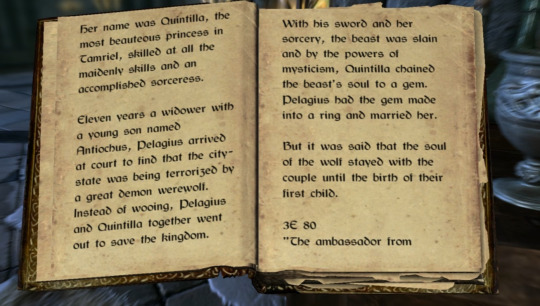
In researching, it seems that the volumes seem to take on completely different binding styles, but we agreed on the style shown here. We also decided to condense these volumes into 1 book— the entire story is only about 12k words, and while the handwritten large text works well for reading the story on a small in-game window on your monitor, it’s not really practical for a physical book. That, and even if I were to print these true to size for the game, each volume would still be about 40 pages, which only equates to 10 sheets of folded paper, so it wouldn’t make for a very robust collection on the shelf.
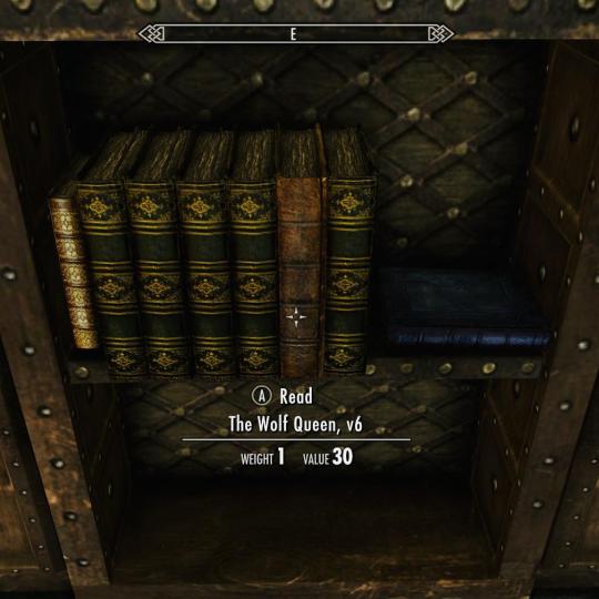

You can see that these books in this game are actually quite weathered, and it seems like all the paper is unevenly torn. If we were to equate Skyrim’s time period with our own based on technology, it’s likely these pages would have been parchment. The in-game textures definitely support this, even for the bindings that seem to be a few centuries ahead of their time.
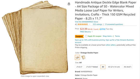
We agreed that antiqued cotton paper would be a suitable alternative, as enough parchment for this project would run a couple thousand dollars as-is, and I don’t believe I have the equipment necessary to print on it. I needed something with a quick turnaround for this project, so I went with this paper in the ‘Vintage Deckle’ finish in the A4 size. According to one review, it’s also short-grained, so it’s actually ideal for bookbinding.
Typesetting
I’m using Adobe InDesign to typeset this, but it can also be done with Word and other alternatives.
Here’s a guide by ArmoredSuperHeavy on tumblr.

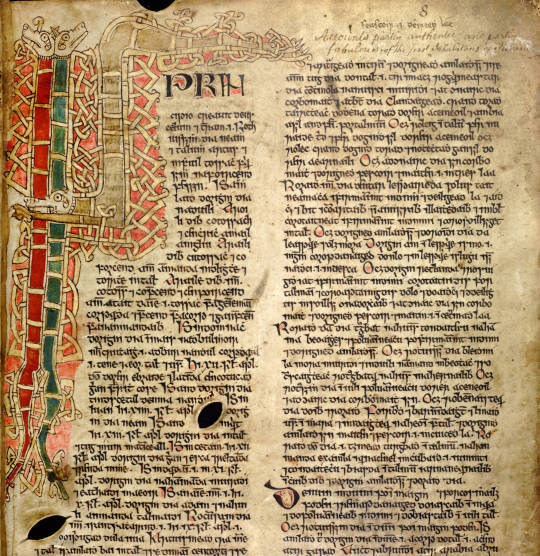
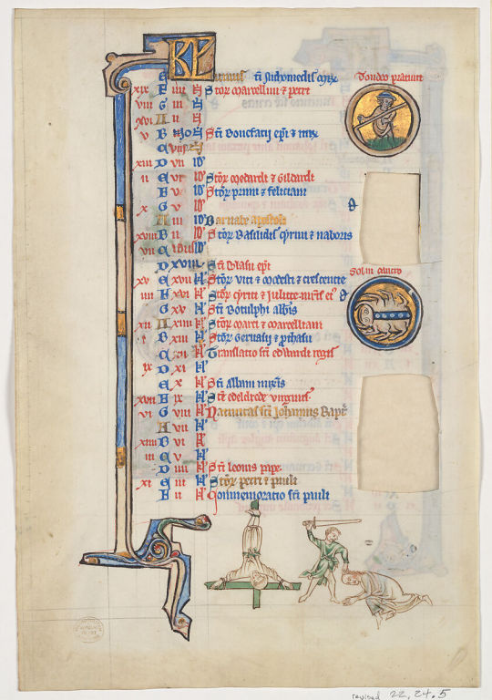
I think Bethesda owns the font used in the Elder Scrolls games, but there is a dupe of it on dafont.com called Cyrodiil. However, it definitely feels and reads more as a modern font; it was designed with readability after all. I’m definitely going for something that feels like a Celtic manuscript, based both on the decorative Celtic knot tooling, and the Gaelic look of the font. I eventually found Kelmscott, which carries the same Gaelic characteristics as Cyrodiil, and is still relatively easy to read, but feels more calligraphic.


I also downloaded Medieval Victoriana for the decorative first letters of each chapter.

To typeset the text, I followed a tutorial article by Grace Fussell and Adobe’s guide for creating book files.
I wanted the text to look dense and almost glyphic, as many old medieval manuscripts do, while still being easy enough to read. I played around with the paragraph tools and eventually settled on this layout. While certainly not all manuscripts have multiple columns, I want this typesetting to really break the boundaries seen in most modern prints of books, so I decided on this two-column format. Some manuscripts keep the text frame smaller and in the center of the page, much like you see in later centuries when the printing area was restricted by a press, but once again, I want to emphasize the look of ‘handwritten’ manuscript, so I made sure to use wide margins.
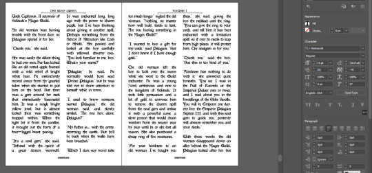
Some other fun details I added were glyphs at the beginning of each chapter, and surrounding the page numbers.
I exported the file for print with InDesign’s ‘Print Booklet’ feature, with the 2-up perfect bound with a signature size of 8 (2 pieces of paper/4 spreads/8 text pages).
Text Block
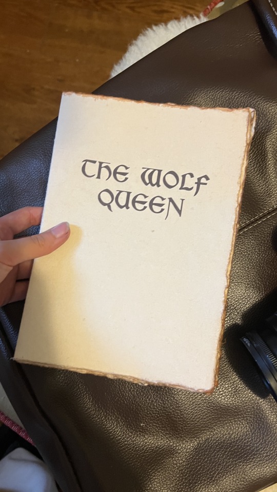
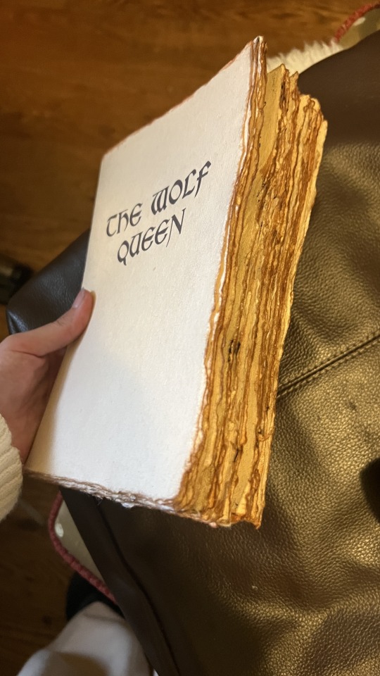
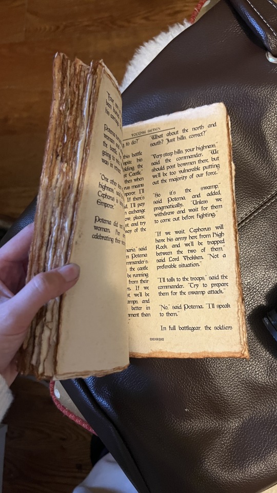
Here’s the printed and folded signatures! I’m really pleased with how these came out— it has the exact weathered look I was trying to emulate from in-game. As an added bonus, since the source material wasn’t particularly long, the thickness of the paper (150gsm) gave the text block a good amount of volume.
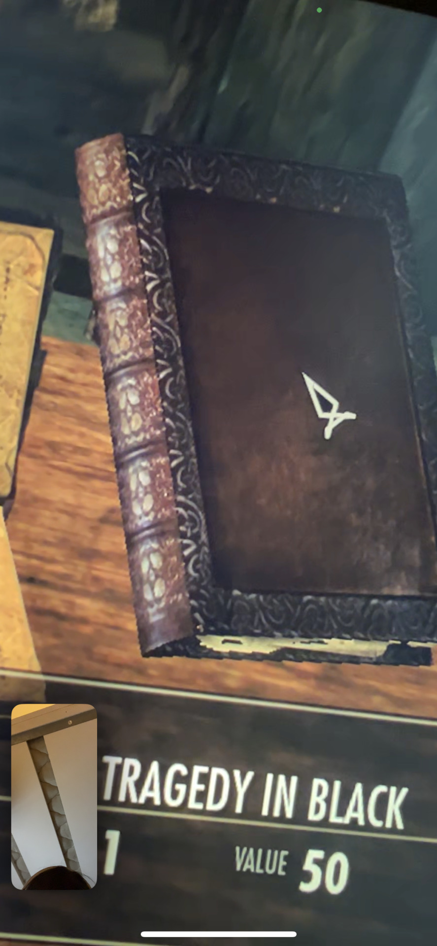

Out of lack of good online reference, my client ended up sending me photos of the book in-game. I was excited to realize this book seems to be bound on cords or leather straps— kind of difficult to tell from the model. We decided to go with a slit leather strap.

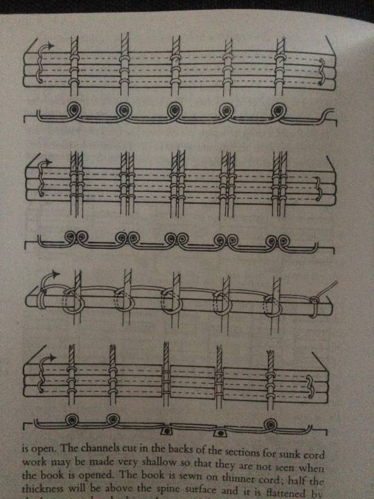
I couldn’t find a great reference image of the stitch for this, but I used the same technique of punching and sewing my signatures as this double cord instructional from The Thames and Hudson Manual of Book Binding.


Endpaper
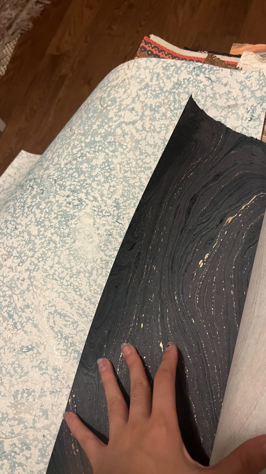
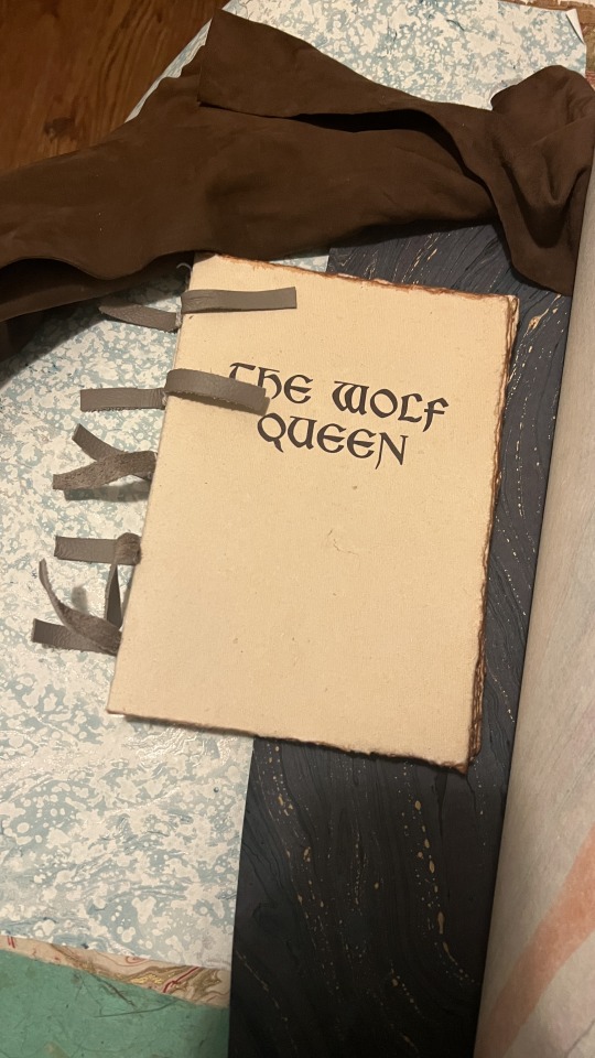
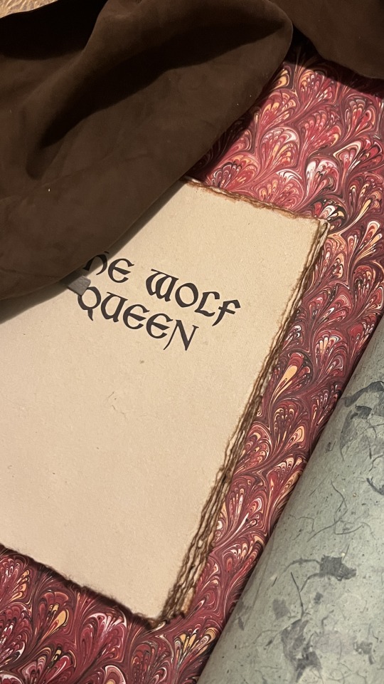
I definitely wanted to go for a more traditional endpaper, so I looked at what I had in my stash of marbled paper. I was initially drawn to this Renato Crepaldi peackock marble I got from Hollander’s, which has a beautiful red that screams “medieval” to me, but Skyrim is a cold place, so I was also drawn to go for this blizzard-esque marble. Though, I ultimately decided on this dark blue/indigo paper I got from the Paper Source.
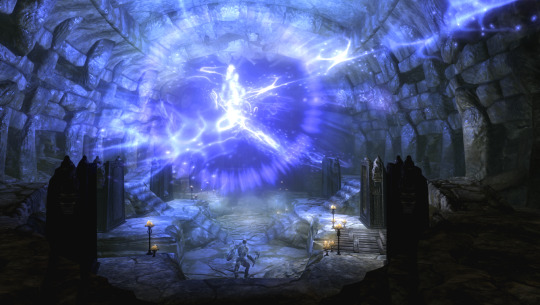

I went for the indigo because the protagonist of this novel I’m binding, Potema Septim, the Wolf Queen herself, is associated with the color purple. Since the goal of this binding was to recreate an in-game item as it would be in-game, a bookbinder in Skyrim would also most likely want to make design choices reflecting the contents of this specific book. Or maybe they’d be illiterate and just go for the red. Either way, my client also liked the dark indigo, so that’s what we went with.
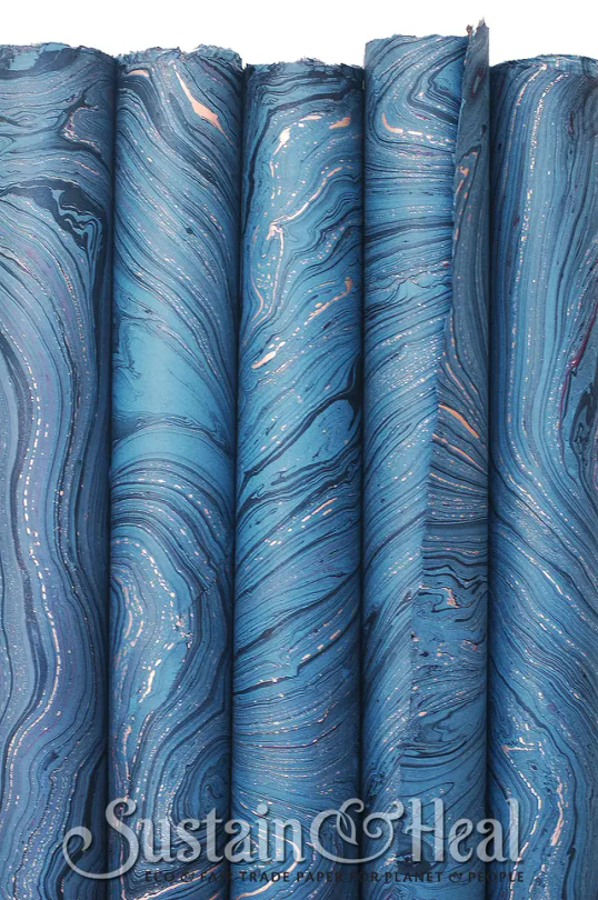
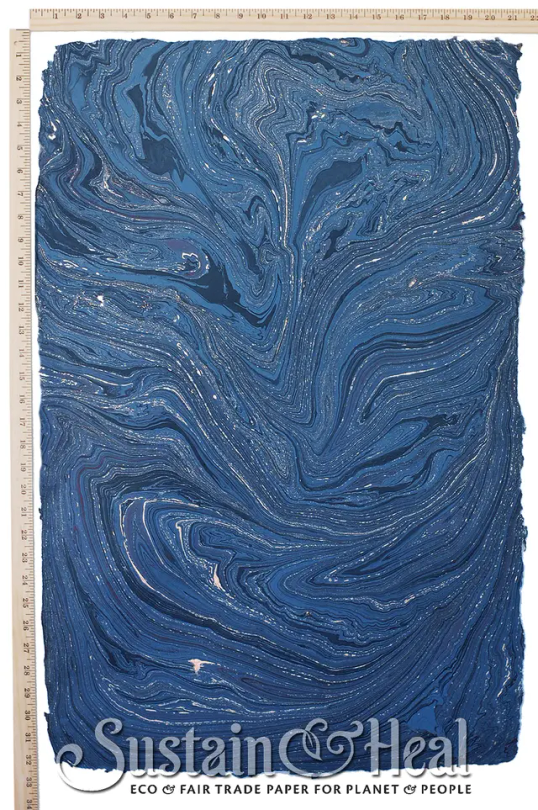
This endpaper is the cover weight of De Milo Design’s line of paper called Sustain & Heal. It’s fair trade, handmade in Bangladesh, from jute fibers.
It also has deckled edges, so I made sure to align my cuts to use that, and I tore the rest by hand to keep the natural edges consistent. This is a bit of an unconventional aesthetic choice, but it stemmed from that it’d be odd if the fly leafs were straight cut with the rest of the text block so extremely deckled.
Headbands
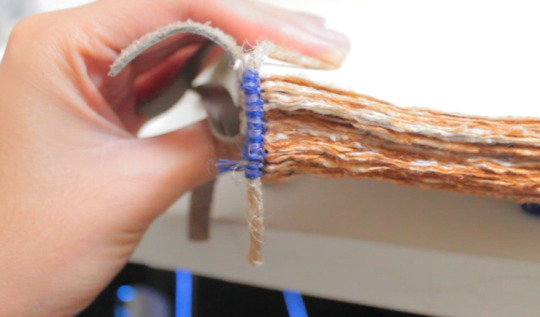

Keeping with the purple/indigo/blue theme, I made two-colored headbands around jute cord with DCM embroidery floss in colors 31 and 796. I basically used the technique outlined here. In retrospect though I’d recommend doing a big double endband or something bulky with this paper, since the deckled edges tend to push the endband back towards the spine and hide it.
Please continue reading here!
Process: Part 1 | Part 2 | Final Result
29 notes
·
View notes
Text
Crossover Fanworks Celebration Masterlist
Thanks so much to everybody who participated! We're still waiting for a couple late entries, but here's the wrap-up of all the fics that were fanworked and their related works. You can find the Ao3 collection right over here.
It seems like everybody involved had a great time, so it's very likely that this will be a repeating event. If you'd like to join in on the next one, follow us here and/or send us a message about joining our Discord!
Knaves All Three by @ginbenci: gen, focused on Steve Rogers, Bruce Wayne, Matt Murdock, Foggy Nelson, and Tony Stark. Funny comedy-of-errors identity porn. 7922 words, rated T.
All Three Knaves by @o-kaythislooksbad
Playlist by @bittercape
Third Wheel by @kangofu-cb: Jason Todd/Bucky Barnes/Clint Barton. Established Bucky/Clint. Roleplay gone hilariously awry leads to a hot-as-hell threesome. 10,776 words, explicit.
Sequel by @carcrash429
Bookbinding by @moonshinebindery
Remix by @there-must-be-a-lock
Playlist by @capriciouswrites
Won’t You Stay Awhile? (I’m Staring At A Ghost) by @daddyswickedqueen: Jason Todd/Steve Rogers. Steve gets picked up (and flustered) in a dive bar; sexy, but also a great look at both characters. 5022 words, explicit.
Podfic by @betrayedbycinnamon
Remix by @sammialex
Sequel by @darbydoo22
Moodboard by @drgrlfriend
Snow On The Beach by @bittercape: Jason Todd/Bucky Barnes/Clint Barton. Interconnected vignettes of a developing relationship — some funny, some fluffy, some smutty, and some all of the above. 13,181 words, range from T to explicit.
Art by @o-kaythislooksbad
More art by @o-kaythislooksbadkay
Timestamp by @betrayedbycinnamon
Spider and Bat Friends by @emmacortana: mostly gen. A series of standalone fics about Peter Parker in Gotham. Mixed bag with something for everybody: some wildly creative crack, some angst, and more. 170,897 words total, mostly rated T.
Podfic by @graham-cracker-guillotine
Art by @wyxan
The Stockings Were Hung by @betrayedbycinnamon: Jason Todd/Bucky Barnes and background /Clint Barton. Christmas lingerie, insecure Jason, and a tender, reassuring Bucky. 3945 words, explicit.
Remix by @darbydoo22
Moodboard by @kangofu-cb
Sunrise On The East Side by @wyxan: Tim Drake/Peter Parker/Michelle Jones, established Peter/MJ. Spilled coffee + endearingly awkward Peter; luckily MJ is a boss and very comfortable doing something about his crush on Tim. 8816 words, explicit.
Remix by @there-must-be-a-lock
Podfic by @noxnthea
Finders Keepers by @drgrlfriend: Jason Todd/Bucky Barnes/Clint Barton. Adorable “meet-ugly” courtesy of animal friends. Clint and Jason aren’t used to romance, and Bucky decides to change that. 3081 words, rated T.
Art by @bittercape
Podfic by @daddyswickedqueen
Remix by TheologyDiscography
Moodboards by @there-must-be-a-lock
What's in the name by @graham-cracker-guillotine: Peter Parker & Bruce Wayne centric. Feel-good fluff and humor. 2142 words, rated G.
Podfic by @carcrash429
Art by @o-kaythislooksbad
blood upon the snow by @carcrash429: One fic is Clint Barton/Bucky Barnes; others are gen, focused mainly on Clint and Dick Grayson, with appearances by Natasha, Roy, and others. Fae Clint fantasy AU with great world-building. 11,900 words, rated T.
Art by @o-kaythislooksbad
Podfic by @noxnthea
Moodboards by @there-must-be-a-lock
can't start a fire without a spark by @mightymightygnomepriest: Frank Castle/Jason Todd. Frank saves a puppy and gets caught in the rain. Soft and sweet and sexy. 3468 words, explicit.
Remix by @daddyswickedqueen
Sequel by @bittercape
getting better in the worst way by @o-kaythislooksbad: gen, featuring characters from Moon Knight, Doom Patrol, Teen Titans, Hulk, and Venom. Creative canon mashup with characters that don’t get a lot of representation in fic. 80,064 words, rated T.
Moodboards by @there-must-be-a-lock
Hawksnest by TheologyDiscography: Jason Todd/Clint Barton. Post-Under The Red Hood friends-to-lovers with a fun twist on Clint’s story. 3359 words, rated T.
Podfic by CainPods
Sequel by @o-kaythislooksbad
Marshmallow Crime Lords by @noxnthea and @there-must-be-a-lock: Jason Todd/Bucky Barnes/Clint Barton, but the relationship isn’t the focus; lots of BatFamily shenanigans and fluff. 46,440 words, rated T.
Remix by @bill-longbow
Sequel by @bittercape
Art by @wyxan
Podfic by @flowerparrish
Playlist by @carcrash429
If It's A Highway by @there-must-be-a-lock: Jason Todd/Bucky Barnes, Lost Days/post-CA:TWS canon fusion. 77,122 words, explicit.
Timestamp by @bill-longbow
Art by @wyxan
#marvel#dc#dc marvel crossover#crossover#crossover fanworks celebration#art#fic rec list#podfic#jason todd#clint barton#bucky barnes#peter parker#bruce wayne#tony stark#steve rogers#frank castle#winterhawkhood#dc/marvel
50 notes
·
View notes
Text
November Reading
Post delayed by a vacation and then PMS. More thoughts than usual, though.
Recent: Finally finished My Lesbian Experience with Loneliness, but fast enough that things did not really sink in, or not all at once. It was good, interesting cultural differences and similarities, probably won't read the sequels.
Reread Steadfast, by Mercedes Lackey. This is not a good book, people. I knew that when I started it. In terms of pacing and plotting and unnecessary digressions and historical accuracy and giving agency to characters it is very very badly done. I thoroughly enjoyed it.
Which is maybe what I need, given how much I get tied into knots about the free fanfic I write for fun needing its theme to be supported by a coherent narrative arc.
I read some of T. Kingfisher's commentary on fairy tales in The Halcyon Fairy Book and most of Lace Making by Eunice Close (published by a tiny Canadian press in 1975, don't go looking for it). I tried to reread The Bacchae for catharsis purposes, but it was a not-great Victorian translation and I didn't get very far. I did find out that Alan Cumming played Dionysus twenty or so years ago and the trailer for that is on Youtube.
Read A Phantom Lover by Vernon Lee, which was good for what it was but I did have to force myself to it. On the drive with @consultingpiskies I finally managed to articulate that I am just not up to unfamiliar fiction right now, and maybe that's okay.
I read all of May Morris: Arts & Crafts Designer at the library, which is the book of an exhibition of her work and was absolutely gorgeous and also gave me feelings about her relationship with her father, so that was great. And on the theme of the English Arts and Crafts movement, English Embroidered Bookbindings by Cyril Davenport, which might have been improved with more practical knowledge of embroidery but was generally good.
Also read Meet Me on the Other Side by @sparklepocalypse, RWRB 1890s cowboy AU. I could be nitpicky about a couple historical attitudes but basically this is just a really good romance novel and I liked it.
Current: Rereading Swordheart by @tkingfisher, and I really want to know more about the Temple of the White Rat's embroiderer(s). Like, maybe Zale does their own embroidery, but in that case I would have expected them to take a project along for the wagon ride. For a while I was carrying this around with me everywhere, but now that I am getting to the climax things are going more slowly.
Just gave 3/5 of my library books back unstarted due to the fiction realization above. I have two digital craft books to flip through, and also some from the Antique Pattern Library, and Chats on Old Lace and Needlework by Mrs. Lowes. Look, basically what I want to do right now is get overwhelmingly caught up in craft projects and never talk to anyone ever again. I won't, because there is Christmas shopping to do and people I am trying to make friends with and so forth, but that's probably where my head's going to be all month.
Various RWRB fanfics going on still. Oh, and there's been more Madame C—. Thank god for Madame C—.
Future: I still have The Dire Days of Willowweep Manor by Shaenon K. Garrity and Christopher Baldwin out from the library, which really does seem fun but I don't know if I have the brain for it. I would also like to get through more of my AO3 Marked for Later list before Yuletide adds a bunch to it, but, well. (I didn't sign up for Yuletide this year, not because I didn't think I could manage it but because I suspected I would hate the process, and that was a good decision.)
If all else fails I will relisten to the Roaring Twenties Magic audiobooks while sewing.
8 notes
·
View notes
Note
waving!! hi!! we have a fragment who’s very attached to once upon a time and can’t tell if they’re a fictive or not — could we get help with an ID? they’re very attached to fairytales and general mythos and resonate heavily in specific with the story of Eros and Psyche and with the Brothers Grimm story of Snow White and Rose Red. They seem to drift more towards masc and neutral things, if that helps? Thank you!
requested by @residentsofeurydice ~

names ~
sparrow, red, hugo, arthur, robin (alt. robyn), magnolia, rouge, gil(bert), ian, sage, theo, benji, merlin, frost

pronouns ~
ice/iceself, pen/penself, sto/storyself, ink/inkblotself, red/redself, fae/faer, dust/dustself, my/mythself

comforts ~
tea, origami, reading nights, baking, picnics, paper making, watercolor, flower pressing, calligraphy, mini figure painting, bookbinding, cleaning/tidying, audiobooks, knitting/sewing, basket weaving

went with a very storybook theme here! feel free to come back if nothing here works for you!! this was a super fun request to work on^^!
~ mod oz
#mod shiver#actually systempunk#endos do not interact#syspunk#actually a system#survivorsunited#systempunk#did osdd#system stuff#system community#did system#osddid
11 notes
·
View notes
Text
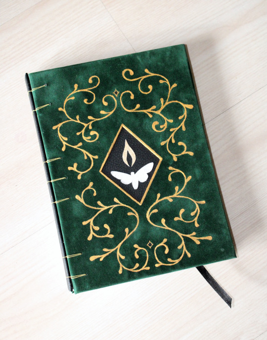

I did some bookbinding for the first time in... I don't even know how many months. I needed a new notebook for TTRPG note-taking, and it was a good excuse to get back into bookbinding.
I needed a notebook where the cover could be folded like a spiral notebook, but I also wanted to glue a bookmark inside the spine.
I used the "secret Belgian binding" method, which seemed to fit the requirements perfectly. It was my first time using this binding technique, and it was fun and pretty quick to do. I'll definitely use it again to make more notebooks.
The cover design is just golden paint over some leftover suede bookcloth. This is the worst material to paint on, but I'm happy with the result, so it was worth it.
#bookbinding#if you noticed that the painted design isnt symmetrical no u didnt#im not great at freehand drawing unfortunately#the notebook also has colored sections to easily separate between my different ongoing campaigns#I actually made it a few weeks ago and i've have used it several times already#hesperis' bookbinding adventures
24 notes
·
View notes
Text
Art school Portfolio project 1
Please, Go Home
Art school didn't end up happening for me (I'm going to do something completely different and more secure, and keep art and writing for myself for fun), so I thought I’d share my portfolio projects here.
Buckle up, this'll be long as fuck.
This is a story I’d been working on for years, since 2018. I’d rewritten it several times, until in 2023, I got the chance to come up with my own project at design school. Immediately, I knew this was what I wanted. I wanted to make this story into a real book. And I wanted to make it all by hand, cause bookbinding seemed cool to try.

I had to come up with 2 ideas to do.
Translation:
Subject 1
Book. Specifically a novel (written by me). I want to make illustrations of the characters, design the inside (text and design thingies and everything), design the cover. Print and bind it myself. Illustrations of the characters are in it, I’ll try to finish as many as possible, but I probably won’t be able to finish all of them. Then I’ll leave blank pages in and stick the remaining illustration in later. (I did finish them all, so I didn’t need to do this.)
Why? I love books. I read them a lot and I’ve been writing for years. Now I want to make a professional looking book myself. And of course I love to draw, I want to incorporate that too. I’d like to have completely handmade versions of the books I’ve written. I’d like to learn bookbinding.
Subject 2
Graphic novel. I want to learn to tell a story visually. And I want to experiment with color more.
Why? I like to read graphic novels. I want to tell and draw stories, and get better with color.
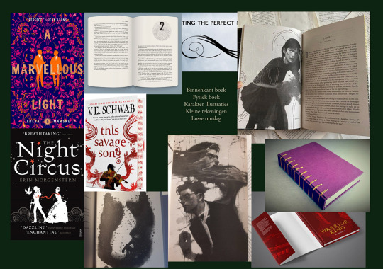
A mood board of what I wanted, I chose the book.
Translation:
Inside book
Physical book
Character illustrations
Little drawings
Dust jacket
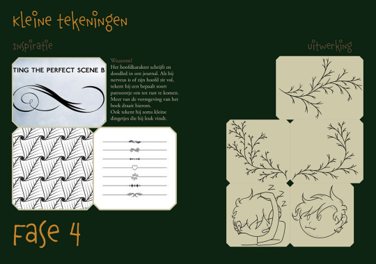
Translation:
Little drawings
Inspiration
Finished product
Why? The main character writes and doodles in a journal. When he’s anxious or his head is full, he doodles a certain type of pattern to calm down. More of the design of the book is based on this. He also sometimes draws little things that he likes.

Translation:
Inside
Fonts
Novels always have a serif font as the standard. Standard book font: Adobe Garamond Pro.
Other than that, I want to use quite a lot of different fonts that resemble handwriting for the chapter titles. The titles are quotes from a character in the chapter, each has their own font as their voice or handwriting. Sometimes, the characters write too, that’s also in their own font.
[A list of fonts.]
Preparations
I made parent-pages for each type of spread that I needed. One with only text, one with an illustration and the start of a chapter, and 2 with only the start of a chapter on either side of the spread. And I made a bunch of paragraph-styles for all the types of text that I needed. I have 2 sections, 1 for the front matter, 1 for the rest.
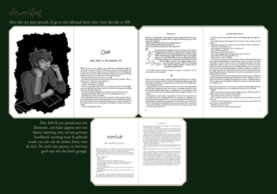
Translation:
Final product
Here are a few spreads, I won’t show all of them, because that’s 308 of them.
Here I have a spread with an illustration, a basic page with a little drawing in it, and a regular chapter opening where I use one of the other fonts for the title. The titles are quotes, and the font shows who said it.
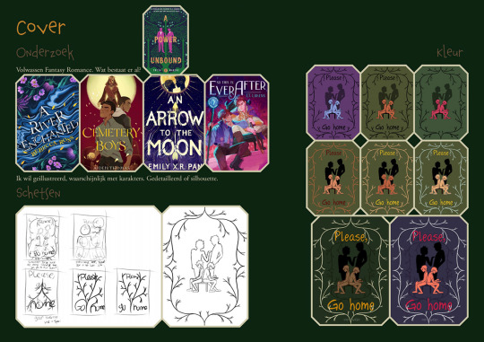
Translation:
Cover
Research
Adult Fantasy Romance. What’s already out there? (Put a bunch of YA there, but whatever)
I want illustrated, probably with characters. Detailed or silhouette.
Sketches
Colour
Translation:
Final product
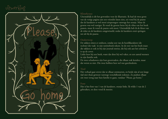
Color choice. In the end, this is the illustration I went for. I showed the two bigger color choices from the last page to a friend, she said with the purple one, that the characters nicely sprung out of the image because of the orange. But the green one was more relaxed. I thought the green one fit better with the vibes of the book, but I really like the purple one too. I ended up switching the colours of the text and the characters, so the characters sprung out like the purple one.
Subject. The twigs are around it, because one of the main characters (the right one) often draws them in his journal. They’re also there in the rest of the book, in his journal entries. He’s writing in it on the cover. Left, he’s reading a book, because he does that often, and others in his family do so too. The two shadows are their grandfathers, who also knew each other, which the main two don’t know. Those two have quite a bit of history.
Title. The story is about them meeting each other, and they’ve both been away from home for various reasons. They push each other to go back to their families, that’s why it’s called ‘Please, go home’.
Font. It’s one of the characters fonts, orange left. I wanted to use one of the main characters’ fonts, and I liked this one better.
Translation:
Dust jacket
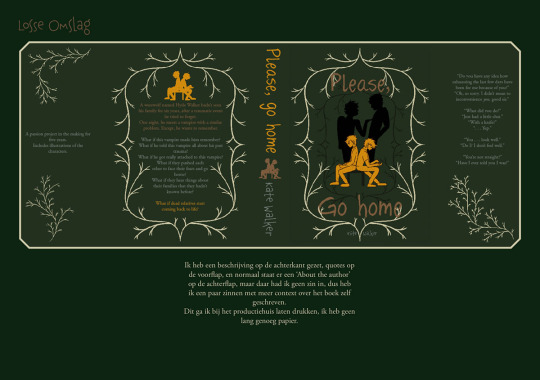
I put a description on the back, quotes on the front flap, and normally there’s an ‘about the author’ on the back flap, but I didn’t feel like doing that, so I put a short text there to give more context to the book itself.
Sorry about the shitty quality of the next few.
Translation:
Character illustrations
Inspiration
Sketches
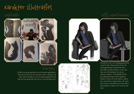
I sketched some poses I could use. Other than that, I’m not planning to sketch a lot, I’ve drawn all these characters before and I already have a good idea of what I want them to look like.
Style experiment
I tried something painty first, didn’t like it. After that, I experimented with the background. I didn’t want the colour to go all the way to the edge, because I didn’t want to have to deal with bleed and trimming. In the end, I didn’t give the background any colour, except black and white lines, as you can see in the final result. I liked the effect of only the character having colour.

Translation:
Rune
Earlier drawings
Sketches
Final product
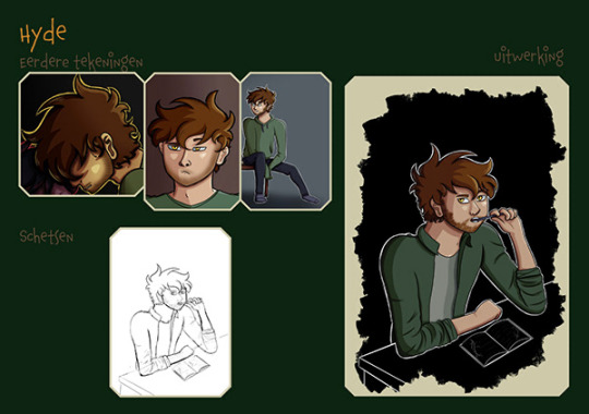
In the book, it’ll be greyscale.
(All the next few have the same text except the characters names, so I won’t translate again. Except if I did add some text somewhere.)
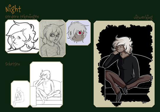

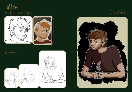

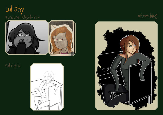
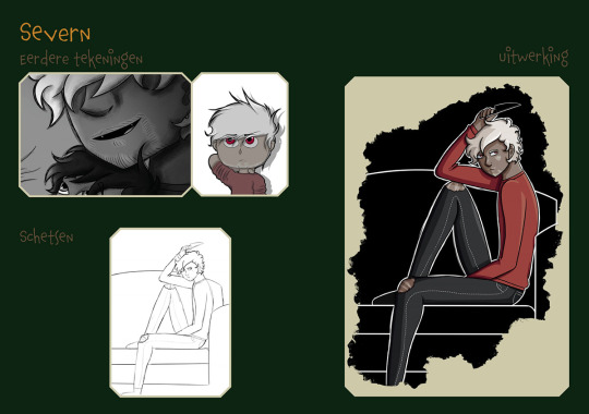

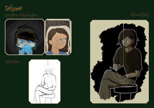

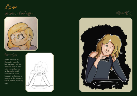
Translation:
And with this, all the illustrations are done. I'm not super happy with all of them, but I did my best to make them all unique and recognizable. And within 4 weeks. I'm happy with it.
Translation:
Physical book
Research
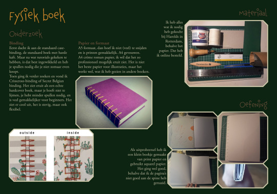
Binding. At first, I thought about doing a standard case-binding, a standard hardcover book. But after watching some tutorials, I realised that's quite complicated and requires supplies that I couldn't easily get. I continued searching and found crisscross-binding or secret Belgian binding. It resembles a standard hardcover book, but you barely have to glue, you need less supplies, and it's easier for beginners. It looks cool, it's sturdy, but also flexible.
Paper and size. A5 size, then I don't have to trim and printing is easy. A4 folded. A4 cream novel paper, I want it to look as professional as I can. It's not the best paper for illustrations, but it does work, I've seen it in other books.
Material. I bought everything I need at an art store in the city, except the paper. I ordered that online.
Practice. As a try-out, I made a small book of printer paper and used watercolour paper. It went well, except that i didn't sew the pages to the spine properly.
Translation:
Final product
Printing
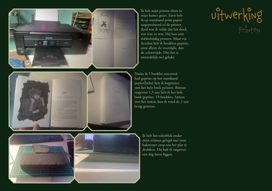
I put my printer at home in my room. First, I tried on standard printer paper if the printer did what I wanted it to do. Which it didn't. It couldn't print double-sided. But with Acrobat, I printed booklets. First only the front, then the back. So I managed to do it.
After successfully printing one booklet on the standard paper(left), I started printing the whole book on the cream paper. Within 1,5 hours, I printed the whole book, 19 booklets. Together with the testing, it took me about 2 hours.
I pressed the pages underneath my cutting mat with two bricks. I left it there for about a day.
Translation:
Cover
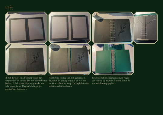
I cut the front and back cover out of cardboard, then covered it with linen paper. I drew a twig on it with ink and a brush. Then I poked holes in it for the sewing.
Here, I made the spine 2cm wide, which I thought would be enough. It was not. I'll get back to that. I covered the spine in linen paper, too.
I sewed the cover together, I followed a tutorial on YouTube. Then i glued the end papers on.

Translation:
Binding & Dust jacket
I poked holes (in the booklets) for the sewing, then I started sewing the paper to the cover.
When I'd sewn 6 out of the 19 booklets onto the cover, I was already halfway along the spine and I realised this wasn't going to fit. I undid all the sewing and remade the spine. This time 3cm.
The new spine was still a bit too small, even though I thought I'd exaggerated it a bit. The book doesn't close properly. But I refused to redo everything again, so I just accepted it. It was better after pressing it for a day. I didn't trim the edges, that was very difficult with the pages already bound into the book. I quite like the untrimmed edges.
I folded the dust jacket around it and pressed it, so it'd keep it's shape. And now the book is done. The paper of it smudges very easily. A little bit of dust on it and it won't come off. That's a bit disappointing. (Now a year later, it also isn't lightfast whatsoever. It stood in a dark corner of my bookshelf nowhere near the sun and the spine turned yellow. I guess I now know why covers have protective coatings on them. Which I didn't have the option for.)
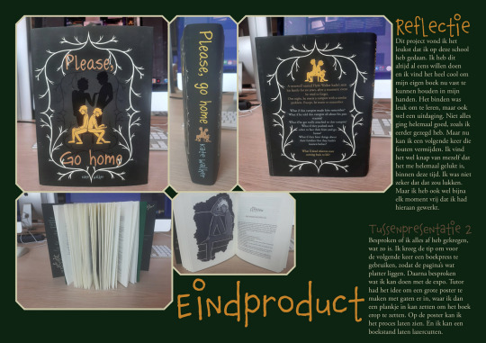
Translation:
FINAL final product
Reflection
This project was the most fun thing I did at this school. I've always wanted to do this and it's awesome I can now hold my own book in my hands. The binding was fun to learn, but also a challenge. Not everything went perfectly, like i said earlier. But now I've can learn from those mistakes. I'm quite impressed with myself that I managed to do this in this time. I wasn't sure I could do it. But i did dedicate every moment of free time I had to this.
(I did all of this in 5 weeks. All the teachers doubted me, that it was too much work, and just told me good luck. And I said "Watch me." Autistic hyperfocus activated.)
(The second paragraph isn't important, just a short description of the last discussion I'd had with my teacher about this.)

Awful picture, sorry.
This is the final presentation I had at school for this, and this is where it stops for the school projects side of this. But it continues.
After this, I didn't touch it for a few months. Then I let a friend read it (digitally) and processed her feedback into the book afterwards. Then I published it on Amazon.
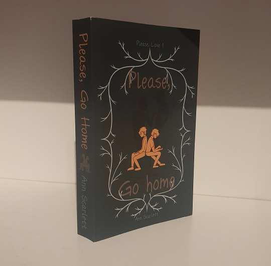

This won't be the last time I do this. The whole process is really fun and fulfilling. And owning a real, published book that I wrote, illustrated and designed is awesome.
In case you're interested, click here to buy it.
#art#original art#my art#artists on tumblr#oc art#small artist#art school#oc#my ocs#vampire#werewolf#werewolf x vampire#book binding#whiskers art#whiskers ocs#portfolio#aw please love#oc: too many#aw: 2023
17 notes
·
View notes
Text
Some findings on: The Fun In Profundity
http://blog.dojoklo.com/tag/the-fun-in-profundity/ (go read the whole thing! italics are my dumb thoughts)
As we returned toward the kitchen, I noted several portraits of Ricken throughout the spaces. He informed me that when he first moved into the house, he required all of his artistic friends and colleagues to provide a drawn, painted, or photographic portrait of him, as a housewarming gift. (this is why so much weird art at bier house) “I do not wish for the house to forget me in my absence, nor to fear me upon my return.” he explained.
Just before reaching the kitchen, we stepped out through a sliding door onto the deck, or Dining Terrace as the architect officially designated it on the floor plans.���This deck was originally built around a large tree, as you can see by the pattern of a now-covered hole, and the notch designed into the roof’s overhang above. It seems that at some point in the house’s history, the tree was misplaced. Perhaps I shall be the one who relocates it,” Ricken declared. “Or perhaps one of the imbibers from the local tavern down below took it with him one night…?” Ricken pondered.
The living room is located 6 steps down (“Exactly 3 feet, 4 inches lower” Ricken informs me) from the entry / kitchen / bedroom level, and can be viewed from the kitchen and the breakfast room.
...the rear exterior of the house, where patrons from a local bar sometimes appear at night. The original house was built around the existing tree, seen here embraced by the wings of the house as it emerges through the Dining Terrace deck. Ricken noted that this tree has currently been misplaced. The bedroom wing is at left. A door seen at the lower-right enters into the lower addition to the house (photo by Thad Russell).
Wright called Domoto a “green amateur” who designed “half-baked imitations.”
The families at Usonia who had commissioned houses from Domoto fought for the young architect’s continued inclusion in the project, and even began constructing his designs without Wright’s explicit approval. The situation so ruffled Wright that the master architect eventually left the Usonia Cooperative project, explaining that he would finish his own three designs, but offer no more leadership or involvement. Domoto continued and eventually completed five houses on the site, but lost clients to other Usonia architects. The Bier House was the largest of Domoto’s contributions.
“I have found the combination to be intriguing, and perhaps ideal. Because this house incorporates the two prominent mid-century architectural styles, I am able to live my life in a ‘living’ machine-for-living.” This brought to mind Ricken’s contrast of man and machine that he expounded upon in his latest book, and Ricken readily agreed, saying “Most machines are made from metal, while this one is made from wood and stone and glass and concrete. And also, it has doors and windows and Himalayan throw rugs.”
When I inquired about another set of stairs that led down from the living room, Ricken invited me to descend to a small study and guest room plus mechanical space tucked under the kitchen. Originally it was a discrete space, but now serves as a transition to the added lower spaces that were part of the later owners’ renovations. Following a musty, earthy odor, we continued down to the added space below the living room, which is currently filled with large bundles of wool, fabrics, and weavings. “This is where I work my Baltic hand loom,” he explained. “I will now demonstrate.” Deflecting my kind but firm protests, Ricken began to weave, elucidating the intricacies of warps and wefts, and explaining how he is compelled to use wool from Emsket-colored sheep who sleep on the south side of a knoll. (weaving in the basement)
“Once I initiated my weaving projects for dear Eleanor’s linens, I had to disassemble my medieval bookbinding workbench, and temporarily place my small-mammalian taxidermy station into storage.”
Ricken offered me a coffee with warm goat milk,
As with the rest of the house, the concrete floors emit radiant heating, as hot water flows through copper tubes embedded in the poured concrete.
“Just as you must send out your image to a mirror in order for it to return as your reflection, you must send out your thoughts to the world in order for them to return in the guise of self-reflection,” he explained. “But listen to me, prattling on like an airport weatherman about my writing, my house, and myself. Why don’t you tell me what you think of my writing, my house, and myself?”
His upcoming book signing event at Selvig’s Flowers in Downtown Kier has, unfortunately, been cancelled.
In an ongoing project, Ricken has asked his photographer and filmmaker friends and colleagues to document his everyday life. Many of these recordings have been shared in a nine-part Apple TV+ presentation titled Severance. Some images and video stills that he has kindly shared, to help illustrate this article, can be viewed at this companion link: http://blog.dojoklo.com/2022/04/28/devon-and-ricken-hale-house-in-kier-pe/

2 notes
·
View notes