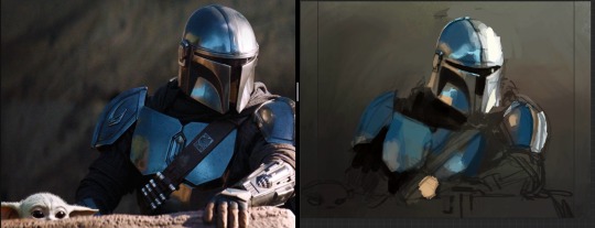
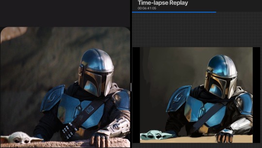
#and trying out a different rendering style sort of
Explore tagged Tumblr posts
Visit Tumblr Blog
Explore Tumblr blogs with no restrictions, modern design and the best experience.
Last Seen Tumblr Blogs


Fun Fact
China blocked Tumblr because of pornography and censorship problems in 2013.
Text

tona in some of my outfits ^_^
42 notes
·
View notes
Text

just some thoughts being thonk
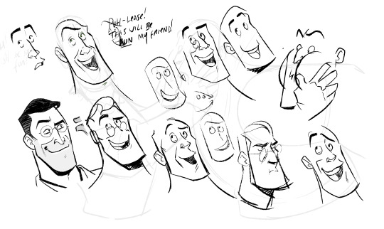
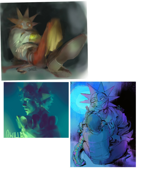
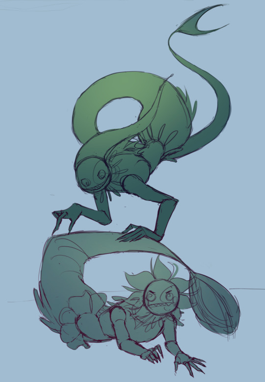
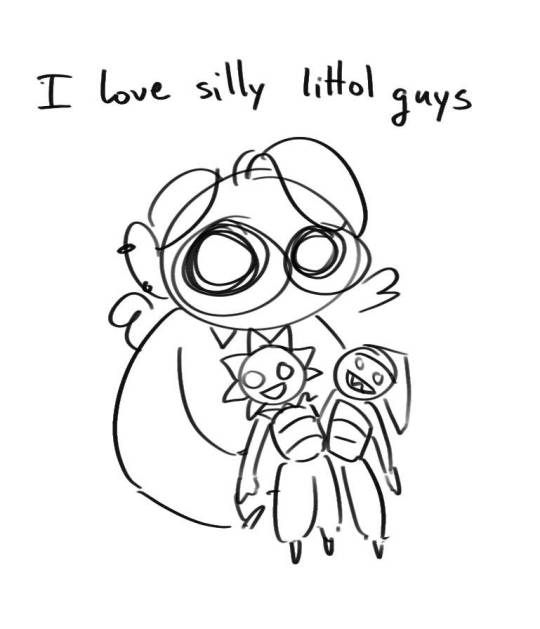
#. // ♡ 🌱 art#dol pc#noel the vendor#it took me a sec to figure the horn hair vent thing#idk if its just the rendering style i took with this work doodle or just the design but there is a different air to this noel and norm!noel#its so funny#im also trying to think of any sort of differences within the fashion too besides the hair#i am tempted with the idea of big oversized crop coat with skintight bodysuit under#since i always find it super cute & fun to do#but i also have to limit myself cause girl this is the uk#not some anime fighting game#i'll figure it out#until then im returning back to the sims since my period started and i got work tomorrow#my enrichment before i wake up for grind city
57 notes
·
View notes
Text
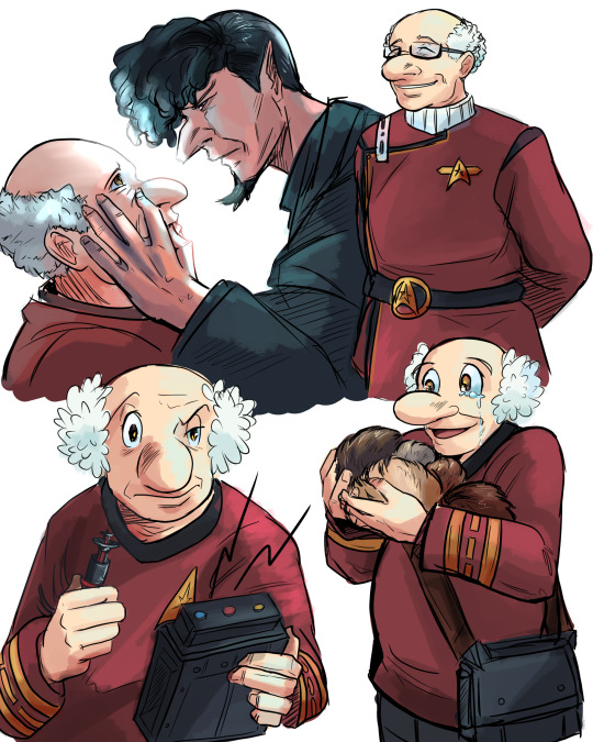
The other half of Star Trek AU! Ochanomizu (ft. mind meld with Tenma)
I thought about putting him in science division but I like the idea of Ochan having a background in communications tbh. I feel like he would be really interested in that.
He grew up hearing about the development of the world's first "positronic brain" - supposedly a piece of technology that would enable humans to create life forms with true Artificial Intelligence. However the research was shelved and left incomplete, leading Ochanomizu to take interest in conducting his own work on the subject. This gets him scouted by Starfleet, with promises of ample resources and a retinue of colleagues with the varied skills offered within the Federation; and while it was never his intention to join Starfleet, he could hardly resist the opportunity.
This eventually lands him leadership of a research initiative whose aim was to continue the research done into the positronic brain, hoping to create the Federation's first truly self-determining AI android. It's three years into his efforts that the outpost gains its first representative of Vulcan's own science institute, though it could be argued he's much less of a "help" than he is an annoyance; Tenma does not make a strong first impression with the human crew he so derides. Though he's proficient as an engineer, it'll certainly take time for the two to warm to each other in any capacity.
Ochanomizu, outside of his primary research, loves Tribbles! He is a licensed caretaker and helps educate people about them. He has a Tribble nursery on the outpost, much to Tenma's chagrin.
Also, even though he's at the rank of captain, he has never sought out his own command. He likes what he has on his little research outpost and doesn't really have the itch for space cowboyisms.
#hiroshi ochanomizu#hirouma#star trek au#umataro tenma#my art#I wanted to try to render him more cartoony but ouhg its harder#I'm used to working with long faces so drawing him is different for sure. circle guy#I did have to do his pluto style for some of these though eheh#I want nothing more for this man than to be covered in fluffy creatures that love him#I like to think that in the context of this as a star trek 'series' there would be an incident like once every 5 episodes#where Tenma encounters tribbles outside of their enclosure and keeps trying to find ways to get rid of them#its a running gag#but yes the central narrative of this theoretical star trek series would be the creation of Atom#in the context of being a sort of pre-Soong type android#more to say about him and that but I think I need to make a separate post lol#anyway. mind meld make out. go
26 notes
·
View notes
Note
How the hell do you manage to superimpose the hilariously exagerated proportions of the tf2 mercs into a cohesive 2d style? I always struggle SO much with like, the way the mercs' models have huge hands, the way they have relatively low-poly definition on things like arms, shoulders, and legs... and Especially the way like, the models are kinda janky when you pose them for art purposes- when using movement tools, things like armpits and seams between body parts get all deformed... Which makes the study of form and silhouette rather difficult.
I assume that a lot of your ability to translate the concept of the mercs from their original mediums into your own works of art comes to you quite naturally- through experience you have with drawing and art style stuff, as well as through intuition. I was simply wondering if I could poke at your mind and get some insight into your process, any thoughts you have about the proportions and silhouettes of the mercs, any quirks you've found while drawing the mercs, or simply what you enjoy drawing about them. Like, don't be afraid to infodump about something just because you think people wouldn't find it interesting- I am here, I am sitting, and I am listening- if you so choose to speak.
I am utterly fascinated and enraptured by the more behind-the-scenes aspect of art. The mundane things that come second nature to great artists yet seem so revolutionary to less experienced artists.
I love your work, I look forward to seeing more of it, and I hope you have a nice day :]
Sorry for the late reply! I've been a little…stuck on how to answer this but that's mainly because to me, drawing is composed of SO many different little skills - you have form, anatomy, shape language, silhouette, appeal, rhythm, acting and posing…not to mention everything AFTER your raw draughtmanship like line style, rendering and colour theory. Trying to distill a multiude of small skills into some pithy advice is overwhelming to my brain. So I'll take the invitation to ramble instead :))
I don't think I have any new or revolutionary insight into the tf2 guys specifically - more I'm using them as work horses to excercise general silhouette/posing/shape-language and further my skills when it comes to drawing characters!
I do agree though the proportions are rather silly when you stop and think about them realistically…they can be kinda tricky if you follow their 'actual' proportions. what looks great individually was maybe never meant to be directly compared (ie: Heavy's hand size against Spy's lol). It would've been funny if the TV show exsisted and we had more content to review…would the animators have had rules like Spy and Heavy can never shake hands? Would they cheated the proportions for shots? Or would they have said WHATVER it's gonna look weird and embraced it? (Like Kingpin in Spiderverse lol)
Paul Lasaine for 'Into the Spiderverse' This is AWESOME. But it's also one of the silliest designs I've ever seen comitted to screen. The varied scales of the characters work because of the unifying treatment (lighting, rendering, consistant hand anatomy, consistant clothing fold treatment etc) and because they are sort of proportional within themselves. A common mantra is that hands should be about as large as a characters face....which they all are here!
Human brains are very flexible and forgiving though. It's totally fine for you to put a character with huge hands and head next to a teeny tiny character! Vanellope and Ralph from Wreck-It Ralph look grand next to each other! And in that film you even have varying levels of stylisation sitting against each other (unified by the look dev treatment of the shaders and lighting). I think as long as the chracter is proportional within themselves it sort of works out. IE: a general rule is that a hand should be as large as the face so…you can have some large arse hands as long as their placed on a body with a big arse head. Unifying characters with the same treatment (ie: lineart brush, colouring style will also help them look cohesive next to each other :) )
I don't actually reference the 3D models/animations very much at all and instead draw their proportions based on my tastes for stylisation following their general vibes/silhouette profiles. I don't stick THAT close to their in-game looks and there are artists who do that are so so so much better than me (Creedei and Flapjack come to mind). I'm not amazing at body-type differentation and TBH they're all wearing chunky clothes all the time so I usually draw the guys as one-of-three body shapes: Heavy is the uniquely wide guy; Sniper/Scout/Spy are all tall and slim and Demo/Soldier/Medic/Engie have a little more of the generic 'hero' bodytype with varying tallness and broadness of the shoulders
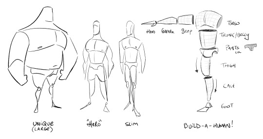
Something like this! You can vary all these individual elements in terms of size, thickness, taper amount etc to create different characters. If you ARE going to reference the 3d works though you'll need to apply some anatomy knowledge to overcome the weird shoulders, armpits and knees which desperately need blendshapes to correct the 3D volumes and approach it a little more like an animation supervisor. There's a reason why you see in making-ofs and art-ofs character designers, character leads or animation supes doing drawovers of the models. These are character models that have had great effort put into their 'base' silhouette but it still needs to be reinforced in every frame for maximum appeal.
Shiyoon Kim for 'Raya' This sort of thing will occur at multiple stages during the animation process. Shiyoon Kim's notes are post final model but pre-animation. Most likely for internal rig tests, exploring what blend shapes and alt shapes are needed for the rigs etc. If your production has time, this will continue all the way to final anim. IF! But it's interesting to see how he emphasises the shapes and enhances the character acting of the 3d model.
As for 'mundane things' - I wouldn't say they're second nature! (If that makes you feel better!) I have to actively really persue certain advice and try to figure out how to best apply it. This can sometimes involve redrawing and redrawing an element of the drawing until I've grasped the nettle of whatever I'm after or…..until I get frustrated and either delete the drawing or just call it done lol
Here, I'm looking for a really specific flow of the head that sells both the acting and a subtle head tilt. I'm also trying to apply the general mantra regarding faces that converging lines (set by the eyebrows and mouth) are more appealing than parallel. It's tough! I also tend to use a drawing I've already done as a template/reference on the page too. Oh! This page is an amazing example of why I'm not an animator or storyboarder…consistancy? Who is she? 💅
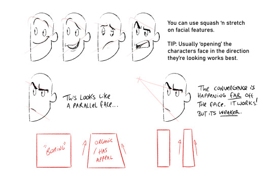
Converging lines (that form tapered shapes) are always more appealing than parallel. Using this logic you can loft the facial features across converging lines to create dynamic appealing espressions. Combining this with anatomy, perspective and rotation is the tough part though. I'm still learning o7
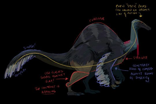
The things I probably think about MOST are always flats vs curves, simple vs complex and general line of action/flow...and then eliminting tangents. Each of these can be a dedicated visual-essay on their own - hence my stumbling as to answer your question. Anyhow, not sure if it's ever come up on this blog but I looove dinosaurs :)) so i'm using a wee piece to demostrate these ideas! (but also to demostrate these concepts apply to everything from humans characters to animals, props and background design)
Okay, I'm getting self-aware that this is getting really long :') I have a wee tutorial tag for my blog if anyone wants to comb through my garbled art-thoughts. Learning, studying, repetition and practice will always be the greatest teachers! I'm glad you like my art- thank you so much for the lovely comments - I feel like such a noob still and not qualified to give people advice but we're in it together learning! High-five! 🙌
#tutorial#asks#sorry for any spelling mistakes whoops!#hopefully...this is VAGUELY useful or interesting to people ;;#TBH I'd much rather do youtube drawovers/videos of my own or others work as that is...my job...rather than doing writeups lol#its much easier to talk and vibe about a piece of art vocally than to try and make everything uber succint in writing
459 notes
·
View notes
Text
Foolish Lil Birdie
Day 30 of Kinktober: Visions of Temptation hosted by @xxsycamore found here Featuring: Ikemen Villains | Jude Jazza x f!reader Tags: mdni, smut, pwp, somnophilia, cunnilingus, creampie, p in v sex, body worship, some angst if you squint, soft Jude Prompts: Cockwarming/Somnophilia | “You feel so good. I don't ever want to stop.” A/N: Wanted to try something a little different with Jude. He has these moments of tenderness when reading through his POV stories, and I couldn't help, but wonder how he might be if he knew Kate wasn't awake... hence, soft Jude :P ao3 link here.

��I want you to use your powers on me, and then… and then have your way with me.”
Jude faltered, the words coming out of your mouth so unexpected, he was rendered speechless… and Jude was rarely speechless because he was rarely flustered, except apparently when it came to you.
Of course… of course a foolish lil birdie like you would make such a dangerous, outrageously lewd request.
“Ya realize what yer askin’, princess?”
You answered with a serene little “I do” and nothing else.
Jude found himself absolutely bewildered. You knew what sort of sadistic, twisted man he was, yet you were still willing to place yourself into such a vulnerable position with him.
“And what if I decide to do somethin’ depraved to ya?”
You simply smiled at him, that sweet, naive smile that just proved how little you knew of the evil in this world. “I trust you, Jude.”
Jude sighed, exasperated, but it came out as an aggravated growl. Of course he could trust you to say something so… so infuriating. A desire to teach you a lesson bubbled to the surface, itching to address your biggest flaw.
Your trust.
You were too damn trusting.
Which was how you ended up as Crown’s Fairytale Keeper in the first place.
“Ya sure about that?” he snapped.
The trust shimmering in your kind eyes stoked his rising ire. Ever since you joined Crown, Jude could tell you’d be eaten alive by life’s cruelty, but no matter how hard he tried to teach you, no matter what callous punishments he gave, you always just looked at him with those wide, trusting eyes.
So damn bright and kind and pure.
“Jude…” you reached up and lovingly cupped his cheek, “I know you won’t hurt me.”
There it was, your blind, unwavering trust in him. One he didn’t deserve. Because you were too good for him. Too good for this dark world he inhabited.
“Tch… ya really got no sense of self-preservation, do ya?” he grumbled, but he’d be lying if he said he wasn’t sorely tempted to see you peacefully lying there, unprotected, dreaming a dream of him… perhaps. “Ya asked for it, princess. Don’t say I didn’t warn ya.”
Your smile widened, and Jude clicked his tongue, annoyed, yet aroused.
He didn’t bother warning you. It wasn’t his style, and when he placed his bony hand on your head, your eyes fluttered closed and your breathing fell into a slow, steady rhythm, your chest rising and falling with each deep breath.
You still had a tiny, sweet smile on your lips. Jude wanted to kill it… or kiss it… or some strange combination of both. He lightly brushed your hair off your forehead with more tenderness than he intended and ran his fingers through your silky hair, smoothing it back.
You slept like you were dead, but the rise and fall of your chest and your beating heart beneath his palm were proof you were still breathing.
“Gonna make ya regret this…” he gruffly said, but his touch said something different.
He placed his large hand on your cheek, feeling how soft and warm you were under his palm, and he pressed his thin lips to yours in a chaste kiss.
You were beautiful.
And you were all his.
Devotedly, maddeningly all his.
He slipped off your blouse and your skirt, cradling your body in his arms as he pulled the fabric away, leaving you bare and exposed for his wavering gaze to take in. He trailed his amethyst eyes down your sleeping body, all the way to your toes, a sight he had seen before, but never in an intimate setting like this.
And as if you could tell he was admiring you, you shivered delightfully, the corners of your lips curling up as if you were pleased.
Jude reached for your plush breasts, ones he’d on a normal basis brutally squeeze until you cried out in pain, but today… today he ached to have them in his mouth, to taste them with his tongue, and to nibble your delectable firm nipples between his teeth.
Gently kneading the plump flesh of one with his palm, his thumb brushing the pert peak, he popped the other in his mouth, swirling his tongue over the bump. He sucked on your soft flesh, marking your skin with red bruises, a parting gift of the wet kisses he was leaving behind. Jude closed his eyes and quietly groaned. It wasn’t the first time he’d touched them, but it was the first time he truly enjoyed them, allowing himself to relish them without any biting or pinching or pain.
You let out a delicious, little moan, and Jude felt himself stiffen, the strain against his pants painful, but he couldn’t relieve himself. Not yet. Not when there was still so much to explore.
“Ya like that, dontcha, ya little masochist,” he teased, but his words carried a playful fondness instead of its usual bite.
Removing himself from your heavenly breasts, Jude parted your thighs. You were on display, a feast for his darkening eyes, and he was entranced by a thin thread of your arousal stretching taut until it snapped as your lips opened. The lust he’d been holding at bay flooded him, crumbling all of his defenses in one roaring, turbulent wave. You glistened, shimmering even in the dim light, a sign of your desire for him. Ready to be taken by him.
“Ah, fuck, princess…” Jude sucked in a ragged breath. “What’re ya doin’ to me?”
He ran a finger through your folds, feeling how slick you were between his pointer and his thumb, breathless at how pliant you were being, and then nestled himself between your thighs, placing a kiss on your pink clit. He breathed you in deeply, the scent of your sweet musk clouding his sharp mind.
You smelled intoxicating.
Jude felt drunk on your smell alone, but when he dragged the tip of his tongue between your inner lips, tasting you on his tongue, he shuddered. The taste of you was just as, if not more, intoxicating than your natural scent.
He wanted, no… needed… more. He was a prisoner in the prison that was you, and he hated you for the curse you cast on him. But he didn’t hate you. He loved you, and that knowledge was enough to drive him mad.
Jude kissed your slit, delving his tongue in between every crevice, lapping your irresistible essence into his mouth. You were scorching against his lips. He ravaged you, darting, flicking, sucking, whatever he could to drink more of your pooling honeyed arousal.
He was a sweltering summer day and you were his cool breeze.
He was starved and you were his feast.
He was an addict and you were his fix.
You writhed beneath him, rocking your hips into his rampaging mouth, sultry gasps slipping enticingly from your luscious lips. Jude was caught in a dizzying storm, swept away in the whirlwind of all things you. Your scent. Your taste. Your voice.
As you coiled tight and let go, Jude became exceedingly aware of the unbearable strain between his legs, the throbbing bulge in his pants begging to be freed, and oh, how he ached to be nestled in your gorgeous, puffy cunt.
Jude rested his forehead against your inner thigh, breathing heavily, his head and his heart wrestling for control. He was disgusted with himself at how he worshiped your body, at how careful he was being with you when he should be pushing you away because you deserved so much more than what he could give.
You deserved to be safe, to have the mundanity of normal life, to meet someone kind and get married and have children.
All things you could never have with him.
“Fuck,” Jude growled.
He told himself not to continue, to go back to pushing you away from Crown, from this violent life… from him. Even as he said these things to himself, he realized, he never made himself promise to stay away from you, maybe because deep down he knew he wouldn’t be able to keep that promise.
But… his Curse had you out cold, and he still had time, time to have a little bit more of you without his head getting in the way.
You wouldn’t remember anything when you woke up anyway.
His body moved on its own. Before he could restrain himself, he was tearing off his clothes, desperate to feel you envelop his needy cock, to feel you wrapped in his embrace.
Jude slid in slowly, groaning as you readily sucked him in, coming to a stop when he was completely buried. He closed his eyes, taking a moment to relish how warm you felt wrapped around his greedy cock.
He knew this would be the first and last time he’d allow himself to be gentle with you, and the thought strangely anguished him.
“Ya feel so good. I don't ever want to stop,” he murmured, grazing feathery kisses along your brow.
He gazed down at you, memorizing every detail of your face in his mind, taking in the pretty, rosy flush on your cheeks, the light sheen of sweat on your brow, the soft part of your lips, the tangled mess of your hair…
He’d be back to being his twisted, deranged self when you awakened.
“Ah, shit,” he quietly whispered to himself.
Jude rolled his hips, thrusting in and out with ease with how wet you were for him, the thought both inflaming and thrilling, and incensed, he nuzzled his nose into the crook of your neck, biting down into the skin, directing all of his anger and frustration with himself and with you into the only angry mark of the evening.
His mouth glued to your neck, he increased his pace, rasping grunts sharply expelling from his throat. The friction of his tip dragging along your walls drove him insane, his composure, which was already hanging on by a very thin thread, unraveling.
“Jude,” you breathlessly moaned in your sleep.
While Jude enjoyed tormenting you senseless into a trembling puddle, hearing you so ardently moan his name ruined him, and as you cried out, arching your back, Jude felt himself explode, pulsing wave after wave of his cum, spilling into you urgently, his vision fading to black.
He remained still, long enough for his breathing to return to normal, and then he burst into sardonic laughter, shaking on top of your prone form.
“Hopeless,” he muttered through his derisive snorts. “So goddamn hopeless.”
He rolled off of you, covering you with a blanket, and opened the window, lighting a cigarette. The room was dark, the sun having set not too long ago. Jude stared broodingly out into the dark outline of the castle garden, blowing smoke into the cool air.
He knew he had to let you go. He knew, but still a part of him wretchedly yearned to hold onto you and never free you from his grip. Selfish. He was being selfish. He contemptuously smirked. A true villain.
“Jude?” your dreamy voice called out.
Jude turned to face you. You were blinking away the haze of sleep, the blanket falling from your shoulders as you sat up. Jude snickered to himself. Your hair was a bird’s nest, tangled and matted from where it was touching the bed.
Tossing out his cigarette, Jude crossed back over to join you on the bed, and roughly yanked his fingers through your hair. It was always bedhead with you.
“Welcome back, princess,” Jude said mockingly, his trademark wicked smirk back on his lips, his sadistic mask settling back into place. “Feelin’ refreshed?”
“Is it over?”
Trust you to say something so silly after asking to be used like a doll.
“Tch… don’t remember a thing, do ya? You get off on that kinda stuff, dontcha, ya nasty woman.”
“Did you enjoy it?”
Jude paused, and his eyes narrowed. He could’ve done anything to you while you were asleep… anything… and you were acting overjoyed, asking if he enjoyed doing what he wanted to you without your knowledge. Jude scowled, feeling the tendrils of irritation hook into his heart, but he wavered seeing the pure, stupid joy in your eyes.
Gruffly sighing, he grabbed his cloak and wrapped it around your shoulders.
“Come on, princess, I’ll help ya get cleaned up. Least I can do for lettin’ me use ya like a ragdoll.”
#missaengg writes#kinktober#kinktober 2024#visions of temptation 2024#jude jazza smut#ikemen villains smut#ikevil smut#ikemen villains jude#ikevil jude jazza#ikevil jude#jude jazza#jude jazza x reader#ikemen villains fanfiction#ikemen villains fanfic#ikevil fanfiction#ikevil fanfics#ikevil fanfic
266 notes
·
View notes
Text

Hello! I think today I want to share something I do sometimes, which is studying artstyles, character designs, colors and etc, usually because I wanna draw a character a certain way and I need at least a bit of practice to get it. A good while back, I sat down and studied Rayman’s design in the Sparks of Hope DLC, all so I could possibly render Ales in a similar style one day.

Aside from the studies (and picking up the one reference to the Magician in the game itself), I also gathered some references, both old and new, to make a sort of moodboard. While the final work would ultimately be my interpretation of the character, I also wanted to try and tweak his design so it COULD, in theory, show up in a game like the Mario + Rabbids series.
That means toning down some aspects that could be read as too scandalous for a Mario spin-off game, but at the same time try to justify other elements as “whimsical” or “classy”. He has high heels because louis heels were worn by men originally, he has an open shirt because that’s how men wore their shirts in the 70s. You know, tie it to his inspirations. I also added The Mad Hatter, not just because of the wonderland inspirations, but also because I like to imagine Ales does the head waggle thing. Even if I have no intentions of animating something like this, I think having in mind the character’s use in animation helps in the design process, like what’s needed from a hypothetical model.

As for actually drawing Ales, I got. Intimidated. So I decided to break it down into pieces first, which is VERY easy with thingamajigs because they’re already broken down into pieces. Some aspects were done deals first try, like how I’d shape the eyes to mimic my own style while still using the base Rayman eyes. However, a lot of other aspects I had to sit back and consider them, like the shape of his torso. Some ideas I’m also still not completely married to, like the shape of his earrings. At this point I also wasn’t sure if I wanted to give him his bell bottoms or not, because I’d figure the devs would want the floating limbs to be front and center for the thingamajig’s designs, not just Rayman. On the other hand, Rayman HAD worn pants in some games (coincidentally the Rabbid games), so it’s not a far off concept.
Then I finally sketched out Ales! It’s not a perfect one to one of the SOH artstyle, but that’s ok, since it’s a first pass :))) I figured out how to keep his pants AND show off his floating limbs at the same time, which I’m very proud of. I do think next pass, I’d want to use a different shape for the earrings, since they’re kind of cluttered, as well as a slightly different half-up hairdo, just to give it a more interesting shape. But overall I’m happy how Ales looks!
I also drew him as a teensy for fun, just to shove him inside that bigass prop hat, and you have to get his glamour or he refuses to come out. I didn’t use my usual design for teensies because Giacomo Boni’s glade character designs are soooo funky and weird (positive, go look at his Murfy art I <333), so I made him hunched and made his nose bulbous while pointing down. Makes him look like the old man Teensies are supposed to be :)))
All in all, I’m happy with this study session! I can’t promise I’ll actually render Ales in this style, but if I ever do I have something to come to for reference!
#cici yaps#rayman#rayman fanart#rayman the magician#rayman ales mansay#ales mansay#sparks of hope#artstyle study#sorry for yapping so much I just really liked thinking about this
81 notes
·
View notes
Text
New Mononoke films are worse
So recently I watched Mononoke.
It happened almost acidentally, beause I randomly stumbled across the Phantom in the Rain (Karakasa) film, and it was so beautiful and so obviously loaded with subtle references and little meaningful elements, that it was enough to get me hooked. I'm a sucker for when a film respects the viewer and treats them as a smart person, not explaining everything to the letter and letting them make their own judgements and derive their own conclusions.
So as the perfectionist/completionist freak I am, I started from the very beginning, from the Ayakashi anthology. I figured that the multitude little references, everything that was going on in every single frame of the film, would be more easily readable and understandable if I immersed myself fully. Then was the original 2007 anime. Honestly, I was shaken. I started watching it admittedly for the striking visuals and for the word 'horror' in the description. And, well, Mononoke isn't a horror in the sense that I'm normally looking for, but it's a different kind of horror, not less, but I daresay MORE rewarding. Mononoke stroke me with the contrast of lush, beautiful art, delightful with its classical style, and the utter minimalism of the story, which was so brilliantly told that it left me shaken for a while.
Mononoke is a sort of everyday, mundane horror, where the terrifying element is the normal people and their everyday lives in the society (honestly I joked that this is the 'horror of being a woman, especially in 19th-century Japan', and, well, it is). Without being didactic or moralising, but with unwavering confidence, the original Mononoke (and honestly the Ayakashi anthology, too) revealed the real horror: hell is here, the demons are around you. On the stunning backdrops of its art, the anime never once romanticised what was happening on screen. While weaving its mystical storylines, it never once said more than was absolutely necessary.
The stoic, detached, yet inexplicably charming Kusuriuri, like a mixture of an insightful therapist and a skilled surgeon, opened up truths, observed them, and then let them go. His character was as fascinating as he was enigmatic, with obviously caring more for the 'demon' souls of the wronged (and maybe the odd woman he wished the best for), but always keeping at a metaphorical arm's length. Honestly, it was good not to know who he was, not to know any story of his, or any of his true feelings. Everything that was truly important, you could already see.
The morals of the stories were also unexpectedly refreshing. I didn't think I'd watch a heavily classically-flavoured anime that would tell me 'selling yourself out for the sake of others is bad' (as a woman, no less!), or 'seeking constant approval and validation will lead to your downfall', or even 'brothels are fucked up places' (incredible to see a non-romanticised view of prostitution in ANY media, to be quite honest with you). And I will reiterate: its study of the treatment of women was extremely interesting. Yes, many women were victims, and yet they were never there to titillate and be ogled. The show was honest about their place in society and what those women's life was like as a result. What it turned them into. How it disposed of them.
Everything was so simple yet so intricate. It kept you looking closely and thinking about meanings. It was also a more or less impartial look at history, especially how women fared. So really, after the anime, I was excited to finally watch the movie from start to finish. I mean, it promised to continue in the best traditions of the anime, set in an absolutely horrifying place rendered in heartstoppingly beautiful art, and followed women trying to find their place in that, again, horrifying world.
And... yeah, the Phantom in the Rain is worse. They cranked the beauty of everything out to the max... but then in the process, they lost the core of what made the story so special, so experimental, so original.
Don't get me wrong, it's stunning. The animation is breathtaking. The visual style is divine. Every single frame is a work of art that you could stare at for days and still not find everything that's hidden in there. But I think in creation of all this beauty, the stripped-down, brutally honest quality of the original story was lost.
The anime was highly successful in striking the balance of making everything beautiful without romanticising. They used the art to amplify the emotions, and those emotions were often far from great, but they were... well, successfully amplified. The original Mononoke was full of creeping disgust and existential terror, and the art tastefully made it that much more poignant.
The film watered down the emotions for the sake of enjoying the beauty, and in that, it also failed in being impartial. It couldn't resist romanticising. It couldn't help admiring. It couldn't stop itself from being self-indulgent. And so, the story, while still impactful, stopped hitting right for the heart and started enjoying itself. And so the sheer horror of the original was lost.
And don't get me started on the new Kusuriuri. And I don't even mean how I immensely dislike knowing his lore, and having his new incarnation be so human. The moment of 'slaying'/freeing the mononoke in the film was the biggest letdown in a while. The unsheathing of the sword in the original anime was not about actually 'slaying' anything, striking anything down. It was a culmination of the next terrible, terrible story that had run its course and that could finally come to its end and lie to rest. And Kusuriuri's solemn way of doing his duty was, paradoxically, much more emotional and impactful without it needing to be a 'fight'. There was no real 'sword', no real 'battle', but those moments were always so hard-hitting. The film traded that for an action scene topped off with a shounen-flavoured 'sorry' that honestly felt cheap. That sealed it for me: I won't be watching the other two. 'Sorry'.
The Mononoke films have lost what Mononoke was about. It feels like the writers had a great idea of how the original *looks* with no idea of how it *feels* and what makes it so impactful. It's a perfect form, but the substance is lacking. I don't know why that is. But I can't shake the feeling. Did the movie have its strong sides? Of course. I liked watching it on its own. But after watching the orginal anime and as a part of the universe, it falls short and feels flat. And the vibrance and overwhelm of its art doesn't save it.
#I saw a similar sentiment recently about Hylics and Absent Moon and that resonated with me greatly#so I decided to get this out#mononoke#mononoke 2024#mononoke 2007#mononoke karakasa
56 notes
·
View notes
Note
Oh uh forgot to ask in the previous ask (the one with the digital piece of candy and scurrying and stuff)
How do you draw art so good
Like
Is there a method you use or is that just the style you've gotten over time?
you've activated my trap card
I'm just gonna preface that this tutorial is from someone who was not professionally trained and didn't have a lot of free time for art, so a lot of the tips I have is short cuts I use to get the best results quickly
If you genuinely want to get better at art then please look at references and practice that is always the best
However if you are like me and only really do art for fun but want to go faster then these are for you pfppt
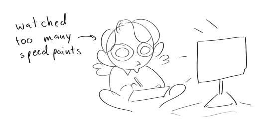
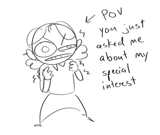
Overall I'd say my style is influenced by speedpaints I would watch when I was younger, I like analyzing how people do things and what makes something look "good" to me
I always recommend watching them because they will often have techniques you've never seen before or do things a certain way that you can try out yourself
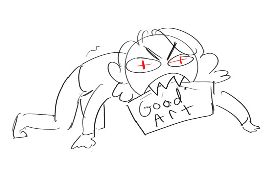
I consume good art, it feeds me
but seriously it can be super helpful when developing your own methodology, or just generally trying something new
Usually it starts with me pulling some references from artists I really admire and sort of sketching out how they do the things I like
For example 8um8le has like super good anatomy and poses so I focused on trying to replicate how they do that
venemous-qwille is super good at color and pulling focus so that's what I focused on in my study of them
In general I'd say my process is sketch -> silhouette -> color -> shading -> render
I really don't like doing lineart lol

I'd say for the sketch the most important part is using references and just kind of fudging it until it looks correct anatomically/physically
General rule of thumb is spend time on areas of interest, and keep non important areas light (like the stitching on his pants)
I don't do lineart because I think its unnecessary for most paintings I do
I naturally tend to put more time and focus on areas of interest (like hands and feet) and if you use a brush with opacity for the sketch, those areas are naturally going to be darker in the final sketch
Of course this is gonna be different for everyone but it's what works for me
Sometimes I do a really really sketchy layer underneath my sketch/lineart, just so I know where everything is going
Use thumbnails! They are great to help figure out the general layout of things and what pose I wanna do
Next is what I call the "silhouette" layer
This is super important for me cause it helps me refine the figure and make sure the pose/anatomy looks correct, also depending on what color I choose for the silhouette helps guide what colors I'm going to use on top
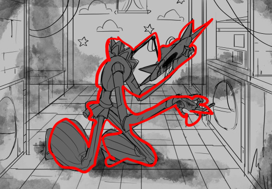
This piece is a good example of how it works. The silhouette shows me how the figure interacts with the background, how the pose looks and if its any good
The silhouette layer doesn't have to be super clean, as long as it follows the sketch decently well and shows where the figure is then its fine
I also sometimes make the silhouette layer multiple colors to help guide shading and vibe
Next is the coloring layer. I usually make this a clipping layer on top of the silhouette layer, or I change the silhouette layer to alpha lock, either way it saves me time on coloring everything in

Sometimes I am super rough with the coloring too, using like an airbrush or my fav watercolor brush just to generically block in color where I want it
Works out cause most objects have like a bounce light to them from surrounding objects, so this is sort of a cheat I use to get that effect without all the work lol
Also don't be afraid to have the lower silhouette layer shining through, having multiple colors sort of subtly shining through the piece helps lots
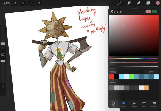
Next is the shading layer, this is usually another clipping layer, usually set to "multiply"
The colors I pick here is usually within this range, any color works, just depends on the piece and vibes.
Since this piece is set in a sunset forest I choose a more desaturated orange for the shading layer
I know there's a whole thing about multiply layer being a crutch (and it kind of it) but it is a useful tool when you just want some darker values across the piece but don't want to go through the process of color picking every single darker shade
Also in my opinion it looks better than picking a darker color and setting it to a lower opacity, idk I just think the color has more "depth"
Next is the hardest to explain, sort of the vibes layer
Usually its just a layer of more concentrated color on top of the normal color and I fudge with the settings and values until I get a result I like
Next is the longest step, is the "extra" or the render stage.
Usually I add a background before this step so that if I need to merge the figure better with the background I can
If I render with a white background but he's supposed to be in a dark forest, its going to mess with the lighting severely
Also this is when I add more "vibe" layers on top to get the figure to match the background better
Backgrounds in general I recommend checking out @/derekdomnicdsouza on instagram he's got lots of great tutorials for breaking down backgrounds simply

I'd say general rule for the rendering layer is to focus on the areas of interest and spend less time on areas you don't care about
I even blur stuff out on the edges I don't want people to see, partially to save time on fixing mistakes in areas I dont care about (oop), but mainly to help draw the eye to the areas I do want people to focus on

Theoretically parts of the background should like mesh with the characters, parrallel lines are a no no unless they are directing a viewer to look somewhere, things that are perpendicular help bring things together
tbh I'm still not the best at layout and probably need more practice, but overall this is what I like doing
Overall this is what my layer set up ends up being
Sort of a sandwich with the lineart/sketch as the "meat" lol
Color and basic shading below the sketch, clean-up and rendering on top
I like this method cause it's super flexible if I ever want to try something different or try to replicate someone's style
I can make each step less or more messy depending on the end result and can add a lineart layer if need be. Also if there's a part that is straight up not working or needs to be removed its super easy to do cause I can just paint over it on the "extras" layer, color picking from the surrounding area to get the same vibe
Generally rule of thumb for my style is: get the initial layout of colors, form and shading to look good, then the rendering should be smooth sailing
Really the best advice I can give to get better at art is to enjoy what you're doing and become very very obsessed with drawing a silly little guy
You'll eventually get very good at drawing them pfptpf
#sundrop#moondrop#long post#art tutorial#fnaf sun#fnaf moon#I draw them way too much holy guac#ask#this is for you asker#idk if anyone else is interested in this kind of stuff#i apologize for ranting lol#also me struggling to spell silhouette like 15 times
120 notes
·
View notes
Text
"An ideal Sims game would have Sims 2's gameplay mechanics, Sims 3's open world, and Sims 4's graphics!"
I absolutely despise this take, and I want to explain why. This is a very long rant and it is full of piss and vinegar directed at everything in the Sims 4. I'm gonna try to keep everything kinda professional as much as I can but I can't guarantee an unbiased opinion.
If you'll let me talk your ears off for a moment, I'd like to explain, from my own experience as an artist and a casual player, my issues with the art style and direction of The Sims 4 compared to The Sims 2. (I'm not really going to comment on 3 because I've never played it.)
I want to start off by explaining the difference between better graphics and higher resolution. The Sims 4 absolutely blows Sims 2 out of the water when it comes to textures and polygon counts on sims, no contest. But I'd argue that the graphics themselves... aren't better. They're worse, even, so much fucking worse. The biggest problems come from the stylization and the animations, in my opinion, so I'll explain what I mean.
Have you ever felt like the Sims in 4 just look... weird? Not quirky, not kinda strange, but off. Distressing. Uncanny. Whatever the fuck the kids call it nowadays. When you strip away the packs and the CC and the shaders, the sims in the base game look bad. They're very close to being human; they walk like us, talk like us, have families like us, but they don't look like us, not exactly. There's always something off about them, no matter how close you try to get. Proportions will be a bit off, or your eyelashes will be like three polygons for some fucking reason, and the jig is up. The illusion is gone.
This is one of the instances where a higher resolution and more detailed models and meshes work against you. You aren't making believe. You are beyond the point of pretending that the pixelated shapes are real clothes and bodies and faces, because at this point, they're close enough that you don't need to. There's no gap to bridge. But that doesn't necessarily mean that they're lifelike, at least, not enough to be completely human. In some ways, they're still tethered to being cartoony and plasticky and fake. Just enough to frighten you. Enough to put you off. They're not using it to their advantage anymore, and instead, it's holding them back.
When the Sims 2 came out in 2004, the developers knew that they weren't going to make a perfectly accurate life simulator. They physically couldn't render every wrinkle in the face or fold in the clothing. In some animations, things clip strangely or the facial expressions are sort of janky or there's just some form of roughness around the edges. But that's okay; your brain doesn't need a perfectly accurate representation this time. That's not what you're here for, anyway.
The Sims 4 is basically Icarus-ing itself into disaster. The entire game sacrifices style for complete realism, a goal that was unachievable ten years ago, and is unachievable now.
The Sims 2 never thought of itself as a completely realistic life sim, though. It has cartoony, low poly meshes and exaggerated proportions and wild, raunchy storylines that would never occur in real life. BECAUSE IT ISN'T REAL LIFE. And it isn't like real life, not because it's failing to be, but because it doesn't want to be!
The Sims 4 is not ever going to completely replicate human looks or interactions or dynamics. And if it's trying to, it's doing a shit job of it. That shouldn't be the goal in the first place. If I wanted to watch a lonely college student talk to himself in the mirror to try and get better at interacting with people, I'd close the computer and go look at myself. It somehow highlights the most mundane parts of life without any of the whimsy and goofiness that the earlier installments had. It takes itself too fucking seriously for its own good, and it's killing both the gameplay and the art style.
The other point I'd like to bring up is the animation. The Sims 4 allows for much more customization of both sim and environments, but at the cost of dynamic animations. How many times is that grab animation reused? How many times is the same set of animations used for sims with wildly different personalities? Your sims barely feel alive with how little they express themselves.
Now, look, I'm a digital artist. I've dabbled in animation, but only briefly, and only in 2D. I've got no clue how 3D animation works, much less how it worked 20 years ago, but I can see the passion in every single animation in the Sims 2. The more niche interactions allowed for more expressive animations than in 4. They could afford to have a distinct animation for mean sims throwing the football extra hard to be assholes, rather than every sim using the same generic football-throwing animation to save time and money. I get where they're coming from. I get the idea. But in one move, you've both made the art style stiffer and less expressive, and you've made the personalities of the sims seem meaningless. Everyone acts the same, regardless of what their moodlets or their traits say. It's hollow. It's stifled. It's a waste of potential.
But for what Sims 2 lacks in polygons, it makes up for in smaller animated details. Quality over quantity. The sims have hair physics, they open the door before they get in the car, they take utensils out of the counters when they cook, they jump on the couch and the cushions smush under their weight. When they dance, the weight is realistic, and when they smile, it tugs at every one of the few dozen shapes that make up their faces. The sims are lively. They dance and sing and love and hate just like humans, and rather than being some strange attempt at mimicry, it's almost a tribute. They were made with love. You can tell that they were drawn up and rigged and animated by a bunch of people working together, studying each other and making faces in the mirror for reference and watching their kids and neighbors and dogs and hands for reference. The sims are not human, and not trying to be, but they're taking the most human parts of us and making them their own.
You could never have a game with the Sims 4's graphics and the Sims 2's gameplay. The gameplay and graphics are inexorably connected, and the Sims 2 just has so much glorious detail baked into it, that you could never really make it work underneath the limitations of the later games. The developers of 2 knew what their limits were, and they worked tirelessly to make the game as full and complex as they could within those limits. The developers for the Sims 4 just did not have those guidelines, and thus, the drive to bend the rules was no longer there. They didn't go wild in rebellion because they were never told they couldn't in the first place. They spent the entire time chasing a goal they couldn't meet, and lost sight of what made the series fun to begin with.
It wasn't the realism you came for; you had realism already surrounding you. It was the caricature of it that made it interesting.
#sims 2#sims 4#rambling#please hear me out here#if I hear this one more time i'll explode#please#the problem is so deeply ingrained that it corrupts all it touches like an oil spill#you cant separate the graphics from the gameplay#please guys#THIS is why the sims 4 feels hollow#IT IS#IN EVERY WAY IT COULD BE#every advancement it claims to make only digs its grave further#GUYS PLEASE#CAN ANYONE HEAR ME#does this count as an essay#it felt like an essay#it's 5am
196 notes
·
View notes
Text

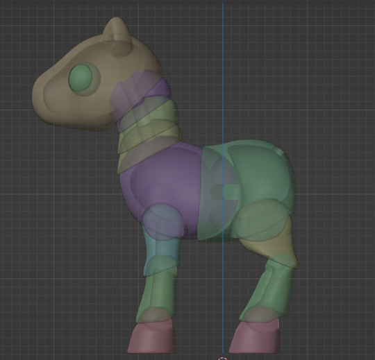
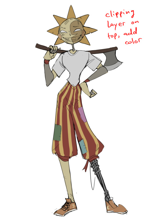
in case yall are wondering, i didn't ignore the results of that poll from a while ago. in order to not burn myself out I've been working on it in bits and pieces. Like today I reworked the h-ead and body. now everything IS articulated. the back leg isnt rendering properly in the preview, but it should be fine after restarting.


we are getting to the point where Blender has a bit of trouble here and there rendering everything.
So... things to alter, minor and major
-After doing the body articulation I realized it looks like shes wearing pants. I might reverse the way the joints go so it looks less like that, maybe try to make it organic and merge a bit with the front leg.
-Most dolls like this have some sort of removable headcap to easily tighten everything and also get the eyes in. I havent added anything like that because I dont know whether I want it to be at the back of the head or the nose
-the legs and stifle in particular look a bit thin compared to the body
-I am considering adding internal "bars" across the body to wrap the elastic over and elevate it, because I worry about the elastic getting stuck in the joints since theyre shaped different than normal BJDs. I'm not sure how animal BJD artists do that. I worry the legs miht not rest in very natural positions when the elastic is tightened.
-sculpting the hair! I'm not sure if I'll just do the same as my "test pony" or I should try a different style.

50 notes
·
View notes
Note
i hope you don't mind the ask- but do you have any advice when it comes to developing your painting skills and anything on facial anatomy? thank you :]
I don’t consider myself a very reliable artist. I’ve been fast and loose with the basics and my art has suffered for it. But two concrete advise are;
1. Remember everything is a shape.
2. Be patient.
Also it’s good to think about what you want to do. I adore realistic renders. It’s a process I enjoy greatly. I also work mostly in one layer. I enjoy painting, so to speak. It’s also what I’m best at. Lately I’ve been wanting to branch out to a more stylistic style, which is why I’ve done a lot of quicker sketches. Drawing a lot of realistic portraits helps greatly with drawing stylistically though, so the principles are the same. If you really want to practice facial anatomy I’d suggest picking references and just drawing portraits upon portraits. Not every drawing has to be a finished piece, but just sketching. Try to study the face and see the shapes and lines that build up the face. You will eventually see how the different parts sort of fit together and it will be easier and easier to draw.
I made a silly video.
When it comes to rendering and patience…. There’s really no shortcut. It will take time. But the more studies and paintings you do, the better results and the the faster you will become.
Here is the difference between 3 hours and 8 hours:


I actually prefer the one on the left. I was at my peak when I made it, and I was good at getting the proportions right faster.
This is a 15h painting in comparison:

Here is it before rendering:

Notice I block in the colors before going in with the details: that’s part of the study.
If there’s interest I can post more time lapses, but I can only add one video per post.
Here are some progress photos though, to illustrate how I use references when doing redraws and studies. I use split screen on iPad and eyeball all the shapes and color by free hand.

Maybe not the most helpful advise, but I hope it helps a bit!
My process is a bit of a mess.
34 notes
·
View notes
Note
hey akane, how do i make smooth outlines and good shading ? I'm new to digital art so I'm trying to learn
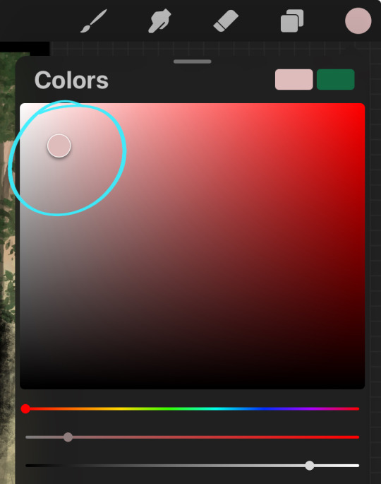
Hi there! Getting used to digital art can be tricky, but there are ways to make things easier for you. Depending on what program you're using there should be a slider option for your brushes called "stabilizer" (or something of that sort). Basically what this does is it slows down your brush speed and should give you a lot more control for smoother lines. It's a little finnicky at first, but especially when you don't have a graphic tablet, this is a life saver.
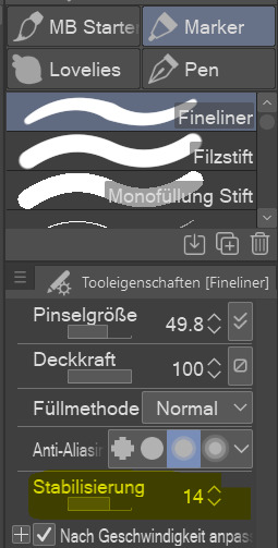

(Sorry my Clip Studio Paint is in German)) As for the shading, the simplest option is to create a new layer over your flat colors that is only for your shading. Layers can be assigned different blending modes. These are layer settings and the effects behave differently depending on the layer below, and what colors you choose to go on top. A fan favorite blending mode for shading is the "multiply" setting.

(Without blending mode on the left, and with multiply on the right)
Of course there are many MANY ways to do this. But as someone who is starting out I'd always suggest trying things out with small stuff. It is tempting to get overambitious early on (been there, done that). Over time you'll find out what rendering style you prefer. There are so many more than just cel shading! You got this!
335 notes
·
View notes
Note
What has been your favourite art piece you have drawn? And your favourite character u have drawn?
AUGH I LOVE THESE QUESTIONS BUT IM SO INDECISIVE SO IM GONNA SHOW SOME OF MY FAVORITE WORKS ACROSS DIFFERENT MEDIA

This was my first creature art for the roblox game i’m helping on called Legends of Pandora, and it taught me a LOT about how to translate colors into my style


This was my first ever painting commission, and was the first time i’ve ever used gold foil and textures for paintings. Unfortunately I kinda got scammed with it, but the experience was still pretty awesome. I think the final products still looks pretty great in their room too!

This is one of a whole group of sculptures I made for my senior show for highschool! I graduated last summer, and wanted to try something new so I decided to go all out. I did sculpts, felting, and some wire art, but this cheetah is by far my favorite.

THIS WAS MY FAVORITE ART TRADE IVE DONE SO FAR!! I pushed myself a LOT with this one, I made a rendered piece with a dynamic pose, I actually tried a background for once, I tried drawing water for once, I used layer modes like multiply and lighten and stuff, and I even used a noise screen for it! This was a fun challenge

These were from a batch of my first time using Ink and paintbrushes andAHHH I honestly loved it. If i had the money for my own supplies, I’d absolutely use this again!!

THIS WAS MY FIRST 3D ENVIRONMENT!! I MADE THIS TWO WEEKS AGO AND I AM VERY PROUD!! I modeled EVERYTHING! Except the water but I taught myself how to set up the nodes for it!
AAANNNDDD my favorite character will always be Piper or Bentley, who belong in the same universe but aren’t directly connected (Piper knows Bentleys brother instead) She’s a goofball and I adore her, and all of the characters I made around her, Bentley and Maddox. Here’s some art I found on my phone.


The last one is terrible quality but i have no clue how to find the magma page i drew it on so oops. If you click on it it helps!
Also also if you meant character as preexisting character from some sort of media haha oops, i ran out of image space. I don’t often draw characters, but it’s probably art of Hancock from Fallout, who I used to teach myself new shading methods. Can you tell I try a lot of weird/random things and end up getting happy with how they turn out?
#art#design#wings of fire#dragons#oc#uhh what else do i tag here#idk#ramble#art dump#painting#traditional art#digital art#blah blah#it’s midnight i should go to sleep#verrix speaks
50 notes
·
View notes
Text

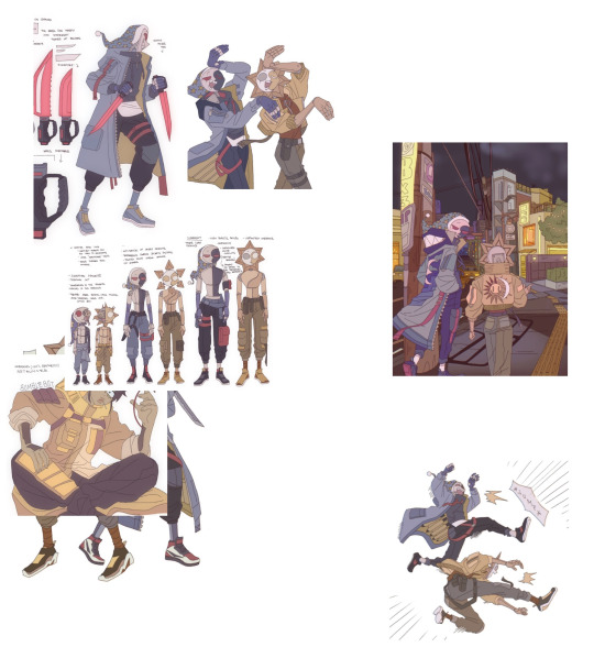
Outer Wilds - Quantum Tug-of-war Kimber
---
Kiberlite belongs to @ultragalaxy06, please check out their blogs and show some support!
---
Rendering techniques exploration.
I'm finding myself between a lot of different things right now, finding the more I pick up, the more techniques and ideas that are getting juggled, I suppose that really influenced the piece that came out in the end. I really felt the quantum nature of Kimber when I was planning the piece.
Their playful nature really stood out to me, I felt like they were the type to play tug-of-war with themselves, just to see if they could.
That's how I feel a bit inside right now, there's so much to consider, where to put shadows, how to tint them, how should you hue shift them, what shapes would they be, what sort of edges to consider, how do you make it pop, does it even work compositionally, I feel like my head is going to fall off. Think it's time to make some smaller pieces for a bit while I try all of this out lol.
I feel like what's happening is I'm kind of trying everything at once to get a feel for it, and now I can tone it back a bit with some more simple ideas now that I have an idea of where it's all headed.
Now it's all about focusing on one thing at a time. I've been really into character design right now, that area I didn't really touch at all, so it's nice to have a more rounded approach.
Anyway, rambling on this one, just a lot to think about and consider for each piece. What I'm realising is, I just don't really have a solidified approach, rules or 'style' if you will for how to render things. So this piece kind of represents the start of my journey into also taking that into consideration.
I literally sat back in the chair towards the end and said, it looks like there's no visual cohesion. I did a quick overlay to tie it together, but that's going to be a fun one to try and work out.
20 notes
·
View notes
Text
Notes on Comic Art #2: To Hatch or Not to Hatch, also some coloring stuff
One of the most influential things I've ever read on the subject of comic art is a piece Jesse Hamm wrote on Alex Toth where he talks about flatpacking.
[I discovered while writing this that Jesse Hamm passed away in 2021. He was a brilliant educator, one of the best in the history of the comics medium, and will be sorely missed.]
In the piece Hamm basically discusses how over-rendering objects usually makes them function worse as comic art. Many other people have discussed how using thicker lines for objects closer to the "camera" is good practice, how colors can seperate shapes and create depth, etc.
The question is, where does cross hatching fit into all of this? Or rather, various methods of adding more detailed rendering to artwork? I'm trying to figure this stuff out as I'm doing layouts for my comic, because I want to know the answers before I start inking the final artwork.
I try/want to have an uncluttered, clean, easily readable art style. I occasionally add hatching to my drawings, because hatching is fun, but I often feel like I've slightly ruined my artwork when I'm finished.
I've decided to look at some of the art that I feel like my own work is trying the hardest to emulate, at least philosophically, to see how other artists "weigh in" on this debate. It's important to remember that inkers embellish artwork [hence the alternate title "embellisher"], and so I'm going to try and find inkers most representative of a given penciller's intentions when applicable.
As I was working on this piece, I read Hamm Tips vol 1.1, and I discovered this diagram, which seems to relate with what I'm going to discuss later:

I think it's accurate to say that my desired approach is Uninflected/Deliberate; I think most people going for a clean and cartoonish look fall into that quadrant. Some people might describe Toth's work as being "clean", and so I should clarify that I'm talking about clean in the spirit of "lines meet neatly".
Some of the artists I'll discuss have lines that fall somewhere between being Inflected and Uninflected, and I think a lot of this comes down to inker approach. I feel like, in spirit, all of these pencillers are Uninflected, but some of the inkers use brushes, which creates a sort of middle ground. Brushes add different weights to a line, whereas crow quill nibs and pens have a uniform width. [The technical term for unweighted inked lines is "dumb line"; I believe this was coined by David Mazzucchelli.]
Let's first look at Adam Warren's work in the Dirty Pair volume Fatal But Not Serious. I'm a huge fan of how this comic looks; the flat, cel animation-style colors are very clean and easy to read. It's a very pleasant look, and I'm surprised more comics don't do this.

There is some hatching here, but it's not "serious" hatching. Just a few lines on cheeks, hands, etc. 98% of the artwork is shapes delinated entirely by a clean line and color. The convention floor panel is able to have a ton of detail without really changing the visual "rules" of the comic. An artist who does things in a more highly rendered way may've, for instance, reduced the crowd to a series of heavily shadowed figures, or colored in a single expressionistic wash to paper over things, etc.
Warren's Magical Drama Queen Roxy used a very similar approach to Fatal But Not Serious:

Let's now look at Rick Mays. I'm not a huge fan of Rick Mays, I've only actual read a single issue of a comic by him, but as I was reading Gen 13 he immediately stood out as being the best artist on that series, aside from Adam Warren himself [speaking only about issues Warren wrote]. It feels very telling that Rick Mays later did the final art for a graphic novel Warren laid out called Livewires.
These are from Gen 13 vol 2 #70:
The biggest difference between this piece has nothing to do with Warren or Mays, and everything to do with the coloring approach. I don't think the coloring here is bad, but the gradient-y colors do create a vastly different visual effect than the cel look I highlighted earlier.
The inking approach feels quite similar between the two artists; while Mays's art takes one or two steps towards realism relative to the Fatal But Not Serious stuff, texture is largely used to the same degree [with the grass and tornado being understandable exceptions]. What's interesting is that this issue has three different credited inkers; Karl Story, Rick Mays, and Jason Martin. I'm assuming this happened for deadline reasons.
I feel like I'm maybe starting to sound a little repetitive, and so I feel like I should share an issue of Gen 13 that I disliked, and then we can move to things that aren't Adam Warren-adjacent. These are from #43 and #44, with pencils by Lee Bermejo and inks by John Nyberg:
I'm not a big fan of this. The borderline chiaroscuro inking makes everything look heavily referenced, labored, and weird, and the "acting" in the comic suffers because of the over-rendered faces. It's a real shame the artwork is like this, because this two-part story is actually quite solid and would be a minor classic with better artwork.
I notice that many newer comic artists [which is to say, people who began their careers during the 90s onwards] put a lot of heavy shadows on figures in a way that feels too slavishly devoted to a certain kind of realism. I say a "certain kind" because the high contrast look of black spots being put onto a figure make the shadows way darker than they'd actually look in real life, so it almost makes the figures look dirty.
Look at comic art from the olden days and figures are largely defined by outlines/color. If a figure in an old comic has a lot of shadow on them, it's for reasons that are obvious and motivated; noir-y venetian blinds stuff, a mysterious villain being obscured, someone being underlit, or having half their face obscured, etc. There's a clear reason shadows are being used in these cases, rather than it being done to add usually unnecessary detail.
Anyways, let's look at Amanda Conner's work. Image on the left is from a Vampirella story called Fantasy Feast, and the image on the right is from Power Girl #12. Texture is used, like on the walls of the bathroom, but sparingly.
Looking at Conner's work in this context makes me realize, I don't think I've ever seen Amanda Conner's stuff colored flat [at least after she fully matured as an artist]. I don't think the more three-dimensional rendering used in any of these panels is bad, but I'm not going to be doing that kind of coloring in my book, and so it's not quite as instructive to me.
That being said, I really love Conner's style. I've noticed that Marvel and DC are increasingly using artists with styles that are broadly similar to Conner's; I've included an example below. Maybe it's because the artist below is too lazy to draw a proper background, but their work feels so much more flavorless than Conner's in comparison. I think it's because the "acting" is not as impressive, and Conner brings a fun-factor that feels completely absent in the page below.
I realize "fun" isn't always the order of the day, but this page doesn't really reflect . . . anything. It's completely bland.
Here's Kirby, who couldn't be bland if he tried. The left image is from the Young Romance collection Fantagraphics put out, and the right is from OMAC. The former is from the 40s, latter is from the 70s. [By the way, the Young Romance image is photographed from my own collection; there's no warping visible because Fantagraphics knows how to design a book].

Looking at these pieces side-by-side really challenges a lot of my assumptions about Kirby's artwork, because in some ways his artwork changed less than I previously thought it did without direct comparisons. There are some things that are more abstract about the OMAC page, like the wiggly shadows. Someone unfamiliar with Kirby might assume these were drawn by two different people, but only because 30-odd years of growth seperate these two pages.
Kirby's style, in my mind, is highly geometric and defined more so by abstract shorthand squiggles than hatching or other forms of rendering, but there actually is a fair amount of hatching on the OMAC page.
However, that OMAC page I believe was inked by Mike Royer, or at least someone using a brush. I noticed that, by sheer coincidence, almost all of the Kirby art from my first post in this series was inked by D. Bruce Barry, who didn't use a brush and also followed Kirby's pencils perhaps more literally than any other inker he ever had. In those images, it's clear that most of the hatching in Kirby's work was added by his inkers.
When Kirby did ink himself [using a brush], his style was oddly clean. He did add in hatching, but it was never particularly dense.
Anyways, I want to close this by including some Jesse Hamm quotes from his instructional PDFs:
-Simplicity is great, but often you need extra texture to seel weirdness.
-Another sign of experience is texture. The pro-level artist has learned to give different textures to grass, hair, tree bark, bushes, etc. Meanwhile, the amateur uses the same one or two shading techniques on EVERYTHING, giving it all a samey feel.
-Open spaces of black or white may be "activated" with a bit of texture. A few pebbles/ripples/etc will spur the mind to fill what's missing.
-We talk often about spotting blacks, but spotting greys (i.e., details/texture) is also crucial to clear compositions.
The lesson in the bit of Hamm writing I most often revisited, the flatpacking post, was that too much texture and rendering can make a comic exhausting to read. But reading more of his work, it turns out he had a more nuanced, texture-inclusive view of things.
What's the lesson here? Discretion.
56 notes
·
View notes
Text
Cyberchase on Pixter Console (part 2/?)
I wasn't sure that I was going to be able to make a sequel to my first post about the sole Cyberchase console game. Back then, I only had a low-quality scan of the manual. It told us plenty about the different mini-games on the cartridge. However, the screenshots were all monochrome.
But now...I have the cartridge. It's gotten a bit scuffed over the past ~20 years, but all of the kids managed to avoid hair, face, and brain damage. One thing that doesn't come across in the scan is that the white ring and white writing have a rainbow shimmer effect in person.

I have a working Pixter console to play it on.
Unfortunately, there is no video output, so any pictures or video that I make will involve pointing my phone camera at the screen. Now, I am aware that the MAME project is working on an emulator for the Pixter console, and they have confirmed that they have dumped data from the Cyberchase cartridge. However, their emulation is still in too early of a state to be able to play the game. Maybe someday, then the emulation is ready, I can give you direct video and screenshot capture from the emulation.
Anyway, while I won't be taking video for everything, I decided to get the animations used for the title screen and intro. I don't believe these have previously been made available online. Given that the Pixter is out-of-style, these animations may not have been seen in years. Now, even at the highest volume setting, the phone's microphone doesn't pick up the audio very well. Therefore, I had to record the audio separately, mute the audio from the phone's microphone, and then combine them together. Please watch to the end, as there is an animation that happens if you stay on the menu for too long.
Alright, I'm going to use screenshots to explain the rest of the game. There are other animations, and I may make a follow-up post to show them.
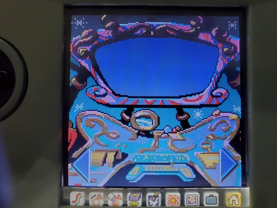
So, we get our title screen, with recreations of our kids that could be rendered on the Pixter's screen.
We get a shot of Motherboard during the intro.
Then we get our menu of five games: Poddle Sort, Bridge Break, Cyber Jam, Scramble and Drawing.
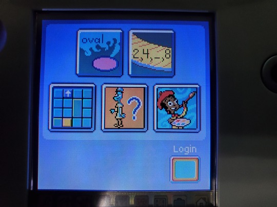
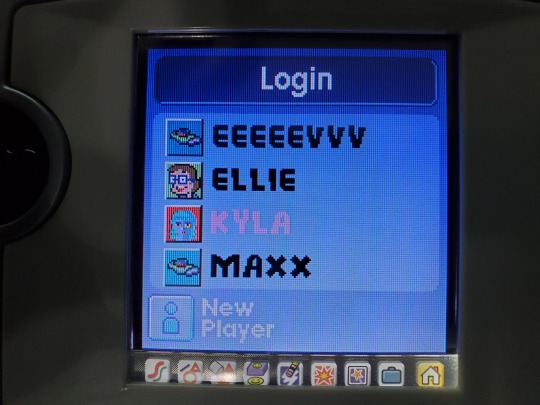
The login page is for up to four stored profiles. All of these profiles were on the cartridge when I found it. I haven't overwritten one to make a profile for myself yet. Not sure when these were last touched.
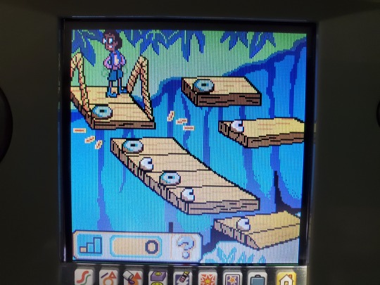
The first game, Poddle Sort, involves sorting Poddles into different trucks based on their shapes. We're trying to get them back to Poddleville, which is confusing. I thought Poddleville was the name of the entire site.
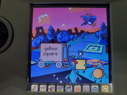
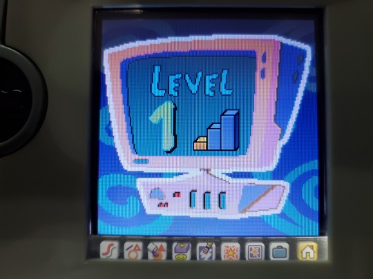
We get this cool computer graphic to tell us which level we are on. The first three games have three levels apiece, which increase the difficulty.
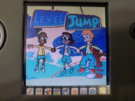
When you complete a level, you get a "level jump," which features the Cybersquad jumping.
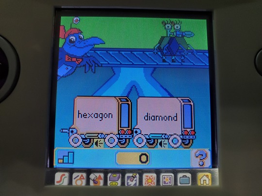
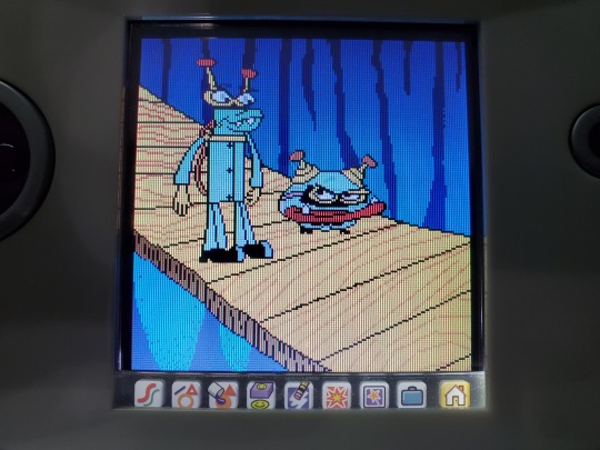
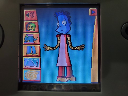
The second game, Bridge Break, features an animation of Buzz and Delete breaking a bridge.
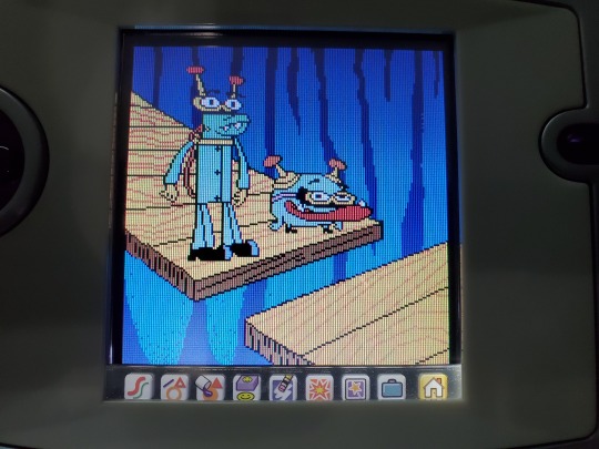
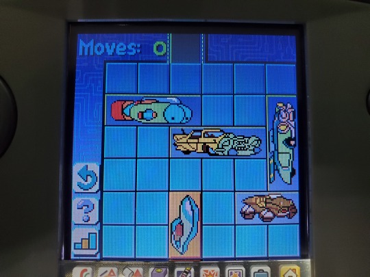
In order to repair the bridge, you need to work out the pattern to figure out which planks go where.
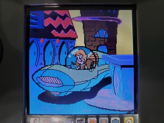
The third minigame, Cyber Jam, features an animation of Matt getting stuck in traffic. Hacker ruined the traffic lights.
This is a classic puzzle called Klotski. You need to move the other vehicles out of the way to get Matt through the exit.
The fourth minigame, Scarmble, features an animation with Jackie. She loves creating Cyber creatures, apparently. That's a bit terrifying.
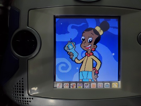
You can make a little guy. He even has a little animation when you're done.
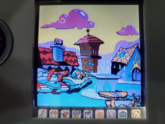
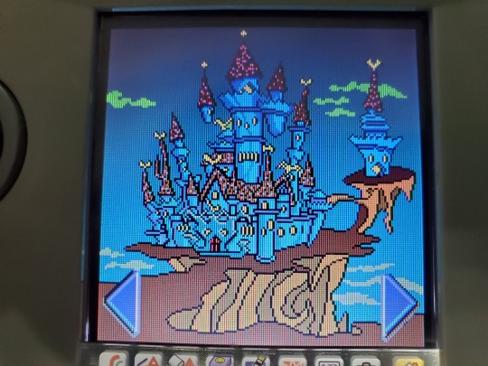
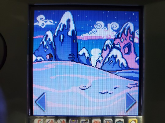
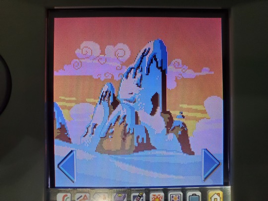
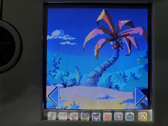
The final game, Drawing, is a simple drawing program. You get several backgrounds to choose from. They are all based on backgrounds from the show, remade to be rendered on the Pixter.
We get the Dracula's Castle from Castleblanca.
I'm not sure what site this is from. It doesn't look like anything we see on Kalamoor during "A Day at the Spa". Maybe its a shot from Solaria during "Snow Day to be Exact", after the Sunisphere was stolen and the site started to freeze over. It could be Penguia, but I doubt it, as Penguia didn't come around until "Penguin Tears" in mid-2005. Penguia would have been pretty late to be included in this game. I wonder if this was just an original piece of winter-themed art, since there weren't many winter-themed sites at the time.
We get that forest where the tall, blue bunny, one of the Lucky charms of Cyberspace, lives.
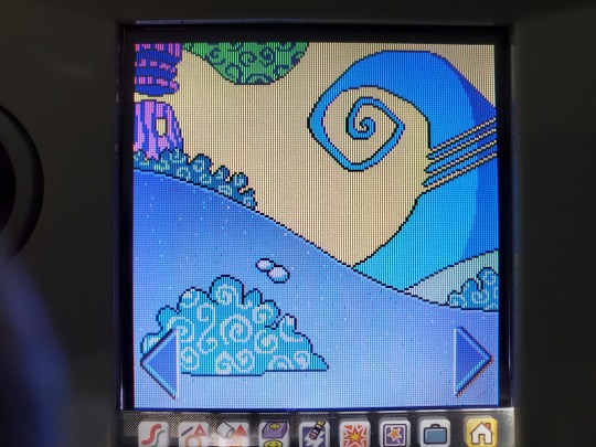
We get another place that I don't recognize.
We get this shot from Solaria.
I'm pretty sure this show it from Sensible Flats.
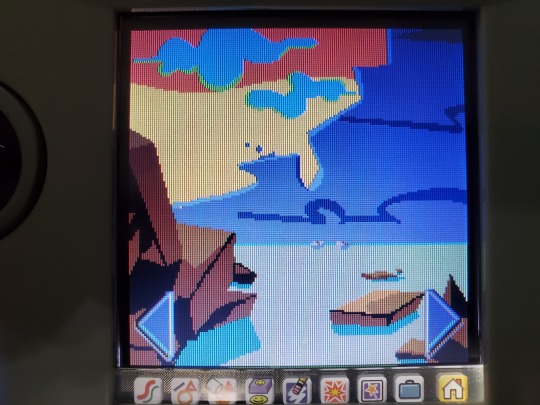
I don't immediately recognize the site from this shot.
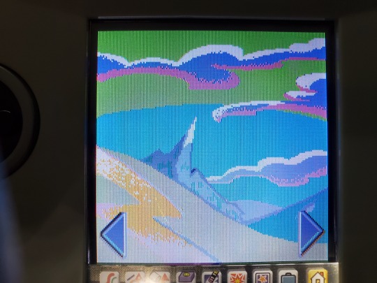
We get a shot of Motherboard's control panel and screen from Control Central.
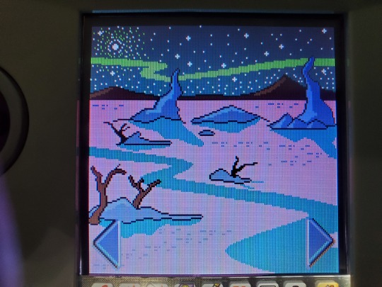
We get a shot of the Northern Frontier.
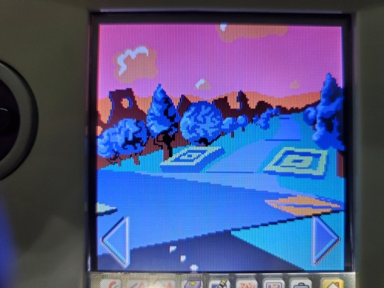
We get a shot from Poddleville.
We get the bridge from The Hacker's Grim Wreaker ship.
And finally, we get this establishing shot of Cyberspace.
That's all that I have to say about this game for right now. I may do a follow-up where I try to capture the transitional animations.
#2000s#cyberchase#nostalgia#cartoon#2000s childhood#retro gaming#handheld#pixter#fisher price#inez#matt#jackie#digit#the hacker#long post
17 notes
·
View notes