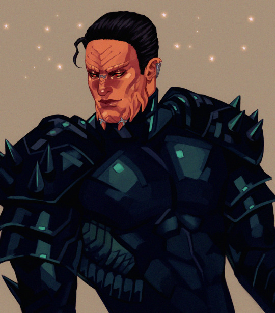
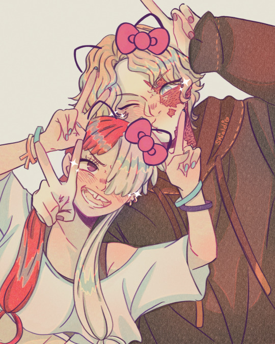
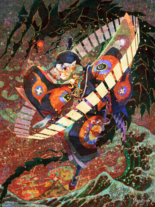
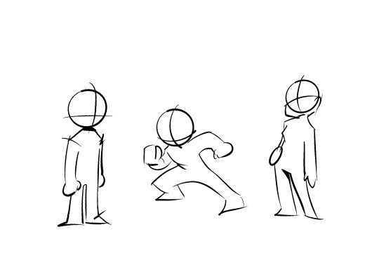
#based on a pose reference on Twitter
Explore tagged Tumblr posts
Visit Tumblr Blog
Explore Tumblr blogs with no restrictions, modern design and the best experience.
Last Seen Tumblr Blogs


Fun Fact
1,644 Tumblr posts in 1 second.
Text

"I will never leave you"
#based on a pose reference on Twitter#stoblitz#fanarts#stolas x blitz#blitzo#stolas goetia#helluva fanart#helluva boss
236 notes
·
View notes
Text
Commissions
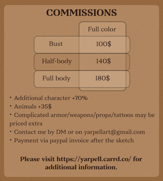
I'm opening a few commissions slots for the upcoming months; please DM/email me with the type of art you'd like to commission (bust/half-body/etc) and we can discuss when we will work on it. Basic price list:
Bust - 100USD
Half-body - 140USD
Full-body - 180USD
For additional information about the commission process as well as ToS please head to my carrd.
Contact me by DM or by email [email protected].

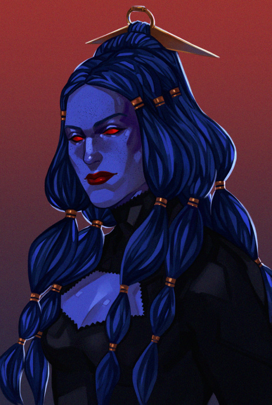
#my art#commissions open#art commisions#swtor#star wars#original character#prices of reference sheets like the one in the examples are based on the number and type of poses on it; this one was 380$#if someone follows me on my nsft twitter and thinks they want a nsft piece that's a secret hidden option and can be discussed :^)
100 notes
·
View notes
Text
You can’t convince me that these two wouldn’t be their own brand of chaotic and I love that for them !!
Base/pose reference from Dahan_illust on twitter/x
#one piece sabo#one piece uta#one piece#one piece fanart#skialdi art#;; my art#digital art#anime art#fanart#I love the idea of the siblings being different types of chaotic depending on who they’re with#so Luffy and Sabo’s level of chaos would be different that Sabo and Ace or Sabo and Uta#I’m here for it#just love them okay#ura tends to stay consistent but Sabo always looks different#I need to draw him more oohp
186 notes
·
View notes
Text

Drunk & Cried
Pose reference
( For ppl who don't know, this is not really the Casino Cups au, it's an AU of it.)
♠️ Read this AU info ♦️
*Please do not repost, copy, or trace my artwork!* Cupbros Parent's blog|Main blog| Twitter | Patreon
But the drinks I did based on it:
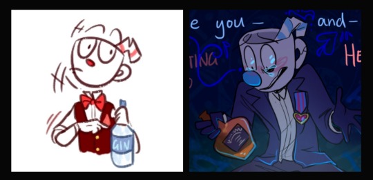

#cuphead#mugman#the legacy of inkwell isle#cuphead dont deal with the devil#cddwtd#cuphead au#PJA art
578 notes
·
View notes
Text
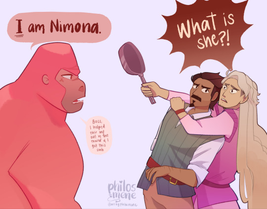
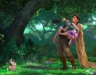
Based on Bodess_r's tangled parody on twitter 💅 I WILL NOT DRAW THE ORIGINAL KOALA POSE Ambrosius has taken Ballister's arm already pls save his back
References:
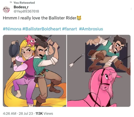
#ambrosius goldenloin#ballister boldheart#nimona#happy pride 🌈#nimona ambrosius#nimona ballister#nimona netflix#tangled#parody#nimona fanart#ballister x ambrosius#ballister blackheart
1K notes
·
View notes
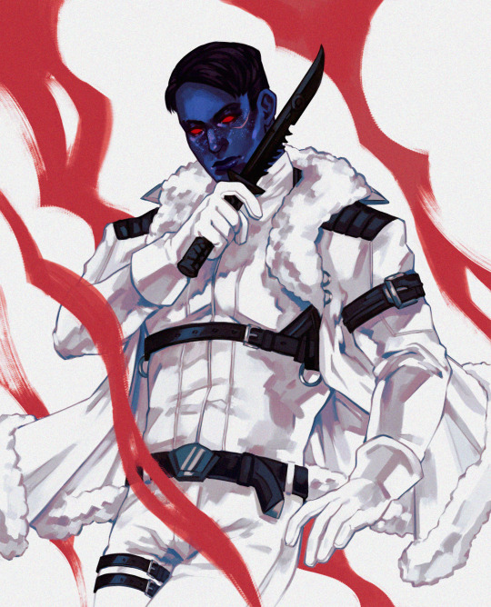
Text
There's a spicy drawing of Light down below the cut! Don't worry, Ryuk's there.

Had to draw a saucy Light based on this image/post. Happy birthday, you evil little man~. Hi, Ryuk!
Ryuk's not in this more mature version. It's just a butt.
The reference image:

Supposedly, the original was drawn by Gil Elvgren, but I cannot for the life of me find a direct image of it. The link provided goes to the BlueSky post where I first saw it. An artist there drew Lucifer Morningstar in the pose (which is very lovely, btw~) and screenshotted the Twitter post shown here, lol. I felt weird about trying to crop out the Twitter stuff to focus on the image. Trying to give credit where credit is due.
#drawn by me#my fanart#based off of a reference#Death Note#Light Yagami#Ryuk#featured as a censor!#saucy shenanigans#tw: suggestive#tw: food issues#fictional character's birthday
79 notes
·
View notes
Text

Continuing to fire on all cylinders to make this Sky 🤝Mononoke collab a reality! 🐲⚖️🌊
Process GIFs and artist commentary below the cut. ⬇️
Left: Process GIF Middle: Just the background, cos I really like how it looks! Right: Illustration without the collab logo
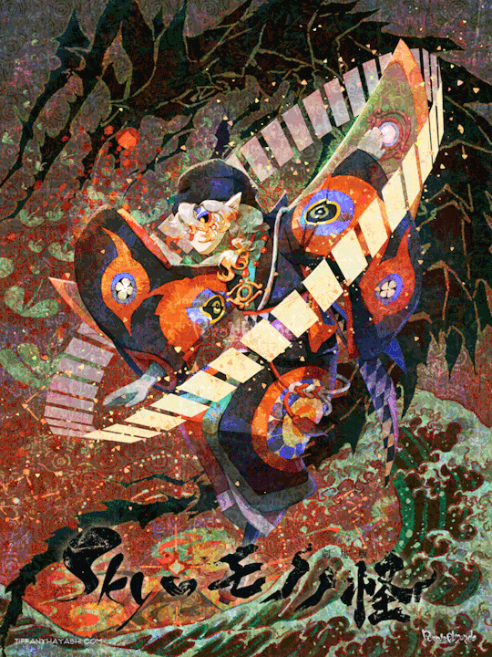
And here are my notes on my inspirations and references. There's a lot of 'em, so instead of embedding relevant images one by one I put them in a callout sheet! For accessibility, I also included transcript (with bonus ramblings) below each sheet.

Ofuda circle modeled in Google Sketchup 2017, then lightly transformed in Photoshop to flare out. I tried my best to hand-draw these, but it the results came out really clunky and stiff. I figured if Mononoke shamelessly utilizes 3D in their show, I can too!
Krill and sky kid composition roughly inspired by the Ayakashi DVD cover illustration. On the surface level, the krill's black-and-red color scheme mirrored that of the bake-neko. Not to mention, in the world of Sky, the krill would be the best fit of a mononoke-like entity. The red background is also a nod to the red skies seen during a shard eruption in Sky.
Sky kid gesture based on the Festival Spin Dancer's Tier 3 poses and the Medicine Seller's iconic pose in the Zakishiwarahi episode as inspiration. This was the idea which springboarded this illustration into existence. I wanted to do my take of the Medicine Seller's pose, but in a more dynamic manner: rotate the pose to a profile position and set the ofuda in a diagonal, flared out arrangement.
Cape inspired by tenbin design featured in the 2024 Mononoke movie. This one's an interesting one - I wanted the cape to be a stiff material that doesn't "flap" when in flight - similar to the Aurora wing capes. It ended up looking like a kite of sorts, which I'm not entirely opposed to! I haven't had the opportunity to showcase the back view of this cape design, but I envision it having some mechanical aspects to it - the "wing" which are flared out in this illustration fold in like moth wings, and a little bell is attached to the "tail" part and it jingles a little whenever the sky kid flaps!
Bandana is based on the Scaredy Cadet's hairstyle from the Season of Assembly. Mask design utilizes the 2023 Days of Style mask and the Nintendo Pack mask as bases. Pretty self-explanatory. I basically went onto the Sky wiki and found the cosmetics that most closely matched what I was looking for. Then if necessary, I went to the Office space to do photoshoots to get the appropriate camera angles for them all.
Seasonal pendant inspired by the classic Medicine Seller's necklace and the eye motif featured in the 2024 Mononoke movie. Possibly the only one-to-one homage to the classic Medicine Seller design here, but his garnet necklace was too good of a match to the seasonal pendant. A side tangent: does the new Medicine Seller possess a necklace, let alone a mirror? So far all the shots of him don't feature it. Fascinating.

Dark dragon krill anatomy references a custom figurine crafted by @/escaflowne_n07 on Twitter. Until I found this, I was honestly at a loss finding reference for this - be it on the internet or during in-game photoshoots. The lighting on the krill in-game focused on its menacing silhouette rather than its structure. And not to mention, getting a close-up shot almost always set off the dark creature's aggro. I have no idea how this guy found the references to put this model together - well done!
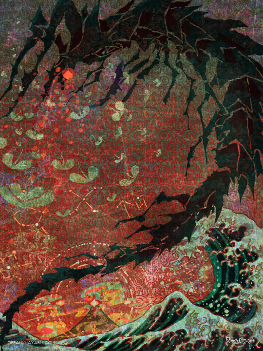
Mantas, elder constellations, and sun dog references murals in the Cave of Prophecy. Krill aside, the overall illustration was leaning a little too much towards Mononoke so I tried finding opportunities to insert more Sky into it. Added bonus is that now there's storytelling in the background: during a shard eruption, a giant krill rises from the frothing waves of dark water to hunt down a flock of mantas.
Clouds behind the sun dog reference the ones featuring heavily in the Umibozu episode. This illustration has a lot of ocean theming, so I figured this would be appropriate.
Rendering style of the background is lightly inspired by the 2007 Mononoke illustration. Mainly having a 2D inked style to contrast with the more polished render of the sky kid. Funnily enough, this was a tertiary inspiration, which lead to the discovery in the next point!
Dark water waves and sun dog composition heavily references Hokusai's "The Great Wave". The waves were modified to be bottle-green of the Golden Wasteland's dark waters. The sun dog is in the spot where Mt. Fuji is in the original composition. these were all hand-drawn by the way! I merely emulated the style of the source material. As a side note, I also borrowed the spotted sea spray rendering for the krill's red spotlight.
Background pattern taken from the ofuda design featured in the 2024 Mononoke movie poster. Mainly to add some gritty texture to the sky. I worked pretty hard to replicate this ofuda design as a high-res asset so I wanted to use it more!
#モノノ怪#mononoke 2024#mononoke 2007#kusuriuri#medicine seller#thatskygame#sky cotl#sky children of the light#thatgamecompany#thatskygame fanart#sky cotl fanart#crossover#purplealmonds#2023#🔕
518 notes
·
View notes
Text
“Damien shouldn’t be trusted, he shouldn’t stand near Angela!” — a parasocial drama in the smoshtwt community! Here’s why:
Around late April 2025, specifically on April 23rd, three prominent Twitter accounts within the Smosh fan community (each with a large following) publicly shared their opinions regarding the relationship between Angela Giarratana and Damien Haas. For privacy, their usernames will not be referenced; instead, they will be referred to as (1), (2), and (3). User (1) initiated the discussion with a tweet stating: "for the record I do not think damien wants to be with angela like that. What I do think is that he wants to be good buds with her the way Courtney/amanda/etc are and that’s why he mentions her a bunch outside of smosh videos too but diva it's not working." followed by a broken heart emoji.
This tweet generated considerable attention, with many followers responding—some interpreting it as sarcasm, while others criticized the poster for being overly parasocial. The original poster did not engage with the replies and muted the notifications instead. User (2), who is known for engaging with the “Damangela” pairing, posted: "that ~4 day span a few months ago when I tried to force myself to enjoy damangela purely out of spite for how mean everyone was being. Until I had to give up and succumb to the reality that damangela truly makes me feel like the walls are closing in around me I don’t know why” accompanied by crying emojis. User (1) responded: "the way I’m kind of the opposite now where I used to just clown on them but now I feel like a beaten-down researcher trying to desperately understand this phenomenon. Like what are you seeing that I don’t I feel like I’m being gaslit.” To which (2) replied: "see on an intellectual level I understand what people are seeing I just don’t understand how they aren’t also experiencing the dark sinister air around it. Like how does one derive positive emotions from whatever that is.” (1) then added: “I’m at the point where I’m like yeah they’re work friends and it sure looks like damien wants to be even more close with her but also how do you also not feel like the room is getting darker” These tweets began to receive wider attention, with others questioning the language used: “What do you mean the room is getting darker?” and “Dark sinister air? They’re just friendly coworkers.” sharing their confusions with the two users public discussion about the relationship. User (3) entered the conversation by replying to (2): "angela moving away from the duet in the karaoke stream really tickled my brain”
(2) responded: “that was literally the moment that made me give up I’m fucking crying” This was accompanied by a clip from a karaoke stream where Damien joins in on a duet. Angela then appears to distance herself, calling Amanda and Spencer back to the camera. (2) commented further: “genuinely I could throw up out of embarrassment it’s so… I should not have been privy to this moment.” (3) replied: “I’m pretty sure damangelas have this blocked from their memories and I don’t blame them lmfao.” At this point, the discourse took an inappropriate turn. The language used—phrases like “dark sinister” and “the room is getting darker”—to describe normal interactions between two coworkers, Damien and Angela, is disrespectful and speculative. Such comments imply that Damien's presence or behavior makes Angela uncomfortable or unsafe, which is an unfounded and harmful assumption. It is important to recognize that these individuals are real people, and making such exaggerated or parasocial claims about their friendship or professional relationship is deeply inappropriate. We are not privy to the nature of their interactions outside of work or off-camera, and suggesting that Damien poses a threat based on selective moments is unjustified and unfair.
what do you think?
39 notes
·
View notes
Text
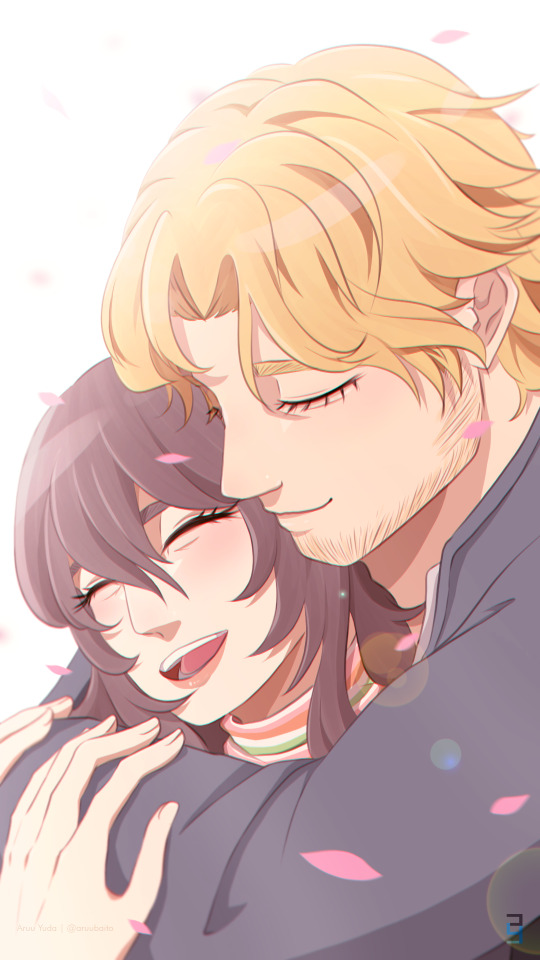
Happy hearts day! 💙🤍✨
I actually saw a reference base for this pose somewhere in the great web but I lost it and I couldn't find it anymore 🤧
The illustration process can be watched here!
[Mouthwashing: Anya, Curly]
Carrd | Ko-Fi | Facebook | Instagram | Twitter | BlueSky
#curlya#mouthwashing#mouthwashing fanart#mouthwashing curly#mouthwashing anya#wrong organ#mouthwashing game#fanart#digital art#illustration
58 notes
·
View notes
Note
TEACH US YOUR ART STYLE PLEASEEEE
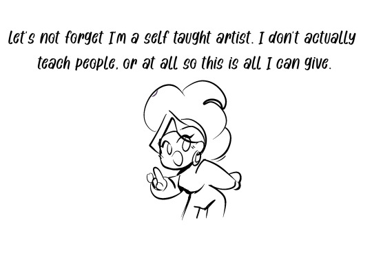
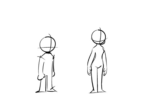
this is my basic character bases. You can use these as a reference. ALSO PLEASE THERE'S A DIFFERENCE BETWEEN USING ART AS A REFERENCE AND OUTRIGHT TRACING!!!!!

And through out my art journey, I spent most of my time doodling on sketchbooks which gave me time to work on my line art. that took like years to get to where i am and honestly i'll still look back and still hate my current art cause I'm still learning as well. I just started digital art recently so I'm still learning digital colouring! but I've seemed to conquer character design and poses. also fun fact: ALL MY LINEART ARE MY SKETCHES! I DON'T SKETCH I DO LINEART FIRST, IS THAT WRONG?
Also back to my art style, best advice I can give you is use references from other artists.
I'll give samples-
As an illustrator, I personally use poses to help portray/exaggerate my characters mood or personality alot!! I'm still learning so let's se if I improve in the next few months. If you are a beginner I really advise you to use pinterest for references.
When I draw/doodle nezha, I try to make his poses reflect his awesomeness as much as I can!! The artists who's styles heavily influenced my current style are @tysonhesse , @hocrea and richard chhoa on twitter(the lmk storyboard artist who designed the fight between wukong and nezha). Hope that helps!! thanks for asking!
63 notes
·
View notes
Text
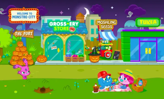
Moshi Monsters likely uses AI art
I need to talk about this. So recently Moshi Monsters' Facebook, TikTok, and Twitter accounts have recently posted this clip, and I'm going to dissect why this seems so suspicious as someone who is one of the admins in the Moshi Monsters Wiki.
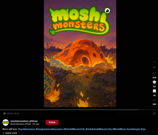
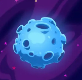
So for context. Moshi Monsters was a family friendly MMO that shut down due to Adobe Flash ending. In this image we have a bright orange asteroid hitting on the ground of Main Street at Monstro City. It seems that this is foreshadowing for a potential Moshi Monsters revival beyond their spinoff and mindfulness apps. Overall, it screams AI to me. There are too many inconsistencies that most artists wouldn't make in the final cut, too many clashing styles, and the way shading and colours are chosen is too inconsistent with the theming. Multiple AI image detection websites say that it is very likely AI generated.

I am aware that generative AI detectors are not always accurate. But for there to be multiple websites saying the same thing with high certainty is a pattern, especially when there are many inconsistent design choices in the artwork itself that is not typical in Moshi Monsters media. There is an oddly shaped figure in the background that does not know if it wants to be a collapsing building or a windmill. There are also instances of bits of the sky being unusually layered over the buildings. There are also strange parts in the background that have blurs, which is typical of AI generated art.


The destroyed sign being destroyed in half but saying "(Wel)come [linebreak] To" also doesn't make any sense. The sign is supposed to reference the "Welcome to Monstro City" sign located in Main Street. When split in half it should have read as "come to [line break] tro city".
The only things in the art that one could argue resembles past Moshi Monsters media is the asteroid and the flames themselves. Their mindfulness and meditation app known as Moshi Kids primarily has Katja Hammond creating the artwork. She has drawn bits of asteroids and planets in the app. The way the orange asteroid is shaded also resembles her colouring style. The flames in the suspected AI art also resemble how fire is depicted in the Moshi Kids app.


HOWEVER, the suspicious part is that only SOME parts of the suspected AI art resemble her art style. Katja Hammond has a background in manga art and has a distinct and colourful art style overall. Her recent Moshi Kids art uses striking and dynamic poses and angles. So either: 1. The overall art is AI generated which took different art styles from different Moshi Monsters media, including Moshi Kids. OR 2. Katja Hammond drew some aspects of the art but either her or someone else in the team added some AI touches into the background and ground-ground. Personally, based on "vibes", Katja Hammond does not strike me as someone who would willingly use generative AI art. So Was There A Response? Multiple people have also noticed that it appears AI generated. The Moshi Monsters social media manager has denied allegations but with no proof on who the artist is or any proof of progress sketches.


It is true that there is a rampant problem with people being too quick to accuse AI to real life artists with little proof. However, this recent Moshi Monsters post has too much evidence stacked against its favour. Moshi Monsters socials eventually adjusted certain parts of the logo where the horns over the "M" are symmetrical and the eye above the "i" is in a more stable position.

I want to believe that the majority of the staff is unaware that their image is likely AI generated, so I tried to also talk about it on Twitter to see if it could do anything.

It would be very disappointing if the art is truly ai generated, because Moshi Monsters has always been a franchise about art and self-expression. Players could publish their fanart in the Googenheim Art Gallery (yes, that is the name please bare with me) in the MMO. There used to be yearly art competitions where the winner would have their Moshling design be made real. The Egg Hunt spinoff app has a gallery for younger artists. I've even made art for their magazines when I was a kid!!
There are many people like myself who played games like Moshi Monsters which served as a creative outlet for us to express ourselves, and this is a franchise that means a lot to me as a past autistic special interest. One of the main reasons I still use the Moshi Kids app every night is because I love the effort put into the art and music. I want to see the Moshi staff do better. You have a wonderful team of artists, please recognise their skill and passion. (Edit: Typos)
30 notes
·
View notes
Text
NEW COMMISSIONS OPEN !
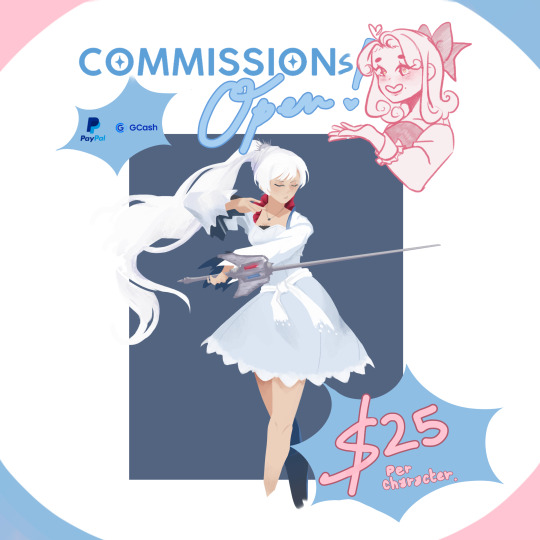
I'm finally opening up a new kind of commission!
-Full body-ish
-Rendered
-Solid Background (Additional details will incur additional $)
-Dynamic or Simple Pose
Opening up 5 to 10 slots for May to June Commissions!
Birthday month incoming woop woop! 🥳
I finally finished up commissions for April, so now I'm switching it up! If you got something you want me to draw, don't be shy! I'm pretty open to a lot of things! 💖
✧DM me if interested!
➤ 5 to 10 slots available!
➤more samples on my profile!
✧💸Payment (via GCash/PayPal)
Payment Policy is Full or 50% Upfront.
➤Base Price: $25/ 1,250 PHP (Per character)
➤Additional details (bg, etc...): $10/ 550 PHP (depends on what is asked)
✧⌛Delivery Time
➤There is no fixed deadline, delivery will depend on the current queue placement and workload.
➤Currently might take a month or so.
➤Frequent Updates will be given.
✧🟢 I Can Draw:
➤OCs
➤Fanart
➤Portraits
➤ Couples
➤ Slight Furry
➤ Slight NSFW
➤ Extremely detailed references will be done a bit more simplified.
✧🔴 I Don't Draw:
➤Heavy NSFW
➤Heavy Mecha
➤Heavy Gore
*anything else not mentioned can be up for discussion.
➤TWITTER: https://x.com/_yunyuniii
#art#digital art#artists on tumblr#digital illustration#commissions are open#fanart#art commisions#commission#sketch#rendered#rendered commission#rendering#oc artist#oc artwork#oc art#couple#couple art#RWBY#rwby fanart#weiss schnee#full body#full body commission
24 notes
·
View notes
Text
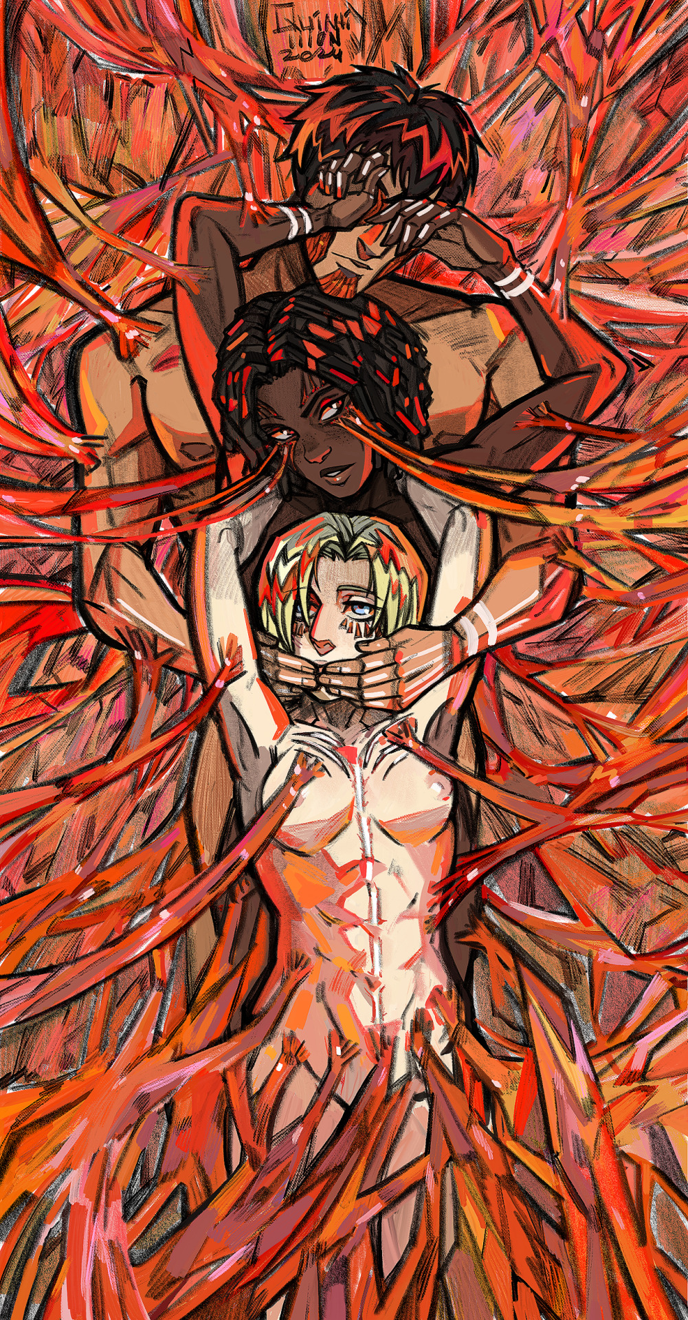
I commissioned this piece from @quintilli0n (same @ on twitter as well), he did so amazing considering my prompting skills, I was lowkey brought to tears when I first saw it. It's based on this ship from a fic I write, and it is indeed a poly-ship. The fic is a canon-divergent longfic in an AU where the history of Marley alongside the Titan powers are slightly different. Anyways, below is a bunch of yap about what I was thinking when I was drafting this to quintilli0n. I got the idea of this from the 'Three Wise Monkeys', who a lot of people know by the maxim "See no evil, hear no evil, speak no evil.". Traditionally, this saying is supposed to be for people to avoid evil thoughts/deeds, but in a lot of modern media (mostly in the Americas), it's been used in reference to turning a blind eye to something, which is what I focused on when I was making my reference image. For Annie I chose speak no evil, I found her to be the most observant of others but especially herself. When it comes to observing herself, Annie is very critical and sees herself as a monster for the things she's done, Calie (the OC) and Bertholdt help alleviate some of that but it all comes crashing down when Annie struggles with her duties as a Warrior. For the next few days Annie forces herself to commit various acts of violence in order to reaffirm her Warrior mentality and is afraid of telling any of the other Warriors about her struggles out of fear they'll see her as some sort of "other", so I gave her speak no evil because of her avoidance of speaking out her "evil" deed of struggling as a Warrior.
For Calie I chose hear no evil. If you close your eyes, you won't see anything, if you close your mouth, you won't say anything, but you can't really close your ears, and even if you have something like earbuds in a lot of the time you can still hear the outside world. Basically, unless you're deaf, you'll always hear something, yet Calie is often unbothered by the things she hears. It doesn't matter if it's a wife begging for her husband's life or her own friends' grievances with her, it goes through one ear and out of the other. It's not voluntarily or anything, like I said it isn't possible to just close your ears, it's just how she was taught to live. Even when surrounded by violence, she doesn't hear any of it, so hear no evil felt appropriate. For Bertholdt, I chose see no evil. Bertholdt is avoidant of many, many things. He is aware of this because his ears work, but he decides that hearing it is enough. Having to actually confront, actually see the problems within himself is terrifying. Seeing the atrocities he's capable of committing isn't in him, so he just keeps his eyes closed to the world and to his evils, and instead lets other people (eg. Calie and Annie) guide him through life, even though he knows they themselves are "impaired" as well. Another reason I picked the Three Wise Monkeys as inspiration for my pose references was because of the often forgotten fourth one, "Do no evil". The reasoning was a lot more simple tbh, in the fic these characters do a lot of evil that they often forget about, which ends up hurting their relationships with the other Warriors. Once again, this was made by @quintilli0n, huge thanks to him!
41 notes
·
View notes
Text
Look out! There's a Light Yagami butt below! Ryuk can't protect you!

Had to draw a saucy Light based on this image/post. Happy birthday, you evil little man~.
The reference picture:

Supposedly, the original was drawn by Gil Elvgren, but I cannot for the life of me find a direct image of it. The link provided goes to the BlueSky post where I first saw it. An artist there drew Lucifer Morningstar in the pose (which is very lovely, btw~) and screenshotted the Twitter post shown here, lol. I felt weird about trying to crop out the Twitter stuff to focus on the image. Trying to give credit where credit is due.
#drawn by me#my fanart#drawn from a reference#Death Note#Light Yagami#fictional character's birthday#saucy shenanigans#tw: suggestive pose#tw: food issues#it's just a butt but I didn't wanna give him underwear so I'd better tag this as mature lol#I almost put him in the nighty but opted for a robe. call it a compromise for not drawing his balls.#I would've posted this on Ao3 but I apparently need another image hosting site to do so. ehehe#I wonder if I put enough warnings to appease the Tumblr gods *snort*
33 notes
·
View notes
Text
Dark Souls 1 faces references Part 1: Oscar, Ricard, Solaire,
Heyyyy Dark Souls artists (all five of you who still use this website fdshfhd), I have great news for you! The curse of Dark Souls 1 (being horrendously undocumented in terms of NPC references) is over!!!

Long story short, I've seen a screenshot of Ciaran that made me question whether she actually had face data in versions of the DLC before Remastered. That started a long chain of me asking literally every person online that I could think of, with no one responding except for single Redditor redirecting me to modding community for Soulsborne, and there, out of waaaaay too many people, finally, someone was kind enough to help me out!
Their only contacts I have for reference are rayanwasalsotaken on Discord and RayanTheMad on Twitter! Yet I've only learned Rayan had a Twitter AFTER posting the screenshot dumps there, so.... 🤡 yeah that was frustrating. Twitter allow editting posts already!! They told me to be free to share the screenshots they gathered online instead of them (they said it was jarring for them to go spread images across social media and wikis. fair and valid.)! Posts will be in several parts as there are several angle shots and sometimes some explaining to do!
Oscar


Okay so, apparently, the boy does not have blue eyes! You know who does (kinda) have? RICARD!
Ricard


Well, actually not even blue, but a more dark shade of greyish green!

Nonetheless, it could be assumed blue from afar! ! And, fun fact! Whereas they look very similar, they are NOT identical!

Aside of having different eye color and Ricard's hair being more saturated (more yellow), they do have different eye shape too; Ricard's is more downturned! Ricard also has a slightly bigger nose! I guess even with limitations of NPC data of Dark Souls 1, they did try to point out the differences in vibe!
Solaire


Nothing new to see here, his screenshots are actually viral, unlike others, but here have a look anyway x) Interestingly enough, his face data changes the hairstyle in the bad ending of his questline; whereas Rayan didn't take screenshot of just that change specifically, it actually IS documented and confirmed!

(This screenshot is from different source: ( x )) I just think it is really good to know that even back in Dark Souls 1, developers bothered to add the lore appropriate changes that are not even possible to observe without datamining dhfhdsdf
Anastacia
Interestingly enough, while Anastacia uses unique model rather than player NPC base one, the data for NPC still exists in the game's files, apparently!


It is actually very convenient to have it, because her unique model does NOT have eyes texture:


At the same time, you can see that this 'unique model' appears to reuse assets from NPC data, as the model for hair is identical, and her face even has the same issue of eyebrows always being that brown color when they aren't grey. I wonder if NPC model lacked functionality intended (like NPC models weren't created to have this pose and animation), so they copy+pasted it mostly on unique asset?
Even with that, I suppose her hair is canonically more "yellow", and her player model is the only reference for her eye color.

Color of Estus Flask (the flask itself, not liquid inside of it!), appropriately enough!

Additionally, the hairbun is definitely something they've settled with even in her concept, so I suppose she holds "priority" for this hairstyle! RIP the braid though
____________________________________
Part 1: Oscar, Ricard, Solaire, Anastacia (you are here)
Part 2: Reah, Petrus, Vince, Nico, Leeroy
Part 3: Pharis/Evlana, Americus, Forest Hunter (Cleric), Beatrice, Dusk
Part 4: Shiva, Shiva's Bodyguard, Forest Hunter (Sorcerer), Forest Hunter (Thief), Forest Hunter (Bandit)
Part 5: Quelana, Jeremiah, Grana, Cut Content Character, Domhnall
Part 6: Darkmoon Knightess, Lautrec, Lautrec's Helper (Sealer), Lautrec's Helper (Warrior)
Part 7: Ingward, Kirk, Oswald, Havel, Tarkus
Part 8: Griggs, Logan, Rickert, Crystal Knight, Laurentius
Part 9: Patches, Siegmeyer, Sieglinde, Mildred, Crestfallen Knight, Crestfallen Merchant
* Shots of characters' faces datamined and provided by RayanTheMad on Twitter + rayanwasalsotaken on Discord!
* Twitter thread with the faces here: ( x )
* Data for characters Ciaran, Darkmoon Soldier (Balder) and Darkmoon Soldier (Berenike) doesn't exist and they simply copy the last face loaded, when there wasn't any loaded they use default placeholder data
#dark souls 1#oscar of astora#undead prince ricard#solaire of astora#anastacia of astora#dark souls#dark souls reference#screenshots#not art#datamined faces
33 notes
·
View notes
Note
Howdy!
I am here to talk about Viv's horrible character designs.
From an animator perspective, they suck.
Here's why
1. The characters have way too much detail
For animation, more lines equal more work. You're going to be drawing them over and over, and it just creates more stress and work for the animators.
For example, I took one of the most egregious designs in HB (Beelzebub) and simplified it to be animation friendly.
(Can't send it here but I'll probably make a post about it or something.)
2. There's too much of 1 color
WHY IS THERE SO MUCH RED??
Especially since they're in a primarily red background, they don't stand out AT ALL.
Like how am I supposed to see them if they blend in to the background??
3. I have no idea what half of them are supposed to be
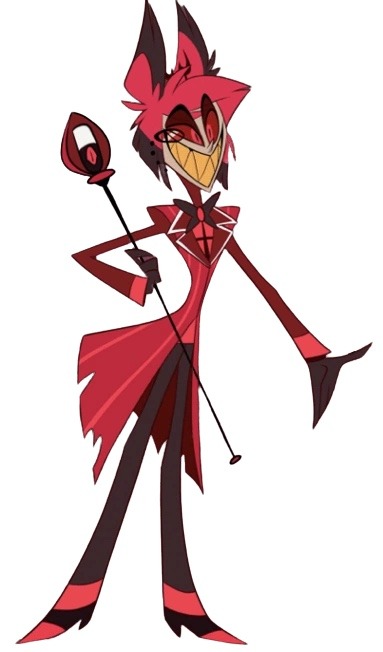
Charlie is based off a doll?
Alastor is based off of a deer?
Katie Killjoy is based off of a praying mantis?
Angel Dust is based off of a spider?
Beelzebub is supposed to be well... Beelzebub?
When designing characters, they need to be clear on what they're supposed to be! And no, explaining it on Twitter does not count.
4. The animation reference sheets are garbage
No wonder there's so much animation errors. There's no facial expression sheets, lip sync guide, nothing. It's just a 4 angle turnaround sheet where the character is in complex poses all the time.
If you Google Lackadaisy's animation reference sheets and then look at HB's, it's like night and day.
I'm more than willing to send some examples (along with the edit I did) if you want
So yeah, what are your thoughts?
These are all great points! I think you summed up the main problems very well, but I'll elaborate on each of them. I'm no expert at character design or animation by any means, but I'll do my best to explain my points!
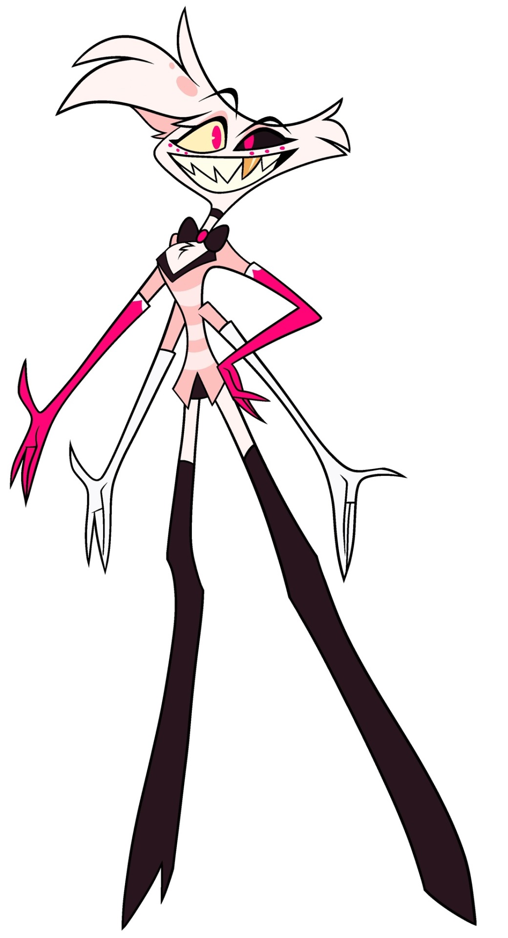
First of all, like you said, the character designs are way too complicated. Anyone who knows even the slightest amount about animation knows you want to simplify and streamline your designs as much as possible to make it easier on the animators. Vivzie is way too obsessed with her Deviantart OC lookin'-ass character designs to actually do this, even though it would seriously help to make the animation process way faster and easier. Beelzebub is seriously the best (or worst?) example of this.
I feel so bad for the poor souls who had to animate this. There are just way too many moving parts here, from her multiple arms, her wings, her markings, to her freaking lava lamp hair and tail?? It's just awful. And so many of Viv's designs suffer this problem, I could go on and on.
Like, I think it actually is a nice looking design, as a still image. Maybe not for the demon Beelzebub, but as a general furry OC, I think she's cute. But that's beside the point. I would love to see your redesign of her!
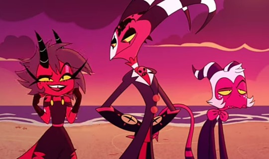
Next, the RED. So, most of the characters we see in Helluva Boss are red-skinned imps, which has been a common depiction of demons for centuries. One big problem I have is that there's little contrast in these designs. Let's look at our three main imps.
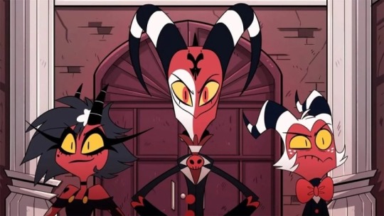
Aside from some white and yellow highlights, they're all mostly red and black. Their color palettes aren't distinct in the slightest! And, I mean, come on. Red accessories against what's almost the exact same shade of red skin? Really? It just doesn't look good. A little contrast here and there goes a long way, like... maybe make Moxxie's bowtie blue? Or Blitz's pendant green? I don't know, anything to help each character stand out, and help give them more visual intrigue.
It doesn't help that most of the backgrounds are primarily shades of red, too. Here's a few screenshots I found that really show this problem.
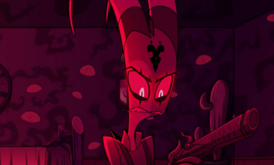
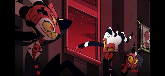
Look at all that fucking red. Like you said, there's such little color variation that the characters blend into the background. Now, to be fair, I did specifically choose these screenshots because I think they really highlight the problem, but this really is what so much of the show looks like. Granted, we do have a bit more variety in the different rings of Hell, each with their own main color, but this is still too much red, considering how much the color comprises the main characters' designs.
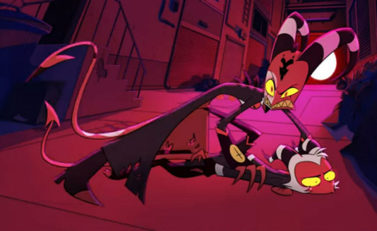
Next, like you said, Vivzie is really bad at making characters actually look like the things they're supposed to look like. Let's take Alastor as an example!
Oh boy! More red and black. So, Alastor here is supposed to be a deer. What's the first physical characteristic that comes to mind when you think of a deer?
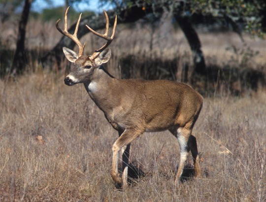
Yeah, those big, impressive antlers! So... where are his? Oh, they're those tiny little forks on his head that are almost entirely obscured by his stupid emo hair. Like, come on! Giving him bigger antlers would have made him look so much cooler and more intimidating, and it would have been a great focal point for his design! It's such a missed opportunity. (I know he has bigger antlers in his scarier "demon" form, but you still could have made these a little more impressive.) And don't even get me started on those ears... they look more like fox ears or something. Like you said, a good design shouldn't need to be explained through supplementary material. We should be able to tell what a character is supposed to be just from looking at them!
Another great example is Angel Dust, who, despite being a spider, lacks so many distinct features we associate with spiders! He only has six legs instead of eight, he doesn't have pedipalps or chelicerae, and he also lacks that big old spider booty, which I think is such a missed opportunity, considering he is supposed to be in the sex industry. He isn't even remotely shaped like a spider, he looks more like a fuzzy stick bug or something.
Part of me feels like Viv is too afraid to make her characters look unique, so she just goes with the same, skinny humanoid design for just about everything. It's such a shame, because I really do think she is a talented artist who can make some really interesting designs. But then again, she also gave us Beelzebub, so... maybe not.
As for the reference sheets, maybe I wasn't looking hard enough but I couldn't find any official ones for the main characters, so if you could send those my way I would appreciate it! Though it honestly wouldn't surprise me if they were bad. I did look up Lackadaisy's and found them pretty easily and...
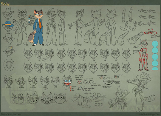
This is so freaking comprehensive and detailed, it's incredible! Look at all those poses and facial expressions!
Comparing Vivzie's works to Tracy's feels kind of unfair, since Tracy has been working on Lackadaisy for 17 years, and it really shows. This is leaps and bounds above Helluva Boss and Hazbin Hotel in quality. Rocky's design is tight; it's detailed, but not overly complicated. There isn't an obnoxious overuse of highly saturated colors, and there's such nice contrast between his fur, his eyes, suit, and tie, making his design very nice to look at. You can also tell so much about his personality and the world he lives in just from his appearance. It's such a good design, and Rocky is just one example from Lackadaisy! All of Tracy's designs are memorable and stand out from one another, unlike so many of Vivzie's characters, whose designs honestly feel interchangable.
So much thought and care has gone into Lackadaisy, and I seriously cannot wait for the full series, as well as all the other amazing indie animated series that have been coming out recently. It's sad that Helluva Boss is seen as the pinnacle of indie animation, when there are so many other series out there that are just.. better! Lackadaisy, obviously, but we've also got Digital Circus, Murder Drones, Monkey Wrench, and so many others that deserve way more appreciation than what Helluva Boss receives. And that's just from an art direction standpoint, we aren't even talking about writing. That's a whole other can of worms.
All of that being said, it's obvious that a ton of love and hard work went into Helluva Boss, and I hold absolutely nothing against the animators and artists at Spindlehorse. These poor design choices are a hallmark of Vivzie's art style, and they're simply working with what they've got. There is such wasted potential here because it feels like Vivzie is too afraid to step outside her comfort zone and design something that isn't a brightly colored, sharp-toothed twink, or skinny anthro wolf girl.
Anyways, that about wraps up my thoughts. Thanks for the ask, this was fun to delve into! And again, I'd be very interested in seeing you post your redesigns! 👀
174 notes
·
View notes