#best thumbnail software
Explore tagged Tumblr posts
Visit Tumblr Blog
Explore Tumblr blogs with no restrictions, modern design and the best experience.
Last Seen Tumblr Blogs


Fun Fact
Tumblr has 4 main sources of revenue.
Text
🎨 Best Tools for Creating Stunning Thumbnails (Online, Offline & AI-Powered)
Whether you’re a YouTuber, content creator, marketer, or designer — thumbnails are the first impression of your content. A high-quality thumbnail can drastically increase your click-through rates. Here’s a comprehensive list of the best tools for creating thumbnails, categorized into Online, Offline, and AI-powered solutions. ✅ Online Thumbnail Creation Tools Canva – Drag-and-drop templates,…
#AI thumbnail generator#AI tools for design#best thumbnail software#Canva#content creation tools#create thumbnails#design tools for creators#free thumbnail maker#GIMP#online thumbnail tools#Photopea#Photoshop#Remove.bg#social media graphics#thumbnail creator#thumbnail design tips#video marketing#YouTube thumbnails
0 notes
Text
Pro tip: if you get sick of fiddling with animation software you can always make a PowerPoint (slideshow/whatever)
It sounds dumb, but it's actually pretty straightforward to add sound (if you're doing an animatic) and have the slides auto-advance. And you can export it as an mp4
9 notes
·
View notes
Text


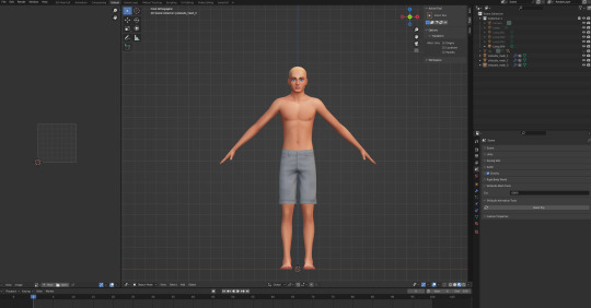
Tattoo Parlor Decor Set for The Sims 4
This set was inspired by my personal experience getting tattoos. Some of the signs are those I remember from my friend’s tattoo parlor. While I was excited about getting tattooing in the Business & Hobbies Pack, I did want more in terms of décor objects. I did my best to keep the items as low poly as possible, but be sure to check the poly counts for what your computer can handle.
The building in my screenshots is one I downloaded from the gallery and made modifications so it resembled my friend's tattoo parlor. The username is MickeySimmers and the original build is a NY Pizzeria uploaded on 4/7/25.
When appropriate, objects are available in English and Simlish versions. Simlish font credit to Franzilla: https://modthesims.info/ For new meshes made by me, textures from Blenderkit were used.
SexyIrish7 Phoenix logo credit: © Liliia Marchuk via Dreamstime.com
All items are base-game compatible.
This set includes:
· Tattoo Counter
· Supply Cabinet
· Salty Signs – Small, Medium, and Large
· Tattoo ink bottles
· Tattoo ink cups – empty ink cup and cups with ink colors
· Tattoo ink cup holder
· Sharps container – Wall-mounted and counter versions
· Tattoo Coil Machine
· Foot switch
· Power Supply
· Stencil Machine
· Autoclave
· Non-sterile Nitrile Glove Boxes
· Portfolios
· Consent form
· Tip Jar
You may view an Imgur album with 31 screenshots of the set here
Creations by SexyIrish7
DOWNLOAD for FREE: SFS
OR at Patreon*
*You must be over 18 to access my Patreon page.
These cc objects are new 3d meshes created using Blender and Sims 4 Studio.
All CC have:
*Ability to search catalog using search terms: sexyirish7 and si7
*Customized thumbnail
*******
CREDITS:
Software credits:
Sims 4 Studio v. 3.2.4.3 (Star): https://sims4studio.com
Blender 4.0: https://www.blender.org/download/
GIMP v. 2.10.34: https://www.gimp.org/
Inkscape v. 1.2: https://inkscape.org/
Thank you to the creators and moderators producing tutorials and answering questions!
*******
TOU:
Do not re-upload and claim as your own
Do not re-upload and hide behind a paywall
Mesh and Image Credits along with descriptions of each item are below:
Tattoo Counter
I was dissatisfied with the number of slots and their placement on the tattoo counter that came with the Business & Hobbies pack, so I modified EA’s The Ultimate Nightstand so that it served as a larger counter and added décor slots to it. There are a total of 3 large slots, 9 medium slots, and 27 small slots. I made some minor modifications to the EA texture for The Ultimate Nightstand but did include all 20 swatches.
Polygon Count: 162
Supply Cabinet
I have long been disappointed with the lack of deco slots in various displays. For this object, I modified EA’s Carina Dining Hutch so that it would serve as an appropriate supply cabinet. I made some minor modifications to the EA texture but did include all 9 swatches. There are a total of 2 large slots, 15 medium slots, and 140 small slots.
Polygon Count: 114
Salty Signs
There are 3 files of what I call “salty” signs. The large signs are not as salty, but I wanted to stick with my theme overall. What do I mean by salty? Well, these are signs that are not for the faint of heart and for those with a darker sense of humor. They were inspired not only by signs that I saw at my friend’s parlor, but also by things he and his colleagues would say frequently.
Large Signs: 7 designs (11 total swatches)
Medium Signs: 9 designs (18 total swatches)
Small Signs: 10 designs (20 total swatches)
Polygon Count: 4
The following were used in several textures in all three files:
Caution/Warning Sign Templates by kenshinstock via Freepik https://www.freepik.com/free-vector/blank-label-warning-caution-sticker-template-set_30903862.htm
Large Sign Image Credits:
Swatches 1-2: Original Artist Unknown. Image from https://razorbacktattoosupply.com/tattoo-studio-feel-the-burn-wrapped-canvas-graphic-art/
Swatches 3-4: Original Artist Unknown. Image from https://www.creativefabrica.com/product/funny-tattoo-artist-hourly-rate-cut-file/
Swatches 5-6: Original Artist Unknown. Image from https://www.pinterest.com/pin/tattoo-artist--218917231881445322/
Swatch 7-8:
Hands, Soap, and Ointment Icons by rawpixel.com via Freepik https://www.freepik.com/free-vector/coronavirus-prevention-icon-set-vector_30086831.htm
Do Not Touch Icon Image by Myshopsigns https://all-free-download.com/free-vector/download/18_warning_signs_47669.html
No Swimming Icon by Fitri Handayani via Vecteezyhttps://www.vecteezy.com/vector-art/51936014-no-swimming-sign-illustration
Bathtub Icon by Fitri Handayani via Vecteezy https://www.vecteezy.com/vector-art/51406319-bathroom-icon-with-bubbles-and-soap
Sun and Breeze Icons Images by Freepik https://www.freepik.com/free-vector/weather-icons-set_709126.htm
Talking on Phone Icon by Mungujakisa Edmond via Vecteezy https://www.vecteezy.com/vector-art/25410803-do-not-talk-on-mobile-cell-phone-icon-sign
Swatches 9-10: Tarot Card Images designed by Eight (Elian-James Showell) https://www.eightco.in/
Swatch 11: Original Artist Unknown. Image from https://www.amazon.com/Tattoo-Artist-Tarot-Card-Sweatshirt/dp/B0D8JBHBFZ
Medium Sign Image Credits:
Background images for Swatches 5-8 by All-Free-Download.com https://all-free-download.com/free-vector/download/advertising_sign_templates_retro_shapes_sketch_6849470.html
Swatches 1-2 and 13-14: Tattoo Gun Image from IMGBIN https://imgbin.com/png/ZNRSzcqv/tattoo-machine-tattoo-ink-tattoo-artist-png
Swatches 3-4: Original Artist Unknown. Image from https://www.amazon.ca/Artist-Tattoo-Artist-Kitchen-Vintage/dp/B0B6DRXFZN
Swatches 5-6: Tattoo Gun Image from IMGBIN https://imgbin.com/png/36i2fKAG/tattoo-machine-body-piercing-tattoo-artist-old-school-tattoo-png
Swatches 7-8: Bullhorn image by All-Free-Download.com https://all-free-download.com/free-vector/download/megaphone_312061.html
Swatches 9-10: Border by Rawpixel.com via Freepik https://www.freepik.com/free-vector/vector-set-vintage-elements_3139397.htm
Picture by EA from Business & Hobbies release video
Swatches 11-12: Cheese Grater Image by Macrovector via Freepik https://www.freepik.com/free-vector/cooking-food-icons_1530806.htm
Saw image by EA
Swatches 15-16: Images by EA
Small Sign Image Credits:
Swatches 1-2, 5-12, 19-20: Caution/Warning Sign Templates by kenshinstock via Freepik https://www.freepik.com/free-vector/blank-label-warning-caution-sticker-template-set_30903862.htm
Swatches 3-4: Tip jar image by Freepik https://www.freepik.com/free-vector/jar-background-with-hand-drawn-money_1148170.htm
Swatches 13-14: Image by Printable Designs https://free-printable-signs.com/
Swatches 15-16: Image by by Mungujakisa Edmond via Vecteezy https://www.vecteezy.com/vector-art/25410803-do-not-talk-on-mobile-cell-phone-icon-sign
Swatches 17-18: Crying Emoticon Image from CLEANPNG https://www.cleanpng.com/png-smiley-emoticon-crying-clip-art-no-whining-clipart-546524/
Tattoo Ink Bottles
Due to file sizes, I split these up into 2 separate files. One file has all of the bottles in English, and the other has all of the bottles in Simlish. I modified the EA debug glue bottle. There are a total of 24 swatches.
Polygon Count: 126
Tattoo Ink Cups
There are 2 files for this object. One is an empty ink cup. The other has all of the ink colors as different swatches. There are a total of 24 swatches for the filled ink cups. I modified the water glass object to create these items.
Empty Cup Polygon Count: 107
Filled Cup Polygon Count: 162
Tattoo Ink Cup Holder
When an artist is using a few different inks for a piece, they can sometimes use a holder for the ink cups so the cups do not get knocked over or spilled. This is an original mesh made by me. I have the object set up so that the ink cups (full or empty) will snap to the holes in the holder. Once the ink cups are in, you can move the entire holder to where you want it and the ink cups will go along. Or you can place the holder and then add the cups. While the holders I tended to see were plastic, I decided to make mine a metal version with slight ink stains.
Polygon Count: 208
Sharps Containers
I created 2 versions of sharps containers for this set. I originally was only going to create the wall-mounted one, but then decided to add the counter version of it as well. These are original meshes made by me.
Biohazard symbol is a public domain image
Wall-Mounted Sharps Container Polygon Count: 268
Counter Sharps Container Polygon Count: 106
Tattoo Coil Machine
There are different types of tattoo machines available, but I find the coil machine to be the most recognizable and therefore wanted this version in my game. This is an original mesh made by me. There are a total of 5 swatches.
Polygon Count: 640
Foot Switch
I created a foot switch to operate the tattoo machine with. This is an original mesh made by me. There are 11 swatches.
Design inspired by FK Delta Foot Switch https://www.fkirons.com/products/delta-foot-switch-cosmic-storm
Polygon Count: 57
Power Supply
For this object, I modified the EA Retro Rock of Ages Stereo mesh and texture to create the power supply. I used a few other EA textures to make adjustments to the components of the object.
Polygon Count: 336
Stencil Machine
Unless you allow your artist to freely draw on your skin before tattooing, many use a stencil machine to create the stencil so you can make sure that your tattoo is placed correctly and looks correct before beginning. This is an original mesh made by me. There are a total of 6 swatches (3 designs in English, 3 designs in Simlish).
Design inspired by Vevor Tattoo Stencil Printer https://www.vevor.com/tattoo-machines-c_12593/
Phoenix Image: © Liliia Marchuk via Dreamstime.com
Claddagh Image: http://clipart-library.com/clipart/8iGbR5bbT.htm
Wolf Image: https://freepngimg.com/png/2674-tattoo-wolf-png-image
Polygon Count: 62
Autoclave
No tattoo parlor is complete without the sterilization equipment, namely the autoclave. For this object, I modified the EA The Schmapple Micro Microwave mesh.
Design inspired by Tuttnauer Valueklave 1730 https://tuttnauer.com/us/veterinary-practices/tabletop-sterilizers/manual/valueklave-1730
Polygon Count: 346
Non-sterile Nitrile Glove Boxes
For this object, I modified EA’s Softy Brand Tissues object. There are 2 box colors available, black and gray. There are a total of 12 swatches.
Non-Sterile symbol is a public domain image
Polygon Count: 40
Portfolios
A detail that I thought was missing was a display of the tattoo artist’s work. In real shops, they can be wall displays or portfolios. I decided to make a portfolio with different tattoo designs. There are 3 swatches of different tattoos. This is an original mesh made by me.
Polygon Count: 262
Image Credits:
Swatch 1: EA
Swatch 2:
Snake and Flying Swallow Images by dgim-studio via Freepik https://www.freepik.com/free-vector/new-style-tribal-tattoo-collection_1168313.htm and https://www.freepik.com/free-vector/colorful-flying-swallow-template_8136770.htm
Colorful Old School Images by Freepik https://www.freepik.com/free-vector/old-school-funny-tattoo-collection_1165044.htm
Tribal, Achor, Ship’s Wheel, Skulls, Roses, Dice, Cards Images by Macrovector via Freepik https://www.freepik.com/free-vector/tattoo-black-white-icons-set_9398078.htm
Tribal Images by Freepik https://www.freepik.com/free-vector/new-style-tribal-tattoo-collection_1168313.htm
Swatch 3:
Colorful Images on Left Page by Freepik https://www.freepik.com/free-vector/collection-hand-drawn-decorative-tattoos_1175499.htm
Colorful Vintage Images on Right Page by Freepik https://www.freepik.com/free-vector/pack-vintage-hand-drawn-tattoos_1194571.htm
Crossed Swords, Anchor, Skulls, Scorpion Images by Macrovector via Freepik https://www.freepik.com/free-vector/attoo-studio-flat-icons-collection_4430574.htm
Consent Form
I created a consent form on a clipboard. This is only available in Simlish. I modified some EA textures to create the form. The clipboard is an original mesh made by me.
Polygon Count: 90
Tip Jar
Tipping is heavily encouraged for getting tattoos, at least in the U.S. As such, I decided I wanted to make a tip jar for my parlor. I modified the EA debug jar and some different debug simoleon meshes. The result is a tip jar with both coins and bills inside.
Polygon Count: 579
#tattoo#inked#tattoo parlor#tattoo decor#tattoo studio#sims 4#the sims 4 cc#the sims 4#sims 4 cc#ts4cc#wall decor#ts4#sims 4 custom content#tattoo shop decor#build/buy#sexyirish7#featured
82 notes
·
View notes
Text
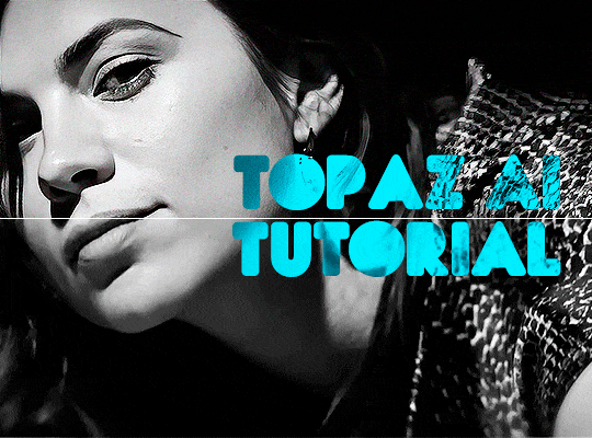
TOPAZ AI TUTORIAL
i was asked to do a tutorial for Topaz AI (a software that enhances screencaps), so here it is! :)
[tutorial under the cut]
i’m going to gif a 720p YouTube video from 12 years ago as an example. it’s the bottom of the barrel when it comes to image quality, but in the end, you won’t believe it was once so shitty. here’s the gif, without any editing:
THE APPLICATION
Topaz AI is a paid software for image enhancement. you can download it for free, but your images will have watermarks. here's a random link that has nothing to do with this tutorial.
you can use Topaz AI as a Photoshop plugin or use the software separately. i will explain both methods in this tutorial.
USING SEPARATELY
it’s the way i do it because it’s more computer-friendly, the plugin can take a toll on your PC, especially when you’re dealing with a lot of screencaps.
you first take screencaps as you normally would (if you don’t, here’s a tutorial on how to do it). open Topaz AI and select all the images. wait a while for the software to do its thing.

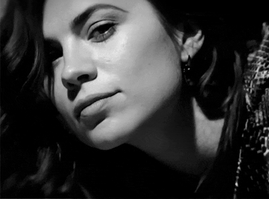
on the left, there is your screencap untouched. on the right, is your edited version. if you click the edited screencap and hold, Topaz will show you the original, that way you can compare the versions even better than just looking at them side by side.
Topaz AI will automatically recognize faces, if any, and enhance them. this can be toggled off, by disabling the “recovering faces” option in the right panel. it’s always on for me, though. you can tweak this feature by clicking on its name, the same thing for the others.
Topaz AI will also automatically upscale your screencaps if they’re too small (less than 4k). it will upscale them to achieve said 4k (in this gif’s case, the original 1280x720 screencaps became 4621x2599). i suggest that you let the app upscale those images, giving you more gif size flexibility. you can change into whatever size you want if you want something less heavy to store. don’t worry though, even these “4k screencaps” are very light megabytes-wise, so you won’t need a supercomputer. it might take a while to render all your screencaps, though, if you’re on a lower-end computer. (the folder with the edited screencaps ended up being 1GB, but that’s because it contains 123 screencaps, which is a lot of screencaps for 4k giffing).
two options won’t be automatically selected, Remove Noise and Sharpening, you will need to enable them to use them. rarely i don’t use Remove Noise, as is the best tool to remove pixelization. the Sharpening option depends on the gif, sometimes your gif will end up too over-sharpened (because of Topaz’s sharpening and later your own). that said, i used the Sharpening option on this gif.
next, select all images by clicking the “select all” button. you will notice that one of the screencaps’s thumbnails (in my case, the first one) will have small icons the others don’t have. this is the screencap you enhanced. you will need to click the dots menu, select “apply”, and then click “apply current settings to selected images”. this way, every screencap will have the same settings. if you don’t do this step, you will end up with one edited screencap and the rest will remain untouched!

all things done, click “save X images”. in the next panel, you can select where to save your new screencaps and how you want to name them. i always choose to add a topaz- prefix so i know what files i’m dealing with while giffing.
just a note: if your way of uploading screencaps to Photoshop is through image sequence, you will need to change the names of your new screencaps so PS can perceive that as a sequence (screencap1, screencap2, etc). you can do that by selecting all the screencaps in your folder, then selecting to rename just one of them and the rest will receive numbers at the end, from first to last. you don’t need to rename them one by one.
here’s the first gif again, without any editing:
without Topaz enhancement but with sharpening:

without sharpening, only the Topaz enhancement:

with Topaz enhancement and sharpening:
her skin is so smooth that it is a bit unrealistic. i could have edited that while tweaking the “Recovering Faces” option and/or the “Remove Noise” option, but i prefer to add noise (filter > noise > add noise) when necessary. this way, i don’t risk not enhancing the quality of the screencaps enough.

i added +3 of noise, making the gif look more natural. it’s a subtle difference, but i thought it necessary one in this case. you can continue to edit your gif as your heart desires.
VOILA! 🥳
AS A PHOTOSHOP PLUGIN
if you have Topaz AI installed on your computer, Photoshop will recognize it. you will find it in filter > Topaz Labs > Topaz AI. while in timeline mode, select the filter. the same Topaz AI window will pop up and you can tweak things the same way you do when you use the software separately. by using the plugin, you don’t need to upload your edited screencaps or use screencaps at all, a video clip (turned into a Smart Layer, that is) will suffice. the downside is that for every little thing you do, Topaz AI will recalculate stuff, so you practically can’t do anything without facing a waiting screen. a solution for that is to edit your gif in shitty quality as you would edit an HD one and at the very end, you enable Topaz AI. or just separately edit the screencaps following the first method.
this is it! it's a very simple software to use. the only downside is that it can take a while to render all screencaps, even with a stronger computer, but nothing too ridiculous.
any questions, feel free to contact me! :)
#*#alielook#usershreyu#userlaro#userchibi#tusernath#usersanshou#userbunneis#userzil#tuserlou#jokerous#usersnat#userdavid#userbuckleys#userbarrow#gif tutorial#completeresources#ps help#resources#*tutorials
275 notes
·
View notes
Text
Game Pile: Civilisation 1 (Video)
Watch this video on YouTube
Script and thumbnail below the fold!
In 1991, Sid Meier released Civilisation, starting off a habit that didn’t really get kicked at any point after that. It’s kind of hard to underestimate the legacy of Civilisation as a game, as a genre.
It isn’t that no game of its ilk happened before, that’s not how history works. We rarely are given hard ‘starts’ for some thing, since, you know, there were all sorts of games being made by developers and never ‘released’ to a greater market, so instead we have to kind of point to places where specific, defined, observed events based, annoyingly, on markets and capitalism.
There were probably videogames about running countries before 1991, possibly games with even more elaborate structures and systems and different ideological perspectives, and they probably had wholly text prompts and were run on some truly abysmal software system like COBOL, Decay mention for the bingo card. The thing is, most of them didn’t succeed to the degree that Civilisation did as a commercial product, and the upshot of that is, generally speaking, it’s a common way to see Civilization 1 as the ‘start’ of the genre.
That’s kind of the nature of the game, too. There’s a lot of stuff that just starts in it, around the same time. If you’re not familiar with the genre –
HOW?
but in this game you play an immortal leader overseeing a cultural identity that expands across territory, builds cities, claims land, trades, researches, all that stuff, and eventually retires at a ripe old age of 6,100 years old. The game lets you play a civilization from a small selection of appropriate civilisations, which have their own personalities and biases. Anyone not covered by these options – Romans, Russians, Babylonians, Zulus, Germans, French, Egyptians, Aztecs, Americans, Chinese, Greeks, the English, Indians, and the Mongols – is just… barbarian tribes.
This makes it a game where you can build Jerusalem, Mecca, or Brisbane, but not be any of the cultures that actually founded those cities, it’s an interesting unintentional statement. Still I’m not here to retread the old conversations about how Civilisation views the question of ‘who gets to be a civilisation’ or even ‘what does it mean to be civilised.’ That’s something other people have done, often better than me, and with a broader context of other Civilisation games.
I haven’t really played any of the other ones after the first. I’ve installed them, I’ve run a few of them, and even played through the tutorial on one of the more recent ones – five, I think? but they all bore me and I just find myself wanting to come back to this one, with its systems.
Part of it is just mental headspace. I don’t think I’ve got it in me to care too much about the specifics of each new game, the way things are almost but not quite the same. It’s just too much and I don’t really feel the absence of those things in the game I like to play. And I do not really understand what’s in this game at all – my knowledge of Civilisation 1 is pretty patchy for a game that I’ve played this much.
What is remarkable about Civilisation 1 is how it scales. When you start playing Civilisation you’ll be introduced to its wide variety of systems without a lot of clear explanation.
You start with some starting technology, some starting units, and a starting location that may or may not feature free resources, units or good terrain and you’ve got to make the life out of it. For example, I literally just before reading this learned how the corruption mechanic works, and that the enemy units were doing things I thought impossible wasn’t because I didn’t understand how to do them, but because the game just cheats.
One thing I remember from my childhood years was that developing technology seemed the best way to ‘succeed,’ because that’s what gave you military units you could use to fight and protect. I had this weird sort of hypermilitaristic state where all my cities would endlessly produce just defensive units, until most cities had sometimes six or eight military units guarding a population of 2-3. Which you might be wondering ‘what’s the point’ or, more likely, ‘what do you mean?’ because you aren’t familiar with a thirty-five year old videogame’s intricate systems.
Cities can be built, they can be defended, they can grow, and they have populations, and all of those terms bring with them a new subset of mechanical information that can be expanded on further, and which brings with it a new layer in the very specific way Civilisation, the videogame, thinks of being.
I came back to it as an adult, as a sort of idle game I can appreciate in a small window while I’m doing other things.
And y’know what?
Civilisation turns out to be a startlingly easy game to break. Not even with cheats or exploits – the game gives every single city square a certain ‘base’ advancement, meaning that making a new city will typically yield more results than letting a neighbouring city develop that square themselves. You need some limit on it because you don’t want to go haywire but the general idea is that if you control an area, you can probably get a really good output of all the stuff you want by ensuring that about a quarter of that area is covered in cities, rather than giving those cities the much larger non-competitive territory they can hypothetically control.
The upshot of this is that you can leap up the tech tree at a speed that makes even the most optimistic monkey wonder why they ever bothered throwing the bone if you’re going to mock the teleology of technological progress like that. In one such game, I had access to superconductors before we even hit the Anno Dominis, just because the game doesn’t do anything to slow you down. And why should it?
It’s just trying to let you play with emergent systems. Anything else would be ridiculous.
There’s no inherent reason any given slick of land should have another civilisation on it, meaning to meet with other cultures and engage in the hypothetically important civilisational struggle, you have to develop both transport boats and the units you want to send, and have a civilisation that appreciates that kind of military adventurism.
Even if you just want to go say hi and discover other nations and see how they’re doing, you have to construct something that can fight to do it. Even a humble settler!
And each city can only support so much in the way of units and their presence in the world, meaning that you basically have to dedicate a city or two to supporting the task of ‘finding someone else’ when all you can gain out of it is an opportunity to smush some loser underfoot. Why bother? You can wind up in the later stages of a successful civilisation, with heavily developed technology and nobody to talk to.
Then at some point, a trireme shows up to your civilisation which is developing the cure for cancer and they wonder if you’d like to learn how to do pottery. This is in cities that are doing nothing but making caravans to contribute to wonders, or building barracks that you sell, because buildings need upkeep and only change your stats in that city, and if you’re happy with only making enough and not making everything, then you suddenly don’t care about giving yourself 50% extra happiness off your temples or whatever.
Suddenly you’re left with no real reason to want to build most of anything in a city. People don’t need a coliseum to be happy, they need more people in the city doing the important job of making entertainment and doing cool art.
The solution to every problem in a city, more or less, can be developed by just growing more, and that rewards growth more than anything else, and the systems that let you grow the most are the ones that discourage you from doing anything military, but that’s okay because going and finding people to fight is a pain in the bum.
But and this is where things get really interface-weird, you can’t just sit back, develop tech, and goof around until the space race kicks in, because the way you build things in this game is to tell your cities to build them, and you do that through a menu. This menu cannot handle a game state where you have access to every piece of technology to build with, or even most of it. It splits into two menus when the menus get too busy, but if there are too many wonders and nobody’s built them… it just stops. You open up the build menu to make something – like one of those wonders – and you get a blank menu of nothing. You have been locked out of all production for the rest of the game, or until someone else develops your technology level, makes some wonders, and shrinks what appears on that menu.
But the AI opponents aren’t likely to do this because wonder building is really slow and annoying and a lot of the benefits are transitory, especially if you’re the tech powerhouse of the world learning the hell out of everything. The game rolls dice on whether it makes a wonder, and it seems to avoid making wonders that aren’t useful any more – It’s fine to have a Great Wall of Newark but if I’ve already developed gunpowder, the game’s not going to bother taking it off my plate.
The game doesn’t actually play by its own rules. It feigns playing fair in a moment to moment, looking-at-the-enemy way, but the enemy civs just behave in really banana ways that replicate the appearance of following the rules, but really don’t. They build faster, earn more, and in some cases teleport to ensure they can oppose you. That’s not even accounting for the way the game can have technologically outmatched units win in combat against seemingly much more powerful things. Ever seen a phalanx with spears destroy a stealth bomber? The math says it can happen so the game lets it happen. There, the game is willinng to ‘play fair’ with its math.
That’s the funny thing about this game, to me. All these years later, as I play it, knowing the game now, the priorities of how to play have shifted. I could make it harder by avoiding this strategy, but I like playing this way. I like how silly it makes history. I like going to space with a civilisation that doesn’t know what a king, a pot, or a horse are. I like the distorted way it works and the mid-game challenge of making wonders quickly enough to not break the end game menu.
Basically, Civilisation wasn’t a game made that ever expected you to be good at it. In fact, Civilisation was a game with a lot of expectations and assumptions about what made the world work in the ways it did, and those historical assumptions are… a thing.
Look, this is not a new observation. Back in 2002, Matthew Kapell wrote in Popular Culture Review the article ‘Civilisation and its Discontents: American Monomythic Structure as historical Simulacrum.’ It’s a short article, not really a paper proper, but it’s a good analytical examination of the game and assumptions that are evident in the text, particularly as they relate to how you tell the story of history and whose history you’re telling.
Kapell talks about the idea of CIvilisation telling a fundamentally American style of history, and not just history but mythic history. In Civilisation 1, know where the game talks about slaves across all the cultures it represents? ‘Cos I don’t, and I’ve played the game a lot.
What Kappell describes in Civilisation that many have observed since is that the vision of games Meier poplated around this time was fundamentally a treatment of the world as a frontier. There is free land and resources waiting for the person to take best advantage of it, and you do so only in competition with other equal parties trying to do the same thing. It is a place for capitalism, free enterprise, and a spread of progress.
This vision of the world as frontier, and the civilisation as a simple relationship to resources and one another does a great job of feeling like it’s about history while skirting around all the murder and genocide. That’s why monomythic: This is the story of America that America tells itself. All history becomes part of this, all of the story is not about representing the world as a place for America to be but rather a world that looks the way America needs it to for it to be correct in how it views itself. The leader of America in Civilisation 1 is Abe Lincoln, not George Washington.
I don’t even necessarily want to talk about civilisations and identity in this though. The thing that stands out to me about this game is the fascinating ideology underpinning how it thinks governments are run and the weird moments of cynical realism it expresses in that.
In this game, you can run your country under a specific system – despotism, monarchy, republic, democracy, or, supposedly, communism. These all have special rules that change the way you relate to resources in your cities.
To unlock Communism, you need to research Communism, which you get to after Democracy and Philosophy. Communism then gives you the government system of Communism, which works identically to Monarchy, but with a special, unique perk: Your people can be oppressed with military presence in the city, and, corruption is omnipresent and equal in all cities.
This is a vision of communism that is not about Communism – the description even takes time out to explain that it hasn’t improved lives for workers – but is really talking about specifically, Stalinism – and like, Stalinism of maybe the 1950s, which had a shelf life of Not Long because Stalin himself didn’t exactly rack up a high score in getting through that decade.
Oh and once you have Communism, you can unlock Labor Unions. Labor Unions let you build a tank.
That’s it.
That’s all labor unions are for, in the idea of Civilisation 1.
But let’s roll back and look at that world that breaks the game.
I’m building as many places as I can for people to live in. When populations grow, I make a new place, and immediately connect it via infrastructure. I don’t build military units at all – unless a place is being attacked, military units are bad, and I don’t want them. If I do have them, I can’t use them to go on military adventurism, sending them out to go beat people up, because that makes the people who are supporting them unhappy: my people don’t support a military exploratory force.
I don’t make money. My tax rate is zero, because I want to work on science instead. Cities grow close together so when the population gets too big, they can’t process more of the land around them, and instead are limited to only about 4-5 squares around them and everyone else in the city takes on jobs of being entertainers, artists, or scientists. And I’m not building the buildings that demand more resources to maintain; people are left with their own goods, so they can use them in their own community. If people are mad about the government for more than one turn, that government collapses.
It’s very hard to argue that the ‘democracy’ outlined here is anything like the democracy the game was sold under. Can you imagine if being mad for a year resulted in an overhaul of everything? Can you imagine being able to impact the military operations in your country and indeed, discourage them? Can you imagine a society that only turns to expressions of force when someone else comes in and takes over a city, turning it into a temple-building military outpost? Can you imagine a place without police where people vote and throw parades and have a nice time? Can you imagine a community that doesn’t know what kings are?
The irony is that the optimal strategy of this frontier strategy is a peaceful anarchism that both does no harm and takes no shit.
No, it wasn’t intentional. But that doesn’t stop it from being funny.
Check it out on PRESS.exe to see it with images and links!
50 notes
·
View notes
Text
Just a bit of a personal thought, but I have grown to deeply dislike how social media, with its' competitive algorithm and need to have a perfect performance, is often giving people a really wrong idea of what is it actually to do art.
Most times, artists are rewarded by posting only their best work: A badly performing post in places like Instagram may affect how well your next post performs. It also prefers you to post finished pictures, very presentable sketches, that kind of stuff. Which is rarely the bulk of an artists' work. Even speedpaints have been chewed down into palatable videos barely reaching 15 seconds. Tiktok and Instagram reels prefer extremely short videos, and speedpaints are mostly just few (sparkles) aesthetic (sparkles) shots of minuscule parts of the process.
And all of that, I've found, gives people this really weird image of what is art actually like. A lot of starting artists grow to make idols out of bigger ones, thinking that these people can only create perfect pieces effortlessly, but that's not how it works. Very far from that. It's mostly that artists that keep active social media and have grown to know the game, know that showing the rough parts of art is not what gets you favoured by the algorithm.
I've been thinking about this ever since I saw a video on twitter of a fairly long speedpaint for what you usually see in social media, I think 4 minutes long, where the person redrew portions of the sketch up to five times. And a lot of people mentioned it was enlightening to see the struggle, to see that even a competent artist sometimes will struggle doing a little phone cord for an hour.
I think that's something I have kind of experienced, too. I'm not a big artist, but a lot of people have mentioned they find me intimidating still, up until they know me on Discord or something and realize I'm just a goof like any other. Up until I mention a face refused to work for 2 hours and I gave up, or how I randomly keep learning new basic functionalities in my drawing software of choice. And I think that's crucial to share too: Art is not a linear road! It isn't a smooth trip! You'll fail again and again and sometimes will end up going back to a previous point, then take another path. Sometimes you render a whole drawing and decide it looks bad so you start over. Sometimes you realize the lines came out wonky as hell and end up redoing it. Sometimes you gave a character 6 fingers or forgot people have eyebrows. It happens! And it's part of what making art is!
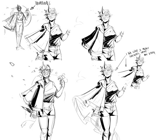
I mentioned this on Twitter- I rarely have visible proof of these struggles, but for an Artfight drawing (where I am trying to be speedy), I struggled with a cloak. For long. I made a thumbnail, I made a sketch, realized the cloak didn't work out, so I redrew it over and over again. I deleted most of the discarded sketches, but here's a few of the things that survived.
And like, I'm tired of not talking about this! I'm sad that people think they're failing because their art process isn't as smooth as it could be! So, yeah: I guess rant over, but I just have been thinking about this a bunch lately. If you'd like, do please feel free to reblog or share in replies any similar situations, struggles and flops. I think it could help people to realize how this is actually just a natural part of the process.
113 notes
·
View notes
Note
hello! you've probably been asked these before, but i'm here to ask how long it typically takes for you to make animatics, if you have any tips, preferred methods, and what you use? i saw your funger animatic and it looks absolutely gorgeous! i love all the detail that's jam-packed into the art and story telling, so i'm curious about your animatic process.
sorry if this is a lot! no need to answer if you don't want to. i love your stuff and i wish you well!
Hi! I don't mind answering some questions!
First things first, I'm not a professional storyboards artist. I've done a few things for some youtube channels. I wouldn't call myself an expert. This is to say that my method of doing things might not the best for people who actually work in the industry.
Most of the time I work in Storyboard pro 7. But honestly, any editing software works as long as it can handle pictures and audio. For the disco elysium animatic I only used clip studio paint and some random editing program called Camtasia. It worked alright but it takes a bit longer to finish stuff since storyboard pro is more streamlined. My go-to method right not is to draw the backgrounds in clip studio and the characters and editing in storyboard pro. That way, I get the best of both worlds.
The funger animatic took about 2 and a half weeks to make. It usually takes longer, but the song wasn't that long so that saved me a lot of time. But as another example, my disco elysium animatic took +3 months. So it really depends. I did work longer on each frame for that one tho, so idk. On average, it takes me about 2 months. But that number keeps going up since my expectations of myself keep rising.
Anyhow! I'll be bringing up my fear and hunger animatic as an example of my process.

My animatics usually start out having the ugliest thumbnails known to man. It does let me experiment with framing and timing, which is absolutely crucial. I do not recommend that people start refining frames without having planned out things beforehand.
After that, I just save every thumbnail and import it to storyboard pro. I just scale it up to the current canvas size. Then I just line up every frame with the audio. It is a little bit tedious but you gotta do what you gotta do.
After that, I begin to draw the backgrounds in clip studio. I do the same thing as in storyboard pro and just size the thumbnail up. And then I just sketch over that! Technically, I could have drawn the backgrounds in storyboard pro. But their brushes are pretty uggo so I prefer to not do that :)


As dumb as it might sound, it kind of stresses me out when my storyboards aren't "pretty". Which is pretty stupid since storyboards are literally made only to be a guide for what an animation should be. so in actuality, it's alright if they're kinda crusty. But since I never intend to animate my animatics I find it nice to spend more time on each frame. Which is sorta stupid because I'm shooting myself in the foot by working so long on every frame...
Either way, after that, I import the new backgrounds into storyboard pro and begin to draw the characters. Technically I could draw them in clip studio as well. But its faster to draw them in story board pro and it also allows me to do some semi-animated things and work faster. So, after a lot of experimenting, clip studio backgrounds and storyboard pro characters is the way to go for me!
And just to note. This animatic might have only taken about 2 and a half weeks. Which sounds pretty good. But when it comes to animatics I can become a real workaholic if im inspired enough. So every day after school I would sit non stop working on this from the second I got home to when it was time to sleep. As well as every second of the weekend after I was done with my chores. So that is to say I work pretty fast and persistently, which i know is not healthy or realistic. So take my timing with a grain of salt.
But that's kinda my process. I just draw backgrounds and draw characters until the thing is done.
If I had to give any advice, I would say it's important to have fun when making animatics as a hobby. When I make an animatic, it's because I personally want to see that animatic, and if other people like it, that is a plus! If you're excited about an idea, it'll be a lot easier to add fun details and soul into it.
But yeah that's it. I can't really come up with anything else to say. I hope I gave some good insight!
#storyboard#animatic#storyboard pro#boarding#tips#thumbnail#don't really know what to tag this as dkgdfkg
188 notes
·
View notes
Text
LETS STOP GATEKEEPING
I didn't use all those, it's just all the info i could gather
My patreon (free)|Discord
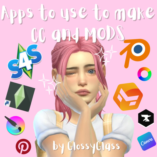
Apps to use to make CC's:
sims 4 studio (must)
canva (to make thumbnails and stuff, can be also any other program but it works best for me)
Krita/ibispaint or other drawing/photo editing software (that's where most of the work happens in making tattoo's/recoloring and stuff)
sims 4 manager (to make loading screens, here again canva comes handy, and pinterest of course)
Pinterest (to look for inspo/patterns)
Blender (to make 3d objects)
Marvelous Designer (to make clothes, not free unfortunately>:( )
Gshade/ReShade (to make reshades for the game)
Apps to use to make MODS:
Mod Constructor V5 (AN ABSOLUTE MUST IF YOU DON'T KNOW PROGRAMMING LIKE ME)
Sims 4 Studio (again, a must especially if you want to translate it or smt)
PyCharm (To my knowledge python is a really handy language that can enable you to make mods!)
Good to have:
mods that show you corrupted mods and CC's in the game(and if yours is not one of them)
CurseForge (for the same reason, it shows you which files are corrupted)
reddit (handy to ask for help there)
discords for ts4 creators, where u can ask 4 advice!
If i'll remember/see something else I'll let you know!!!
#the sims 4#ts4#sims 4#the sims custom content#ts4 custom content#ts4 simblr#ts4cc#ts4 cc#ts4 cc download
80 notes
·
View notes
Note
what’s your painting process?
THIS IS A HARD QUESTION! Because I am a lil chaotic in my personal work. My best personal pieces can vary wildly from me painting randomy shapes in black and white and slowly turning it into something by getting more and more detailed in every pass at it, like I did here:

To an almost completely 3D render with a paint over, like I did here:
Or anything in between those to processes that you can imagine, tbh, I've probably tried that as well. BUT, I'll tell you what I've been doing lately in my professional stuff to keep the quality and style a lil less all over the place.
Step 1: Plan a pose and lighting in Daz 3D.
The models I usually use for this are modified Victoria 9 and Michael 9 because those are the most anatomically correct. But you can totally just use the free Genesis 9 or Genesis 8 models that come packaged with the free software and it souldn't really give you any issues.
Step 2: Posterize your refrence until it's 3 Values, then use that a reference to create a 3 value thumbnail, planning the arrangement of element in your painting and the lighting, midtone, and shadow colours.
Step 3: Create a duplicate of the thumbnail and apply a black and white filter. Put the original thumbnail in a seperate window or on a reference board or something to look at, so you don't stray too far from the points of contrast and lighting in that. Define your hard and sharp edges in the black and white painting, using your favourite hard edged painting brush and your favourite soft smudging tool. then fil in the values that exist in between your 3 key values. You can usually find these correct in-between values by eye drop selecting from the gradient in your newly softened edges.
Step 4: Detail and paint until your black and white painting looks like it would be a passable greyscale painting by your own standard. This one is hard to give specific instructions on how I detail because I just look at things I dont like and fix them until the things I don’t like are minimal.
Step 4: Add base colours using gradient maps, colour balance, selective colour, or curves. If you don't know which out of these is your favourite method for colouring greyscale, I encourage experimenting. Sometimes I myself use different methods even withing the same painting, because they all have their lil quirks of how they work and the colour results.

Step 5: Render. This one is, again, hard to discribe as it's mostly just looking at things you don't like and fixing them until you're happy.
Step 6: Add lighting effects. Here you can see I added bloom, jittered the hue in the shadow and light affected areas to be warmer or cooler, added glare to the glass, and then, dust particles being hit by the light, a VERY transparent colour dodge layer where the light is coming down from an off screen chandelier, then since all these lighting effects washed the character in the dress out too much, I went in with a softlight layer and a low opacity brush to do colour correction.
Step 7: Post processing. Add a noise layer, smart sharpened the image, added a high pass filter on overlay and set it to 20% yada yada now if one were to print the full res it would look nice.

And that's basically the process right now. But if you ask me again in a month I'm probably going to have changed the way I do things again because I'm always developing the process more and more as I go. I hope this answered some questions for people, was informative, or in any way helped.
#digital art process#digital art#illustation#digital painting#3d art#ask answered#answered#ask#my inbox is always open!
12 notes
·
View notes
Note
Do you have any tips/useful information for people who want to start making audio rps?
(Also love ur content sm!!! Mitch is the most lovable little guy)
Aw thank you so much! Love him too!
This is a great question, had to think about it for a bit;
If you want to dabble with making audios, feel free to start off with public scripts! I think there's subreddits like ASMR script haven (IIRC?) that has public scripts that can be filled by anyone. Just be sure to read the author's conditions carefully i.e. credit, terms of use, what can be changed etc. Right at the start I recorded a public script to try and get started, it's a great way to just jump right into making something to learn the ropes of it without also first having to write an entire script for it too. Filling public scripts is a fantastic way to start off, however I reckon writing your own stories is a major part of the fun!
You don't need an expensive mic, but audio quality is a very important factor. Do some test recordings and listen back to them (with headphones!) and see how it sounds. This is especially important for whispered scenes (DO NOT get too close to the mic or breathe on it!) or loud scenes (DO NOT peak the mic!). If your mic has a gain / input dial, play with that before recording! Just start with mono to begin with, play with stereo if your mic supports it after you become familiar with it. Aim for your recording to be no louder than -6db at the highest, if you can keep your voice roughly between like -20 and -6 that tends to sound reasonably natural.
Do your best to eliminate external sounds! If you have AC or anything like that on, turn it off. I have to shut down my main PC and record with only my editing Mac on because the PC fans are much louder and my mic is very sensitive! There'll pretty much always be background fuzz, some mics will just have some, but try to make your room as quiet as you can. Your software may have some background noise removal tools, I use filters for that (expensive so I can't recommend them), but DO NOT use the noise removal tool in Audacity! It's terrible!
Speaking of, Audacity is decent to get started with. It's good basic recording software, plus multiplatform. For a while I preferred recording on Windows with Audiodope, also very simple, plus I liked that it asks me whether I wanted to record in mono or stereo first in case I forget to switch, I currently record on Mac with ocenaudio which does the same, while Audacity won't ask, you have to go into settings. Anyway Audacity is okay to start with for editing, it's free, but from what I understand it's a "destructive" editing software in that after you make a change like adding a filter, you can't then go back in and change it other than just undoing, which I really don't like, plus changing the timing of things looks fiddly. I don't know what to recommend to move up from, I've heard good stuff about Reaper but it looks very complicated. Avoid Adobe unless you have a free subscription from somewhere else. I edit entirely in Final Cut Pro so I can't recommend that unless you're on Mac, plus it's my old work software and expensive! If you need sound effects, I use freesound.org, there are other great free resources as well, but make sure you check each individual sound effect's license before use.
Once you've edited the audio and want to turn it into a video, I've heard good stuff about Da Vinci Resolve and Kden Live, both are free! Make a video canvas of 1920 x 1080, FPS doesn't especially matter if you only have a still thumbnail, 25 or 30 is fine, and render it out as a h264 mp4 if you're not sure what to select! Good compression for internet video, good for streaming. Try to record and export your audio as wav if you have enough space, wav is uncompressed audio so it maintains full quality but they can get large.
I also make my thumbnails in-edit but you may want to use external software like Gimp to make them. Avoid getting random stuff of google especially anime boys / girls, and definitely don't ever use an artist's stuff without asking for permission + giving proper credit. Using pre-built generators like Picrew is totally fine, just be sure to credit where you got it from, but 100% avoid AI generators, obviously. Be careful with Adobe stock images, apparently there's AI slop in there too. You don't need art for audios though, they're a nice to have bonus, but many of my most viewed videos have no art at all. If you need background images, I like unsplash.com because it has a free license! Read over it yourself but basically you're able to use pretty much any image they have in your videos!
Just jump in and try making something small, never start with your magnum opus! I started with the introverted incubus character because I'm a very shy person myself, it was an easier role to get started with! If you want to start writing your own scripts too there's a lot we could talk about there as well, just try to picture the scene from the perspective of the listener, what they may be thinking or feeling at any given moment, not just the perspective of the character you're going to be playing!
This was a lot and I don't think I covered much, I hope some of it helps though!!
49 notes
·
View notes
Text

Doom Stones is a horror visual novel/adventure game created with RPG Maker 2000. The game style is inspired from Charon/Nekofuji Kaoru.
Yuuka, a shy and softspoken girl, loses herself when her best friend Souta passes away. One day, she's given a chance to redo the night his life was taken. Perhaps this time, she'll save him.
This is an authentic serious charon-esque game following the formula, presented by me.
⚠️ Before venturing into any of my works, please heed my disclaimer/rules;; I don't want obstructive people engaging with me or my content.

⚠️Disclaimer ⚠️
⚠️This game contains violent and grotesque depictions, as well as dark themes. Please do not play the game if you are sensitive to this type of material. ⚠️
⚠️Rating: 17+ ⚠️
⚠️Separate fiction from reality + Separate art from the artist -- I do not condone any dark content/themes depicted in my works. Any works done in fiction should not be adapted to real life. ⚠️
Download
❖ Download link
❖ Mirror link
RPG Maker 2000 RTP is required for the game to run. Download link here and in the readme file.
(Chrome or windows may block usage of these programs, but these are safe to ignore.)
Platform and Troubleshooting
The game's engine only works for windows, but EasyRPG can used in it's place. May not be perfect. Instructions in the readme file.
Further troubleshooting instructions are in the readme file. Expect possible errors or the game never running at all, since RPG Maker 2000 is outdated software.
Gameplay Notes
❖ The game is a horror adventure rpg with 8 endings in total. A spoiler-free guide to the different endings is in the readme. (Video Walkthrough here)
Usage Notes
Do not edit, repost, or sell assets from the game without permission!!
Fanworks and videos of the content are allowed, but do not directly use assets from the game to make them. (YT Thumbnails are fine, but modifying the game to post or claim assets as your own is not.)
My email is here, and in the readme for comments and concerns. Please only contact me if there are mild errors such as spelling. Do not contact me regarding troubleshooting errors. Go through the readme instructions, but expect that the game might not work, since RPG Maker 2000 is outdated.
♡ Games Masterlist
♡ Blog (with extra game info)
Screenshots


#yandere#yandere oc#male yandere#rpg maker 2000#rpg maker horror#rpg horror#tw dark content#tw dark themes#charon games#charon#gamestuff#rpggamestuff
80 notes
·
View notes
Text
so i had a project idea, inspired by DeArrow and my annoyances with e621's search syntax
as many of you probably know, e621's tagging is kinda.. transphobic (refer to the TWYS Policy), to put it very mildly
and on top of that, i find the search syntax inadequate at best (give me my blooming boolean operations!) --
so my first thought when thinking about all that was, well, why not run my own bloody image board; i tend to just make my own damn software if i dislike something anyways
but like you can see how that's a horrible idea, it'd need tebibytes of storage, and moderating what is essentially a furry porn site sounds like a sisyphean nightmare
additionally, e621 has the critical mass problem of for example youtube; people won't switch because it's where all the artwork is, a new site will have next to nothing for a long time --
which leads me to the actual idea, inspired by DeArrow, which is a browser extension that un-clickbaitifies youtube titles and thumbnails
what if instead of running the whole image board, i ran a crowdsourced alternate search and tagging backend?
that'd only need maybe gibibytes of storage which costs next to nothing, and even moderation can in some part be crowdsourced with a vote system, since actual content moderation is handled by e621 already, and the actual artwork is drawn from an existing big platform so building critical userbase mass is much simpler
and all the backend would need to do is run a database with a search system that maps artwork IDs to sets of tags, which the frontend injects in place of e621's own search interface and tag listing; that's light enough that even a like 5-10€ VPS might handle that
alternatively, it could have a dedicated frontend, doesn't matter really --
as for the tagging, there's even a very trivial solution to the transphobia problem
like 97.3% of searches are for appearance rather than canon gender, so just use trait-based tagging (yes i was inspired by Rust lmao)
instead of tagging a character 'female' because they have tits and you can't see what's between their legs, just tag them 'has_breasts', that's most likely what someone is actually looking for anyways
and if gender tags are to be a thing at all, base those on canon gender, or don't include them if that's not known --
anyway guess it's coding time
might make my trainspotting tool first though, idk
8 notes
·
View notes
Text
VtM AMV The First (aka my rough draft figuring out how to make an amv) Song: Little Dark Age by MGMT Art: by me (Hyracia) Software: Krita (for the art), CapCut (for the stitching-together) Content Notice: Blood, abusive relationships, PG-13 sexual themes, horror. Topical focus on how VtM as a setting handles ghoul-domitor bonds, and how even monsters become very fond of the things that belong to them.
Notes before you listen: -Yes, the screen is completely dark to start; the images show up around the time the lyrics do. -I made this, somehow, in like… 8 days from first thumbnails to finished product. and that's with not all evenings being the super best for working on it. Still not sure how I did that.
#vampire the masquerade#vtm#lasombra#gangrel#tzimisce#hyra art#amv#vtm marie#vtm sigurd#vtm norm#vtm tosk#vtm jones#vtm rose#vtm charles#vtm kip#vtm sebastian#vtm the doll#vtm amber mask#if only briefly#hyra amv
15 notes
·
View notes
Note
If you don’t mind me asking, how do you make your icons?

i don't mind at all!! i'm always glad to help!! i use photoshop, so what works for me might not work for you if you're using different software. although, as long as you're using something with Layer Mask, Clipping Mask, and Stroke functions, it should be fine.
what you need is a transparent icon mask, a background (a simple pattern or pride flag works best for me) and a transparent image of the character.


set your pattern layer above your icon mask layer, and set it as a clipping mask. (in photoshop, right click on the pattern layer, and "create clipping mask")
bring in the character, scale and position them as you'd like. then, optionally but recommended, add a "stroke" outline to both your character and the icon mask. (in photoshop, right click the layer, this is under blending options.)


select the "inner bounds" of your icon mask, i usually do this by using the magic wand tool on the icon mask layer. then, on your image layer, use your selection to make a vector mask (on ps, click the "vector mask" symbol here.)


you should end up with something like this! click on the layer mask thumbnail (the white shape with the black background), get a white pen, and colour in white over any extra parts you want to "pop out". (colour in black does the opposite, it's useful if you want to "erase" or clean up.)


and there ya go! icons! there's a couple other things you can do, like adding adjustment layers to filter the image or change the colours, but i'm not sure if that's possible in all softwares, and it's far from necessary.


27 notes
·
View notes
Text
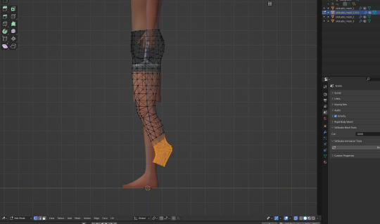
How to make regular TS4 clothing compatible with DigiLegs: PART 1
This tutorial assumes you're converting for my digitigrade mesh used in my DigiLegs and werewolf override, but it should also apply to any other funky-shaped legs you might want to do this with. Useful either if you want your digitigrade sim to be able to wear a piece of vanilla maxis clothing, or for converting cc (please get permission from the creator where applicable before doing so, especially if they make their own meshes).
I'll do my best to make this tutorial accessible to relative beginners, but I'm assuming that you already have some basic blender knowledge. If you don't, there are a lot of good tutorials that explain its clusterfuck of an interface better than I could, so I recommend finding a few of those and familiarizing yourself with the software before you continue.
You'll need Sims 4 Studio, blender, and potentially an image editor like Gimp or Clip Studio Paint (anything that can handle transparency) depending on the clothing.
This first part will cover shorts and anything else that ends above the knee (along with some extra s4s stuff like category settings and CAS thumbnails that I do to make them look better and behave properly in-game); next section will cover long loose pants which is a somewhat different process, as well as cuffed pants, skintight leggings, and other things that might require some heavier editing and altering of the shadow map, UV, and textures.
Getting Started
Base meshes are available for download here. Please don't reupload them unaltered, and don't alter the edited part of the leg mesh (knees down, basically) or it may mess up their ability to match up seamlessly with other digitigrade parts. The most effective way to use them is to append them to the project you're working on and frankenstein them onto your mesh as needed rather than modifying the blend files themselves, especially if you're making WW parts since these don't include Turbodriver's rig.
Mesh Editing For Shorts
Shorts, miniskirts, and anything else that ends above the knee are great because you don't need to do much, if any, actual sculpting, and once you know how it's relatively quick to do.
To start, export the mesh for the shorts you want to convert the same way you did the legs, all LODs. If you're converting cc, it's possible the original creator won't have made proper LODs (some don't because it's incredibly tedious, but it's good practice and improves visuals and performance in-game), and if that's the case you might want to make some LODs, but I won't tell you how to live your life.
For this, I'll be using these base game vanilla shorts, since I need to convert them anyway. Because when I think of satyrs, obviously I think of khaki shorts.
Yeah.
Append the digitigrade mesh via File>Append. navigate to where you put the legs, pick the mesh you want (make sure the one you're importing is the same LOD and frame as the mesh you're altering), select the object folder, and import s4studio_mesh_1.
You'll end up with a situation that looks something like this. Do not be alarmed.

I don't know why it imports these things along with the mesh (there's a non-zero chance someone will yell at me for doing it wrong and it's not supposed to be like that) but in my experience you don't need any of it, so deselect the mesh and delete everything else that imported.
At this point, to make things easier on yourself, you'll want to hit numpad 3 for orthographic side view, set viewport shading to solid, and hit alt+Z to toggle x-ray view.
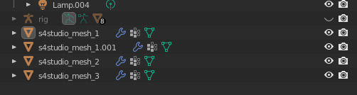
Take note of how many objects make up your mesh. For most maxis shorts (and probably a lot of cc ones) there are three that divide up the legs, and it's important that you maintain that number and don't remove/replace any of them, otherwise the mesh will be broken once you import it to S4S. It's finicky like that.
Select the digitigrade legs and go into edit mode, then select everything up to here:
Separate this bit into a new object (P>Selection), then go back to object mode. Select the separated lower leg bit you just made, then SHIFT+select the lowest piece of the vanilla leg (select them IN THAT ORDER, very important), and hit ctrl+J to join them into one object. Go to edit mode for the newly joined leg bits, and delete the vanilla part, leaving only the lower piece of the digitigrade leg. If you've done everything right up to now, your mesh list will still look like this.
or whatever it looked like when you started, plus the one appended mesh.
Now go back to the main digitigrade mesh and select up to here:

separate it and repeat the process you just did, replacing the next leg segment up.
Now go into the topmost part of the vanilla shorts, and select only the leg part and delete it (it's almost always detached from the shorts in vanilla clothes and very easy to select, but with cc this might be a mixed bag and could take more time/effort to do). At this point you should have only the digitigrade leg and the shorts themselves.
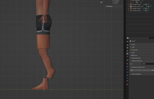
You now want to go back to the uppermost section of the digitigrade mesh and delete most of the top part of it, trimming it down so that the leg ends just inside the shorts.
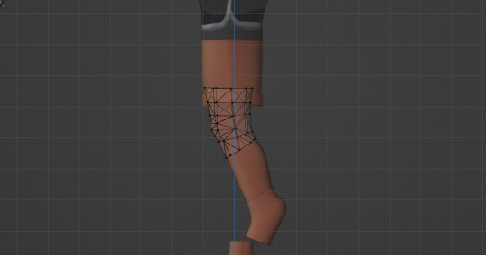
For a lot of shorts and skirts, especially shorter ones, this is all you'll have to do, but in this case I'm going to move those very top/front vertices back a tiny bit, just to make sure there won't be any clipping during animations. I also like to switch viewport shading back to material preview mode at this point to make it easier to see if there are any bits poking through that shouldn't be.

At this point you join the upper legs and shorts like you did with the other two segments (again selecting the digitigrade mesh first and the vanilla shorts second) and by the end your objects list should be back to this:

Now you're done, you can save and import to S4S. the digitigrade legs are already weight painted and have their UVs set up and everything so you don't need to do anything more to them, they'll just work, and as long as you don't edit the mesh or uvs they should blend seamlessly with all the hooves/paws just like the naked leg.
Now do the same thing for the other three LODs. Maybe while singing a sea shanty to stave off the tedium (personally I like listening to podcasts while I do batches of these, it's kind of like knitting for people who love eye strain take breaks from your computer, kids).
S4S Categories/Thumbnails
The three main things you want to do with any digitigrade conversion are disable it for random, restrict opposite frame, and uncheck all occults. That should prevent any broken leg situations. Don't forget to apply to all swatches any time you make a change (I say this because I forget about 30% of the time and end up having to go back and fix it).
At this point, you don't have to do anything more. The clothes will function as they should in-game. If you want nicer looking thumbnails though, and you have the digitigrade werewolves override, there's one more thing I like to do.
Make sure all the thumbnails are blank and check only the werewolf occult in the categories tab, then save and load up the game. Find the clothing you just made in CAS (it will probably show up by default on werewolves of whichever gender you made it for) and cycle through all the swatches to generate new thumbnails that look like this:
instead of this:
Once all the thumbnails are generated, exit the game and export them all (if some of them appear blank, restart S4S and they'll usually show up), uncheck the werewolf occult, clear the thumbnails again, and re-import the werewolf ones. This ensures they won't randomly switch back to the human ones. And it's way faster and easier than making your own custom thumbnails with screenshots and cropping/editing, which is important if you're doing a large amount of these things.
And voilà, you've got your own DigiLeg-compatible clothes. I'll be updating the tutorials as needed for clarity/any information I forgot to include, so please message me if something doesn't make sense or I need to go into more detail on something, and I'll edit it with more/better info. I also entirely learned this through trial and error, so if there's a better way to do any of it that you happen to know, tell me that too, this is just the best way I've worked out to do it.
75 notes
·
View notes
Text
I figured I should show some quick comm/intro presentation cards, now that the bluebird app is having issues.
I meant to upload this yesterday, but for some reason Tumblr didn't let me.
Please share and reblog around as that helps me far more than just a like. If you're so kind, please recommend me to people.

Sketch style is best suited for silly doodles, quick character studies, comic pages or even character design, which I've done plenty.
This style is quick and dirty, meant to be done rather fast, loose and experimental.
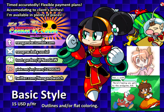
Basic style ranges from outlining to flat coloring and shading, basically a step above sketch in quality, best suited for quick renders or when you're making an asset that does at least need a bit of color.

All-Out means I do everything in my power to make the piece stand out, best suited for major graphical assets (such as stream layouts, live2D pieces, profile pictures and emoticons) or full on posters, thumbnails or character renders.
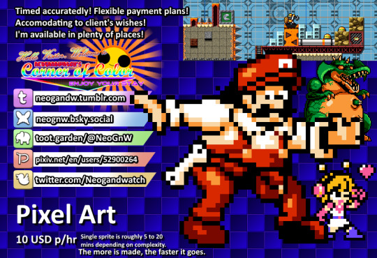
A brand new style I've been practicing a lot lately, the pixel art tier includes tilesets, single sprites, animations or even whole sprite sheets (as I've done multiple Make a Good MegaMan Level costumes, if you want a reference there).
Making a sprite sheet can be time consuming, but the more is done, the easier and faster it is to put together as it gives me chance to iterate on previous sprites to make new ones.
On the subject of time: all work is timed with software and screenshotted as evidence of work is provided, the final price is decided upon a rounding of how many hours it takes to make the piece multiplied by the tier cost.
Ex: 1 hour to make an All Out Emote, would be 20, 30 minutes would be 10, 1 hour and 30 minutes would be 25.
On the subject of flexible payments: not all of it has to be paid on a single go, if the price is too high, a payment plan can be discussed and adjusted to the needs of the client. Once its paid in full, the piece is provided, if its multiple pieces in one go, the pieces are provided as they are paid.
Other notes:
- The initial pitch sketch is not timed, its on me until the idea is decided upon, at which point the timer begins.
- Error and corrections are also not timed, I'll do the fix ups without adding to the timer.
- Evidence of work will be provided periodically.
- The usual restrictions apply: no political, overtly violent or erotic content will be drawn.
- I'm down for drawing whatever otherwise (stream assets, personal drawings, attempting specific art styles, etc.) but I reserve the right to refuse a work for whatever reason I deem fit (for instance: modifying someone else's work without permission).
- Number of characters, backgrounds or size does not affect pricing, only the time it takes to make them.
- I'll strive to be as transparent and ethical as possible with the process. So bear with me there.
#commission open#independent artist#open commissions#commissions#pixel art#sprite art#art commissions
11 notes
·
View notes