#css frame around an image
Explore tagged Tumblr posts
Visit Tumblr Blog
Explore Tumblr blogs with no restrictions, modern design and the best experience.
Last Seen Tumblr Blogs


Fun Fact
Post activity is at the highest at 4:00 pm EDT; notes peak at 10:00 pm EDT.
Text
CSS Frame Around an Image
#css frame around an image#css tricks#css effects#css#css tutorial#html css#frontenddevelopment#css animation examples#codenewbies#html5 css3#pure css animation
2 notes
·
View notes
Text
To Be Hero X theory time
Disclaimer: I'm watching To Be Hero X in Japanese because it was the automatic option for the site I'm watching on. Because of this, anime-specific information will be using Japanese casting and English subtitles paired with the Japanese dubbing.
Okay so I never do this but I've become a deranged, obsessive fangirl who has been overanalysing everything for the past week and I have a major theory I need the world to hear before the second episode airs so it's apparent down the line that I'm either absolutely delusional, a giga genius, or some sort of mix of the two. There's only one episode so far and I want my 4D chess to pay off so I need as little canon evidence to go off of as possible to be more impressive.
I have more than one theory, but I'm going to focus on my biggest one. If you don't want to be spoiled or don't want to do a lot of reading, stop here. This post will be long.
Without further ado, my theory:
Ghostblade is the original Nice. The very first one to ever exist.
We know from episode 1 that anyone can replace a hero so long as people believe in them. Because no one was aware of Nice's suicide, everyone believed that Lin Ling, with his hair styled and painted white, was the real Nice. Thus, he became the real Nice. His hair became naturally white, his eyes turned blue, and his voice adjusted to sound like the former Nice's. Knowing this, it makes sense that even the Nice who killed himself probably wasn't the first Nice. Possibly not even the second or the third or even the tenth. There's a chance that a lot of former-Nices have existed.
After watching episode 1, I was desperate for more content which led me to this Tumblr post with character sheets for the top 10 heroes. When looking through each profile, I noticed something that felt way too strange to be just a coincidence: 4/10 of them, Nice included, have white hair, and all of those white-haired characters are 180cm tall. There's no way that's just a coincidence, right? So I ended up thinking about it more and more. I watched all of the character concept and character story movies (which I will henceforth refer to as CC and CS respectively) to look for more information and, before I knew it, I became a crazy theorist. My theories center around the white-haired heroes, but almost all of what I've thought of so far is exclusively about Nice and Ghostblade.
I saw the following promotional image that pictures the ten heroes focused on during the series.

Aside from the white hair and heights, I took particular notice of how Nice and Ghostblade look awfully similar in this image. This was when things really spiraled out of control for me.

Like dude, come on. Their hairstyle in particular is practically the same. It even parts on the same side.
Ghostblade's Character Concept and Character Story Movies
So I watched every character's CCs and CSs, but I really watched Ghostblades after coming up with this theory—and when I say I watched them, I mean I studied them. I analysed every frame I could, over and over. In doing so, I either became completely delusional or I found some very compelling evidence to support my theory that Ghostblade is the original Nice. I'm not sure how best to explain everything, so I'm just going to run through the videos themselves and do my best.
At the beginning of Ghostblade's CS, it shows him as a child—twelve years old, to be precise—in a dreary room with a mysterious man preparing to perform a surgical procedure on him. We're shown various screens with medical information on them. The text on these screens read:
“The cerebrum is not only the center of senses and voluntary movements, but also the center of mental activities such as memory and judgement. The cerebrum consists of two cerebral hemispheres connected by the corpus collosum, and the connection by the corpus collosum plays an important role in the signal transmission and interaction between the two cerebral hemispheres."
and
"The parietal lobe is located between the central sulcus and parieto-occipital sulcus, above the outer fissure, and contains the motor center that issues motor commands to the [...] somatosensory cortex [...] which are involved in processing [...] sensations such as touch, pressure, and pain, and are responsible for the sensory [...]"
All other text is unfortunately either unimportant or too blurry to read.


Using the text from these images, we can essentially determine that the surgeon was operating on twelve-year-old Ghostblade in an attempt to alter his voluntary movements, memory, judgement, sensations such as touch, pressure, and pain, and probably a lot more we aren't able to see.
Following this, we have a scene of Ghostblade standing in front of a mirror in what appears to be a restroom with smiley faces painted on the stall doors behind him. He takes a knife to the mirror and carves the Chinese character for “smile” before inspecting his teeth, leading us to believe the surgeon operated on them as well as his brain. But his teeth are perfect. Nothing is wrong with them. This means that the surgeon was probably correcting a flaw so that Ghostblade would have a better smile, hence the encouragement to smile with smiley faces painted on the walls.


So it seems to be the case that, whoever this surgeon is or whoever he's working for—whoever ordered these procedures to be conducted on twelve-year-old Ghostblade—was trying to make him a perfect person who's always shining a charming smile. Doesn't that sound familiar?

OH YEAH. IT'S HIM. "Mr. Perfect" a.k.a. Nice.
So, if Ghostblade's upbringing was an effort to turn him into the OG Nice, what other evidence is there for this? What are his parallels to Nice's character? How would Ghostblade fit into the Nice backstory? Don't worry, I've got you covered. Let's switch over to Ghostblade's CC for a bit. It's considerably shorter, but contains valuable insights.
It starts with Ghostblade in some sort of open structure where a field of what looks to be daisies is blossoming and moonlight is spilling through. There's a bit of action, but the sequence of scenes that follow paint a grim picture. First, Ghostblade raises a hand. which transitions into the hand of a man (presumably him) and a woman in wedding attire with the groom slipping a ring onto the bride's finger.


Afterward, Ghostblade is looking up at the moon as its light engulfs him and it enters what appears to be a sequence of memories and daydreams where he's holding out his hand as the scenery changes. It cycles from the current moment

to the image of a girl's hand in his,

rain collecting on his palm,

his bloodied hand in the room of a child,

and his dirty/scratched up hand clenching into a fist above rubble where a single flower grows.

After the sequence, it returns to the flower field where Ghostblade is reaching out to the moon as what appears to be blood splatters begin to obscure the image.

That's basically it in terms of the visuals for his CC. The only thing left to mention is his theme song, because the lyrics are very notably about love which seems bizarre for a character who appears so dark, mysterious, and badass. The lyrics (chopped for the CC) are as follows:
And even if I have to start again It's all because of you If you don't know it by now My love for you will grow Know that this is true
So, what sort of story does his CC seem to tell? I think a good place to start is the flower field. The flowers appear to be daisies. If we assume they were deliberately selected, then if we look at flower language, in most cultures daisies apparently represent innocence, purity, loyal love, cheerfulness, childbirth, and new beginnings. Which lines up a lot with what I've observed so far! Ghostblade wears prayer beads around his wrist, so I'm assuming he's probably a religious man. That could easily align with ideals of purity and innocence. Loyal love/loyalty and love could obviously refer to a lover. Cheerfulness ties back to all the smiley faces and encouragement to smile. Childbirth is rather straightforward and will be relevant in a moment, and new beginnings... we'll come back to that in a bit, but for now, the lyric "and even if I have to start again" sort of speaks for itself.
To me, it seems to be a story about about a future Ghostblade could have had. The girl's hand in his was a lover he dreamed of marrying. The child's bedroom was one he hoped to one day have a child of his own occupy. The rain and the blood and the rubble were a memory, not a dream. His dreams died with his lover.
But who was his lover?
Well, he appears to have a fixation with the moon. When he's staring at the moon, the lyric that plays is "my love for you will grow" so is it possible that the moon might symbolise something? Yeah, sure. I can already think of at least one character who loves a moon—Nice lmao.

Does this mean that Moon died? Yeah. I mean, she died in episode 1 too and we know there's been at least two Nices now—Lin Ling and the Nice before him. There have probably been more Moons too! Whether the Moon I reckon Ghostblade loved in my theory was the OG Moon or not, I'm not sure... but probably? Either way, that detail isn't very important.
So! If we suppose that Ghostblade's CC is about him losing his lover, Moon, and, in turn, the future he dreamed of with her, then how does that tie back in to his CS? Let's pick up where we left off.
After the scene of child-Ghostblade checking his teeth in the mirror, there are various visuals of people smiling and more smiley faces. We're met again with Ghostblade in front of the same mirror he carved on as a child, albeit as an adult now. Looking into the mirror, Ghostblade puts on his signature metallic mask and a frowning face flashes on the screen, contrasting the smile that was so prevalent in his childhood. We then see a sequence of a slaughterhouse. Inside the slaughterhouse, there's a close-up of Ghostblade's eye as he looks at slaughtered animals, followed by a shot of what appears to be a difficult to distinguish image of a cow(?) giving birth. After that, it switches to Ghostblade fighting people in suits rather than your typical villain dressed as uniquely as the heroes are.


A birthing cow seems rather out of place, but we've already encountered the theme of birth. Previously, I mentioned that daisies can represent childbirth. Additionally, Ghostblade appeared to dream of a future where he'd have a child with his lover. This is also where I'd like to come back to the idea of new beginnings. Once again, the lyric that plays during this slaughterhouse/birthing cow/beginning of the fight scene is "and even if I have to start again." From this, it seems as though the birthing cow symbolises a rebirth of sorts when he engages in the slaughter of his enemies, comparing them to animals. This rebirth is also implied by the shot of him putting on his metal mask in front of the mirror with the sad face showing up after. It was likely the first time he donned the mask, as well as the moment he threw away his identity as Nice and was reborn as Ghostblade.
It transitions from the fighting to a scene where Ghostblade is standing by the ocean in civilian clothes without a mask. There are various things littered and washed up on the shore, such as empty soda cans, a shoe, a cigarette, a keyring, and a still-breathing fish. The items left abandoned in the sand, specifically the keyring, could symbolise him discarding things from his life as Nice, and the beached fish—the fish out of water—could represent how he's gone from spending his entire life up to that point playing the role of someone he was forced to be and now being out of his depths as he tries to become someone else, whether it's the real him or not, and start again from scratch.
There's another short fight scene where Ghostblade is curiously wearing sunglasses, a plain cloth face mask, and a normal jacket instead of his hero outfit and metal mask.

It's possible that, in this particular scene, the concept of "Ghostblade" didn't exist yet and this was the OG Nice disguising himself to commit these killings. If people recognised him as Nice doing something like this, his Trust Value would go down and he'd lose power. His reputation would be shattered. But who is he killing, anyway? Who are these people in suits who don't look anything like the villains that show up in the other CCs and CSs, aside from perhaps X's? Well, maybe they're the ones behind the death of his lover, the OG Moon. But what group of shady, well-dressed individuals would want to kill Moon, a hero? Well, how about Spotlight Organisation, the group that, in episode 1, was responsible for attacking Nice/Lin Ling (and Moon because she was there too...)? That checks out, surely.
Finally, at the end of Ghostblade's CS, we see him by the ocean again. A stuffed rabbit is caught in the tide and washes up to him. Maybe it's another one of the things he discarded from his life as Nice. But he reaches down to grab it. Before he can get ahold of it, it's pulled further away again. He begins walking into the water to chase after the rabbit.

Why is this significant? Why is he chasing the stuffed rabbit into the ocean? Well, there's a Chinese folklore story about a rabbit on the moon. Known as the Jade Rabbit, it lives with the moon goddess, Chang-e, and creates elixirs for immortality. During his miserable life being experimented on and forced to smile and be perfect, the only thing that allowed him to keep pushing on was Moon. The only thing that gave him life, just like the Jade Rabbit, was Moon. Perhaps the stuffed rabbit represents Moon, how she was swept away from him, and how he's still chasing after her.
Aw. How sad.
Okay, time for some nitty gritty details! In episode 1, after Nice killed himself and Lin Ling became the new Nice, Lin Ling was the one everyone was seeing and therefore interpreting as being Nice. Because of that, the former Nice was no longer "Nice"—Lin Ling was. Thus, Lin Ling's appearance started to change, physically turning him into the new Nice. Using this same logic, we can reason that it probably works the other way around too! The former Nice probably would have had his appearance start to revert to what he looked like before, had he not died, because he was no longer the person everyone thought was Nice.
We can apply this same sort of logic to Ghostblade with his transition from being Nice to being Ghostblade. We know that Ghostblade already had white hair as a kid so it would make sense for his hair colour and style to stay relatively the same when reverting from being Nice and becoming what is now Ghostblade. After all, if he was the OG Nice, then "Nice"'s appearance probably would have stemmed from his. Nice and Ghostblade have different eye colours and voices, though. This is a little harder to explain away, but eye colour is a feature that's harder to notice without close scrutiny. Even still, both Nice and Ghostblade have light coloured eyes and it's plausible that his Trust Value affected his eye colour either gradually or before anyone actually noticed, because being packaged and advertised as "the perfect hero" immediately evokes a certain image from people. His voice could have potentially undergone a similar sort of process, but we also know that the experiments on Ghostblade started when he was twelve years old. If he became a hero while he was still young, it's plausible that his voice hadn't properly matured yet by the time he publicly became Nice so it was higher and had already made an impression upon his public debut. After abandoning his identity as Nice, someone else probably took over and replaced him. When the replacement became known as the new Nice, it's possible that Ghostblade's eye colour and his voice reverted, but his hair colour never had to change to begin with. Because of him no longer being Nice and his features changing back to what they used to be, he could now be seen as a different person, therefore opening the door for him to become a different hero altogether—Ghostblade.
So, how delusional am I on a scale from 1-10? Did I cook or did this shit come out burned to a crisp? I can't wait for this theory to get ripped apart effortlessly despite all the hours of intense pondering I've spent on it. It's gonna hurt if not one single element of this was even remotely close to being right. If it's wrong? I'll probably just turn it into a fanfiction lmao.
Edit: I forgot to add this, but on his character sheet linked to at the start of this horrendously long post, Ghostblades interests and skills include homemaking and cooking!! Bro was already training to be a housewife, I'm telling you.
#to be hero x#to be hero x spoilers#tbhx#tbhx spoilers#to be hero x nice#to be hero x ghostblade#tbhx nice#tbhx ghostblade#tbhx theories#to be hero x theories
77 notes
·
View notes
Note
sorry if you’ve answered something similar before but how do you format things for your website? in the collections you have for poems
i love how it looks. the book kind of format it has
and i want to do similar/the same formatting for my own works but im really struggling…
i've been asked stuff like this a lot and i don't mind explaining it often because i want people to make websites more. i made a tutorial video at some point but it's kind of hard to make a curriculum or tutorial or whatever around this kind of thing because it's really just a self expression thing. i'll try to break down as much of my thought process as makes sense.
i design my pages in photoshop with either double/single page display in mind and then i use html to set them next to each other. most of the choice here comes down to how overwhelming i want my designs to feel. in the case of the lonely leaver page, the entire book was designed to be something that could be a physical book, and so from the getgo i made the pages in that kind of format. i previewed things in acrobat which has a booklet view mode (which singles out the front and back cover around the contents of the file) & allows you to process double page view as well. as for the actual process in photoshop before that point, i typically will open a canvas that is the size of the full 2 page spread (i.e. 8 inches wide for 2 pages which are both 4 inches wide) and i set grid lines for bleed margins and to mark the center of the page so that i can make the composition something that im comfortable with having a gap in the middle from the book folding. with lonely leaver i had to reformat about half the book at some point because i wanted to make it a larger resolution which was annoying but i just keep my guidelines for a print size in mind while im working. often if im a certain amount of time into a project that i feel like i will be spending a lot more time with i'll create a dummy psd file at this point which is devoid of content but which has all of the margins/resolution stuff set up already so i can just open that up and save a different version of it when i'm done.
my actual writing process and my design process is generally extremely intertwined, that's why things tend to be varying degrees stream of conscious in my work i think. i'll for instance, have a thought im stuck on for several days, and then open photoshop without having a poem or comic in mind, but i'll fill the canvas with some kind of color like red or yellow or a photo or whatever, and then open a text box or start drawing. telling a story through composition (i.e. page layout itself) is generally my favorite aspect of art and design because i enjoy how violent and dramatic framing angles can make the content of a piece feel so i'll try to move stuff around as much as possible in order to get my desired effect, often times using place holder shapes in lieu of finished design elements in order to get a rough blocking. as i do this i tend to react to what i'm writing/making as i'm doing it, and i do a lot of selective self editing during this part. for instance, i'll start manipulating rasterized text or cutting around images or whatever. i'll reread and look at whatever im doing for a couple of hours and then when i'm done with a spread or whatever i will save the document as a psd with a combined full spread and then each page separately as pngs or whatever (split at the middle grid line, back to the example, i'll save 2 different 4 inch wide images by changing the canvas size).
when it's time for me to put stuff on my website i then batch convert whatever pngs i exported into webp's because they load faster and take up less space on the server/my computer. you can look at my direct html/css files in your internet browser's explorer mode to see exactly what i do but essentially i just have either 1 or 2 images in a block and then a series of repeating vertical blocks containing images. i don't have an extremely efficient way of uploading pages and i'll typically just copy the same
"<p><img src="01.png"> <p><img src="02.png">"
like, 30 or 40 times or whatever into a html document. i use visual studio code for this stuff because it lets me do a bunch of stuff like having several files open at once & the navigation pane is nice & there's a live server extension that automatically refereshes the html file in my web browser on file save which is really awesome. i have a css page that i made like, 5 years ago, and i usually just link new projects to that because it has a bunch of different settings in it which i'll toggle on or off depending on the needs of whatever page or i'll add new div id's to it. it's kind of messy at this point, but it gets the job done. i use filezilla and something like bluehost or something for webhosting/file management.
i arrange and organize all of my art extremely methodically so usually in my like "<root catch all poetry folder>" inside of my "<root catch all art folder>" there will be a "<name of specific poem book>" folder which just contains the poems named by their actual name e.g. "dedication to saint eulalia 4.png" and then another folder inside of that is called "paginated" where i, using the acrobat document i arrange stuff in as reference, rename copies of my pages which i have placed in that folder to be named things like "01.png" so that i can then manually flip through it sequentially in the windows photo viewer and also just so that i don't have to go through the arduous process of renaming and tracking stuff inside of the root folder i'm containing that project's files in.
i'm 26 now and i made my first website when i was like 18, and my first zine project and i'm tired of feeling feeling around that same time, so i've got like, coming up on a decade of trial and error behind this and this is generally what has worked for me. my website isn't super complicated and mostly just gets the job done but because i try to think about style and presentation up front with whatever projects i'm doing i tend to just make plans based around that as early as it makes sense. to me having a website for art presentation has always been the Primary Method and intended landing zone for my art so it's genuinely always been a consideration in my process to try to plan around how i will put it on my website. i do this because i believe having my own curated space for containing my art allows it to exist in a context which best heightens whatever message i'm trying to convey. if there's an issues with my website right now they are that i'm very bad at mobile browser formatting & i havent updated the main look of the website in something like 4 years barely at all.
anyway, at the end of the day i think really as long as you can identify whatever your intentions are and do some planning/problem solving around that you should probably be able to find your own method which works for you better than mine might but if you do just want to copy my website the tools to do so are within your brain and internet searches and i believe in you. i think the biggest strength of my website is that it shows how easy it is to just put art big as fuck on a webpage and how effective that kind of minimalism can be. i just want my website to be like a museum's walls. and it's not super complicated to get to that level of html knowledge.
13 notes
·
View notes
Text
When I was making my website with Neocities some of the gifs were too large for me to upload. While paying subscribers can get a crap ton of space there's a hard cap on the size of any individual file. They advised me to convert my Gifs to mp4s and... yeah that was like a 10x reduction in file size. Yeah, Gifs are super obselete as a file format. They don't have the same inter-frame compression that mp4 does meaning a ton of space is wasted. And yet we love gifs, they're all over tumblr, most keyboards have a gif finder feature, they're part of the internet's culture. They're not the only file format that can do moving pictures, but there's something about a gif that makes it special. Part of it is surely inertia, gifs are ancient, part of how things always were and therefore always will be. They remain compatable with all manner of old systems.
I think another part of it is shareability. Gif is an image format, not a video format... despite being used to encode moving images. When you upload an mp4 it will have playback controls, it won't auto play or loop, and may even have sound. This can be solved with some html/css formatting but on social media websites you have no control over that. Gifs can be treated like images and don't need any special help to embed. What's more, most apps will let you download images but WON'T let you download videos for some reason? Like, on tumblr I can right click download a video on the browser but not on the app. I had to get a special 3rd part reddit app to download videos there (rip), and so for stock app users one of the top comments on any post was the video download bot. There's no reason that gifs should be downloadable but mp4s shouldn't, they just aren't allowed for some reason and gifs are. Its so much wasted data space just to get around the arbitrary policy of platform owners. Imagine if we just made like a new gif that used all of the modern compression techniques to.
STOP

"You've just invented the webP. That's fucked up. Look at what you've done!"
2 notes
·
View notes
Text
there is a hidden pipeline you YES YOU are MOST DEFINITELY ready for. here it is.. my masterpiece: carrd -> wix -> squarespace -> wordpress -> strawpage -> neocities -> nekoweb
it happened to me. it can happen to you. be awares.. the Character might get you. (joke. this has canonically applied to at least one known persons -- me -- thus far and is highly contextual to an individual's experience with each of these webhosts)
im bored i wanna talk about this +
most of these guys are drag and drop (DD) website builders. there are some out there that aren't (e.g. neocities, nekoweb, github -- this can be a website host, technically, but you will have to setup backend yourself) and that commonly means doing everything from scratch (FS).
DDs are more widespread i believe due to being easier to get into and being mostly accessible on both mobile and stationary screens. however, control can be variably limited and controlling the elements in your site can be somewhat clunky. resources spread online are usually about how to get a specific look (in carrd's case, anyway).
FSs though, are as stated, from scratch: everything you want to see on your site you have to manually code and put together yourself, and there are a LOT of resources regarding the main 3 guys at work (HTML, CSS, JS) out there to look at. it's a lot easier to get into if you have a pre-established interest in computers + technology, have taken a basic computer science class, and are extremely dedicated to having things in a very particular fashion.
-- DDs reviews --
Carrd: we heard about this one thru instagram in 2020. while it's extremely convenient and easy to use on both mobile and stationary screens, it's also a bit limited in container nesting and stylization. you'd have to pay for some things and sometimes it gets clunky if you have a lot of things to put onto a site. also, imo, looking at the outputted code thru devtools is kind of a nightmare and since it's a DD this isn't exactly something you can control.
Wix: more clunky and while fancy, didn't exactly click with us. we particularly struggled with moving around images and text, which at the time was something we cared a lot about so it didn't end up working out for us. they have templates to make it easy, but it's still not our thing. its name was also invoked once.
Squarespace: this one we also didn't really feel the vibe with and didn't enjoy moving things around, plus, of course, subscriptions.. i don't remember if they were totally necessary, but it's decent.
Wordpress: extremely slow to use on our end and we hated looking at the code or trying to code in it. templates didn't help us, and i believe wordpress is actually kind of notorious for being slow.
Strawpage: i believe this one is quite popular with those on the younger/more interactive side of the website spectrum, due to having a native frame that allows people to draw + ask stuff through your site while gaining information (it might be a blend of PHP/JS? idk i didn't get around to checking the code). it's also got templates and references to like.. old media (the funny text styling) and some popular aesthetics (like, scrapbooks/written media or something). in our experience, it wasn't the worst but it's not exactly the kind of stuff we enjoy.
-- FS reviews --
Neocities: this is one of the biggest known website hosts that allow you to make your own site from your own code, and it's got a bit of a social scene -- you can comment on others' sites and follow each other. it's inspired by Geocities, i believe, and is way popular with those who are dedicated to having things their way. most people don't use the web code editor due to it being kind of slow to use. there are paid tiering options to fund the site, but it's not like a huge gamechanger. most people we know are into website building have heard of this.
Nekoweb: this is a relatively new website host, similar to Neocities, but maintained by a group of people as far as we know. we got into this one in 2024 and we've really enjoyed the experience given that we could theme the site pink when we first joined, but they took that away to focus on other stuff. the web code editor is mostly smooth, but it's still recommended to have your own local editor like Visual Studio Code, Notepad++, Brackets/Pheonix Code, Vim, etc. if you want to edit privately and without much of struggle. this is the one we like the best so far, even if we haven't actually done anything with it. there is also a social scene, but it's more styled after RSS (really simple syndication) / microblogging last time i saw.
Github: this one's more associated with FOSS (free and open-source) projects (e.g. Krita), as it can host like BIG projects and the likes. a really good example we like to look at for websites related to github is [hellogirls.info]! you do have to do a lot more heavy-lifting regarding backend and domain stuff, but this is like the height of custom building.. anything.
-- anyway --
depending on your preferences and desires for control and visuals, any of them can be good enough for you. just like.. know there are options out there looking at you and saying hello. +
Neocities/Nekoweb are the places people go when they don't like any other options or social media but still want ease around backends. they're actually kind of their own separate thing from a social media-related website host, so if you still intend to be a social media person and get other people informed about yourself i don't think this is actually a very good fit for that. i'd say they're more the place to go when you are completely serious about your interest in something and are willing to suffer harder to talk about it. jsyk
1 note
·
View note
Text
Discover 15+ CSS Frames

Welcome to CSS Monster, your go-to destination for a carefully curated collection of free HTML and CSS frame code examples. Sourced from various platforms such as CodePen, GitHub, and other reputable resources, our collection represents the pinnacle of creativity and functionality in frame design. As of August 2023, we're thrilled to introduce six new items, ensuring our collection remains at the forefront of design trends. CSS frames serve as versatile design elements, allowing you to craft borders or structures around other HTML elements on your webpage. Their utility extends to highlighting specific content, creating visual separations between different sections of your site, or simply adding an aesthetic touch to your overall design. The visual appeal of your website can be greatly enhanced by incorporating CSS frames. They provide structure and emphasis to your content, making them particularly effective when you want to draw attention to specific elements or maintain a cohesive design theme throughout your pages. Our collection boasts a diverse array of CSS frames, each presenting a unique design and functionality. Whether you seek a straightforward border frame, a multi-layered design, or a frame incorporating complex shapes and patterns, our collection caters to a variety of needs. We trust that you'll find this collection both useful and inspiring on your web development journey. Feel free to explore, integrate these frames into your projects, and use them as a foundation for your unique creations. Happy coding from CSS Monster!

Author Charlotte Dann November 17, 2022 Links Just Get The Demo Link How To Download - Article How To Download - Video Made with HTML / CSS About a code FANCY FRAMES WITH CSS Compatible browsers:Chrome, Edge, Firefox, Opera, Safari Responsive:yes Dependencies:-

Author Temani Afif January 27, 2022 Links Just Get The Demo Link How To Download - Article How To Download - Video Made with HTML / CSS About a code FANCY FRAME II Compatible browsers:Chrome, Edge, Firefox, Opera, Safari Responsive:no Dependencies:- Author Fernando Cohen January 22, 2022 Links Just Get The Demo Link How To Download - Article How To Download - Video Made with HTML / CSS (SCSS) About a code TEXT FRAME BORDER ANIMATION Compatible browsers:Chrome, Edge, Firefox, Opera, Safari Responsive:yes Dependencies:-

Author Temani Afif January 19, 2022 Links Just Get The Demo Link How To Download - Article How To Download - Video Made with HTML / CSS About a code IMAGE WITH FANCY FRAME Compatible browsers:Chrome, Edge, Firefox, Opera, Safari Responsive:no Dependencies:-

Author Tapas Adhikary October 7, 2020 Links Just Get The Demo Link How To Download - Article How To Download - Video Made with HTML / CSS About a code CSS ANIMATION PHOTO FRAME Compatible browsers:Chrome, Edge, Firefox, Opera, Safari Responsive:yes Dependencies:-

Author Tudor Sfătosu January 31, 2020 Links Just Get The Demo Link How To Download - Article How To Download - Video Made with HTML / CSS About a code FULL SCREEN VINTAGE FRAME WITH MULTIPLE BORDERS Compatible browsers:Chrome, Edge, Firefox, Opera, Safari Responsive:yes Dependencies:bootstrap.css

Author James October 4, 2019 Links Just Get The Demo Link How To Download - Article How To Download - Video Made with HTML / CSS (SCSS) About a code IMAGE WITH CORNER FRAME Compatible browsers:Chrome, Edge, Firefox, Opera, Safari Responsive:no Dependencies:-

Author Chris Smith December 9, 2016 Links Just Get The Demo Link How To Download - Article How To Download - Video Made with HTML / CSS (SCSS) About a code CSS PICTURE FRAME Compatible browsers:Chrome, Edge, Firefox, Opera, Safari Responsive:no Dependencies:-

Author John Skowronski November 2, 2016 Links Just Get The Demo Link How To Download - Article How To Download - Video Made with HTML / CSS About a code CSS 3D BEVELED PICTURE FRAME Compatible browsers:Chrome, Edge, Firefox, Opera, Safari Responsive:no Dependencies:-

Author Gajit March 21, 2016 Links Just Get The Demo Link How To Download - Article How To Download - Video Made with HTML / CSS About a code ELEMENT FRAMES Compatible browsers:Chrome, Edge, Firefox, Opera, Safari Responsive:yes Dependencies:-

Author LittleSnippets.net October 4, 2015 Links Just Get The Demo Link How To Download - Article How To Download - Video Made with HTML / CSS About a code FRAME IMAGE AND TITLE Compatible browsers:Chrome, Edge, Firefox, Opera, Safari Responsive:yes Dependencies:-

Author Ricky Eckhardt July 25, 2014 Links Just Get The Demo Link How To Download - Article How To Download - Video Made with HTML (Slim) / CSS About a code PICTURE FRAME Compatible browsers:Chrome, Edge, Firefox, Opera, Safari Responsive:no Dependencies:-

Author Joe July 10, 2014 Links Just Get The Demo Link How To Download - Article How To Download - Video Made with HTML / CSS (SCSS) About a code ONE ELEMENT REALISTIC PHOTO FRAME Compatible browsers:Chrome, Edge, Firefox, Opera, Safari Responsive:yes Dependencies:-

Author Bryce Snyder September 30, 2013 Links Just Get The Demo Link How To Download - Article How To Download - Video Made with HTML / CSS About a code PURE CSS3 PICTURE FRAME Compatible browsers:Chrome, Edge, Firefox, Opera, Safari Responsive:no Dependencies:-

Author Janice August 11, 2013 Links Just Get The Demo Link How To Download - Article How To Download - Video Made with HTML / CSS About a code PICTURE FRAME Compatible browsers:Chrome, Edge, Firefox, Opera, Safari Responsive:yes Dependencies:-

Author Kaiyuan June 9, 2013 Links Just Get The Demo Link How To Download - Article How To Download - Video Made with HTML / CSS About a code FRAME Compatible browsers:Chrome, Edge, Firefox, Opera, Safari Responsive:no Dependencies:-

Author Daniel Riemer June 20, 2012 Links Just Get The Demo Link How To Download - Article How To Download - Video Made with HTML / CSS About a code CSS3 PICTURE FRAME Compatible browsers:Chrome, Edge, Firefox, Opera, Safari Responsive:no Dependencies:-
Frequently Asked Questions
1. What makes CSS Monster's CSS frames collection unique? CSS Monster's collection stands out for its meticulous curation of free HTML and CSS frame code examples. Continuously updated, our collection, as of August 2023, now includes six new frames, ensuring it remains a cutting-edge and inspiring resource. 2. How frequently is CSS Monster's CSS frames collection updated? To stay current with design trends, CSS Monster regularly updates its CSS frames collection. The recent update in August 2023 introduced six new frames, reflecting our commitment to providing fresh and innovative content. 3. Read the full article
0 notes
Note
Thank you so much! I only really have three main questions at the moment.
How did you code it to where theres a spot for saving/loading previous saves/starting a new game ??
How did you do the profile card?
How do you do the thing where like in the first chapter the player gets to pick whether they're a man, woman,etc? like the cycling through it thing? sorry i dont know how to word things ^^;
Thank you again for letting me ask questions and sorry for the shitty wording of things
starting with 3 because it's the easiest<3
3. that's a cycling link! in sugarcube, it looks like this:
<<cycle "$variable">> <<option "text 1">> <<option "text 2">> <<option "text 3">> <</cycle>>
where "text 1/2/3" is the text of the links that are cycled. if you'd rather the variable was set to something other than the text (for example, a number or true/false), you can just add it after the option. the sugarcube documentation lays it out pretty clearly :)
1. if you mean the 'resume game' button - that's basically an if statement that checks if there is an autosave and loads it if there is.
<<if Save.autosave.ok() and Save.autosave.has()>> [checking for the existence of an autosave] <<button "Resume Game">> <<run Save.autosave.load()>>[upon selection, this button loads the autosave slot] <</button>> <</if>>
if you just mean the general load a save button, it's just a button which loads the save API, which can be done with the run macro:
<<button 'Load Game'>> <<run UI.saves()>> <</button>>
this is the same process for the settings button, which runs UI.settings() instead of UI.saves().
gonna put the explanation of the profile under the cut because it gets a little long!
there are a couple of ways I considered doing the HUD frame - originally (as per this post) it was a background image, with the border bits built into it. this isn't ideal, since it's a big image which takes a while to load, needs a light mode counterpart, and also can act a bit funny with scrolling and scaling - people with their screens set differently to mine (which sort of seems like it's Everyone sometimes) could potentially run into aesthetic jankiness where it's not the right size and the text overlaps the borders, or the scroll isn't seamless.
since i'm nothing if not a control freak, I don't like this. haunted by the idea that someone is perceiving my game in a way i don't want.
so instead of using the background image, I used the border-image setting. there's a couple of issues with this, too: you have to be quite careful with the scaling, as it's very easy to stretch out images; you have to leave space for a much thicker border around the div than you think you'll need; and, especially in this case, you can't set different images for different sides of the div.
i got around this by already having a fairly complicated setup for the way the hud is coded. there are 3 major divs here: the first is the overall #ui-dialog-body.hud div, which contains everything else; then, there's the different sections (directory, profile, achievements), which all have the .section class; then there's the #ui-menu div, with the buttons along the bottom. these divs each have a slightly different image set as their border on one side to create the look of a cohesive frame.

by doing it like this, i can guarantee that the scrolling and scaling will behave themselves, and it all looks neat and coherent :) the border-image css rule can take a bit of messing with to get it looking right, even if you're just using it on the one div, with the one image - i'd highly recommend playing around with the w3schools tutorial on it and see if you can get something simple working with it before you attempt something more like.. this bullshit.
#if it's not clear i love complicating things<3#i hope this was helpful!!#sorry the border-image thing was less of a Tutorial and more of a. thought exercise. but i hope it gave you somewhere to start!#anon#coding
36 notes
·
View notes
Text
Earth has captured a temporary “Mini-Moon”
CSS - Catalina Sky Survey logo. February 27, 2020 An asteroid discovered in mid-February is currently orbiting our planet. It is only the second time that such a case has been observed.
Our new neighbor is not in stable orbit and should not be around very long. (Photo: DR)
Earth has temporarily captured a car-sized "mini-moon", according to astronomers who have spotted the celestial object orbiting our planet. This satellite, from 1.90 to 3.50 meters in size, was observed on the night of February 15 by researchers Kacper Wierzchos and Teddy Pruyne, from the Catalina Sky Survey project funded by the American space agency Nasa, in Arizona (southwest of the United States).
2020 CD3
Video above: Kacper Wierzchos via Twitter @WierzchosKacper, BIG NEWS (thread 1/3). Earth has a new temporarily captured object / possible mini-moon called 2020 CD3. On the night of February 15, my Catalina Sky Survey teammate Teddy Pruyne and I found a 20th magnitude object. Here are the discovery images. "GREAT NEWS. Earth has a newly captured / possible mini-moon object called 2020 CD3 ", which could be a type C asteroid (carbonaceous, so very dark), tweeted Kacper Wierzchos on Wednesday. Captured three years ago For the astronomer, the information is "important" because "it is only the second known asteroid to gravitate around the Earth (after 2006 RH120, which was also discovered by Catalina Sky Survey)". Its current orbit would have been captured by Earth's attraction three years ago, he said.
Animated orbits of 2020 mini CD3 moon
Animation above: Tony Dunn on Twitter: Here's an animated GIF of our new 2020 mini CD3 moon, discovered by @WierzchosKacper. The rotating frame keeps the Earth / Sun line stationary. Orbital elements courtesy of IUA MPEC. The Smithsonian Astrophysical Observatory's Center for Minor Planets, which collects data on minor objects in the solar system, said that "no connection to any known artificial object has been made," stating that it must have been surely d 'an asteroid captured by Earth's gravity. "Orbital dynamics indicate that this object is temporarily linked to the Earth," according to the same source. Already on departure Our new neighbor is not in stable orbit and should not be around very long. "It is moving away from the Earth-Moon system as we speak," which it is expected to release in April, researcher Grigori Fedorets of Queen's University in Belfat told New Scientist magazine.
Earth has temporarily captured a car-sized "mini-moon"
The only other known asteroid to have gravity around Earth, 2006 RH120, was in orbit around our planet from September 2006 to June 2007. Related links: Orbitsimulator: http://orbitsimulator.com/gravitySimulatorCloud/simulations/1582674492776_2020cd3_mpec.html Minor Planet Center: https://minorplanetcenter.net/mpec/K20 Catalina Sky Survey (CSS): https://catalina.lpl.arizona.edu/ Images, Animation (mentioned), Video (CSS), Text, Credits: AFP/CSS/Kacper Wierzchos/NASA/Orbiter.ch Aerospace/Roland Berga. Best regards, Orbiter.ch Full article
53 notes
·
View notes
Text
8 Things You Should Learn to Be A Successful Web Designer
1. HTML
Every web designer needs to know coding. It’s an expected skill for most of the designing jobs. Full form of HTML is Hyper Text Markup language .HTML makes the basic structure of a website. We will need this coding knowledge to place content on a webpage and give it a structure. In one word, we will use HTML to make the structure of the website.
2. CSS
CSS means Cascading Style Sheets. While we will build the structure of a website using HTML and CSS will help us to design the structure. CSS says the browsers how to design HTML for a page of a website. It makes all the text and other content look good. We can adjust the colors, make change of fonts, add an awesome background and many other things using CSS . Actually it is the heaven of design. You can give any design to your webpage using CSS.
3. Visual Design
You must have design sense or you need to gain design knowledge to be a successful Web Designer. Because your website designs have to be liked by people .But you don’t need to be a graphic designer for this. Visual design aims on digital products . Its goal is to develop a product's aesthetic look and usability with perfect images, typography, layout and color. Designers place every elements very carefully to make interfaces that optimize user experience and drive conversion.
4. UX
UX means User Experience .It means how people feel when they use your website. It’s like approaching your design from a user-first perspective .It is a combination of tools, methods, and frame works which allow you to solve problems and develop a beautiful design into something useful and enjoyable. So, now the question is how can we design a website that helps people to get exactly what they need? Here is the answer-
We need to explore our clients and make personas(profiles of fanciful ideal clients). We will organize the pages and content with a site map. We have to find out the way clients take on our site in client streams. We will make wireframes to draw out the critical pieces of every webpage. These parts are very important to practicing client experience plan.
5. DESIGN SOFTWARE
You need the right tool to do your work. Feeling comfortable around the business principles will be useful for each situation and basic in many. You can design a website in a web browser like Adobe Photoshop, Illustrator, and Sketch. Most of the designers use these tool for important parts of their job like making mockups, designing resources, and obviously adjusting and improving photos. You should learn how to operate those tool.
6. JAVASCRIPT
Javascript is a programming language .You don’t need to gain advanced knowledge of javascript you just need the basic.You can code up your plans utilizing just HTML and CSS but if you can program using Javascript you will have a great advantage in the competition. JavaScript permits you to take static components on your webpage and make them interactive .Just think about Facebook news feed that updates consequently, sites that appear to be unique when you're signed in, picture sliders, and then some.
7. COMMUNICATION SKILL
After learning web design you will look for a job in a company or go to the market place to find freelancing jobs. Wherever you go at first you need to understand what your buyer wants . Then you can complete his work as his requirements. You should gain good communication skill to interact with your client. You need to explain what is your plan or idea or how you are going to complete your job. So improve your communication skills to get your point across in every situation.
8. CLIENT MANAGEMENT
As a worker or as a freelancer, understanding the reality will help you ensure you and your organization is productive and sustainable. You should have a thought regarding the objectives and finances of your boss or your business so you can utilize them to control your work. Also, in case you're planning straightforwardly for customers, you should have an arrangement for ensuring that your income and venture excess are both solid and feasible in the short and long haul.
Learn more about Web Design from here
1 note
·
View note
Text
Another Gif Tutorial
No one asked for this, but I thought I’d make another gif tutorial on how I do my gifs now. I’ve changed the process over the last two months. Granted, the other is still useful as well.
This will end up being long so everything will be under the cut!
Previously, I used AviSynth. And while I like AviSynth, and there’s nothing wrong with it I recently decided to try out VapourSynth. It was recommended to me by a few other gif makers in a chat with. For reference, the other one, here.
Why do I use VapourSynth?
Easier to find the exact time stamp that you want/need. It also reduces the loss of quality when importing the frames into photoshop. You can also use Avisynth to crop the gif that you need, but I often just crop in photoshop for personal preference on how I edit my gifs.
However, here is a link on how to install on Windows. The video is at the top on how to install it. It can be complicated, but it’s soooo worth it! If you need any help, feel free to ask me!
Drag your video to VapourScript (I put mine on the desktop like in the video)
This CMD prompt will open.
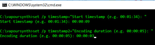
From there, you will add in the start of the time stamp. So I did 00:00:09 (i want it to start at 9 seconds.
The next is encoding duration, which just means how many seconds of it do you want. I normally just always use 00:00:03 (this gives me 90 frames). Just hit enter next.
Just like AviSnyth, another window will pop up in your browser so you can see the settings you want. For this, I only use the denoise filter KNLM.
Settings for KNLM: 0, 6, 4, 1.9 (you can play around with these if you’d like.
I also use 30fps fast, but you don’t have too. It’s what you like and how you want your timing to be.
Once it cropped the time stamp, another pop was open, right? The VaporSynth Editor. This is where it can get a bit tricky.
The video goes into detail on where to copy and paste the code from the resizer, but it also allows you to trim the frames you want, but I don’t want to go through that. So I’ll just put the # sign there to cancel that out. Just like below.
So you see here the trim is grayed out, it just means I won’t use that feature of it.
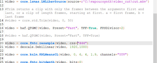
Normally you’ll see this :
video = core.fmtc.resample(video, css="444")
video = descale.Debilinear(video, 630,354)
Instead of:
video = core.fmtc.resample(video, css="444")
video = descale.Debilinear(video, 1920,1080)
I personally like to change it to the original size of the video so when you crop it, it doesn’t come out stretched or weird looking when you use 630,354.
You’ll also see where I used:
video = haf.QTGMC(video, Preset="Fast", TFF=True, FPSDivisor=2)
This is just the present for 30fps fast. That’s optional.
From here once your settings look good, you go to file save script and then script encode video.
Where it says header change it to Y4M (always).
Hit start, and let it do its thing. Then after it's finished you can close it. Sometimes it can take a minute or two once you change the size of the video.
Photoshop
If you haven’t already cut your gif in another program, then you can use photoshop to crop. I, however, recommend that you do. I started using Avisynth maybe a month ago, and it’s the best thing ever. I won’t force that on you, get comfortable with photoshop first if you’re new to PS.
Importing and Resizing
Import video into photoshop (file > import > video frames to layers)
Use these settings
Using the sliders, select the part that you want with the sliders to the left and the right.
Once it’s all open in photoshop, you will need to make sure you have timeline open. window > timeline.
If you used VapourSynth, and have cropped to the frames that you want. Then all you need to do is crop the gif.
So you’ll just go to import > video frames to layers > windows > vapoursynth > output > select output.move
NOTE: IF YOU USE PS CS6 for some reason it doesn’t open MOV files. My mutual found a way to work, so I’ll have to ask her if it’s alright to direct her to you to see how she got it to work.
When I crop my gif to the correct size for Tumblr to keep it under 3MB.
Go in with the rectangular marquee tool. With sizes below:
268 x 360 - 400
268 x 200
540 x 280
Position it to the place that you want. Then go to image > crop.
Once it’s cropped, you will then go to image > image size.
I normally set it to bicubic (smooth gradients).
Also always lock in the width & height.
Here is tumblr’s sizing.
Delete any unwanted frames you don’t want.
Sharpening
I use a varies of settings when sharpening and clearing my gifs how I like.
Select all your frames, and then at the bottom of that timeline window click the convert to video timeline.
Select all your layers, and then convert to smart filters. (filter > convert to smart object)

I no longer use topaz settings. It takes entirely too long, and I’m lazy. So now to get my gifs smooth looking I use gaussian blur and smart sharpen only.
So the steps I take are:
Duplicate your smart filter
On the bottom filter, I use smart sharpen
I normally keep it at 500 / 0.2 or 500 / 0.3.
Copied smart filter:
Filter > Gaussian Blur > I usually use between 1.0-1.6 just depends.
You can lower the opacity of the gaussian blur like below:
Double click the one next to the gaussian blur I usually lower it between 50 to 80% just depends on the look I’m going for.
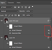
Filter > Smart Sharpen > 500 / 0.3 (a second time)
Convert frames > flatten frames into clips.
Click the bottom button again to convert video to timeline (using that same button as before).
Then delete the first two layers. It’s the one that says layer, the others will say frame.
Once it’s deleted, go to the timeline option button. It’s located at the top right corner of the timeline.
Select the option to make frames from layers.
Coloring + Timing + Saving
To avoid this being longer than it is, I’ll link the original tutorial on coloring, timing, and saving gifs, here.
14 notes
·
View notes
Text
Using Python to recover SEO site traffic (Part three)
When you incorporate machine learning techniques to speed up SEO recovery, the results can be amazing.
This is the third and last installment from our series on using Python to speed SEO traffic recovery. In part one, I explained how our unique approach, that we call “winners vs losers” helps us quickly narrow down the pages losing traffic to find the main reason for the drop. In part two, we improved on our initial approach to manually group pages using regular expressions, which is very useful when you have sites with thousands or millions of pages, which is typically the case with ecommerce sites. In part three, we will learn something really exciting. We will learn to automatically group pages using machine learning.
As mentioned before, you can find the code used in part one, two and three in this Google Colab notebook.
Let’s get started.
URL matching vs content matching
When we grouped pages manually in part two, we benefited from the fact the URLs groups had clear patterns (collections, products, and the others) but it is often the case where there are no patterns in the URL. For example, Yahoo Stores’ sites use a flat URL structure with no directory paths. Our manual approach wouldn’t work in this case.
Fortunately, it is possible to group pages by their contents because most page templates have different content structures. They serve different user needs, so that needs to be the case.
How can we organize pages by their content? We can use DOM element selectors for this. We will specifically use XPaths.
For example, I can use the presence of a big product image to know the page is a product detail page. I can grab the product image address in the document (its XPath) by right-clicking on it in Chrome and choosing “Inspect,” then right-clicking to copy the XPath.
We can identify other page groups by finding page elements that are unique to them. However, note that while this would allow us to group Yahoo Store-type sites, it would still be a manual process to create the groups.
A scientist’s bottom-up approach
In order to group pages automatically, we need to use a statistical approach. In other words, we need to find patterns in the data that we can use to cluster similar pages together because they share similar statistics. This is a perfect problem for machine learning algorithms.
BloomReach, a digital experience platform vendor, shared their machine learning solution to this problem. To summarize it, they first manually selected cleaned features from the HTML tags like class IDs, CSS style sheet names, and the others. Then, they automatically grouped pages based on the presence and variability of these features. In their tests, they achieved around 90% accuracy, which is pretty good.
When you give problems like this to scientists and engineers with no domain expertise, they will generally come up with complicated, bottom-up solutions. The scientist will say, “Here is the data I have, let me try different computer science ideas I know until I find a good solution.”
One of the reasons I advocate practitioners learn programming is that you can start solving problems using your domain expertise and find shortcuts like the one I will share next.
Hamlet’s observation and a simpler solution
For most ecommerce sites, most page templates include images (and input elements), and those generally change in quantity and size.
I decided to test the quantity and size of images, and the number of input elements as my features set. We were able to achieve 97.5% accuracy in our tests. This is a much simpler and effective approach for this specific problem. All of this is possible because I didn’t start with the data I could access, but with a simpler domain-level observation.
I am not trying to say my approach is superior, as they have tested theirs in millions of pages and I’ve only tested this on a few thousand. My point is that as a practitioner you should learn this stuff so you can contribute your own expertise and creativity.
Now let’s get to the fun part and get to code some machine learning code in Python!
Collecting training data
We need training data to build a model. This training data needs to come pre-labeled with “correct” answers so that the model can learn from the correct answers and make its own predictions on unseen data.
In our case, as discussed above, we’ll use our intuition that most product pages have one or more large images on the page, and most category type pages have many smaller images on the page.
What’s more, product pages typically have more form elements than category pages (for filling in quantity, color, and more).
Unfortunately, crawling a web page for this data requires knowledge of web browser automation, and image manipulation, which are outside the scope of this post. Feel free to study this GitHub gist we put together to learn more.
Here we load the raw data already collected.
Feature engineering
Each row of the form_counts data frame above corresponds to a single URL and provides a count of both form elements, and input elements contained on that page.
Meanwhile, in the img_counts data frame, each row corresponds to a single image from a particular page. Each image has an associated file size, height, and width. Pages are more than likely to have multiple images on each page, and so there are many rows corresponding to each URL.
It is often the case that HTML documents don’t include explicit image dimensions. We are using a little trick to compensate for this. We are capturing the size of the image files, which would be proportional to the multiplication of the width and the length of the images.
We want our image counts and image file sizes to be treated as categorical features, not numerical ones. When a numerical feature, say new visitors, increases it generally implies improvement, but we don’t want bigger images to imply improvement. A common technique to do this is called one-hot encoding.
Most site pages can have an arbitrary number of images. We are going to further process our dataset by bucketing images into 50 groups. This technique is called “binning”.
Here is what our processed data set looks like.
Adding ground truth labels
As we already have correct labels from our manual regex approach, we can use them to create the correct labels to feed the model.
We also need to split our dataset randomly into a training set and a test set. This allows us to train the machine learning model on one set of data, and test it on another set that it’s never seen before. We do this to prevent our model from simply “memorizing” the training data and doing terribly on new, unseen data. You can check it out at the link given below:
Model training and grid search
Finally, the good stuff!
All the steps above, the data collection and preparation, are generally the hardest part to code. The machine learning code is generally quite simple.
We’re using the well-known Scikitlearn python library to train a number of popular models using a bunch of standard hyperparameters (settings for fine-tuning a model). Scikitlearn will run through all of them to find the best one, we simply need to feed in the X variables (our feature engineering parameters above) and the Y variables (the correct labels) to each model, and perform the .fit() function and voila!
Evaluating performance
After running the grid search, we find our winning model to be the Linear SVM (0.974) and Logistic regression (0.968) coming at a close second. Even with such high accuracy, a machine learning model will make mistakes. If it doesn’t make any mistakes, then there is definitely something wrong with the code.
In order to understand where the model performs best and worst, we will use another useful machine learning tool, the confusion matrix.
When looking at a confusion matrix, focus on the diagonal squares. The counts there are correct predictions and the counts outside are failures. In the confusion matrix above we can quickly see that the model does really well-labeling products, but terribly labeling pages that are not product or categories. Intuitively, we can assume that such pages would not have consistent image usage.
Here is the code to put together the confusion matrix:
Finally, here is the code to plot the model evaluation:
Resources to learn more
You might be thinking that this is a lot of work to just tell page groups, and you are right!
Mirko Obkircher commented in my article for part two that there is a much simpler approach, which is to have your client set up a Google Analytics data layer with the page group type. Very smart recommendation, Mirko!
I am using this example for illustration purposes. What if the issue requires a deeper exploratory investigation? If you already started the analysis using Python, your creativity and knowledge are the only limits.
If you want to jump onto the machine learning bandwagon, here are some resources I recommend to learn more:
Attend a Pydata event I got motivated to learn data science after attending the event they host in New York.
Hands-On Introduction To Scikit-learn (sklearn)
Scikit Learn Cheat Sheet
Efficiently Searching Optimal Tuning Parameters
If you are starting from scratch and want to learn fast, I’ve heard good things about Data Camp.
Got any tips or queries? Share it in the comments.
Hamlet Batista is the CEO and founder of RankSense, an agile SEO platform for online retailers and manufacturers. He can be found on Twitter @hamletbatista.
The post Using Python to recover SEO site traffic (Part three) appeared first on Search Engine Watch.
from Digtal Marketing News https://searchenginewatch.com/2019/04/17/using-python-to-recover-seo-site-traffic-part-three/
2 notes
·
View notes
Text
re-learning html without the pressure of a project deadline
When practicing HTML again, I worked through a PowerPoint presentation given to us by my lecturer Phil. It went a lot smoother than expected, and actually was a lot simpler than I thought it would be. I decided to document my process of going through it:
To start off with I created a NotePad file and saved it on my desktop under the name "index.html" as the tutorial advised. I have also experimented with other coding software - such as Adobe Dreamweaver and Visual Studio Code - but this was my first time coding without any of the helpful autofill suggestions and colour-coding both of these applications offer.
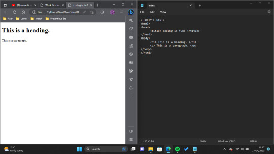
Next, I set up the basics of the HTML page, including its document type and title. Then I added my first heading and paragraph. I decided to keep my text pretty clear and to the point so that I wouldn't get mixed up looking through the code.
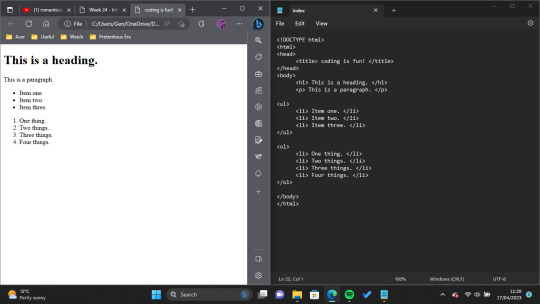
After this I experimented with lists! We didn't really need anything like this when coding our Narrative Project, so it was nice to just have fun and explore the many possibilities HTML has to offer.
As I have had experience coding images from the previous project, I decided to skip these for now and focus my learning on things which I didn't know.
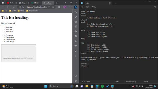
The next thing I decided to try was "inline frame" or <iframe> tags. The presentation I worked through describes inline frames as "An HTML document embedded inside another... Typically, MS Stream or YouTube videos." To play with this, I tried to link a YouTube video (to make myself chuckle, I decided on this video posted by the account Rat. However, even though my code was correct, YouTube wouldn't show the video on the page, so I ended up scrapping this feature.

So that the Horizontally Spinning Rat video still got a feature on the page, my next experiment was with hyperlinks! I tried this a couple of different ways, first of all by leaving it as just a generic hyperlink that opens in lieu of whatever webpage you're on, but - once again, supported by the tutorial provided - was able to change it so that the video opened in a new tab when clicked.

The last thing I wanted to experiment with was adding boxes and borders and I did this by attempting to use the CSS box model. I learned the base code for this from this W3Schools tutorial, and used it to essentially add a pink border around all of my <div> code (which essentially gives some really clean line breaks).
All in all, I really enjoyed this exercise. Admittedly the code I produced here is nothing special, and the web file is quite plain to look at, but as I have already used a lot of style functions for other projects I wanted to focus purely on things which were new to me. Coding in NotePad wasn't as hard as I was worried it would be, either, though it was frustrating having to comb through personally to figure out what wasn't working each time I made a mistake (I decided to leave those moments out of my walkthrough as there would have been many.) In the future, when I have more time, I would love to explore creating my own websites in this way, and giving them more interactivity.
My newfound interest in interactive websites I owe almost entirely to the ARG Welcome Home, created by Tumblr user partycoffin. ARG stands for Alternate Reality Game, and essentially these games use real world mediums like websites and social media to tell a story (. I feel particularly inspired by Clown's website as it is of the psychological horror genre, and utilises a lot of hidden/floating text elements to tell its story. I would love to have the ability to create something like it one day, I just think it's so cool.
Bibliography:
Clown. (2023) Welcome Home. Available at: https://www.clownillustration.com/welcomehomeyou (Accessed: 17 April 2023).
Rat (2022) 'Horizontally Spinning Rat for 10 Hours' [YouTube] 15 May. Available at: https://www.youtube.com/watch?v=YXm9qeq1_eE (Accessed: 17 April 2023).
Richardson, P. (2023) 'Into Web Design'. MD4004: Digital Media Foundations. Kingston University London. Unpublished.
w3schools (2023) CSS Box Model. Available at: https://www.w3schools.com/css/css_boxmodel.asp (Accessed:17 April 2023).
0 notes
Photo
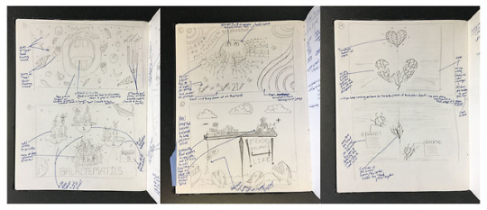

Web Design - Project 2 - Interactive Learning Tool - Process
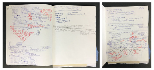
1. Initial concept ideation (brainstorming): These images show my notes from the brainstorming session that was directed in class. The notes explore different things that we learn in school, how we learn them, routines, how to explain routines to people, etc. The focus was on identifying how processes, systems, and other materials are learned, and identifying several topics of interest. From this extended brainstorming session I developed my top six ideas to make wireframe sketches of.
2. Initial wireframe sketches of top 6 ideas: After identifying the top six topics of interest from my brainstorming session, I thought of unique ways to teach young people about each one in an interactive manner. I had the following ideas:
- A game-like tool themed around a big mouth into which people place different foods to teach people about healthy eating (help get them acquainted with healthy and unhealthy foods).
- A game-like tool themed around aliens to teach them about basic arithmetics
- An interactive tool in which people put together a heart to learn about healthy ways to deal with heartbreak.
- A game-like tool themed around hairs on a person’s head to teach people about multiplication.
- A game like tool themed around placing foods on a balance to teach people about healthy and unhealthy foods.
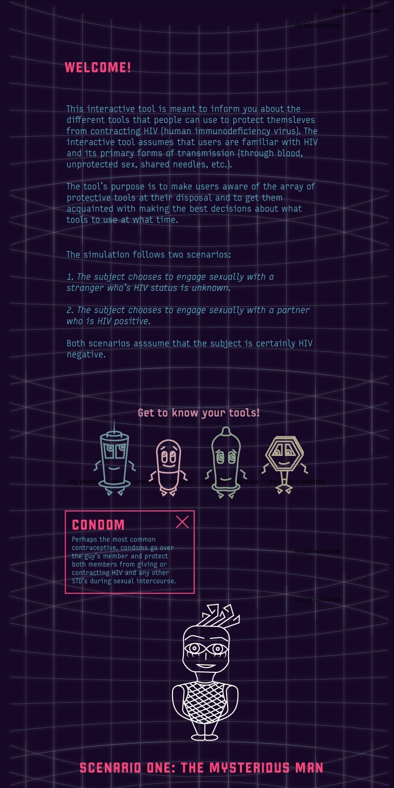
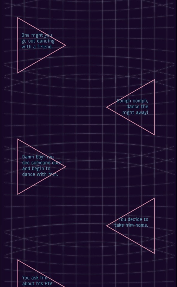
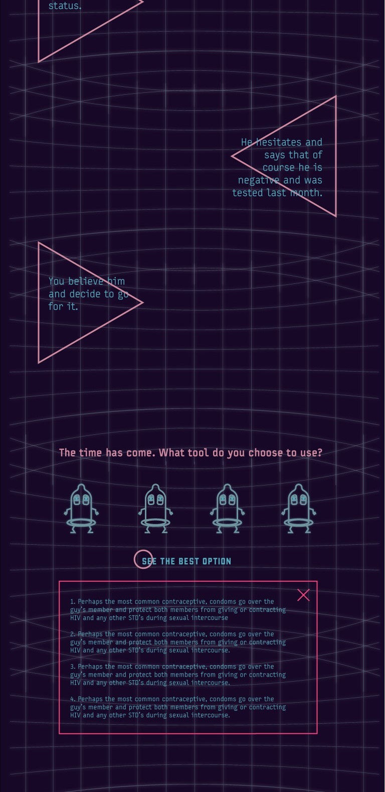
- A journey game in which a person fends off HIV by using different tools, to teach people about HIV prevention. This is the idea that I went with. I knew that I wanted each “tool” to be represented by a unique character and that I wanted the journey to be simulated through a scroll feature. I wanted the character to stay in the center of the screen while the background (and the different scenarios that the character encountered) changed around it, asking the user to make decisions about what preventative tools to use in each scenario. It was in my initial wireframe sketches that I determined the look for my characters.
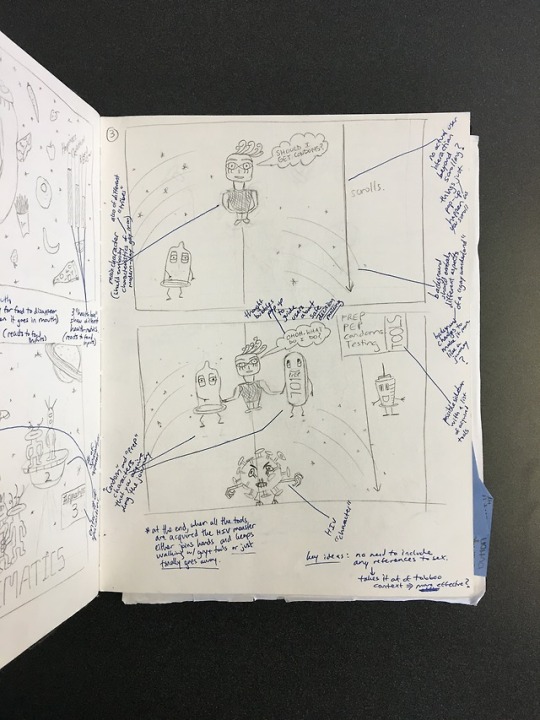
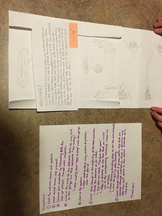
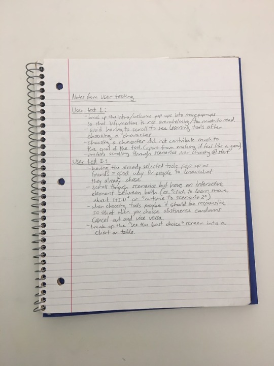
3. Stills and notes from lo-fi user testing: I created a paper prototype to simulate the user experience. This forced me to clearly identify what the experience would be like. For example, I decided that before asking users to make decisions, I would have them learn about each preventative tool. I decided that each scenario should be like a story that a person reads by scrolling, and that after each scenario, the person is asked to make a decision. I simulated the scroll feature by creating a long scroll that I fed through a paper frame. The paper frame held the character in place as the scroll moved underneath it. At this point, I wanted to simulate two scenarios: one in which the partners’s HIV status was uncertain and one in which the partner’s HIV status was positive. At this point I also wanted people to be able to choose their main character. I had two people interact with the paper prototype. The notes from the lo-fi user testing are shown. Videos of the lo-fi testing can be found here:
https://drive.google.com/open?id=1SIWGUOapqjENiQvdkcVci4OBspLOwWo_
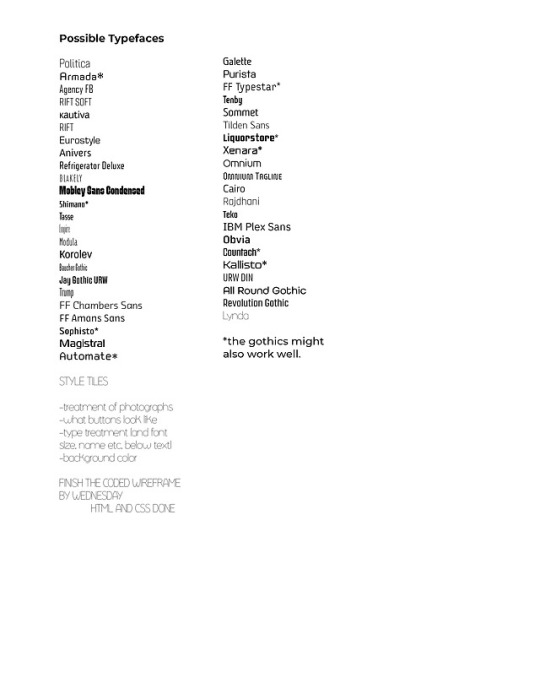
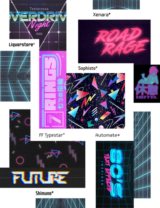
4. Moodboard and type explorations: From an early stage, I decided that I wanted the game to not take itself too seriously, since the subject matter was going to be heavy. I determined that my target audience would be teenage or young adult gay or bisexual men, since this demographic was at higher risk of contracting HIV. I did not intend for it to be for children since the subject matter was relatively mature. That being said, I did want it to be fun and quirky, to offset from the serious tone of the subject matter. For this reason, I decided that my look would be “bubblegum, Japanese, 80′s arcade” to appeal to a more eccentric crowd, and to allude to game-play and incorporate an element of “fun” to the interface. I built a moodboard that allowed me to identify a color scheme, and I simultaneously played with several typefaces that I believed would fit the “bubblegum, Japanese 80′s arcade” aesthetic.
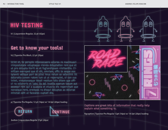
5. Style tyle: At this stage, I decided on some of the other visual elements of the interactive learning tool. I determined that my main typefaces would be Liquorstoe and Typestar Pro, and that the elements would appear to be glowing above a grid that alluded to 80′s video games. I wanted to characters and the other elements on the page to appear to be floating. I also liked the idea of using floating geometric shapes to make the space more interesting. It was at this stage that I decided on the pairing of geometric shape and type for the buttons and for the different phrases of the story-line.
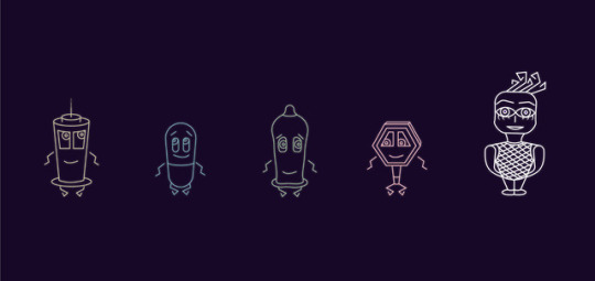
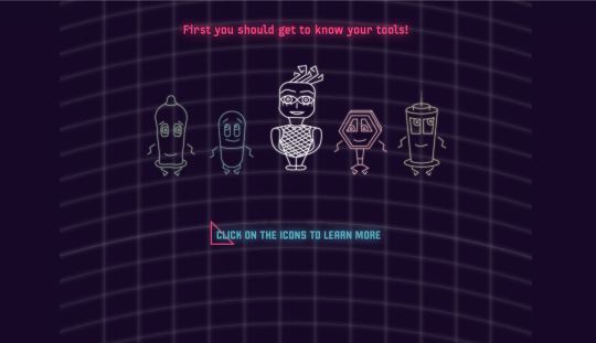
6. Icon design: I knew that the characters had to be done on illustrator to match the digital, geometric theme that I had decided on. I also knew that the characters had to be fun, friendly, quirky, eccentric, and cute. I ended up basing them heavily on the initial sketches that I made for my interactive tool. It was a challenge to find simplified ways to represent each tool as a character, while maintaining the visual language consistent. For example, the placement of the arms and legs was challenging, and the tapering of the body was also challenging (it was hard to make the body taper while still making it look like the tool that it represented). The main things that I did to make the visual language consistent was to make each character’s body narrow from top to bottom, to keep the pupil, mouth (and for some characters the eyebrows) consistent across the characters, and to give the characters very similar-looking arms and legs. The pupils, and arms and legs of the tool characters, were the main thing tying the tool characters visually to the main character (the legs and arms were meant to resemble the main character’s hair).
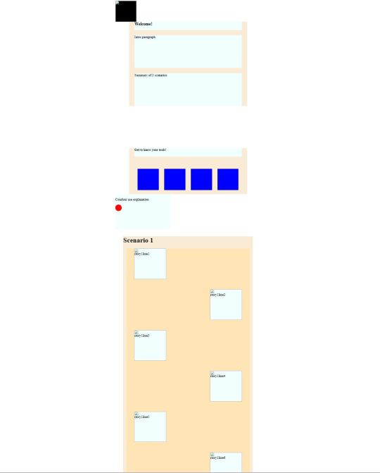
7. Static wireframe: This stage was important as it brought the style tyles and the paper prototype together to determine what the coded website would actually ultimately look like. This step was particularly important for determining the sizes and spacing of the elements on the page. It was at this stage that I decided that my interactive tool would only focus on one scenario instead of two.
8. Screenshot of the coded wireframe: The coded wireframe stage was critical for getting the functional aspects of the website down. It was much easier without the images and body copy to work out the code for the site. Before putting in the images, content, and styling, I determined how to get the buttons to work, and how to get the scroll to work. The scroll, although initially intended to be done through a parallax scroll, was ultimately accomplished by using CSS to fixed position the static element on the page.
The coded wireframe can be accessed here:
https://dresrincon.github.io/project2/
9. Screenshot of the final site: At this stage I added the images, body copy, and other content to the coded wireframe.
The final site can be accessed here:
https://dresrincon.github.io/project2%20-%20Copy/
1 note
·
View note
Note
Hi! I adore your THEME 5: Jupiter, and would *love* to use it with my tumblr, excluding one thing: the actual Jupiter image. lol. Is it possible to put a different border or image there? I'd ideally like to put a square gold frame around my avatar. Thanks so much!
sure, add this to your custom CSS (instructions):
#iconlinks { --drift: 2.25em } .planet .ring { display: none } .planet img { border-radius: unset }
if you don't want a perfectly square avatar, and you want to add slightly rounded corners, you can change border-radius on that last line to any value between 0 and 50% (so it reads "border-radius: 10%", for example). if you'd also like to change the color to something other than your Accent color, replace that last line with this:
.planet img { border-radius: unset; border-color: gold; }
hope that helps!
1 note
·
View note
Text
Apptober Day 1
Now that I’ve got my Rasberry Pi Wall Display built and up on the wall, I figure Apptober is the perfect time to commit to finishing the software side of the project! This month I’m going to be hacking around with MagicMirror2 (a wonderful open source NodeJS app built for the RasberryPi) to make my little Wallberry the fairest wall display of them all.
Magic Mirror, On The Wall
The design aesthetic of MM2 is originally intended to turn a raspberryPi and a two-way mirror into a sleek, space-ship-worthy HUD. While I do love the minimalist mirror look, I’d prefer to give Wallberry a more classic, picture frame display look. Basically I want to go from the image on the left (Wallberry with a vanilla install of MM2) to something like the design to the right:
I’ve got a lot of tweaking ahead of me 😊
BTW - the image on the right there is from a company called Dakboard and they make GORGEOUS wall displays and I’d almost consider using their wall display software but alas I’m a fool for open source and MM2 has stolen my heart.
Project Requirements
Too many of my projects get abandoned unfinished due to feature creep so I’ve challenged myself to start REALLY small this time. To begin with I want my display to have the following features:
Current local time + date
Current time for at least two other cities in different timezones (I can’t do timezone math help me Wallberry)
Current local weather + temperature
Local weekly weather forecast
A gorgeous, high-resolution background photo that periodically changes
Exciting New Tech
I’m anticipating learning a ton of new stuff for this project, including:
NodeJS - finally, an excuse to learn Node 😄
SASS - cool cool, if I can’t avoid writing CSS forever then at least I can put variables in it
How to extend and theme MagicMirror - yay MM2 Modules!
The Unsplash photo API - because this seems like a really fun way to get great background photos
A ton of stuff that seems obvious but somehow isn’t when it comes to the UX design of wall display web apps
Some RaspberryPi-specific development things that’ll definitely pop up to bite me when I least expect it because nothing ever works in production like it does on your development machine
Tomorrow
Gonna get my dev environment all set up wish me luck 🙃
8 notes
·
View notes
Text
What are the three components of Responsive Web Design with examples?
What is a Responsive Website Design?
Responsive Website Design is building a website that works on all devices and screen sizes. It will automatically adjust for different screen sizes. It is designed for usability and user’s satisfaction. These designs are intended to fulfil the needs of a wide range of people by web development company in Chennai. The components of Responsive Web Design are
Fluid Grids
Fluid Images
Media Queries
The single greatest way to develop a website that performs well on any platform, mobile or non-mobile, is through responsive web design. However, few individuals have even a rudimentary understanding of what responsive design entails. Let's have a look at what we can do about it.
Fluid Grids
The paper size was your defining trait in terms of layout when you ran a magazine, newspaper, or other print media. You couldn't fit more than 10.5 inches of text on a typical piece of paper, no matter what additional tactics you used.
For a long time, everyone viewed web pages in the same way — you have the width of your screen and the length of...until you run out of options. The width of your screen, on the other hand, isn't constant.
I can flip from my iPod, iPad, laptop, and desktop screens, and I frequently browse the same website on multiple devices at the same time. Instead of static numbers of pixels, responsive websites use elements that are defined as percentages of the screen's width.
(To be more precise, elements are formed with elements defined as percentages of the wrapper that specifies the website's edges, which aren't always the same as the screen's edge, but that's a technical remark.)
Fluid Images
Similarly, the responsive design employs CSS to specify pictures that have a maximum size (to avoid being stretched or pixelated) but no minimum size (to allow them to shrink proportionally to fit inside the context of the content they're a part of). Because CSS keeps the aspect ratio constant, there should be no pixelation.
Media Queries
Media queries are the undisputed king of responsive design. For years, CSS has used media queries, which essentially tell a CSS style sheet to "ask the browser a query and only do X if you get Y as a response." CSS can, for example, ask a browser, "What width is your frame now set to?
If the response is ">400 pixels," CSS will generate a two-column page; if the response is "400 pixels," CSS will create a single, much longer column. Even the most flowing grid has 'breakpoints' where it does not look nice.
When the website reaches such points, media queries allow it to re-define itself on the fly, allowing new elements to appear while keeping the page as pleasing to the eye and as functional as the screen size allows.
Design the Mobile Site First
The greatest advice from web designing company in Chennai is to build your mobile site first, then add elements so that it naturally 'grows' into a mobile site. The rationale for this is simple: because a mobile site can only include a limited number of elements.
It compels you to concentrate your efforts on the features that your audience will find most appealing. It means that your desktop site will be unable to lose those core pieces, and the extra information that appears around them will also be core-centric.
These three elements, when paired with a current thought process, are used to create sites that are adaptable and don't have any preconceived notions about the resolution of a screen.
Although responsive web design is still a new concept, it offers several benefits to users, including the ability to browse a single site from many devices. The ability to work across various devices provides consumers with a consistent experience without the need for a separate mobile site, which is a big benefit for any website.
This presents new issues for designers. According to recent research, testing web designs across numerous devices is a common issue for web designers. This can be a problem if a designer does not have direct access to all of the devices that are regularly used to access the internet.
Smaller design firms may find it costly to evaluate if their site operates effectively across multiple platforms because mobile devices are always changing.
Device sharing is one option, which has gained traction in some design circles but is still uncommon. There are some mobile emulators and site validators available, but you may need more than one to test all types of devices.
Demonstrate Responsive Design To Your Clients
Instead of explaining the responsive design to your clients, show them what it looks like. This will have a greater impact on them than explaining it to them in technical jargon that they may not comprehend. Although media queries and fluid grids are standard words for web designers, most of your clients will not comprehend them.
Begin by displaying a site on a variety of devices. Demonstrate how wireframes and sketches may be extremely useful tools. Remember that you won't have any pixel-perfect visual designs to show them until their site is finished. This was a lot easier for them to grasp, but you still need to show them how RWD will make their site more usable.
Some designers believe that responsive design is the only method to construct new websites since it allows them to react to their client's requests and accommodates the swipe and touch functionalities found on most mobile devices.
Overcoming RWD Issues
There are challenges with RWD, like with other new technologies; however, most of them have been resolved without too many hassles. To begin with, some designers encountered issues with pictures, navigation, and tables. However, these issues were overcome by combining SVG, icon fonts, and scripts with a uniform design.
There are extra challenges for pre-existing sites that are built on a predetermined width. Other challenges arise as a result of the significant differences between traditional and responsive design. When faced with an issue like this, a designer has two options:
Reverse the site's design: This isn't always the greatest solution, and it takes a lot longer than recreating a site. However, due to a variety of variables, this may be the only option available at times.
Rebuild the site: It is often faster and less expensive to create whole new style sheets and templates. The designer will be able to construct a more responsive device and organize the information correctly as a result of this.
When a site visitor is using an older type of browser, another difficulty with responsive design arises. As a result, the site may appear to be too small for the viewer's browser window. Filler can be used to solve this issue.
Is Responsive Web Design Right for You?
If you don't use RWD, you can be limiting your audience's viewing options. This will not be useful to your company. Because individuals use a wide range of browsers and devices to access the internet, sites that can engage with all of them will have better metrics.
This will result in more site visitors converting to leads or paying customers, which is usually why businesses have a website in the first place! People are increasingly using their mobile devices as their sole means of accessing the internet.
They are not using their laptops or desktops at all. As a result, not having a responsive site will make things tough for consumers on the go, therefore eliminating a significant segment of your potential clients.
Responsive design will be here for the foreseeable future, thanks to the fast-expanding options for viewing the web and their ever-increasing availability. RWD may become the only option to build a high-quality, user-friendly website.
0 notes