#fiddling with mspaint
Explore tagged Tumblr posts
Visit Tumblr Blog
Explore Tumblr blogs with no restrictions, modern design and the best experience.
Last Seen Tumblr Blogs


Fun Fact
Tumblr has a 66 index score for customer satisfaction in the US.
Text
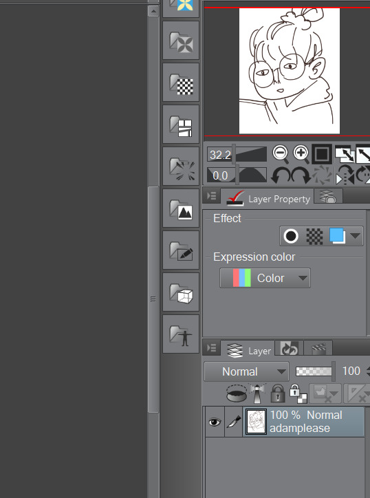
ayo @0rphiichaze *immediately scrambles back into my gremlin hole*


#my art#homestuck#sort..of?#robro#alpha dave strider#fiddling with mspaint#or toby is#uuh i need a tag#🍋🟩#sure limes why not#esit from phone: is there not a line emote on ios?#huh#🥝#lets try kiwis#man i kinda liked the lime
3 notes
·
View notes
Text
Pulp Covers And How To Paint Them
With the rise of cheap printing in the early twentieth century, mass-marked paperbacks swept the world, each offering lurid thrills for obscenely low prices. Sex, sadism, and incredible violence for as little as ten cents. An easy purchase to slot in between fifty cigarettes a day and enough bourbon slugs to kill a small garden.
Pulp fiction is where some of the greats of American literature cut their teeth, including the big three, Raymond Chandler, Ross MacDonald and Dashiell Hammett. The contents of these stories, both the dizzyingly good and astoundingly terrible, have been absorbed and digested and remixed and regurgitated in nearly every permutation imaginable, fuelling pop culture some one hundred years on. This isn't an essay on that. Nobody likes to open a tutorial and be greeted with a wall of text. The history is for another time.
But it is about how to paint it.
Don't let the pre-amble intimidate you, it's not as hard as it sounds. You will need:
Painting software with some image editing capabilities. You don't need all the bells and whistles of Photoshop, but I wouldn't recommend something like MSPaint, at least not to start with. I'm using Clip Studio Paint.
A really beat-up paper texture. The grungier, the better.
A lightly-textured brush. Here are the specific brushes I use, 99% of which is the well-named rough brush. Try and avoid anything with any impasto elements.
Go to your colour-picking tool and use the 'select from layer' option. Doing all the painting on a single layer is going to make your life easier.
A complete willingness to make mistakes and, instead of erasing, painting over them. It generates much more colour variation and interest! Keep your finger off the E key.
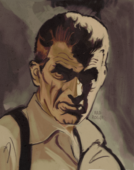
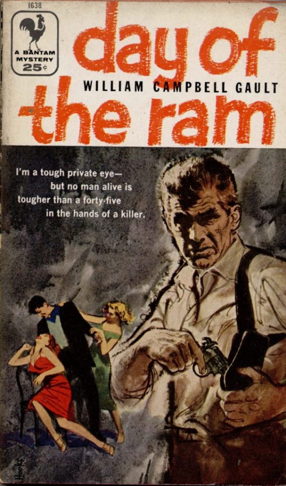
Good reference! That painting is a master copy of Mitchel Hooks' art for Day of the Ram. Find a style you really love and want to learn? Have no clue where to begin? Do direct studies!
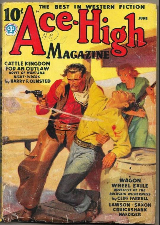
Let's not worry about whatever is happening in the background. It's probably fine. Let's get started! Pulp magazine art is a lot more varied than you might first think, so don't agonize over having a style that 'fits' or not. I'm also specifically aiming for something you'd see on the cover after printing, not the initial painting they would use for printing. The stuff I'll show here is a pretty narrow band of it, but here are some general commonalities. This is a painting by Tom Lovell.
Let's dig into this.

The colours are very bright and saturated, but the actual values, the relative lightness and darkness of them, are actually grouped very simply! You can check this by filling a layer full of black, putting it on top and setting its mode to colour. If the value of a painting looks good, you actually get a lot of leeway with colour. But here's what I think is the most important thing to keep in mind.
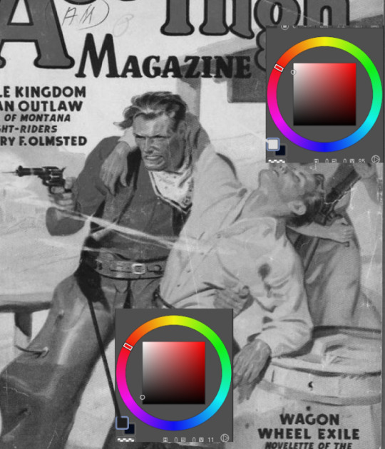
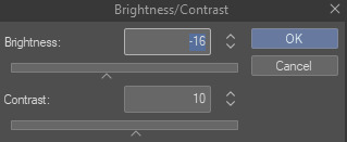
The darks aren't that dark, and the lights aren't all that light! Covers are paintings reproduced on cheap paper. Anything you wouldn't want to happen in the printing process, you lean into. Value wash-outs, lower contrast, colours getting a weird wash to them, really gritty texturing. So let's get painting! Here's my typical setup.
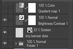
That bottom folder is the painting itself. The screen layer is the grungy paper texture. To get the effect you want, put it down, invert its colour, then set it to screen. That washes out your painting far, far too much, so to compensate, I put a contrast layer up on top. Fiddle around with the settings, but this is where mine ended up sitting.
Note I'm saying this before even starting the painting: you want to do this as early as possible. This is where the 'select from layer' colour picker comes in handy. You can paint without worrying about the screen or contrast layer. Something not looking right? Enable your value check layer and keep painting. When you turn it off, it'll still be in colour. Here's a timelapse so you can see what that looks like.
And when you check the values...
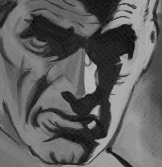
They're pretty simple! This isn't a be all and end all, but I hope it serves as a decent primer. I want thirty dames on my desk by Monday!
#rochedotpng#art tutorial#art resources#couldn't find a thing online about this style so here's how i do it#pulp#it's how i did the death shroud one more or less
364 notes
·
View notes
Note
sorry if you've answered this before but im curious what brush(es) u use :D
This being said I also fiddle around a lot with my brushes anyways to help them best fit MY needs so I’m not sure if they’ll be exact to how my art is LOL
But here’s the best I can do, 2 out of 3 are preset procreate brushes but the pencil is a custom MSpaint brush!

#my art#brushes#miraculous lb#miraculous ladybug#miraculous fandom#miraculous adrien#miraculous fanart#chat noir#ladybug and chat noir#miraculoustalesofladybugandcatnoir#adrien agreste
35 notes
·
View notes
Note
absolutely feel free to ignore this if you've already answered questions like this, but i have some art ones if you don't mind! what canvas size do you usually work on in procreate? do you have any fave brushes? and what size do you usually use them on?
sorry if these are super annoyingly technical questions lol, i'm always just fascinated by other artists' processes. also your art lines are always so CRISP and i need to know your secrets
Hey no problem! Thank you for the kind words.
I dont have a preference for canvas size, but i usually start with a screen sized canvas and adjust from there.
I use the default syrup brush, as well as a copy of the mspaint pencil brush. I also use an adjusted version of this brush, but i fiddled with it so long ago now i couldn’t tell you exactly what i did, sorry ;w; Around the 2-3% spot for all 3 of these I think.
55 notes
·
View notes
Photo

where the hell are you going
49 notes
·
View notes
Photo

antifa icon
#i love drawing cartoon/anime characters in my own style man.....#love taking stylized details like mob's long-bridged nose & his very round face .... and making them a little more 'real' ... y'know?#idk how well that translates in MY art but its something i try to stay conscious of and have fun doing nonetheless :)#mp100#mob psycho 100#i am tagging every thing man#kageyama shigeo#shigeo kageyama#mob#oh and dont mind the little fish doodle on the very right LMAO#mspaint#<for the lines#paint tool sai#<for the colors and cleanup on the left image#i purposefully fiddled w the brush settings while coloring so it would imitate the look of the mspaint brush tool 😌#digital art
27 notes
·
View notes
Photo

Alt Text: an artwork of a girl with only their head and torso within a two third view. It is roughly drawn in mspaint with colors of pink and reddish tan for the skin and black for the hair. Big oval sized eyes with grey pupils stare into the distance with a blank expression. the girl’s arms seemingly end near the biceps with no trace of the rest of the arm. the lower half portrays a messy sketch of red black hues of a surgically made cut where entrails colored in lime green pink and cyan trail out. Blood flows across the image as if stopped in time.
They cut through the middle and revealed my innards
squeezed through my bones and fiddled with organs
I am human so I scream
And cry and wail
To you it’s a net
to me it’s a wall
Just another experiment to tear through again
4 notes
·
View notes
Text
First Meet
Dr. Woodsworth, a biologist who works at a wildlife rehabilitation center for dragons in a more modern-day, ends up getting the strange task of researching an unknown dragon that is way past the biologist's comfort levels.
Contains: Fearplay, fluff, 'trapped' tiny, like, two mentions of basically vore, dragon giant bc hell yeah L:<, non-binary tiny / giant.

mspaint is a hell to draw with man i didn even bother wit that background anyways hi yes, Orpheus (the giant) is owned by my friend, Bard! This is based on an au we had,,,,yeah >:))) Dr. Woodsworth is my character that i made like, today. Sorry if the ending was cut a bit short, i was rEALLY tryna end it.
Story under cut!
There were three people riding the railways towards Enclosure 7-B. Two well-armored guards, eyes just barely seem behind the glinting visors of their helms, tranquilizer guns tightly clenched, close to their chest. They were standing up, somehow able to keep their balance in the shaky compartment riding the railways. And then there was the scientist, a half-elf, half-pixie sitting down on the seat of the compartment. He had crossed his legs, fiddling with a bike chain fidget as he subconsciously bit his lip. Dr. Woodsworth certainly was no stranger when it came to dragons, unknown species of the (usually) winged reptilian species was his branch of work in the rehabilitation center. But most of the dragons he dealt with within that branch were fae dragons, whom Woodsworth, due to his fae roots, could understand, or rather just smaller dragons overall. But he had been told about…whatever this was. Huge…horns that curled upwards, boney claws with could most *certainly* tear him apart in seconds. He was mentally pacing, desperately trying to think of a way he’d be able to deal with such a beast. …He had been told the dragon could talk, so that brought some relief to him. …And what if he were to have to go inside the enclosure…? Woodsworth didn’t have wings, not anymore, at least…he would be as good as dead if the dragon wanted anything to do with him. The movement suddenly stopped; the compartment let out a pressured hiss. The scientist hadn’t looked up at anything else besides his fidget, but he could hear the guards’ armor shift. Letting out a shaky sigh, Dr. Woodsworth pushed himself up from where he sat, sticking the fidget into his pocket. His legs quivered under the weight. “…Here we go.”
***
As the hallway’s walls turned into glass, Dr. Woodsworth quickly pulled out his circular sunglasses, trying to still adjust his eyes to the sudden light. He didn’t bother to gaze outside, just desperately trying to keep pushing onward and hope things go well. Certainly, when it came to the…least dangerous dragons, things weren’t this technologically advanced, not built to keep whatever monstrosities could lie inside. Gigantic…monstrosities. But suddenly, the guards had stopped. “We’ll stand out here, go inside, there’s a distress button if you’re in need of us.” One of them had lightly tapped Dr. Woodsworth with their supposed tranquilizer gun. “…fuck…” Dr. Woodsworth gulped, and carried on, opening the door… It was a small square room, with four simple buttons and a lever. The middle part of the room was nothing but glass to show the *proper* enclosure inside. It was huge, coated with a thick snow with a somewhat rigid terrain. In the corner was…the dragon. A hulking beast of mostly fur, the claws were even sharper than Woodsworth imagined, the horns even larger, their neck winded like a snake’s. …A skull-like mask to cover the upper head. Dr. Woodsworth sheepishly leaned in towards the microphone that was close to the lever, trying to repeat the same words repeatedly before he pressed on the (supposed) microphone button. “…H-h-h-hello…h-h-hello…good-good-good morning? A-a-afternoon? Fuck…fuck…fuck it.” He slammed down onto the microphone button, choking out, “Good afternoon!” The beast winded their head upward, bending into an S shape as they slowly leaned towards the observatory that Dr. Woodsworth was basically stuck inside. Dr. Woodsworth hyperventilated, slowly backing up as the beast got closer, “Please…please don’t…” As if the beast could hear him now, so far from the microphone. As anyone could come for his aid. Whatever happened now. He wasn’t ready.
.
.
.
“Heyo!” With a soft bonk against the glass, the dragon had responded, gently fluttering their massive wings as they peered at the doctor with interest. Refusing to leave the massive dragon waiting incase of…*something horrid*, Dr. Woodsworth clicked on the button once more, leaning into the mic. “…M-my name is-is…Doctor. Doctor W-Woodsworth. I’ve…come to a-ask some questions…” “Oh, my name’s Orpheus!” Orpheus’ ear flicked, their tail faintly swaying in the distance. “Can I ask a question first though…this place is kinda weird an’ all, so like…” “…G-Go ahead…” He pulled out a clipboard and pen, preparing himself to jot down notes of his ‘interview’. “Well, first off, how long have I’ve been hibernating, *why* am I a dragon, and where’s ghost cat? He’s smaller than me, and he…*also* isn’t a dragon.” Dr. Woodsworth, his finger hovering above the microphone, *how was he supposed to answer those questions?* But there…was something interesting. They weren’t always a dragon…? …Huh…? “…You weren’t always a dragon?” “Oh no!” Orpheus raised a claws,”I was like…uh…I think shorter than you…? I dunno. But my friends called me short. Also I didn’t have these cool wings before too! And now everyone is small too, not just ghost cat! Like you! …But. Uhm…it’s really lonely in here and it’s making me nervous.” Dr. Woodsworth wrote that all down,”…W-well I-I s-suppose we-we can help you g-get adjusted…” He tried ignoring Orpheus’ comment about being lonely. As kind as the dragon seemed…he didn’t want to risk it. “Or…or…we can r-reverse it.” “Oh no! No! I don’t want to reverse this! This is super cool, …um, unless ghost cat is uhm…scared of it, but! …You haven’t answered where ghost cat is…?” As Orpheus’ ears flattened, Dr. Woodsworth’s heart sank. What was he suppose to say…? “…I don’t know.” Orpheus paused,”I…I…” The dragon slowly turned. “W-wait! I’m sure we can think of something! Uh-uh…we-we still n-need to a-ask q-questions…and…” Dr. Woodsworth put his hand to the glass before taking it away, his feelings conflicting. Fuck…what was he supposed to do? The dragon wasn’t talking, but he was coming out with no research whatsoever.
He leaned into the buttons, slammed down on the lever, maybe that could do something…? With a mechanical whir, Dr. Woodsworth was… Descending.
Dr. Woodsworth PANICKED, desperately trying the switch the level back and forth, “No! No! No! NO!” No, fuck fuck FUCK. The room shook as it stopped at a halt, the door whining open as a chill swirled into the room. He was still frantically pressing buttons. “…Huh…?” THUMP. THUMP. THUMP. Fuck…fuck…fuck…this was it. He collapsed onto his knees, clinging onto the panel. This was it. The end. Dr. Woodsworth screamed as he saw as Orpheus’ snout poked through the door. He attempted to curl into a ball, sobbing into his lab coat. “Heyo…is everything alright? I saw the square thingy going down, it’s probably really cold in here! I can warm you right up!” Dr. Woodsworth slowly turned, “Wh-“ Orpheus, using their mouth, plucked Dr. Woodsworth by the labcoat, pulling him out of the room. Dr. Wordsworth simply had gone limp, barely able to move by this point, his heart beating out of his chest as he simply accepted his fate. …Whatever that fate was. Being eat alive? Torn apart to shreds? …He didn’t know, but he accepted it to be painful. He closed his eyes, letting the darkness overtake him. …But there wasn’t any limbs slowly torn off, teeth tearing as his skin. …In fact, wherever he was, it felt soft. As he opened his eyes, he realized he had been gently pressed against the dragon’s chest, the dragon’s ‘arms’ curled around the scientist. Dr. Woodsworth caught his breath, still shaken from the recent events. He eventually let himself sink into the dragon’s fur, quivering as he sat himself right up afterwards. “…Is it less cold now…?” Orpheus turned their head slightly down, blinking as they awaited Dr. Woodsworth’s response. Dr. Woodsworth hugged his legs, he was finally able to relax, and soon as the panic was over, it had turned into annoyance. He let out a grumble, “I’m quitting this job.”
#g/t#giant/tiny#g/t art#g/t writing#g/t fearplay#g/t community#oc: dr woodsworth#oc: orpheus#orpheus solely goes by they/them btw!!#and dr woodsworth goes be he/him they/them#but i solely used he/him for the dr for simplicity's sake given orph's pronouns#feel free to ask ab them!!#diversity win! all the characters in this au arent cis!#unless guard is idk? BARD IS GUARD-
36 notes
·
View notes
Note
Is it alright to ask what settings/program/brushes you use in your art? I've personally been having this massive issue where I feel everything I make is too blurry, even when I don't want it to be. (Like is my canvas so small I can individually see every pixel from anti aliasing or is this a problem with my settings, I have no idea.) So I've been asking my favorite artists what their settings are to see if maybe it'll help me find what I'm looking for in my own art.
I can try! Long post ahead captain
Sizing
So for like, my usual doodle posts ‘round here, I make them tumblr’s recommended size which is 540x700. That’s good enough for the quick shit I do but it’s not great if you want to squeeze in a lotta detail and can look crunchy. I compensate by using grainy brushes or very small, very clean brushes at like size 3 or so (going off paint tool sai).
For art you see of my individual dragons, those usually have a max height or width (I flop between the two) of 1500px. No particular reason, I just kinda settle on that number. I shrink em down to 1000 for posting. If I’m feeling spicy, I go 2500 to 3500 for things like commissions and stuff - shrink those by half for posting. The bigger the canvas, the more detail you can put in. Also some brushes will just functionally perform and look better.
I always have a dpi of 300 but lately been doing 600 just cuz I have a few brushes that look nasty ass at 300.
Programs
Paint Tool Sai - me bread and butter <3 I lost access to 1 so I’m using sai2 now and still getting used to it but it’s my preferred tool for lineart and coloring. Watercolor tool is *chef kiss.* If I’m doing pixel art, I flop between sai’s binary brush and mspaint, windows 7 version preferably
Clip Studio Paint - sketch and fancy effect machine lol. I like the way brushes look when sketching stuff in CSP but I’m still working on finding a good way to line stuff that feels good like sai. Also it just has a million tools going on with it that sai doesn’t so it’s good for a lotta stuff
Brushes
Sai - default all the way baby. My lineart and color is done with a default circle brush, with no texture that I toggle the pressure on or off (min size) depending on what style I’m doing like so:

Pressure hard - soft is my personal preference for getting the lines very thin.
If I’m going for my grainy brush (also used for sketching if I’m not in CSP), it be like this:

Watercolor brush for blending:

I don’t touch tool prefs for this one. Personally I find sai’s blur/smear/watercolor better than CSP but I might just be a moron and haven’t set it correctly yet
CSP - I got a brush called woody pencil that’s free to download in the asset store. Don’t really change anything with it other than minimum size and sometimes texture density if I want it to be less grainy

Another pen I got called lineart odemi is very fun when I’m lining, again no changes to the default settings

Bold line pen which is self explanatory. Still getting the hang of this one

If you’re using another program that isn’t the two above, these can all be more or less recreated by just fiddling with textures and settings. A lot of it will just come down to opening a canvas and smearing your brushes across them until you find what fits.
Hope this helps a bit!
20 notes
·
View notes
Text
my "i must draw everything in mspaint"-disease stems from such a stupid idea but i just. cant delete that idea from my brain. and i hate that so much.
its literally just "hmm sai is a good & respected program" -> "i must do good art with it" -> i futz and fiddle with it until i get frustrated and stop drawing
with mspaint i dont have that because who cares if mspaint art looks crummy?? its not supposed to look good! (+futzing and fiddling in mspaint is more trouble than it's worth so i have to let minor mistakes go)
anyway, im not sure where i was going with this, i just wanted to announce that my brain is stupid
#:V#i think i gotta like. restrict my sai experience.#reintroduce myself to it in a way that doesnt make my idiot brain angry
2 notes
·
View notes
Text
s-s-s-studyyyyyyyy (airhorn noises)
goal on this one was just to use a simple, no textured square brush. a big weakness i have is using a very textured brush to create interest when i, in fact, should be doing the legwork. handwork? work. did use it towards the end but only to jazz up the background a little. hey, i said the goal was to do it, not that i actually did it

original painting is portrait of an american sailor, charles bach by leyendecker. i think this is the third leyendecker study i've done? there's something about the way that guy paints that's really fun to try and break down. on to the next!
#rochedotpng#another study for the pile#my tablet is finally falling to bits..... due a replacement very very soon#it'll be exciting to move from 'bargain bin turbobudget' to 'turbobudget..... WITH tilt support!!'#time to take it easy over the festive period. if i'm not on for a while i've eaten my weight in mince pies and will be emerging in june#oo one thing i'm looking forward to doing is more mspaint stuff. great to fiddle around in
64 notes
·
View notes
Text
I’m on an adventure learning the basics of Nintendo DS ROM hacking/modding because there is a very stupid, very self-indulgent, very spoilery ROM hack/mod I want to implement for Ghost Trick. It has been a journey and I’m going to be recapping my adventures on here with the tag #leo-tries-modding-ghost-trick so it can be blocked as desired. Anything pertaining to the actual in-game spoilers down the line will be posted under a readmore.
Now.... for “progress” I’ve made so far, if you can call it that. The first thing I need to figure out is whether I can implement a talk sprite-swap. So I set out to try and isolate the talk sprites.
I started by checking out the Ultimate Nintendo DS ROM Hacking Guide, which seemed as good a starting place as any. I also downloaded the big zipped file with all the referenced programs, but as I found out later, some of the programs didn’t zip properly so I had to procure them elsewhere.
At any rate, I tried to open up the Ghost Trick .nds file in CrystalTile2, and that much was a success.... and just about that much only. Ghost Trick doesn’t use the file types referenced in the guide. There are .xml.lz files and .bin files. I didn’t know what to do with these yet, so I decided to just mess around in the tile viewer and see if I could find anything. After some aimless scrolling, I did find something that gave me hope that I was in fact looking at meaningful data:
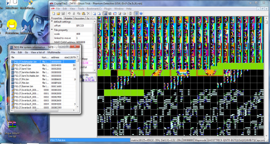
(don’t mind the windows 7 and pesterchum and malwarebytes this is my old 2011 laptop from undergrad, it just so happens that a lot of tools for NDS hacking work great on windows 7 because shit’s old)
That right there is very unambiguously the Ghost Trick logo. It gave me a glimmer of hope. And CrystalTile lets you highlight a selection of tiles and export them as an image:

rearranged in mspaint to:

My rudimentary knowledge of How This Works tells me that it obviously needs to reference the right palette for the colors to be right, but whatever, this is CLEARLY IMAGE DATA so ALL IS NOT LOST.
...but, for a while, that was about as far as I got. Some googling brought me to this thread, where OP states that allegedly the “cpac_2d.bin” contains all of the sprite data in the game [this is Capcom standard, it seems?], but having trouble actually accessing said data. Viewed as-is it’s a jumbled mess, haven’t been able to make heads or tails of it in CrystalTile although this could certainly be because they’re out of order in a way that’s not obvious. It is really, really difficult to just parse like this.... it’s a massive portion of the ROM, too, so even figuring out what general area of this I should poke around in is quite an undertaking. [looking w/ tile form GBA 4bpp as that is the only tile form that gave me a visible image for the logo above]... although I found some things which look promisingly like visual patterns, and might help me figure out how to re-order these tiles so i can maybe see something approaching an image. I uh... haven’t figured out how to customize the tile ordering in CrystalTile (like column widths) very well, that’s next on my to-do list. This one in particular I may come back to later:

(^Viewed at offset 4AD9E0)
There are plenty of others but this is among the more promising as far as likely actually being uncompressed visual data. There’s so much besides just this one though that I would be here all day posting screenshots; At any rate, there are patterns that may be worth looking into, but the sheer volume of data corresponding to this “.bin” file is going to make that REALLY tedious to try and comb through with any sort of reasonable efficiency. This could also be a fool’s errand, as it could be the data is compressed or out of order somehow and it is necessary to extract the true files hidden within that “.bin” to actually make proper sense of them. I don’t know. If I haven't made it clear, I'm a newbie at this and don't really understand what I'm working with yet.
So I briefly tried another approach. I thought, heck, I have the dev version of DeSmuME on here, let’s boot that baby up.
(oh boy did it chug.)
I learned some neat stuff.
First, I learned that for most of the game, the “main screen” is the bottom screen as opposed to the top screen, which makes complete sense if you’ve played it. Just goes against convention which is interesting. Except for during the title screen, where it is the expected order, for... reasons?
Anyway, I first tried isolating what layer the talk sprites were on on the “main” screen, which was unsuccessful but interesting. This is with every other layer turned off on the bottom screen (tools -> view layers, toggled off all except for “Main BG 0″)...:
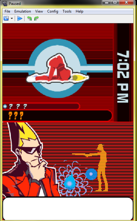
It looks like a lot of things are on that same layer. Now we know.
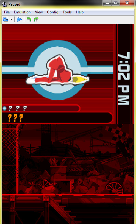
(Worth noting that if you isolate just the “Main BG 3″ layer you get a nice view of the backgrounds!)
My next task was fiddling around in the tile viewer in the *emulator* to see if that got me anywhere. And, well, it did... I think! I don’t know what it means just yet but launching the tile viewer (tools -> view tiles) and selecting “LCD - 0x6850000″, at the 0x140 tile there is a very clear image of the current talk sprite. And this image DOES update when the sprite changes, so whatever this tile is pulling from is where I want to be.

...Unfortunately, I’ve more or less hit a roadblock here and am calling it a night. I have absolutely no idea how to figure out where that tile is getting its information from, and I don’t understand enough about NDS files to know how to parse the information in CrystalTile any better at the moment. I tried using this tool by Luigi Auriemma to dive into the .bin file after exporting it but it spewed out a billion .dat files that are no easier to make heads or tails of than the original.
That's all I got for the time being. If anyone reading this happens to know any directions they can point me toward I am all ears, otherwise I will continue to just poke at this from various angles until it decides to succumb.
4 notes
·
View notes
Photo


so I tried to fiddle around with the screenshots and get a clearer look at that seeecret pokemon seen for a split second in the new trailer, as well as a hastily drawn mspaint interpretation of what I think I see.
I think it’s a cute little teapot elephant!
65 notes
·
View notes
Note
heyo! it's padawin (or wan??) anon again!! thank you for your very kind words ;////; huu, who knows, maybe you'll be able to see them one day! but for now i have another question ~as usual i am dum~ i recently got csp and i have 0 idea how to work it? not asking for a whole tutorial just a basic review on why it's so good since i won't lie i almost deleted it and had a heart attack o(-( thank you! hope ur having a good day!
AH! hello young padawan!
This is ganna be long so I’ll put this under a readmore!
thats great news! honestly from experience once you’ve learnt how to use CSP you can master pretty much adobe (Photoshop and illustrator) The program can be really intimidating at first thats for sure take it easy and stick to the basics and once you’re comfortable with that
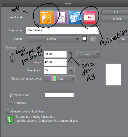
Once you’ve opened the program you’d want to work on an illustration so click on the top bar file > new. You’ll see something like this-
The Illustration one is for drawing and is overall best and easy! The comic ones are little more over whelming with shapes and layout hh and animation is more so timeline (little like flash animation and photoshop sorta)
This tool bar here is mainly useful for layers hhh
I don’t really touch much from there hhh, I only use expression colour to really look at the work in grayscale!
The three most important tools that’ll help give your work dimensions!
1) These are the tools for drawing, Each tool here represents the mediums they look like/ named after. Listed in order!
The pen - Thick lines, different options mess around to see which one suits you, I mainly use this for lineart or bulky shape work
Chalk - in the name! I use this tool for sketches!
Paint brush - This one is best for colour and for defined work! this is biased but the best is the oil paint brush, it just HMMM it just GLides from One colour to another and helps me create this effect -
The spray - Similar to the chalk but is more so identical to the mspaint spray one hhh from experience so I dont really USe THAT one
Stars - these are shapes! If you’ve used gimp you’d know how this one works! your brush turns into the pattern and shapes you chose like so -
Eraser - Self explanatory!
Blend tool - alot of people like this hhh but I’d recommend the oil painbrush over this but this basically makes blending alot more smoother and easier!
2) this is more so layout, some of these activate a new layer (like text)
fill bucket - my lazy butts fav tool, It fills in the pixilated or selected area, be careful tho if the colour is weak it’ll leak out and fill other areas!
Gradient - This… I dont use this at all hhh
Contour Line paint - This tool I dont use either hh, it basically bucket fills and area that is similar to the line around that area
TYPEEE!! - this is where you add text! the text on this program is kinda annoying but hey you can rotate it! how you rotate it, after you’ve chosen what type face (font) you want and size and colour COLLAPSE IT to a EMPTY LAYER!!! then use the selection tool and rotate it! (I will discuss the rotation took in part three!)
NO idEa WHat THIS tOOL IS IF IM HONEST
3) This is basically cropping and editing!
Zoom - This will help you zoom in and out!
Rotation - helps you turn your canvas around, upside down and so on to make difficult angles easy to reach!
— no clue
Movement - helps you move selected layer around! can be a pain if done by accident but hey what is ctrl + z for!
Selection/ lasso! - THIS TOOL wILL bE yoUR SAVOIR! I use to to fix layout as well as anatomy and perspective. When you select an area this will pop up!. The first one on the left is to cancel selection, 7th from the left is the one where you can move, resize! Those are really the important ones hh

Wand - The iconic select took, that selects an area you click and the same options from the selection/ lasso will pop up!
eyedropper - this tool will basically copy a colour on any canvas that is advisable, helps to reuse a colour! it auto works if you just right click on your mouse or pen so you dont have to keep changing from your pen,painbrush or bucket tool!
I think thats the basics? now I’ll talk about all the aspects CSP has to offer in Edit that makes life a blessing such as colour corrector, change line of drawing and change canvas size (which is a million times easier than photoshop, which makes you use math and NUmBERS)
Tonal correction is what I use to basically fix the colours of my artworks, Its easier than redrawing the entire piece hhh, sometimes we all draw a little off colour pallette! so when you click that you’ll get -
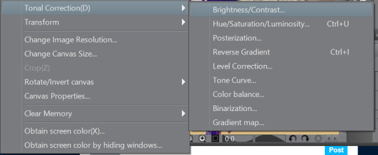
Brightness and contrasts - brightness really just makes its more white and black but contrast makes the colour more vibrant and pop, its a scale option so its really fiddling around with the two bars until what you see is something you’re happy with!
Hue, saturation hhhh - This will help you change YOUR ENTIRE hue aka the CMY (the primary colours, magenta cyan yellow) and the saturation tones the contrast making it easier on the eyes! same as the last one it’ll be sliders! so really mess with it and pick which one is pleasing to you!
the rest i dont use hhh but
Colour BALANCE - this helps me hhh basically you change the entire colour layout beyond CMY, it has three effects, the highlight, shadow and halftone! same as before sliders! mess around with until youre happy with how it looks! (It’ll auto preview)
I think that’s really it? any more questions please shoot me up!
OH! CSP is known to crash, its the only downside tbh, it also auto saves alot, so save alot! SAVE ALOT!! i’ve lost whole works like 6 hours from csp crashing as it was overwhelmed from my layers hh
here is how you can look for backup files incase it does crash! -
My documents -> CELSYS -> Clip studio PAINT DATA-> -Document BackUp or -Initial Backup.
5 notes
·
View notes
Text
i made a squeal to my cringe star trek self insert fanfic. it had just slightly better production values (i figured out png files are smaller than bmp files but dont have the artifacts of jpg files!), but it was lost when i accidentally erased my hard drive in like 2010. i recovered the source images i used for a lot of it, it had lots of recycled stuff from another lost shitty mspaint/windows move maker thing i did. an original cartoon called the crazy weird move. its lost too, but i did manage to recover it’s original script. iirc it was made mostly by keysmashing in microsoft word then letting spellcheck sort things out, then it was rearranged into something barely coherent.
brief summary: an evil oil tycoon named mop is stealing oil from fiji and in his spare time he hides radios under people’s hats. apparently other than that, he’s a nice guy. our hero, dyof (obligatory self insert) has to stop him by hiring “the lawyer man in a dress at moo cow university” but he doesn’t have any money. fortunately his friend polio couch just robbed a bank. anti-flag shows up at the end for a benefit concert.
lots of other stuff that is completely unrelated to the main story happens. is there even a main story? there’s a karate teacher named josh f nukealstein, who goes to an “italian puffy pants party” with someone named pillow b dumb. mop’s criminal headquarters is in someone named john j juju’s garden shed. there’s an old lady named mum kudzu who likes to dance and throw chives at people. there is a character named the dutch fiddle chef. apparently he cooks fiddles and people eat them and get diarrhea.
there’s lots of random song quotes scattered throughout the story for no apparent reason.
the story just ends with “to be continued” because i clearly had no idea how to conclude this trainwreck.
0 notes
Text
hi, other typically-traditional artist here! would put this in the tags but i am a lazy bitch.
i’m trying out and attempting to get better at digital art, and i think its about relearning the basics and figuring out a process that works for you?
i use inkscape on my windows laptop, a stylus my tutor gave me so i wouldnt have to MSpaint with my cursor, and i can tell you my process!
i tend to get the reference images in first, on the sketch layer. i make the sketch slightly transparent if needed, and have a second layer for colors and blending and all that jazz. my final layer is the lineart, which i spend a hell of a lot of time on.
its okay to get frustrated about the quality, and i think that it can and will take a while for a good art style to develop on traditional and digital mediums. maybe try fiddling around with a blank canvas, doing some basic studies and finding the styles and settings that work for you.
and dont worry, i feel the same fuckin’ way
hope this helps (:
I'm pretty decent at traditional art and i'm trying to also get better at digital art but for some reason digital art feels harder for me like idk why, i draw so comfortably on a paper but when i switch to my computer with the drawing tablet and try to make something there it looks less professional and takes so much more time. How to overcome this??
#art#art tips#art community#artists on tumblr#artists supporting artists#digital art tips#digital art#drawing tips#here’s my mediocre advice#hope it helps
81 notes
·
View notes