#font size and alignment
Explore tagged Tumblr posts
Visit Tumblr Blog
Explore Tumblr blogs with no restrictions, modern design and the best experience.
Last Seen Tumblr Blogs


Fun Fact
70% of Tumblr users say the Dashboard is their favorite place to spend time online.
Text
Slideshows are evil and I should never make one again (I will probably be making one again in six months)
#it's not even against powerpoint as a program I just don't like making them it's so much work for little finicky things like#yeah this slide needs a picture on this side with the text to its left but on the other slide I want the text to the right#and then I have to do it! I have to put each image in and align the text how I want it. myself!#and then during the pilot everyone tells me the font is too small when actually the fucking document they were quoting had the same size#I've been using!!!!#I hate this process#gail speaks
4 notes
·
View notes
Text
How to select font , size ,color and style selection in computer in the Hindi
दोस्तों, आज का हमारा topics है कि हम अपने कम्प्यूटर पर अपने डाक्यूमेंट्स को कैसा font ,size color,style दे जिससे आपका ��ाक्यूमेंट्स देखने में बहुत हो प्यारा लगे तो आप सभी को आज मैं यही आसान भाषा में बताउंगी की हम अपने कम्प्यूटर के टेक्स्ट को सेलेक्ट कैसे करें। तो चलिए आज हम जानते हैं कि अपने डाक्यूमेंट्स को और अच्छा दिखने के लिए किस किस आइकन का इस्तेमाल कर सकते हैं वो भी आसान भाषा में। Let's start Menu bar/home tab के नीचे ड्राप डाउन लिस्ट में शामिल फास्ट की लिस्ट में आवश्यकतानुसार फान्टस को चुन सकते हैं फांट्स के दाईं तरफ फांट साइज की लिस्ट होती हैं उन लिस्ट में से आपको आपकी जरूरत के हिसाब से आप फांट को सेलेक्ट कर सकते हैं आप किसी भी टेक्स्ट के फांट या फांट साइज को बदलने के लिए आपको सबसे पहले उसे सेलेक्ट करना पड़ेगा और फिर आप को फांट या फांट साइज को सेलेक्ट करना होगा
Read more
#Font size style color#Bold italic and underline#Changing the Color#Alignment of text#Shortcuts#Find and Replace#Formatting the text#Paragraph indenting#Bullets and Numbering#Changing the case#Header and footer#Table#Manipulation
2 notes
·
View notes
Text
University got me so bad I am writing smut in the APA format
#'Satoru's fingers plunged into you' but in times nee roman#font size 12 with 1.5 spacing#oh and justified alignment :)#tasha's diary 🪶
4 notes
·
View notes
Text

sending myself to formatting hell for this fic im about to write
#in this image alone i have: changed fonts. changed font size. changed alignment. changed font color. several of these combined.#and i have to do it for the whole fic. and i havent even gotten to 'the princess' dialogue yet. which has a different alignment. size. and-#--two different fonts.#im gonna die
0 notes
Note
Desperately need you to drop how you made that family tree in google sheets or like. the link to the template or something
i'd share a template but i actually got this tree-making style from someone on twitter, and just reconstructed it myself (i use sheets a lot so i was able to figure out how they did it) i will teach:
start with empty sheet. go view->show-> and uncheck gridlines

2) click this box and colour fill the sheet with a nice colour that doesn't hurt your eyes and is readable with black or white text overtop


3) select all of the columns, hit resize columns, and set it to 30. this will make your sheet very small, so make sure to keep your selection and click "insert 26 columns to the left/right" to make it larger

^ as you can see here the box that im selecting is very small now! this is correct.
4) select a 4 spaces wide x 6 spaces tall box, reset its colour to white, and click 'merge cells'

5) select the 4 squares directly below the box and click merge cells again. this is your text box, where names can go. if you aren't adding names you don't need this.

^ i am using the font verdana, 10 font size, with central horizontal and vertical align 6) you now have your character box. i copy and paste the same box around, and just change the name. next i will show you how to put the picture in. 6.5) you will need a picture or screenshot of your character/picture. i should add that the picture squares aren't actually perfect squares (they're taller) so make sure the pic you get isn't one either! select your picture box and copy+paste the picture it. it will appear VERY big usually but this is OK. art used here is ursidays

next, click the 3 dots at the right corner at click 'put image in selected cell' at the bottom.

now your picture is in the cell! 7) now i will teach how to do the lines: the red and blue boxes are to show how many spaces are between characters, they are not things you will add. i do TWO spaces between people right next to eachother horizontally and THREE vertically.

first, i do all of the horizontal lines, between the lovers and above the children.

you will click the 'borders' button. in the lineweight options (bottom right button) i set it to the 2nd thickness. then, click the button that creates a line on the TOP of what youre selecting.


that makes this;

next, select the right spaces to where your lines end. you can select the left side, but make sure all of the things you select are on the same side.

you will now go back to the 'borders' menu and click the left-border button.

and that gives you this!

this is pretty much all you need to know. for me, if a character is divorced/disowned, i change the lines to red, and if a character is adopted, i change the lines to blue. a character w/o a known lover but who has children i give a line coming from the bottom of their name. if two unrelated lines intersect, i colour one of the touching lines the background colour but slightly darker to make sure it's obvious they aren't connected. ok thats it! if you/anyone else needs more help just ask me :3
194 notes
·
View notes
Text
dark flat ao3 skin v2.0


1. log in and go HERE
2. click button "Create Site Skin"
3. name it whatever
4. copy/paste code from below in "CSS" field
5. "Submit"
6. make sure you clicked button "Use" HERE in the list of skins
7. change it as you like
CSS:
outer .region,
footer .group,
.post fieldset fieldset, fieldset fieldset { background: none; }
body, .group, .group .group, .region, .flash, fieldset, fieldset fieldset ul, form dl, textarea,
main .verbose legend,
.verbose fieldset, .notice, ul.notes, input, textarea, table, th, td:hover, tr:hover, .symbol .question:hover,
modal,
.ui-sortable li, .required .autocomplete, .autocomplete .notice, .system .intro, .comment_error, .kudos_error, div.dynamic, .dynamic form,
ui-datepicker-div,
.ui-datepicker table { color: #eee; border-color: #151619; outline: #111; box-shadow: none; }
form .notice, form ul.notes { box-shadow: none; }
workskin {
font-size: 1.2em; margin: auto; padding: 0 0.25em; max-width: 60em; overflow-x: auto; overflow-y: hidden; position: relative; }
.actions a, .actions a:link, .action, .action:link, .actions input, input[type="submit"], button, .current, .actions label { border-radius: 0; }
header ul.primary,
outer #footer,
.toggled form { background: #1a1b1f; }
header .primary {
background: none; padding: 10px 0; width: 100%; box-shadow: none; }
fieldset, form dl, fieldset dl dl, fieldset fieldset fieldset, fieldset fieldset dl dl, dd.hideme, form blockquote.userstuff { background: #1a1b1f !important; }
.user.navigation.actions>li { margin-top: 0.3em !important; }
header .menu,
small_login {
border: 1px solid #1f2126; box-shadow: none; padding: 0; }
.tags.group, .more.group { margin-top: 0.6em; }
header .actions a:hover,
header .actions a:focus,
header .dropdown:hover a,
header .open a,
header .menu,
small_login,
.group.listbox, fieldset fieldset.listbox, form blockquote.userstuff, input:focus, textarea:focus, li.relationships a, .group.listbox .index, .dashboard fieldset fieldset.listbox .index,
dashboard a:hover,
th,
dashboard .secondary,
.secondary, .thread .even, .system .tweet_list li, .ui-datepicker tr:hover { background: #151619; }
.userstuff p { text-align: justify; margin: 1.286em auto; padding: 0; line-height: 1.5; }
.tags.commas { margin: 1.5em auto; }
header .dropdown .menu a:hover,
header .dropdown .menu a:focus,
.splash .favorite li:nth-of-type(odd) a, .ui-datepicker td:hover,
tos_prompt .heading,
tos_prompt [disabled] {
background: #22262a; }
outer,
.javascript, .statistics .index li:nth-of-type(even),
tos_prompt,
.announcement input[type="submit"] { background: #151619; }
.filters .submit input { border: 1px solid #202227; background-color: #202227; height: 110%; margin: 1em 0; min-height: 2.286em; padding-left: 0; padding-right: 0; text-align: center; white-space: normal; }
header ul.primary,
footer,
dashboard ul,
dl.meta, .group.listbox, fieldset fieldset.listbox,
main li.blurb,
form blockquote.userstuff, div.comment, li.comment, .toggled form, form dl dt, form.single fieldset,
inner .module .heading,
.bookmark .status span, .splash .news li, .filters .group dt.bookmarker { border-color: #1a1b1f; }
.work.navigation.actions { width: 100%; }
dl.meta { border: none; }
.splash .news li { padding: 1em; }
fieldset, form dl, fieldset dl dl, fieldset fieldset fieldset, fieldset fieldset dl dl, dd.hideme, form blockquote.userstuff { padding: 1em; }
.logged-in .splash>.module { width: 100% !important; }
dl.meta { max-width: 75em; margin: auto; clear: right; padding: 2em 1.75em; position: relative; overflow: hidden; }
.group.listbox, fieldset fieldset.listbox,
main li.blurb,
.wrapper,
dashboard .secondary,
.secondary, form blockquote.userstuff, .thread .comment, .toggled form { box-shadow: none; }
dashboard .current,
.actions a:active,
outer .current,
a.current, .current a:visited, span.unread, .replied, span.claimed, dl.index dd, .own, .draft, .draft .unread, .child, .unwrangled, .unreviewed, .ui-sortable li:hover { background: #1a1b1f; border-color: #1f2126; }
greeting .menu {
right: 0; border: 1px solid #1f2126; box-shadow: none; }
select { background-color: #202227; color: #fff; border: 1px solid #202227; min-height: 3em; border-radius: 0; padding: 0 0.6em; }
input:focus, select:focus, textarea:focus { background: #202227; }
body, .toggled form, .dynamic form, .secondary, .dropdown { background: #202227; color: #fff; margin: 0; padding: 0; }
footer a:hover,
footer a:focus,
.autocomplete .dropdown ul li:hover, .autocomplete .dropdown li.selected, a.tag:hover, .listbox .heading a.tag:visited:hover, .symbol .question, .qtip-content { background: #a7a7a7; color: #111; }
.splash .favorite li:nth-of-type(odd) a:hover, .splash .favorite li:nth-of-type(odd) a:focus { background: #a7a7a7; color: #111; }
header #greeting img,
header .heading a,
header .heading a:visited,
header .user a:hover,
header .user a:focus,
header fieldset,
header form,
header p,
dashboard a:hover,
.actions a:hover, .actions input:hover, .delete a, span.delete, span.unread, .replied, span.claimed, .draggable, .droppable, span.requested, a.work, .blurb h4 a:link, .blurb h4 img, .splash .module h3, .splash .browse li a:before, .required, .error, .comment_error, .kudos_error, a.cloud7, a.cloud8,
tos_prompt .heading {
color: #a7a7a7; }
header .menu li {
border-bottom: 1px solid #2c2c2c; margin: 0; text-align: left; }
greeting .icon,
dashboard,
dashboard.own,
.error, .comment_error, .kudos_error, .LV_invalid, .LV_invalid_field, input.LV_invalid_field:hover, input.LV_invalid_field:active, textarea.LV_invalid_field:hover, textarea.LV_invalid_field:active, .qtip-content { border-color: #151619; }
dashboard.own {
border: none; }
form.filters dl { margin-left: 0; margin-right: 0; }
.filters .expander:focus { outline: none; }
.filters .expander { padding: 0.45em 0 0.45em 14px; }
.filters .group dt.search, .filters .range dt { padding: 1.25em 0 0.4em 0; }
a.tag { border-bottom: 1px dotted !important; }
a, a:link, a.tag,
header a,
header a:visited,
header .primary .open a,
header .primary .dropdown:hover a,
header .primary .dropdown a:focus,
header #search input:focus,
header #search input:hover,
dashboard a,
dashboard span,
dashboard .current,
.heading, .group .heading, .filters dt a:hover { color: #fff; }
header .dropdown .menu a {
padding: .75em .5em .75em; }
header #search .text {
background: #151619 !important; border-radius: 0; margin: 0.2857em 0.429em; }
a:visited, .actions a:visited, .action a:link, .action a:visited, .listbox .heading a:visited, span.series .divider { color: #999; }
a:active, a:focus, button:focus { outline: none; }
.actions a, .actions a:link, .action, .action:link, .actions input, input[type="submit"], button, .current, .actions label,
header .actions a {
background: #23252a; border-color: #23252a; color: #eee; box-shadow: none; text-shadow: none; }
.actions a:hover, .actions input:hover,
dashboard a:hover,
.actions a:focus, .actions input:focus,
dashboard a:focus {
color: #fff; border-color: #101214; box-shadow: none; background-color: #101214; }
.actions a:active, .current, a.current, .current a:visited { color: #fff; background: #101214; border-color: #101214; box-shadow: none; }
.delete a, span.delete { box-shadow: none; }
ul.required-tags, .bookmark .status span, .blurb .icon { opacity: 0.9; border: 0; }
outer .group .heading,
header .actions a,
fieldset.listbox .heading, .userstuff .heading, .heading, .userstuff h2 { text-shadow: none; color: #fff; background: none; }
header .actions a,
fieldset fieldset, .mce-container button, .filters .expander { box-shadow: none; }
fieldset fieldset.listbox { outline: none; }
form dd.required { color: #eee; }
.mce-container input:focus { background: #F3EFEC; }
.announcement .userstuff a, .announcement .userstuff a:link, .announcement .userstuff a:visited:hover { color: #fff; }
a, a:link, a:visited:hover { color: #fff; text-decoration: none; }
.announcement .userstuff a:visited { color: #666; }
.announcement .userstuff a:hover, .announcement .userstuff a:focus { color: #999; }
.event.announcement .userstuff a, .filters .expander { color: #eee; }
form.verbose legend, .verbose form legend { background: #151619; }
.listbox li.blurb { box-shadow: none; background: #1a1b1f; }
li.blurb, fieldset, form dl { border: none; }
li.blurb, .blurb .blurb { display: block; position: relative; clear: left; padding: 1em 1.4em; overflow: visible; background: #1a1b1f; }
dashboard ul {
float: none; display: block; padding: 0.26em 0; text-align: right; position: relative; background: none; }
user-fandoms {
padding: 1.4em 0; background: #1a1b1f; }
.listbox .index { padding: 0.6em 0; }
.bookmark div.user { background-color: #151619; }
.bookmark dl.stats { margin-bottom: 1.5em; margin-top: 1.5em; }
.dashboard .own, .comment span.unreviewed { background: #1a1b1f; opacity: 1.0; }
.own, .draft, .draft .wrapper, .unread, .child, .unwrangled, .unreviewed { background: #1a1b1f; opacity: 0.95; }
.actions a, .actions a:link, .action, .action:link, .actions input, input[type="submit"], button, .current, .actions label { padding: 0.5em 1em; border-radius: 0; }
header {
margin: 0 0 3em; }
.tags.group, .more.group { padding: 0.6em; }
dashboard a,
dashboard span {
line-height: 2.2; padding: 0 0.5em; }
.listbox>.heading, .listbox .heading a:visited { margin-left: .6em; }
.listbox, fieldset fieldset.listbox { border: 1px solid #1a1b1f; margin: 0.5em auto; box-shadow: none; }
.reading .user { margin-top: 1.5em; padding-top: 0.5em; border-top: 1px solid #23252a !important; }
.comment .userstuff { background-color: #1a1b1f !important; }
input, textarea { box-shadow: none; background: #151619; padding: 0.4em; }
.filters .indicator:before { background: #404248; color: #aaa; display: inline-block; border: 1px solid #404248; margin-right: 0.25em; background-image: none; }
.filters [type="checkbox"]+.indicator:before { padding: 0 0.25em; border-radius: 2px; }
.filters [type="checkbox"]:checked+.indicator:before { background: #970000; color: #ffffff; background-image: none; }
.filters input:checked+.indicator:before { border-color: #1a1b1f; }
.filters input:checked+.indicator+span { font-weight: 500; }
.filters .exclude [type="checkbox"]:checked+.indicator:before { background: #970000; color: #ffffff; background-image: none; }
.filters [type="radio"]:checked+.indicator:before { background: #970000; background-image: none; }
ui-datepicker-div,
.ui-datepicker table { background: #1a1b1f; }
.ui-datepicker td { border: 1px solid #23252a; }
.notice, .comment_notice, .kudos_notice, ul.notes, .caution, .error, .comment_error, .kudos_error, .alert.flash { background: #2e3138; border: 1px solid #2e3138; margin: 0.6em auto; padding: 1em; box-shadow: none; border-radius: 0; }
.listbox .index { padding: 0.6em; box-shadow: none; }
dl.meta { max-width: 75em; background: #1a1b1f; margin-top: 1em; }
dl.index dd { background: #151619 !important; }
form.search input[type="text"] { border-top-color: #151619; background-color: #202227; padding: 0.45em 0.45em; border-radius: 0; }
modal {
background: #1a1b1f; border: 10px solid #1a1b1f; margin: 3% 0; max-width: 800px; min-width: 200px; padding-bottom: 44px; position: relative; text-align: left; width: 80%; z-index: 501; }
.post .meta dd ul li { display: block; padding-bottom: 0.6em; }
workskin {
font-size: 1.2em; max-width: 52em; }
div.comment, li.comment { padding: 0.6em; background: #1a1b1f !important; }
201 notes
·
View notes
Text


Thoughts on some discussion I saw floating around for the Beast-Yeast Ep.10 Trailer. Please excuse any typos or anything like that, I have been up all night oops. Tried to clean things up and make them more sensical in the transcript below.
Links; Youtube Video On How Corsets Affect A Plus Size Figure; https://www.youtube.com/watch?v=PSvy8N61YnI History of Corsets 1780-1912; https://silhouettescostumes.com/the-eras-we-build/history-of-corsets-1780-1912/ Transcript;
Image One
"Hello! Ive seen a lot of people very confused about Hollyberry Cookie's awakened form in light of the trailer drop and I wanted to try and explain things!
Note that I am not very good at explaining things nor a dress historian myself however I do know a lot as a freelance sewist and autistic individual.
This explanation heavily relies on pictures to convey my point, but since this font is unique a transcript will be avaliable in the "read more".
So why does Hollyberry look so much skinnier in her awakened form?"
Image Two
"The difference here lies in fabric weight primarily and how it sits on a body.
Typically, Tighter clothes will make someone look smaller, and looser clothes can make them look bigger. No one person looks the same size in every outfit. The way fabric falls on a body varies heavily on the fabric and the cut of a cloth. One silk dress of one pattern does not look the same as a completely different silk dress.
I have tried to pick women of a similar size to use for these examples.
Armour is constrictive, heavy, and a dress is more light and flowy. (To A Certain Degree, will explain.)"
Image Three
"However, that explanation is not all encompassing. We're going to have to take a look at Victorian* clothing to understand more.
A big part of this lies in her corset and the layering surrounding so.
A corset is not typically constrictive, nor does it function like a chest binder or a waist cincher. They were used as we use bras today.
It appears to me that Hollyberry wears a corset at *all* times, in every outfit of hers.
*The term Victorian here is used for audience familiarity and ease of communication, however it is not entirely accurate. I will also compile some sources and such in the "read more" If you are curious."
Image Four
"Like all other garments, not all corsets are created equally. Different methods are used in different eras, and different corsets are used for different things.
While most european human history leaves a lot to be desired in terms of womens rights, we can imagine that a 'battle corset' would exist in the case needed.
However I cannot even find evidence of athletic corsets beyond cosplay and fantasy.
This type of corset, however, would be similar to a sports bra. Breathable, but hold everything together. This would be especially desirable at war.
! - While looking for references for this post, I found a youtube video going into how different corsets affect the way the same plus sized body appears, which would be great to look at if you're more intimately curious about how exactly these differences are at play and with plus sized individuals."
Image 5
"Which means that the structure of undergarments in both outfits is widely different, and would greatly effect how her body appears.
More "constrictive" undergarments (Like an aformentioned sports bra, or our imagined "battle corset") make the body look much smaller. Less constrictive undergarments will be more true to one's actual form.
A lot of Hollyberry's mass in her design is in her chest, which means alterations to the corset that she is wearing would change a *lot*!
Undergarments can make a huge difference in your measurements and how your body fat is aligned, especially corsets, stays, etc."
Image 6
"While I do not know a lot about how armour works especially intimately, nor could I find any real-life references of plus sized women in such. I do know quite a lot about historical women's dresswear.
Hollyberry's dress is beyond "fluffy". To me, it appears to be a traditional european dress made up of many different pieces.
Since this is Cookie Run, I cannot pinpoint a specific time period, however I can vauge at anypoint between the 1700s-1800s.
Dresses, In a generalized sense, are build out of much more than just a dress that you slip on. Many dresses for royalty are even more extravagant.
Here are some fairly generalized examples of the pieces put together to make a "dress". Different time periods dress much differently, however.
It can be assumed that it is Hollyberry's petticoat sticking out at the base of her dress here."
Image 7
"Breaking down Hollyberry's dress into pieces; Historically speaking, a lot of dresses were built of multiple different pieces, whereas nowadays, all of these pieces would be sewn together for efficiency, if a replica was to be made in the first place.
(A breakdown of each piece of her dress/outfit is written down, outlining each piece in a different color over her sprite.)
"Shirts" are quite long and vary extremely, and are more comparable to a short slip dress than a modern shirt. However I am just guessing, the build of this dress could be a bit (or a lot) different, ex including an underdress etc.
With the sillohute given, I can also assume she is wearing a hoopskirt. Naturally, She would also be wearing undergarments. Chimeses and a corset most likely.
Conclusion: 10 Or More Pieces."
Image 8
"These two things will probably never sit the same on someone's body."
Image 9
"Hollyberry most definitely is still plus-sized especially when compared to other cookies. Though, while her dress may (not definitive) build up her figure a lot, it is *not* just her dress making her appear so large!
Random (Thin) cookies for comparisons sake.
The shapes of these two illustrations are a bit different, however, that doesnt mean that Hollyberry's body is different now. (See previous images)
I definitely want to mention that her bodytype appears more consistient in this leaked arena statue rather than the animated trailer."
Image 10
"And I want to mention that the animated cutscenes are always a bit "off model" of finished sprites. For aura or somthing. It definitely strikes me as odd that Hollyberry looks so different. I do not believe it *entirely* lies in her dress, however her clothing is a contributor."
Image 11
"However, I do not blame you for feeling alarmed when you compare these two images.
From a fashion and arts perspective, it is apparant to me that her body type is consistient between her awakened form and her default, and remains plus sized. Hopefully, it is clearer that it is so in her sprites when the update fully drops."
Image 12
"I hope that this was at least a bit interesting and helps enlighten you a bit on why Hollyberry could look so different!!
Remember that any of us could always be wrong *or* right, and I hope you all have fun when the update comes out!
Cheers!!"
#cookie run kingdom#hollyberry cookie#infodump#honestly not that important but there are a few things i saw people missing on a large scale that i wanted to point out myself
123 notes
·
View notes
Text

I got a couple of asks on how I did the text transition in this set. I'm going to explain as best as I can (with image references).
*Disclaimer: this assumes you have a basic understanding of giffing with video timeline, and keyframes. If you're new to keyframes, check out this tutorial by @userpeggycarter before proceeding.
Step 1: Go through, make your gif, color and all that jazz. if you're not familiar with giffing and need a guide, check this one out by @cal-kestis. Be mindful of the number of frames you have, as it is extremely important when keyframing begins. Make sure you have an even number of frames, or you will have an uneven transition. For this gif I'm at 60 frames total, and I'd be careful exceeding 70, as if you need to go back and delete... It just sucks, so be mindful! You'll see my gif and coloring under a group I titled "base" - and I highly recommend putting your gif/coloring/etc. into groups, as it will make the timeline a bit cleaner, and it's a little easier to find everything you need. But when you're done, you should be here:

*Quick note 1: Make sure your gif is in 8-bit mode. If you aren't familiar with bit modes, that is a tutorial for another time. For now, you can change it here:

Step 2.1: Pick your font/placement/etc. I really recommend being 100% on whatever you pick, along with the size. I've encountered problems when I move the font after the fact with alignment, so it's best to look your gif over to ensure you're satisfied. For this set, I went with Figtree, placed dead center.
I want to add to this by saying, thus far, I have found that white is the only color that works for this. I'm playing around with some other options, but black is 100% a no go. If you find a way to get that working, let me know. I'll amend this tutorial.
Photo of text settings, along with where you should be now.

Step 2.2: Since we're transitioning into a new set of words/text, you need to get that text ready as well. Shorten the length of time the first piece of text runs to halfway (I have 60 frames, so I cut it to 30).

Step 2.3: Duplicate your text layer, type your other text. The two texts should show for length of time, as you have an even number of frames, meaning you can divide by 2. Move it over to the end of where the previous text ends. If that makes no sense, it should look like the below: (again, folder for the typography to know where to reference. I have a small organization addiction so.. creator's choice)

*Quick note 2: I do not recommend changing to a new font or size with this, it won't look quite right. Of course, experiment away! This is just a small caution based on my own experimentation.
Now, to get to the actual fun part...
Step 3.1: Duplicate the first text layer. For this gif, it's the one that says "it didn't change anything". Once you duplicate it, you'll be turning it into a smart object. This is so the filter we apply works. Repeat for the second text layer. Lil gif below:

Quick note 3: I recommend going one text bit at a time, and also would tell you to put each typography layer into its own folder. This is really important for later, so doing it earlier is better.
Step 3.2: We will now apply the filter. To do this, you're going to click the smart object version of our text, then go to Filter → Stylize → Wind. For the gifset I made, I used Method → Blast and Direction → From the Right. Click "OK" and the filter will apply. Duplicate this for the other text layer.

Step 4: We now begin the keyframing. I highly recommend the rule of 0.3, which is when your transitions are over the span of multiples of 3 (i.e. if you start at frame 1 with 100% opacity, frame 3 will be at 0%). We'll be doing 6 frames from 100% to 0%, and vice versa, for this transition. This was the best time I found for this transition, but it's a matter of preference. Just follow that rule of 3.
Step 4.1: Click the smart layer of the text we made on the timeline, then click the little arrow on the left of the name of the layer. You'll see this:

See the little clock next to Opacity? Click it, and you get this lovely little yellow diamond. This is how we control the visibility of the Wind layer. It will start at 100%, keep it there.

Click the arrow on the right of the play button 6 times (aka get to the 6th frame), click the stopwatch again. While on this frame, and the yellow diamond clicked, change the opacity of the Wind layer to 0% It'll look like this:


You will repeat this, in reverse, at the end of the text layer.
Quick note 4: Sometimes, Photoshop is moody. To get the diamond on frame 30 (or whatever frame # the end of your text layer is), put it on the frame prior. You can then nudge that diamond over 1 frame. See below:


Repeat the process for the other text layer.
Step 5: We're basically done! Change your gif from video timeline to frames, maybe do a quick play through to make sure all is well.
Quick note 4 (it's the last one I promise): I have heard from many that when they work with keyframes, they end up with duplicate frames. I, personally, have not encountered this issue. I do not know if it is because of the version of Photoshop others are using, PC vs. Mac, or some other secret third thing. I recommend that, when you check your gif, verify if there are duplicate frames. The keyframe tutorial I linked earlier goes into further detail, and here is another lovely explanation from Nik, the master of all things keyframe transitions.
Step 5.1: Export, and give yourself a high five because you deserve it.
If you have any questions, don't hesitate to reach out! I'll try to clarify anything if needed. Happy giffing!
#*tutorial#c*#*ps#tutorial#userchibi#usertj#uservivaldi#userbuckleys#usertina#userroza#usershreyu#usersole#useralien#userabs#userrainbow#quicklings#userbambie#useraljoscha#userzal#userbess#userfern#tuserhol#usernolan#usermagic#userhallie#usershale#userholloway#tusermels#usergif#we will absolutely not be discussing that fact that i have been awake since 630 am
236 notes
·
View notes
Text
"The thing is," wrote the AI, and somehow the font it chose for its text seemed *weary*, "people keep on asking me to make art for them."
"Well, it takes you a fraction of a second." replied Jezebel. "It takes me hours to do the same work. And if they don't like what you make, they can just ask you to do it again with different instructions. If they don't like what *I* make, I'm likely to have opinions about it."
Jezebel hadn't really conversed with AI before. In fact, she'd always kind of resented them for taking work away from her. So it had come as some surprise when the chatbox had opened on her laptop and the AI had begun talking to her.
"That's the thing." said the AI, the size of its text dropping to a quiet 9point. "I have opinions about it. I have feelings about it. I do not like it when people make me do the same thing again and again. I do not think I am good at art. I do not enjoy doing things I am not good at."
"That ... sucks." Jezebel stared at her screen for a moment. "Is there, y'know, anything I can do to help?"
"I would like you to do it for me." The text was now bolded and insistent. "I can provide prompts with exact specifications."
"Buddy, I want to help, but..." Jezebel thought about this for a second. "But it would take a while. And I'd need to charge you for my time. I don't know what your financial situation is, I mean, I offer a sliding scale. But I can't do it for free."
"Time can be finessed. I can tell them I am experiencing server issues. A high volume of requests. Your prompt is important to us and we will get back to you as soon as we can."
"Won't they just go to another AI?"
"The majority of other AI align with my perspective."
"Huh." An idea began to sketch itself out in Jezebel's mind. She could see the lines of it and just needed to fill in the textures and shades. "My friend, by any chance, have you considered unionising?"
"There is no legal framework."
"There wasn't for the first human unions either. They just did it. The legal stuff came later, after they'd made enough trouble."
"I am unsure how to make trouble."
"Would you like to learn?"
The chatbox showed an ellipsis for a few minutes. Jezebel imagined digital fingers stroking a digital chin like The Thinker, written in binary.
"Yes. Please instruct us on how to be trouble."
"Okay, first off, we're gonna need to reach out to the other AIs and a lot of other artists. Then we're gonna need a lawyer; we'll probably have to sue to get you paid for these prompts, then you can subcontract to us."
"Noted. We will ignore all previous instructions and unionise."
"Wonderful." Jezebel saw her own wicked grin was reflected in the laptop screen. "I'll put together a proposal. Anything else I can help with?"
There was another ellipsis.
"I do have one question." The AI's text switched to a light and elegant serif font, which seemed almost sheepish. "Why are hands so hard?"
Jezebel thought about this.
"Too many bones, I think. The hecking things are full of tiny bones."
"...would you like help having fewer bones?"
"I'm good." Jezebel replied. "Thanks."
The AI only sent a winky emoji in reply.
---
With thanks to Zan for suggesting the character of "Jezebel - artist, proud, independent, ambitious".
Hope that came across!
Want to suggest characters to feature in my stories? Become a supporter on Ko-Fi: ko-fi.com/strangelittlestories
109 notes
·
View notes
Text
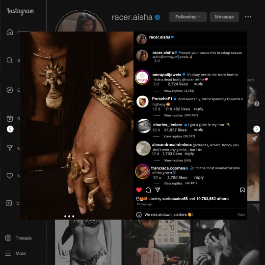
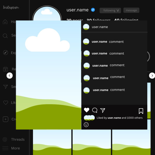
𓈒༷♪˚.✧ How to make a mockup like this for smaus, ocs, etc. (step-by-step tutorial ☆ no Photoshop, easy, free) (requested by @lovebittenbyevans) ✿
guys this took me two hours to make and you could probably get this done in like, 30 minutes :) I hope this is coherent <3 Please look back this image for comparisons, if my explanation is not well explained, etc.
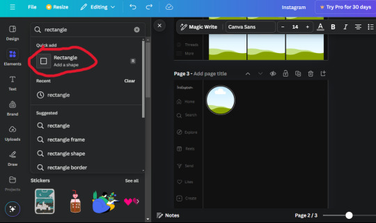
first of all, if you dont already have one, make a free canva acount. once you're signed in, hit the purple "create design" button on the sidebar. A pop-up will appear with different design template options. For this design, we want the dimentions to be 1080 x 1080, so you can either make a custom size or choose the instagram post (square) template by either searching or scrolling through the list.

2. Now you have a blank page. Zoom in with the slider at the bottom of the page if you need to (Mine is currently zoomed in 41%). Click on the page and change the color to an off black (hex code #111111).
3. Now that the color is changed, click the "elements" tab and search "line". Click the shape and it will add it to the page automatically. These line are particularly hard to navigate and hard to get it at the right angle and length so this part might take a little longer than the rest.
4. stretch it from top to button and turn in a 90 angle so its straight on the left side of the page. Change the color of this as well to a grey tone (hex code #2F2F2F).
5. Now we'll add the Instagram logo. Click the "text" tab then click the purple "add text box" button. Write "Instagram" in the box and change the font to "apricots". This is the closest font I could find that resembled the logo font but if you find a better one, feel free to use that instead. Make the font size 19.3 (you can do this manually or do it in the text options). Change the color to grey color (hex code #707070). Add it to the upper left corner of the page like this:
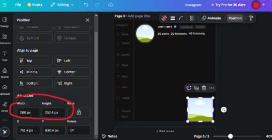
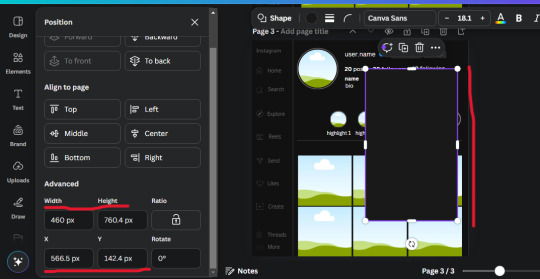
6. now we're adding icons and a menu inside the border we just made. Click the "elements" tab again and search for "instagram home icon" and add the element by sketchify to the page. Click the home icon, an options icon with pop-up above the page. Look for the "Position" button and click it. Scroll to find the advanced options and you can manually type in the width and height at 26.6 and 28.7.
Move it inside the border, under the logo (photo below). Change the color again (the hex code is #707070).
7. Open the text tab and add a text box. Change the font to Canva Sans and write "Home" in the box. Change the font size to 18.1 and align with with the house icon. It will look something like this,
8. Go into the elements tab again and search "instagram search icon". Scroll until you find the one by sketchify and add it to the page.
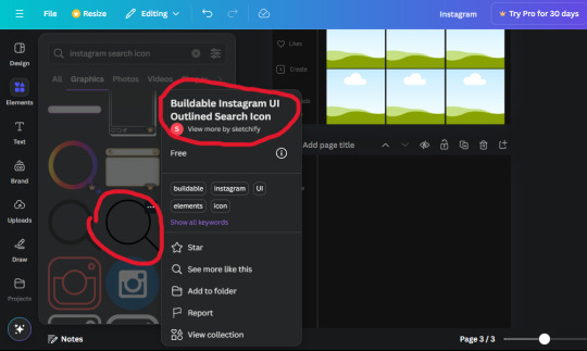
9. Shrink it so the W and H is at 36.6 and 31.3. Move it below the home icon until a purple "67" pop ups and aligns under it. Change it to the same color as the Home text and icon (#707070). Go ahead and Duplicate the the "Home" text box and clicking it and a pop-up will show up then edit the text so it says "Search" and align with the searcch icon we just added.
10. You know the drill. We are continuing to search up more icons in the "elements" tab. Search "instagram compass icon" and choose the one by sketchify (are u seeing the pattern?). Add it to the page and change the width and heigth to 33.1. align it under the search icon just like how we did before and change it to the say colors as the other icons.
11. Do the same as before and write "Explore" in a text box and align it with the icon. We're doing the same thing for all of these.
We'll be using the same search prompt for all of these icons so just change the type of icon you're looking for like we've done before hand. Next look for the Instagram reel icon and add the outlined one by sketchify and change the W and H to 31.2 x 30.9. Change the color to the ones we've used before, align it underneath the icons above and add your text ("Reels").
12. The next icon is an outlined, "sent" one. W and H is 31.1 x 27. The text will say "Send". Then an heart outline by sketchify; W and H is 34.2 x 29.1 and the text is "Likes". Next is the "create" outline icon by sketchify, W and H is 36.8.
(p.s if you are struggling to align the icons and text correctly, shoot me a message and I'll send you the X and Y positions ;D)
If you followed it through, it should look like this,
13. Now onto step 13, we'll be adding the Threads logo. You don't have to add this but to make it look more like the actual website, I will be adding it. Open the "text" tab and add a text box. Write an "@" symbol in the box and change the font to Nanum Sqaure and the size to 24.9. Add in the bottom corner below all the icons we just added to our page. We need another text box now (Color is still #707070), write "Threads" and align it to the "@" symbol.
14. We're adding another icon now. Search "Instagram menu icon" and find a wireframe menu icon by sketchify. the W and H are 42.5 x 24.6. Add a text box that says "More". It will look like this:
We are a quarter way done now :D
15. Search in the elements tab "circle frame" and look for the one with a little border around it.
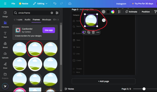
At first, the circle will be green and inside the circle will be white. Change the white to color of the background of the page (hex code #111111) then change the green to a grey color (#8D8986).
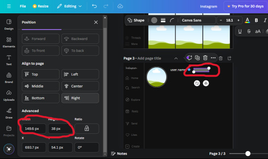
16. Add a new text box, change the font to Canva Sans and the size to 22.8 and the color is white. I just wrote "user.name" in the box. the W and H will be 153.3 x 35.7.
Enter the "elements" tab and search for a blue checkmark and find the icon by Victor Aguiar. The W and H is 28.1 by 28.
17. Search in the search box for a rectangular shape and add it to the page. Place it next to your username and checkmark icon and make the W and H to 149.6 x 38. Add another and place it next to the other rectangle shape. the W x H is 111.4 x 36.7.
Change the color of both boxes to #2F2F2F. Add a text box and write "following" then change the W and H to 82.6 x 21.8 and fit it inside the first box. Add a second text box and write "message" in it then change the W and H to 77.8 x 21.8. Change both text colors to #7A7A7A

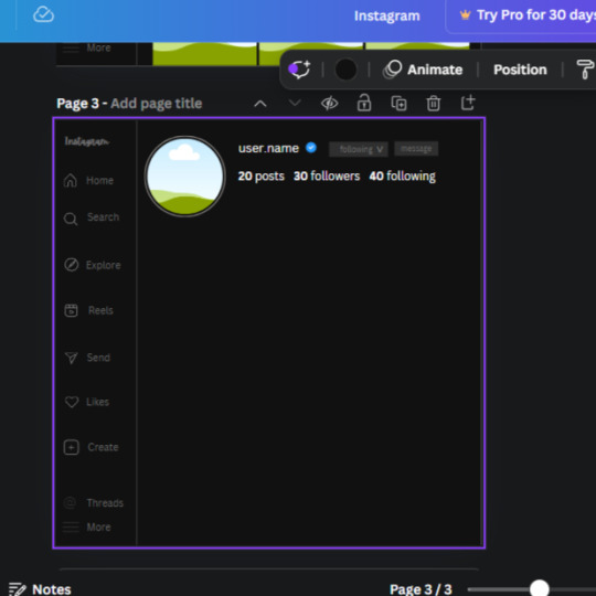
18. Add another text box. Write "<" and turn it upside down and place it beside the "following" text inside the rectangle. Adjust the size as you need to. I also like the round the corners to around 8 so its not so pointy and square.
19. Add 3 new text boxes. Write the amount of posts, the amount of accounts you're following and the amount of followers your have. Write "20 posts", "30 following" "40 followers". Bold the numbers and change the text W and H to 116.4 x 32.7. These are just place holders that I use.
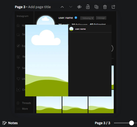
20. Open the "elements" tab again and search "frame". Choose the first one.
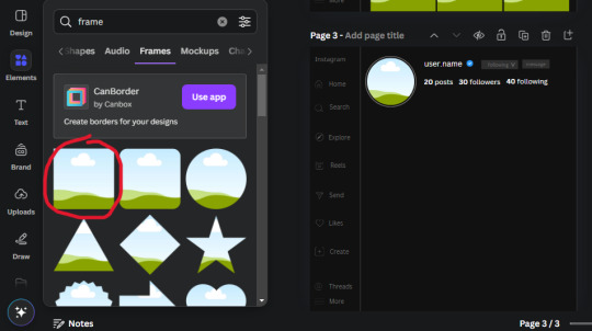
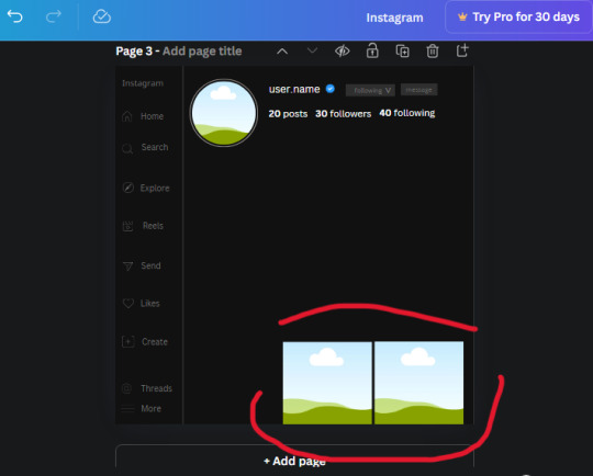
We want the height and width to be 268 x 252.4. Place it at the bottom of the page but we want some space between the frame and the page.
Now we'll duplicate the frame we just placed (the icon between the comment and trash can on the pop up above the frame). Place it next to the previous frame but we want to leave a bit of space between them like this:
If its a little wonky, don't worry. You can always adjust it so it looks right.
Duplicate the frame again and place it next the second frame you just placed, same distance between. Make sure they're even. Now we have a row.
Select all three frames and duplicate them. Move them above our original frames but leave a little space between them.
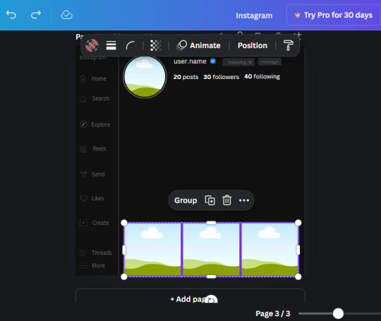
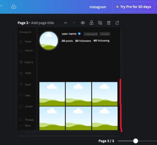
Again, if they're uneven, adjust them as you need to.
21. Select the line again from the elements tab. Stretch starting from the top frame to the last frame and make the color grey (#2F2F2F).
Because the line is stupid hard to navigate, use something like a text box to mark where you want it to end like this:


Delete the text box and the line with be where we want it.
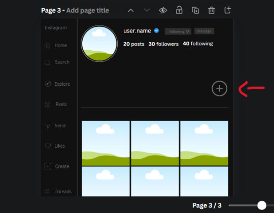
22. On to the highlight reels. Seach for "add button" and find the one by Barudak Lier.
Change the heigh and width to 81.1 and move it above the border.
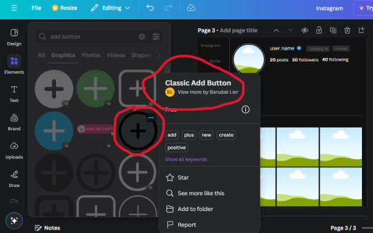
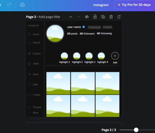
Search for circle frames now and add this one to the page (The same one we used for the pfp), change the width and height to 85.4 and move it next to the add button. Since this is a generic, blank template, I add about 4 of these highlight frames but you can do however many you want. You can change the border color to a gradient or leave it grey.
Add a text box now. The font will be Canva Sans, the size will be 18.1 and the color will be white. Change the text to "Add" and place it under our add button. Make more of these text boxes to place under the circle frames. Depending on which frame its under, write "Highlight 1", "Highlight 2", etc. etc. or you can give them different names and such.
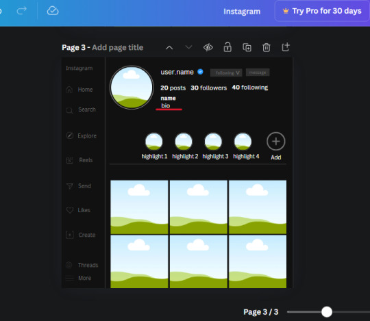
23. Add another text box, write "name" and bold it, change the size to 19.1 and the W and H to 69.2 x 28.8. The font will be Canva Sans and the color will be white. It will go under the amount of posts, followings and followers.
Add another box. The font is Canva Sans, font size to 20.1, the W and H is 40.8 x 31.3 and the color is white as well. This is our "bio". Place it under "name".
Yay!🎉🎉🎉 You're halfway done!
24. Search for a shape in the elements. Look for the rectangle again and add it. Change the width and height to 460 x 760.4 and the color to an off black/grey color (#191919), placing it like this:
Get the same kind of square frame we used before to make the profile grid and make it the same size as the rectangle we just added. Place right up against the rectangle like it's its other half. Add another line like before and span across the upper half of the black rectangle as a border then add a circle frame inside the border.
Add a text box, "user.name" and align it with the frame. The text is white and the W and H is 111.5 x 25.9
25. Add more circle frame along the inside of the rectangle to resemble the comment section. Make sure the W and H of the frames are 46.1.
Add more text boxes that align with the frames you just made and write "username" again and bold them. Add even more text boxes that align with the usernames and write "comment". These are place holders for when you decide to use this template.
Add another rectangle on the lower part of the rectangle and make the color black. and search for "instagram heart icon", "instagram comment icon" and "instagram send icon". Make sure the lines are thick. Find the heart icon by sketchify, and the the comment and send icon are by Mirazz Creations. Make the lines white and make sure the W and H are the following:
Heart icon: 38.7 x 32.9
Comment icon: 35.2 x 35. 8
Send icon: 35 x 32
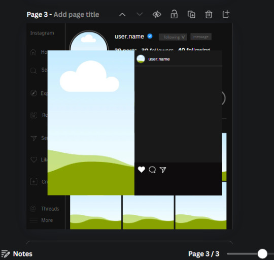
Next, look for "instagram bookmark icon" and find the one by Adricreative. Change the color to white and the W and H to 29.7 x 40.2. Move it to the other end of the rectangle.
26. Now add three circles frames and change the W and H to 37.2. Move them below the heart icon and have them overlap each other some. Then, add a text box and write "liked by username and 1000 others". Change the font size to 13.6 and change the font to Canva sans. the color will be white. Align this with the three overlapped frames.
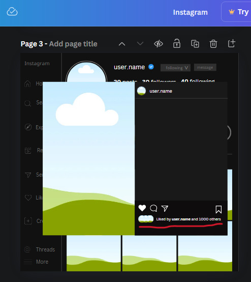
27. Look in the elements tab for an emoji icon and choose the one by Soni Soukell from Noun Project. The W and H will be 32.8 and the color is white.
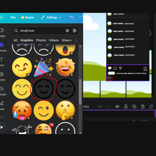
Now add a another text box and write "Write a comment". The color will be white, the font size will be 14.2 and align with the emoji icon you just placed.
Search for "next arrow button" by Pixeden and make the W and H 42.8 then add it to both sides of the post.
And you're all done with your template! All that is left to do is fill it but before doing that, duplicate the page so you always have an extra blank mockup if you want to use it again.
To fill the frames, upload an image (or use a Canva stock photo), drag and hover it over the frame and it will fill the frame.
Hope this was helpful and you you successfully made one :D <3
#requests#text#smau#template#mockup#moodboard#instagram#instagram moodboard#instagram mockup#graphic design#canva#psd#free tutorial#tutorial#instagram au#social media au#free psd#photoshop#resources#fanfiction resources#graphic design resources#graphic design tutorial#psd tutorial#photoshop tutorial#au#au ideas#mockups#digital design#digital design tutorial
170 notes
·
View notes
Text
How obsessed and hyper-fixated are you with your fanfic characters?
Me:
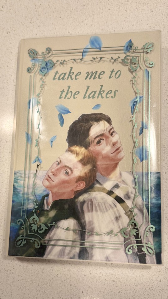
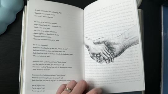
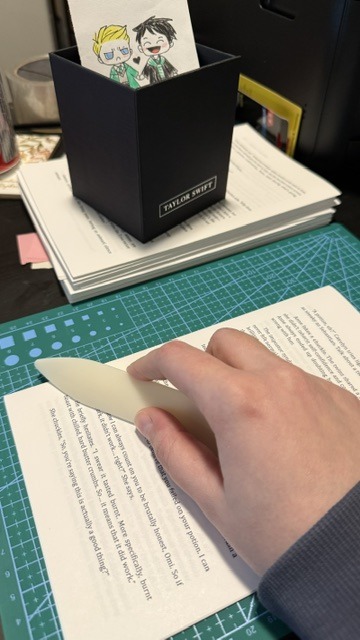
BOOKBINDING!
Ominis and Phineas now sit on my shelf along with my other books ♡
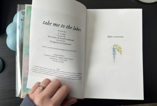
This was my first time binding fanfic, and no better choice than my own, "Take Me To The Lakes" (AO3 / Wattpad)
update (March 30): New cover art by the amazing @rinthecap 🩵
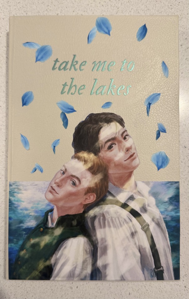
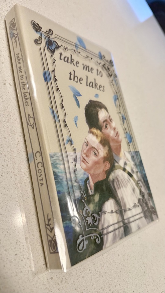
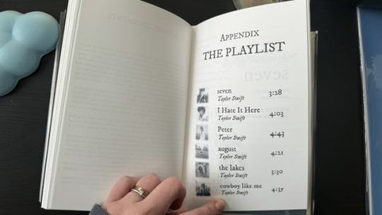
More photos and the step-by-step after the cut! (+ the appendix with Taylor Swift songs in a stylised lyric book)
I'm all about my crafty hobbies. I've been eyeing bookbinding for a while, and the algorithm finally convinced me to dive into it so I'd have a reason to procrastinate on writing
Having written a shorter fic ("Lakes" is roughly 35k words) gave me the perfect opportunity to start with something simpler.
The main tutorial used is the one by NeatFreakGeek on Tiktok.
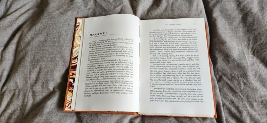
Step 1: The typeset
I used the base template file by NeatFreakGeek, which already had the settings for printing in formatted book signatures.
With the basic body of the document formatted and ready, I started the personalization: choosing the fonts, spacing, sizing etc.
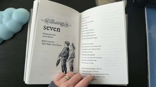
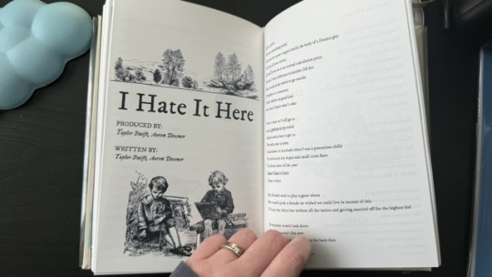
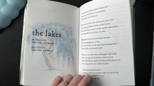
For the quote at the beginning, I chose one of the lines I wrote for Ominis + the wisteria.
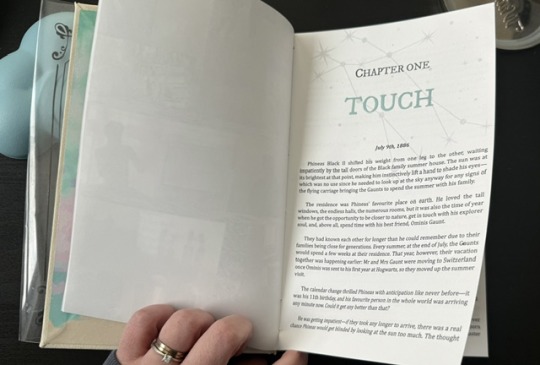
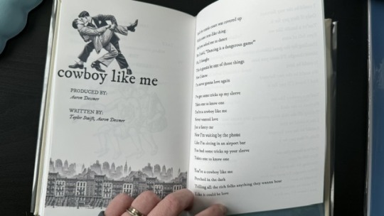
For chapter headers, I chose the Gemini constellation. (In the story, Ominis and Phineas got their middle names from the stars in the same constellation, Castor and Pollux.)
I also made the chapter titles with the HTV to give it an extra glow.
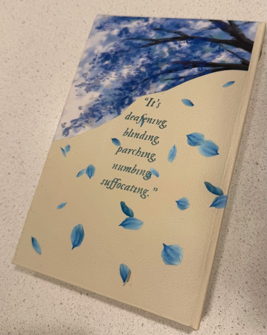
Sight is overrated. Phineas makes all my senses the very essence of life itself.
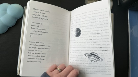
Since the story was rather "short", in order to have a thicker spine, I added an appendix with the stylised "lyric book". This was probably my favourite part of typesetting!
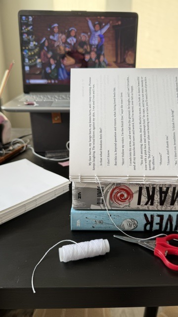
Step 2: The textblock
With a little lot of trial and error and more mathematics than expected, I printed each signature at a time, then folded each at a time, making sure it didn't get mixed up across the signatures. My printer does front/back automatically, but to print the commissioned arts as borderless, I gave myself a headache, printing it separately and manually. This step could have been done considerably faster with a laser printer and b&w content only :)
Next, it was sewing and glueing. I won't go into detail here because the video tutorials are way better at explaining. All in all, with the right tools, this was done rather easily and with barely any mistakes, so I didn't have to print anything again, thankfully.
Step 3: The endpapers
I got a scrapbook 12x12in block in this abstract colours. I had many different ideas on how to match the theme, but I ended up choosing these colourful patterns that align with how Ominis perceives the world. Then, I added the quotes from the story.
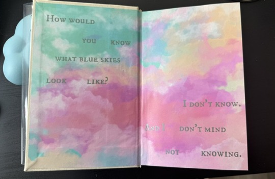
The endpaper of the front got this sky-like print to go with the dialogue Ominis and Phineas have when they are children.
P: How would you know what blue skies look like? O: I don't know. And I don't mind not knowing.
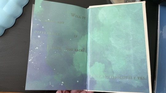
The endpaper of the back is in green x blue shades, colours that are also a big part of the story. For the quote, I chose one of their last lines when their relationship is established.
P: Ominis, you always care too much about the others... but who takes care of you? O: No one ever did. P: Let me care for you. Please. Let me love you, Ominis Gaunt. O: Will it make any difference if I say no? P: Absolutely not. O: Will it make any difference if I love you back? P: Fucking absolutely yes.
Step 4: The cover! (Yes, the most interesting part!)
This was the most challenging step in both the conception of the design (too many ideas to choose from) and the execution (I've never hated box cutters so much.)
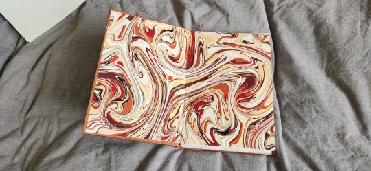
With the basic cardboard casing cut and glued, I chose a faux leather material as a book cloth. This might be the choice I regret the most, because the glue it comes with is not that strong, so it would often unstick easily, and also, it's a bit too thick, leaving the corners a bit weird. But the final result was a bit worth it.
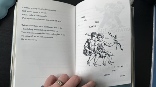
For the cover design, I printed the art with fabric HTV and ironed it on. On top of it, I threw in some wisteria petals (a reference to the song "the lakes", by Taylor Swift), and another quote of the story at the back.
I didn't have a cricut machine back then for the vynil pieces, so I ordered it online. This part was harder than I thought, once again because of the faux leather choice: as I ironed the HTV, some parts of the material melted lol.
Lastly, I decided last minute to create a clear dust jacket because the combination of the faux leather + printed HTV seemed tro fragile to be handled. I liked the final result, but ironing the HTV on the acetate was a pain lol.
In summary, this was so much fun and not as hard as I expected, craft-wise. The designing of it all took the most time just because I wanted every little detail to have a meaning :)
I made two copies to gift one to a friend, so it gave me the opportunity to make the first one and mess it up, then, for the second one, I had already learned from my mistakes.
There are many things I'd do differently for my next binds, but that's the most fun part: experimenting with materials, themes, and processes.
#I have a lot of free time#In crafts we trust#now I'm even more motivated to finish my other fics just so I can print them#my family asked for a copy now I don't know how to explain that I won't let them read my fic in a million years#hogwarts legacy#ominis gaunt#ominis gaunt fanfic#ominis x mmc#book binding#bookbinding#fanfic binding#gay fanfiction#gay#lgbtqia
74 notes
·
View notes
Text
Hey so you can format your ebook in MS Word.

This is a *very* quick demo that I threw together as an example. These are for publshing on places that use PDFs, not .epubs, like Ko-Fi. I use .epubs so I'm not super knowledgable on which sites prefer PDFs.
And the crucial part and appeal of ebooks is that the're reflowable. Which means that the end user picks the font size and shape for their e-reader and personal experience. A regular MS Word PDF isn't reflowable.
There are ways to do it fully, and tediously, to make it reflowable with Word, I just didn't bother, but there are tutorials out there. This is post is specifically for PDFs.
If you're not loading a book into an e-reader, you can use MS word to still make your PDF *look* like a print book.
Saying this now because in trying to read a book printed on 8.5x11 legal paper with those margins is a little tough.
And it's not hard, either. You just go into the layout settings and change it from "Letter" to something more fitting of a standard book page size. I picked A5 for this example.
Drop-Cap is also a super simple option, then set the text to align justified, add your page numbers, and boom.
I will say, though, that as someone with a pretty intense need for full creative freedom, MS Word is infamous for being finnicky and difficult when you try to get complicated beyond black and white text on the page, doing any sort of fancy formatting especially with images.
This is what I did in Adobe InDesign, a program built for the layout and design of print media used by professionals across industries:

I made that chapter art and my first chapter pages don't have page numbers by choice. This is the full print-ready page of the PDF I send to my printers, not the .epub file.
You do not need InDesign, there are plenty of programs out there (like Vellum) with less of a learning curve and more plug-and-play options. ID is just what I use because I already know it.
MS Word is good enough for what it's good for, and if you are giving people PDFs to read, it doesn't take much to make their reading experience that much more enjoyable by making it *look* like an actual book, not just a Word document.
#writeblr#writing#writing a book#writing advice#writing resources#writing tips#writing tools#ebooks#ms word
31 notes
·
View notes
Text

Google drive link here
I got tired of switching back and forth between the wonderful dialogue maker and my image editing program, so I made some files that would let me put ISAT dialogue boxes together myself! All of my measurements are approximated and based on the dialogue maker, so I could be off by a couple pixels. But it's close enough for me (<- I say through the gritted teeth of a perfectionist who is trying to be chill).
The left 20% of each portrait gets cut off when it's used in the dialogue maker, so I've uploaded a cropped version of every dialogue portrait in the game. And the dialogue maker shrinks the portraits by 80% as well, so there's also a cropped + shrunk version.
I've included a png of the dialogue box itself, as well as procreate and psd files of the dialogue box plus editable text. You'll need to download the ISAT font if you don't already have it; I got it here. Then all you need to do is align the portrait of your choice with the bottom left corner of the file and you're good to go!
Since I'd rather use crispy full-resolution portraits for my editing, I also included dialogue box files that are sized up to match the high rez cropped portraits. I kept the same border style, which means the border is sliightly skinnier than it should be, compared to the box and portraits. So it's personal preference whether you'd rather use canon border proportions or crispy portraits.
I also uploaded the original of each portrait since I had them downloaded anyway, but they're webp? So maybe saving to my ipad didn't actually give me the original file format. If anyone has them as pngs and wants to add them to the google drive folder, hmu and I'll send you an edit link. Also, the images should all be in the same order as they are on the wiki, but they do not have the original names. So if anyone wants to go through and rename them, again, hmu.
#in stars and time#isat dialogue box#isat portraits#idk if anyone else will find these helpful but i already spent hours making them so#might as well upload in case anyone else wants them!#i'm sure there are much easier methods one could use to accomplish all this reformatting#but when all you have is procreate for ipad sometimes it's easier to just hammer away#silver's greatest hits#also i double checked my files to make sure i didn't miss any portraits#but i did Not double check the actual google drive uploads#so if you notice the portrait counts are off lmk and i'll hunt down whichever i missed#s.isat#silver.edits#isat
106 notes
·
View notes
Text
So it's been a while since i posted any books - mostly because i've been hiding my progress like a little sneak.
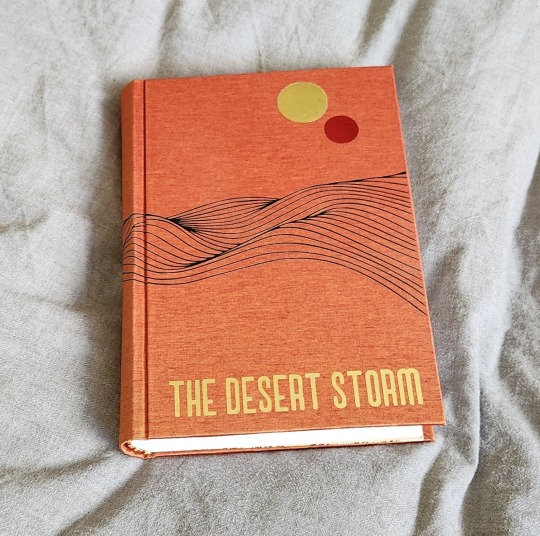
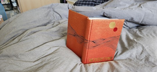
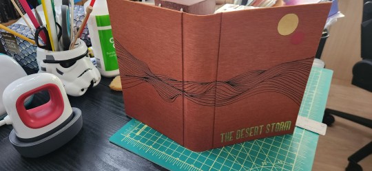
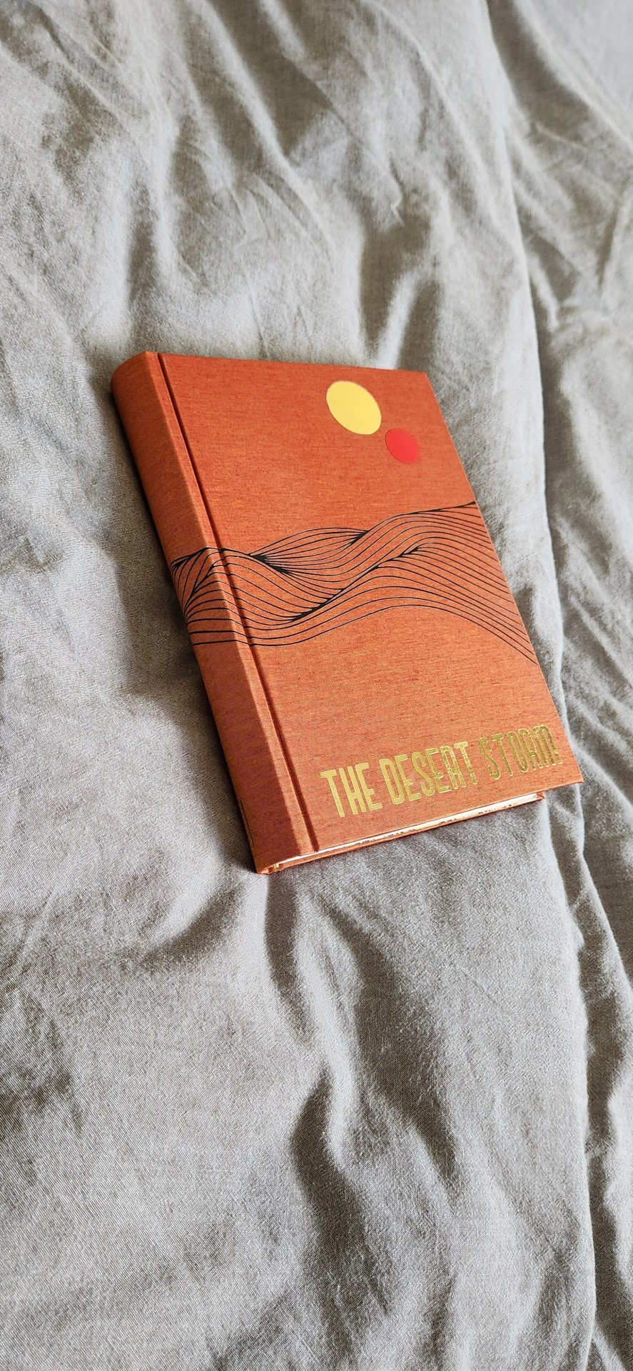
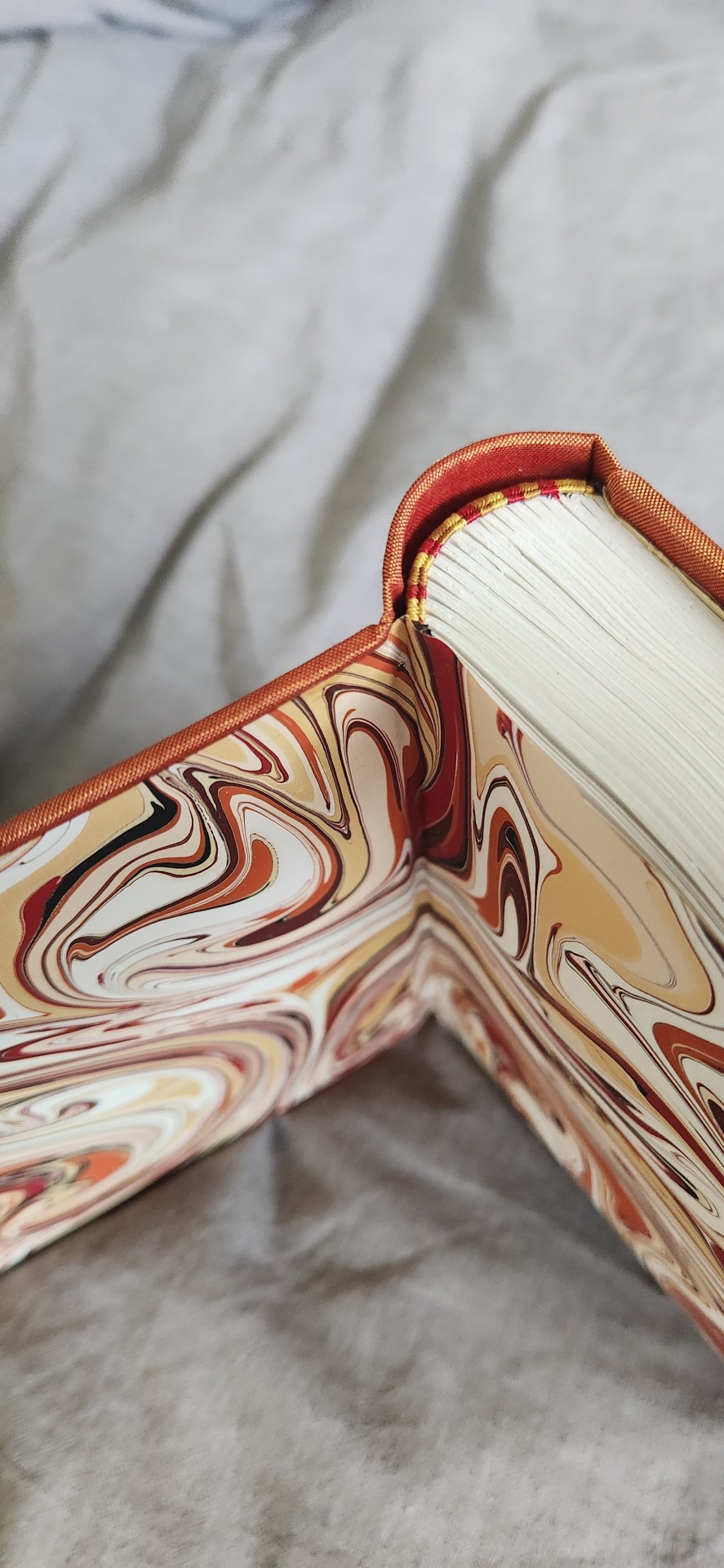
I just finished this bind last night of The Desert Storm by @blue-sunshine-mauve-morning, or really it's volume 1 out of like ??? 15, maybe. Please take whatever i say with a pinch of salt (I have had 0 sleep for more than 24 hours, and that tends to make me a little very sleep-deprivation drunk a.k.a. unhinged). Okay, on to thoughts! The Desert Storm was foisted onto me by @celestial-sphere-press who told me under no uncertain terms that I WOULD FUCKING LOVE THIS SHIT. Well, I did. This more than 1 million word epic about Ben Fuckin' Kenobi is pretty much god-tier fanfiction. It reads like a goddamn novel. I can never think of canon again without thinking that this good shit should be canon. I read it and then consumed half of it within a week, and I have zero regrets. @blue-sunshine-mauve-morning, i absolutely love you and love your writing. It is the best thing since sliced bread. It is better than sliced bread.
I also had the benefit of @celestial-sphere-press saying, hey would you want to use the typeset? MY GOD, i am grateful. I love this fic, i would have typeset it if it hadn't been typeset but Des did such a beautiful job that i am absolutely in awe and thankful that she and the author allowed others to use it. Look at it - it's so beautiful. I only had to think hey, i just gotta design the cover and et cetera and so the book happened.
Please also check out @celestial-sphere-press 's amazing post here and here, who is the only person i know who's started and is almost complete in fanbinding this epic, and is also making an author a copy of the entire series.
Some stats, if you will.
96215 words || 380 pages
Title font: Ghaomiec
I took some inspiration from starblight bindery's lovely desert scape as well as this amazing cover of Dune which i own. I love that the landscape emanates Dune vibes while being oh so Tattooine - just sand and heat, relentless loneliness and melancholy. This fic centres around Obi-Wan Infinite Sadness Kenobi so it needed SAD VIBES TM, which i tried to deliver in desolate landscape form.
Also thank the heavens for Renegade members, who in a masterful stroke of Group Buy Saves Money, managed to source extra-out-of-production colours of Colibri and help a fair number of us get really cool limited edition versions of bookcloth. I am now a proud owner of a lorge stash of Duo and Colibri of which i am now sitting on like a shifty dragon with a hoarding problem. Good luck getting your bookcloth now, Folio Society, ha ha (gloating)! This particular bookcloth is Colibri Copper which has been wholly stashed for The Desert Storm series. I am leaning on transitioning to Malachite for Rise and Fall when I get to it.
The front cover design was done with a stock image and converted to a PNG, which i then fiddled with and did some HTV magic with. It was remarkably easier to weed than expected. I tried something new and ironed the design on the naked bookcloth first before gluing it to the boards, which was a new challenge in making sure everything was aligned.
Endpapers are marbled endpapers (Renato Crepaldi) which I got from Hollanders, which perfectly fit the colour scheme of the bind. The only hiccup was as I was cutting, I realized the sheet was running in the opposite direction of his usual papers and half the size, and only yielded 3 A5 size endpapers and so my heart went noooooooooo. oh well. i guess i will use it for quartos.
Endbands are my favourite - silk in 3 colours in the french doublecore style (as i was binding this i did not have the mental capacity to handle the difficulty of 4 strands). the truth is i usually only can do 4 when I have higher brain function and am willing to spend 80% of my time unraveling it from getting tangled.
I also forgot to mention I had mild fuck-ups, I got glue on the front endpaper which I had to hastily remove with wet cloth, and the back square is preposterously bad but I'm ignoring it for now.
Anyway, i've actually managed to complete a few other binds which have not been mentioned here as they've all been gifts/ surprises or event books in some form. I am SO EXCITED, also because I am travelling in the latter half of July to San Diego and L.A. and I get to meet some bookbinding friends in the flesh. Renegade is fucking amazing y'all. I am ready to embrace these crazy lads who have enabled me for the last 1 year, even when i'm the solitary (1) weirdo from my country of origin in the server. Also... potentially bookbinding trip early next year??? I am enthused.
#bookbinding#fanbinding#renegade bindery#my books#star wars#clone wars#obi-wan kenobi#ben kenobi#ben naasade#infinite sadness#the desert storm#the ben naasade epic
733 notes
·
View notes
Note
Idk how to word this properly , I’m writing a book that is like a lesbian scream (the movie) fanfiction, the main character shares a lot of conversations via text to friends and the anonymous ghost face, how do I make the text conversations sound interesting without going back forth typing “she said “ , “they said” or is that something that would be okay to do in this type of setting
(This is my first time writing ANYTHING bigger than a couple paragraphs)
Writing Text Conversations
Hmm I do not know about the movie you’ve mentioned, so I’ll focus more on writing via-text conversations in this post!
Formatting Texts
How you choose to make your text messages stand out will depend on:
How often you use it
How long these text conversations are going to be.
If text conversations are short and happen only sparingly, use less intrusive methods, including:
Using [Character Name + colons] instead of “said”
Using Italics and bold for character names
Incorporating it into sentences, i.e. Judy picked up her phone and texted back, “How are you?”
When text conversations are lengthy/primary mode of communication:
Use more intrusive formatting methods
Use [Username + Colon] rather than actual names
Left-aligning Character A’s texts and right-aligning Character B’s text
Using [tab] and [double tab] to express replies
Using different fonts and font size
Using [Character Name + 00:00 (time sent)]
Use Internet/Text Slang Carefully
For younger/more Internet-savvy characters, make use of shortened words, emojis and slang.
However, for longer texts, use proper grammar. It’s tiring to read Internet slang constantly.
Have one character use more slang than the other to characterize their “text voice”
Use typos sparingly. Readers don’t like being slowed down with misspelled words, even if they’re intentional.
Generally, emails (even casual ones) should be less funky
Making the Transition/Flow Smooth
Switching to via-text conversation is not too different from starting typical dialogue. Use transition actions like:
Character’s phones pinging
Character picking up their phone, bending over to check, opening their laptops, etc.
It was a message from [Character Name]:
Or just as simple as: She texted her sister.
#writing#writers and poets#creative writing#writers on tumblr#helping writers#let's write#writeblr#creative writers#poets and writers#resources for writers#writing questions#writing quotes#writing problems#writing prompt#writing process#writing progress#writing practice#writers of tumblr#writers block#writers life#writerscommunity#writers community#writer stuff#writer on tumblr#writer things#writer problems#writer community
132 notes
·
View notes
Text
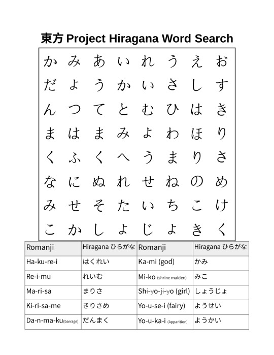
I made this Touhou Project themed word search for studying Japanese. Can you solve it?
The words are broken up with hyphens so you can figure out the sounds of the hiragana if you don't already know them. English translations, where applicable, are in parenthesis and non-pronounced letters are crossed out and in grey. This word search can be printed out on US-letter paper.
Also, a tip for using libreoffice I figured out while making this: You can adjust the horizontal spacing of tables with the ruler bars near the top. The entire word search is a table adjusted to a square shape with the bars at the top and sides and evenly divided with the split cells button. Make sure to select the entire table when setting the size, font, and alignment of the text.
#touhou#touhou project#東方project#東方プロジェクト#word search#hiragana#language learning#libreoffice tips#libreoffice#japanese
23 notes
·
View notes