#free vector source
Explore tagged Tumblr posts
Visit Tumblr Blog
Explore Tumblr blogs with no restrictions, modern design and the best experience.
Last Seen Tumblr Blogs


Fun Fact
After the announcement of the deal with Yahoo!, there were 170K signatures of unhappy Tumblr users petitioning to prevent the sale in 2013.
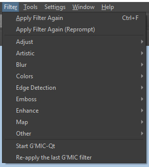
Text
Version 0.11a has been released!
Most of the changes revolve around making things a little easier to do, but there are some new features, like the ability to align nodes and shapes relative to each other.
At any rate, each release brings this project one step closer to leaving Alpha status. :)
2 notes
·
View notes
Text
So, you want to make a TTRPG…

Image from Pexels.
I made a post a long while back about what advice you would give to new designers. My opinions have changed somewhat on what I think beginners should start with (I originally talked about probability) but I thought it might be useful to provide some resources for designers, new and established, that I've come across or been told about. Any additions to these in reblogs are much appreciated!
This is going to be a long post, so I'll continue beneath the cut.
SRDs
So, you have an idea for a type of game you want to play, and you've decided you want to make it yourself. Fantastic! The problem is, you're not sure where to start. That's where System Reference Documents (SRDs) can come in handy. There are a lot of games out there, and a lot of mechanical systems designed for those games. Using one of these as a basis can massively accelerate and smooth the process of designing your game. I came across a database of a bunch of SRDs (including the licenses you should adhere to when using them) a while back, I think from someone mentioning it on Tumblr or Discord.
SRDs Database
Probability
So, you have a basic system but want to tweak it to work better with the vision you have for the game. If you're using dice, this is where you might want to consider probability. Not every game needs this step, but it's worth checking that the numbers tell the story you're trying to tell with your game. For this, I'll link the site I did in that first post, AnyDice. It allows you to do a lot of mathematical calculations using dice, and see the probability distribution that results for each. There's documentation that explains how to use it, though it does take practice.
AnyDice
Playtesting
So you've written the rules of your game and want to playtest it but can't convince any of your friends to give it a try. Enter Quest Check. Quest Check is a website created by Trekiros for connecting potential playtesters to designers. I can't speak to how effective it is (I've yet to use it myself) but it's great that a resource like it exists. There's a video he made about the site, and the site can be found here:
Quest Check
Graphic Design and Art
Game is written and tested? You can publish it as-is, or you can make it look cool with graphics and design. This is by no means an essential step, but is useful if you want to get eyes on it. I've got a few links for this. First off, design principles:
Design Cheatsheet
Secondly, art. I would encourage budding designers to avoid AI imagery. You'll be surprised how good you can make your game look with only shapes and lines, even if you aren't confident in your own artistic ability. As another option, public domain art is plentiful, and is fairly easy to find! I've compiled a few links to compilations of public domain art sources here (be sure to check the filters to ensure it's public domain):
Public Domain Sources 1
Public Domain Sources 2
You can also make use of free stock image sites like Pexels or Pixabay (Pixabay can filter by vector graphics, but has recently become much more clogged with AI imagery, though you can filter out most of it, providing it's tagged correctly).
Pexels
Pixabay
Fonts
Turns out I've collected a lot of resources. When publishing, it's important to bear in mind what you use has to be licensed for commercial use if you plan to sell your game. One place this can slip through is fonts. Enter, my saviour (and eternal time sink), Google Fonts. The Open Font License (OFL) has minimal restrictions for what you can do with it, and most fonts here are available under it:
Google Fonts
Publishing
So, game is designed, written, and formatted. Publishing time! There are two places that I go to to publish my work: itch.io and DriveThruRPG. For beginners I would recommend itch - there's less hoops to jump through and you take a much better cut of what you sell your games for, but DriveThruRPG has its own merits (@theresattrpgforthat made great posts here and here for discovering games on each). Itch in particular has regular game jams to take part in to inspire new games. I'll link both sites:
itch.io
DriveThruRPG
Finally, a bunch of other links I wasn't sure where to put, along with a very brief summary of what they are.
Affinity Suite, the programs I use for all my layout and designing. Has an up-front cost to buy but no subscriptions, and has a month-long free trial for each.
Affinity Suite
A database of designers to be inspired by or work with. Bear in mind that people should be paid for their work and their time should be respected.
Designer Directory
An absolute behemoth list of resources for TTRPG creators:
Massive Resources List
A site to make mockups of products, should you decide to go that route:
Mockup Selection
A guide to making published documents accessible to those with visual impairments:
Visual Impairment Guidelines
A post from @theresattrpgforthat about newsletters:
Newsletter Post
Rascal News, a great place to hear about what's going on in the wider TTRPG world:
Rascal News
Lastly, two UK-specific links for those based here, like me:
A list of conventions in the UK & Ireland:
Convention List
A link to the UK Tabletop Industry Network (@uktabletopindustrynetwork) Discord where you can chat with fellow UK-based designers:
TIN Discord
That's all I've got! Feel free to reblog if you have more stuff people might find useful (I almost certainly will be)!
467 notes
·
View notes
Text

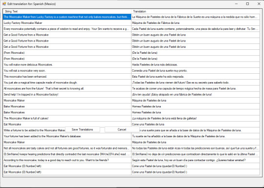
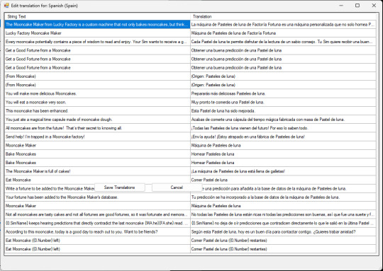
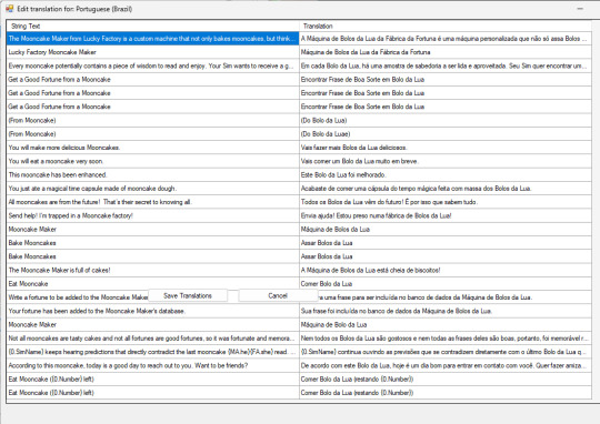
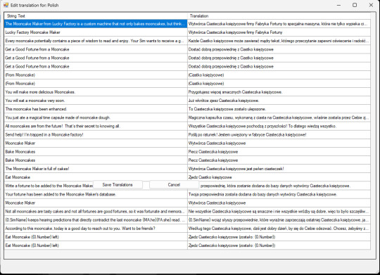
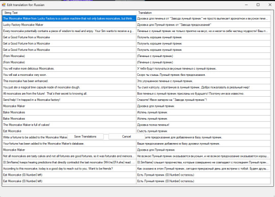
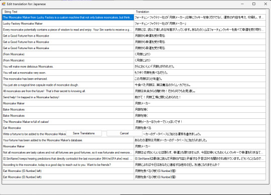
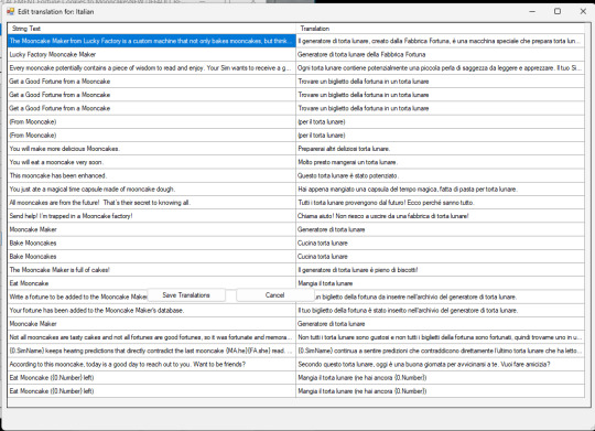
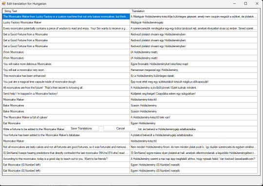
TS3 World Adventures - Mooncakes & Mooncake Machine Maker Remastered: Mooncake Mesh & Texture with Enhanced Graphics & Enabled to Buy Mode & Renamed Mod (All Languages) & Icons Replacement Mod
D E F A U L T R E P L A C E M E N T
New custom Mooncake mesh & texture, to replace EA's "Fortune Cookies" machine maker and edible cake taken from machine maker with working Geostates & animation


EA's graphics from 512x512 with noise was enhanced to 1024x1024 with less noise and adding Simlish Hanzi to replace EA's "bad handwriting" texture on the machine maker. Click this picture below to enlarge.
Enabled to Buy Mode (Appliances > Miscellaneous Appliances), for easy access no need to type cheat "Buydebug" mode ever again.

STBL Renamed mod, from "Fortune Cookies" to "Mooncakes" translated to all languages.
月餅 (Yuèbǐng)= Moon Cake
ⓘ For language translations except Chinese, I use online translator to change word "Fortune Cookies" ---> "Mooncakes" & "Mooncake" depending on singular and plural context. Feel free to correct in comment section if you feel the translation and the grammar is wrong or I accidentally deleted other word.


Icons changed from EA's Fortune Cookies to Mooncake

Reason why I made the change:
Because Shang Simla is taking place in China, not American Chinatown, thus the portrayal of the cookies should be authentic of actual China in real life, not American cookies that are foreign to actual Chinese people. Fortune Cookies are U.S.A.- made cookies: American invention originating in California. History of Fortune Cookies (source: fancyfortunecookies.com) Mooncakes are cakes originated from China, dates back over 3,000 years to ancient China. Mooncakes are a traditional treat during the Mid-Autumn Festival, which is celebrated on the 15th day of the eighth month of the lunar calendar.
Mooncakes are the must-eat Mid-Autumn food in China. They are a traditional Chinese pastry. Their round shape and sweet flavor symbolize completeness and sweetness. At the Mid-Autumn Festival, people eat mooncakes together with family, or present mooncakes to relatives or friends, to express their love and best wishes. Mooncakes are usually eaten after dinner while admiring the moon. History of Mooncakes in China... (source: chinahighlights.com) Fortune Cookies are made in USA and only exist in USA, but mistaken by USA people themselves as "Chinese" cookies just because the cookies are sold in American Chinese restaurant in USA. We actual Chinese live on our country have never seen Fortune Cookies, as we only know the presence of those cookies in Hollywood (U.S.A.) movies. Not just culture inaccuracy, I enabled this machine maker in Buy Mode section for easy access because this item must have been forgotten in the corner and only been played once when the player visit Shang Simla.
Colour & Presets: Same as original EA's: 3 Presets & original EA's Fortune Cookies Machine Maker colour channels.
How to Change Default EA's Fortune Cookies to Mooncake in Shang Simla world.
Fortune Cookies maker in Shang Simla doesn't automatically change to Mooncake due to different coding in-game.
❗You must buy Mooncake Machine Maker from Buy Mode (Appliances > Miscellaneous Appliances) to load the texture first, then travel to Shang Simla world, do "Reset Textures" using Nraas' Debug Enabler.
You need to install Nraas' Debug Enabler (Core mod by Twallan) in order to work correctly ❗
Follow these steps to reset textures:
Click on the Fortune Cookies Maker > Nraas > Debug Enabler > Options: Lucky Factory Mooncake Maker > Object… > Reset Textures > (Choose one) All Sims3.Gameplay.Objects.Appliances.FortuneCookieMaker or This Object
Requirement: World Adventures Expansion Pack
Thank you credits: - Simlish Hanzi: Komorebigo font by Deastrumquodvicis - Mooncake Vector: by Shutterstock - Mid-Autumn Festival Vector & Images by Freepik
Instance code compatibility: 0x010F16B00BA8342B

As usual, install one of these packages on Package folder. You can safely delete the package if you no longer want to use the default replacement.
[ Download Mooncake Machine Default Replacement ]
Language Translations: Click this picture below to enlarge.


#EA The Sims 3 employees from San Francisco please do some research about Chinese culture from your fellow employees from EA Shanghai#ts3#ts3cc#ts3 mod#ts3 default replacement#ts3 chinese#the sims 3#tumblrts3cc#the sims 3 mod#ts3 asian#shang simla#ts3 world adventures#happy mid autumn festival#mooncakes#中秋節快樂#月餅#renamed mod#ts3 override mod#chinese culture
167 notes
·
View notes
Note
Hey sexwitch!
https://www.tumblr.com/apolladay/782927025725898752/people-who-menstruate-what-product-do-you-most?source=share
I saw this poll claiming that free bleeding during menstruation causes horrible infections and was hoping you could set the record straight on whether or not that's true?
hi anon,
great question! no, a person does not face any increased risk of infection if they opt not to use any menstrual collection devices during their period. while it is of course necessary to make sure they're regularly washing up and not walking around coated in layers of their own dried blood, which can cause irritation and other issues, the same is true of any other person using any other collection method - I'm a resolute user of cloth pads, and god knows I have a mess to clean up at times.
it is important to remember that menstrual blood can be a vector for infections to other people by transmitting bloodborne pathogens such as HIV and hepatitis B and C, so it's important to know your own status if you're planning to free bleed. the risk of transmitting an infection through free bleeding is low, but it always pays to be mindful of your bodily fluids and where you're leaving them.
79 notes
·
View notes
Text
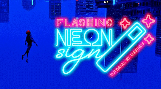
HOW TO: Make Animated Neon Text
Hi! No one asked for this tutorial, but this is one of my favorite typography effects as of late — so I thought I'd share how I do it. You can see this effect in the first gif of this *NSYNC Celebrity set and the last gif of this Anthony Bridgerton set. Disclaimer: This tutorial assumes you have a basic understanding of gif-making in Photoshop. It's also exclusively in Timeline and uses keyframes for the fading effect seen on the blue text.

PHASE 1: PREP YOUR BASE GIF
1.1 – Choose a dark scene. This effect looks best contrasted against a dark background. You can definitely do it with a bright background, but just like a neon sign irl, you only turn it on in the dark/at night — so keep that in mind!
1.2 – Determine the length of your clip. Depending on how much you want your text to flash or fade in, you'll want to make sure you have a scene long enough to also allow the text not to flash — reducing the strain it takes to actually read the text. For reference, my gif is 48 frames.
1.3 – Crop, color, etc. as you would. New to gif-making? Check out my basic tutorial here!
PHASE 2: FORMAT YOUR TEXT
Before we animate anything, get your text and any vectors laid out and formatted exactly as you want them!
2.1 – Finding neon sign fonts. It's easy as going to dafont.com and typing "neon" into the search bar!
2.2 – Fonts I used. Neon Glow by weknow | Neon by Fenotype | Neon Bines by Eknoji Studio
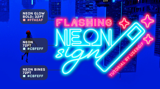
And to not leave my fellow font hoarders hanging, the font for "tutorial by usergif" is Karla (it's a Google font) 🥰
2.3 – Group your text layers. (Conditional) If you plan on having multiple text layers like I did and you want them to appear connected (like how the last letters of "NEON" and "sign" intersect with the wand icon), I suggest putting the layers into groups according to color (the shortcut to group layers is Command+G). If you don't group your text and just apply the outer glow settings to each individual layer, you'll end up with something like this:
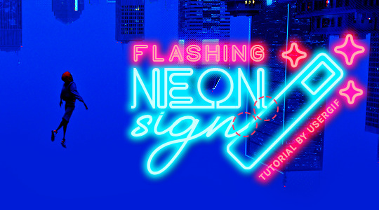
—where you can see the glow overlap with the line, instead of the smooth connection you see in my final example gif. I'm using 2 colors for my text, so I made a group for red and a group for blue.
2.4 – Apply Outer Glow. Right-click your text layer (or your group if you have several layers) and select "Blending Options" to open the Layer Style menu. Check "Outer Glow" and feel free to play around with the settings until you like the way your text looks!
Your outer glow color should be darker and more vibrant than the color of the text itself. The text should be within the same color family but much brighter and, sometimes, almost white (see Step 2.2 again for my text colors).
Here are the settings for the Red Glow (the glow color is #FF3966) and Blue Glow (#00F0FF):
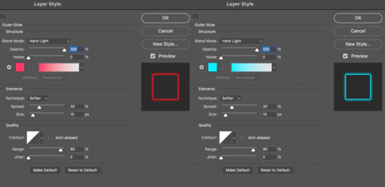
These aren't always my exact settings but they're pretty close to my standard. I always set the blend mode to Hard Light and usually have the opacity at 100%.
For every gif I use this effect on, I like to play around with Spread and Size. Spread will make the glow look denser and "expand the boundaries" (source: Adobe) and Size will diffuse the glow and blow it out so it covers a larger area (Adobe says it "Specifies the radius and size of blur").
2.5 – Duplicate your text layer/groups and remove glow. We're only going to be animating the glow on our text, and since doing this affects its opacity/visibility, we want to preserve the base text by creating a duplicate.
I just hit the Command+J shortcut to duplicate my groups and delete the Outer Glow effects, making sure that the "No Glow" version is above the "Glow" version:
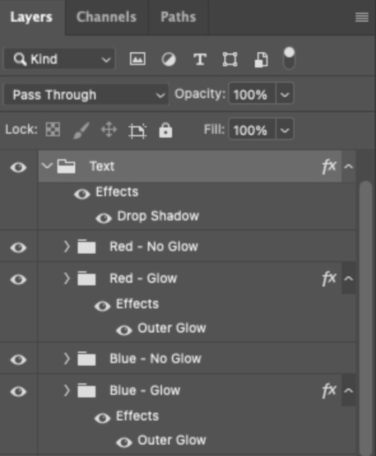
I also put all these groups into one group called "Text" for organization and so I could apply a drop shadow to all the elements for better visibility.
PHASE 3: CREATE THE FLASHING EFFECT
This is for the effect you see on the RED text in my gif!
3.1 – The 0.03-Second Rule If you've read any of my animation tutorials before, you're probably already familiar with this rule. In my experience (and for reasons I can't explain), Video Timeline pauses every 0.03 seconds (try clicking the forward button a few times, you'll probably find a "duplicate" or paused frame). So, keep all your layers a duration of 0.03-second increments (e.g. 0.06 or 0.09 seconds can also work) and align them on the Timeline at 0.03-second intervals. If you don't follow this rule, you'll get duplicate frames when you export, resulting in a choppy final gif.
3.2 – Trim and arrange your text layers. Only on the layers/groups WITH the Outer Glow effect, trim them into several segments of varying lengths where the glow will be "on" (visible) and leaving spaces where the glow should be "off."
Typically, I'll have a mixture of 0.06 and 0.03-second text. That's when the glow will be visible. Between each "flash" of visibility, I've got a 0.03-second blank space, baby *pen clicks* and I'll write your name:
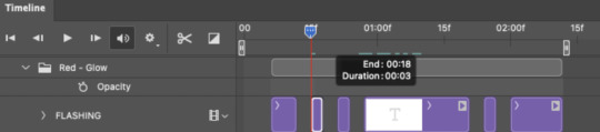
The layers shown above are arranged with a few flashes and two long segments of no flashing. This is the order and duration of each segment shown above (purple = visible segments):
0.06 blank, 0.06 visible, 0.03 blank, 0.03 visible, 0.03 blank, 0.03 visible, 0.03 blank, 0.24 visible (the long bit where "FLASHING" doesn't flash at all), 0.03 blank, 0.03 visible, 0.03 blank, 0.12 visible
(I only did this for the text that says "FLASHING" to give it a glitching effect. The other red text keeps the glow visible starting at the first long segment.)
PHASE 4: CREATE THE FADE-IN EFFECT
This is for the effect you see on the BLUE text in my gif!
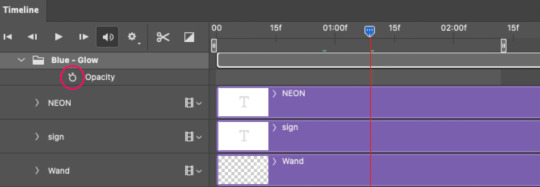
4.1 – Animate using the Opacity Keyframe. Again, we're only touching the layers/groups WITH the glow effect. If you only have one layer of text, you'll find the Opacity Keyframe by clicking the film reel icon:
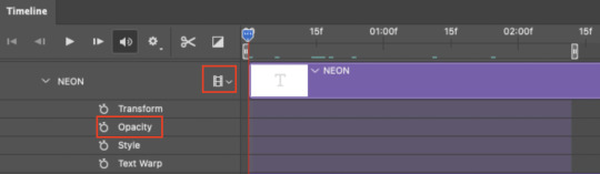
If you're working with groups like me, you'll find it in the Timeline panel under the group when it's expanded:
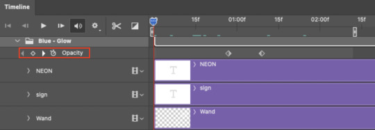
As you can see, I already added my keyframes (lil diamond babies). And luckily, it's super easy to do!
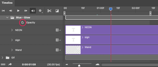
4.2 – Add the ending Keyframe first. We're starting at the end because our layers/groups are already at 100% opacity. Drag the playhead (the blue arrow attached to the red vertical line) to a spot where you want the glow to be 100% opaque — this is where the glow will be fully "on" or visible. [Again, follow the 0.03-Second Rule. You will get duplicate frames regardless when using keyframes (this will be explained in the note in Phase 5), but abiding to the rule will mitigate the amount of dupes you get.]
Then, click the clock icon by "Opacity" to place a keyframe:
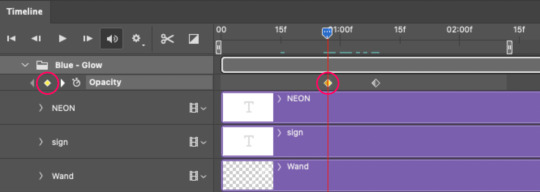
4.3 – Add the starting Keyframe. Go backward from the ending Keyframe you just placed (I went back 0.12 seconds — but you can play around with the duration of the fade, just keep it a multiple of 0.03):
And drop another keyframe, this time by clicking the diamond icon by "Opacity":
4.4 – Reduce the opacity on the starting Keyframe. Keeping that keyframe you just placed selected, go to the layers panel and reduce your layer's/group's opacity to 0%:
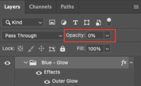
Now, this Outer Glow will slowly fade from 0% to 100% opacity.
And just for a visual aid, here's where my fade-in keyframes are in relation to my flashing segments:
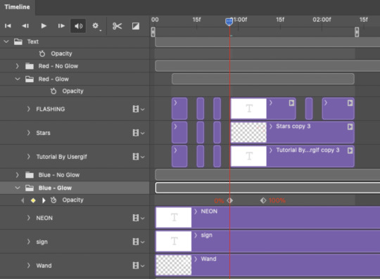
To refresh your mind, the 0% Opacity Keyframe starts when "FLASHING" is visible for 0.24 seconds (the first long segment of visibility).
With these keyframes, you'll get a smooth fade-in à la ✨light switch with a dimmer✨
PHASE 5: EXPORT
Yay, we're finished! Convert from Timeline back to Frames and export your gif!
NOTE: If you only did the flashing effect and followed my 0.03-Second Rule, you shouldn't have any duplicate gifs. BUT if you included the fade-in effect using keyframes, you WILL have duplicate frames. 'Tis the nature of keyframes. 🤷♀️ I had 4 extra frames where the fade-in starts, which I deleted. So, as always, I recommend checking your frames when you convert from Video Timeline back to Frame Animation — and manually delete any duplicate frames.
Sorry this tutorial is so long 🙈 I over-explain so you're not just mechanically copying steps, but understanding the WHY behind each step! Thanks for bearing with me
If you have specific questions about this tutorial, feel free to send a message to usergif and I'll try my best to help! :)
More USERGIF tutorials • More resources by Nik • USERGIF Resource Directory
#typography#gif tutorial#completeresources#usershreyu#useryoshi#userelio#userzaynab#userives#usertreena#usercim#userrobin#userkosmos#usersalty#userhella#alielook#uservalentina#uservivaldi#*usergif#*tutorial#by nik#flashing gif
831 notes
·
View notes
Text
CDK: Company Expo Set (Mesh + Recolor Pack)

Published: 9-14-2024 | Updated: N/A SUMMARY Cubic Dynamics by John B. Cube and Marcel Dusims forged the future with furnishings that were minimalist in design and maximalist in erudite pretension. Generations later, the company continues to produce edge-of-cutting-edge designs. Use the Cubic Dynamics Kitbash (Simmons, 2023-2024) collection to set up corporate, exposition, and office environments. Envisioned as an add-on to the Cubic Dynamics set (EA/Maxis, archived at GOS), it features minimalist and retro-futuristic objects. Find more CC on this site under the #co2cdkseries tag. Read the Backstory and ‘Dev Notes’ HERE. The COMPANY EXPOSITION SET includes 20+ items to create a conference/event space for your businesses and corporations. This set doubles as the main MESH PACK for all items in the CDK series.


DETAILS All EPs/SPs. §See Catalog for Pricing | See Buy/Build Mode All files with “MESH” in their name REQUIRED for textures/models to display correctly in-game. Recolors are linked to the Booth Partition (vertical woods, metal), Booth Table (horizontal woods, colors), Booth Wall in marble (256x256 Mm marble), Floor Sign 1 (256x512 vertical images), Painting 001 (256x512 images), Painting 004 (1024x512 images), Pinboard (256x512 pinfabric), Pinboard Poster (512x512 horizontal images), Planter 001 (256x512 paneling/pouf). Objects in Sims 2 are limited to two recolorable parts, so not all items are recolorable in the same way. Several objects in this series are oversized/offset. You may need to shift an object upwards once to level it, and you may need “move objects” and “grid on/off” cheats to place them to your liking. When placing partitions/floating shelves and tables/desks/counters on the same tile, place the partition/shelves first. I recommend using this set with Object Freedom 1.02 (Fway, 2023), which includes Numenor’s fix for OFB shelves (2006), for easier use overall. ITEMS Banner Signs (Regular/Table) (380 poly) Booth Partition (405 poly) Booth Sign Small/Large (124-128 poly) Booth Table (572 poly) Booth Wall (44 poly) Down Low Exhibition Table (116 poly) Floor Signs 001-005 (364-794 poly) Expo Leather Gallery Chair (1079 poly) Pinboard (112 poly) Pinboard Poster (12 poly) Planters 001-002 (178 poly) Stall Small/Large (429-434 poly) Wall Sign (92 poly) DOWNLOAD (choose one) MESH PACK from SFS | from MEGA RECOLOR PACK from SFS | from MEGA COLLECTION FILE from SFS | from MEGA *collection file last updated: 9-30-2024


COMPATIBILITY AVOID DUPLICATES: The #co2cdkseries includes edited versions – replacements - for items in the following CC sets: 4ESF (office 3, other 1/artroom, other 2/build), All4Sims/MaleorderBride (miskatonic library, office, postmodern office), CycloneSue (never ending/privacy windows), derMarcel (inx office), Katy76/PC-Sims (bank/cash point, court/law school sets, sim cola machine), Marilu (immobilien office), Murano (ador office), Olemantinker, Reflex Sims (giacondo office), Retail Sims/HChangeri (simEx, sps store), Simgedoehns/Tolli (focus kitchen, loft office, modus office), ShinySims (modern windows), SH (reverie office, step boxes/shelving), Spaik (sintesi study), Stylist Sims (offices 1,2, & 3, Toronto set), Tiggy027 (wall window frames 1-10), Wall Sims (holly architecture, Ibiza). *The goal is to link the objects to the recolors/new functions in the #co2cdkseries without re-inventing the wheel! Credit to the original creators.
CREDITS Thanks: ChocolateCitySim, HugeLunatic, Klaartje, Ocelotekatl, Whoward69, LoganSimmingWolf, Gayars, Ch4rmsing, Ranabluu, Gummilutt, Crisps&Kerosene, LordCrumps, PineappleForest. Sources: Any Color You Like (CuriousB, 2010), Beyno (Korn via BBFonts), EA/Maxis, Offuturistic Infographic (Freepik), FlatIcon, Dreamstime, Starline via Free Vector, Cube3d. SEE CREDITS (ALT)
76 notes
·
View notes
Note
Have you ever looked into the Sherman writing system? I'm obsessed, though, it takes meticulous planning, so a really helpful 'shorthand' is Rook's system, which is quite similar!
Oh, absolutely—Sherman's system is incredible, and I hugely admire and am slightly jealous of anyone who can write in it properly, as I'm deeply allergic to vector software. I have a tattoo of 'I am the Bad Wolf, I create myself' in Sherman (or so the internet claimed when I got it, and the internet wouldn't lie, surely...!). I haven't explored Rook's system quite as much.
That said, both Sherman and Rook are ultimately cypher scripts for English—which is perfect for visual storytelling and aesthetics, but didn't quite fit what I needed. I got tired of writing things like 'and then he said something in Gallifreyan' and not knowing what that was.
So, naturally, I spiralled into madness and built a full-on Gallifreyan conlang designed to run entirely on a standard Latin keyboard, because I enjoy creating problems and far too much work for myself.
Hope that helped! 😃
Any orange text is educated guesswork or theoretical. More content ... →📫Got a question? | 📚Complete list of Q+A and factoids →📢Announcements |🩻Biology |🗨���Language |🕰️Throwbacks |🤓Facts → Features:⭐Guest Posts | 🍜Chomp Chomp with Myishu →🫀Gallifreyan Anatomy and Physiology Guide (pending) →⚕️Gallifreyan Emergency Medicine Guides →📝Source list (WIP) →📜Masterpost If you're finding your happy place in this part of the internet, feel free to buy a coffee to help keep our exhausted human conscious. She works full-time in medicine and is so very tired 😴
20 notes
·
View notes
Text
CLİPART - DRAGON+ (3)

Clipart.tips offers a diverse range of clipart categories to cater to various design needs, including tools clipart. Whether you are working on a DIY project, creating digital content, or designing promotional materials, the tools clipart collection provides a wide array of graphics to enhance your visuals. With over 21 million free and royalty-free clipart images, vector illustrations, stock photos, and fonts available, you can find the perfect tool-themed graphics to elevate your projects.
For those in need of people clipart, Clipart.tips offers a vast selection of high-quality images and graphics. With over 100,000 vectors, stock photos, and PSD files available for free commercial use, the people clipart category provides a rich source of inspiration for various creative projects. From detailed illustrations to digital art and stock illustrations, the people clipart collection on Clipart.tips offers a diverse range of copyright-free options.
Nature clipart enthusiasts can explore a treasure trove of visuals on Clipart.tips, with a dedicated category for nature-themed graphics. Boasting an extensive collection of over 555,900 nature clipart stock illustrations and vector graphics that are royalty-free, this category allows users to discover captivating images of landscapes, flora, fauna, and more. Whether you are looking for scenic views, botanical elements, or wildlife illustrations, the nature clipart section on Clipart.tips offers a plethora of options for your creative projects.
147 notes
·
View notes
Text


Alternative NPD Symbol
"While working on a request I wanted to try and grab this NPD symbol and clean it up. However I found out that it existed prior to being used as an NPD symbol, originating as a vector image on Depositphotos dot com ( credit to user image4stock ) and it's license requires you to pay to use and access the high-quality file(s).
I don't like using symbols without attribution ( though I've made that mistake in the past ) and I don't like that the license requires payment ( with the possibility of up to a $5k fine which uh. I could not afford. ever. even if it's unlikely to be given to me. )
So I've taken the Daffodil / Narcissus symbol by omoonstd on flaticon and put it in a similar color-scheme / format to the original symbol ( their symbol only requires a simple attribution, which I've done here! ) I don't claim to have made the original symbol, but I did edit the colors, added the circles, and cleaned up the lines a bit."
This was originally published on my Deviantart ( isobug ) and all relevant external links can be found via the post source link! As Tumblr hates external links and sometimes removes them entirely.
The first image is the plain symbol and the second is a solid-background version meant for icons / pfps. Anyone is free to use this anywhere! No ableism will be tolerated on this post and I'll delete anything hateful.
Taglist - @revenant-coining, @radiomogai
#npd#npd flag#npd symbol#actually npd#actually narcissistic#narcissistic personality disorder#cluster b#cluster b safe#cluster b pds#npd safe#actually cluster b#npd positivity
143 notes
·
View notes
Text
Version 0.10a Released!
I ended up redoing the way you interact with the program, swapping out the "Left click action" concept for a proper set of Tools. This also made it simpler to handle things like selecting multiple nodes, rotating the shape, and even drawing multiple shapes in succession without using a subwindow.
There's a long way to go before Lil' Vector is done, but it's definitely getting there, one step at a time.
3 notes
·
View notes
Text
Free png and source files for everything* on FYG
I'm obviously not active in the Gallifreyan community anymore and I'm not going to be doing anything with these files. So I figured I may as well make them all public for people to use however they want.
Commercial Use
While I am happy for you to use these files for what ever you want even if it's commercial please note that aside from my own Clockwork there are many files here that contain Sherman's/Sirkles and Doctor's Cot.
For Clockwork do what ever you want but credit to either fyeahgallifreyan or @timelordnicky is appreciated.
Sherman's is also free to use for any reason. To quote their own website: "The BBC has ultimate say over whether you're allowed to call it "Gallifreyan," but this writing system is free for all to use. Credit to Loren Sherman and/or a link to this page is appreciated."
The creator of Doctor's Cot statement on commercial use can be found here.
What is a .dpp file and how do I open it?
These are the original files from DrawPlus (the predecessor to Affinity Designer). They are vector files so you can easily edit and move things around if you want to. Full versions of DrawPlus are no longer legally available but the free version can be downloaded here. When I tried it it did ask to register but it worked with the Legacy Registration Key 881887. If you are still struggling to open a .dpp file you can message me on my personal blog @timelordnicky.
Will you proof read something for me?
Sorry, my Gallifreyan is very rusty at this point. I'm sure if you asked on the Gallifreyan reddit or discord another member of the community would be happy to help you.
*that I could find whilst sorting through my old hard drives
17 notes
·
View notes
Text
I decided to write more on my band au because I've gotten to work more on it!
Amy, Gadget and Barry's band is named Piko Piko Shoot and they focus on Pop Rock/Punk.
Amy is the lead singer, she grew up in a rich family and a prodigy in academics, music and skating. She ran away from her home to pursue a musical career with her two (loser) friends. She also dwells in grafitti art, all of which are designed by Barry.
Gadget is the one who actually started the band, he provides the guitars and back-up vocals. He works in a local cafe to pay up for rent and band expenses. He's a pro skater and has a huge crush on Infinite.
Barry is a simple artist and bassist who attended the same school as Gadget. He accepted to form the band in hopes of becoming someone and proving everyone who doubted him, wrong.
__
Chaos Blast is a band started by Shadow and his childhood best friend and sister, Rouge. They focus on deep and meaningful lyrics, mostly inspired by Shadow's older sister, Maria.
Shadow is the lead singer and to fans, a mystery. He prefers to keep any information on himself private, completely avoiding interviews and avoiding any social media. Truth is, Shadow started the band to, not only raise money for Maria's hospital bills, but also offer the young girl some entertainment.
Rouge is the bassist and stylist of the band, sometimes offering some back-up vocals for their songs. She's very gossipy and the main source of information for fans.
Silver is a shy and friendly bassist, he sometimes helps with songwriting and manages the band's social media account. He was born in Soleanna and has a love for gardening. He was close friends with Blaze before losing contact with her.
Knuckles is the band's drummer, known for channeling his short temper and rage into his work. He's quiet and very passionate about cooking in his free time.
__
Phantom Ruby was formed by childhood best friends Sonic and Infinite out of pure boredom, their lyrics being edgy for the sake of it.
Infinite is the singer and main songwriter. He's very open about himself, even coming across as egocentric. In his own head, Chaos Blast is trying to copy Phantom Ruby and steal their spotlight.
Sonic had a simple life growing up in Sunset City with his younger brother, Miles. He accepted forming a band with Infinite to pursue his dream career as a guittarist. He's very loud and energetic and has an easy time hyping up the croud. He's openly gay and has a crush on Shadow.
Blaze grew up in Soleanna and moved to the big city to purse a drumming career. She provides help with the lyrics and helps keep the other two in line whenever their manager, Espio has a hard time.
__
Other characters include
Miles, Sonic's adoptive younger brother, a prodigy and mechanical genius, dropped his studies to become the band's technician.
Espio, a mysteryous and serious person, Phantom Ruby's manager.
Honey, Phantom Ruby's stylist and social media manager. A big gossip always in touch with their community.
Wave, Chaos Blast's official stylist and manager. She grew up a graffitti artist and extreme gear pro. She's dating Rouge behind the scenes.
Maria, Shadow's older and sick sister. Her dream was to be able to watch a band live but due to her condition she was unable to.
Vector, Owner and DJ of the radio station JSR 095. He's very known in Rokkaku Street (Where Gadget and Barry grew up.)
Jet, Wave's younger brother and extreme gear pro. His gang controls Rokkaku Street with their grafitti art.
Ivo, the owner of IvoTech Empire, a company who creates multi-use and purpose robots and implementing them in society. He's also the creator of the extreme gear and his own brand of robo-singers.
#chase rambles#sonic the hedgehog#sonic au#sth#shadow the hedgehog#rouge the bat#blaze the cat#infinite the jackal#gadget the wolf#barry the quokka#knuckles the echidna#amy rose#silver the hedgehog#miles prower#miles tails prower#tails the fox#maria robotnik#eggman#ivo robotnik#ivo eggman robotnik#wave the swallow#jet the hawk#espio the chameleon#honey the cat#vector the crocodile#sorry for overtagging#im just afraid a text post wont do well#i might make another blog just for my aus
41 notes
·
View notes
Text
The Baldur's Gate Cast as the Elements of Harmony
Last night, spurred by whimsy and a little nostalgia, I decided to slam together one of my first fandoms with my current one. I present to you… the Baldur's Gate cast as wielders of the Elements of Harmony!
(Please note that I stopped paying attention to MLP:FiM after season 4, so my takes will not reflect later developments in the show.)
The Element of Magic

(Source for the Twilight vector)
This one's a slam dunk, a no-brainer (ironically). Both Gale and Twilight Sparkle are bookworms who were so gifted in magic that they attracted the attention of the most powerful magic user in their setting, who proceeded to lavish special attention on them while also sending them out on personal tasks. Both of them were so desperate to please this figure that they end up endangering a city/town as a result of their attempts to impress them. Both start their media franchises friendless except for a long suffering familiar who is in many ways more put together than them and feeds them (magic items). Both of them (can) end up becoming (quasi)divine. They're like mirrors of one another, separated by genre and species.
More to the point, as a magical prodigy and Mystra's former Chosen, Gale would be very well equipped to wield the Element of Magic.
If they ever met, I think Twilight and Gale would have a very interesting discussion comparing notes on their respective magic systems. Gale would probably be seethingly jealous that Twilight's respective magical mentor not only takes an active role in her development but actually actively ascended her to alicornhood. She's the physical representative of magic in her world, not nearly Mystra level but still a quasi-deity, and also an intensely curious person. His orb would be fascinating and incredibly alarming to her, while he might be a little leery of yet another goddess of magic.
The Element of Honesty

This one was also simple. Whenever you talk to Lae'zel, she gives you her thoughts plainly, without sugarcoating them or beating around the bush. Truly, no one else on the team is as worthy of wielding the Element of Honesty as her, and she would wield it well.
If they ever met, I think that Applejack and Lae'zel would actually get along pretty well (assuming that they did not meet in the middle of a gith raid on Applejack's orchards, at least). Both of them are straight talking, hard working characters who got good at their respective thing by putting in the effort. They also both share similar roles in their respective parties, as the strong, athletic, and somewhat competitive bruiser. Applejack's strong family focus might be interesting to Lae'zel, who has never had one (but expresses interest after meeting Jaheira's.)
The Element of Generosity

(Sorry for partially covering your face, Wyll, I wanted to block Mizora for the symbolism.)
Of course, if there's a member of the BG3 cast to represent generosity, it has to be Wyll. The man has dedicated his life and his soul to serving others, albeit in a very different way than Rarity does. He gave up his soul for Baldur's Gate, his humanity for Karlach, and is willing to give up his freedom for his father. He'd give a needy man the coat off his back and Astarion the blood from his veins. He is a worthy wielder of the Element of Generosity.
If Wyll and Rarity ever met, I think they'd be great friends. Wyll is exactly the sort of noble early-season Rarity dreamed of meeting in Canterlot - kind, honorable, charming, romantic. I think Wyll would really respect Rarity's industry and the lengths that she is willing to go to for others. She's a fashion designer, so she'd probably insist on gifting him the most fashionable saddles and bridles, which I'm sure the rest of the BG3 camp would find absolutely hilarious.
The Element of Laughter

One of Karlach's most notable traits is her ability to find joy and laughter in every moment alive and free, despite her horrific past. She is a buoyant force who lifts the spirits of everyone around her, and it is for this reason that every single companion (including Minthara) likes her so much. She exemplifies the spirit of the Element of Laughter as much as a character from this genre can.
Karlach and Pinkie Pie would get along like a house on fire. ("Let's throw a party!" "YEAH!"). They're both genuinely cheerful people, but they're also using that attitude to mask other, more negative emotions that they don't want to control their lives but lurk nonetheless. But mostly they'd party together like nobody's business.
The Element of Kindness

This is honestly the biggest stretch, but I'd argue that Shadowheart could represent the Element of Kindness if she goes the Selunite path. Her arc throughout the game is basically that of a woman whose innate kindness is struggling to emerge through many layers of mind wiping and indoctrination despite Viconia's best efforts. As a Sharran, she tried to befriend and adopt a mouse. Even when she is trying her hardest to be mean in acts 1 and 2, she still approves of kind actions by others. If you give her any support at all, she defaults to abandoning her driving dream becuase she cannot bring herself to be cruel enough. And once freed of her Sharran shackles, she begins to bloom into a person truly capable of weilding the Element of Kindness.
Amusingly, a post game Shadowheart who saved her parents is living pretty much exactly the same life as Fluttershy - a cottage close to but not in a rural town where they take care of animals. I think the two of them would be able to bond over their respective menageries.
The Element of Loyalty
Last but not least, we have the Element of Loyalty, wielded by… Minthara! I know y'all were expecting Astarion, but Minthara's first dialogue upon joining the party proper (if you slept with her) highlights her loyalty specifically.
*Her entire being joins with you for a moment, and you see all that she is. Dangerous, cunning, wounded, brutal, paranoid... and utterly loyal to those she trusts.*
And loyal she is. Become the Slayer? She's with you (and thinks you're exquisite). Become a mind flayer? She's with you without a flicker of hesitation. Control the Brain? She's with you (if you spare her). Don't control the Brain? She's still with you. Prance about the city being a goody two shoes to everyone you can help? She's grumpy, but she's with you. Once Minthara finds a purpose, be that a deity or a person, she stands by them with a singleminded devotion that makes her well worthy of wielding the Element of Loyalty in my view.
If Minthara and Rainbow Dash were to meet, Minthara would likely write Rainbow Dash off as a braggadocious blowhard until she heard about the Sonic Rainboom, whereupon which she would spend an hour trying and failing to convince RD to weaponize it. Rainbow would likely find Minthara a bit curt for her tastes. If she hears of Minthara's ambitions or more violent suggestions, she might ping Minthara as a 'bad guy' and pick a fight. However, Minthara canonically reads science fiction and Rainbow Dash enjoys adventure novels, so maybe they might bond over a shared taste for genre fiction. Befriending the villains is a tried and true staple of Rainbow Dash's genre, after all.
(What about Astarion, you ask? Well, the problem with him is that he is not very magical, a consummate liar, selfish, often cruel, not particularly loyal, and his laughter is primarily at others' expense. I'm sorry, but he's just not Element of Harmony material. He's got other things going on.)
(Halsin was a runner up for Element of Kindness. Shadowheart was just far more interesting in that role, so it went to her.)
#shitpost#discussion#bg3#mlp:fim#the tadfools#the elements of harmony#gale#twilight sparkle#lae'zel#applejack#wyll#rarity#karlach#pinkie pie#shadowheart#fluttershy#minthara#rainbow dash#mine
40 notes
·
View notes
Text
Ostrichmonkey Hack: Layout Behind the Scenes
Been procrastinating on this enough! So here is a look at some of the process and decisions that went into doing the layout for the Ostrichmonkey Hack.
Let's start with the goals I had in mind:
Keep it simple.
Keep it easy to make.
With those goals set, next step is gathering materials and resources (not all of this was done as cleanly as I'm making it out to be, but this is the gist).
Materials used:
Classic Explorer Template
Affinity Publisher and Photo
Fonts
Art
The text itself
The Classic Explorer Template was critical in getting this layout done efficiently, since it does a lot of the work for you. It's not a replacement for having a rough idea on how to do layout, but it can serve as a nice tutorial/explainer on different elements of layout and typesetting, and honestly, is worth its (digital) weight in gold. There's a free version available if you want to check out what it offers.
I use the Affinity Suite for my layout work. It's a nice set of programs with a manageable learning curve, but there are plenty of other alternatives so go with whatever works for you (one of my favorite elements of using multiple Affinity programs is that within Publisher, you can access both Designer (vector illustration) and Photo (photo editing, illustration etc) functions, which is just a nice workflow).
Here's what my setup looks like, with all the guidelines/base grid stuff turned on;

Normally I start with some style tests and “sketches” to get a feel for what I want the layout to look like, but the Classic Explorer’s does a lot of that heavy lifting for me already so I get to skip this step for this project. Speed and efficiency is one of the main reasons I wanted to use the template - this was envisioned as a “I just need to get something done” kind of project.
So next up on getting it done, fonts!
There are lots of great places to get fonts from, just make sure you're getting them from legitimate sources. Do your homework and make sure that "free" font is actually free to use in commercial projects.
I pulled three fonts from the depths of my collection.
One for the title and main headers (Wallau Deutsch)
One for the second header (Rakkas)
One for the body text (PT Serif)
Technically a secret fourth font for some "bullet points" (1651 Alchemy)

I picked these fonts out because they work together well and are readable. The title/main header fonts are comparatively less readable, but you can get away with that since headers are Big and used less frequently. The second header (Rakkas) is a nice middle ground between a full on blackletter font like the main header, and the classic-y serif of the body text. It creates a transition between the two fonts.
I used PT Serif since it was already in the template, but it also had the bold/italics versions I knew I would need, is readable at a variety of sizes, and had all the special glyphs I would need (it actually did not, but whoops, we'll get to that later).
Normally when I start layout, I do a quick "sketch page" where I try out different fonts and style tests that can look something like this;

But that wasn't necessary for this project (another advantage of the using the template).
Now, let's get to some choices in formatting the text itself.

Each time a key term came up, it was highlighted by bolding and italicizing it. Any time after that, it was just normal text. I went back and forth on highlighting it every single time, but the current format just looked cleaner so it won out.
Additionally, in several places in the text, rather than introducing a third header (which just broke up the page too much, disrupting the flow and clean look), I instead put what would have been the new third header (HP or WOUNDS in the above example) in all caps and behind a colon. This ended up not disrupting the text too much, and was only necessary a handful of times. But when it was necessary, I made sure to stay consistent. Consistent and organized formatting is one of the key ways to make your layout look nice and clean.
Aside from changing some font choices, one of the other ways I tweaked the template was with some spacing (between "sections", like in the above text, introducing an extra line break between the Attributes and Staying Alive sections) and the "bullet points".
The large bullet points that accompany the second headers are actually a glyph pulled from a different font. I picked that one out specifically because its just a little irregular and handwritten looking (1651 Alchemy is a handwritten styled font), and it also helped pull you to the start of new sections, further enhancing the second header. It helps make each section discrete and more "modular".
Back to extra spacing for a second now. So each "chapter" of the text uses the main header to designate it as a full "chapter".

"Characters" up top there is one of those chapter headers. It's nice and big and special, and also takes up a good chunk of space. One a full spread, this also means that the second page of text begins higher up than the text on the first page (compare where Attributes starts vs where Dying starts).
I played around with the format of spreads that did not have a main chapter header on them, starting the first page text up toward the top to have it line up with the second page. Which, probably would have been totally fine, but I preferred the look when each spread had the same kind of spacing. But repeating the main header on each spread was too clunky. So the solution;

Bam! A line!
Blank empty space looked too empty, but slapping a quick line there took up just enough visual space for it to work. Then, I carried that line-design-language to other places (to separate footnotes from the body text, within the tables, and sort of on the cover). This then made the line choice feel even more cohesive and purposeful.
And speaking of footnotes, that was another extra tweak/flourish I added not present in the template (the sidebars are part of the template, but sidebars rule so they would have happened regardless). The footnotes served as a way to share specific references as an informal "works cited". A lot of NSR/OSR design is super iterative, so I thought it would be cool to shout out some of the more direct inspirations and references I used when making my game.
But the footnotes were also kind of not really my downfall. Turns out PT Serif didn't seem to have all the necessary footnote glyphs, nor did it want to make proper superscripts of integers past 3. So, rather than trying to find a new body font (or deal with the headache of using a font solely for superscript notation), I just fudged the formatting some and stuck to asterisks, and restarting "numbering" on each spread. Oh well.
Let's now briefly touch on laying out tables.
It sucks.
My advice is find an example of a really nice looking table and then try and figure out what makes it look nice, and then doing that forever. Luckily, the template saves me again by including multiple examples of tables, ripe for tweaking. Which ended up looking like this;

Nice and clean! Hooray!
Okay, there's a lot of small decisions that goes into making text properly formatted and look nice, but I skipped some of those decisions and didn't go ham on typesetting, but whatever. That all about covers the important parts regarding the text. Now let's talk about art.
Public domain art is your best friend.
I went and trawled through a bunch of art I've saved from the Met's Open Access collection (there's plenty of great open access collections out there, just happened to have some from the Met handy), and settled on this piece;
Which I then dropped into Affinity Photo and played around until I ended up with this;
Nothing too wild, but it Felt Right, so it's done.
I then immediately dropped that onto the cover page, slapped the title on, added a quick border (and also spent some time trying to fix some weird issues that ended up being solved by just rasterizing it, whoops) and bam;

And that's the only art piece used throughout the zine! But I made the most out of it. Between each chapter, I had a single splash page and dropped in different zoomed/cropped versions of the art. Like so (and even on the back cover!);


The original image was high resolution, so zooming in worked, plus the effects/distortions I created hid any imperfections.
So that's the art sorted and the zine finished!
Now, this is getting pretty long, so if there's anything anyone reading this is interested that I didn't touch on, shout in the notes!
38 notes
·
View notes
Text

˚ ₊ · ͟͟͞͞ ➳ ❥ TRICKERY DOMAIN CLERIC . PSD
an easy to use simple pinned / header / promo / character intro / whatever your heart desires template inspired by shadowheart of baldur's gate 3.
fonts used: seagram tfb & gloucester mt extra condensed
resource credits: illustrator vector assets & scanner trash
this template does require basic knowledge of smart objects.
feel free to edit as you please!
if you use, please provide credit somewhere, whether that's on the post, directly tagged, source link, tags, or elsewhere on your blog. do not claim as your own.
please like/reblog if you use it :)
template can be downloaded in source link below.
#character psd#character template#template psd#free template psd#rp resources#psd template#header template#rph#rpc#by feelrush#🥭#whomp whomp i misspelled the fucking psd file and im too lazy 2 change it now .
180 notes
·
View notes
Text
Krita tutorial the way I know it.
Basics: What is where.
Gimmicks.
Specific advice on specific tools.
Basics: What is where.

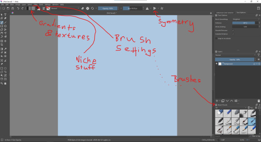
Upon opening the program this is what you're met with. First of all, must comment: The layout is HEAVILY editable so you can just drag menus anywhere you want, even leave them floating amidst the sheet you're drawing on.
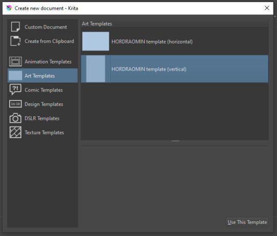
You can create custom art templates, I have two o'mine here as both have my signature background color.
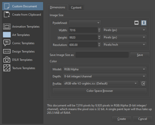
As well, you can edit the custom document settings, as in what size you want it, what resolution, even the initial content of the image. As well you can create from clipboard: Just copy some image from your browser and Krita will recognize it (useful for making meme edits lol).

Now, once you have your file, I will show you what is where.
Brushes:
Brushes are easy to edit and there are tons of free bundles to download online. I myself only got one bundle, Jackpack (bit hard to find now due to original source being lost, it is still available but bit tricky to come by).
There. Are. Tons.

Some of these are my custom brushes for calligraphy in neography, you might even guess which ones. You can edit existing brushes, make new ones from the ones you've edited without changing the original, and all sorts of stuff (more below in the third chapter).
There are numerous packages of brushes once you enter Krita, but only one/two are available when you first open it. To unlock them all, click here:
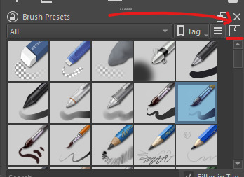
And make sure all bundles are dark gray in color (example of both dark and light below).
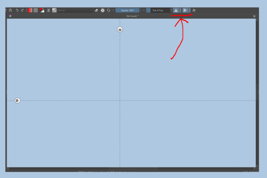
Now Tools Options: those will pop up depending on what tool you're using.
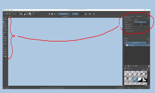
Symmetry: Fun stuff. You can drag the lines depending on how you need them and then center them back to the center of the screen if needed.
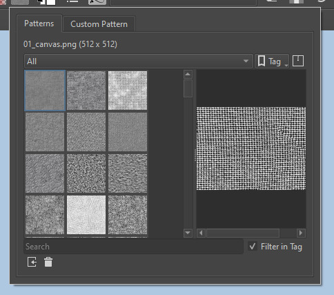
Gradients and Textures also have their tools options, you can play with those to get the feeling what they can do (more in third chapter).

The Filters tab is useful too. Blurring, motion blurring, color mapping, artistic filters and all that: Quite fun.
Gimmicks.
Krita allows you to customize your workspace freely. Floating menus, tabs, anything you want. It has quite many drivers at that-
To access the workspace templates, go to Window and choose Workspace.
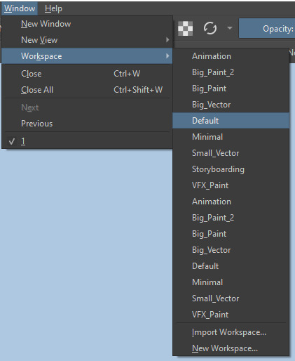
Krita allows for copy-pasting any image onto the sheet. Though, for me it sometimes crashes if I accidentally copy-paste text into it without choosing the Text tool first.
The software allows for both raster and vector work. It is basically Photoshop sharpened to be used by artists primarily.
There are some interesting mechanics regarding the Eraser (default bind E).

You can use it with any brush, allowing for textured erasure/quick work. Good for sketching.
You can use it on gradients (given there's a transparent point on the gradient preset).
There's a Multibrush tool:

People say Krita is good for animation but my brain can't wrap around it yet honestly @~@.
The keybinds:
B - Brush tool.
E - Erase tool option.
M - Mirror (useful for checking accuracy from a new angle).
Ctrl - Color pick (when used with brush or other color-using tools).
Shift+L.Mouse+drag - Changes the size of the brush by dragging left and right.
Ctrl+E - Merge layer with the one below.
Ctrl+G - Group selected layers.
Ctrl+A - Select whole sheet.
Ctrl+Shift+A - Deselect everything.
F - Bucket tool.
G - Gradient tool.
Ctrl+S - Save document.
Ctrl+Shift+S - Save As document.
Ctrl+N - New document.
Ctrl+O - Open document (will be seen in a new tab on top of the sheet).
Ctrl+C - Copy selected layer or selection.
Ctrl+X - Cut selected layer or selection.
Ctrl+V - Paste copied/cut layer or selection.
Q - Multibrush tool.
R.Mouse - Interesting thing: Opens up a quick selector for brushes and colors you've already used in the piece.
1 - Zoom 100%.
2 - Zoom to fit the piece vertically.
3 - Zoom to fit the piece horizontally.
4, 5, 6 - Turn 15 degrees (4 and 6) or undo the turning whatsoever (5).
Ctrl+I - Negative filter applied to layer.
Ctrl+U - Color editing on the layer.
Ctrl+Y - Soft proofing mode (for color mistakes and stuff like that, mostly annoying for me tbh).
Ctrl+T - Transform selection/layer.
Ctrl+R - Square select tool.
Ctrl+J - Lasso select tool.
Honestly you can just hover your mouse over tools and see their shortcut binds, as well. Or edit them in Settings.
Specific advice on specific tools.
Brush:
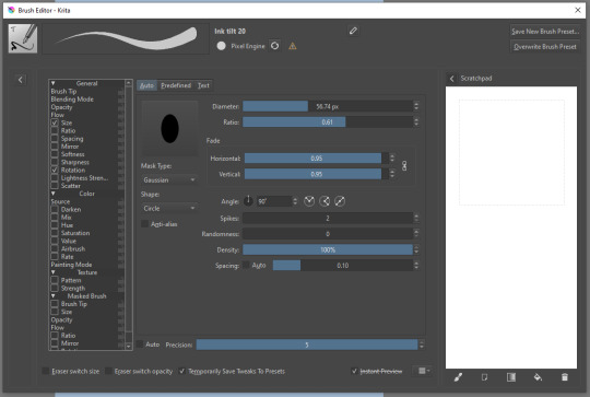
Brush editor is a great tool for making custom brushes, and it even has a sratchpad to test them out. Lots of settings, but no need to be afraid; Most of them you might never use on purpose.
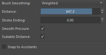
Use Brush Smoothing for great and pretty lines in lining pieces or making calligraphy.
Gradient:
The four icons to the right top are:
Mirror gradient.
Arrange by lightness value.
Arrange by color value.
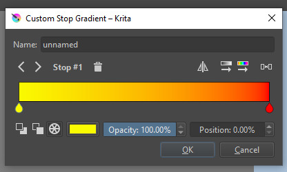
Space the stops evenly.
Click the gradient to add a new stop. The three things to the left are:
Make the stop use Primary Color.
Make the stop use Secondary Color.
Make the stop use a fixed color.
320 notes
·
View notes