#full,width,comma :】
Explore tagged Tumblr posts
Visit Tumblr Blog
Explore Tumblr blogs with no restrictions, modern design and the best experience.
Last Seen Tumblr Blogs


Fun Fact
Tumblr has 16.74 million mobile monthly users in the US.
Text
When I want to add commas to tags, I just use a full-width comma: "," Looks almost identical but can actually be pasted in.
See for yourself
9 notes
·
View notes
Photo
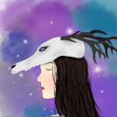
Just taught myself these and thought I'd contribute with the ones I came up with! (some duplicates and weak ones just bc i wanted to get the full alphabet)
✌︎/A - flip the hand upside down and it makes the shape of an A
👌︎/B - didn't have one, so seconding "you will Be okay" (extra effective for helluva boss enjoyers)
If you are (or for the sake of learning this, pretend to be) a cat person: 👍︎ Cats good 👎︎ Dogs bad
☜︎/E - when you make this pose, the fingers pointing against the palm kind of make the shape of an "E"
☞︎/F - points in the same direction as the forks of the F
☝︎/G - what's up G / something about God or maybe Gulls being up in the sky
☟︎/H - down straight to Heck
✋︎/I - think of someone raising their hand like "I do! I know!"
☺︎/J - you smile when you hear a Joke
😐︎/K - "k :|"
☹︎/L - sad loser L
💣︎ Minesweeper
☠︎ Nicotine kills
⚐︎/O - also "paired" with P, it's a more open version (can't really think of anything more)
🏱︎/P - i thought of "flagPole" but that "Pointy flag" is much more useful
✈︎/Q - plane engines are the opposite of Quiet (it's all i got sorry)
☼︎ Rays of sunlight
💧︎/S - water for Swimming (alternatively: a drop is a Small quantity of water)
❄︎/T - Thermal / it snows at low Temperatures
🕆︎/U - compared to the other crosses, the line width here is Universal (all i got)
✞︎/V - i enjoy the "i'm U but stronger". all my brain came up with was "Very"
🕈︎/W - don't have one, i just vaguely associated the increased lines in the cross symbol with the increased lines in a W
✠︎/X - just rotate for an X
✡︎/Y - the star of david is a symbol of judaism, the god of which is Yahweh
☪︎/Z - something something moon and stars -> astrology -> Zodiac
---
Bonus: some punctuation (kind of weak but it's nbd because these don't come up much and can often be inferred)
All the pauses (, . -) are mailboxes, and so is /
📪︎ comma has you wait, like this box is waiting for mail
📬︎ period means you've delivered your point, like this box has a delivery waiting to be picked up
📫︎ hyphen connects two related words, like this mailbox has outgoing mail to connect two related people
✍︎ writing a question
✏︎ idk why my brain decided this pencil is being thrown like a projectile but it is. exclamation! (alternatively, the pencil kind of looks like an exclamation point with the shape and definition of the tip / eraser) (this pencil is in a more diagonal orientation in the undertale Wingdings font)
🕿︎ for "(" and ✆︎ for ")" -- think of which comes before/after. Old style dial phone starts the parentheses, and the newer "call button" on a cell phone closes them
📭︎ slash is slanted like the door of the mailbox is slanted open (distinct from the period bc this one has nothing in it/nothing else going on)
✂︎ quotation marks, think of cutting a snippit out of someone speech when you're quoting them
🕯︎ apostrophe "melts" words together like a little flame
---
Also because I didn't find this post until after I had already made it, here's my own quizlet set! It has the terms/definitions swapped from prev's, as well as some punctuation marks since you'd likely encounter some if you're reading fully fledged dialogue.
sooo, here are the mnemonic devices i used to learn wingdings like the HUGE FREAKIN NERD that i am. i got it down in like two nights and i can pretty much read full sentences now without too much trouble. (provided they are in all caps, which is how gaster talks, so if it’s undertale related, they should be!) i don’t have devices for every letter, but the idea to try and make them from most letters (and the devices for J, K, L, S, and T) comes from @step-by-step-wd, which is an awesome blog that you should check out!
i didn’t bother with the punctuation or numbers here because to be frank they don’t appear that often and with punctuation it’s pretty easy to guess what it is. (lots of mailboxes; you can experiment outside of basic all caps and see which character is what with this wingdings translator.) if you have mnemonic devices for any of the letters i’m missing or any other character feel free to add them in reblogs!
A - don’t have one! B is for it’ll B ok (weak, i know…) C is “paired” with D, its “opposite” D is for thumbs Down E “paired” with F, its “opposite” F when it’s capitalized has a similar shape to a finger pointing right, kind of! G “paired” with H, its “opposite” - also the first letter of GASTER so easy to remember for me personally H pointing straight down to Hell lol I is for In the palm of your hand (also weak…) J is for Joy K is for ‘K then :| L is for a sad Loser M is for Molotov, even though this isn’t one. hey, they both explode!! N doesn’t have its own device, but it is a letter in sans’ name, which is really fitting because of the skull and bones. so if you remember that much you can narrow it down to four letters, at least! O is “paired” with P, kind of a rounder? softer?? version P is kind of shaped like this Pointy flag Q - don’t have one! R is for a Risen sun, a sunRise, etc S is “paired” with T; they’re reversed, Teardrop should be T and Snowflake should be S but they’re backwards! Also TWO of the letters in sans’ name so it appears pretty often. T is “paired” with S, and explained above U is “paired” with V, and… V is “i’m U but stronger” because of the shadow making it look bolded (lol get it?) and “paired” with U W - don’t have one! X kind of looks like an actual X, though slightly rotated Y - don’t have one! Z - don’t have one!
tips:
learn the common letters and vowels first; if you’re trying to read a full text the more letters you know the better you’ll be able to do at guessing the full word
when translating text, if you don’t know a particular character but are able to guess the word, you can use it for a reference. so if you see “S_NS” and guess correctly that the second character is an A, when you come across “G_STER” and see that same unknown symbol, you know you already “solved” a word with it, so you can go back and use that knowledge instead of killing yourself trying to remember that character all over again
stay determined. pretend that you are papyrus, and the wingdings are a puzzle. you GOT this. it’s really not too difficult.
…and if you want, you can check out my undertale tag where i keep my undertale stuff!
#undertale#gaster#wingdings#cypher#i too am such a nerd#this was a lot of fun tho#and for how little time it actually takes to learn#it's a very convenient skill#for an undertale fan who likes knowing secret gaster messages anyway lol#it saves you that whole tedious process of finding a good translator and painstakingly finding and punching in each individual symbol
14 notes
·
View notes
Text
Schläfli symbols my beloved...
#sfw#personal#ok to reblog#doing a Project and it's eating my brain#I can only think in degrees radians and Schläfli symbols#I tried to say I was a quarter sure and almost said 'I'm 90% sure' bc obviously 90 is a number that expresses a quarter#or I could say ½π it's the same thing they're the same number#I love Minecraft the game with {4、3}#(excuse full width comma I can't tag regular ones)
4 notes
·
View notes
Text
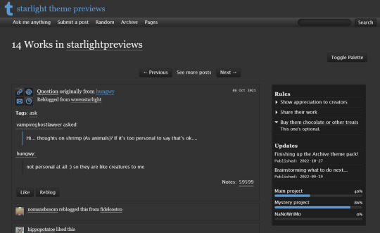


THEME PACK: THE ARCHIVE
Styled after AO3, this pack includes a theme and matching pages, and was designed for writers and readers alike.
����️ Theme 11: Archive Of Your Own
Live preview | Static previews: index page, permalink | Code
Full-width posts in an AO3 work index page format
Sidebars with optional sections such as featured tags, updates, rules, progress bars, and more
Unlimited custom links (display on sidebar or in top navbar), plus several social links in the footer
Add a custom logo beside/replacing your avatar
Inbuilt tag filtering plugin by glenthemes
All fields editable directly in the Customize menu, no HTML required. See below the cut for a full guide
🖋️ Page 3: Archive Records
Preview | Code
A WIP page designed to resemble an AO3 work page
Add tags for ratings, warnings, fandoms, characters, and more, as well as statistics like start dates, word counts etc.
Spaces for summary, start and end notes, and the 'work' itself
🖋️ Page 4: Archivist
Preview | Code
A combined about/navigation page based on the AO3 profile page
Include user statistics or any data you'd like, plus a longer bio
Sidebar navigation with link sections - unlimited links and link groups
The theme and pages all include options for multiple color palettes (initially set to Default and Reversi), text styling (choice of Tumblr/Google fonts and casing options), and more. -
Each page includes instructions on how to edit it, and color/image variables have been gathered together to make customization easier. While not necessary, basic knowledge of HTML is helpful.
For help, check my codes guide, or feel free to send me an ask. Theme 11 customization guide and credits are under the cut.
Theme 11 customization
Regarding the simpler fields:
"Secondary title" refers to the title just above the posts, under the header and navigation. This defaults to "[Total posts] Works in [Username]" when the field is left empty.
"Filtered tags" takes a comma-separated list of tags, entered exactly as they'd be written in the Tumblr post editor but without the hashtag. E.g. the tags #politics, #red and blue, and #green would be entered as "politics, red and blue, green" (make sure there's spaces, and no comma after the last item!). The filtering plugin will then put a warning message over any posts with those tags, along with a button letting you show the post.
"[Section] title" act as the headers for the corresponding section, if provided. "Custom links title" defaults to "Pages" if nothing is entered, and is used when the custom links are displayed on the navbar.
"Featured tags" takes a comma-separated list of tags, in the same format as Filtered tags. This field will display links to those tags, along with the number of posts in that tag on your blog, in the left sidebar.
The Recent posts section displays the 5 most recently posted/reblogged posts on your entire blog, displaying in the left sidebar. If you enter a tag under "Recent posts tag", it'll instead display the 5 most recent posts in that tag on your blog. Only 1 tag is allowed.
Rules and FAQ
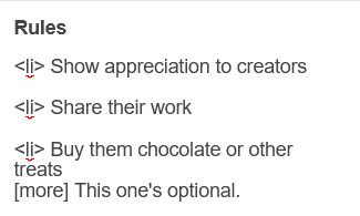
Both these sections work the same way. Each new item, a rule or a question, consists either of one statement, or a statement and some more text, usually as an answer or additional note. E.g. the screenshot below shows three rules, where the last one has more text in the dropdown.
To create an item, prefix it with <li> . To add more text, create a <li> item and add a [more] label underneath, then write your extra text after that. To illustrate, here's the Customize page code for the above:
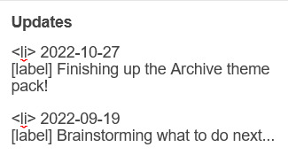
Updates
This section is similar to Rules/FAQ, though it flips the order around. After each <li>, first list the date, then add the [label] marker, then add your actual update. Again, here's an example:
And here's the Customize page code that created that:
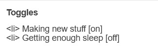
Toggles
This section displays checked/crossed-out items, and uses a simpler version of the formatting for the above sections. Use <li> for each new item, then add [on] or [off] at the end, depending on whether you want it checked or crossed off. Here's an example:

And here's the corresponding Customize code:
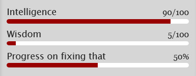
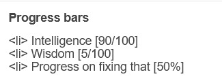
Progress bars
This section also uses <li> items, where each item has two parts: the text label, and the number(s) for the progress percentages, put inside square brackets like with the other sections. Here's an example (note how the top two use fraction values while the bottom one uses a percentage):
And here's the code that made these. In short, the format is <li> Text here [##/##], or <li> Text here [##%], where ## refers to any number.
Social links in footer
The footer links, aside from the email and personal website fields, take usernames or user IDs for various websites. Be sure to check you're not entering a username in a user ID field!
The Email address field takes a standard email in the format [email protected] and adds a link to let people mail that address.
The Personal website fields will generate a link in the footer's Follow section. Personal website name is the human-readable text label for the generated link, and Personal website URL is the URL that will open when the generated link is clicked. Make sure to add https:// to the start of the personal website URL so the generated link doesn't just redirect you to a different part of your blog.
Credits
Layout and design by Archive of Our Own
Style My Tooltips by malihu
Phosphor Icons
Expanded Tumblr localization and NPF photosets plugin by codematurgy
Custom audio posts by annasthms
Tag filtering by glenthemes
Palette toggle by eggdesign
Scroll to top by Fabian Lins
#code#theme#theme 11#page#page 3#page 4#coding cabin#theme hunter#free#full width#sidebar#topbar#nav text#pagination#unlimited links#header img#custom font size#tfont#gfont#unnested#responsive#npf#color mode#search#rblk buttons#timestamps#tags#group
1K notes
·
View notes
Text
ThunderClap | w.w
Platonic!Wade Wilson x plus size!fem!reader
Summary: You are Wade's roommate and also a superhero. When shit goes down you step in to save the day. Pretty much a crack!fic from a dream I had. Warnings: 18+ only, canon-typical swearing, violence, blood. WC: 626

“Oh shit, you are so fucked now you cock sucking motherfucker.”
“Wade, language!” Colossus tried unsuccessfully once again to get Wade to remember that they were in a public area. “There are children here.”
“Relax, tin man.” Wade turned his head away from the group of bystanders. “Well that seems stupid, this is an action sequence. What sort of irresponsible parents would let their child watch this senseless violence? Oh, oh, here she is!”
Wade pointed your way as you stepped out of the jeep you had stolen to race across town and started to laugh maniacally. Your thigh high boots with a stiletto heel clicked along the pavement with every step and you ignored the heat warming your bare thighs as they chaffed together with every step.
“What’s up, Wade?” You nodded as he fangirled over your appearance.
“Oh god, she spoke to me.” He panted. “I just wanted to say, you are so much better than all these superhero assholes combined! And you know how much I love anal.”
“I think everyone knows that.” You chuckled and turned to the bad guy who had escaped prison once again. “So who’s the giant metal dildo?”
“That's Colossus, you’ve met before.” Wade laughed before turning to face the real enemy. “Helmet head? That’s The Juggernaut Bitch.”
“It’s just Juggernaut.” The man growled.
“No, uh-uh, I watched some old footage of you and you definitely said ‘I’m the Juggernaut Bitch’. See?”
“Uh Wade, I think there was meant to be a comma in there.” You whispered to him as he gasped.
“He called Kitty a bitch! Make him pay, ThunderClap.”
You rolled your neck as you warmed up and stood balanced with your legs together, gathering the energy for the explosion you were about to create. Static electricity filled the air and bystanders' hair began to frizz around their head as you separated your knees and made as much space between your thighs as possible. Wade dropped to his knees beside you, watching with excitement as you legs parted to their full width, your biker shorts riding dangerously high.
“It’s more beautiful than I could ever imagine.” He whispered as he held himself back from touching the bare skin.
You didn’t bother warning him before you slammed your legs shut, he would be able to heal his blown eardrums anyway. The slap of skin sent waves rippling along your thighs and the energy you had gathered was released with a sonic boom. You could see the dust in the air part as the concentrated force blew away everything in its path towards the Juggernaut.
The energy wave hit him full force and shattered the metal helmet he wore before throwing him like a ragdoll into a concrete bollard. Cheers erupted as he was crushed into the solid block and he lay a broken mess and unmoving. Your stomach rolled at the spray of blood that had splattered across the white concrete like a Jackson Pollock painting and you turned away as Wade wrapped his arms around your thighs.
“I really need to carry a spare suit, I just creamed this one.” He stated as he looked up at you.
“That’s a new low for you.” You grimaced as you tried to shake him off. “Get off me, Wilson.”
“Leave the lady be, Wade.” Colossus said as he grabbed him by the scruff and easily tore him away before holding his hand out to you. “Thank you, you should consider joining x-force with us.”
You looked between Wade and Colossus before shaking your head. “No thanks, I see enough of that asshole at home, I could not work with him too.”
“She really does, I forget she’s not like Blind Al. I always have my asshole hanging out.”
#wade wilson x reader#deadpool x reader#plus size reader#marvel fanfiction#deadpool fanfiction#wade wilson x poc!reader#wade wilson fanfic
537 notes
·
View notes
Text
How to make a gif + sharpening
Gifs are part of the Tumblr experience and you may want to learn how to do them.
If that is the case, here is a tutorial, showing all the tricks I learned in the past years.
Contents
Software needed
Videos
The process.
Software needed
Windows or Mac OS
Gom Player [download]
Photoshop (I use Photoshop CC 2018, but you can really use any version as long as it has the timeline option).
Talking about Photoshop. You should buy it - but for educational purposes, I can tell you that if you google, you can find many many tutorials on how to install it.
Here is the link to one & [another one]
Overall, I suggest you to google for tumblr tutorials - there are plenty.
Videos
To make HQ gifs you may want to get the scene you want to gif in the highest quality possible.
On Youtube there are a lot of 4K and 1080p videos (especially music videos)
If you are looking for a film or a TV show I am sure you know there are some websites that provide you with 1080p quality files (look for Bluray Rips, they have the best quality).
The process
Now for the fun part. Before starting I want to give you a little cheat sheet on Tumblr’s post dimensions (useful if you want to have really HQ gifs) [here].
Here is the gif I’m gonna make with you today:

It has no filter: just some sharpening.
STEP ONE: SCREENCAPPING
Run Gom Player and open the video you want to get the screencaps from.
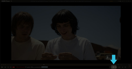
See that little button there? You have to press it. It is called Control Panel.
Once you pressed on it, a pop-up window should load + make sure to click on the Video bar, and the Advanced Capture option:

These are my options:

Now, play the video and press the Burst Capture: once you’re done, press that same button again to stop the process.
Now, the designated folder where you saved the screencaps should have all of the saved frames.
STEP TWO: PHOTOSHOP
On Photoshop go to File > Scripts > Load Files into Stack
This window will pop up:
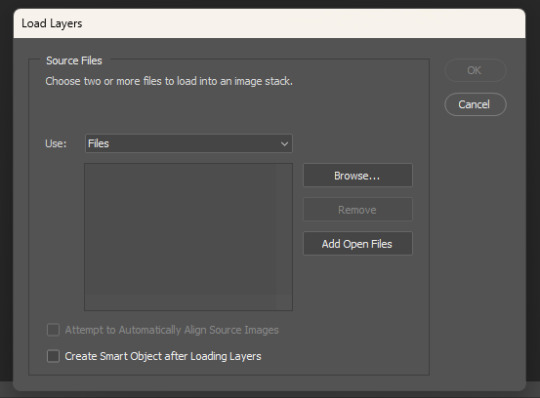
Click on Browse… and select your screencap folder, and select now all the frames of the scene you want to gif, you’ll get something like this:
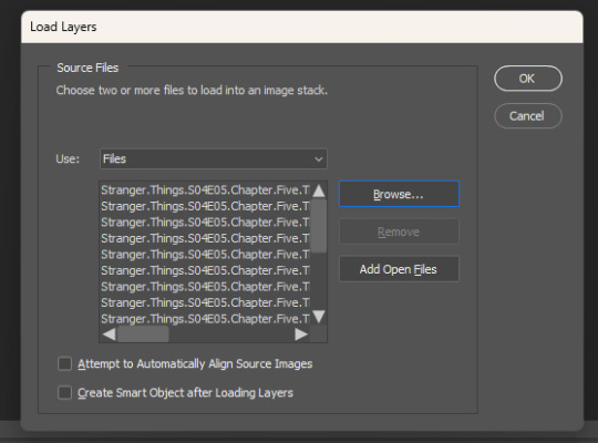
Now press OK and let Photoshop do its job.
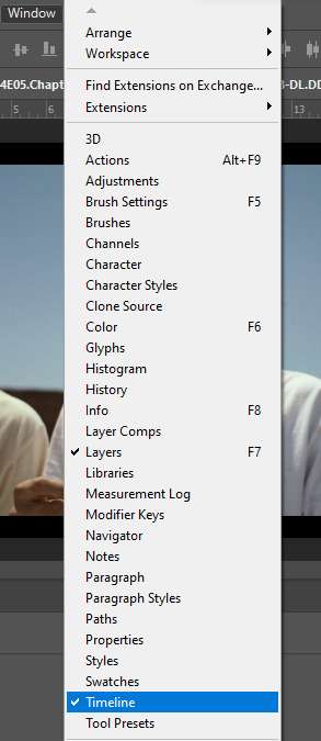
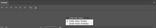
Before starting, make sure the timeline is on (it’s on if it has a tiny check next to it - see the picture below):
Now, your timeline should be visible at the bottom of your screen. Please select the Create Frame Animation option:

Once you’re done, click on the burger menu on top left (see image above):
Click on Make frames from layers
Click again on that menu
Now on Reverse frames
For the last time click on the menu
Select all frames.
Now all of your frames should be selected. Right click on one of those frames where you read “0 sec.”:

Select Other… and write 0.05 (or 0,05 - it's the same tho, for example, my version of Photoshop supports as decimal symbol the comma instead of the full stop!) and confirm.
STEP THREE: CROPPING
Ok, now cropping is really delicate. First, select the crop tool and on the top bar use the Ratio option, like this:
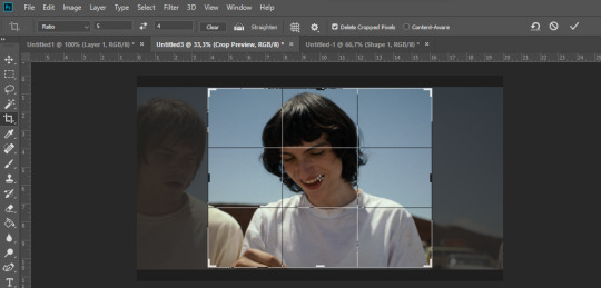
Now, really pick whatever ratio you want (mine is 5:4), and using the handles cut out the black portions of the scene - nothing more. Then confirm.
Go to Image > Image size and write the width based on the cheat sheet I linked above (if the little chain symbol is selected, the height will automatically adjust!) -> These are my options:
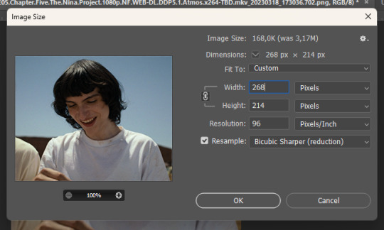
Note: if your resolution is different than 96, don’t change it - leave the number you have.
Confirm.
STEP FOUR: CREATING THE SMART OBJECT AND SHARPENING
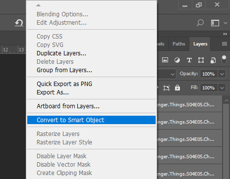
Now, on the timeline, select the first frame, and on the bottom left there is this symbol you may want to click:

Select all the layers, right click and select Convert to Smart Object
Select the newly made smart object and go on the Filter > Sharpen menu and pick Smart Sharpen: these are my options
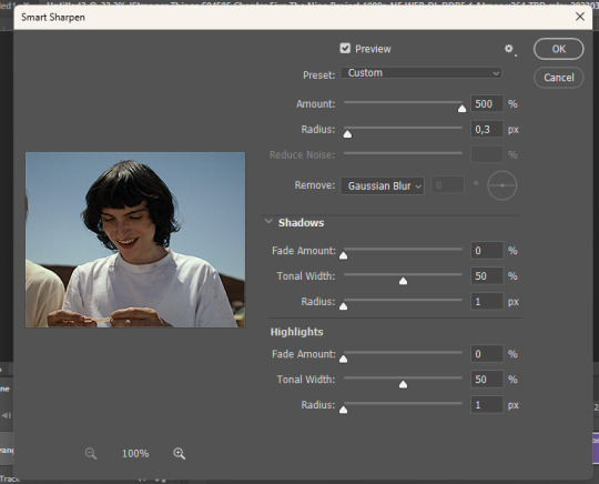

Press OK and then redo it (the smart object has to be sharpened twice).
STEP FIVE: SAVING
File > Export > Save for web

Make sure the looping setting is on Forever - click on save and you’re done!
[list of other tutorials here]
9 notes
·
View notes
Text
I've seen a few of these posts floating around, and no one ever gives a proper answer, so
Tumblr splits up tags whenever it finds the regular comma you can type with your keyboard, but there are several obscure unicode characters which look like commas, but which Tumblr won't recognize as such. Take your pick:
‚
Single low quotation mark (U+201A)
﹐
Small comma (U+FE50)
,
Full width comma (U+FF0C)
ok how are you people putting commas in your tags
78K notes
·
View notes
Text
2019 Debut YA Covers Megapost (part 1)
I’ve fallen off the wagon of keeping up with cover reveals even a little, and there were a whole bunch in the past few weeks, so to get back up, i’m gonna try to do quick and dirty rundowns of as many 19 debuts as have had cover reveals (that I haven’t already talked about) as I can this week! HERE WE GO (these are in no particular order):
1) BLOODLEAF by Crystal Smith

Oh Bloodleaf, you expensive little TOG rehash. What have you brought us. This is another Billelis creation, and I actually like the type! The hypercondensed slight serif feels appropriate but fresh for YA fantasy and the color scheme, the central flower image, and the silver thorns are all really working. BUT I have the exact same issue that I had with the updated Dark of the West cover; the “fancy border with illustrated story-relevant elements” thing doesn’t really work for me when it’s uneven and almost-random the way this is. The crown, moon and tree up top are so symmetrical and balanced that you expect the same thing in the opposite corners, and instead you get a castle with a lot more visual weight than the others, plus a raven and a bow that are just...... hanging out? This would have been a stronger cover with the additional symbols completely removed; the flower and thorns are plenty of visual interest alone.
2) THE PIONEER by Bridget Tyler
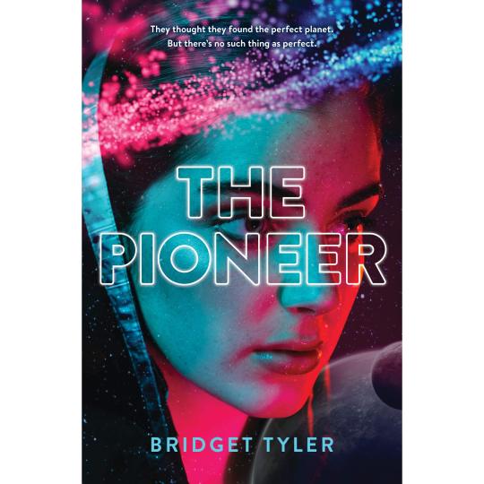
I am obsessed with this one. I don’t know a damn thing about the book, haven’t seen it hyped on twitter or anywhere else, but this cover is gorgeous and perfect and evocative; there’s DEPTH and DRAMATIC COLOR and it’s got BISEXUAL LIGHTING and the outlined type is INTERESTING. It’s an aesthetic cousin to the UK Edition of THE DEVOURING GRAY that i talked about here and it looks like a movie poster and I want it on my wall.
3) ENCHANTEE by Gita Trelease
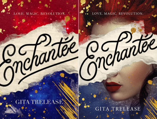
Poor Enchantee has already had a cover redesign (old on the left, new one on the right, with the face). It was for the better, although they didn’t address my biggest issue with the original, which is that tYPE. The even-width, sort of chalkish calligraphy SCREAMS “art director’s instagram” and “cloyingly cute NEVERTHELESS, SHE PERSISTED posters you can buy on Etsy”, and “chalkboard signage your high school friend pinned to her WEDDING INSPO pinterest board”, rather than. Yknow. Sexy Magic Revolutionary France, which is the book. Where is the CONTRAST. where is the impression of ACTUAL INK. (Also: I didn’t crop these weird, the type being cut off/ a tangent on the edge there is Actually Like That.)
The Lipstick-ed face DOES say Sexy Magic Revolutionary France, so I appreciate its presence and also think it looks good (it def is victim to looking a little like a tumblr graphic, a phenomenon i have mentioned before, but that’s pretty harmless here); and the gold paint splotches and red-blue starry textures are pretty! They could have done a less halfassed job getting the vivid blue cropped around her chin, but. C'est la vie. I like it and I’m actually super hype for the book itself.
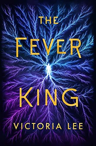
4) THE FEVER KING by Victoria Lee
This is......... a weird one. I love the colors! the blue and purple (veins?) lightning is really striking (LOL) and the texture is super visually interesting. I’m very curious to see the print choices eventually; I think matte vs glossy vs texture vs foil could make a big difference in how this one feels overall. I sort of wish SOMETHING was different, just to make this a little less symmetrical or abstract, whether that’s a different text layout or an additional focal point in the imagery or whatever, but I do think it fundamentally works as-is.
5) FOUR DEAD QUEENS by Astrid Scholte
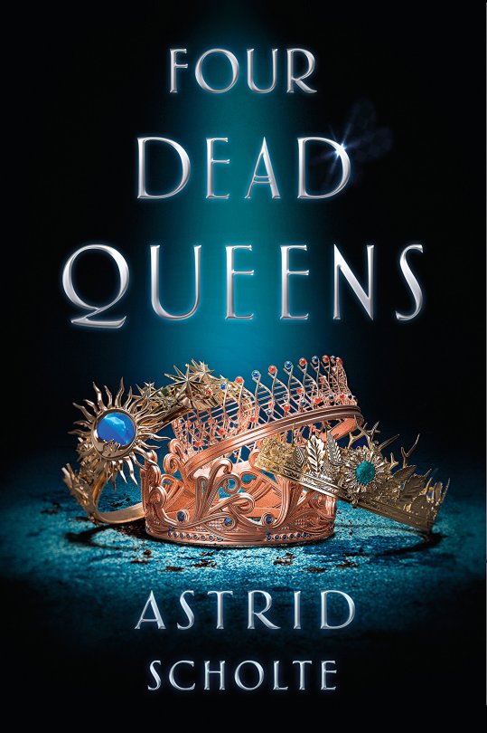
Thanks, I hate it! this shares a lot of problems with the Burning Glass cover and everything I dislike about lazy object covers generally: the imagery is unclear at first glance (what a waste of all that detailed rendering) and not evocative of anything in particular in terms of mood, setting, or themes, and the type’s layout COULD NOT BE MORE BORING + is an ineffective use of the space and has a totally unnecessary glowy effect. The “spotlight” effect could generously be considered to be a visual signifier of the ~ murder mystery element but. oof. is a 90s crime drama aesthetic really what you want your secondary visual to be on what seems to be a pretty serious YA fantasy book?
(Okay, it could be worse, at least the hierarchy is clear and sensible. but that DNA crown, lmfao.)
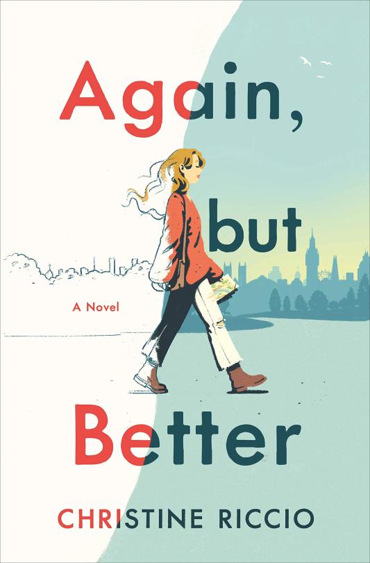
6) AGAIN, BUT BETTER by Christine Riccio
I got a couple requests for this one, and I really like it!!! i think the illustration style is SO cute and the whole layout is simple but effective. The little touches like the birds in the corner and the placement of “a novel” are all perfectly balanced; it’s a more successful version of the illustration on WHAT IF IT’S US (and a few others, like HOT DOG GIRL by Jennifer Dugan; that general style + palette is a trend right now) and the concept of the line across and the girl coming into full color is a clever little representation of the coming-of-age story elements.
7) HOUSE OF SALT AND SORROWS by Erin Craig

I really! WANT! To like this cover! I think the layout and rendering of the text and the various nautical effects are sophisticated and pretty! HOWEVER COMMA! It’s just so low-contrast. This entire cover has the same single gray-green color and [lack of] depth; it’s like an intricately detailed dining room table. Nothing, not even the text, stands out immediately, so your eye wanders looking for a focal point; the title is readable, but not.... amazingly so. Kind of an unfortunate misfire despite having some of the most thoughtfully designed ~ fantasy ~ text I’ve seen in a while.
8) WE RULE THE NIGHT by Claire Eliza Bartlett
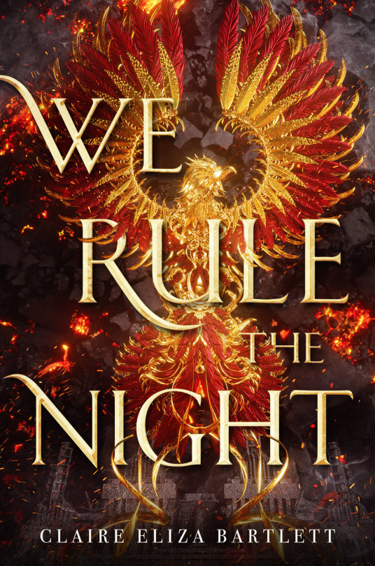
This is, quite obviously, another Billelis creation, so we’re back to talking about the various foibles and failings of art directors trying to integrate type with his illustrations. And this one. uH. IT’S ROUGH, although the bigger question here is why that gorgeous, intricately rendered phoenix (?) isn’t centered on the damn cover. (neither is the.... fortress? on the bottom.) It’s so symmetrical that it’s clearly meant to be! Perfect centering and a tighter crop would have done a lot towards offsetting...... whatever is happening with the type, which feels VERY awkward. I do think the sort of ~random placement of words could work with a little more thought but into it, but as it is. Woof. It’s cohesive enough that I still feel okay about it as a cover overall, but some sTRANGE choices happened there.
Also, having looked this up, it’s actually dieselpunk? IE vaguely fantasy WWII? And as with our last vaguely fantasy WWII book (RIP Dark of the West’s OG cover) that is..... not being expressed. Here, I would say that a different typeface, one that feels more militaristic/ modern as opposed to ~ high fantasy ~ might have been the play.
MORE 2 COME
142 notes
·
View notes
Photo

How to Use the WordPress Responsive YouTube Playlist Video Player Plugin
In this post, I'm going to review the WordPress Responsive YouTube Playlist Video Player plugin, which allows you to integrate a video player which is capable of playing YouTube playlists seamlessly.
For websites that deal with a lot of video streaming content, it’s important that they should organize their content in a way which is appealing and intuitive to end users. Also, it should be a part of their advertising strategy as well. Specifically, if you’re looking for a better way to represent your niche YouTube content, you’re at the right place!
When it comes to embedding YouTube content, there are thousands of free plugins and scripts available online. You’ll also find commercial options that provide ready-to-use features and extended support. In the case of commercial options, you should also expect quality code, bug fixes, and new enhancements.
WordPress
Best Video Background Plugins for WordPress
Nona Blackman
WordPress
Free WordPress Video Player Plugins
Monty Shokeen
WordPress Plugins
Top WordPress Audio and Video Plugins of 2019
Daniel Strongin
WordPress
How to Add the Stellar Video Player to Your WordPress Site
Ashraff Hathibelagal
Today, we’re going to explore one of the most popular plugins available at CodeCanyon: WordPress Responsive YouTube Playlist Video Player. It allows you to embed your YouTube content in different ways, whether as a playlist, channel or single video. Also, it comes with a custom designed interface instead of YouTube’s default interface.
Let’s quickly go through the important features WordPress Responsive YouTube Playlist Video Player brings:
support of YouTube playlist, channel playlist or a single video
responsive with intelligent resizing
interface customization
latest YouTube v3 data API
AJAX based pagination with unlimited number of videos
horizontal and vertical layouts
and many more
This plugin provides a lot of useful features that allow you to embed your YouTube content effortlessly.
Our Agenda
There are different ways you could use this plugin and customize your output. Although in this post, we’re going to build a full-fledged horizontal YouTube player by embedding a YouTube playlist by id.
The outcome of our process will look like this:
Throughout this tutorial, we’ll explore different aspects of this plugin while moving closer to our goal to build a YouTube playlist video player. In the next section, I'll show you how to download and install this plugin.
Installation and Register Your Own YouTube API Key
In this section, you’ll see how to install and configure the WordPress Responsive YouTube Playlist Video Player plugin once you’ve purchased and downloaded it from CodeCanyon. For this post, I’ve used WordPress 5.2.3, and the plugin version is 1.11.0. I recommend that you install the plugin if you want to follow along with this post.
The player uses YouTube’s Data API V3 and in order to use the API you will need an API key. If you do not register your own private API key, the default key will be used. However, the default key is used by lots of other users who haven’t entered their own key, and the API only has a limited number of requests it can make per key. So it’s always a good idea to have your own key to make sure there’s no outage if you’ve a high traffic website.
If you don’t know how to register the YouTube API key, the plugin provides a nice guide which explains it in detail. When you access the main plugin page on the admin side, there’s a message telling you to enter your own API key. Click on the REGISTER KEY button to open the guide. Follow the instructions in the guide and get your key.
Once you get your API key, you just need to enter it in the GENERAL SETTINGS section of the plugin as shown in the following screenshot.
In the next section, we’ll go through the different configuration sections this plugin provides.
Plugin Configuration Options
In this section, we’ll quickly go through the different configuration options provided by the WordPress Responsive YouTube Playlist Video Player plugin.
Once you install this plugin, you can access it by clicking on the YouTube link in the left sidebar.
General Settings
In this section, you can configure generic settings related to pagination, autoplay and GDPR. And as we discussed earlier, you can register your YouTube API key in this section.
Appearance
As the name suggests, you’ll find settings related to the visual aspects of your player in this section. A couple of important settings includes playlist layout, player width, HD display, and a few text-related settings.
Controls
When you want to customize a player, it’s important that you should be able to choose among the different player controls. This section allows you to hide or show different player controls as per your requirements.
Colors
This section allows you to configure colors of almost each and every player control.
So that was a brief introduction of the configuration options provided by this plugin. In the next section, we'll build a full-fledged horizontal YouTube player by embedding a YouTube playlist by id.
Create a YouTube Player With a Horizontal Playlist Layout
YouTube playlists can be added onto your posts or pages by using the shortcode button in the editor as shown in the following screenshot:
When you click on that button, it opens up the popup as shown in the following screenshot.
As you can see, there are different ways you can add your YouTube content to your site. In our case, as we’re going to embed the YouTube playlist, we’ll use the first option: YouTube Playlist. To embed the YouTube playlist you’ll need a playlist URL, which and you can easily get it from your YouTube channel page. Of course, if you haven’t created any playlists yet, you’ll have to create one first. In any case, you should end up with a playlist URL like https://www.youtube.com/playlist?list={YOUR_PLAYLIST_ID}.
Once you get your playlist URL, insert it into the YouTube Playlist field as shown in the following screenshot and click on the INSERT button.
Your shortcode will be generated and added to your page or post. In my case, I’ve created a new page. The shortcode should look like:
[ytp_playlist source="PLMP2_J2lf0P1P7pjwaDe1ki-XQjaP5P1j"]
Go ahead and publish the page to see how it looks like in the front-end.
So that’s the default view of what it looks like. The main video is on the left side and the other videos in the playlist are on the right sidebar. You can click on any of them to play it. It’s the vertical playlist type in the terminology of this plugin.
In our case, we want to show the other videos in the playlist horizontally. You can control this layout by supplying the playlist_type parameter in the embed code. In fact, this plugin provides a lot of customization options through the shortcode that allows you to control different aspects of the YouTube player. It’s not possible to discuss all the options, but we’ll highlight the ones that are required for our use-case.
Firstly, let’s add the playlist_type parameter as shown in the following snippet.
[ytp_playlist source="PLMP2_J2lf0P1P7pjwaDe1ki-XQjaP5P1j" playlist_type=”horizontal”]
Next, we want to make sure the player is responsive—this is done by using the width_type parameter.
[ytp_playlist source="PLMP2_J2lf0P1P7pjwaDe1ki-XQjaP5P1j" playlist_type=”horizontal” width_type=”responsive”]
Next, we want to make sure that the video quality is HD and the YouTube logo is hidden.
[ytp_playlist source="PLMP2_J2lf0P1P7pjwaDe1ki-XQjaP5P1j" playlist_type=”horizontal” width_type=”responsive” force_hd hide_youtube_logo]
The settings we have done so far are specific to player controls customization. Somehow, I feel that we also need to change the color of a few controls so that they look more intuitive. So let’s change a couple of color settings at YouTube > COLORS.
When it comes to changing colors, this plugin allows you to change colors of different controls. In my case, I have tried to change colors as shown in the following screenshot. Of course, you could experiment on your own to find a color theme which works for your site.
With all the changes we’ve done so far, the player should look as follows:
As you can see, there are customization options for each and every aspect of the player. In this post, we embedded a YouTube playlist, but you can also embed a channel or a single video. I'll leave that to you as an exercise! Of course, you could always ping me using the feed below if you’ve any queries.
Other Possible Uses
In this post, we discussed how you can add a player for a YouTube playlist to your WordPress site. As we discussed earlier, the WordPress Responsive YouTube Playlist Video Player plugin is also capable playing different kinds of YouTube content. You could also use it to integrate:
YouTube channels
YouTube users
YouTube single videos
YouTube multiple videos by comma separated ids
The Next Step: Other WordPress Media Scripts
If you're looking for other WordPress media scripts that you could use right away, I recommend that you check out the following scripts that are available for a low cost.
Media Library Categories Premium
Jixxio Media Management
WordPress
Best Video Background Plugins for WordPress
Nona Blackman
WordPress
Free WordPress Video Player Plugins
Monty Shokeen
WordPress Plugins
Top WordPress Audio and Video Plugins of 2019
Daniel Strongin
WordPress
How to Add the Stellar Video Player to Your WordPress Site
Ashraff Hathibelagal
Conclusion
Today, I took an opportunity to introduce the WordPress Responsive YouTube Playlist Video Player plugin available at CodeCanyon. It’s a commercial media player plugin which allows you to embed different types of YouTube content effortlessly. Moreover, it also allows you to customize the look and feel of the player as per your requirements.
I hope that you've enjoyed this article, and feel free to post your thoughts using the feed below!
by Sajal Soni via Envato Tuts+ Code https://ift.tt/33Nj6Pl
1 note
·
View note
Text
Tutorial: how to make photosets and photos looking like tumblr’s dashboard
Like this:

I’ve found a very simple way of doing this kind of layout and all we need is, the post css info, use the pxu photosets and wrap the block photos in divs and use calc ()! Don’t know how to use pxu photosets? check this tutorial!
Difficulty: ★ ★ ☆ ☆ ☆ CSS and Html knowledge. The theme must be made by you, or else you won’t know the posts info (padding, width, etc).
If you’re now using pxu photosets, the div wrapping the photose blocks is .photo-slideshow { }. Now, search for {block:photo} and {/block:photo} and wrap everything inside with the div post-photo, or anything else you want. Now, let’s go for the methods:
Method 1: for responsive themes.
If your theme is responsive (mobile friendly) it will stay responsive! First thing you need to find is the post infos, specifically the paddings. eg. my post has a max-width of 500px and a padding of 1em. To make the photoset to have no space at the sides, like tumblr’s, we are going to use calc( ) to make it have 100% of width plus two times the same value as our padding. eg:
.photo-slideshow{ width: calc(100% + 2em ); /* my posts has 1em of padding, so we double that number!*/ }
This will make the photoset exceed the post box. To fix that, we are going to give the photoset div a margin-left of the same value as the post padding (1em). The code are going to be like this:
.photo-slideshow{ width: calc(100% + 2em ); /* my posts has 1em of padding, so we double that number!*/ margin-left: -1em; /* the same value as the post padding */ }
Why? If the post has a padding of 1em, that means all its sides (top, bottom, left and right), will have the same value. If you put the calc to 1em only, the photoset will not exceed the post padding, and it wil not look good. Using the double value and the margin, it will make that a space never appear in the post. And it’s responsive.
Now, to make the photos have the same layout, use the same code in the div we just wrapped our block:photo, but this time, we’re going to apply only to the images:
.post-photo img{ width: calc(100% + 2em ); /* my posts has 1em of padding, so we double that number!*/ margin-left: -1em; /* the same value as the post padding */ }
This is optional, but if you want to make also the images uploaded in a text post to have the same layout style, just add this:
.tmblr-full img{ width:100%; height:auto; margin:0; display:block; } .tmblr-full{ margin:0; width:calc(100% + 2em); margin-left:-1em; }
Text posts are different, because they wrap the images in a figure class. But is the same code as the photoset and photos, except this time we have to apply a margin 0 in both image and container and make some code tweaks on the image alone.
Also, if you don’t have any information on the top of the post, like dates, buttons, icons, etc, you can also add a margin-top to the codes so the images will go up!
margin-top: -xx; /* xx is the value of the posts padding*/
There is a simple way of compile the codes of photoset and photos to avoid repetitions. You can put all the divs altogether and separate them with commas:
.photo-slideshow, .post-photo img{ width: calc(100% + 2em ); /* my posts has 1em of padding, so we double that number!*/ margin-left: -1em; /* the same value as the post padding */ }
You can also do this same thing with the audio player, by adding the same styling css to the class:
.tumblr_audio_player{ }
You just have to check if in your {block:Audio} the audioplayer is embed:
{block:AudioEmbed} {AudioEmbed} {/block:AudioEmbed}[
And you can use that to the link as well. Just add the calc on the width and the margin-left normally.
Method 2: for not responsive themes.
If you want to make your post layout look like tumblr’s dashboard posts, and you haven’t made your theme responsive, don’t worry. Just replace the ‘em’ to pixels. Make every change until the code part (use the pxu photoset and wrap the photo block with a div).
If your posts has a 500 px of width and a padding of 10px, the code should be like this:
.photo-slideshow{ width: calc(100% + 20px ); /* my posts has 10px of padding, so we double that number!*/ margin-left: -10px; /* the same value as the post padding */ }
.post-photo img{ width: calc(100% + 20px ); /* my posts has 1em of padding, so we double that number!*/ margin-left: -10px; /* the same value as the post padding */ }
.tmblr-full img{ width:100%; height:auto; margin:0; display:block; } .tmblr-full{ margin:0; width:calc(100% + 20px); margin-left:-10px; }
See that in the width, we always double the padding, and in the margin we let the same value! That’s the rule.
Let me know if anything goes wrong, or if I didn’t explained clearly.
15 notes
·
View notes
Text
Have a full width comma for the tags
,
Oh so ur a writer?? Prove it. Drop the last sentence of ur wip in the tags
#The sound wasn't the thick drumming cadence,or even throaty purr bordering on roar that she thought it would be. No,the PDC's 𝘬𝘦𝘦𝘯𝘦𝘥.#It was high,with an extended vibrato,like a choir of sopranos.#Lines of liquid gold stretched from her ship to her enemy and washed over them. each barely discernible dot creating a little splash,#like small stones dribbled into water... It was almost beautiful,if not for how terrible it was...#Forged tungsten penetrators traded for extinguished human lives.
46K notes
·
View notes
Note
full width commas! ,<- doesnt count as a regular comma :3
OHHH that's so cool !! :00
0 notes
Text
Notes from Holiday SDL Videos
History of Frame rates
Phi Phenomenon by Max Wertheimer in 1912
The human brain can perceive 10-12 individual images per second brain turn them into motion
Thomas Edison the magic number is 46 times per second, It won’t flickers because of our persistence in vision
flash each frame 3 times, a total of 48 frames per second - 16 fps
The frame rate for film and music, established in 1929 as 24 fps
2 seconds= 12FPS
3 seconds = 8FPS
4 seconds = 6 FPS
Band width - Fritz Schroter (1930) and Richard Ballard (1932)
To avoid flickering, each frame would be interlaced, broken down into alternating fields. An upper and lower field, seen on screen one after the other in a comb-like pattern, to eliminate intermodulation - distortion caused by hum, generated in electrical current. The refresh was set to that of the AC power.
60 Hertz = 60 fields per second = 30 fps
VHF= (30- 300MHZ) UHF= (300-3,000 MHZ)
Georges Valensi in 1938 broke images down into luminance and chrominance, so they could embed a colour signal as a subcarrier in the tv signal.
Had to reduce the frame rate by 0.1% so colour and audio would never fully match up
60 fields per second to 59.94% fields per second for an effective 29.97 full frames per second
only in countries that use the NTSC standard
PAL and SECAM - 50 fields/sec for 25 frames per second.
24 fps x 99.9% = 23.976fps/ 29.97 = 4/5 = 3:2 pull down
3,2,3,2 = Partial frame cause Telecine Judders
24 fps x 104% audio raised by 0.679 semitones
Filmmakers have tried to push the temporal resolution or frame rate higher
4k standard include a 120 fps option
Framerate is the engine behind the cinematic lie
How to create a GIF in Photoshop
Select, select & mask
Smooth
Feather
Contrast
Layer mask
Invert = Command/control I
Command & comma = hide
Export - save as web (legacy)
GIF
Max colours
Loop forever
Interlaced and Progressive Frame rates
24p, 30p, 60p, 60i
P = progressive
I = interlaced
Progressive = 24 images played back 24 times within one second. Film = 24fps Video = 60i fps
The more frames added makes it seem smoother but also makes it easier for our brains to process. 24 fps forces our brains to pay attention to take in the image than it would otherwise
Persistence of motion - more frames for a smoother playback
Combing - gives away interlaced effect
Keep them consistent from beginning to end for best results
interlaced footage is only good for tv, should be deinterlaced for youtube
Type in Motion
All about storytelling
Elastic screen size - make sure our typography is legible and readable.
Design for the middle - Large enough to show up on different screen sizes. Heavier weights show up even better at screen sizes. sufficient contrast between type and background.
Design for mobile.
When choosing a style for your type, make sure it is true to your content and keep your audience in mind.
Choosing a style sets a tone
Style, size, weight and width
The larger the size, the more visible it will be, and the impact it will have.
With a heavier weight, they read more clearly on screen
Size + weight packs a punch
recommend using heavier weights to ensure higher visibility and legibility for type in motion.
Adding a bit of movement makes it more interesting.
Contrast between foreground and background
Strong distinction is best
Highly saturated colours, like back and red don't play well together unless the type is large.
Colour that is too light doesn't provide enough contrast
Lowercase feels friendlier than caps
Asit animates, type creates a mood, sets the tone and has more impact than static type.
Type transparency
Remain or dwell on the screen long enough the eyes can take in the letter forms and translate them into words.
Dwell time can also make a mood, by being fast or slow
Special effects can cause distraction from tour message
when is the best time to use special effects? - the story you are telling, the mood, and how much time you have.
Sometimes less is more, depending on the story, more is more.
0 notes
Text
full width comma that i made up so i could talk normal even in tag world
tumblr needs a “not for you” page where it just has things that you disagree with and make you angry
121K notes
·
View notes
Text
A Fiction Writer’s Guide to English
Tips, tricks, and complaints on how to make your story sound a lot better
By a five-year-old someone not qualified to talk about writing
Disclaimer: By no means am I a writer, a linguist, or an expert on any of the subjects discussed below. However, I do read a lot (a lot), published and unpublished works alike, and this post is made to address certain syntactical, structural, grammatical, aesthetic, and linguistic issues that irk me whenever I come across them. The following is my personal opinion (albeit a well-researched one), and if I've said something horribly wrong, by all means tell me and I shall fix it post-haste. Probably.
Again, this is by no means fully comprehensive, and I doubt it is fully accurate, but from what I've read, this list could do a lot, with a few simple tips, to ameliorate fiction and fanfiction stories a thousand-fold; because, to be honest, a spelling mistake or a grammatical error is one thing that will infallibly take me out of a story and will get me to look at it with a much more critical eye.
Note: the grammar and punctuation rules below (mostly) follow the American set of rules as standard, since I am American, and most fanfiction stories use this standard as well.
I will probably, once the initial post is out there, come and update it when I come across something that would be a helpful addition; feel free also to shoot me a message or an ask if you have a question or need clarification on anything.
These tips are ordered in no specific way whatsoever, and credit goes to all the original creators of the images and posts I reference herein.
Use the passive voice wisely. You'll hear a lot of English Teachers tell you that the passive voice is bad bad bad, and should never ever ever be used. This is not the case. While one should shy away from using it too frequently, there are some cases where the passive voice is acceptable, and even preferable. As a reminder, the passive voice is when the subject of the clause receives the action: "The ball was kicked." Use the passive voice sparingly; it is best used when "the thing receiving an action is the important part of the the sentence—especially in scientific and legal contexts, times when the performer of an action is unknown, or cases where the subject is distracting or irrelevant". (For more info, go here.
Pay attention to the setting and the time period of your story. While this may seem self-explanatory, I have seen far too many stories where everything is going perfectly until the student who is supposed to be in a London primary school asks his "Mom" to help him with his "math" homework. (The correct words are, of course, "Mum" and "maths”.) Similarly, a gentleman living in 1880's New York will not greet his friends with "Yo, what's up, man? You good? Cool." (Yes, that is an actual line I have actually read.) I know that this can be hard, especially for authors who don't live in the country their story is set in, but a little bit of research goes a long way in making your story sound better. (This doesn't apply to writers who use anachronisms and the wrong words purposefully, for humor or otherwise).
Accents and dialects. When you want a person to speak in a certain accent or dialect, research that accent or dialect a bit to understand the most prevalent words and grammatical form, and use them in your dialogue, and, if in first person, your narration as well. You can also think about adding certain regionally-specific words, spellings and grammatical structures. If imitating a work written in that region, definitely watch the spellings and alternative words, and incorporate them in both your dialogue and your narration. ( “mom” vs. “mum”, “math” vs. “maths”, “color” vs. “colour”, etc.). e.g., in England: I was sitting there, laughing --> I was sat there laughing. curb (street), jail, tires, tv --> kerb, gaol (sometimes), tyres, telly, etc.
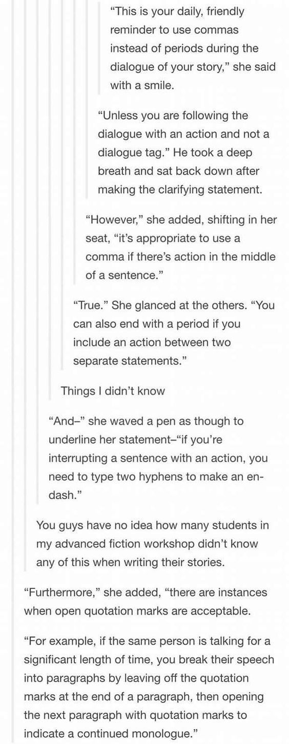
Beware punctuation with dialogue. Use commas. (NEVER EVER EVER CLOSE A DIALOGUE QUOTATION WITHOUT SOME FORM OF PUNCTUATION! There must ALWAYS be either a period, a comma, a question mark or an exclamation point, or an em-dash before the quotation marks close.) The following image perfectly illustrates the proper ways of punctuating dialogue: WARNING: Use em-dashes instead of en-dashes for interruptions. See below.
Dashes vs. hyphens "-": hyphen, used to separate parts of compound words and last names. (e.g. five-year-old; pick-me-up; short- and long-term; Lily Evans-Potter) "–": en-dash (because it has the width of an "N"), used in number and date ranges, scores, directions, and complex compound adjectives. (e.g., he works 20–30 hours per week; the years 1861–1865 were eventful; FC Barcelona beat Real Madrid 3–2; Ming Dynasty–style furniture is expensive) (Note: when you use "from" before a range of numbers, separate the numbers with "to" instead of an en-dash.) "—": em-dash ("M"), can be used instead of parentheses, commas, colons, or for interruptions in dialogue, thought, or narration. (e.g., I know I'm right, and you're — stop throwing things at me!) (For more info, go here.)
Vary sentence lengths. When your sentences are all the same length and all the same complexity, your story starts to sound monotonous. Experiment with length, clauses, commas and semicolons, etc.: “This sentence has five words. Here are five more words. Five-word sentences are fine. But several together become monotonous. Listen to what is happening. The writing is getting boring. The sound of it drones. It’s like a stuck record. The ear demands some variety. Now listen. I vary the sentence length, and I create music. Music. The writing sings. It has a pleasant rhythm, a lilt, a harmony. I use short sentences. And I use sentences of medium length. And sometimes, when I am certain the reader is rested, I will engage him with a sentence of considerable length, a sentence that burns with energy and builds with all the impetus of a crescendo, the roll of the drums, the crash of the cymbals—sounds that say listen to this, it is important.” — Gary Provost For more on sentence and paragraph structure, see thewritersguardianangel’s post.
Don't be afraid of contractions. Contractions are common in everyday speech and in everyday writing. Use these, especially in dialogue, since contractions will be used almost all the time, unless the character is older, teaching, or speaking intentionally formally. (A college student is not going to tell his friend "You have got to do this homework assignment, or you will fail the class, and the teacher has caught on to you. He will not be lenient." It'll look more like "You've got to do this homework assignment, or you'll fail the class, and the teacher's caught on to you. He won’t be lenient.")
Avoid overly verbose and complex wording, especially in dialogue. Don't use words that are very grandiose and complicated, especially in dialogue with younger people. A teen might use "merely" once or twice, especially in more formal speech, but will very probably use "just" instead. It makes dialogue more realistic too; real conversations don't often have very hypotaxical, full-of-dependent-and-subordinate-clauses language.
Use italics. Italics are, fortunately, available in all softwares and formatting when writing a story, so one mustn't shy away from using them. They provide a very good way to indicate emphasis, as well as to show anger or frustration without the use of capitals, which just make sentences sound like a petulant child throwing a tantrum. Compare "'I CAN'T BELIEVE YOU!' I yelled." and "'I can't believe you,' I hissed." Much more effective, no? (A good rule of thumb is: italics for everything except someone blowing their top. Think the end of Harry Potter and the Order of the Phoenix.)
Narrative Perspective. Unless using third person omniscient, stick to one narrative point of view for one section of text, and don't change the perspective style in the story. Don't start in third person close (like Harry Potter) and end in first person (like Percy Jackson). A note about third person close: you can change whose perspective the story is told in throughout the story, but separate those perspective changes, either via a new chapter or a scene break ("******"). Perspectives: First Person: usually singular, occurs when the narrator is telling the story. (Moby Dick, Percy Jackson). Can sometimes be plural (A Rose for Emily). Third Person Close/Limited: the narrator is separate from the main character but sticks close to that character’s experience and actions. The reader doesn’t know anything that the character could not know, nor does the reader get to witness any plot events when the main character isn’t there (Harry Potter). Third Person Omniscient: features a god-like narrator who is able to enter into the minds and action of all the characters (Little Women, The Scarlet Letter).
Use the subjunctive for conditionals and hypotheticals. This might be a bit of a controversial topic, so i'll make this optional, but strongly recommended. The subjunctive mood is what characterizes verbs in conditional and hypothetical situations, so wishes, dreams, hopes, predictions, etc. One should be wary of it in dialogue, though, because it isn't widely used. Use it freely in narration. Usually comes after if or that (e.g., I insist that he leaves leave now; If I was were there, I would be happy.)
Write out numbers. Don't use digits, use words. The man doesn't have 200 dollars, he has two hundred.
The verb "said". Unlike many who tell you never again to use the word "said" when constructing dialogue, I won't. "Said" is a good word, and should be used, but not over-used; find synonyms when it starts to get repetitive, and you can also use it with different adjectives to spice it up. Sometimes you don't need a dialogue tag at all. However, don't try to come up with a different synonym for "said" for every dialogue tag, since it just sounds excessively wordy and extremely trite. A mistake a lot of writers make is the above, which is to replace every single instance of the word "said" with some outlandish synonym. Also, be wary not to replace a dialogue tag with an action verb (which can also lead to a comma splice) (e.g., "I can't believe you," Mike raged, "you're such an idiot!" vs. "I can't believe you!" Mike growled. "You're such an idiot!")
Connect independent clauses correctly. Independent clauses are sentence fragments which have a subject and a verb, and can stand alone as sentences. If one wants to join them into one sentence, however, there are three ways of doing so: One can use a semicolon (as discussed in the punctuation section below), or one can use a comma + coordinating conjunction. A coordinating conjunction is a word that can, after a comma, join two independent clauses, and they are FANBOYS (For, And, Nor, But, Yet, So). (e.g., Alex went to swim in the pool, but Max couldn’t come.) The last way one can connect two independent clauses is with a conjunctive adverb. Conjunctive adverbs look like coordinating conjunctions; however, they are not as strong and they are punctuated differently. Some examples of conjunctive adverbs are: accordingly, also, besides, consequently, finally, however, indeed, instead, likewise, meanwhile, moreover, nevertheless, next, otherwise, still, therefore, then, etc. When you use a conjunctive adverb, put a semicolon (;) before it and a comma (,) after it. They can also be used in a single main clause, and a comma (,) is used to separate the conjunctive adverb from the sentence. (e.g., There are many history books; however, none of them may be accurate.; I woke up very late this morning. Nevertheless, I wasn’t late to school.) These words can be placed pretty much anywhere in the second clause after the semicolon as long as they’re separated by commas on either side (e.g., Mark was happy to have finished his essay; his dog ate it, however, before he could hand it in.)
Punctuation, Punctuation, Punctuation. Watch your punctuation closely, because it can make or break your story. Dialogue punctuation has already been discussed above, but that is for formatting quotations, not for narration and the content of the quotations themselves.
Every sentence or sentence fragment, even it it’s a single word, MUST end with either a period ("."), a question mark ("?"), or an exclamation point ("!"). It can also end with an em-dash ("—") if and only if the thought or sentence is interrupted.
Commas are for separating sentences into more manageable chunks, to separate dependent clauses, and independent clauses with coordinating conjunctions (see below), and to mark off lists. (e.g., I wanted to talk to her, but she had to go shopping for milk, eggs, bread, and cheese.)
Use the Oxford comma. For those who don't know, the Oxford comma is the last comma in a list of things, just before the last item, usually before an "and" (e.g., milk, eggs, and cheese). It helps reduce a lot of confusion, and, while this is a topic that can be controversial, use it to be safe, and to avoid sentences like this: I dedicate this to my parents, my editor and Random House Publishing.
Beware the comma splice. Never ever ever separate two independent clauses (i.e., full sentences with subject, verb, and object) with just a comma. Use a period, a semicolon, or a coordinating conjunction instead. (e.g., A comma splice walks into a bar, it has a drink and then leaves. (for this example, make the comma a period or a semicolon, or eliminate "it" from the sentence.))
Colons (":") are for denoting lists and setting up quoted text (not dialogue. Use commas for that.) (e.g., What I need is this: eggs, flour, and milk.; In Moby Dick, the main character, in the beginning of the book, says: "Call me Ishmael.")
Semicolons (";") are for separating two independent but related clauses, as discussed in the comma splice section above.
Tenses and tense agreements. This is a big one. When writing a story, choose a tense for your narration and stick with it throughout. If you start in the past, as a lot of fiction does, stay in the past until the end. Also, make sure all the tenses in your narration agree with the main tense of your story. (For flashbacks, one of two ways are possible: a blocked off section in italics, with the same tense as the main story, or within the narration, in the tense past the tense of the story (i.e. has -> had; had -> had had)) If events A, B, C happen in order, and we take B to be the "present" in the story (i.e. when the events are unfolding):
Present: B is happening. C will happen. A happened. (I walk down the aisle, happy. Hopefully nothing bad will happen. I wasn't able to cope when the incident last year happened.)
Past: B happened. C would happen. A had happened. (I walked down the aisle, happy. Hopefully nothing bad would happen. I hadn't been able to cope when the incident last year had happened.)
Give your story to someone who hasn’t read it yet. Writing and editing a story is a very comprehensive process, and both you and your beta reader will probably have read it so much that your and their eyes will be jaded and will slide over mistakes. A fresh pair of eves will always be beneficial in sussing out mistakes, typos, plot holes, and the like.
Watch for homophones, misspellings and incorrect word usage. This is the one that is most obvious, and the one that the most people catch and the most people hate. For this reason I will list the most common errors I have seen in hopes of helping those lost souls find they’re way. (See what I did their?) I’ll put in a break to not make this post any longer than it already is:
Index: v. = verb; n. = noun; adj. = adjective; prep. = preposition; adv. adverb; conj. = conjunction.
There vs. their vs. they’re There = In, at, or to that place or position (Look over there! Who’s in there?) Their = third person plural possessive pronoun (my, your, his, our, their) (This is their car, that one is mine.) They’re = contraction for they are (They’re window shopping.) ex: If you look over there, you can see the Simpsons. They’re looking for their car.
Your vs. you’re Your = second person possessive pronoun (This is your card, that one’s mine.) You’re = contraction of you are (Stop shouting! You’re so loud!) You’re insufferable when you get your report card back.
Too vs. to Too = adverb: to a higher degree than is desirable, permissible, or possible; in addition, also (It's too hot in here; You love the Beatles? I love them too!) To = (prep): expressing motion in the direction of; identifying the person or thing affected; concerning or likely to concern something; identifying a particular relationship between one person and another (walking down to the mall; he was very nice to me; a threat to world peace; he's married to that woman over there) (infinitive marker): used with the base form of a verb to indicate that the verb is in the infinitive, in particular. (He was left to die.)
-'s vs. -s vs. -s' (and similar apostrophic conundrums) -'s = a contraction for is, has, or us; possessive indicator for nouns. (it's = it is; let's = let us; he's = he is; a car's = of a car; she’s done it = she has done it); NEVER A PLURAL -s = indicator for plural nouns; with it, a possessive indicator. (phones = more than one phone; cars = more than one car; its = of it, owned by it) -s' = indicator of possessive plural nouns, and possessive for words ending in -s. (cars' = of multiple cars; Iris' = of Iris) Come on, let's go, he's not gonna come anytime soon. Iris' car's broken down, and the car's tires' air pressure is almost zero, and its exhaust pipe is clogged. The towing company workers are going to come soon.
Were vs. we're Were = plural past tense of "to be"; subjunctive of "to be" (We were really happy; If I were rich, I would do this.) We're = Contraction of "we are" (We're going out tonight!) If I were you, I would have made your announcement when we were all together. Now we're all doing our own thing.
Who’s vs. whose Who's = contraction of who is (Who's doing this?) Whose = belonging to or associated with which person (Whose pen is this?) Who's drawing on the board? Can you tell whose handwriting that is?
Who vs. whom Who = what or which person or people, the subject of a verb; used to introduce a clause giving further information (Who ate my apple?; Jack, who was my best friend) Whom = what or which person or people, the object of a verb (By whom was my apple eaten?) Who left this jacket here? To whom does it belong?
X and I vs. X and me X and I = (= we) used when both subjects are the subject of the verb. (Mike and I went to the mall.) X and me = (= us) used when both subjects are the objects of the verb. (My father took Mike and me to the shop.) A good way of figuring out which one to use is to get rid of the second person altogether, and see which pronoun you would use in that case: Mike and I went to the shop –> I went to the shop; He took Mike and me to the shop –> He took me to the shop.
Wary vs. weary Wary = (adj.) feeling or showing caution about possible dangers or problems. (Be wary of strangers.) Weary = (adj.) feeling or showing tiredness, especially as a result of excessive exertion or lack of sleep; reluctant to see any more of; (v.): to cause to become tired (He looked at me with weary, sleepless eyes.) His long day’s march had made him weary, but, wary of possible dangers, he made himself stay awake and keep watch.
Affect vs. effect (for our purposes, excluding obscure definitions) Affect = (v.) to have an effect on; to bring a difference to (The US foreign policy greatly affected European trade.) Effect = (n.) a change that is a result or consequence of an action or other cause (The US policy's effect on European trade was largely detrimental.) Judaism's effect on Christianity largely affected the New Testament.
Could of, would of, should of THESE ARE NOT WORDS. They sound like real ones, but they're not. The correct forms are: could have, would have, should have. (You can also contract them to could've, would've, should've.)
Lose vs. loose Lose = verb; to be deprived of or cease to have; to become unable to find something; to lose a game (I always lose my keys; If we don’t score soon, we’ll lose; I can’t keep losing people) Loose = adjective; not firmly or tightly fixed in place; detached or able to be detached (These pants are too loose; Let loose! You're too strung-up!) Loose shirts and pants are comfortable, but don't wear them to interviews or you'll lose your reputation and respectability.
Except vs. accept Except = (prep.): not including; other than (everything except for my socks) (conj.): used before a statement that forms an exception to one just made (I didn't tell him anything, except that I needed the money). Accept = (v.) consent to receive; give an affirmative answer to; believe or come to recognize (an opinion) as correct (he accepted a pen as a present; he accepted their offer; her explanation was accepted by her friends.) He accepted every one of her excuses, except for her claim that her dog had eaten her homework.
Peak vs. peek (vs. peaked/peaky) Peak = (n.): point or top of a mountain; point of highest activity; (v.): reach a highest point (He climbed to the peak of Mt. Everest; I peaked in sixth grade) peaked (US), peaky (UK)= (of a person) gaunt and pale from illness or fatigue. (You look a bit peaked/peaky. Are you ill?) Peek = look quickly, typically in a furtive manner; protrude slightly so as to be just visible (Faces peeked from behind the curtains; his socks were so full of holes his toes peeked through) Don't peek through the curtains!, he said, then climbed to the peak of a nearby hill.
Advice vs. advise Advice = noun: guidance or recommendations (e.g., He's in dire need of some relationship advice.) Advise = verb: offer suggestions about the best course of action to someone; to recommend; to inform. (I often advise my friends regarding their scholastic endeavors; I advise you to take this class; you will be advised of the requirements) Go, advise him about what to do for his relationship; he'll heed your advice.
Suit vs. suite Suit = (n.): outfit, set of clothes, men's outfit with jacket and pants (He's wearing a very nice suit.) (v.): be convenient for or acceptable to; act to one's own wishes; to go well with. (He lies when it suits him; suit yourself; that hat suits you.) to follow suit = conform to another's actions. (James started eating and Lily followed suit.) Suite = a set of rooms designated for one person's or family's use or for a particular purpose; a set of instrumental compositions (I rented out the honeymoon suite; I love Gustav Holst's The Planets' Suite) The man, dressed in a sharp suit, stepped out of the honeymoon suite, and his newlywed wife followed suit.
Curb vs. curve Curb = (n.): a stone or concrete edging to a street or path (He parked his car on the curb) (v.): to restrain or keep in check (Curb your enthusiasm) Curve = noun: a line or outline that gradually deviates from being straight for some or all of its length; verb: to form or cause to form a curve (The parapet wall sweeps down in a bold curve; her mouth curved down) He parked his car on the curb, just where the road started to curve into the suburbs.
Ladder vs. latter vs. later Ladder = a structure consisting of a series of bars or steps between two upright lengths of wood, metal, or rope, used for climbing up or down something (He climbed the ladder.) Latter = situated or occurring nearer to the end of something than to the beginning; denoting the second or second mentioned of two people or things (The latter half of 1946; Arthur and Richard were friends, and the former died while the latter lived.) Later = comparative of late. (I was late, he was later.) Frank and Emma, while friends, had a falling-out; the former went into the ladder-making business, and, two years later, the latter moved to France.
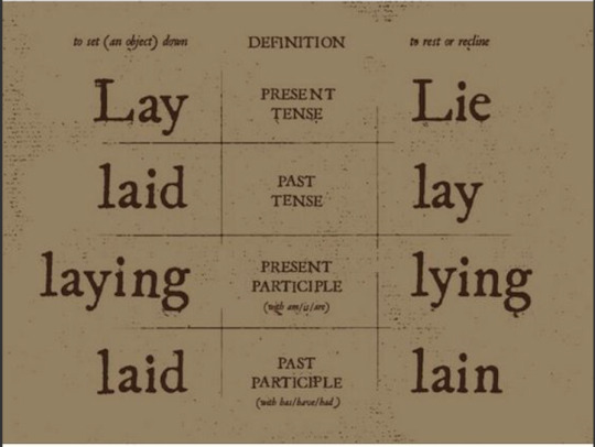
Lay vs. lie (re: the reclining or putting down definitions)
Break vs. brake Break = (v.): separate or cause to separate into pieces as a result of a blow; to interrupt (If you pull on the rope too much, it'll break.) (n.): an interruption; a pause from work (You're way too tired! Take a break!) Brake = (n., with equivalent verb) a device for slowing or stopping a moving vehicle. (If you want to stop your car, you have to press on the brakes.) Don't step on the brake so hard! You'll break both our necks!
Taught vs. taut Taught = past tense of "to teach" (I taught middle schoolers in Boston for three years.) Taut = (adj.) stretched or pulled tight, not slack; (of muscles) tense and not relaxed (The rope was pulled taut; all his muscles were taut and straining) In the fitness class my friend taught, he said that you shouldn't keep your muscles taut all the time.
Through vs. threw Through = (prep.): moving in one side and out of the other side; continuing in time toward completion of; so as to inspect all or part of; by means of (a process or intermediate stage) Threw = (v.) past tense of "to throw" I threw the ball straight through the doorway.
Retch vs. wretch Retch = (n., v.) make the sound and movement of vomiting (When I saw the blood, I retched.) Wretch = (n.) an unfortunate or unhappy person; a despicable or contemptible person. (the wretches were imprisoned; ungrateful wretches) I almost retched at the thought of being nice to that ungrateful wretch.
Ring vs. wring Ring = 1. (n.) a circular band; a group of people or things arranged in a circle. (Her engagement ring was beautiful; the men stood in a ring.) 2. (v., associated n.) make a clear resonant or vibrating sound; (of a place) resound or reverberate with (a sound or sounds) (Church bells are ringing; the room rang with laughter) Wring = (v.) squeeze and twist (something); break by twisting it forcibly (I wring the cloth out into the sink; I wrung the animal's neck) If you don't stop that alarm from ringing, I'm gonna wring your neck!
Bear vs. bare Bear = 1. (v.) To carry; to support; to endure. (He was bearing a tray with a tea service on it; weight-bearing pillars; I can't bear it!) 2. (n.) a large, heavy, mammal that walks on the soles of its feet, with thick fur (Polar bear) Bare = (adj.) not clothed or covered; basic and simple (He was bare from the waist up; the bare essentials of a plan) Apparently, men can't bear to see women's bare shoulders.
Pose vs. poise Pose = 1. (v., w/ associated n.) assume a particular attitude or position in order to be photographed, painted, or drawn (She posed for the camera). 2. (v.) to present or constitute (a problem, danger, or difficulty); to raise (a question) (This storm is posing a threat to our summer plans; a statement that posed more questions than it answered) Poise = (n.) graceful and elegant bearing in a person. (Poise and good manners can be cultivated.) Poise is not just striking a haughty pose; it's about how you hold yourself.
Pore vs. pour Pore = 1. (n.) a minute opening in a surface (this opens up the pores in your skin) 2. (v.) be absorbed in the reading or study of (I spent hours poring over my physics textbook). Pour = (v.) (especially of a liquid) flow rapidly in a steady stream; to cause a liquid to do so (The water poured off the roof; I poured myself a glass of milk). As I was cleansing my pores with a face mask and poring over my favorite book, I accidentally spilled the water I had poured myself all over my pants.
Breech vs. breeches vs. breach Breech = the part of a cannon behind the bore. Breeches = short trousers fastened just below the knee Breach = an act of breaking; failing to observe a law, agreement, or code of conduct, or the action of doing so (A breach of contract; the river breached its banks) (Come on, guys, no one wants to hear about an army trouser-ing the perimeter.)
Rend vs. render Rend = (v.) tear (something) into two or more pieces (teeth that would rend human flesh to shreds) — Note: the correct term is heartrending, since whatever does that rips the heart in two. Render = (v.) provide or give (a service, help, etc.); cause to be or become; represent or depict artistically (A reward for services rendered; the rain rendered my escape impossible; the eyes are exceptionally well rendered) The artist's rendering of the wolf's fangs, which would easily rend human flesh to shreds, was amazingly realistic.
Damnit It's either dammit or damn it. The "n" disappears if it merges into one word, but stays if it's two.
Conclusion: Look. Writing is hard. I know. Some of the above tips seem fairly obvious, and I know that mistakes, errors, and typos happen and go unnoticed. That being said, if you apply these tips regularly, and devote a bit more time to proofreading and editing, the quality of your story and the satisfaction of a lot of your readers will increase tremendously. Authors, I know writing is a thankless job, and many of you are sacrificing your own time to satisfy your followers and your readers; and for that, on behalf of your readers, and even on behalf of those that read and don’t leave reviews, thank you. Do not ever think that this post is meant to belittle you or your devotion to your craft; it is just a list of hopefully helpful suggestions that can help you and, with it, please those readers — like me — who are unfortunately too picky for their own good. And again, use these tips freely (I take credit only for putting them together), good luck, and know that you are universally loved for your efforts, past, continuing, stopped, or postponed. Thank you.
#writing#writing tips#grammar#english#english language#fanfiction#fiction#tips#vocabulary#punctuation#words#literature#perspective#verbs#verb tenses#orthography#homophones#misspellings#typos#errors#narration#narrative perspective#narrative voice#dialogue#authors#writing suggestions#dialogue punctuation#why did i make this
2 notes
·
View notes