#geometric transition
Explore tagged Tumblr posts
Text
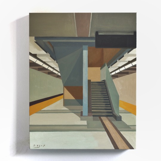
Downsview Park Station #3, 11" x 14", Oil on Wood, Available
Super excited for this Friday to sunday!! The Toronto Outdoor Art Fair in Toronto is happening this July 7th to 9th and i’ll be at Booth 92. Come and check out the show and all the new paintings and take some of them home ☺️.
Friday, July 7, 10:00 AM to 7:00 PM Saturday, July 8, 10:00 AM to 7:00 PM Sunday, July 9, 10:00 AM to 5:00 PM
At Nathan Philips Square in Toronto Canada, dont want to jinx it but looks like the weather is gonna be awesome. ���🥳
#art#painting#illustration#toronto#ontario#canada#geometric#architecture#design#perspective#diogo pinheiro#artists on tumblr#structure#buildings#subway#trains#stations#public transit#oil painting#gallery#toaf62#toaf#toronto outdoor art fair
38 notes
·
View notes
Photo

Family Room Enclosed Chicago Inspiration for a mid-sized transitional enclosed dark wood floor family room remodel with a standard fireplace, a tile fireplace, a wall-mounted tv and gray walls
#recessed lighting#white interior trim#light gray walls#monochromatic#gray velvet sofa#geometric design#transitional style
3 notes
·
View notes
Text


Price Tag - $29
Font 1: ITC New Baskerville Pro
Designer: John Quaranda, ITC
Distinct features: Downwards pointing serif at the end of 2, rounded 9 tail instead of arc, double line dollar sign, varied font weight
Font 2: Futura (PT Medium)
Designer: Vladimir Yefimov, Paul Renner, and Isabella Chaeva, ParaType
Distinct Features: No tail on u, all lowercase letters with stems except t reach the cap height, thicker regular weight(as opposed to say Century Gothic), ~1/2 cap x-height
#font identified#itc new baskerville#category: serif#class: transitional#futura#category: sans serif#class: geometric#fonts#typography#damn baskerville for having so many variations...i finally narrowed it down to baskerville pt but it only had one line on the dollar sign#until i gave up and googled it bc i figured it was also the brand's logo#i'm counting it as a win tho
1 note
·
View note
Text
Not me spending like an hour+ trying on new frames only to not like any of them and asking to just cut new lenses for my current frames 😭😭😭
#the people working there are so so sweet and had no problem with it tho 💖💖💖#tbh they encouraged me heh#so im sticking to my cool gold geometric frames! but ooo theyll have cool green transitions!!!#the one bit of bad news tho is that these frames were discontinued </3 even tho these are like the coolest imo#scout.txt
0 notes
Photo

Seattle Contemporary Family Room Example of a mid-sized trendy enclosed carpeted family room design with a standard fireplace, a metal fireplace and a wall-mounted tv
0 notes
Text
Kitchen Dining - Dining Room

Mid-sized, modern image of a kitchen and dining area with a medium tone wood floor but no fireplace
#transitional#dining room design#custom dining table#crate and barrel#custom dining room wall art#blue green#geometric
0 notes
Text
Bathroom Master Bath

Inspiration for a mid-sized transitional master bathroom remodel with shaker cabinets, gray cabinets, a one-piece toilet, white walls, a vessel sink, quartz countertops, white countertops, and a freestanding vanity in beige tile and ceramic tile, wood-look tile floor, brown floor, double-sink, tray ceiling, and wainscoting.
0 notes
Text


Finished last night. Unlike my more geometric colour wheels, this one isn't separated into strict sections. In order to keep the transitions between colours as smooth as possible, the gradient areas had to be worked over a wedge shape. It took a bit of math and some adjustments while designing it, but the stitching itself was no more complicated than my other blackwork gradients.
Cross stitch and blackwork embroidery on 14-count Aida cloth.
Pattern here (my site) or here (Etsy).
#blackwork#embroidery#blackwork embroidery#cross stitch#fiber arts#fibre arts#crafts#rainbow#color wheel#colour wheel#pattern#my designs
2K notes
·
View notes
Photo
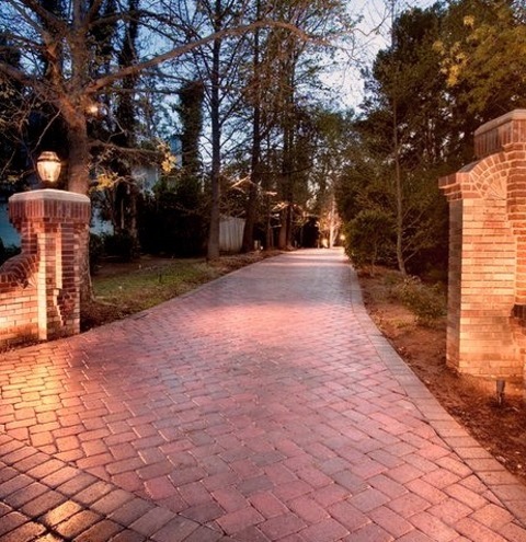
Traditional Landscape - Front Yard An example of a huge traditional front yard brick driveway.
0 notes
Photo

Austin Transitional Entry Small transitional light wood floor entryway photo with gray walls and a light wood front door
#transitional condo remodel#geometric accent table#condominium remodel#mudroom#black and white art#blue color scheme#maple kitchen cabinets
0 notes
Text
Media I imagine different fiction podcasts in instead of the media of being a podcast.
TMA: A selection of volumes, relating to the fears, each with those removable covers. Those covers has a victim or two, and then underneath the cover is a really detailed cover. The paper is decoratively ripped, with a kind of scraggly font, and each has a foreword and ‘author’s note’ from Jonathan Sims.
Malevolent: A really gritty graphic novel with deadly detail in each panel, and very little color. Maybe a trinket on each important character has a color? Like Arthur’s eyes being yellow or Oscar’s collar having a blue sheen to it. The novels are long, dramatic, and intimate in a visceral way.
Welcome to Night Vale: Local 58 bullshit. A broadcast on television with low quality images and audio, tacky music, and a kind of 80’s aesthetic. Each episode the words WELCOME TO NIGHT VALE zoom onto the screen, the purple eye behind them. And each weather segment is an animated short by a different artist.
The Penumbra(Juno Steel): A webcomic. Hours spent scrolling downward a comic that has so much color and GEOMETRIC design. Juno and his curvy jaw, brown pie slice eyes, a cartoonishly high collar for his investigator jacket. Nureyev and his sharp square jaw, shimmering jewelry, and stick legs. Characters sticking out of the panels, fonts changing constantly, a little blue Juno that does his narration and *guitar theme plays* each time he appears.
Wolf 359: A classic comic. Issues month by month. Different special covers of the characters in extra dramatic poses or scenes. Even MORE panel breaking than Juno Steel. So MUCH onomatopoeia, even for small things like the clink of a panel or the disapproving hiss of Hilbert in the background. Geometric designs like Juno Steel, but less colorful. Like the superhero art style mixed with a more stylized look.
Midnight Burger: You pull up the Midnight Burger website. They have a hidden page that has a sort of script-comic thing going on, where the art is next to the writing. Small coded in notes from Leif sometimes pop up if you hold your arrow over the art. Links are attached to the parts where Effie and Zebulon play music, linking you to the music so you can listen to it while you read.
Desert Skies: An animated show. Indie, something you’d find on YouTube. The animation is bouncy and incorporates 3D animation alongside the 2D. Maybe the Sphere Movers have 3D models and the staff don’t? The credits are short because it was made by one guy. People are complaining about it on Twitter /j. People are making content farms about it. Everyone is pissed at Corson like they’re pissed at Jax.
The Amelia Project: A sort of simulation video game. You play as Arthur. You listen to their stories and draw pieces of the tale to invent their death. Every once in a while the game transitions to a point and click suspense game where you solve puzzles as Cole and Haines. Maybe there should even be an Operation-esque part of it where you work as Kozlowski.
Ghost Wax: A novel with a lot of pictures spliced in it. The stories are all in a single book, though the book is through Luca’s perspective— so he picks up on the ghost’s body language and Voncid’s reactions. The pictures are tarot cards with each victim as a card. Some are repeat cards— Lorem does not have a card at the end of the story. Nor does Our Home or Evening at the Ardent. The pictures are only white with black line art. No color whatsoever.
Kakos Industries: A company newsletter. Not a broadcast. A newspaper that arrives at your door and has big bold letters with the main story and pictures of the events that happen in the story as it goes. And the Sunday Comic page is full of employee shenanigans. Some innocent… some not.
I am losing my mind.
#the magnus archives#malevolent#welcome to night vale#the penumbra podcast#wolf 359#midnight burger#desert skies#the amelia project#ghost wax#kakos industries
448 notes
·
View notes
Text
Lies, damned lies, and Uber

I'm on tour with my new, nationally bestselling novel The Bezzle! Catch me TONIGHT in PHOENIX (Changing Hands, Feb 29) then Tucson (Mar 10-11), San Francisco (Mar 13), and more!

Uber lies about everything, especially money. Oh, and labour. Especially labour. And geometry. Especially geometry! But especially especially money. They constantly lie about money.
Uber are virtuosos of mendacity, but in Toronto, the company has attained a heretofore unseen hat-trick: they told a single lie that is dramatically, materially untruthful about money, labour and geometry! It's an achievement for the ages.
Here's how they did it.
For several decades, Toronto has been clobbered by the misrule of a series of far-right, clownish mayors. This was the result of former Ontario Premier Mike Harris's great gerrymander of 1998, when the city of Toronto was amalgamated with its car-dependent suburbs. This set the tone for the next quarter-century, as these outlying regions – utterly dependent on Toronto for core economic activity and massive subsidies to pay the unsustainable utility and infrastructure bills for sprawling neighborhoods of single-family homes – proceeded to gut the city they relied on.
These "conservative" mayors – the philanderer, the crackhead, the sexual predator – turned the city into a corporate playground, swapping public housing and rent controls for out-of-control real-estate speculation and trading out some of the world's best transit for total car-dependency. As part of that decay, the city rolled out the red carpet for Uber, allowing the company to put as many unlicensed taxis as they wanted on the city's streets.
Now, it's hard to overstate the dire traffic situation in Toronto. Years of neglect and underinvestment in both the roads and the transit system have left both in a state of near collapse and it's not uncommon for multiple, consecutive main arteries to shut down without notice for weeks, months, or, in a few cases, years. The proliferation of Ubers on the road – driven by desperate people trying to survive the city's cost-of-living catastrophe – has only exacerbated this problem.
Uber, of course, would dispute this. The company insists – despite all common sense and peer-reviewed research – that adding more cars to the streets alleviates traffic. This is easily disproved: there just isn't any way to swap buses, streetcars, and subways for cars. The road space needed for all those single-occupancy cars pushes everything further apart, which means we need more cars, which means more roads, which means more distance between things, and so on.
It is an undeniable fact that geometry hates cars. But geometry loathes Uber. Because Ubers have all the problems of single-occupancy vehicles, and then they have the separate problem that they just end up circling idly around the city's streets, waiting for a rider. The more Ubers there are on the road, the longer each car ends up waiting for a passenger:
https://www.sfgate.com/technology/article/Uber-Lyft-San-Francisco-pros-cons-ride-hailing-13841277.php
Anything that can't go on forever eventually stops. After years of bumbling-to-sinister municipal rule, Toronto finally reclaimed its political power and voted in a new mayor, Olivia Chow, a progressive of long tenure and great standing (I used to ring doorbells for her when she was campaigning for her city council seat). Mayor Chow announced that she was going to reclaim the city's prerogative to limit the number of Ubers on the road, ending the period of Uber's "self-regulation."
Uber, naturally, lost its shit. The company claims to be more than a (geometrically impossible) provider of convenient transportation for Torontonians, but also a provider of good jobs for working people. And to prove it, the company has promised to pay its drivers "120% of minimum wage." As I write for Ricochet, that's a whopper, even by Uber's standards:
https://ricochet.media/en/4039/uber-is-lying-again-the-company-has-no-intention-of-paying-drivers-a-living-wage
Here's the thing: Uber is only proposing to pay 120% of the minimum wage while drivers have a passenger in the vehicle. And with the number of vehicles Uber wants on the road, most drivers will be earning nothing most of the time. Factor in that unpaid time, as well as expenses for vehicles, and the average Toronto Uber driver stands to make $2.50 per hour (Canadian):
https://ridefair.ca/wp-content/uploads/2024/02/Legislated-Poverty.pdf
Now, Uber's told a lot of lies over the years. Right from the start, the company implicitly lied about what it cost to provide an Uber. For its first 12 years, Uber lost $0.41 on every dollar it brought in, lighting tens of billions in investment capital provided by the Saudi royals on fire in an effort to bankrupt rival transportation firms and disinvestment in municipal transit.
Uber then lied to retail investors about the business-case for buying its stock so that the House of Saud and other early investors could unload their stock. Uber claimed that they were on the verge of producing a self-driving car that would allow them to get rid of drivers, zero out their wage bill, and finally turn a profit. The company spent $2.5b on this, making it the most expensive Big Store in the history of cons:
https://www.theinformation.com/articles/infighting-busywork-missed-warnings-how-uber-wasted-2-5-billion-on-self-driving-cars
After years, Uber produced a "self-driving car" that could travel one half of one American mile before experiencing a potentially lethal collision. Uber quietly paid another company $400m to take this disaster off its hands:
https://www.economist.com/business/2020/12/10/why-is-uber-selling-its-autonomous-vehicle-division
The self-driving car lie was tied up in another lie – that somehow, automation could triumph over geometry. Robocabs, we were told, would travel in formations so tight that they would finally end the Red Queen's Race of more cars – more roads – more distance – more cars. That lie wormed its way into the company's IPO prospectus, which promised retail investors that profitability lay in replacing every journey – by car, cab, bike, bus, tram or train – with an Uber ride:
https://www.reuters.com/article/idUSKCN1RN2SK/
The company has been bleeding out money ever since – though you wouldn't know it by looking at its investor disclosures. Every quarter, Uber trumpets that it has finally become profitable, and every quarter, Hubert Horan dissects its balance sheets to find the accounting trick the company thought of this time. There was one quarter where Uber declared profitability by marking up the value of stock it held in Uber-like companies in other countries.
How did it get this stock? Well, Uber tried to run a business in those countries and it was such a total disaster that they had to flee the country, selling their business to a failing domestic competitor in exchange for stock in its collapsing business. Naturally, there's no market for this stock, which, in Uber-land, means you can assign any value you want to it. So that one quarter, Uber just asserted that the stock had shot up in value and voila, profit!
https://www.nakedcapitalism.com/2022/02/hubert-horan-can-uber-ever-deliver-part-twenty-nine-despite-massive-price-increases-uber-losses-top-31-billion.html
But all of those lies are as nothing to the whopper that Uber is trying to sell to Torontonians by blanketing the city in ads: the lie that by paying drivers $2.50/hour to fill the streets with more single-occupancy cars, they will turn a profit, reduce the city's traffic, and provide good jobs. Uber says it can vanquish geometry, economics and working poverty with the awesome power of narrative.
In other words, it's taking Toronto for a bunch of suckers.

If you'd like an essay-formatted version of this post to read or share, here's a link to it on pluralistic.net, my surveillance-free, ad-free, tracker-free blog:
https://pluralistic.net/2024/02/29/geometry-hates-uber/#toronto-the-gullible

Image: Rob Sinclair (modified) https://commons.wikimedia.org/wiki/File:Night_skyline_of_Toronto_May_2009.jpg
CC BY 2.0 https://creativecommons.org/licenses/by-sa/2.0/deed.en
#pluralistic#uber#hubert horan#fraud#toronto#geometry hates cars#urbanism#ontpoli#olivia chow#self-regulation#transport#urban planning#taxis#transit#urban theory#labor#algorithmic wage discrimination#veena dubal
906 notes
·
View notes
Text
The Architecture of Rain World: Layers of History
A major theme in Rain World's world design that often goes overlooked is the theme of, as James Primate, the level designer, composer and writer calls it, "Layers of History." This is about how the places in the game feel lived-in, and as though they have been built over each other. Here's what he said on the matter as far back as 2014!

The best example of this is Subterranean, the final area of the base game and a climax of the theme. Subterranean is pretty cleanly slpit vertically, there's the modern subway built over the ancient ruins, which are themselves built over the primordial ruins of the depths. Piercing through these layers is Filtration System, a high tech intrusion that cuts through the ground and visibly drills through the ceiling of the depths.
Two Sprouts, Twelve Brackets, the friendly local ghost, tells the player of the "bones of forgotten civilisations, heaped like so many sticks," highlighting this theme of layering as one of the first impressions the player gets of Subterranean. Barely minutes later, the player enters the room SB_H02, where the modern train lines crumble away into a cavern filled with older ruins, which themselves are invaded by the head machines seen prior in outskirts and farm arrays, some of which appear to have been installed destructively into the ruins, some breaking through floors.
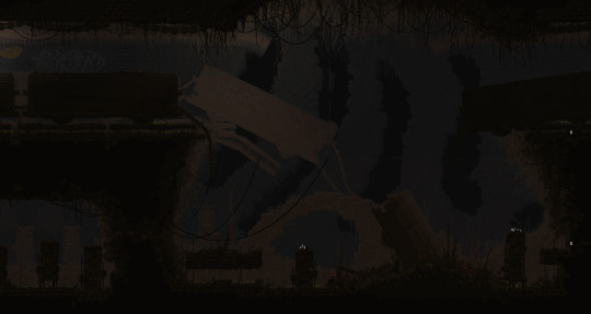
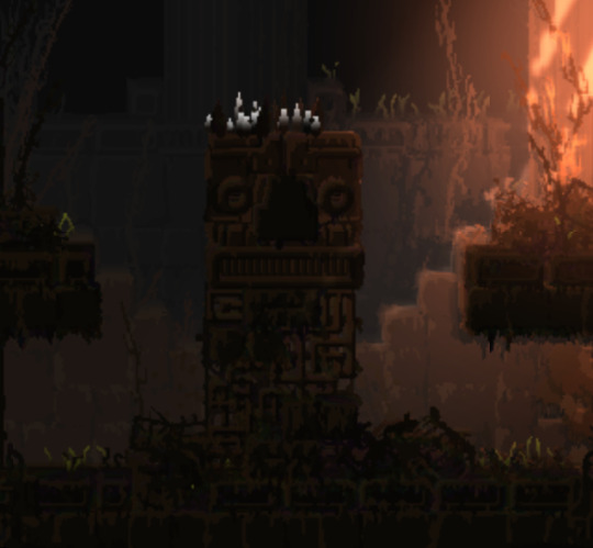
These layers flow into each other, highlighting each other's decrepit state.
The filtration system, most likely the latest "layer," is always set apart from the spaces around it. At its top, the train tunnels give way to a vast chasm, where filtration system stands as a tower over the trains, while at the bottom in depths, it penetrates the ceiling of the temple, a destructive presence. (it's also a parallel to the way the leg does something similar in memory crypts, subterranean is full of callbacks like that!)


Filtration system is an interesting kind of transition, in that it is much later and more advanced than both of the areas it cuts between. This is a really interesting choice from James! It would be more "natural" to transition smoothly from the caves of upper subterranean to the depths, but by putting filtration system in between, the two are clearly demarcated as separate. The difference in era becomes palpable, the player has truly found something different and strange.
Depths itself is, obviously, the oldest layer not only of subterranean but of the game itself. The architecture of Depths has little to do with the rest of the game around it, it's a clear sign of the forgotten civilisations that our friend Two Sprouts, Twelve Brackets showed us, there's not actually that much to say about it itself, it's mostly about how it interacts with the other layers of subterranean.
That said, Subterranean is far from the only case of the theme of layers of history. It's present as soon as the player starts the game!
The very first room of the game, SU_C04, is seemingly a cave. It is below the surface, the shapes of it are distinctly amorphous rather than geometric. (well. kind of, it doesn't do a very good job of hiding the tile grid with its 45 degree angles.)

But let's take a closer look, shall we?

See that ground? it's made of bricks. The entire cave area of outskirts is characterised by this, the "chaotic stone" masonry asset is mixed with brickwork, unlike the surface ruins which are mostly stone. This, seemingly, is an inversion of common sense! The caves are bricks and the buildings are stone. This is not, however, a strange and unique aspect but a recurring motif.
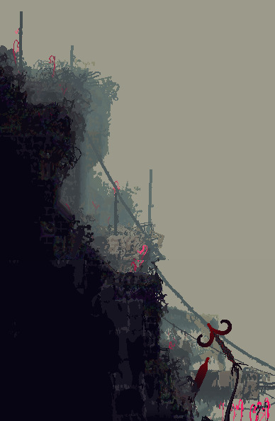
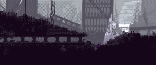
This occurs enough in the game for it to be clearly intentional, but why would materials such as bricks be used in otherwise natural looking terrain?
The answer lies in the "Layers of History" theme. This is in fact, something that happens in real life, and it's called a tell
To be specific, a tell is a kind of mound formed by settlements building over the ruins of previous iterations of themselves. Centuries of rubble and detritus form until a hill grows from the city. Cities such as Troy and Jericho are famous examples. The connections to the layers of history theme are pretty clear here, I think. Cities growing, then dying, then becoming the bedrock of the next city. The ground, then, is made of bricks, because the ground is the rubble of past buildings. The bones of forgotten civilisations, heaped like so many sticks!
#rain world#rainworld#rain world lore#rainworld lore#rw lore#rw#subterranean my beloved#thank you to videocult for making the first survival game themed around stratigraphy and new york city rats#i would've gone on for another paragraph about how OE relates to this but like.#that's dlc stuff#and i still think of the dlc stuff as modded content lol#better to keep it separate#also this analysis is not comprehensive! the layers of history stuff is common throughout#there's farm arrays there's the relationship between shaded citadel and five pebbles there's the stuff buried under garbage wastes#so much more#unfortunately i do not have much energy lol
911 notes
·
View notes
Text
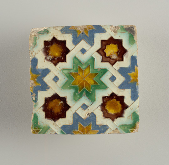


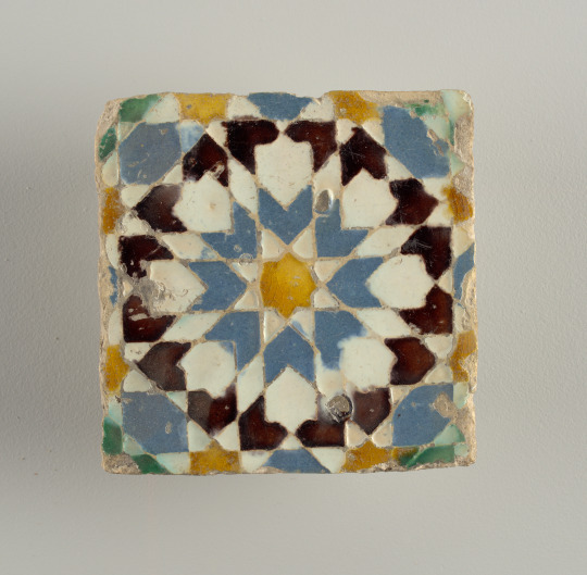
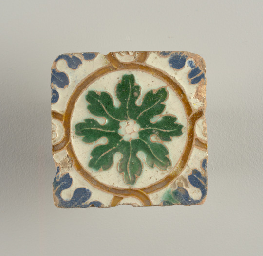

Tile(s) (Spain), 16th. century. Glazed moulded earthenware .
Likely dating from the early to mid sixteenth century, this tile illustrates Spain’s rich multicultural design history. Spain’s remarkable decorative pottery tradition originated during the eighth century when the country was conquered by the Moorish Muslim troops of North Africa as part of the expansion of the Umayyad Caliphate. This sixteenth-century tile shows how influential Islamic design principles were on Spanish pottery, even after the Reconquista—the period of the Moors conquest to their dethronement in the fifteenth century. The sixteenth century was also a time of transition for Spanish pottery. One can identify the influences of Flemish and Italian immigrants to Renaissance ideas and the continual impact of the country’s remaining Muslim population on Spanish pottery design. [1]
The white interlace motif on this tile creates a pattern of diamonds centered on an eight-pointed star in green and yellow. Strong color contrasts make the tile visually striking. This tile would have been one of countless others used to decorate a wall or ceiling in order to create an abstract and complex geometric pattern. Geometric patterning is a key visual element of Islamic art as one of three types of non-figural decoration along with calligraphic and vegetal patterns.
Although stylistically diverse, the visual complexity of all-over patterning is also seen in Spanish lustreware (referred to as Hispano-Moresque ware) and textiles from this period. This preference for all-over patterning can in part be attributed to Spanish decorative art’s intimate relationship with Islamic art and culture. In addition, this is the period when the country’s colonisation of the Americas further enriched Spain’s cultural complexity as is mirrored in both Spanish and Mexican Talavera pottery.
https://collection.cooperhewitt.org
90 notes
·
View notes
Text
Five years ago I thought it would be a neat idea to try and make my favourite trinket of all time (3D wire mandala). So I found myself some copper wire, beads, a set of pliers and began tinkering. 5 years later, I make these wonderful multi-purpose pieces for lovely people all over the world full-time, and I couldn't be happier.
The ingredients for making a 3D wire mandala:
122.5 inches of electroplated copper wire (gold, silver, black)
14 funky beads (8mm size)
7 pieces of banding wire (22 gauge)
A one step looper and bent-nose pliers
and a lot of patience.. XD The next step in my small shop journey is to transition from selling on Etsy to my own website. Don't get me wrong, Etsy has been amazing for me as someone who wanted to open their own handmade shop but didn't know where to start, however, it is now time for me to spread my wings and (hopefully) fly. fingers crossed
Use code TUMBLR at checkout for a special discount just for discovering my work on here! PLUS checkout using PayPal and receive a FREE Spring Bloom Orbi-Loop with your purchase. (yes, I ship worldwide too!) Finally, don't forget to follow me as I am preparing a full-fledge tutorial (for free) to teach others how to make this on their own! It'lI be such a fun at-home craft project that I hope others will enjoy as much as I do!
PS: Sorry if this isn't blaze worthy. Just had a few extra credits available from Tumblr.
PPS: Style in video is Purple Nova (silver wire/standard size)
#artists on tumblr#dopamine decor#handmade gift ideas#my art#small artist#transforming jewellery#fidgettoys
176 notes
·
View notes
Note
hii
I want to learn how to paint people, and I wad wondering if u have any tips? I rlly like your self-potraits alot and ur style of painting urself is something I want to achieve
I dont have to opportunities to go to art school but I still want to learn! any advice would be grand :)
thanks!
I do !! im not the best at explaining my process but i will try.
I think as a base level starting out some of my best advice is to practice drawing over a photograph. doing this repeatedly will give you an idea of where the features lie, start with tracing the entire image, to just the main features, to just the “bare bones” of the face.
as you get more comfortable with each step and take away detail it will be easier to understand and figure out on your own where these things look right placement wise.
im not the type of person to follow the standard templates or rules for learning certain art methods. i dont like vanishing points, i dont like measuring out the body with this person is whatever heads tall. i do better just going by what i see and replicating that.
when i first started with portraits the style way very different. i would make things very geometric only using flat colors to define the planes of the face. this was really helpful for me as well ! and as i got to understand things more i would transition into more traditional rendering.
heres some of that old art:


i would go into more depth with the rendering process etc but i do not want to overwhelm you !! so this is my advice on starting out :) i hope it offers some insight at least.
39 notes
·
View notes