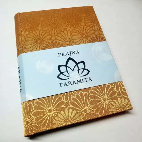
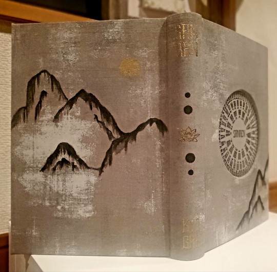
#gold foil effect
Explore tagged Tumblr posts
Visit Tumblr Blog
Explore Tumblr blogs with no restrictions, modern design and the best experience.
Last Seen Tumblr Blogs


Fun Fact
Celebrities use Tumblr as well.
Text
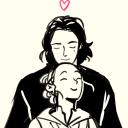
Icarus and The Sun
#idk man#i was having fun w/ gold foil effects and making people sad#yeehaw mofos#my art#star wars#digital art#star wars the clone wars#star wars fanart#tcw#clone trooper fives#arc trooper fives#clone trooper tup
202 notes
·
View notes
Text

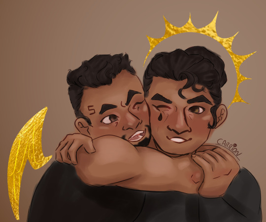
My shop is open again ! I'm tired of seeing my BG3 fanarts stolen on multiple platforms, so from now on, I'm offering some stickers and prints in my shop. Feel free to share, it's always appreciated, thank you ^^
✨My shop✨ :
#bg3#baldur's gate 3#astarion#karlach#raphael bg3#bg3 gale#halsin#bg3 fanart#stickers#my art#I'm not good at taking pictures but the Astarion print is gold foil#And Gale sticker has holographic effect#like it's the Weave woooow
491 notes
·
View notes
Text
If you like tarot cards, please look at this gorgeous deck, and then maybe back the campaign.
#tarot#divination#tarot cards#tarot deck#other people's art#I am not the one behind the campaign#I just really like these cards#and want to see it hit the gold foiling stretch goal#because these cards would look so cool with metallic effects
1 note
·
View note
Text
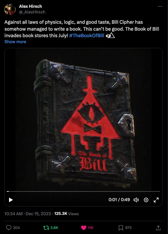
Tweet link. (Beware: this video of the book has flashing lights and glitching graphics.)
Link to tweet.
Link to Books.disney.com
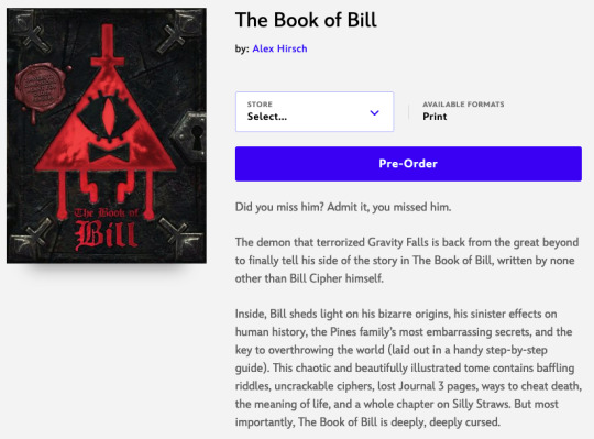
Did you miss him? Admit it, you missed him.
The demon that terrorized Gravity Falls is back from the great beyond to finally tell his side of the story in The Book of Bill, written by none other than Bill Cipher himself.
Inside, Bill sheds light on his bizarre origins, his sinister effects on human history, the Pines family’s most embarrassing secrets, and the key to overthrowing the world (laid out in a handy step-by-step guide). This chaotic and beautifully illustrated tome contains baffling riddles, uncrackable ciphers, lost Journal 3 pages, ways to cheat death, the meaning of life, and a whole chapter on Silly Straws. But most importantly, The Book of Bill is deeply, deeply cursed.
Beware: This book travels to dimensions meant for older readers.
Alex Hirsch, #1 New York Times bestselling author, resuscitates this infamous villain and invites fans to a Bill’s eye view of the Gravity Falls universe. There are many who believe this book is too dangerous for human hands. But if you can’t resist, beware: Once you make a deal with Bill, it’s not so easily undone . . .
Released: July 23rd, 2024
Pages: 208
ISBN1368092209
9781368092203
Age Range: Adult

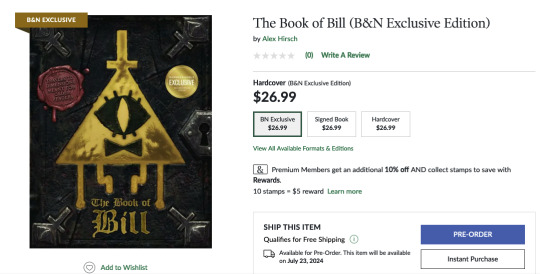
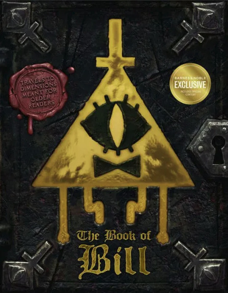
Barnes & Noble exclusive edition!
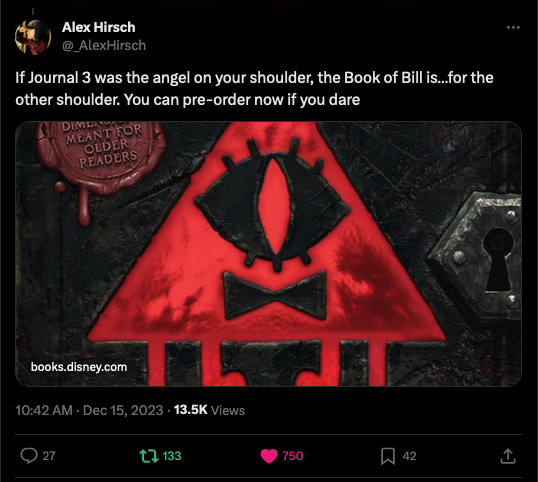
This Barnes & Noble Exclusive Edition features a gold foil jacket and includes 16 extra pages of Bill's twisted life advice!
This also displays a link for a "Signed Book", for the same price as the B&N Exclusive. It is a signed copy of the B&N Exclusive edition.
And just to round things off:

Link to tweet.
THIS IS NOT A DRILL. It’s a dremel. Learn the difference at Ranger Henson’s woodworking workshop every other Wednesday at 11 at our Administration Building
That's it for now! I'm sure there will be more later, but time to post this.
12K notes
·
View notes
Text
Book Decoration: AKA All The Ways I Don't Use a Cricut
(this post is for people who don't want to buy an expensive cutting tool, or for those that do have an expensive cutting tool that would like to mix things up a little)
1. Print That Shit
If you're already printing your own textblocks, an easy step for titles is to print them. Above is a title printed onto an "obi" of decorative paper. I measured out where I wanted things on the finished book and laid it out in Affinity, then printed it on a full sheet & trimmed it down to wrap around the book. A more simple method is to print & glue on the label into a slight indent in the cover (to protect it). A third option is to do the spine in bookcloth, while you print on paper for the cover and then glue that paper onto the boards (this usually looks even better when it is a three-piece bradel bind).
2. Foil Quill / Heat Pens
The heat pen is one of my go-to tools, but it can be a bit touchy about materials. The most popular version is the We R Memory Keepers' Foil Quill (which is one of the most ergonomic), but other pens exist that can get you to a higher heat temp, finer lines, or more consistent foil. For example, I have a pen created by a local Japanese bookbinding studio that fares way better on leathers than the WRMK quill & with a finer tip, but it's hell to control. Best results in general are on paper or smooth bookcloth (starched linen, arrestox, colibri - even duo will work but its less solid). The fuzzier a bookcloth is, the less your foil quill wants to deal with it. This means the heat n bond method of making bookcloth does not play nice with a heat pen usually, but there are two solutions: 1) use this tutorial on paste + acrylic medium coated bookcloth instead that will get you a perfect surface for the heat pen, or 2) use the pen on paper & then glue onto the cloth. I did a video tutorial for both foil quill use and this type of homemade bookcloth for @renegadeguild Binderary in 2023.
You get the most consistent results by tracing through a printed template that is taped in place, as I do in the video above.
3. Paint That Shit
Acrylic paints will do you fine! The above is free-handed with a circle template, because I wanted that vibe. If you need straight lines that won't seep, lay them down with tape first & then paint over it first with a clear Acrylic medium, then your color. Same goes for stencils. Two more examples of painted bookcloth:
4. IT'S GOT LAYERS
By using layers of thinner boards, you can create interesting depths & contrasts on your cover. You can also make cutouts that peep through to the decorative paper behind. The most important part to this technique is the order in which each edge is wrapped. To get a good wrapped inside edge, you will split the turn in into tabs to get them to conform to a curve. You can also layer multiple colors of bookcloth without multiple layers of board, as seen below left, so long as you mind your cut edges for fraying.
5. Inlaid... anything
Mirrors! Marbled paper! I saw someone do a pretty metal bookmark once! The key is creating a little home for it to live in, which is pretty similar to the above layering method. On one layer you cut the shape, & glue that layer onto the bottom solid board before covering. You can do the top layer as an entire 1 mm board (like I did for the mirrors) or a sheet of cardstock, like I would use for inlaid paper.
6. Decorative Paper
Decorative paper is always helpful & adds to the paper hoard... & its effects can be layers with other techniques, as below. Marbles, chiyogami, momi, or prints & maps of all kinds can be great additions. Some papers may need a protective coating (such as wax or a sealer).
7. Stamps (with optional linocut)
While I've not used many more regular rubber stamps, I do know some who have, successfully! And I've used one once or twice with embossing powder (see photo 3 up, the gold anchor on the little pamphlet bind). What also works is to carve your own linocut or stamp, & then use block printing ink to ink it onto your fabric (as i did above). A bit time intensive, but it was nice how easily reproducible it was, and I liked the effect I got for this particular bind.
These methods are not exhaustive, just ones I've used, and there are of course many others. I haven't gone too into detail on any of these for the sake of length (& post photo limits) but feel free to ask about more specifics. Usually I'm using them in combination with other options.
#fanbinding#bookbinding#celestial sphere press#ficbinding#in progress review#bookbinding how to#i am not particularly anti-cricut or anything#it's just a very expensive tool#and its prevalence sometimes makes new binders think they HAVE to get one#when they absolutely do not#you can make pretty books without it
1K notes
·
View notes
Text
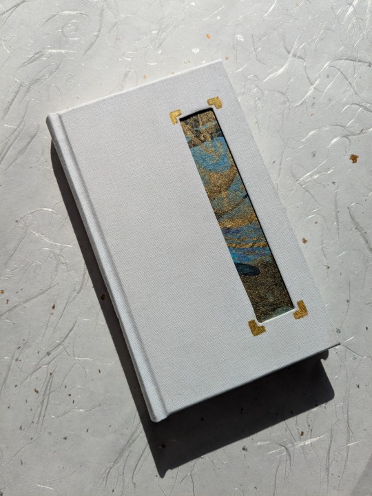
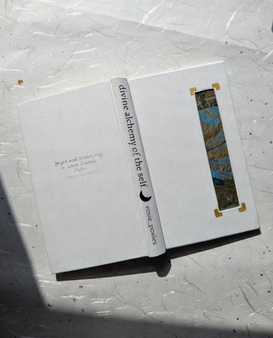

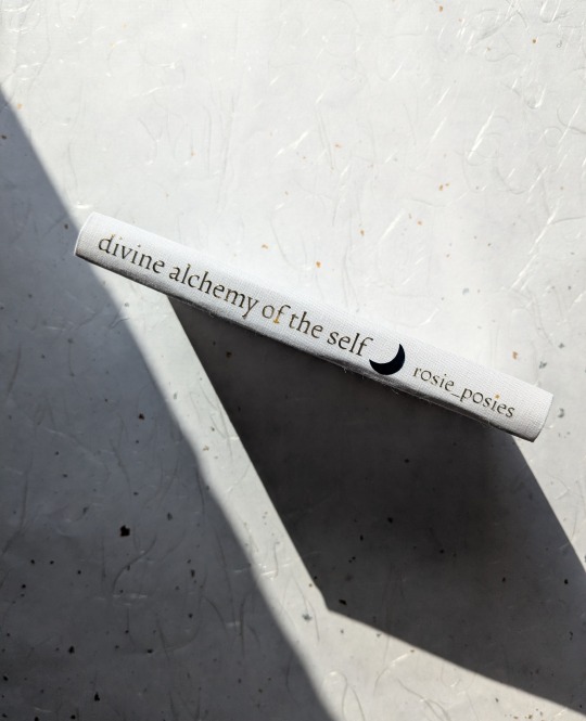
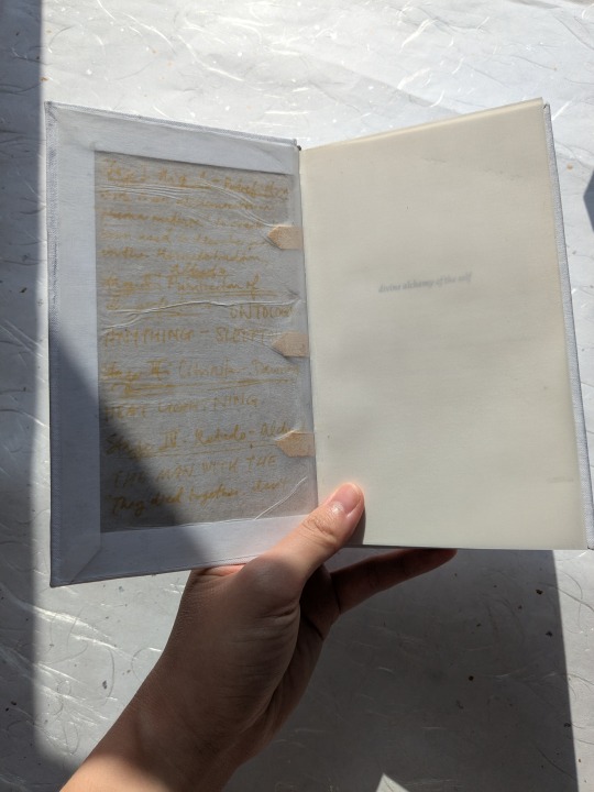
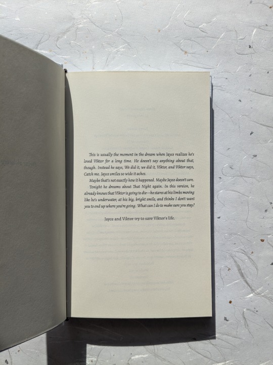
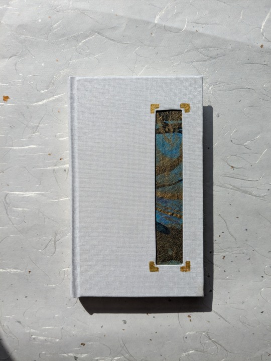
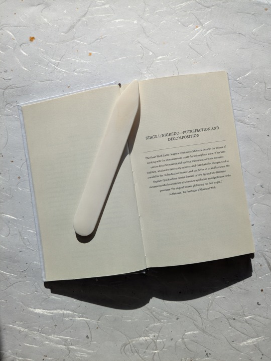
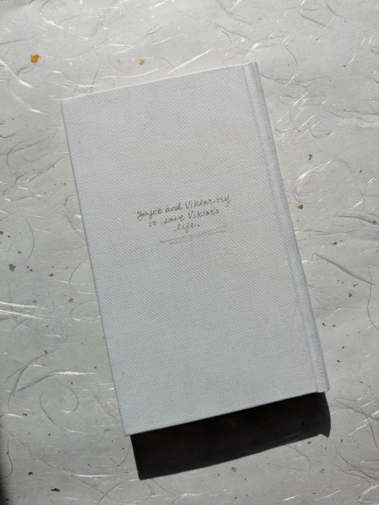
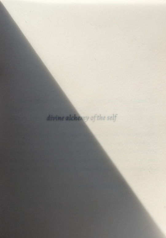
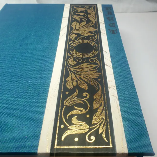
Another jayvik book!!! This is the incredible divine alchemy of the self, by r0sie_p0sies.
This fic was recommended to me by dear friend @ilgaksu and holyyyyy shit. It was written pre-s2 and yet somehow ends up in the exact same emotional place as the finale; the similarities range from larger scene beats all the way down to certain dialogue choices. Rosie just gets these characters, through and through!
As usual, process chatter under the cut!
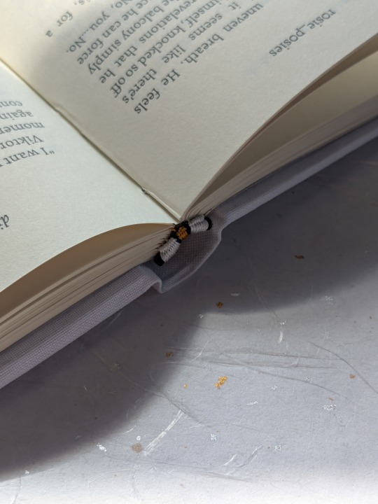
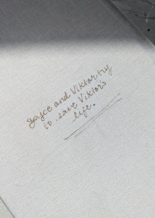
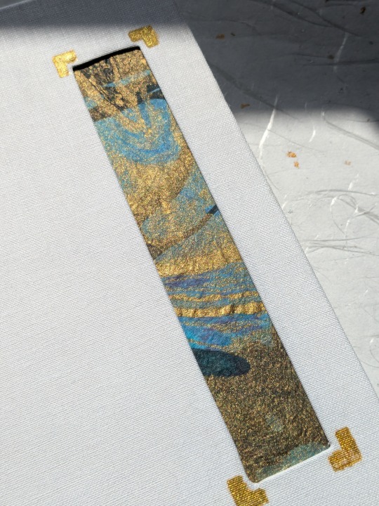
It's fitting for a jayvik book that this first attempt was chock-full of experiments and new techniques! This is my first hardcover quarto Legal size, which I really loved doing. I also finally have a proper finishing press, so I was able to properly round and back a book for the first time! The shoulders are a little weak, so I'm hoping to improve when I make Rosie's author copy. I also used my foil pen for the first time and handwrote the little blurb on the back.
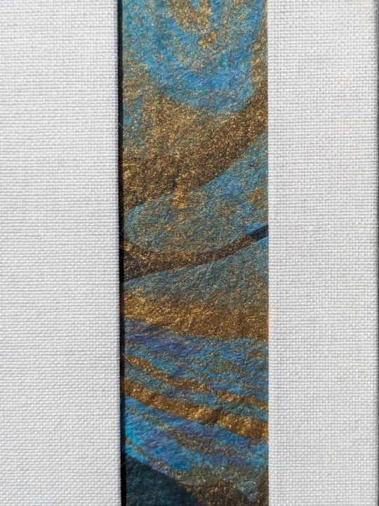
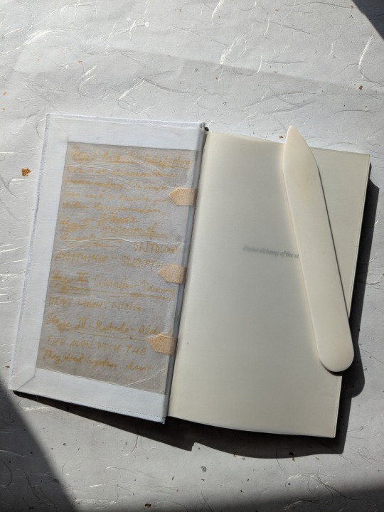
Most exciting, this was the first time I tried an inset! I used some of my favorite blue Momi marbled paper; rectangle placement is heavily inspired by one of @pleasantboatpress's gorgeous binds. Loveee me a good rectangle, heh. I thought an inset was fitting for this story; as you can probably tell from the title, the fic is all about transforming oneself--through grief, through illness, through love. I wanted this to be a book of contrasts--stark white for a kind of blank canvas (also a nod to Viktor's hexcorized dolls in s2), blue and gold for magic/hextech. Here's an abridged version of what I sent Rosie while chatting about design (please picture me as that It's Always Sunny conspiracy meme, but in DMs):
The framework of the fic being alchemy, creation, a literal step-by-step guide for how to create something divine, is something I really want to explore! I really like the idea of this kind of blank canvas casing + swirling paper inset. All the love and life and messy tendrils of illness surrounded by this...blank divinity. That divinity as a medium, a container, for the complicated human experience. But also the inverse--the blankness of the canvas drawing attention to the brilliant blue/gold of the inset. The bright light shining through the windows of their living room in the ending scene juxtaposed with the moment of their (possible? wonderfully ambiguous?) deaths; those two moments being, in many ways, the same. A window into their lives loving each other, seen from both the outside and within. *insert lots of keyboard smashing*
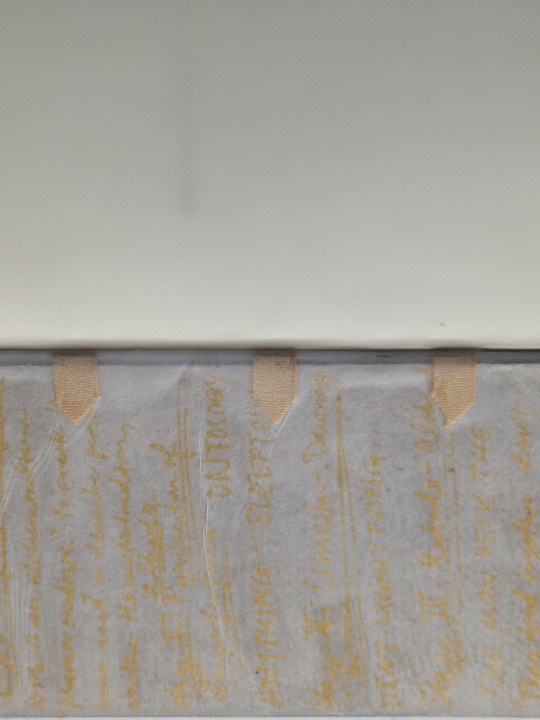
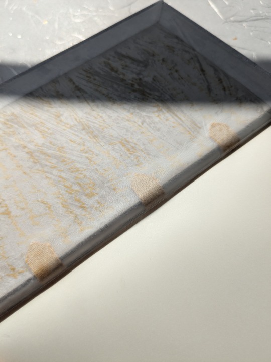
Interiority and vulnerability were also two themes I wanted to convey. So with that theme in mind, I tried something very, very new to me, and thought, fuck it, let's try to use paper vellum for the endpapers:
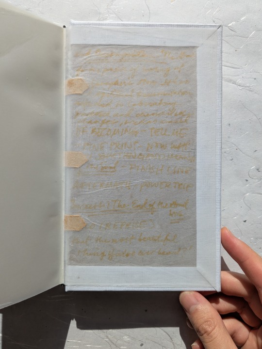
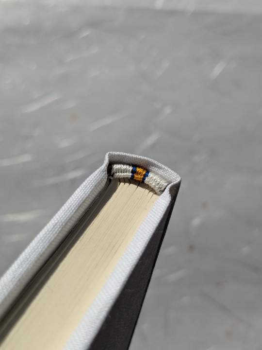
You're not really supposed to use paper vellum for endpapers because 1) it wrinkles and curls like all hell and 2) since it's translucent, it means you can see the inside of the boards and the tapes. But for this bind, I decided to lean into that effect--I scribbled the four stages of the alchemical process (the framework of the fic's chapters) onto the boards so you could see them when you opened the book (I wanted to evoke jayvik's "mad scientists" vibe lol); I cut the supporting linen tapes into points (a nod to the rune Viktor carves into his leg brace) and painted them gold so they'd stand out more (they reminded me of Vik's spine brace; I mean hell, they're literally sewn into the spine of the book for extra support. It felt criminal to not incorporate them in some way!); I tried to be more intentional with the glue brushstrokes while casing in to give the paste-down a more painted effect; and finally, probably the thing that was hardest to let go (and which I'm still a little unsure about, to be honest), I let the damn endpapers wrinkle, for more ~texture.~
The overall effect is something I'm still mulling over, even as I write this--it kind of goes against everything I've learned as a bookbinder, and almost makes me feel (or rather, the book feel lol) naked. These are the parts of the book you aren't normally supposed to see, put on display the moment you open it. But! I think that even if it's not the strongest from a design perspective, I think thematically, it works. Reading this fic made me feel like I was being carved open, so I wanted the experience of reading the book to be a little vulnerable, too. Also: beauty in imperfections, right? :3
Aaand that's all for today! A million thanks again to Rosie for letting me bind her wonderful work <3
And once more for the road: you can read divine alchemy of the self on ao3!
391 notes
·
View notes
Text
Okay so here’s a REAL fun little theory extrapolating from all the parallels we’ve been seeing more and more of between Ruby and Salem:

As I’ve said elsewhere, at this point I’m pretty confident that Salem is Ruby’s true, ultimate villainous counterpart/foil, in the sense that Salem represents the ‘fallen hero’ version of Ruby. That underneath all the bias, propaganda, outright lies and general unreliable narration that the God of Light fed to Ozma, we’re going to find out that Salem was effectively the Ruby of her time. Uniting all of humanity in a war against a seemingly insurmountable foe who threatened them with destruction.


So if Salem was the Ruby Rose of her time, what if she ALSO had her own parallels to Weiss, Blake and Yang? What if she had her own TEAM?
What if during her journeys in the wake of losing Ozma the second time (or even the first time), Salem gained three companions whom she grew to befriend, bond with and perhaps even love, platonically or otherwise. The first and closest of the countless friends, allies and followers that Salem would assemble and unite in her battles against the gods.
The three closest friends that Salem would LOSE when the God of Light decided that his creations turning against him meant they lost their ‘deserving to exist privileges’.
I mean for one, we see Salem specifically having three main members of her inner circle.
Like we’ve always assumed the repeated use of groups of four people traces back to Salem’s and Oz’s four daughters, but what if it goes back even further? What if the original huntress team was SALEM and her three closest compatriots?
Now if you’re wondering ‘If these people were so important, why didn’t we see them in Jinn’s vision?’, well two things:
One; because Ruby asked Jinn “What is Ozpin hiding from us?”, so I’m willing to bet that Jinn’s vision only represented the extent of what OZ knows and believes. And let’s not forget that he just so happened to be DEAD for 99.999% of Salem’s whole conflict with the gods, baring those collective ten or so seconds where he was being repeatedly revived and unrevived by Dark and Light. And it’s pretty clear that ALL of Oz’s information on what happened while he was dead came second hand from Light, or at least the vast majority of what he actually BELIEVES.
Especially when we consider that Salem’s account of what happened is summed up in five seconds as ‘She said the gods were to blame for everything but she was TOTALLY lying. Now don’t read anything more into that.’ And considering GoL’s whole spiel about Salem ‘manipulating’ everyone, it makes sense that he would omit things like her having actually loyal friends and allies. Or maybe Light simply couldn’t be arsed to care or remember anything that specific about the puny, ungrateful creations that dared to defy him.

And Two; I think even in Jinn’s unreliable-narration-laden vision, we actually DO have some potential candidates. Remember those three prominent leaders we see Salem recruiting to her cause?

A European-style monarch with blue eyes and flanked with blue banners.

An East-Asian styled queen with a flower motif.

And a buff warlord with a prominent gold and brown color scheme in both his clothing and surroundings.
Sure it’s not much, but I think it’s just enough to for these three to be potential narrative parallels to Weiss, Blake and Yang. And that is ESPECIALLY when we consider just how much of Salem’s story was omitted from Jinn’s vision. That what we’ve seen so far is just the extremely generalized, summarized, propagandized, skewed-in-favor-of-the-god-of-light-ized version. If/When we get a big ‘once more, with clarity’ look at Salem’s story, it might turn out that these three seemingly generic rulers were MUCH different and potentially have much more notable parallels to Weiss, Blake and Yang, just like Salem has to Ruby.
#rwby#rwby theory#Ruby Rose#Salem#Team RWBY#Weiss Schnee#Blake Belladonna#Yang Xiao Long#character parallels
170 notes
·
View notes
Text


HG 1/144 Prototype Earth Federation Forces Mobile Suit RX-78-3 "G3 Gundam (Trans Pride Livery)" [Beyond Global] (Bling Knockoff)
Happy Pride everyone!!! This year's pride month build is pretty similar to last year's, adding a trans pride colour scheme and gradient shield onto an otherwise pretty standard kit.
This kit is a Bling knockoff of the Beyond Global version of the RX-78-2, with a custom cyan/magenta colour scheme that I felt would fit perfectly with a trans pride build. Bling's knockoff is pretty much identical to the base RX-78-2 Beyond Global, however unfortunately instead of recoloring the plastic for this scheme, they've simply painted over the sprue, which meant I needed to manually paint over all the nub marks. It's otherwise a very impressive knockoff, with smooth painting, perfect detail, and even a set of knockoff G3 decals with plenty of spares for customisation. The G3 is essentially another RX-78 that made it off Side 7 in pieces, and in the novels replaced Amuro's main Gundam later in the series.

The Beyond Global kit is nominally a High Grade, but it's designed to have as much articulation as possible, and be as colour separated and detailed as a Real Grade kit. There's a ton of articulation, including pivots at both the wrists and upper arm, a cleverly designed shoulder and torso for shoulder articulation, and even a torso flexion and ab-crunch! It can easily get a to lot of the human-like poses you see in the anime.

Apart from fixing up the visible nub marks with an extra layer of paint, and a basic silver and gunmetal weathering for all the grey parts, I added a trans flag and a trans rondel to emphasize the trans-flag adjacent colour scheme. I'm really proud of how the flag turned out, as I feel it's representative of my improved masking skills. The rondel is a little messy, unfortunately, but I still think it adds to the kit. I also ended up painting the eyes and head sensors with my gold marker, which helps them stand out, especially since there weren't any foil stickers included.

Apart from this, the kit was so well colour separated that there was no need for any further touch ups, apart from applying decals. I'm not sure what decal sheet was included, but it's one of the highest quality decal sets I've ever used. The decals are fairly durable and extremely thin, with minimal borders, and they lay super flat against the model. After topcoating, they look as though they've been tampo printed onto the kit, unlike Bandai's, which often notably stick up a little from the surface. I was even able to mask and paint on top of one on the thigh with no issues.

There's a nice little instruction sheet induced for decal placement, but I also improvised a little and included a few of my own spare decals to help bring everything together, especially on the shield and the beam rifle.
As above, the kit is super poseable, and can easily hit and maintain a lot of anime accurate poses, especially given the lack of polycap usage (although a lot of the plastic parts still resemble the polycaps they were derived from). I had a lot of fun trying out poses I couldn't quite hit with my older Origin version of the RX-78-2.

This kit comes with a few hand options for posing, including an open left hand, two open fists for the beam sabers and shield, and a right hand pistol grip. There's also the standard gundam Beam Rifle, with a little peg for attaching to the rear skirt, and both a curved and straight beam saber effect for different poses.


Overall, this is one of my favorite builds so far. I really enjoyed the decal process, and I love how the unique colour scheme helps it stand out on my shelf.

#gunpla#my gunpla#hg gunpla#ko gunpla#plamo#model building#gundam#mobile suit gundam#pride#pride 2025#pride month#trans#trans pride#transgender#transgender pride#Amuro Ray#RX-78-3#RX-78-3 G3 Gundam#G3 Gundam
124 notes
·
View notes
Text
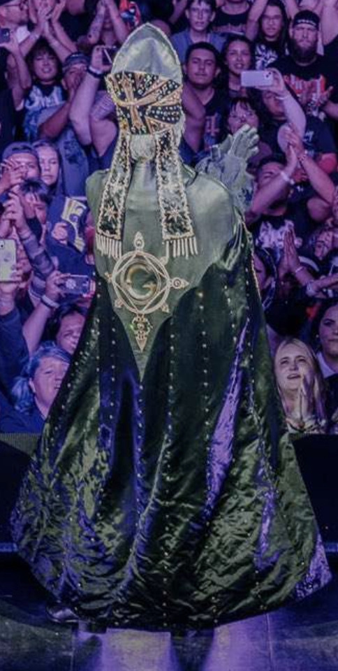
ok had some proper time to digest whatever the fuck happened in the world of ghost so. yapping/rambling session because perpetua and copia already foil each other so much just solely based on designs and im losing my marbles
ive seen some miscellaneous thoughts floating around so some of them may be echoed here but. yeah

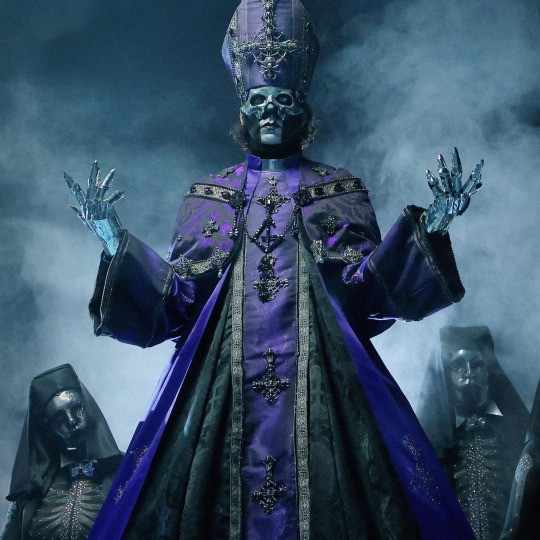
im especially going insane over the potential sun/moon dynamic shenanigans we can get here… copia’s colors are blue and gold (apologies, i don’t know specific colors) whereas perpetua appears to be purple and silver. now, gold and silver have obvious relevance, both being metals commonly used for jewelry and whatnot. blue and purple, however, are more interesting choices. typically, sun + moon shenanigans are represented w/ blue and yellow, so having purple instead is a Choice. yet, it fits — especially given the shades they’re wearing, purple can represent the night sky whereas the blue can represent the daytime sky. combine that with the metals, you get the sun/blue sky and the moon/night sky. a lot of copia's little designs on his outfit resemble stars as well.
and this especially comes into play w the eclipse shown during the rhrn montage when imperator sees her life flash before her eyes. i saw a comment somewhere suggest that this could represent perpetua eclipsing copia, or surpassing him.
and then in addition, we have perpetua’s cool ass metal gloves + metal looking mask too. like yeah its a half mask bc its toblerone but also like. having a mask on skull paint which already should be kinda masking half ur face is. An Interesting Concept and i definitely think theres more to be said about it... almost like double masking in a sense??
a lot of the glittery stuff on copia also feels equally distributed across the entire design, whereas w perpetua it's really concentrated on his specific accessories/jewelry. like copia's entire outfit is Sparkly As Fuck...
shoutout to my friend (@galaxy-of-me) for pointing this out but even their face paint differs in the balance between black and white. copia’s facepaint is mostly all white, with the black being used to distinguish the little jaw bones or lack of them in skeletons. however, perpetua’s black skullpaint has the opposite effect. it highlights kinda the “main” parts of his face (and helps to highlight the mask).
also the design of their clothes is interesting. like, copia's reads w more circles/curves whereas perpetua's feels more rigid and sharp. something something shape language. it also stands out to me how copia's has like. a solid blue that's divided on the front of his chausible by black whereas perpetua's is just solid black solely divided in the middle by purple. this is also seen w the mitres...
ok and. back designs from that really quick camera shot we got. idk what colors it's gonna Specifically be but you can already see some kinda lace thingies on perpetua which is cool... like i'm not sure if this is a cape of sorts (since copia's is more of a cape) so idk if it's fair to draw Exact Comparisons here... but on another note the lappets/ribbons from the mitre are also diff. copia has star looking things (again) whereas perpetua's are more rounded/oval shaped (sun and moon content AAAAUUGHHHHHHHH).
and then in regards to lore like. if we assume that satanized really is perpetua's backstory (I HOPE IT IS!!) it would make their backstories like. Very Opposite. i think it's commonly believed that copia grew up in the clergy or wtv under sister, but then this would mean perpetua possibly grew up in the catholic church or in an abbey of sorts. so, already they grew up in different environments and thus have different viewpoints on a Lot of things. i am SO excited to see how this is gonna play out oh my days
#the band ghost#ghost bc#papa emeritus iv#papa emeritus v#papa v perpetua#papa iv#papa v#ghost copia#rambles#im going insane#not too normal about any of this information#hellequinistic yapping
135 notes
·
View notes
Text
a jew review of: nhl team happy hanukkah posts
good evening and chag sameach to my hanukkah-celebrating pals out there on hockeyblr. today i bring you: a non-comprehensive and entirely subjective review from one (1) jewish hockey fan of the graphics posted by various nhl teams in celebration of the first night tonight. i definitely missed some, and some teams didn't post any at all, so it's a bit patchwork. here we go.
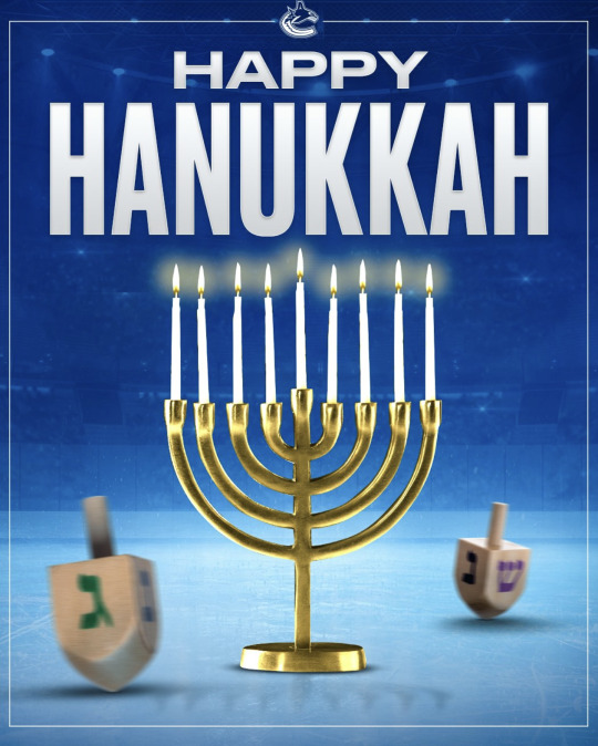
vancouver canucks: this is an extremely serviceable graphic. love the blurred dreidels to give the effect that they are spinning. very funny. props for the detail that there is a shadow of the menorah on the ice. straightforward. icemenorah is a themeTM but some did it better than others and this is a classic. 7/10
post continues under the cut for the sake of your dash and mine.

carolina hurricanes: obsessed with what the canes have done here though i cannot comprehend it. the weird techno style textured background. the out of focus magen david around. THE HURRICANES. IN HEBREW. WITH THE LITTLE CANES LOGO THING I FORGET THE NAME OF ON THE HEI? INCREDIBLE. points for creativity. overall baffling vibes. 6/10.
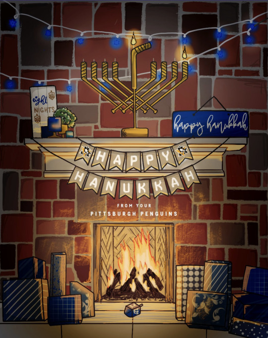
pittsburgh penguins: this is just adorable. you hired someone to draw this. spectacular work, guys. it's giving a bit of 'we browsed the target hanukkah deco section for inspo' but it's too adorable for me to care. it's team themed, it's hockey themed, it's holiday appropriate. love everything going on here. they get points for doing what very few other teams are doing and remembering this is night one, so only one candle is lit. most everyone else is getting a bit a head of themselves. 9/10.

washington capitals: and here we have another edition of the icemenorah, with a minimalist twist. this graphic screams 'oh fuck wait is that tonight' which to be fair is also how i, a jew, felt about realizing tonight was the first night of hanukkah. could'a done more, but it's perfectly fine. 6/10.
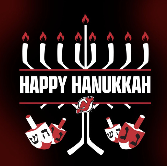
new jersey devils: this fucks. it's got devils themes. it's got a cool style. it's got vibes. it's got: more hockey stick menorahs which i am always excited about. that shamash candle is a graphic design nightmare but other than that i am all on board. 8/10
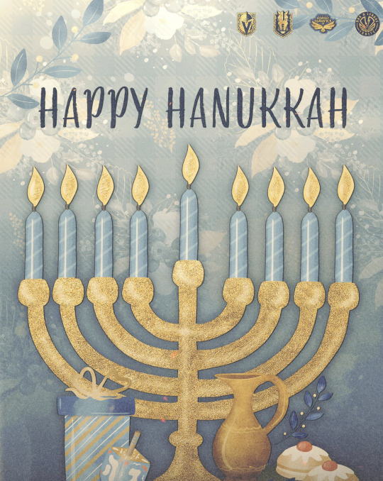
vegas golden knights: i love the gold foil effect and that you remembered there was more to hanukkah than candles, that's nice, as is involving the other affiliates! however. where are the vibes. this is not the vgk wishes you a chag sameach, this is a greeting card i got on etsy. 6/10 just bc i KNOW you can do better. where's the neon, babes.
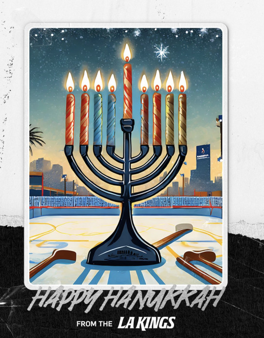
los angeles kings: oh this is fun. it's icemenorah: WITH A TWIST. the art style is cute, it's got plenty of hockey theme, it's also very obviously LA-y, i'm giving them points for this one. the shadow is insane but that's okay, it's ~stylistic. it's cute. 7/10. UPDATE: definitely AI. boo hiss. 0/10.
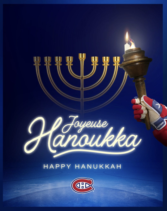
montréal canadiens: this is probably my favourite for sheer vibes. you got: levitating icemenorah. you got: action-shot candle lighting. you got: remembering this is night ONE. you got: the implication that the torch is the shamash candle????? you got: JOYEUSE HANOUKKA!!!!!!!! (and like happy hanukkah or whatever i guess). obsessed. it's so funny. it's amazing. 9/10.
#long post#happy hanukkah besties here is: SOME THOUGHTS#chag sameach!!!#vancouver canucks#carolina hurricanes#pittsburgh penguins#washington capitals#new jersey devils#vegas golden knights#los angeles kings#montréal canadiens
777 notes
·
View notes
Note
things for a robot regressor? :3
Things for your robot regressor ( !💿💾! )
Foods & drinks …
Byte-Sized Sandwiches – Tiny sandwiches made with mini bread slices or crackers
Gear Gummies – Fruit gummies shaped like gears or rings (Lifesavers work well too!).
Robot Wires – Pull-apart licorice (like Twizzlers) to look like colorful robot wires
Metallic Popcorn – Popcorn with a little edible silver or gold glitter powder to look metallic!
Glowing Gelatin – Blue or green Jello cut into squares for a "glowing energy" effect.
Bright ramune sodas – flavors like melon, classic, and peach make for great days!
Blue raspberry lemonade – store bought or homemade, either works!
Neon Milk – Regular milk with a tiny drop of food coloring to make it look "charged up."
outfit ideas !
Gray or futuristic pajamas
soft, comfy robot pjs.
slippers made to look like robot feet! Or in a bright color.
soft, comfortable silver dresses.
oversized gray sweaters with colorful buttons (drawn on, or sewn on!)
dress shirts with colorful buttons
Tie-dye shirts in comfortable, bright colors.
metal-colored shoes with circuit patterns
ACTIVITIES
= Build-A-Bot – Use LEGO, magnetic tiles, or recycled materials (cardboard, foil, bottle caps) to create your own robot!
= Design a Control Panel – Draw buttons, screens, and switches on paper or use stickers to make your own robot dashboard.
= DIY Circuit Board Art – Draw pretend circuit boards with markers or use metallic stickers for a cool, futuristic look.
= Robot Costume Making – Use boxes, foil, and tape to create your own wearable robot armor.
= Code Your Own Dance Moves – Make a "robot dance routine" by writing simple step-by-step commands for yourself to follow!
= Invent a Robot Language – Create fun robotic sounds or a simple "beep-boop" code to talk in!
= Decorate Your Charging Station – Make a cozy "charging pod" with blankets and pillows where you can rest and "recharge."
Games (new addition!)
Roblox games such as cozmo and friends: team battle, robot simulator 2, Natural disaster survival games, or even just roleplay games where you can dress up as a robot or robotic character!
Minecraft with robotic addons or with friends to do robotic roleplays with!
Geometry dash
mimo: learn coding
any coding website
Beat maker pro
Block Blast
Screw it out
songs and playlists
I want to be a machine - the living tombstone
eeeaaaooo - shadowstep
Playlist by me
Playlist by 5-tar
Superstar - toy box
Harder, better, faster, stronger - Daft Punk
Dr. Gaster - shadrow
Playlist by The Hank Tapedeck
#Agere#sfw agere#agere blog#agere community#age regression#age regressor#sfw interaction only#agere little#agere robot#Robot agere#Robot regression#Robot kin#roboregressor#Things for your little mindset#Robot regressor#Robotic#robot#robot regression#agere playlist#Agere music#agere games#babyre#age dreaming#agedre#agere activities#things for a robot regressor
81 notes
·
View notes
Text

Sharing the freebie sticker for my upcoming pin campaign, Themed Monster Enamel Pins! After struggling with a different design of the same character, I decided to re-purpose the Nightmare Portrait pin design to be the sticker instead. If we get enough funding I might add a foil effect to the gold areas.

Themed Monster Enamel Pins is part of the Oddities & Obscura collection, which is launching March 18 and will end April 3. If you pledge to six or more campaigns in the collection you will receive exclusive freebie pins.

Additionally, each campaign in the collection is partnered with another and if you pledge to the pairs you'll receive even more exclusive freebies! You can follow the pre-launch pages now to be notified when the campaigns launch, and get early bird rewards and more.
#enamel pin#enamel pins#eldritch angel#eldritch angels#biblically accurate angel#biblically accurate angels#monster#monsters#monster art#original character#oc#oc art#creature design#character design#pin making
105 notes
·
View notes
Text
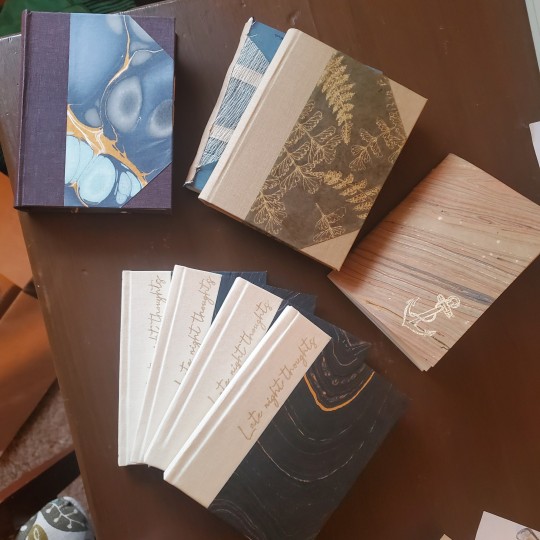
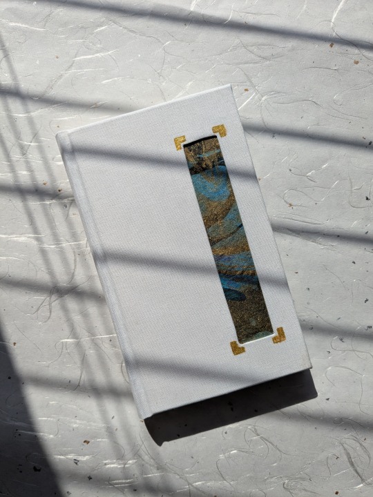
was asked to see a bit more of my process of making my bookmarks! I don't save much process but I have an ongoing concept document and I can ramble about things for Ages so here's some of that:

This was my very first group of sketches after the initial mushrooms I did (which were planned/lined traditionally). As you can see, some are almost identical to how they ended up, some changed a lot, some didn't go anywhere. the book spines I guess I just started like that and developed them further in the actual final file.

Below is kinda 1.5 I guess (crossed off after I completed them, I just hid that layer on the other images), there's the couple newest dagger ones, purple/yellow fungi (different species at this point, I just wanted those colours), very rough colour blocks for the book spines I already had + new ideas just to see all the colours together..


and then current page:

shifted those vague book shaped blobs here to work on them better. some, like the dragon, I just figured out in the proper file, the rest are clearly pretty worked out at this point already. I'm not sure if I'll do the lichen since I already have a bunch of green ones, and I really want to do a wizard spells kinda vibe I just can NOT figure out a colour palette or what objects to use for it.

I've been prioritising the book spines since they sell way better than the daggers/swords and I think are the most unique, but I do want to make more swords because ultimately i just do what i want........ have almost finished the jungle & dark water ones which is probably where I'll stop for now.
[I also haven't 100% decided on the dark or light version of the snowy book - I will print proofs of both. I like the contrast of the dark one but I think the light one might look better as a physical object]
As far as decision making, I start with ideas/colours I like obviously, but I also think about:
what colour palettes are common on book covers with similar themes (I often think of a few books I like to match them to specifically)
what colours/palettes have I not used yet? I like to have a rainbow of bookmark designs. (you can see in the concepts above I've got a little group of some colours I might use for new ones...)
what genre/niche of book have I not covered much of yet (how I came to do a couple more horror & sci-fi - ish ones)
what other slightly different imagery or design element can I add in to the main theme to make it a bit more interesting? (like: the celestial theme on the cards/coins one; the key on the fantasy map, there's some spiderwebs on the eldritch one #tma)
also all of them (except some of the fungi) are different on the back in some form! either subtly (slightly different flame overlap) or very obviously (different colour or details, broken sword, closed angel eye)
my only 'limits' really are keeping some level of consistency with the different types, ie: fungi designs all have a squared bottom shape; the swords all have a wider background element (often kinda elements or environments?), the daggers have more closeup specific objects as a background; the books are either fantasy or sciencey themed. if I ever choose to do non-book or non-sword/dagger bookmarks I would want to do a set, not just having a random bookmark that's a different kind of weapon or something
Oh, the other relevant thing to the book designs is that I briefly explored if I could get special versions made with gold/silver foil on the spine designs - only sparkly ink was an option, and that wasn't obvious enough to be worth it. But that is what made me end up doing these matching sticker designs - because metallic effects can be done on stickers! Some of these I did after the matching bookmark design, some before.
Also I have speedpaints of some of these on tiktok: bones, crystal dagger, potions, plants part 2, crystals, fire, water, honey, orange fungi, purple roses, a couple daggers, raven, murderbot, sabran, ead. mostly just parts of the process on the rare occasion I remembered to record some.
-----
Also since I'm here? I made graphs of all my bookmark sales at events since late 2023
This doesn't include the sets that I used to sell (5 swords, 6 daggers, 5 book spines), since I don't sell them as sets anymore in person. I keep making new designs and it's annoying to update sets constantly (also, table space)


I didn't include the fandom designs in the rest of this post since I did them kinda separately but here's the sales for those too. obviously I sell them mostly online!

and below is all of the total bookmarks I've ordered (as in the numbers I requested from my manu - not counting the extras they sometimes give me or bgrade/damaged ones, etc). I also of course have a thousand or so in stock that I haven't sold yet
(I've been counting the 3 priory designs in one total here, which is why it's far above the others)
organised by type, then in order from when I made them. obviously some have been around for 4 years so I've had more time to sell more of them, hence the general downward curves

we are approaching 10k. that's a lot of bookmarks. wow thanks!
38 notes
·
View notes
Text
Wouldn't say it's the best character design in Hades game franchise (that is subjective) but for me personally Eris Hades game II has to be my favorite design in the whole IP.
From Hades game I the goddess of strife was established to be source of conflict within the narrative - she is a bearer of the Adamant Rail - something that goes against the narrative setting of the story within Ancient Times. They build further on this anachronism by evoking Punk aesthetic - we see her short hair, wild colors, studded corset, torn clothes, wild makeup (which double as evoking her own wings), her band makes her look like she's got tattoos, eating plastic wrapped snacks, her disregard for typical social norms. Her and Exagryph both are anachronistic and therefore punk by the aesthetics of the game. While also not being too off - she wears a chiton still. As well as that braided bra style idk what's it called.
Her design simultaneously works withing the narrative of the story. I've already talked a bit here how she scratches out the Moon Sigil on her gorget and wears it upside down on her face to opposed the Unseen. But that sigil on her face also golden - which we've specifically associate with Chronos, the Unseen's Enemy (who prefer silver). It's also gold like her Iconic Golden Apple, the symbol of her most famous crime. Eris's design also bears the colors of the Three Eriynes - who in the first game, serve as a much more personal antagonist and foil to Zagreus the protagonist there. Here, Eris is Mel's most personal guardian boss outside of Hecate - they've got beef with each other, and that's likely due to their past history.
The colors and the tassels to me also recall the jester archetype. The jester in history was tasked to entertain the king and also dole out information that the royals might not want to hear (and do so without getting killed cause rule of funny). Eris is the most verbally opposed to Mel - challenges her on her motivations especially. Why is she so hell bent on this task when she doesn't even know her family (who she might not fit in with)? What does she plan to do with her life then? Loosen up! Which she tries to get Mel to do - by fighting her to the death. "This is for your own good Trouble" and all. The Jester indeed.
This conflict leads me to another detail - Eris is an excellent enemy foil to Melinoe. Melinoe who is neat and proper compared to crass and messy Eris. Melinoe who is hellbent on restoring an Order she's got no familiarity with. Eris, who lived it and opposes it. Melinoe who's a slave to her task and whose future post-task is a big Question Mark - she's never considered it, never questions it. Eris who also lives in the present but specifically to have freedom and hedonistic-ally strife causing as possible. Melinoe who has an insane level of rizz and is absolutely adored by all around her - but is unaware of the effect she has on others but somehow is fixated on Eris herself. Eris, who is loathed by all and actively is aware of the effect she has on people at all times and intentionally cultivates a negative response from them - with the exception of Melinoe, where her troublemaking serves a dual purpose of exasperating her but also luring her in. Melinoe and Eris both are estranged from their birth families - Melinoe due to circumstances leading to nurture, Eris due to her nature. Melinoe, who Chronos describes as not fitting anywhere despite her clawing for a place in said world, Eris who had no place to begin with, and continues to dig herself out of each subsequent one. I could go on.
It's such a great foil dynamic for a boss. I love Eris.
#Eris (hades)#Melinoe#hades 2#hades II#hades II spoilers#meta#also if you put your shipping goggles - Eris calls Mel trouble (trouble and strife = wife in Cockney slang) and has an umbrella erected#in their beach fights meant to relax Mel and also the whole thing with the nectar exchange#Eris *is* planning for the future in a way - theoretically it's to bag Mel#planning that we never see Mel do with any of her situationships
148 notes
·
View notes
Text

wip to show i'm not dead and tiny update in keep reading below!
tldr i'm going to say a lot of things and explain them with vagueness but! a little explanation on where i've been
-> my town is flooded (i am okay) and all of my friends towns are (some are not okay/in need of recovery)
-> since the charity stream i've found out the reason why half my face was bruised (lmao)
-> i'm going in for surgery on it soon and it's been majorly effecting my ability to draw (i am drooling on my art tablet and in calls)
-> catprint nightmare for my gold foil prints for donators (i forgot utah existed and my hard copy proof came in fucked up as hell) but we're getting there. if donators have not gotten their owed art/dont know where things are/need updates please do not hesitate to message me
-> more kitty scares
and last but not least,
-> there are wild hogs outside of my home and it's made leaving my house a nightmare
83 notes
·
View notes
Text
I can't believe that ThamePo is now officially done. I finished the last episode exactly 24 hours ago and it feels at the same time like a sigh of relief and warmth as well as a sense of loss. I followed it week by week since the beginning although I wasn't even planning on doing so. I cannot say in words how much I absolutely adoooore this sweet little show.
I enjoyed the last episode quite a bit actually. It was fun and sweet and loved. To see Po being there for Thame and to be able to give him the space to chose himself, something he was unable to do earlier. To have the members 'save him' and save MARS was a lovely parallel to where we started with the show. I think going independent after the entire scene with Oner was the only way they could reconcile all the angst and heartbreak in the previous episodes. (Spoilers for Young Royals Finale, but, for me it reminded me a lot of how the only resolution to Wille's story was the abdication, there was no other way it could have gone right or landed right.)
I am glad Fern and probably the fans she represented had a wake up call about the hurt they were causing their idols because of the unrealistic expectations. I wish it didn't need to have the side effect or ruining relationships to have this realisation, but it did.
Seeing Gam was so important to my heart and I needed that sigh of relief and genuine smile on both her and Pepper's faces. Nano being a menace to keep his JunDylan ship going is gold. He is the captain and I'm just a lackey on the ship he is navigating. I love that Dylan kept denying it and Jun was just astonished at Dylan's audacity to reject him. All in all the members and MARS just made it so so precious.
I love that the show didn't randomly give Po another director job right after this very conveniently. It was important for me to see him be content with the job that allowed him to sustain. Nothing special. Nothing big. Nothing dreamy. Something real. Something easy (?). Something that holds a looot of meaning for me. I love the call back of the suits MARS wears as the suits from their suit store. I love it.
And now. To one of my faaaavourite parts, the reunion. It was again, such a callback and a foil to the opening. I loved the anticipation of Thame coming. Fern and his other friends' curiosity towards who is Mr. B and the big reveal. I loved how unabashed Thame is with his love towards Po. He doesn't care or mind what people would think there. I'm sure he knew Fern's reaction to Pepper's relationship but he couldn't care how she would react to this relationship. He had lost everything and having Po back made everything better for him, so there was no way he would let anything come in between again. The soft way he called Po back into the frame for the photo was such minute but soo meaningful. Going from not being mentioned at all by his ex to be intentionally involved and included by Thame must be so meaningful. I loved how Earn's attitude never changes and his superficiality keeps making an appearance.
Po asking if Thame wasn't mad at him was something I was wondering if they would address and I was very happy how they did it. So so good.
And then the call back to the movie and knowing that since after the first time of watching the movie, Thame had never again let them finish a movie and I love that it brings out the cheekiness.
There were definitely parts that frustrated me. Especially with Pemika. I would've rather had her stay the no-questions asked corporate person. But I can see how hypocritical it might look that it is being said by a corporate themselves. I would've also liked to see Ming and Tae be more involved with the MARS part of it, but I guess they don't get paid enough for either of those. I would also have liked if Thame and Po got to speak more and we could see more of that conversation. Especially about the letter and the leaving. Also, would've loved to see Pepper and Gam a little bit more. All this to say though, I'm nitpicking for a lot of them.
All in all, I really liked the finale. It was a good wrap up. I am so excited to rewatch it again. Also, I need to say, as usual watching it real time, with all of you here was so exciting. I loved it all.
I didn't know Lykn or William or Est before this, but after the series and as importantly, the OST, I'm so excited to hear more songs from them all. There is such a warmth and so much of heart in these songs that were just so so good and perfectly suited the mood of the series.
I am also very excited to see where all of these boys go from here, and I will for sure be tuning in to more of their things.
Edit: I forgot to mention two things in the above portion.
Pepper being the leader. It came as a surprise I don't really have any opinion towards it except that I know he is going to be fantastic. We've seen his planning, his delegation, he was the one to suggest to Thame to bring in Po and knowing what is all at stake that was very resourceful of him. He cared a lot and most importantly could cover all of the roles they would need in a leader. He is rational and empathetic and it was a pleasant surprise in a way.
Secondly, Po's comments about the missed reunions itself. That hits so close to my heart, I can't tell you. As someone who had still unable to find the role and Jin that fits me and currently doing hospitality for the sake of it, I felt particularly seen in that particular sequence. When he said he never felt successful, I think it very well showed how success can mean so many different things to people, and as long as you are happy, you can claim to be successful.
#thamepo the series#thamepo heart that skips a beat#thame po heart that skips a beat#thame x po#williamest#thai bl#thai bl series
37 notes
·
View notes