#graphical user interface
Explore tagged Tumblr posts
Visit Tumblr Blog
Explore Tumblr blogs with no restrictions, modern design and the best experience.
Last Seen Tumblr Blogs


Fun Fact
In 2020, 44% of users from Denmark used Tumblr daily.
Text


The Fifth Element (1997)
#the fifth element#90s#cult classic#retro futuristic#cyberpunk aesthetic#retrofuture#retro futurism#new york city#aesthetic#90s movies#90s aesthetic#cyberpunk#graphical user interface#user interaction#user interface#graphic design#motion graphics#ui#ui ux design#uidesign
1K notes
·
View notes
Text
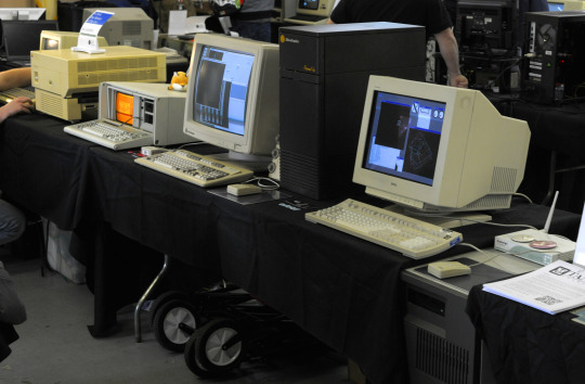
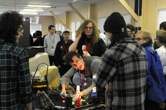
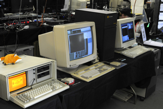
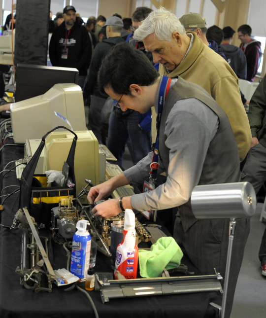
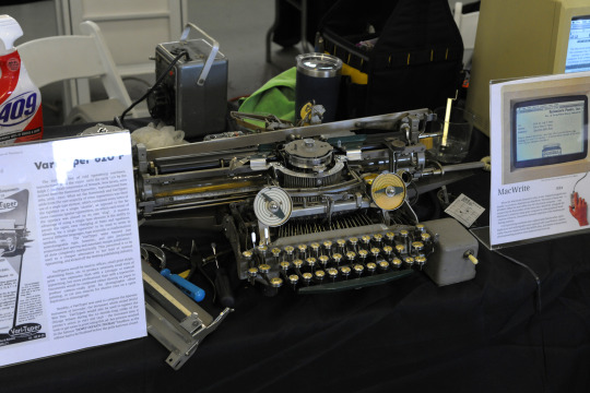
VCFed: The History of The Gui – Ian Litchfield, Thomas Gilinsky, CJ Reha, Douglas Crawford
"Since the dawn of technology, the interaction between mankind and machine had been limited to rudimentary mechanical or electronic interfaces, oftentimes designed more to the limits of technology than to the capabilities of people. This fundamentally changed with the introduction of the Graphical User Interface – though it took time for its true potential to be realized. The GUI’s original killer app – WYSIWIG text editing, as delivered to the masses by the Macintosh – is demonstrated next to its mechanical ancestor in the form of a 1950’s vintage ‘Vari-Typer’ cold typesetting machine.
The GUI’s history did not begin with the Macintosh, of course – another major contributor to GUI computing were the LISP machines, represented here by a Texas Instruments MicroExplorer, an example of an attempt to wed the pioneering principles of LISP machines with the market success of the Macintosh. And the history did not end with the Macintosh, either – also demonstrated are early GUI systems for the nascent IBM PC-Compatibles and the then-emerging UNIX Workstations. Sit down and use these primordial GUIs, from an era before the near-universal acceptance of Windows and X11. Were they more limited? Were they less refined?
Or were they ahead of their time?"
VCF East XIX
#vcfexix#vcf east xix#vintage computer festival east xix#commodorez goes to vcfexix#gui#graphical user interface
12 notes
·
View notes
Text
GUI: Definition, Examples & Essential Tips

Discover the meaning of Graphical User Interface (GUI), explore real-world examples, and learn essential tips to design effective interfaces. This guide from MITSDE helps you understand the role of GUI in user experience and its impact on modern digital products."
Pune | Mumbai | Nagpur
0 notes
Text
« If you look at gamers playing video games, they want to push a lot of buttons on those controls. And if you look at DJs and digital musicians, they have endless amounts of buttons and joysticks and dials to make music. There seems to be this kind of richness of the tactile experience that’s afforded by pushing buttons. They’re not perfect for every situation, but I think increasingly, we’re realizing the merit that the interface offers. »
0 notes
Text
About 10 or 15 years ago I was talking with a friend and I said --without any irony or sarcasm -- that I would prefer to still use Windows 95 over whatever software I had at the time (I honestly can't remember what OS I was on). He made a crack about "Ah, I see you fear change" and I responded "No, it's just that it worked."
Now, obviously, there was a lot that W95 didn't work well with, and in a perfect world we would have newer systems that did everything better, but my point stood then and it stands now. Because people weren't already familiar with GUIs and computers in general that meant everything had to useable by somebody completely fresh to the whole concept. That meant detailed instructions, that meant intuitive controls, that meant entry level functionality.
Now that people are "digital natives" (ugh) all of that has been cut away because "everybody knows already". And that leads to...this.
One small but extremely annoying effect of Tech Modernization or w/e is how UI contrast is garbage anymore, especially just, like, application windows in general.
"Ooh our scrollbar expands when you mouse over it! Or does it? Only you can know by sitting there like an idiot for 3 seconds waiting for it to expand, only to move your cursor away just as it does so!" or Discord's even more excellent "scrollbar is 2 shades off of the background color and is one (1) pixel wide" fuck OFF
I tried to move a system window around yesterday and had to click 3 times before I got the half of the upper bar that let me drag it. Why are there two separate bars with absolutely nothing to visually differentiate them on that.
"Well if you look closely-" I should not!! have to squint!!! at the screen for a minute straight to detect basic UI elements!! Not mention how ableist this shit is, and for what? ~✨Aesthetic✨~?
and then every website and app imitates this but in different ways so everything is consistently dogshit to try to use but not always in ways you can immediately grok it's!!!! terrible!!!! just put lines on things again I'm begging you!!!!
27K notes
·
View notes
Text

#Xerox PARC#graphical user interface#GUI#technology#desktop metaphor#computer technology#history#invention#science#70s#black and white#historical
0 notes
Text

The Evolution of Graphical User Interfaces
Discover the visual revolution brought about by iconic elements in Step 3, where graphical symbols replaced text-based commands, reducing the learning curve and making computing accessible to a broader audience.
Source:- https://megataskweb.com/service/ui-and-ux-design-company
0 notes
Text

【 𝆺𝅥𝅮 】 ⋯ Spotify Replycon Template
╰⸻ F2U﹒ Credits not required ◈ Self〜Indulgent。 RB2USE ◇ Edits﹒ Recolors → Encouraged ◈ Click "Read More" for PSD & more examples.


Hello, just a little note. I've added some important notes in the PSD Please be sure to read it before editing! This is an example of what you can do with the replycon. Link to PSD: Google Drive And I forgot to add, this can only be viewed on Photopea Overall, I had lots of fun doing this (❁´◡`❁)

#◇ Handiwork#◈ Resources#﹕ ✧ 】 Replycons#editblr#rentryblr#rentry decor#rentry resources#rentry graphics#replycons#spotify#spotify playlist#carrd resources#user interface#carrd decor#carrd graphics
307 notes
·
View notes
Text
A'ight. This is what the inventory screen looks like in Animal Crossing New Horizons, right?

And this is what the few UI elements Project Special K has so far look like.

Which is not too different from the mockup I'd made May last year when this got started if I say so myself.

Just a little brighter, a little blue-er, and maybe a little too close to the top edge. All things that two config files can change.
So I was thinking earlier, would a similar style work for the inventory?

I kinda freehanded the scale and amount of things (and I just bothered to count and it turns out I got the amount just right what the fuck) and the bells counter is missing but yeah, instead of a bubble it'd be a screen-spanning rectangular panel. With the // edges on the other elements so far it'd have to be like that or the entire grid is slanted to match. Alternatively, the sides of the panel could be straight vertical but fade out.
90 notes
·
View notes
Text


Fake UIs part 6
468 notes
·
View notes
Text
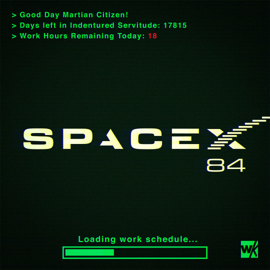
SPACEX84
#spacex#scifi#science fiction#dystopian#retrofuture#retro computing#retro computer#retro#cyberpunk#pop art#technology#scifi art#digital art#user interface#elon musk#space#mars#photoshop#graphic art#1984
242 notes
·
View notes
Text


The Fifth Element (1997)
#the fifth element#90s#cult classic#retro futuristic#cyberpunk aesthetic#retrofuture#retro futurism#new york city#aesthetic#90s movies#90s aesthetic#cyberpunk#graphical user interface#user interaction#user interface#graphic design#motion graphics#ui#ui ux design#uidesign
516 notes
·
View notes
Text
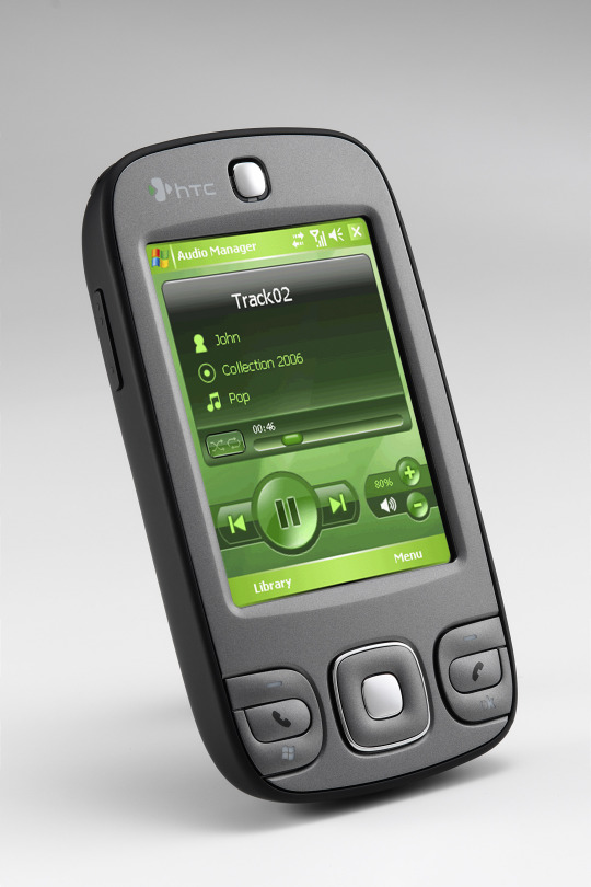

HTC P3400 (2007)
source 1 source 2
#2007#2000s#07#00s#art#cellphone#design#frutiger aero#graphic design#graphics#green#htc#htc p3400#microsoft#mobile#phone#photos#tech#technology#user interface
734 notes
·
View notes
Text
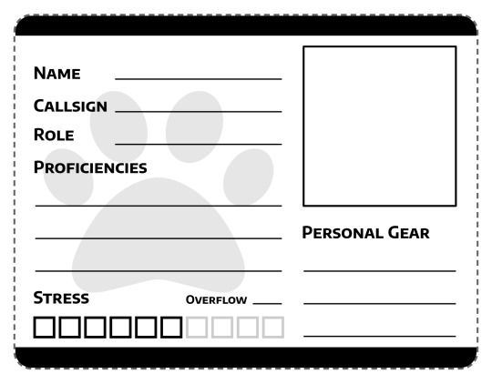
Finally throwing together a proper character sheet for Space Gerbils. The generic pawprint watermark will be replaced with something appropriately space-agey once I get around to commissioning a logo. I've tried to keep the write-in spots nice and broad for the benefit of those playing with pen and paper because I cannot write small to save my life and under-height form fields are therefore my mortal enemy.
#gaming#tabletop roleplaying#tabletop rpgs#space gerbils#game design#graphic design#user interface#user experience
499 notes
·
View notes
Text
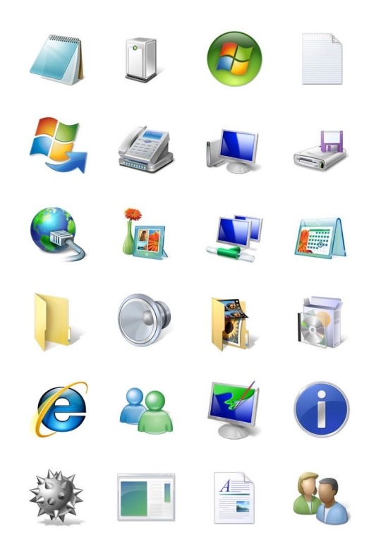
Windows Vista iconography, 2007
ig: cheri.png
#it’s beautiful#I love it#windows vista#2007#google didn’t help with the designers of these I might just look up on linkedin#old internet#old web#00s#y2k#2000s#cyber y2k#cybercore#moodboard#cyber core#tech#techcore#iconography#tech core#user interface#graphic design#y2k core#y2k internet#y2k aesthetic#y2k blog#tech blog#webcore#vaporwave#nostalgia#y2k nostalgia
591 notes
·
View notes
Text

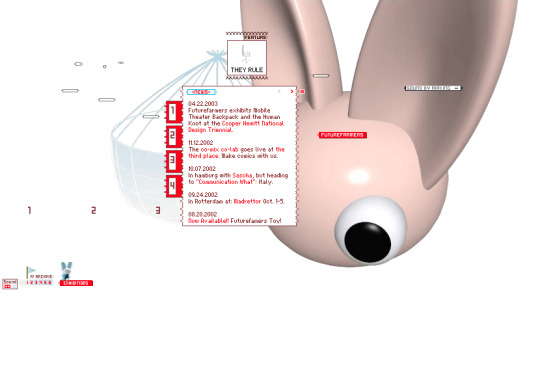

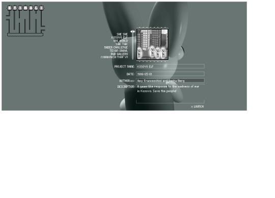
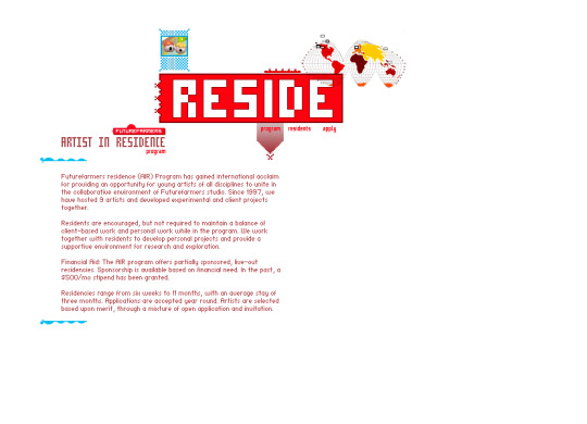

Future Farmers website (2001)
#3d#2001#2000s#01#00s#art#cgi#cybercore#cyber y2k#design#future farmers#graphic design#graphics#internet archive#kaybug#old tech#screenshots#uidesign#ui ux design#user interface#y2kcore#y2kore#y2k aesthetic#y2k core#y2k cyber#y2k design#y2k future#y2k graphics#y2k
274 notes
·
View notes