#grimm art tutorial
Explore tagged Tumblr posts
Visit Tumblr Blog
Explore Tumblr blogs with no restrictions, modern design and the best experience.
Last Seen Tumblr Blogs


Fun Fact
Mobile Tumblr US users spend an average of 4.04 minutes per session on the app.
Note
How do you pick colours to use for your characters? Also do you have any advice for character designs with meaningful colours? A lot of information I find online is either contridictory or feels too reachy
Colors and Character Design
Oooo good question! And perfect timing too-I’ve been updating the Key Art for my OCs and just finished the first two characters, who coincidentally are perfect for this as examples! I would use Anthea and COTL for this, but for color symbolism especially, using OCs rather than game characters with pre-set colors (aka Red for the Lamb’s cloak, White for Baal, Black for Aym, ect.) would be a lot better since while I can interpret the game designer's reasons they're not exact.
Picking Colors
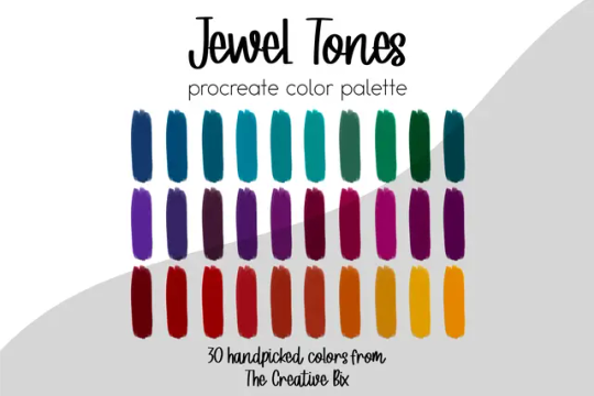
Now, how do I pick colors? Typically I prefer jewel-tones for my palettes, so vibrant but not oversaturated, and somewhat dark but not muddy. I just like how they look for the most part.
Typically when working with a character, I usually set two things down first in their lineart-their skin tone and their hair color. The reason for that is its a LOT easier to pick colors when you know WHAT they’re going against because color is relative (meaning whatever colors are next to each other will slightly influence how they’re perceived as a whole), or at least in this case its easier. I typically know what skin tone my characters are going to have since I’ve had most of my main OCs for a decade now, though even if it's not a set in stone color I still at least place one down first then adjust down the line, like with Anthea and Narinder’s cameo in my Christmas piece I originally had their skin set as this olive-undertone one before warming their colors up after messing around for a bit with their clothes.


Skintone is kinda really important to have the colors match (Or match with multiple skintones if its say, a uniform everyone wears for example) to avoid issues. It both helps the character look nice in their outfit, and avoids a Nasica and the Valley of the Wind situation where your character's pants are a bit too close to their skin color and make some poses awkward.
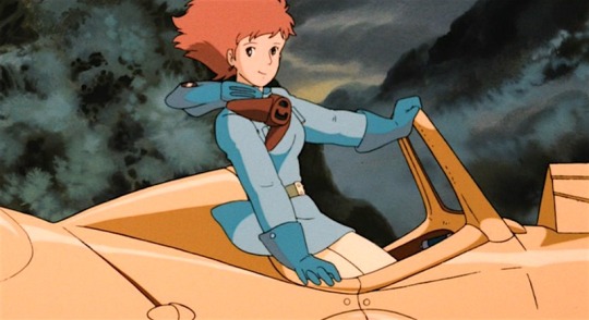
(See how Nasica’s pants are a light cream color but her skin is a very light peach? Depending on the quality of the film scan/shot they can appear identical and make it look like she's wearing a short dress and nothing underneath)
Anyway, with Chrysa and Leo, who you'll see shortly, their characters have been with me for a decade, so whenever I redesign/update their looks I kind of already have a set skin/hair for them. Chrysa’s meant to be very pale with red hair, while Leo has a warm tan and brown hair. I also never use pure white for eyes whites/teeth, and instead lower the opacity down to like 70-80 to let the skin tint it a little, this is just to help keep it from being too sharp. After skintone and hair are down, it’s onto Theme Color.
Theme Colors

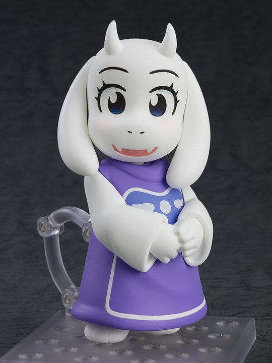
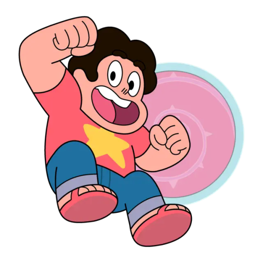
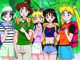
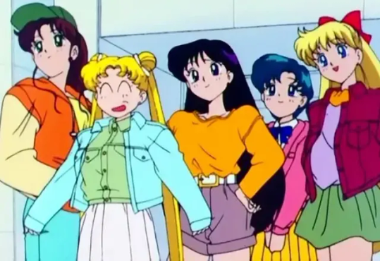
It’s very common in media for certain characters to have a ‘theme’ color, so a color they’re always wearing/associated with. Sonic the Hedgehog is blue, Toriel is purple, and Steven Universe is pink. Now this isn’t always the case, the girls from the 90s version of Sailor Moon for example wear a bunch of colors like most people do for every-day looks, but in character design if your character primarily has one outfit it’s good to pick a main color, and especially one that matches them.
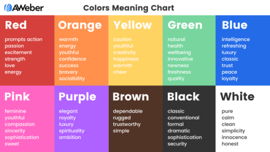
Colors have meanings both positive and negative beyond just the chart above (and there are a lot of different takes that can even vary from culture to culture), like how Red is passion/anger in the west, but in China represents joy and prosperity. Your character doesn’t have to match every one of those meanings for them to use that color though. For Chrysa and Leo here:

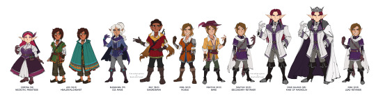
Chrysa: Purple meaning Royalty, Mystery, and Compassion Chyrsa’s a princess who’s been exiled and disgraced since she was born, she has a whole lot of mystery surrounding her purpose in life and just what she is (as she has magic and abilities most mortals typically don’t-which spoiler alert she is only alive as the the result of some godly intervention via a pact between the Goddess of Death and a dishonest queen), and her greatest strength is her kindness and compassion towards others regardless of who they are. She also has a sub-theme color in pink (so her secondary color) because of its association with youth, since Chrysa's isolation left her rather not so much naive but unaware of the outside world, which gives a lot of her morals and beliefs this youthful optimism. Leo: Green meaning Nature, Growth, and Selfishness Leo’s the healer of the party who is more knowledgeable of the world around them both in regards to the kingdom they’re in (as he was raised by his mother a nomadic healer and traveled alongside her), and in regards to being more aware of the fae most mortals overlook. He’s got this unassuming look where his clothes don’t fit him right and a boyish face that makes it clear he’s got some growing up left to do when combined with his attitude, and especially at first Leo is rather selfish with others, often keeping his travel experience to himself when the party struggles in hopes they’ll give up their quest. (mainly due to having little faith left in their situations improving, kid's a huge pessimist)
Those are Chrysa and Leo’s basics, but that’s not all I was thinking about with their colors. While you can just leave it at that, I do have more reasons why I picked the shades/placements I did. Connecting the colors to where they’re placed on the design and why something is the way it is can be super important too. Heck, even where the outfit came from in-lore can be important too sometimes. So congrats, you’re getting a mini character design lecture too I guess? Really this is me just taking the excuse to talk about the little things I did with my OCs’ designs here lol, but its somewhat relevant so trust me. Also as usual you can see more of OC stuff here @illustratemuse
Also I was gonna go into Leo too, but to not go on for long we'll just look at Chrysa's today.
Symbolism and Connections to Design


For Chrysa her entire character centers around being ‘inbetween’ life and death. As a girl raised in isolation not really wanted by anyone after her mother died in childbirth, she never had the chance to ‘live’ when all she wondered was why she hadn’t ‘died’. Chrysa basically has no opinion on if she lives or dies, and just wants someone to straight up tell her what to do since she doesn't know what either fully mean. (Just what does life have to hold? Just what peace does death offer?) Thus her colors I specifically chose based off twilight, that time between day (life) and night (death).
She’s also meant to resemble both a nun (as the story follows her becoming a Priestess of Death and the nun appearance is a quick shorthand glance for ‘oh she’s the priestess of this adventure party’ to the audience) and a bride crossed with a mourner-that bride part because another element of her character is how a lot of people place her mother's image over her, down to even misremembering her mother’s slightly sharper and at times angrier face to instead being as soft and gentle as Chrysa’s. And what is often viewed as pure in regards to woman? Being a bride-whose dress can easily be recolored into a mourner's if you change the fabric from white to black. Her mother’s death haunts her despite her having little emotional connection to the woman, and thus that’s how she’s dressed, a pure white bridal gown beneath a mourner's garb for a mother she never knew.
Now Chrysa isn’t a bride and is not getting married, but that imagery is still there since for a lot of the story it’s other people giving Chrysa her outfits, so it's like they're trying to recreate either that image of Chrysa's mother on her wedding day or her funeral, though I used the darker purples mostly since again the twilight nod as well as simply to make her look more vibrant, especially with her hair. Were Chrysa's outfit actually black she'd stick out too much when placed alongside her party.
Chrysa’s colors are very dark clothing-wise, so we're naturally drawn to her pale face and bright, vibrant red hair. Red like her mother’s blood. Red and curled like the threads of life she cuts as a priestess. So bright and alive unlike the rest of her appearance, yet covered by the only actual black garment on her, the veil. (which note that it’s not pure black but instead a very dark purple-I recommend using a dark version of a color that appears black since it helps match nicer). For the veil, Chrysa’s outfit was from her maternal aunt who becomes her mentor as the only other Priestess of Death, a woman who tries to pretend that she sees only Chrysa and not the sister she lost. And yet what does she give her niece upon first meeting? A veil. And what was Chrysa’s mother’s hair? Long, black, and straight. Chrysa’s key defining trait, the one thing people cannot place her mother’s image over, the trait they cannot soften/alter in memories, was her hair, yet here it is covered in a way that still gives Chrysa her mother’s silhouette/hides that red.
Extra
Another little note is that if two or more characters are meant to go together check their colors side by side and adjust as needed! I usually line everyone up like this at the end to check them all over. Also at least for me, I have certain color types for certain materials that are the same for ALL characters in a cast. In my OC cast, metals like gold, silver, and iron are the same, as well as anything that’s white cotton or linen, since it helps unify the group. You can do leather too, but since leather can be dyed or colored you can honestly mess with its appearance to, that’s what I do where I tint the leather to match the theme color.
Conclusion
Honestly with color, study the characters you like and the types of colors they use, and don’t be afraid to color pick from a color palette from image site or from even a character you like. Make it your own, have fun, and just play around and see what happens!
#I like getting questions about character design they make me happy :D#I will yap about my OCs and symbolism and XYZ if you give me the chance don't think I won't lol#grimm rambles#grimm art tutorial#art tutorial#color theory#storytelling#character design#character design tutorial#color tutorial#my art#illustration#oc
46 notes
·
View notes