#honestly mostly used this to try a different way of rendering
Explore tagged Tumblr posts
Text
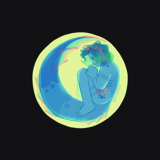
rebirth
#.png#jrwi#jrwi riptide#gillion tidestrider#sorry he’s naked?? but he did kinda leave his clothes behind so. dunno what u want me to do abt that#do i need to tag that#artistic nudity#let’s go with that#u can see like half a buttcheek it’s like Nothing#honestly mostly used this to try a different way of rendering#i think i like it :D#and the colours turned out nice :]#i’m really glad i spread the pink out across his design more it would’ve stood out too much as just the coral
390 notes
·
View notes
Note
hello i love ur art <3 may i ask how you shade/render? or if you can share any helpful tutorials you learned from ^^


Unhinged Art Tutorial
Well, anon and @merlucide! I'm not sure if I'm the best person to learn from (I'll attach some video links at the end to people who I personally look to for art advice) but I happen to have a series of screenshots for how i render with a strawpage drawing I did recently(at the time I drafted most of this a month+ ago), so I'll go over what I do, at least in this case.
Warning: A bit rambly. Not sure if intelligible.
Tutorial..? Explanation? under the cut.
I have a few different shading styles based on ease of program usage and effort level, but in this case i had to individually streak the shadows. I'll be focusing on hair and skin for the most part here.
My sketches are pretty poor, because I'm hasty:


Honestly I find the better the initial sketch, the easier the final profuct will come. So take your time, use layers when sketching to be clean. The airbrush layering shows vaguely how I tend to shade hair.

Backlighting *Applicable mostly when there is a bright background, light behind the subject, or in neutral lighting.
The 'underside'/inside I tend to use a peachier, brighter tone closer to the skin color (for tanned skinned characters I'd use a shade closer to a rosy orange, since that's just a more saturated peach. For darker skinned characters, I'd recommend a slightly redder & brighter version of their skin tone. This works pretty well with dark hair+dark skin, but in the case that your character's hair color is a lot lighter compared to their skin tone [also in the case of a fair skinned character with WHITE hair] it's totally fine to ignore the natural undertone of the character and shade it with a pinkish white.) This works for any hair texture but can be more time consuming for coily hair textures. (2c-4c)

Lineart when I take my time / Old rendering video


It looks more stable if you start off with a solid lineart base because you won't struggle with big-picture placement issues.
"Lineart" when I just try to pump out a drawing

I first did a rough sketch, kept it as an overlay layer and drew over it.

(Chickenscratching is valid though, honestly. I think it has a look to it!) I usually block out base colors, and vaguely where I want the shading to go, unless I need a special type of lighting, which then I'd do the base colors and either choose to wait until I'm finished rendering or do light processing* (*will discuss this later in this post) with different blending modes and layers.
For example if I'm doing the colors mostly FIRST (Choosing a grayed out palette) and then rendering, it'd look a little something like this: Left (Trackpad, on FireAlpaca) / Right (iPad, on Clip Studio & Procreate)


Sometimes, I'll shade with a dark, grayed out tone and then fill it in with something slightly more vibrant. This kind of gives it a bounce-light feel? Also with a lot of pieces I do recently I try to block out entire parts as white because lighting especially on white background pieces looks better if you pretend that it's white behind the character due to an intense sunlight.

Also, I use gradient layers to tweak with the colors. It's pretty useful and looks nice!!!! Gradient maps are available in every software I use: Procreate, FireAlpaca and Clip Studio Paint.

I find that the more intense the light (but not scattered, as in the source is either very bright or it's very close) the darker the shadows usually look? And if there's a brightness coming from behind the figure and the hair is splayed out in some way, it will appear semi translucent because it's just a bunch of strands made of keratin and collagen, something like that....


Anyway this is all very messy but I hope it helped

Here's a process photo for how I shade if that helps too.


More examples..

I broke down my thought process in my lighting so here's a close up of that.
i totally forgot about the video links so here's my idol the one and only:
And I think this guy makes quick but concise tip videos:
Finally I really like the in depth professional explanations from a long time illustrator:
I've personally taken advice from all three's videos and used them to improve my own art, so take a peek!!!!
89 notes
·
View notes
Note
I've adored your art for years now and honestly the way you draw bodies and scars is amazing! I got drawing bodies down, but I can never seem to get scars to look as detailed/ finished like yours, any advice or tips you have on drawing, painting, or rendering scars would be great! Keep up the great art!
thank you so much it means a lot! 🙏
I'm honestly. really bad with giving tips because I'm out here brain dead winging it but I'll try
as with everything else involving drawing, having references is king, though understandably looking up for scars might get gruesome and not everyone is into that - but here are some I have saved as some examples
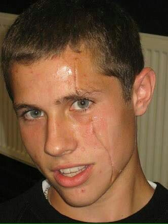


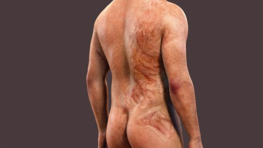
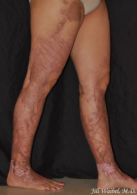
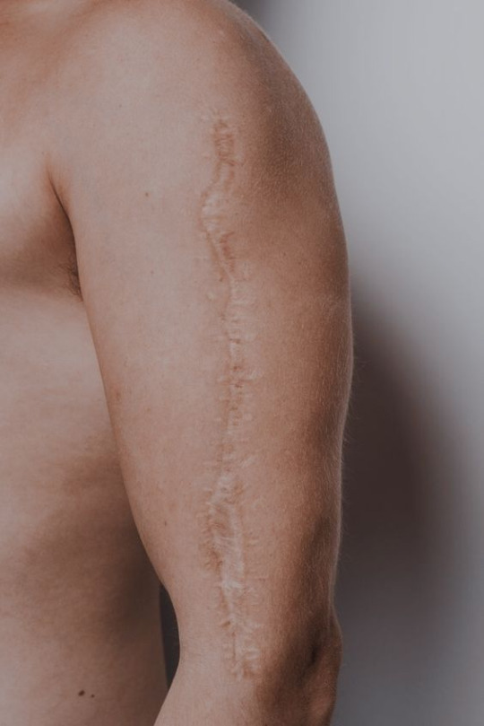

there is of course taking into account what the scar is from, a slash wound or a bullet wound or a burn will scar differently, as well as how healed it is (ie having faded with time or not), but typically I'll use a dark color for the scar itself plus a lighter edge for the raised skin around it, to give it some volume
also try to follow the contours of whatever surface they're on, like going around a shoulder instead of just being a straight line
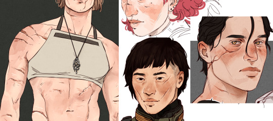
there are of course the cases where the scar isn't that deep either so it's just a discoloration of the skin - my disorganized ass couldn't find an example for this but it doesn't necessarily have to be a lighter color

for burns I do follow the same dark/light color logic but it's mostly just scribbles
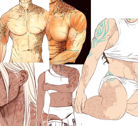
hope this has been any help and if you have any more questions feel free to ask but like I said. < brain dead winging it
677 notes
·
View notes
Note
hellooooooooo i love all of your renders and posts you're so talented oml. may i ask for a tut on how you did the smoke in this post? tysm ily :D
Hey, thank you so much ahhh!!! That means so much to me!! ILY! 😘
In truth, my method for smoke is not sophisticated at all... It's actually laughable how simple/easy my process is for this, I'll admit 😅
There is a way to do it right in blender, but for this particular trick I don't use blender (mostly because I've never been able to get it to work right, user error I'm sure haha). But if that's what you're looking for, there's an (untested) tutorial here!
I personally use photoshop for my smoke, and, I admit, brushes!
This tutorial assumes you have a basic knowledge of photoshop, but if you don't or if any of this is confusing feel free to send me an ask and I'll be glad to help!
A while back I scoured the internet for free cigarette smoke brushes and amassed a small collection of them. Unfortunately none of mine are marked with a name or anything so I can't link to specific ones, but here are a few I've found for this tut:
Click with caution! I use ad blockers and these sites are fine for me but as always be careful!
Brusheezy free smoke brushes 15
Brusheezy free smoke brushes 12
Resource boy 200+ free smoke brushes
If you're using photoshop, make sure the brushes are in .abr format!
Once downloaded (& unzipped), if you double click the .abr file it should automatically install and open your photoshop if it's not open already.
I've pulled one of my renders of Ariss (pre-smoke) into photoshop, so let's make some smoke.

Step 1: Create a new Layer!
Make sure you are working on a new, empty layer! This will be important in later steps!

Step 2: Add smoke using your smoke brushes
On the new layer, select the smoke brush you want to use, and make sure your color is set to white/off white/grey.
Hover over your image and select where you want your smoke to be. I was unable to take a screenshot of this process, but I put my smoke here:

Step 3: Adjust opacity/shading

You should have a layer for your smoke now. Double click it and the layer style window should pop up.

In this step... honestly go ham. If you follow exactly what I'm doing, it won't look the same because of differences in our base image (color, brightness, saturation, etc). But I usually adjust:
Blend mode
Opacity
Color overlay
Outer glow
If your smoke isn't on a separate layer, any adjustment you make here will be on the main layer, which we don't want!
I've adjusted mine, & ended up with this:


Step 4: Move & adjust your smoke
Because your smoke is on a separate layer, now you can move and adjust it.

This is all up to your preference! I typically just move, adjust, and edit the layer style until I get something I want.
Sometimes I'll also blur the smoke, which you can do by selecting filter -> blur -> gaussian blur, just make sure you're on your smoke layer!

You'll know you did it right when you get this window showing the transparency instead of your image, & if the smoke blurs when you adjust the radius!

& that's it!
There's a way to also use the standard brush tool and "path blur", which I've used before but don't usually like the result of it.
But if you'd prefer to try that, here's a tutorial for it!
#thank you so much for the ask and the love!#ts4 tutorial#ts4 edit tutorial#sims 4 tutorial#sims 4 edit tutorial#sims tutorial#sims edit tutorial#ts4#sims 4#sims#ts4 editing tips#sims 4 editing tips#sims editing tips#salemsims tutorials#I hope this helps#if not lmk!#& I'll try to clarify
28 notes
·
View notes
Text
A Chapter by Chapter analysis of Amgydala by Sam Fennah
Preamble: My favorite kinds of novel tend to be ones the author has written entirely for their own gratification. Without worrying about what might be "marketable" or "relatable" to an audience. These books are not always good, sometimes they are infuriating, but they are never boring. I disagree vehemently with the politics of Dean Koontz but I am fascinated by his material. Anne Bishop's 'The Others' series frustrates me in deep and complicated ways, but I don't regret having read them. And in the same vein I adore The Black Jewels trilogy for doing exactly what it set out to do.
Amygdala, the first book in what is to be an eight book series, is exactly this. Written by Sam Fennah, it explores a world of his own creation, full of creatures of his own creation, and aims to tell a sprawling story about the birth and struggles of a newly formed society. His stated aim is to use this exaggerated parody of civilization as a lens through which to examine ideologies of all stripes. I am keenly interested to know if he succeeds at this. I am reading from the Second Edition of the book, which contains a few scenes not present in the first, and some editing for brevity.
Disclaimer: This is not a takedown, sporking, or otherwise derogatory look at Fennah's work. Likewise I'm not here to kinkshame about the decapitation stuff. Let he who is without a weird fetish cast the first stone, and that is emphatically not me. I intend to engage with this book in good faith, if you are interested in that then we will begin with chapter one below the cut.
Chapter One
We begin with an overview of where we are and what we're dealing with. The narrator introduces us to the Kivouack, a pre-big bang mass of chaos that operates under different laws of physics, chemistry, and geometry than the world we're accustomed to. The landscape is wild, eldritch, and the animals that live here are as strange as the place that birthed them. Kivouachians, or Kivva for short, have no real shared body plan save for three navels, cross shaped pupils, and their method of reproduction. Outside of that the sky is the limit as far as appearance, environment, diet, and gender go. Sex is binary, but vestigial, which is to say all Kivva are capable of siring and bearing young and secondary sex characteristics are cosmetic. A bit of a handwave on the part of the author to explain why gendered pronouns, or even gender itself, exists in this society. I too understand the pain of trying to invent a neo-pronoun for your race of functional hermaphrodites that doesn't sound jarring or silly, so I'm willing to accept it. And honestly breasts as a vestigial organ is a very funny concept to me. Like being born with or without that tendon in your wrist that lets you throw things a little farther, but for tits. They are also immortal; like lobsters they don't die of old age and will keep on trucking until they are either killed or rendered incapable of sustaining themselves.
The explanation of all that comes a little later on though, for now we get a brief history lesson. In the beginning there was Freyda, a very large and volatile kiv who basically rampaged her way across the landscape eating and fucking whoever and whatever she wanted while all her smaller brethren mostly just tried to keep the hell out of her way. Eventually she spawns Locket, who looks at this mess and decides she wants something better. Locket organizes an army, takes down Freyda, and when the dust settles she establishes the Underbirth, the first real city the Kivouack has ever seen.
What this historical overview wants to impress on the reader are two things. One, that Locket's society is driven by the idolization of competence and a fear of failure. Sink or swim culture taken to a logical extreme. In order to discourage complacency, death is touted as the ultimate failure and the bodies of those failures are done up in elaborate poses called 'bows' meant to humiliate the victim. If you fail in the underbirth not only will you die, but other kivs will bend your corpse over backwards and use it as an armchair in order to further add insult to injury. Life in the underbirth is all about that #grindset and falling behind means you could be someone's dinner or decoration depending. I should also note here that Kivouachians are the only species of animal around and thus the only available source of meat, though it is not specified in this chapter if kivs require animal protein in their diet or if it's just a preference. Largely they appear to be omnivorous.

Two, a premium is placed on physical fitness. Disability and sickness aren't unheard of, but they are uncommon and medicine as it exists in our society hasn't really taken off. See the previous paragraph about no other sources of meat being available outside of other Kivs. Why heal the sick when you can eat them? That's much more economic. Jonathan Swift would do numbers here though the satire would probably be lost. I am of course being moderately facetious, this is obviously where the 'exaggerated parody' bit of the setting comes into play. You spend your whole life working until you can't and then you die. The ways in which society can kill you have just been made more direct, and the need for blood to grease the wheels has been made social text rather than social subtext.
After our introduction to the setting we are introduced to one of what will be a fairly sprawling ensemble cast. Lucy Lacemaker is something like our protagonist, at the very least she's the one who's going to get the ball rolling on a whole mess of circumstances. And as far as introductions go I think this is a good one. Lucy is a fowler, a juvenile kiv yet to fully mature. Fowlers don't really have rights until they reach adulthood, and so spend their adolescence trying not to get eaten by adult kivs. They're small and nimble and generally get by stealing food where they can get it and figuring out what sort of trade they'll want to get into once they hit adulthood so they can get a head start on learning it. Lucy is small, inquisitive, reckless, and deeply curious about the world she inhabits and the people that inhabit it with her. She's fascinated with body language and learning to read it, a hobby that is one part survival mechanism and one part sincere interest in the lives of others.
This is also the part of the chapter where we get a more detailed explanation of how these critters reproduce. So when a kiv is beheaded they enter a state called rottulation. They aren't dead, they're basically unconscious, and the head can be reattached at any point after provided the brain isn't damaged in some way. However if two other kivs… look there's no way to put this delicately, if they cum on the body it gets absorbed into the skin and the body becomes a 'vessel' for a litter of fowlers. Who will then proceed to eat their way out of the host Aliens style and then scamper off before something else can come along and eat them. Notably the vessel does not contribute anything genetically to the offspring, it's just there to incubate them until they're ready to come out. So in addition to only having each other to eat, reproduction means killing at least one person.
This is probably the setting detail Fennah gets the most shit for and… well yeah it's kind of a uncomfortable and graphic thing to center your OCs around, but again as someone with several physically impossible kinks of my own I'm not going to throw shade here. Plus if you want to make your alien and inhuman cast feel alien and inhuman, well yeah mission accomplished. That does it. Everything we learn about this society just further underscores the violence inherent to the nature of these animals. It's a point Fennah wants to make sure you get. This comes naturally to them, so much so that they barely stop to question it. It's just what they are. They aren't without empathy or compassion, they are social animals, but in the sense that a band of 10 or 20 chimpanzees will socialize with each other and then go out and absolutely fuck up another band of chimps without reservation.
We set this backdrop not to be oppressive, but to highlight the small moments of tenderness experienced or offered by the cast. For example: Lucy is lucky. She's got a mentor. Sally Sefton, who owns what is essentially a fucking huge general store, went against her own instincts when she found Lucy rummaging through her things. And instead of eating her decided to take her on as something like an apprentice. She cares for Lucy, and Lucy for her, and it is thanks to this that Lucy had the opportunity to study and learn in a place of relative safety, helping out around the book burrow in exchange for lodging and the occasional meal. The underbirth is a cashless society. Apparently they tried currency once and it went so badly they decided they weren't doing that again. Instead everything is done by barter. Goods for goods and services for services, underpinned by what appears to be a complex social credit system where a person's reputation is nearly as valuable as their skill set when it comes to finding work.
Lucy meanwhile has been stalking an ex-friend, trying to grant herself some closure for the way things have turned out between them. You see Goldune was another fowler, until he hit kivic puberty and became a legal adult (kivs don't age gradually like humans, rather they undergo a sort of metamorphosis after an indeterminate amount of time and get one massive growth spurt, settling into an adult form). Once 'safety in numbers' became less of an issue for him he immediately ditched his old crew and got a job. Lucy, hurt by this betrayal and wondering what he's gotten up to, follows him around the city for a bit where we see him try unsuccessfully try to peddle a mysterious substance to several vendors who all tell him they don't want any part of his bullshit. Lucy for her part has two objectives here. She wants to know what's in those bottles, and she wants a chance to confront Goldune for abandoning her. And maybe wave the letter of recommendation she just got from Sally in his face a little, show him that she doesn't need him and she definitely doesn't care that he left. He didn't dump her, she's dumping him! While observing him waiting for this chance, she overhears a number of suspect conversations that imply Goldune has gotten himself mixed up with some shady business. A few important names are dropped, but otherwise this tailing sequence is a way to explain a little more of the city and how it works, as he stops at several locations trying to find someone who's willing to sign a contract with his employer.
Of course the confrontation ultimately goes sideways once it happens. Goldune laughs in her face, tells her he never really liked her, and that whatever 'friendship' they shared was completely mercenary on his part. A means to an end. Once he made it to where he needed to be he dropped her like a hot potato and because she's so good at reading faces she knows he's not lying. She loses her cool, picks up the little glass bottles (a substance we learn is called Mire) and starts chucking them at him in a bit of a tantrum. They start breaking on impact, which is unfortunate because whatever this stuff is supposed to do, it is extremely volatile. The dollhouse they're in, this setting's amalgam of brothel/playhouse/music hall/dance company, goes up in flames and both Goldune and Lucy are caught in the blaze. Lucy makes for the window before noticing that Butika, the dollie Goldune had hired earlier, is still unconscious on the floor with her head off and unable to move. After a brief hesitation she goes back, puts her head back on, and yells at her to move before making her own escape.
At the end of all this Lucy is left bereft. Goldune is dead, and while she was furious with him this wasn't actually the outcome she wanted. Her letter of recommendation has gone up in smoke, and she can't go back to sally and admit that she was so stupid and careless. And without that letter potential employers won't know her name from mud when she's old enough to work legitimately. Honestly as far as inciting incidents go this is a very solid start. We're presented with a clear conflict that has clear and direct consequences, and an opening intrigue. Lucy is thrust into a disadvantageous position of her own making, and now must figure out how she's going to survive going forward. It's also a very, well, human conflict. At several points other kivs tell Lucy she doesn't need to confront Goldune about anything. He made his intentions perfectly clear when he left. All she needs to do is accept this and let it go. But she can't, she can't accept that she was so disposable, she needs to hear it from him before she can really believe it. She's young and impulsive, and this feels realistically like the kind of mistake a young and impulsive person would make.
There is also an overarching theme to this novel which can be summed up by Sally's advice to Lucy:
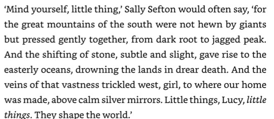
As much as this chapter is focused on establishing the particulars and peculiarities of the setting, it is also the thesis statement for the rest of the novel. "It's just a little thing" will become an arc phrase, to signal when something will be the first in a line of dominoes leading to something more spectacular. Lucy herself is referred to often as a little thing, and we get a swift and flashy example of how her involvement escalates as situation with the fire at the dollhouse, which will follow her throughout the rest of the book.
While the writing trends towards overly poetic and bombastic in places it's ultimately very readable. I do think it plays better as an audiobook. Fennah knows how he wants the material to sound and that comes across in his narration. When listening to the chapter the dialogue sounds fairly natural. When reading it tends to come off as kind of stilted. The usual issues with a self published work are also present, grammar and punctuation errors, formatting issues, nothing egregious but the sort of inevitable little mistakes that slip through when you're trying to get an 800+ page behemoth out the door without the oversight of a dedicated editor. Still so far I'm having a good time with this. Writing any novel is something most aspiring authors struggle to make happen. Writing eight hundred pages of novel with seven more on the way borders on madness. One must be impressed by the sheer ambition of it all if nothing else.
11 notes
·
View notes
Text
quite literally NOBODY asked but long post about the mental illness I gained drawing mattress car door and attic (process and references sort of... id post a timelapse but i don't have one because storage :/) this is more just to look back on because i forget my own thought processes 😔 this sounds pretentious i promise i don't think im that guy i just like to Talk


it is legitimately just taiji taomote's marble statue "death visceration" . like i STOLE IT that was my main reference AND HIS OTHER WORK IS SO COOL you can read a bit more about it here . i actually saw this BEFORE i made my karmor and it made me want to make a karmor just so i could draw mahatma and atilla like this.

i think the meaning??? in my drawing is pretty bog standard basic nothing special there like he's trying to stop his mate from dying innit . the moment was only a couple seconds but i wanted him to have like an anime moment in his head so i guess this was it lol
ummm and karmors pose was partially referenced from these spiderman sketches by j scott campbell (?) hehe so neat i love spiderman karmors pose sucks tho but what can U do lol

ummm started with a sketch and added some colours to see if i actually wanted to draw it realised what the hell sure . gradient maps did not help in this case cause i didn't have a lot of different values so i just did
regular colours
dark blue multiply layer to darken the colours
radial gradient on linear light mode going from blue in the centre to yellow/orange to brown/red on the outsides. radial just means circular i think. like radius circle yea did not know that before i found it on my program lol
blue gradient from the top and red background for some contrast yass
teal blue radial gradient in the centre with ... soft light layer mode??? idk (added after i don't think it's in the picture)


cleaned up my lines (lucario helped) and added my flats and started rendering before i realised layers are annoying and i needed to merge them and paint like a REAL WOMAN!!#(# (joking). when i had some shadows down i merged the layers together and PRAYED (U can see in 2nd img below i painted ontop of the lineart which is sooooo useful)


main shadows for me go like a shade that's hue shifted one way, then another shade that's a bit darker than that one and then a lighter shadow shade that's hue shifted the opposite direction to the first shade to fill in blank spaces i guess idk it just looks a bit more interesting
blending used brush with some pressure opacity and colour picker is amazeballs bc my program's blending tool sucks bruh. i put down a colour with slight pressure and picked the resulting colour and painted with that on hard pressure. doing that just gets you a mix of the two colours and more control over what you put down because you don't have to worry about maintaining a light pressure or anything it's just all paint no opacity
hue and saturation sliders my fave cause u can see what shading colours look good but obviously do that before u merge ur layers... highlights mostly reddish from the background
used a gradient map on black and white to check values (deleted after) and see if the highlights are actually highlights (i should've gone darker with the shadows and had more of a stronger red but it doesn't matter who cares 💔) oh and some super basic hatching in some areas that look a little bit flat
karmors lightning power thingy was a last minute decision honestly it doesn't make any sense considering the lighting but idc . who gaf. maybe using my pencil brush would've been better but i was lazy so just don't zoom in and pretend the random ribbon brush looks in place
export + a little cleanup on a new canvas (barely any cause im lazy) . check how it looks on phone add a cool toned filter to it (using my phone gallery app 😭) and . yeah . also Instagram story crash out is mandatory unskippable step
i also just stole karmors entire outfit from Pinterest you see nothing i do is original IM A FRAUD i just steal and look the other way 😭😭😭😭 AND I STOLE HIS FACE i based him off of the model akeem osborne he is very pretty if only i took the time to practice other hair textures instead of being a bum and karmors hair wouldnt look like POPCORN in the final image GOD
I also just cannot paint and. can't draw faces from weird angles . but im glad i drew a full illustration i don't think i really have like this since 2021 😞


okay ya that's it bye
8 notes
·
View notes
Text
Tagged by @luvo27 once again thank you I love these tagging games wheeeee
Fic Writer Ask Game:
how many works on ao3?
11
total ao3 wordcount? 115,152 what a fun number
Top 5 fics by kudos?
So Sweet Saluteth Me
Then Begins a Journey in My Head
To Have a Giant's Strength
In Our Peevish Opposition
Eat Your Heart Out
What fandoms do you write for?
Batman and Batman adjacent mostly nowadays
Do you respond to comments?
I call my mom and cry to her while I read the particularly nice ones
Angstiest Ending?
Honestly the only truly angst thing I've ever done would be I Want to be a Passenger in Your Car Again and I would say that's more of a hopeful ending maybe?
Fic with the happiest ending?
Literally all of them. Love fluffs. Probably Then Begins a Journey in My Head has the most sappy ending that I really indulged myself with. Eat Your Heart Out and So Sweet Saluteth Me both have the most, healthy endings?
Do you get hate?
Knock on wood. No.
Do you write smut?
Not yet! Sincerely interested in trying just because it seems like good writing practice. For whatever reason I feel confident at writing smut even though I've never done it before lmao. It might be Punisher and Daredevil related tbh.
Do you write crossovers?
Not yet! A while back I thought SW and Marvel & DC crossover would be super fun but that world is just, way too big
Ever had a fic stolen?
Omg no. Again knocking on wood
Have you ever had a fic translated?
Not yet I think someone once mentioned something though and I'd love to see some of the fics translated
Have you ever cowritten a fic?
Not yet!!
All-time favorite ship?
Not really have ships. Even when I read things that are categorized as ships, I'm more interested in the platonic aspects of the relationships. I want to see how people interact beyond the attractions.
WIPs you want to finish but doubt you ever will?
Don't think I doubt it because I still have the outlines for All in Good Yuletude. It's just a matter of time and stuff lol
Writing Strengths?
Memories haha. Rendering and all the watercolor texture things.
Writing Weaknesses?
Getting to the point. Tackle the actual things and not talk in circles. Be obvious. Also sometimes just be plain and straightforward. I'm too worried about things be boring sometimes.
Thoughts on mixed language dialogue?
Very much depends on the languages being used. Some I feel completely comfortable transcribe (is that what it's called) into English but some..not so much. I feel pretty strongly against using butchered English to indicate that someone is speaking another language though. It indicates a level of hierarchy in different languages and more importantly a perception of different levels of intelligence between the characters. I'd love to be able to introduce more languages especially for characters like Batman. It would add so much to his personality (imo). But the concern is whether it would make the reading experience quite annoying.
First fandom you wrote for?
When I was in grade school, Harry Potter. (And I did get some hate back then haha people could be ruthless towards 11-year-olds)
Favorite fic you've ever written?
Eat Your Heart Out. It was longer and I got to have a lot of lovely interactions with people during it. I think it helped me to learn and write new types of scenes etc and I loved adding all the mundane tidbits/injecting my own hobbies in there hehe.
no pressure tagging: @batbirdies , @cetaceans-pls, @imbecamiel, and @lurkinglurkerwholurks (especially because I think a lot of people have done a round of writing tag games not too long ago)
and anyone else who wants to play!!!!!
#I love tag games#Really really want to play a physical version of this#My friend told me that game exists for adults and it's called orienteering#Does anyone want to join me during recess
7 notes
·
View notes
Note
do you recommend puzzle pop? i keep really wanting to play it but i do not want to get apple arcade just for that. but i dont know of any other way to get it... so i keep waffling back and forth. i guess im mostly wondering if you think its worth it, i know youve been posting about it but i blocked spoilers so idk what your thoughts are fully
Hi anon :) This is a very good question and gives me a chance to talk about the game
So for starters: You can technically get a free trial of Apple Arcade for a month and this is honestly enough time to just play through for the story modes. I think there are free Apple Arcade trials offered through Best Buy and stuff if you've already used a trial though. If you have an Apple device I feel like it's good to just go for it and try it out?
My short answer is: Yes if you want to play for story and collectibles! Especially if you're mostly interested in the Fever characters! But no if you are more focused on online multiplayer or the Madou characters. The suzuran group actually get a decent amount of content in this game, especially Ecolo in their main story.
I can't really say if I recommend it because everyone in the fandom has really different tastes honestly? Like, if you care mostly about the Madou Monogatari characters, I don't know if you'll like it because the story focus is heavy on Sig and Amitie…and it raises more questions than anything. So I'll just put a personal pros/cons list.
Pros:
The game looks really nice for an Apple Arcade game. Yeah the models are reused, but they use the expressions/motions to their full potential and the cel-shading is great. I also love the environment design. It also isn't live service so you can play it without an internet connection.
The main story, overall, is really good. There are a few standout side stories too IMO! My favorites are Feli, Witch's, Risukuma's, Ally's and Rafisol's.
So many collectibles. The Puyo Card feature, a customizable ID card you can unlock stuff for, is probably the most fun thing they've added to this game.
There's not a lot of new songs but the new ones are very good.
The inclusion of Nazo Puyo-style puzzles in story mode is a lot of fun, but they're skippable if you're bad at them.
Photo mode is fun. Basically you have a diorama where you can pose the characters however you want, but I haven't used it much.
Cons:
Yes the models and animations are reused, most other stuff in the game is new though!
The main story starts out really strong but does feel a bit anticlimactic in the last act. If you have already read the novel Sig's Secret you most likely won't get anything out of the story, which was the case for me. I've known a lot of people who haven't and cried at the ending though.
Some of the side stories for certain characters are really whatever to me but this is subjective.
The translation can be really weird in places -- I think Suketoudara's side story is where it was at its worst, but there are random errors scattered throughout the English translation...
The music selection is a bit weird to me. Like, Rafisol's theme isn't in the game but the Color Tower theme is? It's just a weird selection.
The challenge dungeons for unlockables can feel really tedious since you're not guaranteed to get characters' special items. If you have a grind mindset and really enjoy Puyo Puyo gameplay though, this is probably fine.
The online is terrible and nonexistent. This kind of renders the Puyo Card moot if you really care about showing it off.
You will need a controller for some of the harder stages. The touch controls are fine if you just want to get through the story, but you'll need a bluetooth controller for more precise inputs.
I basically do think it was well-constructed at the start, but most likely Yoshino (the writer) ran out of space or time for the last story in the game.
#inquiries#anonymous#Yoshino's characterization bias was also really obvious in this game lol#puyo puyo#long post
13 notes
·
View notes
Text
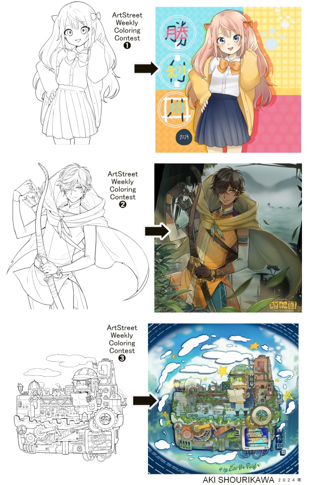
Blog No.003🍊 24年5月10日
「Let's Talk About Coloring+Rendering!!」
~ The Chaos of Akehhh-style Layering w/ Colors & Values ~
ArtStreet recently released some weekly coloring contests and as someone who likes joining 'em + colorwork being the absolute joyous part in drawing for me, I got really into it!! One of them somehow won and I still have the raw .mdp file of it with most of the layers unmerged... so, I thought there might be some value in sharing my chaotic coloring progress with it. There may never be an opportunity like this again...
CONTENTS:
Preface・・・・・・・・・
The Linework・・・・・・
Composition + Planning・
The Render・・・・・・・
Additional FX Tips・・・・
The Layers of Dread・・・
1. Preface
I use the free software MediBang Paint, which is made by the same folks who made the aforementioned art-sharing website, Artstreet. Although its file type extension is .mdp, it can also save as and open .psd files all the same.
If interested, you can download it on their website here! I believe it's available in both PC, Apple, iOs, and Android (also on the PlayStore). ☞And here is my google drive link of my fully rendered entry's raw .mdp file. I also included a .psd version that should be accessible with most other softwares like Photoshop, Clipstudio, etc.
NOTE: Not sure how some layer effects will be displayed apart from MediBang though (either in name or function) . But I think "multiply" and "overlay" is fair game on most drawing/photo-editing softwares with layer systems.
Either way, ↑this is just a bonus thing if you wish to see for yourself how much my MediBang cries everytime I work on something, since visuals of the rough step-by-step will be provided here as well!
At the end of this post, all of the layers' purposes will be explained...y-you'll see...
■And just as a disclaimer: I'm an instinctively self-taught illustrator who is a heavy visual learner, so there are certain methods I do that I cannot readily explain with back-up studies on color theories or formally taught techniques in art schools and the like/certain made-up terminologies that may or may not exist as something else. I mostly operate on instinct, observation, subjective preferences, and vibes, so this would just be me trying to verbalize my process (with visual aid) as a means of share-rambling, rather than actually directly "teaching" anything, I think haha You can take it as a cautionary tale too, honestly-
※I will also be going through this with the assumption that the reader has some background knowledge on digital illustration and general drawing basics + lingo. If you have any questions or needed clarifications, please feel free to let me know!
Although art can be fundamentally "wrong" when it comes to achieving certain specific styles, structures (especially when involving realism as the standard), or general executions of intentions/themes, I am of belief that there is generally no wrong or right 'way' for drawing anything; or for doing ANY type of artistic endeavor for that matter. This might be perceived as a "bad anatomy defender" / "no need to improve, then" stance on my part, but it is absolutely not the case! An artwork is never finished, there's always room for improvementsーa galaxy's size of a room especially for myselfーbut I just think anything at all that brings you an expressive or creative outlet, joy, or peace of mind is worth pursuing, regardless of your own skill or tact and there's no shame in that. I do not wish anyone, especially people starting out with drawing to be discouraged for having their own different approaches in comparison to other people's works by misconception of, "oh, am I doing it wrong?". Sometimes having different or an uncommon worldview is not always a 'bad' thing, I think. Heaven forbid artists actually start getting creative and unique―
What I will be presenting here is simply my one way out of thousands of thousands of different possibilities. So, let's start★
2. The Linework
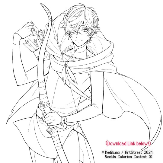
Equally lengthy talk of lineart is probably for a later discussion, but here is the template provided by ArtStreet for the contest + what will be colored in for today.
☞The contest has since ended, but you can still download the lineart template here if you'd like!
3. Composition + Planning
The contest rules said it's "OK to draw backgrounds", so let's go!!
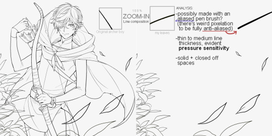
I had already decided on how I want to color it early on: It will be more scenic in nature, rather than stylistic. So, there will be more focus on looking 'real' than 'aesthetically stylish'! Just so it doesn't look disconnected or too out of place, I tried to draw my additions similarly to how Mr. archerman's linework looked as much as possible.
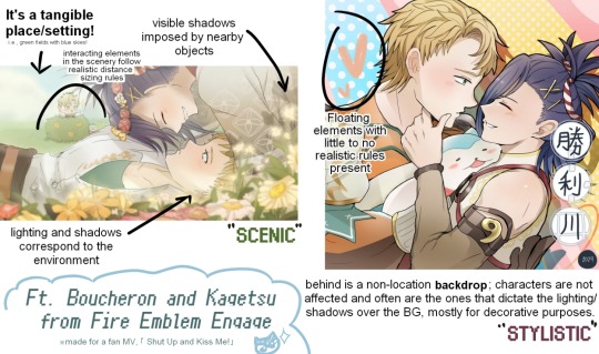
This how I visually define "scenic" VS "stylistic" illustrations (in my head)
I like experimenting and mixing different rendering techniques with varying linework styles and tend to think about my approach with the rendering long before the coloring process, even waaay before I line my final sketch, usually. But for this, I'm simply working with what was given to me.
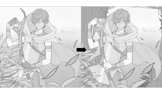
At first, I just wanted a "cool breeze w/ leaves flying away ahhhh refreshing~~" mood, but the space at the side of his head looked rather empty as is, even with Nessie. So I thought about putting him inside a vague...darkly-lit abandoned ruins-setting to eat up some of that space.
And with that, it's time for colors.
4. The Render
My coloring process is the lengthiest and often makes people who see me color in real-time scream in horror, but I think it's actually fairly simple and can be summarized into three nutshelled stages:
①Fill in the colors with a finalized palette of your choice,
②cry Continuously render until your arms fall off you're satisfied.
③ cry even HARDER (optional) Adjust accordingly to fit in better with other elements of the illustration, such as with the focus/subject to background. *will be explained later.
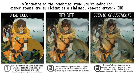
oh and btw, the usage of the words 'render(ing)' tends to be confusing with its association with other mediums like 3D models, but when it comes to drawing I like to think of it this way:
🎨Coloring is the planned/intentional selection of your color range, tints, tones, and palette to use in a drawing, ☀Rendering is the act (or product) of the set of techniques (including effects, filters, etc.) you use with the colors/values to create the illusions of depth, shadows and light, movement, warmth/cold atmospheres, etc in a 2D illustration.
But that's just how I define it with my own step-by-steps. Otherwise, I think either term is pretty much interchangeable.
Anyhoo, what do you think should this man's hair, skin, eye, and clothing's colors be?
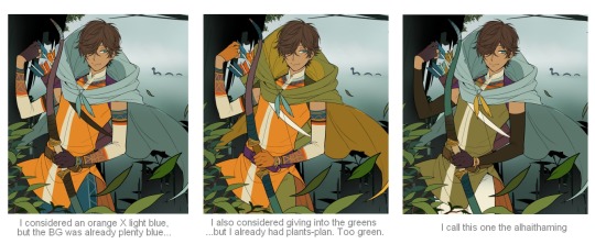
here are some of the variations on the color picks of his outfit that rotted my brain for about 3 hours straight, like it's a 2000s dress-and-match flash game
The many submissions for the contest had many fun color combinations and interesting interpretations I personally think should've won. I saw a lot of blonde archer-princes wearing greens, browns, and blues, as a lot also went for the "forest hunter boi" vibe. But I was saddened by the lack of my favorite colors being used as the primary colorーorange and yellow. So, let's use those!!
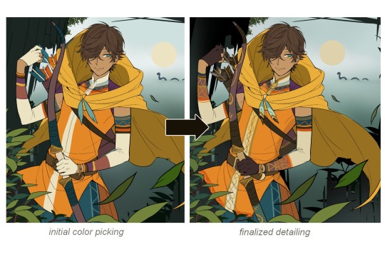
The start of my coloring/rendering journey is never at Layer '1'.........
―Starting with what I've always referred to as "environment prep":
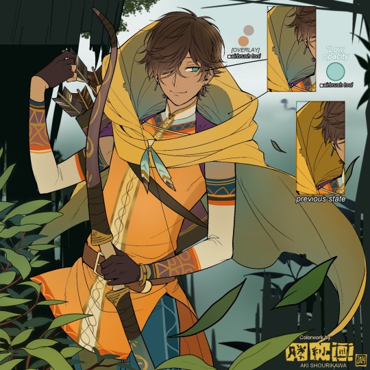
The purpose here is to 'set' the base colors so they match with the environment or general atmosphere. Get ready to see this over and over
This could mean adjusting the saturation, or spraying gradients of the BG's most prominent color on parts that...gives me anxiety the most-
As someone who tends to work with very, very bright color schemes with character designs, trying to blend in when the illustration is meant to be scenic or 'serious' in tone without it being a distracting eyesore can be a challenge. So, this is what I do to counter it.
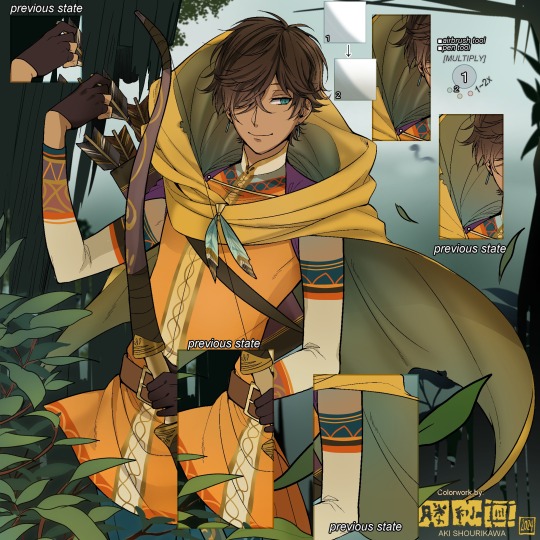
Shading is usually an early step for me as well, even though I think it's a lot of other artists' near-to-final step. I tend to lean towards an abomination mix of soft shade and cel shadeーthe strokes are sharp enough to trace where the shadows start and end, but softened around the edges for effect.
I also tend to apply an additional spray of subtly darker shade on top of the first one? It's usually on spots where I think the light source won't be hitting as much. I wouldn't do this for simple styles (stylized illustrations like with a chibi style), but for scenic illustrations I find it's necessary to achieve that depth against a fully-rendered environment.
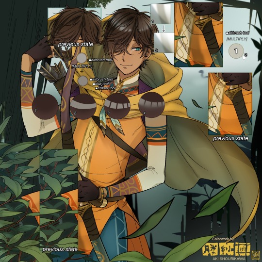
※Just a side note: You may see multiple things changing around, but in real time I'm most definitely working on one part at a time lol. These visual aids were ripped off the raw .mdp by hiding some of the layers, so that's why different areas seem to progress together all at once, even if that's a bit idealistic in actuality.
Apart from the previous adding of shades with a multiply-mode layer for the preliminary shadows, I add one more layer of shadow on there for objects or other characters that can cast distinct shadows on the subject. In here, it's the bow and the hovering strap across his chest.
Lighting is also starting to be added as well.
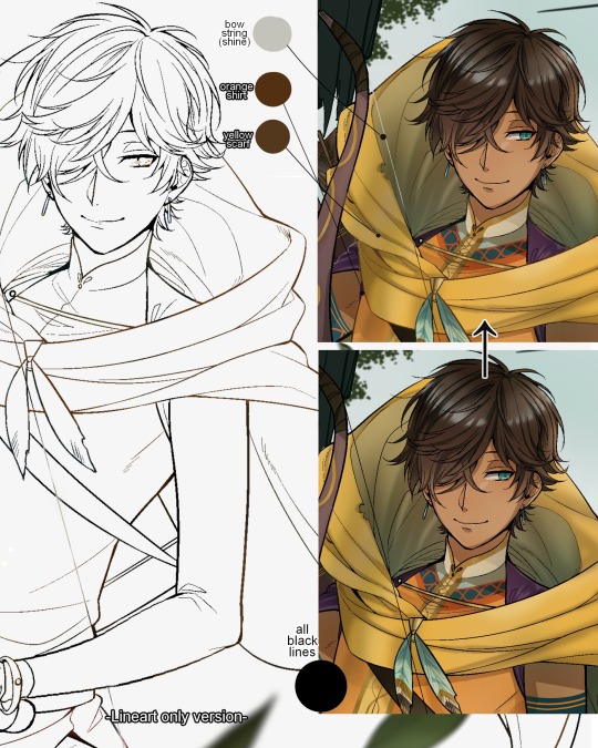
One direct alteration I did with the lineart template was change the line's colors. I find it really softens them to mix better with their filled-in colors + as well as not stand out too harshly against a light-colored scenic background.
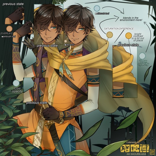
I think you now have a good idea over my hyperfixation on making sure colors are 'vibing' well against the BG lol A lot of these steps are basically just doing the same thing over and over with new layers for the sake of this purpose, really.
And after that, just repeating all the stuff we did with the character onto everything else (background, foreground, objects, etc.) until you're satisfied with it!
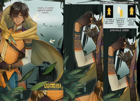
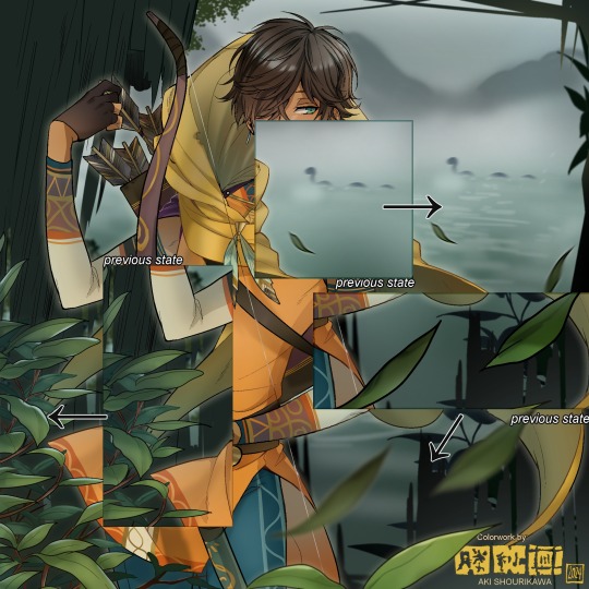
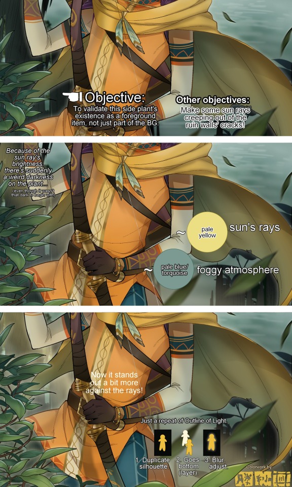
A lot of these changes are very subtle on their own, but makes all the difference in the bigger picture, I think!
Just maybe some additional finishing touches for some boom shakalaka and...that's pretty much it! You will notice that throughout the entire process, there's a lot of random little things that suddenly appear or change with seemingly not much purpose or meaning on its own. I unfortunately have always drawn in this sort of vague, quickly impulsive, directionless way since I was a child and I don't think even I will ever understand it, logically. It's mostly a... continuous string of instinctive feelings of "HEY let's do it this way, if not there's like 10 other things we can try next", is the closest I can get to an explanation of how it feels.
I don't know if it's common for other artists to think or function this way, but I do know for a fact that many people seem to be surprised and confused when they see me drawing in real time this way. Everytime I get asked 'how' I draw certain things, I say things like 'I turn my brain off and vibe with many, many layers with a broken back.' and people think it's just a dismissive joke. I-it's really not, it's literally what happens, I don't have any secret shortcuts for you-
Hopefully this very lengthy post + visual aids can help demystify some misconceptions on what "really" goes on when I'm drawing! It's also a bit of an update of my tutorials made for friendos starting out with digital drawing back in 2015!
Anyway, the rendering stage is where the simplified steps ② and optional step ③ branch out like a fork in the road for me; I don't think one is any "better" than the other, I think doing either is simply a matter of personal preference and artistic choice;
➋being leaving all that 100++ layers rendering that we just did alone and calling it a day,
➌being a little bit more extra w/ additional shadows/lighting that corresponds with the environment the character is in.
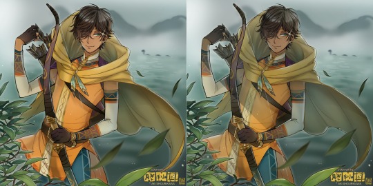
I removed the walls to see the whole figure better in a side-by-side comparison. I like the unadjusted (L) without the wall, but with the walls in the final illustration, I think adjusted (R) felt 'right'. What do you think?
There are some things, although realistic, don't look that good as a visual aesthetic and are just downright excessive/unnecessary to add to certain types of illustrations.
Then there's things that aren't possible in real life, but artistically? Looks really dang cool. Being biased for either ends of the hyperrealism and hyperstylized spectrums of styles is fine; only as long as no discrimination is involved towards people who don't share your opinions, in my opinion-
and to conclude this section, I say,
『 You go render however you wantーhellーno colors even necessary if you wish!
Simple ≠ laziness, just as much as complexity ≠ skill。』
I will never stop yapping about how a lot of minimalist styles require so much more amounts of planning and effort to make sure everything is nice and clean, especially compared to mindless rendering loops like these. Mine's a maximalist hell and I wouldn't have it any other way, but I greatly envy minimalist artists that can render with just something like my step ① with so much grace and tact; not a single stray or wasted stroke!! Anyone who dismisses these types as "lazy" I will violently stuff inside a couchーwithout any potato snacks to snack on!!!
5. Additional FX Tips
Just a shorter section for some optional finishing touches tips'n'tricks used in this I frequently (ab)use☆
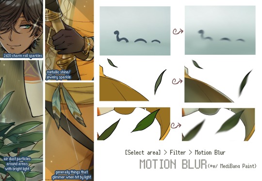
◆ From the very beginning, even before I understood how to draw, it's always been a tradition to doodle around sparkles all around the place. I usually do it with MediBang's sparkle brush if I want it to look polished, or simply draw it manually using either the pen or airbrush tool for a cruder charm.
◆ Motion blur is great, and MediBang in particular also has different types of blur effects like Gaussian and regular blurs. If your software doesn't have these effects / if you're working traditionally but still want to achieve the illusion of motion in a still drawing, you can still achieve the same effect through your linework! Try looking into incorporating action lines (commonly seen in manga and comics) into it. Otherwise, purposefully drawing something blurily to begin with oughta work as well.
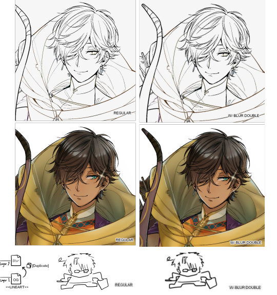
◆ Apart from changing the lineart's colors, there's also this little effect that is achieved by duplicating the lineart and blurring it. It gives something like a...'dreamy' quality to it? The higher the blurred copy's opacity is, the more emphasized it makes everything look.
6. The Layers of Dread
At long last we've arrived... at my MediBang's repeating demise for all of eternity...
Here's a preview of what the .mdp/.psd file of this colored entry's unhingedmerged layers looks like + how I try to validate their existence. When I work on full-sized illustrations, I tend to merge layers as I go, so this is probably one of the rare times I can show something like this without either mine or your PC dying. If you'd like to see, play around with, and toggle them for yourself in all of its............glory, feel free to download it here.
Yes
we're starting at Layer 611. Enjoy.
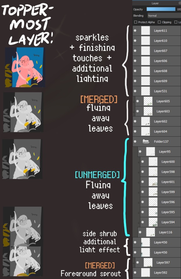
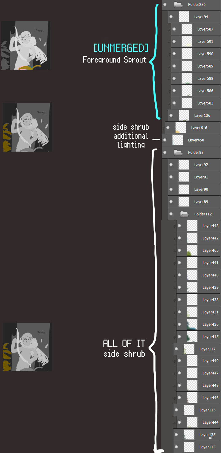
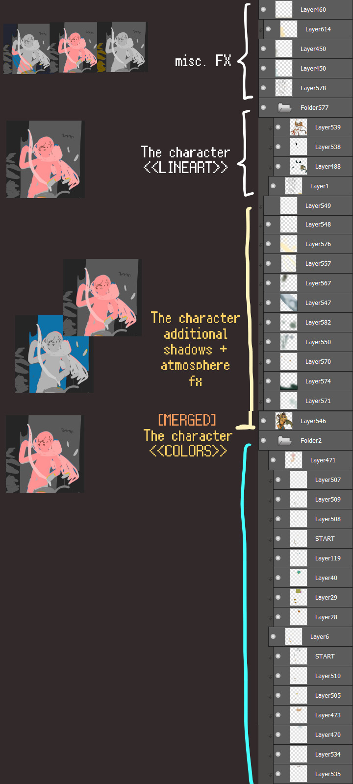
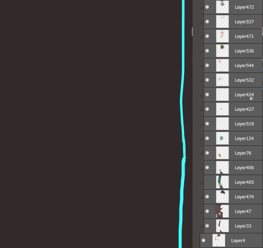
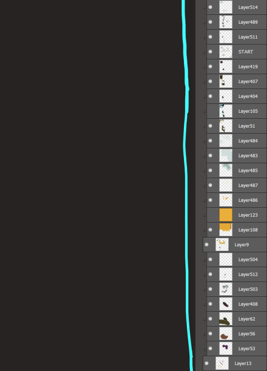
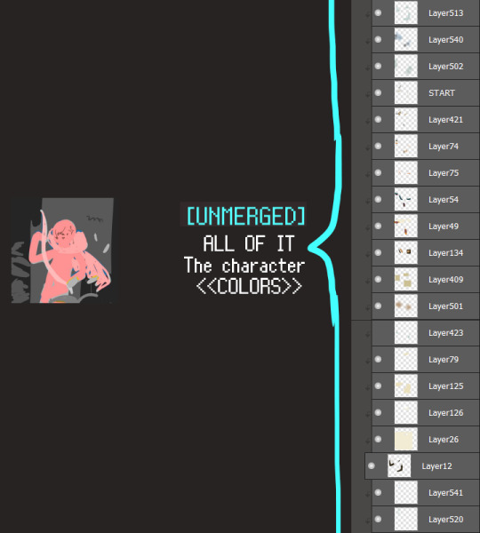
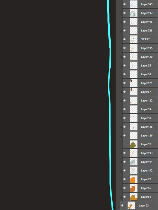
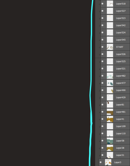
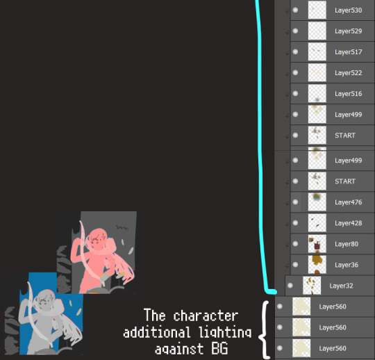
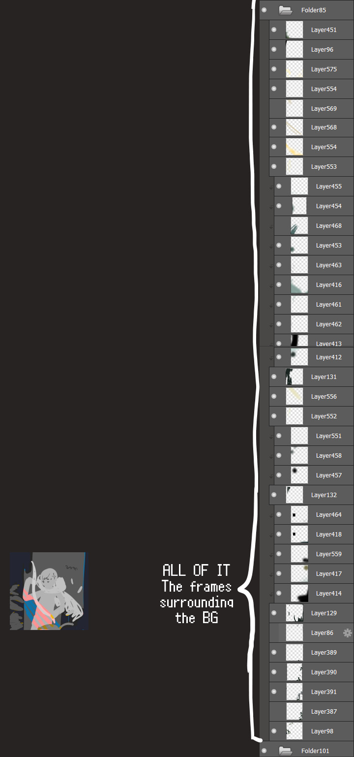
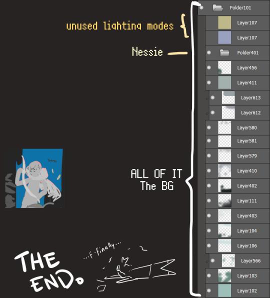
I will now delete my PC's copy because jfc that's one too many MBs ...and it's still eons lighter than what I usually work with on my own full illustrations from sketch to finish......。 (;´༎ຶٹ༎ຶ`) thank you for reading this far and making it out alive, goodbye for now...
・・・ホームページALL LINKS・・・
・Art Gallery・Commission Info・Free resources・
#art blog#long post#coloring#coloring tutorial#art tips#art tutorial#digital art#digital illustration#digital drawing#digital art tips#digital art tutorials#medibang#drawing journal#drawing process#illustration#coloring practice#nessie#the loch ness monster#🍊
34 notes
·
View notes
Text


Basically a big Hoyo wallpaper dump. XD I just felt artistic when I got home today. I honestly wasn't intending on making so many Sunday ones, but honestly people made a bunch of pngs of him that were awesome art so there was just more available for inspiration. Like I would really love to make another Aventurine one, but I didn't have an idea of other motifs to do with the other renders I have. I'm actually even pushing it on creativity with the last Sunday one.
But anyway, new Zhongli one that I think is finally better than the other two I made and like a better motif and scheme than the other two. I mixed a texture in with like his profile plate thing. I used the traditional characters for his name because my Japanese computer doesn't seem to like simplified.
Aventurine's is pretty straightforward, but I played with the colors a bit to try to get both his yellow-gold color along with his green together in a nice blend. The roulette there is a screenshot from his trailer too.
Sunday's one's the first two are basically playing with lights for the most part. I go a generic render of a piano for the 2nd one to try to like emphasize some mad playing skills, and honestly sometimes I forget that he's very musically inclined. He kind of reminds me a little bit of how much I liked Nodame Cantabile back in the day because his boss motif is as a conductor (Chiaki), but like his trailer is all the piano (Nodame). The web event was violin though, which doesn't really fit that reminder other than it being a classical instrument. I guess also a bit of Eternal Sonata because that game is all Chopin. The background of both of the first two does actually have game screenshots though. The first one has the Penacony Grand Theater, but mostly darkened out as I lit it so that it seemed like he had sudden divine inspiration or something. The 2nd one is a screenshot from his trailer where one of himself is playing in the theater. Underneath the big piano him is a tiny version of him also playing the piano on a different layer. The light beam is from that background image so I placed it in such a way so that it'd light the bigger image of him and played around with the lighting to hide most of the rest of the background.
The third Sunday one I think I was getting tired and I don't think I got the lighting exactly right. I'll probably get around to another one like I came back around for this Zhongli one in the future. The background is an actual cathedral picture and I just played with the lighting and colors to try to get something cohesive. Placement and such though I was trying to like make him seem like really holy and like rising up like an actual angel. He's like so biblical motif and very seraph-y. I kind of wish there were renders of him with the six wings, but I think this is okay.
I honestly don't really know why I wanted to do so many Sunday ones, but I just did. Like I said the art was pretty and he's out right now and also escaping my pulls. ;o; I really don't want to spend that much money on him, but also I'm trying to make a secondary team for my Dan Heng Imbibitor Lunae because my main team is a break team with Aventurine and Acheron, and I just want a team of my favorite boys. Also, for real all these boys from the walls I've made recently are yellow. Like Dan Heng's the other day because he's Imaginary and had some gold on his outfit, but Zhongli has yellow gold from being Geo and both Aventurine and Sunday are also Imaginary, but have a lot of gold in general in their motifs too. I was actively trying to change the text color in the Sunday wallpapers so that not all of them would be yellow.
Sunday makes me think of a bunch of things though because I didn't really like him so much at first because he was kind of a dick to Aventurine. But then like after his fall and events with his sister, it seemed like he probably was actually okay and just misled by his adoptive parent, but is also very genuine in wanting to help people. Just misled on the how and the helicopter parenting kind of POV. But like he seems like he genuinely wants to learn and does seem to have regret for his mistakes. Like he genuinely seems like a very sweet boy that really just wanted to try his best and got it wrong. I hope he learns a lot on his travels. But like also, I was raised by a Catholic mother who took me to church sometimes. My English name is a biblical name too, and I don't really care so much and I don't really believe in organized religion because I feel like a lot of churches are corrupt or like really hypocritical in how they interpret scripture or even like...just dumb. Like I don't really think they follow the spirit of things and like hold on so tightly to words that were written, chosen, and translated by fallible human men who had their own agendas they were pushing. Like Sunday's story route is like a child who was raised in the church only to meet the outside world and realize that the religion he was taught was full of hypocrisies and hate that he wasn't aware of, which is how I felt growing up where there was what scripture and churches "said", but then I also didn't want to be a mean jerk to other people? So yeah, Sunday kind of just hits a spot for me.
10 notes
·
View notes
Text


i wasn't sure what i wanted my first post to be on here but i decided on posting my artwork from my basic drawing class !! ( ill be posting my final in another post )
i finished my first semester and this drawing class was honestly my favorite one and ive definitely learned a lot and did things i never thought i'd make tht im really proud of. my main medium is digital art but ive been wanting to tackle more traditional art and this was a fun way to do so, we mostly used graphite, charcoal and prismacolor pencils ( mostly in black, terracotta and red ) for our work !! ill put under the readmore what each piece is abt so if yr interested, feel free to keep reading underneath !!
i made sure to put these in the order we were assigned to do them but if yr ever curious abt one particular piece, feel free to send an ask!
Perspective
This was our very first assignment! We learned abt 1, 2, and 3 point perspectives during class and were assigned to take or choose a photo in one of these perspectives, pick a minimum of 3 things and then draw boxes in the proper perspective in place of the chosen objects !! i ended up choosing my mess of a workspace to do for this one !!
Imaginary Space
This one was another perspective focused drawing but we were assigned to choose a perspective and then draw a variety of shapes of our choosing to create a space we could theoretically have a difficult time walking through. I actually had an idea of make it look like claws were coming out but simplified it cause the original concept was not working too well!
Rendered Objects
This is where we started learning about shading! We were assigned to pick 3 different shapes and simply render them with a medium of our choosing! Since I was doing a lot of graphite work, I decided to use a blue prismacolor colored pencil for this and really like how it came out!!
Grid Method
During this time, we actually began working on our first still life but next to that, we learned about the grid method which then became our next homework assignment! We had to choose and take a picture of an object ( preferably something small ) and then use the grid method to scale it and draw it onto our big 18x24 drawing paper !! I ended up on simple scissors that I have because I actually did this last minute and felt horrible but my teacher still really liked it !!
Overlapping Objects
This one was very interesting! So originally this assignment was supposed to be two different ones assigned at different times but because we missed a day of class, my teacher gave us the liberty of choosing either one or if we wanted to, combine them which is what I ended up doing. The original two assignments were to do a personal still life on toned paper using charcoal and white chalk or pick an item and draw it in different angles and sizes to make it look like objects floating in space! I really wanted to do the overlapping object one but i wanted to try out the toned paper too so that's what I did and my teacher really loved this one!! ( also it was absolutely a mess to work with lol )
Still Life
This was my very first ever still life I actually did and I'm so happy abt it !! This was an in class assignment that we worked on for about 3 weeks and were allowed to finish at home on the last day and turn it in as our next assignment ! I am so so happy with how it came out and i'm very proud of myself for going out of my comfort zone with this !! Realism is definitely not my style but poking at it in this assignment definitely made me feel a bit more comfortable with it and maybe one day ill do another still life to keep practicing !!
Drapery Study
This was our next " still life " assignment !! This was a nice change of pace because not only was it just one " simple " object but i decided to work in color for this one and use a red erasable prismacolor pencil ( it was also very messy and smudged but it was still fun regardless ) !! Learning how to render the folds and how deep the shades should be at certain areas was so fun and my teacher really liked the result as well !!
#my art#traditional art#artists on tumblr#still life art#graphite#charcoal#chalk#prismacolor#drapery study
3 notes
·
View notes
Note
I love ur art so much!!!!🥹🫶🫶 how long have u been drawing for? and I was wondering if u have any tips(?) for drawing cuz im trying to learn how to ehe👉👈
thank you so much!! sorry for the late response
i honestly dont know how to answer how long i've been drawing for because i kinda just been doodling since i was a toddler but i started doing it more seriously when i was in 5th-6th grade and then digital art when i was around 12? it doesn't really matter when you start though
tips!!!!!!!!!! this might get long i hope i dont sound pretentious
in my opinion, art is 70% observation and 30% putting it into practice i.e. you first have to see the concepts and the breakdowns and the details before being able to use them at all. they're not going to appear by brute force or out of thin air unless you first observe that they exist and how they are used.
i have an entire archive on art tips and breakdowns that i store that cover basically everything like anatomy, color theory, composition, perspective etc. i also have an archive for art that i just enjoy looking at and want to emulate! that doesn't necessarily mean to copy verbatim someone else's style, but to pick up details in how they use colors or how they conduct lighting or how they paint a landscape. it's to pick out what makes their art so appealing and figure out how that can then be used to apply to your own art! I also just like looking at beautiful art to inspire me :)
general tips i think are really good for improvement vv
study the difference between cast shadows and form shadows. this is REALLY helpful in making your art look more 3 dimensional. for simplicity's sake, cast shadows are generally more hard while form shadows are generally more soft (depending on the form) and every object has a combination of the two. the way that you can see it most notably and then apply it is on clothing, where the clothing folds will cast a shadow while also being rounded and have a form shadow
color and light are deeply intertwined and something that you can use is cool shadows/warm light or vice versa! this doesn't ALWAYS apply, but it is a good starting point.
think of shadow not as an addition but the starting point while light is where you are adding. therefore, the shadows should be heavily influenced by the environment that they are in, i.e. a white box in an entirely red room is not going to have gray shadows, but red shadows. when the white light is shined on it then it becomes white.
use dynamic lighting to create the sense that something is real! this can be done in the way that either your shadows are rendered while your light has little detailed or that your light is rendered and your shadows have less detail
when referencing, use at least one or two "reference" lines that go across the entire picture horizontally or vertically so you are not trying to draw everything relative to each other but instead search for where something is relative to that line and you will be able to then capture the proportions in much more more comprehensive manner
i think this one might be overdone but break everything down into simple shapes!! it becomes a lot easier to understand something when it's not as visually complex and then after you have gotten down the basic shapes of a figure
use blank space as a guide (when referencing or otherwise). sometimes something isnt looking right when you have tried to redraw something and that might be because the blank spaces in between the lines of the figure and outside the figure arent actually matching up!
the heat of your drawing is determined by the dominant colors and when trying to make a color more cool or warm, you don't necessarily need to shift your hue over to that color. for example, if you have a predominantly warm color scheme with strong oranges/reds/yellows/pinks, if you wanted to have bluer shadows all you need to do is to make the color more desaturated. it will pop out as blue because your colors are mostly warm
make shadows a bit more lighter/saturated in the insides of them because light is being reflected onto it
this one might not apply to you, but it really helped my art when i stopped trying to force myself to do lineart. there are ways to improve at lineart but i prefer not to do it and to just create multiple layers of sketches and then at the very end after i've colored i create a layer on top of everything to clean up the messier bits
implement light fall-off! tbh i don't reallyyy know what this is i just see it a lot but it's basically a really saturated red-orange that you mostly see on skin where the shadows meet the light
pick what your brightest and darkest colors are going to be when you start coloring. i would normally stay away from pure white or pure black because by picking other colors as your brightest/darkest you can create mood and tone
fade out the hair at the edges of it because hair isn't really a block despite often being drawn like one. it's a large collection of strands and as it nears the edges those stands would begin to thin out in comparison to the cneter. in addition, add flyaways to your hair to make it more realistic because again, it's a collection of strands that is usually composed into blocks because that's how it looks most of the time
alright that's kinda all I got for now there's so much more i could talk about but i think this is getting long LOL... i hope that at least one of these is helpful in some way, shape, or form <3
12 notes
·
View notes
Note
how do u color so nicely? sorry for such a vague question but your style and the way you color and shade stands out so much to me, its super unique, do you upload speedpaints or anything?
Lol its ok thank you so much! I haven't made a speedpaint since I was like 12 but they were fun so I could record more if anyone would be interested
My actual coloring process is hard to describe (and also generally very inconvenient but its the way I like to do things) so i will do my best to show you using this arcade drawing I never posted:

First my sketches are reallyyyyy messy. Also i draw on a grey background because supposedly it helps you choose better colors but idk if that's true. Also here's my sketch brush for CSP if anyone is interested

Second I put down flat colors. These ones are a little messed up since I erased them as I went later but this is the gist of it. My base coloring is messy and usually doesn't cover all the sketch since I change so much as I go anyway

Third i make a new layer above both the colors and lines layers and just paint over it until I like how it looks. usually my rendered/realistic drawings look bad until I do this. For this piece I had THAT ^ until i decided i didn't like it so I colored over it AGAIN: (colored over instead of restarting bc I liked the face)

NOTABLY, the most important part of my coloring process is probably color jitter. I mostly use a brush called flashito on CSP which has built-in color jitter, but you can turn it on on basically any brush you use. It basically just makes it so that each stroke has a slightly different saturation or hue based on your brush settings. It helps me get the color variety I like and works well with my insane painting process.
usually by the time I'm done painting something, I do so much that I can hide the lines and flat colors layers and it'll be virtually the exact same. Here's my arcade drawing without the flats/lines layers on

It's a little tedious but I like how it looks. This is a long post but honestly in short I think using a brush with color jitter will do a lot for you if you like the way my coloring looks. If u don't want flashito here's how to turn on color jitter on any brush on CSP, not sure about other art programs though

As for shading I honestly think I'm not very good at shading but i'm just critical because I'm myself. Usually i just try to remember that if the lighting is warm then the shadows will be cool or some sort of similar rule. unfortunately i love bright colors so it is hard for me to follow this
#not art#ask#I should start tagging asks#I'm glad my coloring style is unique because my sketching style is so inconsistent so it's my crutch
8 notes
·
View notes
Note
"How are you holding up? The girls?" a silly question, perhaps, but often one needed an open ended one even if it meant that it was to come with anger first. Maxima doubted it would, but one could never be sure. The Magister watches the girls from a distance, keeping her shoulders straight and thinking, wishing, for a second that things had turned out different. For all the ways he paints himself Varric (@extravagantliar) was a liar that cared too deeply and that ended up in painfully mundane ways. Smiling behind closed lips she thinks that it might even end up being something out of Varric's own books.
Maxima drinks the wine cup in a single go. She would take care of them. As best as she could while being pulled from all directions. Who in this world wasn't being pulled in all directions. Still, it hurt the thought that this might just be the way of the world: young girls growing up without their fathers and those that did realising too quickly how much their faults had shaped them. Curling her lips, pushing the cup away, Maxima makes a mental note to bring her own wine next time. It seemed they were as matched in romance as they were in taste of booze "I want to increase the security around the house. If you are not opposed to it?"
𝐒𝐇𝐄 𝐏𝐀𝐔𝐒𝐄𝐒 𝐀𝐓 𝐓𝐇𝐄 𝐐𝐔𝐄𝐒𝐓𝐈𝐎𝐍, fingers tapping against the stem of one half of a set of wine glasses fetched from the back of the cupboard. it's a simple thing compared to what they'd had in the keep, glass wrought delicate and clear without any further engraving or fluting, but it fits her hand well. there's no use lying to maxima, or skirting around the truth. those keen eyes have always been skilled at seeing through the walls most during the inquisition never cared to even peer behind. ❝ well enough, ❞ she nods with a half smile as ilsa's laughter rings through the garden, ❝ honestly? better than i expected. estie misses the city and complains there's too many trees around, but i think she's mostly just parroting varric. ilsa likes all the flowers and saw a rabbit yesterday which quite the event. i don't think she's quite understood that this all is permanent yet, not the way her sister has. ❞
sidri reaches for the bottle, a sweet antivan white picked up in the village market, and refills maxima's glass before topping her own off. the past three weeks all still feel like a blur, everything a haze in a way that she hasn't experienced since the inquisition. there had been late night talks between her and varric long after the girls had tucked in, too many hushed whispers and sour rumors floating through the city, until there had been one final discussion and a decision rendered.
❝ i told him we would stay and fight it all if he wished, maxima. i would have understood entirely. it's kirkwall, after all, but- ❞ her voice lowers to ensure that no little ears overhear what they shouldn't, her expression softening. ❝ he wouldn't have it. he wanted us safe. that was more important than anything else. ❞
she takes a slow sip of her wine, leaning back in the chair pulled from the kitchen out into the lazy sunlight before reaching for the magister's hand with her own. ❝ you're too gracious to us. you know that, right? i can hardly say no, just so long as it won't worry the girls, but only if you're certain. ❞ somewhere along the line, that line between acquaintance & stranger had blurred into friendship and blurred further still until the woman beside her feels right here somehow, an integral piece of this new place and new start.
sidri makes a mental note to try and find a larger table when things are settled.
#mercysought#SID LOVES MAXIMA THAT FAMILY LOVES AUNT MAXIMA#unfortunately she did take the downing of that wine as a 'oh this is good' reaction#skells we all just dont deserve you tbh
2 notes
·
View notes
Note
4 and 24 for the ask game :)
HI!! THANK YOU FOR SENDING THESE!!!!!!
4. if you can remember, why did you start editing?
I'm honestly not totally sure. I think that originally it was just to make pretty pictures, and to try and make something even 1/10th as nice as the edits people I followed were posting. It was really just me experimenting with photoshop, learning how to draw shadows, learning what the different adjustment layers do, etc. But over time my focus did a very strong change. Now basically all of my edits are in some way meaningful to the character they're about. I rarely if ever do "this is just here to look pretty" edits anymore. Now my edits are my way of sharing a little bit about my OCs with the world. And I know most of my followers don't know anything about these characters and don't care or pay attention to what I do share, but that's okay. Making these makes me happy, and if even one or two people pay attention to my OC lore, that's enough for me. I wouldn't do this and share these if it didn't make me happy. Sometimes, like with the Checkmate render, I get so obsessed with an idea or theme (in this case Sigmar's identity reveal and the accidental chess symbolism going on with Rook) that I just have to get it out of my head or I'm going to explode, and since I can't draw, sims and blender is the closest I can come to realizing images I have in my head. Or rather, descriptions of images I have in my head, because I don't actually see pictures in my head.
24. do you plan edits beforehand or do you make them up as you go along?
Oh, I absolutely plan them out. Well, mostly. I always go in with a very clear "this is what I want this edit to be". For example, for the Judgement card, I knew I wanted Avra to be sitting up in her own grave in a dark forest, with a raven watching over her. Part of the reason I had such a good plan for it is because it's meant to be a recreation of an actual event from Avra's past. The Fool card is perhaps one of the most vivid ideas I had beforehand, because the idea was rotting in my brain for months before I was able to actually make it a reality. The concept of Aspen being used as a puppet by their patron, Fin, had been with me for a long time, so I knew exactly how I wanted to set up the render. I didn't make the pose with this one, but that's because there was already a pose that was perfect for what I was imagining. Mirror Punch was the same way where I had an extremely vivid mental description of how I wanted the render to look, down to the framing and the pose. That's because it's based on my written description of an actual even in the campaign, and is meant to be what the party saw when they came to find Rook after hearing a crash and a scream. Not all of them start out with quite so clear a plan, though. With the Moon card, all I knew going in was: two renders in the same setting (a moonlight forest), one with Carrion's "monstrous" rage form, and one with his "normal" form. The poses were just ones I found scrolling through ts4-poses that fit the vibe.
I'm so sorry for rambling. My brain is more than a little fried after my organic chemistry exam earlier today, and I'm in kind of a "desperate to talk about my OCs/edits/interests" mood, so you get extra long responses. (As if my normal ask responses aren't already long, lmao.)
2 notes
·
View notes
Note
I'm gonna hit you with that 31, 21, 12, and 11.
31) thaaat's a tough oneee. i'm gonna say mt terajuma though? i love the vibes.
21) honestly! either Nimpossible Predicament or A Teila Fire and Ice. new terajuma is just really good i like it a lot
12) matthew changes the way his beard looks every once in a while just to make an 'inconsistency' joke to eizen
11) ( more under the cut because you just opened the floodgates sparkie )
so let's give a quick overview of all of them! let's start with the classic
Hephae Canestus! She's a mechanic at Xen with unhealthy loyalty issues. She likes to stare at people a lot, and she's got a fairly thick southern accent. She comes from Unova and got her love for automechanics from her father.
King Caliburn! He's a grunt in Bladestar who has a hyperfixation on crustaceans. His entire team is crustacean Pokemon, and he aspires to become a veterinarian for aquatic Pokemon- but he also can't stand the way GDC is run, so he's going to help put a stop to that first.
Lusca! King's best friend and boss. A Bladestar Admin who uses mollusk Pokemon, they were the reason King got into Bladestar in the first place. He's also studying to become a veterinarian.
Queen Caliburn! King's sister. A teacher at Axis High, she has no clue what's happened to her brother. She knows he's in Bladestar, but him telling her that went worse than poorly, so now they're out of contact- after the events at the ball, she's worried he died.
Eleanor! She's a "Destroyer of Aevium" - aka the people under Vitus who use wield eleki and drago. She's the owner of Regidrago! She's a very violent and angry person, having been raised to be an aggressive weapon by Vitus since she was a baby. She has a crush on Hazuki which unfortunately leads to her death in the Sanctuary.
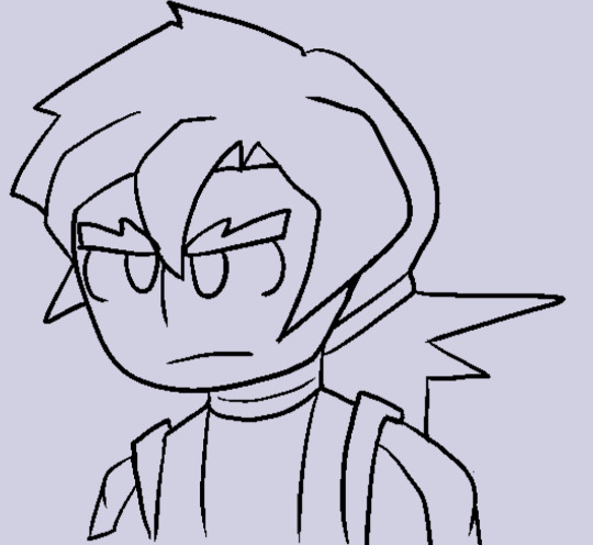
Raiden! The other "Destroyer of Aevium", he wields Regieleki. He's the strong, silent type, and usually lets Eleanor speak for him. He's also Eleanor's impulse control- otherwise, these two would just be getting into constant fights. He can and will beat the shit out of you, though. He manages to live into the modern day, but he's no longer a Destroyer. He's busy traveling.
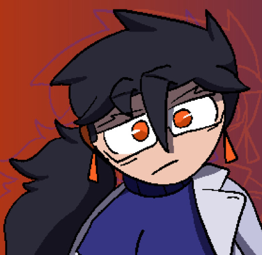
Nathaniel Goode! Not much to go over with him; he's basically Zeight's antivirus system while also being a virus himself. He also coincidentally looks like a Garufan programmer also named Nathan Goode. Why he does is unknown because trying to communicate with him is impossible ( he's too busy fixing the rendering engine )
whew okay breather time.
alright breather time over back to it-
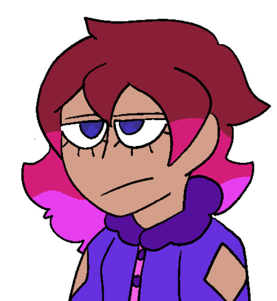
Gale Suite! She's a part of a family of travelers that extend over the rebornverse for the fun of it- she lives in Aevium and helps one of her family members hunt down Zygarde Cells. We'll only go over one of the other Suites to keep things as brief as humanly possible...
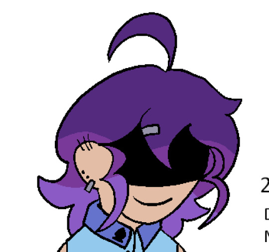
Kim Suite! She's the eldest of the Suites and the scariest. She's got a perpetual smile and a shade always over her face- this is hiding the fact she's actually a 25% Zygarde. She's the one who gathers Cells- mostly Just In Case Something Happens. She tends to go between Reborn and Aevium.
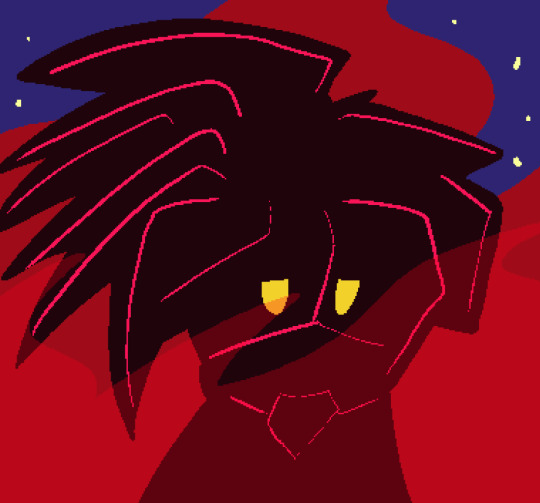
Apho! Xen Mage who has a grudge against Hephae, for some reason. Regardless they're a very quiet person who also happens to be one of the creepiest people ever, constantly muttering about doing very violent things to people they don't like.
Ray and Yra! ( Yra's the one with the hat. ) Interceptor OCs based on the concept of making one different decision. Ray's paragon while Yra's renegade-- the turning point is the aftermath of Mt. Valor, where Yra decides to close herself off from everyone while Ray decides to help everyone get through it. Both are heavily committed to the Bit and tend to fail upwards in most battles.
aaand i think that's it! there might be a few i'm missing but theyyy probably dont have enough characterization for me to discuss or put here. sorry for the too long i aint reading all that post lmao
#mags answers#oc: hephae#oc: ray#oc: yra#oc: king#oc: lusca#oc: queen#oc: apho#oc: kim suite#oc: gale suite#oc: nathaniel goode#oc: eleanor#oc: raiden
4 notes
·
View notes