#i do use ibispaint for textures (noise) and stuff
Explore tagged Tumblr posts
Visit Tumblr Blog
Explore Tumblr blogs with no restrictions, modern design and the best experience.
Last Seen Tumblr Blogs


Fun Fact
When “GIF” was named word of the year in 2012, Oxford Dictionaries U.S.A. credited Tumblr for pushing the word.
Text
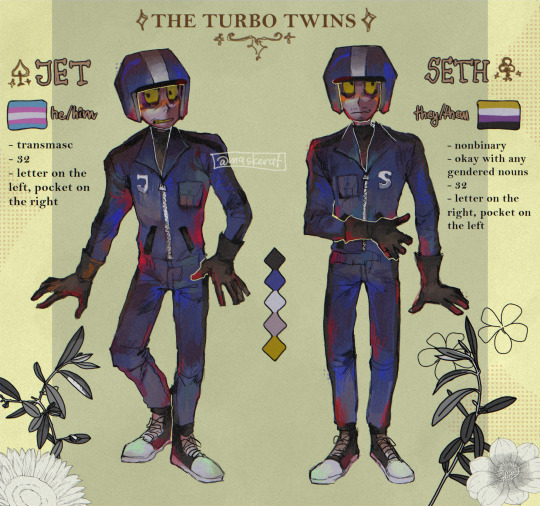
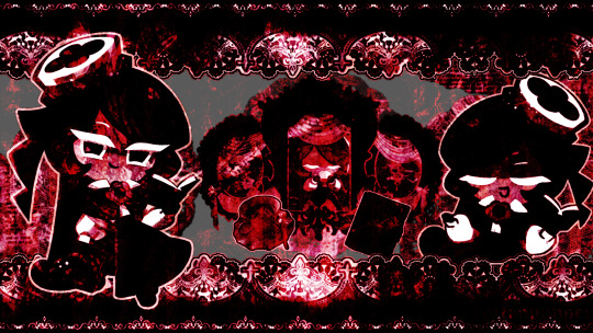
drew my iteration of the turbo twins. also using ibispaint's stock images for decorating is quite fun
#maskerat art#turbotime#turbotastic#turbo twins#turbo#wreck it ralph turbo#wreck it ralph#turbo wreck it ralph#i draw in autodesk sketchbook (or sketchbook pro idk how they call themselves anymore lol) but#i do use ibispaint for textures (noise) and stuff#although i plan on making my own stamp brushes#digital art#illustration#artists on tumblr
512 notes
·
View notes
Note
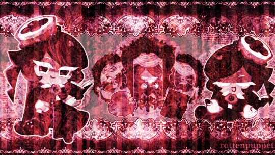
hellooo!! you have really good tastes in ships lol, style and scollace for life omggg :) but i wanted to ask, what brushes do you use to imitate the scott pilgrim anime lineart and stuff?? and in the second drawing how did you get that pixely texture? your art is so good i would love a tutorial HJDSK thank you! ^^

TYSM!! i use the default digital brush on ibispaint for the lineart, and i use the filter on it to make the pixel texture just press on the filter button, then go to "artistic" and you'll see the "glitch" and "noise" effect. i used both of them, (i lowered the opacity on the noise effect so it wouldn't be too much) and got that as my result!! i hope i explained it well enough 4 u 😭
143 notes
·
View notes
Note
Would you ever consider doing a coloring tutorial? Totally cool if that's not ur thing but I'm very curious how you get all the variation on each color like that
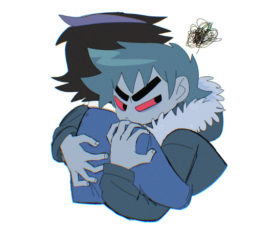
tried my very best. lol. sorry in advance for the headache
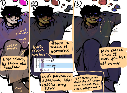
i dont mess with colors too much early on so it doesnt get to messy, my base colors are normally pretty boring. then i add moody filters. this one i started off dark, so using difference or multiply with cool colors (purple.) and i didnt do it that much in this one but picking colors you like from that is Very important
i get almost all my favorite colors in the in-between base colors and dramatic filters colors. mixing them together makes it easier to digest too. i picked a lot of green from Benrey's sweater that i wouldnt have gotten if i didnt use filters.
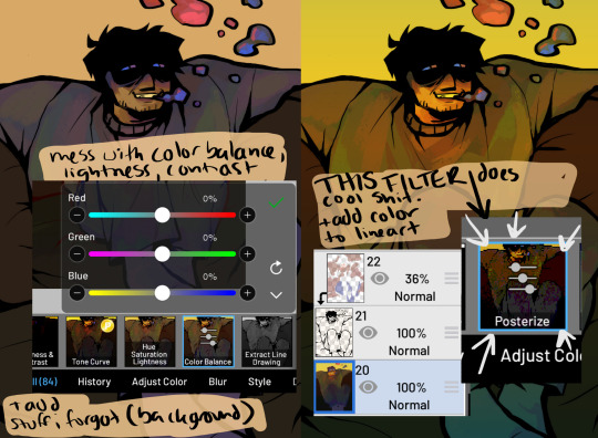
then i go fucking crazy. messing with literally every option i have on ibispaint. this is when i move the files from my computer to my phone. i condense the colors to one layer and the lineart to another so i only have to deal with 2. messing with different hues can change the entire thing. this one ended up being a lot warmer than i meant it to just because i ended up liking it more along the way.
this is also when i add stuff i forgot to do on my computer, ex. the background, and adding color to the lineart.
THEN i use posterize. im not sure what kind of crack ibispaint puts in this filter but im obsessed with it. it ups the contrast in colors and emphasizes them a lot. also adds a cool rough texture. this with a noise filter is my favorite.
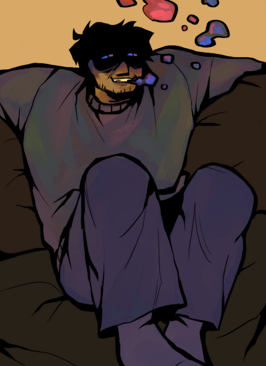
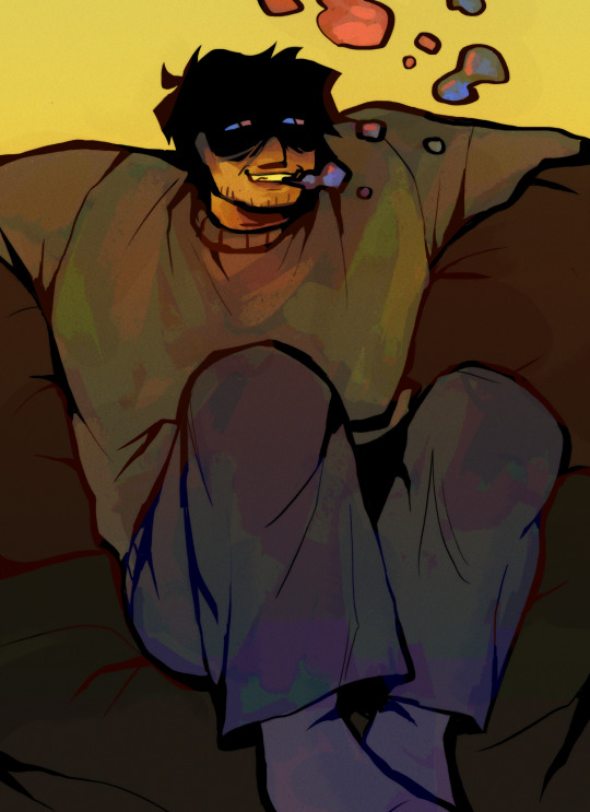
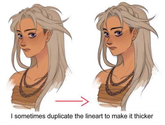
left is messing with just saturation and color balancing, right is after posterize filter and messing with contrast more. ALSO forgot to mention i always double my lineart and blur the one on top. putting it on a low opacity to give the drawing a comforting fuzz :)
edit: sometimes i use the colors i got from the posterize filter to! ill save it and bring it back to my computer so i can make it more detailed. i do that with bigger stuff. this ones just a doodle so i let the filter do the work lol
#i do this..... every time..............#this is why i cant do speedpaints. if u saw rhe amount of in-betweens my art go through youd throw up#asks
31 notes
·
View notes
Note
Hello, your drawings are really beautiful. I hope you don't mind if I ask you a few questions.
1. Which program do you use and recommend for drawing?
2. Are there any tips you can share for drawing?
3. How do your drawings look so smooth? (I use Ibispaint and the drawings do not look smooth at all.)
4. Do you have any advice to get to a better level in drawing?
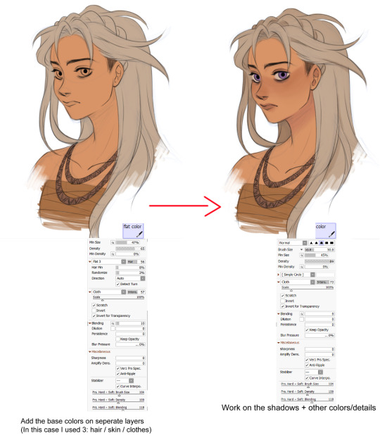
Hi!! Hope you're doing well Anon! And sorry for replying late :'(
Here we gooooo:
I changed the way I work since the last ask I received (I had to because my tablet started acting weird again and my hand would end up hurting by the end TwT)
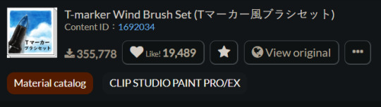
1/ The program I use is Sai 2! And when I want to add filters/textures, I copy and paste the drawing to CSP and modify it there! The noise filter I use comes with this brush set on CSP 👇
As for the program I'd recommend, it would definitely be Procreate! A friend of mine sometimes lends me her Ipad so that I can draw stuff for her and it's always the best experience ever! (far better than CSP and Sai methinks) That's why I'm saving money rn in order to get an Ipad too and finally be done with this old tablet of mine :') (it's a Wacom Intuos CTH-480 if you're wondering)
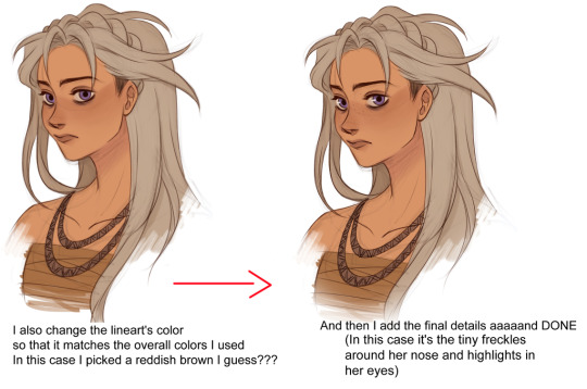
2/ Here's how I basically draw (I hope this helps!!)


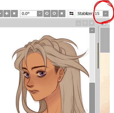
3/ It's cuz I always turn the stabilizer on 15 when I do the lineart >:)
I turn it to 0 when I sketch tho'!
4/ Idk if this is helpful but here's how I improved:
When I started taking drawing seriously I first began by improving on how I draw faces! I would look up my favorite artists' stuff and try to understand how they drew theirs >:) I first would copy their art and then try to replicate it without looking and see if I remembered and understood how they went about it! I then started to combine everything I liked from each until I reached a result I really liked :')
The only downside to this is that I didn't study anatomy AT ALL so I started all over again using the same method but with full bodies, and after I felt like I learned how to draw very basic poses I started looking up references on Pinterest and try to replicate them into basic shapes! And that leads us to today lmao
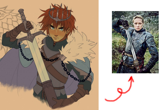
Keep in mind that I still use references to this day! They're very important!! For example, I used Gwendoline Christie as a reference for my recent Robb X)
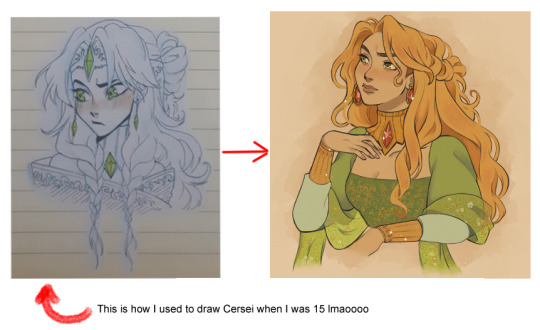
And here's some examples of my old embarrassing doodles:

ANYWAYS, remember that the most important thing of all is to have fun Anon! I hope this was helpful!! And I'm wishing you the best for your art journey :') NEVER GIVE UP!!! 💖💖💖💖💖
31 notes
·
View notes
Note
How do you texture your layouts?
(I don't know if that's the right term sorry..)
no worries! im not the best at breaking down my process, but i'll try to explain it as best as i can under the cut :)
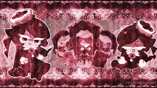
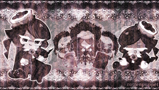
once everything for the layout/graphic has been grayscaled, i make one or two layers for colouring specifically. this mostly just helps to give it a more consistent/vibrant colour
left img is with colour & textures, right img is with no colour / only textures

!! possible eyetsrain warning below !!
as for texturing, i gather whatever overlays/texures i want to use (pinterest and tumblr are good places to look for those) and import them into the file. make sure all of them are on seperate layers as well if possible!
i prerer using different layer/blend modes on different textures, as well as changing the opacity of the textures. i personally like to use overlay, exclusion, and hard/soft light the most, but it helps to experiment~
different programs/apps have different names for each layer mode, but heres the ones i used in the example layout + their opacity lvls. (I use ibispaint x, btw)

in my opinion, layer modes are the most important, as they affect how the layout/graphic looks the most.
the left img is with all of the layer modes set to "overlay" at 100% , the right image is with all of the layer modes set to what is shown in the image above. big difference, right?
the bottom image is also with all layer modes set to "overlay", but with the opacity also set to what is shown in the image above.

i didnt do it with the example, but i also sometimes add a black and white Noise layer, it makes everything look a bit more static-ey which is just a personal thing i like ♡ :)
im not really sure how to end this, like i said i have no idea how to explain my process (im not good with words or technical stuff) but uh hope this helped in someway!
#𓏴 — “ a look behind the curtain? ”#sorry if this wasnt very clear i tried my best =w=" /lh#im not sure if tumblr ruined my image formatting or its just a me issue but oh well
5 notes
·
View notes
Note
do u mind if you give me some rendering tips, helpful art facts or something? Because I drew so many lucs andd I wanna draw it on device but I do NOT know how to render. At all :'D
omg thanks sm for asking!!! ill try my best to give u my tips and stuff when i draw :))
i find it very helpful when i start sketching out my artwork, i tend to draw it rlly small on the canvas so i dont stress too much on the details of the sketch and i zoom it out later on where i do another sketch over it <3
I dont do lineart, i just sketch and go straight to coloring/shading etc. cus i can always fix it up with rendering later and i also try to not focus too much on the characters outfit details cus im lazy and also cus when i zoom out and as long as it looks like how its supposed to look, then im happy
For rendering, i usually merge all my layers together and paint over it or you can always just add a new layer on top of everything and paint on that layer!
I also add like a noise effect on all my works so it looks decent and gets some texture thing lol (opacity 15-20%)
im not the best at explaining , i can always try to do art tuts if you guys want some as well :) i use ibispaint to do my art btw! Also heres a speedpaint, so you can see my process! hope this helps, much love!!! 🩷
5 notes
·
View notes