#i started this devlog with one main menu then halfway through threw it out to make the new one
Explore tagged Tumblr posts
Visit Tumblr Blog
Explore Tumblr blogs with no restrictions, modern design and the best experience.
Last Seen Tumblr Blogs


Fun Fact
In 2020, Tumblr had 29.4 million users in the US.
Text
Devlog - Getting the main menu right
So! Like I said in the last devlog, I’ve been ironing out the kinks of the game and to do that, I started right at the the splash screen and main menu! Because who knew you had to start the game to actually start the game!

the main menu looks pretty now
So I went and did the splash screen - language selection screen - main menu - load game menu (which is actually the save/load menu but since I wasn’t happy with the way it looked, I changed it). I set up the whole thing with a Manager (persistent) Level that controls the actual start of the game and the language selection, with a Main Menu Level that deals with, well, the main menu, and a separate Base Level that’s the level of the whole game (since it’s just one big-ish map).
I still need to test out the loading part and see if I haven’t broken anything (I mean, it was working the last time I checked but you know...)
So, let’s talk about the main menu!
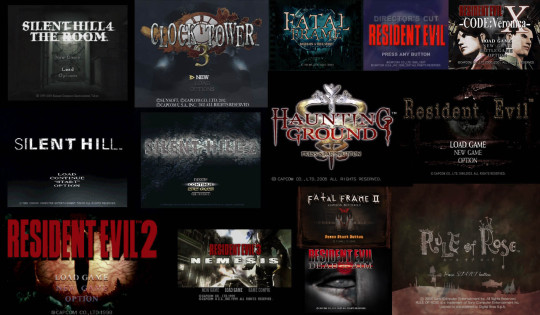
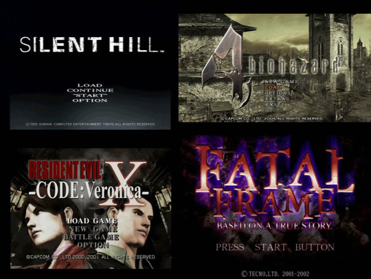
Hello to the reference board!
To go with the PS2-ish (and some PS1 and a GameCube thrown in there) aesthetic, I wanted to recreate the feeling of a main menu from that era’s horror games and boy this was (still is?) hard. Like with most things in this game, it was hard figuring out the balance between purposefully low-res and just plain ugly. And I definitely made some ugly things that I tried to convince myself looked ‘retro’, but on a second look... no.
My first approach was to go with a grunge-y style, since that worked on the game’s textures, but then it didn’t look quite right.

It looked like it was stuck between that era and the modern times, which isn’t really a good look
So I went back to my reference board to figure out why it looked wrong. What I noticed is that those menus either a: had one of those fancy-for-its-time 3D rendered images as a background, or b: had a somewhat cartoon-ish look to the background and logo*.
* What I mean by cartoon-ish look is that, for instance, if you take a look at the Clock Tower 3 one, they had the clock image that looked like it had been drawn instead of a pre-rendered or real image of a clock (as well as the general appearance of the text in the logo). Both Fatal Frame 1 and Haunting Ground had similar aesthetics as well.
This had me scratching my head because my logo had none of those things... oops. I tried switching it up a little, but didn’t want to stray too far from the current one because that’s already the game’s logo. So I tried a bunch of different things, from using a (not really pre-rendered because it was prototyping) image as background, to more grunge, to a more minimalistic approach, ended up with a few happy accidents (one of which I’ll clean up to use a some promo art and possibly the save menu background) and then ended up with what I have now.
Also, I made the logo much bigger because, I mean, look at the reference board. Subtlety apparently didn’t exist back then. (Also bigger/higher def screens, but, you know ¯\_(ツ)_/¯ )

The main menu, now with transitions!
I kinda like it, but that’s also how I felt above the previous version of the menu so we’ll see I guess. At least it’s good enough that if I don’t have the time to change it later it’s not ugly as hell!
The one thing still missing though: It needs to have some big ass white text at the bottom with like COPYRIGHT © something something for it to feel truly authentic
I swear it was a thing
So I got the main menu done, including transitions and stuff (sound effects TBD tho). Also got the starting a new game bit done, though I skipped the intro scenes so I’ll have to put those back in later. Next stop in UI shenanigans: Save/Load Screen!
#devlog#game dev#game development#indie dev#observo#i started this devlog with one main menu then halfway through threw it out to make the new one#which is why this devlog took a little longer to make than intended lmao#i actually started it before the last one
32 notes
·
View notes