#i started using clip studio paint instead of paint tool sai and i am slightly afraid to start rendering again
Explore tagged Tumblr posts
Visit Tumblr Blog
Explore Tumblr blogs with no restrictions, modern design and the best experience.
Last Seen Tumblr Blogs


Fun Fact
Tumblr Inc. is using 66 technologies for its website.
Text
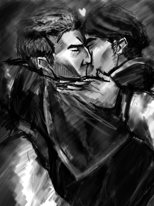

hello regular old burda kiss + holy fuck i cant stop drawing plagueniil from @indigo-constellation's roleswap au (go read it im serious)
#i started using clip studio paint instead of paint tool sai and i am slightly afraid to start rendering again#are you proud of me tho guys#artists on tumblr#art#digital artist#artist support#pathologic#pathologic 2#artemy burakh#digital art#daniil dankovsky#pathologic bachelor#pathologic haruspex#roots rain & reflections#burakhovsky#бакаруспик
130 notes
·
View notes
Text
Artfight Postmortem
as you may know, i am prone to reflection on my art and process and progress. herein, i'm gonna navel gaze a bit about artfight 2024.
top line: really enjoyed myself, did a bunch of new things and this was "The Year of Artist Friends" which is spectacular.
i completed 20 attacks this year, including my first ever mass attacks! altogether I drew 28 different characters (incl 4 of my own).
for the first time, I had *users* i wanted to attack, rather than just characters i'd gathered via search or discord. honestly, three years ago when i picked up the stylus i was just excited at the prospect of drawing for other people, period. artfight was a cool way to be in community without prerequisites. i didn't quite dare to dream i might make some real connections and make proper friends. and yet :) here we are! i went in with three 'art friends' and i'm leaving with at least three more
in addition to being the year of artist friends, this could be "the year of clip studio paint was on megasale a week before artfight" because i knocked out like 2 practice pieces before July 1st so i wouldn't be starting with completely unfamiliar tools, but i used/learned csp for the vast majority of my attacks. one i finished in krita (lonnie), and my final attack i only used krita.
definitely trial-by-fired myself! but it motivated me to explore csp, and most important, gave me a reason to practice practice practice. last year i drew almost exclusively humans, lots of full bodys, because i wanted to get a better grip on anatomy and drawing a variety of faces. it worked then, and, well, i think i learned more of csp in one month of artfight than i would have if i was just plodding through my personal projects for 33 days :) *looks at my wip folder with months old files* pretty sure.
ok i'm gonna look at a few faves/standouts now:


came in hot with 0tt0 here! the main brush for this one (froggy pencil) was a mainstay for the whole month. so versatile!!! and lovely texture. this isn't quiiite brat green but this was what made me go, hmm, what if i... did a few pieces inspired by this album i can't stop listening to?
and then i took a huge turn and just used a soft round brush for Desa and Iryna for my dear friend @bobomcfoe bc i really wanted to turn these out in something approaching my "usual style" of late and i feared getting too deep into the temptations of csp if i put them off. and, um, yeah i love them. i got sooo close to matching that angle but ahh i can see the tilt now! nonetheless, love these two, not least bc brookie has some of the most pleasing color palettes to work w :)


then on to Rosé and baby's first vector lines! you can RESIZE lines in csp. did you know that? i didn't know that. i did forget to use it as much as i could have in later ones though, so i still only kinda know it ig. and halftone shading! bc why not? another thing i really only did this once, but want to experiment with more
Rook here, for my new friend @gender-premium-tm, was me realizing how to use filters/filter layers in csp. now THAT is something i used a lot this month! also something i use often in krita. i must say, though the csp options are slightly more limited (afaik), they have oomph!


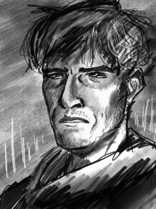
okay these two are my "explicitly brat pieces"! artfight keeps you moving, which i find really valuable, bc i could have dithered foreverrr over Lonnie's gif here. like, do i add his arm? maybe he should be wearing a shirt? or, what if i just draw him twice, instead of splitting the expressi--see it just never ends. and as i am always going on about, art is so precious bc it is a reflection of us when we make it. maybe for some future artfight i'll redraw this (as Lonnie's artist @wenmistry did for me with Ebon this year), but for july 2024, i'm amazed at how well i executed this for just 2.5 days of work! (i did forget his glasses, which realization gave me a different take on the composition, so this is high on my list of potential redraws)
and then Aagatha. this is in my top 3 for this year. the pink just works so well with the green and her artist added the song to her character playlist AND added the necklace to her actual dnd inventory. like. omg. the impact your art can have!!! how freaking cool is that???


two mass attacks! i was in a silly goofy mood. i feel like i really got a handle on vectors w the anthro mass attack, i adjusted every single point on that one by hand. weird what hyperfocus makes you do sometimes, but i learned a lot from that. mainly that i will probably never user vectors as my main linework tool. there are circumstances it is perfect for, and outside of that i'm good w my raster lines lol
which is exactly what i used for this other mass attack, featuring mostly my ocs. hey, sometimes you need to shake things up! i can see here the style starting to hew back to my "usual style", though i'm thinking that might have a lot to do with drawing 5 people very quickly. falling back on practiced techniques. and by this time i apparently knew csp well enough to reproduce them pretty closely! ooh, one thing this made me miss was the transform tool in krita. that floor was ROUGH to wrestle into place in csp.


purple and green turned up a lot this year!
Echo is my crowning achievement with the froggy pencil, most of the shading here is just layers w that. and one last nod to brat green :)
i've worked in the paper cut style before (both my pfp's use it) but i really exploited csp's clipping layers to make Scraps here. they did make me briefly forget how they work in krita when i switched back, so well done w that
i played with gradient maps a little earlier in the month but for Okanar i actually made my own gradient! really a useful tool for ref'ing real human skin tones to make non-human ones, without muddying them up too much.

finally, Chaos. this actually might be my favorite! ironically this is the one that i made in krita. it was like, ahh, yes my old friend. wait where is the scroll bar. ah, okay, yes my old friend... the line layer is set to burn which just makes the whole thing so warm (and the cause of the red outlines on the earrings). used my old sable brush, a pattern fill set to overlay... my old stomping grounds! but plus a rendering technique i picked up this month and some other random habits i picked up in csp (like copying a detail to a new layer, moving it where i want a copy, and drawing/tracing it back onto the original layer in the new position. nothing i couldn't have been doing in krita all along, but made easier by the tool layout in csp, and therefore now discovered by me. amazing how one integrates new knowledge. it's like magic sometimes!!!)
that was a good roundup! if you actually read this to the end, wow! and thank you! i hope it was interesting... and inspiring! bc i want to read about your process and reflections too! yes you! and plz tag me, i'm always down to gush about art XD
7 notes
·
View notes
Text
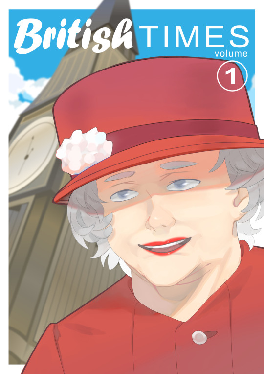
YCA Asset Creation: Queen Elizabeth Illustration + Cover Design
20.03.19
Today I started working on my illustration of Queen Elizabeth for this project. I wanted to have her on the front cover of a graphic novel that I would be designing. The background would have Big Ben, which you can see in the previous post below.
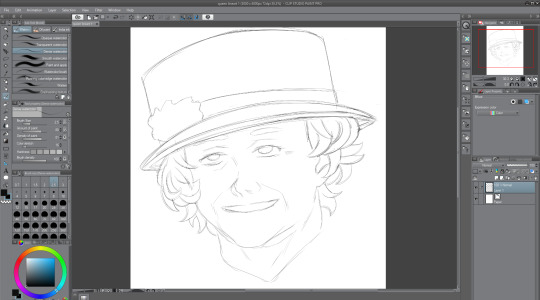
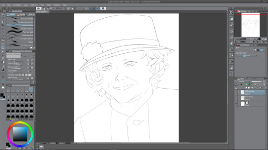
Rough Linework
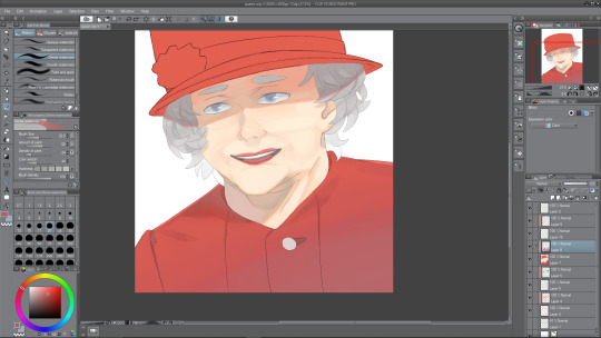
So, to start with, I sketched out a rough drawing of the Queen in a drawing program called Clip Studio Paint. Out of Paint Tool Sai, Photoshop and this, I find this to be my favourite program to draw and paint in. For this rough sketch, I used a thin watercolour brush like I usually do. I used various different reference images from Google. I decided to draw her like how she looks most of the time. I think that the hat and the curly hair are kind of her defining parts. The hair was really challenging to get right—I’m not very good at drawing curly hair/hair in general. The hat looks pretty good too I think. I tried to get it to look like her as best I could, as far as this particular style will let me, and I think I kind of pulled it off, but I still need to improve on my faces in general.
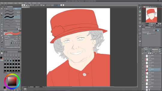
Polished Linework
After finishing the rough sketch of the Queen, I thought it time to go over the lines. To do this, I created a new layer, and then lowered the opacity of the sketch layer, so that I could go just make out what I was drawing over. I don’t really like how the lines turned out once I compare it to the original sketch work, because it kind of lost the sketchy and rough charm, but I thought that I could probably make up for that when it comes to painting it. In this screenshot, you can see her outfit now—it is her usual outfit that she appears in public wearing. I went with this one because it was simple, and I would prefer to keep the focus on her face if possible. Overall, I’m not a big fan of how it looks right now, but I’m confident that I can improve this soon.
Colouring
The next thing to do after finishing the linework was to colour in the Queen’s main parts, so I’d decided that I wanted her outfit to be coloured red, since I was adhering to the colour palette of the Union Jack; red, white, and blue (the blue will be the sky, white for clouds). I chose a regular not-too-saturated but not-too- desaturated red shade for her clothing and her hat. For the moment, I want to have the rose thing on her hat red, but maybe it will look good if I am to make it white instead. I chose a middle shade of grey for the hair, because I would need highlights for it as well as, obviously, darker tones. A regular white skin tone and plain white for the eyes and mouth for now. The mouth is white at the moment as I plan to show teeth, but later on I change this.
So, to colour this in, what I do is I create two layers—one where I will colour whatever I want, so the hat and torso for example. And how I colour is I use a pen to draw around the outside using the red, and then I just fill in the rest because it is much more easy and efficient than colouring in the hat, and then doing the outlines. Anyway, after I’ve coloured the parts, I use the second layer above the coloured one, and apply a clipping mask of sorts. This enables me to paint on this layer, only on the colour that I’ve filled in, an extremely useful feature.
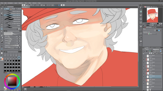
Painting Face I
Now it was time to paint the face that I’d coloured in with the skin tone. I added the necessary shades first, like with her face lines, which I’ve exaggerated in her favour, the shade under her nose and shadows being cast by her hair, look to the left and right of her face. Also, you may have noticed that I completely forgot to draw the eyebrows from the second screenshot onward, so i corrected that below. I painted in the inside of the ear using dark shades also. It was fun to paint underneath the head, where a shadow is being cast. The shadow being cast from her hat makes her look almost evil and scheming right now, I think it may be because the eyes aren’t painted yet. There must be a relatively harsh lighting right now with how dark I’ve made the shadows—probably midday sunlight or something. There are all sorts of shades among the shadows, underneath the hat are a mix of greys, oranges and also a bit of red and pink nearer the top, where the colours from the hat bounce off. The shadow below the head has multiple shades too, mainly the same as the shadow from the hat, except from reds. There is a slight pinkish shade on the left side of the of the shade, bouncing off of the clothing, and an orange shade just under the chin.
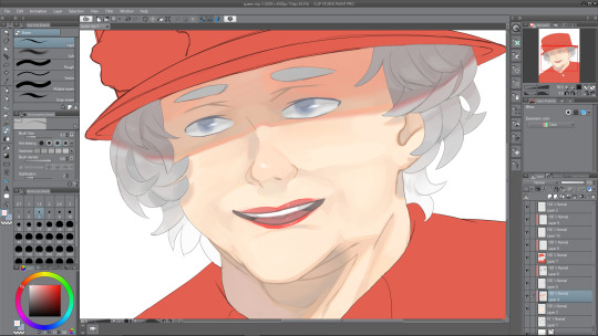
Painting Face II
Next I decided to work on the face some more to try and finish it. I started with the eyes. The eyes were under the hat’s shade, therefore, I needed to paint them accordingly. This meant that the main white in the eye would be a darker shade; grey. I painted her eyes a greyish blue, like her real eyes, and kept the shading quite minimal. After I finished the iris, I went over the outside using the blur tool to give it a soft look. Then I went back to the brush tool and did one white stroke on each of the eyes, and airbrushed a slight white over the middles of them. I think that it really adds to the painting and makes her eyes look less dead, which is something that often unintentionally happens when I’m drawing eyes. After finishing the eyes up, I moved to the mouth. After a bit of experimenting, I realised that making her grin was a bad idea, mainly because I just couldn’t get it to look right, but also because, once I drew her with her mouth open, presumably in joy, it looked a lot better.
I also tidied up the face shading, using the blend tool to blend parts that looked like they were too harsh and intruding. Next I continued on with the mouth area, and painted her red lips. Right now they don’t look very good, like they’re too thin or something, I fix this somewhat later on. I painted a small white dot on her lips to look like a highlight, which I think really goes far. Finally, I worked on the hair—easily my least favorite part of the illustration. For starters, even the sketches don’t look good to me, so adding depth to the hair via color wasn’t sounding too thrilling. But alas, I continued on, and painted them in a way that is acceptable, not great but I’m okay with it, so I continued with the shade from the hat, and painted a dark shadow coming from one edge of the hat to the other. It kind of dips, down and then up at the edges, which corresponds to how close the hair is to the sides of the hat. There aren’t many different shades among the hair, but I did decide to make it get lighter as it went down, no particular reason really, I just thought it would look nice and kind of a little less boring.
Painting Outfit I
Next I worked on her outfit, which wasn’t too difficult to come up with something I was pleased with. I looked at references of her wearing this kind of stiff outfit when I was sketching, and the reason I call it stiff is because there are minimal wrinkles on the outfit, not really any lines to introduce any shading to, and the lighting that I went with doesn’t really help me there either. Instead I used some of my usual tricks to add some kind of nice depth to something that is really flat otherwise. I painted a gradient from a desaturated purple-ish red from the bottom of the composition, to the red that I started with nearer the top. Although, this isn’t to say there’s no shading whatsoever, there is a nice shadow that continues on from the neck from the one that is being cast by the head. This shadow has a nice variety of shades in it, some greys, some purples and reds, and a slight desaturated orange as a bounce light from the skin tone that is very close by. There’s also some other shading as you can see in the illustration. Also a dark shade where the button is sewn through.
Painting Outfit II
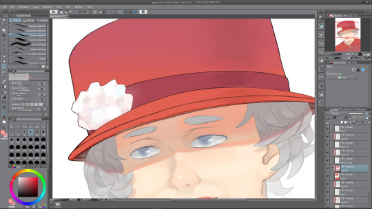
I am nearing the end of the illustration, and next is to do the hat, which I thought would be difficult. Luckily so, I got kind of distracted by my linework—it was really messy still, therefore, I needed to clean it up, which took quite a while to be honest, though I think it was worth it. Essentially, I went over the hat lines with a thicker brush and then erased the thicker parts to correspond with the rest of the lines throughout the drawing. Now, it was a hat, not much I can think to shade really. I did the same gradient trick that I used with the outfit, and then also did a slight darker shade down the right hand side of the hat, to give it a slight beveled effect—make it look as though it was rounding off towards the edges, as a hat would do. I may still work on the hat some more later. I made the strip across the bottom of the hat a darker shade so that it didn’t look too boring. Now, for the white flower thing, I’m not sure what to call it, it was a challenge at first. I started by trying to make each of the points join together at the center where it would be darker, but as that looked terrible to me, I decided on a much more appealing way of painting it. As you can see, it looks quite soft and pastel-themed almost. I used a slightly large brush size to paint these blobs everywhere to create the effect of something that was puffed out. I’m really pleased with how it turned out, and I love the colours that I used in it. Again, looking at it now, the hat will probably need some more doing to it, but right now, I was roughly done with the painting.
Finished Queen Elizabeth Illustration with Cover
0 notes