
Don't wanna be here? Send us removal request.
Statistics
We looked inside some of the posts by unit7designmethodsgeorgesmith and here's what we found interesting.
Average Info
Notes Per Post
0
Likes Per Post
0
Reblog Per Post
0
Reply Per Post
0
Time Between Posts
5 days
Number of Posts By Type
Text
6
Last Seen Tumblr Blogs


Fun Fact
25% of US internet users with an annual income of $80-100K use Tumblr.
Text
Short Case Study into Hiroshi Nagai
04.04.19
So as a short case study, I have chosen to write about one of my favourite illustrators/graphic designers, Hiroshi Nagai. His work is mainly inspired by American pop art, and he says that he would not have started painting if not for his visit to the States in 1973. Surrealism and hyper-realism were also big influences in his work, and some of his bigger early inspirations were Rene Magritte and Salvador Dali.
The summer scenes that he paints are inspired by America and especially Hawaii, and he finds it easy to paint once the summer comes along, but can still paint like he does regardless of setting, which I think is really interesting, since it means that he can paint a summer scene even in other seasons, which is important for artists, who I think should ultimately strive to learn to paint and illustrate something without references.
Nagai has designed various different album covers, below is one for French music producer Onra. This one is my personal favourite of Nagai’s.
https://onra.bandcamp.com/track/all-the-time-2

In this particular example, the sky is painted as if it were a gradient, going from a blue to a lighter lavender colour. This shade of purple near the bottom is likely to be the effect of the skylines and the lights emanating from the city. The moon is out and is a simple white circle. The plant that you see in the foreground is black when viewing it from this angle, and you can see tips of white at the top of the plant; light that is coming from the bright moon. It really creates a sense of depth and shows that Nagai is experienced with lighting. You can see Onra’s name written in English characters that are descending.

The pool and how it reflects the imminent things around it like the plant and the chairs and table really makes it look believable as a pool. The perspective is excellent in this painting as if you are to look above the center of the table, you can see the line of lights goes directly into the distance, and the lines that are adjacent also move inevitably into that same point in the middle. Onra’s name also corresponds with this line. Nagai no doubt did a lot of rough sketches in order to get the perspective correct before he started painting, and it paid off.

After finishing the painting, he encased it in a black box to really accentuate the whole painting. He further added some more text at the bottom, this time over the top of the black; “Nobody has to know”, the title of the album. I like the stylization of the words, first, the first letter of each word is bolder than the following letters, the kerning of the letters is good, and there is just enough space between them where it doesn’t look like he did it just to stretch it out across the composition.

Interview source + Instagram:
https://kaput-mag.com/stories_en/hiroshi-nagai/
https://www.instagram.com/hiroshipenguinjoe/
0 notes
Text
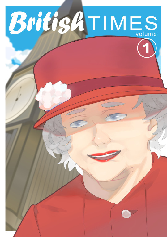
YCA Asset Creation: Queen Elizabeth Illustration + Cover Design
20.03.19
Today I started working on my illustration of Queen Elizabeth for this project. I wanted to have her on the front cover of a graphic novel that I would be designing. The background would have Big Ben, which you can see in the previous post below.
Rough Linework
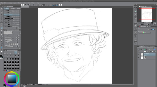
So, to start with, I sketched out a rough drawing of the Queen in a drawing program called Clip Studio Paint. Out of Paint Tool Sai, Photoshop and this, I find this to be my favourite program to draw and paint in. For this rough sketch, I used a thin watercolour brush like I usually do. I used various different reference images from Google. I decided to draw her like how she looks most of the time. I think that the hat and the curly hair are kind of her defining parts. The hair was really challenging to get right—I’m not very good at drawing curly hair/hair in general. The hat looks pretty good too I think. I tried to get it to look like her as best I could, as far as this particular style will let me, and I think I kind of pulled it off, but I still need to improve on my faces in general.
Polished Linework
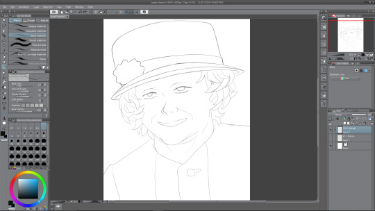
After finishing the rough sketch of the Queen, I thought it time to go over the lines. To do this, I created a new layer, and then lowered the opacity of the sketch layer, so that I could go just make out what I was drawing over. I don’t really like how the lines turned out once I compare it to the original sketch work, because it kind of lost the sketchy and rough charm, but I thought that I could probably make up for that when it comes to painting it. In this screenshot, you can see her outfit now—it is her usual outfit that she appears in public wearing. I went with this one because it was simple, and I would prefer to keep the focus on her face if possible. Overall, I’m not a big fan of how it looks right now, but I’m confident that I can improve this soon.
Colouring
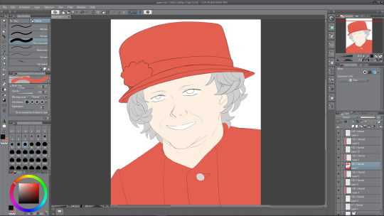
The next thing to do after finishing the linework was to colour in the Queen’s main parts, so I’d decided that I wanted her outfit to be coloured red, since I was adhering to the colour palette of the Union Jack; red, white, and blue (the blue will be the sky, white for clouds). I chose a regular not-too-saturated but not-too- desaturated red shade for her clothing and her hat. For the moment, I want to have the rose thing on her hat red, but maybe it will look good if I am to make it white instead. I chose a middle shade of grey for the hair, because I would need highlights for it as well as, obviously, darker tones. A regular white skin tone and plain white for the eyes and mouth for now. The mouth is white at the moment as I plan to show teeth, but later on I change this.
So, to colour this in, what I do is I create two layers—one where I will colour whatever I want, so the hat and torso for example. And how I colour is I use a pen to draw around the outside using the red, and then I just fill in the rest because it is much more easy and efficient than colouring in the hat, and then doing the outlines. Anyway, after I’ve coloured the parts, I use the second layer above the coloured one, and apply a clipping mask of sorts. This enables me to paint on this layer, only on the colour that I’ve filled in, an extremely useful feature.
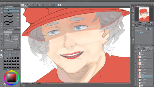
Painting Face I
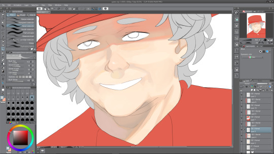
Now it was time to paint the face that I’d coloured in with the skin tone. I added the necessary shades first, like with her face lines, which I’ve exaggerated in her favour, the shade under her nose and shadows being cast by her hair, look to the left and right of her face. Also, you may have noticed that I completely forgot to draw the eyebrows from the second screenshot onward, so i corrected that below. I painted in the inside of the ear using dark shades also. It was fun to paint underneath the head, where a shadow is being cast. The shadow being cast from her hat makes her look almost evil and scheming right now, I think it may be because the eyes aren’t painted yet. There must be a relatively harsh lighting right now with how dark I’ve made the shadows—probably midday sunlight or something. There are all sorts of shades among the shadows, underneath the hat are a mix of greys, oranges and also a bit of red and pink nearer the top, where the colours from the hat bounce off. The shadow below the head has multiple shades too, mainly the same as the shadow from the hat, except from reds. There is a slight pinkish shade on the left side of the of the shade, bouncing off of the clothing, and an orange shade just under the chin.
Painting Face II
Next I decided to work on the face some more to try and finish it. I started with the eyes. The eyes were under the hat’s shade, therefore, I needed to paint them accordingly. This meant that the main white in the eye would be a darker shade; grey. I painted her eyes a greyish blue, like her real eyes, and kept the shading quite minimal. After I finished the iris, I went over the outside using the blur tool to give it a soft look. Then I went back to the brush tool and did one white stroke on each of the eyes, and airbrushed a slight white over the middles of them. I think that it really adds to the painting and makes her eyes look less dead, which is something that often unintentionally happens when I’m drawing eyes. After finishing the eyes up, I moved to the mouth. After a bit of experimenting, I realised that making her grin was a bad idea, mainly because I just couldn’t get it to look right, but also because, once I drew her with her mouth open, presumably in joy, it looked a lot better.
I also tidied up the face shading, using the blend tool to blend parts that looked like they were too harsh and intruding. Next I continued on with the mouth area, and painted her red lips. Right now they don’t look very good, like they’re too thin or something, I fix this somewhat later on. I painted a small white dot on her lips to look like a highlight, which I think really goes far. Finally, I worked on the hair—easily my least favorite part of the illustration. For starters, even the sketches don’t look good to me, so adding depth to the hair via color wasn’t sounding too thrilling. But alas, I continued on, and painted them in a way that is acceptable, not great but I’m okay with it, so I continued with the shade from the hat, and painted a dark shadow coming from one edge of the hat to the other. It kind of dips, down and then up at the edges, which corresponds to how close the hair is to the sides of the hat. There aren’t many different shades among the hair, but I did decide to make it get lighter as it went down, no particular reason really, I just thought it would look nice and kind of a little less boring.
Painting Outfit I
Next I worked on her outfit, which wasn’t too difficult to come up with something I was pleased with. I looked at references of her wearing this kind of stiff outfit when I was sketching, and the reason I call it stiff is because there are minimal wrinkles on the outfit, not really any lines to introduce any shading to, and the lighting that I went with doesn’t really help me there either. Instead I used some of my usual tricks to add some kind of nice depth to something that is really flat otherwise. I painted a gradient from a desaturated purple-ish red from the bottom of the composition, to the red that I started with nearer the top. Although, this isn’t to say there’s no shading whatsoever, there is a nice shadow that continues on from the neck from the one that is being cast by the head. This shadow has a nice variety of shades in it, some greys, some purples and reds, and a slight desaturated orange as a bounce light from the skin tone that is very close by. There’s also some other shading as you can see in the illustration. Also a dark shade where the button is sewn through.
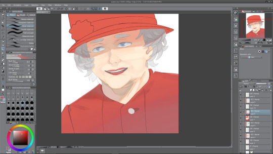
Painting Outfit II
I am nearing the end of the illustration, and next is to do the hat, which I thought would be difficult. Luckily so, I got kind of distracted by my linework—it was really messy still, therefore, I needed to clean it up, which took quite a while to be honest, though I think it was worth it. Essentially, I went over the hat lines with a thicker brush and then erased the thicker parts to correspond with the rest of the lines throughout the drawing. Now, it was a hat, not much I can think to shade really. I did the same gradient trick that I used with the outfit, and then also did a slight darker shade down the right hand side of the hat, to give it a slight beveled effect—make it look as though it was rounding off towards the edges, as a hat would do. I may still work on the hat some more later. I made the strip across the bottom of the hat a darker shade so that it didn’t look too boring. Now, for the white flower thing, I’m not sure what to call it, it was a challenge at first. I started by trying to make each of the points join together at the center where it would be darker, but as that looked terrible to me, I decided on a much more appealing way of painting it. As you can see, it looks quite soft and pastel-themed almost. I used a slightly large brush size to paint these blobs everywhere to create the effect of something that was puffed out. I’m really pleased with how it turned out, and I love the colours that I used in it. Again, looking at it now, the hat will probably need some more doing to it, but right now, I was roughly done with the painting.
Finished Queen Elizabeth Illustration with Cover
0 notes
Text
YCA Asset Creation: Big Ben
15.03.19
After sketching out Big Ben in my sketchbook, I have now decided to create it in Adobe Illustrator. Below is the process behind the final tower. Of course, it isn’t a perfect recreation of the real thing, but I tried to get the main details from images online. Below is one of the main references that I used:

The Process
To start with, the main outline, if you will, of the tower. Since I would be doing it from a worm’s eye view, I needed to get it to look like it was bigger at the bottom. I think I more or less pulled this off. The angle was an awkward and new one to me that I had no experience with. I don’t usually create pieces of architecture let alone from this dynamic of an angle. I think that it has allowed me to get out of my comfort zone and make something I don’t usually do. You can see a lightly coloured line which goes through the building at the corner—I used this as a kind of scaffolding for the most part of the process, and let go of it near the end. It was a very useful idea which allowed me to more or less get the right perspective. The perspective isn’t perfect by the end, but I do think that it more or less looks correct overall.
I chose a kind of golden brown colour, roughly what it looks like in real life. I am exaggerating it a bit, so everything is not completely correct anyway. I chose a darker shade for the place where the clocks would be, just so I could differentiate this from the rest of the tower. I also made it look as though it was sticking out a bit since it is in real life. I think I did this well. The curved part was really difficult to get right however, and I used the direct selection tool to help me get a shape I liked (I use the direct selection tool a lot throughout—much more than I ever have I think). The perspective that I’d gone with meant that the left side of the tower was slightly squished and looked as though it was going down further than the right side. It was challenging, but everything I did on the right side I had to completely do anew on the left side, but more tightly packed together. The top of the tower looks interesting—I didn’t quite capture the pointiness of the original tower, but this is my own kind of rendition after all.

Now it was time for possibly one of the most difficult maneuvers I’ve had to do in Illustrator before—the clocks on the side. Of course, I had to get them to look like they were facing the right direction and also at an angle. This was incredibly difficult to get right and even at the end, I’m not completely pleased with them. The one on the left looks good to be honest, but I’m really not sure how I managed that because the one on the right I just couldn’t do. Here it looks kind of not round—like some deflated thing. I tried my best, and even enlisted help from my tutor, who even helped me to get it to this stage. In retrospect, I could have made the whole thing in the 3D perspective mode, but I don’t think that it would have had the same charm to it that my final design has. Once I was happy to some degree, I did some details like the clock hands and the ring around the outside—no, I don’t plan on adding the roman numerals, they would be possibly even more challenging, since I’d have to make two sets of twelve numbers, and then organize them so that they’d fit with the perspective around the outside. I thought it was unnecessary, since you would most likely not even be seeing the numbers because they will be obscured by the Queen when I get around to illustrating her.
I added some more details to the tower, like with the boxes that the clocks were on top of, the ridges below the clocks that had shadows at the tops to show that they were going inwards. You can see this design in the real thing, so I kind of replicated that in my own interpretation. I used the line tool for it all, and then added those triangle-shaped shadows at the top also using the pen tool. I think that this was a really good idea and gives the tower some depth. I added some gradients here and there like on the clocks and the tower itself, since I like messing around with gradients. I also changed the spiky top to a dark grey, since it feels better in my opinion.

Not too much to say in this update, but I did finish the indents on both sides of the tower. Along with this, I created a little strip of something wrapping around near the bottom of the composition. I noticed it in the real picture, and thought that it was necessary—of course, like I say, I added my own twists here and there to make it look more original by me. I implemented some more gradients here and there, like on the strip that wraps around the side, which makes it looks almost metallic, or at least, shiny, which is what I was going for at this point. I like the gradient that I gave to the indents, as it looks as though it really is shiny, even a little rusty at the same time. It was my way of giving textures without using the effects gallery within Illustrator. The corner of the tower also has a new strip going up towards the clocks.

The Final Design
Below is the final Big Ben design that I created. after the last update, I added some small details as well as some gradients for stylistic choice. As for the small details, I drew some lines near the top of the tower using the pen tool to make it look less empty up there—I couldn’t really think of what else to add there. The bottom of the composition also has some new square shapes as well as a continuation of the corner strip. I gave the clocks a gradient which makes it look a lot less flat and more shiny. As for the gradients on the side ridges, I think these look really nice, possibly my favourite part of the design even. I added some greyish blue tints to pretty much all of the existing gradients, and a new one as the spike at the top. The left side has a more obvious blue tint to it, and this was just to show that the sky is kind of bouncing off of it. The top gradient looks really good in my opinion—like it is almost realistic even. You can see the gradient bar on the right hand side of the screenshot in the Illustrator document. which can kind of give you an idea as to what I was thinking when making them.

Overall, I am very happy with how this design of mine turned out, and I’m glad I tried something new, instead of just going with a straightforward, front-facing view of the tower. I’m really pleased with my own twists that I put on the design, since if I were to try and follow the original design, I don’t think that it would translate as well as my more slimmer design.
0 notes
Text
Ideas and Sketchbook Work for YCA Project
08.03.19
For my YCA project, I plan to create a graphic novel cover with Big Ben and the Queen on the cover design. Though there is no theme this year, I have decided to still do something that represents England, so I think that those two things are perfect for this. It will be the first volume of the series, so I want to make sure I entice people and make them want to read the story right off the bat. Big Ben will be in the background while the Queen will be more in the foreground, though not centered. I probably won’t have the focus on Big Ben, since I want to mainly demonstrate my illustrative skills. I plan to create Big Ben in Adobe Illustrator, since it is comprised of a lot of lines and geometrical shapes. If I were to draw Big Ben in a drawing program like Clip Studio, I feel I won’t be able to make it look good since I’m not too confident in my landscape or architectural illustration skills.
Sketchbook Work
The angle at which Big Ben will be at is from a worm’s eye view—opposite of a bird’s eye view, so everything from the bottom will be bigger until it reaches the top which will be the smallest point of the tower in this case. Big Ben will be in front of a nice blue sky with some clouds spread out throughout the composition. I also think that a lens flare could look good behind the tower, to imply that there is the sun behind it. This will be done in Photoshop once I’ve created the design in Illustrator. You can see the illustration of Big Ben below. Along with Big Ben however, is the Queen, just as a profile shot. She of course won’t be this big in the final composition (I don’t think so at least), since I want to showcase Big Ben too. If I fail to create something I like, then sure, I’ll make the Queen bigger, but if I am actually pleased with how it turns out, then I will want to show that off too, therefore having to mess around with sizes. The pencil illustration below of the Queen is something I did in my general art style by looking at different reference images of her on Google. It doesn’t look exactly like her, but I think that you still get the idea that it is her. Though when it comes to doing the illustration in Clip Studio, I will try my best to get her to look like the actual Queen. I’m not completely sure which style I will be going with, whether it be simple or a painty-realism kind of style, I am leaning towards a bit of both to be honest.
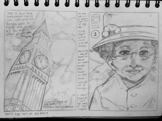
Below are some initial sketches and some notes talking about my ideas. The colour palette that I thought about would consist of a red, blue and white, like the Union Jack. The Queen would probably be wearing something red—or the title that I will eventually come up with will be written in red. The sky would be a nice blue, and there will be some white clouds. These drawings of the Queen somehow look more like her than the drawing I spent more time on above does.
The top image (top right in this case) is the original cover design I had in mind would look (excluding the Queen). It looks relatively the same as how I drew the better version above. The title will most likely be at the top, and the volume number somewhere, probably below the title. The bottom illustration is maybe how it would look if there were no Big Ben, or at least, the Queen was obstructing it too much. I think that this drawing of the Queen best looks like her, so when it comes to illustrating her in Clip Studio, I may look to this for a good reference.
Ideas for the Story
When it comes to the actual story behind the graphic novel, I am not sure what I want to convey just yet. One idea is that it could just be about the current state of the UK, but I dislike politics so I may want to stay away from that, that and I just don’t understand it well enough to be able to come up with a good story—not that I’m writing an actual story for this anyway. Another idea is that it could be about the Queen’s life—of course I don’t know what she does, but I could come up with some kind of entertaining plot that involves her tending to important matters in her way. She would only be on the cover of the first volume, since she is a prominent figure—so other characters would be added to the story, like the Duke and Duchess maybe, various celebrities or whatever, and take future volume cover illustrations. I could make it a comedy of some kind, with the Queen and various other established people. Perhaps future volumes would be centered on different countries and people. I’m sure it would be pretty amusing to see Donald Trump or Kim Jong Un on a graphic novel cover. Maybe some of the gags would include them fighting over nukes. Another idea proposed by my tutor is that I could have the series focus on addressing the news—in an attempt to get younger people to read it more often. If they saw it portrayed in a graphic novel, they would perhaps be more inclined to read about the news.
Final Idea
I think that the idea that I’m most inclined to go with is the bottom two ideas from above—so, to teach the youth about the news, while also including humour, so, a political comedy...? That must be the biggest oxymoron since ‘jumbo shrimp’. The ‘news’ that I’ve been referring to should also mean things that have happened in the recent decade or so, so I guess it could also teach people about the past. I don’t think there would be enough interesting things happening in the news where I could create en entire graphic novel series about it. That, and I obviously don’t know what is going on in the daily news over in America and certainly not North Korea—but, does anyone know what’s going on in North Korea? (This was in reference to me mentioning Donald Trump and Kim Jong Un earlier).
Actual Final Idea
28.03.19
Okay, so I said that the above would be the final idea, but I think that I want to change the story completely to fit the cover more. I know that it would usually be a bad idea to change the story after so long, but as I am not actually writing a story for this book, I feel more inclined to go with something else, especially since after looking at the cover and title, I realize that neither looks comedic or satirical in the slightest, so I need to revise the plot, ideally. The idea that I feel more comfortable with now would be a more serious story that focuses on the Queen’s life, and the people surrounding her. The Queen’s smiling face on the front cover will only serve as a facade to cover up a more dark story about the Queen and the goings on behind the UK. Of course, the story would be entirely fictional and not based upon any real life stories—I wouldn’t want to unleash any dark secrets about the Queen or the UK. I think that the story will start with a young Queen Elizabeth, and will kind of progress as a coming-of-age story where she faces various difficult choices and situations until she inevitably becomes the ruler of England. Yeah, I think that works much better than telling the news, after all, that’s not really what graphic novels are intended for.
Title Ideas
21.03.19
As for title ideas, I’m sort of dry on those. Perhaps something including the words: world, worldwide, globe, global, happening, events, times, affairs, etc. The title probably won’t be something boring, like “World Events” though, maybe it will be a kind of humorous title, even a question of some kind. Some that I’ve thought of: Worldwide Happening, Global Occurrences, The World, Happening, International Instances. I kind of like ‘The World, Happening’ for some reason.
25.03.19
As the April Fools’ Day deadline (I hope it isn’t just some prank) approaches, an idea that I just came up with is “We Interrupt this Life!”, this one is interesting, but maybe a bit of a stretch, my thoughts are that it’s common in television shows that a message like “we interrupt this program...” will show up on the screen when something big happens, so because my aim is to tell the news through comedic and/or satirical means, I think that this would be a fitting title. I chose the word ‘life’ because it is referring to the reader, and how the book is—well, going to interrupt their life if they choose to read on. The word could be substituted for a more suitable choice, but for what, I do not know right now. Maybe even “We Interrupt Your Life!”, but then it kind of just looks like an overly-aggressive marketing advertisement. I have to think about how this would look on the actual cover too, I think it would be good to have two words on the same line and two below—they would also be stylized so that they are not completely uniform, and a bit uneven. Another one that I just came up with is “Six O’Clock!”, this one could really be a stretch, but it is in reference to generally the most common time at which news is broadcast worldwide, to my knowledge (might be 10 actually). I’m unlikely to choose this one, but it’s out there.
28.03.19
After considering it and messing around with how it looks on the cover, “We Interrupt this Life!” just isn’t very good—I said it aloud, and it just sounded stupid in all honesty. The title that I will most likely be going with will simply be “British Times”. It’s the best I can think of, and it fits with the cover (British Times - Big Ben in the background, a clock). I will also most likely scrap the idea that future volumes would be taking place in other countries, mainly so that this title idea will work, but also because I wouldn’t be knowledgeable about other countries enough to write an imaginary story about them.
0 notes
Text
Various Idea Generation Techniques
07.03.19
I did some research into various different idea generation techniques, and below are some of my findings:
To start with; brainstorming. A process which involves essentially just saying whatever comes to mind when thinking of a new idea, with no fear of criticism. Bizarre and strange ideas are accepted with open hands. Usually, the more unorthodox the idea the better. Mindmapping is another technique that is very commonly used in idea generation. It’s a graphical technique that allows for imagining connections between various pieces of information or ideas. Each idea is written down and then connected by (curved) lines to its minor or major idea, which builds a map of relationships. I found a technique called “synetics”, which is essentially a creative idea generation and problem solving technique that arouses thought processes that the subject may not be aware of. So it’s like approaching problem solving and creativity in a more rational manner.

Storyboarding is not so much an idea generation technique but more about developing a visual story to explain or explore. It’s about working on an existing idea. They can help to represent information to creative people which was gained during research. One other one that I had not considered was role playing. In this technique, each participant can take on a personality or role different from their own. This lets you see things from another person’s perspective or angle. Unexpected ideas can come out since it’s more of a fun technique, maybe unlike the others mentioned. Forced relationships is an easy and good technique to use, and what this involves is basically joining completely different ideas to come up with a fresh idea. It’s not a strictly unique solution, but it frequently results in an assortment of combinations that are often useful.
Reverse thinking is a technique that I learned about recently, and it’s as the name suggests, instead of adopting the logical, normal manner of looking at a challenge, you would reverse it and think of the complete opposite perspective. For example: “how could I improve my health?” can turn into “how could I become incredibly unhealthy?” The vast majority of people would find it much easier to produce ideas for the negative challenge. Instead of thinking about how to become healthy, think about how to become unhealthy, such as eating more junk foods, doing no exercise, picking up a bad habit even, and then you’d think, “so, eat healthier, exercise more, and make sure to not fall into a bad habit.”

Daydreaming—a technique not usually held with high regard—is one of the most fundamental ways of triggering great ideas. It enables a person to establish an emotional connection with the problem, which is beneficial when it comes to coming up with a really good idea. Brainwriting, an easy technique which requires one to—instead of shouting out ideas—simply write down their ideas pertaining to a specific problem or question on sheets of paper, for a small number of minutes. After, they pass their ideas onto someone else, and they read these ideas and add their own, and so on.
Bibliography
Cleverismcom. 2015. Cleverism. [Online]. [7 March 2019]. Available from: https://www.cleverism.com/18-best-idea-generation-techniques/
0 notes
Text
Waterfall and Agile Design Processes
07.03.19
Waterfall Design Process
Much like an actual waterfall, this process is a sequential design process, which means that as all of the stages are completed, the designers move on to the next step. Because this process is a sequential process, once a step is completed, there’s no going back, only forward. Though if you were to go back, then you would have to scratch the the whole project and start from the beginning, as this is what it’s about—moving fast, developing ideas and completing the design. There isn’t any room for for error or even change, a project outcome and an extensive and detailed plan must be set from the start and then followed carefully. Throughout the process, the development that you’re going through may not be particularly well-received by a client, or even yourself, as you’re working fast with no changes allowed. You’ll still produce your intended final design if you follow your original plan carefully.
Agile Design Process
The agile design process came about as a kind of “solution” to the disadvantages of the waterfall method, which I’ll be going over after this. So instead of a sequential and continuous process, the agile design process follows a more incremental approach. Designers start off with a simplistic design, which gets the point across—it may not be pretty or exciting, but it does what it needs to do. Then small parts are worked on as days and weeks (sometimes) go by. During this design process, you’re free to go back and forth through the different steps, in order to refine and come up with a better design. Also during this time, client feedback is to be incorporated into the design before the process continues. This process however, with its lack of initial design steps, is often criticized for its collaborative nature that focuses more so on the principles as opposed to the process.
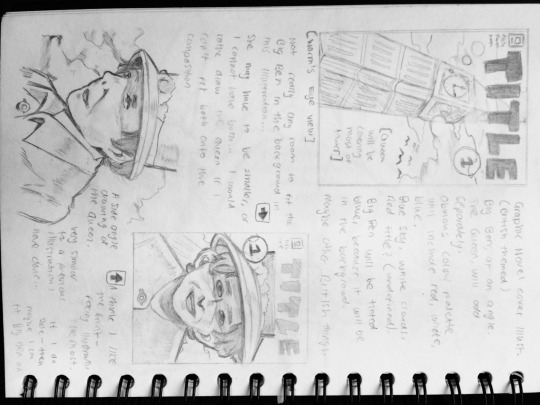
Below is a good diagram that I found which quickly breaks down each of the design processes.

Waterfall Design Process Advantages and Disadvantages
For the advantages, the waterfall design process stresses meticulous and intricate record keeping. Having such records allows for the ability to improve upon the existing design in the future. With this process, the client will know what to expect at the end—they’ll have an idea of how it will look, and a definite idea of what their design will include in the end. As for the disadvantages, the obvious one would be that once a step is completed, designers cannot go back to a previous stage and make changes. The waterfall process relies heavily on initial requirements, however, if these requirements are faulty in any manner, then the project is surely set for failure. The plan doesn’t take into account the client’s evolving needs. So if the client realises that they need more than they initially thought, and demand change, the project will come in later and impact price.
Agile Design Process Advantages and Disadvantages
As for the advantages of the agile design process, it allows for changes to be made throughout the project, after the initial planning. New requests and ideas from the client are to be expected. Since this process allows for changes to be made, it is easier to add features to the design that will keep you up to date with the latest developments in the industry. Feedback from the clients is always available, so ultimately, they will be able to get the design that they desire. For the disadvantages, there’s not a whole lot of them, since as I mentioned, this process was essentially created in order to solve the disadvantages caused by the waterfall process. With a less successful project manager, the project can become a series of stopping the designer to provide feedback, which is likely to make the project come in late and over budget.
Bibliography
Base36com. 2019. Base36com. [Online]. [7 March 2019]. Available from: http://www.base36.com/2012/12/agile-waterfall-methodologies-a-side-by-side-comparison/
0 notes