#is such a perfect combination of these elements that i think evokes a very subtle commentary on minimum wage labor and and and
Explore tagged Tumblr posts
Visit Tumblr Blog
Explore Tumblr blogs with no restrictions, modern design and the best experience.
Last Seen Tumblr Blogs


Fun Fact
There were a total of 171.5 billion posts on Tumblr in 2019.
Text
Obsessed with the way the passenger (2023) juxtaposes the incredibly serious with the comically absurd. And they exist simultaneously, never contradicting each other. I love how it manifests in the visual language of the movie, and is also at the core of the story! I think it's so important to the ethos of the movie that the genesis of Randy's life-altering trauma is sort of ridiculous. It being ridiculous does not change the emotional impact of it on Randy, and it's still treated with tenderness and gravity.
The sharpness of the juxtaposition feels sort of surreal or jarring at certain moments, but I think it's actually part of what makes the movie hit a real, emotional nerve. The thing that's been haunting you for years does not always seem so obvious out of context. Or sometimes the thing haunting you IS so obviously unspeakably bad that it's going to kill you, and the only way you can talk about it is to say something as trivial as, "I wanted to be a giraffe when I grew up."
A fuzzy yellow sweater and childhood sexual abuse. A lifetime of denying yourself agency or personhood, and a woman with a color-coordinated eyepatch for every outfit. A brutal workplace shooting and bedazzled stuffed animals.
Which speaking of, it's also why, in my opinion, the epilogue does work. It reverses the dynamic from serious with a side of comical to comical with a side of serious. Our focus is on the eraser game, the sillier part of Randy's traumatic story, while the lasting impact of violence lurks quietly in the background (Randy's still physically injured, he's still got the jacket). And then the last shot of the stuffed animals is the *chefs kiss* on top of the whole thing!
#anyway. i had to physically restrain myself from writing an additional four paragraphs about all the more subtle examples of this and how#Randy and Benson are both deeply serious and unserious characters and its what makes you care about them and also how the BBB environment#is such a perfect combination of these elements that i think evokes a very subtle commentary on minimum wage labor and and and#ive said it before because of this movie and i'll say it again. when is someone going to start a 33 1/3 type series for movies.#the passenger
295 notes
·
View notes
Text
Brittleheart CRT shader

What’s good! Today I’m going to be talking about a fun little project I took on for the development of Brittleheart: a very basic crt shader. First, I’ll go over the rationale behind its inclusion and implementation, and then I’ll go over the actual methodology (I’ll even post the source code and texture that I used).
I wanted to create a screen effect like this one because one of the main goals in terms of mood that we’ve established for the game is that of loneliness and isolation. I can’t quite put my finger on why at the moment (maybe it has something to do with a childhood spent playing more video games than I should have), but the image of sitting in a dark room staring at a CRT monitor evokes such a strong feeling of isolation that I felt it was a perfect fit.
That said, I know that CRT shaders are fairly divisive, so I wanted the implementation to be as unobtrusive as possible, and of course I also plan to add a slider for toning down the effect.
Anyway, the look can be split into 4 components, and now I’ll go over how I accomplished each of them.

The warping at the edge of the screen is done by using a combination of sub-viewports and a viewport texture applied to a curved mesh. Note: If you’re having an issue with the 2d scene appearing in front of the 3d scene, be sure that the 2d scene is at the top of the hierarchy (first child of the subviewport container).

The actual CRT effect (screen door, chromatic aberration) is really just a small texture tiled across the screen and then multiplied against the original screen texture. Very very simple. You can fade the effect out by using the Mix() function with the original texture as the first parameter, and the combined crt and original textures as the second parameter, and then whatever value you want as the third parameter. Theoretically, you could even set up some sort of function to change this value based on the screen_uv and make the effect more or less visible at the edges of the screen.
The most subtle effect is the downscaling. I was having some issues with certain game elements not aligning to the pixel grid because secretly the game is being rendered at 1920 * 1080 and not 480 * 270. This means objects controlled by physics, and elements rendered through code (think line renderers) would not be aliased properly. This was hardly noticeable before I added the CRT effect, but after I added it that meant that there were instances where only have of a pixel would be lit up and it looked terrible!
My solution was to downsample the entire screen texture to make it so that every pixel would be made up of uniform sub-pixels. This had the added benefit of making the code-rendered elements look more cohesive with the existing art style.
Finally, the bloom. To really sell the feeling that you’re playing this game in a dark room late at night, I had to add a little glow. This was accomplished very easily using Godot’s built in bloom feature, which can be found as part of the World Environment node. Just add one of those bad boys to your 3d scene and observe as each pixel of your new crt screen glows comfortingly.
Here's the actual text of the shader: CRT.gdshader
Whelp… that’s all folks! Thanks for coming to my Ted Talk. Peace.
0 notes
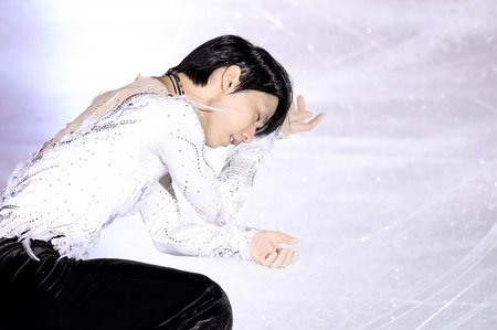
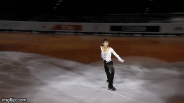
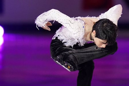
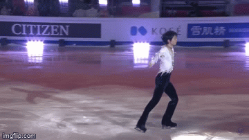
Text
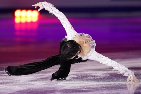
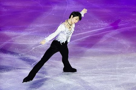
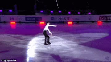
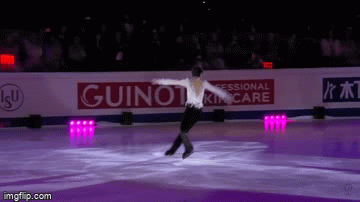
The Swan. Harmony under the starry sky.
Translator’s note: Today is Yuzuru Hanyu’s 26th birthday. To celebrate the date, wonderful Yulena gave us this technical and emotional analysis of the Notte Stellata, that I would like to share. Yuzuru has become an inspiration and has brought hope to so many people. And in the times of adversities, I cannot think of a better program to keep in heart than Notte Stellata.
Notte Stellata (”Starry night”), a program choreographed by David Wilson, is one of the best exhibitions of Yuzuru Hanyu. A song by Italian trio Il Volo set to the music of Saint-Saëns’ The Swan and of the same name became an unexpected gift to Yuzuru.
In April of 2016 renowned Russian coach Tatiana Tarasova told Yuzuru: “I have a song for you, a song I would like to see you skate to very much”. And she gave him a recording.
“I was very happy that coach Tarasova reached out to me. I admired the rivalry between Plushenko and Yagudin that made me desire to get serious with figure skating and to become Olympic champion. That’s why I was truly happy to receive music directly from the coach of the sportsman that once stood at the very top of the victory podium in Salt Lake City.” (c)
Yuzuru has already turned to the swan theme in his short program White Legend. With this beautiful program set to the music from Tchaikovsky’s ballet Swan Lake arranged by famous Japanese violinist Ikuko Kawaii, Yuzuru competed in 2010-2011 season. In the first part of the autobiography Aoi Honoo (Blue Flame) Yuzuru shared that the melody of the White Legend is sorrowful but despite that it gives a feeling of setting wings free and brings strength to fight the adversities. After the Great East Japan Earthquake, this program for him became connected to the restoration after the disaster, that is why Yuzuru chose that program for the first charity show in Kobe (in April of 2011) and as the exhibition program of the season as well as the exhibition in Olympic Sochi.
youtube
Japanese papers named that program 星降る夜 (“The Night of the Falling Stars”)
Yuzuru’s recollections of the first days after the tragedy spent in the evacuation center come to mind. All the lights were cut off the night following the earthquake, and the sky full of stars could be seen above.
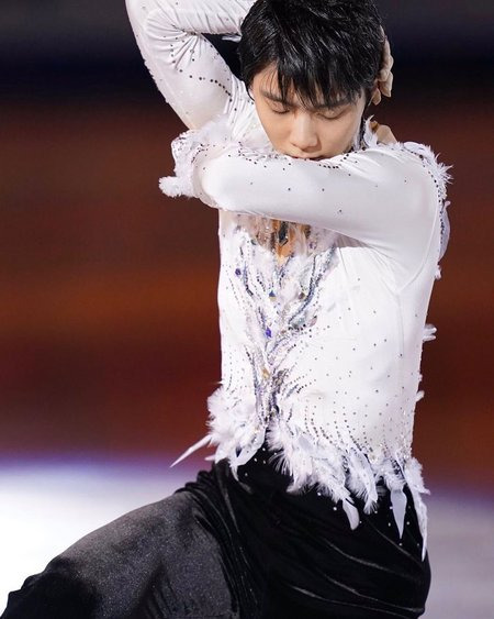
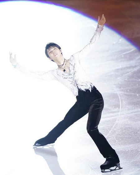
Even though both programs share the same theme, Notte Stellata shows us a different Swan, delicate and fragile. A symbol of light, love and hope.
This symbolism can be seen in the pattern on the rink and in the skating elements, in the choreography’s delicately reflecting the lyricism and gentleness of the music, and the dynamic accents of the vocals.
The composition of the program consists of several key elements that come together with the music to bring laconicism but also sophistication to the choreography. Prolonged lobe on the left foot, multirotational twizzles, Ina Bauer, hydroblade, spread eagles with the change of edges and sit twizzles are scattered across the program as if they were pearls on the thread of the melody. Those elements create unique harmony between the music and the movements.
Composition-wise, there are two main ways in which choreography is used to highlight those central elements: execution of the elements at the peak of the melodic phrases and the execution of the elements as accents to the rhythmic patterns of the music.
This new Swan image is also shown through the shining white costume with deep-cut neckline both at the front and at the back, that might represent the purity, delicacy and fragility of the beautiful creature.
Starry night on the forest lake. A swan glides across the water...
The program starts with a soft intro and laconic choreography highlighting the tranquility and serenity of the music. There is some choreography posing into back inside three-turn, followed by a couple of running steps and a prolonged forward-outside lobe on the left foot.
The LFO lobe last through the last two parts of the melody. This lobe and the right arm softly going down at the end speak of tranquility.
The vocals come in to three variations of the half-lunges, gentle and ceaseless movements of the body and hands in harmony with the soft intonation of the melody.
Guarda che lago che luna c’è.
The image of a beautiful bird is created with the vocabular made of delicate movements of the body, the head and the arms, even with the simplicity of the basic running steps.
The main element of this part is the multirotational RFI twizzle at the peak of the musical phrase, that brilliantly highlights the prolonged vocals.
In the next part, choreographic accent is put on the expressiveness of the body and arms. There is a mazurka jump at the change of the musical phrases into a lunge and a knee slide with soft “enveloping” arm motion.
The elegant pose in the lunge with the lowered head and the smooth line of the outreached arms with the loose wrists evoke the image of a bird spreading the wings.
What a pity that this lunge lasts just a second!
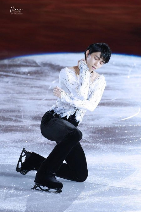
Arms wrapping and enveloping the body in the knee slide highlight the tenderness of the melody and the softness of the vocals. Yuzuru melts into the music, his expressiveness incredible.
At the end of the phrase there are two crossed chassés, followed at the beginning of the new phrase by a waltz three (вальсовая тройка) on the left foot into a rittberger three turn (BO three turn with the free leg in front of the main one) set right to the music.
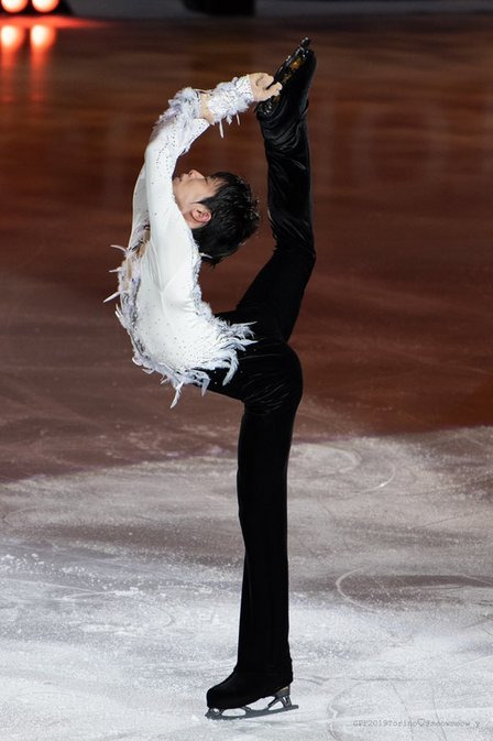
Then, at the culmination of the melody, Yuzuru executes his signature Ina Bauer, the key element of this part of the program. Arms spread softly become the main feature of the element, their movement lasting through all the long vocal part. Those arms speak in the very language of the music.
Beautiful bird sets the wings free and then folds them again gently at the end.

The next phrase of the music is accompanied by a series of similar choreographic elements that highlight the rhythmic structure. After a LFO three turn with prolonged exit lobe set to the vocals, Yuzuru executes four side half-lunges together with delicate arm movements of a beautiful swan.
Despite choreographic simplicity, you can watch and re-watch this part forever.
Then comes a combination spin set carefully to the music. Once again arm movements draw the attention during the spin with their nuanced musical interpretation:
a feather-like swing of the right wrist and rounded soft lines in the camel spin;
arms being spread open smoothly in the sit spin;
soft movement of the left hand before the Biellmann;
both arms being gracefully spread after the Biellmann at the spin exit, accompanied by the tender sound of the cello.
Difficult variation of the Biellmann at the culmination rightfully becomes the highlight of this spin.
Exiting the spin, Yuzuru does some choreographic posing at the beginning of the new musical phrase, a three turn, a slide on both feet with accentuated arms movements, and a waltz three turn, and then dives into a gorgeous hydroblade at the peak of the melody.
And once again during the prolonged vocal part there is the right arm’s expressive movement of a wing being softly spread open. Incredibly subtle motion of the same hand’s wrist becomes a choreographic touch at the end of the musical phrase.
Flight of the beautiful swan.
At the beginning of the next part the structure of the musical phrasing is highlighted by three inside spread eagles.
Guarda che notte stellata!
Yuzuru wonderfully expresses the music with the intensity and the duration of the spread eagles that fit the rhythmic pattern. Every element is accompanied by one arm softly moving up to the high notes.
Then there come a Jackson, a LFI bracket, a crossed step and a double back outside choctaw into a half-flip. And then a signature half-sit twizzle into inside Bauer with both arms elegantly going up.
This skating transition reflects the growing intensity of the music. The intricacy of the arms and body movements expresses the nuances of the phrase and adds complexity and volume to the choreography.
Then there are a waltz three turn on the right foot and three crossovers in preparation to the culmination of the phrase - a gorgeous choreographic combination of the delayed and triple axels.
The delayed axel and the following triple axel out of the twizzles and into the twizzles excellently highlight the change of the musical intonations, they are performed in complete harmony with the soft and lyrical vocals. Both the take-offs and the landings of the jumps in unison with the lines: Guarda che notte stellata! L'amore per noi...
Incredible composition and performance.
There is a half lutz after the twizzles at the triple axel exit and into some turning steps.
Yuzuru’s body and arms language expresses tender motives of the final musical phrase with the words of choreographic accents.
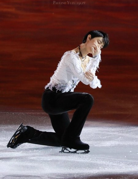
A half-sit slide creates another bird image.
The swan folds his wings.
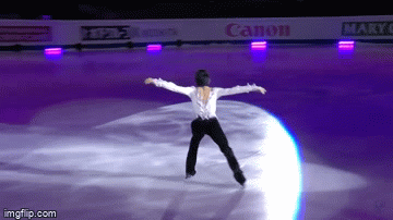
Beautiful final spin perfromed to the music fading away, and to the deafening applause of the audience, makes the perfect ending of the program:
an incredible camel spin with accentuated change of variations as the musical parts change;
a sit spin in the difficult variation “leg behind”, the rounded shape of the arm position resembling wings.
In the deeply touching final pose, Yuzuru’s arms and eyes are turned to the sky above. To starry sky of his.
“This is not just about being harmony with the music by one hundred percent and about emphasizing with it, not just about the most difficult elements that fit every single note this is some completely incredible unity of the human soul and the music. I have seen something like that only twice in my whole life, and not on the ice, but in the ballet: when Maia Plisetskaya danced to "The Dying Swan“ under the accompaniment of Mstislav Rostropovich, and in the New York dance studio where Diana Vishnyova danced with Valery Gergiev as conductor. Yuzuru Hanyu’s skating is a phenomenon of that same scale.” Tatiana Tarasova
On the 7th of December Yuzuru celebrates his 26th birthday.
I would like to with him all the very best and bright that there is on the whole Earth. Most of all - to be in great health. Then there will be power to fulfill all of the plans. Fly high, beautiful and strong Swan! Those wings behind your back will carry you lightly and freely. Fly towards your dream that will definitely come true.
At the Continues With Wings show Yuzuru once said to the audience: “Your eyes are like the stars to me”. The source of that light are all the incredible emotions that Yuzuru’s skating brings us, his skating where the technical mastery intermingles with art.
Yuzuru Hanyu is the brightest star on the figure skating horizon.
124 notes
·
View notes
Text
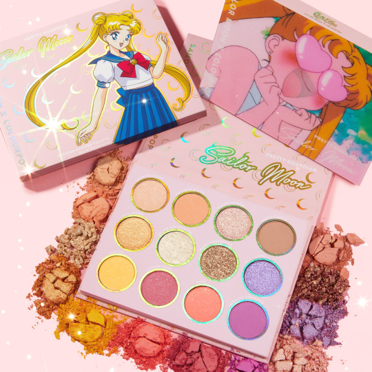
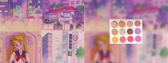
ColourPop is dropping a Sailor Moon collab on Feb 20th and I have some Opinions
It’s the moment Sailor Moon makeup geeks have been waiting for - ColourPop cosmetics, noted for their affordable and colourful official pop culture makeup collaborations, has announced a Sailor Moon collaboration containing an eyeshadow palette, two liquid lipsticks, two lip glosses, two blushes, and two body glitters. Most likely this collab is being timed with the 25th Anniversary of Sailor Moon’s debut in North America to contrast with Japanese cosmetics from brands like Creer Beaute and Shiseido, which were released for the Japanese 25th anniversary.
Source: ColourPopCo on Twitter
After my initial excitement about the long-awaited collaboration died down, I was left with a somewhat disappointing realisation... this entire collab, over a total of nine products, was not about Sailor Moon: The Show... it was about Sailor Moon, the character.
When I imagine a makeup collection for Sailor Moon I immediately picture the rainbow of colours represented across the whole Sailor squad, or at least the OG Sailor Team five. But almost everything in the collab is quite warm, and either pink or neutral/natural. Exceedingly neutral/natural, in fact. One look at the names for all the product colours - “Shining Moon”, “Twilight Flash”, “Bun Head”, “Usagi” - make it clear that the products are intended to reflect Sailor Moon and Sailor Moon only.
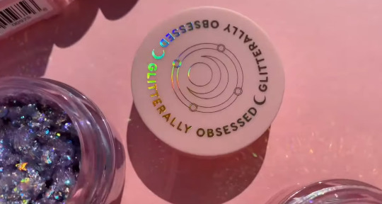
The packaging itself is... interesting. I can appreciate that they were trying something new with the eyeshadow and blush cases, as they are all topped with different holographic pictures - not (just) the shiny kind of holo, but the old school kind that flips between two different images, all exclusively featuring Usagi and sometimes Luna. You can see the effect in action in this video review by TrendMood. Good concept but slightly awkward execution. I think they would’ve benefited from some kind of static frame around the images so that it didn’t look like I’d just hot glued a pog to my pencil case. The rest of the packaging features the same old redrawn clipart from every other piece of anniversary merch, so, yawn, though the prismatic elements are nice. The body glitter pots are cute, featuring Usagi’s first transformation brooch to mirror the round shape of the pots, but ColourPop’s “gliterally obsessed” branding seems out of place. I know that’s the name of their glitter gel series but maybe it could’ve been swapped out just this once.
(Screencap from above video by TrendMood)
The lip sticks/glosses are by far the most disappointing. Apart from the cardboard boxes they come in, the only branding visible on the tubes themselves is the series logo and a nondescript crescent moon pattern on the caps. Don’t get me wrong, I’m a big fan of subtle packaging. I don’t really want Sailor Moon’s face plastered all over a lipstick either; but I’ve also never been a fan of using random moons/hearts/stars as a stand-in for something more relevant to the show when that imagery is so generic and disconnected from the series. Why not little graphics of the Silver Crystal? If they’d thrown some rabbits, bows, and/or roses into the pattern then the combination would read more as “Sailor Moon” than moons on their own. (That said, splitting them into “Moonlight” for the liquid lips and “Daylight” for the lighter glosses with transformed vs. non-transformed? Brilliant. Genius. The perfect blend of nostalgic and practical.)

(Screencap from above video by TrendMood)
Here’s a photo of the palette taken from Temptalia’s website with everything but the shadows desaturated, so you can read the colours more clearly without being influenced by the packaging:

At first I wasn’t sure what this colour story was trying to tell me. I definitely understand going for a more neutral/“everyday” palette over something more glam, since the characters themselves are generally fresh-faced, but the AMOUNT of neutral shades here seem out of place for such a bright series. Tuxedo Rose and Love (the two pinks in the middle of the bottom row) are so similar for such a limited palette. Twilight Flash (top, second from the left) feels out of place; oddly saturated and just a bit too warm to play nicely with many of the other colours. Mare Serenitatis (the coppery-looking one) stood out as unusual but is actually more of a wine/plum under all the glitter, which is much more appropriate and reminds me of Sailor Moon’s transformation.
The more I looked at this palette, and the more I saw of reviewer's looks using it, the more I slowly realised that this palette wasn’t really evoking the character of Usagi herself, but rather the nostalgic, hazy, pink-washed aesthetic of the entire 90s Sailor Moon animation.
The dreamy not-quite-pastel quality of the 90s anime (half conscious design choice, half convention of the time) has received a lot of modern attention and praise. It makes sense that the palette feels like it’s being viewed through a rose-tinted filter when the entire show felt that way, or is at least remembered that way. It wouldn’t surprise me if ColourPop literally based some swatches on recurring colours picked from screenshots.
That being said... Does that make it a good choice for a makeup collab? Is this what Sailor Moon fans want and will buy? Is it versatile enough to warrant a purchase for non-diehard fans? Is it actually what casual fans, who might buy something like this out of pure nostalgia, are actually nostalgic for? Just because I see what ColourPop was going for, does it automatically translate to the most appropriate choice?
Ultimately, my judgement on that comes down to whether this is ColourPop’s only Sailor Moon collab. If this is them testing the waters to see if they can branch out into releasing products focused on the other girls, like a blue/silver mini palette for Sailor Mercury, a green/pink mini palette for Sailor Jupiter, etc. then I’m all for it. When perceived as a palette that represents the show itself, and not any specific character - not even Usagi, despite what all of the swatch names suggest - it really shines. But that’s not really ColourPop’s MO. Most of their pop culture collections are released in one big shining burst of products and then... nothing. And there are quite a few different products here.
I’d also be remiss not to point out that there are lots of indie Sailor Moon-inspired makeup collections already on the market, which makes sense for an almost-30-year-old series that literally repeats the words “make-up!” nearly every episode. Maybe ColourPop felt like they would be stepping on fandom toes or running the risk of copycat accusations if they strayed too close to any of the 2,348 red Sailor Mars-inspired eyeshadows online, though I assume they’d have the legal upper hand. In that respect, I do appreciate that this is a unique approach to a concept that has been nearly driven into the ground.
But ColourPop is not an indie brand and there are some benefits that come with that. They are generally more accessible, sometimes more affordable, can usually ship to more places in less time at a lower cost to the buyer, and can afford much larger runs that will sell out less quickly (though don’t be fooled, this collab will almost certainly start to sell out shortly after its launch). For many fans, especially younger fans, this is probably their only feasible option for Sailor Moon makeup. And some fans prefer the stamp of authenticity from an “official” collaboration, even if indie collections are often, well, better. So I think there’s an impetus for ColourPop to release a less specialised collection that’s reminiscent of more characters.
If this really is the only Sailor Moon collab ColourPop is planning to release, then the packaging, in my opinion, is an odd choice. I don’t know why they decided to focus exclusively on Usagi herself; if the colour story is meant to represent the entire series, then why not either have all the girls on the front in a rosey colour scheme, OR have none of them and focus on one of the cityscapes that clearly inspired the palette? I feel like there are lots of fans who aren’t necessarily fond of Usagi herself who may be put off by the overwhelming focus on her.
Overall: The lip sticks are nice but not super exciting, but I like what I can see of the lipglosses. The subtle glitter is very Sailor Moon. I love the Moonlight/Daylight concept but wish it were reflected on the actual tubes. The body glitters (Moonlight Legend, Moon Prism Power) are exciting and interesting, by far the most experimental part of the collab. The shape and colour choices for the glitters are very “Sailor Moon” and I can see them getting some use on the festival scene. The blushes also seem cute but a tad overpowering for the otherwise understated vibe of the rest of the collab, like the liquid lipsticks, and I love the Luna stamp in the blushes but would be sad to actually use them and see it get worn away. And while I like the gauzy backdrop-inspired looks people are making out of the palette, I feel like it’s extremely limited in the number of unique looks you could actually pull off.
So, in the end... am I going to be buying any of these? Hell, probably, if they’re not totally sold out by the time I get to them. My initial roller coaster of OMG COLOURPOP SAILOR MOON!!!! excitement dropped into “that’s it?” disappointment but has now leveled out at a respectable buzz of interest. I could see myself wearing most of these products, and the collector in me wants at least a piece of the collab for posterity. I just really hope that this isn’t the end of ColourPop’s involvement in Sailor Moon and that we might see some future products tailored specifically to the other girls, so that my collection isn’t just Usagi’s face staring back at me.
#Sailor Moon#ColourPop#Colour Pop#merchandise#long post#edit: just bc I have some questions about this collab I hope this didn't come off as overly negative#I'm still planning on buying a lot of it LOL#and the more I look at it the more excited I get#I think I wrote a lot of this when I was still in the disappointed downspiral from the initial announcement#bc I was thinking about what it 'could' have been based on my own biases#when i look back and see what it actually is I'm still very excited#the more I look at it the more I feel like these are uniquely 'sailor moon'
251 notes
·
View notes
Text
Granite By Bhandari Marble Group
Why BHANDARI MARBLE GROUP INDIA RAJASTHAN KISHANGARH GRANITE IS BEST IN THE WORLD
India is a top-ranked country for granite and marble exporting services over the world with high-end premium quality. All granite and marble products are been derived after the long-scheduled natural volcanic processes.
Granite material is the first choice when choosing natural stone for kitchen tops, flooring, and other finishing for home, workspace, and other residential premises. Everyone wants to know about the best granite exporting company to buy quality granite collections, here is the BHANDARI MARBLE GROUP “Top High Selling Granite Exporting and Manufacturing Company in India.
BHANDARI’S granite is considered higher quality and more durable than other granite companies. Countertops should be available in order to provide the necessary durability associated with natural stone.
The largest exporters of these stones are BHANDARI MARBLE GROUP India.
Which Color Granite is best from BHANDARI MARBLE GROUP INDIA RAJASTHAN KISHANGARH?
Dark Granite
No shade will appear more elegant than black or dark gray.
White Granite
Pure white granite is nearly possible to find.
Beige Granite
Neutral granite countertops have unlimited versatility and can be part of almost any design plan.
BHANDARI MARBLE GROUP
Dark-colored granite countertops are harder than light-colored granites. Granites are composed of a variety of minerals, each of which has specific performance properties. The hardest mineral commonly found in granite is quartz, which is normally a somewhat translucent, white to grey colored mineral.
Are you ready to upgrade your countertops to a unique yet durable surface, but not sure where to start? Our top granite stone expert roundup will help guide you to the perfect stone that meets your lifestyle and design preferences.
The beauty of a natural stone is truly unmatched, and granite has a one of a kind look that few other countertop materials can compare to.
Granite countertops can take any kitchen to the next level visually and often become the talk of the room after a new install. Granite has been a top choice for countertops since the beginning, and to this day continues to be, due to its strength and variety of rich colors and natural patterns.
Cutting Edge Countertops carries a wide shade range of granite, so you are sure to find a vibrant or neutral color that suits your style. However, these are the best-selling granite colors in the World!
Alaska White Granite
With Alaska White granite, you can create stunning countertops or backsplashes, perfect for both indoors, and out! This stone has a lighter background with darker minerals running throughout creating a striking look that works well with many different designs. The white can pull in some lighter aesthetics if paired with dark wood cabinetry, or on the contrary, the darker elements can provide a great visual contrast to white or grey cabinetry. Alaska White granite can vary from slab to slab, so with this material, you are sure to get a unique look in your home.
Black Granite
Black granite is a frequently used material for residential and commercial design due to its beauty and durability. This granite features black speckles. These glistening minerals that make up the black design come together to create the perfect timeless piece for your space. This granite color has been a popular choice for decades now, making it a go-to option for home remodels.
Cotton White Granite
Light cannot be described in one defining way. This stone has been around for many, many years, with its reliability and beauty, cotton white granite has created a name for itself in the stone industry. The beauty of cotton white granite can be found in its soft cream color and subtle speckles in shades of deep grey. The mixture generated through the different layers of color is brought to life by the dark black or burgundy contrasts against the soothing cream base. Designing with this stone in your home will bring a beautiful elegance to any bathroom or kitchen. A very neutral option, it can be paired with a variety of styles and colors.
One of the most popular white granites on the market, White cotton Granite can be recognized by its pristine beauty. This granite has been admired for many years and its popularity only continues to increase. This predominately white stone features mixtures of blue and grey tones running throughout. If you are looking to make a statement, pair this stone with a darker cabinet, or achieve a trending yet timeless design by combing it with white cabinetry.
Alaska Gold Granite
Known for its golden creamy tones, Alaska gold Ornamental granite is a gorgeous stone. What gives Alaska gold Ornamental its stunning color is the abundance of golden minerals that are present. Up close, you can see that dotted around the stone is a mix of brown minerals. These minerals can vary though and can range from a lovely light cream color or a dark to light honey color. Achieve a natural and flowing design when you combine Alaska gold Ornamental with finished wood cabinets that have a light or medium. The golden Earthy tones of this stone become one with the cabinets!
Granite countertops kitchen
Trends come and go, but the countertops you choose will remain in your home for years to come. With this being said, we always encourage our customers to pick something that makes them happy when they walk in the room and see it. Shop these beautiful countertops along with many others on our website or visit a Cutting Edge Countertops Factory outlet showroom Our experienced team is here to help educate and guide you on both the current trends and timeless classics to ensure you are confident in your choice.
Make sure you follow along on our Cutting Edge Countertops blog to stay updated on the latest news, kitchen and bath designs, and more!
On Trend: Pairing Natural Stone and Quartz
When planning a new kitchen or major kitchen remodel, pairing countertop and backsplash materials present an age-old dilemma. Many designers swear by hard fast rules regarding how to make the perfect pairing, while others will say all the rules are meant to be broken!
It makes the most sense to start with your countertops. The countertop is the main hub of your kitchen and will most likely take up the bulk of your budget (other than cabinets!). Your desired style, budget, and the way you plan to use it will go a long way in determining the best material for your countertop. Generally speaking, there are more limited color/texture options with countertops whereas backsplash options are virtually unlimited. Nail your countertops first, then you can get creative and make a statement with your backsplash.
Many homeowners desire the look of a natural stone material like marble, but either doesn’t have the budget or are turned off by its high maintenance nature. This is one of the main reasons many opt for engineered quartz for their countertops. Quartz is a non-porous material which makes it virtually maintenance-free. No worries about staining from spilled red wine or highly acidic liquids. Based on advancements in the engineering process, quartz closely mimics the beauty of natural stone and is available in a large variety of colors. It is also more consistent in pattern than the natural stone making it versatile for both traditional and modern styles. As mentioned, this would allow you to get creative with your backsplash and have it define the ultimate style of the space.
Why can’t you have the beauty of natural stone and the ease of maintenance and versatility of quartz? You can, by pairing a natural stone backsplash with your quartz countertops. It’s all about combining different colors, textures, and patterns to project the style statement you desire. For instance, pair beautiful vein cut limestone tiles with a limited pattern quartz countertop. Or add more texture by going with a stacked stone accented backsplash with quartz. To help inspire you to create your own unique combinations, let’s take a look at some examples.
Tranquility
Trending Color Round-Up
Have you seen tour top countertop colors for the year? We’re introducing our semi-annual color round-up showcasing our most popular granite and quartz colors purchased by our customers. Scroll through to see what they love.
Monolith Inception Kitchen Designed by Richard T. Anuszkiewicz
As a luxury kitchen specialist, it is always important for me to bring thought-provoking ideas and execution techniques to the market. At the Kitchen & Bath Industry Show (KBIS) last month, I showcased my latest forward-thinking design titled “Monolith Inception”.
The Monolith Inception kitchen was commissioned by Liebherr Refrigeration to celebrate the launch of their new column refrigeration series. The concept of the kitchen is derived from the definition of “Monolithic”, meaning, “formed of a single block of stone.” This idea can be found throughout the kitchen in the crisp contemporary geometries and the layered long linear planes.
The overall palette evokes a masculine sense in dark and moody tones, think “Tom Ford Fashion”. Exotic and luxurious finishes run through the entire space. Two of the most talked-about pieces in the kitchen where the dual refrigeration armoires. The first armoire was comprised of striking poly-sheen eucalyptus wood. This high-gloss furniture styled refrigeration series has a drawer chest appearance on the bottom and includes a full refrigerator, full freezer, and full wine column.
The second armoire was more contemporary in its nature. A sleek full flat-paneled aged-brass face with the finishing touch of a fine leather stitched handles. Its bespoke details like this that create an experience for your user. This second armoire had a full 30” refrigerator and full 24” freezer.
Another showstopper was my signature Autobahn cabinet inspired by the face of the Bentley grill. This super-car cabinetry complimented the Superior Next series range with custom-aged- brass accents. A pop of excitement was found inside the cabinetry with my trademark Richer Living Collection Luce red interiors.
The island was a multi-tiered element creating a wow factor with a cantilevered 6” thick Dekton by Cosentino countertop. This Kelia material from the Natural Collection ran throughout the kitchen and was in the perfect gray hue to compliment the deep wall color. I designed the custom kitchen table with Grout house lumber highlighting a subtle chevron textured wood pattern with a brass screw detail.
The bar showcased artisan caliber plumbing products by KALLISTA in Gunmetal and hand-hammered polished silver. The Bradley USA “Chika” wall covering by Susan Jamieson of Bridget Beari Designs added a playful graphic detail and was further celebrated by the “Prost” neon sign meaning “Cheers” in German.
The final magic moment of the kitchen was the inception wine room inspired by the idea of a dream within a dream. This selfie-ready room was completely reflective and created the illusion that space infinitely continued.
Add by Granite expert and export team of BHANDARI MARBLE GROUP INDIA RAJASTHAN KISHANGARH.
1 note
·
View note
Text
Watch these videos that have been released for tracks featured on Find A Song!
Leanne Tennant - Bring It All Back
youtube
The video follows three different couples in their familiar but surreally presented suburban environments. The couples perform the song to each other like a love letter turned cautionary tale about the demise of their relationships. The viewer may notice that there are clues in the scenes about one of the partners planning on leaving - a suitcase, a car, a motorcycle. As the video progresses, reality begins to leak in and the couples notice signs of outside life penetrating their isolation. Flowers begin to appear, they see dirt on the ground and wind disrupts their quiet. In the next scene, we see all the couples running and jumping together through a field of grass and flowers. They lie together, they soak up the sun, they are happy, joyous. Their isolation has been broken, and for a moment they can exist in pure happiness together.
Director Jennifer Embelton elaborates: "The video invites you into its compelling, surreal, cinematic scenes set in familiar suburban landscapes. Exploring the theme isolation plays in the demise of a relationship, it shows how community and belonging can help you ‘bring it all back." (press release)
Gazel - Walk On Land
youtube
Bewitching and enthralling, the video summons the ritualistic nature of dance, seeing Gazel, and an all-female cast, flow effortlessly through surreal visions of natural beauty, summoning elemental spirits and evoking undertones of mystic significance, accompanied by the track’s possessing steel drums and intoxicating melodies. “We shot the video in Bristol with Conner Foley and Alex Millichamp, with choreography by Hannah Millchamp,” says Gazel. “It was great fun to make a video for such a colourful, summery song, and to create choreography for my lyrics. The track is a celebration of the interconnectedness of man and the natural world, so shooting outside in such a beautiful setting seemed a perfect way to express that in the video.” (press release)
The Darkness - Heart Explodes
youtube
The ‘Heart Explodes’ video captures the band on their recent stadium-sized outdoor tour as personally invited special guests and main support for fellow Suffolk-based musician Ed Sheeran with footage shot both onstage as well as featuring some intimate backstage hijinks. (press release)
The Lost Hours - Lonely Love (live)
youtube
Vile Assembly - Propaganda
youtube
The ‘Propaganda’ video rages against mass media and the political elite that use news stories as a form of control.
Inspired by the barrage of misinformation, gossip, hearsay and out-and-out propaganda churned-out by some of the world’s leading tabloid and media sources, the latest from Vile Assembly is a stinging counter attack infuriated by the spin on Brexit, the criminal obsession with Nigel Farage, and the rabid promotion of a hatred of what is simply misunderstood.
As lead singer and lyricist Paul Mason states: “The media does not necessarily tell you directly how to behave, or what to think, its more subtle than that, the media does tell you what to think about, presenting narratives, stories they want to consume you in a way that channels your thinking….. Arguably, it’s the most powerful tool on planet earth which is why it’s so valuable, I suppose this is some of the thinking behind our song Propaganda.”
As with each Vile Assembly video, ‘Propaganda’ has its own visual identity to reflect the strong narratives that underpin their work. Here the band’s hypnotic new video takes visual inspiration from the art-noir Robert Rodriguez film Sin City and the work of Gerald Scarfe. Inexpensively made and with a strong DIY ethic, the video was created in just half a day with frequent visual collaborator Will Hutchinson. Shot in Will’s flat in Portsmouth with a makeshift green screen, the video overlays a torrent of clippings from that day’s tabloid media upon focussed headshots of frontman Paul Mason. He reflects:
“We popped out to the newsagents and bought that morning’s vile offerings (bar The Sun as we’d never buy that piece of s**t), rolled up individual pages and used them as blindfolds. The idea being, the head will sing the lyrics to Propaganda whilst all this media generated miss information fly’s about, with the lyrics to the song representing how we’re manipulated by the media. We are blinded by Propaganda, the continuous barrage of headlines and hatred become the words we speak, repeating the message they want you to believe and repeat”.
‘Propaganda’ was written by Paul Mason with VA manager Keith Mullin. Believers in the effectiveness of visual imagery especially when combined with music, the pair see these components as being at the very core of the most persuasive propaganda. Looking to take the concept apart with their new single, Vile Assembly sought to create a strong visual companion as an imperative to make their own message as impactful as possible. As Paul says:
“The word “Propaganda”, it’s a marketer’s dream, it’s a well-researched form of control categorised as types, the modes used to convince an audience through selective facts and manipulation of a story to encourage a particular perception aiming to achieve an objective. Vile Assembly believe we’re way beyond that now, certain individuals, those aristocratic alliances learned a lot from the Nazis and how to make the most despicable and appalling abuses acceptable, its Propaganda on steroids. the ultimate tool of deceit and control…. Propaganda is the rhetoric of the worlds media and we have bought it like we did the war in Iraq, we can defeat Propaganda but it needs us to unite in our human collective understanding and fight back against the corporate elite who are robbing us of a life of love and freedom.” (press release)
#music#music blog#indie music#alternative music#videos#Leanne Tennant#Bring It All Back#Gazel#Walk On Land#The Darkness#Heart Explodes#The Lost Hours#Lonely Love#Vile Assembly#Propaganda#indie#alternative#find a song
1 note
·
View note
Text
A Look Back on TREASURE PLANET
So recently I rewatched TREASURE PLANET for the first time in about fifteen years and… I'm not gonna lie, it's still my personal favorite of the 2D Disney animated features from the early to mid-2000s.
Let's be real. Of the 2D features Disney released around that time period, TREASURE PLANET is one of the more solid films. ATLANTIS: THE LOST EMPIRE had some interesting ideas and some really nice design work and animation, but it really needed to be at least two hours long if it wanted to flesh out the characters and the world-building without requiring supplementary material (like a special edition of Disney Adventure magazine). Hardly anybody remembers BROTHER BEAR was even a thing, and the less said about HOME ON THE RANGE, the better. (Seriously, that movie wasn't even worth the Steve Buscemi cameo.)
The only other film of that era that has really held up was LILO AND STITCH, and I'll admit it's probably a better film than TREASURE PLANET. It took more risks in terms of character, setting and originality, and emotionally it leaves more of an impact. (That scene when Nani sings to Lilo makes me cry like a baby every time.) My only problem with it is it always felt like two entirely different movies collided with each other and it never felt like they really meshed well. Otherwise, I agree with most fans that it’s a good film.
Also, of course, there was the excellent THE EMPEROR’S NEW GROOVE, which was just such a huge departure from Disney’s normal schtick and trying something more Tex Avery-esque, only for it to be a perfect storm instead of a total crash and burn. That is much to be proud of.
Going back to TREASURE PLANET, I can understand that most folks walk away saying it’s an "okay" film. I, however, am not one of those people. I've had a real soft spot for this movie ever since I saw it, but now I appreciate this film for additional reasons.
Namely, the animation and effects work. Holy crap, is this movie gorgeous! It's like watching Don Bluth's ANASTASIA, except I don't have to feel guilty about historical inaccuracies. (Now it’s just scientific inaccuracies, but STAR WARS gets away with that all the time.)
Directors John Musker and Ron Clements had apparently wanted to do a sci-fi retelling of "Treasure Island" since before they started working on THE LITTLE MERMAID. With that in mind I do feel like this movie would have fared better with critics back in the early 90s during the Disney Renaissance. However at that time they would not have had such elaborate and detailed CG effects within arm's reach. There's something I really enjoy about the use of 3D backdrops so that they may do sweeping camera movements, and that's not even getting into the lighting effects to establish atmosphere.
What's more, there are a lot of subtleties to the character animation that I never appreciated until now. You could just pick one character and focus on him or her during the whole movie and find a lot of fun little quirks in their dialogue or walk cycles.
Admittedly, much of this film’s appeal probably depends on how much of an animation fan you are. In my case I was watching John Silver’s animation and I suspected that Glen Keane was probably in charge of animating him (as there are moments when Silver looks so much like Ratigan). Those suspicions were confirmed during the end credits and I was delightfully geeking out about it.
It’s also easy to see where this film might not have had a lot of mass appeal. Most of the focus on the story is on Jim Hawkins and his daddy issues, which by the early 2000s was already a cliche of a character arc. And it’s not helped by the fact that Jim himself is... well, kind of on the bland side as a protagonist. There’s not a lot about him that makes him any more or less interesting than any other teenage male lead. But for what it is I think the movie did fine at establishing and building the relationship between Jim and Silver, which does have its warm and comforting moments. For both of them.
And at least the film is straightforward with its plot and characters and it’s not a structural mess like HERCULES, a previous venture by Musker and Clements.
Something I’ve noticed over the years is that TREASURE PLANET has a little bit of a cult following. I distinctly remember this one time when I was taking a storyboard class in college; we were assigned to do a “Master Study” assignment by recreating the key story frames in our favorite scene in a favorite animated movie. One of my classmates picked the scene when Jim is brought home to the inn by the police and embarrasses his mother. I recall being so impressed, and even a little envious, that she got the character design style down to a T. (If you’re wondering what movie/scene I picked for my Master Study, I picked the Big Ben scene from THE GREAT MOUSE DETECTIVE.)
Then, of course, some friends and I suspect that TREASURE PLANET might have fared better if it had been released a bit later, more towards the height of the Steampunk craze. It’s not quite what I would call “Steampunk”, as it takes place in a sort of alternate universe version of the 18th century and not the Gothic era, and most of their transport is solar-powered and not steam-based. Nevertheless it’s easy to see how fans of Steampunk could find it appealing, with its mostly earth-tone color pallet to evoke the painted illustrations of the classic novel it was based on. Also that combination of a pre-20th century aesthetic with out-of-this-world science fiction elements is pretty much, in my opinion, what makes Steampunk so much fun to play around with. Also, a robot made out of copper. End of story.
In terms of why this film didn’t do so well when it was released, I suspect what stunted its success was the marketing. I could be wrong, as I was actually living in Honduras at the time of the film’s release, but we got some TV stations from Denver, Colorado. I remember a lot of the TV spots spent most of their time highlighting the goofy comic relief moments with Morph, and there was a real emphasis on the presence of B.E.N., even though he's in less than one-third of the movie. In other words, the film's success might have been partially sabotaged by a marketing team that seemed to think if you don’t take your film seriously at all that will somehow draw in the crowd.
Although speaking of the comic relief characters, I actually don’t mind them that much. I always thought Morph had a lot of cute, funny moments that weren’t too obnoxious. As for B.E.N., I kind of have mixed feelings for him. On one hand, the directing team made better use of Martin Short’s improvisational skills than PEBBLE AND THE PENGUIN or WE’RE BACK! ever did. But on the other hand, does B.E.N. have to be so loud and shouty? However, while B.E.N. is a real screw-up, he’s not so much to the point where I want to see him get smashed with a sledgehammer. He’s generally likable, not at all loathsome, and just annoying enough, but not TOO annoying.
However while we’re still on the subject of B.E.N., I’d just like to add that the CG animation on him is really nice. Making him 3D gives him a sort of sense of solidity compared to his hand-drawn humanoid compadres, and to top it off his animation isn’t at all stiff or feels like the CG is holding him back. There is some really expressive squashing and stretching going on with his dialogue. It’s so subtle in places that you’d probably miss it if you’re not looking for it. A lot of CG animation studios at the time like Pixar and Dreamworks had not quite mastered squashing and stretching themselves, so kudos to Disney for pulling it off so well.
Now if I may indulge a little on why I remember this film fondly, my favorite characters were always Dr. Doppler and Captain Amelia. They are both fun and engaging on their own, but together they are weirdly adorable. Granted, I've always thought them getting together at the end was a bit rushed, but I still totally buy it.
(What I don't buy is that they'd be so eager to have kids after Doppler showed such annoyance and revulsion towards that toddler alien girl at the beginning. I get that the creators wanted some visual shorthand to indicate that they're an official couple, but they could have just been wearing wedding rings or throw in a little more of them dancing together.)
Part of the reason I love these characters on their own is the casting. I was already familiar with Emma Thompson from Ang Lee's adaptation of SENSE AND SENSIBILITY, and her character of Eleanor Dashwood was very quiet and reserved. You can imagine my disbelief and delight hearing her play an assertive, witty badass as Amelia. (As if I didn't already think Amelia’s design was cool.)
As for David Hyde Pierce, I had only occasionally watched FRASIER growing up, but when I saw this movie I was familiar with him through some other memorable voice acting roles, particularly that excellent Season 8 episode of THE SIMPSONS, “Brother From Another Series.” In other words, I already knew him to be funny, snarky and charismatic.
While I'm on about the casting, I feel like there's a totally wasted opportunity to have these two characters in a room together, say, before the black hole scene, exchanging witty banter to show how compatible they are in a casual setting. It’s a shame that Emma and David didn’t record their dialogue together, because with her being an accomplished writer and with his skills at improvisation, there could have been some good verbal combat by way of “Much Ado About Nothing-Meets-Frasier.”
But looking back, I remember I immediately loved Captain Amelia just on principal. As a kid I never really gravitated that much to any of the Disney princesses. I can’t really describe why, but it was mostly how they were marketed as just looking pretty and (arguably) kind of passive in their own stories. Not to mention how when Disney Princess became a brand, they really amped up the girly cutesy-ness to their preexisting images. Not to say there’s anything inherently wrong with cute or feminine things, but it really made me feel like a weirdo who somehow wasn’t fit to be called a girl.
Captain Amelia, on the other hand, had her own style of femininity by wearing a classy, more masculine captain’s uniform along with thigh-high high-heeled boots (that she has no problem running in). She had a no-nonsense attitude, she was focused and cool-headed in a stressful situation, she was downright snarky and took crap from no one. In other words, she was the type of woman I wanted to be when I grew up, and to this day she is my favorite Disney Lady, bar none.
And while I’m at it, I’m just going to add that I’ve always found Dr. Doppler more attractive than your standard Disney prince. Besides his character design looking like a canine version of Roger from 101 DALMATIONS, he just always seemed like he’d be fun to get a coffee with.
Well, that’s about all I really want to talk about regarding TREASURE PLANET. It’s a shame it’s not remembered by more people as it does have some really good elements to it, but in some regards I can kind of see why it wasn’t a huge critical success. If you haven’t seen it already I recommend checking it out as it’s a pretty solid standalone film that doesn’t need supplementary material and covers all the bases with the plot and some fun character moments here and there. If you’re an animation fan I cannot stress enough how you really need to watch it, or even rewatch it, because, again, the animation and effects work is just a real feast for the eyes.
17 notes
·
View notes
Text
The Klokers Klok-01 is unique, cool, sophisticated, and interesting. For so many of the watches I take a look at on WWR, it’s a take on the traditional form – strap, springbars, hands, quartz or automatic movement. There’s an unlimited variety of this formula, and many many makers do it well. To really make an interesting step, however, one must look outside the traditional form, and invent something totally new. Klokers has done just that with its Klok-01, the second piece from this artsy and interesting French brand.
I spent the past week with the Klok-01, on my wrist, in my pocket, and on my desk, cycling through two leather straps as well as the desk stand and pocket case. In short, it’s a fresh and interesting take on the watch, with unique design elements. It’s polycarbonate case is questionable, but its overall look and utility is unwavering, and it makes a handsome addition to your wrist, or desk.
First Impressions
This watch is so darn cool! From the beginning, the box it came in was interesting – a simple white box, with the Klok-01 presented in the middle of a foam panel, with straps curving around. Simple and easy. I appreciate Klokers for swaying away from some sort of garish presentation box, and going for a simple white box, intended for the single opening.
The Klok-01 makes an immediate impression. Presented apart from the straps, it’s an immediate nod to the creativity and versatility of the piece. I put on one of the straps include, and then slid and clicked the Klok-01 into the mount, and there it is, on my wrist.
Setting with the large crown is easy, although it takes a moment of getting used to setting the dials backwards. More on how to read it below.
The straps are finished nicely, with the custom mounting bracket really making them stand out as cool items themselves.
The black leather pocket case/desk stand is finished in soft black leather, although the positioning of the clock mount, and general build seem a little under-built to me.
Fit and Finish
It’s important to remember that the case of the Klok-01 is polycarbonate plastic. It appears to be one piece going from the silvered case section to the clear domed crystal section. Given that it’s all plastic, the finish is perfect – no scratches or scuffs, and a smooth transition from silver to clear. On first glance, it’s hard to tell that the case body is plastic – but it is.
The caseback is brushed stainless steel, and has helpful etchings explaining the latching mechanism, and which screws to remove for battery service.
Dial printing is perfect, and I especially love the subtle red index markings on the black color edition. That little touch really makes it extra interesting.
The crown has an etched Klokers logo, and Klokers is printed on the index marker as well. Finally, it’s worth noting that “Hours” “Minutes” “Seconds” is printed in English, French, and German around the edges of each ring. Cool!
On the Wrist
Klok-01 is certainly an eye catcher. It’s a larger watch, but certainly NOT huge. The relatively sleek case sits on my wrist nicely, and although it sits a little higher than most watches, because of the mounting mechanism, it’s not unwieldy at all. The size is just right to make the dials clearly visible, without becoming cumbersome.
Because it’s primarily made of plastic, this watch is much lighter than you’d expect based on its size. It feels light and airy on the wrist, and is easy to wear for an entire day. The metal mounting bits of the strap warm up after you’ve worn it for a bit, and actually feels quite nice. As far as an every day wearer, this is a great option comfort wise.
Reading the time off the dial takes getting used to – time is read on the red index line, and given that the entire face is visible under the clear plastic, it looks a bit complicated when you first glance at it. It’s not the easiest to glance at the time in a quick moment, but a very slightly longer glance at the index is really all it takes. Definitely not much more of a distraction, and certainly worth it.
The Klok-01 is certainly eye catching, but not ostentatious or flashy. I loved wearing this and talking about it with friends – but never felt like I was making an overly flashy statement, like wearing some sort of diamond and gold giant tourbillon watch or something. This one is just interesting and cool.
As a daily wear, the only hangup I had was the plastic crystal – will that scratch easily?
Complications
Time
The Klok-01 is simple – Hour, Minute, Second. But how it shows the time is unique. Here’s how to read the Klok-01:
Three concentric discs (hours, minutes and seconds) rotate counter-clockwise to indicate the time along the vertical axis at 12 o’clock (patent-pending).
https://www.klokers.com/img/cms/TUTO%20KLOK-01.mp4
Feedback
The unique styling of the Klok-01 leads to some interesting materials, design, and usability quirks. None are particularly insurmountable, and arguably add a bit of interest to the piece. However, there’s one issue that haunts me every time I wear it – the polycarbonate (plastic) crystal. Most watch crystals are made from either sapphire or mineral glass, save for some smartwatches. These very hard materials are selected for their clarity and scratch resistance, among other qualities. However, for some reason, Klokers has opted for a plastic crystal – oh so scratchable plastic. That means that even brushing the watch up against slightly harder plastic, your wall, edge of your desk, or really anywhere else has the potential to scratch it. That’s a bit of a letdown, and a constant fear I have while wearing it. I’d say if there was one thing Klokers could do here, it’s switch to an all stainless steel case, and domed sapphire or at least mineral glass crystal.
Besides that, the piece is great!
Should You Buy It?
If you’re looking for a truly unique, functional, and inspired watch to wear around the city or to the office, the Klok-01 fits the bill. Its look is unique, its clear and readable, and its latching system lets it transition from your wristwatch to your desk clock. Looking for a weekend beater, outdoors sportster, or gala sweeper, this is not the one.
Final Thoughts
The Klokers Klok-01 is a truly unique, inspired time piece. The combination of interesting materials, a unique, interesting, and eye catching face, clear legibility, and innovative and flexible latching system make this a standout timepiece of any collection – certainly mine. Go grab a Klok-01 and set yourself apart from the crowd.
Brand & Model: Klokers Klok-01
Price: 399,00 €
Who we think it might be for:
If I could make one design suggestion, it would be: Use a domed sapphire or mineral glass crystal, instead of polycarbonate. As hard as the polycarbonate may be, it’s still going to scratch much much much more easily than sapphire. As a daily wearing watch, pocket watch, and versatile mounting watch, scratch resistance is really key here – the polycarbonate really just doesn’t cut it.
What spoke to me the most about this watch: The slide-rule inspired design, with that super unique bezel, and easy to read index. This is a unique piece for unique people.
Specs
KLOK-01 WATCH-HEAD
Circular slide rule inspired watch
Three discs (H, M, S) turn counter-clockwise
Time display along a vertical line at 12 o’clock
Swiss Made Movement, High Tech Ronda
Interchangeable strap
Dimensions: Ø 44 mm, 11.5 mm deep
Material: metal-polymer composite
Glass: transparent polymer with built-in magnifying lens
Water Resistant
Swiss Made
Movement: Ronda movement (quartz)
1,5 V battery
Two-year warranty
The klokers key: a pushbutton at 8 o’clock to unlock the watch head from its base
Colors: yellow, blue and gray.
STRAP KLINK-01
Interchangeable strap
Dimensions: 230 mm x 22 mm
Strap material: real leather, alcantara (sand)
Pin buckle material: stainless steel; engraved buckle
Colors: matte black, satin black, chocolate brown, indigo blue, sand, newport yellow
DESK & POCKET
Dimensions: 90 x 55 x 20 mm folded, 245 x 55 mm opened
Color: matte black
Compatible with KLOK-01 and KLOK-02
Case made from high quality PU (smooth grain evoking the full grain of genuine leather)
Metallic parts made from stainless steel
Upcoming: The KLOK-08
Stay tuned for a comprehensive writeup of Klokers’ latest piece, the KLOK-08
The @klokerswatches Klok-01 slides onto my wrist.. and rules #affordable #unique #under$500 The Klokers Klok-01 is unique, cool, sophisticated, and interesting. For so many of the watches I take a look at on WWR, it's a take on the traditional form - strap, springbars, hands, quartz or automatic movement.
1 note
·
View note
Text
Week 3 Results!!
Week three has come to an end, and thank you everyone for voting and supporting ENTM! We are now over half way done! Remember there is no elimination this cycle!
The winner of Week 3 is:
Doki Kodoki! Congratulations, now let’s see if you can keep your spot, or if someone else will beat you out next week!!
The reviews from the judges are below!
Flare: Sorry for the short reviews, have a lot going on this week!
Kusuh: Aesthetically this is the most vibrant and colorful picture out of the bunch. I love the colors and the tone.
Doki Kodoki: Darker pictures tend to be some of my favorites, I love the panic and urgency in the photo.
Noesis Phobos: The picture looks very well put together. Another one where the colors soothe together.
Rivienne Cotrlaint: Great use of the background and the pose makes you look like a real tomb raider.
WoW Wie: Nice simple and subtle shot. Don't worry, we won't tell anyone about your treasure.
Stephen Fairbrook: Nice tones in this picture. The pose works nicely overall.
Nadede Lasalle: The monotone filter looks nice and adds to the picture. Looks like that mimic is about to strike!
Gangly
Kusuh Valentione: The lighting here is beautiful! I’m a huge fan of the bright 2 filter, and I think it works incredibly well in this shot (the gold on your pickaxe is just wow!). The colors are extremely vivid, which creates a nice contrast between you and the background. The outfit works well with the shot, and it looks as if you’re shading your eyes from the sun because of the bit of light hitting the side of your face. I think the shot could’ve done without the golem in the back because I feel it is out of place, but it does not take my focus away from you because of how centered you are!
Noesis Phobos: The darkness of this shot works well with the light to create an interesting contrast! The bright 3 filter is perfect; it reduces the colors while accentuating the darker and lighter values. Your outfit is fitting for your scenario, and your expression adds a sense of worry. I like how you’re looking somewhere off in the distance, as if you’re hurriedly trying to look for a place to run. I love the lighting on the golem in the back because it makes the shot more dramatic; it’s practically saying, “Fight me!” or “Run away while you can!” However, I do think the golem looks rather docile because it’s just standing there. I can’t even imagine how difficult it would be to try and take a shot while in battle, but despite the differences in lighting on you and the golem, you manage to keep yourself in focus because of your proximity to the camera!
Doki Kodoki: Ahhhhhh, behind you! Your outfit and expression are great, and I love the face makeup giving you a more rugged look. Your kneeling pose gives me the impression that you’re about to open a coffer that is off-screen, but you were interrupted by the evil mummy. The saturated linework effect adds a sense of action, while also making the shot a bit more cartoon-like (which is cute!). Because of how dark the shot is, I am interpreting the shot as more serious, which clashes a bit with the effect chosen. Reflection blur can be a pain to use because it really blurs out the sides, but I think it would have worked quite nicely with the overall darkness of the shot. Using a filter that adds just a bit more color would work with the saturated linework effect as well!
Wow Wie: Ohh, don’t mess with Wow Wie! I love how you have all the treasure behind you, and your pose is most definitely fitting! Your outfit has a Lara Croft feel to it, and your expression is mischievous. Your face has a playful expression, but the gun in your hand says otherwise! I also like the bracelets and earrings you’re wearing; it’s like you put on some of the treasure you’ve just found! The lighting in the back is already sufficient, but I think adding a few more lights on top of the treasure could give it some major bling!
Rivienne Cotrlaint: This shot is incredibly well-lit! The lighting on the ruins behind you is beautiful and lightens it enough to create a nice contrast with your black outfit. Your pickaxe is practically glowing, and I love it! Your expression is determined, and you look ready to find some untold secrets in the ruins. I’m not quite sure about the pose; it appears more like a fashion pose. The hat also looks a bit out of place because of how big it is in comparison to your more tightly fitting clothes. I still love how you dyed your whole outfit black; it gives you a more serious aura while helping you stand out in the shot!
Nadede Lasalle: It’s a mimic, RUUUUUUN! The monotone filter gives the shot a more dark and tense mood, and the lighting on your face looks rather ominous. Your expression looks worried and your pose makes it look as if you’re saying, “What am I supposed to do?!” I think putting a very faint light (similar to the light in front of you) behind you would help create a greater contrast between you and the background because your hair is completely blending into the black background. I do think the lighting on the mimic is interesting; it blackens the front and its teeth, making it seem more menacing!
Stephen Fairbrook: This is a great perspective for this shot! We see the bend in the wall, and know that you are trying to hide but have been spotted! The lighting on your hair is fantastic, and I like your outfit choice; although it isn’t what you would think of when visualizing an explorer, it becomes toned down with the black dye. Your head turned to the side gives me the impression that you are debating on what to do, now that the treasure is being guarded. I think the shot could have done without the blurred background; you are already my focal point because of the vivid lighting on you, but those zombies are also important in your shot! I think that glimmer effect from the coffer is interesting; it makes the zombie look like he’s got materia in his arm!
Katarh
Noesis Phobos: Lovely colors. The slight camera tilt works in your favor, adding a disjointed sense to the image. Your golem is on the right third, and you on the left third, making this shot perfectly framed. The lighting is spot on, evoking a perfectly spooky feeling. The outfit is good, but something a bit lighter (in weight) might have made sense for an underground desert cavern, or at least with just a bit more color. I really like the pose - panic is so hard to capture well. The filter of Bright 3 brings it all together in soft blues and purples.
Rivienne - Can I ask you to lead my next raid group? Your powerful pose and strong words scream leadership. Hand me my pick axe and I'll help you to dig right in! The outfit is the perfect combination of work and adventure, and as someone who is allergic to the sun, I can appreciate the choice of big floppy hat for digging in the desert. Colored marker is such an interesting filter because it can drastically change the atmosphere of a shot - and to be honest, it took me a while to realize where this is. (Entrance to Qarn.... right?) But that's a good thing - it adds to the mystery of the composition and helps elevate it beyond just another day in the desert.
Stephen Fairbrook: If you can't see them, they can't see you, right? A great composition, and thoroughly taking advantage of 4:3 screen ratio to show all the elements. Your zombie "extras" are perfectly placed to guard the treasure chest, and the outfit camouflages well with the greenish eerie background. I think a stronger light source from the /gpose selection might have made the shadows deeper, emphasizing the otherworldly nature of your adventure. Bright 1 was a good choice, not washing anything out but allowing the background lights to glow in a golden haze.
Wow Wie: Shhhh - my lips are sealed and I saw nothing except an amazing tomb raid! Bright 1 combines with what looks like some limbal darkening to draw the eye dead center. I love the choice of background - you clearly had a very successful raid. I think this shot might have been stronger if you had managed to not be dead center yourself, but off to the side, putting the emphasis on the treasure. I like the choice of Bright 1, as it made your background lamp glow and also deepened all the shadows around your treasure.
Doki (and friend): The requirement this week was only for a screen filter, but you used the additional effect of line-work too - and it really works to emphasize your danger! This feels like a scene from a comic book or another illustration. I really love this choice of location, because we get to see some details on the wall glyphs that I've honestly never seen before. I think the echo was also a great choice for a filter, since it cast everything in a nice vintage feel. I just wish your "friend" was a little bit bigger, as he's kind of tiny and very far off in the distance (although that's good for your character in this case.) Also the eyepatch? PERFECT. You've clearly been raidin' tombs for a while.
Kusuh: The sun is too brrrrright! Love the concept and the pose. The problem is... the light is clearly at your back, and if you're squinting at the sunrise, your character is facing the wrong way. Don't be afraid to turn on the extra floodlights in gpose - they gave them to us for a reason! The outfit choice is excellent for a night of exploration, and the Bright 2 filter brings the entire thing to life. I hope you had a successful night of raidin'!
Nadede: That horrifying moment when you open a mimic.... I love the use of the monochrome filter. Your panic expression says it all, too - oops! Now all we need are violins shrieking horror music in the background. The background and location are good for the theme, but your hair is blending in a bit too much with the background, and because of the side profile, it's hard to get a good sense of your tomb raidin' clothes, especially in the monochrome filter. It also appears there's a status effect around the chest, but I can't quite see what it is.
#entm#entm results#cycle 7 results#Eorzea's next top model cycle 7#eorzea's next top model#week 3 results#woot week 4 is coming
8 notes
·
View notes
Text
Compare And Contrast - Like The Corleones: Grimes vs. The Knife
It’s been several years since I’ve seen The Godfather. Perhaps it would have been worth re-watching it before delving into this thing, but I think my vague memory of it should suffice for the comparison I want to make here.
Before I properly begin, though, I’d like to point out what seems like the sheer unlikelihood of the comparison I’m about to make even existing; it’s an oddly specific shared reference point that two separate alt-electronic pop songs should build off intertwining themes of gender and The Godfather. Nevertheless, both Grimes’ “Kill V. Maim” and the Knife’s “One Hit” do indeed share improbably close subjects. Maybe Grimes was inspired by the earlier Knife song, seeing as it follows nearly a decade after? This is, however, besides the point.
The point being that despite “One Hit” and “Kill V. Maim” containing similar material on a surface level, they seem to take their actual philosophies of gender in very different directions. Both tackle a sort of “two-faced” masculinity, but the Knife aim for a kind of broader social critique of traditional patriarchal family structures, while Grimes reaches for what appears to be a more personal and anarchic approach to gender. As I distinguish between these approaches, I’d also like to draw attention to how the songs differ musically as well, and how this may be related to the lyrical content.
But for clarity’s sake, let’s start at the beginning and explore why the two songs may have chosen such similar reference points and why they may not be as similar as they first appear. Why The Godfather? Well, we should begin with a certain assumption, based on the public images and auxiliary projects of both Grimes and the Knife, that both are very much interested in art philosophy and film. Additionally, both being (or at least being fronted by) women, they’ve picked up on the gender disparity throughout art and film history. Often, feminist critique involves what the kids in critical theory call “hermeneutics of suspicion”, in which historical and “canonical” works are viewed with a critical eye towards the power structures that may have allowed them to be considered “great” in the first place. Seeing as The Godfather is directed by a man, concerns largely men and a kind of archetypal masculinity and is considered “one of the greatest films of all time”, it should come as no surprise that it’s a perfect target for both artists.
However, while both artists enact a kind of parody of the central men of the films, they go about it in very different ways. The Knife’s approach is subtle, as is the Godfather reference; you don’t think about the gangster-like attitude of the song’s central male character until you hear the line “Spending time with my family, / Like the Corleones” (more on that one later). Grimes, on the other hand, has explicitly stated in interviews that her song’s character is something a little more, er, outrageous...specifically something to do with a gender-shifting vampire version of Michael Corleone, like “The Godfather meets Twilight”.
From here, we may begin to see how each artist takes this theme down different paths. The Knife’s central character is a true “family man”, at least in the patriarchal sense. His is a story of violence told violently, as the opening verse declares, “It was headline news, / One more abuse, / I’ve got to tell it with a fist”. His power is exerted over the inhabitants of his domestic sphere, introduced in the second verse: the archetypal trophy/stay-at-home wife and the children. This verse also ends in the titular phrase, which comes to symbolize a key split in the man’s personality, that of “one hit, one kiss”. Here, we see an apparent duality that actually serves the same purpose: the man wants to be seen as powerful, but also loving, and his actions reinforce this. In the end, both become mechanisms by which he maintains power over his family; the promise of love brings them close while the threat of violence discourages them from leaving (”If you enter, you’ll stay”). This is the Knife’s parody of the archetypal masculine gangster, as is made suddenly explicit in the previously-mentioned line on “spending time with my family”. Just as the gangster’s family’s very structure contains violence, so does that of the character developed in the song.
The song goes on to explore to more parts of this masculinity which also merit some attention. The song’s third verse details a supposedly “not” pornographic scene, as it’s considered art, “if you do it with a twist”. This segment seems to further emphasize the elaborate guise this song’s character dresses his violent masculinity in, attempting to couch the institution that favours his sexual desires in the language of art. Finally, the last verse, perhaps the most chilling, has the man making apparent concessions as to further mask his absolute power: “For a reasonable salary, I will wash the world”; it’s meant in reference to housework at its most literal, but I hear something eerily fascistic in that phrase as well. He goes on to claim that this sharing of house duties is not only more equitable, it doesn’t demean him (which makes the listener question if this same would apply to his wife): “No need to mark my territory, / It’s all obvious to me”. For the Knife, this is “manhood’s bliss”: the power to quietly slip in and out of traditional roles and keep the face of the benevolent dictator, while remaining a supreme patriarchal ruler.
It should be noted that the music the Knife sets these lyrics to is remarkably well-suited to the themes. Probably the most interesting aspect of the song is that it has something of a vocal drag-performance of its own from singer Karin Dreijer Andersson (something that will probably come as little surprise to those already familiar with the group): for the duration of the song, her voice is pitched down to take on the approximate sound of a deep baritone. While this pitch/tone-of-voice technique could potentially have troubling gender essentialist ideals behind it, it’s Karin’s delivery that really makes it, as she takes on a sort of swaggering confidence atop the beat’s muscular shuffle that, combined with those lyrics, seems like it could only belong to a (as Hop Along might put it) “Powerful Man”.
While Grimes may share an initial character template in Corleone, and it’s probably interesting to note that the similarity is more than skin-deep: her fantasy version of the gangster also undergoes a kind of gender-bending, as she sings the song from his(?) first-person perspective and evokes some vaguely violent imagery from the very first line. However, the difference begins to reveal itself by way of a number of subtle signs; for one, Grimes doesn’t adopt the “vocal drag” that Karin favors. In fact, she seems to strive for a consciously more “hyperfeminine” voice in the song’s pre-chorus, imitating a sort of cheerleader-like chant and even shifting up the pitch of her voice, further exacerbating the gender-bending elements.
But pay close attention to the lyrics here, as they too signify an important shift that is mirrored in Grimes’ vocal delivery: the final lines of each verse refer to a kind of diminished power, claiming “I’m only a man, and I do what I can”. And the chorus is dripping with ironic defiance: from the spelling-out of “B-E-H-A-V-E” to the chipmunked refusal to do so, Grimes is rejecting something here with a distaste that could hardly be less clear. My guess? Though it’s unspoken, she seems to be rejecting the very strict gender roles that the Knife’s narrator seems so confident in. In fact, this makes the pre-chorus line “I’m only a man” even more ironic, as its supposedly male Corleone speaker is already gender-bending through Grimes’ vocalization, making him hardly “only a man”.
This is where I believe Grimes really begins to depart from The Knife’s vision of gender is a truly distinct way: her vision of gender transgression seems significantly more optimistic than “One Hit”’s. Whereas the narrator of the previous song saw this ability to move beyond his assigned gender role as a way to further exert his power without harming his “essential masculine nature”, Grimes appears to employ gender-defying actions as a way to deconstruct gender and free one’s self from the constraints of being purely masculine or feminine.
The music seems to match this instability; at first listen, it seems to have an almost simplistic “bubble-gum pop” production job with bouncy synth riffs and the works. The chorus, however, seems to take on an almost rock-like feel, with a real driving pulse behind it, making the genre of the song itself somewhat ambiguous. And obviously, as with The Knife, Grimes’ vocal delivery is crucial here too: the squeaky tone she uses in the verse jars with the exaggerated faux-cheerleader chant and chipmunk vocals of the chorus, which suddenly give way to outright screaming as the climax. It’s a masterful composition and performance, seeming to morph before your ears as its central character might before your eyes.
So who’s right, The Knife or Grimes? I don’t feel qualified to make such a grand judgement myself, but regardless of which conveys the better philosophical/political truth about gender, both are fascinating examples of the ways in which gender can be performed in pop music as a kind of critique in itself. At the very least, they are artistically formal marvels.
3 notes
·
View notes
Text
CLAUDE MEYLAN takes its inspiration from the magical prism of seven colours and creates TORTUE RAINBOW in various harmony with so deep signification. With RAINBOW, colours enhance the sculpture of time. The new declination of our movement 165CM16 gives way to a new element. Subtle and inserted between the base plate and bridges, it matches the hands and sets the tone to the inspirations linked to its colour. Each bridge are cut out, fully decorated and in a harmony of specific shapes. It prompts an intriguing transparency of lights pushed to new dimensions by the character of suspended colours. TORTUE RAINBOW takes you to a new dimension where your own imagination and spirit will lead you a new time-space.
It is thanks to Isaac Newton that we understand the rainbow phenomenon. He demonstrates that the colours are actually the result of the decomposition of white colour from the sun.
When he wanted to name the different colours visible, he chose seven, less a scientific approach than the desired analogy with magic and omnipresence of the number seven.
The seven colours of the rainbow and the seven notes of the diatonic scale reveal a regulator of vibration, vibration which are in more primitive traditions, the essence of the matter.
Seven corresponds to the seven days of the week, the seven planets, the seven degrees of perfection, the seven heavenly spheres or degrees, the seven petals of the rose, the seven heads of the Angkor cobra, the seven branches of the tree cosmic and sacrificial shamanism, etc.
Some are other sevenfold’s symbols; as rose to the seven petals evoke the seven heavens, seven angelic hierarchies, all perfect sets. Seven means all planetary and angelic orders, all the heavenly mansions, all of the moral order, and all energies mainly in the spiritual order. Amongst Egyptians, it was the symbol for eternal life. It symbolizes a complete cycle, a dynamic perfection, a positive renewal.
Combining the number four, which symbolizes the Earth (with its four cardinal points) and number three, symbolizing the sky, seven represents the whole universe in motion. It is universally the symbol of a whole, yet a whole in movement or in total dynamism.
These inspirations, these myths and legends have given birth to the creation of TORTUE RAINBOW. Its movement cut in sunlight rays, its specific and devoted shape called for the adjunction of a new coloured element whose rays interspersed with bridges and base plate. As an analogy to the rainbow and its seven colours, we enhance the positioning of 7 o’clock and leave you with endless imaginations.
Note that the seven colours of the rainbow sky only reveal the visible spectrum… We'll leave you here, for enthusiasts, among others, for theology, esotericism and numerology to continue the fascinating discovery of the multiple meanings of this figure so special, mentioned 77 times in the Old Testament more than 300 times in the Bible...
Claude Meylan Tortue Rainbow Technical Specification
Mouvement
16 ½ Mécanique à remontage manuel (Movement Mechanical, hand winding)
Functions: Hours, Minutes
Decorations: Fine finish, skeleton
Bridges/Baseplate: Matching and bicolour
Calibre 165 CM14
Autonomy 42 hours
Case
Steel 316L,
Sapphire crystals backs
Dimension: 40 mm
Waterproof: 30 m
Claude Meylan Tortue Rainbow – Symbolic colour meaning
RED
Think fire and blood – Red rushes to us with messages of passion, primal urges, action, pleasure, vibrance, radiance, and love. • Red is affiliated with the planet: Mars • Its zodiac sign is: Aries • Red is associated with the number: One • Employ the colour red for: Energy booster, protection • Red’s mantra is: “I am ignited”
ORANGE
A nice subdued blend between the aggressive red and the high-pitch of yellow – Orange is about harmony, aspiration, sociability, contentment, and intelligence • Orange is affiliated with the planet: Mercury • Its zodiac sign is: Gemini • Orange is associated with the numbers: Two and Four • Employ the colour orange for: Aid in decision making, • Orange’s mantra is: “I am satisfied”
GREEN
The fresh start of spring brings waves of Green and with it comes attributes of youth, sentimentality, nature, adventure, growth and health. • Green is affiliated with the planet: Venus and Earth • Its zodiac signs are: Libra and Taurus • Green is associated with the numbers: Four and Six • Employ the colour green for: Promoting compassion and overall physical health • Green’s mantra is: “I am accepted”
BLUE
Look to the sky for the meanings of Blue – open spaces, freedom, imagination, expansiveness, inspiration, and sensitivity. • Blue is affiliated with the planet: Jupiter • Its zodiac sign is: Sagittarius • Blue is associated with the number: Five • Employ the colour blue for: Healing the sense organs, • Blue’s mantra is: “I am expansive”
YELLOW
Worshipped in the form of the sun – Yellow is all about radiating creativity, protection, intellect, positivity and clarity. • Yellow is affiliated with the luminary: Sun • Its zodiac sign is: Leo • Yellow is associated with the numbers: One and Three • Employ the colour yellow for: Helping inner vision, • Yellow’s mantra is: “I am centred”
INDIGO
Similar to the attributes of blue, but Indigo’s energy runs very deep – consider the unknown depths of the sea along with emotion, strength, fluidity, persuasiveness, expressiveness, and pervasiveness. • Indigo is affiliated with the planets: Saturn and Neptune • Its zodiac signs are: Capricorn and Pisces • Indigo is associated with the number: Five and Seven • Employ the colour indigo for: Invoking clarity of purpose, aiding in spiritual healing • Indigo’s mantra is: “I am deep”
PURPLE
The hue of fragile flowers and sleepy sunsets, Violet reminds us of spirituality, communion, grandeur, high-ideals, devotion, and peace • Violet is affiliated with the planet and luminary: Uranus and Moon • Its zodiac signs are: Aquarius and Cancer • Violet is associated with the number: Seven and Twelve • Employ the colour violet for: Enhancing nurturing qualities, balancing sensitivity • Violet’s mantra is: “I am revolutionary”
More information can be found on Claude Meylan Website.
Claude Meylan Tortue Rainbow CLAUDE MEYLAN takes its inspiration from the magical prism of seven colours and creates TORTUE RAINBOW…
#Claude Meylan#Claude Meylan Tortue Rainbow#independent brand#independent watchmaking#Tortue Rainbow
0 notes
Text
Sarimanok ng Bayan ng Mapayapa by National Artist Abdulmari Asia Imao in front of the Vargas Museum
“Sarimanok ng Bayan na Mapayapa” is an art piece made by National Artist Award for Visual Arts recipient Abdulmari Asia Imao. This art piece has an oil paint in a canvas as the type of media used for the creation. This art piece had been created during the year 2006. It stands as a 36 inches by 48 inches artwork.
The artwork shows an image of a sarimanok, which is considered to be a legendary bird of the Maranao people who originate from Mindanao. Its name has been derived from the words “sari” which means garment or clothing and “manok” which means chicken. The sarimanok shown in the artwork is a complete image of the said legendary animal and has been placed in the middle of the whole of the artwork. Also, the sarimanok stands out among the other objects shown in the artwork as it is the largest thing that a viewer can see in the painting. In the background, it shows an image of a circle on the left side while a crescent on the right side along with two buildings with a dome as the roof. The said objects can be considered as some of the Islamic symbols considering the artist, Abdulmari Asia Imao’s background. He is a muslim originating in Sulu he himself said that he has been focusing on the sarimanok style, improving it and revitalizing it to develop it into another design that will become distinctively muslim.
The art piece has been consisting of mostly curves. It is minimal when it comes to straight lines. In the main subject of the art piece, the sarimanok, it is made up of mostly curves with only its beak that contains straight lines. The feathers, the tails, and the hair are shaped with curved lines. Making it appear flowing. These scroll-like, leafy and spiral motifs are considered to be the symbols of good fortune. With art piece focusing on the sarimanok, it is likely that the dominance of curved lines in the piece as a whole would be a connection to the legendary animal.
The colors present in the artwork are various. As it is a legendary animal derived from the clothes of the Maranao tribe, the animal also contains a variety of color in its feathers to represent the colorful garments of the said tribe. When it comes to size, the sarimanok dominates the space in the artwork. It appears to be the largest object. This alone would represent its characteristic in the Islamic legend as an enormous animal where its crest has touched the second heaven though it is only in the first heaven among the seven heavens that the legend believed to have which is also further fortified by the shape resembling a mountain beneath its talons. The background has a single dominant color which blue though in two different shades which is in stark contrast to the animal. The animal has various colors that do not seem to have followed a common color scheme. However, despite this, the clashing of the colors creates a harmonious effect which really sets the animal apart from its background.
In terms of light, the artwork seems to have a contrast. The background has been divided into two parts vertically. The left side has a dark blue color above and a light blue color below while the other side has a light blue color on top of a dark blue color. This difference probably represents the two heavens in which the sarimanok is believed to have touched. Additionally, the left side has a round shape while the right side has a crescent shape which could represent sun and moon respectively which contributes to the contrast.
The artwork also contains shapes that resemble clouds. The shapes seem to contain movement and let the viewer think that it is moving to the left. This is also reinforced by the sarimanok and the fish in its talons as both are facing to the left.
Overall, the artwork represents the Islamic culture and belief with an emphasis on the legendary animal, “sarimanok”. I find the artwork interesting and striking. It changed my perception of colors and how it should be complementary to each other. As I look at the artwork, it emanates a positive vibe especially when I see the thin line between the sarimanok’s beaks which makes the animal appear to be smiling which I think is what the artist would want to say knowing that the artist’s objective is to promote his religion’s culture and belief.

Allah Calligraphy by National Artist Abdulmari Asia Imao in front of the Vargas Museum
One artwork of Abdulmari Imao is his painting entitled, “Allah Calligraphy”. This painting is showcased during the Eidl Fitr in Newport Mall in Pasay City in the gallery entitle, “Unite as Muslim and Christian artist as one” which showcases the paintings of Muslims and Christian showing family values and traditions here in the Philippines. This gallery show in which many paintings of different artist in the Philippines was held during the 2014. This gallery is one way to show how untied the Filipinos are despite of being divided by different religions by showing a glimpse of what their culture are through the most creative way a man could ever do, their artworks.
The painting shows or portray Islamic culture which is evident by the symbols that is used in the painting just like the star and crescent moon. It somehow shows a mosque that serves as a worship place for our Muslim brothers and sisters. The painting uses dark colors that emphasizes each figure and also uses colors that compliments each other. The painting is composed of lines that makes up different shapes and figures. Such as the blue and green line that connects to make up a roof of the mosque. The painting has no other illustrations and just focuses on one subject matter in the positive space. The way we see the stroke of the paintbrush that the artist has made can make us conclude a smooth texture of his artwork. The way how the colors produced consistency in such a way that it doesn’t change its value for it remains dark color shades. Such as the background, it maintains dark red, the colors blue and green maintans dark, the color yellow in the painting remains dark, all color shades in the painting artwork remains the same. All in all, this artwork of Abdulmari Imao is a magnificent one for it portrays and gives justice to the elements of art accordingly.
Interpretation:
This artwork symbolizes the unity of Muslims during the day of Eid’l Fitr for Allah’s sake after Ramadhan month. Eid’l Fitr is a Muslim festival celebrating the end of the feast of Ramadhan. Ramadhan is very important for our muslim brothers ad sisters for it is one of their act of worship to their God, Allah. At the center of the painting has the name of Allah written in arabic. It represents that our Muslim brothers and sisters do things for Allah and place Allah at the center of it all. For them, if you place Allah at the center of everthing, all things will fall according to its perfect places. The crescent moon in the painting is called the Hilal that is used as symbol together with the star in Islam.

Untitled piece (1984) by National Artist Abdulmari Asia Imao in front of the Vargas Museum
Calligraphic in form, this large-scale piece rests atop a concrete platform. It is the first work to greet museum visitors once they enter the driveway. It cues vision to the museum building and the sprawling ground beside it. This work is example of Philippine modern sculpture that expresses and embodies Muslim ethnic identity through abstract form. As chronicled in Pasyal, a monograph on public art in the university, this brass piece combines three themes from Islamic iconography. One is the 5-pointed star atop the structure reminiscent of the sari-mosque which when can be spotted, it gives an idea to them that it is the crest of the Muslim religion. The core of the sculpture evokes the figure of the sari-manok, a mythical rooster carrying a fish in its beak. The curvilinear shape reminds us of the motifs pako rabong and naga from the Tausug and Maranao woodcarving traditions. It looks great due to its eye catching in line of sight. It has an arrangement of objects or themes which combining the three interrelated themes, that of the sari-mosque as identified in the 5-pointed star that sits within the crescent moon, that of the sari-manok or the rooster with a fish caught in its beak, and that of the sari-okir with its curvilinear motif. There is only one color which is gray that makes it calming to look. It is well carved and polished because some are straight lines, curvy, and formation of the three themes. It’s a public viewing sculpture because of its position and angle as well as the placement. Its abstract form portrays the combination of different shapes and forms which some are not in a fixed shape that makes it more complicated to determine its actual spacing and meaning. In other words it is a subtle in its contrast which the sculpture’s form is difficult to be analyzed or described. Its movement is flowing due to some curvaceous lines and edges. Its color is pale due to its cement-like color that makes it more a cemented sculpture to be seen by. The sculpture is also Asymmetrical because unequal proportioned elements.
The painting makes me feel puzzled due to its abstact form which is hard to figure out what does the sculpture portrays. It is cool due to the color and if the light touches the sculpture, it will more likely to brighten up due to its color to absort light. I believe that he made the sculpture to bring Muslim culture closer to a wider audience in terms of their identity, tradition, and overall in their religion. It is catchy to the eye of the viewers and set as the reason of curiosity towards the viewers of what would be the sculpture wants to tell us. We can also observe that the scale or size of the sculpture is monumental type and i guess the reason why is it monumental it is because the artist of this sculpture wants us to realize how important our culture is, though it looks like old now as you can see on the picture but then the essence of the sculpture remains new specially to us millennials, because it tells us and notice the Muslim ethnic identity through abstract form.
0 notes
Text
How to Get Creative with Conference Staging Ideas
As you know, conferences are the bread and butter of event planners. You plan so many conferences of a similar nature each year that it can be easy to get stale. But, just because conferences have a heavy business-focus, doesn’t mean they need to be (or should be) lifeless! Even on a small budget, there are simple ways to get the most out of conference staging ideas.
With our tips, you’ll see that it’s possible to improve engagement and set your next conference apart from every other one you’ve planned before. So today, we’re going to start by looking at some inexpensive, yet creative, conference staging ideas, followed by some more tech-heavy ideas. If you just started planning your next conference make sure to take a look at our
https://js.hscta.net/cta/current.js hbspt.cta.load(430132, ‘dad1a763-b7c9-4264-a15c-b8ca85b24e04′, {}); so you don’t miss a step!
Let’s take a look at conference staging ideas in terms of:
What your staging needs to achieve
How creativity can overcome budget constraints to create an impact
Modular staging for the ultimate in customization
Enhancing staging with AV
Using projection for conference staging
Conference staging goals
Although the content of the conference is what should take center-stage, sometimes attendees need a helping hand to get over the line and engage with what’s being said. That’s where the right environment comes into play – particularly, by creating ambiance with conference staging. Conference staging ideas are often overlooked when it comes to conference planning. But, one of your goals as an event prof should be to use staging as an extension of the brand, to generate interest and display originality.
One way to do this is to plan for branding opportunities. Taking both in-person viewing and event photography into consideration is vital. For instance, the on-stage branding should serve to remind attendees why they are there. You’ll probably include some combination of brand colors, logo and messaging. Use it to connect with your attendees, but of course, make sure it isn’t too overwhelming – you don’t want to distract them from the fantastic content and the speakers delivering it!
As for event photography, consider how the on-stage branding will appear online – whether in official event photography, or those taken by attendees and posted to social channels. To make the most of those branding opportunities, you need to make sure any logos or messaging aren’t too subtle to be conveyed in photos. Remember, this applies to the branding of event sponsors as well.
Another one of your goals will of, course, be to keep it on budget. Just like every other aspect of the event, you’ll have a budget for conference staging. But, don’t worry. Keep reading to find out more on this, so you can learn how to use creativity in place of a big budget.
Ways for creativity to overcome budget constraints
In the event world, we’re used to seeing examples of things progressively growing bigger and better. That goes for conference staging ideas too. But, we want you to take a step back for a moment and stop worrying about how you’re going to stretch that event budget further every time. Instead, we want you to go back to some conference staging ideas that work really well and aren’t complicated.
Creativity can indeed overcome budgets. Here are some ideas for starting small.
Portable cardboard backdrop
DIY staging. I think we’ve all probably been there at one point or another. But, that doesn’t mean you can’t create something amazing. This church creates their own portable backdrop from white corrugated cardboard boxes and LED uplighting. They even added Velcro strips to ensure it holds fast each time they put it up. Although DIY, enhancing it with lighting creates quite an impact, proving that creative conference staging ideas are possible within a small budget.
Giant styrofoam letters
Another very simple, but effective option comes in the style of classic TED Talk staging. By that, we mean using giant letters cut from styrofoam, which are painted and coated. You know, sometimes you honestly can’t beat real three-dimensional objects over projections. And I don’t know about you, but seeing giant letters like that, seems to fill me with a childlike wonder.
Fabric panel gridwork
The next natural step up from event profs trying to go it alone is to hire a relatively inexpensive option. Like fabric panels that link together to create a gridwork. You can choose to use them in brand colors, and this type of staging backdrop can look good on its own. But, they can also take light, so if you have access to light projection equipment, you can quickly change the color of the backdrop over the course of the conference. Something so simple as changing the backdrop color for each session can give attendees the feel of a significant change.
Shape, texture and color
No matter which conference staging ideas you choose to try, always think about how you can use shape, texture and color to evoke a mood. We’re constantly surprised by the uniqueness that can be created from a particular combination of elements. Make it something attendees will enjoy looking at. It doesn’t have to be animated and shiny, but it definitely should be engaging. As well as your branding, you could also look at your attendee personas to inform your choices here.
Let’s use the staging at the Girlboss Rally Business Conference as an example. The purpose of the event was for 600 women to come together to enjoy a sense of community and discuss the meaning of success. That’s why the uplifting and cheery palette, featuring a few bold highlights was so appropriate. Clean rows of white chairs ensure all attention is directed right to the stage. Although some of the branding is quite subtle, the singular ‘g’ can’t be missed – perfect for those branding opportunities we mentioned earlier.
If you are planning a sustainable conference, or the brand held eco-friendly values, you can get creative. Why not find ways to use recycled materials to create a stage set?
However creative you get with your conference staging ideas, there’s one rule of thumb. Keep it as clean as possible. Power cables and the tech they are connected to should be appropriately concealed. Even the most beautiful staging will come undone by unnecessary clutter. Not to mention, that it will also take the attention of your attendees away from what matters.
Modular Staging
Modular staging is a fantastic adjustable system containing easily-assembled, and often lightweight platforms. Reasonably-priced rental sets like these can add instant zest to an ordinary conference. To find out if they could be the right move for your next conference, let’s take a look at the benefits of using rental staging sets:
Portable or standalone in case you’re working with a stageless venue
Alternatively, it can often incorporate to your existing stage system, to enhance what is already there
Customizable to your requirements so that what you get actually suits your needs
Can be part of your event production package – fewer vendors to coordinate with, equals one less thing to worry about
Now, stage sets are generally going to come in neutral colors like black and grey. But, there’s a lot you can do to dress them up to suit your theme. The rental decks themselves can often be covered with carpet or fabric to give them an instant lift. You can also dress basic staging up with furniture. Statement pieces of furniture not only add an element of interest to the design but can also make conference speakers feel more at home.
Hiring modular staging
If you decide you would like a rental deck for your next conference, we suggest you don’t let a modular stage set be the only reason you choose a particular company. You see, your regular AV/production company may be able to rent it anyway. Those modular sets are pretty common and are easy to rent so if that’s what you’re interested in, you might be able to get one through your regular vendors.
As we mentioned earlier, the possibility to reduce the number of vendors you need to coordinate with is going to make your life as an event planner easier. Alternatively, even if your preferred vendor doesn’t have access to a particular staging system you had your eye on, you could talk to them to see if there’s a way they can take inspiration from that modular set and create something for you.
Another reason why modular staging is such a great idea is because of how versatile it is. You see, using a system like this can help you create a non-traditional stage shape so that attendees surround most of the stage, rather than just being seated in front of it. A more open and interactive atmosphere can help attendees feel like they are part of the conference, not just spectators. You can get really creative here, with circular, semi-circular, hexagonal or even trapezoid options.
Enhancing with sound, lighting and video
Working with a full-service event production company has the significant benefit of being able to supplement conference staging with AV too. This helps to create an immersive event and branded experience – vital when you’re trying to create a conference with a difference. You can use an event theme to inform your staging decisions and help your preferred event production company bring your conference vision to life. Let’s take a look at a few key AV options to tie into your conference staging ideas:
Sound
Conference audio must always be expertly controlled and pleasing to the ear to ensure your attendees stay engaged with the content, and don’t miss a thing. That means when planning your stage design, microphone and speaker placement is incredibly important (and any foldback placement too!). No matter how excited you may get by conference staging ideas, make sure the practical elements like speaker placement aren’t sacrificed.
Lighting
It’s a good idea to use lightweight LED lights for your conference, to minimize the amount of rigging required. That’s because lightweight LEDs can often be fixed to a venue’s existing points.
At the very least, stage lighting should ensure presenters look alive (not washed out) and the lighting is a comfortable level for attendees’ eyes. They shouldn’t have to strain to see, but attendees shouldn’t be blinded by the lights either. This could lead to their eyes being tired, so they’ll start looking around the rest of the room, and their attention span will drop. It’s important when planning your conference that audience lighting is sufficient for attendees to be able to take notes if desired, but it also shouldn’t detract from presentations occurring on the stage.
So, that takes care of the practical nature of conference stage lighting. But, ideally, your event lighting will be used to enhance the physical features of your staging and create ambiance. We’ll have more on this in a moment, where we dive into the world of projections.
Visual elements
If you want to include added extras at your conference like audience polling and live social feeds (e.g. event tweets), then having a staging setup that incorporates an LED wall is vital. If the conference you’re planning is large, it’s worth adding multiple well-placed flat screens. These help to create various viewing angles and provide better visibility for the audience. Get creative with your use of on-stage screens and think about how you can use them for:
Static images
Important statistics or diagrams
Relevant quotes
Video
Live-stream video-conferencing
Projection on stage sets
Perhaps your budget is less limited, and you’re wondering how to make your conference staging a little more unconventional. In that case, rather than using LED screens or even standard projector screens, you could explore creative uses of projection. Let’s take a look at some options:
3D projection mapping
3D projection mapping is the epitome of creativity. Team up with your AV company and see how you can get creative with projecting detailed images or video onto 3D surfaces. Although projection mapping with moving media is incredibly exciting, you do need to make sure not to get too carried away and detract from the presenter.
Other creative uses of projection
You could easily take a step back from 3D projection mapping and opt for the projection of images onto an existing flat surface instead. Once more, you don’t need traditional projector screens to bring this to life, just a flat surface. That surface could be the stage backdrop, stage floor or even the ceiling above the stage.
Off-the-shelf products like PowerPoint can be great tools to use for this type of projection. That means you can easily fade from image to another or use basic animation commands. For added decadence, try something like a fleur screen as the stage backdrop with the logo then projected onto it.
What we love about creative uses of projection is that you don’t need to concentrate only on specific images. But, you can also use the techniques to create texture and color to evoke a mood. Like this example of the staging for 10th ANF Congress. There aren’t a lot of elements, but the clever use of lighting, texture and color fills the stage in and creates quite an impact, all while staying on-brand.
youtube
Logo projection
It’s commonplace to include a company logo on the stage backdrop at a conference. Using metal or glass gobos have been a particularly popular way of achieving this. But now, you don’t need to spend a lot on a colored glass gobo. In fact, we’re excited by the idea of replacing gobos with projectors and a PowerPoint-created logo.
Often, this makes for a crisper image and an unlimited choice of color. You can even change it throughout the event with animation, or to make it tie in well with your conference theme. Brightness and distance can be an issue. But for a smaller venue and short distance, an off-the-shelf projector achieves a great result. You can have a lot of fun with it, too.
Final thoughts on conference staging ideas
Conference staging plays an essential role in planning a conference that’s engaging and original. We encourage you to think about different ways you can using staging to showcase the brand or event theme to connect with the audience. Remember, it’s not a case of ‘go big or go home.’ There are less expensive, but still creative options available to you.
What aspect of conference planning do you struggle with the most? Please share in the comments.
https://js.hscta.net/cta/current.js hbspt.cta.load(430132, ‘f5d4b0f9-3c68-485b-bc07-c33652f8011a’, {});
from Endless Events https://helloendless.com/conference-staging-ideas/
0 notes
Text
The 5 types of fonts and how to use them
If you’re dipping a toe into the wide world of typography, it probably seems a bit overwhelming. More than almost any other design element, fonts deliver both message and feeling to your viewer almost instantaneously, so it’s really important to pick the right type of font.
Each of the 5 types of fonts has its own individual character.
There are now thousands upon thousands of fonts in a diverse range of styles that are easily available at the click of your mouse. But it’s harder than ever to know if you’re choosing the right font type for your project or composition. Read on to learn how to make the right selection by understanding the different types of fonts and what kinds of projects they suit best.
The anatomy of fonts —
Before we delve into the world of fonts types and font styles, it can be helpful to understand a few things about the anatomy of type. All fonts sit on an invisible plane called a baseline—think of it as the blue lines on your loose leaf paper—and have an invisible center line called a mean line.
The cap height is the top plane of a capital letter, like the straight line on the top of a capital T. The cross bar is the line in the center that crosses a capital H or A. Some letters, like a lowercase h or b have what’s called an ascender, a line that crosses above the mean line. Others have descenders, which—you guessed it!—drop below the baseline. Classic descenders are the little loop on a lowercase g or the lower half of a y.
All letterforms have these basic parts, but their thickness (known as “weight”), shape and height all influence what “family” or type of font they fall into.
Meet the gang: the 5 types of fonts
—
Serif fonts
Design by curtis creations for Dart Farms.
Serif fonts are the most classic, original fonts. They are named for the little feet at the top and bottom of the letterforms. Serifs date back to the Romans who flared their brushstrokes out at the top and bottom, creating what we now know as serifs. Serif typefaces came into vogue in the 15th century and held court for three hundred years. Even within this one designation, there are tons of smaller classifications (Old Style, Classical, Neo-Classical, Transitional, to name a few). While a casual observer might lump them all together, a type geek can explain that subtle differences between the weight, ascender heights, and shape of the actual serif give you clues to what era it was created in.
For the non-type geeks, here’s what you need to know: serif fonts are ubiquitous in our day to day life in nearly every book we read or document we open (hey there, Times New Roman). They are go-tos for logos and print copy and are generally considered to be the most trusted (or conservative) fonts on the planet. Our eyes love them for everything from short titles to long pages of text.
Slab serif fonts
Design by C1k for Looy Crafts Studio.
Slab serifs are the fonts with the most impressive, large serifs. They are the louder cousins of the classic, quiet serifs, that rose to prominence in the billboards, posters, and pamphlets of the 19th century, designed to yell their message from a good distance. Later they evolved into some more genteel forms like the ever-popular Clarendon, that could work for longer paragraphs of text.
Slabs almost always bring a vintage vibe to a design and they have a rugged athleticism that can’t be denied. The classic forms work incredibly well for any brand relating to the outdoors and the more refined modern versions always feel a little artsy—probably because almost every typewriter font is a slab serif.
Sans serif fonts
Design by Mike Barnes for Block Precision.
Sans serifs are fonts that lack the little serifed feet. They started popping up in the mid-19th century but truly hit the big time in what’s known as the “Modern” era, in the twenties and thirties. They were considered new and flashy, like shorter skirts and the Charleston dance craze. (Fun fact: you will still see sans serifs with the word “grotesque” in their name owing to people thinking they were crass and only good for advertising.) In the mid-century German designers ran away with the footless forms and created some of the fonts that remain popular and iconic to this day, like Futura and Helvetica.
Sans serifs are still considered the most economical, efficient, clean and modern choice. They are also readable at a large range of sizes and their less-detailed shapes have lent themselves incredibly well to digital screens. Sans serifs are bold and a little bossy—while they work well for long paragraphs text they have always shone in larger uses like headlines and logos.
Script fonts
Design by Project 4 for Julian’s.
Script fonts are those that mimic cursive handwriting. They are separated into two categories, reminiscent of a party invitation: formal and casual. Formal scripts, as the name implies, are the very fanciest scripts. They evoke the incredible handwriting of masters of the 17th and 18th century. They are immediately recognizable for their over the top curls and flourishes that extend from the serif, known as swashes. These are to be handled with care. Using them for extended amounts of copy can lead to your design resembling the Declaration of Independence. That said—they will never go out of style for wedding invitations, romance book covers, and any design that wants to feel more historical.
Casual scripts developed in the twentieth century and resemble less the work of calligraphers and more of sign painters. These scripts have far less swashes and are more legible. The work well for anything with a more casual, homespun feel including logos, posters, and pamphlets, and tend to feel timeless.
Handwritten fonts
Design by jestyr37.
Different from formal or casual scripts, handwritten fonts were difficult to find even ten years ago. Handwritten fonts often lack the structure and definition of the letterforms in a traditional script, instead mimicking the loop and flow of natural handwriting. They might also be technically sans serif and resemble your dad’s all-capital letters in a birthday card. The sheer range makes handwritten fonts difficult to describe but the recent explosion of available forms is exciting to watch.
They work really well for book covers and posters and are inescapable in logo design, as they bring a creative, unique touch that almost all small businesses want to capture. (One note of caution: evaluate handwritten fonts carefully before purchasing them. Sometimes in the rush to make a truly distinct typeface, shortcuts are taken. A fun font is great for headlines but sometimes they lack the full range of letterforms and punctuation.)
Tips for combining types of fonts —
This packaging design by Wooden Horse successfully combines different types of fonts.
Peanut butter and jelly. The internet and cats. Some things are just meant to go together. Fonts are no different. A quick search brings up a myriad of specific suggestions for combining different types of fonts, using easy to find fonts that are already on your computer as well as ones you may have to seek out. Some general guidelines: like in all facets of design, contrast is key. You can’t beat an all-caps sans serif and an italic serif. The lightness of the italic balances the heavy, dark weight of the sans. Sometimes it’s not even an issue of pairing fonts from different families—most sans serif families have a range of weights and spacings so one font can be used in a variety of different ways in the same design. Condensed and heavy for a headline, regular light for body copy. Never underestimate how versatile a single type of font can be.
Best fonts for the screen versus the page
“Font Bureau’s Antenna, a stylish square sans design, has been optimized for onscreen reading as part of their Reading Edge Series.” Via CreativePro.
As noted above, sans serifs have boomed in popularity due to the rising importance of digital design. But no matter the family, all fonts intended for digital use are tweaked to enhance readability and performance onscreen across a variety of formats. This means less eye strain and fatigue for the person engaging with your design. If you’re a web designer that’s incredibly important.
On the other hand, many web fonts are custom built for websites to take full advantage of the design potential unique to digital interfaces and don’t even include a corresponding desktop-use font. That’s why it’s essential to think carefully about your font choices if you’re planning on transitioning web design to printed marketing materials.
Think about the era
A beautiful, classic design by Martis Lupus that uses traditional script and serif fonts.
The most important piece of advice when it comes to choosing font styles is to always think about time. As explained above, each type style carries particular baggage with it, tied to when it originated and grew in popularity. Thinking about the time period the font evokes is a great shortcut to the selection of the right type of font: a Victorian tinged calligraphic script is simply a bad choice for a web design company. While a sci-fi feeling geometric sans serif might not work well for a gardening company.
Dot the i’s and cross the t’s
—
Now that you know the different types of fonts, you’ll be able to take your design to the next level. And because the best pieces of advice are often the cheesiest: have fun and experiment! Sometimes a combination of two fonts will create a composition that is more than the sum of its parts and other times a font you never think will work is the answer to all your design issues. And remember, even the most seasoned designer will try multiple font styles and font combinations before finding the correct one. Familiarize yourself with the rules of font types so you can take risks and make your next typographic project truly shine!
Need a typography expert for your next design project?
The perfect designer is waiting for you right here.
Let’s go!
The post The 5 types of fonts and how to use them appeared first on 99designs Blog.
The 5 types of fonts and how to use them published first on https://www.lilpackaging.com/
0 notes
Text
The 5 types of fonts and how to use them
If you’re dipping a toe into the wide world of typography, it probably seems a bit overwhelming. More than almost any other design element, fonts deliver both message and feeling to your viewer almost instantaneously, so it’s really important to pick the right type of font.
Each of the 5 types of fonts has its own individual character.
There are now thousands upon thousands of fonts in a diverse range of styles that are easily available at the click of your mouse. But it’s harder than ever to know if you’re choosing the right font type for your project or composition. Read on to learn how to make the right selection by understanding the different types of fonts and what kinds of projects they suit best.
The anatomy of fonts —
Before we delve into the world of fonts types and font styles, it can be helpful to understand a few things about the anatomy of type. All fonts sit on an invisible plane called a baseline—think of it as the blue lines on your loose leaf paper—and have an invisible center line called a mean line.
The cap height is the top plane of a capital letter, like the straight line on the top of a capital T. The cross bar is the line in the center that crosses a capital H or A. Some letters, like a lowercase h or b have what’s called an ascender, a line that crosses above the mean line. Others have descenders, which—you guessed it!—drop below the baseline. Classic descenders are the little loop on a lowercase g or the lower half of a y.
All letterforms have these basic parts, but their thickness (known as “weight”), shape and height all influence what “family” or type of font they fall into.
Meet the gang: the 5 types of fonts
—
Serif fonts
Design by curtis creations for Dart Farms.
Serif fonts are the most classic, original fonts. They are named for the little feet at the top and bottom of the letterforms. Serifs date back to the Romans who flared their brushstrokes out at the top and bottom, creating what we now know as serifs. Serif typefaces came into vogue in the 15th century and held court for three hundred years. Even within this one designation, there are tons of smaller classifications (Old Style, Classical, Neo-Classical, Transitional, to name a few). While a casual observer might lump them all together, a type geek can explain that subtle differences between the weight, ascender heights, and shape of the actual serif give you clues to what era it was created in.
For the non-type geeks, here’s what you need to know: serif fonts are ubiquitous in our day to day life in nearly every book we read or document we open (hey there, Times New Roman). They are go-tos for logos and print copy and are generally considered to be the most trusted (or conservative) fonts on the planet. Our eyes love them for everything from short titles to long pages of text.
Slab serif fonts
Design by C1k for Looy Crafts Studio.
Slab serifs are the fonts with the most impressive, large serifs. They are the louder cousins of the classic, quiet serifs, that rose to prominence in the billboards, posters, and pamphlets of the 19th century, designed to yell their message from a good distance. Later they evolved into some more genteel forms like the ever-popular Clarendon, that could work for longer paragraphs of text.
Slabs almost always bring a vintage vibe to a design and they have a rugged athleticism that can’t be denied. The classic forms work incredibly well for any brand relating to the outdoors and the more refined modern versions always feel a little artsy—probably because almost every typewriter font is a slab serif.
Sans serif fonts
Design by Mike Barnes for Block Precision.
Sans serifs are fonts that lack the little serifed feet. They started popping up in the mid-19th century but truly hit the big time in what’s known as the “Modern” era, in the twenties and thirties. They were considered new and flashy, like shorter skirts and the Charleston dance craze. (Fun fact: you will still see sans serifs with the word ��grotesque” in their name owing to people thinking they were crass and only good for advertising.) In the mid-century German designers ran away with the footless forms and created some of the fonts that remain popular and iconic to this day, like Futura and Helvetica.
Sans serifs are still considered the most economical, efficient, clean and modern choice. They are also readable at a large range of sizes and their less-detailed shapes have lent themselves incredibly well to digital screens. Sans serifs are bold and a little bossy—while they work well for long paragraphs text they have always shone in larger uses like headlines and logos.
Script fonts
Design by Project 4 for Julian’s.
Script fonts are those that mimic cursive handwriting. They are separated into two categories, reminiscent of a party invitation: formal and casual. Formal scripts, as the name implies, are the very fanciest scripts. They evoke the incredible handwriting of masters of the 17th and 18th century. They are immediately recognizable for their over the top curls and flourishes that extend from the serif, known as swashes. These are to be handled with care. Using them for extended amounts of copy can lead to your design resembling the Declaration of Independence. That said—they will never go out of style for wedding invitations, romance book covers, and any design that wants to feel more historical.
Casual scripts developed in the twentieth century and resemble less the work of calligraphers and more of sign painters. These scripts have far less swashes and are more legible. The work well for anything with a more casual, homespun feel including logos, posters, and pamphlets, and tend to feel timeless.
Handwritten fonts
Design by jestyr37.
Different from formal or casual scripts, handwritten fonts were difficult to find even ten years ago. Handwritten fonts often lack the structure and definition of the letterforms in a traditional script, instead mimicking the loop and flow of natural handwriting. They might also be technically sans serif and resemble your dad’s all-capital letters in a birthday card. The sheer range makes handwritten fonts difficult to describe but the recent explosion of available forms is exciting to watch.
They work really well for book covers and posters and are inescapable in logo design, as they bring a creative, unique touch that almost all small businesses want to capture. (One note of caution: evaluate handwritten fonts carefully before purchasing them. Sometimes in the rush to make a truly distinct typeface, shortcuts are taken. A fun font is great for headlines but sometimes they lack the full range of letterforms and punctuation.)
Tips for combining types of fonts —
This packaging design by Wooden Horse successfully combines different types of fonts.
Peanut butter and jelly. The internet and cats. Some things are just meant to go together. Fonts are no different. A quick search brings up a myriad of specific suggestions for combining different types of fonts, using easy to find fonts that are already on your computer as well as ones you may have to seek out. Some general guidelines: like in all facets of design, contrast is key. You can’t beat an all-caps sans serif and an italic serif. The lightness of the italic balances the heavy, dark weight of the sans. Sometimes it’s not even an issue of pairing fonts from different families—most sans serif families have a range of weights and spacings so one font can be used in a variety of different ways in the same design. Condensed and heavy for a headline, regular light for body copy. Never underestimate how versatile a single type of font can be.
Best fonts for the screen versus the page
“Font Bureau’s Antenna, a stylish square sans design, has been optimized for onscreen reading as part of their Reading Edge Series.” Via CreativePro.
As noted above, sans serifs have boomed in popularity due to the rising importance of digital design. But no matter the family, all fonts intended for digital use are tweaked to enhance readability and performance onscreen across a variety of formats. This means less eye strain and fatigue for the person engaging with your design. If you’re a web designer that’s incredibly important.
On the other hand, many web fonts are custom built for websites to take full advantage of the design potential unique to digital interfaces and don’t even include a corresponding desktop-use font. That’s why it’s essential to think carefully about your font choices if you’re planning on transitioning web design to printed marketing materials.
Think about the era
A beautiful, classic design by Martis Lupus that uses traditional script and serif fonts.
The most important piece of advice when it comes to choosing font styles is to always think about time. As explained above, each type style carries particular baggage with it, tied to when it originated and grew in popularity. Thinking about the time period the font evokes is a great shortcut to the selection of the right type of font: a Victorian tinged calligraphic script is simply a bad choice for a web design company. While a sci-fi feeling geometric sans serif might not work well for a gardening company.
Dot the i’s and cross the t’s
—
Now that you know the different types of fonts, you’ll be able to take your design to the next level. And because the best pieces of advice are often the cheesiest: have fun and experiment! Sometimes a combination of two fonts will create a composition that is more than the sum of its parts and other times a font you never think will work is the answer to all your design issues. And remember, even the most seasoned designer will try multiple font styles and font combinations before finding the correct one. Familiarize yourself with the rules of font types so you can take risks and make your next typographic project truly shine!
Need a typography expert for your next design project?
The perfect designer is waiting for you right here.
Let’s go!
The post The 5 types of fonts and how to use them appeared first on 99designs Blog.
via https://99designs.co.uk/blog/
0 notes
Text
Zenith embarks on the debut edition of LVMH Watch Week with a new kind of innovation in its DEFY collection with DEFY Midnight, a uniquely conceived line of women’s watches with a dreamy, cosmic touch. In addition, the new Elite collection redefines the codes of 21st-century watchmaking for the ultimate in contemporary elegance.
“I’m very grateful that Zenith is in Dubai for the first edition of LVMH Watch Week – DUBAI 2020, which I believe is the new international destination for the world of watchmaking. Glamorous and forward-thinking at the same time, Dubai is the perfect place to present an innovative collection of feminine watches. We are placing women’s watches at the forefront of the brand’s creative endeavors. But we weren’t content with making yet another ladies’ watch. With our newest models, it is the first time that Zenith has conceived women’s watches from the ground up”, revealed Zenith CEO Julien Tornare.
EXPLORING TWO SIDES OF FEMININITY
With its new creations dedicated entirely to women, Zenith is elevating both ends of the spectrum of women’s watches. On one side, the resolutely contemporary DEFY Midnight and on the other, the timelessly elegant Elite collection.
There is dreamer in each of us, gazing at the starry night sky and taking in the infinite potential that lies ahead. For its first purely feminine watch, Zenith sought inspiration from the cosmos when creating the DEFY Midnight, a versatile sporty-chic timepiece with a uniquely celestial dial, conceived with free-spirited women in mind. As much a jewel as it is a watch, the DEFY Midnight is the perfect companion for the independent women of today: confident, expressive and with a style of their own. Living by their own rules and assertive in their choices, DEFY Midnight women are never afraid to stand out and project their dreams.
Housed in a 36mm stainless steel case embellished with brilliant-cut diamonds, the dial of the DEFY Midnight gives Zenith’s “time to reach your star” philosophy a literal, visual manifestation. Available in deep blue or grey colors, the dial features a glossy finish with a vertical gradient effect for an unprecedented depth. Portraying the night sky above the endless horizon, where the dark vastness of space gives way to the glimmer of starlight, the dial at once enchants and enlightens the wearer. Evoking the Zenith starry sky, the brand’s faceted star emblem is the highest, brightest point in the depicted night sky. Completing the celestial landscape are stars of different sizes – some of which glow in the dark. A third dial made of white mother-pearl with a vertical gradient effect evokes moonlight on a cloudy night. White diamonds are applied on every hour marker, except at 3 o’clock where the date window is placed. Equipped with the automatic Elite in-house movement, the DEFY Midnight provides dependable precision and autonomy of 50 hours. A star-shaped oscillating weight brings a galactic element to the case-back view.
The DEFY Midnight features an assortment of bracelets and straps that can easily be swapped by the wearer, allowing the DEFY Midnight to adapt itself to different looks and situations. The integrated stainless steel bracelet as well as a selection of colored satin and leather straps with rubber backing can be swapped by means of a quick strap-change mechanism integrated directly onto the back of the straps, and requiring no tools or special skills for the owner to do on her own, be it for a change of seasons or just a change of outfit. Each DEFY Midnight will come in a special box that includes 3 additional colored straps and an interchangeable folding clasp.
Zenith revisits its own past from the vantage point of today, with the newly revamped Elite collection of unisex watches. Sleeker, more minimalistic, yet strong in its graphic identity and confident in its timeless lines and proportions, the Elite collection doesn’t repeat the past, but rather rejuvenates the codes of mid-20th century watchmaking. Through two models available in two sizes and a number of case and dial combinations, the Elite Classic and Moonphase models set the tone for Zenith’s vision of contemporary elegance. The line caters to the desires of those who value the aesthetics and enduring appeal of watches from bygone eras, with just enough modern accents to ensure it never feels antiquated.
Like rays of light darting out from the sun, the radiant sunburst pattern of the Elite Classic dial creates a spectacle of highlights and shadows. To enhance the visual depth, the dial is set with tapered hour markers that are faceted and polished. The minutes and seconds track lend the dial a scientific touch, while slightly larger applied hour markers break up the track and highlight the four cardinal points of the dial. Floating above the lively dial are sharp and slim “Dauphine” shaped hands, a nostalgic nod to Zenith timepieces from mid-20th century.
The Elite Moonphase, majestic in its tones and whimsical in its harmonious asymmetry, uncovers the veil of night to bring out the enchanting beauty of the moon. A midnight blue circle on the lower half of the sunburst pattern dial takes on the same tone as the moonphase disk, giving the impression of an oversized display of the golden moon and stars. In juxtaposition, a small running seconds hand at 9 o’clock recalls the fleeting nature of time.
Carefully reapplying the same elegant proportions across the collection, the Elite Classic and Elite Moonphase models are available in 40.5mm and 36mm case diameters, in stainless steel or rose gold. Besides the choice of dial colors, the wearer can give his or her Elite a more personal touch with a wide choice of straps in numerous materials and colors, available from Zenith boutiques and authorized retailers.
DEFY 21 LAND ROVER EDITION Reference: 97.9000.9004/01.R787
NEW CREATIONS FOR LVMH WATCH WEEK – DUBAI 2020
When two partners who are pioneers in their respective fields come together the results can be unexpected and exciting. Coinciding with the release of the next-generation Land Rover Defender, a total redesign of the emblematic, all-terrain vehicle with its most significant evolution to date, Zenith and the famed British carmaker are reinforcing their partnership with their most original collaborative watch to date: the DEFY 21 Land Rover Edition. This edition is a rugged and stealthy reinterpretation of the 21st century El Primero high-frequency chronograph, embodying the resilient spirit of the new Land Rover Defender that combines the ultimate in ruggedness and comfort. A limited edition of 250 pieces, it represents a complete makeover of the 1/100th of a second chronograph with a raw and minimalistic look. Crafted in microblasted titanium, the case absorbs light from all angles to better accentuate its faceted surfaces. Paired with a matching closed grey dial, the redesigned display features for the first time in a DEFY 21 a linear power reserve window, with the slightest touches of color for legibility. Gerry McGovern, Land Rover Chief Creative Officer, said: “For the next chapter in our partnership with Zenith we wanted a timepiece that captured the essence of the new Land Rover Defender: modern, durable and highly desirable. With subtle details that capture the character of the new Defender, this for me is the best timepiece we have created with Zenith”.
DEFY 21 CARL COX EDITION Reference: 10.9001.9004/99.R941
With respect to exceptional collaborations, Zenith is proud to introduce its newest Friend of the Brand, world-renowned DJ and producer Carl Cox. An undisputed living legend in electronic music and specifically “techno”, Carl Cox is credited with bringing his craft to new heights and his unique sound to a global audience. From underground rave parties in the 80s to main stage performances at festivals and his own stage at Burning Man as well as his pioneering record label, Carl Cox lives the “time to reach your star” philosophy to the fullest. His perseverance and undeniable talent have propelled him from his humble beginnings to becoming one of the most revered and influential personalities in the world of electronic music. For his first eponymous special edition watch, the DEFY 21 Carl Cox, limited to 200 pieces, Zenith turned up the tempo with a special execution of its futuristic 1/100th of a second chronograph, with a carbon fiber bezel and strap stitching that glow in the dark. For a very personal touch by Carl Cox, the open dial keeps the beat pumping with a rotating disk shaped like a vinyl record at 9 o’clock, serving as a running seconds indicator. “I am very lucky that I am able to share my love of music all over the world. All of us have the power within us to feel the beat and dance – my job is to bring that energy out and to unite everyone on the dancefloor. In a similar way, Zenith is about elevating the art of watchmaking and sharing its innovations with the world, so collaborating with them on a watch with a high-frequency beat felt very natural”, said Carl Cox.
EL PRIMERO A384 REVIVAL Reference: 03.A384.400/21.M384
There are not many movements that can claim the kind of pedigree enjoyed by the El Primero, which celebrated its 50th anniversary last year. For the first model to be equipped with the groundbreaking movement in 1969, the A384, the brand worked on a new and daring case design. For the bracelet, they sought the expertise of the famed Gay Frères specialist company to create an original and exclusive bracelet that would match the watch’s avant-garde design. The result was the so-called “ladder” bracelet, which featured an unusual open design that boasted superior comfort and a dressier look compared to other sporty steel bracelets of the time. Now, the coveted Ladder bracelet makes its grand return in the A384 Revival, completing the retro look and feel of the revived chronograph icon.
PILOT TYPE 20 RESCUE Reference: 03.2434.679/20.I010
On the subject of icons, Zenith’s line of Pilot watches – specifically the Type 20 collection – is an airborne legend in its own right. Based on the earliest Zenith dashboard instruments that accompanied pioneers like Louis Blériot during the dawn of aviation, the Pilot Type 20 revisits the archetypical Pilot’s Watch design, with a strong vintage accent. Yet until now, the collection has been heavily influenced by the aesthetic of such historical instruments, using a combination of aged case materials and textured colored dials to emulate an early 20th century look. Today, Zenith has revisited its iconic Pilot’s Watch to offer the utility of a modern instrument with all the analog charm of the past. The Pilot Type 20 Rescue and Pilot Type 20 Chronograph Rescue are offered in a stainless steel case with a slate-grey sunray dial, with the signature oversized Arabic numerals entirely made out of Super-LumiNova®.
From the tarmac to the cockpit, yellow is a recurring color in the world of aircrafts that grabs the attention for vital controls and information. Securing this rugged model firmly to the wrist is an aged black calfskin leather strap recalling the classic shearling leather flight jacket, with rivets and a titanium pin buckle as well as a distinctive tab recalling those seen on vintage pilot helmets.
ZENITH: TIME TO REACH YOUR STAR.
Zenith exists to inspire individuals to pursue their dreams and make them come true – against all odds. Since its establishment in 1865, Zenith became the first watch manufacture in the modern sense of the term, and its watches have accompanied extraordinary figures that dreamt big and strived to achieve the impossible – from Louis Blériot’s history-making flight across the English Channel to Felix Baumgartner’s record-setting stratospheric free-fall jump.
With innovation as its guiding star, Zenith features exceptional in-house developed and manufactured movements in all its watches. From the first automatic chronograph, the El Primero, to the fastest chronograph with a 1/100th of a second precision, the El Primero 21, as well as the Inventor that reinvents the regulating organ by replacing the 30+ components with a single monolithic element, the manufacture is always pushing the boundaries of what’s possible. Zenith has been shaping the future of Swiss watchmaking since 1865, accompanying those who dare to challenge themselves and break barriers. The time to reach your star is now.
DEFY 21 LAND ROVER EDITION Reference: 97.9000.9004/01.R787
DEFY 21 LAND ROVER EDITION Reference: 97.9000.9004/01.R787
Key points: Tribute to the legendary Defender. 1/100th of a second chronograph movement. Exclusive dynamic signature of one rotation per second. 1 escapement for the Watch (36,000 VpH – 5 Hz); 1 escapement for the Chronograph (360,000 VpH – 50 Hz). Special linear power reserve indicator. TIME LAB Chronometer certified. Limited edition of 250 units
Movement: El Primero 9004 automatic
Frequency 36,000 VpH (5 Hz)
Power reserve approx. 50 hours
Functions : 1/100th of a second chronograph functions. Chronograph power-reserve indication at 12 o’clock. Hours and minutes in the centre. Small seconds at 9 o’clock, Central chronograph hand, 30-minute counter at 3 o’clock, 60-second counter at 6 o’clock
Price 13900 CHF
Material: Microblasted Titanium
Water resistance: 10 ATM
Dial: Special matt grey dial with special power reserve indicator
Hour markers: transferred and coated with Super-LumiNova®SLN C3
Hands Special anthracite hands, faceted and coated with Super-LumiNova®SLN C3
Bracelet & Buckle: Grey Rubber “Adventure”. Comes with an additional “Country” fabric effect strap. Microblasted titanium double folding buckle
DEFY 21 CARL COX EDITION Reference: 10.9001.9004/99.R941
DEFY 21 CARL COX EDITION Reference: 10.9001.9004/99.R941
Key points: Full carbon model: case, pushers, crown and buckle head
Carbon bezel with SuperLuminova. 1/100th of a second chronograph movement. Exclusive dynamic signature of one rotation per second for the Chrono hand. 1 escapement for the Watch (36,000 VpH – 5 Hz);1 escapement for the Chronograph (360,000 VpH – 50 Hz). TIME LAB Chronometer certified. Limited edition of 200 units
Movement : El Primero 9004 automatic
Frequency 36,000 VpH (5 Hz)
Power reserve approx. 50 hours
Black colored main plate on movement
Functions: Hours and minutes in the centre. Special rotating small second disc at 9 o’clock. 1/100th of a second chronograph : Central chronograph hand – one turn per second, 30-minute counter at 3 o’clock, 60-second counter at 6 o’clock, Chronograph power-reserve indication at 12 o’clock
Price 19500 CHF
Material: Black carbon
Water resistance: 10 ATM
Dial: Matt black
Hour markers: Black ruthenium-plated, faceted and coated with Super-LumiNova Black SLN
Hands: Rhodium-plated, faceted and coated with Super-LumiNova Black SLN
Bracelet & Buckle: Black Rubber with red “Cordura effect” & Super-LumiNova stitchings. Titanium double folding buckle with black carbon head.
EL PRIMERO A384 REVIVAL Reference: 03.A384.400/21.M384
EL PRIMERO A384 REVIVAL Reference: 03.A384.400/21.M384
Key points: Revival of the 1969 Reference A384. Original case with 37 mm diameter
Automatic El Primero column-wheel chronograph. Original Revival of the “Gay Frères” ladder bracelet
Movement: El Primero 400 Automatic
Frequency: 36,000 VpH (5 Hz)
Power-reserve.: min. 50 hours
Functions: Hours and minutes in the centre. Small seconds at 9 o’clock
Chronograph: Central chronograph hand, 12-hour counter at 6 o’clock, 30-minute counter at 3 o’clock. Tachymetric scale. Date indication at 4:30
Price 8400 CHF
Material: Stainless steel Water-resistance: 5 ATM Dial: White-lacquered dial with black-coloured counters Hour-markers: Rhodium-plated, faceted and coated with Super-LumiNova®SLN C3 Hands: Rhodium-plated, faceted and coated with Super-LumiNova®SLN C3
Bracelet & Buckle: “Ladder” bracelet with double folding clasp
PILOT TYPE 20 RESCUE Reference: 03.2434.679/20.I010
PILOT TYPE 20 RESCUE Reference: 03.2434.679/20.I010
Key points: New 45-MM Brushed steel case. Case-back engraved with Zenith flying instruments logo. Inspired by the legendary Zenith aviation watches. Arabic numerals entirely made of SuperLuminova
Movement: Elite 679 automatic
Frequency: 28,800 VpH (4Hz)
Power-reserve: min. 50 hours
Functions Hours and minutes in the centre. Central second hand
Price 7400 CHF
Case-back: Stainless steel case-back engraved with the Zenith flying instruments logo
Material: Stainless steel
Water-resistance: 10 ATM
Dial: Slate-grey-toned sunray-patterned
Hour-markers: Arabic numerals in Super-LumiNova SLN C1
Hands: Rhodium-plated, faceted and coated with Super-LumiNova SLN C1
Bracelet & Buckle: Black vintage calfskin leather strap with rivets. Titanium pin buckle.
PILOT TYPE 20 RESCUE CHRONOGRAPH Reference: 03.2434.4069/20.I010
PILOT TYPE 20 RESCUE CHRONOGRAPH Reference: 03.2434.4069/20.I010
Key points: New 45-MM Brushed steel case, Automatic El Primero column-wheel chronograph, Case-back engraved with Zenith flying instruments logo, Inspired by the legendary Zenith aviation watches, Arabic numerals entirely made of Super-LumiNova
Movement: Movement El Primero 4069, Automatic
Frequency: 36,000 VpH (5Hz)
Power-reserve: min. 50 hours
Functions: Hours and minutes in the centre. Small seconds at 9 o’clock.: Chronograph: Central chronograph hand, 30-minute counter at 3 o’clock
Price 7900 CHF
Case-back: Stainless steel case-back engraved with the Zenith flying instruments logo
Material: Stainless steel
Water-resistance: 10 ATM
Dial: Slate-grey-toned sunray-patterned
Hour-markers: Arabic numerals in Super-LumiNova SLN®C1
Hands: Rhodium-plated, faceted and coated with SuperLuminova SLN®C1
Bracelet & Buckle: Black vintage calfskin leather strap with rivets. Titanium pin buckle.
DEFY MIDNIGHT Reference: 03.9200.670/02.MI001
DEFY MIDNIGHT Reference: 03.9200.67/02.MI001
Key points: New 36-MM case dedicated for Women. Gradient dial with starry sky pattern. New Interchangeable strap system. Strap box included : 3 different colors straps + a interchangeable folding buckle
Movement: Elite 670 SK, Automatic
Frequency: 28,800 VpH (4Hz)
Power-reserve: min. 48 hours
Finishing: New star-shaped oscillating weight with satined finishings
Functions: Hours and minutes in the centre. Central seconds hand. Date indication at 3 o’clock
Price 8900 CHF
Material: Stainless steel
Water-resistance: 10 ATM
Dial: Gradient grey
Gemsetting: Carats 0.1 cts, Dial 11 VS brilliant-cut diamonds
Hour-markers: Diamond hour-markers
Hands: Rhodium-plated and faceted, coated with Super-Luminova SLN
Bracelet & Buckle: Stainless steel with interchangeable strap system. Comes with 3 different colored straps.
DEFY MIDNIGHT Reference: 03.9200.670/01.MI001
DEFY MIDNIGHT Reference: 03.9200.670/01.MI001
Key points: New 36-MM case dedicated for Women. Gradient dial with starry sky pattern. New Interchangeable strap system. Strap box included : 3 different colors straps + an interchangeable folding buckle
Movement: Elite 670 SK, Automatic
Frequency: 28,800 VpH (4Hz)
Power-reserve: min. 48 hours
Functions: Hours and minutes in the centre. Central seconds hand. Date indication at 3 o’clock
Price 8900 CHF
Gemsetting: Carats 0.1 cts, Dial 11 VS brilliant-cut diamonds
Material: Stainless steel
Water-resistance: 10 ATM
Dial: Gradient blue
Gemsetting: Carats 0.1 cts, Dial 11 VS brilliant-cut diamonds
Hour-markers: Diamond hour-markers
Hands: Rhodium-plated and faceted, coated with Super-Luminova SLN
Bracelet & Buckle: Stainless steel with interchangeable strap system. Comes with 3 different colored straps.
DEFY MIDNIGHT Reference: 03.9200.670/03.MI001
DEFY MIDNIGHT Reference: 03.9200.670/03.MI001
Key points: New 36-MM case dedicated for Women. Gradient dial with starry sky pattern. New Interchangeable strap system. Strap box included : 3 different colors straps + an interchangeable folding buckle
Movement: Elite 670 SK, Automatic
Frequency: 28,800 VpH (4Hz)
Power-reserve: min. 48 hours
Functions: Hours and minutes in the centre. Central seconds hand. Date indication at 3 o’clock
Price 8900 CHF
Material: Stainless steel
Water-resistance: 10 ATM
Dial: Gradient mother of pearl
Gemsetting: Carats 0.1 cts, Dial 11 VS brilliant-cut diamonds
Hour-markers: Diamond hour-markers
Hands: Rhodium-plated and faceted gold, coated with Super-Luminova SLN
Bracelet & Buckle: Stainless steel with interchangeable strap system. Comes with 3 different colored straps.
DEFY MIDNIGHT Reference: 16.9200.670/01.MI001
DEFY MIDNIGHT Reference: 16.9200.670/01.MI001
Key points: New 36-MM case dedicated for Women. Gradient dial with starry sky pattern. New. Interchangeable strap system. Strap box included : 3 different colors straps + an interchangeable folding buckle
Movement: Elite 670 SK, Automatic
Frequency: 28,800 VpH (4Hz)
Power-reserve: min. 48 hours
Functions: Hours and minutes in the centre. Central seconds hand. Date indication at 3 o’clock
Price 10900 CHF
Gemsetting: Carats 1.48 cts, Bezel 44 VS brilliant-cut diamonds, Dial 11 VS brilliant-cut diamonds
Material: Stainless steel with diamond-set bezel
Water-resistance: 10 ATM
Dial: Gradient blue
Hour-markers: Diamond hour-markers
Hands: Rhodium-plated and faceted, coated with Super-Luminova SLN
Bracelet & Buckle: Stainless steel with interchangeable strap system. Comes with 3 different colored straps.
DEFY MIDNIGHT Reference: 16.9200.670/02.MI001
DEFY MIDNIGHT Reference: 16.9200.670/02.MI001
Key points: New 36-MM case dedicated for Women. Gradient dial with starry sky pattern. New Interchangeable strap system. Strap box included : 3 different colors straps + an interchangeable folding buckle
Movement: Elite 670 SK, Automatic
Frequency: 28,800 VpH (4Hz)
Power-reserve: min. 48 hours
Functions: Hours and minutes in the centre, Central seconds hand, Date indication at 3 o’clock
Price 10900 CHF
Gemsetting: Carats 1.48 cts, Bezel 44 VS brilliant-cut diamonds, Dial 11 VS brilliant-cut diamonds
Material: Stainless steel with diamond-set bezel
Water-resistance: 10 ATM
Dial: Gradient grey
Hour-markers: Diamond hour-markers. Comes with 3 different colored straps.
Hands: Rhodium-plated and faceted, coated with Super-Luminova SLN
Bracelet & Buckle: Stainless steel with interchangeable strap system. Comes with 3 different colored straps.
DEFY MIDNIGHT Reference: 16.9200.670/03.MI001
DEFY MIDNIGHT Reference: 16.9200.670/03.MI001
Key points: New 36-MM case dedicated for Women. Gradient dial with starry sky pattern. New Interchangeable strap system. Strap box included : 3 different colors straps + an interchangeable folding buckle
Movement: Elite 670 SK, Automatic
Frequency: 28,800 VpH (4Hz)
Power-reserve: min. 48 hours
Functions: Hours and minutes in the centre. Central seconds hand. Date indication at 3 o’clock
Price 10900 CHF
Gemsetting: Carats 1.48 cts, Bezel 44 VS brilliant-cut diamonds, Dial 11 VS brilliant-cut diamonds
Material: Stainless steel with diamond-set bezel
Water-resistance: 10 ATM
Dial: Gradient mother of pearl
Hour-markers: Diamond hour-markers
Hands: Rhodium-plated and faceted, coated with Super-Luminova SLN
Bracelet & Buckle: Stainless steel with interchangeable strap system. Comes with 3 different colored straps.
ELITE CLASSIC – 36MM Reference: 16.3200.670/02.C832
ELITE CLASSIC – 36MM Reference: 16.3200.670/02.C832
Key points: Entirely restyled case & dial : Redefine the codes of Elegance. Automatic Elite calibre beating at 28,800 VpH. Date indication at 6 o’clock. Stop second mechanism
Movement: Elite 670 SK, Automatic
Frequency: 28,800 VpH (4Hz)
Power-reserve: min. 48 hours
Functions: Hours and minutes in the centre. Central seconds hand. Date indication at 6 o’clock
Price 7900 CHF
Gemsetting: Carats 0.60 cts, Bezel 75 VS brilliant-cut diamonds
Material: Stainless steel with diamond-set bezel
Water-resistance: 5 ATM
Dial: Blue-toned sunray-patterned
Hour-markers: Rhodium-plated and faceted
Hands: Rhodium-plated and faceted
Bracelet & Buckle: Blue jean alligator leather with protective rubber lining. Stainless steel pin buckle
ELITE CLASSIC – 36MM Reference: 22.3200.670/01.C831
ELITE CLASSIC – 36MM Reference: 22.3200.670/01.C831
Key points: Entirely restyled case & dial : Redefine the codes of Elegance. Automatic Elite calibre beating at 28,800 VpH. Date indication at 6 o’clock. Stop second mechanism
Movement: Elite 670 SK, Automatic
Frequency: 28,800 VpH (4Hz)
Power-reserve: min. 48 hours
Functions: Hours and minutes in the centre. Central seconds hand. Date indication at 6 o’clock
Price 14900 CHF
Gemsetting: Carats 0.60 cts, Bezel 75 VS brilliant-cut diamonds
Material: 18-ct rose gold with diamond-set bezel
Water-resistance: 5 ATM
Dial: Silver-toned sunray-patterned
Hour-markers: Gold-plated and faceted
Hands: Gold-plated and faceted
Bracelet & Buckle: Burgundy alligator leather with protective rubber lining. Rose gold pin buckle
ELITE CLASSIC – 40.5MM Reference: 03.3100.670/02.C922
ELITE CLASSIC – 40.5MM Reference: 03.3100.670/02.C922
Key points: Entirely restyled case & dial : Redefine the codes of Elegance. Automatic Elite calibre beating at 28,800 VpH. Date indication at 6 o’clock. Stop second mechanism
Movement Elite 670 SK, Automatic
Frequency: 28,800 VpH (4Hz)
Power-reserve: min. 48 hours
Functions: Hours and minutes in the centre. Central seconds hand. Date indication at 6 o’clock
Price 5900 CHF
Material: Stainless steel
Water-resistance: 5 ATM
Dial: Blue-toned sunray-patterned
Hour-markers: Rhodium-plated and faceted
Hands: Rhodium-plated and faceted
Bracelet & Buckle: Blue alligator leather with protective rubber lining. Steel double folding clasp
ELITE CLASSIC – 40.5MM Reference: 18.3100.670/01.C920
ELITE CLASSIC – 40.5MM Reference: 18.3100.670/01.C920
Key points: Entirely restyled case & dial : Redefine the codes of Elegance. Automatic Elite calibre beating at 28,800 VpH. Date indication at 6 o’clock. Stop second mechanism
Movement: Elite 670 SK, Automatic
Frequency: 28,800 VpH (4Hz)
Power-reserve: min. 48 hours
Functions: Hours and minutes in the centre. Central seconds hand. Date indication at 6 o’clock
Price 12900 CHF
Material: 18-ct Rose gold
Water-resistance: 5 ATM
Dial: Silver-toned sunray-patterned
Hour-markers: Gold-plated and faceted
Hands: Gold-plated and faceted
Bracelet & Buckle: Brown alligator leather with protective rubber lining. Rose gold pin buckle.
ELITE MOONPHASE – 36MM Reference: 16.3200.692/03.C833
ELITE MOONPHASE – 36MM Reference: 16.3200.692/03.C833
Key points: Entirely restyled case & dial : Redefine the codes of Elegance. Elite Calibre 692: ultra-thin movement powering a moonphase indication. Crown-adjusted moonphase indication. Stop second mechanism
Movement: Elite 692
Frequency: 28,800 VpH (4Hz)
Power-reserve: min. 48 hours
Functions: Hours and minutes in the centre. Small second at 9 o’clock.
Moonphase indication at 6 o’clock
Price: 8900 CHF
Gemsetting: Carats 0.60 cts, Bezel 75 VS brilliant-cut diamonds
Material: Stainless steel with diamond-set bezel
Water-resistance: 5 ATM
Dial: Slate-grey-toned sunray-patterned
Hour-markers: Rhodium-plated and faceted
Hands: Rhodium-plated and faceted
Bracelet & Buckle: Grey alligator leather with protective rubber lining. Stainless steel pin buckle
ELITE MOONPHASE – 36MM Reference: 22.3200.692/01.C832
ELITE MOONPHASE – 36MM Reference: 22.3200.692/01.C832
Key points : Entirely restyled case & dial : Redefine the codes of Elegance. Elite Calibre 692: ultra-thin movement powering a moonphase indication. Crown-adjusted moonphase indication. Stop second mechanism
Movement: Elite 692
Frequency: 28,800 VpH (4Hz)
Power-reserve: min. 48 hours
Functions: Hours and minutes in the centre. Small second at 9 o’clock.
Moonphase indication at 6 o’clock
Price 15900 CHF
Gemsetting: Carats 0.60 cts, Bezel 75 VS brilliant-cut diamonds
Material: Rose gold with diamond-set bezel
Water-resistance: 5 ATM
Dial: Silver-toned sunray-patterned
Hour-markers: Gold-plated and faceted
Hands: Gold-plated and faceted
Bracelet & Buckle: Blue jean alligator leather with protective rubber lining. Rose gold pin buckle
ELITE MOONPHASE – 40.5MM Reference: 18.3100.692/01.C922
ELITE MOONPHASE – 40.5MM Reference: 18.3100.692/01.C922
Key points: Entirely restyled case & dial : Redefine the codes of Elegance. Elite Calibre 692: ultra-thin movement powering a moonphase indication. Crown-adjusted moonphase indication. Stop second mechanism.
Movement: Elite 692
Frequency: 28,800 VpH (4Hz)
Power-reserve: min. 48 hours
Functions: Hours and minutes in the centre. Small second at 9 o’clock.
Moonphase indication at 6 o’clock
Price: 13900 CHF
Material: 18-ct Rose gold
Water-resistance: 5 ATM
Dial: Silver-toned sunray-patterned
Hour-markers: Gold-plated and faceted
Hands: Gold-plated and faceted
Bracelet & buckle: Blue alligator leather with protective rubber lining. Rose gold pin buckle
ELITE MOONPHASE – 40.5MM Reference: 03.3100.692/03.C923
ELITE MOONPHASE – 40.5MM Reference: 03.3100.692/03.C923
Key points: Entirely restyled case & dial : Redefine the codes of Elegance. Elite Calibre 692: ultra-thin movement powering a moonphase indication. Crown-adjusted moonphase indication. Stop second mechanism
Movement: Elite 692
Frequency: 28,800 VpH (4Hz)
Power-reserve: min. 48 hours
Functions: Hours and minutes in the centre. Small second at 9 o’clock.
Moonphase indication at 6 o’clock
Price: 6900 CHF
Material: Stainless steel
Water-resistance: 5 ATM
Dial: Slate-grey-toned sunray-patterned
Hour-markers: Rhodium-plated and faceted
Hands: Rhodium-plated and faceted
Bracelet & buckle: Grey alligator leather with protective rubber lining. Stainless steel pin buckle
DEFY 21 LAND ROVER EDITION Reference: 97.9000.9004/01.R787
DEFY 21 CARL COX EDITION Reference: 10.9001.9004/99.R941
EL PRIMERO A384 REVIVAL Reference: 03.A384.400/21.M384
PILOT TYPE 20 RESCUE Reference: 03.2434.679/20.I010
PILOT TYPE 20 RESCUE Reference: 03.2434.679/20.I010
PILOT TYPE 20 RESCUE CHRONOGRAPH Reference: 03.2434.4069/20.I010
DEFY 21 CARL COX EDITION Reference: 10.9001.9004/99.R941
EL PRIMERO A384 REVIVAL Reference: 03.A384.400/21.M384
DEFY 21 LAND ROVER EDITION Reference: 97.9000.9004/01.R787
ELITE MOONPHASE – 40.5MM Reference: 03.3100.692/03.C923
ELITE MOONPHASE – 40.5MM Reference: 18.3100.692/01.C922
ELITE MOONPHASE – 36MM Reference: 22.3200.692/01.C832
ELITE MOONPHASE – 36MM Reference: 16.3200.692/03.C833
ELITE CLASSIC – 40.5MM Reference: 18.3100.670/01.C920
ELITE CLASSIC – 40.5MM Reference: 03.3100.670/02.C922
ELITE CLASSIC – 36MM Reference: 22.3200.670/01.C831
ELITE CLASSIC – 36MM Reference: 16.3200.670/02.C832
DEFY MIDNIGHT Reference: 16.9200.670/03.MI001
DEFY MIDNIGHT Reference: 16.9200.670/02.MI001
DEFY MIDNIGHT Reference: 16.9200.670/01.MI001
DEFY MIDNIGHT Reference: 03.9200.670/03.MI001
DEFY MIDNIGHT Reference: 03.9200.670/01.MI001
DEFY MIDNIGHT Reference: 03.9200.670/02.MI001
Zenith places women in the spotlight in Dubai at the inaugural edition of LVMH Watch Week – Dubai 2020 Zenith embarks on the debut edition of LVMH Watch Week with a new kind of innovation in its DEFY collection with DEFY Midnight, a uniquely conceived line of women’s watches with a dreamy, cosmic touch.
0 notes