#it will have alt text embedded if I end up using it
Explore tagged Tumblr posts
Visit Tumblr Blog
Explore Tumblr blogs with no restrictions, modern design and the best experience.
Last Seen Tumblr Blogs


Fun Fact
Tumblr has been banned in Indonesia for providing people with access to pornographic content.
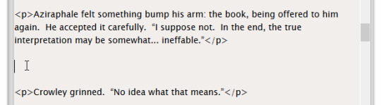
Text

guys b honest is this readable
8 notes
·
View notes
Note
Hello! I noticed that some of your fics on Ao3 are tagged "Screen Reader Friendly," and I wondered what makes a fic screen reader friendly. Is it just about formatting, or does content matter too?
Hi, thank you so much for asking this question!!! Disclaimer I am not visually impaired so all of this information I have learned by seeing blind or visually impaired people talk about this issue.
It’s primarily formatting! I’ll list everything I do to try to make my fics accessible here.
Line breaks!!! Use the ao3 line break code instead of adding a bunch of symbols. This is the biggest thing I had to change once I realized my fics were not screen reader friendly.
HOWEVER some screen readers won’t pick up on the horizontal line, either. Another good option is to use a short series of symbols, for example: “~~” or “- - -“
Basically, just don’t use more than three symbols in a row. I used to use “~~~/\~~~” with a delta symbol in the middle to look like the triforce, but a screen reader would see that and say “asterisk asterisk asterisk delta asterisk asterisk asterisk” which is pretty annoying lol
Most screen readers don’t differentiate between regular text and bold/italics. It’s fine to have those in your story, but if the bold/italics significantly changes the plot or the implications of a sentence then it is not screen reader friendly
Screen readers can’t describe a line break that is just an empty space. For example, in one of my fics I have a character reading a note, and I have an extra ‘return button’ space before and after the note to make the note distinct from the rest of the text. To make that fic more screen reader friendly, instead of just an empty space, I wrote “[Line Break]”. That way, a screen reader can say “line break”, and readers still recognize it as a line break
If you have any sort of chat fic (AND this goes for hashtags on tumblr too!) with screen names, be sure to distinguish the separate words in the screen name. You can do this with by capitalizing the first letter of each word like this “ScreenNameHere” or with dashes in between each word “screen-name-here”. That helps screen readers and also people with things like dyslexia who have trouble distinguishing words if they aren’t capitalized or separated in some way.
Screen readers can read image emojis like this smiley face 😁 because they have embedded alt text, but they can’t read text emojis as an emoji, like this one “:D”. If you use any of those in your fic, add a description like this: “ :D [Image description: text emoji of a smiley face with a big, open mouthed smile. End description].”
Also, this one doesn’t have to do with a screen reader, but if you have an image embedded in your story, keep these things in mind:
Be sure to describe the image so anyone who is blind or visually impaired can still experience the image. I don’t think it’s possible to add alt text to the actual image, so I usually put this below the image: “[Image ID: description of the image. Note the important details, but be as concise as you can. /End ID]”. Including the image description instead of some sort of alt text is good for DeafBlind people who can’t see the image well enough but don’t use a screen reader.
Some blind or visually impaired people don’t use a screen reader and instead zoom in on the text. If an image is embedded in the story, be sure it is sized correctly. If it isn’t, it can make scrolling sideways to read zoomed in text more difficult because it makes the webpage much wider than the text itself.
Not all my fics have the screen reader friendly tag because 1. There might be a few I haven’t updated yet, and 2. I didn’t include the tag on fics that have weird formatting or are accent heavy. For example, in Kinship I wrote Twilight’s dialogue to represent his strong accent, and those kinds of things with apostrophes and half-words don’t come through well with a screen reader.
I personally don’t think it’s good practice to include a ton of apostrophes or shortened words to distinguish an accent. Even for people not using screen readers, it’s hard to read. For me, if I see a fic with things like that, I won’t read it. Maybe try having a few words that the character’s accent comes through on, or write something about their heavy accent outside of the dialogue.
The “Screen Reader Friendly” tag isn’t an officially recognized AO3 tag yet, but the more people who use it, the sooner it will be!
Those are all the things I can think of right now. If anyone has any other tips to add, please do so!!
713 notes
·
View notes
Note
a little late asking you a question but do you have some favourite books to share? and why they are your favourite? like such as how did they influence your way of thinking, your relationship with art, your way of writing, &c.
i've gotten a few asks about books/writing that influenced me and this is the most open-ended one, so, congratulations on winning that lottery anon.
the book that most recently affected me is The Left Hand of Darkness by Ursula K. Le Guin. it's about a representative from an intergalactic alliance of worlds embedding within and learning about the culture of a previously uncontacted civilization, to try to get them to join. but really, it's about observing the sociological particulars of a human culture where everyone is functionally intersex, and sort of swap male/female gender roles during the time period when they're (for lack of the term actually used in the book that i can't remember) "in heat". it's an astonishing work of science fiction that is every bit as good as its reputation suggests. i had a hard time getting into the first 20-30 pages, but once it really digs into the particulars of "shifgrethor" (this culture's all-important sense of decorum and near-invisible communication that the protagonist struggles to understand til the end) i was hooked. i love fictional social systems. i'm a homestuck, i can't help it. there's a profound materialism in how Le Guin observes this culture into being that unlocked something in me. i'll be thinking about the journey across the ice for the rest of my life.
i was also very inspired by This Is How You Lose The Time War by Amal El-Mohtar and Max Gladstone, perhaps the most pure distillation of the feminine desire to hatefuck your rival into an ascendant beacon of cosmic revolution yet put to the page. much of how they write about time travel has made it into godfeels, not to mention the wildly extravagant and brief but numerous visions of absolutely batshit speculative alt-history tableau. i mean, the way they talk about Atlantis as this sort of annoying constant of the timeline, sometimes real and sometimes fake depending on the strand, definitely casts a shadow over the metaphysics explored in Chapter 8.
the other book i always recommend alongside Time War, because i read them at the same time while i was in the middle of production on Chapter 8 in 2021, is There Is No Antimemetics Division by qntm. anyone who's read it or knows about it can immediately spot the gargantuan influences it's had on Silverbark's narrative in Chapter 8 and especially in Double Album. if you're not aware, Antimemetics Division is a standalone SCP novel about a branch of the Foundation dedicated to studying & intercepting the phenomenon of antimemes, ideas & entities that defy our ability to remember them in various ways. think The Silence in Matt Smith's second season of Doctor Who, or the Void Fish in the Balance arc of The Adventure Zone. i'm not an SCP person at all, i think i've read maybe half a dozen other SCP entries, so i'm not totally full of it when i say this book stands very tall on its own two legs. i very much intend to take a closer look at it in detail down the road because i think, whether intentional or not, the main "villain" of Antimemetics Division operates as a very handy analogue for the socio/psycho-logical effects of the profit motive on individuals & on society at large. also: Marion Wheeler is so fucking good. i did not know she existed when i came up with Silverbark but you bet your ass it's an influence now.
a non-fiction book that's had an outsized influence on me is Zen and the Art of Motorcycle Maintenance by Robert Pirsig. i always feel self conscious about bringing this one up because it sounds like a self-help book or some kind of Chicken Soup for the Soul ass grifter textbook. that absolutely could not be farther from reality. ZAMM was written in the 60s and it's a semi-autobiographical philosophy of metaphysics text by a professor of rhetoric who some years ago underwent electroshock therapy after a destructive manic phase. it follows Pirsig on a motorcycle trip across the American west with his son and some college friends, as he tries to uncover the ideas that drove his past self (who he characterizes as a different person that he calls Phaedrus) off the wall. those ideas concern the nature of "quality" and how we perceive it. as in, why should we Know that a good painting is "good" within seconds of examining it, in the same manner that we know a stove is hot almost before we've even touched it? he digs deep into how we conceptualize the split between objectivity and subjectivity, and posits that understanding Quality requires a substantial re-evaluation of our base assumptions about human perception. of course there's SO much more to it than that, it's a beautiful and strange book that succeeds in part because its philosophy is deeply couched within the metaphor of a road trip, making it a lot more accessible than an otherwise straightforward metaphysics text. i read it in an honor's philosophy class full of incurious Christians at age 22, and that was absolutely the perfect time for it.
another non-fiction entry would be Acceptable Men by communist labor agitator Noel Ignatiev. it's a memoir about his time working at Gary Steel Works in the 70s, at the time the largest steel works factory in the world. it relates in very simple terms how racism sabotaged the USAmerican labor movement through anecdotes from his workplace. it's important, i think, for those of us dreaming of & pushing for a more equitable world to stare long and hard at struggles past and not lose their most valuable lessons in our desire to simply have it be true that unions are good. they are good but they're not everything, and in fact they're just as capable of systemic dysfunction and capitulation to capitalist white supremacy as any other organization of human beings.
what else? i started reading The Traitor Baru Cormorant and much enjoyed its early pages, but holy shit that's one long book in a series of long books. people are telling me to read Exordia so i might give that a shot. i've got Gretchen Felker-Martin's Manhunt as well as May Leitz's Girlflesh on my desk, just waiting for the day i'm psychologically prepared to be ravaged by transfem body horror. i keep picking away at China Mieville's October, i'm sure one of these days i'll just sit down and power through it. of course i recommend everyone check out Lenin's State and Revolution, great book from the original poster, absolutely still relevant more than a hundred years later. and much easier to read than you might expect! no one ever talks about how entertaining he is as a writer, unless you hang out with communists in which case you're probably sick of us never shutting up about it.
i hope there's some good stuff in there, and not too much that i've written about before. i really need to make myself read more, but then again who doesn't?
27 notes
·
View notes
Text
How to Embed Images and Links on AO3
Note: I have a site skin so the colors might look different. Just follow along with the red arrows! Also, this is a tutorial used on the computer, and I assume mobile posting would be different.
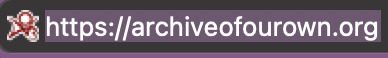
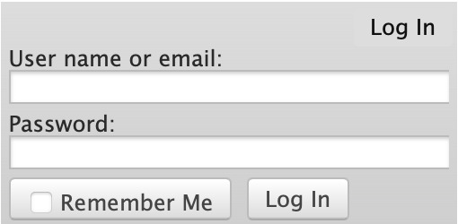
First, open archiveofourown.org and log in if you haven't already. If you don't have an AO3 account, sign up for one as soon as possible because it takes about a week for them to verify you and give you access to your new account.
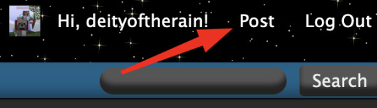
Next, select "Post" in the top right hand corner like you would typically. Set up everything you desire as you normally would until you reach "Work Text*".
Note: If you need further help, I have an AO3 Tag Guide, a Story Title Guide, a List of Random AO3 Shortcuts, and a How to Post a Work on AO3 with Step-by-Step Explanations Guide for your convenience! I also have a Foundations Writing Lesson post for any beginners or for people who would appreciate a review <333
Once there, click on "Rich Text" in the top right of that section, and then select the image icon or the link icon, depending on which you are intending to make.
Note: Check under the cut for more in-depth instructions slash a continuation of this guide! There is an Image Icon Route and a Link Icon Route.
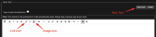
Image Icon Route
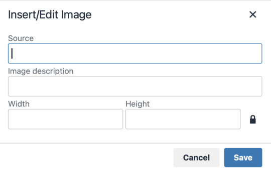
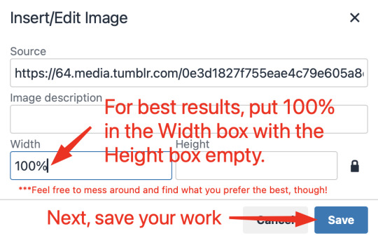
Once you click on the Image Icon, the screen similar to below should pop-up:
*Link Icon Route detour start here
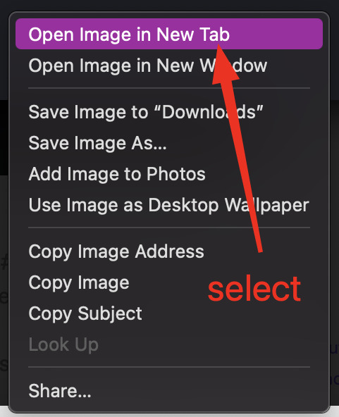
The source is the link to the image you're wanting to add to your work. AO3 doesn't host images itself, but you can use an image hosting site such as postimages.org or even Tumblr itself. If you want to use Tumblr, post a draft with the desired image or locate a post with the desired image. Once you've done that, right click the desired image and Open Image in New Tab (or whatever your computer's equivalent is).
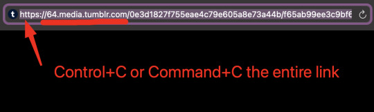
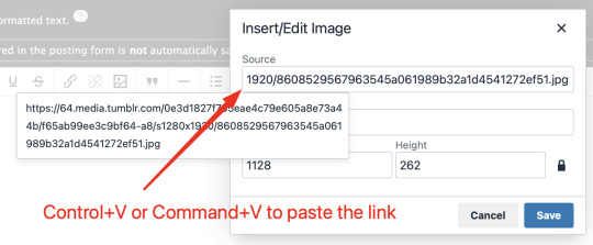
You should have a tab open that starts with "https://64.media.tumblr.com" followed by a bunch of numbers and letters. I want you to copy that link and post it in the source box.
*Link Icon Route detour ends here
Now that the image link is in place, adjust your Width/Height boxes if desired. Feel free to add an image description as well. For best result, I suggest doing 100% in the Width box with nothing in Height, but this is ultimately a personal decision. Feel free to mess around with the proportions using the work drafts and find what's best for you!
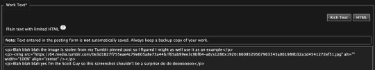
If you prefer, you can also use < img src="LINK" alt="IMAGE DESCRIPTION" width="100%" align="center" /> aka < + img src="https://64.media.tumblr.com/0e3d1827f755eae4c79e605a8e73a44b/f65ab99ee3c9bf64-a8/s1280x1920/8608529567963545a061989b32a1d4541272ef51.jpg" alt="" width="100%" align="center" /> for this example (*excluding the plus sign at the start) to insert an image using HTML instead of Rich Text. It'll look like this:
It is always a good idea to double-check and confirm that everything is how you want it. Previewing your work also allows you to create a draft.
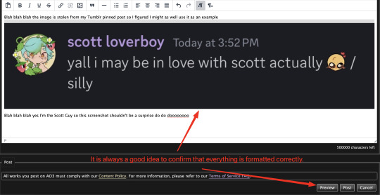

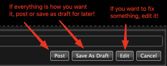
If you're unhappy with something, edit the work to fix it! If you're happy with how everything looks, go ahead and post it! You're finished here! You've successfully posted a work with an image embedded! Well done; good job :D
Link Icon Route
Once you click on the Link Icon, the screen similar to below should pop-up:
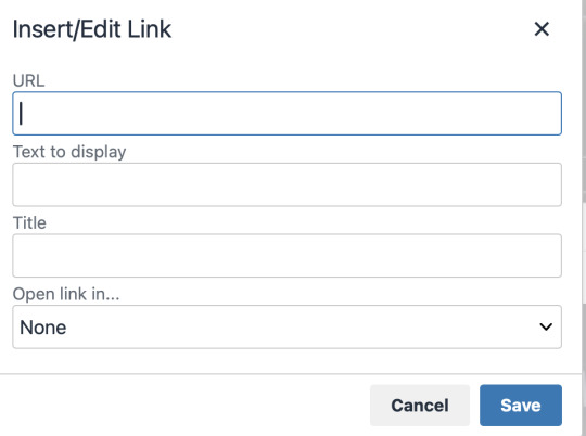
Go copy (Control+C or Command+C) the link to whatever it is you want to insert into the body of the work.
Note: If you're wanting to link specifically to an image and not a post containing that image, scroll up to the link icon route detour colored purple.
Once you got that, paste (Control+V or Command+V) the link into the URL box. If you want something other than the link to display, change the text in the "Text to display" box.
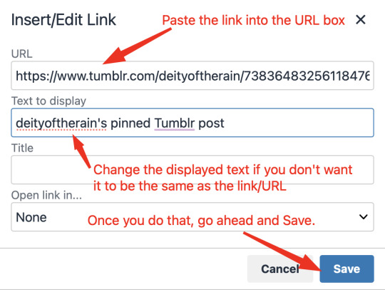
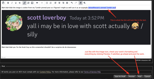
Save your work, check the formatting and everything else like we did in the Image Icon Route section. If everything is how you want it, then congratulations! You have successfully added a link embedded to your work!
If you have any questions or comments, feel free to comment and I'll respond! If this guide was helpful to you, please like and reblog! I appreciate it <333
#rain’s tips#ao3 author#ao3 help#ao3 writers#ao3#archive of our own#embedded#images#links#ao3 link#ao3 images#ao3 guide#idk how to tag this#idk what tags to use#writing help#guide
17 notes
·
View notes
Text
Hey, Here's something I learned for creating my tumblr bio.
So, in current times, I'm a little apprehensive to say anything too searchable in my bio such as that I'm trans. So I didn't want to use the official emoji. But I wanted the flag there for humans to see. I have very limited knowledge of html and css but I got this to work. I embedded the image data it's self into the html code. Usually images are linked, and the address is stated in the html, but that would require uploading the image somewhere and tumblr linking to it even when my not viewing it within my tumblr themed page.
So here's what I did. First I created a file in photoshop that is 8×5 pixels. I painted it with the colors of the trans flag. As tumblr limits how many characters you can put in your bio, the smaller the image the better. As the flag is the same left to right, I reduced it to 1×5 px. Then I saved it as a gif to the desktop.
I'm sure this is easy to do on a Windows or Linux computer too but on a Mac, open the Terminal app. *See alternative option below. type:
cd desktop
Then type: (include the single space at the end after txt)
base64 -i imagename.gif -o imagename.gif.txt
It'll export a file on the desktop with a code in it that looks something like this:
R0lGODlhAQAFAKIAANUtAP+aVv///9NipKMCYgAAAAAAAAAAACH/C05FVFNDQVBFMi4wAwEAAAAh+QQEAAAAACwAAAAAAQAFAAADBAghQwkAOw==
Add the image into the html with a usual:
<img src="#" alt="text" title="text"
Replace the # with this code and the image data:
data:image/png;base64,
Add the inline css to size and position it.
style="image-rendering: pixelated; height: .8em; width: 1.2em; display: inline; position: relative; top: -.15em;">
The final html code looks like this: (remove the $, its there to let you see the code without it rendering the image)
<$img src="data:image/png;base64,R0lGODlhAQAFAKIAAFvO+tewxfWpuPvd4////wAAAAAAAAAAACH/C05FVFNDQVBFMi4wAwEAAAAh+QQEAAAAACwAAAAAAQAFAAADBAhCAgkAOw==" alt="TF" title="TF" style="image-rendering: pixelated; height: .8em; width: 1.2em; display: inline; position: relative; top: -.15em;">
So that's it. It doesn't work in posts, only a tumblr bio or a webpage of your own. Let me know if it works for you and I'll try to help if you run into trouble.
BTW, tumblr only allows up to 2000 characters including spaces in your bio.
Here are some references and additional information that I used to create this.
References:
https://www.thesitewizard.com/html-tutorial/embed-images-with-data-urls.shtml
https://developer.mozilla.org/en-US/docs/Web/CSS/image-rendering
https://www.macworld.com/article/221277/command-line-navigating-files-folders-mac-terminal.html
https://www.w3schools.com/Css/css_positioning.asp
*this next one is a tool that lets you create the image code without the Terminal app.
https://www.coderstool.com/gif-to-base64
hopefully I didn't miss anything, goodluck!
1 note
·
View note
Text
May I gently say that in general - but especially during a genocide and amongst those who want to bring it to its end - we need to start embedding disability justice.
How many Palestinians are now deafened, blind, mentally unwell, physically disabled etc? The world we want to build - can these people access it? What about our own disabled siblings and comrades - are we bringing them with us? Do we see them with us in this new world we are trying to make?
I know that there are many places where obviously, it will not be fully accessible. Nobody is saying we need a blind man to be a sharpshooter.
But what we are saying is that we need to wrestle with the ways that settler colonial, imperialist racial capitalism has successfully propagandised to us regarding disability. Things we take for granted. Things we see as common sense - are these things actually the natural state of affairs? Or does this mode of thinking reinforce capitalist and settler colonialist violences in small and big ways?
Let me bring this down from the abstract and macro, to the more concrete and micro. For example: we realise that:
one way the American (+ Israeli + other allies) retains its stranglehold on its hegemony is by a vast propaganda machine. This is audio visual media, like news, TV, books etc.
these countries do not want a politically educated working class. schools and universities do not give people the ways to analyse and critique their society, and come up with ways to change it for the good of everyone.
These countries have legal systems that facilitate (enable, make it easy) capitalist productions. Such as no maternity leave, bad workplace protections etc.
This type of working disables people. It makes people sick and unwell, physically and mentally. It’s hostile to anyone whose body or mind can’t function well in a job.
This is on top of historical processes of disablement and debilitation by genocide, ethnic cleansing, colonialism, war etc.
The capitalist entertainment industry exists to make money, and to make money off a numb, overworked and tired population. there are a lot of tv shows books etc which have no real substance, and provide comfort for peoples difficult lives. And people are not encouraged to engage with this critically. Often they also don’t have the time or the tools to do so.
Therefore, any of us who seriously want to change this, must realise that
We have a lot of propaganda to counteract. I think many people realise this, and share a lot of tweets, book excerpts etc. however-
Sharing is not enough. We need to be sharing information in an accessible way.
This is because the masses are - for the reasons I’ve laid out above - tired and disabled. They may not be well educated or literate. They may not speak the dominant language of your country very fluently. They also have been drenched in capitalist and imperialist propaganda for years.
Therefore: order to reach these masses effectively, the information we are sharing should be shared as accessibly as possible.
A simple way we can do that is by copying and pasting text if we post screenshots of tweets, articles etc. This makes it easier for blind people and people with visual impairments. They can have the text read to them by using screen readers. But not everyone has screen readers, which also read alt-text. Image descriptions allow people to magnify or enlarge the text. People can also translate the text online to a language they understand better.
Please describe your screenshots.
The majority of image descriptions on this website are done by other disabled people. It takes longer for us to describe the images after, because you have to use an online converter. Or type it out ourselves. It’s a lot quicker if you are taking a screenshot to copy paste the text at the same time.
I know it’s not always possible to do. And it’s hard to get into the habit. But I think we need revolutionary discipline to practice and get into this habit, those of us who can.
I am also speaking to myself here. It took me 2 years before I started seriously to describe text. I was shamed into doing so by blind users on this app who were rightfully upset at how those of us with sight completely erase them from online experiences. It kind of awkward to do at first. You kind of feel silly. But you do get better. Even if you are a small account, it’s important to try your hand at this. It can be an introduction into mutual aid for a lot of us - helping each other out because it’s important for us to help each other and to have links with each other, including disabled people.
I think the more of us who try to do this, it will lead us to increase accessibility in other areas, like in-person organising.
If you’re interested in getting into describing text, have a look at my tag: image descriptions. It’s got some tips, tutorials and explanations written by people who rely on images being described to get info and navigate the web.
Thank you for reading.
#Image descriptions#Accessibility#Disability#Socialism#Long post#FYI I’m not blind or visually impaired
2 notes
·
View notes
Text
Adobe indesign Pt1
I cant go in and grab my version of this project so i'll just be using the images and some of the info from moodle :) sorry! What is indesign used for? Using photoshop and illustrator you can create images, but in indesign you can combine and assemble them. Though they have similar tools for creating shapes its far more common to make vector graphics in Illustrator. Raster images of photos and backgrounds are generally created in Photoshop. Because of how the design process is and how a client uses it Indesign gives creators several methods of making changes easily to projects. Two of these methods are styles, and Linked items.
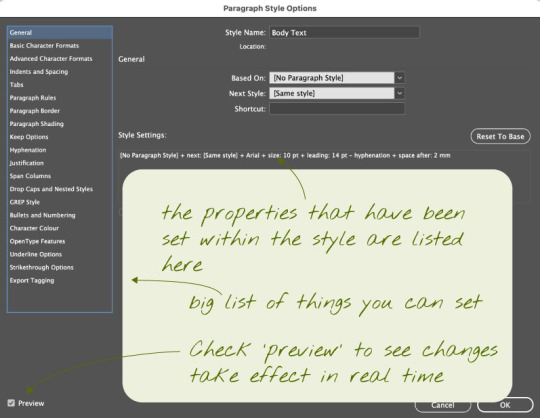
"Styles allow designers to apply settings to objects and text and save those settings as a style. The style can then be applied to multiple things of the same kind, such as text. If the client or designer decides they want to change that style, then all instances where it was applied will change if the designer makes a change to the style." Paragraph styles In Indesign, a paragraph is the text that is enclosed by two carriage returns. A carriage return, which got its name from the typewriter's carriage moving from the end to the beginning, is just pressing the return or enter key after writing a title, bullet point, list item, or a piece of text.
As soon as your work gets more than a few paragraphs, it makes sense to use paragraph styles. For smaller documents it isnt as needed.
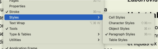
Paragraph styles can be accessed from the windows menu as seen below
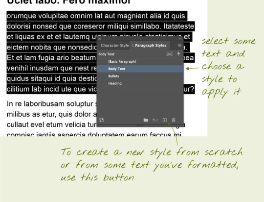
Above is an example of the 'Paragraph styles' box.
Inside of the 'Paragraph styles' Bullet points
A bullet point is a symbol that is used in writing to introduce an item in a list. A commonly used symbol to represent a bullet point is a centered dot (•), but many different symbols and characters can be used in bullet point lists. Sometimes, bulleted lists even use numbers and/or letters. Below is how to correctly use a bullet point in indesign.

Loading images into InDesign and moving them around. Indesign images are stored as links, this means instead of it embedding a file into your work it inserts a link, which is somewhat similar to a smart object in photoshop; meaning that when something is changed about the image it can be updated using the link
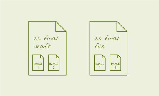
Without linked files, any image files are duplicated within each document, creating larger files:
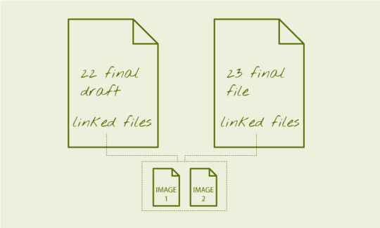
With linked files, there's only one copy of each image file, and edits to it will show up in the file:
The benefits of this is that the images are not included in the file, and remain 'live'. If you're supplying an InDesign as an archival package, you must supply the images with it. To insert an image into your InDesign document, go to File > Place and navigate to the desired image(s) you wish to include. Moving images around. The important thing to understand in InDesign from the get go, is that anything added via 'place' is put into a frame, which is the same size as the image. Understanding this will avoid a lot of confusion.
To an image around in the document, press V to activate the selection tool. Then click the image and drag the image around.To move an image within its frame, use the selection tool and after clicking the image drag the circle that appears in the middle.
To scale / adjust the frame that contains the image, click the image, then manipulate the corner or edge points of the gizmo. Hold shift whilst doing this to constrain proportions. Hold Option/ALT (PC) whilst doing this to scale from centre.
To scale / adjust the image AND the frame together, hold down Command/CTRL (PC). A common move is to hold down both Shift and Command/CITRL (PC) to reliably scale objects and their frame together.

To wrap image around text you need to put the image into the text area and then open the properties menu. Use the text wrap options in the properties panel (WIndow > Properties) to set the text wrap around the image object.

0 notes
Text
Image Descriptions and You!
or, How to avoid cluttering up your posts with extraneous text while simultaneously making it *easier* for screen readers to parse image descriptions
Lately, I've noticed an increase in people adding image descriptions to reblogs of art or photos. This can be helpful for users who rely on screen readers, since many older posts were created before embedded image descriptions became available.
However, I've also noticed a lot of people adding text-block image descriptions to their own new photo posts, so you end up with something like this:

While this is not wrong to do, it can be a little clunky when there is text content in the post as well as an image description -- and when the image ID is placed after other text, it can be confusing. It's also not really necessary, because you can add image descriptions directly to your uploads! Here's how:
On Desktop*:
After uploading your image, mouse over it so the menu icon in the lower right appears. Click on the three dots and select "Update image description."

A text-entry box will appear. Type your image description in the box:

Click the Update button, and Tumblr will save the description of that image so that screen readers will automatically find it exactly where the picture is placed in that post!
On Mobile**:
After adding your image, tap the menu button in the lower right corner:
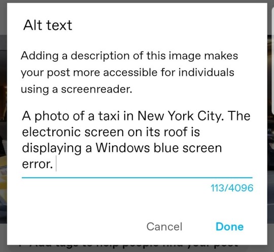
Select "Add alt text" from the popup menu:
Then enter your description and tap "Done."
...and you're done! It's so easy!
Adding Text Descriptions to Reblogs
Now, what if you're reblogging a post with an image, and you want to know whether or not it already has a description so you know if you should add one in your reblog?
Well, alt text is supposed to show up in mouseovers, but we all know that Tumblr doesn't work quite like other sites (*cough*search function*cough). Fortunately, there's an easy way to check!
First, right-click on the image you want to investigate. Select "Inspect" (Chrome; Edge) or "Inspect Element" (Safari) or "View Source" (some other browsers) or whatever option allows you to see the code for that particular page element.

A window will open displaying the HTML for that image. Look and see if there's already alt text in the block of image code. (It will be in the format alt="text description" and will usually be the only section of non-hyperlink text in the block.)

If there is, then you don't need to add an image description because the person who posted the photo already added one! If there isn't, then you can add one in the body of your post.
Now go forth and (more efficiently) describe images, friends!
* Desktop demo shown with Tumblr's "new" post editor (which has been available for literal years at this point, despite still technically being in beta)
** Mobile demo shown using the Android app. I don't have access to an Apple device, so someone with an iPhone can add to this if there's a different process.
#image descriptions#accessibility#how to tumblr#post editor beta#screen readers#please rb to let people know about this change in the user interface#i am fully aware that some people add image ids for virtue signaling and will fully ignore alt text#but i'm hoping that we can gradually make adding alt text a part of tumblr culture
54 notes
·
View notes
Text
Day 29: Cascade
https://homestuck.com/story/4028
There we go. I remembered that Gamzee had created the Clown doll, but I had forgotten the exact context in which he did it. Dave provoked Gamzee to create it by showing him ICP’s Miracles, and he had the opportunity to do it because the Condesce used him as an unwitting agent of English.
The exact form of the doll is almost certainly a result of the fact that Gamzee’s religion is symboically associated with clowns.
I wonder if you could make the Argument that the Zilly Stuff is in some way clown stuff. It’s certainly got the right level of whimsy, what with the change of skintone, the bright colors, ridiculous suspenders, honking, and so on.
I mean, the obvious Doylist answer is that the clown stuff is because of Andrew’s clown fascination, but from a Watsonian point of view, from whence does the Clown arise? I feel like reading it as a derivation of Zilly stuff is a good possible answer, but perhaps not something you can read out of the text.
https://homestuck.com/story/4063
I’ve already pointed this out, but it’s worth bringing back up - the stratification of the Haemospectrum as a system made effectively inevitable by exploiting individual hate is again directly paralleled with the repressive power that Gl’bgolyb has over troll society, an existential threat to all trollkind. Both the Haemospectrum Caste System and the Rift’s Carbuncle are gifts of Doc Scratch.
https://homestuck.com/story/4066
All of this is set up for the Condescension, and with her, Meenah, as a character, it seems to me. All of what we’ve read over the past several pages, the Dancestor stuff.
Here are a few takeaways. Her Imperious Condescension is reckless, and she’s reckless in ways that cause her to sacrifice things that are irreplaceable to her in her mindless pursuit of satisfaction for her greed.
https://homestuck.com/story/4077
Andrew himself is the actual instrument of Doc Scratch’s destruction, or at least, the Author Avatar Character is.
https://homestuck.com/story/4081
English’s only dialogue takes place in the Alt Text. The means by which he communicates isn’t merely on the narrative layer, it’s embedded into its very fabric; subtly, and in a way that’s easy to miss.
https://homestuck.com/story/4085
Karkat’s true strength, what makes him his friends’ leader, and the true heir to the signless is that Karkat considers his friends’ wellbeing before his own. Underneath the veneer of anger which he inherits through the Vast Expletive, he is endlessly forgiving, up until the point where there is simply nothing to forgive, compassionate and understanding even to people who he blames for all his suffering, easily placated, and universally friendly.
Even if he is an asshole.
https://homestuck.com/story/4109
So, what creates the Green Sun?
I think the answer is that hate, retribution, violence, and cycles of abuse create the Green Sun. Its power source is at least symbolically both of the universes, and their destruction is circumstantially simultaneous with it, but all of the revenge, and murder, and neglect, and abuse is what allows for the tumor to come into being in the first place. The various actors who are all complicit in producing the session of Sburb that has the Tumor and Jack as the physical manifestation of the cancer - their inability to forgive, inability to express themselves in a constructive way, inability not to resort to violence. The Tumor is a symbol of the moral incompetence of everyone who Lord English makes complicit in his rise to power.
But there is hope, because all this destruction is parallel with something he does not understand. For English, power, Lordship, means the ability to coerce everyone into doing what you want them to, it means turning everyone into chessmen on his board.
But Karkat’s placation of everyone on the meteor, and particularly Gamzee, is another kind of leadership, and it’s the one that will win. Karkat and English are diametrically opposed models of leadership, and victory between two competing powers will ultimately go not the one who has the most raw force, but to the one who knows how to yield.
Short one today, but I think I want to observe tradition, pause at the end of Act 5, and continue tomorrow.
Act 5 is a long exercise in showcasing the characters’ technical competence, and emotional incompetence, as everyone fails to come to terms with their own inner struggles, and for the most part, they all fail just narrowly. By the End of Act 5, while the survivors of murderstuck have all evaded their demise in the scratch, and mostly have done so by being able to call upon the bonds of those who love them and coming face to face with their own mortality, it’s all... just barely.
All of this power, and it only barely manages to save their own lives. Everything that they love and care about has been erased. It’s a decidedly hollow victory. When it comes time to be able to repeat that performance in late Act 6, they won’t be nearly so lucky. It will take a miracle for them to survive Homestuck.
Luckily, Miracles are all around us.
Cam signing off, Alive, and Not Alone.
7 notes
·
View notes
Text
Okay, just to be clear-- that alt-text is the secondary punchline of the actual comic, and xkcd puts the secondary punchline in the alt-text.
And while I agree that they are getting many very valid complaints, it's worth noting that anybody reading feedback for a major website is going to have to sift through rather a lot of ridiculous stuff.
I have managed a few smaller websites, and I built a web application that ended up being adopted enterprise-wide in a fortune 500 company. Let me give you some examples of actual complaints and how I closed them out.
Complaint: "Warning message that clicking this button will replace the contents of clipboard is insulting. That's what the button does." Resolution: Since they won't leave my manager alone, manager has ordered me to remove the warning.
Complaint from same user: "I had a very important URL in my clipboard, and your application removed it without warning me when I clicked the button that replaces the contents of the clipboard." Resolution: Told manager to own up to his decision and stop yelling at me.
Complaint: "Page does not load correctly on Netscape 4.01." Resolution: Advised user that they needed to upgrade their browser to something released within the last decade.
Complaint: "Application does not function correctly on <fad browser>". Resolution: Advised user that a) the application, per corporate policy, is designed to run on the browser that is installed on all company computers, and b) that particular fad browser is on the "do not install" list because of major security issues.
Complaint: "Layout will not fit all content in the frame if the browser is reduced to half the screen." Resolution: Advised caller not to do that.
The following aren't mine, but happened to people I know personally.
Complaint: "Application does not work on <obscure browser>." Resolution: Advised caller that they would need a browser that supports JavaScript.
Complaint: "Application refuses to store local preferences." Resolution: Look, you're the one that turned off cookies.
Complaint: "Sound not working on embedded video." Resolution: After following up with the user, determined user had no sound card, and was specifically demanding that embedded video not be used on the... and I cannot stress this enough... entertainment blog.
It honestly just looks like staff aren’t even paying attention to any feedback they deem “negative” anymore under the guise of “the haters” or something
15K notes
·
View notes
Text
How to center and nice-size an image in an AO3 fic using a work skin
Maybe someone can use this? In my fic for the DIWS Good Omens Mini Bang, I embedded some images from my wonderful illustrator. The centered images will never be wider than the text, no matter the screen size, but they also are never stretched larger than their native size (I resized ‘em to 800px wide in my trusty paint program for faster downloading). Here’s how one looks on my giant monitor and on my phone screen:

If you have never done AO3 skins before then I promise they are not actually scary! You have the option of doing relatively complicated things with them, but this thing is simple.
Anyway this is how I center my images.
Step one: make a skin.
In your AO3 dashboard, click “Skins” in the menu (left or top of page, depending on if you’re on a big or small screen). This takes you to the Site Skins page, which are for if you want to make all of AO3 look different to just you. You want a Work Skin, though, which makes your fic look different to everyone, so click My Work Skins.

Click Create Work Skin in the top right and you’ll get an editor that’s similar to when you’re posting a fic! You only need to set two things. One, give it a title that makes sense to you (the title won’t be visible to people reading your fic). Two, paste some stuff into the big “CSS” box.
This is the stuff to paste:
.centered { margin-left: auto; margin-right: auto; text-align: center; }
.centered img { max-width: 100% !important; }
That was the stuff to paste! Just toss both of those two blobs in the big editor and click Submit. Now you have a skin!
Step two: use the skin in your work.
Open up the work you want to do this in. Find the Select Work Skin box (just under the Choose A Language box) and select the skin you just made. Yay! Sorry, the Homestuck and Undertale ones are just there for everyone and that’s how it is. (Nothing against Homestuck or Undertale. I just don’t like unneeded entries in lists.)
Step three: center your image.
This is the most complicated bit, only because I can’t give you an exact thing to copy-paste. But I can give you a basic template! Don’t try to paste this into Word or a similar word processing program. The quote marks could get turned into “smart quotes” (like the ones I typed there, just now -- see how the opening and closing quotes are different from each other?). If you need to save it off for later, Notepad or another very simple plain-text editor will be perfect, because it will keep the quotes as not smart quotes.
Find the spot in your AO3 work where you want the centered image to be. It would be between two blocks of text which are wrapped with <p> tags, so something like this...
Into that space, you’re gonna hit Enter a couple of times (which I’ve already done in the screenshot) and then paste this block:
<p class="centered"> <img src="BANANA" alt="ORANGE" /> </p>
That was the block to paste. Before you’re done, you need to change two things!
BANANA goes away. Inside the quote marks where BANANA used to be, you need to put the URL of your image. This URL must start with http or https (preferably https), or else it won’t work. I can’t give specific instructions on how to get this, because it depends on where the image is hosted! If it’s only on your computer, or attached to an email, it can’t be embedded. It has to have been put somewhere on the web, like Flickr, Photobucket, or Google Drive. It will work to embed from Tumblr, but I don’t trust Tumblr not to change everything up and bork all the old image URLs, thus breaking your embedded images on an arbitrary date in the future. (Any image host could theoretically do this, but -- well. We’re all familiar with Tumblr, right?)
ORANGE also goes away. Inside the quote marks where ORANGE used to be, you optionally can (I recommend you do!) put a brief (200 characters or fewer) description of the image. This is text which is invisible when viewing your fic in a normal browser -- it’s there for screen reader technologies, used by people who are blind or otherwise have trouble seeing a screen. Their screen reader software will literally read out to them, so that they can hear it with their human ears, the description you put here. Don’t start it with “image of” or “picture of”, because the screen reader tells the human that it’s an image already. Here is a pretty user-friendly guide on how to write alt text! If you’re more technically-inclined, the W3C has more involved docs. Remember, the screen reader is going to say out loud whatever you put here, so don’t make it super long, or else you’ll force people who are using screen readers to wait through the long description for your story to continue.
A finished version of the banana/orange block might look like this:
<p class="centered"> <img src="https://www.my-nifty-example-website.com/prettypicture.jpg" alt="Two dogs having a tea party wearing fancy hats" /> </p>
Step four: do it again if needed.
If you have more images to center in the same work, just repeat step 3 for each! Step 2 has to be done once per work. Step 1 might be done once ever (and then you just keep pulling that same skin into many works), or you might do it multiple times (if you want other changes in the skin that are special to only this one work). I do a different skin every time I have a fic that needs a skin, but that’s because I do extra fancy things that are different for each fic.
You never have to do either step 1 or step 2 more than once per work, even if it’s multi-chapter. In future chapters of the same fic, just do step 3 again.
Step five: preview and/or temporary draft is your friend
I am an IT professional with a (technically expired but work with me here) Microsoft certification in HTML5/CSS and seven years of writing this stuff for pay under my belt. Even I don’t post without previewing. Preview and saving as a draft without publishing are both your friends.
Some fun(?) notes
What you are doing here is using cascading style sheets. The AO3 skin is a very simple stylesheet, which is a series of rules that your readers’ browsers will use to apply to text in your story. There are standards that all your normal sort of browsers (Firefox, Chrome, Safari, Edge, Opera...) are supposed to follow when they see these rules, so that no matter which browser someone uses, a webpage will look as similar as possible.
A skin created from the above steps defines a class named “centered” and tells the browser how “centered” should look. Then, in your fic, if you apply the class named “centered” to something in the big editor -- like, say, the <p>aragraph tag that wraps around your image -- then the style from your skin will be applied.
The magic of cascading style sheets is that you can define your class exactly once and then use it many times. If you decide you want to change all the places you used it -- maybe you want every centered image in your 87-chapters-long heavily-illustrated fic to have a green border? -- you have to change exactly one place: your skin. The change will bubble down to every single place you used it.
Skins do not allow all the features of true CSS (no media queries; I am sad), and you can’t put comments in your skin (the editor strips them out). Browser-specific overrides also do not work (if you don’t know what this means, that’s okay, you have to go to extra work to try to use them in the first place). But they’re still pretty cool.
A lot of people will just put <center> tags around their thing, and use width=“100%” or some other number, but that is technically not standard HTML, hasn’t been for a very long time, and sooner or later Chrome is going to get clever and stop respecting it. (Google’s developers like to make Chrome very clever and change how it does things just because they feel like it. It makes my day job rather more difficult. Ask me about SameSite cookies!! Actually, don’t. Never ask me about that thing.)
For portrait-oriented illustrations -- taller than they are wide -- I like to float the image to the right of the text and have it take up no more than 50% of the width of the screen (as seen near the end of this chapter). But that is a more complicated thing than this one, and I am keeping it simple today. Maybe I’ll show how to do the nice floaty at some point.
For any-oriented illustrations, you could have a small resized version which links out to a larger version as a click-to-zoom thing. That is also a little more complicated, so it isn’t in this post.
Questions and clarifications welcome.
That is how to center and nice-size an image in an AO3 fic using a work skin! I hope you are having a good day.
#ineffablefool original post#man idk how i would even tag this thing#i'll worry about that later#not good omens#look you don't understand i love html and css this is fun for me#i don't get to do it very often at my job since they promoted me so i hafta get my kicks where i can
42 notes
·
View notes
Text
mtmte liveblog - 2012 annual
iirc the annual takes place between 7 and 8, or something. whatever, im gonna go for it
shifts in art style always throw me off phewwww
i cant remember what theyre doing but i find it really funny that first aid is there squaring the fuck up to punch shit
ah yes of course how could i forget the time they shrunk down to fight tiny robots in ultra magnus’s head. a comic classic
poor magnus lmao
HBJSDKFBSHJFDHJSD HIS TERRIFYING SMILE HAUNTS MY NIGHTMARES. LOVE IT
love the continuation of magnus’s law-vision
the fact that everyone is dunking on magnus for smiling ONCE hvbhjdksbfjks
rewind and chromedome ough
i feel like cyclonus spends 90% of his early mtmte screentime staring broodingly out of windows lmao
tg so precious
lmaooo i love the flashes of rodimus saying ‘til all are one’ All The Time
rodimus just wants to be like his dad ok
rodimus telling drift to go meditate or something vbhjfdbhdsjkf
i love rodimus calling magnus out on referring to himself in the third person lmaoooo but also I'm like Oh I See That [eyes emoji]
wish i had emojis on the computer sigh
lmao so the circle of light is a bunch of pacifists With Big Ass Swords
them betting on how long it'll take rodimus to say ‘til all are one’ vbkjsdhbfjhkhsdf
damn so ambulon rlly did switch sides late in the game
cyclonus is here!! being an emotionally closed-off fool as usual
nooo rodimus let tailgate speak
cant believe rodimus graffiti’d tailgate
drift, immediately: rodimus is FUCKING POSSSESSED
ratchet: ok, no,
godddd everything abt the galactic counsel here is so funny. ‘its big - its grey - its taxpayer funded’ hvbkjshdbfjkdf and the fact that their ship is called ‘the benign intervention’ lmaooo
also DAMN that is a BIG ASS SHIP
‘a fleshling in a stupid hat’ i love rodimus and his irrational hatred of hats
magnus comin in CLUTCH with the dry-ass clauses shit
rewind vhjbdskfbaksdfn ‘the sub-section 7 defense - sneaky’ ily
tailgate hvbhjadkfbjskdf its ok that you don't know what's going on
also tailgate serves a vital role in the story as the audience insert character (or w/e its called), bc he’s often confused which allows for handy exposition that we the audience also need lmao
i find it so interesting to see how the cybertronians are viewed by the rest of the galaxy - we don't see a lot of aliens but its always fascinating when we do, because of COURSE they’re mostly gonna think of the cybertronians as destructive and war-like when that’s what they’ve been up to for 4 million years
ooof swerve :( swerve is one of those characters who you’re like ‘haha he’s funny’ most of the time but pretty often he’ll have startling moments of like, deep pain about life or w/e, and you’re like Oh Shit and then you kinda move on, until finally the swearth arc hits and it all comes together. what I'm saying is that this is some nice building towards that
HGDSBJFKJSJBDF THERE IT IS THERE IT ISSSSSSSSSS
THE PANEL WHERE REWIND IN ALT MODE CAN FLY FOR SOME REASONNNNNN
i fucking love that shot so much. does everyone see this. rewind is a GIANT FUCKIN FLASHDRIVE and he’s hovering ominously thru the air. like, what happened to all the biz from issue 1 or w/e where his husband was roasting him for having a non-mobile altmode? if he can fucking HOVER than Actually rewind is the fucking coolest, no contest
or like, is the implication that they all teleported there (having switched to alt mode along the way i guess?) and rewind is just like, suspended in midair? bc that's what the speed bubble text implies, but it also totally looks like they're just travelling across the area and rewind can levitate
anyways. that panel has always cracked me up lmaoooo
rodimus calling the council ‘fascists’ hvbhduifbjsdjfajskf sir i love you
GODDD and there's the joke payoff from a few issues ago - rewind, facing front, hearing drift transform behind him and not only being able to tell its drift without looking, but also being able to tell that drift is upset, JUST like chromedome said he could....fucking PEAK i love that type of payoff humor
ooof and more swerve introspection. i mentioned earlier but i fucking LOVE how this series showcases the extremely wide range of reactions/coping mechanisms that everyone has towards the endless war finally being over - and swerve really nails it here: confusing peace with happiness, and assuming that everything would automatically be better after the war is over, when in reality you still have to work just as hard to build shit rather than break it
also i adore the horror of a guy who is half-embedded in the wall, his face stuck in a rictus of terror & death, waxing philosophical about how peace is about the freedom of choice, and how they should all just feel lucky to have survived...oof, that's very specifically ironic coming from you, dude
but i do love the little characterization we get here for ore, a character who is literally already dead and has so far been used as a plot device pretty exclusively, but we still get to know little things about him here, and how HE feels about the war and the current peace, etcetc. it really makes the story and characters seem believable, like every character has a story even if we don't take the time to see it
love cyclonus posing coolly
kinda love how clear it is that drifts whole hippy schtick is just a front to cover his anger, and a tool to make him seem like an approachable, upstanding autobot
drift dramatically monologuing while pointing his sword at the sky is extra funny with everyone else just staring at him doing this
cyclonus why are you grabbing at the edge of the hole you're falling into, you can LITERALLY FLY,
magnus finally getting some appreciation for being The most law abiding guy like, ever
genuinely forgot abt the whole metrotitan plot that happens here
GOD when rodimus is like BRAIN QUEST TIME and then we smash cut to them at the brain ‘six minutes later’ vhbhkudfjbjksf i live for that shit
also that would be even funnier animated which further proves that we need an mtmte/ll animated series, please, somebody,
HBDSJKFSHDJF REWIND IS SO FUCKING FUNNYYYYYY you cant even tell if he GENUINELY didn't think cyclonus could talk or if hes just being a dick but either way? comedy gold
oh i adore the flashbacks being in a different artstyle, especially one that's so retro
i love rewind being a history geek, and cyclonus passionately explaining cybertronian creation theory
HHHH i fucking LOVE the myth/lore stuff like....a lot of franchises tend not to dwell in this type of mythology, you tend to get The True Version Of Events, but this kind of explanation rocks bc it totally sounds like the kind of religious mythology that naturally develops based on a species’ progression
and drift and ratchet’s very opposing and polarizing views certainty do make for interesting perspectives, tho i feel like the story sometimes leans too much towards ratchet being ‘more correct’ bc, logic! or something idk i feel like i used to have a couple mild opinions on this but i don't remember
and its funny bc i am, irl, an atheistic medical professional who believes in science above all else - essentially just like ratchet. but i feel like the narrative portrayal skews a little more in his favor than i’d like, despite that
skids just out here being a bummer, completely unprompted. cant even blame you tho dude
hhhhhh chromedome talking abt rewind ;_;
and when he says ‘maybe there’s someone out there who can save your life, too’ and cyclonus is there....hhhh
god i fucking LOVE drift and rodimus’s entire relationship. the layers...the LAYERS!!!
OH HEY ITS THOSE ROBOTS SKIDS FOUGHT
ah, inconvenient laser time!
ok i fuckgin love how cybertronian’s brains look just like the planet cybertron. that's so fucking great
of COURSE brainstorm brought his shrink ray
truly i love the convo between ore and swerve, especially overlaid onto everyone fighting
oof, the themes and plot threads of this annual are all so nicely tied up (which is something i love abt mtmte, especially early on when the story is smaller), with swerve now choosing to disobey an order from rodimus
oh yeah, the circle of light! that's who you've been looking for this whole time basically!
and then the ending, hearing that magnus smiled (willingly!) :) i love it
rodimus’s profile says ‘finds it difficult to sit still’ bc rodimus is an adhd icon
lmao i feel like over half of my sentences in this recap - and in most of my recaps - contain ‘i love it’ or ‘i love how-’ or some variation upon that theme. I'm predictable
anyways - the annual! i love this issue. its really long which is cool and i feel like it does a lot to flesh out the setting and lore, and even the characters as well. also, as i said above, it does an excellent job telling an exciting and well-contained story, with solid story beats throughout and plot threads that emerge and get resolved all within this issue, even while leaving plenty of stuff up for future resolution. that's the Early MTMTE Special, and i adore it. tho i will say I'm glad we’ll be getting back to the regularly scheduled art style, bc this one didn't really do it for me
2 notes
·
View notes
Note
The epilogues look terrible and I don’t want to spend my time reading them... but I love + trust your judgement and your takes on things. Could you summarize them? (No pressure if you don’t want to)
OK, it’s been a few weeks since i read it, but I will do my best.NOTE: This is probably not comprehensive and definitely not objective. As a supplement, I did some poking around, and the MSPA wiki has some bullet points. I also eventually found another summary on tumblr, albeit by someone who also didn’t like it, so it is probably biased as well.
ANOTHER NOTE: Those content warnings weren’t a joke. Below are references to sexual content, assault, suicide, sexism, transphobia, character death, and probably some other stuff.
WHAT HAPPENED:
In the prologue, Rose summons John to inform him that he needs to defeat Lord English right now, or they will all experience terrible consequences. These are mostly meta consequences you can interpret as ‘if we don’t produce new Homestuck content on its 10th anniversary, everyone will give up on this franchise for real, and also canon doesn’t seem stable when the big bad never got beaten’. John goes to visit Roxy and Calliope before he leaves and is given the option to eat either meet or candy. This represents a choice he is supposed to make, and that choice creates two timelines.
In MEAT, John travels back in time and gathers three 16 year old versions of his friends. They confront Caliborn in the battle he represented in his Masterpiece and are sucked into the house juju. Vriska activates it, but not before being pulled into the black hole. Rose and Jade die immediately, with Rose’s body being destroyed and Jade’s falling into the black hole, because why should women get to fight the story’s biggest misogynist. Dave lands a solid hit on English before having his head bitten off Mami from PMMM style. John gets chomped on as well and a gold tooth ends up embedded in his chest. Davepeta appears and drags the wounded LE into the black hole. John finds his father’s wallet, retrieves his car, and slumps inside. Terezi appears, in bad shape after a long time wandering the ring. She seems confused at his state (explained because in CANDY she has been texting that version of him for years). She removes the tooth from his chest and they have sex.
Meanwhile, on Earth, Dave and Karkat have avoided talking about being a relationship for seven years, while Jade harasses them about becoming a threesome. This is explicitly tied to her abandonment issues but also she is referred to as a slut so like. Don’t love that. Jane is running for president, and Dave thinks this is terrible because she’s a woman fascist and doesn’t understand the economy and Karkat should run instead. Other shit is happening but I lost track. Rose is ill because she’s becoming her ‘Ultimate Self’ and seeing all timelines. Dirk claims he’s overcome the same problem and offers to help her but ends up controlling her and revealing he is the one actually writing this narrative. There is a bit where the narration starts addressing the reader directly and then turns orange which I admit is genuinely cool and might have been interesting if done with characters I didn’t actually care about.
Dirk amps up controlling the narrative, directly forcing people to do and think certain things. (For example, he sequesters Rose away in his workshop and tells Kanaya via narration she believes Rose is better off with him, and she uncomfortably agrees without understanding why she thinks that.) He supports Jane’s bid for the presidency, even though she wants to crack down on trolls because they are naturally violent and reproduce too fast. Everyone tries to get Jake’s endorsement because he’s popular, which includes Jane attempting to seduce him in a very uncomfortable scene.Then Jade slips into a nice coma, because it’s not Homestuck without Jade losing her agency, and alt!Calliope starts using her as an avatar to take control of the narrative away from Dirk. They have some back and forth arguments before he is pushed out which, again, is genuinely clever but would be more enjoyable without all the edgy bullshit. Dirk eventually tricks alt!Callie and sedates Jade, taking back control of the story. Jane wins the presidency. Also at some point Meat!Roxy and Callie ID as nonbinary and start using they/them, and narrator!Dirk freaks out about it and misgenders them a lot, which is character assassination bc everyone knows Dirk is a trans icon. Anyway. Dave and Karkat have an awkward talk about their relationship where they keep dancing around things and Dirk tries to force Dave to kiss him. Dave gets frustrated because he’s aware someone is trying to make him do something (like with the Aimless Renegade), and eventually yells at Dirk to get out of his head before kissing Karkat. Terezi brings John back to Earth, and he begins to fade, since apparently LE’s tooth was poisoned with something more powerful than god tier that makes you irrelevant. Possibly a meta commentary on the hero or story not being needed once the big bad is gone. Terezi is sad about this and listens to him bleed while she smells him die. Then Dirk contacts her via narration and implies he can help her. She gets a text (later revealed to be Vriska). Dirk gets a spaceship from Jake after forcing him via narration to grovel about how much he loves him and then rejecting him and flying away with Rose and Terezi in tow. Jade wakes up long enough to tell everyone Dirk’s gone bad before she gets repossessed and starts pointing in his direction, prompting everyone to give chase.
There is a final scene that will make more sense later, so I’ll add it later.
CANDY
John decides not to go fight LE. Roxy is delighted, and they began dating. Calliope tells John it is time to let Gamzee out of the fridge. Gamzee pops out and claims he is redeemed in a long speech making fun of sloppy redemption arcs. He then proceeds to be terrible for the rest of the story.Candy essentially satirizes Harry Potter epilogue style fics. Jane marries Jake (it’s implied she essentially roofies him with the trickster lollipop) and has Gamzee on the side. They have a son named Tavros. John and Roxy have a son named Harry. Rose and Kanaya adopt a troll clone of Vriska and name her Vriska. Jade, Karkat, and Dave are all dating, but Dave and Karkat are miserable. Dirk kills himself when he realizes the timeline went off kilter. Jade’s corpse from the Meat timeline crashes to earth, and in the middle of the funeral (which was genuinely a good scene) she sits up, possessed by alt!Calliope. Alt!Callie sequesters herself on the old meteor, now landed, and explains to Aradia and Sollux that this timeline is a dead end and she is protecting it from the influence of the prince. She also, in a parallel to Dirk’s reveal in Meat, talks about how every narrator has an agenda even if the text is formatted to make you not realize that.Jane becomes a fascist dictator and begins oppressing trolls. Karkat eventually get sick of being in a trio and runs off to be a resistance leader, including getting a sick eye patch (reference to Summer Teen Romance). Meenah stole the Ring of Life from Meat John and lands in the session; she and Karkat begin dating. Other ghosts begin falling from the sky as well, and Gamzee converts them to his redemption religion.John feels like something is really off. His only solace is texting Terezi a lot, and he seems closer to her than he is to his wife. He and Roxy break up for a while and then (non-romantically) reconcile. Jake eventually leaves Jane and takes Tavros with him. Jade and Dave become rebels as well, then Dave meets a hologram of Obama, who helps him attain his ultimate self, putting his soul in a new robot body.
Oh, also Vriska falls out of the sky, has hatesex with Gamzee, kills him, and then talks with Rose and Kanaya’s Vriska about how she loves Terezi. Then she texts her, as seen in the Meat timeline. Isn’t Vriska 13 and Gamzee an adult at this point? Probably. There’s a lot of questionable age stuff in this.
I’m sure I missed some details. Can you tell I’m losing steam.
Anyway, the two last chapters of each section reference the other storyline. At the end of Meat, Lord English’s body falls out of the sky, and alt!Callie (still in Jade’s body) devours it, becoming powerful enough to battle Dirk. Candy!Davebot arrives and he and Aradia jump into the black hole in pursuit.At the end of Candy, Dirk’s ship nears a new planet where he intends a new game of SBURB to be played. Rose is in a robot body serving as his handmaid essentially, and Terezi’s also on board.
TAKEAWAYS:
There are a lot of different interpretations of the epilogue. A mockery of the two extremes of fanfic. Andrew Hussie continuing the theme of ‘all authors are tyrants by nature’ and using his self-insert to display how he hates his own story but also can’t stop telling it. Dirk trying to create conflict by making himself a villain because otherwise they’ll lose relevance and disappear. Musing on how being arbitrarily labeled 'grown up’ when you’re not ready (aka handed godhood by a game that doesn’t understand people) can fuck you up, and there is no single winning screen in life. Just a big old meta experiment on unreliable narrators. I can see where some of this is coming from, but frankly, I found it disturbingly sexist (even if it is intended to be so for effect). A lot of the sex and violence felt over the top and graphic just to be #ow the edge rather than serving any narrative purpose. Also, authors can do what they want with their texts, and they’re allowed to write tragedies, but after Hussie’s self-insert informs Caliborn that the most important stories are about friendship and teamwork and the fandom (that I’ve seen anyway) really responding to the bonds between characters, it felt cruel. That’s my feeling. Not everyone shares it. But hey, I’ve got my solution.
60 notes
·
View notes
Text
gif tutorial with vapoursynth
i will be going over how to use vapoursynth to make gifs! if you want another alternative without vapoursynth you can see this tutorial where i go over how to make gifs with vlc player!!
what you will need:
photoshop
vapoursynth

step 1: clipping videos
so i like to start off by having two windows open, one for the video i’m going to be using and another for vapoursynth.

then what you will do is click and drag the video onto ‘vapourscript.bat’ and this window will pop up:

this is where you will put in the timing of where you want to start your clipping and it has to be in this format “00:00:00″. then you will hit enter and another prompt will show up on that window asking for the duration or how long you want the clip to be and it will be in the same format (i.e. if you want 5 seconds of the video you will put 00:00:05). then you hit enter again and wait until this window pops up on your browser.

from here you will put your gif size and you can crop it to how you want by dragging the corners. now you don’t have to do anything else to the settings and you copy what you see in the text box on the right side of the browser. the vapoursynth application will open up and you can follow the notes that are already embedded in the script.
now to clip it even further to make it more accurate you will go to line 14 and put a ‘#’ in front of all the text so that the line will be ignored. now you will go to script > preview and use the sliders to see which frames you start and end.

then you can remove the ‘#’ from line 14 and put in the numbers you want to clip the video. then you can save it by going to file > save and go to script > encode video and this will pop up.

just make sure that your header is set to “Y4M” and then hit save.
step 2: importing
now you go into photoshop and go to file > import > video frames to layers and a window will pop up and you go find the file.

then this will pop up and depending on how long your clip is you can press ok or select the option “limit to every 2 frames”. since the clip i got is a bit long i selected that option:

step 3: sharpening (optional)
it’s completely optional to do this since vapoursynth does some sharpening for you but i personally like to have a little more sharpening on it!. you can find a ton from @completeresources and @yeahps to just name a couple ps resource blogs!!
to use an action you will have to select all the layers on the layers panel and you should also set your timing for your gif here too in the animation timeline:

now you have to change the timeline from frame animation to video timeline and you can do that by clicking the button on the bottom left corner on the timeline that looks like stacked rectangles.
from here you will have to make all your frames into one layer so you have to go to filter > convert for smart filters. and you can use your action on that by going to the actions panel, selecting what action you want to use and press the play button.
now you can put the colouring that you would like on your gif! i have a few tutorials on how i colour that you can check out here~
step 4: saving
now when you save you can do the shortcut ctrl+alt+shift+s or go to file > export > save for web and this will pop up:

and so you make you sure you have these settings:

and also check to see if you are under the 3mb limit and the looping is set to forever and that’s really it!
70 notes
·
View notes
Text
Final Thoughts on Experience
INTRODUCTION
As a Bachelor of Applied Science candidate, I am more focused on the interface design aspect, mainly dealing with web + mobile design & development. I enjoy creating digital arts with a combination of computer programming in HTML/CSS. My hope is to become a UI/UX developer at a high-tech company like Google, Amazon, or even Yelp. That is why I am thankful to have interned at One Wave Designs during the summer of 2018 from June 1st to August 31st as a Web Design & Development Intern.
INTERNSHIP PROCESS
Learning Experience
As a Yelp Elitist, I searched up the “Best Web Design Company” on Yelp, in which One Wave Designs popped up as the first search with a 5-star rating! I gave it a shot and emailed the President/CEO/Owner of the company, Paul. He responded back asking for my resume and portfolio where I finally got a response a month later that I got the internship position!
During my time as an intern, I was responsible for mainly 3 things: web design & development, layout concepts, and SEOs. I mainly worked on 8 projects in 10 weeks. I learned that SEOs (Search Engine Optimization) is very important in web development because websites with good SEOs will always appear at the top of the search list depending on keywords that you use. For instance, if I were to type “Hawaii Web Design” in Google Search, One Wave Designs will be the first to pop up under all the other Google ads search. I learned how to hyperlink emails (mailto:) and phone numbers (tel:), which are also important factors in SEOs. Hierarchy, or the way you order the sizes of the header and texts, also matters too. When you’re adding images or links, it’s good to add a title or alt texts to increase SEO keyword searches. Lastly, saving/uploading images that are 200K or less is great for websites because it loads a lot faster.
I learned how to use 2 types of content management system (CMS), DNN Software and WordPress. I am very familiar with WordPress, it was my first time hearing about DNN. Unfortunately, though, DNN is not used as often anymore and non-developers are shifting to easy CMS like WordPress.I really liked using DNN because of how much coding is involved, whereas WordPress is almost dragging-and-dropping... this is more ideal for non-coders.
I learned how to use an FTP (File Transfer Protocol) software called FileZilla. This allows me to be flexible and customize a website through HTML/CSS coding. Basically, I can manipulate a style of the website by changing up the codes - which can only be done by FTPing and coding. It’s very confusing to explain and understand... I never heard anything like it before until I interned here! After taking web design & development course here at UHWO, I learned that it’s always a smart idea to make copies of the original files that I’ll be editing incase I mess up the codings. Don’t want to repeat that mistake again because there was a time where I had to reset the entire website and build it from scratch. :(
Layout concepts were the MOST STRESSFUL projects I had to do when I interned here. I honestly kind of dreaded it. Paul hated doing layout concepts too! Which explains why I always worked on them instead of him. These 4 software helped me a great deal when I had to make layout concepts/drafts for potential clients:
WhatTheFont.com
Google Fonts
Pantone Color Picker
iStockPhoto.com
WhatTheFont.com allowed me to upload a screenshot of a word so that it can identify the font types for me. Once it generates a few options of fonts, I’d download them (for free) using Google Fonts. Fonts that I find on Google Fonts are great for websites because it doesn’t have to be embedded. Another thing with the web is determining the color, so that’s why I always use the color picker on the Pantone website. Lastly, copyrights and permissions on images/videos/etc. are always questionable. That’s why I always look up stock photos on iStock since we have a subscription with them anyways.
Discoveries
I feel like I’ve grown as a person over the years. I used to be so shy and quiet, never being the first person to speak or raise my hand. Through this internship among other things, I learned how to speak up and ask questions when I needed to. If this is an unpaid internship that I am devoting much of my time to, I EXPECT to learn quite a few things. It never hurts to ask questions because that’s how you learn -- this is my motto. I learned that I am not that great at criticisms or taking in constructive feedback. I want to learn how to be more patient because there were times I’d get super annoyed when my supervisors would tell me what to do when I’m already doing it or will do it. Also, seeing how much projects I’ve done in such a short time span, I discovered that I am a very quick self-learner. As Paul mentioned, every client will have different expectations when it comes to building their website, which is why he couldn’t help/guide me as much as he should’ve. But in a field like web design/development, everything to customizable and flexible, so there’s never just “one way” to work on every single project.
Sample Work
Here’s a GIF image I found that totally speaks to me when it comes to designing layout concepts: the struggle with making the sizes exact. I was able to learn what the difference is between changing an “image size” and a “canvas size” on Photoshop because of this!

CONCLUSION
I wouldn’t mind working in a place similar to my internship~ I mean, I accepted a job position with One Wave Designs after finishing up my internship hours so that says something :D until this day (December) I am still with them. After 6 months, I learned a lot from working at a small yet successful company. There’s sooOoOoOoo much stress that comes with it. There were several times when Paul would dump a handful of projects on me despite my limited schedule and time constraint. I would lose my cool with him at times, and that’s where I reached my boiling point and told him I had enough. That’s when I discovered how much courage I had. Just a few days ago, I turned in a 30-day resignation letter to him, planning to resign by the end of this year since my last semester of college will be a stressful one yet. After Paul received my letter, he decided to give me a freelance position and allowed me to work whenever I can and work from home instead of in the office (lolol). This is what I’ve always wanted!
To conclude, it was a great experience interning here, but it was even better when I actually got paid. Sometimes I would question whether the amount of work I’m doing would even equate to how much I was getting paid by the hour. Ultimately, I was in it for the long run to build my experience and resume. I finally learned when/where to draw the line, which I should’ve done a lot sooner.
In the end, I learned that it’s good to build relationships with others and never be afraid to ask questions. Since I showed a lot of dedication and commitment when working here, I was able to earn Paul’s trust and was able to get things my way most of the time. I take internship experience very seriously. I’m here to learn so I’m not afraid to ask questions when I need to.
Whoops, forgot to add my presentation slides here: CM 390 Presentation
3 notes
·
View notes
Link
In today’s world, a strong online presence means more business, both through online sale and higher brick-and-mortar sales due to greater creditability and online awareness.
How can you increase and enhance your online presence? Here are five proven ways to do it, either yourself or hiring someone to do it.
1. Create concise, informative press releases that announce your online site.
The press release should provide useful information (you can find many of these on Google Trends which gives you an idea of what people are interested in right now), contact info, the site name and its features, and should be submitted only to publications that are generally read by your target market or a very broad, general segment like women, businesses, or families, for example. This is also a good way to build rapport with journalists and editors. (NOTE: Submit to multiple publishers and get even more exposure and links.)
2. Author blogs on your website.
Once you set up the blog, use it. For even greater online presence, utilize a service like Hootsuite, Buffer, or SocialOomph (also using IFTTT is good, but you might want to hire someone on Fiverr or SEOClerks to set the accounts up for you). Having a blog isn’t the end-all, it’s posting to that blog on a constant, periodic basis, i.e., once a week that creates the value and builds your online profile. You can write general blogs and then in the last paragraph relate it to your business. Having that last paragraph of relevant content is important for SEO purposes, as well as including keywords for your business in the blog. Also, commenting on other blogs related to your website's niche can be a good SEO technique. Many of the highest authority blogs are only too willing to let you comment. (Blogs are a great way to get higher rankings in the search engines. Search engines are always crawling your site, so “fresher” content, more content, and visitors linking to that content signal the search engines that there is something of value on your site, so they should direct others there. Backlinks are the strongest signa; to the search engines that your site has value.
3. Think videos.
Posting a video on YouTube that is properly tagged can help grow your business because YouTube is pulling millions of viewers in every day. You can also post on your website using the YouTube code. Videos are not hard to create: i) there are numerous free sites where you can grab a video and post on your site (while claiming ownership and being able to tag: Archive.org and Pixelbay.com are two sites that offer free videos (Shutterstock has tens of thousands of videos available on a one-time or subscription basis); ii) use Fiverr, SEOClerks, or another online vendor to create (they can b had for as little as $5); iii) your vendors may have clips they will make available to you; iv) you can create on PowerPoint and record right on PowerPoint; or, you can subscribe to Adobe Photoshop or another photo/video editor software package (or use the free alternative, Gimp); these software packages take some time to learn and some skill to use; and, v) hire us or a local vendor. Cost will usually run $400 or so for one minute, including voiceover. SALES SPECIALS CAN BE TURNED INTO A VIDEO. Properly tagged, not only will you attract traffic and businesses but also the search engines.
4. Email Lists.
Emails can be very effective as long as they are: i) directed at a target audience that has some interest in your products or services; and, ii) you send them periodic messages, i.e., every month. Once bought a direct mail marketing package after seeing an infomercial. Most important point emphasized was that repeated contact was important; they estimated average sale took nine contacts (obviously, will vary by industry but in all cases one contact ain’t going to do it. What can you say so many times: new products; personnel changes; special sales; special pricing; local events; interaction with vendors, community, church; charitable giving/events; etc. Doesn’t have to be product-specific, in fact more effective campaigns are not but your name and visibility will be enhanced. Are you capturing the email address of your visitors? You should try; that list is valuable.
5. Product feeds are valuable.
A product feed can help draw traffic and business to your site. The feed will show details that the search engines like, i.e., descriptions, images, and prices of your services and products. Submit them to sites which compare prices and to the major search engines. Add an RSS feed icon on your site or blog and suggest to readers that they should subscribe to your site's feed for the latest updates. (For most retail businesses, if you’re not selling on Amazon, think about doing it. Amazon will promote you at no cost to you.)
Every blog, video, email, or product feed should have proper SEO tagging, i.e., sub-URL, title tag, embedded keywords, keywords in the content and images with alt text tags.
OK, now you’ve attracted traffic and rankings. Is your website ready to handle, i.e., is the site visually attractive, have strong “call to action” prompts (telephone number, “Contact” button, and contact form, easy navigation, and have good content supporting the products and keywords? If not, update it. We can evaluate your site and redesign it (sometimes lonely slight changes are needed, i.e., add the phone number to the top, add visual boxes that click-through to the right page/section).
Make sure to avoid duplicate content. Each tag and written paragraph should be unique. If you cannot avoid them all together, avoid them in the index. Duplicate content and pages can lower your ranking on search engine result pages (SERP’s).
A good online marketing plan and proper execution of that plan will help enhance the company’s online profile, products, and services, as well bring more business to the site whether a national brand or a small local business. These programs and steps will help a business of any size. Contact us and we’ll help devise an effective, efficient plan and budget that works for you.
The post How to Create A Superior Online Profile/Presence for Your Business appeared first on Best SEO Company.
1 note
·
View note