#just like.. 60 more frames to completely color
Explore tagged Tumblr posts
Visit Tumblr Blog
Explore Tumblr blogs with no restrictions, modern design and the best experience.
Last Seen Tumblr Blogs


Fun Fact
Tumblr has 16.74 million mobile monthly users in the US.
Text
#art#digital art#animatic in progress#I know my friends are tired of my complaints so I’m taking it to the internet#helloWORLD#it’s gonna be banging when it’s done though#just like.. 60 more frames to completely color#😀
0 notes
Text
Like the goofy horror crossover that inspired it (Sadako vs Kayako) Dandadan's identity is all about smashing together the identities of its many eclectic inspirations. (most notably of course, ghostststs vs aliens)

So how does its opening embody that identity? Well of course the song itself is swarming with references to everything from a couple Japanese creepypastas from 2chan to Demon Slayer and other popular shounen hits, to M. Night Shyamalan — but not to be left out, the formal elements of the animation combine not only the bold and sharply contrasting color schemes that are characteristic of the show, but also three completely different animation styles into one strangely cohesive piece.
Directed by "Scott Pilgrim Takes Off" director and one of Science Saru's original creative voices, Abel Góngora, the opening sets the stage with the contrast between these close-ups of the syllable "dan" shown mostly on various digital screens, and these character shots that give the impression of analog film with soft edges between highlight and shadow, and overlaid grain, scratches, and imperfections.


These cuts are not exactly realistic per se, but they reflect a version of the world of the show that's very grounded in live-action cinematic techniques, like I discussed in my previous video. Many of them mimic a wide-angle perspective and give the impression of a real camera filming the characters.


Soon though, we jump into these highly stylized cuts in which bold, textured silhouettes stand out against saturated painted backgrounds.

This style in particular feels very characteristic of Góngora, who has worked on many of Science Saru's opening sequences, and seems to love these stark, stylized, and textured silhouettes:


Many of these shots are direct references to the 1967 Ultraman TV opening,

but they also generally draw inspiration from 60s and 70s pop art and cut-out animation. Slight imperfections in the credit text and slight camera wobble even give the impression of hand-cut paper being filmed with an old 60s camera rig!


Turbo Granny gets up in the mix with a third totally different style: these loose, chaotic, and gestural scribbles where clean line-work gives way to pure organic energy with very little consistency between frames.
These cuts are mostly done by Kyouhei Ebata (江端 恭平) (who you might recognize from his crazy painted frames on Dungeon Meshi) and Genta Ishimori (石守 源太) who has relatively few official credits so far, but has done some extremely impressive (if quite disturbing) independent work on his youtube channel, and whose own personal style seems to have primarily created the vision for how Turbo Granny would be portrayed in the show!


And finally, the three art styles and two major opposing colors all come together in this climactic cut as this slick, detailed illustration goes from clean, detailed blue, to bold, chaotic red in an instant as Okarun smashes through it, and is interspersed with these three demonic frames that find a middle ground between the bold textured silhouettes and the loose scratchy turbo granny scribbles.

This is all just a sampling from this video, where I go more in depth on all these elements, and lay out way more of the direct references, so go watch it! (If you're not too scared… Maybe you can't handle it…)
youtube
226 notes
·
View notes
Text
This is a long rant to shoot down mad BoB theories insisting that Tommy is a villain / secret spy in cahoots with Gerrard / plot device / temporary LI. The show's writers are mature adults who surely wouldn't go so out of the way to villainize a queer character? To the extent that he'd fool all the main characters into thinking he was a good guy and great for Buck for an entire season, and then start revealing his true colors in the next season? To make a beautiful storyline about queer joy blow up into flames with such a major negative plot twist? All so that Eddie can suddenly realise he is gay and he and Buck can get together? I seriously don't think a 60 year old showrunner would allow such childish nonsense to happen on his show.
I'm not saying queer characters can't play dark / negative roles — Eva's character is an example from this very show itself. But the writers always told us that she is a bad influence on Hen's life right from the start, never got us attached to her by depicting her as a great person in the beginning and then revealing later that she is bad. If Tommy was meant to be horrible for Buck, the narrative would clearly tell us that from the start the way they did with Eva and Hen. The writers cannot be so insensitive as to give the LGBTQ+ community such significant mlm representation with Buck and Tommy, first making us fall in love with their romance and then humiliating us (as well as Buck) by completely destroying Tommy's character — all to serve the end purpose of making a fanon ship go canon? That might happen in B*ddie fanfics written by teenagers, but it can't happen on a show being written for a sensible, mature audience by grown-ass career TV writers!!!
B*ddie would have happened a long time ago if the writers wanted to make it canon. They are not going to do it now, definitely not by making Tommy the scapegoat in that awful mess, just so the toxic portion of the fandom can be appeased over the rest of the audiences who appreciate the show for its thoughtful and sensitive storytelling.
Why is maligning Tommy even necessary to make B*ddie canon? Like Eddie and Buck have seen each other dating one woman after another through the seasons but only Tommy being the bad guy will suddenly lead to a feelings realisation arc? Why didn't it happen before, or why couldn't it happen without reintroducing Tommy if B*ddie canon was always the end plan? Probably because the writers aren't interested in going there at all, and Tommy is genuinely being written as a long-term LI for Buck?
Backing this argument is the fact that most of the conversations had by the other characters after Buck's coming out have not been explicitly about him now identifying as bisexual, but more about him being involved with Tommy. If Tommy was being written as a plot device or a short-term LI, I don't think the other characters (including Eddie, mind you) would be hyping him up during these conversations. The writers would have probably framed the conversations on the lines of, "Oh wow Buck you realised you're bisexual? Congratulations!" instead of "OMG you and Tommy? Tell us more / We love him for you and approve of you two together!" They wouldn't take the efforts they've been taking to make Tommy a pivotal subject of these conversations if he was just a plot device as the BoBs believe. And if he was supposed to be a villain, the other characters would have told Buck to find someone better if they thought Tommy's vibes were off. Not all of them can be foolish to not see through Tommy if he was truly as bad as BoBs say he is (especially not Bobby.) Yes, Buck's bisexuality is valid regardless of who he dates or even if he doesn't, but the fact the characters talk so positively about both him + Tommy during these convos clearly implies this is an important love story blended into the coming out arc.
If B*ddie canon was in the works, JLH and Kenny Choi wouldn't have said on their IG lives that it's not going to happen, Ryan Guzman wouldn't be referring to Eddie as heterosexual, etc. So, we cannot let the BoB comments get into our heads because they are not the ones writing the show. I think we can expect a lot better from Tim & Co. than them giving in to the delusional fantasies BoBs want to see being manifested. Wanted to say this piece because I am fed up of seeing the BoB conspiracy theories all over and don't want to give them the power to steal our joy. That's all for now!
___
#911 discourse#tevan#kinley#bucktommy#tommy kinard#evan buckley#evan ‘buck’ buckley#911 abc#evan x tommy#buck x tommy#tommy x buck#tommybuck
89 notes
·
View notes
Note
Hellooo I'd like to request something:
So it's with George Weasley and the reader and him are classmates (so they know eachother but kindly mind their own business). The reader is muggleborn and a big fan of old muggle music (I'm thinking of maybe something from the 60s/70s like the Beatles, Pink Floyd etc. but you can choose some other if you want) and kinda has like a similiar style (don't know how to describe it, maybe like flare jeans or something?) and totally lives and loves it. But they get bullied from some idiots about it and about being muggleborn and about nobody knowing "their kind of people". So maybe one day the reader gets bullied really hard (calling names, laughing at them etc.) and George sees it and helps them and then they become really good friends and he learns a lot about muggle music and starts loving it. And then - BOOM - one day both realise that they want more than friendship but it's kinda complicated telling eachother? So all in all it's friends to lovers.
It would be cool if you write it but only if you have the time, no pressure! If you aren't able to at the moment it's completely fine ♡
Have a nice weekend (btw I really like your fanfictions)

Babes I'm not sure what more I can do, you wrote the blurb already in your request! That's freaking great, like you did it, I can add a little extra but you did this babes!
You had always thought George was the softer twin. Whereas they were both boisterous and always pranking and loud, Fred just seemed more 'in your face' where George was more observant. Maybe that's how he found himself standing up for you after a particularly nasty group of Slytherin's were bullying you.
They were calling you names, making fun of how you dress when you weren't in school attire, calling it 'old' and 'groovy' and 'ancient', calling you 'four eyes' but George had seen you before and thought your style was rather cute and that your glasses complimented your facial features. He also now had another excuse to jinx some Slytherins.
You had thanked him when he saved you, full intentions on walking off but instead he asked where you were headed and if you needed company. That was the day you spend several hours in the library, you telling him about muggle movies and music and he knows a little bit of what you're talking about since his dad works in the Misuse of Muggle Artifacts Dept. at the MOM, but the way you talk about it makes it so much more interesting.
Neither of you realize you've missed dinner until Fred comes looking for him, surprised to (1) find his brother in the library and (2) find him talking to a girl he's never seen before. George makes plans to meet with you again, and you're taken aback at first, but agree to meet with him.
So you start hanging out more, start showing him your old record player that was your dad's and all the old music and George is in love with it all, telling you that he thinks it's more magical than most stuff he's experienced.
And when he asks you to the yule ball your confused, because he could ask anyone, but George has never been more sure of anything in his life.
With him being in Gryffindor and you in Ravenclaw you opted to go for golden color dress (it matched most closely with both houses and also complimented your glasses frames).
When you met George at the bottom of the Ravenclaw steps you nearly took his breath away, and it was at that moment he knew he never wanted anyone else.
George could do nothing but smile on the dance floor watching you enjoy yourself and playfully criticising wizard music, "Not to say anything bad about wizarding music, all music is great if the listener likes it, but I know quite a few muggle songs that I'd much rather listen to right now."
And George would smile and nod in agreeance while he swayed with his hands on your waist, watching your lips as you talked so enthusiastically only to be suddenly cut off by his lips on yours.
You respond immediately, hands finding trace in the hair at the base of his skull pulling him closer. And when you finally break away, both breathless, chests heaving, George just smiles and tells you to continue what you were saying, that he just had to kiss you quickly before he got to scared later.
148 notes
·
View notes
Note
Hiii, do you have any tips for drafting out embroidery patterns? I've got one in mind, but drafting it out and color picking is so nerve-wracking!!
[Hi!!!! this got kinda really long so I'm gonna crop it under a read more. And I honestly don't have any real training/instruction in fiber arts so this is just how I do things, and probably others do them very differently!]
Haha so my fandom embroideries are VERY different from my non-fandom personal pieces in this respect. For non-fandom things i just kind of throw myself in like WAHOO FREEFORM LETS GO and go for a kind of messy colorful approach that ends up as things like this:
Versus my fandom stuff is way more structured and designed to fill space, be very precise, etc. So for those I do go in with a digital mock up of the design I make in photoshop, that I then color in, and then as my last step translate to thread colors.
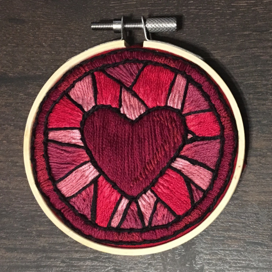
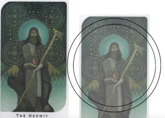
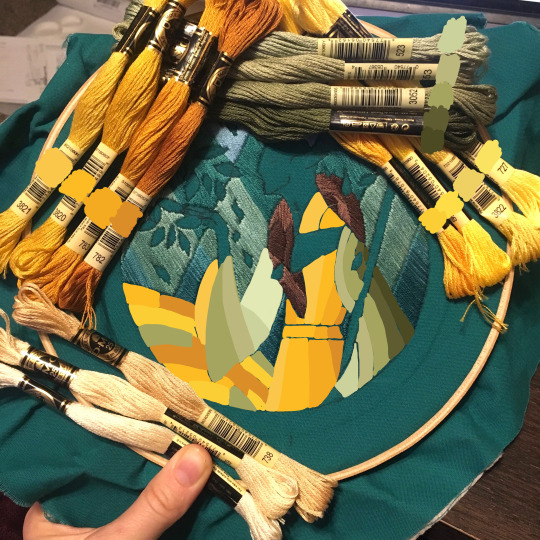
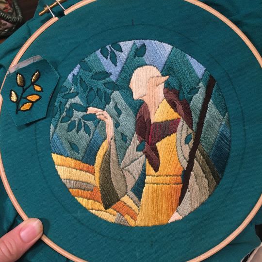
For my Dragon Age series. this has been because I'm specifically trying to mimic the stained-glass style of art you see in parts of the game like the dialogue wheels, some icons, windows, etc. The icons in particular were really easy to copy into embroidery because they already come in handy circles:

This is mostly because I have desperately wanted to pick up stained glass work as a hobby for like 6 years now. As in once every 3-6 months I put everything I'd need to start doing it into an online shopping cart and look at the price total and then sadly close the window because I just don't actually have any space I could do it in (I live in a 2bed apartment so i have no garage or yard or anywhere it wouldn't make everything else a mess or be a hazard). The day after one of those events I impulse bought and completed a floral embroidery kit from the craft store and kinda was like... ok, well, I did this once how hard can it be to use this medium to mimic the hobby I wish I could be doing? Plus, it's only like 60 cents per color! I can afford that! So I took the first design I wanted to do, the romance icon, and basically redrew it sloppily in photoshop, then freehand-copied the design onto fabric and stitched it the next day:

I learned a lot from this piece and changed my approach a little. Here you can see I tried shading in the parallel direction to my thread, which looked messy and added texture, so now I shade horizontally to my thread direction instead.
But it gave me a basic approach for turning the Tarot cards or DA Keep tiles (or any other art!) into embroidery patterns, which I couldn't copy as directly into this really smooth stained-glass style. There's a basic process I follow when doing these conversions that generally follows the same order, which I'll go through below.
STEP 1: SHAPES
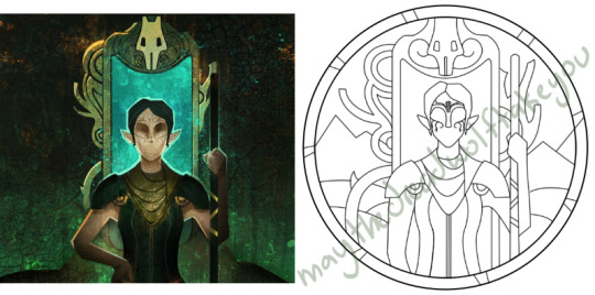
The first thing I do is pick the shape of my display frame which is usually a circle, but could be an oval or rectangle too, since I hang the finished pieces on my wall to have nice way to show them off. I like to fill the whole space so knowing the size and shape of what I want the finished project to look like is a good goal for me. Since I am doing fandom pieces I want to be recognizable, I do stick pretty close to the "original" character design/art, but you can absolutely change as much as you want and freehand draw your own interpretation instead. If you're doing original art just substitute the below composition notes with "sketch out roughly what you want it to look like". I personally do my pattern drafting digitally as I find it easier, but you can do this part by hand too.
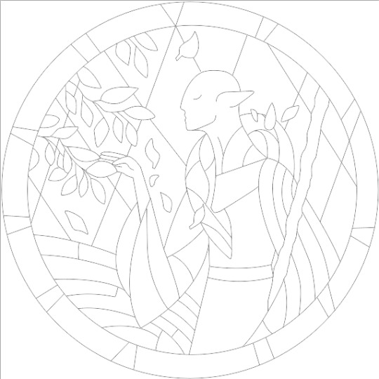
First, I keep the reference image I'm working off of open next to me while I work, and draw in the shape of my frame (here, a circle). If I'm adding in the little border to be fancy, I add a second inner circle. I keep these as their own top layer so I always know I'm working within the final "frame" and don't spend time designing any section that will fall outside it. Then I will take copies of the reference image and knock the layers down to 25-50% opacity, and start moving them around underneath the 'frame' layer until I like the way their positioning looks as a composition. Sometimes elements of a card I want to include don't all fit in, so I'll chop the section out and add an additional layer to throw in (like the background circle things in the Hermit design below). Or I'll just freehand things like adding much bigger diamonds behind Solas in my Hierophant design because I did NOT want to do 1000 tiny ones. Then once I'm satisfied with the general composition, I'll use the plain ol circular brush tool to trace out the major shapes of each element. I try to keep in mind that I can't go too small, and curvy lines are more difficult to fill in than straight ones. I usually do a rough messy version first, make it mostly transparent, and then a cleaner and more precise one over that.


(you can see parts of the rough one on the left and the fully 'cleaned up' on the right for the Hierophant design)
Now: depending on what you are doing next with the pattern, this might be where you stop and start coloring. If you are planning to freehand your design or just trace it onto fabric (or even print it onto fabric here), there's no need to do more than this kind of lineart! However, if you are working digitally and want to create a scalable vector so you can print it at different sizes, you can use the pen tool in photoshop to trace your design and make a "work path" of the lineart. However, another note: THIS PART IS VERY FRUSTRATING AND TEDIOUS BECAUSE THE PEN TOOL WAS CREATED BY THE DEVIL TO TORMENT US. It is so so so easy to accidentally delete a line or even the whole path and not notice later on. Ask me how I know 😭 Anyway I'm not going to include a pen tool tutorial because I don't even know how to use it well and have to google or watch videos every other time I try to use it. But if you can muddle through it gets you some really clean lines that eventually look like this:

With the work path selected, you can select the brush tool/size/color and use the "stroke path" option to create lineart of the vector. Then you can save this as a transparent png file for use at different sizes and for printing and it looks so nice and clean! one of the big benefits to this is that you get really fine lines that are easier to be precise with stitching on. This is extra perfect if you are printing the design directly onto your fabric (which you can do with an at-home inkjet printer for designs under 8inches wide, as long as you stick a piece of stabilizer on the back of your fabric and cut it down to printer sheet size--this is what I do and can make another post about that process if people want haha), or if you are printing onto transfer paper like you can buy at craft stores.
This is where I end the lineart for my designs. After I have this, I move on to the next phase, which is...
STEP 2: COLOR
For interpreting my designs into thread, I start by thinking of it as flat colors first. You can't "shade" as easily with threads as you can with things like paint or brushes in digital art (though you can A Little, which I will get into), so to start color planning I pick the "main" color each section will be in the piece.

For the existing icons this was simple--I kept the same sections as the original designs, so for each I just color picked or eyeballed the color in photoshop and colored it in (but you could do this on paper with pencils, markers, whatever as well--they don't need to match your threads exactly and usually won't, it's just to give you an easy reference to follow as you go). For the tarot cards which were more complicated in coloration, I just did my best and went with what looked good next to each other, even if it was a little off the original art. It will be off more later anyway when you have to pick threads so don't stress it too much honestly. I will often make layers with different color options and turn them on/off for direct comparison to try to determine what I think looks best as well, like below where I was debating between more blue/desaturated for the background or brighter colors.

I do wanna note I have regrets about the color selection, shapes, or shading in EVERY SINGLE ONE of my finished pieces. But no one else ever comments or probably even notices! One aspect of this hobby is just learning to be satisfied with what you've made and using what you learned to get closer to your preferences next time. I'm only going back and redoing some of my designs' colors because I want to make it easier for others to choose on the patterns I sell, more than I care for just for myself. Also since I'm doing this lineart/stained glass looking approach where I go over the distinct shapes with black thread at the end, it means I get these clear delineations between sections you might not necessarily have in your own pieces, and that's ok.
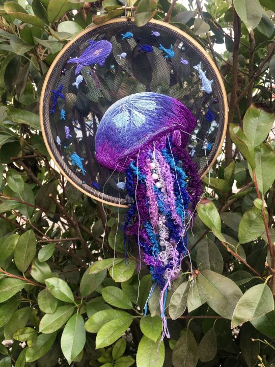
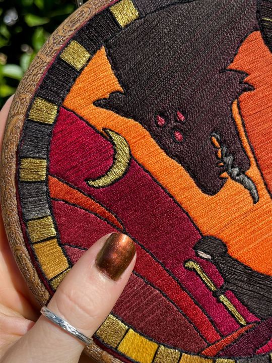
Ok right. Now while shading/coloring in detail is hard with thread, you CAN make whats essentially dithered gradients. "Dithering" in the concept of art means using 2 (or more) colors to give the impression of a third color, or to gently scale between the existing binary rather than a hard line. Think of it like blocky pixel art or gameboy game images. If you're doing needlepainting, you use really small stitches close together to get this effect, which translates to "smaller pixes"--if you look at the jellyfish in my first photos that's a very messy casual version of that. If you want a better example, I recommend looking at @ammocharis 's pieces like these in her pinned post, which are truly amazing! I simply do not have the patience myself 😂 For my stained glass style, I work only in very long straight stitches, so I can only shade in one direction and have to be a little more precise with it.
So for shading, I think about in each section which direction my threads might go. Then perpendicular to that direction I pick which side will be the light one and which the darker one. Sometimes I color this in on my pattern mockup, but sometimes I don't! Or I'll only do it for certain sections to make sure I don't forget. Like for my Tower design I only colored it as flats, and waited until I selected threads to decide how the shading would go. I am currently working on a smaller, simplified version of my Hierophant design and I did add shading digitally for that one just for fun. But it's not as important as having the flat color version you can use to quick-reference how you want your design to go while you're stitching. You might also notice I don't actually color my gold--I just throw in a stock image of gold foil for that layer so I can't confuse it with any of my yellow thread sections.

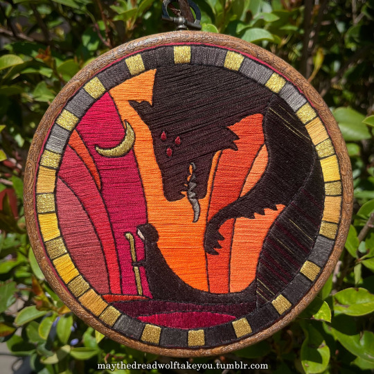

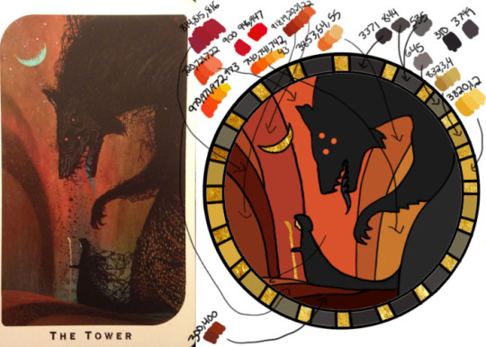
Here's a close up where you can kind of see what I mean by the "dithered" effect between colors--some are more obvious (like the red on the far left or middle orange) and others pretty subtle (dark grey to dark red on the wolf face):
Now, while I use single layers of satin stitches for this, and just alternate thread colors increasing/decreasing as I go, you can accomplish the same thing with short overlapping stitches like with needlepainting, or with clusters of french knots, or whatever else. But in GENERAL you are going to be able to trick people into seeing gradients out of dithering best when you are using the same type of stitch for that whole area. So if I was using multiple stitch types like having french knots, daisy chains, ladder stitching or whatever else for some sections, I would keep those to contrasting areas/colors. A fantastic example of using different layered types of stitching to create more intricate color/texture in an embroidery would be these incredible tarot card depictions by @hattedhedgehog, which I like even better than my own embroideries. Here's his take on the Tower card as well for comparison to mine (I'm so in love with it!!!).
But anyway, at this phase, your design is actually still digital--the above is just to explain how it translates later in the process. The next step is...
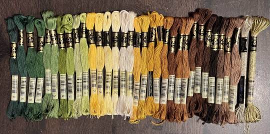
STEP 3: THREAD SELECTION
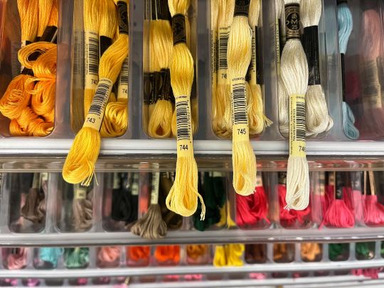
I will admit here I am not great at this part. I am constantly second guessing my thread colors, and can spend over an entire hour in the thread aisle at the craft store agonizing over choices. Really, I think this is just one of those things that takes practice and you get better at it over time. What I have had the best luck with is actually printing out a reference photo of my design/the original artwork and taking it with me. If you already have threads you can do this part at home too, but DMC alone has over 500 colors and I definitely don't even own half that so I like to torture myself by looking at them all together on the thread racks. Plus Anchor and Artiste and whatever other brands there are out there. One approach is to just sit there and pick out what you want for each section and line it all up together on top of your printout. Or in the case of my Tower I laid a bunch of options out on top of my template in the hoop to guess how they'd look in the frame.
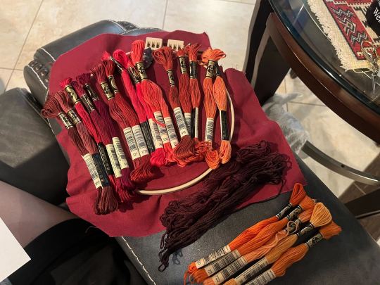
For me since I am also doing this dither shading thing, I also need 2-3 colors per sections depending on its size. Sometimes it's easy and the threads have a color just a little darker or lighter right next to them in the numerical lineup! Other times, there is no good match, or it looks too far away to shade nicely, or I want one to be a warmer or cooler tone than the other... which means a lot of standing and fretting to myself over it. I actually take a lot of photos at this stage because it can be easier to see how they will look in the end from a photo than in person to me? Idk why. Plus then after they get scrambled in my bag I remember wtf order I meant for them to go in later. But as long as you're not preventing other customers from shopping themselves, you can spend as long as you want staring at thread in the embroidery aisle and they won't kick you out unless it's closing time, so take your time.
Now, IN THEORY, you can sort of combine steps 2 and 3 by color-selecting from your threads and using that to color in the design. However I have tried this and it led to mixed success because the photoshop eyedropper brush simply isn't actually that exact (in my experience, it desaturates compared to what we actually see). And because then you have to have the threads on hand while you're coloring... which means you might buy ones you don't end up using if you don't like them. So I prefer to just use this as a refinement step where I pick threads based on the design colors, then will re-color the design a second time to match those threads more closely to be sure I like the effect.
I've even used this as a tool when I needed to adjust my color choices mid-project, by digitally coloring over over my WIP:
Or here's a design (but I haven't posted the finished piece yet bc it's a gift so shhh) I made with certain color tones initially, but after buying thread I re-did the color mockup to be more vibrant, because I liked those threads better in the store:


Once you have your thread, you can make yourself a little reference chart with the colors you intend noted on the sections you want them, like below:
(note: i didn't end up sticking to these colors because I ended up dying my own thread for several sections. And then forgot I made this entirely and picked new ones because I put the project down for a year between design and stitching. Sigh).
Or for my Solas pattern I did this in a really detailed way, which i am sorry but i have redacted because... i have it for sale now and don't wanna just give that away haha. But if you buy the pattern from my shop this is one of the files you'd get with it, for ease of reference. I do also include a text-only list of them as well.

Now I don't go to this much trouble for all my designs, just the ones I put up for sale (or plan to). You can also just make a text list of your color plans if you want. Though for fun I also have been using my scrap thread to make these little "color palette" keyrings for my finished pieces, so if I ever remake them or update their patterns I will know what the original colors were, plus I can compare what i used to other threads if I wanna change part of the design up. This step is absolutely not necessary and I'm just doing it because I'm selling the patterns now, but they are kinda fun to look at.
And don't forget.. if you start a section in a certain color and decide you don't like it, you can just cut the threads and pull them out! I did that with my original hierophant piece actually. I had an entirely different color for one row of diamonds i thought just clashed way too much with the others, so I used photoshop to paint over it with some alternate options until I found one I liked better. Then I cut away all the old threads and put in the new color. It can be a little harder to fill a piece the second time since the fabric will have stretched out a little, but as long as you're using a good stabilizer it usually doesn't move too much.
You can also just make test swatches on spare fabric to test before you add them to your real piece. I wish I'd done this for some color transitions that didn't end up looking the way I wanted, but I am simply too lazy most of the time. My exception is usually for metallic, satin, or sparkly threads, because I want to know how they feel while embroidering. But if you're really worried about a certain color or shade it's a good thing to remember you can just do.
SO yep, that's my general process for drafting patterns. I start with the shapes/design, then do my flat color version, then I pick my threads. Makes it sound easy and short when phrased like that :) But I can honestly spend 8-10 hours just on making the lineart and coloring it in. If I was better at art, probably this would be less, but I'm working with what I've got (not much) 😂 I think all aspects of this are also something that gets easier over time, but it will probably never look as bad as you worry when you start out. I think all my pieces look awkward and rough right up until I do the finishing steps and move them to the display frame sometimes.
I hope this was helpful and answered your questions!! Feel free to post/share your WIPs to ask for feedback or advice ever too :) I've only ever had people in the embroidery community on tumblr be encouraging and helpful to me, and I'm happy to answer any questions myself when I can or if parts of this were confusing
#ramblings#my stuff#my embroidery#embroidery#dragon age embroidery#calicostorms#oh god tumblr changed the alignment of all my images so theyre all huge now great#WELL I keep tryign to rearrage them to be on the same line and it is NOT working so. thats how they will look i geuss#this is gonna annoy me all night... thats what i get for expectign a Functional Website though#embroidery chatter
31 notes
·
View notes
Text
It's kinda sad Fairly Odd Parents: Fairly Odder only got one season because I really like it! Mixed medium of live action and 2D animation isn't for everyone but it reminds me of:
Blue's Clues
Bed knobs and broomsticks
Space Jam
Marry Poppins
Who framed Roger Rabbit
Looney Toons: Back in action
Enchanted
The Incredible Mr. Limpet
It's just so classic and nostalgic, I love it! 😁 Silly, goofy, magical fairies kinda fits this genre perfectly! In the 60s to 70s this was really popular and without modern special effects, it was the best way to bring real people to what's not and the fact that there's such a strong distinction between the two (instead of making what's imaginary look as real as possible) in a way makes it seem more magical, that there's this brightly colored, bold outlined character makes it seem more otherworldly.
The animation industry and its workers have been treated like trash lately. People are forced to work overtime, wearing multiple hats they're not qualified for and underpaid for their labour. And because of the streaming wars, animated shows have been the most common casualties because it's more difficult to produce, thus it takes longer and is more expensive. Maybe producing more live-action animation content would be a healthy balance. Animators can still find work but they're not doing all of it alone. Not being completely animated would make it cheaper too.
I just love animation so much, I want to see it still holding strong through these trying times.
9 notes
·
View notes
Text
“Nine People you want to know better” tag game
Thank you so much for the tag @beebundt <3 it was great getting to know you a little better :3 Here are my answers, blank template under the cut. Tagging: @kiastirling | @queenaeducan | @knightdawn | @shivunin | @greypetrel | @demandthedoodles | @xochihuacoyotl | @fadedsweater | @ghostwise <3 No pressure!
Last Song: Spotify recommended a playlist of indie songs from 2010 and I gave in to the urge to reminisce... I have so many memories tied to the songs in that playlist, but this one stands out from my bus ride home today: Spanish Sahara (Foals)
youtube
Favorite Color: Proooobably maroon. It was my high school class color and we were so right for that tbh.
Last Movie/TV Show: I think it was The Boy and the Heron. It was interesting, I have some mixed feelings about it. I think it should have been two separate movies, so that its two sets of themes could have been fleshed out adequately. It was very quirky and I liked the world building/narnia-esque quality to it, and it kind of felt like a return to Spirited Away, but...it didn't have the follow-through I wanted for many things, compared to Miyazaki's earlier works. It feels almost like at this point in his career, no one is allowed to edit Miyazaki lol including himself. I do think a major theme was about retirement and being a creative and not knowing when to let go.
Sweet/Spicy/Savory: In order from best to least favorite: Savory > Spicy >>>>>>> Sweet. I rarely want something sweet. My favorite snack is the Tapatio Doritos or the knock-off chili lime Takis from Trader Joes. I will always go for a savory food though.
Relationship Status: You know. A friend today said that "Men think they're competing with other men for women's attention, but really they're competing with a woman's peace." Gave me a lot to think about.
Last thing I googled: The name of a friend of my family's who was a painter. He passed away a while ago and I was wondering if I could find any of his other works. Unfortunately it doesn't seem like any of them are digital, but here are two from my childhood home. They're very large!

Current Obsession: Hollow Knight lore! I just played through the game for the first time (90% completion atm!) and it is such a unique and DEEP world to explore. Super tragic, and while it's very much a Souls game to its core (including the story), it is so, so unique. There's very little like it. So imaginative! And so many twists and turns to think about its story. (I have listened to. like. 60 hours of video essays about it at this point.)
Last Book: The last book I fully read through was Gods of Jade and Shadow by Silvia Moreno-Garcia! I really enjoyed it.
Looking forwards to: Getting frames for more of my art! I have been so fortunate to collect so many beautiful prints & be gifted so many more, like my sisters got me a whole set of Ghibli-style TOTK/LOZ prints, and they need frames and they need to go up on my wall. Slowly! It really has helped my mental health to start putting up decor in my apartment.
Blank Template
Last Song:
Favorite Color:
Last Movie/Show:
Sweet/Spicy/Savory:
Relationship Status:
Last Thing I Googled:
Current Obsession:
Last Book:
Looking Forward To:
Tag nine people whose answers you are interested in!
7 notes
·
View notes
Text
Last night I dreamt that Claude Rains was playing a totally different character. Like a kind older man named Angus, complete with thick rimmed glasses and a neutral plaid shirt and overcoat. It was like a romance movie where he was married, but his wife was getting older (she was in her mid 50’s while he was in his 60’s) and she was feeling insecure about herself, her body, and their sex life. Their bedroom wasn’t dead, but chilled out considerably compared to when they were first married in their 20’s. So she tells him that if he wants to go out and find other younger women to sleep with, she won’t be mad or upset. She loves him and wants him to feel fulfilled in the bedroom and knows he still has a fairly high libido despite his age. She just wants him to be happy. But he immediately shoots such an idea down because he could never ever ever ever entertain the thought of going to another woman for that sort of thing. His wife is his best friend, his wife of 30 or so years, and he married her because he loves her more than anyone and can’t imagine being intimate with anyone but her. He shows his wife just how much he loves her and proves to her that their sex lives haven’t changed all that much from when they were younger by taking her to bed and making love to her for hours, proving to her that they still got it. A part of her insecurity was that they never had children even though they tried many times, and now that she’s been through menopause, she can’t have them. Though he wanted children at one point, he learned to be okay with not having them because he had her in his life and she was all he needed. Just her, him, and the dog(s) make up their little happy family, and that’s enough. He doesn’t want to have children with a younger woman. Even if he outlives his wife, he can’t imagine ever remarrying. Why try again at love or another wife when he already has the best? Then he and his wife go to the eye clinic together because “Angus” has an eye exam and needs to pick out a new pair of glasses. He likes the ones he has, but you point out that the black and glass frames are sooooo thick and heavy. He should go for a plastic pair with thinner or different colored frames to better suit and bring out his eyes.
#claude rains#Claude rains dream#random dream#just thought I’d share with the Claude fans on my page
3 notes
·
View notes
Text
Top Garage Door Styles You’ll See Across Tennessee
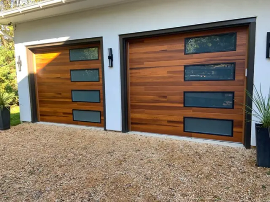
Did you know that over 60% of homebuyers consider garage door style before making an offer?
Garage doors are not just functional—they’re one of the most visible parts of your home’s exterior. For Tennessee homeowners, where real estate values continue rising, curb appeal plays a huge role in property value.
A stylish garage door can transform your home’s look, boost energy efficiency, and even improve security. Whether you live in a modern Franklin neighborhood or a historic Nashville suburb, the right garage door adds character and charm.
Let’s explore the top garage door styles in Tennessee, how they work for different homes, and why style matters more than you think.
1. Traditional Raised-Panel Garage Doors
These are the most recognizable and widely used garage door designs in Tennessee.
Why they’re popular:
Clean, symmetrical look that fits both older and newer homes
Available in multiple materials like steel, fiberglass, and wood
The raised panels provide depth without overwhelming the façade, making them perfect for classic brick and ranch-style homes common across Tennessee.
2. Carriage House Garage Doors
Carriage-style garage doors bring old-world charm with modern performance.
What makes them unique:
Hinged-door appearance with modern upward-lifting mechanisms
Often designed with decorative handles and cross-beam details
These styles work beautifully on Craftsman and farmhouse-style homes. Many Tennessee homeowners love their timeless look paired with durable, insulated materials.
3. Modern Flush Panel Garage Doors
Sleek and minimal, flush panel garage doors are a top choice for contemporary homes.
Key features include:
Smooth surfaces with minimal detailing or paneling
Materials like aluminum, frosted glass, or steel for a clean finish
These doors suit homes with minimalist architecture, often seen in newer developments around Franklin, Brentwood, and surrounding cities.
4. Contemporary Glass and Aluminum Garage Doors
If you want natural light and a bold statement, this is the door for you.
Why homeowners love them:
Transparent or frosted glass allows in daylight without sacrificing privacy
Aluminum frames offer strength and weather resistance
This design pairs well with modern builds and can even be used for workshops or converted garage spaces that need extra natural lighting.
5. Wood Garage Doors
Wood offers unmatched character and warmth to a home’s exterior.
Popular features:
Custom carvings and grain patterns make each door one-of-a-kind
Ideal for historic or custom-built Tennessee homes with unique facades
Keep in mind, wood requires more maintenance in Tennessee’s humid summers and cold winters. But with the right care, these doors last for decades.
6. Steel Garage Doors with Faux Wood Finishes
Want the beauty of wood with the strength of steel? This style blends both worlds.
Why they’re trending:
Low-maintenance surface that mimics real wood grain
Insulated panels that boost energy efficiency and reduce noise
Homeowners across Tennessee appreciate this cost-effective, durable alternative to traditional wood—especially in areas with fluctuating weather.
7. Custom and Specialty Garage Doors
Some homes call for something completely custom—and that’s where this option shines.
Options include:
Unique shapes, windows, and color finishes to match your home’s architecture
Mixed materials or custom hardware for a standout appearance
From mountain cabins in Eastern Tennessee to upscale Nashville homes, custom garage doors let you design something personal and practical.
Why Garage Door Styles Matter for Tennessee Homes
Your garage door is a major visual anchor of your home’s exterior. The right style not only boosts curb appeal—it reflects your taste and supports the local home aesthetic.
Here’s why style matters:
Tennessee homes range from rustic farmhouses to sleek, modern townhomes
The right door complements your home’s architecture and regional trends
Choosing a style that suits your neighborhood can also help with resale value. First impressions count, and your garage door often makes the first one.
Everlast Garage Doors Can Help You Choose the Right Style
Selecting a garage door isn’t just about looks—it’s about function, durability, and long-term value. Everlast Garage Doors helps homeowners across Tennessee choose doors that match their lifestyle, budget, and home design.
Why choose Everlast Garage Doors:
Experienced technicians who understand regional style and architecture
A wide selection of styles, materials, and customization options
Honest pricing and expert installation that lasts for years
Contact Everlast Garage Doors today:
Phone: 615-808-8806
Website: http://everlastgaragedoors.net/
Email: [email protected]
Address: 1107 Battlewood St #222, Franklin, TN 37069
The right garage door style can completely change how your home looks and feels. Let Everlast Garage Doors help you find the one that fits.
#Garage Door Repairs Franklin TN#Garage Door Opener Franklin TN#Garage Door Maintenance Franklin TN#Garage Door Parts Franklin TN#Garage Door Services Franklin TN#Garage Door Installation Franklin TN#Emergency Garage Door Repair Franklin TN#Residential Garage Door Repair Franklin TN#Commercial Garage Door Services Franklin TN#Best Garage Door Repair Franklin TN
0 notes
Text
Elevate Your Space with a Designer Stool: Where Style Meets Functionality

When it comes to home décor, it’s often the smallest details that make the biggest impact. Enter the designer stool — a piece that effortlessly blends practicality with style. Whether you’re revamping your kitchen, sprucing up your living room, or adding a touch of luxury to your bedroom, a stylish stool can completely transform the look and feel of your space. It’s more than just a seat — it’s a statement.
Why Stools Are the Unsung Heroes of Interior Design
Stools have long flown under the radar in the world of interior design. Traditionally associated with bars and kitchen counters, they were once considered purely functional. But not anymore. The modern designer stool is a beautiful blend of art and utility. Sleek, stylish, and versatile, stools are now key players in creating spaces that are both comfortable and chic.
In today’s homes, stools can be used in almost any room. Need a compact seat for a small apartment? A stool has your back. Looking for a unique side table? Try stacking a few stylish stools for a creative twist. Want to add a pop of personality to a minimalist room? A colorful designer stool can do the trick.
Style for Every Taste
One of the best things about designer stools is their sheer variety. Whether your aesthetic leans toward Scandinavian simplicity, industrial edge, boho charm, or mid-century modern, there’s a stool out there for you.
Minimalist Lovers: Clean lines, neutral tones, and simple silhouettes are your go-to. Look for wooden stools with natural finishes or matte metal frames.
Bold & Artistic: If you love making a statement, opt for stools with vibrant colors, sculptural shapes, or unexpected materials like acrylic or terrazzo.
Vintage Vibes: Retro lovers can find designer stools that bring back the charm of the ’50s, ’60s, and ’70s with rich hues, velvet upholstery, and brass accents.
Rustic Charm: For that cozy farmhouse feel, think reclaimed wood, distressed finishes, and sturdy craftsmanship.
No matter your personal style, a well-chosen stool can become the pièce de résistance of any room.
Perfect for Small Spaces
If you’re working with a compact area, stools are a lifesaver. Unlike bulkier chairs or sofas, stools take up minimal space and can be easily tucked away when not in use. A stylish stool can serve as an extra seat, a plant stand, or even a bedside table in a pinch. And when guests arrive? Just pull them out for instant seating.
Some stools even come with hidden storage, making them an even smarter choice for apartment living or multipurpose rooms.
Functional, Yet Fabulous
Functionality doesn’t have to be boring. Designer stools prove that everyday items can be just as eye-catching as they are useful. Many brands now offer stools that combine ergonomic comfort with luxurious materials — think plush velvet seats, sleek metal bases, and hand-carved wooden details.
Need adjustable height? Swivel functionality? Cushioned tops? You got it. Today’s stylish stools are designed with both aesthetics and convenience in mind, ensuring you never have to compromise.
A Trend That’s Here to Stay
The rise of open-plan living and multipurpose spaces has only boosted the popularity of designer stools. In kitchens, they line up beautifully along breakfast bars or islands. In living rooms, they serve as chic footrests or impromptu coffee tables. Even in bathrooms, a small wooden stool can add spa-like elegance and serve as a handy perch for towels or bath products.
And let’s not forget outdoor spaces. Weather-resistant designer stools are a perfect match for patios, balconies, and garden areas, creating cozy nooks for entertaining or unwinding with a good book.
How to Choose the Right Designer Stool
Feeling inspired to add one (or a few) stylish stools to your space? Here are a few quick tips:
Consider Height: Match the stool height to its purpose — bar stools for higher counters, counter stools for kitchen islands, and low stools for casual seating.
Think About Materials: Wood, metal, plastic, or upholstered — each material has its own vibe and durability. Choose one that suits both your aesthetic and lifestyle.
Prioritize Comfort: If you plan to sit on your stool often, go for cushioned tops or ergonomic shapes.
Make It Match (or Not): You can match your stool to the rest of your furniture, or intentionally go for contrast to create a focal point.
Versatility is Key: Pick a stool that can adapt to multiple roles — extra seating, side table, plant stand, and more.
Final Thoughts
A designer stool might seem like a small piece of furniture, but don’t underestimate its power to elevate your home. Stylish, versatile, and space-saving, stools are the secret weapon of smart interior design. Whether you want to make a bold statement or simply add a touch of elegance, the right stool can tie your whole room together.
So go ahead, explore the world of stylish stools — your space deserves a little lift.
Original Source: Decorative Stool
0 notes
Text
Layered and Lovely: How to Style Rugs for Texture and Warmth
There’s something magical about a well-placed rug. It doesn’t just ground your furniture—it softens the space, adds depth, and brings in that subtle sense of warmth that turns a house into a home. And when it comes to layering rugs, the impact becomes even more intentional. With just a few thoughtful textures and tones, you can completely transform a room—no renovation needed.
At Home and Soul Dubai, we believe that beautiful living starts from the ground up. Whether you're styling serene bedroom rugs or refreshing your living space, layering rugs is one of the easiest ways to add comfort and personality—especially with the neutral, breathable textures perfect for homes in the UAE.
Why Layering Works
Layering rugs adds dimension to a room in the same way a throw or cushion adds softness to a sofa. It allows you to mix materials, balance proportions, and introduce subtle contrast without changing your furniture. It's especially useful in open-plan spaces or areas where you want to define zones—like a reading nook, lounge corner, or bedroom retreat.
And in warmer climates like Dubai, layering lightweight materials such as a cotton rug over a natural fiber base brings in that cozy look without the heaviness of traditional rugs.
The Base Layer: Start with a Natural Foundation
Your bottom layer should be slightly larger than the area you're styling. A neutral, flatwoven cotton rug or jute rug works beautifully as a grounding piece. These materials are breathable, texture-rich, and ideal for homes with tiled or wood flooring—keeping the space airy while still feeling layered and lived-in.
Try : Louis Hand Knotted Cotton Rug
Pro tip: A natural rug with subtle texture helps anchor furniture while letting your top layer shine.
The Top Layer: Add Texture, Color, or Pattern
Once your base is in place, it’s time to add a statement. The top rug can be smaller—just enough to sit under a coffee table, frame a bed, or accent a sofa. This is where you can introduce pattern, a hint of color, or a different texture for contrast. Stick to warm, earthy tones or calming neutrals to stay true to the Home and Soul aesthetic.
In the Bedroom: Soft Underfoot, Calm All Around
When it comes to bedroom rugs, layering brings softness and serenity. Start with a large neutral rug under the bed that extends at least 60 cm on each side. Then, add a smaller cotton rug near the foot of the bed or beside it—this extra layer gives the space a boutique-hotel feel while making every step more comfortable.
It’s a simple styling trick that creates visual interest and transforms your bedroom into a tranquil retreat.
Rugs in Dubai: Style That Works with the Climate
Living in the UAE means balancing beauty with breathability. The best rugs in Dubai are ones that look luxurious but remain light and practical. That’s why cotton and flatweave styles are so popular—they handle heat and high traffic with ease while still delivering that soft, elevated feel.
Layering these pieces adds depth without making your space feel heavy or closed in, making it ideal for year-round use.
Styling your space with layered rugs is an invitation—to slow down, sink in, and surround yourself with comfort that feels effortless. Whether you're designing a soft sanctuary with bedroom rugs or refreshing your living space with a textured cotton rug, layering creates warmth, interest, and soul underfoot
0 notes
Text
Best Home Decor Items Under $100: Style Your Space Without Breaking the Bank
Decorating your home doesn't have to cost a fortune. With a little creativity and an eye for detail, you can find stunning home decor items that transform your space—all for under $100. Whether you're redecorating your bedroom, adding flair to your living room, or bringing warmth to your kitchen, affordable decor is more accessible than ever.
From statement pieces to small accents, this blog will guide you through the best home decor items that are budget-friendly, stylish, and just a click away. Let’s dive in and discover how you can elevate your home’s aesthetic without emptying your wallet.
1. Framed Wall Art – From $20 to $80
One of the easiest ways to revamp a room is by adding wall art. Online platforms offer a variety of affordable prints, canvas paintings, and digital downloads. Whether you're into minimalist sketches, abstract bursts of color, or photography, framed artwork can become the focal point of any room.
Many sellers even allow you to personalize the prints with quotes, names, or locations—making these home decor items both meaningful and eye-catching.
Budget tip: Buy printable digital art and pair it with affordable frames from local stores or Amazon. You’ll spend less than $50 and still get a designer feel.
2. Throw Pillows & Cushion Covers – Under $30
Switching out your cushion covers is one of the most cost-effective ways to refresh your space with the seasons. Go bold with geometric patterns, soft pastels for spring, or rich velvet for winter. The beauty of these home decor items lies in their versatility and the comfort they provide.
Look for bundles of 2��4 cushion covers for under $25 online. Add an inexpensive throw blanket to match, and your sofa or bed instantly feels brand new.
3. LED String or Strip Lights – $15 to $50
Lighting plays a powerful role in setting the mood of a room. LED strip lights behind your TV or under shelves create a modern vibe, while fairy lights in a jar or across a wall bring softness and warmth.
Many smart lighting options are available online for under $50, complete with app control and color-changing features. These home decor items offer both function and ambiance without the high cost.
4. Ceramic Vases and Planters – $10 to $60
Ceramic vases and planters make for elegant tabletop or shelf decor. Whether you fill them with fresh flowers, pampas grass, or artificial stems, they add height, texture, and sophistication to your setup.
You’ll find beautifully designed pieces in various sizes, colors, and finishes—matte black, glossy white, or earthy terracotta. These stylish home decor items often come in sets for under $100, perfect for balancing design elements across your home.
5. Wall Mirrors – $40 to $100
Mirrors not only make a room feel larger but also reflect light to create a brighter atmosphere. A well-placed mirror in the hallway, living room, or bedroom can be both functional and decorative.
You can find chic round or rectangular mirrors under $100 with frames that match your aesthetic—gold for glam, wood for rustic, or metal for industrial. They are the perfect blend of practicality and style when it comes to home decor items.
6. Decorative Trays – $20 to $50
A decorative tray on a coffee table, vanity, or dresser pulls everything together. Use them to organize candles, perfumes, keys, or snacks—all while keeping your space looking curated.
From marble to acrylic, wood to metal, trays are available in endless styles and materials. These home decor items are small investments that deliver a big visual impact.
Pro tip: Add a candle, a book, and a small plant on your tray for an instant Instagram-worthy setup.
7. Scented Candles and Holders – $10 to $40
Never underestimate the power of scent. A beautifully packaged scented candle not only smells divine but also enhances your home’s aesthetic. Look for hand-poured soy candles with unique fragrances like sandalwood, citrus, or vanilla.
Pair them with a stylish candle holder, and you’ve got yourself one of the coziest and classiest home decor items—all under $40.
8. Books and Coffee Table Decor – $20 to $70
Decorative books are trending for good reason. Whether it’s a photography book, a fashion anthology, or a travel guide, coffee table books serve as conversation starters and style statements.
Stack two or three on your table or shelf, and top them with a candle or a vase. These home decor items reflect your personality and elevate the room’s overall design.
9. Floating Shelves – $30 to $90
Floating shelves are both functional and fashionable. Use them to display small decor pieces, books, photos, or plants. Opt for natural wood for warmth, or black metal for a modern industrial look.
You can install a set of two or three shelves for under $100—perfect for transforming empty wall space into an artful display with a mix of home decor items.
10. Decorative Clocks – $25 to $80
Clocks are making a stylish comeback. From oversized wall clocks to unique tabletop timepieces, they blend practicality with personality.
Choose a design that complements your existing theme—minimalist white for modern homes, vintage Roman numerals for traditional spaces, or quirky shapes for eclectic vibes. These home decor items are functional accents that never go out of style.
Final Thoughts
Who says decorating your home has to cost a small fortune? With a smart budget and a keen eye, you can shop for the best home decor items under $100 and still create a space that’s stylish, functional, and uniquely you.
Whether you're curating your first apartment or giving your long-time home a fresh twist, these budget-friendly items are proof that great design is for everyone. So go ahead—light the candle, hang the mirror, fluff the pillows—and watch your home transform, all without breaking the bank.
0 notes
Photo

One day, it’s sunny and 60 degrees, and the next, there’s a full-blown blizzard. Welcome to spring in the mountains of Telluride, Colorado! Even if your weather isn’t quite this extreme, you’re likely dealing with unpredictable temperature swings. So how do you dress when Mother Nature just can’t make up her mind? You want to look chic and stylish, but you also need to stay comfortable—without sweating or freezing. The solution? Light layers. In this post, I’m sharing 3 lightweight spring jackets that will instantly elevate your outfits. With the right layering pieces, you can walk out the door quickly, looking polished and chic—without sacrificing comfort. Strategic shopping and simplicity are the keys to dressing for tricky spring weather. Are you ready to layer up and look fabulous? Let’s dive in! Turn on your JavaScript to view content If you find yourself struggling with what to wear on the daily, make sure to subscribe to our newsletter here for instant access to our FREE Wardrobe Basics Checklist! lightweight spring jackets #1 – Trench Coats When in doubt, get your trench coat out. Nothing elevates an outfit faster than a chic trench coat! 😉 Even if you’re wearing a sweatsuit or workout set, just throw on a trench and—voilà!—instant polish. It’s effortless, it works, and you should try it! A trench coat is also a travel must-have. Not only is it incredibly elegant, but it’s also functional—keeping you warm and shielding you from unexpected rain. Just be sure to check that yours is actually water-resistant (you’d be surprised how many aren’t!). Right now, cropped trench coats like the one above are trending, but you can choose the length that works best for you. The most classic and versatile option? Knee-length. Want to elongate your frame? Try a longer trench like this one for a sleek, sophisticated silhouette. (BTW, you can find more chic trench coat outfit ideas in this post.) Why It Works: Timeless, water-resistant, and perfect for unpredictable spring weather. PRO Tip: Swap out the belt that comes with your trench with a gorge leather belt for an elevated look. Push up the sleeves, pop the collar, and head out the door looking effortlessly cool and sophisticated. Turn on your JavaScript to view content How Should a Trench Coat Fit? The Best Styles for Every Body Type A trench coat is timeless, but the right fit makes all the difference. Whether you’re petite, tall, curvy, or have a straight figure, here’s how to find a flattering trench coat: Petite – Cropped or knee-length styles to avoid looking overwhelmed. A belted waist + monochrome outfit underneath elongates your frame. (Longer trenches can also look quite chic, but can be tricky depending on your height.) Tall – A longline trench (mid-calf or longer) plays up your height, creating a sleek, sophisticated silhouette. Curvy – Choose a trench with a defined waist and flowy A-line shape to highlight your shape. (Like my stunning Sandro pleated trench above! Just a few sizes left!) Rectangle shape – A double-breasted trench with a cinched waist helps create curves. A-line styles will also add shape. Turn on your JavaScript to view content #2 – Spring Leather bomber jacket Leather and faux leather jackets are perfect layering pieces for unpredictable spring weather. They add instant edge to any outfit while keeping you warm without the bulk. I wanted to highlight two standout options—both completely different styles and at different price points, so you can find the one that fits your wardrobe and your budget. First up, this on-trend, affordable, faux leather bomber jacket (above). The bomber is huge this season, and gives that sporty-meets-chic vibe. I love the soft, versatile neutral color, which makes it easy to style with everything. The cropped length is just right—hitting at the top of high-rise jeans while still providing coverage. This jacket would also look amazing layered over spring dresses. (I’m envisioning it with a beautiful white dress!) Why It Works: A faux leather bomber jacket instantly adds a modern, sporty edge to any outfit, keeping your look fresh and on-trend. PRO Tip: For a chic and flattering spring look, style this jacket with varying neutral tones—think soft beige, creamy whites, or muted pastels. The tonal look will add length and height to your frame while also looking quite luxe! Turn on your JavaScript to view content leather peplum If you’re ready to skip straight to the standout, statement layer for spring… this is it! This exquisite leather jacket from L’Agence is the perfect mix of masculine edge and feminine elegance—a true wardrobe investment that turns heads. The exaggerated peplum defines the waist beautifully, while the slight puff shoulder creates width up top, making your waist look even more cinched. Add in the gold hardware, and you have the perfect luxe finishing touch. This isn’t just a jacket—it’s an outfit-maker you’ll reach for again and again! Why It Works: The lighter shade feels fresh and versatile for spring, making it easy to pair with skirts, dresses, and jeans. PRO Tip: Zip it up for an ultra-flattering hourglass effect—perfect for creating that sculpted, feminine silhouette. Turn on your JavaScript to view content #3 – Classic Black Blazer Yes, You Can Wear Black in Spring! You might be a little surprised by this one—mainly because of the color. Black isn’t the first shade that comes to mind for spring, but, it absolutely works. In fact, I couldn’t put together a jacket roundup without including the ultimate wardrobe essential—the black blazer. One of my all-time favorites is the Veronica Beard scuba blazer, a piece I’ve owned and loved for six years (and counting!). The stretchy, slightly structured fabric feels casual, yet polished. And, the zip-in, zip-out lighter-colored inserts make it easy to “spring-ify” the look. There’s a reason this blazer earns a spot in nearly every seasonal capsule wardrobe—it’s timeless, seasonless, and a smart investment for any woman’s closet. A Budget-Friendly Alternative While I adore the original Veronica Beard blazer, I know many of you are looking for a more budget-friendly option—and I found an amazing one! This look-for-less blazer is very similar to the real deal for a fraction of the price at just $99. You can check it out here. Why It Works A black blazer is the perfect transitional layer—light enough for spring but structured enough to add polish. It’s ideal for cool mornings and evenings and instantly elevates even the most casual outfits (yes, even a t-shirt and jeans!). PRO Tip: Be sure to push up the sleeves and choose thoughtful accessories to elevate your look even more. Turn on your JavaScript to view content The Perfect Spring Layer Spring weather may be unpredictable, but your style doesn’t have to be! With the right lightweight layers, you’ll easily stay comfortable and chic no matter what the forecast brings. Whether you’re drawn to a classic trench, a statement leather jacket, or a polished blazer, investing in versatile, thoughtful pieces will make getting dressed this season so much easier (and faster). Which of these spring layering pieces is your favorite? Let us know in the comments below. Source link
0 notes
Photo
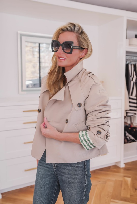
One day, it’s sunny and 60 degrees, and the next, there’s a full-blown blizzard. Welcome to spring in the mountains of Telluride, Colorado! Even if your weather isn’t quite this extreme, you’re likely dealing with unpredictable temperature swings. So how do you dress when Mother Nature just can’t make up her mind? You want to look chic and stylish, but you also need to stay comfortable—without sweating or freezing. The solution? Light layers. In this post, I’m sharing 3 lightweight spring jackets that will instantly elevate your outfits. With the right layering pieces, you can walk out the door quickly, looking polished and chic—without sacrificing comfort. Strategic shopping and simplicity are the keys to dressing for tricky spring weather. Are you ready to layer up and look fabulous? Let’s dive in! Turn on your JavaScript to view content If you find yourself struggling with what to wear on the daily, make sure to subscribe to our newsletter here for instant access to our FREE Wardrobe Basics Checklist! lightweight spring jackets #1 – Trench Coats When in doubt, get your trench coat out. Nothing elevates an outfit faster than a chic trench coat! 😉 Even if you’re wearing a sweatsuit or workout set, just throw on a trench and—voilà!—instant polish. It’s effortless, it works, and you should try it! A trench coat is also a travel must-have. Not only is it incredibly elegant, but it’s also functional—keeping you warm and shielding you from unexpected rain. Just be sure to check that yours is actually water-resistant (you’d be surprised how many aren’t!). Right now, cropped trench coats like the one above are trending, but you can choose the length that works best for you. The most classic and versatile option? Knee-length. Want to elongate your frame? Try a longer trench like this one for a sleek, sophisticated silhouette. (BTW, you can find more chic trench coat outfit ideas in this post.) Why It Works: Timeless, water-resistant, and perfect for unpredictable spring weather. PRO Tip: Swap out the belt that comes with your trench with a gorge leather belt for an elevated look. Push up the sleeves, pop the collar, and head out the door looking effortlessly cool and sophisticated. Turn on your JavaScript to view content How Should a Trench Coat Fit? The Best Styles for Every Body Type A trench coat is timeless, but the right fit makes all the difference. Whether you’re petite, tall, curvy, or have a straight figure, here’s how to find a flattering trench coat: Petite – Cropped or knee-length styles to avoid looking overwhelmed. A belted waist + monochrome outfit underneath elongates your frame. (Longer trenches can also look quite chic, but can be tricky depending on your height.) Tall – A longline trench (mid-calf or longer) plays up your height, creating a sleek, sophisticated silhouette. Curvy – Choose a trench with a defined waist and flowy A-line shape to highlight your shape. (Like my stunning Sandro pleated trench above! Just a few sizes left!) Rectangle shape – A double-breasted trench with a cinched waist helps create curves. A-line styles will also add shape. Turn on your JavaScript to view content #2 – Spring Leather bomber jacket Leather and faux leather jackets are perfect layering pieces for unpredictable spring weather. They add instant edge to any outfit while keeping you warm without the bulk. I wanted to highlight two standout options—both completely different styles and at different price points, so you can find the one that fits your wardrobe and your budget. First up, this on-trend, affordable, faux leather bomber jacket (above). The bomber is huge this season, and gives that sporty-meets-chic vibe. I love the soft, versatile neutral color, which makes it easy to style with everything. The cropped length is just right—hitting at the top of high-rise jeans while still providing coverage. This jacket would also look amazing layered over spring dresses. (I’m envisioning it with a beautiful white dress!) Why It Works: A faux leather bomber jacket instantly adds a modern, sporty edge to any outfit, keeping your look fresh and on-trend. PRO Tip: For a chic and flattering spring look, style this jacket with varying neutral tones—think soft beige, creamy whites, or muted pastels. The tonal look will add length and height to your frame while also looking quite luxe! Turn on your JavaScript to view content leather peplum If you’re ready to skip straight to the standout, statement layer for spring… this is it! This exquisite leather jacket from L’Agence is the perfect mix of masculine edge and feminine elegance—a true wardrobe investment that turns heads. The exaggerated peplum defines the waist beautifully, while the slight puff shoulder creates width up top, making your waist look even more cinched. Add in the gold hardware, and you have the perfect luxe finishing touch. This isn’t just a jacket—it’s an outfit-maker you’ll reach for again and again! Why It Works: The lighter shade feels fresh and versatile for spring, making it easy to pair with skirts, dresses, and jeans. PRO Tip: Zip it up for an ultra-flattering hourglass effect—perfect for creating that sculpted, feminine silhouette. Turn on your JavaScript to view content #3 – Classic Black Blazer Yes, You Can Wear Black in Spring! You might be a little surprised by this one—mainly because of the color. Black isn’t the first shade that comes to mind for spring, but, it absolutely works. In fact, I couldn’t put together a jacket roundup without including the ultimate wardrobe essential—the black blazer. One of my all-time favorites is the Veronica Beard scuba blazer, a piece I’ve owned and loved for six years (and counting!). The stretchy, slightly structured fabric feels casual, yet polished. And, the zip-in, zip-out lighter-colored inserts make it easy to “spring-ify” the look. There’s a reason this blazer earns a spot in nearly every seasonal capsule wardrobe—it’s timeless, seasonless, and a smart investment for any woman’s closet. A Budget-Friendly Alternative While I adore the original Veronica Beard blazer, I know many of you are looking for a more budget-friendly option—and I found an amazing one! This look-for-less blazer is very similar to the real deal for a fraction of the price at just $99. You can check it out here. Why It Works A black blazer is the perfect transitional layer—light enough for spring but structured enough to add polish. It’s ideal for cool mornings and evenings and instantly elevates even the most casual outfits (yes, even a t-shirt and jeans!). PRO Tip: Be sure to push up the sleeves and choose thoughtful accessories to elevate your look even more. Turn on your JavaScript to view content The Perfect Spring Layer Spring weather may be unpredictable, but your style doesn’t have to be! With the right lightweight layers, you’ll easily stay comfortable and chic no matter what the forecast brings. Whether you’re drawn to a classic trench, a statement leather jacket, or a polished blazer, investing in versatile, thoughtful pieces will make getting dressed this season so much easier (and faster). Which of these spring layering pieces is your favorite? Let us know in the comments below. Source link
0 notes
Text
Firstly the NES was in 1985, as it's the American rebranding. The Famicom came out in 1983 though and that's about the same hardware so I get you. You can go back pretty far and find most games were 60 fps because that's just straight up what TVs operated on and it genuinely would require more effort / hardware to make something not match that. The Atari VCS was 60 fps, and it had 128 bytes of ram. FPS on older consoles wasn't really dependant on the RAM or CPU, though CPUs had to be clocked to be able to output the right frequency. If you lived in a PAL country like the UK and most of Europe, your consoles would've all been 50 hertz instead of 60, and processors for PAL consoles actually ran slower than their NTSC counterparts. I have both of these consoles (an Atari VCS and an NES), and t's worth noting that a lot of games were NOT very accessible. There weren't any warnings for if the screen would explode into bright rapidly flashing colors or flash white very quickly upon completing an action, etc. A lot of Atari games had sprites that would flash quickly to save RAM by using the RAM to draw something else for a frame. The NES was definitely somewhat better about it. The 30 fps thing seems to have started when actual performance overtook the cost of adapting consoles to a different FPS. Remember almost movies are still recorded and played at 24 FPS, which is even slower. It's a very complex and nuanced thing beyond screwing you out of 60 fps, especially with modern screens and video technology. I do honestly wish though that all software for computers and games for consoles alike were able to run at 60 FPS without any issues on an average or moderately powerful computer / console. There is NO reason, in my mind, that my computer that I JUST bought that has a lot of high power features should not be able to run most games smoothly, like they need to design games to be significantly less intensive, that's a completely new norm. Like you used to be able to expect your computer to just run any software compatible with the system and it would do it perfectly fine unless the thing was rather old. Things can and are expected to move very fast across the screen now so frames matter.
Look, there's a lot to be said about the contemporary gaming industry's preoccupation with graphics performance in contemporary video games, but "no video game needs to run at higher than thirty frames per second" – which is something I've seen come up in a couple of recent trending posts – isn't a terribly supportable assertion.
The notion that sixty frames per second ought to be a baseline performance target isn't a modern one. Most NES games ran at sixty frames per second. This was in 1983 – we're talking about a system with two kilobytes of RAM, and even then, sixty frames per second was considered the gold standard. There's a good reason for that, too: if you go much lower, rapidly moving backgrounds start to give a lot of folks eye strain and vertigo. It's genuinely an accessibility problem.
The idea that thirty frames per second is acceptable didn't gain currency until first-generation 3D consoles like the N64, as a compromise to allow more complex character models and environments within the limited capabilities of early 3D GPUs. If you're characterising the 60fps standard as the product of studios pushing shiny graphics over good technical design, historically speaking you've got it precisely backwards: it's actually the 30fps standard that's the product of prioritising flash and spectacle over user experience.
4K notes
·
View notes