#lost type foundry
Explore tagged Tumblr posts
Visit Tumblr Blog
Explore Tumblr blogs with no restrictions, modern design and the best experience.
Last Seen Tumblr Blogs


Fun Fact
Kazakhstan’s Minister of Communications and Informatics has blocked the Tumblr site because it contained 60 sites of terrorism, extremism, and pornography in 2015.
Text
Free Art Resources
Terms of use vary from site to site. Read the license before you download.
Font Archives:
FontSpace
FontSquirrel
Fontspring
FontShare
DaFont
Google Fonts
Best Free Fonts
Font Foundries:
Atipo Foundry
Open Foundry
The League of Moveable Type
Indestructible Type
Lost Type Co-Op
Blambot
Reference Photos:
Dan Kehlenbach
BarnImages
Animal Photo Reference Repository
DoodleWash
Unsplash
Flickr
Wikimedia Commons
Reference Photo Packs:
Noah Bradley Megapack
Nomad Bundle
The Pic Pac
Textures:
TextureLabs
The CoffeeShop Blog
WebTreats ETC
Fuzzimo
SALVAGED dot NU
Lost + Taken*
*L+T is no longer maintained. Most page links are now broken. Though the original site remains online, the Wayback Machine is necessary to navigate it in modern day.
36 notes
·
View notes
Text
Duke Wyll Ravengard
A/N: I kind of wrote this out of spite cause I was so mad that Wyll broke up with my Tav cause we went to the Steel Watch Foundry before saving his dad.I wrote this from Wyll’s pov after the breakup. Nonetheless I really hope you guys like it! This is my first post!

The Blade of Frontiers, now Duke Wyll Ravengard of Baldur’s Gate. I gained one title and lost another. I stand before the people of Baldur’s Gate, the loud cheers echoing beyond the horizon. Yet all I hear is silence as the murmur that usually originates from beside me is no longer there.
I stand before a full room, yet I am alone. My own thoughts echoing back to me.. Letting Tav go felt like the easiest option at that time, but oh how wrong I was. Taking my father’s position as the Duke — was my responsibility. He unfortunately passed away while being held in the Iron Throne prison, I was naturally the heir to his throne.
I stand in front of my people feigning to be all high and mighty. The Blade in me, no longer sharpened. Tav is not beside me — not anymore, they took the sound of happiness with them. The castle, my house is nothing but an empty home although it is always bustling with people. Countless maidens and bachelors have attempted to appease the unease in my heart, but no one compares to them. Tav became the embodiment of light for me, now I can’t differentiate between night nor day. It’s as if I carried the shadow curse of the shadow fell lands along with me to my place.
I lost them and gained the throne.
The day I got the invite from Withers to join the camp party, my heart quivered at the thought of facing my light. I broke their heart when I let them go, I left them to grieve by themselves over the loss of us while I grieved over my father’s inevitable passing.
Nervousness — the word would be an understatement to describe how I was feeling. I would get to meet their honeyed gaze once more after so long, after six long months.
The air bubbled with anticipation. Everyone was there except for them and — Astarion. Strange.
Then I saw them, dressed in a expensive Baldurian attire, adorned with gold hoops. My whole world slowed down when my eyes laid upon them. But right behind them I saw him, Astarion. Looming behind them, wearing a similar type of garment gleefully waving at our other friends. My heart sank and my ears started ringing.
N-no not him..It can’t be… Astarion grinned while conversing with Shadowheart as his hand connects to their hips. Unbeknownst to my heartache, he turns his head towards me and waves, this gets Tav’s attention who also meekly waves back.
Astarion, the pale rouge — took my light from me. Ironic isn’t it? Considering they have to live in the shadows as Astarion had rejected ascension. He always fancied Tav, I guess he swooped in when I walked away.
Like a moth drawn to a flame, Astarion grew closer to them, and now they are his. No longer mine. At the end of the night, I go back to my house alone. While Astarion takes my home with him. The lights in my house will never brighten my surroundings — not when I lost my only light.
#bg3 wyll#baldurs gate wyll#wyll x tav#wyll x reader#baldur's gate 3#baldurs gate tav#baldurs gate astarion#baldurs gate gale#gale dekarios#gale of waterdeep#bg3 gale#gale x tav#astarion#angst#bg3#bg3 tav#bg3 fanfiction#bg3 angst#wyll angst#astarion angst#fyp#tumblr fyp#I love this man so much#wyll ravengard
21 notes
·
View notes
Text
Resources for (actually) Free Fonts
Free as in free, not "Free for Personal Use"
This is a list of websites that I want to exorcise from the top left corner of my browser. All of the websites are good places to find free, fashionable fonts, and I've actively used all of these while designing. Enjoy and partake at your leisure. Links are inline instead of the big boxes because tumblr doesn't like there being too many boxes.
If you have any more, do let me know, and I'll add them if I believe they're up to snuff.
Type Foundries
A.K.A. Companies and people which design and distribute fonts.
https://velvetyne.fr
Absolutely incredible and experimental fonts. Playful, avant-garde, and inspirational. If I end up making my own typeface, It'll be because of Velvetyne.
https://fonderie.download/index.html
A foundry that provides a serves a small, beautifully bizarre catalogue. Each font is a practical work of art. I recommend garamon(d/t), if you're looking for something generically "usable."
https://www.theleagueofmoveabletype.com
These fonts are absolute go-tos for any project you start. Clean, usable, and remarkably useful.
https://www.collletttivo.it
An lovely, free resource for all things type. I greatly recommend thumbing through their website for quite some time, especially if you've got a real fascination with typography and language.
https://www.tunera.xyz
Unabashedly creative fonts which possesses an air of elegance. A number of fonts are also dings/patterns, which I always appreciate.
https://indestructibletype.com/Home.html
Owen Earl is a fucking real one. These fonts are absolutely stunning, while providing a treasure-trove of features. It's indescribable how useful these fonts can be.
https://www.suvatypefoundry.ee
Absolutely stunning, artistic fonts, made by the students of the Estonian Academy of Arts. Select these fonts to stay on the cutting edge of avant-garde type.
https://toomuchtype.com
Stunningly feature rich fonts, with a beautiful presentation.
https://lokalcontainer.com
A open-source type foundry that seems to have just gotten off the ground, with a limited but clean selection of sans serif fonts. Give 'em some love.
https://resourceboy.com
Resource Boy is just a general motherload of all things free and good. You could get lost hunting in this website for a good long while. A lot of it is aimed at the cowardly photoshop users, but other software (such as my darling Affinity Designer) can use most of what you'll find.
https://typodermicfonts.com/downloads/
Large collection of free use fonts which are quirky, cute, and questionably usable. Have seen use in some pretty big commercial projects back in their heyday, though, so they must be good for something, someone, somewhere.
https://open-foundry.com
A great place to find great fonts, with a stunningly elegant presentation.
Type Catalogues
https://uncut.wtf/
A clean catalogue that is fun to thumb through, if you've got the time.
https://www.fontshare.com
A wide collection with a clean and easy presentation. Curated by a type foundry, as well.
https://usemodify.com
Raphaël has a good eye and good taste.
https://bestfreefonts.com
A good website, with some clean picks.
https://online-fonts.com
Probably one of the biggest collections I've found. Very good, extremely versatile, though with not many good search tools. Hope you have some time on your hands.
https://unblast.com/fonts/
Good fonts by the seems of things. The website unnerves me slightly, but I could not tell you why.
https://fonts.google.com
A rare moment of kindness from google. Good fonts. I reccomend looking around the other sites first. Google is a vulture.
3 notes
·
View notes
Text
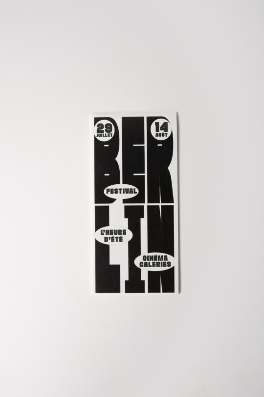
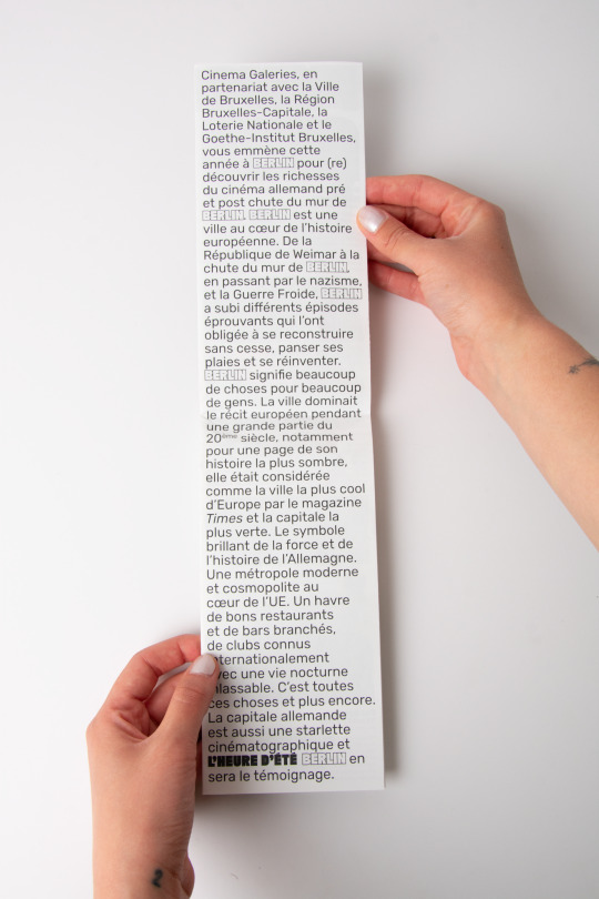

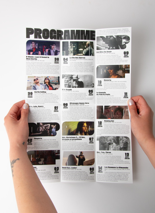
L'HEURE D'ÉTÉ : BERLIN 3-fold A3 leaflet for a local berlin-themed film festival
the font is the great faction personal from the lost-type foundry, and i also used letter combinations to shape the miniature stills
printed on 100g silky coated paper
2 notes
·
View notes
Text
What Fonts are used for the Grand Theft Auto franchise Logos and Menu Texts? (Gaming) (Grand Theft Auto) (Fonts Blog) (What Fonts)


Logos ©Rockstar Games
Article by @warrenwoodhouse #warrenwoodhouse
The fonts that are used for the various logos and menu texts throughout the Grand Theft Auto franchise are:
The font that is used for the logo of GTA is called font name by developer
add link here
The font that is used for the logos of GTA London 1969 and GTA London 1961 is called font name by developer
add link here
The font that is used for the logo of GTA 2 is called font name by developer
add link here
The font that is used for the menu texts in GTA, GTA London 1969, GTA London 1961 and GTA 2 is called font name by developer
add link here
The font that is used for the Grand Theft Auto III logo and the menu text is called Pricedown by Typodermic Fonts ( @nagoyish )
The font that is used for the Vice City logo and menu text is called Rage Regular by URW Type Foundry
The font that is used for the San Andreas logo and menu text is called Old English by developer
add link here
The font that is used for the Liberty City Stories logo is called Varsity by developer and the font that is used for menu text is called Pricedown by Typodermic Fonts ( @nagoyish )
add link here
The font that is used for the Vice City Stories logo and menu text is called Rage Regular by URW Type Foundry
The font that is used for the IV logo is called a_CampusGrav by Arsenal Company
The font that is used for the menu text on GTA IV is called Neue Helvetica Paneuropean 85 Heavy by Linotype
add link here
The font that is used for The Lost and Damned logo is called TLAD by Rockstar Games
No link available
The font that is used for The Ballad of Gay Tony logo is called Neue Helvetica Paneuropean 85 Heavy by Linotype
add link here
The fonts that are used for the GTA V logo are called:
The font that is used for the V lettering is called font name by developer
add link here
The font that is used for the FIVE lettering is called Dollar Bill by developer
add link here
#warrenwoodhouse#2024#gaming#grandtheftauto#gta#grand theft auto#gta v#gta 5#gtav#vice city#fontsblog#whatfonts#what fonts#logos that use the pricedown font#logos that use the neue pricedown font#logos that use the tlad font#logos that use the a_campusgrav font#logos that use the old english font#logos that use the varsity font#logos that use the rage italic font#logos that use the rage regular font
2 notes
·
View notes
Text
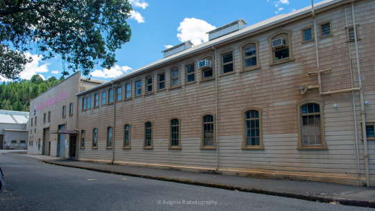
The A. & G. Price Ltd Foundry in Thames. January, 2021. This is gonna be a long one, so consider yourself warned.
Directly behind the image is where the East Coast Main Trunk Line (ECMT) connected to the Foundry and allowed for A. & G. Price built locomotives to be attached to the end of an outgoing NZR train.
Many non-Price Locomotives have graced the (long removed) timetable, including the 'Taupō Mallet' (ALCo 53970/1912).
But who were A. & G. Price? Originally founded in Onehunga, Auckland, as a marine firm by Alfred and George Price, the brothers would take advantage of the Coromandel gold rush and begin selling industrial pumps to mining companies in the 1870s.
They would also close down the Onehunga premises and set up shop in Beach Rd, Thames. Price got their start in the railway industry with a small 0-4-0ST locomotive for Messrs. Smith of Kennedy's Bay. This loco is generally considered to be a resounding failure. The first successful locomotives would be the Ministry of Works (known colloquially as the Public Works Dept, PWD) 501-502 series. These were identical to the NZR Wf Class.
Price is well known for their Climax and Heisler clones, which employed features from both locomotives. Notable engines include the Cb Type (Cb 117 used on construction of Nihotupu Dam), V Type ('true' Heisler clone), E Type (Class B Climax clone, used Heisler style pony trucks) and the Cba (an improved Cb). They would build 16-wheeler bush lokeys*.
Price would also build dozens of locomotives for New Zealand Railways and would later begin producing diesel locomotives for bush and industrial railways. By the 1990s, Price was king! They had spent the 20th Century building locomotives and road vehicles for lucrative government contracts, and there was no end in sight. They had even regauged the Silver Star carriages to metre gauge for export to Singapore.
Except there was. By 2017, the company lost most of its work, as neither NZRC (New Zealand Railways Corporation), TranzRail, TollRail, or KiwiRail have ever gone back to Price. The company was subsequently placed into administration. The company was saved by an Auckand based businessman and was reformed as AG Price Ltd, ending the 149-year legacy of the greatest engineering firm in Aotearoa New Zealand.
Many A. & G. Price locomotives can still be found on heritage railways, and I know of one Price-CAT Inc. motor grader in a museum. The Foundry is a heritage listed building which means it can never be torn down.
6 notes
·
View notes
Text
Creating science fiction locations inspired by MBTI personalities infuses your game book's universe with a diverse array of settings, each reflecting the core traits and themes associated with a personality type. These locations can serve as hubs of adventure, conflict, and discovery for players exploring the vast reaches of space and the depths of human (and alien) psyche.
### ISTJ - The Archive of Eons
- **Description**: A massive space station orbiting a dead star, home to the universe's largest collection of historical data, artifacts, and ancient technology, meticulously preserved and cataloged.
- **Adventures**: Players could be tasked with recovering lost artifacts, solving a historical mystery, or defending the archive from those who seek to exploit its knowledge.
### ISFJ - The Haven Habitats
- **Description**: A series of interconnected biospheres on a gentle, garden planet, each designed to mimic the natural environments of different species, providing refuge and healing to the war-torn and displaced.
- **Adventures**: Safeguarding the habitats from ecological sabotage, mediating interspecies disputes, or curing a mysterious plague affecting the planet's unique flora and fauna.
### INFJ - The Dream Nexus
- **Description**: A space station located at the confluence of quantum leylines, where psychics and dreamers can connect with the collective unconscious to guide and shape the future.
- **Adventures**: Navigating the depths of the collective unconscious to prevent a prophecy of galactic calamity, or harnessing dream energy to solve a crisis.
### INTJ - The Quantum Foundry
- **Description**: An artificial planetoid where reality is programmable, harnessing the power of quantum computing and reality manipulation technologies to create or modify matter and energy.
- **Adventures**: Thwarting a rogue AI's plan to rewrite reality, participating in experimental reality-shaping programs, or solving complex puzzles that guard ancient quantum tech.
### ISTP - The Asteroid Forge
- **Description**: A sprawling industrial complex carved into a wandering asteroid, specializing in the creation of custom starships and advanced weaponry, operated by master engineers and mercenaries.
- **Adventures**: Racing against time to construct a unique ship to escape a cosmic threat, or infiltrating the forge to steal blueprints of a devastating weapon.
### ISFP - The Nebula Canopy
- **Description**: An artist colony floating within a vibrant nebula, where creators use exotic matter and energy to craft works of art that are alive, telling stories or embodying emotions.
- **Adventures**: Protecting the colony from pirates seeking to steal priceless art, unraveling the mystery of a sentient masterpiece, or creating a masterpiece that could change the galaxy.
### INFP - The Refuge of Lost Worlds
- **Description**: A hidden sanctuary planet where endangered cultures and species are preserved away from the ravages of galactic conflicts and environmental destruction.
- **Adventures**: Rescuing a population from a doomed planet, uncovering the secret location of the refuge, or resolving a moral dilemma involving the intervention in natural evolution.
### INTP - The Anomaly Research Facility
- **Description**: Orbiting a mysterious cosmic anomaly, this research station attracts the brightest minds seeking to understand the universe's most perplexing mysteries and phenomena.
- **Adventures**: Solving a dangerous anomaly threatening the galaxy, decoding an alien message hidden within the anomaly, or discovering a breakthrough technology based on its properties.
### ESTP - The Galactic Arena
- **Description**: A massive space station hosting the most thrilling and dangerous competitions, where participants from across the galaxy test their skills, courage, and technology for fame and fortune.
- **Adventures**: Competing in the ultimate galactic challenge to win a critical piece of information, or infiltrating the arena to expose its dark underworld.
### ESFP - The Starlight Bazaar
- **Description**: An orbiting marketplace known for its extravagant parties, exotic goods, and entertainment, where the galaxy's elite and adventurers mingle to trade and revel.
- **Adventures**: Tracking down a rare item needed for a crucial mission, uncovering a smuggling ring operating within the bazaar, or navigating high-stakes social intrigue.
### ENFP - The Wanderer's Rest
- **Description**: A space station at the crossroads of wormhole paths, offering a meeting place for adventurers, storytellers, and dreamers, sharing tales of the cosmos.
- **Adventures**: Embarking on a quest based on an ancient legend shared at the station, solving a mystery involving the disappearance of explorers, or defending the station from a cosmic threat.
### ENTP - The Innovation Nexus
- **Description**: A floating think tank where radical scientists and inventors collaborate on projects that defy conventional understanding, pushing the boundaries of what's possible.
- **Adventures**: Joining a project to develop a new technology, stopping a dangerous experiment from going awry, or mediating a dispute that could end in scientific sabotage.
### ESTJ - The Command Spire
- **Description**: The central hub of galactic governance, a towering structure of efficiency and order, where the galaxy's leaders convene to enforce law and policy across star systems.
- **Adventures**: Navigating political intrigue to pass crucial legislation, responding to a crisis that tests the galaxy's leadership, or uncovering a conspiracy within the spire.
### ESFJ - The Harmony Stations
- **Description**: Space stations designed as diplomatic and cultural exchange centers, where species from across the galaxy come together to foster peace, understanding, and alliances.
- **Adventures**: Facilitating a historic peace treaty, thwarting espionage aimed at disrupting harmony, or organizing a cultural festival that brings rival factions together.
### ENFJ - The Beacon of Enlightenment
- **Description**: A traveling vessel that serves as a mobile university and library, bringing knowledge and enlightenment to the far reaches of the galaxy, uplifting civilizations.
- **Adventures**: Defending the beacon from anti-knowledge zealots, recovering lost knowledge from a remote planet, or teaching a critical technological advancement to a civilization in need.
### ENTJ - The Dominion Core
- **Description**: A vast empire's heart, a fortress planet from which a powerful ruler and their fleet command respect and obedience, pioneering expansion and order in the chaotic galaxy.
- **Adventures**: Leading a critical military campaign, negotiating a treaty that expands the empire's influence, or managing a crisis that threatens the empire's stability.
These sci-fi locations, inspired by MBTI personalities, offer a vast canvas for creating stories that explore the intersection of human (and alien) nature with the boundless possibilities of science fiction.
3 notes
·
View notes
Text
Different Types of Casting Methods for Ferro Titanium Alloys: Which Is Right for You?
When it comes to manufacturing ferro titanium alloys, choosing the right casting method can make a significant difference in product quality, cost-efficiency, and industry compliance. Ferro alloys play a vital role in the steelmaking and foundry industries, particularly in applications that require desulfurization, deoxidation, and grain refinement.
Industries such as railway infrastructure, automotive, aerospace, and heavy engineering frequently rely on high-quality Ferro Titanium Alloys to meet performance standards. For procurement managers, production heads, or government departments like Indian Railways, understanding the casting methods involved in producing these alloys is critical to ensure durability, performance, and value.
Let’s explore the most common casting methods, their advantages, disadvantages, and which industries each is best suited for.
1. Sand Casting
Overview: One of the earliest and most used techniques for making ferro titanium alloys is sand casting. Melted alloy is poured into the mold cavity after a mold is made out of sand.
Advantages:
Cost-effective for low-volume production
Simple and flexible for various shapes and sizes
Suitable for large components
Disadvantages:
Surface finish may be rough
Less dimensional accuracy
Higher porosity in some cases
Industry Suitability:
Railways (for large, heavy-duty components)
Heavy machinery
General engineering
Client Note: Railway departments needing robust yet affordable alloy components often prefer sand casting for its ability to deliver bulk components efficiently.
2. Investment Casting (Lost Wax Casting)
Overview: A wax model covered in ceramic is used to create a mold in investment casting. After the wax is removed, melted metal is poured into the mold.
Advantages:
High dimensional accuracy
Smooth surface finish
Excellent for intricate and thin-walled parts
Disadvantages:
Higher production cost
Longer lead times
Industry Suitability:
Aerospace
Automotive
Defense
Client Note: Departments requiring precision parts, such as railways’ electrical components or connectors, may find investment casting a worthwhile option.
3. Die Casting
Overview: Die casting is a process that uses high pressure to force molten alloy into a metal mold, or die. It's suitable for high-volume, precision parts.
Advantages:
Excellent surface finish and dimensional accuracy
Fast production rate
Minimal post-processing required
Disadvantages:
High tooling cost
Not suitable for very large parts
Industry Suitability:
Automotive
Electronics
Mass production environments
Client Note: Die casting can be leveraged by railway departments for mass-producing small, high-precision components such as brackets, housing parts, and fixtures.
4. Centrifugal Casting
Overview: This process uses centrifugal force to evenly distribute the alloy after molten metal is placed into a spinning mold.
Advantages:
High integrity with fewer impurities
Stronger grain structure
Suitable for cylindrical parts
Disadvantages:
Limited to symmetrical shapes
Higher setup complexity
Industry Suitability:
Oil and gas
Power generation
Specialized transportation components
Client Note: Railway applications requiring cylindrical components such as bushings or bearing sleeves can benefit from centrifugal casting.
5. Continuous Casting
Overview: This method is typically used for producing long sections of metal like bars, rods, and billets. Molten alloy is continuously poured and solidified in a mold.
Advantages:
High efficiency for large-scale production
Uniform quality
Reduced waste
Disadvantages:
Limited to simple shapes
High initial setup cost
Industry Suitability:
Steel production
Infrastructure projects
Client Note: Government infrastructure departments, including railways, often prefer continuous casting for large-scale procurement of standard alloy sections for tracks or base plates.
Choosing the Right Casting Method: Key Considerations
When selecting a casting method for ferro titanium alloys, consider the following factors:
Volume of Production – Low volumes may benefit from sand casting or investment casting, while high volumes justify die or continuous casting.
Component Size – Larger parts may require sand casting, while smaller, complex components are best suited to die or investment casting.
Precision Needs – High dimensional accuracy? Go for investment or die casting.
Budget Constraints – Sand casting is generally more cost-effective for limited runs.
Application Requirements – Evaluate whether the application demands strength, appearance, or both.
Why It Matters for Railways and Public Sector Procurement
For organizations like Indian Railways or public sector units procuring ferro titanium alloys, understanding casting methods helps ensure:
Better vendor selection
Longer component life cycle
Improved cost-efficiency
Compliance with industry and safety standards
Partnering with reliable ferro titanium alloy manufacturers who offer a range of casting solutions can help optimize both performance and procurement efficiency.
Final Thoughts
Ferro titanium alloys are still essential to contemporary infrastructure and engineering. Selecting the right casting method ensures that the components perform as expected in their designated environments.
Whether you're an industry buyer, engineer, or procurement officer in the railway or government sector, understanding these methods empowers you to make smarter, cost-effective, and performance-driven decisions.
Looking for trusted Ferro Alloys Suppliers with expertise in multiple casting techniques? Connect with specialists who understand your sector-specific needs and can deliver precision, quality, and scale.
#FerroTitaniumAlloys #FerroAlloysSuppliers
0 notes
Text
How a Steel Foundry Boosted Lining Life by 60% with LeisterTech’s Lining Vibrators

Location: Ahmedabad, Gujarat Industry: Medium-Scale Steel Foundry Furnace Type: 3-ton Induction Furnace Challenge: Frequent refractory lining failures after 18–20 heats Solution: LeisterTech Model X Lining Vibrator
Refractory Failures Were Slowing Down This Foundry—Until They Found a Better Way
An Ahmedabad-based steel foundry specializing in alloy castings for the automotive sector was facing recurring production disruptions. Despite using high-quality high-alumina refractory material, their furnace linings failed prematurely—typically after 18 to 20 heats.
The culprit? Manual ramming. Issues such as uneven compaction in the lower crucible, operator fatigue, and early-onset cracking led to an average 3–4 days of downtime per month—costing lakhs in lost productivity and material waste.
Enter LeisterTech: A Smarter Way to Line Furnaces

Following a free lining audit by LeisterTech’s expert team, the foundry switched to the Model X mechanical lining vibrator—a game-changing tool designed specifically for induction furnace refractory applications.
Key Features of the Model X Vibrator:
Adjustable RPM (2200–2800) to suit various refractory mixes
Wide vibration head for even compaction across the crucible radius
Reinforced portable base for flexibility
On-site operator training and technical support by LeisterTech engineers
Want to explore more about the Model X? Click here for product details
What Changed in Just 60 Days?
MetricBefore LeisterTechAfter Installing Model XLining Lifespan18–20 heats29–32 heatsMonthly Downtime3–4 daysLess than 1 dayMaterial Waste~12% per batch<5% per batchOperator FatigueHighLow (semi-automated)Annual Maintenance₹8.5 Lakhs₹2.4 Lakhs
“We didn’t realize how much we were losing until the downtime stopped. This one tool paid for itself in just two months.” – Foundry Manager, Ahmedabad
Why This Case Matters for Other Foundries
This success story illustrates that:
Consistent lining compaction drastically reduces cracking and erosion
Smart tools, not expensive automation, can drive high-impact improvements
Custom mechanical vibrators can be adapted to your furnace and refractory type
Operator dependency is reduced, increasing repeatability and reliability
Explore more tools and success stories on leistertech.com
Need Help Optimizing Your Furnace Lining?
LeisterTech isn’t just about products—they’re a complete solutions partner. From on-site lining audits and training sessions to annual servicing and vibration testing, their team helps foundries minimize downtime and maximize performance.
📞 Reach out directly via their contact page or call +91 93289 16310 / +91 99091 79617 ✉️ Email: [email protected]
Want similar results? Book a free lining audit today and discover how LeisterTech can enhance your furnace efficiency—just like they did for this foundry.
0 notes
Text
The Art & Science of Type Pairing

💘 Why Pair Fonts?
Using one typeface everywhere is like wearing a tuxedo to the beach — impressive, but maybe a little overkill. Font pairing adds variety, contrast, and personality to your design. But when done wrong, it’s like pineapple on pizza… controversial.
(Just kidding. Pineapple's fine. But Comic Sans and Papyrus? No.)
🧪 What Makes a Good Font Pairing?
Great type pairings do two things:
Create contrast (to emphasize differences in hierarchy or tone)
Maintain harmony (so your design doesn’t look like it’s fighting itself)
Imagine a tall, elegant serif heading paired with a clean, modern sans-serif body text. Beautiful. Like Benedict Cumberbatch reading poetry on a smart speaker.
🎯 Strategies for Winning Combinations
Let’s break down the most reliable methods for pairing fonts:
1. Contrast Serif and Sans-Serif
Classic move. Pair an expressive serif with a neutral sans-serif.
Headline: Playfair Display (serif)
Body: Open Sans (sans-serif)
It’s the equivalent of pairing a fancy blazer with sneakers. Bold and approachable.
2. Mix Width or Weight
Keep the font family the same, but vary the weight or width.
Headline: Roboto Bold
Body: Roboto Regular
This keeps your layout cohesive and classy — perfect for minimalist design.
3. Pair Fonts with Shared Roots
Fonts designed by the same type foundry often pair well. Example:
Montserrat + Cardo: Both geometric, both elegant in different ways.
It’s like dating within the friend group. Fewer surprises.
4. Use Superfamilies
These are typefaces that include both serif and sans-serif versions. Try: PT Serif + PT Sans, or Roboto Slab + Roboto
These are the Swiss Army knives of font pairing.
⚠️ Common Type Pairing Sins
Let’s avoid these tragic design decisions:
Too similar = confusing: Don’t pair Helvetica with Arial. That’s just chaos.
Too wacky = distracting: Don’t mix five decorative fonts. This isn’t a ransom note.
Ignoring hierarchy: If everything looks like a title, your readers will get lost faster than a cat in IKEA.
🧠 Unique Fact of the Day
The phrase “font pairing” wasn’t even a thing until the digital design boom of the 2000s. Back in the print era, designers stuck with one typeface — but used its full family of styles creatively. Bold. Italic. Small caps. All within one font. Pairing became necessary when digital design tools opened the floodgates of font choice.
And thank goodness — otherwise we’d all still be living in Times New Roman.
🧪 Type Pairing Challenge
Create a simple landing page mockup with:
A large headline
A paragraph of body copy
A button
A quote or testimonial
Try these pairings:
Playfair Display + Lato
Roboto Slab + Roboto
Bebas Neue + Source Sans Pro
Then ask: Which feels most modern? Which feels luxurious? Which one screams "startup"?
Pro move: Try the same layout with a bad pairing — like Comic Sans and Impact — and watch your soul shrivel.
https://letterhanna.com/the-art-science-of-type-pairing/
0 notes
Text
Wk 1, Feb 14th, 2024 Reflection
Visiting the Auckland Art Gallery Toi o Tamaki
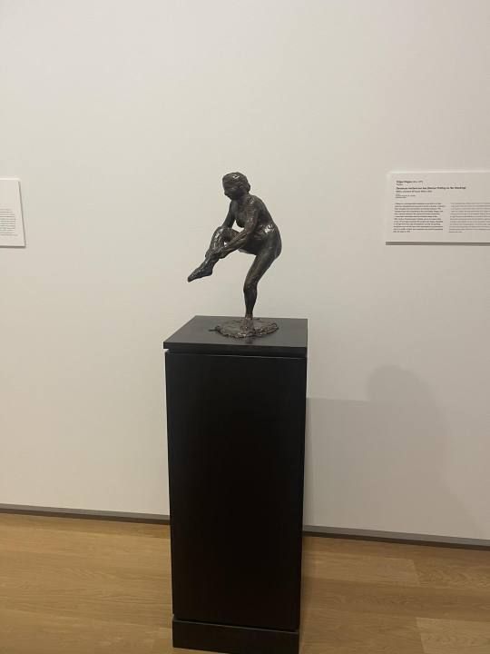
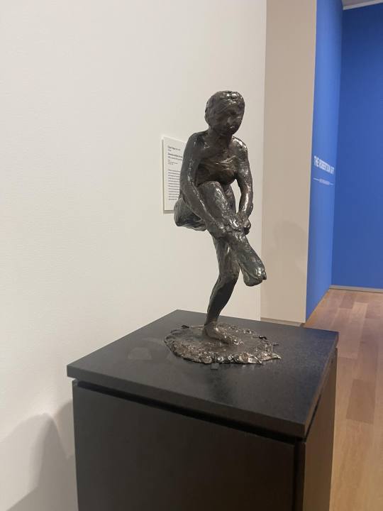
Edgar Degas, Dancer Putting on Her Stocking (Femme Mettant Son Bas), Bronze, Mackelvie Trust Collection, Auckland Art Gallery Toi o Tamaki
Informing my practice is a historical use of Marquette making and how Marquettes, with their crude materials, were able to communicate the form of sculpture before being translated into bronze. Materials like plaster, clay, beeswax etc are combined in Edgar Degas’ sculptural practice. It important to note that Degas was described as going against the norms of maquette making and using whatever material he felt necessary to create his forms which were then translated in bronze by artisans in the foundry he patronised. Degas had a seemingly haphazard but methodical practice of making maquettes from his bronze sculptures. He placed focus on the role of fingermarks on clay, wax, and other ephemeral debris that constructed his maquettes, which built the basis of his bronze sculptures.
Close up of Edgar Degas, Dancer Putting on Her Stocking (Femme Mettant Son Bas), Bronze, Mackelvie Trust Collection, Auckland Art Gallery Toi o Tamaki
I have had the opportunity to see in person in the Auckland Art Gallery, The dancer putting on her stocking (photos taken on my phone). The use of bronze informs my practice examines Degas as it allows me to understand the ability of bronze to pick up the detail of the maquettes being true to the material that is being cast. For example if a work was made from a maquette that used clay and wax, the bronze would have traces that clay and wax makes, the type of lines that wax leaves, the type of curves that fingers can mark in clay. In a way, if I was going to cast from life, using a found leaf, then the bronze would be 'true to' the leaf, picking up its type of line, the mark of vegetation. If, however, I made a maquette in clay and wax of the same found leaf, the bronze work would instead be 'true to' the clay and wax marks- because they came last in the process before melting the bronze.
The way bronze was used by Degas, is in the same way it is used in many contemporary foundries today. The lost-wax technique sees the wax set over the 'object' and make a wax mould. This mould can then be impressed in plaster (or today it's usually silicone). From their the bronze is poured into the mould and left to set. Also shown in the Gift to the Auckland Art Gallery exhibit, was a Barbara Hepworth Sculpture translated from wire mesh and plaster maquette to bronze.The works detailing picked up the language of plaster (see below), it picks up the way plaster can be moved and smoothed onto a surface, how it chips off when dry and how plaster can bear the mark of tool used to pock and prod into itself. Maquette making as a practice has me thinking if I want to remain 'true to the materials’ that I cast and not translate them from life, or if it would be more 'true to' go straight from life to capture my organic matter in a more direct way?

Barabara Hepworth, Torso II, 1958, Bronze, Mackelvie Trust Collection, Auckland Art Gallery Toi o Tamaki
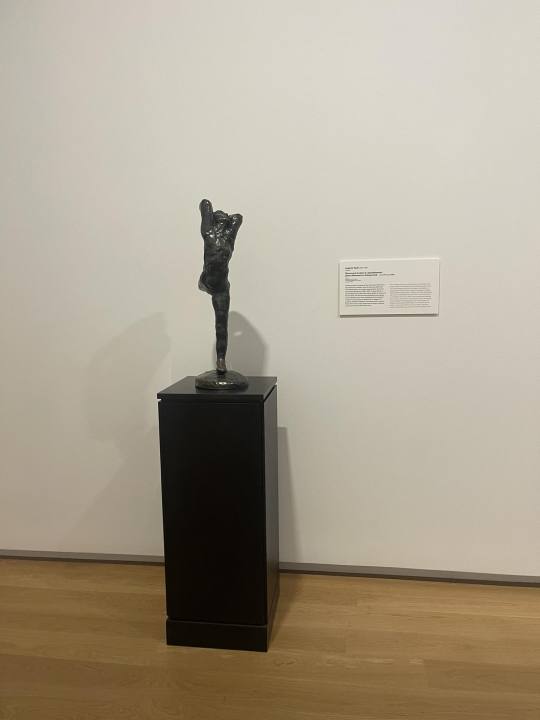
Auguste Rodin, Dance Movement A Enlargement [Mouvement de danse A, agrandissement], 1911, bronze, 730 x 250 x 330 mm, Mackelvie Trust Collection, Auckland Art Gallery Toi o Tāmaki
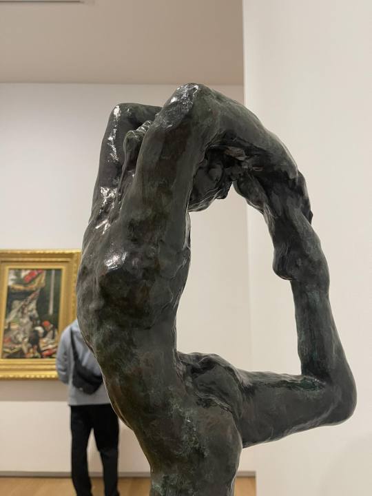
Close up of Auguste Rodin, Dance Movement A Enlargement [Mouvement de danse A, agrandissement], 1911, bronze, 730 x 250 x 330 mm, Mackelvie Trust Collection, Auckland Art Gallery Toi o Tāmaki
All works from the exhibition: Julian and Josie Robertson Gift to the Auckland Art Gallery I visited on the 14th of February
0 notes
Text
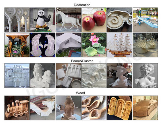
ATC CNC Router for Plastics & Foam for Sale
Machining plastics and foam require specialized CNC Router Machine. You need a rigid and robust CNC Router Machine construction with a powerful driver system and high-performance CNC Cutting Machine controller to make sure the best cutting edge and working quality.EPS Foam CNC Router is one kind of foam CNC machines, it is mainly working as a CNC foam cutter for styrofoam carving, it has a big working dimension, does a good job in carving or cutting of large scale workpieces in different materials, such as wood, aluminum, styrofoam, but not for steel, iron, etc.
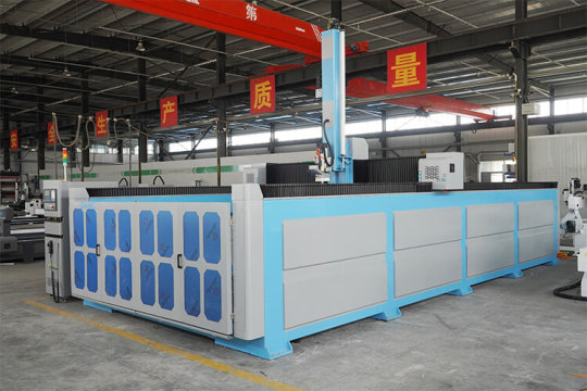
Our CNC Milling Machine delivers all types of applications from simple to 2D profile cut letters to complex 3D carvings and engravings, slotting, V-grooving and a variety of tooling for plastics and foams.
ATC CNC Foam Router
This is a type of foam CNC router equipped with an automatic tool changer magazine. Added with a linear auto changer magazine or carousel auto tool changer, it can not only automatically change different tools but also complete more patterns and complex engraves. It has the advantages of fast cutting speed, low maintenance cost, high engraving accuracy, etc. Moreover, it reduces the interference of manpower, which save a lot of labor and time, as well as improves work efficiency.
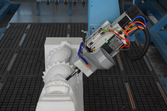
Advantages Of 4 Axis EPS CNC Router Machine:
1. Whole working table cast by resin sand. The annealing and other heat treatment methods ensure that the whole structure is tested to the limit for sturdiness and reliability.
2. Italian high-speed spindle, with top speed of 18000rpm, guaranteering maximum processing efficiency and productivity.
3. It adopts imported ball bearing, widening linear guide rail, self-lubricating sliding block. When engraving, equal force in all directions, to ensure the accuracy and strength.
4. Taiwan Syntec controller can read the codes in an efficient manner. On-line simulation and monitoring function are available. Processing efficiency and safety are guaranteed.
5. All of these models can be customized according to customer requirements.
CNC Router for Plastics & Foam Application
CNC foam router is often applied to industries including Mould-making (lost foam, wood foundry pattern, aluminum casting pattern, Expanded Polystyrene Mold), Custom EPS EVA Molding, 3D Polystyrene Shapes, Foam Sculpture Props & Statues, Rapid Prototyping and more.
0 notes
Text
Week 5: Project #4 - Remaking Language


I have been dedicating most of my time this week to Project #4, which has the ambitious goal of designing the 27th letter of the English alphabet. As I highlighted in my previous blog post, the primary objective of this project is to familiarize myself with typography terminology, specifically serifs and sans serifs in typefaces. In general, the project is proving to be a valuable opportunity to enhance my comprehension of typography and its significant contribution to design.
During my experimentation period, I devoted the majority of my time to exploring different fonts and typefaces with the aim of improving my comprehension of letterforms and the various elements that constitute the final form. After testing out various alternatives, I ultimately settled on Roboto Slab (regular) for my serif letter form and Ubuntu (regular) for my sans-serif letter form. I selected these fonts because they have a timeless and structured feel, and their styles and shapes are quite similar. To dive deeper into these choices, I created 21 sketches that encompassed multiple concepts for a potential 27th letter, with 12 ideas for the serif letter form and 9 for the sans-serif letter form.
After receiving feedback from my peers and professor, I realized that I needed to broaden my experimentation with letterforms. They advised me to further break down the shapes and create a more cohesive flow between the selected letters. Although the shapes were intriguing, they were too obvious. To gain a deeper understanding of how to deconstruct these concepts, I opted to transfer my work to the computer for additional experimentation. Nevertheless, this phase of the process presented some challenges. Creating these letterforms without distorting the type was difficult, and I had a learning curve when manipulating the letter forms in Illustrator. Fortunately, my professor supplied me with extra videos and resources to help me overcome these obstacles.
Once I've chosen two ideas from my sketches, I'll transform them into vector graphics using Illustrator. These vector files will be exported to InDesign, where I will design three specimen spreads inspired by Emigre Type Foundry's famous specimens or Lost Type.
The readings for this week have provided me with crucial concepts and ideas that can assist me in my design process. Kerning, tracking, line spacing, alignment, and vertical alignment are all vital factors that must be taken into consideration when designing a layout for a spread. Of particular importance are tracking and alignment, as they can impact the expression of meaning and the commentary on conflicts between different types. According to the text, the author states "You can express the meaning of a word or idea through the spacing, sizing, and placement of letters on a page…combining different types can comment on conflicts between hard and soft, industrial and natural, and planning and chance." The exercises conducted on these pages have been inspiring, as they have shown me how type can be utilized to foster a sense of emotion or clarity. Words are not just a means of conveying information but can also contribute to the mood of a page. This is especially relevant in magazines or printed advertisements, where the placement and shaping of text can add to the overall emotion or feeling conveyed by the material. Although text is a form of information, it should also be treated as an object or material that can add interest to the piece. However, it is important to exercise caution and review to ensure that the text remains legible and organized. These factors will be crucial as I move forward with the second portion of this project. All of these elements are necessary to create a successful layout for my three design spreads for my 27th letter.
Lupton, Ellen. “Kerning, Tracking, Line Spacing, Alignment, Vertical Alignment.” Thinking with Type: A Critical Guide for Designers, Writers, Editors, & Students, Princeton Architectural Press, New York, 2010, pp. 102–123.
0 notes
Text
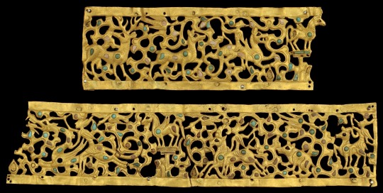
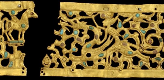
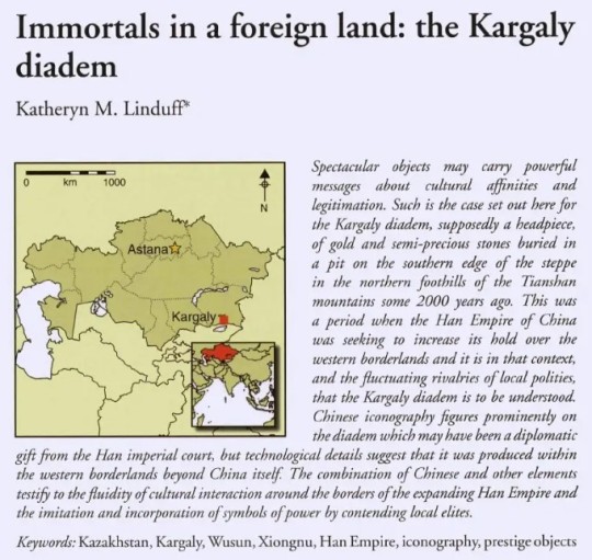
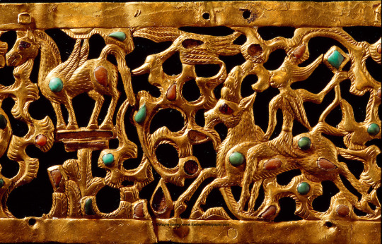
The Kargaly/Wusun diadem 2nd C. BCE - 2nd C. CE. Note, Katheryn's article below is much longer and has more info, I just took snips of what I found most interesting. It can be found online.
"According to Chinese archaeologists, the excavated skeletal remains presumed to be Wusun are of the short-headed Europoid Central Asian interfluvial type (Mallory Mair 2000: 93-94). On the basis of six skulls from the last centuries BC/first centuries AD found in Semirechye and presumed to be those of the Wusun, Soviet archaeologists have described them as ranging from primarily Europoid with some Mongoloid admixture to pure Europeans (Mallory Mair 2000: 93-94). Evidence from ancient Chinese texts is contradictory about the appearance of these peoples and only DNA and other types of scientific testing will bring clarity to this issue.
Although gold artefacts and inlay can be found dating from the Late Neolithic through to the Bronze Age in China, it was most prevalent in its borderlands (Bunker 1993: 27-46) until the Qin and Han, when it found preference on a broader scale.
In addition, the lost-wax lost-textile casting technology was developed and used (Bunker 1988: 222-27) in the area adjacent to the very tombs from where the iconography and style of the diadem hails. Observations about the inlay technology used on the diadem are important clues as well. Inlay appeared on Chinese-produced objects almost exclusively where a cell was created into which the stone was placed and adhered with some fixative (Bunker 1993). This is not the technique used to produce the diadem, where the gold was hammered into a matrix-template, then engraved (or chased) on the surface. Many of the cells for inlay were created in the hammering process and after the stones were in place, secured by hammering the bezels surrounding each stone. In addition, there were pierced cells filled from behind with stone and secured with the addition of a gold sheet adhered behind the stone. Items produced using such techniques would probably not have been created in Chinese foundries.
Moreover, gold animal plaques known from earlier Xiongnu tombs (third century BC) use inlay to enhance the natural conformation of the beasts (Figure 5). By placing inlays at the points of movement such as at the haunches of quadrupeds or at the wing joints of birds, the potential of movement and thereby the power of these wild creatures is underscored. Inlays also mark such features as eyes. On the Kargaly diadem, however, circular inlays are used decoratively as a patterned design, still often at the haunches, but also throughout the clouds. They no longer emphasize the natural form or movement of the animals or the clouds, but create an overall pattern. This recommends a later date for the diadem, perhaps late first or second century AD.
But why would such models be used in south-eastern Kazakhstan at this time? This is a unique piece—its style and iconography were nor known before or after in the region. The models for the iconography were taken from types known near Han imperial military outposts in a place where the Chinese hoped their troops could contain barbarian incursions and where peace and stability were difficult to maintain. Those units often included conscripts whose allegiance was opportunistic. The models for diadems (Stark 2012: 134) or for applications to adorn carts or clothing come from further west.
So, was this piece made in the Western Regions, in the territory beyond the Jade Gate of the Great Wall (in present day Gansu) that marked the boundary of Han hegemony, and then carried west? Was it perhaps made as a gift for an embassy to present to a Wusun or Yuezhi leader far outside of Han territory, such as in Wusun? Or, alternatively, was it carried by a regional princess to her place of exile and burial as the partner of one of those 'foreign' leaders?"
-Katheryn Linduff, Immortals in a foreign land: the Kargaly diadem. 2014, Antiquity, Vol 88, issue 339
#wusun#indo european#indo european mythology#chinese mythology#chinese#artifacts and antiquity#dragons#archaeology#anthropology#history#ancient history#ancient art#art#museums
241 notes
·
View notes
Text
What Fonts does the ABC’s Lost TV Series use for its Logos? (Fonts Blog) (What Fonts)


Logos ©ABC Studios; Disney Studios; Bad Robot Productions
Article by @warrenwoodhouse #warrenwoodhouse
The fonts that are used throughout the Lost franchise are:
The introduction logo font is called Futura PT Medium Oblique by Adobe
The end credits logo font is called Interstate Light by Frere-Jones Type
The promotional materials logo font is called Impact Standard Regular by Monotype
#warrenwoodhouse#2024#fontsblog#whatfonts#what fonts#Lost (TV Series)#lost tv series#lost abc#abc lost#abclost#disney
3 notes
·
View notes
Text

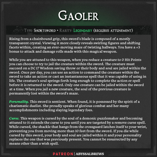

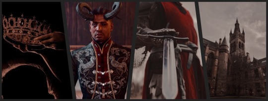
High res versions of the art, a Foundry VTT module, and other formats, as well as a full compendium of our 100+ items can be found on our Patreon
Gaoler
The world can be a scary place at times, not due to monsters but due to the people that inhabit it. Some of the worst types you could ever come across are locked away and forgotten in long lost dungeons where they were left to rot. One individual had a different idea though. He felt that for some, they were too dangerous to be allowed to exist on the same plane as the rest of us. He set forth to make a deal. A sword that could lock away the worst the world had to offer in exchange for a lifetime of service locking away enemies of the being he made the deal with. Little did he realize he too would pay the price.
If you want to see more of our items you can check us out on our Website, Twitter, Pinterest, Tumblr, Bluesky, Threads or Instagram where we post them regularly. You can also find us at our Discord server where you can hang out and chat with the community.
#digital art#dnd#dnd homebrew#dnd5e#dnd 5e art#dungeons and dragons#fantasy art#fantasy illustration#magic item#ttrpg#artists on tumblr#digital illustration#illustration#digital drawing
27 notes
·
View notes