#mpdevelopment
Explore tagged Tumblr posts
Visit Tumblr Blog
Explore Tumblr blogs with no restrictions, modern design and the best experience.
Last Seen Tumblr Blogs


Fun Fact
Tumblr was acquired by Yahoo for $1.1B in 2013.
Text
#BathymetricSurvey#HydrographicSurvey#WaterMapping#SlokaInfraSolutions#SurveyExperts#DevelopmentMatters#SustainableDevelopment#InnovativeIndia#GeospatialTechnology#UnderwaterMapping#SonarSurvey#SurveyingIndia#GISMapping#InfrastructureDevelopment#EngineeringSolutions#MadhyaPradesh#MPDevelopment#SmartCityMP#NarmadaRiver#WaterResourcesMP#MadhyaPradeshProjects
0 notes
Text
Evaluation
Through extensive research, I developed a clear understanding of the issues surrounding ultra-processed food and the impact of additives. It effectively communicates healthy alternatives to UPF products while educating about additives, fitting to those overwhelmed by health information.
Challenges included illustrating ingredients both visually and functionally, and managing messaging around UPF without taking away from my product's appeal. This issues was resolved through extensive development and refinement.
I demonstrated a practical methodology by exploring new and innovative approaches in visual communication. This included exploring effective strategies to educate and engage audiences about the health implications of UPF.
Independently project managing ideas, time, and resources, I engaged with academic support, feedback, and resources for successful realisation. Through critical reflection, I documented the process of my major project, highlighting its relation to personal and wider professional contexts. This enabled me to assess the complexities of my project and identify areas for improvement, such as further research into successful initiatives that have shifted societal perceptions, like the transformation seen with cigarettes.
Overall, I am pleased with the outcome of my project, which comprehensively addresses the brief while maintaining a professional standard across a variety of touch points. Through this project, I have made significant progress in my personal creative practice and have successfully demonstrated my ability to engage with complex issues in visual communication.
Further development could involve creating real-life packaging for in-store demonstrations and organising a photo shoot for product usage to resolve issues with mockups.
0 notes
Text
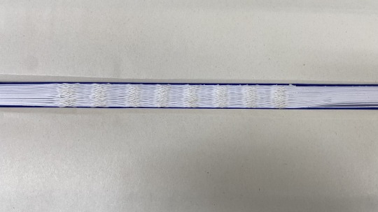
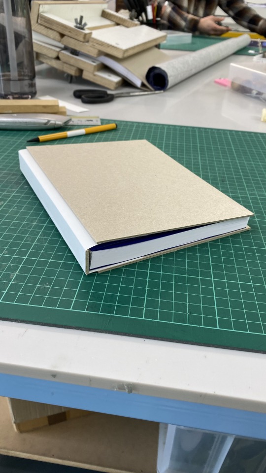
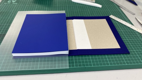
Process Book binding


0 notes
Text
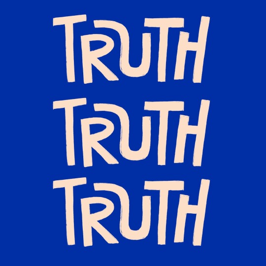
Instagram post

As Truth cares about the planet, I wanted to demonstrate how that would look across its branding.
0 notes
Text
Tote Bag


Initially, I was drawn to the idea of incorporating actual "lies" onto the tote bag. However, I found that it became unclear whether I was referring to my own brand. To avoid confusion and allow for versatility, I decided to get rid of them. This way, people can wear the tote as a fashion statement rather than just a shopping bag. After all, not many would want to use a bag that boldly states "low calorie."
0 notes
Text
Test Print
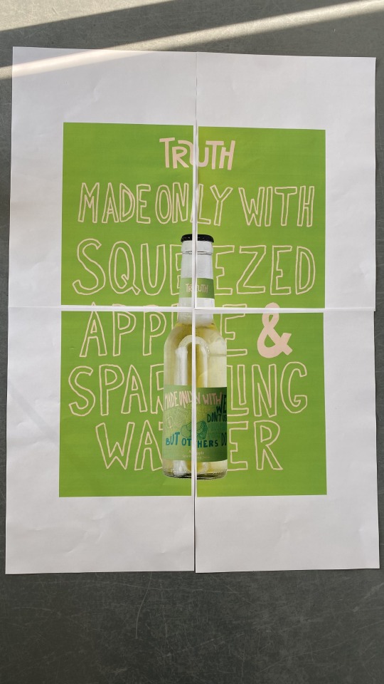
I test printed the poster to check for readability and size. I forgot to colour in 'made only with', but other than that I am happy with the outcome.
0 notes
Text
City Mockups


I was searching for an outdoor mockup in a city setting featuring three posters, but I had difficulty finding the perfect fit. However, I think that the bottom one reflects the concept quite well.
0 notes
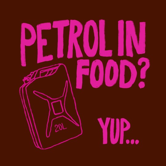
Text
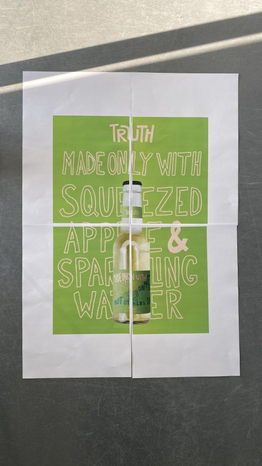
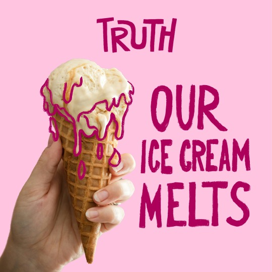
Posters


These posters strike a balance between promoting the brand positively and calling out other products. They will be strategically placed in public areas for maximum visibility and will feature different products tailored to the environment and season. With summer approaching, promoting a refreshing drink feels like the perfect choice.
0 notes
Text
Delivery


I designed a van and a box to showcase on the website, providing customers with a clear expectation of what to anticipate upon delivery. Utilising a branded van also serves as a powerful promotional tool, reaching potential customers as it travels. To convey the essence of the brand, I included a slogan and ingredient illustrations, allowing people to grasp the brand's identity. Additionally, featuring a website link offers quick access to further information.
0 notes
Text
Delivery


Knowing that a big part of my target audience are busy individuals, I wanted to solve it by providing delivery options, making Truth even more accessible for people.
0 notes
Text
Edited instagram posts


I decided on my final colour palette and edited some posts for consistency and visual recognition. I also created some extra assets that demonstrate other products.
0 notes
Text
Balancing colour


Previously, there was a noticeable separation between the back and front due to the use of two different colour palettes. I've now blended the colours more to create a sense of cohesion between the two.
0 notes
Text
Assets
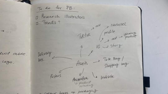
Planning promotional materials and other touch points that will help me elevate my design strategy.
0 notes
Text
Packaging development


The back of the packaging will now say "We don't use... but others do", by saying this I solve the problem of people questioning why those ingredients would even be in that product.
0 notes
Text
Instagram posts


Instagram serves as a platform for sharing information about ultra-processed food and promoting Truth products as an alternative. I didn't want this account to solely focus on products; instead, I aimed to turn it into an activist platform where truth is revealed. This account is also accessible to a wider audience.
0 notes
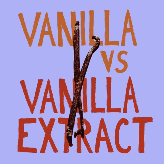
Text
UPF side of the packaging


Exploring ways in which I can showcase what ingredients aren't used in this product.
0 notes