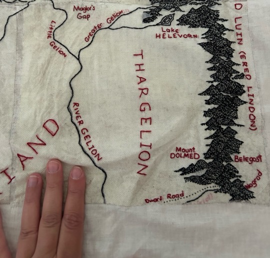
#nothing like physically recreating places on a map to better understand distances
Explore tagged Tumblr posts
Visit Tumblr Blog
Explore Tumblr blogs with no restrictions, modern design and the best experience.
Last Seen Tumblr Blogs


Fun Fact
The Tumblr app for Google Glass was released on May 16, 2013.
Text
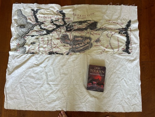
The map is now half way complete! Panel 8 is done! I had to take a little break in order to get a bunch of crochet gifts done (such as for my BRAND NEW NIECE 🥰) but now I am free to focus more on this project.
Now it’s time for Panel 9 and going back to the sea, which will be much easier since it has neither forests or mountains to stitch.
#I am having so much fun and learning a lot about beleriand while I stitch#nothing like physically recreating places on a map to better understand distances#and how places are related to one another#beleriand embroidery project#embroidery#fibre arts#lotr#silmarillion#Tolkien
526 notes
·
View notes
Note
How is DBD if you don't mind me asking? :0 What does the game contain like how is the gameplay and what is it about?
Oh boy, strap in nonny.
At its’ core, Dead By Daylight is an asymmetrical (4v1) horror game. You either play as a Survivor and aim to fix generators and, well, survive. Or you play as a Killer, aiming to sacrifice Survivors to a being simply known to all as The Entity.
Gameplay-wise, especially when playing as a Survivor, DBD reminds me a fair bit of the old Assassin’s Creed multiplayer (see: Brotherhood, Revelations, 3 and I think Black Flag? for examples) in that when you get chased by the Killer, there’s a multitude of ways to attempt to break the chase. You can vault through windows to try and break line of sight and/or gain distance, stun the Killer with a pallet to also do the same.
As a Killer, you have some sort of power at your disposal. This is (typically) unique to each Killer, though some do have minor similarities. These powers can be as simple as laying bear traps down in hard-to-see places to trap Survivors in so you can grab them, being able to instantly down a Survivor with your power, or being able to get to one end of the map to another to be able to patrol more efficiently through whatever means they have, among other things. Each Killer usually has a playstyle that works best with their power, but this can be affected by maps, perks & also Survivor organisation.
With perks come 4 different ways you can customize your playstyle. Some perks personally bring your character (whether Survivor or Killer) a benefit after reaching certain criteria, hinder the other side, or help out teammates (if Survivor). Some help to stall progress.
Lore-wise is where I think Dead By Daylight now excels strongest. I’ll put the rest of the post under a read-more and tag it as #long post so as to not clog people’s dashes with lore sdhjfgshdgjfhj
What we know thus far is this:
The Entity is some sort of eldritch, almost primordial living dimension and is described as the cosmic embodiment of evil. The Entity itself is rarely seen, though we do know that the grounds for the trials themselves are a part of it, and when it manifests to collect the sacrificed Survivors, it manifests as giant spider-like limbs. It feeds off of emotion, and we recently (like, in the past year or so) discovered that not only does The Entity feed off of the emotions of sacrificed Survivors (as that’s the most direct and filling source iirc), it feeds off of the emotions of its’ own Killers as well. The thrill of the hunt, the adrenaline rushing through the systems of both Survivors and Killers alike, the fear, the bloodthirst, all satisfy The Entity’s endless hunger.
We also know now that The Entity is not bound by time or space. It exists in all time periods, of all spaces, in all timelines, universes without exception. This also explains how characters that we know as horror characters in our universe (Michael Myers, Freddy Krueger, Leatherface, The Pig, Ghostface, The Demogorgon and most recently Pyramid Head and their respective Survivors if applicable) physically exist in The Entity’s realm.
Its’ ultimate goal is to consume every world (i.e every variation of Earth/Terra) in the cosmos, and to do so, it must grow stronger. It prefers worlds full of chaos and darkness, worlds where murder, death and pain are prevalent. To be able to make a start on consuming a world, it must first choose its’ first victim, better known to those in the trials as a Killer. It starts to corrupt one such individual, forcing them to create great misdeeds and pain in order to weaken the veil between The Entity and the world. When The Entity can break through, it starts to draw more people into its’ realm, corrupting more to do its’ deeds. Some are willing from the get-go, some instantly break and do its’ bidding, some are coerced and tortured into working for it. The Entity doesn’t mind, it is patient enough, and knows that all will eventually bend and break somehow if needs be. It always has someone willing to work for it, even if it’s because it broke them.
The grounds for the trials themselves are imperfect recreations of the areas that The Entity seeped into our world from. You may end up in the same place twice (say, Mother’s Dwelling for example), but there will always be something different each time. The exit gates may be in different locations, trees may be in wildly different places than they were the last time, etc. This is because, and I quote:
“Unable though to really understand the true nature of the world it touches, it tries to replicate it as best it can, although it never quite gets it right. As a result, the world is an ever changing nightmarish fusion of familiar and strange elements as The Entity makes up what it cannot comprehend.”
which makes the trials just that much more unnerving. This is no familiarity here, except for the campfire.
The campfire is the safe haven for Survivors, where they exist until they are eventually pulled into a trial, but even then, the Killers sit just out of sight, watching and waiting with keen eyes and hungry weapons. There is no true escape. If you make it through an exit gate, you’re sent back to the campfire. If you are sacrificed or outright killed through a Memento Mori, you also end up back at the campfire. As the tagline says, Death Is Not An Escape. You are The Entity’s prey and plaything until you become an emotionless husk.
And, in the event that a Survivor does become an emotionless husk, what is left of them is eventually tossed into The Void. A space that we only know so little about. The Void in this context is where the aforementioned husks or emotionless shells of Survivors are tossed, but also potentially the first prototype Killers were tossed as a result of not being able to work properly. This is a blank limbo, where nothing else exists. No trials, no emotions, no pain. We don’t know much else about this particular Void, but it has been hinted that escape may be possible from it, but only back into the realms of the trials.
Another aspect of The Entity itself is the thick, ever-present fog that exists in its’ realms. This is mostly referred to as the Dark/Black Fog, or the Auric Fog, due to its compositional makeup of Auric Cells. It feels alive, and seems to carry the memories of the people from worlds that The Entity has touched or consumed.
There’s a fair bit more that I could go on about, but I’ve already said so much, and spilling everything wouldn’t be fun now, would it? I hope this kinda answers your question, since I did go on an infodump tangent sdhjgfsdhjgfhj
#jesus christ this is Long#long post#para rambles#tw: torture mention#tw: murder mention#tw: spider mention#tw: blood mention#tw: death mention#ask to tag#since i know there's probably things I missed!#Anonymous
2 notes
·
View notes
Text
For whatever reason I thought Control was a small indie experience that I would enjoy because of some fun mechanics and a cool design aesthetic. It’s not, this is a full fledged amazing game with everything a game should have to offer. I mean wow. Okay, I found out about this game from Jim Sterling’s review when it was originally released and like 3 of you hunties messaged me about making sure I played that shit. That’s the biggest sign of a game’s worth for me when I haven’t played it yet; people actually going out of their way to let other players know they have to play it so I definitely had it in my list but I didn’t KNOW!
IT’S SO FUCKING GOOD!! I played almost the entire weekend. Could not, could not and I must absolutely mention that I could NOT stop playing it. My back hurts a little bit today because I didn’t take my breaks from sitting down sometimes just cuz I wanted to keep going.
The flow of the game is so incredibly smooth and organic. I go from thing to thing, area to area, reading documents, exploring, continuing the story, managing my equipment and levels and suddenly a side quest pops in and I fast travel to that.
It’s beautiful, first of all. The design aesthetic of the game delivers on every level. Even the live action video you run into and works as storytelling and filling out the world is dud up in the same exact colors, muted yellow walls, labby looking tables with technical equipment on top. They did SUCH A GOOD JOB!
I bitch about brutalism a lot on here but the game made me feel and understand the appeal of brutalist architecture. Being inside molded concrete has never felt more appealing because I understand it better now after having spent so much time exploring a building dud up in that style.
I felt instant intense desire to play Echo when I first found out about it because there’s something about labyrinthine interiors with rooms that fold into each other and I did not at all expect to get that feeling recreated so well in this game. I haven’t even played Echo yet and Control gave it to me without expecting it. I love it. The desolation, the feeling of being lost. I am never physically lost. My brain keeps track of every place I’ve seen with my eyes. I have mental maps of every place I’ve ever lived in. That’s part of the appeal of having the feeling of being disoriented and not knowing your location that I love to see in games and they do it so well here. The best is as your brain eventually does catch up with the size of the location and I create these maps in my brain, it’s incredible, the feeling.
OMG the gameplay. I just got another mechanic thrown at me that majorly ads to experience cuz I can literally levitate and float. You can pick up objects and throw them or use them for puzzles. The weapon transforms into several shapes, each unique that can be mixed, matched, modified and upgraded. You can force push enemies as the melee attack, create a shield for defense, move your body quickly over a short distance for environmental traversal and dodging attacks. It’s so fluid and fun to move her around during a fight but even just exploring is so dynamic as you move her and the camera simultaneously. An absolutely blast.
The story is coocoo banana and fully realized as well. Nothing about the narrative feels phoned in either. I can’t wait to see where everything ends.
Anyway, in love with this game. I can’t get enough and I’m a whore for not sticking to it by now because it’s probably the best game I’ve played this year thus far. I need to keep an eye on this developer for whatever’s next and definitely check out their older games.
I absolutely love Control. This is the self folding inside maze I always wanted and...
I’ll add more later but I’m loving this so much. I haven’t been able to stop playing.
6 notes
·
View notes
Text
Experiencing the Humanities
Chapter 9 of Experiencing the Humanities by Richard Jewell
There are four elements that are extremely important in how most works of art that we appreciate visually are developed. These are the use of tension, medium, perspective, and plan. These elements of art in the visual, sculptural, architectural, and other sight arts are discussed in this chapter. (Elements of literature and music are discussed in their own, separate chapters.)
What do these four elements mean? The tension or pairing of opposites in works of art better conveys beauty. Medium is the materials used to make a work of art, and different mediums have different affects. Perspective is the three-dimensional quality of a work, and its successful use helps draw a viewer more deeply into the work. And a plan is the pattern, organization, or map system of a work of art--how its parts or divisions are arranged--such that the viewer's eyes are drawn to key parts.
Beauty In Tension
What do we mean when we say that a particular work of art is beautiful?
One thing we obviously mean is that it is pleasing to our senses. And since, as human beings, we all have similar sensory equipment, we all tend to find (at least in general), the same kinds of things beautiful: sunsets, for example, and their brilliant panoply of color, or the haunting songs of birds, or perhaps the curve of warm marble lying in the sun. These things and many more are recreated in art, and it is the power and wonder of such recreation that make art beautiful to us.
There is another reason why art is beautiful, too, and this is a sometimes surprising type of beauty. It has to do with tension.
Tension is very important for an object to be beautiful. Tension is created in art when, for example, a story has heroines and heroines on the one hand, and terrible villains or obstacles on the other. Tension is created in architecture when hard, vertical stretches of columns are placed against delicately curving columns. Tension is created in music when harsh, loud sounds compete with gentle, soft ones. And tension is created in dance when hard, jerky movements that take effort are combined with, or opposed to, gentle, flowing movements that seem effortless.
Often it is just such tension that makes works of art special to us. The tension speaks to both the good and the bad, the easy and the difficult in life. Art that is happy all the time--like elevator music, flower-print wallpaper, and smile-face designs--is not necessarily good art. Good art often is filled with tension.
Why tension? Our own lives are filled with opposites and with striving to move from point A to point B. We describe our emotional lives in terms of opposites: happy, sad; angry, passionate; crying, laughing. Good art echoes these opposites in our lives, makes us feel these opposites--good art helps us to recognize these opposites and, sometimes, learn how to accept or deal with them better. This is one of the reasons why art is such a very special and very dear language to us as a human race: we need this language of the feelings, this language of tensions, to help us understand and improve our lives in ways regular languages often can't.
This tension is why really good art sometimes contains ugliness, hate, and depictions of sin, brutality, and other things we would never hope to see in real life--good art often, perhaps most of the time--shows us great contradictions that life can bring in the worst possible circumstances. And we learn from the resolution of those crises, so that within ourselves we can learn how to surmount our own ugliness, brutalities, and hatred, whether from within us or from those outside of us. These bad things in life hurt, and art is a healer. And in that healing lies true beauty.
Medium--the Materials
Medium is the stuff or material out of which the work of art is formed--the stuff you can actually see or touch after the work of art is made. In the visual arts, medium is such things as canvas, paper, wood, cloth, glass, tile, and video screen; and inks, pigments, chalk markings, and points of light on a video screen.
Medium makes a big difference in transmitting the feelings of art. Imagine, for example, what kind of emotional responses you might have to the same subject in these different mediums:
a comic strip picture of Charlie Brown in Peanuts a tile mosaic or stained glass picture of Charlie Brown a televised or video picture of Charlie Brown a woodcut or engraving in wood or metal of Charlie Brown
Just the difference between a visual work of art that moves (video) and does not (comics, photographs, paintings, etc.) is great in how it affects us. In addition, think of the great differences between seeing visual works of art with no color (woodcuts, charcoals) and the those that do. Color deeply affects how we respond to works of art.
Finally, consider the great difference between video screen or electronic works of visual art and all others that are on unmoving objects like paper or wood. Video seems much more alive, more full of possibility and energy, even when only one picture is constantly transmitted. In fact, some futuristic art critics suggest that holograms-- three-dimensional pictures--may become the paintings of choice in the future: we will walk into the middle of a painting and feel as if we are actually right in the middle of it.
Even in traditional (non-video) visual arts, the mediums make a great difference in how we feel--how we receive with our eyes--the work of art.
Oil paintings, for example--if you see the real thing and not just a poster reproduction--have thick swirls and layers of oil. The thickness of the paint itself contributes an illusion of depth or three-dimensionality. In addition, the thickness and textures of the oil make it look infinitely richer and more substantial than just a photograph of the same work of art.
Similarly, charcoals, ink drawings, pastels, and watercolors convey a sense of sparseness and plainness, sometimes graceful and even pretty, but certainly more bare and simple.
Likewise the partially carved surfaces of woodcuts and etchings conveys a richer, fuller physical texture to the picture, especially if we are allowed to touch it. And the use of different woods offers various forms of naturalness and warmth--wood is considered "warm"; whereas the cold smoothness of etchings in metal conveys a coolness and efficiency wood cannot offer.
Other traditional works of art convey varying degrees of coolness or warmth as well: mosaic tile work often is cool, smooth, and clean, while tapestries are warm of touch and look and a bit fuzzy of image close up, lending a softness to their appeal. Glass is cool and hard but yet filled with light (as stained glass windows) and requires an almost abstract sense of design with fewer specific details.
And photographs and video displays have a precision unrivaled by any traditional visual works of art: photographs--and video pictures--are able to give us the subject so exactly that it is as if the subject had been collapsed into a two-dimensional form.
Each of these different mediums has its emotional affect upon us.
Perspective: Two- and Three-Dimensional Art
"Perspective" means "viewpoint" or "vantage point." In visual art, it has to do with how much and/or how well a work of art tries to show three dimensionality.
Some forms of visual art obviously are three dimensional: sculpture and architectural structures such as buildings are the most obvious examples. Perspective in them is created, often, simply by the very fact that they are three dimensional: they look three dimensional because they are three dimensional, and the proportions of their parts look exactly like they are in real life: a statue that looks like a six-foot human is, indeed, a six-foot statue of a human. This kind of perspective is, then, simply a real or natural perspective.
Other forms of visual art obviously are meant to be two dimensional: paintings, drawings, visual designs on the surfaces of buildings or crafts, and TV, movies, and videos all are examples of art that occurs in real life in just two dimensions. Such visual works have no perspective at all--they are simply flat, two-dimensional objects or designs and do not pretend to be anything more.
A major design element of many two-dimensional visual arts, however, is that they are meant to look three dimensional. In artistic language, they have "perspective" of some kind. The more they succeed at being successfully three-dimensional in a way that enhances their artistic qualities, the better their perspective.
The most obvious examples of two-dimensional art meant to look three dimensional are traditional paintings from approximately the fifteenth through the early twentieth centuries. Renaissance, Gothic, and modern paintings almost always pretend to be in some fashion a picture of reality: when we see such a painting, it is as if we, the viewers, have come across the painter's house and are looking out a window in it. Van Gogh's rooms, fields, and skies show some objects as close and others as more distant; da Vinci's The Last Supper makes Jesus and his disciples look like they are sitting at a real table; and, of course, almost any modern movie or TV program attempts to photograph scenes so that we have a sense of their three dimensional attributes, as if we are present in the scenes. Even the famous painting The Scream by ___________ is powerful in part because of the perspective of the bridge fading into the distance behind the screamer.
Two-dimensional art, on the other hand, makes no pretense at being more than something drawn or painted on a flat surface. Most crafts with designs on them show two-dimensional designs. Likewise, designs on the surfaces of buildings usually are meant to be, however attractive, nothing more than a flat or nearly flat image. Many paintings created before the fifteenth-century Renaissance are the same way: they make little or no pretense at trying to show three dimensions. Even if they show scenes, they rarely try to make them appear anything more than flat. Likewise, some contemporary paintings (and other designs)--in particular, works by abstract painters such as Kandinsky and ______, Cubists and Surrealists such as Picasso and ________, and iconic painters such as Andy Warhol--attempt obviously or subtly to overthrow the conventions of three dimensional perspective and, instead, convey emotion and meaning by a partial or complete return to two dimensionality.
An especially interesting use of perspective--of the addition of three-dimensional aspects--exists in some sculptural and architectural forms. Rodin, the famous French sculpture, made beautiful statues of men and women with bursting, realistic muscles and tendons and a wide variety of emotions on their faces. Many of the statues are larger than life; however, if one examines parts of them, especially feet and hands and sometimes other parts of the bodies, he or she will discover that these parts are larger in proportion to the trunk of the body itself. David's sculpture __________ is another famous example: viewed from a distance far above the street, all parts of it look proportional; however, the feet and hands are noticeably larger when viewed closely. David made them larger than normal because if he had not, they would have appeared too small from the distance below. In buildings, too, perspective may play an important part. The greatest towers of the world, such as Chicago's Sears Tower and the Eiffel Tower in Paris, soar not only because of their height but also because the perspective element has been designed to make them look taller and more slender than they are. Many of the monolithic buildings of Nazi and early Russian Communist architecture have a perspective that makes them look even more gigantic, squat, and overwhelming than they are. Perspective often is used in mild but significant ways in crafts and in two-dimensional designs, often to make normally flat pictures or designs look like they might jump off of their surfaces or to make them appear larger or more delicate than they are.
If a work of art can embody competing perspectives successfully, the effect often is of a heightened tension. The great monuments of Greek and Roman architecture, places such as the Parthenon and the Pantheon, often successfully incorporate competing perspectives to create beauty through tension. They often are very large, bulky structures that somehow manage to look both delicate and powerful, inviting and indicative of authority, at the same time, largely because of the competing perspectives.
Visual Plans of Art
There are other basic plans, organizations, or maps for the way visual arts are designed. This means, simply, that what we see on the canvas or paper has been preplanned, pre-organized, to fit a certain visual pattern. Here are some of the basic visual plans artists frequently use. They are used in the sculptural and stage arts, too, at times:
radial -- Main lines radiate from a central point. pyramidal -- Main elements form one or more triangles. rectangular or columnar -- Main object forms a vertical rectangle or column. parallel or bisected -- Left and right sides parallel each other. mixed -- Two or more plans dominate. breakaway -- Plans purposely compete in unharmonious tension.
Let's look at each of these plans in turn.
The radial plan has its major lines radiating from a center point. Or you could say that all major lines "point to" a single place on the canvas. This single place or center point usually is not in the exact center of the canvas, but rather off to the side, top, or bottom. In fact, occasionally the center point may even be off the canvas such that we see only the lines converging or pointing toward it, but not the point itself. In the radial plan we can find a strong sense of unity, wholeness, strength, a feeling of oneness and concentration because everything is focused on one central point or idea. And we can examine the contents of such a painting or drawing, often, by asking ourselves, "What is in the central point that the artist considers so important?"
Two good examples of radial plans are Giotto's Death of St. Francis (ca. 1325) and Giorgione and Titian's Sleeping Venus (ca. 1505). Death of St. Francis is a picture of a number of people watching St. Francis die. If you were to draw lines between the eyes of most of these people and St. Francis, whom they are watching, these lines would demonstrate the radial plan of this painting: the sight lines radiate outward from St. Francis. Likewise, in Sleeping Venus, lines already exist that radiate from the sleeping figure of Venus, lines that are part of the existing objects in the painting. In both cases, the radiating lines draw the eyes of us, the viewers, to the central figure of each of these paintings.
The pyramidal plan has main elements that form a triangle (with the point at the top). Many buildings have pyramids as part of their plan. In two-dimensional art, close-up portraits of people's faces with heads and shoulders are pyramidal, as are medieval and renaissance paintings and drawings of three human figures with one on top and two lower down on the left and the right. The pyramidal point often offers a feeling of solidity, stability, and concreteness on the bottom, even while the top soars or points to the sky or heavens. We sometimes can examine the contents of this kind of painting or drawing while asking ourselves, "What is on top, what is on bottom, and how are they different yet related?"
Two examples of pyramidal plans are Madame Cézanne in the Conservatory by Paul Cézanne and, from the Vatican, Sistine Madonna by Raphael. Both show obvious pyramids using lines and groupings of people.
. The left one comes from a portrait of a seated woman, . The pyramid is Madame Cézanne. The right one comes from the Vatican, Raphael's Sistine Madonna, and the pyramids show lines and groupings of people.
The rectangular or columnar plan has a main object that forms an upright or vertical rectangle or column. Most architectural forms--buildings--use this plan in some way. Paintings or drawings of one human figure from head to toe, of a single tree, and of an entrance to a building are examples of two-dimensional versions of the rectangular or columnar plan. This plan gives a feeling of solidness because it is solidly planted on the ground; yet it also is solid at the top. The resulting feeling may be that the object we see is huge--and fills up all of reality. We often can examine this kind of painting or drawing by asking ourselves, "What is the importance of this object that the artist is trying to show us?"
We can find rectangular or columnar plans in two examples: The Thinker by Thomas Eakins (1900) and a section of the the Portico of the Pantheon in Rome (202).
The parallel or bisected plan has two sides that are parallel to each other, almost as if the basic lines were drawn on one side in wet ink, and then the side were folded over to impress the same ink lines on the right side. Architects often use this kind of plan. In two-dimensional art, this plan often is used in paintings or drawings of buildings or of nature, especially trees. The bisected plan offers balance and harmony--as in nature and life, things are repeated. There is a sense of safety, security, and comfort in looking at a bisected plan. We may be able to examine the contents of a bisected work of art by asking ourselves, "What kind of harmony is the artist trying to show, and what tensions, if any, does the artist bring into this harmony?"
Two examples of parallel or bisected plans are in Raphael's School of Athens (1509-11) and in a part of the TWA Terminal Building at Kennedy Airport by architect Eero Saarinen.
The mixed plan has two or more of the above plans used to create its basic form. The parallel or bisected plan, for example, sometimes contains two sets of rectangular objects like each other. And the pyramidal may also be parallel if both sides of the pyramid are similar. Other works of art may use different plans on different parts of the canvas, all in one work of art. The mixed plan offers several emotional feelings, sometimes in harmony with each other and sometimes competing on purpose. We can examine the contents of a mixed-plan painting or drawing by finding the different plans in use and asking ourselves, "How does each plan, separately, affect my feelings about this picture?"
Two examples of mixed plans are in Leonardo da Vinci's famous The Last Supper (1495-8), which uses radial, bisected, columnar, and pyramidal plans; and in Michelangelo's building Tomb of Guiliano de Medici, which uses pyramidal, columnar, and bisected plans.
The breakaway plan has elements that break away from, or disobey, the other plans. It has become popular especially in the most recent century. For example, a painting or drawing using a pyramidal plan may have, on one side, an arm or tree branch suddenly sticking out toward nowhere. Or a parallel-plan painting or drawing may suddenly have, on one side, an object that is glaringly obvious in the way it is not balanced by something similar on the other side. The feelings we get from such breakaways are surprise, confusion, and interruption. We can examine the contents of a breakaway element sometimes simply by asking ourselves, "What is so special or important about this element that the artist wants it to stand out? Why?"
Two examples of breakaway elements are in Jose de Rivera's sculpture Construction #1: Homage to the World of Minikauski (1955) and Giorgio de Chirico's Melancholy and Mystery of a Street (1914). Both have mixed plans; in each, the plans appear to compete with each other, thus heightening tension for the viewer.
Exercises
Exercise 1
Examine a work of art you like a lot. Try to find the two opposing elements, types, or "camps" of tension. Read, look, or listen to just the positive, happy, strong, or good elements first--feel them as entirely and thoroughly as you can. Then, for awhile, experience the opposite elements, the discomforting or painful ones. Do this as fully as possible. Then try to describe on paper what each is like, and how the tension between the two of them is solved in this work of art you like.
Exercise 2
Look at several works of art in two-dimensional form. Draw the basic plan or plans of each, quickly and briefly, on paper. Look at several architectural or sculptural forms. Draw their basic plans, too.
Exercise 3
Get a pen, a box of crayons, and a piece of clay. Then draw or make something long and slender with each. Then draw or make something bright, energetic, or vivid. Then try something gentle, rounded, and big. How do the three different mediums affect each of these types of drawings or sculptures?
Exercise 4
Look at a group of photographs in a magazine or photo album. Name and describe the plans of some of these photos, especially those with possible mixed or breakaway plans.
0 notes