#offset:
Explore tagged Tumblr posts
Visit Tumblr Blog
Explore Tumblr blogs with no restrictions, modern design and the best experience.
Last Seen Tumblr Blogs


Fun Fact
Tumblr is used by 21% of adults online aged 18-29 years.
Text
Next Level CSS Styling for Cursors
New Post has been published on https://thedigitalinsider.com/next-level-css-styling-for-cursors/
Next Level CSS Styling for Cursors

The cursor is a staple of the desktop interface but is scarcely touched by websites. This is for good reason. People expect their cursors to stay fairly consistent, and meddling with them can unnecessarily confuse users. Custom cursors also aren’t visible for people using touch interfaces — which excludes the majority of people.
Geoff has already covered styling cursors with CSS pretty comprehensively in “Changing the Cursor with CSS for Better User Experience (or Fun)” so this post is going to focus on complex and interesting styling.
Custom cursors with JavaScript
Custom cursors with CSS are great, but we can take things to the next level with JavaScript. Using JavaScript, we can use an element as our cursor, which lets us style it however we would anything else. This lets us transition between cursor states, place dynamic text within the cursor, apply complex animations, and apply filters.
In its most basic form, we just need a div that continuously positions itself to the cursor location. We can do this with the mousemove event listener. While we’re at it, we may as well add a cool little effect when clicking via the mousedown event listener.
That’s wonderful. Now we’ve got a bit of a custom cursor going that scales on click. You can see that it is positioned based on the mouse coordinates relative to the page with JavaScript. We do still have our default cursor showing though, and it is important for our new cursor to indicate intent, such as changing when hovering over something clickable.
We can disable the default cursor display completely by adding the CSS rule cursor: none to *. Be aware that some browsers will show the cursor regardless if the document height isn’t 100% filled.
We’ll also need to add pointer-events: none to our cursor element to prevent it from blocking our interactions, and we’ll show a custom effect when hovering certain elements by adding the pressable class.
Very nice. That’s a lovely little circular cursor we’ve got here.
Fallbacks, accessibility, and touchscreens
People don’t need a cursor when interacting with touchscreens, so we can disable ours. And if we’re doing really funky things, we might also wish to disable our cursor for users who have the prefers-reduced-motion preference set.
We can do this without too much hassle:
What we’re doing here is checking if the user is accessing the site with a touchscreen or if they prefer reduced motion and then only enabling the custom cursor if they aren’t. Because this is handled with JavaScript, it also means that the custom cursor will only show if the JavaScript is active, otherwise falling back to the default cursor functionality as defined by the browser.
const isTouchDevice = "ontouchstart"in window || navigator.maxTouchPoints > 0; const prefersReducedMotion = window.matchMedia("(prefers-reduced-motion: reduce)").matches; if (!isTouchDevice && !prefersReducedMotion && cursor) // Cursor implementation is here
Currently, the website falls back to the default cursors if JavaScript isn’t enabled, but we could set a fallback cursor more similar to our styled one with a bit of CSS. Progressive enhancement is where it’s at!
Here we’re just using a very basic 32px by 32px base64-encoded circle. The 16 values position the cursor hotspot to the center.
html cursor: url("data:image/svg+xml;base64,PHN2ZyB4bWxucz0iaHR0cDovL3d3dy53My5vcmcvMjAwMC9zdmciIHdpZHRoPSIzMiIgaGVpZ2h0PSIzMiIgdmlld0Jve D0iMCAwIDMyIDMyIj4KICA8Y2lyY2xlIGN4PSIxNiIgY3k9IjE2IiByPSIxNiIgZmlsbD0iYmxhY2siIC8+Cjwvc3ZnPg==") 16 16, auto;
Taking this further
Obviously this is just the start. You can go ballistic and completely overhaul the cursor experience. You can make it invert what is behind it with a filter, you can animate it, you could offset it from its actual location, or anything else your heart desires.
As a little bit of inspiration, some really cool uses of custom cursors include:
Studio Mesmer switches out the default cursor for a custom eye graphic when hovering cards, which is tasteful and fits their brand.
Iara Grinspun’s portfolio has a cursor implemented with JavaScript that is circular and slightly delayed from the actual position which makes it feel floaty.
Marlène Bruhat’s portfolio has a sleek cursor that is paired with a gradient that appears behind page elements.
Aleksandr Yaremenko’s portfolio features a cursor that isn’t super complex but certainly stands out as a statement piece.
Terra features a giant glowing orb containing text describing what you’re hovering over.
Please do take care when replacing browser or native operating system features in this manner. The web is accessible by default, and we should take care to not undermine this. Use your power as a developer with taste and restraint.
#Accessibility#ADD#amp#animations#Articles#browser#CSS#css-tricks#data#desktop#Developer#display#event#Events#eye#Features#filter#Filters#focus#form#heart#HTML#Inspiration#it#JavaScript#motion#offset#One#operating system#power
0 notes
Photo

Read Full recipe here 👉⋆🦋 {{Hawaiian Roll French Toast}}🦋⋆
#moodboard#hawaiianrollfrenchtoast#Recipe#mood#Homemade#cozy#Easy recipes#food photography#Baking#Food#healthy eating#FoodPorn#Delicious#pizza#vegan#png#cute#explore#tasty#chicken#italy#france#japan#america#aesthetic
440 notes
·
View notes
Photo
PORTO ROCHA
1K notes
·
View notes
Photo
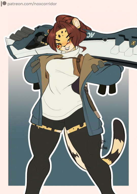
Legendary Boulder ~ WrestlerCheetah
Next sketch for cheetahgirlmuscles Another entry on the Mia cosplaying as Guilty Gear characters book~ I hope you like it
61 notes
·
View notes
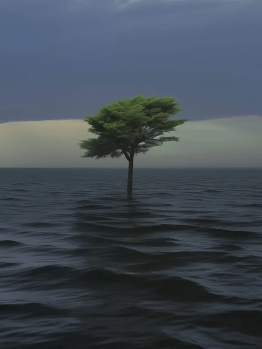
Photo

(vía Another America 50 by Phillip Toledano)
79 notes
·
View notes
Photo
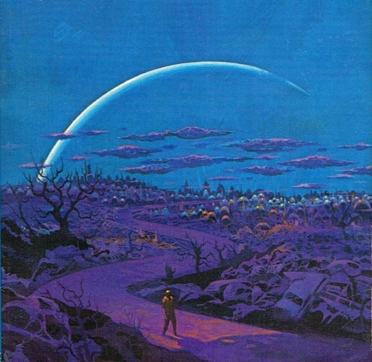
One of my favorites by Paul Lehr, used as a 1971 cover to "Earth Abides," by George R. Stewart. It's also in my upcoming art book!
1K notes
·
View notes
Quote
もともとは10年ほど前にTumblrにすごくハマっていて。いろんな人をフォローしたらかっこいい写真や色が洪水のように出てきて、もう自分で絵を描かなくて良いじゃん、ってなったんです。それで何年も画像を集めていって、そこで集まった色のイメージやモチーフ、レンズの距離感など画面構成を抽象化して、いまの感覚にアウトプットしています。画像の持つ情報量というものが作品の影響になっていますね。
映画『きみの色』山田尚子監督×はくいきしろい対談。嫉妬し合うふたりが語る、色と光の表現|Tokyo Art Beat
155 notes
·
View notes
Photo
No one wants to be here and no one wants to leave, Dave Smith (because)
111 notes
·
View notes
Text
don’t call me whiny baby if you didn’t care about my whiny baby feelings already, which you didn’t care about!!! shocker!!!
53 notes
·
View notes
Text
Typecasting and Viewport Transitions in CSS With tan(atan2())
New Post has been published on https://thedigitalinsider.com/typecasting-and-viewport-transitions-in-css-with-tanatan2/
Typecasting and Viewport Transitions in CSS With tan(atan2())
We’ve been able to get the length of the viewport in CSS since… checks notes… 2013! Surprisingly, that was more than a decade ago. Getting the viewport width is as easy these days as easy as writing 100vw, but what does that translate to, say, in pixels? What about the other properties, like those that take a percentage, an angle, or an integer?
Think about changing an element’s opacity, rotating it, or setting an animation progress based on the screen size. We would first need the viewport as an integer — which isn’t currently possible in CSS, right?
What I am about to say isn’t a groundbreaking discovery, it was first described amazingly by Jane Ori in 2023. In short, we can use a weird hack (or feature) involving the tan() and atan2() trigonometric functions to typecast a length (such as the viewport) to an integer. This opens many new layout possibilities, but my first experience was while writing an Almanac entry in which I just wanted to make an image’s opacity responsive.
Resize the CodePen and the image will get more transparent as the screen size gets smaller, of course with some boundaries, so it doesn’t become invisible:
This is the simplest we can do, but there is a lot more. Take, for example, this demo I did trying to combine many viewport-related effects. Resize the demo and the page feels alive: objects move, the background changes and the text smoothly wraps in place.
I think it’s really cool, but I am no designer, so that’s the best my brain could come up with. Still, it may be too much for an introduction to this typecasting hack, so as a middle-ground, I’ll focus only on the title transition to showcase how all of it works:
Setting things up
The idea behind this is to convert 100vw to radians (a way to write angles) using atan2(), and then back to its original value using tan(), with the perk of coming out as an integer. It should be achieved like this:
:root --int-width: tan(atan2(100vw, 1px));
But! Browsers aren’t too keep on this method, so a lot more wrapping is needed to make it work across all browsers. The following may seem like magic (or nonsense), so I recommend reading Jane’s post to better understand it, but this way it will work in all browsers:
@property --100vw syntax: "<length>"; initial-value: 0px; inherits: false; :root --100vw: 100vw; --int-width: calc(10000 * tan(atan2(var(--100vw), 10000px)));
Don’t worry too much about it. What’s important is our precious --int-width variable, which holds the viewport size as an integer!
Wideness: One number to rule them all
Right now we have the viewport as an integer, but that’s just the first step. That integer isn’t super useful by itself. We oughta convert it to something else next since:
different properties have different units, and
we want each property to go from a start value to an end value.
Think about an image’s opacity going from 0 to 1, an object rotating from 0deg to 360deg, or an element’s offset-distance going from 0% to 100%. We want to interpolate between these values as --int-width gets bigger, but right now it’s just an integer that usually ranges between 0 to 1600, which is inflexible and can’t be easily converted to any of the end values.
The best solution is to turn --int-width into a number that goes from 0 to 1. So, as the screen gets bigger, we can multiply it by the desired end value. Lacking a better name, I call this “0-to-1” value --wideness. If we have --wideness, all the last examples become possible:
/* If `--wideness is 0.5 */ .element opacity: var(--wideness); /* is 0.5 */ translate: rotate(calc(wideness(400px, 1200px) * 360deg)); /* is 180deg */ offset-distance: calc(var(--wideness) * 100%); /* is 50% */
So --wideness is a value between 0 to 1 that represents how wide the screen is: 0 represents when the screen is narrow, and 1 represents when it’s wide. But we still have to set what those values mean in the viewport. For example, we may want 0 to be 400px and 1 to be 1200px, our viewport transitions will run between these values. Anything below and above is clamped to 0 and 1, respectively.
In CSS, we can write that as follows:
:root /* Both bounds are unitless */ --lower-bound: 400; --upper-bound: 1200; --wideness: calc( (clamp(var(--lower-bound), var(--int-width), var(--upper-bound)) - var(--lower-bound)) / (var(--upper-bound) - var(--lower-bound)) );
Besides easy conversions, the --wideness variable lets us define the lower and upper limits in which the transition should run. And what’s even better, we can set the transition zone at a middle spot so that the user can see it in its full glory. Otherwise, the screen would need to be 0px so that --wideness reaches 0 and who knows how wide to reach 1.
We got the --wideness. What’s next?
For starters, the title’s markup is divided into spans since there is no CSS-way to select specific words in a sentence:
<h1><span>Resize</span> and <span>enjoy!</span></h1>
And since we will be doing the line wrapping ourselves, it’s important to unset some defaults:
h1 position: absolute; /* Keeps the text at the center */ white-space: nowrap; /* Disables line wrapping */
The transition should work without the base styling, but it’s just too plain-looking. They are below if you want to copy them onto your stylesheet:
And just as a recap, our current hack looks like this:
@property --100vw syntax: "<length>"; initial-value: 0px; inherits: false; :root --100vw: 100vw; --int-width: calc(10000 * tan(atan2(var(--100vw), 10000px))); --lower-bound: 400; --upper-bound: 1200; --wideness: calc( (clamp(var(--lower-bound), var(--int-width), var(--upper-bound)) - var(--lower-bound)) / (var(--upper-bound) - var(--lower-bound)) );
OK, enough with the set-up. It’s time to use our new values and make the viewport transition. We first gotta identify how the title should be rearranged for smaller screens: as you saw in the initial demo, the first span goes up and right, while the second span does the opposite and goes down and left. So, the end position for both spans translates to the following values:
h1 span:nth-child(1) display: inline-block; /* So transformations work */ position: relative; bottom: 1.2lh; left: 50%; transform: translate(-50%); span:nth-child(2) display: inline-block; /* So transformations work */ position: relative; bottom: -1.2lh; left: -50%; transform: translate(50%);
Before going forward, both formulas are basically the same, but with different signs. We can rewrite them at once bringing one new variable: --direction. It will be either 1 or -1 and define which direction to run the transition:
h1 span display: inline-block; position: relative; bottom: calc(1.2lh * var(--direction)); left: calc(50% * var(--direction)); transform: translate(calc(-50% * var(--direction))); span:nth-child(1) --direction: 1; span:nth-child(2) --direction: -1;
The next step would be bringing --wideness into the formula so that the values change as the screen resizes. However, we can’t just multiply everything by --wideness. Why? Let’s see what happens if we do:
span display: inline-block; position: relative; bottom: calc(var(--wideness) * 1.2lh * var(--direction)); left: calc(var(--wideness) * 50% * var(--direction)); transform: translate(calc(var(--wideness) * -50% * var(--direction)));
As you’ll see, everything is backwards! The words wrap when the screen is too wide, and unwrap when the screen is too narrow:
Unlike our first examples, in which the transition ends as --wideness increases from 0 to 1, we want to complete the transition as --wideness decreases from 1 to 0, i.e. while the screen gets smaller the properties need to reach their end value. This isn’t a big deal, as we can rewrite our formula as a subtraction, in which the subtracting number gets bigger as --wideness increases:
span display: inline-block; position: relative; bottom: calc((1.2lh - var(--wideness) * 1.2lh) * var(--direction)); left: calc((50% - var(--wideness) * 50%) * var(--direction)); transform: translate(calc((-50% - var(--wideness) * -50%) * var(--direction)));
And now everything moves in the right direction while resizing the screen!
However, you will notice how words move in a straight line and some words overlap while resizing. We can’t allow this since a user with a specific screen size may get stuck at that point in the transition. Viewport transitions are cool, but not at the expense of ruining the experience for certain screen sizes.
Instead of moving in a straight line, words should move in a curve such that they pass around the central word. Don’t worry, making a curve here is easier than it looks: just move the spans twice as fast in the x-axis as they do in the y-axis. This can be achieved by multiplying --wideness by 2, although we have to cap it at 1 so it doesn’t overshoot past the final value.
span display: inline-block; position: relative; bottom: calc((1.2lh - var(--wideness) * 1.2lh) * var(--direction)); left: calc((50% - min(var(--wideness) * 2, 1) * 50%) * var(--direction)); transform: translate(calc((-50% - min(var(--wideness) * 2, 1) * -50%) * var(--direction)));
Look at that beautiful curve, just avoiding the central text:
This is just the beginning!
It’s surprising how powerful having the viewport as an integer can be, and what’s even crazier, the last example is one of the most basic transitions you could make with this typecasting hack. Once you do the initial setup, I can imagine a lot more possible transitions, and --widenesss is so useful, it’s like having a new CSS feature right now.
I expect to see more about “Viewport Transitions” in the future because they do make websites feel more “alive” than adaptive.
#2023#almanac#animation#Articles#background#Brain#change#clamp#course#CSS#deal#direction#display#easy#effects#focus#Full#functions#Future#hack#how#it#layout#Method#notes#nth-child#objects#offset#One#opposite
0 notes
Photo
PORTO ROCHA
773 notes
·
View notes
Photo

--
#catherine elizabeth#princess catherine#princess of wales#princess catherine of wales#catherine the princess of wales#kensington palace
55 notes
·
View notes

Text
GENERAL MEMES: Vampire/Immortal Themed 🩸🦇🌹
↳ Please feel free to tweak them.
Themes: violence, death, blood, murder, depression/negative thoughts
SYMBOLS: ↳ Use “↪”to reverse the characters where applicable!
🦇 - To catch my muse transforming into a bat 🌞 - To warn my muse about/see my muse in the sunlight. 🩸 - To witness my muse drinking blood from a bag. 🐇 - To witness To catch my muse drinking blood from an animal. 🧔🏽 - To witness To catch my muse drinking blood from a human. 🦌 - For our muses hunt together for the first time. 🏃🏿♀️ - To see my muse using super speed. 🏋🏼♂️ - To see my muse using their super strength. 🧛🏻♂️ - To confront my muse about being a vampire. 🌕 - For my muse to lament missing the sun. ⏰ - For my muse to tell yours about a story from their long, immortal life. 🤛🏽 - To offer my muse your wrist to drink from. 👩🏿 - For my muse to reminisce about a long lost love. 👩🏽🤝👩🏽 - For your muse to look exactly like my muse's lost love. 👄 - For my muse to bite yours. 👀 - For my muse to glamour/compel yours. 🧄 - To try and sneakily feed my muse garlic to test if they're a vampire. 🔗 - To try and apprehend my muse with silver chains. 🔪 - To try and attack my muse with a wooden stake. 👤 - To notice that my muse doesn't have a reflection. 🌹 - For my muse to turn yours into a vampire. 🌚 - For my muse and yours to spend time together during the night. 🧛🏼♀️ - For my muse to tell yours about their maker/sire.
SENTENCES:
"I've been alive for a long time [ name ], I can handle myself." "I'm over a thousand years old, you can't stop me!" "Lots of windows in this place, not exactly the greatest place for a vampire." "Do you really drink human blood? Don't you feel guilty?" "Vampires are predators, [ name ] hunting is just part of our nature, you can't change that." "You just killed that person! You're a monster!" "Tomorrow at dawn, you'll meet the sun [ name ]." "Can you make me like you?" "Do you really want to live forever?" "You say you want to live forever, [ name ], but forever is a long time, longer than you can imagine." "What was it like to live through [ historic event / time period ]?" "Did people really dress like that when you were young?" "What were you like when you were human?" "We’re vampires, [ name ], we have no soul to save, and I don’t care." "How many people have you killed? You can tell me, I can handle it." "Did you meet [ historic figure ]?" "Everyone dies in the end, what does it matter if I... speed it along." "Every time we feed that person is someone's mother, brother, sister, husband. You better start getting used to that if you want to survive this life." "[ she is / he is / they are ] the strongest vampire anyone has heard of, no one knows how to stop them, and if you try you're going to get yourselves killed." "Vampire hunters are everywhere in this city, you need to watch your back." "Humans will never understand the bond a vampire has with [ his / her / their ] maker, it's a bond like no other." "Here, have this ring, it will protect you from the sunlight." "I get you're an immortal creature of the night and all that, but do you have to be such a downer about it?" "In my [ centuries / decades / millennia ] of living, do you really think no one has tried to kill me before?" "Vampires aren't weakened by garlic, that's a myth." "I used to be a lot worse than I was now, [ name ], I've had time to mellow, to become used to what I am. I'm ashamed of the monster I was." "The worst part of living forever is watching everyone you love die, while you stay frozen, still, constant." "I've lived so long I don't feel anything any more." "Are there more people like you? How many?" "Life has never been fair, [ name ], why would start being fair now you're immortal?" "You want to be young forever? Knock yourself out, I just hope you understand what you're giving up." "You never told me who turned you into a vampire. Who were they? Why did they do it?" "I could spend an eternity with you and never get bored." "Do you really sleep in coffins?" "There are worse things for a vampire than death, of that I can assure you [ name ]." "You need to feed, it's been days. You can drink from me, I can tell you're hungry." "The process of becoming a vampire is risky, [ name ], you could die, and I don't know if I could forgive myself for killing you." "I'm a vampire, I can hold a grudge for a long time, so believe me when I say I will never forgive this. Never." "You were human once! How can you have no empathy?" "You don't have to kill to be a vampire, but what would be the fun in that." "You can spend your first years of immortality doing whatever you want to whoever you want, but when you come back to your senses, it'll hit you harder than anything you've felt before." "One day, [ name ], everything you've done is going to catch up to you, and you're never going to forgive yourself." "Stop kidding yourself, [ name ], you're a vampire, a killer, a predator. You might as well embrace it now because you can't keep this up forever." "You can't [ compel / glamour ] me, I have something to protect me." "When you've lived as long as me, there's not much more in life you can do." "You want me to turn you? You don't know what you're asking me to do." "You really have to stop hissing like that, it's getting on my nerves." "I'm going to drive this stake through your heart, [ name ], and I'm going to enjoy it."
#ask meme#symbol meme#roleplay sentence meme#sentence starter meme#rp sentence prompts#vampire ask meme#ask box#ask memes#vampires#tw : blood#tw: violence#tw: death#tw: depression#tw: vampires#tw: murder
174 notes
·
View notes
Quote
よく「発明は1人でできる。製品化には10人かかる。量産化には100人かかる」とも言われますが、実際に、私はネオジム磁石を1人で発明しました。製品化、量産化については住友特殊金属の仲間たちと一緒に、短期間のうちに成功させました。82年に発明し、83年から生産が始まったのですから、非常に早いです。そしてネオジム磁石は、ハードディスクのVCM(ボイスコイルモーター)の部品などの電子機器を主な用途として大歓迎を受け、生産量も年々倍増して、2000年には世界で1万トンを超えました。
世界最強「ネオジム磁石はこうして見つけた」(佐川眞人 氏 / インターメタリックス株式会社 代表取締役社長) | Science Portal - 科���技術の最新情報サイト「サイエンスポータル」
81 notes
·
View notes