#or it can be read as consistent in that that's the image Roman works to project
Explore tagged Tumblr posts
Visit Tumblr Blog
Explore Tumblr blogs with no restrictions, modern design and the best experience.
Last Seen Tumblr Blogs


Fun Fact
BuzzFeed published a report claiming that Tumblr was utilized as a distribution channel for Russian agents to influence American voting habits during the 2016 presidential election in Feb 2018.
Text


Kieran Culkin on Roman's playboy image and the way the actors/writers understanding of backstory fits together. (x)
#thought it might be interesting to throw this out there#I think “playboy” is sometimes used in connection with Roman by Jesse/Mark in a way that can be read as a split from Kieran's view#and that's totally fair#or it can be read as consistent in that that's the image Roman works to project#which i tentatively think may be the implication for what his life looked a little like pre-series but still thinking through that#I think that's what makes Roman so interesting to watch when he's in those party environments#he's clearly good at people in a way his siblings aren't#and he knows how to be in those spaces (even if there's a discomfort with drugs and sex)#see for example how he is with Lawrence in S1 and that he knew about Rhomboid#but at the same time that's clearly not all of Roman or even an accurate reflection of his internal life#and it's unclear how frequently he actually goes out#anyway I think the point is just that Roman is interesting haha#and I think both reads support the fake playboy thing and not like...a real one lol#roman roy#succession#cast interviews#hbo succession#kieran culkin
454 notes
·
View notes
Text
One of the most persistent misconception people have about faith, especially in media, is the idea that faith is inherently illogical. That believing in anything beyond the natural, scientifically explainable forces is superstition--a gullible belief in made-up stories.
That certainly was the main argument for one entry submitted to a poetry contest with the prompt: "The Eternal Question: God, No God, Maybe God?"
(The entry read more like a rant than a genuine poetic meditation on that question, but I digress.)
Despite how frequently faith is mocked as being stupid, much of our current framework of scientific knowledge owes its foundation to great logical minds who saw no contradiction between studying the natural world with faith in the divine.
For example, Robert Boyle, considered a pioneer of modern scientific method, have been known to say:
“If the omniscient author of nature knew that the study of his works tends to make men disbelieve his Being or Attributes, he would not have given them so many invitations to study and contemplate Nature.”

Likewise, Johannes Kepler, who discovered the Third Law of Planetary Motion, expressed:
"Geometry is one and eternal shining in the mind of God. That share in it accorded to humans is one of the reasons that humanity is the image of God."
While skeptics think that science disprove the need for faith, men like Boyle and Kepler--and also Isaac Newton, Galileo Galilei, Leonhard Euler, and Gregor Mendel--saw the opposite.
They believe the fact that natural laws are not random, but follows a consistent, logical, and harmonious pattern serve as evidence for the existence of a Creator, not against it.
"For his invisible attributes, namely, his eternal power and divine nature, have been clearly perceived, ever since the creation of the world, in the things that have been made." – Romans 1:20
In my own entry to the contest prompt, I tried to go further. I wanted to see whether examining nature could actually point to the God of the Bible (as revealed through Moses, the Prophets, and the Apostles), beyond a generic "Creator". I express my findings in the following poem:
The coloured space refracts the Creator's essence A vision soaked in palettes with threefold lens RGB, HSV, or Lab—three in dimension, yet one in hue In every shade and gradation, His light shines through There are no depths from which He does not gleam In blackest nights, faint sparks can still be seen A triune of quarks swirl in quantum lore Chromodynamic sparks weld together the atoms' cores Galaxies ignite where the elements unite As trichrome charge converges to white 'Til eons pass and the stars cave in And remnant dusts collide to birth new kin What wondrous run, what state of art! The world we tread on beats with iron heart Fe, atom number 26, is a sacred sign To the tetragrammaton, YHVH, His name divine Then to its mass, add neutrons—30 in all The age when priests (and Christ) are given call As Iron-56 stands, most stable of time and space Thus our lives shall be, when yielded to His grace In all of this the bonds shout eight-point-eight When fusion peaks, new dawn shall propagate Through life of stars the Spirit breathes Through crimson blood that iron sheathes Abundant life is encoded within the Son's name As the oxygen in air sparks resurrection's flame Even atmospheres bear witness to the cross The Word is inscribed in all of cosmos Thus Nature's Laws pulsate with His decrees Woven in Love, not random debris From stellar breaths to fermion spins Every speck of existence are God's fingerprints
Detailing the numerological, theological, and scientific considerations I have for this piece might take too long, so if anyone is interested to read further, please check out my blog post, linked below.
#christianity#christian faith#christian apologetics#poem#poems and poetry#poets on tumblr#original poem#original poetry#science#physics#biology#chemistry#astronomy#quantum mechanics#quantum physics#numerology#biblical numerology#biblical truth#quotes#nature#natural philosophy
8 notes
·
View notes
Note
Previous anon here! I would love to read how you did it. Im suprised you managed to did it in Google Docs. I thought you used a program similar to InDesign or programs that are more suitable for graphic design ANYWAY i am also curious how many chapters you used. Was it seven? Did you stop there because the length was convinient or because a story arc ended there? I am not really good at identifying where an arc begins and stops. okay bcgjkkcj THANK YOU FOR YOUR TIME
YAYYY I LOVE TALKING ABOUT ARTS AND CRAFTS!!
gonna put this in main tags as well this time so:
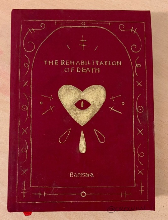
this is my bookbind of trod pt 1 :] by @bamsara which u can and SHOULD read here
ok so this first bit is how I made the pdf and then the next bit is how I turned it into signatures for binding. Then the last bit is splitting up chapters and stuff. If anyone has any advice or tips on what I could do differently (for free or v cheap haha) please let me know!! This is so fun I love learning and discussing and making things
first thing I did was grab a real book so I could take a look at where they put the title page, where they left the pages blank, etc
I then formatted the title and contents and stuff in docs by messing with font and position on the page (etc) until it was to my liking! THEN I realised I wanted an image on the very first page so I went back and put that in. I got to design it it was sooo fun
OH. I ALSO STUCK A SHAMURA QUOTE WHERE THE DEDICATION WOULD BE. HEHE
thennn I went and changed all the heading, title and normal text options for the doc so that they looked nice! I used times new roman size 16 :) but that might be a bit big for most people. I like bigger text
^^ that step was important so that when I started copy-pasting in the text it would all come out the right size automatically. also so that my chapter titles and notes pages looked consistent
next I downloaded trod from ao3 as a html file! I found it works better than pdf bc there aren’t any page breaks
I just copied and pasted trod in one chapter at a time and added in the notes and summary for every chapter where I wanted it and that worked pretty well for me
THEN SPELLCHECK. I didn’t want to do it automatically (docs had some horrible opinions sometimes. Also kept trying to erase bits of the writing style that made perfect sense and sound beautiful???) so I had to confirm every change which took a while but I think was worth it
lastly I added page numbers. They did not want to cooperate with me and I still do not understand the tiny fuckers, but I managed to get them in the middle of the page for book 2 so it looks less weird (hurrah). There’s a button for it
then I saved it as a pdf!
OK NEXT THING : SIGNATURES
this post is my bestest friend (link is to a tumblr post that was really helpful)
and this webpage is how I got a pdf of the signatures (it’s the same one linked in the post)
CHAPTERS:
yeah I split it into chunks of 7 chapters! Book 1 ends on the argument in the field bc a) it was getting wayyy too long and b) I want to lend it to my friends and that’s a delightful emotional cliffhanger. Book 2 (which is actually finished. I’ll try and post photos later today or something) ends after hekets release from purgatory which is I thiiiink another 7 chapters? Book 3 is gonna be a bit longer bc I want to do it up to the most recent chapter, which I was gonna leave out bc of length but then it came out and I went insane haha
OH in book 2 I did drop caps and title decoration which I designed in procreate and then imported into docs and moved around as imported photos. I’ll put a bunch of pictures at the end too
THANK U FOR ASKING!!! If there’s anything else u want to know then let me know!! :]


15 notes
·
View notes
Text

Coly, the company behind Mahoyaku and Stand My Heroes, have announced a new game. Some friends and I realized that despite looking somewhat generic at first glance, it's got a handful of intriguing things going on with it! So here's a quick kind of long introduction to/my thoughts on Break My Case!
First: the website! The music on the site is really good! Go listen while you read this post!! There are 12 people listed as composers in the credits page, and it seems most every VA involved has at least a bit of experience with singing or music projects. The tone is a bit dark for a rhythm game (though I'm not ruling that out entirely), but otherwise it seems like there's gonna be a music focus. Cool! As far as other staff goes--the main scenario writer is also the writer of Stand My Heroes, and the character designer is Utako Yukihiro, who also did some work for B-Project.

The story concerns a cafe with a myriad of eccentric employees that runs an after-hours service where they solve problems. The exact nature of all this is left pretty vague.

And the draw for a game like this: The characters! Interestingly, they're divided into different departments at the cafe. What exactly those departments do isn't clear yet. As for the characters themselves--the more we looked at them, the more we liked them, lol. Quick summaries about what intrigued us about each guy. Note that these are not translations, none of us are fluent in Japanese (we all know just enough to get by with the google+jisho combo lol), and this should all be taken with a grain of salt.


The Main Office, consisting of Ai Kosaka, Yuzuru Kise, and Roka Suoh. (Names are listed in western given-family order because that's what the site uses for romanized names.) Roka is the one who owns the cafe, is the oldest character in the bunch at 36, and is that fun "mysterious guy with unknown backstory and an endless amount of weird acquaintances, who acts incompetent but might actually be hypercompetent" type of trope.
On account of the whole acting-incompetent thing, Ai and Yuzuru run the actual cafe business. And normally I won't be including fullbody character art in this post but I have to make an exception just this once.


Anyways.


Tumblr won't let me put four images in a row. Come on man. I wanna maintain the BMC's site style. Why are you mean to me. Anyways. The Simulation Department, consisting of Kou Ayato, Mao Ukyo, Akehoshi Hinomiya, and Yuragi Kanno. "Simulation" is its English name given on the site, but the Japanese given would probably read more like "relationship department".
Kou is a footloose playboy and Mao is a serious intellectual type, but apparently Kou will ask Mao to pretend to be his girlfriend so that he can avoid trouble with women. That's gay. I love that. (Mao is a guy [as far as we know], he just likes makeup--he's not the only one in that cast who does, either!) We all want Mao's outfit.
Akehoshi was a sleeper hit in the group chat, because his bio has a sentence about how he's the most normal-looking-yet-dangerous employee at the cafe, and also explicitly describes him as being like a dog, and naturally we all went crazy for the silly puppy as soon as we realized that he was in fact a silly puppy. Yuragi, on the other hand, likes cats. Such a classic for his character design trope, lmao.


The Administrative Department, consisting of Taiga Tsukimoto, Haruhi Ichikawa, and Sei Okiya. Taiga looks cool but if you look at his fullbody he's wearing awful sweatpants and apparently he cries while watching anime. I love this for him. Haruhi is a streamer because that's like an obligatory character trope now I guess. Sei was very popular in the group chat for being the single most suspicious character in the cast. What's his problem.


The Watchdog Department (or enforcement department, if you translate the jpn) consists of Shizuka Fushimi, Takeru Mikado, Soyogu Shinkai, and Shinobu Aizawa.
My friend described Shizuka as a "wet looking glasshole" and yeah. ok. unfortunately he does look like that. But it's ok he's allowed because his bio says he prefers quiet, orderly places with plants and no people and keeps to himself in common spaces but his own room is a complete mess. AKA he's an autism king. So I like him.
Takeru was obviously a hit because look at them. Takeru and Mao talk about makeup together, apparently. CUTE! Shinobu is the most fashionable guy in the cast and his bio says he has a few screws loose, which is amazing. Good for him. I have nothing to say about Soyogu I think I forgot he existed until I was putting this post together and I only looked at these all guys a few hours ago


The Negotiation Department, with Kiho Arima, Kyoya Shido, and Riku Tateshina. I described this group as "grandma, grandpa, and Columbo" and then the group chat couldn't call any of them anything else. And I do mean grandma. Because. ok. another fullbody. Because oh my god we have to look at Kiho.

GIRL. WHAT. IS. THAT. YOU'RE WEARING A CARPET. YOU'RE WEARING A COUCH. kiho is apparently a fortune teller and my friend acted as if this excused the outfit but i DONT agree i don't think anything excuses this. WHAT IS THAAAAAT
Kyoya is an artist and Riku is a psychologist so honestly this is a really fun bunch of jobs going on in this department. Riku is described as someone who falls in love easily, and he's most interested in Ai (from the Main Office, the very first guy in this post). We couldn't tell if the implication there is that he's in love with Ai, or if he falls in love with random people and yet his true attention always drifts back to Ai. Both of these options are gay.


The ST (special tasks) Department, with Yomose Onda, Yu Nina, Kamiya, and Urara Manami.
Yu had his life saved by Tomose and has now dedicated himself to him, to the point of being ready to die for him. YOU GOTTA LOVE THAT. INCREDIBLE TROPE. UNBEATABLE. GAY AS HELL. All we know from Tomose's side is that he's "fond" of Yu. That's fine I'm sure you can learn to love him. Or learn to hate him. Whatever's more entertaining.
Kamiya has no memory, hence the singular name. I'm sure whatever's going on there is weird and interesting. Urara is the youngest character, at 20. THAT'S RIGHT. THE YOUNGEST CHARACTER IS 20. THERE ARE ZERO TEENAGERS! THE AVERAGE CHARACTER AGE IS AROUND 26. THIS SHOULDN'T BE AS NOTABLE AS IT IS BUT THAT'S GACHA GAMES FOR YOU. Anyways I like Urara because I think he looks like an angry kitty.
Anyways, that's the gist of what we know about BMC--or BreMai, if you wanna go for something closer to the jpn abbreviation--right now. More info might drop at/around Animate Girls Fest, since they seem to be giving out game beta codes there. I don't know if I'm completely sold on it just yet--coly did just have a detective-themed gacha game fail a few months ago with &0. But we're not even completely sure it is a gacha yet, or what kind of gameplay it might have otherwise, so... there's a bit of hope. Maybe it'll be a weird cool dark rhythm game! Who knows!!!
26 notes
·
View notes
Text
Full quotes in context below the cut.
"I believe in one God, and no more; and I hope for happiness beyond this life. I believe in the equality of man, and I believe that religious duties consist in doing justice, loving mercy, and endeavouring to make our fellow-creatures happy. But, lest it should be supposed that I believe many other things in addition to these, I shall, in the progress of this work, declare the things I do not believe, and my reasons for not believing them.
"I do not believe in the creed professed by the Jewish church, by the Roman church, by the Greek church, by the Turkish church, by the Protestant church, nor by any other church that I know of. My own mind is my own church. All national institutions of churches, whether Jewish, Christian, or Turkish, appear to me no other than human inventions set up to terrify and enslave mankind, and to monopolize power and profit." —Thomas Paine, The Age of Reason (1794) .
"As the government of the United States of America is not in any sense founded on the Christian Religion,—as it has in itself no character of enmity against the laws, religion or tranquility of Musselmen [Muslims],—and as the said States never have entered into any war or act of hostility against any Mehomitan [Islamic] nation, it is declared by the parties that no pretext arising from religious opinions shall ever produce an interruption of the harmony existing between the two countries." —Article 11 of the 1797 Treaty of Tripoli, written by Joel Barlow, ratified unanimously by the US Senate, signed by President John Adams
["Now be it known, That I John Adams, President of the United States of America, having seen and considered the said Treaty do, by and with the advice and consent of the Senate, accept, ratify, and confirm the same, and every clause and article thereof." —John Adams on the Treaty of Tripoli] .
"This free exercise of reason is all I ask for the vindication of the character of Jesus.
"We find in the writings of his biographers matter of two distinct descriptions. First a groundwork of vulgar ignorance, of things impossible, of superstitions, fanaticisms, & fabrications.
"Intermixed with these again are sublime ideas of the supreme being, aphorisms and precepts of the purest morality & benevolence, sanctioned by a life of humility, innocence, and simplicity of manners, neglect of riches, absence of worldly ambition & honors, with an eloquence and persuasiveness which have not been surpassed.
"These could not be inventions of the grovelling authors who relate them. They are far beyond the powers of their feeble minds.
"They show that there was a character, the subject of their history, whose splendid conceptions were above all suspicion of being interpolations from their hands. Can we be at a loss in separating such materials, & ascribing each to its genuine author?
"The difference is obvious to the eye and to the understanding, and we may read; as we run, to each his part; and I will venture to affirm that he who, as I have done, will undertake to winnow this grain from its chaff, will find it not to require a moment's consideration. The parts fall asunder of themselves as would those of an image of metal & clay.
"There are, I acknowlege, passages not free from objection, which we may with probability ascribe to Jesus himself; but claiming indulgence from the circumstances under which he acted.
"His object was the reformation of some articles in the religion of the Jews, as taught by Moses. That Seer had presented, for the object of their worship, a being of terrific character, cruel, vindictive, capricious and unjust. Jesus, taking for his type the best qualities of the human head and heart, wisdom, justice, goodness, and adding to them power, ascribed all of these, but in infinite perfection, to the supreme being, and formed him really worthy of their adoration." —Thomas Jefferson to William Short, 4 August 1820
"You ask if I mean to publish anything on the subject of a letter of mine to my friend Charles Thompson? Certainly not. I write nothing for publication, and last of all things should it be on the subject of religion. On the dogmas of religion (as distinguished from moral principles), all mankind, from the beginning of the world to this day, have been quarrelling, fighting, burning and torturing one another, for abstractions unintelligible to themselves and to all others, and absolutely beyond the comprehension of the human mind. Were I to enter on that arena, I should only add an unit to the number of Bedlamites." —Thomas Jefferson to Mathew Carey, 11 November 1816
["It is a document in proof that I am a real Christian, that is to say, a disciple of the doctrines of Jesus, very different from the Platonists, who call me infidel, and themselves Christians and preachers of the gospel, while they draw all their characteristic dogmas from what its author never said nor saw." —Thomas Jefferson on his 'wee little book', in a letter to Charles Thomson on 9 January 1816] .
"On a general comparison of the present & former times, the balance is certainly & vastly on the side of the present as to the number of religious teachers, the zeal which actuates them, the purity of their lives, and the attendance of the people on their instructions. It was the universal opinion of the century preceding the last that civil government could not stand without the prop of a religious establishment, & that the Xn religion itself would perish if not supported by a legal provision for its clergy.
"The experience of Virginia conspicuously corroborates the disproof of both opinions.
"The civil government, though bereft of everything like an associated hierarchy, possesses the requisite stability and performs its functions with complete success, whilst the number, the industry, and the morality of the priesthood & the devotion of the people have been manifestly increased by the total separation of the Church from the State." —James Madison to Robert Walsh Jr., 2 March 1819 .
I can't find any evidence that John Adams ever said or wrote the exact words "the United States is not, in any sense, a Christian nation."
He did, however, sign the Treaty of Tripoli, written by Joel Barlow and containing (in its English version, which was the one President John Adams signed) Article 11: "the government of the United States of America is in no sense founded on the Christian religion."
Thomas Paine: “I do not believe in…any church,” he declared. In a call to arms against what he called church-state tyranny in early America, he insisted that “every national church or religion accuses the others of unbelief; for my own part, I disbelieve them all.”
George Washington: "The government of the United States is not, in any sense, founded on the Christian religion."
Thomas Jefferson: " The Christian God is a being of terrific character -- cruel, vindictive, capricious, and unjust . We discover in the Bible a groundwork of vulgar ignorance, of things impossible, of superstition, fanaticism and fabrication . On the dogmas of religion, as distinguished from moral principles, all mankind, from the beginning of the world to this day, have been quarreling, fighting, burning and torturing one another, for abstractions unintelligible to themselves and to all others, and absolutely beyond the comprehension of the human mind."
James Madison: “It was the universal opinion of the [18th] century, that civil government could not stand without the prop of a religious establishment and that the Christian religion itself would perish if not supported by a legal provision for its clergy.” But as President, Madison found that, “the devotion of the people have been manifestly increased by the total separation of church from the state.”
John Adams: “the United States is not, in any sense, a Christian nation.”
#ex christian#quotes#full context#let's be honest#our case is strong enough without falsehood to ''bolster'' it#it's plain that America's founders didn't intend the country to be a theocracy#they wanted the Church to be totally separate from the State#that is clear#whatever their personal religious or spiritual beliefs may have been.
5K notes
·
View notes
Text
Typography 101: How to Choose the Right Fonts
Typography plays a crucial role in design, branding, and communication. The right font can enhance readability, establish a brand identity, and create a powerful visual impact. On the other hand, a poorly chosen font can make content hard to read, confuse the audience, or even damage a brand’s credibility.
Whether you're designing a website, crafting a social media post, or working on a presentation, selecting the right typography is essential. In this guide, we'll explore the fundamentals of typography and share expert tips on choosing the perfect fonts for any project.
1. Understanding the Basics of Typography
Before diving into font selection, it's important to understand the basic elements of typography:
a) Typeface vs. Font
Many people use these terms interchangeably, but they are not the same:
Typeface refers to the overall design of a set of characters. For example, "Arial" is a typeface.
Font is a specific version of a typeface, such as Arial Bold or Arial Italic.
b) Font Categories
Fonts are categorized into different styles, each serving a distinct purpose:
Serif Fonts – These fonts have small strokes (serifs) at the ends of letters. They are often associated with tradition, reliability, and professionalism. Examples: Times New Roman, Georgia.
Sans-Serif Fonts – Clean and modern, these fonts lack serifs and are widely used in digital media. Examples: Arial, Helvetica.
Script Fonts – Designed to mimic handwriting, script fonts can be elegant, casual, or decorative. Examples: Brush Script, Pacifico.
Display Fonts – These are highly stylized and used for headlines, logos, and creative projects. Examples: Impact, Lobster.
Monospace Fonts – Every character in these fonts takes up the same space. They are commonly used in coding. Examples: Courier, Consolas.
2. Factors to Consider When Choosing a Font
Picking the right font involves more than just personal preference. Here are key factors to consider:
a) Readability & Legibility
A font should be easy to read, especially in long-form content. Consider:
Font size: Ensure the text is neither too small nor too large.
Spacing: Adjust letter-spacing (kerning) and line-spacing (leading) for better readability.
Contrast: Ensure the font color contrasts well with the background.
b) Purpose & Context
Different fonts evoke different emotions. Choose a font that aligns with your content’s message:
Professional documents: Stick to classic serif or sans-serif fonts.
Creative projects: Experiment with decorative and display fonts.
Web content: Opt for web-friendly fonts like Open Sans or Roboto.
c) Font Pairing
Using multiple fonts can enhance design, but they should complement each other. A good rule of thumb:
Combine a serif font with a sans-serif font for contrast.
Use a decorative font sparingly and pair it with a simple, readable font.
Maintain consistency by limiting the number of fonts to two or three.
d) Brand Identity
Typography should align with a brand’s image. For example:
Luxury brands use elegant serif or script fonts.
Tech companies often opt for modern sans-serif fonts.
Children’s brands might prefer playful, rounded fonts.
3. Best Fonts for Different Use Cases
a) Best Fonts for Websites
Open Sans
Roboto
Lato
Montserrat
b) Best Fonts for Print (Books, Magazines)
Times New Roman
Garamond
Baskerville
Georgia
c) Best Fonts for Social Media Graphics
Poppins
Bebas Neue
Raleway
Playfair Display
d) Best Fonts for Logos
Futura
Gotham
Avenir
Proxima Nova
4. Common Typography Mistakes to Avoid
Even with the best fonts, design mistakes can ruin a project. Avoid these common errors:
a) Using Too Many Fonts
Stick to a maximum of two or three fonts to maintain visual harmony.
b) Ignoring Readability
Fancy fonts may look appealing but can be hard to read, especially in large blocks of text.
c) Not Considering Mobile Compatibility
Ensure your font choices look good on both desktop and mobile screens.
d) Overusing Capital Letters
All caps can be hard to read and may come across as aggressive. Use them sparingly.
e) Poor Kerning and Leading
Adjust letter-spacing and line-height to make text visually balanced and readable.
5. Tools to Help You Choose the Right Font
There are several free tools available to help with font selection and pairing:
Google Fonts – A vast collection of free, web-friendly fonts.
Adobe Fonts – Premium font choices for professional designers.
FontPair.co – Helps find perfect font combinations.
WhatFont (Chrome Extension) – Identify fonts on any website.
Conclusion
Typography is more than just choosing a pretty font—it influences readability, branding, and the overall user experience. By understanding font categories, considering readability, and making strategic font pairings, you can create visually appealing and effective designs.
Whether you're designing a website, writing a blog, or creating a social media post, choosing the right typography can make all the difference. Experiment with fonts, but always keep readability and purpose in mind.
Which fonts do you love to use in your designs? Share your thoughts in the comments below! 🚀
0 notes
Text
March 10, 2025
Like an Eagle
Cindy W. Arora (Washington, USA)
Today's Reading
Romans 8:18-30
Thought for the Day
When I spend time with God, my strength is renewed.
Prayer Focus
Leaders facing dissent
."They that wait upon the Lord shall renew their strength; they shall mount up with wings as eagles; they shall run, and not be weary; and they shall walk, and not faint." - Isaiah 40:31 (KJV)
"A cacophony of crows drew my eyes heavenward. A dozen or more were flying above a bald eagle, taking turns diving at the eagle’s head. It made me think about the pressures of ministry that were barraging me. When I had to dismiss a volunteer, my decision caused a ripple of dissent within the ministry. Friends were calling me to offer their advice. But I felt harassed and weary.
Above my head, the eagle appeared not to notice the annoying crows. Its speed and altitude never changed when the crows swooped within inches of its head. The eagle continued to fly a straight course. I wanted to be like that eagle, to remain swift and unfazed. I was reminded of today’s quoted scripture: “They that wait upon the Lord shall renew their strength; they shall mount up with wings as eagles.” I closed my eyes to sit in God’s presence, and God assured me that I had done the right thing. When I opened my eyes a few minutes later, I felt confident and able to face any challenge.
Spending time in God’s presence renews our strength when we feel harassed or weary. With God’s help, we can move forward with speed and endurance like an eagle." Rely on God's strength to help you move forward and to meet the next challenge, of life, head on.
Today's Prayer
"Thank you, Father, for the peace of your presence. You give us the strength and hope to rise above any struggle." Amen.
Romans 8:18-30
"18 I believe that the present suffering is nothing compared to the coming glory that is going to be revealed to us. 19 The whole creation waits breathless with anticipation for the revelation of God’s sons and daughters. 20 Creation was subjected to frustration, not by its own choice—it was the choice of the one who subjected it—but in the hope 21 that the creation itself will be set free from slavery to decay and brought into the glorious freedom of God’s children. 22 We know that the whole creation is groaning together and suffering labor pains up until now. 23 And it’s not only the creation. We ourselves who have the Spirit as the first crop of the harvest also groan inside as we wait to be adopted and for our bodies to be set free. 24 We were saved in hope. If we see what we hope for, that isn’t hope. Who hopes for what they already see? 25 But if we hope for what we don’t see, we wait for it with patience. 26 In the same way, the Spirit comes to help our weakness. We don’t know what we should pray, but the Spirit himself pleads our case with unexpressed groans. 27 The one who searches hearts knows how the Spirit thinks, because he pleads for the saints, consistent with God’s will. 28 We know that God works all things together for good for the ones who love God, for those who are called according to his purpose. 29 We know this because God knew them in advance, and he decided in advance that they would be conformed to the image of his Son. That way his Son would be the first of many brothers and sisters. 30 Those who God decided in advance would be conformed to his Son, he also called. Those whom he called, he also made righteous. Those whom he made righteous, he also glorified." When we cannot find our voice and speak, the Spirit will speak for us in our groans and utterances. The Spirit is there to ass you always. I am feeling my blessing. Joe
0 notes
Text

Designing for Print: Posters, Brochures, and Flyers
In a digital-first world, print design remains an indispensable tool for communication and branding. Posters, brochures, and flyers continue to hold significant value, delivering information tangibly and creating lasting impressions. The art of designing for print involves a deep understanding of the medium, audience, and design principles. This is where a graphic design institute can play a crucial role in equipping aspiring designers with the necessary skills and knowledge. Let’s explore the intricacies of designing effective posters, brochures, and flyers that captivate and engage.
1. Understanding the Purpose
The foundation of effective print design lies in understanding the purpose of the material. Each format serves a unique role:
Posters: Designed to grab attention from a distance, posters are often used for advertising, events, or public service announcements. They require bold visuals and concise messaging.
Brochures: Typically multi-page documents, brochures are ideal for providing detailed information about products, services, or organizations. They balance visuals and text to inform and persuade.
Flyers: Flyers are compact, single-page designs meant for quick distribution. They’re great for promotions, sales, or event announcements and focus on simplicity and impact.
Understanding the purpose ensures that the design aligns with the communication goals and the target audience.
2. The Role of Visual Hierarchy
Visual hierarchy guides the viewer’s eye through the design in a logical flow. It’s essential for all print formats:
Posters: The headline or main graphic element should be the most prominent, followed by secondary information like dates, locations, or taglines.
Brochures: Use headings, subheadings, and bullet points to break down information. Ensure the most critical details are highlighted on the cover.
Flyers: Prioritize the primary message, whether it’s a discount, event name, or call to action, with bold fonts and striking colors.
A well-structured hierarchy ensures that the message is communicated effectively and quickly.
3. Typography Matters
Typography is a cornerstone of print design. Choosing the right fonts can make or break your design:
Readability: Use clear and legible fonts, especially for body text. Sans-serif fonts like Arial or Helvetica work well for modern designs, while serif fonts like Times New Roman add a classic touch.
Consistency: Stick to two or three fonts to maintain a cohesive look. Use font weights and sizes to create contrast and emphasize important elements.
Scale: Ensure that headlines are large enough to catch attention, while body text is comfortable to read at arm’s length.
Typography should complement the overall design and support the message without overpowering it.
4. The Power of Color
Color plays a pivotal role in evoking emotions and creating visual impact:
Posters: Bold and vibrant colors work best for grabbing attention. Use contrasting colors to make the design pop.
Brochures: Opt for a more subdued and professional color palette that aligns with the brand identity.
Flyers: Use colors strategically to highlight offers or key details, but avoid overwhelming the design.
Ensure color consistency with the brand’s guidelines and consider the psychology of colors to influence the audience’s perception.
5. Importance of Images and Graphics
High-quality images and graphics are critical for print designs:
Posters: Use a single, striking image or illustration as the focal point. Ensure it’s high resolution for sharp printing.
Brochures: Include images that complement the text, such as product photos or infographics, to enhance understanding.
Flyers: Simple icons or visuals can make a flyer more engaging without overcrowding the design.
Avoid low-resolution images, as they can appear pixelated and unprofessional in print.
6. Composition and Layout
A well-structured layout ensures a visually pleasing design:
Posters: Follow the rule of thirds or use a grid system to balance the design elements.
Brochures: Maintain consistent margins and alignments across pages. Use white space effectively to avoid a cluttered look.
Flyers: Keep the layout simple and direct, focusing on a central theme.
Test different layouts to find the most effective arrangement for your content.
7. Print-Specific Considerations
Designing for print requires attention to technical details:
Resolution: Ensure images are at least 300 DPI (dots per inch) for sharp printing.
Bleed and Margins: Include a bleed area (typically 3mm) to prevent white edges after trimming.
Color Mode: Use CMYK (Cyan, Magenta, Yellow, Black) color mode, as it’s the standard for printing.
Paper Type: Consider the type of paper and finish (glossy, matte, or textured) to enhance the design’s appeal.
Collaborate with the printer to ensure the final output matches your vision.
8. Call to Action
An effective print design includes a clear and compelling call to action (CTA):
Posters: Encourage viewers to attend an event, visit a website, or follow a social media page.
Brochures: Include contact details, a QR code, or a link to additional resources.
Flyers: Highlight offers or next steps prominently to drive immediate action.
The CTA should be easy to spot and motivate the audience to engage further.
9. Testing and Proofing
Before sending your design to print, review every detail:
Proofread: Check for spelling or grammatical errors.
Test Prints: Print a sample to evaluate colors, fonts, and layout.
Feedback: Gather opinions from colleagues or clients to refine the design.
Testing and proofing ensure a polished final product that meets expectations.
Conclusion
Designing for print is both an art and a science, requiring creativity, technical skills, and attention to detail. Posters, brochures, and flyers each serve unique purposes, but all share common design principles that ensure effectiveness. This is where graphic design institutes in Pune come in, offering comprehensive training in these principles. By understanding the audience, using visual hierarchy, and considering print-specific requirements, designers can create impactful print materials that leave a lasting impression. In an age dominated by digital media, the tangible power of print design continues to captivate and inspire.
0 notes
Text
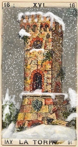
These pills better not take away my creative genius. The tower card i made prior to the winter of 2024. Where there was no winter or any snow.
Compared to this winter

Where it looks like nature is going back to normal. And not being laced with hormones and Bs.
The news, which i dont beleive like any other peice of information coming my way. Where trump is pulling a “russia” by expanding its territory. To where theres untapped natural resources. In preparation for war. Still, people are still playingat aggrevating my natural tendenciies of being a teacher. I would have made a great father. Ugh.
To tarot amd the emperor using the roman numerals. Is the forst card that is a negation number. Which is fallowed up by the neo of nemural negation to a common base number. Is the death card. Wich is arrived at by addition. Fuck tarot. Leave it to the femme bots. There’s enough of them already.
For example i wasbtaught in school that alaska was bought from the indians from the states. And not from the russians in the 1800’s.
Originally this was the image i had in mind for letter Тт. Which combines cards for temperance and the tower respectfully. But a forge may also work.
Santé sécurité uh? Too bad no one cares about my santé sécurité. Keep dosing me with ass raping drugs. Like it feels good to be me. 40 fucken years. Fuck off
All these devils’s advocate fucken cocksucker s
Want to read something. Oh too bad! Want to study sething ? Oh! Too bad. Cant do anything but stare at a fuckem tv screen. And fucken chain dmoke.
Im judt going to dtop any motivation to make the world a berter p’a e cause nobody gices a fuck. Lunar fucktards.
Might as well support it with the three gate way frugs of sugars cafeene and nicotine. Marijuana? Fuck i hate life. Fuck you guys. Get all your children addicted before they can even spell the alphabet.
The subject was going to be on tempwrance and tolerance. But unfortunately. Tolerance is akin to suppression. And isn’t infinite. And brings it back to tarots strength card with is akin to the American independence day. And the lunar nations civic conditioning.
The word AND broken down, to tarot pictorially equals the fool(magician) strength and the emperor. And suggests continuation and expectation. Unlike the Cyrillic alphabet. There’s is only one word written for AND.
There is another perspective for AND. Separated from the consistency of civic conditioning. Which is touched by the biblical text. And that is the consistency of lunar needs agaist the “logos�� function of solar productivity and advancement with its bipolar relationship to the lunar function.
The strenght card comes up repeatedly in national “holidays”
And now thatbim handicapped from ever knowing what feeling loved is like. Not much point is there.
Messing with me on gaming again. Now all im thinking is all the manipulations at work. Fun dun
Dont have mind for anything else.
40 straight years if being runned, governed and fucked with by other people.
I dont want to go to work anymore. Spend the rest of my shirt life on fucken welfare.
Chemically induced coccygeal Nerve Issues.
Massaging the tip of the tail bone helps elevate symptoms.
No ones ever going near my dick ever again. Fuck that. Sluts and femmes. Ugh.
If she cant say hello then im not even going to bother. Like all people. Assume and project. Women are the worst. Next in line are lunar males and dickheads.
The inorganic nature of this treatment. Obvious. Is depressing.
The growing concern of this Lucifer effect on these dicktwats. Breeding what its evhoed out into the world.
An angel born in hell.
The pillar of foundation is unalterable. And brings the old corrupted strength card to light on letter Тт.
Of course the lion has to go it denotes pride and ownership over the female body. But the plain old pillar and the women in lion’s clothing is perverse to the denotement of nature, and applies simulteaneously to “mother nature” whichbis again a bias to reason. Which eventually gives “birth” to the notion of the spirit of “masculinity” because its ethereal and not present without the form of structure. Which is non-existent paired to the notion on mother nature or “gaia” to cut it short.
Which unfortunately is part and base of all knowledge as is “known”.
“Mother nature” on its own doesn’t exactly take care of you. Its all trials and suffering. Holy masculinity. Which has been seperated from the scheme becomes the saving “grace”.
The world is green because the sky is blue and the sun is yellow.
0 notes
Text
How to Optimize eBooks for Different Devices and Platforms

eBooks are a popular manner for readers to get right of entry to books on the cross. However, with so many unique gadgets and platforms accessible—clever phones, drugs, e-readers, and computer systems—optimizing your eBook for a lot of these structures can appear difficult. But don’t fear! In this weblog, we’ll stroll you thru easy steps to ensure that your eBook appears extremely good and is simple to examine on any tool.
Why Is eBook Optimization Important?
Optimizing your eBook is critical as it ensures that readers have a unbroken enjoy, regardless of what tool they use. Whether a person is studying on an iPhone, a Kindle, or a pc laptop, the intention is to make certain the content material shows successfully, the textual content is simple to observe, and the formatting stays consistent.

1. Choose the Right eBook Format
The first step in optimizing your eBook is choosing the right layout. Different devices and structures assist one-of-a-kind formats. Here are some not unusual ones:
EPUB: It's the most common eBook format. It works on almost any device, including iPhones, iPads, Android devices and Kobo (e Readers).
MOBI: This version is intended for Amazon Kindle devices. But MOBI if you are publishing on Amazon.
PDF: Preserving the layout and formatting of files is one of the great perks of working with PDF files. They are not as flexible for resizing on smaller devices, but. Fixed format content, like magazines or textbooks is what they are better suited for.
AZW3 (Kindle Format): Amazon’s own format for new Kindle devices.
When unsure, EPUB is generally the great choice due to its flexibility throughout distinctive platforms. If you're publishing on Amazon, you’ll also need to transform your eBook to MOBI.
2. Keep Layout Simple and Clean
When designing your eBook, keep away from complex layouts that may not show well on smaller suggests or e-readers. Stick to a easy, clean format that adapts well to special display screen sizes. Here are some guidelines:
Use a single-column layout: For most devices it works just fine, making sure that the text does wrap properly to different screen sizes.
Avoid fixed-width layouts: Fixed-width designs are harder to read on smaller screens because they don’t adjust properly.
Limit large images and graphics: Too many images can create slow loading time or make the images still distorted on different devices. For when necessary, use smaller and higher quality images.
3. Optimize Fonts for Readability
Choosing a font is very important in how your eBook appears and if it’s easy to read. Follow these tips to ensure your text is readable on any device:
Choose web-safe fonts: Some fonts like Arial, Times New Roman and Georgia are good fonts and are easy to read on screen and most platforms will support them.
Set a readable font size: Usually 12-14 pt font size should be used for body text, you can adjust based on device and our audience.
Use proper line spacing: Line height that’s at least 1.2–1.5 also adds extra space between lines which is great for readability on small screens.
4. Test on Multiple Devices
Now, after you’ve created your eBook, you need to actually test it out on different devices to make sure it looks good. Here are some common platforms and devices to test on:
Kindle devices (e.g., Kindle Paperwhite, Kindle Fire)
Apple devices (iPhones, iPads)
Android smartphones and tablets
Desktop or laptop computers
Other e-readers (e.g., Kobo, Nook)
Testing on one of a kind gadgets will assist you find out any troubles with text formatting, image resolution, or format. You can use eBook conversion equipment like Calibri or preview gear from systems like Amazon Kindle Direct Publishing (KDP) or Smash words to appearance how your eBook will seem.

5. Optimize for Smaller Screens
If you want many readers to use your eBooks on their smartphones or smaller tablets, you should ensure that they're well optimised for smaller screens. Here’s how:
Shorten paragraphs: If you want many readers to use your eBooks on their smartphones or smaller tablets, you should ensure that they're well optimised for smaller screens. Here’s how:
Use large, readable fonts: Also make sure that the text is big enough to be read on smaller devices. Don’t have small fonts that require the reader to zoom in.
Test portrait and landscape modes: You probably have some readers who want to read your content in landscape mode, so make sure your content looks good on their devices both orientations.
6. Add Interactive Elements Carefully
Interactive elements, like links, footnotes, or films, can enhance the reading revel in however may be problematic to optimize across all gadgets. Here’s a way to address them:
Hyperlinks: Check that links are clickable and operate rightly on all platforms. Don’t use long complicated URLs which might break viewing on smaller screens.
Footnotes: If you make it have footnotes, make sure they’re formatted accordingly and provide navigation for them. If you are struggling with a small screen, you might want to consider using endnotes instead.
Multimedia: If your eBook has videos or audio files, be sure they’re optimized for mobile consumption. You might consider offering downloadable file / link for people that won't be able to play those media files.
7. Create a Table of Contents
For eBooks (and especially for long ones) an interactive Table of Contents (TOC) is indispensable. Readers need to navigate easily between chapters and sections, so make sure your TOC is:
Clickable: Make sure that the story link doesn’t need to be looked up every time a user clicks on a chapter or section heading.
Easy to use: Make it simple and well arranged so that it’s easy to navigate on different devices.
8. Check for Accessibility
But make sure your eBook is accessible to all, disabled readers included. Here are some tips for improving accessibility:
Alt text for images: Write descriptive alt text for images to make screen readers read the image out to visually impaired users.
Provide a text-only version: For some readers, in particular those with a screen reader, you may wish that your eBook appears in a text only version.
Ensure proper contrast: You also want to be sure that your text has enough contrast on the background, which is no easy task – but it’s especially important for visually impaired readers to be able to read your text.
9. Consider Different eBook Stores’ Guidelines
The eBook stores have their own format and submission requirements. For example:
Amazon Kindle Store: MOBI files are accepted by Amazon as well as EPUB files, which they will convert. However, you have to arrange your eBook according to Amazon’s recommendations.
Apple Books: EPUB format is required by Apple, it has guidelines about what kinds of fonts (and font sizes), images, and metadata they accept.
Google Play Books: EPUB and PDF files are accepted by Google, and Google has a strict way how metadata and cover images are required.
Make sure to read and follow the guidelines set up by the platform where you’ll be publishing your eBook.
10. Use eBook Creation Tools
To create and optimize your eBook you have many tools at your disposal. Some popular options include:
Calibre: A free, open source eBook management tool to convert, edit or optimize your eBook.
Adobe InDesign: It’s a professional design tool to give more formatting options and export features.
Scrivener: It is a writing software that helps authors write, organize and format eBooks.
Conclusion: Make Your eBook Reader-Friendly
Optimizing your eBook for distinct devices and structures may additionally seem like numerous work, but it’s essential for imparting the great reading revel in on your target audience. By selecting the proper layout, simplifying your format, optimizing fonts, and trying out throughout more than one gadgets, you may make certain that your eBook seems extraordinary and capabilities properly no matter the way it’s being study.
With these suggestions, you’ll be properly on your way to creating an eBook that appeals to a wide variety of readers and platforms! Happy eBook publishing!
0 notes
Text
Crafting a Masterpiece: How to Style Your PhD Thesis for Maximum Impact
A PhD thesis is more than just a collection of research findings; it’s a representation of years of dedication, intellectual growth, and meticulous effort. While the core focus of a thesis lies in its content, styling it effectively can make it more engaging, professional, and easier to navigate. A well-styled thesis not only reflects your academic rigor but also ensures your ideas are presented with clarity and sophistication. Here's a guide to styling your PhD thesis like a pro. ### 1. Start with a Clean Template
Start with a professional and clean template for your thesis. Most colleges and universities provide official templates for formatting. If this is not the case, explore software that offers robust formatting capabilities, such as LaTeX, or use highly advanced word-processing tools such as Microsoft Word or Google Docs in order to maintain consistency of layout throughout the entire document.
**2. Select Proper Fonts
The choice of font is an important factor in improving readability. For academic writing, serif fonts such as Times New Roman or Garamond are classic choices, while sans-serif fonts like Arial or Calibri can give a modern touch. Use one font family for the main text and another complementary font for headings, ensuring they do not clash. Always follow your institution's formatting guidelines for font size and type. 3. Structure Your Thesis Thoughtfully A well-structured thesis is easy to follow. Standard sections usually include: - Title Page: Your title, name, department, university, and date. - Abstract: A concise summary of your research. - Table of Contents: Clearly outline chapters, sections, and page numbers. - Introduction: State your research question, objectives, and methodology.
Chapters: Present findings, discussions, and analysis systematically.
Conclusion: Summarize key findings and suggest future research.
References: List all cited works in the required style. Use consistent headings, subheadings, and numbering for sections. Use an automatic table of contents generator for updates with minimal effort.
4. Master the Art of Page Layout
Margins, line spacing, and alignment all affect the visual appeal of your thesis.
Margins: Keep to the size specified by the institution, usually 1 inch on all sides.
Line Spacing: Double spacing is the norm, but do check the requirements.
Alignment: Justify the body text for a more professional look. Add page numbers, headers, or footers to keep it navigable. Don't overcrowd the pages; clean pages are appealing and easier to read.
5. Add Visual Elements Wisely
Graphs, charts, images, and tables can make complicated data understandable. Just make sure they're well-integrated:
Clearly label each figure or table and number them consecutively.
Provide captions that describe their significance. Conduct uniform color schemes and styles of the visuals. Place it near to a text where appropriate for understanding through the context. Always cite the sources.
6. Be Observant of Citation and Reference
Consistent and accurate referencing is critical in academic writing. Choose a citation style—APA, MLA, Chicago, or any other—based on your institution’s preference. Tools like Zotero, EndNote, or Mendeley can help manage and format references efficiently.
7. Use Appendices Wisely
Appendices are used for all supplementary material, including raw data, additional analysis, or extremely long tables. This maintains conciseness in the text for interested readers who would like to receive more details. Clearly distinguish appendices and reference in the text when appropriate.
Maintain Focus on Proofreading and Editing
Styling is incomplete without thorough editing. Common errors in formatting, grammar, or consistency can undermine your work. Proofread meticulously or consider professional editing services. Pay attention to:
Consistency in terminology, fonts, and citation style.
Correctness of page numbers in the table of contents.
Spelling and grammar checks.
9. Infuse a Personal Touch
While academic guidelines must be followed, your thesis should reflect your voice. Craft an engaging introduction, use concise and clear language, and maintain a professional tone throughout.
10. Test Print and Digital Versions
Before submission, review both digital and print versions of your thesis. Ensure all links work in the digital copy, and the print version looks polished. Binding and cover design should be neat, complementing the content within.
Styling your PhD thesis is not merely a matter of aesthetics but also a question of presentation. A well-styled thesis leaves a lasting impression on reviewers and readers that highlights the quality of your work. It is a fine balance between attention to detail, following guidelines, and that touch of creativity which can make this document as impressive as the research it represents. Your PhD thesis is the culmination of your academic journey—make it a masterpiece worthy of your achievements!
Need expert guidance for your PhD, Master’s thesis, or research writing journey? Click the link below to access resources and support tailored to help you excel every step of the way. Unlock your full research potential today!

Follow us on Instagram: https://www.instagram.com/writebing/
#dissertation#phd student#thesis#phd life#grad school#phd research#exams#writingcitation#research#graphic design
1 note
·
View note
Text
The Do's and Don'ts of Resume Formatting

Your resume is the first impression you make on a potential employer. Whether you're a fresher, entry-level, or mid-senior professional, a well-formatted resume is crucial to standing out in today’s competitive job market. Here's a quick guide on the do's and don'ts of resume formatting to help you create a clean, professional, and attention-grabbing resume.
Do’s of Resume Formatting:
Use a Clean Layout
Stick to a simple and professional format with clear sections like Contact Info, Profile Summary, Skills, Experience, and Education.
Use consistent font sizes (e.g., 11-12pt for text and 14-16pt for headers) and an easy-to-read font like Arial, Calibri, or Times New Roman.
Keep it Concise
Limit your resume to 1-2 pages, especially for freshers and entry-level roles. Mid-senior level professionals can extend to two pages if necessary.
Focus on highlighting key accomplishments, skills, and experience that directly align with the job you’re applying for.
Use Bullet Points
Bullet points make your resume easier to skim and help emphasize key details quickly. Each bullet should start with a strong action verb and be no longer than 2-3 lines.
List your achievements and responsibilities in reverse chronological order, starting with your most recent experience.
Highlight Achievements with Numbers
Quantify your accomplishments whenever possible. For example, "Increased sales by 20%" or "Managed a team of 10 employees" grabs attention better than vague statements.
Ensure ATS Compatibility
Many companies use Applicant Tracking Systems (ATS) to scan resumes. Use standard fonts, avoid graphics or images, and include relevant keywords from the job description to ensure your resume passes ATS filters.
Don’ts of Resume Formatting:
Avoid Overly Creative Designs
Skip fancy fonts, colors, graphics, or images unless you're in a creative field. Most hiring managers prefer a clean, professional look, and ATS systems can struggle with complex designs.
Don’t Use Long Paragraphs
Avoid lengthy paragraphs to describe your work experience. Instead, opt for short, concise bullet points to improve readability and ensure key information isn't missed.
Skip Personal Information
Avoid including unnecessary personal details like age, marital status, or a photo unless the job posting specifically requests it. This information isn't needed and can hurt your chances.
Avoid Clutter
White space is important for a neat, organized look. Don't overload your resume with too much text or irrelevant details. Make sure there is enough space between sections for easy readability.
By following these do's and don'ts, you'll create a resume that is not only visually appealing but also effective in showcasing your qualifications to potential employers. A well-formatted resume can make all the difference in landing that interview and moving forward in your career!
"https://AnyResume.AI" can help you analyze your resume and provide a comprehensive report with suggestions. Update your resume today and succeed in your next career move!
0 notes
Text
“God's Subversive Tactics” based on Matthew 5:38-42 (please read!)
The groundbreaking scholarship on this Matthew passage isn't new, it was published in 1992 by Walter Wink in his book “Engaging the Powers: Discernment and Resistance in a World of Domination.” I remember hearing it in High School, I've preached it before – here – and some of you have ridiculously good memories. But also, not all of you have heard me preach it before, and it is SUCH GOOD STUFF and so central to how we understand the entire Jesus movement. So, anyway, if you already know this stuff, prepare for an excellent review. And if you don't, hold on to your pew – this is going to be fun.
Those of us who have heard this passage without Wink's scholarship have probably heard it as an invitation to be doormats, right? “Don't resist. Let someone hit you repeatedly. Be passive. Be... weak.” And, heavens that's concerning, that anyone would teach such things in a church. What a way to empower domestic violence, maintain the status quo, and teach those in positions of less power (women, racial and ethnic minorities, children) that the Godly way is to accept the harm that comes their way.
However, if you accept a perspective that the choices are violence or nonviolence, I can see how you might conclude that following Jesus is NOT a violent way, so you have to pick passivity. BUT, this passage doesn't mean that AT ALL, this passage is about a third way. This is about how to engage in nonviolent resistance to undermine the powers that oppress. This is Jesus speaking to people who lived lives of oppression. This is the way called nonviolent ENGAGEMENT.
It seems especially fitting on this day when we are also thinking about Juneteenth because when we celebrate the freeing of those who had been enslaved, it also makes sense to talk about the ways that people who were enslaved resisted. We sometimes read in history about slave rebellions, but there were lots of ways that people engaged in regular, consistent resistance of the oppressive power of slave holders too. They pretended to be ill. They worked slowly, and badly. They “lost” or “accidentally damaged” equipment. They took what they needed, or just what they wanted. Papers were displaced. Things caught on fire. I suspect a lot of individuals were geniuses at such work, engaging in subversive actions that created immense disruptions without ever seeming to be fault.
Slave holders tried to break the spirits of those they enslaved, but the core human dignity, the reality of imago dei (that we are all made in the image of God – ALL OF US), seems to be quite resilient. And I think that's the core of what Jesus was talking about too.
Let's unpack each of Jesus's suggestions. “Turn the other cheek.” First thing to know – you didn't use your left hand for anything in ancient society because toilet paper wasn't a thing yet and left hands were used for “unclean tasks.” This was a hard and fast rule, even gesturing with the left hand was illegal and carried a strict punishment. So, we are talking only about right hand hits. Which means that a person who is hit on the right cheek has been backhanded, which was ALWAYS AND ONLY diminutive. It was a common and normal way of putting people in their place. “A backhanded slap was the usual way of admonishing inferiors. Masters backhanded slaves, husbands, wives; parents, children; men , women; Romans, Jews.”1 Most people would cower.
One did NOT backhand a peer, it was actually illegal.
But if people can only hit with their right hands, and one has already been backhanded on the RIGHT cheek, then to turn the other cheek – to invite another hit – is NOT to passively accept violence. It is to invite the person who is trying to humiliate you to either back down, or treat you like an equal. “This action robs the oppressor of the power to humiliate. The person who turns the other cheek is saying, in effect, 'Try again, Your first blow has failed to achieve its intended affect. I deny you the power to humiliate me. I am a human being just like you. Your status does not alter that fact. You cannot demean me.'”2
Which, then, puts the one who hit into a conundrum. Which is EXACTLY Jesus's point. (Can you now see how this advice fits the one who also told parables?) “In that world of honor and shame, he has been rendered impotent to instill shame in a subordinate. He has been stripped of his power to dehumanize the other.”3
The second image is to give cloak along with coat, right? We are going to call them the outer-garment and the inner-garment so we can track it. Note that impoverished people only had those two garments, their were not backups. And, Hebrew Scriptures provide for someone to be sued for their outer-garment:
If you lend money to my people, to the poor among you, you shall not deal with them as a creditor; you shall not exact interest from them. If you take your neighbor’s cloak in pawn, you shall restore it before the sun goes down; for it may be your neighbor’s only clothing to use as cover; in what else shall that person sleep? And if your neighbor cries out to me, I will listen, for I am compassionate. - Exodus 22:25-27
Note that even in this passage it is clear that only a poor person would be in this situation, and it is so tenuous that you can't even take the outer-garment consistently, you have to take it for only the day so they can sleep with it at night. It seems, even in this passage, that the creditor is being pretty severely demonized for deciding to demand retribution on the poor, right? (Matthew's language is wrong in implying it is the inner-garment, just ignore that – Luke gets it right, it is the outer-garment.)
Back to Wink, “Indebtedness was endemic in first-century Palestine. Jesus' parables are full of debtors struggling to salvage their lives. Heavy debt was not, however, a natural calamity that had overtaken the incompetent. It was the direct consequence of Roman imperial policy.... By the time of Jesus we see this process already far advanced: large estates owned by absentee landlords, managed by stewards, and worked by tenant farers, day laborers, and slaves. It is no accident that the first act of the Jewish revolutionaries in 66 C.E. Was to burn the Temple treasury, where the records of debts was kept.”4 And Jesus is talking to people at the bottom of this system. “Why then does Jesus counsel them to give over their undergarments as well? This would mean stripping off all their clothing and marching out of court stark naked! Imagine the guffaws that must have evoked. There stands a creditor, covered with shame, the poor debtor's outer garment in one hand, his undergarment in the other. The tables have already been turned on the creditor. The debtor had no hope of winning the case; the law was already entirely in the creditor's favor. But the poor man has transcended this attempt to humiliate him. He has risen above the shame.” You may remember that there was a taboo against nakedness in ancient Judaism, but it turns out the larger taboo was against SEEING someone's nakedness, not being naked.
“Jesus provides here a hint of how to take on the entire system by unmasking its essential cruelty and burlesquing its pretensions to justice. Here is a poor man who will not longer be treated as a sponge to be squeezed dry by the rich. He accepts the laws as they stand, pushes them to absurdity, and reveals them for what they have become. He strips naked, walks out before his fellows, and leaves the creditor, and the whole economic edifice that he represents, stark naked.”5
The third one – the “second mile”. Roman soldiers had the right to require civilians to carry their heavy packs for a mile – a form of forced labor. People hated it. However, if they asked someone to carry it for MORE than a mile, they were subject to discipline, and the discipline could vary immensely, including really severe punishment. So the soldiers regularly demanded their packs be carried a mile, but ONLY a mile. As he has in the two prior examples, Jesus recommends to the disempowered that they reclaim their human dignity even in the midst of oppression.
Wink says, “Imagine the soldier's surprise when, at the next mile maker, he reluctantly reaches to assume his pack, and the civilian says, 'Oh no, let me carry it another mile.' Why would he want to do that? What is he up to? Normally , soldiers have to coerce people to carry their packs, but this Jew does it so cheerfully, and will not stop! Is this provocation? Is he insulting the legionnaire's strength? Being kind? Trying to get him disciplined for seeming to violate the rules of impressment? Will this civilian file a complaint? Create trouble?”6 By messing with the soldiers head, the pack-carrier has taken back their human dignity and reclaimed their own power to choose! Regarding the soldier “If he has enjoyed feeling superior to the vanquished, he will not enjoy it today. Imagine the situation of a Roman infantryman pleading with the Jew to give back his pack!”7
He continues, “Jesus does not encourage Jews to walk a second mile in order to build up merit in heaven, or to exercise a supererogatory piety, or to kill the soldier with kindness. He is helping an oppressed people find a way to protest and neutralize an onerous practice despised throughout the empire.” Now, one final note on these suggestions, all of them. “Such tactics can seldom be repeated. One can imagine that within days after the incidents that Jesus sought to provoke, the Powers That Be would pass new laws: penalties for nakedness in court, flogging for carrying a pack more than a mile! One must be creative, improvising new tactics to keep the opponent of balance. To those whose lifelong pattern has been to cringe before their masters, Jesus offers a way to liberate themselves from servile actions and a servile mentality. And he asserts that they can do this before there is a revolution.8”
That is, Jesus so deeply believed that everyone was created in the image of God and deserved to have utterly wonderful lives, that he took the time to assess the situations and come up with some really subversive answers to the problems people faced, solutions that restored their dignity. There is, you may have noticed, one more piece of advice, and it is one that is a challenge to many of us. “Give to everyone who begs from you, and do not refuse anyone who wants to borrow from you.” Wink says, “Such radical egalitarian sharing would be necessary to rescue impoverished Palestinian peasants from their plight; one need not posit an imminent end of history as the cause for such astonishing generosity. And yet none of this is new; Jesus is merely issuing a prophetic summons to Israel to observe the commandments pertaining to the sabbatical year enshrined in Torah, adapted to a new situation.” That is, for those who were poor to break out of the realities of staggering interest and taxes, they need to work together and not apart. They needed to overcome the stragety of divide and conquer with radical sharing.
In each of these recommendations in this tiny little piece of the gospel, Jesus recommends third ways. Neither passively accepting the oppression that dehumanizes the people nor fighting violence with violence. He recommends, wit, humor, solidarity, and making visible the problems that the system created. We don't face exactly the same issues, but the SPIRIT of these commandments are a gift to us as a playbook for how to deal with oppression. Violence begets violence. Passivity in the face of violence changes nothing. But there are third ways, and I will say that I think God is really in favor of third ways and I've noticed that when I am stuck between two unacceptable options, and sit with them (and with God), God often nudges me toward a third way – a far more creative one that I could find on my own.
God calls the world from violence and oppression to peace and the radically embraced humanity of all. And the way from here to there, it turns out, involves creativity, wit, and humor. Let's go! Amen
1 Walter Wink, Engaging the Powers; Discernment and Resistance in a World of Domination (Minneapolis: Fortress Press, 1992) p. 176.
2 176.
3 176-7.
4 178.
5 179.
6 182.
7 182.
8 182-3.
Rev. Sara E. Baron First United Methodist Church of Schenectady 603 State St. Schenectady, NY 12305 Pronouns: she/her/hers http://fumcschenectady.org/ https://www.facebook.com/FUMCSchenectady
June 30, 2024
#thinking church#progressive christianity#Walter Wink#fumc schenectady#schenectady#umc#first umc schenectady#rev sara e baron
0 notes
Text
The Importance of Book Formatting: A Guide for New Writers and Authors
As a new writer or author, you've worked tirelessly to create your manuscript, pouring your heart and soul into every word. But before you publish, there's a crucial step that can make all the difference in the world: book formatting.
Book formatting is the process of preparing your manuscript for publication, transforming it into a professionally designed and visually appealing book that readers will love. In this blog, we'll explore the importance of book formatting, share valuable tips, and introduce you to essential tools to help you create a stunning book that stands out in a crowded market.
Why Book Formatting Matters?
Book formatting is not just about making your book look pretty; it's about creating a reading experience that's engaging, comfortable, and enjoyable. A well-formatted book can:
Enhance readability and overall reading experience
Create a professional and polished appearance
Help your book stand out in a crowded market
Show respect for your readers and your work
Book Formatting Basics
Before we dive into the tips and tools, let's cover the basics:
Font and size: Choose a clear, legible font (e.g., Garamond, Times New Roman) in size 12 or 14 points.
Line spacing: Use 1.5 or double spacing for easy reading.
Margins: Set margins to 0.5-1 inch on all sides (top, bottom, left, and right).
Indentation: Use a 0.5-inch indentation for the first line of each paragraph.
Headers and footers: Add page numbers, title, and author name (if desired).
Book Formatting Tips
Now that we've covered the basics, here are some valuable tips to help you create a professionally formatted book:
Consistency is key: Maintain a consistent format throughout your book.
Use styles: Apply built-in styles (e.g., Heading 1, Body Text) to simplify formatting.
Images and graphics: Use high-resolution images and format them to fit your book's design.
Proofread and edit: Ensure your manuscript is error-free and polished.
Book Formatting Tools
Here are some essential tools to help you format your book like a pro:
Microsoft Word: A popular choice for book formatting, with built-in styles and tools.
Adobe InDesign: A professional design and layout tool for advanced formatting.
Vellum: A formatting tool specifically designed for ebooks.
Atticus: A formatting and design tool for print and digital books.
Conclusion
Book formatting is a crucial step in the publishing process that can make all the difference in the world. By following this guide, you'll be well on your way to creating a professionally formatted book that showcases your writing and respects your readers. Remember, consistency, clarity, and attention to detail are key to a beautifully formatted book. Happy writing and formatting!
Additional Resources
Book formatting templates: Find pre-designed templates online or in word processing software.
Formatting guides: Refer to guides like the Chicago Manual of Style or the AP Stylebook.
Online communities: Join writing forums and groups for support and advice.
By investing time and effort into book formatting, you'll create a book that's not only beautifully designed but also engaging, readable, and professional. So, don't neglect this crucial step – format your book with care, and get ready to share your writing with the world!
0 notes
Text
Today I was tasked with editing some text based arrangements in order to make them more legible and appealing. I started off with an excerpt from a Sherlock Holmes novel. When I received this assignment I immediately noticed that the texture on the background would make any text harder to read. I asked my superior about it and they said the background absolutely must stay. Additionally, I was not allowed to change the color of the text. This made it rather challenging to differentiate the text from the speckled paper.
After all my limitations were established I began working on the body text. Since the body text was the biggest aspect of the graphic, I thought if I got that right, everything else would fall into place. I knew I wanted a sans serif font, this would make the text more readable. After picking one I also made the text slightly bigger. The dark specs on the page were especially noticeable when the text was smaller, making some letters look off compared to others. I also moved the text accordingly, making as few intersections as possible. Lastly for the body text, I indented the paragraphs, allowing for more separation and visibility.
After dealing with the body text, I moved on to the details. I ordered the book title, book part and chapter largest to smallest at the top of the page, using the same sans serif font I used for the body. I kept the source font as Times New Roman. This helped differentiate it as less vital than the main text.
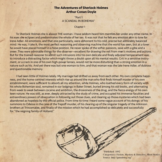
The next piece I had to work on was an art nouveau article. The text was small and disconnected from their images. The text was also in Times New Roman, which certainly has a place in college research papers but not quite in this particular article. Once again I opted for a sans serif font for legibility and cohesion. Even though I was allowed to change text colors for this article, I decided against it for two reasons; one being that I was not allowed to change the background color. I find using colored text on a white background is too risky, the colors can easily be too light and/or too bright and can cause eyestrain. The second reason is consistency. Since this is an article that will be presented on a computer screen, the article would immediately be compared to all other online articles. To fit this mold, I wanted to keep the standard white background and black text.
Now it was time to arrange my composition. I had two images to work with, both with corresponding blurbs of text. I knew I did not want to change the size of the images, I felt making it bigger wasted space and making it smaller made the images harder to decipher. I put the images in opposite corners to keep my composition balanced. Next I made a shape in illustrator that went around the first image and put text inside of it. This made for an effective use of space and felt more dynamic than a square of text.
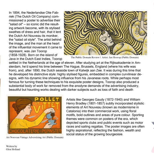
The next project was the most involved but also the most fun. I was told to create a wedding invitation almost entirely from scratch. All I was given was the text that had to be on the card. My superior told me to find all the assets myself and make a compelling layout. This proved challenging because I had almost nothing to work with. So I looked up example wedding invitations, almost all of which involved flowers in some way.
While looking for images to use, I found a free png of pink and blue flowers on pngtree.com. They were angled in such a way that I could put them in the corners of my design perfectly. I then used these flower decals as a reference to form my color palette.
Next I began working on my text. The type was, again, given to me in Times New Roman. Since many of the reference invitations had a flowy script font, that is what I chose for my design. I also wanted the letters to be big in this font, as I wanted to use this for the bride and groom's names. For the rest of the supplementary information, I went with a thinner, serif font. I wanted to keep the invite delicate and soft looking. However, I think the light pink may be hard to read on the light background. I made the text bigger but that only remedied it slightly. Overall I think this was a fun exercise, the seemingly endless freedom really let me express my creative freedom.
This was where I got the flowers
https://pngtree.com/free-flower-png
1 note
·
View note
Text
High Noon Gallery is currently showing Les Problémes du Confort, an exhibition of work by Mary Jones.
From the press release-
Jones began this most recent body of work, collectively called simply, “Interior Design,” by painting Sumi ink over the black and white printed pages of a comprehensive French Interior Design publication from the 1960s. “[I chose the series’ title] not only to underscore the attributes of the original images, but to address their psychological component: the topos of dreams, so notably analyzed by Gaston Bachelard and James Hillman, spaces we conjure to discover the elements of our inner lives. Homes and interiors are not only spaces we remember, but also labyrinths of symbolism, familiar to all of us as emotionally charged experiences,” she explains.
The addition of her signature mark making started as an exercise to identify patterns in the tonal pages, separate from the context of the imagery. It seemed to act as a compositional barometer of sorts, deflecting the space in certain areas and illuminating it in others. The painted catalog images were then collaged, blown up, printed on canvas, and painted again, further conflating space and gesture, and inhabiting the vacant interiors with a visible energy. In doing so, Jones satisfies the principles of high design with the paintings’ harmonic beauty, and also the open systems of fine art by positioning the work as cultural critique that challenges the colonialist motifs that permeate the aesthetic sensibility of many of the spaces.
Jones’s work has long gnawed at the malleability of subject matter. She consistently uses legible imagery to anchor her abstractions, prodding at the fickle divide between the two modalities. Her sensitivity to painting’s illusionistic properties is connected to her experience as a faux painter, freelance work she’s done for 25 years. While the object of faux painting is to not let the artist’s hand show, Jones riffs on her craft by skillfully merging gesture and image in ways that are largely indistinguishable. She allows the marks to emulate form and object, playing on the viewer’s expectations of pictorial logic and slyly addressing the disparity between fine art and design, as for many decades— and especially during painting’s theoretical heyday in the second half of the 20th century— they shared a tenuous opposition. Design is associated with expense, and American society is perpetually transfixed by the Romantic notion of the artist as a working class hero.
Ionic Memories (2023), depicts a decadent room steeped in Roman busts and columns, the title a tongue-in-cheek reference to the science of memory and the unstable nature of artistic movements and empires alike. Jones echoes the velvety matte blacks of the printed image in her direct painting gestures, mixing a near perfect replica of the tone and texture for her to set up a meta tromp-l’oeil effect. In the foreground, a collaged brush stroke swipes away at the interior revealing a snowy landscape wherein a bush and modernist cabin are obscured by a swath of pink oil paint. In the context of the whole, the landscape reads as decorative forms within the room, such as fan coral and glass spheres. Other works such as Cocteau and Table (2023) make greater use of a fragmented effect wherein decisively multiversal looking forms cut through the composition like a glimpse into a parallel reality. Through a mix of painterly and faux elements, Jones takes care to merge her augmented realities just enough to allow the viewer to believe the image exists in one picture plane.
Perhaps to be comfortable is to momentarily resist time, to be temporarily impervious to the clamors for change. In Les Problémes du Confort, Jones reminds us that the arrangements we make with ourselves are transitory, constructed illusions to describe and reflect a sense of our place in the world we know, and that improvisational beauty can be found in transitions, in languages we don’t know, and in uncertainty.
This exhibition closes 4/23/23.
#mary jones#high noon gallery#nyc art shows#art#art shows#printmaking#interior design#collage#painting#mixed media
3 notes
·
View notes