#pie chart css
Explore tagged Tumblr posts
Visit Tumblr Blog
Explore Tumblr blogs with no restrictions, modern design and the best experience.
Last Seen Tumblr Blogs


Fun Fact
Tumblr.com rank in the US is 25.
Text

CSS Pie Chart
#html css pie chart#css pie chart#pie chart css#html css#codenewbies#frontenddevelopment#html5 css3#css#css tricks#css effects
1 note
·
View note
Text
2025’s Must-Have Tools for Data Visualization & Analytics
Big data is entering people’s lives. Although obtaining data is not a big problem, many people do not know how to draw conclusions because there is too much data. Therefore, I am here to provide 4 useful big data visualization tools to help you understand the data.
1. Datawrapper

Datawrapper is an online data visualization tool for making interactive charts. Once you upload the data from the CSV file or paste it directly into the field, Datawrapper will generate a bar, line or any other related visualization file. Many journalists and news organizations use Datawrapper to embed real-time charts into their articles. It is very easy to use and produce effective graphics.
2. Tableau Public

Tableau Public perfectly grafts data operations with beautiful charts. Its program is easy to use, companies can use it to drag and drop large amounts of data onto the digital “canvas”, and create various charts in a blink of an eye.
3. Chart.js
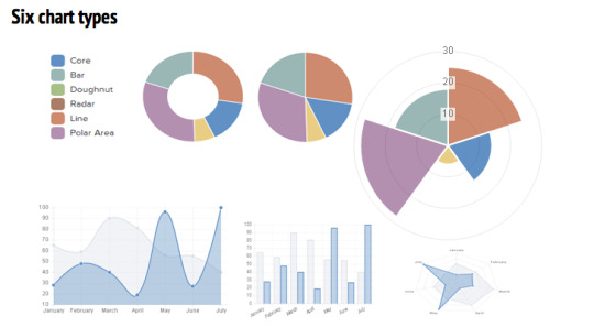
Chart.js is a free open-source JavaScript library for data visualization, which supports 8 chart types: bar, line, area, pie (doughnut), bubble, radar, polar, and scatter. Chart.js renders in HTML5 canvas and is widely covered as one of the best data visualization libraries.
4. D3.js

D3.js is a JavaScript library for manipulating documents based on data. D3 helps you bring data to life using HTML, SVG, and CSS. D3’s emphasis on web standards gives you the full capabilities of modern browsers without tying yourself to a proprietary framework, combining powerful visualization components and a data-driven approach to DOM manipulation.
0 notes
Text
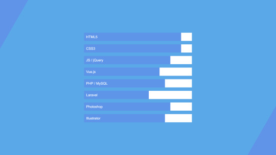
Progress Bars
YAYINDA! https://mguzel.com.tr/progress-bars/
Progress Bars
Progress Bars Shortcodes
Check out all the progress bars options and can be set in different styles with Visual Composer Progress Bar, Pie Chart shortcodes.
Default
60%
0%
Contextual classes
Striped
Animated
Border Radius
Sizes
Animated & Tooltips
HTML/CSS
100%
Design
85%
WordPress
75%
Photoshop
85%
Colors
Primary
50%
Secondary
70%
Tertiary
75%
Quaternary
40%
Circular
HTML/CSS0%
HTML/CSS
Sizes
0%
HTML/CSS0%
HTML/CSS0%
Options
HTML/CSS0%
HTML/CSS0%
HTML/CSS0%
0 notes
Text
Understanding the Science of Gradients with a Gradient Color Generator
Introduction: The Visual Allure of Gradients
Gradients have become a cornerstone of modern design, effortlessly blending colors to create depth, movement, and emotion. Whether it’s the glowing hues in a mobile app interface or the soft transitions on a website background, gradients captivate audiences with their versatility. But what makes them so impactful? The answer lies in the psychology of colors and the science of their transitions.
In this blog, we’ll explore the emotional power of gradients, delve into their types—linear, radial, and angular—and reveal how tools like Gradient Color Generators bring these visual elements to life. Plus, we’ll look at real-world examples of successful brands leveraging gradients for a competitive edge.
The Psychology of Color: How Gradients Influence Emotions
Colors are more than just visual stimuli; they evoke feelings and shape perceptions. Gradients take this a step further by blending colors to create a spectrum of emotions.
Warm Gradients: Think of fiery oranges blending into deep reds. These gradients evoke energy, passion, and urgency. They’re often used in call-to-action buttons or promotional banners.
Cool Gradients: A smooth transition from aqua blue to emerald green offers calmness and serenity, ideal for wellness and nature-focused designs.
Multicolored Gradients: Combining multiple hues, like purples and yellows, creates a sense of playfulness and creativity, perfect for tech startups or entertainment platforms.
By leveraging a Gradient Color Generator, designers can experiment with these combinations, crafting transitions that evoke the desired emotional response.
Understanding Gradient Types
Gradients can take on different forms, each offering unique design possibilities. Let’s break down the three most common types:
1. Linear Gradients
Linear gradients create a smooth color transition along a straight line. Designers can specify the angle, direction, and range of colors to achieve various effects.
Applications:
Website headers for a sleek, modern look.
Call-to-action buttons to grab attention.
Dynamic text effects to make headlines pop.
Example:
A linear gradient transitioning from vibrant pink to purple creates a futuristic vibe, perfect for tech brands.
2. Radial Gradients
Radial gradients radiate outward from a central point, creating a circular color transition. They’re ideal for adding depth and focus to a design.
Applications:
Backgrounds that draw attention to the center of the page.
Logos or icons with a spotlight effect.
Abstract art pieces that exude creativity.
Example:
A soft radial gradient transitioning from light blue to white mimics the sky, offering tranquility and openness.
3. Angular Gradients
Angular gradients rotate colors around a central point, creating a pie-chart-like effect. While less common, they offer a bold and dynamic design option.
Applications:
Abstract patterns for eye-catching visuals.
Branding elements that convey energy and movement.
Backgrounds for tech or gaming platforms.
Example:
An angular gradient rotating through the rainbow spectrum creates a vibrant, energetic feel for a music app.
How Gradient Color Generators Work
Gradient Color Generators are powerful tools that simplify the process of creating visually stunning gradients. Here’s how they work:
1. User-Friendly Interface
Most tools offer an intuitive drag-and-drop interface. Designers can choose starting and ending colors, adjust angles, and preview changes in real-time.
2. Algorithmic Precision
Behind the scenes, these tools use algorithms to calculate the smoothest transitions between colors. They ensure that the gradient looks harmonious without harsh breaks or clashing tones.
3. Customization Options
From opacity adjustments to multi-color gradients, these tools provide endless possibilities. Some even allow exporting code snippets (e.g., CSS) for seamless integration into web projects.
Popular Tools to Explore
CSS Gradient: Ideal for developers, offering both visual and code outputs.
UI Gradient: A curated collection of gradient presets for inspiration.
Coolors: Perfect for generating unique gradient palettes with ease.
Case Studies: Brands That Nailed Gradients
Instagram: A Gradient Revolution
Instagram’s iconic gradient logo—transitioning from pink to orange—has become synonymous with the brand’s vibrant and creative community. It conveys warmth, creativity, and inclusivity, setting the platform apart from its competitors.
Spotify: Bold and Dynamic
Spotify often uses gradients in its playlist covers, combining bold colors like neon green and purple. This approach communicates energy and modernity, aligning with the brand’s youthful target audience.
Apple: Subtle Elegance
Apple’s use of gradients is minimalistic yet impactful, often featuring subtle transitions in product images and advertisements. These gradients enhance the sense of depth and premium quality associated with the brand.
Practical Tips for Using Gradients
Start with Two Colors: Simplicity is key. Begin with two complementary colors and experiment with their transitions.
Consider Context: Match the gradient’s tone with your project’s purpose. Warm gradients suit energetic campaigns, while cool ones are ideal for calming designs.
Play with Opacity: Adding transparency can create layers and depth in your design.
Use Contrast Wisely: Ensure sufficient contrast between text and background gradients to maintain readability.
Test Across Devices: Gradients can appear differently on screens. Use tools to preview how they’ll look on various devices.
The Future of Gradients in Design
As design trends evolve, gradients continue to thrive, driven by advancements in technology and user expectations for visually engaging experiences. From 3D gradients to dynamic, animated transitions, the possibilities are limitless.
Gradient Color Generators will play a crucial role in this evolution, empowering designers to push creative boundaries with minimal effort.
Conclusion: Experiment with the Science of Gradients
Gradients are more than a visual trend—they’re a powerful design element rooted in color psychology and science. Whether you’re crafting a bold brand identity or enhancing a website’s appeal, gradients offer endless possibilities.
Ready to experiment with gradients? Try a Gradient Color Generator today and unlock the potential of seamless color transitions in your designs.
0 notes
Text
Building Dashboards with D3.js

D3.js is a powerful JavaScript library for creating interactive, data-driven dashboards. Unlike other charting libraries, D3 gives you full control over your visualizations, making it perfect for custom, interactive dashboards.
Getting Started:
Set Up: Include D3.js via CDN or npm.
Prepare Data: Load data from JSON, CSV, or APIs.
Create Visuals: Use D3 to build charts like bar charts, line graphs, or pie charts.
Add Interactivity: Implement features like tooltips, hover effects, and zoom.
Responsive Design: Make your dashboard adapt to different screen sizes using SVG and CSS.
D3.js may have a learning curve, but its flexibility allows you to create highly customized, dynamic dashboards. Start simple, then gradually add interactivity and polish as you go. Happy coding!
0 notes
Text
ORACLE APEX BI

Unlocking Business Intelligence with Oracle APEX
Oracle APEX, the powerful low-code development platform within the Oracle Database, offers a surprisingly robust set of tools for creating insightful Business Intelligence (BI) solutions. In this blog, we’ll dive into how you can leverage APEX to enhance your data analysis and decision-making.
Why Choose APEX for BI?
Cost-Effective: APEX comes bundled with your Oracle Database license, eliminating the need for expensive third-party BI software.
Agile Development: APEX’s low-code environment lets you prototype BI solutions quickly, allowing faster iterations based on user feedback.
Data-Centric: APEX seamlessly integrates with your Oracle Database, giving you direct access to all your data without complex data movement or synchronization.
Customization: Customize your BI components to match your business needs and branding perfectly.
Secure: Benefit from the robust security features baked into the Oracle Database and APEX.
Key BI Features in APEX
Interactive Reports:
Drill-downs, pivoting, sorting, filtering, and aggregations empower users to explore data dynamically.
Easily export data to various formats (Excel, PDF, etc.).
Charts and Visualization:
There is a wide range of chart types to visualize business metrics: bar charts, pie charts, line graphs, scatter plots, and more.
Control the look and feel of your charts for maximum impact.
Dashboards:
Combine multiple reports, charts, and visualizations into consolidated, interactive dashboards.
Provide a high-level overview of critical KPIs (Key Performance Indicators).
Analytic Views:
Leverage the power of Oracle Analytic Views to pre-calculate complex metrics and aggregations, optimizing performance when dealing with large datasets.
Integration with External BI Tools:
While APEX has native BI capabilities, it can smoothly integrate with more extensive BI platforms, such as Oracle BI Publisher, Microsoft Power BI, and others, if needed.
How to Get Started with APEX BI
Understand Your Data: Identify the key data sources and metrics you want to track.
Design Your BI Components: Plan the reports, charts, and dashboards aligned with information needs.
Leverage APEX Wizards: APEX provides intuitive wizards to help you create these components quickly.
Customization: Use SQL, PL/SQL, CSS, and JavaScript to tailor components and add advanced functionality.
Example: Creating a Sales Analytics Dashboard in APEX
Create an Interactive Report showcasing sales data (customer, product, date, revenue, etc.).
Add charts visualizing sales trends, top-selling products, and regional sales performance.
Construct a dashboard with interactive reports and charts, providing a consolidated view of sales metrics.
Beyond the Basics
APEX’s BI capabilities extend far beyond what’s covered here. You can explore features like geospatial mapping, advanced analytics, and more. The best part is that APEX constantly evolves, offering new features and enhancements in each release.
Conclusion
Oracle APEX provides a powerful and accessible platform for building tailored BI solutions directly within your Oracle Database environment. If you’re looking for a cost-effective, adaptable, and secure way to gain data-driven insights, it’s an excellent choice.
youtube
You can find more information about Oracle Apex in this Oracle Apex Link
Conclusion:
Unogeeks is the No.1 IT Training Institute for Oracle Apex Training. Anyone Disagree? Please drop in a comment
You can check out our other latest blogs on Oracle Apex here – Oarcle Apex Blogs
You can check out our Best In Class Oracle Apex Details here – Oracle Apex Training
Follow & Connect with us:
———————————-
For Training inquiries:
Call/Whatsapp: +91 73960 33555
Mail us at: [email protected]
Our Website ➜ https://unogeeks.com
Follow us:
Instagram: https://www.instagram.com/unogeeks
Facebook: https://www.facebook.com/UnogeeksSoftwareTrainingInstitute
Twitter: https://twitter.com/unogeeks
0 notes
Text
Discover 25+ CSS Charts And Graphs
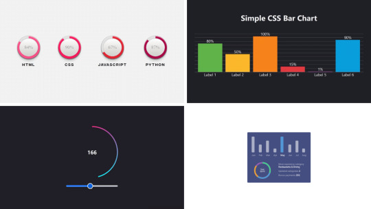
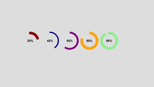
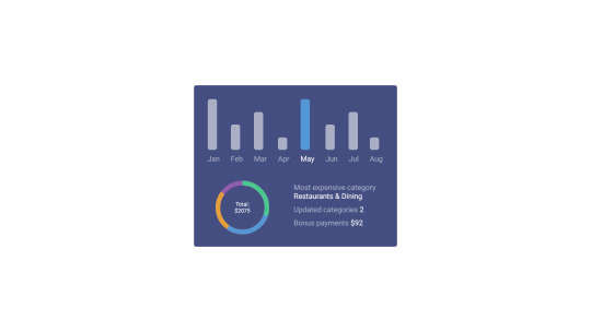
Welcome to CSS Monster, your go-to destination for discovering our curated collection of free HTML and CSS chart and graph code examples. These examples, carefully sourced from platforms like CodePen, GitHub, and other reputable resources, represent an exciting update to our July 2023 collection, introducing three new items to inspire your creativity. CSS, renowned for its versatility, offers a myriad of advantages when it comes to crafting charts and graphs: Flexibility: CSS empowers you with a high degree of customization, allowing the creation of charts and graphs that seamlessly align with your website's aesthetic. Interactivity: With the capabilities of CSS, you can design interactive charts and graphs that respond dynamically to user input, enhancing overall user engagement and experience. Performance: CSS-based charts and graphs are known for their swift loading times and optimal performance, ensuring a smooth user experience even on lower-end devices. We extend an invitation to explore our collection of CSS charts and graphs, tailored for both seasoned developers and those just starting their coding journey. We are confident that within this collection, you'll discover elements that ignite inspiration for your next project. It's worth noting that every item in our collection is freely available for use. So why wait? Embark on your exploration today and elevate your projects with the dynamic and visually appealing world of CSS charts and graphs! Author Hannah March 9, 2023 Links Just Get The Demo Link How To Download - Article How To Download - Video Made with HTML / CSS (SCSS) About a code PROGRESS DONUT CHARTS Compatible browsers:Chrome, Edge, Firefox, Opera, Safari Responsive:no Dependencies:- Author Adam Argyle February 12, 2023 Links Just Get The Demo Link How To Download - Article How To Download - Video Made with HTML / CSS / JS (Babel) About a code GRADIENT CIRCLE OUTLINE BOUND TO ANGLE Compatible browsers:Chrome, Edge, Firefox, Opera, Safari Responsive:yes Dependencies:- Author Mark Boots October 27, 2022 Links Just Get The Demo Link How To Download - Article How To Download - Video Made with HTML / CSS About a code SIMPLE CSS BAR CHART Compatible browsers:Chrome, Edge, Firefox, Opera, Safari Responsive:yes Dependencies:-
Author Temani Afif January 6, 2022 Links Just Get The Demo Link How To Download - Article How To Download - Video Made with HTML / CSS About a code CSS-ONLY PIE CHARTS Compatible browsers:Chrome, Edge, Firefox, Opera, Safari Responsive:no Dependencies:- Author Ana Tudor May 28, 2021 Links Just Get The Demo Link How To Download - Article How To Download - Video Made with HTML (Pug) / CSS (SCSS) About a code SKILLS CHART ANIMATION WITH A BIT OF HOUDINI MAGIC Compatible browsers:Chrome, Edge, Firefox, Opera, Safari Responsive:no Dependencies:-

Author Rami November 19, 2020 Links Just Get The Demo Link How To Download - Article How To Download - Video Made with HTML / CSS About a code PURE CSS AREA CHART Compatible browsers:Chrome, Edge, Firefox, Opera, Safari Responsive:no Dependencies:-
Author Jorge Mendes June 3, 2020 Links Just Get The Demo Link How To Download - Article How To Download - Video Made with HTML / CSS About a code GRAPH Compatible browsers:Chrome, Edge, Firefox, Opera, Safari Responsive:no Dependencies:-
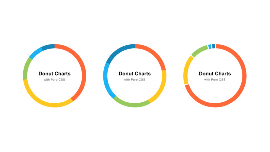
Author Jerry Low April 20, 2020 Links Just Get The Demo Link How To Download - Article How To Download - Video Made with HTML (Slim) / CSS (SCSS) About a code PURE CSS DONUT CHARTS Compatible browsers:Chrome, Edge, Firefox, Opera, Safari Responsive:no Dependencies:-
Author Ana Tudor May 21, 2019 Links Just Get The Demo Link How To Download - Article How To Download - Video Made with HTML (Pug) / CSS (SCSS) About a code PURE CSS BACKGROUND DEPENDING ON HEIGHT Compatible browsers:Chrome, Edge, Firefox, Opera, Safari Responsive:no Dependencies:-
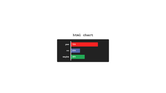
Author sean_codes April 17, 2019 Links Just Get The Demo Link How To Download - Article How To Download - Video Made with HTML (Pug) / CSS (SCSS) About a code HTML CHART Compatible browsers:Chrome, Edge, Firefox, Opera, Safari Responsive:no Dependencies:-
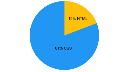
Author Bence Szabo April 13, 2019 Links Just Get The Demo Link How To Download - Article How To Download - Video Made with HTML / CSS About a code THIS PEN IS 19% HTML & 81% CSS Compatible browsers:Chrome, Edge, Firefox, Opera, Safari Responsive:yes Dependencies:-
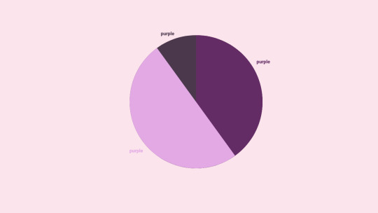
Author Anjanas_dh January 29, 2019 Links Just Get The Demo Link How To Download - Article How To Download - Video Made with HTML / CSS (SCSS) About a code PURPLE PIE CHART Compatible browsers:Chrome, Edge, Firefox, Opera, Safari Responsive:no Dependencies:- Author Sabine Robart January 13, 2019 Links Just Get The Demo Link How To Download - Article How To Download - Video Made with HTML / CSS (SCSS) About a code STATISTICS CARD Compatible browsers:Chrome, Edge, Firefox, Opera, Safari Responsive:no Dependencies:- Author Olivia Ng October 29, 2018 Links Just Get The Demo Link How To Download - Article How To Download - Video Made with HTML (Pug) / CSS (SCSS) / JS About a code CSS ANIMATION: A LINE GRAPH Compatible browsers:Chrome, Edge, Firefox, Opera, Safari Responsive:no Dependencies:simple-line-icons.css, jquery.js Author Ana Tudor July 4, 2018 Links Just Get The Demo Link How To Download - Article How To Download - Video Made with HTML (Pug) / CSS (SCSS) About a code INTERACTIVE, RESPONSIVE PIE CHART Compatible browsers:Chrome, Edge, Firefox, Opera, Safari Responsive:yes Dependencies:-
Author Erin E. Sullivan July 18, 2017 Links Just Get The Demo Link How To Download - Article How To Download - Video Made with HTML / CSS About a code SIMPLE AND RESPONSIVE ORGANIZATIONAL CHART Compatible browsers:Chrome, Edge, Firefox, Opera, Safari Responsive:yes Dependencies:-
Author Champlow July 13, 2017 Links Just Get The Demo Link How To Download - Article How To Download - Video Made with HTML / CSS (Less) About a code BAR GRAPH Compatible browsers:Chrome, Edge, Firefox, Opera, Safari Responsive:no Dependencies:-
Author Chen Hui Jing February 24, 2017 Links Just Get The Demo Link How To Download - Article How To Download - Video Made with HTML / CSS (SCSS) About a code CHARLES HAYTER'S COLOUR DIAGRAMS Compatible browsers:Chrome, Edge, Firefox, Opera, Safari Responsive:yes Dependencies:- Author Nick Walsh February 14, 2017 Links Just Get The Demo Link How To Download - Article How To Download - Video Made with HTML / CSS (Sass) Read the full article
0 notes
Text
How to use JavaScript for data visualization
Data visualization is the process of transforming data into graphical or visual representations, such as charts, graphs, maps, etc. Data visualization can help us understand, analyze, and communicate data more effectively and efficiently.
JavaScript is a powerful and popular programming language that can be used for creating dynamic and interactive data visualizations in web browsers. JavaScript can manipulate the HTML and CSS elements of a web page, as well as fetch data from external sources, such as APIs, databases, or files.
To use JavaScript for data visualization, we need to learn how to:
Select and manipulate HTML elements: We can use JavaScript to select HTML elements by their id, class, tag name, attribute, or CSS selector. We can use methods such as getElementById(), getElementsByClassName(), getElementsByTagName(), querySelector(), or querySelectorAll() to return one or more elements. We can then use properties and methods such as innerHTML, style, setAttribute(), removeAttribute(), appendChild(), removeChild(), etc. to manipulate the selected elements.
Create and modify SVG elements: SVG (Scalable Vector Graphics) is a standard for creating vector graphics in XML format. SVG elements can be scaled without losing quality, and can be styled and animated with CSS and JavaScript. We can use JavaScript to create and modify SVG elements, such as , , , , , etc. We can use methods such as createElementNS(), setAttributeNS(), appendChild(), etc. to manipulate the SVG elements.
Handle events: We can use JavaScript to handle events that occur on the web page, such as mouse clicks, keyboard presses, window resizing, page loading, etc. We can use methods such as addEventListener() or removeEventListener() to attach or detach event handlers to elements. We can also use properties such as onclick, onkeyup, onload, etc. to assign event handlers to elements. An event handler is a function that runs when an event occurs. We can use the event object to access information about the event, such as its type, target, coordinates, key code, etc.
Use AJAX: We can use AJAX (Asynchronous JavaScript and XML) to send and receive data from a server without reloading the web page. We can use objects such as XMLHttpRequest or Fetch API to create and send requests to a server. We can also use methods such as open(), send(), then(), catch(), etc. to specify the request parameters, send the request, and handle the response. We can use properties such as readyState, status, responseText, responseJSON, etc. to access the state, status, and data of the response.
These are some of the basic skills we need to use JavaScript for data visualization. However, writing JavaScript code from scratch for data visualization can be challenging and time-consuming. That’s why many developers use JavaScript libraries and frameworks that provide pre-written code and templates for creating various types of data visualizations.
Some of the most popular JavaScript libraries and frameworks for data visualization are:
D3.js: D3.js (short for Data-Driven Documents) is a JavaScript library for producing dynamic and interactive data visualizations in web browsers. It makes use of SVG, HTML5, and CSS standards. D3.js allows us to bind data to DOM elements, apply data-driven transformations to them, and create custom visualizations with unparalleled flexibility1.
Chart.js: Chart.js is a JavaScript library for creating simple and responsive charts in web browsers. It uses HTML5 canvas element to render the charts. Chart.js supports various types of charts, such as line, bar, pie, doughnut, radar, polar area, bubble, scatter, etc.2
Highcharts: Highcharts is a JavaScript library for creating interactive and high-quality charts in web browsers. It supports SVG and canvas rendering modes. Highcharts supports various types of charts, such as line, spline, area, column, bar, pie, scatter, bubble, gauge, heatmap, treemap, etc. Highcharts also provides features such as zooming, panning, exporting, annotations, drilldowns, etc.
These are some of the popular JavaScript libraries and frameworks for data visualization. To use them in your web development project, you need to follow these steps:
Choose the right library or framework for your project: Depending on your project’s requirements, goals, and preferences, you need to select the most suitable library or framework that can help you create the data visualizations you want. You should consider factors such as the learning curve, documentation, community support, performance, compatibility, scalability, etc. of each library or framework before making a decision.
Add the library or framework to your web page: You can add a library or framework to your web page using either a script tag or an external file. The script tag can be placed either in the head or the body section of the HTML document. The external file can be linked to the HTML document using the src attribute of the script tag.
Learn how to use the library or framework features and functionalities: You need to read the documentation and guides of the library or framework you are using to understand how to use its features and functionalities effectively. You should also follow some tutorials and examples to get familiar with the syntax, conventions, patterns, and best practices of the library or framework.
Write your application code using the library or framework: You need to write your application code using the library or framework functions, methods, objects, components, etc. You should also test and debug your code regularly to ensure its functionality and quality.
These are some of the ways you can use JavaScript for data visualization. To learn more about JavaScript and data visualization, you can visit some of the online resources that offer tutorials, examples, exercises, and quizzes. Some of them are:
[W3Schools]: A website that provides free web development tutorials and references for HTML, CSS, JavaScript, and other web technologies.
[MDN Web Docs]: A website that provides documentation and guides for web developers, covering topics such as HTML, CSS, JavaScript, Web APIs, and more.
[Data Visualization with D3.js]: A website that provides a comprehensive course on data visualization with D3.js.
[e-Tutitions]: A website that provides online courses and for web , development, Learn JavaScript and you can book a free demo class.
[Codecademy]: A website that provides interactive online courses and projects for various programming languages and technologies.
0 notes
Photo

🔴 Create PIE Chart using only HTML & CSS | Radial Gradient ☞ https://bit.ly/2PFsqQ5 #html #css #javascript
6 notes
·
View notes
Text
HTML CSS Pie Chart
#html css pie chart#css pie chart#html css#codenewbies#frontenddevelopment#html5 css3#css#css tricks#css snippets#learn css#webdesign#learn to code
4 notes
·
View notes
Text
Transforming Data into Insight: 4 Useful Big Data Visualization Solutions
Big data is entering people’s lives. Although obtaining data is not a big problem, many people do not know how to draw conclusions because there is too much data. Therefore, I am here to provide 4 useful big data visualization tools to help you understand the data.

Datawrapper is an online data visualization tool for making interactive charts. Once you upload the data from the CSV file or paste it directly into the field, Datawrapper will generate a bar, line or any other related visualization file. Many journalists and news organizations use Datawrapper to embed real-time charts into their articles. It is very easy to use and produce effective graphics.
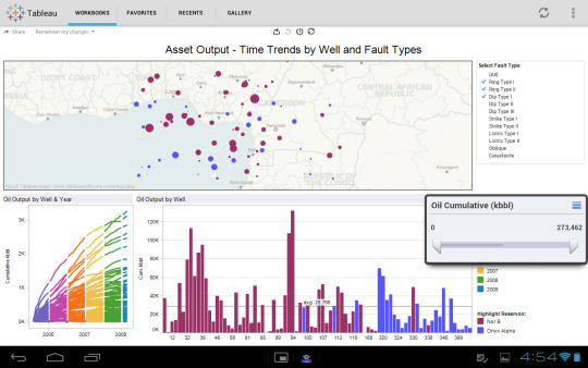
Tableau Public perfectly grafts data operations with beautiful charts. Its program is easy to use, companies can use it to drag and drop large amounts of data onto the digital “canvas”, and create various charts in a blink of an eye.

Chart.js is a free open-source JavaScript library for data visualization, which supports 8 chart types: bar, line, area, pie (doughnut), bubble, radar, polar, and scatter. Chart.js renders in HTML5 canvas and is widely covered as one of the best data visualization libraries.
D3.js is a JavaScript library for manipulating documents based on data. D3 helps you bring data to life using HTML, SVG, and CSS. D3’s emphasis on web standards gives you the full capabilities of modern browsers without tying yourself to a proprietary framework, combining powerful visualization components and a data-driven approach to DOM manipulation.
0 notes
Photo
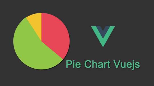
Pie Chart with CSS Conic Gradient and Vue.js ☞ https://school.geekwall.in/p/egCtppvk/pie-chart-with-css-conic-gradient-and-vue-js #vuejs #javascript
4 notes
·
View notes
Photo

Pie Chart with CSS Conic Gradient and Vue.js ☞ https://school.geekwall.in/p/egCtppvk/pie-chart-with-css-conic-gradient-and-vue-js #vuejs #javascript
1 note
·
View note
Photo

Pie Chart with CSS Conic Gradient and Vue.js ☞ https://school.geekwall.in/p/egCtppvk/pie-chart-with-css-conic-gradient-and-vue-js #vuejs #javascript
2 notes
·
View notes
Photo

Pie Chart with CSS Conic Gradient and Vue.js ☞ https://school.geekwall.in/p/egCtppvk/pie-chart-with-css-conic-gradient-and-vue-js #vuejs #javascript
1 note
·
View note
Text
Data Visualization in Frontend Development: Creating Interactive Charts and Graphs

Introduction
In the dynamic world of front-end development, data visualization plays a pivotal role in transforming complex information into intuitive and interactive charts and graphs. With businesses and users demanding richer experiences, front-end developers embrace innovative data presentation methods. In this blog, we'll explore the significance of data visualization in frontend development, understand its impact on frontend development services, and how frontend development companies leverage it to create engaging and user-friendly interfaces. Join us on this exciting journey into the realm of interactive charts and graphs!
Basics of Data Visualization
Data Types:
Categorical: Data that represent distinct categories or groups.
Numerical: Data with continuous or discrete numerical values.
Ordinal: Data with a predefined order or ranking.
Choosing Chart Types:
Categorical data: Bar charts (vertical/horizontal), stacked bar charts.
Numerical data: Line charts, scatter plots, histograms.
Ordinal data: Dot plots, ranked bar charts.
Popular Chart Types:
Bar charts: Visualize categorical data using bars of different lengths.
Line charts: Display trends and relationships between numerical data points.
Pie charts: Show proportions of different categories as a whole.
Tools and Libraries for Data Visualization
Frontend Libraries:
D3.js: Powerful library for creating interactive visualizations using HTML, SVG, and CSS.
Chart.js: User-friendly library with a variety of chart types and easy setup.
Comparison of Different Tools:
D3.js: Offers high customization but requires more coding skills.
Chart.js: Quick to implement with less coding required but may have limited customization options.
Selecting the Right Tool:
For complex, interactive visualizations, consider D3.js if you have front-end development expertise.
For simpler visualizations and faster implementation, choose Chart.js for efficient front-end development services.
Data Preparation and Formatting
Cleaning and processing data is essential to ensure accuracy and meaningful insights before visualising it.
Data cleaning involves removing errors, duplicates, and inconsistencies in the dataset.
Processing data includes transforming, reshaping, and aggregating it for better analysis.
Dealing with missing values requires imputing them with appropriate techniques or removing the affected records.
Outliers, which are extreme values, need to be handled by either adjusting them or considering them separately.
Transforming data into a suitable format for charts and graphs involves organizing it into columns, rows, or categories.
The data is converted into a compatible format, such as CSV or JSON, for visualization tools.
Creating Interactive Charts
Interactive charts provide enhanced user experiences and allow users to explore data interactively.
Adding tooltips, hover effects, and click events to charts can display additional information when users interact with specific elements.
Tooltips provide contextual information when hovering over data points, helping users understand the data better.
Hover effects highlight or change the appearance of chart elements to provide visual feedback when interacting with them.
Click events enable users to drill down into detailed data or navigate to related content.
Implementing interactive filters and data controls allows users to modify the chart's displayed data dynamically.
Filters enable users to select specific data subsets based on predefined or custom criteria.
Data controls, such as sliders or dropdown menus, provide a convenient way for users to interact with data parameters.
Frontend development company offer services to create visually appealing and interactive charts that meet specific business requirements.
These companies specialize in implementing front-end technologies and frameworks to create seamless and engaging user interfaces for data visualization.
Customizing Visualizations
Styling charts to match website design and branding enhances visual appeal and user experience.
CSS (Cascading Style Sheets) and SVG (Scalable Vector Graphics) are powerful tools for customizing chart appearance.
Using CSS, you can control colours, fonts, and layout to align with your front-end development company's branding.
SVG allows for scalable and resolution-independent graphics, ensuring crisp visuals on any screen.
Accessibility in Data Visualization
Accessibility is crucial for front-end development services to cater to all users, including those with disabilities.
Implement proper labels and alternative text (alt text) for charts and visual elements.
Alt text provides descriptions of images, making them understandable for screen readers.
Test visualizations for accessibility compliance using tools like Lighthouse or Wave.
Performance Optimization
Performance optimization is a crucial aspect of front-end development. It ensures that websites and applications run smoothly, providing a seamless user experience. Here are some techniques to improve chart rendering performance and handle real-time data updates efficiently:
Chart Rendering Performance:
Implement data caching: Store pre-rendered charts to reduce processing time.
Use optimized chart libraries: Choose high-quality and efficient rendering libraries.
Minimize DOM manipulation: Limit the number of redraws and updates to the chart's DOM elements.
Enable hardware acceleration: Utilize the GPU to accelerate rendering, especially for complex charts.
Implement data pagination: Load and render data in chunks to avoid overwhelming the browser.
Lazy Loading of Data:
Load data on demand: Fetch data only when needed, particularly for large datasets.
Implement infinite scrolling: Load additional data as users scroll down instead of loading everything upfront.
Handling Real-time Data Updates:
Use efficient data update algorithms: Optimize updating chart data to minimize computation.
Implement data streaming: Receive and process real-time data updates incrementally, reducing the load on the front end.
Utilize web sockets: Establish a persistent connection for real-time data transfer, avoiding frequent HTTP requests.
By employing these techniques, front-end development companies can significantly enhance performance and provide efficient front-end development services.
Conclusion
In conclusion, data visualization has emerged as an essential aspect of front-end development. It empowers front-end development companies to craft visually appealing, user-friendly interfaces that convey information effectively. By embracing interactive charts and graphs, front-end developers can elevate the overall user experience, making data more accessible and engaging for everyone. As businesses continue to emphasize data-driven decision-making, mastering the art of data visualization will be a crucial skill for front-end developers. So, let's embrace the power of data visualization and unlock a world of creativity and innovation in the front-end development domain.
0 notes