#regular square image and then make the edges transparent to make it *effectively* a circle‚ but like… would that appeal?
Text
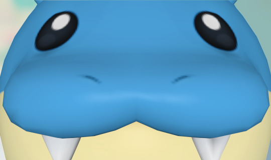
#spheal#i wish i could post circular images on tumblr. because this one is deserving of a fully circular PNG. i could technically just take a#regular square image and then make the edges transparent to make it *effectively* a circle‚ but like… would that appeal?#if that would appeal then i'll do it. i don't think it would be *too* prohibitively hard. i would be willing to make an addendum#with a circular transparent image of spheal staring at the screen if enough of you want it. either way#this guy rolls everywhere and i think tumblr is gonna like that. i feel like this is gonna end up being a well-liked pokémon amongst tumblr#as in. i feel like. it already is. because. of how it is. i just don't know bc spheal isn't like. one of my favorites#it's cute don't get me wrong but it's just not one i think about all the time. it's one that i'll like if prompted but not unprompted#i'm gonna stop before i dig myself into a hole. i beat totk finally. it was very good and i honestly had way way more fun with it than i did#with botw. i have my criticisms obviously. it's not perfect it's not pmd. but it was very good. and now i've moved onto the next game in my#backlog. which is very long but i'm steadily working through it. hopefully i can get it done before i graduate this december and stop having#any time for the rest of my life ever forever to play video games. dreading that day. but uh#until then i will game. and hang out with my friends. and go on tumblr. and do all these things i like to do. until i no longer can#wow this got depressing i'm gonna Stop here. enjoy spheal
657 notes
·
View notes
Text
Creating Icon Borders with Bre
One of the few skills I have is my ability to create graphics in Photoshop. While I have far from mastered this skill, I’ve had a few people ask how I create icons like these:

While I won’t recreate these exact icons, I will show you the basic skills used in each of these!
Things you will need:
Photoshop
Base icons without borders
Table of Contents:
First Lesson
Advanced Steps
Batch Icon Making
Now- Let’s get started!!

First step, make the new document you’ll be using for this project. Import all of the icons if you want, I’ll be showing you how to apply frames to multiple icons at the end of this lesson!

Make that new layer! Pro tip: Always name your layers and folders! While naming the icons themselves isn’t always necessary, naming your frame and the layers used to make it makes it easier to keep track of everything.


While you can make borders out of any shape or size, for this lesson, we’ll just use a simple circle made with the Ellipse tool.

Now, icon border veterans may be wondering: “Bre, you fool, if you’re making a border, why not just use the stroke option?”
Using a filled shape can cut out multiple needless steps and makes it much easier to specifically control the size and shape of the border. (For sharper borders like squares, it may be best to just make the selection yourself and save that selection.)


While turning shapes into regular layers can be done in other ways, it’s important to familiarize yourself with the process of moving items to different layers.


In this step, you created a selection excluding the inside of the circle, and used that selection to clear out the excess image outside of the frame. Making the copy visible before hand ensures that you can delete the excess on that layer and confirm that you’re happy with where everything falls inside of the frame!

While you don’t have to do this step right now, Clipping Masks are going to be very important in creating transparent-looking frames for your icons. This way, you can see the changes you’re going to make as they happen!

We’re getting close to actually creating the border! This next part will require a lot of trial and error and personal preference.


Pro-tip: Make sure you have “Apply effect at canvas bounds” checked. This ensures that borders that touch the edge of the canvas won’t make a distorted selection!


This is the fun part! Mess around with all of the settings to make the border look however you’d like. If you want a nice suggestion, a setting I like is:
Color Overlay: Black, normal, 50% Opacity
Stroke: 1px, Black, center, normal, 100% opacity
Bevel & Emboss: Inner Bevel, smooth, Depth 1000%, Size 13px, Soften 0px
Drop Shadow: Normal, Black, 100% Opacity, Angle 30, Distance 5, Spread 15, Size 24
And there you have it! If you’re satisfied, you can keep the settings you chose and skip to Batch icon making. Now, we’re going to move onto some more advanced steps!
12 notes
·
View notes
Text
Photo editor for PC to scale photos or photos color tone
Additional resources to cut images with the photo editor download and functional photo editor for Computer and professionals to professional cut a picture. Intelligent enhance pictures with a photo editor for PC for professionals to removal of unwanted elements. Get the photo editor for PC for fast and intelligent saturate an image.
It is difficult to get an excellent mobile phone photo what was taken with a light up. Many times, they shoot an image look overexposed, adversely altering brightness and also making subjects turn out washed out. As a matter of fact, even the cellphone flashing light is rumored to have a few imperfections. Take advantage of the resources of natural light you should locate, also at night time. This offers you a possibility to play with darkness, just as in the picture above, or develop a silhouette with various other ambient resources of light, like street lamps and also bordering houses. As soon as you have actually make the image, play with the exposure device in your preferred photo editing app to made the image a little shinier. Photo editor carries out possess some of the functionalities is actually popular for, which happens quite helpful when you've decided on you have actually like to try your give on something extra trendy than photo transparency and also correction of contrast.
Photo editor can easily also bring in stills coming from video, in add-on to various reports. And when you're feeling a little bit idle or even it is actually merely plain oblivious about how to usage a few of the devices, a helper can support you to change the rudiments just like lights, focus, shade, and cutting of images. For them who love their pictures in widescreen versions, the software program aids you effectively produced images to make a panoramic image.
And when it is actually time to print off your photography capabilities, you can select among the photograph strategy concept templates to quickly publish all of them in a particular size.
Photo editor for PC free download or software edit photo to blur images
This photo editor is actually most effectively for excited learners with a lot of attend their workflow to figure out the also technological features that will terrify initial time picture modifying consumers. It similarly comes complete along with a full circle panorama system. Probably the glossiest treasure in the package would be actually the stunning skin effect, which deals with reddish locations and evens out the skin.
While there's no automatically different colors repair work alternative quite required to repair work the bad illuminating very most digital cams document, there are actually the regular functions of cropping photos. Either the most well-known misunderstood components of digital photography is what happens once you make the photo in fact editing your photos. This is where you modify the photos you have actually taken, to produce the end product. Modifying your photos is the matching of the darkroom from the time long time earlier. We are most likely to be discuss some suggestions for editing and enhancing your pictures, from the fundamentals like photos color key as well as flip photo, with a lot more complex functions.
The cropping tool enables you to transform the dimension of your image, as well as likewise to alter the element proportion. You can cut out a photo from a rectangle-shaped form to a square shape. There are lots of reasons you would certainly wish to cropping, including for posting in different styles as well as aspect proportions. Compared to the initial, I have actually chopped the photo with photo editor for PC to eliminate the colored part of the right side of the image and also reassembled making use of the policy of fourths. That makes the darkness bolt much more the focus of photo shot. When making the image, you might question why I did not just make up effectively. So in this situation, I was working on a long presence photo shooting without any a tripod, so had actually the video camera stabilized on the edge of the street for stability. That really much limited my capacity to flawlessly frame the minute, so I just shot wider, understanding I had to be able to chop the shot appropriately right after the fact. In this both cases, cutting out is really basic and also it is just involves you selecting the crop appliance and after that choosing the location you intend to keep with your computer mouse. You use the modifications and also your new cropped photo is prepared to go. When we was searching the web for a great photo editor for PC, we at last tripped over this really impressive program download. Additional info to blur a picture with the photo editor download or new photo editor for amateurs to easy saturate images or easy correction of contrast. Easy flip a photo with a photo editor for professionals to photos sepia. Download photo editor for PC for amateurs and software to edit an image to rotate photos or selective color change.
Photo editor for PC to resize a photo and edit an image software to removal of unwanted elements for trainees
Read all about rotate an image with the photo editor free download or great photo editor for Computer to enhance images and software to edit a photo to clone stamp for amateurs. Saturate pictures is simple with the photo editor for PC. Download photo editor for amateurs or software edit photo to rotate an image or photos color tone. If the perspective boundary in a picture is not even level, one of my personal petty nuisances in photography is. Often when we are taken up in the moment, this basic policy is failed to remember yet fortunately is that editing your photos with the photo editor to make them grade is additionally really simple.
Adjusting the cam within the corner of the pier suggested that the photo was not degree this is photo editor software notably visible to the sight when the photo has a clearly specified perspective line, such as the lake. The leveling device becomes part of the output tool, and also you are able to simply rotate the pic to fit. The grid will certainly show up to help you obtain the positioning proper while you utilize the photo editor. Pointing an image is an actually basic job in which will certainly get simply a couple of ticking, causing a much extra visually wowing photograph.
Sometimes while we take a picture, parts of the photo might end up being actually shadier than we like. I describe the gloomy parts of the shot as shadows, as well as the bright areas of the picture as spotlight. Comparison is actually regarding highlighting the contrast between the lighting and also darker parts of the photo. Enhancing the comparison of a photo can significantly boost the aesthetic influence in which had, by making the borders between these dark and light areas more clear. Color scheme adjustment is an additional vital part related to the photo editor. We can adjust image color or texture in each sort of ways, from altering the general warmness of the image like just how red and green it looks, to individually changing the hue as well as concentration of details color schemes inside of a photo. I only would like to cover some very helpful shade corrections anyone can use to make your photography simply just a little bit much more creatively amazing.
The most effective solution in order to readjust the color of a photo is actually using the color tone method of the photo editor for PC. That modifies the visual appeal related to each color in an image to help make it essentially condensed.
Similar to lots of changes, the trick is definitely to choose a really good evenness way too much coloring the images often tends to seem instead unnatural. Hue pictures can easily be actually really effective, as well as naturally light as well as dark is an amazing selection for all sort of situations, in specific, snapshots, as well as various surroundings pictures.
Different people are sometimes searching in the web for the photo editor for PC to crop photos
Photo editor free download for experienced for convenient colorize an image or easy beauty retouching. Read more about Photo editor for Computer or software to edit a picture to soften pictures. Free download photo editor for PC for amateurs and edit image software to sharpen a photo and image size alteration. In some cases there may be a little something inside a picture that you really do definitely not desire to exist, such as an annoying acne breakout on someone's nose. That is very simple to erase in almost all the major photo editor.
It is usually quite easy to remove any type of things directly out of an image yet the photo editor for PC performs perfectly on distinct, very small objects that are generally been around by consistent shades. This is because the recover tool has to change the location you desire to remove with something else, as well as this functions best when it has a location nearby that looks similar. For example, bright spot on a face is bordered by a whole lot of similarly tinted skin, so the heal device can quickly compute what to replace the dark point based on the surrounding location. This is for the photo editor has to take out the spot you desire to erase along with another thing, as well as that does work best if it gets a field close that looks very same. Photo editor has become very complex and also impressive and it is actually possible to manipulate photograph so they change into absolutely different from the original. There certainly are loads of photo editor and wide ranges of methods of achieving the same or similar results.
My intention very most for the majority of pictures I upload procedure is definitely to produce all of them look as normal as possible. I have no doubt this is a great point to start, also if you intend to go on as well as produce much more unique looking pictures. Tone variety in a photograph is among the main priorities. Your eyes are able to normally see a wider series of shade than your electronic camera can make.
The meaning of picture editing is the process of altering an image, put simply. However this is simplifying a theme that is quite complicated. You can commonly perform basic image editing strategies just like photos sepia rather easily and promptly yet intricate techniques and digital editing might call for photo editor for PC as well as more knowledge.
Photo editor is a helper that anyone able to utilize to manipulate and also enhance pictures. Due to the fact that photos contain an enhancing number of uses, increased people are experiencing ways to reutilize pictures and use them on larger number of channels. Download for free the photo editor and top photo editor for Computer to improve an image or software photo editor to photo transparency for amateurs. Cut images is easy with the photo editor. Free download photo editor for professionals and software to edit a photo to resize a picture and gamma correction.
0 notes
Text
How to Create Floating Corner Designs for Content in Divi
Creating floating corner designs is a simple and easy way to add a little creative style to Divi Modules that you may not have thought was possible without custom code. Good news! With Divi, you can use dividers and blurbs to style the four corners of your module using Divi’s built-in options. And, it can be pretty fun to try out the different possibilities.
In this tutorial, I’m going to show you how to create floating corner designs for your content in Divi. Once you have the elements in place, you can style those corners with countless shapes, icons, and colors!
Let’s get started!
Sneak Peek
Here is a sneak peek of the floating corner designs possible from this tutorial.
Download the Floating Border Design Examples Layout for FREE
To lay your hands on the floating border designs layout, you will first need to download it using the button below. To gain access to the download you will need to subscribe to our Divi Daily email list by using the form below. As a new subscriber, you will receive even more Divi goodness and a free Divi Layout pack every Monday! If you’re already on the list, simply enter your email address below and click download. You will not be “resubscribed” or receive extra emails.
Download the File
.et_bloom .et_bloom_optin_1 .et_bloom_form_content { background-color: #4843d2 !important; } .et_bloom .et_bloom_optin_1 .et_bloom_form_container .et_bloom_form_header { background-color: #ffffff !important; } .et_bloom .et_bloom_optin_1 .carrot_edge .et_bloom_form_content:before { border-top-color: #ffffff !important; } .et_bloom .et_bloom_optin_1 .carrot_edge.et_bloom_form_right .et_bloom_form_content:before, .et_bloom .et_bloom_optin_1 .carrot_edge.et_bloom_form_left .et_bloom_form_content:before { border-top-color: transparent !important; border-left-color: #ffffff !important; } @media only screen and ( max-width: 767px ) {.et_bloom .et_bloom_optin_1 .carrot_edge.et_bloom_form_right .et_bloom_form_content:before, .et_bloom .et_bloom_optin_1 .carrot_edge.et_bloom_form_left .et_bloom_form_content:before { border-top-color: #ffffff !important; border-left-color: transparent !important; } }.et_bloom .et_bloom_optin_1 .et_bloom_form_content button { background-color: #f92c8b !important; } .et_bloom .et_bloom_optin_1 .et_bloom_form_content .et_bloom_fields i { color: #f92c8b !important; } .et_bloom .et_bloom_optin_1 .et_bloom_form_content .et_bloom_custom_field_radio i:before { background: #f92c8b !important; } .et_bloom .et_bloom_optin_1 .et_bloom_border_solid { border-color: #f7f9fb !important } .et_bloom .et_bloom_optin_1 .et_bloom_form_content button { background-color: #f92c8b !important; } .et_bloom .et_bloom_optin_1 .et_bloom_form_container h2, .et_bloom .et_bloom_optin_1 .et_bloom_form_container h2 span, .et_bloom .et_bloom_optin_1 .et_bloom_form_container h2 strong { font-family: "Open Sans", Helvetica, Arial, Lucida, sans-serif; }.et_bloom .et_bloom_optin_1 .et_bloom_form_container p, .et_bloom .et_bloom_optin_1 .et_bloom_form_container p span, .et_bloom .et_bloom_optin_1 .et_bloom_form_container p strong, .et_bloom .et_bloom_optin_1 .et_bloom_form_container form input, .et_bloom .et_bloom_optin_1 .et_bloom_form_container form button span { font-family: "Open Sans", Helvetica, Arial, Lucida, sans-serif; } p.et_bloom_popup_input { padding-bottom: 0 !important;}
Download For Free
Join the Divi Newlsetter and we will email you a copy of the ultimate Divi Landing Page Layout Pack, plus tons of other amazing and free Divi resources, tips and tricks. Follow along and you will be a Divi master in no time. If you are already subscribed simply type in your email address below and click download to access the layout pack.
DOWNLOAD
You have successfully subscribed. Please check your email address to confirm your subscription and get access to free weekly Divi layout packs!
To import the layout to your page, simply extract the zip file and drag the json file into the Divi Builder.
Now let’s get to the tutorial shall we?
Getting Started
The only thing you need for this tutorial is Divi. We will be building these examples from scratch on the front end of the Divi Builder.
To get started, create a new page and give your page a title. Click to use the Divi Builder on the front-end and choose the option “Build from Scratch”.
Now you are ready to go!
Creating the Floating Corner Design Layout Template
Since there are going to be countless design possibilities with this design, it makes sense to create the basic layout (or template) to work from.
For this template, we are going to add four dividers to each corner of a text module. Then once the layout is in place, you will be able to explore new ways to customize those dividers for unique designs.
First, create a new regular section with a one column row.
Before we add the text module, update the row settings as follows:
Custom Width: 640px
Custom Padding: 0px top, 0px bottom
Then add a text module to the row and update the following:
Text Text Size: 20px
Text Line Height: 1.8em
Custom Margin: -25px top, -25px bottom, 25px left, 25px right
Custom Padding (desktop): 10% top, 10% bottom, 10% left, 10% right
Custom Padding (phone): 20% top, 20% bottom
Border Width: 4px
Border Color: #eeeeee
The custom margin and padding is going to help align our divider modules we will be adding shortly. Since the dividers will have a height and width of 50px, the -25px top and bottom margin will pull those dividers halfway into the text module for a nice symmetrical design (you’ll see).
Adding the top two Floating Corner Dividers
With the text module in place, we can start adding the top two floating corner designs using divider modules.
Create a new divider module and drag it to the top of the text module.
Then and update the divider settings as follows:
Show Divider: NO
Background Color: #7cda24 (or whatever color you want)
Height: 50px
Width: 50px
The 50px height and width gives us the perfect square we can use for our floating border.
Now, add a box shadow to the divider to create the floating effect as follows:
Box Shadow: see screenshot
Box Shadow Vertical Position: 0px
Box Shadow Blur Strength: 0px
Box Shadow Spread Strength: 20px
Shadow Color: #ffffff
To make sure the divider module stays above the text module (and doesn’t get hidden behind it), we need to add a snippet of CSS to the main element as follows:
Main Element CSS:
position: relative
Then update the Z Index to 1.
Next duplicate the divider module and update the duplicated divider settings as follows:
Module Alignment: right
Custom Margin: -50px top
This aligns the divider to the right and pulls it up the exact height of the divider module sitting above it. This creates the exact corner placement we are looking for.
Adding the bottom Corner Dividers
To add the two bottom corner dividers, deploy the wireframe view mode and copy the left and right dividers you just created and paste them below the text module (making sure the left divider stays stays stacked on top of the right divider as shown in the image below).
That’s it! Let’s check out the final design of our basic layout.
Exploring New Floating Corner Designs
With this template in place, we can explore some different designs that are possible. You can save this entire section to the Divi library so that you can keep it as a template going forward. But for now, let’s just duplicate the section and explore a new design.
Diamond Shapes with gradient backgrounds
With a duplicate of our template in place, use the multiselect feature to select all four of the divider modules. Then click the settings gear icon on one of the selected dividers to deploy the element settings modal. It might help to use click mode for this step.
In the element settings, update the following:
Gradient Background Left Color: #7cda24
Gradient Background Right Color: #edf000
Gradient Direction: 45deg
Then use the transform options to rotate the divider into a diamond shape.
Transform Rotate Z-axis: 45deg
Here is the final design.
Skewed Dividers
You can also use the transform skew option to skew the dividers for an even more unique design. You can either add a separate skew design for each divider, or use multiselect to update the transform skew for all four at the same time by -37deg on the X and Y axis.
Here is what that would look like.
Dark Background Designs
You can even experiment with adding a dark background color to the text module for a unique floating corner design. Here is an example of the text module with a background color of #002130 using the without an transform rotate or skew.
Rounded Edge Corners
To put some rounded corners on the design, you can simply add rounded corners to the row as follows:
Rounded Corners: 20px
Circle Floating Corners
To turn those square corners into circles, you can add the following snippet of custom CSS to each divider’s main element:
border-radius: 50%;
Since the dividers are 50px by 50px, this will create a perfect circle design.
As you can see there are a ton of different ways you can tweak these elements for countless new corner designs.
Now, let’s explore using blurb icons for floating corners instead of divider modules.
Creating Floating Corners with Blurb Icons
Adding Blurb icons to each corner of the text module can give you even more unique designs. You can use the same layout template we built at the beginning of the tutorial. The only difference will be using blurb modules instead of divider modules for the four corners.
Go ahead and get a duplicate of section layout template deployed.
Then delete the divider modules above and below the text module.
Adding the top two blurb icon corners
Since we are only going to want to use the blurb module to display a single icon, we need to make sure and get the size and spacing correct.
Add a blurb module above the text module and take out the title and body text. Then click to use an icon instead of an image and select the circle facebook icon.
Then update the following blurb settings (these settings are very similar to the settings we added to the divider module in the first example):
Background Color: #ffffff
Icon Font Size: 50px
Width: 50px
Custom Margin: 0px bottom
Rounded Corners: 50%
Box Shadow: see screenshot
Box Shadow Vertical Position: 0px
Box Shadow Blur Strength: 0px
Box Shadow Spread Strength: 20px
Shadow Color: #ffffff
Main Element CSS:
position: relative;
Blurb Image CSS:
margin-bottom: 0px
Z Index: 1
Next, duplicate the blurb module to create another one just below the current blurb and update the following:
Module alignment: right
Custom Margin: -50px top
Then copy the top two blurb modules and paste them under the text module (making sure the left blurb stays stacked above the right blurb).
Then you can update the icons for each blurb to whatever you want.
Here is the final design.
Explore More Designs with Blurb Icon Floating Corners
With this setup you can explore many unique designs. You can change up the icons, use different color combos, and even scale or rotate them with transform options.
Here is an example of the design using a dark background color for the text module and different icon colors.
Works in Multiple Column Layouts
As long as you keep the elements together, you can add these floating corner layouts in multiple columns.
Wrapping Up
Creating floating corner designs for your content in Divi really does showcase the power of Divi builder. With all of the built-in options available, you can create countless design variations from one basic layout template. I hope this will inspire you to have some fun exploring new designs of your own.
I look forward to hearing from you in the comments.
Cheers!
The post How to Create Floating Corner Designs for Content in Divi appeared first on Elegant Themes Blog.
😉SiliconWebX | 🌐ElegantThemes
0 notes
Text
Hyperallergic: Minoru Onoda, Circle Master from Japan’s Gutai Group
Minoru Onoda, Work 64-W, 1964; oil, gofun and glue on plywood; 36 1/8 x 36 1/8 x 1 3/4 inches (photo © Estate of Minoru Onoda, courtesy of Anne Mosseri-Marlio Galerie)
BASEL, Switzerland — Beyond the orgy of art-world hype surrounding the annual Art Basel fair, the gallery scene here in its host city and its environs is as varied as it is compact; operating in the shadow of the venerable Kunstmuseum Basel, the repository of some of Europe’s finest modern and medieval art collections, including the vast holdings of drawings, watercolors, and prints in its Kupferstichkabinett division, these local galleries know how to put on a good show, especially when the high-profile Art Basel fair rolls into town.
Just a few blocks from the Kunstmuseum, for example, Anne Mosseri-Marlio Galerie is presenting Maru (“Circle” in English), an exhibition of paintings by Minoru Onoda, a member of Japan’s post-World War II, avant-garde Gutai group. As I noted in a recent Hyperallergic Weekend article about Onoda’s Gutai confrère, Toshio Yoshida, the Gutai Art Association, as their collective was officially known, was founded in 1954 by the businessman-turned-painter Jirō Yoshihara and more than a dozen younger art-makers from Osaka and Kobe.
The Japanese artist Minoru Onoda (1937-2008), a member of the avant-garde Gutai Art Association, making a kite in 1988 (photo by Paul Eubel-Plag, © Estate of Minoru Onoda, courtesy of Anne Mosseri-Marlio Galerie)
In recent decades, such Gutai artists as Atsuko Tanaka (1932–2005), Kazuo Shiraga (1924–2008) and Sadamasa Motonaga (1924–2008), among others, have earned critical recognition apart from their influential association’s collective label. Now, with dealer Anne Mosseri-Marlio’s Basel presentation, it’s Onoda’s turn in the spotlight. On view through July 14, Maru is the first-ever solo showing outside Japan of works by this artist, who was born in Japanese-occupied Manchuria, China, in 1937 and died in Japan in 2008.
At its core is a selection of paintings Onoda produced during the first half of the 1960s, before he became a Gutai member. In them, he worked out what would become the fundamentals of his signature formal vocabulary. Organized by Mosseri-Marlio in conjunction with the painter’s son, Isa Onoda, an artist and art teacher based in southern Japan, this concise survey includes a few pieces from later decades, too.
One of the Gutai artists’ motivating principles was to honor — and, in effect, to reveal — the inherent expressive properties of their materials without trying to cunningly manipulate them. So was their determination to create works of radical originality: Tanaka made a “dress” of colored electric light tubes; Shōzō Shimamoto made “paintings” of newspaper sheets stretched on frames and punched through with holes; Shiraga painted with his feet; and Motonaga explored the accidental beauty of big, drippy, majestic blobs in color-saturated pictures.
Close-ups of artist Minoru Onoda’s paintings from the early 1960s showing their undulating, textured surfaces made with gofun, a Japanese, moldable paste (photo by the author for Hyperallergic)
Onoda, whose father had worked as a policeman in Japanese-controlled Manchuria, was still a boy when his family moved back to Japan before World War II ended, settling in Himeji, to the west of Kōbe. He went on to study art in Osaka (later he would say he enjoyed reading van Gogh’s biography and letters); by the mid-1950s, having assimilated Western modernist techniques, Onoda was producing paintings of traditional Japanese houses and other buildings, but toward the end of the decade he began making stylized images of flattened, rectangular human figures.
Like the other Gutai artists, he became aware of post-WWII European, art informel forms of abstract painting but eventually dismissed them as merely resembling walls. Yet his own works, which he actively exhibited in group shows, became more abstract themselves, incorporating thinly cut, circular slices of PVC pipe laid flat against their surfaces and slathered with paint to produce rich textures.
Minoru Onoda, Work 61-14, 1961; mixed media on plywood; 36.14 x 52.36 inches (photo © Estate of Minoru Onoda, courtesy of Anne Mosseri-Marlio Galerie)
In 1961, a Himeji-based art magazine published a text Onoda authored about what he dubbed “propagation painting.” In it, he observed that art informel, whose influence had been felt in Japan for several years, had become so “safe” and “accepted” that it had “los[t] its initial drive for negation and rebellion.” Citing his own efforts to “make a cynical critique,” and what he called his “obsession” with the notion of the mechanical duplication of just about anything, Onoda ditched his sculptural PVC circles and began painting endless maru — circular dots — in sprawling, eddying, seemingly random patterns of essentially primary colors, with streams of smaller and larger colored dots flowing into real gullies and broad valleys on the surfaces of his pictures.
That’s because Onoda used glue and traditional Japanese gofun, a moldable paste made from pulverized oyster and clam shells, to produce bas-relief mounds on their gently undulating, thick plywood surfaces; this kind of experiment in oil-painting technique is exemplified in such pieces on view as “Work 63-12” and “Work 63-13” (both 1963), which are narrow and vertical in format, and “Work 64-W” (1964), a large, hippy-trippy, psychedelic square. They’re colorful, dynamic, peculiar — and hypnotizing.
Minoru Onoda, Work 63-12 and Work 63-13, both dated 1963; oil, gofun and glue on plywood; each piece 40 x 10 1/8 inches (photo © Estate of Minoru Onoda, courtesy of Anne Mosseri-Marlio Galerie)
(It’s tempting to compare Onoda’s dot-making obsession with that of another Japanese modernist, Yayoi Kusama, who famously painted dots on the naked bodies of participants in her New York happenings of the late 1960s, but her evolving use of the motif could be variously spectacular, mysterious, or elegantly decorative. In interviews and in her writings, Kusama has explained that her obsessive-repetitive use of certain motifs was motivated more by particular psychological-emotional impulses than by the kinds of formal, aesthetic, or intellectual concerns Onoda expressed in relation to his art.)
It was Motonaga who brought Onoda into the Gutai Art Association in 1965. That year, Onoda showed his work in the collective’s 16th group exhibition, which took place in Tokyo; he would continue to take part in every regular, similar presentation until the association disbanded in 1972, following the death of its leader, Yoshihara.
By that time, Onoda’s art had evolved in many ways. In 1970, for example, artists associated with Gutai produced an array of action-based performances and multi-media works for the world’s fair, Expo ’70, which took place in Osaka; Onoda’s mixed-media contributions attempted to humanize that era’s emerging technologies through the use of sound sensors, moving walls, and interactive features.
Minoru Onoda, Work 70-G2, 1970; oil, gofun and glue on plywood; 27 1/8 x 23 5/8 x 3 1/2 inches (photo © Estate of Minoru Onoda, courtesy of Anne Mosseri-Marlio Galerie)
In the current Basel show, such pristine, precise, geometric abstractions as “Work 70-G2” (1970; oil, gofun and glue on plywood) and “Work 75-Blue 9” (1975; acrylic on plywood), feature big, finely rendered groups of concentric circles (some of which are made up of countless dots, of course); here the artist can be seen pushing his ideas forward technically and formally, bringing his visual language in line with the harder-edged, tech-romancing, design-flavored aesthetic that characterized a lot of 1970s art, for better or worse.
“Watashi-no maru (‘my circles’) will extend out of the picture, not only to the wall and ceiling, but to the road and the car,” Onoda once wrote, daydreaming about the power of his favorite, inexhaustible art-making motif. His dot- or circle-filled “propagation paintings,” he believed, would somehow poke a defiant thumb in the eye of “the world we are now living in.”
“Looking up at the sky vacantly,” he also observed, “I dream that this sky and the world will be filled completely with watashi-no maru.” He compared the proliferation of his key motif of the 1960s to microorganisms and declared, “My wish is that these bacteria will spread all over the world.”
Isa Onoda and art dealer Anne Mosseri-Marlio at Anne Mosseri-Marlio Galerie in Basel, Switzerland, examining photo sheets showing works from the different phases of artist Minoru Onoda’s career (photo by the author for Hyperallergic)
As it turned out, before that rash of circle-dots could break out in an all-enveloping inundation, Onoda’s art evolved through several distinct phases. In Basel, his son Isa showed me photos of his father’s late red-on-black, blue-on-black, and black-on-black painted-plywood-on-painted-plywood paintings, in which loosely rectangular forms with perforated edges lie like flattened sheets of pie dough against pitch-black grounds.
As the evidence of such works makes clear, ultimately, Onoda’s aesthetic gears shifted with the passage of time, as his creative focus moved from dizzying oceans of colored dots to quiet, sober essays in pure form (one of which, “Work 84-12-I,” 1984, is on view in Basel). In the very last series of paintings he produced, between 1994 and 2008, big, dense, semi-transparent patches of black and blue, layered on top of each other with broad brushstrokes, seem to float above white backgrounds; they function more as symbols of tightly concentrated energy than of ominous foreboding.
At the gallery, Isa Onoda told me, “Looking back over the span of my father’s art-making experience, from one creative phase to the next, he seemed to stay true to Gutai’s spirit of innovation and deep engagement with his materials. There is something new to be found in the works of each phase.”
Minoru Onoda, Work 75-Blue-9, 1975; acrylic on plywood; 31 1/2 x 31 1/2 x 1 3/8 inches (photo © Estate of Minoru Onoda, courtesy of Anne Mosseri-Marlio Galerie)
For now, this illuminating exhibition, which calls attention to yet another strong, personal, creative vision that helped shape Gutai’s collective ethos, is well worth a detour from the frenzy of Basel’s big fair.
Minoru Onada’s Maru continues at Anne Mosseri-Marlio Galerie (Malzgasse 20, CH-4052 Basel, Switzerland) through July 14.
The post Minoru Onoda, Circle Master from Japan’s Gutai Group appeared first on Hyperallergic.
from Hyperallergic http://ift.tt/2rqJ5t3
via IFTTT
0 notes
Last Seen Blogs

sf-shonendan-blog
SF소년단(SF少年団)

coffeeislifeu
sis

kellyphotoanddesign
Kelly Photo & Design


chaoticbelievertheorist
제목 없음