#src: Modern Family
Explore tagged Tumblr posts
Visit Tumblr Blog
Explore Tumblr blogs with no restrictions, modern design and the best experience.
Last Seen Tumblr Blogs


Fun Fact
Tumblr was attacked by a cross-site scripting worm deployed by the Internet troll group GNAA on Dec 3, 2012.
Text
Svea: You're too young to be dating a senior. Aeren: You sure you wanna play that game? Arthur: You sure you want to, son?
#t: incorrect quotes#src: modern family#ch: svea sauvageon#ch: arthur ayers#ch: aeren sauvageon#gossip witch#all: oc memes#cc: clara
8 notes
·
View notes
Photo


A sculpture titled 'The Family (Small Modern New Family Minimalist statue)' by sculptor Carol Acworth. In a medium of Resin bronze and in an edition of 9/50.
3 notes
·
View notes
Text
HTML and CSS Made Simple: Know the Difference and Why It Matters

If you're beginning your journey in web development, you've likely encountered the two most fundamental technologies: HTML and CSS. They are the building blocks of nearly every website you’ve ever visited. While these two tools work side by side, they each play distinct roles in how websites look and function. Understanding the HTML and CSS differences is crucial for anyone wanting to build a clean, functional, and visually appealing website.
In this blog, we’ll explain what HTML and CSS are, how they differ, and why knowing both is essential in 2025 and beyond.
What Is HTML?
HTML stands for HyperText Markup Language. It's the standard language used to create the structure and content of a webpage. Think of HTML as the skeleton of a website. It organizes everything — from text, headings, and images to links and videos — into a readable format for web browsers.
Here’s a simple HTML example:
<h1>Welcome to My Website</h1> <p>This is a paragraph about me.</p> <img src="profile.jpg" alt="My Profile Picture">
With just a few lines of HTML, you can add essential elements to a page. But while HTML is powerful for content structure, it doesn’t handle design.
What Is CSS?
CSS, or Cascading Style Sheets, is the language used to style and design the elements you create with HTML. CSS controls how your web page looks — colors, fonts, spacing, layout, and more. If HTML is the skeleton, CSS is the skin, clothing, and personality that make your website visually appealing.
Here’s how CSS can change the look of the HTML example above:
h1 { color: blue; font-size: 36px; } p { font-family: Arial, sans-serif; color: #444; }
By linking this CSS code to your HTML file, you can completely transform how your page appears, all without altering the content.
Why Does the Difference Matter?
Understanding the difference between HTML and CSS helps you:
Design better websites – You can separate structure and style, making your site easier to build and maintain.
Write clean code – You’ll avoid clutter by keeping your content (HTML) and design (CSS) in separate files.
Make your site responsive – CSS allows for flexible design that works on all screen sizes.
Collaborate efficiently – Designers and developers often work together. Knowing both HTML and CSS makes communication smoother.
Level up your career – Most front-end development jobs require a solid grasp of both technologies.
How Do HTML and CSS Work Together?
To build a modern website, you need both HTML and CSS. Here’s how you connect them:
Write your HTML content
Create a CSS file with all your styles
Link the CSS file to your HTML file using a simple line of code in the <head> section:
<link rel="stylesheet" href="styles.css">
Now, every element in your HTML file can be styled using your CSS rules. This separation makes updating your site fast and efficient.
Real-World Analogy
Still confused? Think of building a house.
HTML is like laying the bricks, putting up the walls, and installing the windows.
CSS is choosing the paint colors, installing curtains, and decorating the interior.
One provides the structure, and the other provides the look and feel.
Why Learn HTML and CSS in 2025?
In 2025, the demand for front-end developers continues to grow. As more businesses go digital, the need for well-designed, functional websites is increasing. Learning HTML and CSS opens doors to roles such as:
Web Developer
UI/UX Designer
Front-End Engineer
WordPress Developer
Freelance Web Designer
Even if you don’t plan to code professionally, knowing the basics helps you better manage websites, communicate with developers, or even build your personal portfolio.
Where to Start Learning
The best way to learn HTML and CSS is by doing. Here are a few steps to get you started:
Use free platforms like W3Schools, free Code Camp, or MDN Web Docs
Watch YouTube tutorials for beginners
Practice by building small web pages (a resume, a portfolio, or a personal blog)
Join online communities and forums for support and feedback
Consistency is key. Start small and gradually build more complex layouts and styles.
Final Thoughts
HTML and CSS are the foundation of web development. While they serve different functions, they are designed to work together seamlessly. Understanding the difference between HTML and CSS not only helps you become a better coder but also makes your web projects more efficient, attractive, and professional.
So whether you're a student, a business owner, or an aspiring developer, start learning HTML and CSS today. You’ll be amazed at how quickly you can bring your ideas to life on the web.
#HTML#CSS#HTMLvsCSS#WebDevelopment#FrontEndDevelopment#LearnToCode#CodingForBeginners#WebDesign#ProgrammingBasics#WebDevelopmentTips#WebsiteDesign#HTMLandCSS#TechEducation#CodeNewbie#DigitalSkills
0 notes
Text
How Web Fonts Impact Core Web Vitals and How to Avoid Performance Issues?
A fast, smooth website keeps visitors engaged, but slow loading times can send them away. One overlooked culprit? Web fonts. While they enhance design, they can also harm site performance, affecting your Core Web Vitals—Google’s key metrics for user experience. If your site depends on custom fonts, understanding how to optimise them is crucial. Are your website designs not ready for customer interaction? Hire Graphic Designer in Sydney at Craze For Marketing today!
Why Web Fonts Can Slow Down Your Site
Web fonts load separately from the rest of your page, and delays can cause:
Flash of Invisible Text (FOIT): Users see blank spaces where text should be while fonts load.
Flash of Unstyled Text (FOUT): Text appears in a default font before switching to the intended one.
Increased Page Load Time: Large font files can slow down rendering, making users wait longer.
Cumulative Layout Shift (CLS): Fonts loading late can cause content to jump, affecting readability and interaction.
Google’s Core Web Vitals measure user experience, focusing on Loading (Largest Contentful Paint), Interactivity (First Input Delay), and Visual Stability (CLS). Poor font management negatively impacts all three.
How to Optimise Web Fonts for Better Performance
Improving font loading ensures your website stays fast while maintaining a polished look. Here’s how:

1. Use Fewer Font Variations
Each additional weight or style increases the number of files your site must load. Stick to essential variations to reduce strain on performance.
2. Preload Key Fonts
Preloading tells browsers to fetch fonts earlier, reducing delays. Add this to your HTML:
<link rel="preload" href="your-font.woff2" as="font" type="font/woff2" crossorigin="anonymous">
3. Choose Modern Font Formats
WOFF2 files are smaller and load faster than older formats like TTF or OTF. If your site still uses outdated fonts, it’s time for an update.
4. Use System Fonts Where Possible
System fonts like Arial, Helvetica, and Times New Roman load instantly because they’re already available on users’ devices. A mix of system and custom fonts can balance style with speed.
5. Font Display Settings Matter
Setting font-display: swap; in your CSS allows text to be shown in a fallback font while the custom one loads, preventing FOIT.
@font-face {
font-family: 'CustomFont';
src: url('customfont.woff2') format('woff2');
font-display: swap;
}
6. Optimise Hosting and Delivery
Hosting fonts locally rather than relying on third-party services can speed up delivery. If using Google Fonts, generate a subset to only load the characters your site needs.
7. Reduce CLS With Consistent Font Sizing
Set specific font sizes and line heights to minimise layout shifts when fonts load.
The Role of a Professional Design Team
Ensuring fonts don’t impact Core Web Vitals requires technical know-how. A well-designed site should be visually appealing without sacrificing speed. Businesses looking to maintain both can benefit from expert design services.
If you need assistance balancing aesthetics and performance, hiring a professional designer can make all the difference. Those looking to hire a graphic designer in Sydney should choose one who understands the impact of fonts on web performance.
Final Thoughts
Web fonts can enhance your brand identity, but without proper handling, they can slow your site and hurt rankings. By optimising font loading, businesses can create a smooth user experience while keeping Google happy.Looking to improve your website’s performance? Hire a graphic designer in Sydney with expertise in optimising fonts and visuals for speed and style. Contact Craze For Marketing today to ensure your site performs as well as it looks.
0 notes
Text
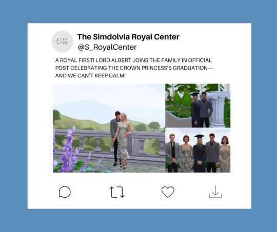
A ROYAL FIRST! LORD ALBERT JOINS THE FAMILY IN OFFICIAL POST CELEBRATING THE CROWN PRINCESS’S GRADUATION—AND WE CAN’T KEEP CALM!
15 June 2018
Royal watchers, history has just been made—and we’re obsessed! The Royal Family’s official social media account shared a heartwarming post celebrating Crown Princess Victoria’s graduation, but what really has everyone talking is the unexpected—and unprecedented—inclusion of Lord Albert Saxe-Gotha in the official family social post.

Yes, you read that right! Standing proudly alongside Their Majesties The King and Queen, and Princess Alexandra was none other than Lord Albert, looking every bit the part of a trusted companion and, dare we say, future royal consort?
This move is nothing short of groundbreaking. The Royal Family’s communications team is notoriously selective when it comes to their official posts, especially those marking significant milestones. So the decision to include Lord Albert—who was recently revealed as the Crown Princess’s romantic partner—sends a clear message: Albert isn’t just a fleeting figure in Victoria’s life; he’s part of the inner circle.


We also obtained a candid photo of the Princess and the dashing gentleman having a private moment before the ceremony.
Royal insiders are already buzzing about how unprecedented this is. Never before has a non-married partner of a senior royal been included in such an official and intimate family moment. And while the Palace has yet to issue a formal statement on the relationship, this carefully curated photo seems to say it all without a single word.
It’s no secret that Lord Albert has grown close to the family, especially after being seen laughing and chatting comfortably with The King and Queen during the recent Royal Navy Honours (where, let’s not forget, he was an honoree and shared a private moment with Victoria!). But this? This is next level.
The photos has already sparked waves of excitement, with many speculating that the Royal Family’s subtle move could be paving the way for something even bigger—an engagement, perhaps? Could this be the soft launch of Lord Albert as the future Prince Consort? Because if this post is anything to go by, the Palace is giving a quiet nod of approval to this royal romance.
One thing’s for sure—this isn’t just another photo. It’s a statement. And we’ll be right here, waiting for the next chapter in this royal love story!
What do you think, royal watchers? Is this the modern fairy tale we’ve all been waiting for? Drop your thoughts below! 👑💞✨
Yours truly,
The SRC Team <3
#the simdolvia royals#the saxe-coburg#royal sims 4#royal simblr#simdolvia#ts4 royal legacy#ts4 legacy#sims 4#ts4 simblr#ts4 royals
2 notes
·
View notes
Text
Asian Wedding Photography and Videography: Blending Tradition with Modernity
Introduction
In the vibrant tapestry of cultural celebrations, few events hold as much significance as weddings. For many, these moments are not only a union of two individuals but also a celebration of heritage, family ties, and cultural legacies. This is especially true within Asian communities, where traditional customs intertwine seamlessly with contemporary practices. As we delve into Asian Wedding Photography and Videography: Blending Tradition with Modernity, we'll explore how Birmingham wedding photographers and West Midlands wedding photographers capture the essence of these unique celebrations.
The art of wedding photography has evolved dramatically over the years. No longer confined to static poses and formal group shots, modern photography embraces spontaneity, emotion, and storytelling. In this article, we will discuss various aspects of Asian wedding photography and videography that reflect both age-old traditions and modern innovations.
Asian Wedding Photography: What Sets It Apart? Cultural Significance in Photography
Asian weddings often feature rich traditions that vary by community—Hindu, Sikh, Muslim, Chinese, and more. Each culture has unique rituals that deserve to be captured authentically. Photographers specializing in Asian wedding photography Birmingham understand the importance of these customs and strive to encapsulate their essence through their lenses.
youtube

Storytelling Through Images
Rather than merely documenting events as they https://www.google.com/localservices/prolist?src=2&q=Ikonic%20Media%20Solutions%20Wedding%20Photography%207%20Vicarage%20Rd%2CWednesbury%2CWS10%209DW unfold, skilled photographers aim to tell a story through their images. This narrative approach allows couples to relive their special day long after it has passed. By capturing candid moments alongside traditional ceremonies, photographers create a comprehensive visual diary.
Utilizing Natural Light
One hallmark of expert wedding photographers is their ability to utilize natural light effectively. In an Asian wedding context filled with vibrant colors and intricate details, natural lighting can enhance the beauty of photographs significantly. Many Birmingham wedding photographers prioritize outdoor shoots during golden hour for that perfect glow.
The Role of Videography in Asian Weddings Capturing Movement and Emotion
While photography freezes moments in time, videography offers a dynamic way to experience emotions. A well-crafted wedding video can transport viewers back to the day’s joyous laughter or heartfelt tears. Hiring a dedicated wedding videographer ensures that no precious moment goes uncaptured.
Incorporating Cultural Performances
Many Asian weddings involve live performances like dance or destination wedding photographer music. A talented videographer captures these moments with precision, allowing families to relive the excitement for years to come. The interplay between audio-visual elements makes these recordings invaluable keepsakes.
Pre-Wedding Events: Engagement Photo Shoot The Importance of Engagement Shoots
Before the big day arrives, many couples opt for an engagement photo shoot—a chance to showcase their personalities together while celebrating their love story. These sessions provide couples with stunning images they
1 note
·
View note
Text
Responsive Typography
Responsive Typography: A Comprehensive Guide
The digital age, where content is consumed on a myriad of devices, typography plays a pivotal role in delivering an optimal user experience. Responsive typography ensures that text remains legible and aesthetically pleasing regardless of screen size or device. This article delves into the core principles, tools, and best practices of responsive typography.
What is Responsive Typography?
Responsive typography is a design approach that adjusts font sizes, line heights, letter spacing, and other typographic elements dynamically based on the screen size, resolution, and user preferences. The goal is to ensure that text is easy to read and visually harmonious across different devices, from smartphones to large desktop screens.
Key Principles of Responsive Typography
1. Scalability
Typography should scale seamlessly across different screen sizes. Techniques like relative units (e.g., em, rem, or percentages) help achieve this scalability.
2. Readability
The primary purpose of typography is to convey information. Responsive typography prioritizes legibility by adjusting font size, line spacing, and alignment for different screen sizes.
3. Flexibility
The design should accommodate a variety of content types and layouts. Flexible typographic systems adapt to changes in screen orientation and dynamic content updates.
Techniques for Implementing Responsive Typography
1. Use Relative Units
Relative units like em and rem enable text to scale based on the root font size or its parent container. This flexibility is critical for maintaining consistency across devices.html { font-size: 16px; } body { font-size: 1rem; /* Equals 16px */ } h1 { font-size: 2.5rem; /* Equals 40px */ }
2. Media Queries
Media queries allow designers to apply specific styles based on the screen size. This technique can be used to adjust typography for different devices.@media (max-width: 768px) { body { font-size: 0.875rem; /* Smaller font size for smaller screens */ } }
3. Fluid Typography
Fluid typography scales text size dynamically between a defined range of viewport sizes using CSS clamp or viewport-relative units (vw, vh).h1 { font-size: clamp(1.5rem, 5vw, 3rem); /* Scales between 1.5rem and 3rem */ }
4. Line Length and Spacing
Optimal line length and spacing are critical for readability. Aim for 45-75 characters per line and adjust line-height (leading) appropriately.body { line-height: 1.6; max-width: 70ch; /* Limits line length to 70 characters */ }
5. Variable Fonts
Variable fonts allow for dynamic adjustments to weight, width, and other properties, enabling finer control over typography.@font-face { font-family: "Inter"; src: url("Inter-VariableFont.woff2") format("woff2"); font-weight: 100 900; } body { font-family: "Inter", sans-serif; font-variation-settings: "wght" 400; }
Tools for Responsive Typography
Google Fonts: Offers a vast library of web-safe and responsive fonts.
Modular Scale Calculator: Helps establish harmonious font size hierarchies.
Font Squirrel: A resource for free, high-quality fonts with web-safe options.
Best Practices for Responsive Typography
Test Across Devices: Ensure your typography looks good on various devices, from mobile phones to 4K monitors.
Prioritize Accessibility: Use sufficient contrast ratios and scalable font sizes to enhance readability for all users.
Establish a Typographic Hierarchy: Clearly differentiate headings, subheadings, and body text.
Minimize Font Variations: Limit the number of fonts and weights to reduce load times and maintain visual consistency.
Embrace White Space: Proper spacing enhances readability and reduces visual clutter.
Conclusion
Responsive typography is an essential aspect of modern web design, ensuring that content is accessible and visually appealing across all devices. By leveraging techniques like relative units, media queries, and variable fonts, designers can create scalable and user-friendly typographic systems. Prioritize readability and accessibility to deliver a seamless experience for all users, regardless of their device.
0 notes
Note
[ src. ] ✔
( with romeo from any of your LoP muses [or just P lol] )
[ easy plotting ; ACCEPTING ]


My muses: the LoP gang, Karl :)
Do I know your muse(s): yes* | no | a little | tell me about your muse * when it comes to Romeo ofc, which I assume you sent the meme for ♥
NOTE: I know plenty about the chocobros, but the rest I know close to nothing about the other muses, with little hints of Knowledge of Sarah ( bc of the FFXV crossover ) and Gundham
Setting: our verse | my verse | your verse | modern | alternate universe ( for Karl's LoP AU ) | other
Pre-established relationships? yes | no | depends on the relationship
Possible relationships: friends ( the Hotel gang ) | classmate | co-worker ( Karl & P ) | roommate ( P ) | family, real or adopted ( P, Venigni ) | dating or blind date | married | friends with benefits | unrequited love | lending a hand ( the Hotel Gang ) | teacher - student ( maybe w Eugènie? ) | rivals | allies | partner-in-crime ( P, Karl ) | enemies ( eventually Karl I think, Bonnie, gameverse P ) | protecter - guarded ( P, Venigni ) | business partners | spy - infiltrated | manipulator - manipulated | star-crossed ( P ig vfnadfd ) | first meeting ( Bonnie ) | other: I do think Antonia at least knew of Romeo bc of Carlo, and Venigni had a big respect for the King before gameverse
I’m in the mood for: fluff | angst | horror | romance? | humor | crime | hurt / comfort | action | supernatural | slice of life | crack | dark threads | light threads | any genre | multi-para | shorter para | one-line | any length | plotted threads | unplotted threads | other
Feel free to: message me ooc | message me ic | tell me your ideas | write a starter | answer one of my opens | send a meme | reblog this with your preferences - let’s find common interests!
1 note
·
View note
Text
REBLOGS: 1- SHORT FILM: THIS TIME AWAY (2019) -2- ART: Art of Movement -3-FILM: The Way, Way Back (2013) (1197)

Nigel is an elderly man living as a recluse, haunted by his past and memory of the family he once had, until an unexpected visitor arrives and disrupts his lonely routine.
Read: This Time Away: a succinct and heartwarming character study with a sting in its tail – Under Southern Eyes (edpinsent.com)
IMDb 7'3
youtube
1197-1 link https://youtu.be/RIKaRigsL44 source: great-shortmovies origin: Apr 8, 2021 Sci-Fi Short Film: “This Time Away” (2019) (Starring Timothy Spall)
ART: Art of Movement

source has been deleted: hauntedbystorytelling
A. Grinberg (?) :: Ornamental plastic pose, mid-1920s. Artist’s photographic print. Catalogue of the third “Art of Movement” exhibition, 1927, No. 277. OE | src Nicoletta Misler's The Russian Art of Movement 1920-1930 (see pdf book at: misler_estratto1_0.pdf (nieuweinstituut.nl)

An art movement is a tendency or style in art with a specific art philosophy or goal, followed by a group of artists during a specific period of time, (usually a few months, years or decades) or, at least, with the heyday of the movement defined within a number of years. Art movements were especially important in modern art, when each consecutive movement was considered a new avant-garde movement. Western art had been, from the Renaissance up to the middle of the 19th century, underpinned by the logic of perspective and an attempt to reproduce an illusion of visible reality (figurative art). By the end of the 19th century many artists felt a need to create a new style which would encompass the fundamental changes taking place in technology, science and philosophy (abstract art). Read more at: Wikipedia

The art of movement refers to the way artists convey action and energy within their work. It involves utilizing elements such as line, shape, color, texture, space, and value to create a visual representation of physical motion. Essentially, it captures the dynamic essence of a moment in art. (AI Copilot)

The Way, Way Back is a 2013 American coming-of-age comedy-drama film written and directed by Nat Faxon and Jim Rash in their directorial debuts.

Anna Sophia Robb (20) in The Way, Way Back (2013)
The story is about Duncan, an introverted 14-year-old who goes on summer vacation to Wareham, Massachusetts with his mother and her overbearing boyfriend.
1197-2 link https://ok.ru/video/6670609353464
#1197#SHORT FILM#THIS TIME AWAY#2019#ART#Art of Movement#FILM#The Way Way Back#Way Back#2013#2024-09-28
0 notes
Text
Arthur: I'll spend some father-daughter time with Nia, and you can spend the afternoon with Aeren. Svea: Aww, that's so sweet, you can take her to her baby class. Arthur: I think she already knows how to be a baby. Svea: I love you, but I can't laugh at that again.
#t: incorrect quotes#src: modern family#ch: arthur ayers#ch: svea sauvageon#ch: aeren sauvageon#ch: nia sauvageon#gossip witch#cc: clara#all: oc memes
7 notes
·
View notes
Text
Pressure cooker 5 litre

Pressure cooker 5 litre A 5 litre pressure cooker is an essential kitchen gadget for quick, energy-efficient cooking. This size is perfect for medium-sized families, offering the flexibility to cook a wide range of dishes, from stews and soups to rice and beans. Pressure cookers work by creating a high-pressure environment inside the pot, significantly reducing cooking times while preserving nutrients and flavors. Many models come with safety features such as locking lids and pressure release valves, ensuring safe use. They are also available in various materials, including stainless steel and aluminum, catering to different cooking preferences and needs. alt="A modern 5 litre pressure cooker" src="https://ae01.alicdn.com/kf/Se041d1a389c644c7971157c74010eb57j.jpg" />
Key Features and Benefits
Efficient cooking reduces time using high pressure > Saves energy by cooking faster > Versatile - suitable for a variety of dishes > Enhances flavors, preserving nutrients > Features safety mechanisms for secure use > Available in stainless steel and aluminum materials >
src="https://ae01.alicdn.com/kf/Sed53d8fe99f343a8af1244a0175138a5s.jpg" alt="Stainless Steel Pressure Cooker" /> 4-11L Ultra-Durable Stainless Steel Pressure Cooker Kitchen Pressure Pot 80Kpa High Pressure Cooking Rice Cooker > href="#product-4597d76a-c8c3-4ab7-a0c2-e089db5fedce" > src="https://ae01.alicdn.com/kf/Se041d1a389c644c7971157c74010eb57j.jpg" alt="Aluminum Alloy Large-Capacity Pressure Cooker" /> Aluminum Alloy Large-Capacity Pressure Cooker Gas Cooker Can Use Explosion-Proof Pot Home Cooking Utensils 5-18L > href="#product-4597d76a-c8c3-4ab7-a0c2-e089db5fedce" > src="https://ae01.alicdn.com/kf/S7708e7ca518743d89b82e53dec5c2b7eB.jpg" alt="Aluminum Stovetop Pressure Cooker, 6 Quart" /> Aluminum Stovetop Pressure Cooker, 6 Quart Safe, Durable, Easy To Clean > href="#product-4597d76a-c8c3-4ab7-a0c2-e089db5fedce" > src="https://ae01.alicdn.com/kf/Sb9d6ba57d5a741b29522ca63bbae287bN.jpg" alt="Portable Pressure Cooker" /> Outdoor Camping Pressure Cooker 1.6L/2L Pressure Cooker Outdoor Camping Portable Micro Pressure Cooker Household 304 Stainless Steel 5-minute Quick Cooking Pot > href="#product-4597d76a-c8c3-4ab7-a0c2-e089db5fedce" > src="https://ae01.alicdn.com/kf/S8d209f1be4ee4593be78c38b540ecc53I.jpeg" alt="6-Quart Aluminum Stovetop Pressure Cooker, 15 PSI" /> 6-Quart Aluminum Stovetop Pressure Cooker 15 PSI High-Pressure Capability for Efficient Cooking > href="#product-4597d76a-c8c3-4ab7-a0c2-e089db5fedce" > src="https://ae01.alicdn.com/kf/S92bd29931572467ca109b804c9b67305o.jpg" alt="304 stainless steel rice cooker inner container" /> 304 Stainless Steel Non-Stick Rice Cooker Inner Pot Non-stick cooking pot replacement accessories for higher cooking efficiency and easier cleanup. > href="#product-4597d76a-c8c3-4ab7-a0c2-e089db5fedce" > src="https://ae01.alicdn.com/kf/S7708e7ca518743d89b82e53dec5c2b7eB.jpg" alt="Aluminum Stovetop Pressure Cooker, 6 Quart" />
Aluminum Stovetop Pressure Cooker, 6 Quart, Safe, Durable, Easy To Clean
View More >Pros > Safe and durable design Easy to clean Efficient cooking >Cons > Requires careful handling when pressurized May not be compatible with all stovetops This 6-quart aluminum stovetop pressure cooker combines durability with easy maintenance. It's designed to offer safe and efficient cooking, leveraging the benefits of pressure cooking to prepare meals faster while preserving nutrients. Its easy-to-clean feature ensures it remains a practical choice for any kitchen. >Material > Aluminum >Capacity > 6 Quart >Features > Safe, Durable, Easy to Clean src="https://ae01.alicdn.com/kf/S8d209f1be4ee4593be78c38b540ecc53I.jpeg" alt="6-Quart Aluminum Stovetop Pressure Cooker, 15 PSI" />
6-Quart Aluminum Stovetop Pressure Cooker, 15 PSI
View More >Pros > Efficient cooking with 15 PSI Durable aluminum construction Suitable for a variety of recipes >Cons > Requires careful handling due to high pressure Not suitable for induction cooktops This 6-Quart Aluminum Stovetop Pressure Cooker is designed for fast, efficient cooking at 15 PSI, making it a great addition to any kitchen. It's suitable for preparing a variety of dishes, ensuring meals are cooked to perfection. However, its users need to handle it with care due to the high pressurization, and it's not compatible with induction cooktops. >Material > Aluminum >Capacity > 6 Quarts >Pressure > 15 PSI src="https://ae01.alicdn.com/kf/Se041d1a389c644c7971157c74010eb57j.jpg" alt="Aluminum Alloy Large-Capacity Pressure Cooker" />
Aluminum Alloy Large-Capacity Pressure Cooker Gas Cooker Can Use Explosion-Proof Pot Home Cooking Utensils 5-18L
View More >Pros > Large capacity suitable for family use Explosion-proof design for safety Compatible with gas cookers >Cons > May be too large for small households Requires careful handling to ensure safety This Aluminum Alloy Large-Capacity Pressure Cooker is an essential kitchen utensil for those who love cooking at home. Its large capacity, ranging from 5 to 18 liters, makes it perfect for preparing meals for the whole family. The explosion-proof design adds an extra layer of safety, making it a reliable choice for your cooking needs. Compatible with gas cookers, this pressure cooker is a versatile tool for various cooking methods. >Material > Aluminum Alloy >Capacity > 5-18 liters >Safety Feature > Explosion-proof design src="https://ae01.alicdn.com/kf/Sed53d8fe99f343a8af1244a0175138a5s.jpg" alt="4-11L Ultra-Durable Stainless Steel Pressure Cooker" />
4-11L Ultra-Durable Stainless Steel Pressure Cooker Kitchen Pressure Pot 80Kpa High Pressure Cooking Rice Cooker
View More >Pros > Ultra-durable stainless steel construction High pressure 80Kpa for faster cooking Versatile use from cooking rice to tenderizing meats >Cons > Requires careful handling due to high pressure May be intimidating for new users This 4-11L Ultra-Durable Stainless Steel Pressure Cooker is an excellent addition to any kitchen needing to save time while cooking. Its 80Kpa high pressure capability allows for faster cooking times, ensuring dishes are prepared efficiently and retaining their nutrients and flavors. Whether you are preparing rice, stewing meat, or cooking vegetables, this pressure cooker's versatility and durability make it an essential kitchen tool. >Capacity > 4-11 liters >Material > Stainless Steel >Pressure Level > 80Kpa src="https://ae01.alicdn.com/kf/S92bd29931572467ca109b804c9b67305o.jpg" alt="304 stainless steel rice cooker inner container" />
304 stainless steel rice cooker inner container Non stick Cooking Pot Replacement Accessories kitchen food Rice Cooker liner
View More >Pros > Durable 304 stainless steel material Non-stick surface for easy cleaning Compatible with multiple rice cooker models >Cons > May not fit all rice cooker sizes exactly Initial metallic taste may be present Upgrading your rice cooker with a 304 stainless steel inner container not only ensures longevity but also enhances cooking performance. Its non-stick surface simplifies clean-up, making it an ideal replacement or upgrade. Ensure compatibility with your cooker's size for optimal results. >Material > 304 Stainless Steel >Feature > Non-stick >Compatibility > Various Rice Cookers src="https://ae01.alicdn.com/kf/Sb9d6ba57d5a741b29522ca63bbae287bN.jpg" alt="1.6L/2L Pressure Cooker Outdoor Camping Portable Micro Pressure Cooker Household 304 Stainless Steel 5-minute Quick Cooking Pot" />
1.6L/2L Pressure Cooker Outdoor Camping Portable Micro Pressure Cooker Household 304 Stainless Steel 5-minute Quick Cooking Pot
View More >Pros > Portable design perfect for outdoor activities Made from durable 304 stainless steel Quick cooking time of 5 minutes >Cons > Smaller capacity may not be suitable for larger groups May require adjustment to cooking times for certain recipes This compact and portable pressure cooker is a must-have for outdoor enthusiasts who don't want to compromise on the quality of their meals while on the move. With its quick cooking capability and the strength of 304 stainless steel, it ensures a hearty meal is just minutes away. Whether it’s for camping, hiking, or any outdoor adventure, it combines practicality with efficiency to make outdoor cooking a breeze. >Capacity > 1.6L/2L >Material > 304 Stainless Steel >Cooking Time > 5-minute Quick Cooking > Pressure cooker 5 litre Pressure cookers have become an indispensable kitchen appliance for preparing quick and nutritious meals. A 5-litre pressure cooker is particularly well-suited for small to medium-sized families, allowing for the preparation of a wide range of dishes. From cooking beans, stews, and soups to steaming vegetables and even baking cakes, this versatile tool can dramatically reduce cooking time and energy consumption. Many modern 5-litre pressure cookers come with safety features such as locking lids, pressure indicators, and automatic pressure release systems, making them safer and easier to use than ever before. Ideal size for small to medium-sized families Reduces cooking time and energy consumption Versatile use from beans to baking cakes Equipped with modern safety features Enhances flavors and retains nutrients When considering purchasing a 5-litre pressure cooker, it's important to choose a model that suits your cooking needs and preferences. Look for cookers that offer multiple pressure settings for different types of dishes. Some models also come with additional accessories like steaming baskets or racks, which can expand your cooking repertoire. Cleaning and maintenance are other factors to consider; many modern pressure cookers feature detachable parts that are dishwasher safe, simplifying the cleanup process. Ultimately, a 5-litre pressure cooker can be a valuable addition to your kitchen, offering a convenient and efficient way to prepare healthy meals. Read the full article
0 notes
Text
A Web e os navegadores estão evoluindo rapidamente! Muitas otimizações que fizemos há alguns anos estão desatualizadas ou não são recomendadas. A entrega do Google Fonts para obter desempenho máximo também mudou recentemente à medida que os navegadores implementaram novos recursos. Já escrevi uma postagem no blog sobre como otimizar o Google Fonts. Esta postagem é especificamente sobre por que você deve hospedar o Google Fonts por conta própria. Leia também Argumentos de desempenho desatualizados Argumento: os navegadores já terão o Google Fonts armazenado em cache Quando você incorpora uma fonte do Google, ele primeiro baixa um arquivo CSS de “fonts.googleapis.com” e, em seguida, baixa os arquivos de fontes mencionados nesse arquivo CSS de “fonts.gstatic.com”. Apenas os arquivos de fontes baixados de “fonts.gstatic.com” têm um período de cache de 1 ano. O arquivo CSS principal tem apenas 24 horas de vida útil do cache. “Os navegadores já terão Google Fonts em cache”, sim, mas para servir essa fonte em cache, o navegador precisa baixar um arquivo CSS a cada 24 horasisso também bloqueia a renderização na maioria dos sites! Se isso não te convenceu o suficiente, aqui está mais um 😉. Novo “particionamento de cache” em navegadores para privacidade O Chrome e o Safari implementaram algo chamado “Particionamento de cache” ou “cache de chave dupla”. Em palavras simples, os arquivos armazenados em cache pelo site A não estarão disponíveis para o site B. Quando um site A baixa um recurso de “example.com/script.js”, armazena-o em cache e outro site B tentar baixar o mesmo arquivo, terá que baixá-lo novamente. Portanto, uma fonte do Google baixada por um site não estará disponível para outro site no cache do navegador. Nos bastidores, o navegador usa uma chave para armazenar arquivos em cache. Normalmente, a chave do cache é a URL do arquivo. Mas com o particionamento de cache, a URL do site que solicitou o arquivo também é incluída na chave de cache. Sem particionamento de cache Com particionamento de cache Você pode ler mais sobre particionamento de cache no Chrome aqui: Ganhar segurança e privacidade particionando o cache. Implementação de particionamento de cache no navegador ✅ Chrome: desde v86 (outubro de 2020) ✅ Safári: desde 2013 🚫 Firefox: a partir da v85 (janeiro de 2021) Navegadores como Edge, Opera, Brave usam o mecanismo Chromium, então espere esse recurso em outros navegadores em breve. Além disso, observe que Somente o Chrome e o Safari têm uma participação de mercado de aproximadamente 80% em navegadores. Argumento: o Google Fonts oferece fontes otimizadas com base no dispositivo/navegador Sim, o Google oferece fontes diferentes com base no agente do usuário. Mas contanto que você entregue o Google Font auto-hospedado em No formato “woff2”, você tem como alvo aproximadamente 96% dos navegadores. Apenas o Internet Explorer e o Opera Mini não suportam “woff2”. Nesse caso, você pode adicionar “eot” como alternativa e ainda obtenha todas as vantagens da auto-hospedagem. Aqui está o código de exemplo: @font-face font-family: 'Poppins'; font-style: normal; font-weight: 400; src: url('../fonts/poppins-v15-latin-regular.eot?#iefix') format('embedded-opentype'), /* IE6-IE8 */ url('../fonts/poppins-v15-latin-regular.woff2') format('woff2'), /* Super Modern Browsers */ Argumento: Google CDN é mais rápido Se o seu site tiver uma boa hospedagem ou tiver CDN e tiver HTTP/2 habilitado, a auto-hospedagem terá um desempenho melhor do que o Google CDN. Porque o navegador não precisa fazer pesquisas extras de DNS, handshakes SSL, etc. e reutilizar a conexão HTTP/2 existente. Quando você auto-hospeda e insere o Google Fonts, o navegador pode começar a baixar a fonte imediatamente após receber o primeiro HTML. Você também pode aproveitar a funcionalidade de pré-carregamento. Sia Karamalegos
escreveu um ótimo post sobre como comparar a diferença: Tornando as fontes do Google mais rápidas⚡. Sem auto-hospedagem Com auto-hospedagem É legal auto-hospedar fontes do Google? "Sim. As fontes de código aberto no catálogo do Google Fonts são publicadas sob licenças que permitem seu uso em qualquer site, seja ele comercial ou pessoal.” Fontes do Google – Perguntas frequentes Na verdade, o próprio Google recomenda a auto-hospedagem do Google Fonts para controle completo, como o pré-carregamento. É mencionado em um de seus vídeos no YouTube: Como auto-hospedar fontes do Google no WordPress Meu Deus, meu Deus O plugin pode auto-hospedar Google Fonts. Mas achei difícil de usar. Temos que pesquisar as fontes ou detectar automaticamente abrindo as páginas manualmente. Se você estiver usando FlyingPress, ative “Otimizar fontes do Google”. Ela cuidará da auto-hospedagem, combinação e tudo mais para você! Leitura adicional O novo sistema de ‘particionamento de cache’ do Chrome afeta o desempenho do Google Fonts Tornando as fontes do Google mais rápidas⚡ Diga adeus ao cache de recursos em sites e domínios É hora de dizer adeus às fontes do Google
0 notes
Photo


A sculpture titled 'Joy of the Family (Modern Minimalist Abstract statue)' by sculptor John Brown. In a medium of Bronze Resin and in an edition of /12.
2 notes
·
View notes
Text
A Web e os navegadores estão evoluindo rapidamente! Muitas otimizações que fizemos há alguns anos estão desatualizadas ou não são recomendadas. A entrega do Google Fonts para obter desempenho máximo também mudou recentemente à medida que os navegadores implementaram novos recursos. Já escrevi uma postagem no blog sobre como otimizar o Google Fonts. Esta postagem é especificamente sobre por que você deve hospedar o Google Fonts por conta própria. Leia também Argumentos de desempenho desatualizados Argumento: os navegadores já terão o Google Fonts armazenado em cache Quando você incorpora uma fonte do Google, ele primeiro baixa um arquivo CSS de “fonts.googleapis.com” e, em seguida, baixa os arquivos de fontes mencionados nesse arquivo CSS de “fonts.gstatic.com”. Apenas os arquivos de fontes baixados de “fonts.gstatic.com” têm um período de cache de 1 ano. O arquivo CSS principal tem apenas 24 horas de vida útil do cache. “Os navegadores já terão Google Fonts em cache”, sim, mas para servir essa fonte em cache, o navegador precisa baixar um arquivo CSS a cada 24 horasisso também bloqueia a renderização na maioria dos sites! Se isso não te convenceu o suficiente, aqui está mais um 😉. Novo “particionamento de cache” em navegadores para privacidade O Chrome e o Safari implementaram algo chamado “Particionamento de cache” ou “cache de chave dupla”. Em palavras simples, os arquivos armazenados em cache pelo site A não estarão disponíveis para o site B. Quando um site A baixa um recurso de “example.com/script.js”, armazena-o em cache e outro site B tentar baixar o mesmo arquivo, terá que baixá-lo novamente. Portanto, uma fonte do Google baixada por um site não estará disponível para outro site no cache do navegador. Nos bastidores, o navegador usa uma chave para armazenar arquivos em cache. Normalmente, a chave do cache é a URL do arquivo. Mas com o particionamento de cache, a URL do site que solicitou o arquivo também é incluída na chave de cache. Sem particionamento de cache Com particionamento de cache Você pode ler mais sobre particionamento de cache no Chrome aqui: Ganhar segurança e privacidade particionando o cache. Implementação de particionamento de cache no navegador ✅ Chrome: desde v86 (outubro de 2020) ✅ Safári: desde 2013 🚫 Firefox: a partir da v85 (janeiro de 2021) Navegadores como Edge, Opera, Brave usam o mecanismo Chromium, então espere esse recurso em outros navegadores em breve. Além disso, observe que Somente o Chrome e o Safari têm uma participação de mercado de aproximadamente 80% em navegadores. Argumento: o Google Fonts oferece fontes otimizadas com base no dispositivo/navegador Sim, o Google oferece fontes diferentes com base no agente do usuário. Mas contanto que você entregue o Google Font auto-hospedado em No formato “woff2”, você tem como alvo aproximadamente 96% dos navegadores. Apenas o Internet Explorer e o Opera Mini não suportam “woff2”. Nesse caso, você pode adicionar “eot” como alternativa e ainda obtenha todas as vantagens da auto-hospedagem. Aqui está o código de exemplo: @font-face font-family: 'Poppins'; font-style: normal; font-weight: 400; src: url('../fonts/poppins-v15-latin-regular.eot?#iefix') format('embedded-opentype'), /* IE6-IE8 */ url('../fonts/poppins-v15-latin-regular.woff2') format('woff2'), /* Super Modern Browsers */ Argumento: Google CDN é mais rápido Se o seu site tiver uma boa hospedagem ou tiver CDN e tiver HTTP/2 habilitado, a auto-hospedagem terá um desempenho melhor do que o Google CDN. Porque o navegador não precisa fazer pesquisas extras de DNS, handshakes SSL, etc. e reutilizar a conexão HTTP/2 existente. Quando você auto-hospeda e insere o Google Fonts, o navegador pode começar a baixar a fonte imediatamente após receber o primeiro HTML. Você também pode aproveitar a funcionalidade de pré-carregamento. Sia Karamalegos
escreveu um ótimo post sobre como comparar a diferença: Tornando as fontes do Google mais rápidas⚡. Sem auto-hospedagem Com auto-hospedagem É legal auto-hospedar fontes do Google? "Sim. As fontes de código aberto no catálogo do Google Fonts são publicadas sob licenças que permitem seu uso em qualquer site, seja ele comercial ou pessoal.” Fontes do Google – Perguntas frequentes Na verdade, o próprio Google recomenda a auto-hospedagem do Google Fonts para controle completo, como o pré-carregamento. É mencionado em um de seus vídeos no YouTube: Como auto-hospedar fontes do Google no WordPress Meu Deus, meu Deus O plugin pode auto-hospedar Google Fonts. Mas achei difícil de usar. Temos que pesquisar as fontes ou detectar automaticamente abrindo as páginas manualmente. Se você estiver usando FlyingPress, ative “Otimizar fontes do Google”. Ela cuidará da auto-hospedagem, combinação e tudo mais para você! Leitura adicional O novo sistema de ‘particionamento de cache’ do Chrome afeta o desempenho do Google Fonts Tornando as fontes do Google mais rápidas⚡ Diga adeus ao cache de recursos em sites e domínios É hora de dizer adeus às fontes do Google
0 notes