#Responsive Typography
Explore tagged Tumblr posts
Visit Tumblr Blog
Explore Tumblr blogs with no restrictions, modern design and the best experience.
Last Seen Tumblr Blogs


Fun Fact
US Tumblr user growth rate is estimated to slow down to 4.1%.
Text
Responsive Typography
Responsive Typography: A Comprehensive Guide
The digital age, where content is consumed on a myriad of devices, typography plays a pivotal role in delivering an optimal user experience. Responsive typography ensures that text remains legible and aesthetically pleasing regardless of screen size or device. This article delves into the core principles, tools, and best practices of responsive typography.
What is Responsive Typography?
Responsive typography is a design approach that adjusts font sizes, line heights, letter spacing, and other typographic elements dynamically based on the screen size, resolution, and user preferences. The goal is to ensure that text is easy to read and visually harmonious across different devices, from smartphones to large desktop screens.
Key Principles of Responsive Typography
1. Scalability
Typography should scale seamlessly across different screen sizes. Techniques like relative units (e.g., em, rem, or percentages) help achieve this scalability.
2. Readability
The primary purpose of typography is to convey information. Responsive typography prioritizes legibility by adjusting font size, line spacing, and alignment for different screen sizes.
3. Flexibility
The design should accommodate a variety of content types and layouts. Flexible typographic systems adapt to changes in screen orientation and dynamic content updates.
Techniques for Implementing Responsive Typography
1. Use Relative Units
Relative units like em and rem enable text to scale based on the root font size or its parent container. This flexibility is critical for maintaining consistency across devices.html { font-size: 16px; } body { font-size: 1rem; /* Equals 16px */ } h1 { font-size: 2.5rem; /* Equals 40px */ }
2. Media Queries
Media queries allow designers to apply specific styles based on the screen size. This technique can be used to adjust typography for different devices.@media (max-width: 768px) { body { font-size: 0.875rem; /* Smaller font size for smaller screens */ } }
3. Fluid Typography
Fluid typography scales text size dynamically between a defined range of viewport sizes using CSS clamp or viewport-relative units (vw, vh).h1 { font-size: clamp(1.5rem, 5vw, 3rem); /* Scales between 1.5rem and 3rem */ }
4. Line Length and Spacing
Optimal line length and spacing are critical for readability. Aim for 45-75 characters per line and adjust line-height (leading) appropriately.body { line-height: 1.6; max-width: 70ch; /* Limits line length to 70 characters */ }
5. Variable Fonts
Variable fonts allow for dynamic adjustments to weight, width, and other properties, enabling finer control over typography.@font-face { font-family: "Inter"; src: url("Inter-VariableFont.woff2") format("woff2"); font-weight: 100 900; } body { font-family: "Inter", sans-serif; font-variation-settings: "wght" 400; }
Tools for Responsive Typography
Google Fonts: Offers a vast library of web-safe and responsive fonts.
Modular Scale Calculator: Helps establish harmonious font size hierarchies.
Font Squirrel: A resource for free, high-quality fonts with web-safe options.
Best Practices for Responsive Typography
Test Across Devices: Ensure your typography looks good on various devices, from mobile phones to 4K monitors.
Prioritize Accessibility: Use sufficient contrast ratios and scalable font sizes to enhance readability for all users.
Establish a Typographic Hierarchy: Clearly differentiate headings, subheadings, and body text.
Minimize Font Variations: Limit the number of fonts and weights to reduce load times and maintain visual consistency.
Embrace White Space: Proper spacing enhances readability and reduces visual clutter.
Conclusion
Responsive typography is an essential aspect of modern web design, ensuring that content is accessible and visually appealing across all devices. By leveraging techniques like relative units, media queries, and variable fonts, designers can create scalable and user-friendly typographic systems. Prioritize readability and accessibility to deliver a seamless experience for all users, regardless of their device.
0 notes
Text

Responsible Fashion Agency
#Responsible Fashion Agency#timeless designs#sustainable practice#full-service boutique agency#Australia#New Zealand#fashion#industry#brands#typography#type#typeface#font#Akkurat#2023#Week 29#website#web design#inspire#inspiration#happywebdesign
3 notes
·
View notes
Text

"We made painting feel like typing, but we should have made typing feel like painting."
#freelance#web developer#digital#marketing#advertising#programming#digital marketing#webdesign#logo#interface design#app#ux#ui#web#user interface#user experience#typography#graphic design#interactive#digital art#social media#ai#mobile app#creative#art direction#branding#responsive design#WordPress
0 notes
Text
Color, Typography, and Beyond: The Building Blocks of Brand Identity
In today’s competitive marketplace, a well-defined brand identity is critical for businesses seeking to make a memorable impression. Among the essential elements of branding, color and typography play pivotal roles, shaping how consumers perceive and connect with a brand. This article explores "Color, Typography, and Beyond: The Building Blocks of Brand Identity," providing insights into how…
#best practices for brand management#Blocks#Brand#Branding strategies for small businesses#Building#building brand loyalty#business growth strategies#Color#corporate social responsibility#creating a strong brand identity#customer relationship management#digital marketing for startups#e-commerce tips for businesses#how to scale your business.#how to start a successful business#Identity#importance of social media for businesses#influencer marketing for brands#small business funding options#top business trends 2024#Typography
0 notes
Text
CSS Typography and Web Fonts - Chapter 2: Text layout properties
Chapter 2: Text layout properties
Chapter 2: Text layout properties
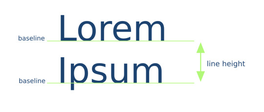
line-height
The CSS property line-height defines the height of a line frame. It's often used to set the spacing between lines of text.
...
The book is available on:
https://books.abdelfattah-ragab.com
— — — — — — — — — — — — — — — — — — — — — — — — — — -
Join our affiliate program to promote Angular and React courses.
You will only receive money when sales are made, and these should be through your link. Then you will receive 45% commission.
Sign up:
#angular #react #affiliate #commission
0 notes
Text
Introduction to Web Design Concepts for Beginners
For beginners in web design, it’s essential to grasp some foundational concepts that will set the stage for creating effective and visually appealing websites. Here are some key concepts to get started: Responsive Design Websites should be designed to provide an optimal viewing experience across a wide range of devices, from desktop computers to mobile phones and tablets. Responsive design…
View On WordPress
0 notes
Text


jQuery, jQuery Mobile, responsive single-page application (SPA) developed for mobile UX.
#jquery#responsivewebsite#responsivedesign#responsive web design company#responsive web development#ui ux development services#ui#ui ux design#uidesign#ux#user interface#design#ux desgin#icons#illustration#typography#graphic design#graphic art#layout#web graphics#htmlcoding#css#html5 css3#frontend#html css#code#html#html5#css3#Lynn Stanikmas
1 note
·
View note
Text
In Golden Flame v1.03
Major Changes
BEAT 22: The Hall of Mirrors now has two extra pages added in which it is possible to hold a conversation with CAUSTIC.
Added section in Running the Campaign: The Team (p. 61) regarding team backstories, including six new alternate backstories.
In keeping with major lore changes made to Act 2 (work still in progress), all references to the diasporan Kingdom Aniline have been retroactively removed. House Aniline is now a minor house of the House of Smoke.
Mechanical
COMBAT: A Face to a Name - the coolant pipe junctions are now in a line, and rupture in sequence. They can now also be intentionally triggered by characters shooting them.
COMBAT: Shoo the Vultures - removed Sentinel from 4-player lineup.
COMBAT: Silence the Guns - removed Rapid Response from Archer.
COMBAT: Silence the Guns - Bombard moved to 4-player lineup from 5-player lineup. Added High-Impact Shells.
COMBAT: Silence the Guns - Assault moved to 5-player lineup from 4-player lineup.
COMBAT: Silence the Guns - reactors can now explode.
COMBAT: Break the Line - added Assault Launcher to Lobber.
The Cult Influence clock did not specify how many ticks it should have. This has been rectified to 8.
Statistical
Corrected orbit distance of Impact Plaza from 357,000 km to 187,000 km. Some intern accidentally parked the station at the L4 LaGrange of the wrong moon, and has consequently been shoved out of an airlock.
Formatting
Reflowed parts of Running the Campaign: The Team (p. 61).
Reflowed combats to remove "The Battlefield" and "The Fight" section headers, ironically allowing more space for information about the battlefields and the fights.
Writing and Lore
A number of corrections in typography, spelling, grammar and formatting that, due to the fact that I started doing it way before I started making this changelog, will have to go unenumerated.
Decreased instances of the word "fuck" in Act 1 from 82 to 67, meaning I officially give 18.29% less of a fuck.
All references to "RA" by Valentinian children changed to "YMIR," to better reflect their dad's weird obsession.
Added more detail about outlander culture to ENCOUNTER: Ghost Town.
Added the worst line in the history of writing to COMBAT: Bad Star.
133 notes
·
View notes
Note
I want to know more about the guy who threw three tons of type into the Thames, please! Thank you!!
So first, thank you for this ask. I love talking about this guy, and you gave me an excuse to fact-check all of the absurd things I’ve learned about him over the past year or so and, as a result, learn even more absurd things about him. But oh man, where to start. So those tags were about a guy named Thomas James Cobden-Sanderson (often written about as T. J. Cobden-Sanderson, TJCS here for efficiency). He was an absolutely fascinating dude – quit like three or four different career paths before actually becoming a lawyer and just fucking hating it. He was hanging out with his buddy William Morris (yes, THAT William Morris*) lamenting his lack of satisfying work when Morris’s wife Jane (yes THAT Jane Morris**) suggested he try his hand at bookbinding. (Side note (there are going to be so many side notes): TJCS is the one who coined the name “Arts and Crafts” for the decorative arts movement that Morris basically founded, and TJCS was hugely influential in that circle as well.) He started a bookbinding apprenticeship and just kind of blew everyone away. He was crazy good at it much faster than he should have been, and he founded the Doves Bindery (named after the nearby pub, not the bird) with capital from his wife.
(The biggest side note: TJCS was a hard core Wife Guy, and Annie Cobden-Sanderson was insanely cool in her own right. She was a famous suffragette, was arrested and imprisoned for demonstrating in the lobby of parliament, and was an evangelist for vegetarianism. This whole post could be about her, actually. TJCS thought she was so cool that he took her name – he was T. J. Sanderson, she was Annie Cobden, and when they married, they both took the name Cobden-Sanderson. She went to the U.S. in the early 20th century to teach the suffragettes there what she had learned protesting in England, so I feel like she is in part responsible for my right to vote. Love her.)
Okay, but back to TJCS. Our very talented, very egotistical, very tempestuous little dude was Not Satisfied binding whatever books came in the door because he had big feelings about what the Ideal Book should be. To that end, he teamed up with printer and engraver Emery Walker, William Morris’s former partner at the Kelmscott Press (yes, THAT Kelmscott Press***) to found the Doves Press so that he could create the most beautiful books by printing only the most beautiful words. TJCS was the “visionary and fanatic” (his words) and Walker was the technician. TJCS commissioned a new typeface to be used exclusively by the Doves Press. It was based on some of the most beautiful typography ever created – the capitals based on Nicholas Jensen’s 15th century roman that’s still considered one of the standards of perfection in type design (if you’ve ever used Centaur or read a book set in it, that’s kind of the contemporary version of Jensen’s roman). The Doves Press was unexpectedly successful and it along with Kelmscott Press laid the foundation for what would be the fine press movement of the 20th century. The Doves Bindery now only bound Doves Press books, and if you have a local library or museum that has examples in their collection, it’s well worth the trip to go look at these books.

(The opening of Genesis from The Doves Bible, widely regarded as one of the most perfect books ever printed, image from Jonkers Rare Books.)
Of course, “tempestuous” and “egotistical” are not a great recipe for long and healthy partnerships, even when coupled with “very talented,” and TJCS and Walker had a mega falling out. TJCS was a perfectionist the level of which it is hard to overstate. Walker was… not. He was a printer. You printed your pages, and that was that; sometimes there were going to be errors. Also, he liked to make money. The Doves Type was widely regarded as the most beautiful typeface in existence, and there were lots of folks willing to pay to use it in their own printing pursuits like advertising and other commercial work. I’m sure you can imagine how well this went over with TJCS. After what seemed like endless fighting, a mutual friend, Sydney Cockerell****, suggested a compromise: TJCS would get exclusive use of the Doves Type for the rest of his life, but Emery Walker would own it and could do whatever he wanted with it once TJCS died. Walker figured this was the best he was going to get and agreed. TJCS agreed at the time, but as he got older, he got even more tempestuous and obsessive, and this is where the river comes in. Dude grabbed all of the matrices and punches (the stuff you would need to make more of the Doves Type) and literally threw it into the Thames. Fine, now the only Doves Type that exists is what’s in active use by the Doves Press. That was not good enough for our good friend and Weird Little Guy TJCS. No, in addition to throwing the matrices and punches into the river, he ALSO threw every last piece of type in the workshop into the river. This is fucking hilarious because it’s not like a print shop just has a few copies of the alphabet laying around. A working press (even a small one) like the Doves Press had literally more than a ton of type in the workshop. TJCS was so petty and so determined that only HE would ever get to use this type that he made almost TWO HUNDRED trips to Hammersmith Bridge to dump type in the river.
And the story doesn’t even end there! And I’m typing this alone on my couch instead of trying to retell the abridged version over drinks with friends, so guess what? You get the rest of the story too! The Doves Type is still to this day considered one of the most beautiful typefaces ever created, and I get to introduce you to another single-minded, obsessive little guy who REALLY REALLY wanted to create the most accurate digital facsimile possible of the Doves Type. His name is Robert Green, and at first he was just looking at the texts printed by the Doves Press and trying to recreate it from the printed pages themselves. He did a pretty good job. In his quest, read everything he could about TJCS and the Doves Press, including TJCS’s diaries. I’m not sure anyone before Green really took literally TJCS’s declaration that the type had been “dedicated & consecrated” to the river but Green sure did. He even figured out that TJCS’s bridge of choice must have been Hammersmith. And then he started digging around. Almost a hundred years after TJCS donated it to the Thames, Green found a piece of the Doves Type in the mud under Hammersmith Bridge. With help from Port of London Authority divers, more than one hundred and fifty pieces of the Doves Type were recovered, and Green was able to revise his facsimile based on actual specimens.
The absolutely insane consequence of this is that YOU, dear friend, can buy your own license to the Doves Type and use it for whatever unhinged purpose you can dream up. Whether your interests align with TJCS and you also want to create the Ideal Book, or you feel like typesetting your favorite shitpost, one of the most beautiful typefaces ever cut is at your disposal.
Feels a little silly to put the footnotes under the cut given how long this got, but we're running solely on vibes now, so here we go.
*Founding member of the Arts and Crafts movement, iconic designer, you definitely know who William Morris is. Or at least you've seen his wallpaper.

**Similarly, textile artist, muse and model for the painters of the Pre-Raphaelite Brotherhood and Arts and Crafts movement, you know who Jane Morris is.

***If you know Kelmscott press, it's likely because you know The Kelmscott Chaucer. It is widely considered one of the most beautiful books ever printed, and it's likely that you've seen images of its pages if your interests run bookish at all (and I kind of assume they do if you've managed to read this far).

****Okay, so I footnoted Sydney Cockerell mostly to talk about his younger brother, Douglas. You probably don't know who Douglas Cockerell was, but I think you should! The fine binding tradition in England is an incredibly vibrant community of artists, and many of them can trace their education directly to TJCS through his apprentice Douglas Cockerell. Cockerell quickly became a giant in the craft and trained a generation of bookbinders himself, notably Bernard Middleton, another deeply talented binder and teacher who taught many, including Dominic Riley, from whom I have been lucky enough to take classes.
#so this definitely got away from me#but yeah everyone loves to hear the story of the Weird Little Guy who tossed a literal ton of printers type into the Thames for spite#t. j. cobden-sanderson#william morris#jane morris#the doves press#bookbinding#letterpress#fine press#long post
40 notes
·
View notes
Text
it just makes me so sad that gifmakers will pour hours upon hours into crafting a gifset, overanalyzing every colouring and blending and typography decision to create pure art, which is so unique and creative, and the most the majority of users on this site can be bothered to do in response is hit the like button
#ah yes we're back here again#anyway i finally had some time on my hands to go through the full NYNF tag because i wanted to see what people had been making#and it's breathtaking#so much pure art there so much creativity#BUT what pissed me the fuck off was that the notes were so low???#and the likes to reblog ratios even more abismal#so many fandoms so much beauty and y'all can't even be bothered to share it#i love this site but damn it's killing it#what's the point in being creative if no one will share your work?
212 notes
·
View notes
Text
phoenix in aa5 is like I don’t really know who that is but it makes sense if u frame it like he’s in his millennial post-alcoholism posting typography pics saying “create positive vibes. stay stronger. you are not responsible for other people’s opinions of you.” mindframe like he truly went to h&m bought the greenwashed three piece gelled his hair and said new me! we’ve all been there.
12 notes
·
View notes
Text
trying not to be a huge asshole in the discord server over this. im very politely asking for the resources i need lots of please and thank you's. but.
like. she hasn't provided the logo image, which if she doesn't do all our layouts will come out with a grainy shitty logo. and her How To video is mostly just a rundown of basic indesign functions. and she hasnt given me access to the text i need to layout for this book so i don't even know if its a picture book or more text based or what.
and worst of all I just realized that the page numbers??? the page numbers arent ACTUAL RESPONSIVE PAGE NUMBERS. THEY'RE MANUAL. SHE JUST PUT IN LITTLE NUMBERS AND WENT THATS PROBABLY FINE. its NOT FINE.
does she even know how a parent page WORKS does she even know to actually do page numbers? you learn that like at the end of typography 1 !!!! which she had to have passed by this point because its nearing the second semester!!
girls how do you politely ask to take over someone's entire job. she's doing it wrong.
13 notes
·
View notes
Note
I NEED MATTY PROPOSING TO ESTE AND/OR THEIR WEDDING I BEG 🙏🙏
Dedication

The proposal
1420 words
—
a/n: thank u sm for this request bc i loved dreaming this up !!! also slightly inspired by charli and george’s little tea tray bc that broke my heart. wedding blurb may come in the future but for now here's the proposal :))) anyway sorry if this is bad i haven’t written in like over a month😭😭 but i kind of love it so enjoy lmfao love u
Read the main fic here!
—
It’s late in the evening, the summer sun is dim and almost hidden by the horizon. An orange and pink and lilac sky surrounds the mosquitoes that buzz about. Este sits at the small table in their backyard and lights a citronella candle to stop them from nipping at her. It makes the air smell like fond August memories.
She can hear Matty shuffling around the kitchen as he makes the two of them cups of tea. He’s been out at the studio most of the evening, so they ate dinner separately. On nights like these, they almost always share sweet and lazy conversations over a brew afterwards, to make up for that missed time. Their sometimes foggy minds or tense muscles need a way to find solace before resting each night—and Matty and Este find that in each other.
The glass doors reopen to reveal Matty and the two mugs. He had a book tucked under his arm, too.
“Thank you, love,” Este says after he sets hers down. The table is small and round and flush against the concrete wall, so he sits on the left and her on the right. They lean against the house with their teas between them and peer at the sunset, taking leisurely sips.
He hums in response to say ‘you’re welcome’ wordlessly. Then, he hands the book over to Este. “Got you something while I was out.”
Once it’s in her hands, she recognises it to be a copy of And Our Faces, My Heart, Brief as Photos by John Berger. It makes her smile since it’s a favourite of hers. Este had never seen the cover design before.
“Is this a new edition?” She asks, admiring its colours and typography and the way they perfectly align with her taste.
Her eyes break contact with the book to look up at Matty, who gives a nonchalant shrug.
“Not sure,” He says, “Maybe the inside cover will say.”
Matty’s right; the publication information is typically listed within the first few pages. She has to flip and find it quite often for work. Este likes his suggestion, a smile still pinned on her face from the nice surprise as she opens it up to feel its pages. They feel thick and durable and have rough, haphazard edges.
She drags her fingers over them to appreciate their character, then flips past the first page that reads its title, and sets her eyes onto the small text on the opposite side. Before they find any answers Este is looking for, they settle on another��much more important—spectacle. It makes her heart stop. The dedication. She stares at it in shock.
The book is one she’s reread plenty of times, so she remembers John Berger’s small blurb that formally thanks some institutions and few people who helped him put together the prose to follow. But it doesn’t say that. Instead, it reads,
For my Este. I’d like to make you my wife if you’ll let me.
Matty’s knee shakes from the other side of the table. He watches her mouth fall agape and smiles nervously. He isn’t sure why the nerves are there, since he’s never been so sure of anything in his life. But they race through Matty’s body as he waits for her to say something.
He slides the ring in an open velvet box across the table to her when she finally looks up.
“Are you fucking joking?” Este’s voice quivers.
She can tell there are words threatening to spill from his tongue and every emotion possible washes over her when she imagines how beautiful the words will be. She has to stop herself from jumping out of her seat and tackling him in excitement and pure adoration.
Tears well up in the corner of her eyes at the expense of those thoughts swirling in her mind and Matty reaches over to wipe one away when it escapes. He does the same to his own when they eventually fall. More rush down her cheek when Este realises that he’s crying too, but of course he is.
“Course I’m not joking,” he starts, voice equally as weak. “There are a million ways I could explain how much I love you and why I am so desperate to marry you, but one that feels so authentic to us is with this. This book is so special. Not only because I know how much you love it—that’s the reason I read it in the first place—but also because it sort of changed me,”
Este reaches across the table to set her hand over his and rub her thumb back and forth against his skin.
“When I was falling in love with you, so much of that time was spent away from you. It was the busiest year of my life. And in moments—not in doubt, but just in fear of tainting how significant your love was to me—I considered that to be an opportunity for weakness to grow. That maybe one day, that distance could wedge between us. But when I read this, it showed me just how important every aspect of those times are. The far and close. It says,”
‘When you are away, you are nevertheless present for me. This presence is multiform: it consists of countless images, passages, meanings, things known, landmarks, yet the whole remains marked by your absence, in that it is diffuse. It is as if your person becomes a place, your contoured horizons. I live in you then like living in a country. You are everywhere.
In the country which is you I know your gestures, the intonations of your voice, the shape of every part of your body. What changes when you are there before my eyes is that you become unpredictable. What you are about to do is unbeknown to me. I follow you. You act. And with what you do, I fall in love again.’
“And yes, I did memorise that for the purpose of reciting it back to you,” They both laugh. “But it wasn’t hard, because it felt so true. You are everywhere, Este. Even when we aren’t face-to-face, everything I know of this world is through what it means to love you. And all I want for the rest of my life is for you to keep doing and for me to keep falling in love with it.”
By now, the neckline of his t-shirt is dampened with the tears. Matty gets up from his chair to kneel between her legs and hold Este’s waist. The rise and fall of her breathing is unsteady from all the crying but it still calms him. She cups his face like it’s the last time she’ll ever have the chance to.
“Marry me, please,” She utters desperately and brings his face up to kiss him. Matty’s lips taste of salt and English Breakfast tea. They can feel each other’s grins.
“I think I'm supposed to say that,” he argues, leaning his forehead against Este’s.
“Took too long.” She jokes. Matty stands and lifts her into an embrace. Her legs wrap around him and he spins with joy, then sets her down.
“Was the speech too cheesy?” asks Matty, half-serious.
Este shakes her head. “You are everywhere, Matty.”
They stand and stare, wiping the last of the tears off of each other’s faces. He turns to reach for the ring and she lets him slip it onto her finger. She admires its chunky bezel and the way she hadn't seen an engagement ring quite like it before. Este kisses him once more, and studies his hysteric smile. His eyes are squinty.
And then, they go about their evening. They sit back down, each in their usual chair; and though their teas are a bit cold now, it doesn’t bother them.
Matty explains that he found a local Manchester book binder to design a cover for And Our Faces specifically for her, and to bind the proposal into its dedication. He even chose the font, paper, and roughed edges that he thought she'd like the best. Este expresses how perfectly loving the gesture is and grips the book—now the most prized in her collection—with passion.
Excited discussions of a ceremony (its venue and her dress and his suit and how soon they can do it) are exchanged over their now empty mugs as what's left of the orange summer sun washes over them with charisma.
Somehow it can’t make the moment any more beautiful than it already is.
#tbsg#meste blurb#ask#matty healy#the 1975#matty healy fanfiction#the 1975 fanfiction#matty healy x oc#matty healy fanfic#matty healy fic#matty healy fluff#fluff#fanfiction
88 notes
·
View notes
Note
It's really weird if you sit down and think about it. I remember when getting inspired was a good thing, wanting to have the same artistic ability as your idol was celebrated in a sense. Yes, sometimes a person will copy your drawing or editing style while they are discovering their own but it's not a bad thing. It should be celebrated that someone admired your work so much that they wanted to be on the same level as you. I feel like this is such word vomit right now.
no i understand! this is gonna sound a bit silly but i remember reading lore olympus and wanting so badly to work with colors, i just didn’t really know how to incorporate it. but with time, i learned all about color theory, how emotions are tied to certain colors, etc and that was from one artist. there’s a lot of power to that and it’s a strange feeling we aren’t really taught to deal with so defensiveness is sometimes the initial response. something i would ask myself is why is this bothering me so much? the answer always looped back towards something that felt a bit selfish and there’s nothing good about creating a community that’s just me. but yea, now i try to be super encouraging of questions down to basics of editing, typography to even sharing texture packs etc and it’s really awesome to be able to assist people :)
#however my feelings towards lore olympus have changed deeply ion want to get into it#if you’re heartbroken over lore olympus i HIGHLY suggest reading lore olympus: rekindled here on tumblr!#asks
11 notes
·
View notes
Text
Build a Seamless Online Store with the Ecommerce TNC Webflow Template
Ecommerce TNC empowers you to offer an exceptional digital shopping experience — without writing a single line of code.
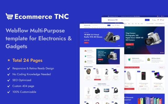
Standout Features
Modern, Clean Layout A minimalistic yet stylish design puts your products in the spotlight. The airy white space, crisp typography, and bold visual hierarchy create a professional and trustworthy first impression — critical for ecommerce success.
Customizable Homepage Hero Grab attention instantly with a full-width hero section designed to showcase promotions, bestsellers, or new drops. Add call-to-action buttons, dynamic images, or sliders with ease — no code needed.
Dedicated Product Pages Each product page includes customizable fields, image galleries, size guides, and reviews — so you can provide every detail a shopper needs before clicking “Add to Cart.”
Flexible Collection Grids Effortlessly categorize and display your products with responsive grids that adapt to mobile and desktop devices alike. Organize by category, popularity, or tags for a smooth shopping experience.
Conversion-Optimized Cart & Checkout Designed with usability in mind, the cart and checkout flow is sleek, straightforward, and mobile-ready — helping reduce cart abandonment and improve customer satisfaction.
Fully Responsive Design From mobile to tablet to widescreen desktop, this template ensures your store looks sharp and functions flawlessly on any device.
CMS Integration for Content Marketing Launch a blog or news section in minutes using the integrated CMS. Perfect for announcing sales, sharing customer stories, or improving SEO with fresh content.
Global Styling System Quickly change fonts, colors, or component styles from one centralized place. Ideal for maintaining brand consistency or testing new seasonal looks.
Smooth Interactions & Animations Add motion without overwhelming the user. Scroll-triggered animations, hover states, and button transitions make for an engaging and delightful experience.
Built-in Contact and Newsletter Forms Grow your list and stay in touch with ready-to-use contact and subscription forms — fully integrated and customizable.

Who Is Ecommerce TNC For?
DTC (Direct-to-Consumer) Brands Digital Product Sellers Fashion & Lifestyle Businesses Home Decor or Tech Gadget Stores Startups building MVPs quickly
Launch Your Store with Ecommerce TNC Now
Don’t wait to bring your store to life. Explore the Ecommerce TNC Webflow Template and start customizing today. Whether you’re launching a new product line or scaling your business, this template helps you look polished and professional from day one.
👉 Get the Ecommerce TNC Template Now
#webflow#webflowtemplates#websitetemplate#template#web design#ui ux design#webflowdesign#web development#businesswebsite#degital marketing#ecommerce
3 notes
·
View notes
Text
Expert Picks: The Best Shopify Website Designers for 2025’s Trending Store Features

The world of eCommerce is transforming faster than ever, and Shopify remains at the forefront of that evolution. As brands aim to deliver exceptional user experiences and capitalize on design-led growth, the need for a skilled Shopify designer has never been greater.
Cross Atlantic Software specialize in bringing together cutting-edge creativity and eCommerce functionality. In this article, we’re diving into the top Shopify website designers to watch in 2025 and sharing expert insights on the trending Shopify store design features that are shaping the future of online retail.
Why Shopify Design Matters in 2025
Before we get into the list of designers and specialists, it’s important to understand why Shopify design is more critical than ever. Online shoppers expect more than a functional website—they want intuitive navigation, fast load times, visually engaging layouts, and mobile responsiveness. That’s where the expertise of a Shopify specialist comes into play.
What Makes a Great Shopify Website Designer?
A truly standout Shopify website designer goes beyond aesthetics. They focus on:
Conversion-driven layouts
Brand-centric user experience
Responsive mobile design
SEO-optimized pages
Seamless app integrations
Let’s take a look at what trends are dominating Shopify in 2025 and who is best equipped to execute them flawlessly.
2025’s Top Shopify Store Design Trends
1. Personalized Shopping Experiences
Thanks to AI and data analytics, personalization is no longer a luxury—it's an expectation. Smart Shopify store design integrates AI-driven recommendations, dynamic product displays, and personalized landing pages. This keeps customers engaged and encourages more frequent purchases.
2. Video-First Product Displays
Static images are taking a backseat in 2025. Leading Shopify website designers are building immersive product pages with background videos, 360-degree product views, and storytelling clips. These elements give customers a real feel for what they’re buying, right from the screen.
3. Mobile-First Design
With more than 75% of eCommerce traffic coming from mobile, top Shopify specialists are prioritizing mobile performance. Think smooth scrolling, effortless one-tap checkouts, and pages that load in the blink of an eye—because today’s shoppers won’t wait around.
4. Eco-Conscious Branding
Consumers are more conscious of sustainability. Modern Shopify store designs are incorporating eco-friendly color schemes, carbon tracking widgets, and transparency tabs to showcase ethical sourcing.
5. Modular Design Systems
In 2025, agility is key. Many Shopify designers are adopting modular design systems—reusable UI components that let store owners update their sites quickly without starting from scratch.
Meet the Experts: Top Shopify Website Designers for 2025
Cross Atlantic Software works with some of the most forward-thinking professionals in the Shopify ecosystem. Here are the types of Shopify website design services that are in high demand—and who’s delivering them.
1. The Strategist Shopify Designer
A strategist isn’t just focused on look and feel—they focus on conversion. They use analytics, customer behavior, and A/B testing to inform every design decision. Our own Cross Atlantic Software design team is known for combining user psychology with clean aesthetics to boost ROI.
Best for: DTC brands looking to scale quickly.
2. The Visual Storyteller
These Shopify website designers are all about emotion. They create visual narratives through imagery, layout, typography, and animation. For lifestyle, fashion, and beauty brands, this approach is especially effective.
Best for: High-end or boutique brands seeking emotional engagement.
3. The Technical Shopify Specialist
Some projects require deep technical know-how. Whether it’s integrating custom features, building subscription logic, or streamlining complex product catalogs, these Shopify specialists bridge the gap between design and engineering.
Best for: B2B, SaaS, or stores with unique backend needs.
4. The Speed-First Optimizer
If performance is your priority, look for a Shopify designer focused on speed. These experts optimize image sizes, reduce unused code, and streamline user flows—all to reduce bounce rates and increase sales.
Best for: Mobile-heavy industries or global brands.
5. The Brand Builder
A great store starts with great branding. These Shopify website design services offer end-to-end support—from logo creation and color palette development to building a custom Shopify theme that aligns with your vision.
Best for: New brands or rebrands that need full creative direction.
Why Choose Cross Atlantic Software?
With hundreds of projects completed and clients across North America, Europe, and Asia, Cross Atlantic Software is more than just a design agency—we’re your eCommerce growth partner.
Our Services Include:
Custom Shopify store design
Theme development and optimization
UI/UX design tailored to your industry
Shopify Plus migration and setup
Full-stack Shopify website design services
Cross Atlantic Software believes every brand has its own story to tell. Our Shopify specialists work closely with you to make sure your store doesn’t just look great—it feels like you.
Client Success:
One of our recent clients, a sustainable fashion label based in Los Angeles, came to us for a full redesign. Their outdated store had a high bounce rate and poor mobile usability.
Our team implemented a modern Shopify store design with immersive video elements, quick-load product pages, and mobile-first navigation. Within three months:
Bounce rate decreased by 27%
Mobile conversions increased by 40%
Average order value rose by 15%
This is the power of working with expert Shopify website designers who understand trends and business objectives.
Conclusion:
If you're planning to launch or revamp your Shopify store in 2025, don’t settle for generic templates or cookie-cutter solutions. Partnering with an experienced Shopify designer or Shopify specialist can make the difference between a store that looks good—and one that converts.
Cross Atlantic Software is passionate about building digital experiences that drive growth. Whether you’re a startup looking for full Shopify website design services or an established brand wanting to refresh your Shopify store design, we’re here to help.
Ready to future-proof your eCommerce store? Contact Cross Atlantic Software today for a free consultation and let’s create something extraordinary together.
#shopify website design services#shopify store design#shopify website designers#shopify specialist#shopify designer
3 notes
·
View notes