#summativework
Explore tagged Tumblr posts
Visit Tumblr Blog
Explore Tumblr blogs with no restrictions, modern design and the best experience.
Last Seen Tumblr Blogs


Fun Fact
Tumblr was attacked by a cross-site scripting worm deployed by the Internet troll group GNAA on Dec 3, 2012.
Photo

this is what i have for the inside i think that i will leave it here but i am pretty happy with it might do more but will wait and see.
0 notes
Photo

In terms of my brochure this is what i have got for the inside currently and i do think it is working but might need some tweeks. I think i will add another image next to the pen to help fill that space a bit which is easy enough to do.
The other thing i have been looking at is what should go on the other side of the book. Either text or a image. Leaning more towards an image as doing some testing and realising it just become a little to type heavy on the one side of the brochure and doesnt read as well or work as well in compostion. Thinking about doing and illstration of one of the writer in the still life illstration style i did to see if that works or just having an illstrated image there in general and once that is done i will start on the outside cover of the brochure
0 notes
Photo

I fixed the colours a bit! It looks much better with the mono chrome blue background. Only thing is though it appears a bit dark. Hoping that by using the orange text it will help to brighten up the inside and if it does great but i am worried that it will then be competing with each other in terms of higharchy. But that is a problem for when it come to it!
0 notes
Photo


After add colour this is what i have so far but that back around is changing. have just been trying to get it right and for some reason its not liking me too much. It will have that orignal background on it but just in blue, or maybe an orange but be a matter of testing and seeing. I also have a breif test in the colour i want to use in this one which i think work well. I did also take the outlines away from the pen and book illstration but i think that they need to go back as its just no really working as well
0 notes
Photo

this is what I have started with brochure front, i will show the way it opens in the first draft i print. There is still a bit to go on this as it not quite there yet but its a start
0 notes
Photo

This is what i am thinking in terms of the inside of my brochure in terms of illustration. Im going to add colour just haven't done that yet. Its a simple illustration but i think it will add just that bit extra. Im going to have the text one the side next to the pen and well as slanted on the book, to look like that is the text for book.
0 notes
Text


Some creative fun billboards I found looking at some for inspiration
0 notes
Photo

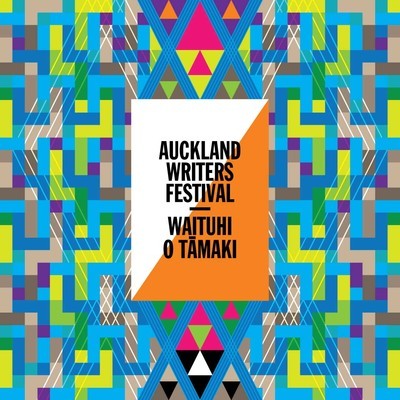
This is a screen shot of the writers festival logo i have made. Got in both black and white. I made this as it proably better in terms of not wanting to be copy righted, but also i really didnt like the white and orange trignals as i didnt think it work and was a bit pointless.
0 notes
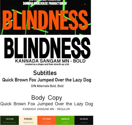
Photo


This is the color paltee which i think im going. to go with. Its a stripped down reversion of the color paltte. Wanted to work with something that is more limited in colour palete which will help to make the design pop more. I am also going to be using the same type as i would as if i was doing blindness event. Its the same typography in the event as the writers festival.
0 notes
Text
Restarting
So I was doing the event blindless withen the event of auckland writers festival which i am not doing anymore. This is because we weren't actually meant to be doing an event that is on its own (most preferably based in nz) or a festival. So i will be doing the writers festival, however it does mean i have to restart a week out from the deadline. I did have some really cool ideas that where a bit different so i will do my best to bring it though and if it i cant i will post. I do have illustrations i have done for the blindess event, i will try and bring though and if not will save for another day.
was talking with David and he said to think about theses things. With the intent of maybe being able to use some of the things i have got already.
books, reading, authors, discussion(s), talks, curling up with a book on the sofa, take 'me time' with an authors work, the idea of being transported into your or the author's imagination by a writer's skill.
So will look more into these things but it gives me a more of idea on where to go
0 notes
Photo

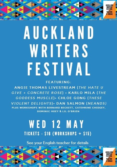

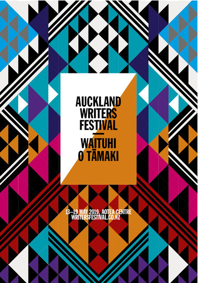

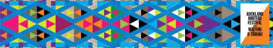
These are some collateral that i found of the writers festival. I couldnt find that meany. I going to stick with the color pallete that is simialer but i wanted to simifiy it as the 3 poster which have the more limited colour i think might be the most effect. i will also keep the typography as the typography is very consistant across. Like in these collateral, pattern is very prominate there is a lot of patterns but i think i will keep to for the most part. But i may change it, will see how it goes
0 notes
Photo


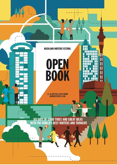
This is from the website. Its just an brief overview of the event and the festival. I think that i will keep mostly to the design compostions and layouts. I think i may just change the logo to just the type as i personally dont see the funtionality of the white and oragne trignal behind them. Apart from that there seems to be a good grid system set behind the layout which I will defintely use.
0 notes
Text
Summative Deliverables
Design system proposal for the Festival/Event comprising application of image making Visual Assets, including images, pattern(s) or other graphic elements. Proposal to show them applied to:
• Street Billboard/Poster
• 4 panel/page folding brochure
• way finding device
• 1 other collateral applications.
To be uploaded to Canvas by: Tuesday 5th April, 9am
This is just what is required to be done for assignment including the new assessment dates and the new requirements. which i am so grateful for seemed like more achievable now.
SINGLE PAGE LANDSCAPE INDESIGN FILE A3
1 note
·
View note
Photo


In terms of imagery of this event there really isn't that much to go off. This was actually a special event so that makes sense. The idea is that it would change into a returning event which is why i would be refreshing it in way.
the imagery is mainly of the inside of the event. which involves some type of interesting light installation with writing on the walls with people sitting in with headphone. In terms of illustration it all photography apart from the Auckland writers festival adverting that it is apart from.
So with this event m switching from the photography based they have done to hand drawing illustration like in my formative. But I will stick to the main colour palette of the illustrations. There is a chance i may not fit with the festival illustration themselves. But if this would be something i do in real life i would be redesigning the festival illustrations too but in terms of times and restraints Im just doing the event
0 notes
Photo
Looking at this event, these are main parts of the design system that i will be keeping, so there logo i will be keeping, as well as the color pallet and then here is not much i the way other type of i decide to move to fix
0 notes
Link
Auckland Writers Festival, in partnership with Auckland Live, presents the Donmar Warehouse production of BLINDNESS. A socially-distanced sound installation and immersive theatre experience direct from the UK. Voiced by Juliet Stevenson. 32 Performances: Tuesday 11 May - Sunday 16 May. BLINDNESS, the adaptation of Nobel Laureate José Saramago’s 1995 novel of the same name, written by Tony Award-winning playwright Simon Stephens and directed by Walter Meierjohann, was originally staged at London’s Donmar Warehouse. It was the first production to be delivered to a paying public following the UK’s first COVID-19 lockdown.
As the lights change at a major crossroad in a city in the heart of Europe, a car grinds to a halt. Its driver can drive no more. Without warning or cause, he has gone blind. Within hours, it is clear that this is a blindness like no other. Within days the epidemic has spread through the city. The government tries to quarantine the contagion by herding the newly blind people into an empty asylum. But their attempts are futile. The city is in panic. The multi-award-winning creators conceived the innovative story as a sound and light installation. It’s experienced through headphones, in socially-distanced pairs, under glowing fluorescent lights expertly designed by Jessica Hung Han Yan. With a gripping narration by Juliet Stevenson (Truly Madly, Deeply; Bend it Like Beckham), Auckland Town Hall’s Concert Chamber will become the theatrical epicentre of a society sent into free fall by a pandemic. Previous and upcoming performances in London, New York, Washington, Toronto and Amsterdam
IMPORTANT NOTES
Seating is in socially distanced pairs; in the event of a rise to COVID -19 LEVEL 2 , single tickets will need to be reallocated or refunded.
Masks must be worn during the performance and will be available at the door.
Production contains full blackout periods, bright light, loud noises and sensitive content.
An audio-described channel is available if requested; please advise at time of booking.
Wednesday 12 May, 10:00am will be a captioned performance if requested; please advise at time of booking.
ORIGINAL CREATIVE TEAM: Director: Walter Meierjohann, Designer: Lizzie Clachan, Sound Designers: Ben and Max Ringham, Lighting Designer: Jessica Hung Han Yun. MADE POSSIBLE BY THE GENEROUS SUPPORT OF AUCKLAND WRITERS FESTIVAL DONORS:
British Council New Zealand Philip Carter Gardner Family Josephine & Ross Green Lizanne & Julian Knights Charlotte Lockhart & Andrew Barnes Sir Chris & Lady Dayle Mace Fran & Geoff Ricketts Jenny & Andrew Smith Mark Todd 32 PERFORMANCES. DURATION 75 MINUTES. Click to individual ticket links:
TUESDAY 11 MAY: 6.30PM, 8.15PM
WEDNESDAY 12 MAY: 10:00AM*, 12:00PM, 2.15PM, 4.15PM, 6.30PM, 8.15PM
THURSDAY 13 MAY: 10:00AM, 12:00PM, 2.15PM, 4.15PM, 6.30PM, 8.15PM
FRIDAY 14 MAY: 10:00AM, 12:00PM, 2.15PM, 4.15PM, 6.30PM, 8.15PM
SATURDAY 15 MAY: 10:00AM, 12:00PM, 2.15PM, 4.15PM, 6.30PM, 8.15PM
SUNDAY 16 MAY: 10:00AM, 12:00PM, 2.15PM, 4.15PM, 6.30PM, 8.15PM
As an adjunct to Auckland Writers Festival & Auckland Live’s presentation of the Donmar Warehouse’s production of BLINDNESS, join disability advocate Martine Abel-Williamson, legally blind writer Steff Green and The University of Auckland Dean of Arts Dr. Robert Greenberg for a post-performance conversation about the controversy surrounding Saramago’s novel of the same name because of its negative representations of blindness, and the ways in which society privileges sight / the visual.
This conversation will take place on Friday May 14 at 3.30pm (immediately following the 2.15pm performance) in the Supper Room of the Auckland Town Hall, 301-317 Queen Street, and is free to attend.
For accessibility information please go to: https://www.writersfestival.co.nz/about-us/faqs/attending-the-festival https://www.aucklandlive.co.nz/accessibility
This is the general over view of the event that i choose from the Auckland Writers Festival. Its called blindness. I have also been trying to find the already existing design purposal for this event so that i can find out what fonts and things but its proven to be harder then expected. Might just have to work out what is simialer and how to make it work.
0 notes