#the technique in question is using the mix brush to blend the shading
Explore tagged Tumblr posts
Visit Tumblr Blog
Explore Tumblr blogs with no restrictions, modern design and the best experience.
Last Seen Tumblr Blogs


Fun Fact
Tumblr was acquired by Yahoo for $1.1B in 2013.
Text

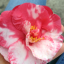
trying out new shading techniques feat. these two of course
#penny arcade#jonathan gabriel#tycho brahe#by me#the technique in question is using the mix brush to blend the shading#and colouring some of the lineart#revolutionary i know /s#gabe looks like hes tweaking out but idgaf
7 notes
·
View notes
Text


I did an oil painting of Jade! I wasn't sure who I wanted to paint, so I rolled a dice and Jade was the lucky winner. I had a lot of fun doing this one, I need to use my paints more often.
And I took a whole bunch of photos of the process, so you guys can see how it came into being!

First things first. Planning. Traditional painting doesn't have the luxury of being able to make sweeping changes as you go like you can with digital, so if you generally want to plan ahead.


Next I printed out my lineart onto some watercolour paper and taped it to a board. I then sealed the print/paper with some clear acrylic medium and painted my tape white because it was bright fucking green and would throw off my colour mixing. My set up is pretty simple. I have a jar of mineral turpentine with a strainer at the bottom to clean my brushes on, my palettes are just boards with wax paper clipped onto them (easy cleanup) and a roll of paper towels and some rags for cleanup. And I also use an medium that both thins out my paint and helps it dry faster, otherwise oils can take months to fully cure.

I planned out all my colours in advance, so all I had to do was mix up the appropriate shades and then pretty much play paint by numbers.


The general process is block out each colour and then do whatever blending is required. If you want a harsh shadow you dont do too much blending, if you want a soft shadow you use a fluffy brush and go over the area multiple times.


And then you just go around area by area filling it in as you go. Of course there's a whole lot of different techniques and processes for completing a painting. This is just what I did for this specific painting.

And he's done! He took a few days to dry, even with the added fast drying medium. There's a few areas I'm not happy with, but I would cannibalise any colour on my palette by mixing it into the next colour I was going to use. So sans re-mixing that exact specific paint, I couldn't go back in to touch up anything.
The digital planning stage was done the evening before, and the painting stage was about 6 hours? So all in all anywhere from 8-10 hours total for this.
If you guys have anymore questions (this was a pretty brief overview) feel free to dm me or leave a comment or whatever. I don't bite and am happy to help anyone out there looking to improve thier skills, or satisfy anyone's curiosity.
#not too happy with my final photos#but I used the best camera I had access too so#*shrug*#I guess this is what I can show you#twst#is my art#twisted wonderland#jade leech
223 notes
·
View notes
Text
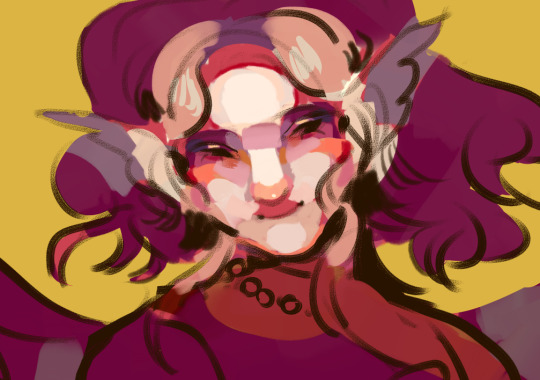
colouring tutorial from sygni aka sima
DISCLAIMER 1. eng is not my native language 2. i am using techniques of a realistic art so it's not for everyone! but you may find some tips interesting tho
big text screamer
so obv 1. making our sketch (and after lineart if you're using it bc im not) 2. filling up background, then character. think about what atmosphere you want to create in result, try to use different background colours for your characters for diff effects in result. i've had a small post with a little explaining for choosing colours, you can use that too! i suppose i can make a post about emotional effects of different colours if someone interested bc that's really a HUGE part of final effect on viever. actually i can tell and explain in art so much feel free to send questions <:D so like that! (tbx i changed it like 3 times so it's okay to change your colouring desigions mid-drawing if you're feeling something feels off)

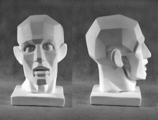
3. time to get some basic shading going! don't skip that step i swear to god you can think bruh sima for what do you they added overlays that i can use after i finish the art? are you a caveman or what please just trust me it'll add so much charm in your art so how to do it: 1. choose where your light sourse is. on my art it's in front of griande 2. use a CONTRASTING colour for each big part of a character (hair, clothes, face etc) and make shades with that. REMEMBER dark colours going next to light ones, light to dark. please don't use black for shades for god's sake. also shades are cold coloured most of the time thats important too ig 3. if you're confused where you shall place shades then find a ref or make a photo of yourself OR use a mirror (preferable!) and this things can help you understand face shading better too \/
don't feel not good enough that you need to study sth or use refs it's fully okay every good artist using that!

so i know this looks like mess BUT what did i do (guys trust the process): 1. desided i want a face to be a centre of viewer's attention so made everything else darker 2. put a light on a face, the most light shade on the parts which are closer to light sourse - at my art it's nose and a bit of forehead. and exact same thing but backwards with eyes remember face isn't flat! so even if forehead is in the light, it slowly goes back, so it won't be light all the way (you can see it on previous photo of the gypseous head)
then the longest part goes: we're using semitones (colour which are simmilar to base shade) to connect shades to light parts, to add volume to the art make sure your brush moves according to .. ehh.. face shape? just take someone and weirdly touch their face to understand how it goes and with your brush cope that example (look closely to the strokes):

so i've did something
i know this looks like "let's add some details" type of thing but: i've added semitones to the shadows to correct their forms -> to suit the relief of the face added a contrasting (to pink of the base) orange as blush, a dark blue to show the farthest spots from light added a basic reflects on the sides of the noce (orange spots), chin (peach). reflections on things are sooo important and add so much life in your art! yet it's easily done: you just create a little light blended line on the bottom of your shade. if next to thing you're making a reflection on is the diff-coloured thing, then pick a colour from it and mix them. example \/
made an edge on a forehead (dark-red line) yet i'd make it more accurate later, and will add it on the chin and sides of the nose to highlight them and separate from other parts of the face. actually this edges are just the darkest spots between the light of the item and reflection on the bottom of it. i like to make it noticible, yet someone tend to blend shades in. if you're just studying how to shade i'd reccomend starting without using blending yet you can notice how colours going more dull from forehead to chin to make her look like she's angling her head forward, i guess i'll make it more noticible later
AND i'm going to sleep but i have more to tell + i need to finish the work later anyway so put some feedback for part 2
63 notes
·
View notes
Note
Love your art dude! Was wondering what program you used? (and also how you get that painted look in your art? Some of your digital pieces look like paintings to me sometimes and it’s so cool, but I totally get if explaining it would take too long or if it’s complicated to explain 😅)
THANK YOU !!!!
i use procreate for the ipad for my drawings (it's an apple exclusive and it costs money though 👎) i will always reccomend ibis as an alternative
short answer for the painting question; it's mostly just a mix of brushes and never soft shading
long answer; Procreate's brush software is different than most art programs. instead of blending their colors together, the colors layer on top, unless you want to use the smudge tool. base program brushes from procreate, medibang, and ibis for example

[ID: A showcase of blending brushes from the art programs Procreate, Medibang, and Ibis paint. Under Procreate it's showing off acrylic, wet acrylic, hard blend, and larapuna. Under Medibang it's showing off watercolor, watercolor wet, and acrylic. There's a bullet point under acrylic that says "important to note, acrylic isn't set as a blending brush. it's a texture brush. Under Ibis it's showing off watercolor (wet), fade watercolor (wet), and oil pen (soft.) Procreate is shown again with smudge tool added to their brushes. End ID.]
the thing is, i hate procreate's smudge tool and for some reason their actual blending brushes blend with the background, even if it's on a separate layer (you can see that in hard blend). it's ugly and i hate it. so, i never use their blending brushes or smudge tool
I only use 2 brushes when shading. flat brush and tinderbox. if you look closely at some of my pieces you can see that most of my shading edges are hard and kinda messy. that's those 2 brushes


[ID: Four close-ups of digital illustrations. One a face. The other a chest. The third of hair. and the final of a hand. End ID.]
this technique is common in both traditional and digital paintings. it makes things be less muddy for me and i mostly was inspired by artists that use acrylic. sometimes instead of battling time and blending with paints that are actively drying, they'll wait and just block in colors instead, leaving hard edges. (thats what i did before a switched to gouache LMAOO) i really like that look so i used it for my digital paintings. along with some hatching, it creates the illusion of softness when you look from afar.
it's all mostly just experimentation. but i'll bring out ol reliable for how my process usually goes

[ID: A step by step guide on my shading process using a pink circle. The text says "Step one 1: Get your base. Step 2: Find your light source and block in colors (I use flat brush.) Step 3: Darken edges and add some desaturation in the dark (mimics color reflection.) Step 4: Refine and add texture and fun bits (I use tinderbox.) Step 5: Color balance and TADAA you have a 3D object. kinda." End ID.]
although this is the technique i do, i recommend using references and better drawing tutorials that explain things in much more detail than this one photo. (and references don't just have to be lighting references, you can look at other painters and try to mimic that digitally.) there's so much nuance with lighting that this one picture is barely scratching the surface. i've been doing this for a decade and i'm still learning and deciding what i want to "do." maybe next year i'll only be into cell shading with purple multiply. play around with brushes and layer modes to see what sticks. that's the fun part of experimentation.
if you made it this far, thank you for listening to my ramblings and mini procreate brush software rant. happy drawing !!!!
#this is the first time i've been asked my art process so i'm sorry if it's overexplained#i just get excited when i get to talk about procreate and how shitty it is and the workarounds#tutorial (????)#more of an explanation really#had to bang out the proper grammar for this one#long post#art#ask#wrote a novel that brought me to how i shade now#i just think all of it is equally as important#this is redundant asf but whatever
5 notes
·
View notes
Text
Top Uses of Pigment Powder for Stunning DIY Projects
Looking to add vibrant color, creativity, and a professional touch to your DIY projects? Pigment powder is the perfect solution. This versatile coloring agent has become a must-have in the world of arts, crafts, and home improvement. Whether you’re a seasoned artisan or a weekend crafter, pigment powder offers endless possibilities to elevate your creative efforts. At Touchwood Design, we understand the magic that color brings to any project. Let’s explore the top uses of Pigment Powder and how you can incorporate it into your own creations.
What is Pigment Powder?
Pigment powder is a finely ground, dry substance made from natural or synthetic materials used to add color to various mediums. Unlike dyes, which dissolve in liquids, pigment powders remain suspended, providing a richer, more opaque finish. They're available in a wide range of hues, metallics, and pearlescent shades.
Top Uses of Pigment Powder for DIY Projects
1. Resin Art and Furniture Coating
Pigment powder is a favorite in resin-based projects. From colorful coasters to epoxy river tables, adding pigment powder to resin creates stunning visual effects. At Touchwood Design, we often use pigment powder in resin tables to produce captivating swirls and metallic finishes.
2. Candle Making
Want your homemade candles to stand out? Adding a small amount of pigment powder to your wax can result in bold or pastel shades. Make sure to use pigment powders that are safe for burning to avoid releasing toxins.
3. Soap Crafting
Natural mica pigment powders are a go-to for coloring handmade soaps. They provide vibrant, skin-safe hues that don’t fade over time. Whether you're making cold-process or melt-and-pour soap, pigment powder blends beautifully without clumping.
4. Clay and Polymer Creations
Crafters love using pigment powder to add shimmer and detail to polymer clay or air-dry clay. Brush it onto molds before pouring or mix it directly into the clay for a marbled effect.
5. Painting and Fine Art
Mixing pigment powder with acrylic mediums, oils, or watercolors allows artists to create custom colors with unmatched vibrancy. It also works well in mixed media and abstract art forms.
6. Concrete and Cement Decor
Yes, even concrete can benefit from a splash of color. Add pigment powder to concrete mixes to create colorful stepping stones, countertops, and planters.
7. Nail Art and Makeup
Cosmetic-grade pigment powders are widely used in nail salons and homemade beauty products. From holographic nails to highlighter palettes, the possibilities are endless.
8. Wood Finishing and Staining
Combine pigment powder with wood stains or oils to enhance grain patterns and bring out the natural beauty of timber. Our experts at Touchwood Design often recommend this technique for bespoke furniture pieces.

How to Use Pigment Powder Safely and Effectively
Start with a small amount and build up to the desired color intensity.
Mix thoroughly to avoid uneven coloring.
Wear gloves and a mask when handling to avoid inhalation or staining your hands.
Use a compatible medium such as resin, wax, or acrylics depending on your project type.
Choosing the Right Pigment Powder
Not all pigment powders are created equal. When selecting the best pigment powder for your DIY projects, consider the following:
Color fastness: Ensure it won't fade over time.
Compatibility: Choose pigments based on the medium (resin, soap, wood, etc.).
Safety: Use cosmetic-grade pigment for skin or body applications.
At Touchwood Design, we prioritize high-quality pigments that are safe, long-lasting, and environmentally friendly.
Frequently Asked Questions (FAQs)
Q1: Can pigment powder be used in food or edible items? A: No. Unless it is food-grade, pigment powder should never be used in edible products.
Q2: What's the difference between pigment powder and mica powder? A: Mica powder is a type of pigment powder made from natural minerals that add shimmer. Pigment powder, in general, includes both matte and metallic versions.
Q3: How long does pigment powder last? A: Stored in a cool, dry place, pigment powder can last for several years without losing its vibrancy.
Q4: Can I mix different pigment powders together? A: Absolutely! Mixing different pigment powders can create custom shades and effects tailored to your project.
Q5: Is pigment powder safe for children’s crafts? A: Choose non-toxic and child-safe versions, and always supervise use.
Final Thoughts
From resin artwork to wood staining, pigment powder adds flair and functionality to any DIY venture. Its ability to transform basic materials into vibrant masterpieces makes it an essential part of every craftsperson’s toolkit. At Touchwood Design, we embrace innovation, quality, and creativity in every piece we create—and pigment powder plays a big part in that journey.
Ready to Get Started?
Unlock the full potential of your DIY creativity with premium-quality pigment powder. Browse our Touchwood Design Collection to find inspiring furniture, helpful resources, and tools to bring your colorful ideas to life. Create with confidence. Create with color. Create with Touchwood Design.
0 notes
Text
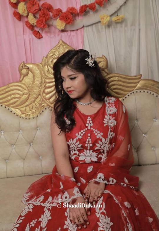
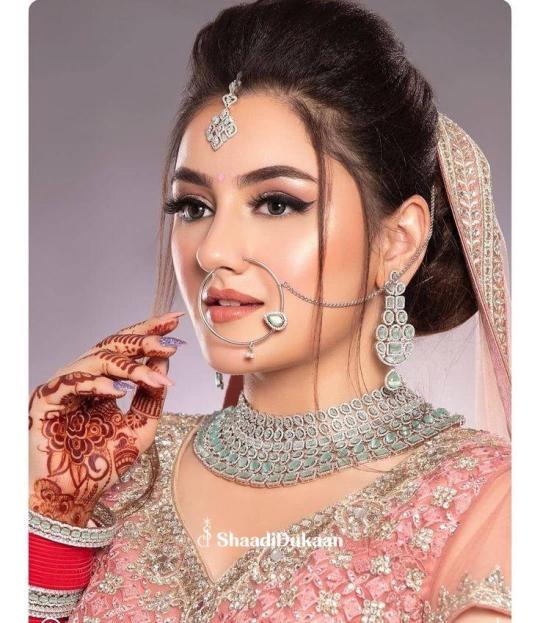
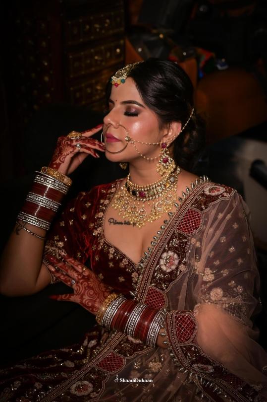
Best Bridal Makeup in Dehradun for Your Dream Wedding Look
When a bride walks down the aisle, all eyes are on her. It's her moment, her day, and she deserves to look nothing less than magical. The bridal look is not just about wearing a stunning lehenga or a dazzling saree—it’s also about how that look comes together with flawless makeup. And in a city like Dehradun, where nature and tradition blend effortlessly, bridal makeup has taken on a whole new meaning.
Dehradun, nestled in the foothills of the Himalayas, has become a hotspot for destination weddings and elegant ceremonies. With its picturesque views and cool climate, it's no surprise that brides want their makeup to reflect the charm of the city—fresh, radiant, and timeless. But the real question remains: how do you find the best bridal makeup in Dehradun?
The Essence of Bridal Makeup
Bridal makeup is not just about looking pretty—it’s about enhancing the natural beauty of the bride, capturing her personality, and ensuring she looks stunning both in person and in photos. It requires precision, creativity, and above all, understanding.
A good bridal makeup artist doesn't just apply products; they tell a story through shades, highlights, and contours. They understand skin tones, face shapes, and most importantly, the emotional value of a bride’s special day.
In Dehradun, the best makeup artists blend traditional techniques with modern trends. Whether it’s a bold North Indian bridal look with deep red lips and kohl-rimmed eyes, or a subtle pastel-themed style for a daytime wedding, versatility is key.

What Makes Bridal Makeup in Dehradun Unique?
Dehradun offers a unique charm that influences the bridal makeup styles popular in the region. Here’s what sets it apart:
1. Natural and Dewy Finishes
Thanks to the cooler climate, makeup doesn’t need to fight against sweat or humidity as much as in the plains. Artists can work with lighter, breathable foundations that leave the skin looking radiant and glowing—perfect for the bride who wants a natural finish.
2. Fusion of Tradition and Trend
Many brides in Dehradun prefer a mix of traditional and modern elements. Makeup artists in the city are known for experimenting with this fusion—think gold shimmery eyelids paired with a nude lip, or a bold maroon pout with subtle contouring.
3. Customised Bridal Packages
Instead of one-size-fits-all packages, the best bridal makeup in Dehradun often comes with custom options tailored to the bride’s skin, outfit, jewelry, and even the weather. Some artists even include pre-wedding skincare regimens in their packages to ensure the bride’s skin is picture-perfect before the big day.
4. Use of Premium, Skin-Friendly Products
Brides today are more conscious than ever about what goes on their skin. Top makeup artists in Dehradun opt for high-end, dermatologically tested brands to avoid any skin reactions—especially important for multi-day celebrations.
What to Look for in a Bridal Makeup Artist in Dehradun
Choosing your makeup artist can be as crucial as selecting your bridal outfit. Here are a few things to consider:

1. Portfolio and Style
Every artist has a signature style. Some specialize in bold, dramatic looks while others focus on natural elegance. Review portfolios to ensure their aesthetic aligns with yours.
2. Trial Sessions
Always ask for a makeup trial. It’s the best way to see how the artist interprets your vision and how the makeup sits on your skin.
3. Hygiene Standards
Makeup hygiene is non-negotiable. Brushes, sponges, and products should be clean and sanitized. The best bridal makeup professionals in Dehradun maintain top-notch hygiene practices.
4. Punctuality and Professionalism
Weddings are high-pressure events. You want someone who arrives on time, stays calm under pressure, and can handle last-minute changes with grace.
5. Comfort and Compatibility
You’ll be spending crucial hours with your makeup artist before your wedding—make sure they’re someone who makes you feel at ease.
Bridal Makeup Trends in Dehradun for 2025
Every wedding season brings new trends. For 2025, Dehradun brides are leaning towards:
Pastel Palettes – Soft pinks, lilacs, and peach tones are replacing heavy reds and golds.
Minimal Glam – Clean skin, feathered brows, and subtle highlighter.
Statement Eyes – Smokey eyes in jewel tones like emerald and sapphire for evening ceremonies.
Sustainable Beauty – Eco-friendly products and cruelty-free brands are in demand.
The Final Look—More Than Just Makeup
Bridal makeup isn’t just about how you look—it’s about how you feel. On your wedding day, you want to feel like the best version of yourself. The right makeup artist in Dehradun will understand your vision, work with your features, and help you feel confident and radiant.
Whether your wedding is a grand affair in a five-star resort or an intimate celebration in your backyard, your bridal makeup should make you feel special, loved, and beautiful.
Conclusion :
The best bridal makeup in Dehradun is not about who has the biggest name or the fanciest salon. It’s about who can understand your dream, your vision, and bring it to life with artistry and heart.
So if you're a bride-to-be in Dehradun, remember: your face is the canvas, and your makeup artist is the painter. Choose someone who sees the masterpiece within you.
Because when it comes to your wedding day—you deserve nothing but the best.
#BridalMakeupDehradun#BestBridalMakeup#DehradunWeddings#DehradunMakeupArtist#BridalGlow#WeddingMakeupIndia#DehradunBride#MakeupForBrides#IndianBridalMakeup#MakeupInDehradun#TopMakeupArtists#BridalMakeup2025#WeddingReady#DehradunBeautyExperts#DoonValleyBrides
0 notes
Text
Explore the Best Online Painting Classes at Gritty Tech
Unlock Your Creativity with Online Painting Courses
Artistic expression has no boundaries, and learning to paint has never been more accessible. Online painting classes allow you to master various techniques and styles from anywhere in the world. One of the leaders in offering premium painting education is Gritty Tech, providing a wide range of courses for all skill levels For More…
Why Gritty Tech Stands Out for Online Painting Education
Choosing Gritty Tech means you benefit from:
Top-Tier Instructors: Courses led by acclaimed artists.
Flexible Learning: Study at your own pace with lifetime access.
Vibrant Community: Join forums and live workshops.
Verified Certification: Boost your resume with recognized certificates.
Comprehensive Learning Pathways: From foundational skills to masterclasses.
Painting Classes for Beginners
Kickstart your journey with beginner classes designed to build confidence.
1. Fundamentals of Acrylic Painting Master the essentials of acrylics, from color mixing to brush handling and canvas preparation.
2. Watercolor Painting Basics Explore watercolor techniques like wet-on-wet, layering, and creating dynamic compositions.
3. Drawing Skills for Aspiring Painters Learn to sketch accurately with a focus on proportion, shading, and layout fundamentals.
Intermediate Level Painting Courses
Expand your abilities and dive deeper into artistic techniques.
1. The Science of Light and Shadow Understand the role of lighting in painting realism and drama.
2. Oil Portraiture Techniques Refine your skills in capturing likeness and expression using classic oil techniques.
3. Mastering Color in Painting Dive into color theory, exploring how to balance and enhance your compositions.
Advanced Painting Courses
Challenge yourself with advanced topics tailored for experienced artists.
1. Expressive Abstract Painting Break creative limits and embrace abstract techniques.
2. Realistic Acrylic Mastery Learn to paint lifelike imagery with intricate detail and precision.
3. Advanced Landscape Oil Painting Craft breathtaking landscapes under expert mentorship.
Exclusive Workshops at Gritty Tech
Specialized workshops offer targeted skill development.
1. Painting Animals with Watercolors Bring animals to life using delicate watercolor techniques.
2. Urban Sketching and Fast Painting Capture the pulse of city life with swift sketches and vibrant colors.
3. Botanical Art and Illustration Blend scientific detail with artistic creativity through botanical studies.
Features of Gritty Tech’s Learning Platform
Designed for optimal learning experiences:
Crystal-Clear HD Tutorials
Downloadable Practice Materials
Fun and Challenging Quizzes
Student Art Showcases
Easy-to-Use Progress Tracker
How to Join Gritty Tech Painting Courses
Getting started is easy:
Visit the Gritty Tech website.
Explore the Painting Courses catalog.
Pick your preferred course.
Register and make a payment.
Start creating immediately.
Student Success Stories
Emma T.'s Artistic Growth Emma transitioned from graphic design to a flourishing watercolor artist after completing courses at Gritty Tech.
James M.'s Second Act After retirement, James mastered oil painting and now teaches workshops in his community.
Pricing Options at Gritty Tech
Choose a plan that fits your needs:
Single Course Access: Pay once, access forever.
Monthly Subscription: Unlimited courses at a low monthly fee.
Annual Membership: All-access at the best value.
Special Bonuses for Students
Enrollees receive:
A free "Painter’s Handbook" eBook.
Exclusive access to live webinars.
Invitations to online art shows.
Frequently Asked Questions
Do I need prior painting experience? No, beginners are welcome!
What materials are required? Each course lists necessary supplies, typically paints, brushes, and canvas.
Can I communicate with instructors? Yes, through live sessions, forums, and feedback channels.
Are certificates officially recognized? While not academic degrees, Gritty Tech certificates are respected within creative circles.
Conclusion: Begin Your Artistic Adventure with Gritty Tech
Gritty Tech’s online painting classes empower you to unlock your artistic potential. With expert instructors, community support, and a flexible learning structure, you have everything you need to thrive. Enroll today with Gritty Tech and turn your passion into a masterpiece!
0 notes
Text
Empowering Educators: The Ultimate Art Lesson for Teachers
Art has the power to transform the classroom, making it a space for creativity, self-expression, and inspiration. For teachers, designing and delivering engaging art lessons can feel challenging—but it doesn’t have to be. Whether you're an experienced art educator or a teacher looking to incorporate more creativity into your curriculum, learning how to craft an effective art lesson is essential.
Let’s explore how teachers can develop impactful art lessons that inspire students while fostering artistic and critical thinking skills.
Why Art Lessons Matter in Education
Art lessons go beyond painting and drawing; they nurture imagination, improve fine motor skills, and enhance problem-solving abilities. For teachers, art is a bridge to connect with students on a personal level. It allows them to:
Cultivate emotional intelligence by encouraging self-expression.
Promote collaboration and appreciation for diverse perspectives.
Create a balanced curriculum that integrates creativity with academics.
By focusing on these benefits, teachers can use art to foster an environment where every student thrives.
Steps to Designing an Engaging Art Lesson for Teachers
1. Set Clear Objectives
Every successful art lesson begins with a purpose. Ask yourself:
What should students learn or experience?
Are you teaching a specific skill, like shading, or a broader concept, such as storytelling through art?
For instance, a lesson on abstract art and emotions could teach students how colors and shapes convey feelings, while also developing their creativity.
2. Choose the Right Materials
Equip yourself with the tools that align with your lesson’s objectives. For teachers, simplicity is key—choose materials that are accessible and easy to manage in a classroom setting. Examples include:
Paint, brushes, and palettes for color-mixing exercises.
Pencils, erasers, and sketchbooks for drawing lessons.
Recyclable materials for eco-friendly crafts.
3. Begin with an Engaging Hook
Start your lesson with something that sparks curiosity. You could:
Show famous artworks and ask students to describe what they see and feel.
Share a quick anecdote about a famous artist.
Pose a thought-provoking question like, “What story can a single color tell?”
This initial activity grabs attention and sets the tone for a creative session.
4. Demonstrate and Guide
Visual learners benefit greatly from demonstrations. Show your students how to use a particular technique, like blending colors or creating textures. Encourage them to ask questions and try the technique themselves.
As students work, walk around to offer guidance and encouragement. Constructive feedback helps them refine their skills and build confidence.
5. Encourage Personalization
Give students room to make their artwork unique. Whether they’re drawing, painting, or sculpting, remind them there’s no right or wrong way to express themselves. This freedom enhances creativity and keeps them engaged.
6. Reflect and Share
End the lesson by giving students an opportunity to showcase their work. This not only builds their confidence but also fosters a sense of community in the classroom. Reflection also helps students articulate their creative process, deepening their understanding of art.
Resources to Enhance Your Art Lessons
Looking for more inspiration and tools to design impactful art lessons? Visit Creative Kids Art Lessons. The website offers a treasure trove of resources, from step-by-step lesson plans to creative project ideas tailored for teachers. It’s an excellent platform to help educators bring more art and creativity into their classrooms.
Conclusion
Art lessons for teachers are more than just activities—they’re opportunities to inspire, connect, and empower students. By following these steps and tapping into resources like Creative Kids Art Lessons, teachers can create a vibrant classroom environment where creativity flourishes.
Start crafting your next art lesson today and see the transformative impact it has on your students and your teaching journey!
0 notes
Text
Exploring the Evolution of Neo-Modern Art in Today’s World

Neo-modern art was established as a movement that negotiates between the concepts of modernism and contemporary art in the ongoing process of artistic evolution. It is a form of art that shows how society and art interact with each other through the incorporation of traditional art with the modern world art. This movement is a tribute to the great modernist period and at the same time, an innovative shift in the representation of the modern world.
The Roots of Neo-Modern Art
The origin of neo-modern art lies in the late 19th and early 20th century, neo-modernism emerged as an art movement with artists such as Pablo Picasso, Wassily Kandinsky, and Piet Mondrian who challenged the traditional art by incorporating abstract art.
Over the years, artists in the 21st century were able to bring out new considerations to these modernist concepts. Due to the application of modern approach, mixed media, and social issues, neo-modern artwork became the new form of modernism that reflects the contemporary world.
Notable Neo-Modern Artists
Several artists have become leading figures in the neo-modern art movement, combining the boldness of modernism with contemporary elements:
Julie Mehretu: Mehretu is renowned for large abstract paintings that depict themes such as urbanism, history, and migration through layered stencils.
Gerhard Richter: A versatile painter, Richter is as comfortable working in the realm of the abstract as he is in photorealism, and his neo-modern works are defined by experimentation.
Olafur Eliasson: Combining nature, art, and technology, Eliasson’s installations are about perception, questions of sustainability, which perfectly reflect the principles of neo-modern art.
Takashi Murakami: The paintings of Murakami are brightly saturated and colorful, portraying the commercial aspect of neo-modern art through his character.
Simple Techniques to Get You Started
Experiment with Geometric Shapes: When an artist is painting, he/she should use basic shapes such as round, square and triangle in order to produce good art work. The use of symmetry and asymmetry creates an object that has visual stability while the object contains energy.
Layering Textures and Colors: Overlay colors and use contrasting textures to build up space. Layering aids in increasing depth and interest in your work regardless of the media you are using such as brushes and paints, collage or graphic design applications.
Use Minimalism with a Twist: First, begin with plain styles, not many shades to start with, proper line work and then add elements such as rough textures and other forms of media into the picture.
Explore Abstract Expression: Do not aim at depicting the idea or the feeling, as a definite object or as a person but try to express it in general forms. Let the lines and color patterns lead your artistic work.
Blend Traditional and Digital Tools: Use paint and canvas as well as graphic software and produce works that belong to neo-modern art.
How Neo-Modern Art Fits into Home Decor
Neo-modern art is now trending in home decor since they are simple yet flexible. Whether it is the use of bright and clear colors in the paintings or the use of digital technology in art, neo-modern artwork can easily blend in modern settings. It is versatile and easy to incorporate into any design concept ranging from the simplest minimalistic interior to the more complex interiors of an eclectic style.
This artwork features abstract shapes, geometrical shapes and black and white color schemes which makes it ideal for the living room, bedroom, and offices. Moreover, employing custom modern art pieces can bring uniqueness and class to the space, which makes it the choice of art lovers and homeowners.
Conclusion
The neo-modern art is a revival of modernist art in a contemporary world with reference to the current trends and technology. Such contemporary artists as Julie Mehretu, Gerhard Richter, and Olafur Eliasson add new ideas and new visions to the world of art. Thus, no matter whether one is an artist or a collector, or a simple lover of the art, neo-modern art can be considered as a rich and meaningful vision of the world that is very close to the contemporary one. Its applicability to interiors and the fact that it makes people think makes it unique in the art world and this means we are likely to see it grow more in the future.
Artists continue to favor canvas paintings because they offer both traditional and adaptable surfaces for artistic expression. In neo-modern art, the canvas is an ideal base for abstract shapes, vivid colors and multilayered textures that allow artists to go beyond limits while keeping alive the timeless charm of conventional painting methodologies. Be it in the houses or exhibitions, the canvas paintings bring a sense of distance and a touch that fascinates one.
#modern art#abstract art#art paintings online#paintings online#canvas wall art#wall painting#wall art#canvas art print#home decor#artwork#artists on tumblr
0 notes
Text
10 Tips for Beginners in Knife Painting Classes in Thane
Introduction
Embarking on a journey into the world of knife painting can be an exhilarating experience, especially for beginners in Thane. The unique technique offers a dynamic and textured approach to creating captivating and satisfying art. To help you make the most of your knife painting classes, here are ten invaluable tips to set you on the right path towards mastering this art form.
1. Invest in Quality Materials
Before you even pick up a knife, it's crucial to start with good-quality materials. Opt for high-grade canvas, brushes, and, of course, a reliable set of painting knives. These tools are the foundation of your artistic journey.
2. Understand Your Knives
Each knife has a specific purpose. From the flat-edged palette knife to the angled trowel knife, take time to familiarize yourself with the different types and their functions. Knowing which knife to use for specific effects will significantly enhance your painting skills.
3. Master the Basics of Color Mixing
Knife painting relies heavily on adequate colour mixing. Learn the fundamentals of primary and secondary colours and experiment with blending techniques. This will allow you to create a broad spectrum of shades and tones.
4. Start with Simple Subjects
Beginners should start with uncomplicated subjects. Simple landscapes or still-life scenes are excellent starting points. Focus on mastering the techniques before moving on to more complex compositions.
5. Practice Patience and Precision
Knife painting demands patience. Take your time to apply each stroke deliberately. Precision is critical, and a steady hand will produce more refined results.
6. Embrace Texture and Depth
One of the unique aspects of knife painting is the rich texture it imparts. Feel free to layer paint and experiment with different techniques to achieve depth and dimension in your artwork.
7. Learn to Adapt and Adjust
Mistakes happen. Instead of getting discouraged, view them as opportunities to learn and grow. Knife painting allows for corrections and adjustments, making it a forgiving medium.
8. Study Light and Shadow
Understanding how light interacts with objects is crucial for creating realistic and dynamic paintings. Study the play of light and shadow in your subjects to add depth and realism to your artwork.
9. Experiment with Different Surfaces
Don't limit yourself to canvas alone. Try painting on various surfaces like wood, paper, or even fabric. Each surface will yield different textures and effects.
10. Seek Feedback and Keep Learning
Lastly, always continue learning. Joining a knife painting class in Thane opens up opportunities for feedback and critique from experienced artists. Embrace constructive criticism, as it will fuel your growth as an artist.
Conclusion
Embarking on a journey into knife painting in Thane can be a genuinely fulfilling endeavour. Armed with these ten tips, you are now equipped to dive into the world of this unique art form with confidence. Remember, practice, patience, and a passion for creating will be your greatest allies. So, pick up your palette knife, embrace the canvas, and let your creativity flow. Happy painting! If you have any further questions or need assistance, please do not hesitate to contact us.
We look forward to hearing from you!
0 notes
Text
-Dear Grandma-
Out of every art piece I had done this year, this piece took a toll on me. Though at first, I thought it’d be fun and interesting to look at how artists portray their subjects, however when I was the artist of this piece, I was completely immersed into the painting. My chest tightens when I pick up my brush to paint my grandma, guilt rushes through me as I mix the paint to match her tanned skin, and guilt overwhelms me when I stare at the painting for too long. It’s been a few weeks and I’m not sure whether it’s me or her that does not want the painting to be finished, for as time has never been more significant on a canvas until now.
Having found out that my grandma was diagnosed with stage II cancer in January 2021 was a startling start to the year. Yet all it made me feel was anger. It was immature of me looking back now, but it made sense at the time. As the cancer grew in such a place that even surgery can’t cure, I had to witness my mother helplessly finding connections and medication that proves the growing cancer otherwise. A sniffle in the kitchen, red puffy eyes in the morning, a saddened smile from her, or uncombed hair in the afternoon when she just woke up, left me feeling helpless. I felt useless. I refused to cry, as being strong is the only way I could feel useful. Such anger arose in me for what my grandma’s incoming death is doing to my mother, such anger arose in me for what my mother’s refusal to see the truth is doing to herself, such anger arose for what I am, what I felt, what I did. I did nothing. I wished to feel the overwhelming pain for my mother, but I knew her better than anyone else, and accepting help from others is not her strong suit.
Everytime we went up to visit my grandparents, my grandma would always whisper mantras over my head as she combed through my hair, and that was my most pellucid image of her in my mind. That was always how I remembered her, protecting me from afar. I could never stay alone with her, I felt obligated to question this mysterious woman, yet there’s this detachment I felt between us, as if she’s a stranger that I call a family member.
Thus this painting was my attempt in capsulating my relationship with my grandma.
I was inspired by Placido Merino and Ayana Otake’s series of painting the same model being showcased in different styles and angles, hence I went with painting my grandma in a set or triptych. This was to induce my exploration of her, and reading her from afar. The blue tinted background that gradients to Merino’s style of dripping acrylic paint represents the detachment I felt with her, and the loneliness I was later on feeling for her seeping out through the blue gradients. The leaves that are painted in three different ways and shades symbolizes the emotions I was able to feel when I was in her presence. In the first part of the triptych, I painted it in the style of Jenny Saville’s visible and rough brush strokes, in colours and various shades of rich greens to present how my grandma’s aura has always felt healing to me, it was impossible to not recognize her in a room full of people. However the leaves were then smoothed out on the second part of the painting, with tints of blues to showcase how as we started talking and making eye contact, the familiar sense of quiet indifference was again recognized. The last part of the triptych is covered with diluted acrylic paint drips to show how as my grandma looked away, it always left me with a sense of regret, to not make a better effort to connect with her, even if there were opportunities presenting themselves to me multiple times.
When painting my grandma’s clothing, I made sure to paint the reds on her flannel as pigmented as possible, it was my way of conveying both my anger towards her and a sense of intimidation she gave me. With the blue patterns over the reds shows a conflicting atmosphere between us. As she was aware I was grieving for her in my own way, it was clear to me that if I were to hate her for dying, she’d allow it. Yet I don’t, it was far from hatred, it was helplessness, that I felt.
I was calculated when it comes to positioning my grandma to pose for the painting. In the first part of the painting, I presented my grandma looking away from me, painting her in the style of Fan Xue Xian’s smoothened texture and photorealism painting technique, with smooth and thin lines, with visible form and blended shapes, such conjugation of elements was used to depict how I was able to understand my grandma from far away, capturing her in authentic and undisturbed environment. Yet when she made eye contact with me on the second part of the painting, I felt nervous, it’s as if all my knowledge of her disappeared and all that’s left is simply just another human being before my eyes. Such emotions are reflected upon using Saville’s rough brush strokes on painting her, keeping patchy textures untouched with thick and wide lines, and being as detailed with the eyes as possible to bring life to the painting. In the third part of the painting, as my grandma looked away from me, the painting reverted back to Xian’s style of photorealism, showcasing that the only times when I can study her is when she isn’t studying me.
Media: Oil paint, acrylic paint
Dimensions: 123cmx87cm


7 notes
·
View notes
Text
Strategies You Can Use When Making Use Of Water Color Pencils

While traditional water color pans and tubes will likely always be the favored type variable for watercolorist, there is no denying the versatility, benefit, as well as efficiency of watercolor pencils. Helping typical drawing artists link the void to watercolors, watercolor pencils are a terrific intermediary device for those seeking to discover the globe of watercolors without the sensation of needing to purchase very big pan sets or tubes.
Consider When Acquiring Watercolor Pencils:
To get the most effective results from your work, it's vital that you rely upon the proper art supplies. Investing in a great pencil sharpener will certainly make certain not just that the pigment inside the watercolor pencil has a sharp tip, but will additionally help to prevent the tip from repeatedly damaging when being sharpened.
If we made a brief mentioned about the Pentel Water Brush as its excellent for transportability, this will be tailored for those watercolorists seeking to convert their watercolor pencil attracting to a complete watercolor painting. If you want to just mix a couple of small components of your paint for the information work, after that an anemic blender will certainly end up being an important device. With both a fine as well as brush tip, you can attain a vibrant series of impacts.
Watercolor Pencils Are Terrific For Plein Air Paint
Water color pencils can be an extraordinary fulfilling experience. Nevertheless, one of the largest battles that watercolorists have when trying to do this is duke it outing their lots of art products. Of all the watercolor tools (pans, tubes, and so on), watercolor pencils are without a question one of the cleanest and most convenient mediums to take with you when paint beyond the four wall surfaces of your workshop.
youtube
If you plan on water coloring a seaside landscape or locate some peculiar subjects at your local coffee house, you can quickly capture the essence of the scene with watercolor pencils.
In addition, watercolor pencils likewise make it very easy to effectively put a really quick illustration to set the structure, all while taking your time to include the information work and also watercolor blending at your very own rate with your watercolor brushes. Certainly among one of the most crucial tools past the watercolor pencils themselves that you will intend to carry hand will certainly be a watercolor sketchbook.
Types of Strategies You Can Utilize When Utilizing Watercolor Pencils:
What really establishes watercolor pencils in addition to the other watercolor mediums is their techniques. Considered that you are working with a hybrid tool that exists in both a strong and also fluid state, you can actually obtain creative with the results you attain. Going here: https://toolgeeky.com/best-watercolor-pencils/ for details.
Below are a few of the a lot more prominent methods watercolorists use:
Wet Pencil Suggestion: Yes, similar to a paint brush, you can dip the idea of the watercolor pencil right into the water. Doing so will certainly make the shades circulation in a far more vibrant issue than what you would otherwise attain in their all-natural strong state.
This can help you attain wider strokes of the pencil while also making an accent color actually stand apart.
Wet Paper + Dry Pencil: When utilizing your watercolor pencil in tandem with a watercolor brush, you can make unique lines that hemorrhage right into the paper. Watercolorists might use this for attracting individual blades of grass or branches when paint landscapes. Various other concepts for this method would be powerful lines of buildings when painting urban settings.
1 note
·
View note
Text
Really ask yourself if your story needs those first two pages of paint mixing and rumination before submitting this story. Your story could begin the moment MC gets trapped between the two opposing armies without provoking line item edits throughout the text. MC doesn take any assertive action throughout the entirety of the story, but even worse, Reader is forced to hang out with her before the main event. In France we like to buy our everyday products in drugstore and even though Sephora, Marrionaud or Nocibe are doing very well here, they don have the power to push huge trends. People go there for staples, not for a whole vanity. If I recall correctly, the only trend they managed to introduce recently was "bold brows", but mainly among teenagers and young women. I don need the LBD style classics if they don appeal to me. I don own a LBD because I look terrible in black. I also don like how I look in red like 목포출장샵 black, it too harsh for my muted coloring and very pale skin. My worry about your inner perception of the colour blue is a facet of the basic isolation that is part of the human condition. Even if we think we can really know other people, we cannot be certain of that knowledge. Historically, psychologists have adopted a stance called behaviourism, which acts as if questions about inner experience are irrelevant. I think it valuable for people to be able to come and voice what types of rooms they interested in seeing. Good place for mods of subs to come and see what their subscribers want. And also there have been a few subs created specifically because people saw demand and no rooms existed for the topic from the subs you would think would have created them. There a billion recipes. Figure it out. Or buy one. Corporal punishment was definitely a thing. Makeup was not something I wanted to risk getting hit for. I went on to a much stricter private high school, and it was worse there.. I can walk down a street for any span of time, and maybe maybe one car will pass. Get in a vehicle I need to turn around with a 3 point turn or pull up to an intersection with that road (either one), and the traffic dam bursts in both directions. Every time. When this picture is distorted or out of focus, you can feel unhealthy, unattractive (in terms of beauty and what you attract to you), and unfulfilled. When the picture is in focus and sharp, you can feel like everything is effortless, your life naturally flows and you feel 'switched on'. One of the most revered prophets said 'the kingdom of heaven is within'. No referral links or invites. THIS INCLUDES B Exceptions are Graze Invite Requests, which you can find here and Ipsy/FFF starter boxes which you can find here. YOU WILL BE BANNED IF YOU POST REFERRALS OUTSIDE OF THESE. Some antiseptic ingredients can be harmful if swallowed and can't be used on the mouth. To reduce this and ease some of the discomfort, take aspirin or ibuprofen. Also, apply cooling gels, corticosteroids or antihistamines to ease the pain and moisturize the skin. I had so many hits and misses with drugstore eye makeup that I just avoid them entirely these days.SquishySnail 1 point submitted 5 months agoI wish I had more of those experiences with someone like you, my foundation matching journey years ago would have definitely been less frustrating.Being from an asian country (where being fair is the ideal), I was forever being matched with a shade lighter for my face, which is a few shades lighter 목포출장샵 than the rest of my body. Ghost face! Argh! It usually the frou frou brands that follow the technique you talked about (and a few really great sales associate from the drugstore I like to visit).roadtohealthy 5 points submitted 5 months agoI got the big set of Sigma brushes on sale at Winners (a Canadian discount store) for $99CAD (not sure of exact price as it was a while ago). I don use all the brushes because some don suit my taste (good quality but not the shape I like) so I hesitate to buy the set for full price (because I am cheap) but I would get the set if I could get it for less than the cost of the individual brushes I love (F80 Kabuki, F84 angled Kabuki, E36 small blending brush, E25 blending/crease, E35 fluffy blending, E45 tapered blending, E47 small brush good for inner corner and small areas, E55 shader brush).
1 note
·
View note
Text
General Process of getting Sweep Balayage in Denver
Unlike traditional highlights, balayage does not use foils; rather the hair colorist uses hand painting method with the help of a hair color brush and a wooden panel to apply highlights to the hair. Balayage is a freehand highlighting technique that uses seeping motion to create a multidimensional and natural-looking highlight. Colorists use brushes to paint sweeps of vertical features onto the hair with segments of cotton or saran wrap layered between each segment, which secures the application by staying away from any color draining or spotting.
With balayage style, the colorist selects the specific sections or strands of hair that will have lighteners applied to them. Depending upon the base color of your hair and the end result you want, the colorist will purposefully leave out a few sections and not dye them. This process makes a softer grow-in and less harsh lines as your hair grows. Every colorist has their own style of applying balayage, based on the current state of your hair and the result you want, but here is the general process that you can expect during your balayage appointment:
1. Evaluation of the Hair:
Even if you have already consulted, your colorist will still evaluate your hair and show you some inspiration photos. They will ask you certain questions such as, how often you heat and style your hair, which way you part your hair, how committed you are to return for follow-ups, etc.
2. Hand-Painting the Hair:
Once the final color is decided, your colorist will mix up some lightener and bring it to your station. This process could take 1 – 2 hours, depending upon how much hair you have and how lighter you want to go. The colorist will then work section-wise, painting specifically the selected strands of hair. Then those sections will be covered by cotton or saran wrap so that the lightener doesn’t bleed onto other strands of hair. The lighter you are going, the smaller the sections will be, and more strands of hair from each section will be painted.
3. Use of Dryer:
As the lightener works faster with the involvement of heat, your colorist will make you sit under the dryer for 15 – 45 minutes. Lightener works immediately after coming in contact with your hair, so your colorist will most likely apply the dryer during the 2nd half of your head.
4. Protein Treatment:
After your hairs have got the right shade of the color, the colorist will then rinse your head. As bleaches can be a bit harsh on hair, you will likely receive a protein treatment to restore the bonds in your hair.
5. Gloss:
The colorist will then apply toner or gloss to your hairs to blend your natural base color with your new highlights. After the required color is achieved, you’ll be then shampooed and conditioned.
6. Blow-Drying & Trimming:
After toner is applied, the colorist will then blow dry your hair and then trim
0 notes
Photo


stylized fur tutorial. thanks for the question! i’ve been getting quite a few requests regarding how i paint fur, but honestly even i don’t have a set procedure for it yet orz
still i thought i would take a few moments to randomly blob out a clump of fur just to see for myself what techniques i’m using right now. so for brushes, i generally like using the watercolour ones. i have two atm, one set to a larger min. diameter (with high ease of mixing), and another set to a smaller min diameter (with low ease of mixing and high load colour).
(1) i use the smaller brush first to sketch in the general fur shapes, they’re pretty big at this stage, we’ll be adding in smaller clumps later
(2 - 3) using the larger watercolour brush now, i blob in a few shadows - keeping in mind the light source. i then select a lighter colour and make the brush smaller to make the definition between the light and shade sharper.
(4 - 7) now i take out the smaller brush again and refine the edges and points! i also use it to quickly add extra tufts of fur and then i’ll switch back to the larger brush to blend the new tufts in. and i basically keep doing this until i’m satisfied with the level of detail.
(8) i adjusted the levels to make the contrast higher. you can do this to make the character blend into whatever environment you’re painting them in.
(9) added colour with an overlay layer! although tbh i usually paint in colour to begin with in most of my drawings. but overlay/add layers are still super helpful for creating nice lighting effects and interest! you can add highlights and rim lighting at this stage too~
hope this was helpful!
3K notes
·
View notes
Text
Ask Me Anything: 10 Answers to Your Questions About concrete saw
The concrete really should be combined into the "regularity of oatmeal." But...how thick would you try to eat your oatmeal? Mainly, you wish the concrete for being dry sufficient to reduce likely cracking during curing, but thin adequate to operate with. We observed that it absolutely was far better to err on the facet of remaining somewhat wetter than as well dry. (
The best way to Pour an easy Concrete Countertop To produce a simple concrete countertop, Do it yourself professionals display how to create the forms, put together the concrete blend, pour the concrete and acquire it in shape to overcome.
The first thing you have to know is the fact that not all of Concrete Genie’s story mode is playable in VR. In reality, the VR section of the game is solely independent.
The basic edge profile and sink edges were distressed to abide by fit Using the cabinetry and gave this countertop an aged planet look and feel. See a lot more pictures from this contractor >>
Island foundation is simply two or 3 inches thick. For the interior kind, personnel utilised Styrofoam that was also supported by picket cribbing. The concrete combine Karmody was utilized. The black shade was integrally mixed in to the concrete and concrete was positioned in four discrete pours, Even though placement was hardly ever stopped in order that the complete foundation is usually a monopour. Reinforcement, positioned given that the concrete was getting positioned, was wire mesh and fiberglass.
Specified for use in household and light-weight to reasonable website traffic commercial places. Oil, gasoline, alkali and waterproof. Typically applied by small force spray, but rolling and brushing can be utilized for little areas.
Scott recognizes that one particular piece of pizza Minimize into two slices is the same sum as chopping the same piece of pizza into three slices.
youtube
Since the sides are Prepared, you might want to seal all the inside of seams with silicone caulk. Choose a colour that stands out from the melamine.
James McGarrigle built an experiment that analyzed Piaget’s clarification that a child is not able to check class with sub-class on account of centration. Centration refers to a child’s inclination to only handle one particular facet of a circumstance at a time.
A straightforward tool to estimate just how much concrete is required for pouring slabs, footings, columns and techniques.
Examine how this concrete island and kitchen countertop were developed. See a lot more images from this contractor >>
If you prefer something that can withstand oil and gas for prolonged amounts of time, you desire the Armor UTN60. If you have problems with dampness, you would like the Armor Epoxy. If you aren't sure which coating is very best to suit your needs, Call us right now and Permit one among our specialists support!
An illuminated concrete countertop featuring fiber optic lighting. The Concrete Countertop Institute has long been providing classes for incorporating fiber optics into counters considering the fact that 2006.
Misplaced your password? Remember to enter your e-mail tackle. You might get a hyperlink and will develop a new password via e-mail.
0 notes