#there is no intuitive way to color-code them in graphs
Explore tagged Tumblr posts
Visit Tumblr Blog
Explore Tumblr blogs with no restrictions, modern design and the best experience.
Last Seen Tumblr Blogs


Fun Fact
In February 2021, Tumblr had 518.6 million blog accounts.
Text
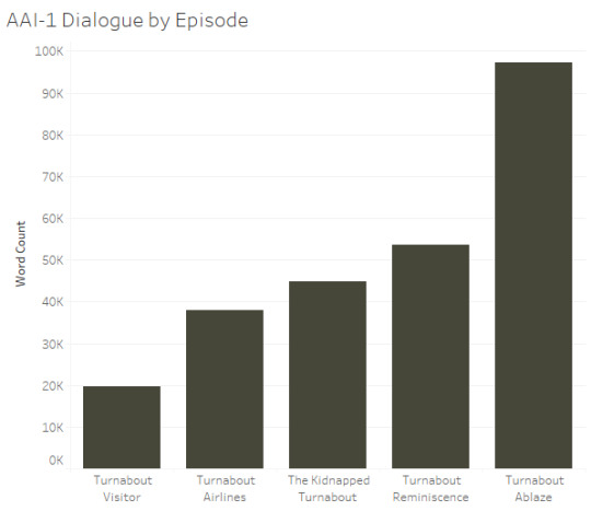
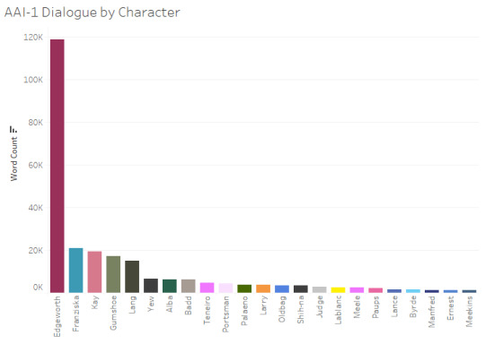
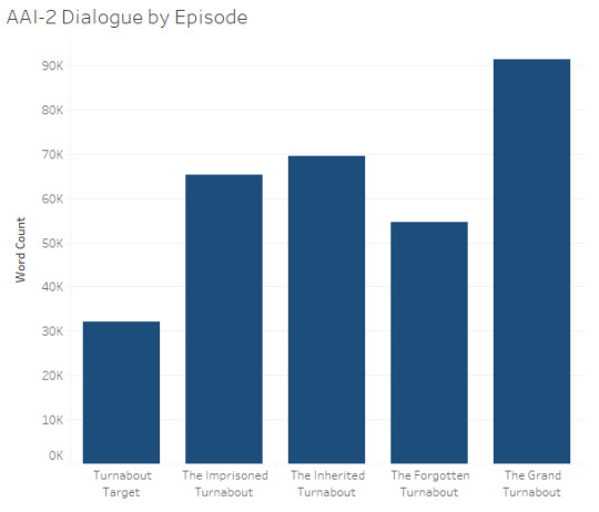
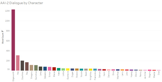
How much dialogue is in the AA Investigations Duology (in graphs)
I like graphs, so I made some graphs about the total amount of dialogue across the Ace Attorney Investigations duology (minor/oblique spoiler warning, although I put the graphs featuring AAI-2 below the cut to help prevent spoilers for anyone who's only played the first game)
AAI-1
(AAI-2 and combined graphs below the cut)
AAI-2
AAI Duology Overall
Overall total dialogue:
AAI-1: 256,002 words
AAI-2: 316,930 words
AAI duology total: 572,932 words
For reference, that makes AAI-1 pretty comparable to AA3 in terms of total dialogue while AAI-2 is substantially more dialogue-heavy than any of the trilogy games.
Data source: I’m using a dataset that I put together pulling from the episode transcripts on the Ace Attorney wiki (which I did almost entirely via Python, but with a bit of manual cleanup). There’s bound to be some error resulting from that process, but the numbers should be pretty close. I'm specifically using the English transcripts, so the AAI-2 counts are based on the fan translation, fwiw
Word counts: The word counts are based on all dialogue from the episode transcripts EXCEPT for the green typewriter text (for scene transitions and Court Record updates) and any dialogue that appears as a pop-up gif rather than text in the dialogue box (e.g., “Objection!”).
AA trilogy graphs: I made similar graphs for the AA trilogy here (for dialogue by character) and here (for the dialogue by episode)
#Ace Attorney#Ace Attorney in Graphs#Ace Attorney Investigations#AA Investigations#Ace Attorney Investigations 2#AAI#AAI1#AAI2#Graphs#Tableau#sC original#I have a 'criticism' of the Investigations games that I'm pretty sure no one else has ever made:#there is no intuitive way to color-code them in graphs#with the mainline games I've been going with a color associated with the main prosecutor for each game#which makes sense to me at least#but that approach can't work here#so bonus points to anyone who figures out what I did instead~
60 notes
·
View notes
Text
Colour Trading App: Simplifying Financial Markets with Visual Cues
The financial landscape is constantly evolving, with new technologies and platforms emerging to meet the needs of both novice and experienced traders. Among the latest innovations in this space is the Colour Trading App, a unique trading platform designed to make financial markets more accessible and intuitive by using color-coded signals. This article explores the concept behind the Colour Trading App, its key features, benefits, and how it is transforming the way people engage with trading.
What is the Colour Trading App?
The Colour Trading App is a mobile trading platform that simplifies the process of buying and selling financial instruments by utilizing a color-coded system. Unlike traditional trading apps that often rely on complex charts, graphs, and numerical data, the Colour Trading App presents market information in a visual format that is easy to understand. This approach is designed to help traders, especially beginners, make informed decisions quickly and with greater confidence.
The Concept of Colour-Coded Trading
At its core, the Colour Trading App uses colors to represent different market conditions and trading signals. This method helps traders interpret market trends at a glance without needing to delve into detailed technical analysis. Here’s how the color-coding system typically works:
Green: Indicates a buying opportunity or a positive market trend. This color suggests that it might be a good time to purchase assets or hold existing positions.
Red: Signifies a selling opportunity or a negative market trend. When the market shows red, it may be advisable to sell assets or reduce exposure to risk.
Yellow/Orange: Represents caution or neutrality. This color suggests that the market is in a state of uncertainty, and traders should proceed with caution or wait for clearer signals.
By simplifying market data into these easily recognizable color codes, the Colour Trading App aims to reduce the cognitive load on traders, allowing them to focus on making decisions rather than analyzing data.
Key Features of the Colour Trading App
The Colour Trading App is packed with features that enhance the trading experience for users of all levels. Here are some of the standout elements that make this app unique:
1. User-Friendly Interface
One of the primary advantages of the Colour Trading App is its user-friendly interface. The design is clean and intuitive, with a focus on simplicity. The color-coded signals are prominently displayed, making it easy for users to understand market conditions and make quick decisions. This streamlined design is particularly beneficial for beginners who might find traditional trading platforms overwhelming.
2. Real-Time Market Data
Despite its simplified approach, the Colour Trading App provides real-time market data across various financial instruments, including stocks, commodities, currencies, and indices. Users receive live updates on market trends, prices, and indices, ensuring that they have the most current information when making trading decisions. This real-time data is crucial in the fast-paced world of trading, where timing can significantly impact outcomes.
3. Customizable Alerts
To help users stay on top of their trading activities, the Colour Trading App offers customizable alerts. Traders can set up notifications based on specific market conditions or color signals. For example, users can choose to receive an alert when a green signal appears, indicating a potential buying opportunity, or when a red signal emerges, suggesting it might be time to sell. These alerts ensure that users never miss important trading opportunities, even when they are not actively monitoring the market.
4. Educational Resources
Recognizing that many of its users may be new to trading, the Colour Trading App provides a range of educational resources. These include tutorials, guides, and webinars that explain how to use the app effectively, interpret the color-coded signals, and develop basic trading strategies. By offering these resources, the app helps users build their knowledge and confidence, making it easier for them to navigate the financial markets.
5. Demo Trading Mode
For those who want to practice trading without risking real money, the Colour Trading App offers a demo trading mode. This feature allows users to trade with virtual funds in a simulated market environment. The demo mode replicates real market conditions, providing a risk-free way for beginners to gain experience and for more experienced traders to test new strategies.
6. Security and Privacy
Security is a critical aspect of any financial platform, and the Colour Trading App takes this seriously. The app uses advanced encryption techniques to protect users’ personal information and financial transactions. Additionally, it complies with relevant financial regulations, ensuring that users can trade with confidence knowing their data and investments are secure.
Benefits of Using the Colour Trading App
The Colour Trading App offers several benefits that make it a valuable tool for both novice and experienced traders.
1. Simplified Decision-Making
One of the most significant benefits of the Colour Trading App is its ability to simplify the decision-making process. By translating complex market data into easy-to-understand color codes, the app allows users to make quick, informed decisions without getting bogged down by technical analysis. This simplicity is particularly beneficial for beginners, who may find traditional trading platforms too complex or intimidating.
2. Accessibility for All Skill Levels
The Colour Trading App is designed to be accessible to everyone, regardless of their trading experience. The intuitive design and educational resources make it easy for beginners to start trading, while the real-time data and customizable alerts provide value for experienced traders as well. This broad accessibility helps democratize trading, making it possible for more people to participate in financial markets.
3. Time Efficiency
In trading, timing is everything. The color-coded system used by the Colour Trading App enables traders to make quick decisions without spending hours analyzing charts and data. This efficiency can be particularly advantageous in volatile markets, where opportunities can arise and disappear in a matter of minutes.
4. Learning and Growth Opportunities
The educational resources provided by the Colour Trading App ensure that users are not just trading blindly. By learning how to interpret the color signals and understanding the underlying market mechanics, users can grow as traders and develop more sophisticated strategies over time. The app’s focus on education makes it a powerful tool for continuous learning and improvement.
5. Flexibility and Convenience
With the Colour Trading App, users can trade anytime and anywhere using their mobile devices. The app’s flexibility allows traders to stay connected to the markets and manage their trades on the go, making it an ideal solution for those with busy schedules or who prefer to trade outside of traditional market hours.
The Impact of the Colour Trading App on the Market
The Colour Trading App is poised to make a significant impact on the financial trading landscape. By making trading more accessible and user-friendly, the app is likely to attract a new generation of traders who might not have considered entering the market otherwise.
1. Expanding the Trader Base
By lowering the barriers to entry, the Colour Trading App is helping to expand the base of traders participating in financial markets. This increased participation can lead to greater market liquidity and more opportunities for all traders.
2. Promoting Financial Literacy
Through its educational resources and simplified approach, the Colour Trading App is playing a role in promoting financial literacy. As more people learn how to trade and understand market dynamics, they become more informed investors, contributing to overall market stability.
3. Encouraging Responsible Trading
The app’s focus on education and user empowerment encourages responsible trading practices. By providing users with the tools and knowledge they need to make informed decisions, the Colour Trading App helps reduce the risk of impulsive or uninformed trades.
Conclusion
The Colour Trading App represents a significant innovation in the world of financial trading. By using a color-coded system to simplify complex market data, the app makes trading more accessible and intuitive for users of all skill levels. Whether you’re a beginner looking to learn the ropes or an experienced trader seeking a more streamlined approach, the Colour Trading App offers the tools and resources you need to succeed.
As the app continues to gain popularity, it is set to play an increasingly important role in the future of trading, making financial markets more inclusive, educational, and user-friendly. With its combination of simplicity, accessibility, and real-time insights, the Colour Trading App is well-positioned to revolutionize how people trade and invest in the financial markets.
0 notes
Text
How do I choose the right data visualization tool?
In today's data-driven world, businesses rely heavily on data to make informed decisions and gain valuable insights. The ability to effectively analyze and present data is essential for success, and that's where data visualization tools come into play. These tools allow businesses to transform complex data sets into visually appealing and easy-to-understand charts, graphs, and dashboards. However, with a plethora of options available in the market, choosing the right data visualization tool can be a daunting task. Here are some key considerations to help you make an informed decision.
Define your requirements: Before selecting a data visualization tool, it's crucial to clearly define your requirements. Understand what type of data you'll be working with, the level of complexity involved, and the specific insights you want to derive from the data. This will help you identify the features and functionalities you need in a tool.
Consider your business intelligence needs: Business intelligence services play a vital role in data visualization. is an integral part of data visualization. Some tools seamlessly integrate with popular BI platforms, allowing you to leverage existing infrastructure and data sources. If you already have a BI system in place, ensure compatibility with the data visualization tool you choose. On the other hand, if you're starting from scratch, look for tools that offer comprehensive BI capabilities.
Evaluate customization options: Custom data visualization is often crucial to presenting data in a way that aligns with your brand or specific requirements. Look for tools that offer a wide range of customization options, such as color schemes, fonts, and layouts. The ability to create interactive and dynamic visualizations is also a valuable feature to engage your audience.
Consider ease of use: Data visualization tools should empower users of all skill levels to create meaningful visualizations without extensive coding or technical expertise. Consider the tool's user interface, ease of data integration, and the availability of drag-and-drop functionalities. A tool with an intuitive and user-friendly interface will save you time and resources.
Scalability and performance: As your business grows, so does your data. Ensure that the chosen tool can handle large data sets efficiently without compromising performance. Scalability is crucial to accommodate future growth and ensure smooth operations as your data visualization needs expand.
Explore data connectivity options: Assess the tool's ability to connect and integrate with various data sources, such as databases, spreadsheets, and cloud storage services. The more flexibility you have in accessing and analyzing your data, the better insights you can derive.
Consider support and training: Look for tools that offer comprehensive support and training resources. Good documentation, tutorials, and a responsive support team can greatly assist you in utilizing the tool effectively and overcoming any challenges along the way.
Budget considerations: Finally, consider the cost of the data visualization tool. Evaluate the pricing model, whether it's a one-time purchase, subscription-based, or requires additional add-ons. Take into account the long-term value and return on investment the tool can provide.
In conclusion, choosing the right data visualization tool requires a thorough assessment of your specific needs, compatibility with existing systems, customization options, ease of use, scalability, data connectivity, support, and budget considerations. By carefully evaluating these factors, you can select a tool that empowers your business to unlock valuable insights from data and present them in a visually compelling manner. Remember, the right data visualization tool can be a powerful asset in driving data-informed decision-making and boosting business performance. If you're looking for a trusted partner in the realm of data visualization and business intelligence, consider Innosoft. As a leading business intelligence company, Innosoft offers a comprehensive suite of tools and services designed to meet the diverse needs of modern businesses. With their expertise and cutting-edge solutions, Innosoft can assist you in harnessing the power of data and transforming it into actionable insights.
0 notes
Text
Finding The Best No-code Data Visualization Tools
Picture this: you're staring at a pile of data so large it could give Mount Everest a run for its money. You know there are valuable insights buried in there somewhere, but where to begin? You get a headache as you navigate the maze of spreadsheets and graphs, wondering if there's a better way. That's where no-code data visualization tools steps in.
The sheer volume of data available to businesses today can be overwhelming. But we can’t deny data’s importance in deriving valuable insights. With traditional BI tools proving complex, time-consuming, costly, and requiring specialized expertise to use them effectively, they are slowly turning obsolete. They may also be contesting to integrate with other tools and services, creating silos of information that are hard to break down. Situations like these can lead to lost productivity, missed opportunities, and, ultimately, lost revenue.
Thankfully, no-code data visualization tools are changing the game. These tools allow businesses of all sizes and industries to access and analyze data without requiring specialized technical skills. Actionable insights are leading the game with customizable dashboards, drag-and-drop functionality, and real-time data integration. And only a no-code tool user would know to lead the way.
In this article, we'll explore the key factors to consider when choosing the best no-code data visualization tool for your business. From customization options to data integration capabilities and access to collaboration features, we'll cover everything you need to know to move in the right direction.
So, if you have had enough of drowning in data and are ready to make the most of your information, let's dive into some clarity!
What is no-code data visualization?
No-code data visualization tools enable businesses to create interactive and visually appealing charts, graphs, and other data visualizations without the need for programming knowledge. These tools typically use a drag-and-drop interface, allowing users to customize their visualizations' look and feel effortlessly.
Why are no-code data visualization tools beneficial?
Their benefit to businesses ranges from helping them make data more accessible and easier to understand. With visualizations, data can be presented in a way that is more intuitive and engaging, making it easier for users to identify trends, patterns, and insights. This can lead to faster and better-informed decision-making and improved communication and collaboration among teams.
How can no-code data visualization tools enhance business intelligence?
No-code data visualization tools can enhance business intelligence by giving users a more efficient and effective way to analyze data. By making data more accessible and easier to understand, these tools can help users to identify patterns and insights that might otherwise go unnoticed. This can lead to more accurate predictions, better-informed decisions, and a more agile and competitive business.
Key Features to Look for in No-Code Data Visualization Tools
#1-Customization Options
When choosing a no-code data visualization tool, it's essential to look for one that offers a range of customization options. This should include changing colors, fonts, and other visual elements and adding interactive features like hover-over effects, filters, and animations.
#2-Data integration capabilities
Data integration is another feature that decides the use of BI. This includes connecting to various data sources, such as spreadsheets, databases, and cloud-based services. No-Code Business Intelligence tools usually have visualization features that allow users to manipulate the data as needed, such as filtering or sorting, to create more customized visualizations.
#3-Accessibility and ease of use
No-code data visualization tools should be easy to use and accessible to all users, regardless of technical skill level. This means that the tool should have an intuitive interface that allows users to quickly create and edit visualizations and provide helpful tutorials and guides to assist users in getting started.
#4-Collaboration features
The tool should allow multiple users to work on the same project simultaneously and provide tools for sharing and discussing visualizations. This can foster directive collaboration and communication among teams.
#5-Security and compliance
Lastly, security and compliance features should be considered when choosing a no-code data visualization tool. No-Code Business Intelligence tools should have adequate measures in place to protect sensitive data, such as encryption and access controls. It should also comply with relevant regulations and standards, such as GDPR and HIPAA.
Factors to Consider when Choosing a No-Code Data Visualization Tool
A. Budget
You might be tempted to choose a more affordable option for a no-code data visualization tool but ensure you're not compromising on the functionalities as per your organizational needs. While many affordable options are available, some tools are expensive. It's crucial to weigh the costs against the potential benefits to determine if the investment is worthwhile.
B. Scalability
Scalability is another important consideration, particularly for businesses anticipating significant growth or data volume changes. The tool should be able to handle increasing amounts of data and users without sacrificing performance or quality.
C. User support and training resources
No-code data visualization tools should offer adequate user support and training resources. This includes a comprehensive knowledge base, helpful tutorials, and responsive customer service. This can help users quickly resolve any issues or questions that may arise.
Grow offers a range of support options such as FAQs/Forum, Knowledge Base, Chat, Email/Help Desk, 24/7 (Live rep). Their training facilities have Videos, Webinars, Live, In-person-training and much more to choose from. Learn more on Grow Reviews 2022.
D. Integration with other tools
In any case, integration can reduce your efforts towards collecting data thousands of times. Therefore, No-Code Business Intelligence software should be able to integrate seamlessly with other tools and services your business already uses, such as CRM or marketing automation platforms. Streamlining workflows and reducing the need for manual data entry is the ultimate win-win for both organizations and users.
E. Reviews and user feedback
Lastly, reading reviews and user feedback before choosing a no-code data visualization tool is essential. This can provide valuable insights into the tool's strengths, weaknesses, and any issues or challenges users may have encountered. Testing the tool through a free trial or demo can also get a feel for its capabilities and usability. Grow is one such tool for No-Code Business Intelligence, offering a free demo.
Key Takeaways
No-Code Business Intelligence tools can help businesses to make data more accessible and understandable, leading to faster and better-informed decision-making. Consider all the above factors and choose a BI and visualization tool that resonates with your needs and users’ technical knowledge above all.
Grow is a comprehensive Business Intelligence platform with a no-code data visualization tool, data integration, analytics, and collaboration features. It offers a range of plans to suit businesses of all sizes. Our no-code data visualization tool emphasizes collaboration and data governance.
Access a range of customization options, data modeling, and exploration features and make a much-needed difference to your analytics game!
#No-code data visualization#No-Code Business Intelligence#No-Code Business Intelligence software#No-Code Business Intelligence tools
0 notes
Text
ggplot cheat sheet 100% working EKJ9+
💾 ►►► DOWNLOAD FILE 🔥🔥🔥🔥🔥 Data visualization with ggplot2 cheatsheet. The ggplot2 package lets you make beautiful and customizable plots of your data. It implements the grammar of. Data Visualization with ggplot2. Cheat Sheet. RStudio® is a trademark of RStudio, Inc. Beautiful plotting in R: A ggplot2 cheatsheet · Add x and y axis labels ( labs() , xlab() ) · Get rid of axis tick and labels ( theme() , axis. ggplot2 Aesthetics · At the canvas level: All subsequent layers on the canvas will inherit the aesthetic mappings defined when the ggplot object was created with. 9 By Sharon Machlis. There's a reason ggplot2 is one of the most popular add-on packages for R: It's a powerful, flexible and well-thought-out platform to create data visualizations you can customize to your heart's content. But it also can be a bit overwhelming. While I find the logic of plot layers to be intuitive, some of the syntax can be a bit of a challenge. Unless you do a lot of work in ggplot2, I'm not sure how easy it is to remember that, for example, the simple task of "make my graph title bold" requires the rather wordy theme plot. So I've come up with a two-step method that's drop-dead simple -- at least for me -- to do my most common dataviz tasks in ggplot2. I hope it will help you, too. Below is a cheat sheet, easily searchable by task, to see just how to do some of favorite and most-used ggplot2 options -- everything from creating basic bar charts and line graphs to customizing colors and automatically adding annotations. If you're still somewhat of a ggplot2 newbie, page 2 of this post has a brief explanation of the ggplot2 layers concept. Part 2 will make this even easier. I've created RStudio code snippets for several dozen of these tasks, so you don't even have to copy and paste -- or re-type -- these commands. Instead, you can download my ggplot2 code snippets. Find out more about the ggplot2 code snippets and download them to your own system. Free registration required. Here are the latest Insider stories. More Insider Sign Out. Sign In Register. Sign Out Sign In Register. Latest Insider. Check out the latest Insider stories here. More from the Foundry Network. Beginner's guide to R: Painless data visualization. Useful new R packages for data visualization and analysis. Great R packages for data import, wrangling, and visualization. Need continuous numerical data on both axes. Aesthetics are mappings. See chart of available shapes. There are other variations with a midpoint color, specific numbers of colors and more. Type can be sequential or diverging; palettes can be names or numbers. See documentation. Run colors in base R to see all available color names. Need categorial data for x axis. Without this, the graph will show counts of each value on the x axis. Only an x value is needed because this default counts number of records for each x category. Remove the - before the y column name if you want ascending order. As with fill, the color can be a color name available in R like "lightblue" or a hex value like " B2". A vector of breaks could look something like c 0,25,50,75, or seq 0,, If there are values outside your defined limits, they won't display, so you can use this to statically zoom in on a portion of your dataviz. Put multiple plots from different data on one page - gridExtra package Any grid. File extension determines type of file created Set width and height in inches with width and height arguments. This is added to the basic ggplot object. Color can be a color name available in R like "lightblue" or a hex value like " B2". Needs categorical data on x axis and numerical data on y axis. This can be confusing since "color" is not the main item color but its outline. Customize colors in a bar graph where colors have been defined to change by a category - use RColorBrewer. See available RColorBrewer palettes with display. With categories on x axis, intercept 3 means the 3rd item on the axis. While there are ways to do this in ggplot2, if order matters to you, create a variable ordered as you want in R. Any number of plots can be entered, separated by a comma. There are other options for annotate besides "text" such as "rect" for rectangle with properties xmin, xmax, ymin, ymax and alpha transparency and optional color border and fill fill color.
1 note
·
View note
Link

Visualization of the average temperature over the Lower 48 states, 1895 to 2017, using NOAA data. Each stripe is color-coded to represent the temperature of a particular year. (Ed Hawkins)
Excerpt:
Temperatures over both the Lower 48 United States and the planet have steadily warmed in recent decades. Ed Hawkins, a climate scientist at the University of Reading in Britain, sought to illustrate this warming in the most straightforward way possible.
So he created visualizations of the course of temperature over time using strictly a series of color-coded stripes. You might mistake them for modern art, carpet patterns or perhaps flags. But they are scientific representations that unambiguously reveal a long-term warming signal.
The blue stripes portray cooler years, while the reds are hot. The darkest shades of blue and red depict those cold and hot years that were most extreme.
For the both the Lower 48 states and the planet, the progression from more blue to more red over time is crystal clear.
“I wanted to communicate temperature changes in a way that was simple and intuitive,” Hawkins said in an email. “This visualization removes all the distractions of standard graphs and allows the viewer to just see the long-term trends and variations in temperature without needing to interpret anything else.”
5 notes
·
View notes
Text
TIMES - Extraordinary Newspaper Magazine Theme
New Post has been published on https://click.atak.co/times-extraordinary-newspaper-magazine-theme/
TIMES - Extraordinary Newspaper Magazine Theme
Briefly about features
TIMES is an extraordinary newspaper / magazine WordPress theme designed to redefine publishing by making content both easier to create and consume. It combines professional looks and unmistaken typography with impressive user experience (UX) and incredible attention to details.
Enjoy your content on mobile devices, tablets and more thanks to a responsive layout, now even faster and better with optimized images and support for high-quality retina screens. This theme supports menus 3 levels deep as more than this is a burden for users to navigate. If you have more questions, please email support.
Changelog
May 12th, 2018 — version 1.4.8
ADDED - Option to show "Unique posts only" on the homepage. While, previously, only posts of the same type were not repeated, with this setting you can choose to skip the same post from the entire homepage. That includes every post on the homepage and inside sidebars/widget areas. Of course, your handpicked posts on the homepage will be displayed as usual and won't be affected by this setting. ADDED - Option to "Copy link" to the article, in the share area below article. We've added yet another way to share your articles, your readers can now simply click the button to copy the post link and share it ony any site, community or platform. ADDED - Option to "Email" article link, in the share area below article. Your readers can also send the article link to a friend or colleague via email. IMPROVED - Visual tweaks and improvements. IMPROVED - Customizer experience.
March 17th, 2018 – version 1.4.7
ADDED - Font Editor - We've added a brand new section to the customizer that will allow you to change every font on the site effortlessly. There are three font families loaded with the theme by default, you can swap them all out with almost 900 fonts offered by Google Fonts or add your custom fonts with a link or code from your font provider. Using Greek, Cyrillic or Vietnamese script with your Google Fonts? Easily add font subsets straight from the customizer! Want to use only one font on the whole page? Sure! Just check the "Use universal font?" checkbox and you're good to go. All that available in the customizer from today! ADDED - Shortcodes can be inserted directly to the homepage as part of Custom Code module. IMPROVED - UX tweaks and improvements for customizer’s publish menu. IMPROVED - Moved the "Font Subset" option from Settings page to customizer. IMPROVED - Front-end, visual tweaks. IMPROVED - Performance.
November 24th, 2017 – version 1.4.6
ADDED - Custom Code module to the homepage builder. You can now insert any HTML, JavaScript code or text to the homepage. Great for adding advertisements, even if your code is not optimized to be responsive, you can use the module's tabs to enter different code for mobile, tablet and/or desktop devices. This module is very similar to WordPress’ Text Widget, once you toggle the "Include basic styling?" checkbox, it allows you to move some of that content from sidebars to the homepage. ADDED - Smart reload to the homepage builder. We think that this feature will greatly increase the productivity of assembling your homepage. The customizer now refreshes the homepage once it detects that you are done making changes, avoiding unnecessary updates and improving the customizer's performance, especially on older devices. ADDED - Compatibility with WordPress 4.9 and it's new features. IMPROVED - Few visual tweaks and improvements.
October 28th, 2017 – version 1.4.5
ADDED - Option to change ticker content font type: serif and sans-serif. ADDED - Option to disable/enable opening social media links throughout the site in a new tab, in customizer. ADDED - Checkbox to Social Media widget that allows to disable opening links in a new tab. ADDED - Option to hide posts date on the homepage, articles and across the site. IMPROVED - Social Media widget following count. Results are now loaded asynchronously to improve page loading speed in some cases. IMPROVED - Ticker content is now loaded asynchronously to avoid additional database queries on page load and to improve load speed. IMPROVED - Visual tweaks.
September 29th, 2017 – version 1.4.4
ADDED - Breaking News Ticker - This is a big one, we've actually created the whole ticker system from scratch, we started with creating the best experience by designing an intuitive and familiar UI to customize your ticker content, appearance and behavior. You can either show post: latest, oldest, most bookmarked / commented, from category(ies), handpicked or add your own content right from the customizer. Adjust the appearance and layout to fit your sites style, set your own colors, change the label text or choose the scrolling direction – all that with instant, live preview, which makes customizing a quick and productive task. ADDED - Option to disable rich menu dropdowns (Functionality ON/OFF > Other). ADDED - Option to the Social Media widget to open profile links in a new tab. IMPROVED - Few visual tweaks.
August 24th, 2017 – version 1.4.3
ADDED - New layout for Secondary Menu Bar called "Divider". You can check it out in Dashboard > Appearance > Customize > Header Layouts. ADDED - New layout for Secondary Menu Bar called "Shadow". ADDED - New background type for "Boxed" layout in Secondary Menu Bar: "Dark Background" ADDED - New background types for "Boxed" layout in Secondary Menu Bar: "Custom Light & Dark Color" which allows you to set a custom color, light or dark, for the bar’s background. ADDED - Added option to choose amount of padding / space for Secondary Menu Bar: Small, Medium, Large Padding. ADDED - Instant, live feedback in customizer for Showing / Hiding Secondary Menu Bar’s search button, date and social icons.
July 24th, 2017 – version 1.4.2
ADDED - Custom made, light and fast one-click demo importer designed specially for TIMES with clean, simple, intuitive and clutter-free interface. We've written, completely from scratch, brand new demo importer tailored specifically for TIMES, it's fast, light-weight and easy to use, you can add some demo content to your sites in minutes and remove just as fast, all that with a click of one button that conveniently turns into a slick progress bar. In short, it's awesome and to try it out just activate the free bundled Dash+TIMES plugin ADDED - New demo content called "TIMES Starter Pack". Contains everything you need to get started with the theme, a complete and lightweight package, ideal for new sites and easily removable. ADDED - Option to enable or disable "pinch to zoom" on devices with touch screens. IMPROVED - Few visual tweaks.
June 15th, 2017 – version 1.4.1
ADDED - Optional print button in the interaction area. You can enable it or disable it by going to the Dashboard > Appearance > Customize > Show/Hide and (un)checking the "Print Button Below Post" checkbox. ADDED - Option to remove all theme's meta tags in case you want to use a third-party plugin for meta tags. Meta tags include Open Graph tags, Twitter tags and meta description tag. ADDED - Updates for WordPress 4.8. IMPROVED - Visual tweaks.
May 31st, 2017 – version 1.4.0
ADDED - Homepage Builder - This is a big one... We've created completely from scratch a tool that allows you to modify any element on the homepage. You can rearrange every sections, have multiple sliders or any module, each with different settings. You can pick certain posts to appear in the section in most modules or, for example, set the post type to display most commented posts from this week. This tool allows for a total flexibility and customization of your homepage, on top of that it is very intuitive, nicely designed, clean and without unnecessary clutter. The builder is very smart and adaptable, for example, if you add two compatible modules that display the same type of posts, the second module will not show the same posts, they will be offseted. There are plenty of unique touches like that and this paragraph is already too long so I would recommend that you give the builder a try by going to the Dashboard > Appearance > Customize > Homepage Layout. Oh and don't worry! Every change you've made to the slider or other modules through the customizer will be converted to the builder so you don't have to redo your layout! IMPROVED - Slider section from customizer was moved to the Homepage Layout section and all your settings will be mirrored to the homepage builder. IMPROVED - Few visual tweaks.
April 30th, 2017 – version 1.3.9
IMPROVED - Few visual tweaks. IMPROVED - Main menu experience. IMPROVED - Hero image performance.
April 3rd, 2017 – version 1.3.8
ADDED - New widget called "Category Posts" that allows you to display articles from specific category in any post-excerpt format neatly in the sidebar. You can also pick the number of posts to show as well as set the time-range. IMPROVED - Few visual tweaks.
March 23rd, 2017 – version 1.3.7
IMPROVED - Customizer looks and experience. Biggest customizer redesign to date, we made the customizer much, much more organized, easier to navigate, less cluttered and gave it a more modern look. Every section has it’s own custom made icon and a description for easier navigation, similar settings are now grouped together to make the best use of space and each group has a short explanation to it. Words really can't do a justice once you compare the old customizer with the new one. Make sure to try it out and if find something not working properly, just go to Dashboard > Settings > General and uncheck the "Customizer tweaks" checkbox. ADDED - Dark mode. Yes, your website can now join the dark side. To change the color scheme of your site go to the Dashboard > Appearance > Customize > Change Colors and pick a dark color scheme. ADDED - Sepia color scheme. Give your site the old-school look with subtle brown shades. You can change the color scheme in the same section as the dark color scheme. ADDED - Option to change the default sorting for comments.
BUY From ENVATO Marketplace
#blog#clean#extraordinary#Magazine#modern#newspaper#parallax#professional#publishing#simple#social media#social sharing#theme#times#typography#wordpress
1 note
·
View note
Text
Colour Trading App: Simplifying Financial Markets with Visual Cues
The financial landscape is constantly evolving, with new technologies and platforms emerging to meet the needs of both novice and experienced traders. Among the latest innovations in this space is the Colour Trading App, a unique trading platform designed to make financial markets more accessible and intuitive by using color-coded signals. This article explores the concept behind the Colour Trading App, its key features, benefits, and how it is transforming the way people engage with trading.

What is the Colour Trading App?
The Colour Trading App is a mobile trading platform that simplifies the process of buying and selling financial instruments by utilizing a color-coded system. Unlike traditional trading apps that often rely on complex charts, graphs, and numerical data, the Colour Trading App presents market information in a visual format that is easy to understand. This approach is designed to help traders, especially beginners, make informed decisions quickly and with greater confidence.
The Concept of Colour-Coded Trading
At its core, the Colour Trading App uses colors to represent different market conditions and trading signals. This method helps traders interpret market trends at a glance without needing to delve into detailed technical analysis. Here’s how the color-coding system typically works:
Green: Indicates a buying opportunity or a positive market trend. This color suggests that it might be a good time to purchase assets or hold existing positions.
Red: Signifies a selling opportunity or a negative market trend. When the market shows red, it may be advisable to sell assets or reduce exposure to risk.
Yellow/Orange: Represents caution or neutrality. This color suggests that the market is in a state of uncertainty, and traders should proceed with caution or wait for clearer signals.
By simplifying market data into these easily recognizable color codes, the Colour Trading App aims to reduce the cognitive load on traders, allowing them to focus on making decisions rather than analyzing data.
Key Features of the Colour Trading App
The Colour Trading App is packed with features that enhance the trading experience for users of all levels. Here are some of the standout elements that make this app unique:
1. User-Friendly Interface
One of the primary advantages of the Colour Trading App is its user-friendly interface. The design is clean and intuitive, with a focus on simplicity. The color-coded signals are prominently displayed, making it easy for users to understand market conditions and make quick decisions. This streamlined design is particularly beneficial for beginners who might find traditional trading platforms overwhelming.
2. Real-Time Market Data
Despite its simplified approach, the Colour Trading App provides real-time market data across various financial instruments, including stocks, commodities, currencies, and indices. Users receive live updates on market trends, prices, and indices, ensuring that they have the most current information when making trading decisions. This real-time data is crucial in the fast-paced world of trading, where timing can significantly impact outcomes.
3. Customizable Alerts
To help users stay on top of their trading activities, the Colour Trading App offers customizable alerts. Traders can set up notifications based on specific market conditions or color signals. For example, users can choose to receive an alert when a green signal appears, indicating a potential buying opportunity, or when a red signal emerges, suggesting it might be time to sell. These alerts ensure that users never miss important trading opportunities, even when they are not actively monitoring the market.
4. Educational Resources
Recognizing that many of its users may be new to trading, the Colour Trading App provides a range of educational resources. These include tutorials, guides, and webinars that explain how to use the app effectively, interpret the color-coded signals, and develop basic trading strategies. By offering these resources, the app helps users build their knowledge and confidence, making it easier for them to navigate the financial markets.
5. Demo Trading Mode
For those who want to practice trading without risking real money, the Colour Trading App offers a demo trading mode. This feature allows users to trade with virtual funds in a simulated market environment. The demo mode replicates real market conditions, providing a risk-free way for beginners to gain experience and for more experienced traders to test new strategies.
6. Security and Privacy
Security is a critical aspect of any financial platform, and the Colour Trading App takes this seriously. The app uses advanced encryption techniques to protect users’ personal information and financial transactions. Additionally, it complies with relevant financial regulations, ensuring that users can trade with confidence knowing their data and investments are secure.
Benefits of Using the Colour Trading App
The Colour Trading App offers several benefits that make it a valuable tool for both novice and experienced traders.
1. Simplified Decision-Making
One of the most significant benefits of the Colour Trading App is its ability to simplify the decision-making process. By translating complex market data into easy-to-understand color codes, the app allows users to make quick, informed decisions without getting bogged down by technical analysis. This simplicity is particularly beneficial for beginners, who may find traditional trading platforms too complex or intimidating.
2. Accessibility for All Skill Levels
The Colour Trading App is designed to be accessible to everyone, regardless of their trading experience. The intuitive design and educational resources make it easy for beginners to start trading, while the real-time data and customizable alerts provide value for experienced traders as well. This broad accessibility helps democratize trading, making it possible for more people to participate in financial markets.
3. Time Efficiency
In trading, timing is everything. The color-coded system used by the Colour Trading App enables traders to make quick decisions without spending hours analyzing charts and data. This efficiency can be particularly advantageous in volatile markets, where opportunities can arise and disappear in a matter of minutes.
4. Learning and Growth Opportunities
The educational resources provided by the Colour Trading App ensure that users are not just trading blindly. By learning how to interpret the color signals and understanding the underlying market mechanics, users can grow as traders and develop more sophisticated strategies over time. The app’s focus on education makes it a powerful tool for continuous learning and improvement.
5. Flexibility and Convenience
With the Colour Trading App, users can trade anytime and anywhere using their mobile devices. The app’s flexibility allows traders to stay connected to the markets and manage their trades on the go, making it an ideal solution for those with busy schedules or who prefer to trade outside of traditional market hours.
The Impact of the Colour Trading App on the Market
The Colour Trading App is poised to make a significant impact on the financial trading landscape. By making trading more accessible and user-friendly, the app is likely to attract a new generation of traders who might not have considered entering the market otherwise.
1. Expanding the Trader Base
By lowering the barriers to entry, the Colour Trading App is helping to expand the base of traders participating in financial markets. This increased participation can lead to greater market liquidity and more opportunities for all traders.
2. Promoting Financial Literacy
Through its educational resources and simplified approach, the Colour Trading App is playing a role in promoting financial literacy. As more people learn how to trade and understand market dynamics, they become more informed investors, contributing to overall market stability.
3. Encouraging Responsible Trading
The app’s focus on education and user empowerment encourages responsible trading practices. By providing users with the tools and knowledge they need to make informed decisions, the Colour Trading App helps reduce the risk of impulsive or uninformed trades.
Conclusion
The Colour Trading App represents a significant innovation in the world of financial trading. By using a color-coded system to simplify complex market data, the app makes trading more accessible and intuitive for users of all skill levels. Whether you’re a beginner looking to learn the ropes or an experienced trader seeking a more streamlined approach, the Colour Trading App offers the tools and resources you need to succeed.
As the app continues to gain popularity, it is set to play an increasingly important role in the future of trading, making financial markets more inclusive, educational, and user-friendly. With its combination of simplicity, accessibility, and real-time insights, the Colour Trading App is well-positioned to revolutionize how people trade and invest in the financial markets.
0 notes
Photo

The Way of The Knife
Adventures in Excel
If you've been following along with the posts in this series, and you've been putting some of the scenarios into practice, you've now crossed a crucial juncture in your never ending quest to master the bloated beast that is Excel. To put things in perspective, if you've conquered all the quests that I've set you upon, you should now be able to: * Open up and add macro code into an Excel Worksheet * Utilize lookup functions (particularly Index(Match)) to compare and validate data sets * Build a complex formula * Utilize IF/AND/and OR statements in order to manipulate data and finally... * Understand your role in the data underground If there was any running theme among the posts in the past, it's that if you're in the position in which you're forced to utilize Excel in order to analyze data, you're probably grabbing a dirty version of the data-set from an intermediary platform (such as Tableau or Business Objects) built by a developer who isn't informed as to how the end user is going to use the data. Your mission, whether you choose to accept it or not is essentially to take data from people who know data and don't know the business, and turn it into data for people who know business and don't understand numbers. If you're wondering if perhaps you're in this role and don't know it yet,there's a simple two question litmus test =IF(AND(COLORCODING,OR(SLICE,DICE)),"Analyst","Something Else" For those of you who are just joining the party, that essentially says that if: 1. If a superior of yours has ever asked you to "slice" and or "dice" the data 2. If you're asked to color code things arbitrarily. Then you might be an analyst. Now, while your sitting at your desk (in what's most likely an Aeron chair) and you read the above qualifiers, the first thought that pops into your mind should be: "WTF does slice and dice mean when it comes to data analysis?" The answer may surprise you in that it's not just meaningless business lingo, it's actually a pretty good explanation of what you're going to be doing A LOT of (but fear not, in all likelihood, your boss didn't mean it like that due to what I'd like to call the leveraging of the synergy paradigm ). Essentially, when one attempts to slap-chop a "data dump" (in the computer patois, that's how you say data that's pulled straight from the source), it often involves as the first step "normalizing" the data so that the format is logical, and is in a position in which you can start employing some of the wizardy that we've been speaking about. The normalization process often involves only a few steps, all of which are quite easy, but EXTREMELY un-intuitive, and if you follow these steps, you'll either be done with the normalization process, or you'll be able to figure out how (all data dumps are dirty, but not all shit is created equal). 1. Ensure that your data has headings! a. Headings are essential not just because they're a logical way to organize your variables, but they're are also REQUIRED to build a pivot table down the road, if even one of your columns doesn't have a heading, Excel won't play nice! 2. Ensure that your headings don't repeat themselves a. While this may seem obvious, if a heading repeats itself, Excel won't pivot properly, won't graph correctly AND won't upload properly in external tools (such as Microsoft Access, which we'll explore in a later post!) 3. Ensure that multiple sources are all located on the same Excel workbook (basically, if you're pulling data from multiple places, that you paste them all into the same Excel file). a. Note that since Excel 2007, this step isn't 100% necessary, but it makes things much faster in both ease of use, and in the computational sense. 4. And finally, ensure that your variables are in the correct format...which is what we'll focus on for the rest of this post. Often, data dumps combine multiple variables into one "string" (a set of characters with no other format) most often last names, first names, and ID numbers which is fine when you're trying to figure out how many Smith,Bob,8675309s exist in your data...so basically useless on it's own. This brings us to the title of this post: how we're going to slice up (or "Parse") this string so that it's useful to us. There are a few was of going about this, but in my experience the most useful is some combination of the following formulae: =LEFT which returns a specified number of characters from the start of a string. =RIGHT which returns a specified number of characters from the end of the string. =MID which returns a specified number of characters from a defined point in the string =LEN which returns the number of characters in the string, and =FIND which returns the location of a specified character or string within a string. Just a word to the wise, starting from the beginning is always 0, not 1 in any of these examples. Assuming you've got some android in you, you notice that =left and =right are basically useless if you need to break up a string (but can be useful if you wind up with a data dump that gives you a preset amount of garbage to throw away each time, or as a second step in this process). Instead, we're going to leverage the fact that Data Dumps are generally exported in Comma Separated Format (CSV) which means that there are going to be a lot of commas for you to set as "flags" where you want to break things up. Take the example I gave you before: Smith,Bob,8675309s. This is actually a particularly mean example because you're going to need to break it into three steps for which there are multiple solutions, simply because there's more than one comma to "put your flag down". One way you can go about it is as such: First use the "mid" function alongside the "find" command in order to separate the last name from the first name and ID, like so: =MID(A1,FIND(",",A1)+1,LEN(A1)) The result of this will be Bob,8675309, and the reason why the +1 is included is so that we don't include the comma (which would start this whole circus again) From there, you can repeat the steps on the newly created Bob,8675309 in order to obtain the ID. Once you have the ID number, if you return to the original string and perform =left(A1(find(",",A1)-1) (the -1 removes the first comma as opposed to the second) you'll get "Smith" Finally, you can go to the Bob,8675309 string (which we'll say is located in B1) and perform the same steps in order to get "Bob" all by itself. With all that being said, until we get a bit more advanced (yes, you can do this in fewer steps), assume you need one formula per comma in order to "parse" each section, and you'll find your way. The benefit of breaking it down this way is that you can drag the formula down and it'll perform the exact same steps regardless of how long the initial string is, as long as it has 3 commas. So, what have we learned? We've learned to slice up data dumps We've learned to dice up the resultant strings and finally We've learned how to take a small bit of useless garbage and turn it into variables that we can use in further analysis via slicing and dicing. So you see? Perhaps your boss knew something after all when they were asking you if you knew how to slice and dice data...juuuuuust kidding. Now that you have a basic fund of knowledge (and if you don't I implore you to read the rest of the Adventures in Excel series), the next few lessons are going to go into some of the crazier stuff that I've personally been asked to do (which my other friends on this blog could do in 5 minutes using something other than Excel) and you'll learn to start a fire with some flint and a bunch of sticks. -Snacks out.
- Max Mileaf Read post
1 note
·
View note
Text
The Topmost Free SVG Tools for Better Graphics

The scalable vector graphics or SVG is a file format that allows the users to display vector images on their websites. It is gaining popularity these days in web design. You can create SVG graphics using tools like Inkscape or Illustrator. But, optimizing for lighter results becomes essential when it comes to web design. Nowadays, more than 80 percent of any webpage can be seen studded with images. Unfortunately, these images can’t adapt to the evolution of the web and change so quickly. It is a general concept that when your image takes more the size of your website, it takes your website longer time to load, which means you are going to lose your leads, potential customers, visitors, and ultimately your business. SVG is a powerful format that scales naturally without losing quality.
For users’ convenience, we have a wide range of tools that can help you work with SVG efficiently and quickly. These are mostly online tools that can help you make patterns, conversion, optimization, and many more.
b64
The simple tool can be used to optimize photos and images and then turn them into the format of base64. You can grab the CSS with the image of the base64 background after dropping your SVG images.
Interactive SVG Coordinate System
The exceptional interactive tool introduced by Sara Souiden helps the users learn about the functioning of SVG coordinates. You can use the preserveAspectRatio and viewBox on SVG to play guided by purple and orange lines and a handy ruler while learning SVG’s coordination function.
SVG OMG
The tools turn the SVGO’s command line into the GUI version, which is easy to use and intuitive. You can activate or deactivate every feature only by toggling the buttons. In the end, it will help you to grab the result as code and image files.
SVGO
The users can use this tool to remove hidden elements, comments, or editor metadata. You can install using the GUI versions or through npm. The GUI version offers a drag and drop feature to process the optimization of SVG.
SVG to PNG converter
The SVG to PNG converter tool can help you export your SVG files to PNG form without opening any other application like Illustrator. You can get URI PNG Base64 data and images in PNG format.
SVG Now
The tool helps you to get the optimized version of the SVG that you have exported right from your Illustrator workspace.
SVG Sprite
The tool based on the Node.js module optimizes SVG files in the bunch and bakes them into sprite-types of SVG that includes SVG stacks, traditional CSS sprites for foreground-background images, and many more.
SVG Circus
You can use SVG Circus to create loader animations. The tool enables the users to make their spinner, loader, or anything that resembles looped animation. You will need to set the Actor position, color, size, and other things from the panel. Further, you can export to get the results.
Plain Pattern
The users can use this tool to upload their image, change or scale down the spacing, recolor and rotate them until they get a beautiful pattern.
Quasi
The users can use this tool to generate Quasicrystal images and play around switching to various options. After then, you can use the ‘Save SVG’ button to download the results.
Trainglify Generator
The tool is useful when it comes to creating beautiful geometric patterns based on SVG. You can set the variant, color randomness, granularity size, and then a color palette.
SVG Filters
With SVG, you can add many effects to images like saturation, hue, linear color overlay, blur, and many others. The SVG Filters tool visualizes these effects and gives the users a snippet making it easy for them to embed that effect into their project.
SVG Morpheous
The JavaScript library allows its users to morph an icon based on SVG from one shape to another. Besides, the users can set rotation direction, duration of transition animations, and easing effect.
Chartist.js
It is a type of library that can be used to create highly responsive and customizable charts. The tool utilizes SVG for displaying graphs. You can make pie charts, bar charts, line chart, and many other types of maps. Plus, you can also add animation to these charts.
Clip path generator
The tool helps users click the clip of images with a polygonal shape or many points.
Method Draw: A Simple SVG Editor
The web-based SVG editor has an intuitive interface packed with lots of tools on the canvas’s sides. You can draw shapes, lines, use in-built shapes, or input text. After then, you can edit the drawn objects’ properties and export the image in SVG format or save it in PNG format directly.
Export Flash to animated SVG
You can use this tool to work on CS6, CS5, and CC and export into SVG format when it comes to Shape Tweens, Classic Motion Tweens, Bitmaps, and Symbols.
The users use points, shapes, and lines to create a vector image. They can scale these vector images to any size without losing their quality. These vector images are used in the best ways for various elements like icons, logos, illustrations, and typography. The tools mentioned above help improve your performance and web designing skills to a great extent. With these best graphic design tools, you can stand apart in the crowd and prove your skills.
SOURCES = The Topmost Free SVG Tools for Better Graphics
0 notes
Text
Tiranga Colour Trading App: A New Era in Simplified Trading
In today’s dynamic financial world, trading is no longer an activity confined to professionals sitting behind sophisticated trading desks. With the advent of mobile technology, trading has become accessible to everyone, anywhere, at any time. Amidst this evolution, the Tiranga Colour Trading App emerges as a game-changer, offering a unique and intuitive approach to trading through the use of color-coded signals. This article delves into the features, benefits, and impact of the Tiranga Colour Trading App, illustrating how it is transforming the way people engage with financial markets.

What is the Tiranga Colour Trading App?
The Tiranga Colour Trading App is a mobile trading platform designed to simplify the trading process by using a color-coded system inspired by the Indian national flag—hence the name "Tiranga," which means tricolor. The app aims to make trading more accessible and less intimidating by providing users with visual cues that represent market conditions and trading signals. Whether you’re a novice trader or a seasoned investor, the Tiranga Colour Trading App offers a fresh and intuitive way to navigate the financial markets.
The Concept Behind Tiranga Colour Trading
Traditional trading platforms can be overwhelming for beginners, with their reliance on complex charts, graphs, and technical indicators. The Tiranga Colour Trading App addresses this challenge by distilling market information into simple, easy-to-understand color codes. Here’s how the color system works:
Saffron (Orange): This color might represent a bullish market trend or a strong buying opportunity, signaling that it might be a good time to purchase assets.
White: White often symbolizes neutrality or a period of consolidation in the market, where it’s advisable to hold your positions and wait for a clearer trend to emerge.
Green: This color could indicate a bearish trend or a signal to sell, suggesting that it might be a good time to exit positions or reduce exposure to risk.
This color-coded system helps users make quick, informed decisions without getting bogged down by data analysis, making trading more intuitive and user-friendly.
Key Features of the Tiranga Colour Trading App
The Tiranga Colour Trading App is equipped with a host of features designed to enhance the trading experience for users at all levels of expertise. Here are some of the standout features that make the app unique:
1. User-Friendly Interface
One of the most appealing aspects of the Tiranga Colour Trading App is its clean, intuitive interface. The design is simple yet effective, with the color-coded signals prominently displayed, making it easy for users to understand the current market conditions at a glance. This simplicity reduces the learning curve, allowing even those new to trading to get started quickly and confidently.
2. Real-Time Market Data
The app provides real-time market data across a wide range of financial instruments, including stocks, commodities, currencies, and indices. This real-time information is crucial for making timely trading decisions, especially in fast-moving markets. The Tiranga Colour Trading App ensures that users are always up-to-date with the latest market trends and developments.
3. Customizable Alerts
To ensure that users never miss a trading opportunity, the Tiranga Colour Trading App offers customizable alerts. Users can set up notifications based on specific market conditions or color signals. For example, you can receive an alert when the market shows a green signal, indicating a potential sell-off, or when a saffron signal appears, suggesting a buying opportunity. These alerts help users stay on top of the markets, even when they’re not actively monitoring them.
4. Educational Resources
Understanding that many users may be new to trading, the Tiranga Colour Trading App includes a variety of educational resources. These resources are designed to help users understand how to use the color-coded system effectively, learn basic trading strategies, and develop a deeper understanding of market dynamics. This focus on education empowers users to trade with greater confidence and knowledge.
5. Security and Compliance
Security is a top priority for the Tiranga Colour Trading App. The platform employs advanced encryption technologies to protect users’ personal and financial information. Additionally, the app complies with all relevant financial regulations, providing users with a secure and trustworthy environment for their trading activities.
6. Demo Trading Mode
For those who are new to trading or want to test out the app’s features without risking real money, the Tiranga Colour Trading App offers a demo trading mode. This mode allows users to trade with virtual funds in a simulated market environment. It’s an excellent way for beginners to practice and gain confidence before they start trading with real capital.
Benefits of Using the Tiranga Colour Trading App
The Tiranga Colour Trading App offers several benefits that make it a valuable tool for both novice and experienced traders.
1. Simplified Decision-Making
The use of color-coded signals streamlines the decision-making process. Instead of spending hours analyzing charts and technical data, traders can quickly assess market conditions and make decisions based on the color signals. This simplification is especially beneficial for beginners, who may find traditional trading platforms too complex and overwhelming.
2. Accessibility for All Traders
The Tiranga Colour Trading App is designed to be accessible to everyone, regardless of their trading experience. The intuitive design and educational resources make it easy for beginners to start trading, while the real-time data and customizable alerts ensure that experienced traders can benefit from the platform as well.
3. Increased Speed and Efficiency
In the world of trading, timing is everything. The color-coded system used by the Tiranga Colour Trading App allows traders to make quick decisions without getting bogged down by data analysis. This speed and efficiency can be particularly advantageous in volatile markets, where opportunities can appear and disappear in a matter of minutes.
4. Enhanced Learning and Growth
The educational resources provided by the Tiranga Colour Trading App ensure that users are not just trading blindly. By learning how to interpret the color signals and understanding the underlying market mechanics, users can grow as traders and develop more sophisticated strategies over time. This focus on learning and growth makes the app not just a trading tool, but also an educational platform.
5. Community and Support
The Tiranga Colour Trading App fosters a sense of community among its users. Traders can share insights, discuss strategies, and learn from each other, creating a collaborative environment where everyone can improve and succeed. Additionally, the app offers customer support to help users with any issues they may encounter.
The Impact of the Tiranga Colour Trading App on the Market
The Tiranga Colour Trading App is poised to make a significant impact on the financial trading landscape. By making trading more accessible and user-friendly, the app is likely to attract a new generation of traders who might not have considered entering the market otherwise.
1. Expanding the Trader Base
By lowering the barriers to entry, the Tiranga Colour Trading App is helping to expand the base of traders participating in financial markets. This increased participation can lead to greater market liquidity and more opportunities for all traders.
2. Promoting Financial Literacy
Through its educational resources and simplified approach, the Tiranga Colour Trading App is playing a role in promoting financial literacy. As more people learn how to trade and understand market dynamics, they become more informed investors, contributing to overall market stability.
3. Encouraging Responsible Trading
The platform’s focus on education and community support encourages responsible trading practices. By providing users with the tools and knowledge they need to make informed decisions, the Tiranga Colour Trading App helps to reduce the risk of impulsive or uninformed trades.
Conclusion
The Tiranga Colour Trading App represents a bold new approach to financial trading, combining simplicity, accessibility, and innovation in a single platform. By using color-coded signals to guide trading decisions, the app makes it easier for anyone to participate in the markets, regardless of their experience level.
Whether you are a beginner looking to learn the basics or an experienced trader seeking a more intuitive platform, the Tiranga Colour Trading App offers the tools and resources you need to succeed. As the app continues to grow and evolve, it is set to play a significant role in shaping the future of trading, making it more inclusive, educational, and engaging for all.
0 notes
Photo

32+ Best Online Home Interior And Exterior Design Software (Free & Paid): Colors, Siding, Windows, Shingles, Trim, and that's just the beginning
Envision the exterior of your home with special tones, siding, materials, windows, shingles, shakes, trim, and the sky is the limit from there. These are some uncommon free home exterior perception programming program structures the spot you can perceive what your homegrown seems like with numerous remarkable exterior design components. It's energizing as well.
This is a phenomenal cool article because of the reality the product program is so cool for any proprietor of a house considering depicting their homegrown exterior or modifying exterior material.
Underneath you will find all the measurements that you need to chart your fantasy house. As of late, I decided on a posting of free arrangement programming projects and I needed to check them all and make a survey. I go through days partaking in with each product, twerking the dividers, goods, and having loads of fun. So we made a posting of 15+ free ones and also as a little something extra a posting of 17+ ones that I assume are a stupendous expense for the buck you need to get one of them.
The posting is creating as fast as I discover another homegrown format programming program that is well worth referencing, so because you are a supporter, you will get free updates. This energizes me without a doubt, as a little child I was once fixated on real property magazines, extravagances homegrown magazines, partaking in computer games that concerned building a home or two or a total area.
The time gave anyway my vigor for design, exact taste, and sketch proceeds right up 'til today without flipping the magazines now I peruse the net looking for the contemporary and greatest in the homegrown decoration and format industry.
So with the help of the pc and web, I can graph and picture my ensuing venture.
On the off chance that you resemble me and you like to play with the design, you can endeavor any of the product programs beneath, starting without any preparation, or choosing an undertaking and wreck around with it till you like it so parcels that you need to develop it. The excellent method to begin is to find portrayals of ground surface plans and start consuming the test by including new components like revising the dividers, adding new and quickened furniture, and so forth
You furthermore have the option in contrast to selecting a specialist homegrown embellishment/engineer to do it for you. The remarkable stage is that there is a bounty online programming program reachable on the web and the dominant part is simplified, so you don't need to know about any coding or any PC data to utilize them.
So I might want regardless the free posting first and after I will start with the paid ones. I rouse you to investigate all the free ones since they don't esteem something and the dominant part is online. So just make some record and begin playing. We picked an immense fluctuate of programming programs which incorporate kitchen programming programs ( with kitchen modules & outlines), room programming, latrine programming, scene and patio programming, and so on
It's trying to envision an exceptional hue or material. That is the spot these product program inclinations come in.
Most that we have decided to include in this posting used to rush to utilize. Look at them.
1. Home Dedicated's Interior Design Software (Free)
We made an online inside format gateway with the help of our associate basically for you. The top-notch area is that most of the presentation is free and it's online, so you don't need to download anything. You can arrange any room of your craving right away basically by utilizing intuitive.
You can design a room or a whole house. The craving is yours. Simply conform to this hyperlink and make a free record and start testing.
2. Organizer 5D (Free)
You can make a room or convert a configuration into a 3D structure so can have a considered by what means will it look. You can substitute or add new goods from gigantic extra-large beds, windows, peaks, steps, to little mellow switches and gentle bulbs, the probabilities are boundless.
Organizer 5D furthermore can portray pools, decks, and in ordinary the entire part connected with exterior design. It's our 2d five-star gadget seeing that you can develop your home from the floor up.
For additional little print please watch the video under and you can get section to the product program immediately from their web website (no need to download)
3. HomeStyler (Free)
HomeStyler is utilizing ways the best programming program that you can utilize. You can deal with the aggregate from entryways, windows, steps, installations easily. It's electronic so you don't need to download whatever on your PC, essentially make a record and start testing.
4.RoomToDo (Free)
RoomToDo is a heavy little electronic programming program that allows you to draw your homegrown from the floor up. It is cloud-based and easy to utilize. It has an extraordinary capacity that allows you to stroll through 3D space. You can do this from unique points and it is loads of fun. Here is a speedy demo and on the off chance that you like it, endeavor it.
5. Space Designer (Free)
You can design a room or a whole home immediately from the SpaceDesigne web website (no need to download) and it's impeccable easy to utilize. With their essential interface, you basically need to move the task and start redesigning it.
You will cherish it.
6. HomeByMe (Free)
This little homegrown organizer has numerous aspects and you need to download it. You can manage the whole from allotments to furniture. You can change over your room into a 3D model. For more prominent significant focuses and watch this concise instructional exercise of the product.
7. Home Hardware Design Center
The Canadians from Home Hardware are extremely exact at what they are doing. The homegrown inside arrangement programming program is reachable for anyone and it is cloud-based (no need to download). It can work with predefined rooms you can add a photograph or an endeavor and start playing.
8. Little Blue Printer (Free)
Little Blue Printer gives a scope of components that causes you to make homegrown arranging along with display and gardens. You can get the right of passage to the product program online promptly other than download. Watch this example to situate out additional.
9. Room Sketcher (Free)
Room sketcher is a free on-line programming program application that allows you to design flooring plans and with the extra in a hurry layout, you essentially need to pick one and start testing. You have the ability to see them in 2D and 3D and be wary a few layouts are free, anyway they have some that are premium.
10. Olympic Paint Color Visualizer (Free)
Olympic Paint Color Visualizer bears the cost of an open programming program spot you can add a photo of a room and add exceptional devices to it to perceive in what capacity will it look. It's designed to help you chose the fine divider and ground shading for that room.
11. IKEA Home Planning and Room designs(Free)
IKEA made a product program application to help you to enhance a stay with its furnishings. On the off chance that you diagram to buy IKEA furniture, this is a top-notch alternative. The product program comes free any way you need to set up it on your PC. They give a wide range of room formats and you essentially select one and start redesigning your washroom, dwelling room, room, kitchen, closets, and so on
12. My Deco 3D Room Planner (Free)
Here is a too little programming program that is advantageous to utilize and you don't need to download anything. It's online and you can get the privilege of section to it each time you like. They give many instructional exercises to kick you off.
13. Lowe's Virtual Room Designer (Free)
This is a free inside arrangement programming program outfitted by utilizing these at Lowe's that allows you to organize a kitchen, eating room, washroom, or pantry. You can work without any preparation or utilize the instant layouts that they outfitted and start playing. It has limited execution anyway has by utilizing some distance the extraordinary pics of any homegrown inside diagram programming. Tt's online and you can shop your advancement in your record.
14. SmartDraw Interior Design Software (Paid, anyway Free Demo)
SmartDraw is a well-known programming program that lets you design home plans, kitchens, gardens, washrooms, and so on especially an incredible arrangement for any room that you need to design. It's a downloadable item and from my experience, it's exceptionally advantageous to utilize. Make room formats, flooring plans easily.
15. Decolabs (Free application for iPad)
Decolabs is a free iPad application that allows you to design rooms in a hurry. You can snap a picture of your room, peruse their list that viewpoints numerous shops in and interface the apparatuses that you like to the image to perceive in what capacity will it look.
16. Cylindo (Paid, anyway free demo)
The chamber is given inside chart programming program that's helpful to utilize and fun, in any case, it arrives in a preliminary form, and when it terminates, you need to buy it to utilize it. The fundamental main focus is on transforming your decorations into a 3D model that can contain your room design so you can have considered how it will look.
17. Boss Architect (Paid)
Boss Architect is a product program that presents a lot of viewpoints anyway the most acclaimed one is the Home Designer Suite. This product program is impressively easy to work with and pre-created layouts of cool designed rooms or you can start without any preparation. The remarkable area is that Chief Architect can deliver 3D and 2D for a higher encounter.
18. FloorPlanner (Free and Paid)
With FloorPlanner you can make a ground for nothing, any additional deck will charge you extra. You can moreover select a membership-based value plan. You have the ability to outline your entire house, scene, or basically a little room and add apparatuses as you wish. You don't need to download anything, essentially work in your program.
19. HGTV Design Software (Paid)
HGTV Design Software is one of the pleasant homegrown chart bundles helpful and now they presented another trademark which is the inside designer. Be cognizant that this is not, at this point free programming. They have a huge load of instructional exercises on the best way to utilize their product program to take advantage of every one of their highlights.
20. DreamPlan Home Design Software (Free)
Here is a free home, scene, and inside arrangement programming program that you can use for your tasks. It has numerous angles like building up the ground format of your home, condominium, or loft, modified units of shadings, change somewhere in the range of 2D and 3D models, easy to utilize interface, and the capacity to fundamentally change present rooms. This product program is downloadable and turns out essentially for the Windows OS.
21. Punch Software (Paid)
Punch Software is one of the top-notch homegrown inside and exterior format programming available today. It accompanies many top-class angles and it's easy to utilize. The top-notch stage is the point at which you work on a 2D life-sized model you can see simultaneously the 3D projection. With an advantage to utilizing interface and marvelous illustrations, Punch Software is our Number 1 option including whole homegrown inside and exterior design programming.
22. Provia Visualizer
Provia is a simple to-utilize homegrown exterior visualizer. You can add your own picture or utilize one of the numerous previews provided with the guide of them.
Siding/exterior tone and material
Windows
Front entryway
Rooftop
Trim tone
Shades
Vents
23. Menards Design-It-Center
With the Menards Design-It-Center programming, you can utilize one of the numerous homegrown exterior pictures or add your own.
This product program gives additional boundaries concerning what you can tweak. This is what you can redo:
Exterior tones
Exterior materials
Rooftop shingles
24. Alside
Alside's exterior programming program includes an extraordinary arrangement like Menards' above. The preeminent differentiation is that Alside gives its own personal siding materials. You can utilize the provided homegrown previews or add your own.
Customization can be used to:
Siding
Exterior tones
Rooftop shingles.
25. DreamDesigner
With DreamDesigner you can utilize one of their homegrown previews or add your own.
I noticed this particular programming program a digit burdensome to utilize. It's quick, be that as it may, you need to make a ton of picks to follow changes. The in addition to perspective is this customizer presents pretty a tremendous scope of customization decisions for most exterior design viewpoints, for example,
Exterior tone
Exterior material
Rooftop shingle
Front entryway
Trim
Windows
26. CertaPro "My Paint Colors"
CertaPro also makes it practical to add your own image or play round designing with outfitted homegrown exterior photographs.
This visualizer is extra limited than others recorded here. It centers around exterior fabric and colorings as it were.
The in addition to angle is you are given pretty a couple of exterior fabric decisions including:
Paint (huge loads of tones)
Stonework (numerous types)
Siding (various types)
Fundamental divider (plaster – numerous tones).
27. Appeal Home Designer
What I love about this dressmaker is how simple and rapid it is. It doesn't have all the extravagant accessories, in any case, you can quickly customize various of the dominating exterior focuses including:
Rooftop
Siding versus Stone
Trim
Blast, you're finished. It changes the design rapidly.
28. Champion Windows Designer
With Champion's homegrown exterior design programming system to tweak the control charm of a homegrown or your home, you can utilize an image provided (many to pick from) or add your own.
When the picture is stacked, you have a scope of exterior components to trade on the left. Highlights you can exchange include:
Windows
Front entryway
Siding
Rooftop shingles
Trim.
29. Window World Visualizer
Champion's product program designs or allows you to imagine remarkable windows, siding, and the front entryway. It's fundamental, nonetheless, it is a window and siding manager all things considered, so it centers around these exterior highlights.For more information click here
30. Hoffman Weber House Design Software
OK, you need to supply this product program for 30 to 60 seconds to stack. When stacked, it's outstandingly cool because of the reality there are numerous homegrown exterior components you can modify.
While you can't add your own personal photograph, there is a precise wide assortment of outfitted pictures to pick from. You can redo the accompanying:
Rooftop shingles,
Siding,
Columns,
Sash and Soffit,
Drains,
Flat Trim,
Vertical Trim,
Window Trim,
Entryway Trim,
Carport Trim,
Carport,
Entryway, and
Railing.
31. GAF Virtual Home Designer
GAF is a material organization so it makes experience its configuration programming program centers around rooftop alternatives. Be that as it may, you can furthermore envision exterior parcels and the trim.
You can add your own special photograph or utilize the one gave.
One capacity I particularly like is how it proposes reciprocal fits in the rear right. That is helpful when beginning.
To sum up, you can imagine the accompanying:
Rooftop shingles,
Exterior dividers,
Trim.
32. Eldorado Stone
Eldorado Stone sells stone siding as that is the thing that you can picture with their stone siding programming.
It's clear. You can add your photo or utilize their photographs.
Select a region, at that point work on something stone siding you want to attempt.
Exterior design is important because it gives life to your home You can visit our site-rendering exterior design
0 notes
Link
BI and analytics teams and self-service BI users can choose from various types of data visualizations. Here are examples of 12, with advice on when to use them.
A wide variety of data visualization techniques can be used to help business users find the meaning in BI and analytics data. Visualization is a core component of the business intelligence process, and many enterprises are seeing an explosion in the need for it, driven by improvements in data infrastructure, wider use of BI tools and a corresponding rise in data literacy.
The core ideas behind data visualization have been around for decades, but visualization options and practices have changed over the years -- and not always for the better. Early data visualizations tended to be simple but not flexible. As BI developers and visualization designers got more and more fancy in displaying data, graphics became dense and often inscrutable.
"Finally, we are reaching a place where customer needs drive the design and simplicity, and clarity is returning," said Gary Davis, senior UX designer at CloudCheckr, a cloud management platform vendor. Ultimately, Davis added, designers are still trying to solve the same problem: finding the best way to communicate data analysis results to answer business questions.
Instead of implementing standard charts, BI analysts and data scientists increasingly are creating custom ones "that can help tell the story in an intuitive fashion," said Ramesh Hariharan, CTO at consulting firm LatentView Analytics. But they and self-service BI users need to tread carefully in employing the cutting-edge techniques and interactive capabilities built into today's data visualization tools, he cautioned.
"With the rise of modern tools, visualization is easy to do and even easier to get wrong," Hariharan said. "The mistakes in visualization far outweigh the mistakes in other aspects of data analysis, both in terms of frequency and impact."
Davis, Hariharan, and other BI and analytics practitioners weighed in on some of the best -- and worst -- ways to use common data visualization techniques, from line and bar charts to more elaborate methods of visualizing data. Here's a look at 12 of those techniques, with an example of each one.
Line charts
Line charts are familiar to most people, and well-designed ones can be easily analyzed at a glance. "Nothing is better than a good old line plot when monitoring numerical attributes over time," said Paolo Tamagnini, data scientist at open source analytics software vendor KNIME AG.
Line charts can show different measures of categorical attributes on separate colored curves so users can quickly compare them. In addition, making a line plot interactive can help users browse through a large number of curves that might be confusing in a static visualization.
During the COVID-19 pandemic, for example, line charts have been the most used data visualization technique to illustrate the spread of the disease and to compare the effectiveness of containment measures country by country, as in the interactive example provided by Tamagnini that's shown below.

KNIME
Interactive line chart showing COVID-19 case data by country
Bar charts
The bar chart is one of the simplest and best known data visualization techniques. "Humans eyes are really good at comparing the length of sorted bars -- not angles, not color gradients, not curved shapes," Tamagnini said. "That's why I still love to use bar charts whenever I can."
Patrick Miller, who leads the data reporting and visualization team at consulting firm West Monroe Partners, said bar charts can be understood by virtually anyone without training or explanation. But watch out for the temptation to make them too busy, he cautioned.

KNIME
Bar chart comparing a company's revenue by year and month
Pie charts
The pie chart is another well-known type of data visualization, in which different percentages of a whole are represented as slices of a pie. They make great eye candy, but visualization experts said they don't convey the differences between data as well as other techniques do. As a result, they can be hard to interpret.
"Pie charts rank low in precision because users find it difficult to accurately compare the sizes of the pie slices, although such charts can be helpful when you're giving a high-level message," said Manjula Mahajan, director of business intelligence and data analytics at storage vendor NetApp.

Pie chart showing survey data
Bubble charts
Bubble charts are used to express three dimensions of data based on the x-y location and size of each bubble. With minimal explanation, a bubble chart can provide useful information about relatively complex data sets, said Chris Adams, vice president of product management at SparkPost, maker of a predictive analytics platform for analyzing email outreach efforts.
Adams recommended, though, that the labels for the various bubbles be clearly visible. Also, he said the bubbles should be sized so they don't bump into each other and are different enough to quickly convey insights about the data they represent. For example, in the SparkPost visualization shown below, the bubble sizes indicate the relative frequency in which different sentiments were used in the subject lines of an organization's email campaigns.
But not everyone is a fan of bubble charts. Mahajan said they aren't always a good fit for BI dashboards and can require too much mental effort to understand "due to their lack of precision and clarity."
SPARKPOST
Bubble chart showing data on a company's email marketing campaigns
Histograms
Daniel Chalef, vice president of data science at SparkPost, said histograms offer an effective way to visualize the distribution of the values in a data set, which may help users when analyzing the data. Averages are often misused and can be misleading, Chalef said. For example, the average deal size in a sales pipeline can be skewed by several large deals. To provide more accurate information, an analyst can use a histogram to show the number of deals within different price ranges, as in the example below.
Histograms look like bar charts, but they're specifically designed to illustrate data distribution. The equally sized numerical ranges that the data values get grouped into are called bins, some of which may not have bars if no data falls into those ranges. One potential issue with histograms is ensuring that the bins are properly sized to convey useful and relevant information.

SPARKPOST
Histogram showing data on the size of sales pipeline deals
Heatmaps
A heatmap uses color coding to show the magnitude of data elements in two dimensions. CloudCheckr's Davis said that can help his company's customers understand the temporal characteristics of their cloud infrastructure. For example, CloudCheckr uses heatmaps to visualize the use of cloud resources in different time periods so customers can see good times to shut off or downsize servers to reduce costs.
But Joshua Moore, principal technologist for cloud analytics at NetApp, said the heatmap is his least favorite visualization technique, at least in most situations he has seen it used. He often sees dozens or hundreds of key performance indicators (KPIs) on things like the operational health of servers tracked on a grid in one view, with all but a few of them showing as green.
"This just creates clutter and noise," Moore said. "The healthy KPIs require neither action nor attention, so why does anyone need to see them? Conditional formatting like this is best kept to a handful of top-level KPIs, not huge heatmaps."
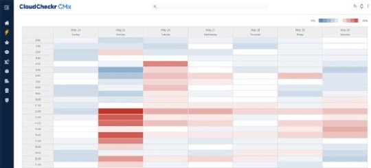
CLOUDCHECKR
Heatmap showing data on an organization's use of cloud resources
Scatter plots
Scatter plots are useful to display the relative density of two dimensions of data. Well-designed ones quantify and correlate complex sets of data in an easy-to-read manner. "Often, these charts are used to discover trends and data, as much as they are to visualize the data," Adams said.
For example, the SparkPost scatter plot below enables digital marketers to correlate the number of characters in email subject lines with email read rates to help them identify best practices and plan future campaigns.
KNIME's Tamagnini likes to use scatter plots to show relationships for single data points -- for such uses, they're easier to read and interpret than bar charts and other visualization techniques, he said. However, he added that scatter plots struggle when analysts try to display more than two dimensions. Also, packing too many data points into a scatter plot can make it hard to decipher.
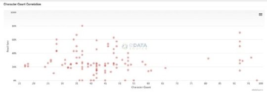
SPARKPOST
Scatter plot showing data on email marketing campaigns
t-SNE
This technique, formally known as t-Distributed Stochastic Neighbor Embedding (t-SNE), uses a machine learning algorithm to model high-dimensional data sets as two- or three-dimensional data points for display in a scatter plot, using colors, shapes or other visual elements to represent the third dimension. It was developed to address some of the limitations of conventional scatter plots.
Data scientists tap t-SNE to transform relationships in the raw data so they're easier to visualize. "The adoption of data transformation techniques, like t-SNE, is the direct consequence of the increase in data literacy and data science expertise in the data visualization field," Tamagnini said.
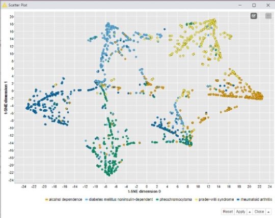
KNIME
A t-SNE scatter plot showing data on biomedical literature from PubMed
Sankey diagrams
Sankey diagrams represent data and process flows via lines and arrows with different widths that illustrate the magnitude of individual flows. SparkPost's Chalef said they're a "beautiful tool for illustrating flows in a network," using a directed graph that runs left to right.
A Sankey diagram can be visually overwhelming at first, West Monroe's Miller said. But it's a flexible visualization technique that can work even with massive fluctuations in the underlying data set, he added. For example, he has used it to visualize how applications move through a complicated, nonrigid workflow.
"A Sankey diagram is not easy to understand and requires explanation to the user in order to gain insights," Miller said. He recommended that designers include instructions or help text in a visualization or a dashboard where it's embedded, ideally in a hover-over information field.

LAWRENCE LIVERMORE NATIONAL LABORATORY AND THE U.S. DEPARTMENT OF ENERGY
Sankey diagram showing estimated data on U.S. energy consumption
Treemaps
A treemap displays hierarchical data using nested blocks that are sized differently based on the data values they represent and can be packed into other blocks to show large data sets. For example, IT administrators often use treemaps to track the use of disk space, memory or CPU resources in systems. The blocks can help users identify data trends, although fluctuations in their sizing and how they're ordered are potential complications that visualization designers need to consider.
Davis said CloudCheckr has started experimenting with treemaps to visualize cloud security vulnerabilities based on the severity and scope of individual security issues. It can be hard to communicate the size and scale of a particular vulnerability to customers using other data visualization techniques, he said, adding that the treemaps show promise in helping users to understand the severity of the issue at hand and the level of urgency it requires.
Treemap representing data as different-sized blocks
Circle packing charts
A circle packing chart is a treemap variation that use circles rather than blocks to represent the relationship among data objects. See Ho Ting, senior director of software engineering for CommScope's Ruckus line of networking products, said he finds them useful for showing an overview of a network and illustrating the severity of performance issues in different parts of the network.
Plotting different-sized circles within larger circles makes it easier to display network data three layers deep, including the overall network, the individual controllers and the different zones within each controller, Ting said. That provides a helicopter view of a network's health for a quick scan by users, plus deeper visibility into problems, he added.
COMMSCOPE RUCKUS
Circle packing chart showing data on network issues
Network diagrams
A network diagram represents the way data elements are connected by showing nodes and the link lines between them. "Network diagrams help visualize data that is most hard to grasp without visualization," LatentView's Hariharan said. There are many examples: networks of friends and the strength of their relationships, data transmission between systems and devices, financial networks, disease propagation, transportation and people movement, criminal activity and more.
One of the challenges of designing a network diagram is deciding what to show and what to hide. "Many times, the default network diagram comes out like a ball of mud with no obvious patterns," Hariharan said. Designers need to include a mechanism to show the big picture and then progressively drill down and see more details as a user zooms in on the diagram, he advised.
NEO4J INC.
Network diagram showing connections among companies, people and cities
Combined visualizations
"Simple charts are powerful, but combining them together is even more powerful," KNIME's Tamagnini said. For example, he combined a bar chart, a scatter plot and a parallel coordinates plot in a single dashboard, shown below, to provide a more detailed and interactive view of the underlying data for an analytics application to predict customer churn.
The combination of the three visualizations enables users to select all customers who churned or didn't churn by clicking on the associated column in the bar chart. Data on the selected group of customers is automatically displayed in the two plots so the users can compare numerical attributes to see whether there's a correlation between them and customer churn. It's an example of how the visual analytics mantra coined by UX and visualization pioneer Ben Shneiderman in 1996 can be applied to all sorts of data visualization techniques: "Overview first, zoom and filter, then details-on-demand."
0 notes
Text
Review of Huawei Matebook X Pro Price & Specification
The MateBook X Pro 2020 is still one of the best notebooks on the market maintaining the line of its previous generation, but with new finishes and chipset inside.
Huawei MateBook X Pro (2020): is it worth your purchase?
Punctuation:
Huawei has not changed much the appearance of the MateBook X Pro 2020, but why do it if the previous model was already one of the best laptops you could buy?
The update with tenth generation chips and the new finishes keep it on our recommended product list within the list of the best laptops.
Retail price (RRP)
From $1638
Review Huawei MateBook X Pro 2020

Huawei MateBook X Pro
The manufacturer continues to wage a tough battle to demonstrate that it is still worth buying its smartphones despite not having full Google support, a problem that fortunately does not affect laptops running Windows 10.
The 2020 edition of Huawei’s flagship notebook doesn’t change much from the previous generation, but an increase in specs and a new green finish are enough to remind us why we’re fans of these MateBook X Pro.
Design and build quality
If you choose to buy the MateBook X Pro with its gray or silver finishes, you will find it difficult to distinguish between this year’s model and that of the previous year. The laptop features the same ultra-slim chassis at just 14.6mm thick and weighing 1.33kg.
It is light enough to glide smoothly through the padded compartment of your backpack in the blink of an eye. Its screen offers a 3: 2 aspect ratio, with frames that you will hardly see are there when you download the webcam to the keyboard to save space.
We must say that we do not find this location of the webcam uncomfortable, since anyway it is little used, something more these days of videoconferences and use of Zoom. However, the chin angle is never flattering, plus if you take notes during the call, all they will see is your fingers.
Still, there are privacy benefits to having the webcam physically locked by key, with the novelty that it’s still pretty fun. It is not practical to log in with Windows Hello, but there is an integrated fingerprint sensor on the power button.

The keyboard feels very spacious and comfortable, with a shallow but satisfying ride that ensures balance between click and keystroke. It is one of the best keyboards we have used, as well as the wide trackpad, something that has not changed from the previous version.
They have not changed their ports and connectors either, offering the 3.5mm headphone jack, plus two USB-C ports (with Thunderbolt 3 support on one of them) and a single USB-A 3.0 port on the other side which is all an achievement on such a slim laptop.
So if everything is the same as last year, why do we recommend it? Let’s say that Huawei has improved what needed to be changed, such as the generation of chips and their finishes, emulating what it has been doing with its line of smart phones.
With the new dark green finish, we see that the MateBook X Pro wins integers and becomes the most attractive model in the family, resulting elegant for professional or business environments, and also to be among the youngest and most casual public.
We really wish every laptop would look like this.
Bright and amazing display
The fact that it uses the same panel as last year’s model does not prevent it from being one of the best screens that you will see integrated into a laptop today. The 3: 2 aspect ratio is somewhat rare, being higher than the 16: 9 which is the tonic.
This does not mean that it is a very grateful value when working, since you can fit a few more rows if you move spreadsheets, more rows in word documents, as well as some additional space in the lines of code.

With a 13.9-inch size and 3000 x 2000-pixel resolution, the FullView 3K touchscreen provides efficient and intuitive interaction with the ability to swipe three fingers down to capture the screen effortlessly.
Also, sharing content has been intelligently simplified since interactions between PCs and mobile devices have never been so easy. It is even possible to record the PC screen or copy text from one device to another.
Also, sharing content has been intelligently simplified since interactions between PCs and mobile devices have never been so easy. It is even possible to record the PC screen or copy text from one device to another.
It may not be 4K quality, unlike the Dell XPS 13, but its resolution is high enough for most jobs, whether you’re using photo and video editing, or just to view multimedia content.
It is high contrast and high gloss, and covers a wide range of colors. Beyond its slightly shiny finish, there’s little room for improvement. The screens of the best laptops do not differ in what the new MateBook X Pro from 2020 offers right now.
Specifications and performance
The other real change that comes associated with the laptop is the increase in RAM memory and the update in the use of the tenth generation Intel Core processors. The base model is now a Core i5-1020U with 16GB of RAM and 512GB of storage.
From here, it is possible to upgrade and add an Nvidia GeForce MX 250 GPU for an additional $218, while for $327 more you can improve performance and opt for a Core i7-10510U and upgrade storage to 1TB (setup here analyzed).
Huawei MateBook X Pro 2020 benchmarks

The graph shows benchmarks where the notebook’s performance is solid and shows that it is on par with its big rivals, although oddly it lags behind last year’s model as tenth-generation chips boost energy efficiency.
It also suffers a bit in the longer and more demanding PCMark 10 test, likely reflecting the challenges of cooling down such a slim chassis, which clearly results in slight acceleration of its fans to prevent overheating.
However, there is nothing to worry about, because this is what this machine is intended for, guaranteeing daily productivity and moderate work, without having to tackle 4K video editing or a full gaming or gaming experience.
At the time of testing this laptop, the company offers a single model on its website, to which you can add another series of accessories such as mouse, MateDock 2 hub hub or FreeBuds 3 headphones, but without great offer in its configuration.
Battery and charge to last
While Huawei’s early MateBook suffered from integrating tiny batteries, the company has changed this on the latest models so that now the MateBook X Pro 2020 lasts 15 hours in our continuous video battery discharge test.
With these times it is positioned as one of the best notebooks we have seen, where the average 8 hours comes to be the average value of notebooks with this high configuration. So, you can not worry about calling the charger daily everywhere.
Using a USB-C port for charging means, of course, you can also use your phone’s charger to charge it at any given time, or even a USB-C powerbank with enough amperage.
Obviously, you will not get the best charging speeds or reach the 65 W that the charger supplied with the equipment guarantees, but it will allow you to face unforeseen events. With its original charger we managed to charge the battery to 45 percent in just 30 minutes, to face four more hours.
Software with additional functions

The MateBook X Pro comes with full Windows 10 Home support, so there’s no need to worry about lack of access to important Windows services or features. Everything is here, as expected, without restrictions of any kind.
You also get a couple of Huawei benefits, as long as you own a brand-new mobile phone or tablet from the company. Touch a compatible device with the Huawei Share tag next to the touchpad and you can link them by NFC.
It is the fastest and easiest way to share files between your phone and laptop. You can also display the screen of your phone on the computer, allowing you to use your phone as if it were an application with mouse and keyboard support.
You’ll have to keep the phone close to your MateBook laptop, of course, but don’t worry, since it won’t have to be with the ‘Share’ function constantly activated.
Premium laptop price
As expected, the Huawei MateBook X Pro 2020 is not cheap, but neither does it raise its price compared to last year’s version, despite incorporating the new generation of tenth-generation Intel Core chips.
The model that you can buy in the official Huawei store costs $1,638 and has an Intel Core i5-10210U chip with 8 GB of RAM, and 512 GB of storage. It is possible to double the RAM to 16 GB, as well as the storage up to 1 TB of capacity.

You should pay special attention to the configurations, since the Huawei MateBook X Pro New model with eighth generation processors is still listed, which is a clear indication that it is not the now presented model of 2020.
There are other alternatives such as the HP Dragonfly that we analyzed last month with a similar configuration at a sale price of $1,857.29 which is accompanied by a digital pen to operate along with its touch screen.
If you are convinced that you want to buy a Huawei laptop, the MateBook D14 starts at a recommended price of $818 with an AMD Ryzen 5 processor configuration, 8 GB of RAM and 512 GB of storage.
Discover with our article the complete selection of the best laptops of 2020, where we bring you the best models from top brands.
Final verdict

Huawei has not modified much the new 2020 edition of the MateBook X Pro, something that we see is positive since why change something that works like a charm and is valued by users. It was one of the best laptops you could buy last year.
The processor upgrade is evident, and we would appreciate the fact that Huawei allows you to customize your RAM, storage or even graphics chip much more, something that the major brands offer, in order to diversify the offer according to your needs.
For the rest, if you are looking for a light and efficient laptop, that you can comfortably carry everywhere, and forget to accompany it with the power charger, this should be your choice, guaranteeing more than 15 hours of use in normal conditions.
Specifications
13.9-inch LTPS touchscreen and
3K resolution of 3000 x 2000 pixels and 260 dpi
Intel Core i5-10210U or i7-10510U processor
Intel UHD or Nvidia GeForce MX250 graphics
8GB or 16GB of LPDDR3 RAM
512GB or 1TB SSD storage
1Mp pop-up webcam
Ports: 1x USB-A 3.0, 2x USB-C (1x Thunderbolt 3) and headphones
Fingerprint Power Button 2.0
Connectivity Wifi, Bluetooth 5.0
Speakers with Dolby Atmos and microphones
Windows 10 Home Operating System
Dimensions of 304 x 217 x 14.6 mm
Weight 1.33 kg
from WordPress https://ift.tt/3enNLZt via IFTTT
0 notes
Text
What Are The Top Apps That Built With Flutter App Development

Flutter ever since its inception has gained a lot of traction due to the amazing features and performance it has delivered, which has impressed the developer community massively. Within a short span of time, Flutter has managed to build a huge fan base. Both startups and fortune 500 companies alike have been migrating in large numbers to this newly released open source cross-platform application development tool.
To witness the much talked about capabilities of Flutter and have a look at its performance, here are the top applications that are built using Flutter:
Xianyu App by Alibaba
Alibaba, which is the world’s biggest online commerce company, has leveraged the capabilities of Flutter to create a beautiful app experience for Android and iOS. Xianyu app, the emerging second-hand online marketplace in China, which has already crossed 50 Million downloads, with over 200 Million registered users is successfully built using Flutter.
Intrigued by the high FPS and smooth UI of Flutter, Alibaba group decided to quickly take the plunge and develop their Xianyu app using Flutter.
Google Greentea
Greentea, which is Google’s internal CRM application, is also built using Flutter. It has everything from the rich visualizations to a great UX that has helped the team manage their sales targets and progress in an efficient way.
Google Ads
The famous advertisement platform of Google provides its users with the ability to run their ad campaigns smoothly on their smartphone. This has not only enabled them with the rich visualizations and functionalities of Google Ads but has also provided the advantage of mobility to its users.
It showcases many functionalities such as the real-time alerts and notifications, lets the users call Google expert, acts on the suggestions to enhance the ongoing campaign, adds, edits or removes keywords, and a lot more.
SG Bus Tracker
SG Bus Tracker is a bus tracking app that is built using Flutter. It tracks the local buses arrival in Singapore, using bus timing database directly from Land Transport Authority of Singapore.
It has a customizable and rich UI, where it offers appearances in Light, Dark & Colorful themes, letting the users choose whichever they want. It Lists nearby bus stops that are serviced by SBS, SMRT, Go Ahead, and Tower buses.
SG Bus tracker provides its users the provision to mark the bus stops as favorites for a better and quick access. It shows color coding for the seat availability, with Green for Vacant seats, Yellow for standing available and Red for limited standing space for the bus.
Reflectly
Reflectly is a beautiful journal and mindfulness app built in Flutter, that is driven by Artificial Intelligence. Its amazing UI impresses the users, making the daily journaling more interesting. It is the personal mental health companion, which helps its users reflect on their daily thoughts and issues.
It allows its users to create stories in their personal journal, where it offers a set of few questions every day to reflect the day. Reflectly also offers advanced statistics to determine the behavior pattern of the user, along with actionable insights.
Hamilton Musical
Hamilton is the official app of Broadway musical built using Flutter that includes a lot of features for its users. This app includes several features such as daily lotteries, exclusive news, videos, trivia game, merchandise store and lots more.
It has a branded native design that is consistent on both the iOS and Android, which makes it even more rich in terms of the user experience it delivers to its end users. With lot many features, and rich visualizations, Hamilton is surely an app which has successfully engaged its users and has been among their favorites.
Top Goals
Top Goals is a fully customizable football app built using Flutter. It offers rich UI and high flexibility, where the users could create their own theme, follow their favorite football teams live.
It lets the football fans create their polls, comment their predictions, get the latest news about the sport, get the live updates of the ongoing games, rankings table, and forum where they can engage with fellow football fans. All this offers a high user engagement, making it a favorite among the football enthusiasts.
Flydirekt
Flydirekt is an app built using Flutter for standby travelers. This app gives live and detailed information about availability forecast, destination, and routes, exact loads of the airlines through its amazing UI.
Abbey Road Studios Topline App
Topline is the first app from the famous Abbey Road Studios. This app which is built in Flutter is meant for musicians to capture their song ideas on the move. It helps the artists to record the songs, where they can share files, sing over the imported tracks, add lyrics and a lot more with just a single app.
Its amazing features and a rich UI makes it a favorite among the artists who like to sing and record on the go.
InKino
InKino is an app made using Flutter, which is dedicated to searching for the movies and showtimes in the Finkino cinemas. This app which uses Dart has 40% code sharing between the Flutter and the web.
InKino happens to be multiplatform Dart app which showcases Redux. While Android and iOS apps are built using a single Flutter code. The web app is made using AngularDart, making it one of its kind applications.
InKino lets its users book and buy tickets by going through the details of the ongoing movies in the Finkino cinemas. Its rich UI and detail-oriented approach make it one of the favorite movie ticket booking apps.
Trinity College Orientation Application
Trinity College Orientation Application is an app built using Flutter that has been created for the Trinity College at the University of Toronto, to accompany the first year students during their orientation week. The best part of this app is an engaging and rich UI that has powerful animations and card transitions.
It has a detailed schedule of events, interactive maps, miscellaneous information with a Q&A system that assists the new students in the most engaging and effective manner.
Watermaniac
Watermaniac a lightweight simple yet effective app built using Flutter that aims to track and log the daily intake of water and fluids. It has a beautiful UI and engages its users with constant reminders to drink water, whenever they fall short of the expected water levels.
SpaceX Go!
SpaceX Go! which is an unofficial open-source SpaceX tracker, has been built for the mobile platforms using Flutter. It is an interesting app with a rich UI that allows its users to check both the past and upcoming launches, portfolios of the vehicles, and a roundup of the company.
It is highly simple and subtle but an interesting app dedicated to space and astronomy enthusiasts, which aims to give them regular bytes.
Weight Tracker
Weight Tracker is a simple weight tracking app built in Flutter. It is a lightweight app that is cross-platform compatible in nature. It aims to help people trying to manage their weight do it in an efficient manner.
This app has a rich UI that makes it very user-friendly. It keeps a log of your daily weight and plots graph to show insights into the progress of your weight management journey.
Platypus Crypto
Platypus Crypto is an ad-free cross-platform app that is built in Flutter, which aims at tracking the various cryptocurrencies. It has an intuitive interface that includes real-time graphs for a week, the current prices, market caps and the percentage change over time.
It has various features such as rapid sort, search and refresh, along with several other customization UI features that make it one of the most desirable apps among the cryptocurrency enthusiasts.
On a closing note
With these Top 15 Apps that are built in Flutter, we can clearly infer that Flutter offers a fleet of widgets that can be leveraged to develop beautiful and highly functional apps that are cross-functional, without burning a hole in the pockets.
But the catch is, one has to trust skilled developers that are capable enough to make beautiful apps using this fairly new technology for your business.
CitrusLeaf is one such company that has been working on Flutter since its inception. Having developed some of the most beautiful and highly functional apps for the businesses using Flutter, we are looking forward to helping you build an amazing app for your business.
Feel free to write us at [email protected] or contact us to avail our reliable Flutter App Development Services.
Source: https://flutterhub.in/top-apps-built-in-flutter/
0 notes
Text
May Flowers
The Pedestrian May Update
Thanks for joining us for this month’s update of The Pedestrian development. May has been flying by at an astounding rate and game development has been keeping pace. We mentioned last month about starting official beta testing and that continues to be a focus. Getting the game into player’s hands and making decisions and adjustments based on their feedback. We’re still continuing with more phases of beta testing as it’s just unbelievably beneficial. To read more about what’s happening with development please enjoy the rest of the update.
Twitter - Facebook - Steam Wishlist - Website
Video -
Normally this video is an alternative to reading the text version of the update. But this month we thought we’d do something a little different. It’s a bit more casual and conversational. Give it a watch.
youtube
Continued Lightmap Journey -
Lightmaps are like the frosting on our Pedestrian cake, mmm cake. In order to maintain your suspension of disbelief and immersion, the backgrounds have to be convincing. Having a nice glaze of interesting lighting situations is crucial to creating a consistent and believable environment. So this month we were able to light a few more areas to roughly how we want them. Most of the grunt work is getting it set up and getting a clean bake. Once there, the values can be fiddled with and there you have it, a finished cake.

Current lighting for the Rooftops and Subway areas.

Fun shadows in the Inner City and Campus areas
Beta Mechanic Finds -
Having playtesting sessions is one of the most exciting experiences for us. It allows us to bring the game out of our isolated little studio and give it some sun. When people understand and enjoy the game, it’s so encouraging. But, It’s also awesome to see when they find bugs, struggle, or have suggestions because it helps improve the game as a whole and we can see different playstyles. So because of the beta phase there have been some fixes and design tweaks to help make things cleaner and more intuitive.
Beta Visual Finds -
Playtesters have those fresh eyes that can pick out visual oddities. So it’s been nice to have a few art issues highlighted so that we can fix them. Our Pedestrian seasoned eyes are sometimes better than we’d like at overlooking things like unfinished textures or floating props.

Some objects that need fixed. Some cups with a seam and just color as a texture and a toaster with an outdated texture.
Options Menus work -
Our menus have had some more work on them, updating the art style, getting it working with keyboard and controller inputs. Still working out what to put in it and the best way to display them, but they’re improving.

Current state of our in-game options menu. Going for the classic look on these old tube TVs.
Kickstarter campaign game assets -
We’re continuing to add in all the in-game Kickstarter rewards, should be pretty close to being done with those. It’s fun to play around the game and see all these brands and decals filling up the world. The world has so much more life now, instead of just having our signature Butts™ brand we have a fun variety of different graphics.

Kickstarter brands and decals in the Downtown area. Really helps to add color and interest.

Kickstarter brands and decals as graffiti in the Inner City area.
Rewired -
We recently implemented a plugin called Rewired. This plugin takes inputs from a ton of different controllers and mouse/keyboard, standardizes the buttons and maps them to a set of actions we define. We can then use those actions in our code. It’s a night and day difference using this instead of Unity’s built-in input system.

One of the interfaces of the Rewired plugin. Showing the devices on the left, then narrowing down to the action on the right.
Graph -
We've noticed recently, that the old graph doesn't do a very good job of portraying the current state of the game. That chart was started during a time when we were still filling out the areas with content. Now that we are past that stage, the percentages barely change because most of the work being done is on the back-end or is beta testing fixes. We are in the process of figuring out a better way to visually showcase progress. For now you can continue to check out our Task Manager export on Google Drive.
Shout out - Unbound: Worlds Apart
One of our Kickstarter backers just recently launched a campaign of his own. You can obviously tell he is a fan of puzzle games when he supports games like ours and is now making his own! I have a feeling that if you like our game, you’ll like Unbound as well. From what it shows in the demo and the campaign page, it looks like it’s going to be a pretty awesome experience. Let’s show him some love and give him support, guys!

Thanks -
So next steps are to continue with beta testing, new wave coming soon, and making changes based on the feedback. Along with that we’re also moving along with our already created list of tasks. The big ones being story enhancement and music implementation. Thank you all for being supportive and patient while we finish up The Pedestrian.
Twitter - Facebook - Steam Wishlist - Website
0 notes