#this is a wip btw - i will render this one day (after finals)
Explore tagged Tumblr posts
Visit Tumblr Blog
Explore Tumblr blogs with no restrictions, modern design and the best experience.
Last Seen Tumblr Blogs


Fun Fact
The Tumblr app for Google Glass was released on May 16, 2013.
Text
WIP when its actually Wednesday.
Specifically waited to post this so it would tic over to wednesday, btw. For once.
Tagged by @sidesteppostinghours (their post here).
I'm mostly using this to post an assortment of things I otherwise wouldn't have been compelled to do so late.
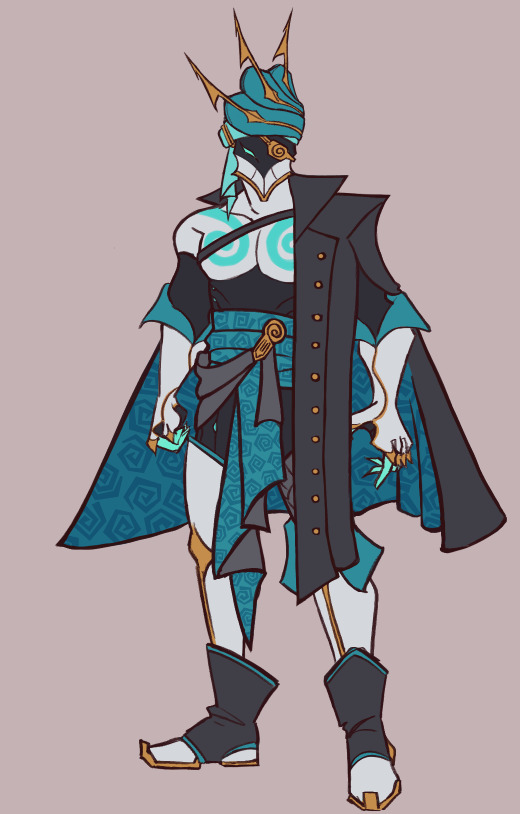
@b33tlejules requested for Maelstrom design progress on the new design. Sorry for getting to this so late, I forgor. (also consider yourself tagged for wip wednesday 🫵).
It's a long one so strap in:
The original idea, when the inevitable urge to improve on the (frankly lackluster) previous design came knocking on my door, was to do something with old diving suits. This was to stay in the theme of the Mysterious suit tag that was canon to River since his inception.
An idea I quickly abandoned not even 2 doodles in.
I quickly landed on the Hydroid Deluxe Skin (from hit video game Warframe) as a design and aesthetic I wanted. And maybe try to have some kind of homage to the last suit. Thus, the first doodles in my sketchbook:
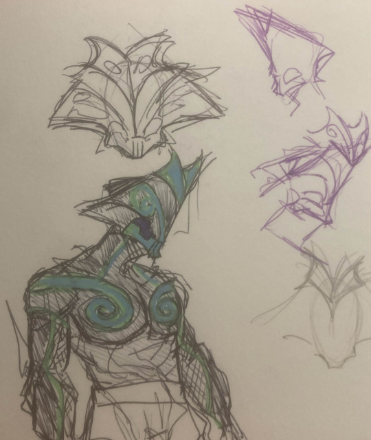

As you can see, I was trying out shapes for the helmet that were maybe a little too similar to the Hydroid skin. Though the main body elements that stuck in the final design came together quickly.


I digitalised a sketch I liked, cleaned out some details. Covered his crotch (but that tang away). Decided he should have a cape. After not having a cape since his proto-river days.
I mean. you can't be a pirate without some kind of cool jacket.

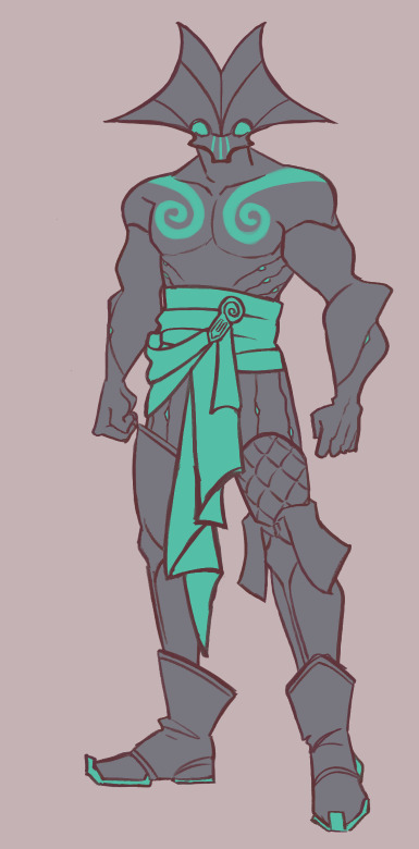
For about a week, the design sat at this stage (not shown are the several color combinations I went trough for the main body to get there).
It was good. But it looked too much like Hydroid (deluxe edition) Warframe to me.
So what did I do to fix this?
Take a different warframe for helmet inspiration. Of Course.

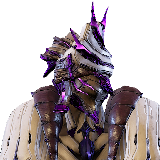

Say hello to Sevagoth Lucifuge helmet (pictured in the middle), but a little to the left. I know Sevagoth's design philospophy is surrounded by the idea of "ghost ship" - so it's no wonder I looked at the alternate lucifuge helmet and said "that looks like a seashell to me". It's not rendered as such in game, but it has the shape. And the point bits I could easily imagine as harpoons.
I didn't quite like the face of the helmet - besides it being pointy - and changed it in a way I liked. But the eyepatch was too funny not to include, considering River does lose his eye to Argent. I even kept it on the same side because while River loses his own right eye, it's more fun for the eyepatch to be on the wrong side. Where people might assume he has a blind-spot. He does now, but not on that side :)
After the helmet - and more color palette debates - came even more color palette debates. For the Cape(tm) specifically.
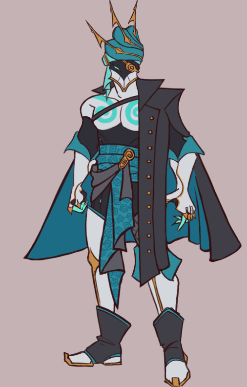

I was fighting for my life in the trenches. Nothing was quite hitting.
But as I was bemoaning about my artistic woes to my friends, @cigarettesandinevitablebetrayal came with the genius idea of mixing in the teal and white in the cape, to make it look more like water. (also hi cigs, consider yourself tagged for wip wednesday)

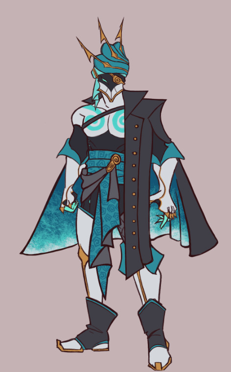
I mean. Fucking look at that. Doesn't it slap? It goes so fucking hard. This is when I truly fell in love with the design.
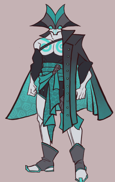
After that it was beating photoshop into a pulp trying to make a nice ref sheet. And the rest is history or whatever.
Thanks for getting this far, as a favor to me, kill the guy calling yourself cringe in your head. That's what I did while convincing myself to write this post.
ANYWAY. wow. If your name isn't Jules or Cigs and thus haven't been tagged yet, you're tagged now. Right here. Bam. @heartbreakincident, @vahingoniloinenlapsi, @ehlihr, @reverendlazarus.
#tagged some mutuals and new people i've been seeing with art in the fhr tag. feel free to ignore! I just want to pass the torch around 💜#fhr#fhr art#sidestep#my art#idle art#wip
27 notes
·
View notes
Text
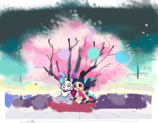
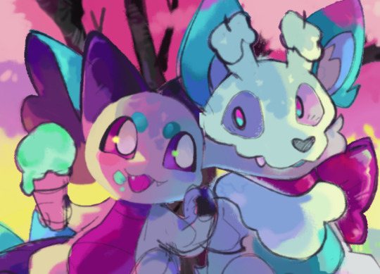
Spring Hues (4/16/25)

this one was painted for my dear partner tech's birthday. i kinda... waited way too long to start... but we clutched and got it done and that's all that matters. i have a few drafts and wips from along the way.
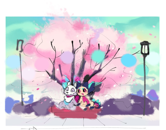
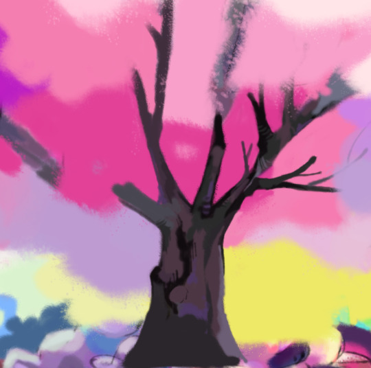
this was the very first scribble! i decided to draw a scene based on our most recent venture to the cherry blossom festival. it's SO pretty and smells sooo nice. it makes me happy to see so many different people from different countries and cultures enjoying nature like that. next year i should tally how many different languages i hear... that'd be cool. anyway:
at this point the only real color ideas i had were the green sky, tree, and the vague purple/blue blobs in the background there. the colors on the characters were added pretty arbitrarily and don't really mesh but that doesn't matter at this point. these days i find color to be the driving force for whether or not i finish a piece: if i don't have any good palette ideas it's reaaallyy hard to get things moving.
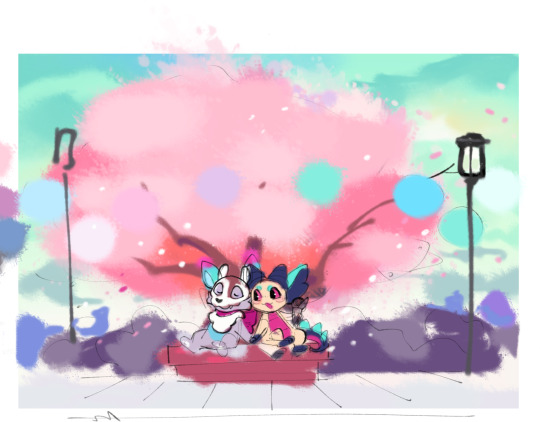
then i had two other thoughts: this year, we went to the festival at dusk and got to see the paper lanterns lit up. plus, the darker blue/green is tech's favorite color (especially when paired with pink) so i wanted to play with that more. i found this layer with the darker sky but it was quickly reworked. it's too yellow and de-saturated here.
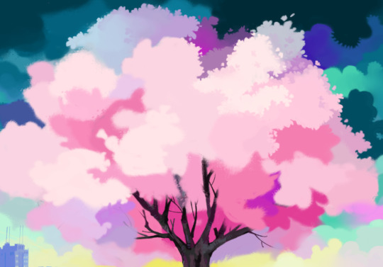
alternate tree base color. the warmer pinks and orange tied the sky in better, in both the daylight and dusk drafts.

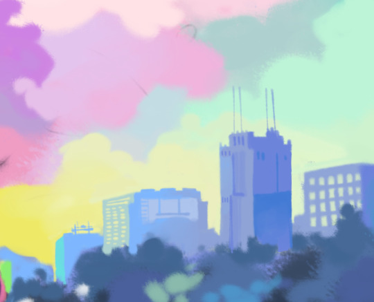
tying down a more final palette.the blobs on the right were my basis for tech's fav colors so i tried to play off of those. i also wanted to add kind of weird and different for the colors, so having the yellow sunset behind those aforementioned blue/purple blobs sounded fun. cool contrast. i kind of like how rough and primitive the buildings look in this one. i was also excited to do that painterly effect around the street lamp to indicate it's lit, but i just didn't have time to work it in properly. i also felt the characters were a bit too pink at this point.

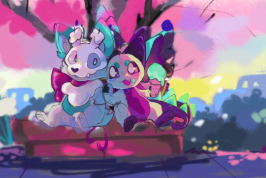
around this point i also did a more structured sketch of the characters. i didn't really know how to intertwine their hands but i think this pose is cute, almost makes it look like they're mid conversation about something...
toning down the pink shading. i wanted the green/grey/blue shadows pulled from the sky (you can see a similar tone i worked from on the right again).
around this time i merged things and started to paint. this snippet is one of my favorites as far as palettes go; it just feels a lot different from what i might normally choose so it's interesting. i keep imagining the yellow as a goopy paint and i wanna eat it
RIP snuffer and sye: tree time! i think my lazy scribble rendering suits bark alright
(this is a flipped screen shot) rendering the sky and tree. i like slapping a few random accent colors into cloud scenes like this, but as i worked on the tree it just.. didn't look right. too busy, i guess? something about the tree colors were starting to not vibe with me too. i tried using a premade brush on the blossoms to save some time but it took more effort than it was worth and just didn't work with the rest of the painting style. go go gadget: 3 hours of boring blobby shape painting. i was worried about the tree looking too flat as well but once i added the branches poking out it felt better
more of the same. the sky continued to gnaw on me.
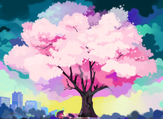
i recorded most of the rendering after the color tie-down (included below), and while rewatching i noticed that the simple early sky looked WAY better. so i painted a similar deal here. i also added stars poking through to say "hey this is at dusk btw it's almost night time". it was a nice way to pull in some of the pinks and greens from further down in the painting. it was also a good excuse to use pure white somewhere in the piece (the sparkly big stars). a little personal challenge i like to do is include pure black/white in drawings whenever i can, out of spite for the years spent not doing that. lukewarm art advice on the internet were engraved in younger me's brain and it led to the UGLIEST colors of all time for years. so doing that, plus throwing on whatever bright, weird colors i feel like, is kind of fun to explore now. i used pure black on the tree bark, for those keeping score at home
played around with color correcting the blossoms. the orange here does work better with the sky colors but it felt a little too orange. this process was very annoying because most everything was on one layer, and i already had to painstakingly paint around the tree to fix the sky.
more troubleshooting. this did prove to me that the original colors (left) needed to be toned down a bit. you can also see some of the foliage being rendered too: this is probably the part of the piece i'm most disappointed with. i wanted to properly draw more realistic plants and had even gathered a bunch of refs, but i just didn't have the time. the abstract shape-y plants are fine, but not what i really wanted going into this one.
beginning to render the characters. i HATED painting the bricks in this one. i just didn't have any great ideas for the colors and considered just lining it but could get it working. i tried giving it a slightly gritter texture. good enough. i also wanted to do more for the sidewalk but again, no time.
i ended up using the second draft colors for these guys much more than i expected. no time! i was doing this part an hour before bedtime the day before his bday! ahhhhhhhh!!!!! i had to finish it while clocked in and working the day of!

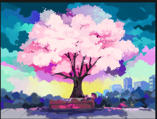
aaaand the final. i REALLY had to skimp on some details which i'm still bummed about. i just need to plan and time things better next time, but i did still have a few things i liked on it so it's okay. plus he liked it and that's what's important!
aaand here is a recording of the painting process. my favorite parts of the piece are colors (specifically the yellow sunset with the cityscape). my biggest let-downs are the lack of detailed plants and the rushed rendering on the characters. i really wanted to slap more color and detail on them but alas... i did learn some things so i'll take it :)
2 notes
·
View notes
Text
the beloved, the dear, the best, the greatest,

#gerry is my favourite character#but this is Actually my first fanart of him#it's just a sketch but still#tma#gerry keay#gerard keay#the magnus archives#magpod#tma fanart#The Beholding#synth sketches#gerry delano#this is a wip btw - i will render this one day (after finals)
386 notes
·
View notes
Text
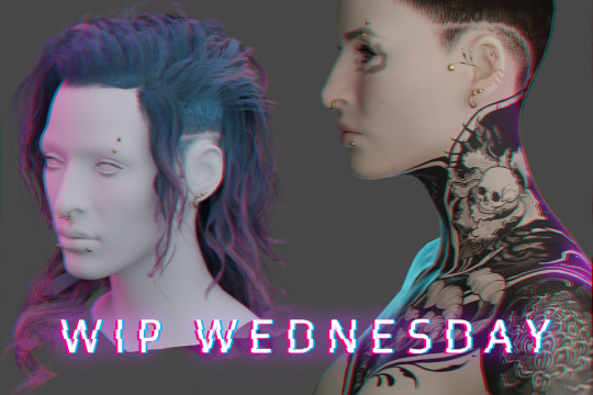
WIP WEDNESDAY - 21/06/23
(I mean it’s technically Friday now between timezones and spoons but have this otherwise I’ll keep forgetting) My first WIP Wednesday! Thanks @theviridianbunny for the tag! I’ve been really getting stuck into modding - as well as falling into my usual mod habit of ‘start like six project at once and end up with a million WIP files' but I guess I’ll talk about the major ones.
Graphic design is my passion ...
(Long) rambling about mods I'm making + things I've learned below the cut~
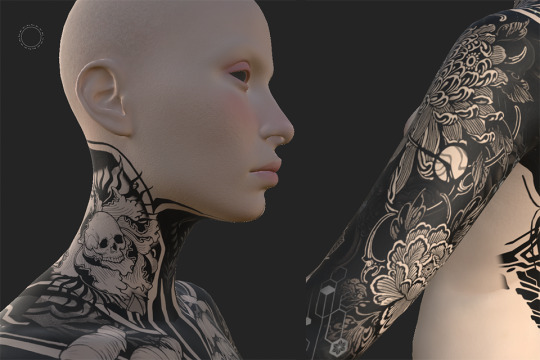
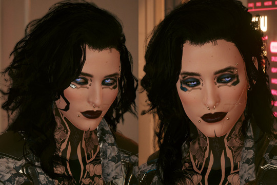
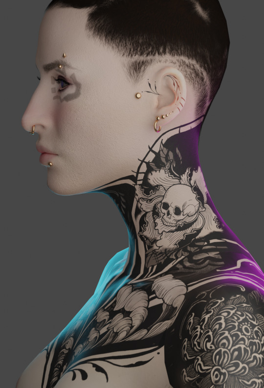
My V’s tatt project is still ongoing, and I’ve (somewhat begrudgingly) been trying out Substance Painter to work on bits of it, mainly polishing seams between UV maps. It’s definitely got a lot of benefits, especially for graphic placement in really tricky areas (like anywhere in the entire head mesh region for example) but I still think a lot of the heavy work will still be done in Photoshop so I’ll probably be writing up both experiences with them when I do that tutorial I keep hinting at for complex tatt work. I’ve started drafting a tumblr tutorial but I wonder if that’s the best format, maybe a PDF? Google doc? Github wikis look cool? (tho I think I need to pay for that) - if y’all got suggestions for tutorial formats pls let me know!
As for the other arguably overly-ambitious-project-where-I-bit-off-more-than-I-could-chew ...
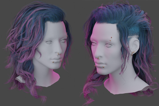
H A I R.
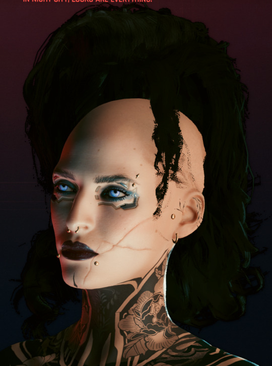
Hair has been the bane of my existence for about the past week( ... weeks? Maybe two?), most of it involving cursing, a lot of reverse-engineering game meshes and smashing my head against blender. But if not already evident from my monowire post - I am a stubborn bitch with too much time on my hands so even though there were at least two moments where I wanted to curl up on the floor under my desk and just stay there - we got there.
This all started because my favourite hair mod which I cannot split from my V’s identity was acting funky and the shape of it had been altered since a physics update. It wasn’t her anymore. So I needed new hair. I tried editing the existing hair. I tried importing the old hair mesh. I tried so many things and they didn’t work out one way or they threw a million errors or there were an obnoxious amount of verts.
I even tried looking for replacement mod hair. None of them fit, all of them felt too ‘clean’ for my V. So I just concluded: FINE. I’ll make my own damn hair. From scratch. At least then I’ll actually KNOW what’s going on with the mesh, right?
Problem with hair is tutorials are very limited in respect to Cyberpunk, so I had to learn a lot of this by myself and looking at other processes used for building game hair. I’ve had a previous stint in game design at uni but it was very introductory and more broad-strokes concepts not specific stuff like what ‘real time hair’ is and how you actually go about placing hair-cards (there’s a million different ways btw) but after another 3 days smashing my head against blender I finally got shit to work to a satisfactory level using hair tools for blender and the particle hair grooming system (not the 3.5 blender system, maybe more on that at some point).
Putting together the hair cards I was 120% convinced this was going to blow up in my face, primarily through vert count. But this hair tool plugin? Alarmingly efficient. I was frequently checking my work against Alt's hair mesh (one I was planning on rigging to) and here's the final-ish stats -

This is with only Alt's hair mesh selected (no cap) and then only my mesh(s - lots of layering to build it up), and by comparison I felt I'd built up the density of a chinchilla. This is not a brag, this is mostly genuine confusion over how efficient this plugin is, all I did was smack around hair curves. It did all the UV mapping junk on the fly.
Although structurally complete, I still consider this a WIP (yes I know there's a reeeeal fun vert funkiness in that second render, it's been fixed) since I'm having to go back and fine-tune some of the UV's the plugins mapped that I'm not happy with and generally figuring out my density problem because if anything, after putting it in-game it felt too dense.
Because yes, somehow I got it in game.
WITH. PHYSICS.
This may have driven me absolutely up the wall between having to learn blender from scratch then what the heck real time hair is and how that works etc. etc. but ... god, seeing her move back from the mirror and just feeling that instant catharsis of 'IT'S HER!' made it so. Damn. Worth it.
It looks too thick - this might be because I chucked in the 'doubled' feature Wolvenkit comes with because I hadn't spent any time doing backfaces. But it also might be because it's black? That's going to need investigating.
The physics need a lot of work too, I did a pretty rushed weight painting job last night on a merged version of the mesh because I was worried whether it was even viable and I'd already dumped an insane amount of hours into this between trying to salvage the old hair and building a new one (with some more bells and whistles. Mainly - curly). That wasn't without it's issues -
This almost fucking cracked me, given this was one of the issues I was experiencing before trying to fix an existing mesh mod. Turns out I was just being dumb and forgetting to export the armature, which I'd thought I wasn't supposed to do after having blender throw a bunch of errors on other hair attempts. I gave it a try after one last shot and boom. Worked. (I dunno what those errors were about man but now I know armature? very important).
Will I release this hair? no damn clue, depends on if I can get it to a level I feel is 'releasable'. I already know what I'm calling it though - Venatrix her side-handle I've decided on.
I look forward to adapting it into maybe a comb-back version, as well as a tied up version, so I can show off both her undercut + have the option of NOT hiding every damn tatt I've obsessed over placing on her neck haha.
In other news -
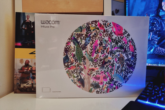
My much-needed wacom tablet replacement arrived (as well as other things I was looking forward to 👀) meaning my Wacom Cintiq, workhorse of ten years can finally enjoy her retirement. Her controls were getting funky, she had a few dead pixels but man. I'm convinced they won't make them like her ever again. Either way she's done unfortunately - upgrading my monitor to 2k made this painfully obvious. I don't think it's even running in full HD, it's that old. And with Phantom Liberty coming out this year? I'm probably going to need a new videocard and DVI compatibility isn't really a thing anymore.
So for future I think I'll just stick to the basic tablet set up, invest in screens. Also now I FINALLY know what her hair is gonna look like and with the tablet here, I can get back to work on the tattoo bodysuit.
Anyways, that's it for now! (Jesus Christ did you really read all of this? If you did you're a fucking trooper). Sorry for the extended ramble but MAN I did a lot, I needed to yell.
Till next time Chooms! Thanks again @theviridianbunny for the tag~ <3
Oh shit wait, have the blender renders before I forget because hahah I figured out how to do that too lol -
#cyberpunk 2077#my mods#wip wednesday#kerytalk#god I am sorry this is a fucking essay but I had a lot to talk about I guess#one can do a lot in a week with nothing but the power of autistic hyperfocus and the love for one's OC blorbo ok#cp2077 mods#cp2077 modding
36 notes
·
View notes