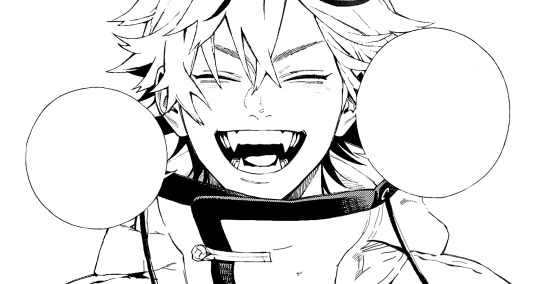
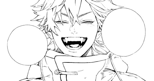
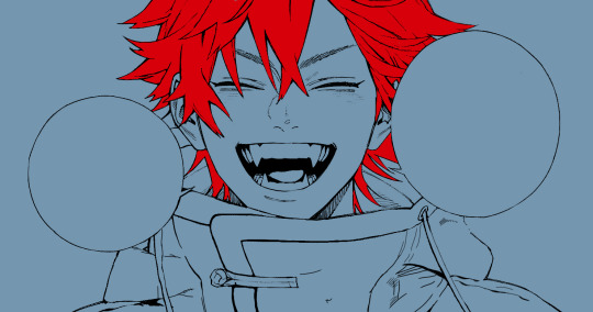
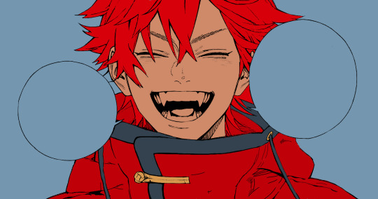
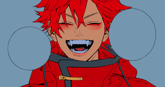
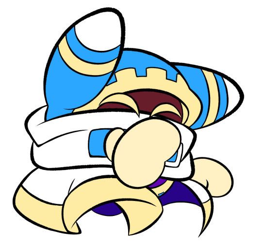
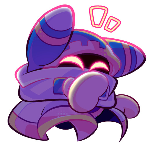
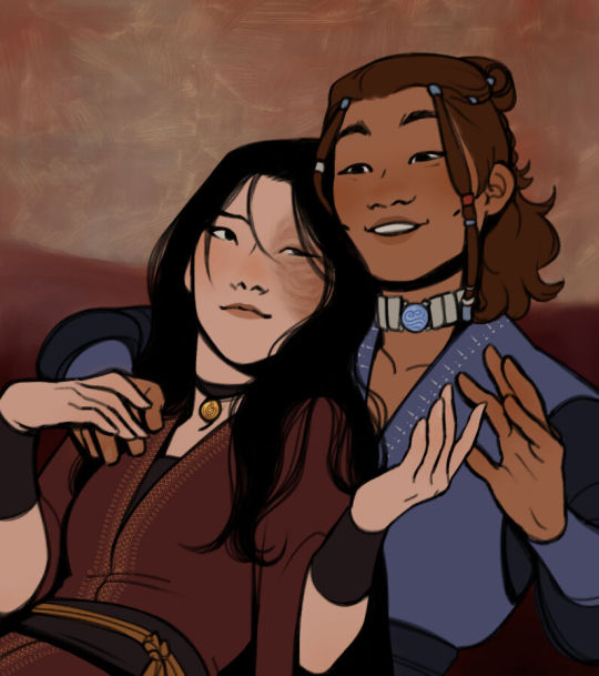
#this more lineart based style is fun
Text
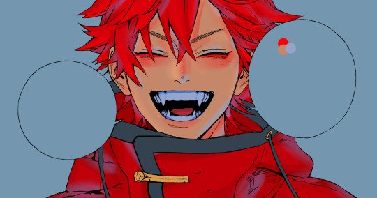
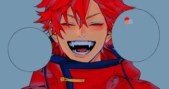
Behold some very messy sketches of @margindoodles2407’s Star Wars High Fantasy AU Ahsoka design!!!!
#I will absolutely be drawing her more to try and figure her out hehe#I’m not quite sure abt some of the details#Like for ex I wasn’t sure how her braids ended so I just based them off Shaak ti’s XD#Margin’s high fantasy Star Wars au#Hfsw#Hfsw ahsoka#Ahsoka#the best girllll#I was gonna clean these sketches up#But for some reason the lineart was just not lineart it today#Ok but can I just say her headdress thingie is so fun to draw#My style also apparently does not lend itself well to bright colors lol#my art#art#doodles#Star wars#the clone wars#tcw#tcw ahsoka
66 notes
·
View notes
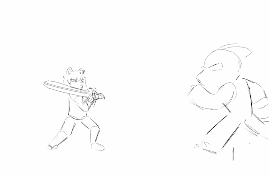
Text
i watched rottmnt and it’s so good you guys… i gave them sweaters :) theyve earned it
#rottmnt#rise leo#rise donnie#rise raph#rise mikey#my art#i hope those are the right tags for those guys#also don’t ask how raphs shell is going through his jacket idk either#but man rises designs are so fun and colorful#and i feel like it’s easier for me to draw them bc finding good reference photos for mutant mayhem is kinda tricky#also my art style keeps changing help me!!!!#but i like how this looks it’s more rendered than usual and i used a different brush for lineart#in other news#you can literally tell when idk what to caption something based on how much rambling i do in the tags#like???? help im overthinkg this
31 notes
·
View notes
Text
take this, girls love soldier.
#my art#oc#god im supposed to be studying but i just saw some art on pinterest and knew i had to try the style out going from how i remembered it#very fun to do and not that challenging so i might use it for more cutsey stuff im not quite sure abt the lineart and esp shading tho#(<- he did not use a single reference)#also i rediscovered my abililty to draw furries…. dies from success (commissions wink wink)#also this drawing kinda feels weird to look at bc what the hell is she catgirl?? furry??? her base design is literally a rectangle head bfr#ok rant over yayyy
4 notes
·
View notes
Note
If I want to study someone's art or style, how do I do that? Like where do you even start when looking at an illustration that they made 😭thank you!!!
Here’s stuff i think about. i don’t do that many style studies, so idunno how helpful it is! pls sound in tha comments if anyone has tips:)
Pinpoint what stuff you like, and focus on that. Focus on technique rather than exact replication, for example ( just first thing comes to mind) if you like rostov’s disco elysium cover art and want to study it, don’t just repaint the image, find what’s key in the style. looseness, maybe? then, instead of copying the image with your technique, try to apply the same looseness. (feat. shitty 5 min sketch plz dont judge example of how i normally approax paintings, versus a study. ALSO not to say u CANT do this it's just how i would study, myself. )
That being said, don’t force yourself to make art decisions that feel unnatural to you. a lot of the time artists make decisions based on their weaknesses as well as strengths. I do very shaky, hatchy lineart because my hands are very shaky. I focus on painting what I* feel is important and fun.
Instead of copying a style from a picture, look at a variety of pictures and find technique. For example a lot of people redrawing a screenshot in “sailor moon style” or “ghibli style” will draw… let’s say, an old man, looking like a usagi because that’s the screenshot they looked at, instead of watching what stylistic choices for example takeuchi made when stylizing an old man. So the “studies” end up homogenous. I personally find it unproductive to replicate a painting for purposes of study, but like focusing on individual elements. say you like egon schiele, replicating whole paintings at a time IMO isn't gonna do much, but maybe you can set out on a series where you sketch copy his hands or feet from different paintings, and then try stylizing your own hands the same way? Or maybe your fave artist draws moonlight like a blue stream, or a red one? Try applying only that light to your paintings.
You could also color pick or look at the colors they make and paint whatever you want with those same colors, to understand how they work together and what can be done with them.
Also, if you can, look at their influences! Everyone learns art by seeing others art. Chances are they saw art they liked and picked from there what elements they enjoyed. Looking at the inspiration can help make some of the techniques more obvious.
Basically focus less on copying(not that copying is bad- but not always helpful for studying), and more on what you like. If you find what you like, you can work from there and try to think about your own art from the same perspective.
IDK if this helps as i said, feel free to add onto^_^
379 notes
·
View notes
Text
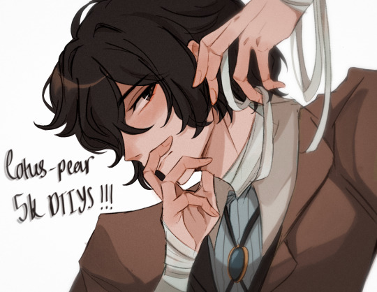
YAAAAAYYYY ITS FINALLY HERE!!! ty guys sm again for 5k i rly appreciate it <3
rules and guidelines under the cut!
rules and due date (i've never done this before so bear w me ok!!):
-due date will be march 1st! i will accept entries a few days late dw i'm nor ur professor or smth BUT I WOULD RLY PREFER IF U GET IT DONE BY THEN (just dm me if u need more time)
-pls tag ur finished piece under #lotuspear5kdtiys and dont forget to mention my user @lotus-pear! if i neglect to reblog ur piece then pls lmk even though that probably won't happen bc i'll be checking that tag every day for new entries👹
-pls don't trace the art.. i'll be really sad if u do that :(((( if u need help at all w the posing or hands then shoot me an ask or weed ur way into my dms bc ik this is kind of a complicated piece
-anyone can participate!! u don't have to be following me or anything and it's fine if we've never interacted before
-colors and expression are completely flexible and i'd even encourage playing around w it since the final product isn't meant to mimic my style. if u can then pls try to keep the pose relatively similar although i don't mind if it's changed a little bit. whatever is most comfortable to u as the artist.
-if u guys want to see the piece without any shading or rendering then pls dm me, ik it might be easier for some ppl to just see the bare sketch or the lineart w base colors
prizes🤩 (ik this is what u guys are rly after /j):
-alr so ik everybody's all like "well what's in this for me🤨" oh my god if u would just let me explain 😐 i'll be choosing three winners and two honorable mentions amongst all the contestants
-the top three winners get a follow (yea ok kinda sucky but wtv) AND they get to commission a fully rendered piece from me of a single character of their choice for free >:) (i'll discuss the details w the winners in two months)
-the two runner ups will also get a follow from me AND they get to commission a sketch of a single character from me (again, i'll discuss what this entails in further detail when the honorable mentions are selected in two months)
————
ermmm yea i think thats it for now i'll come back and edit the post if i feel the need to add anything.. HAVE FUN GUYS I CANT WAIT TO SEE WHAT U GUYS DO🫶🏼🫶🏼
1K notes
·
View notes
Text
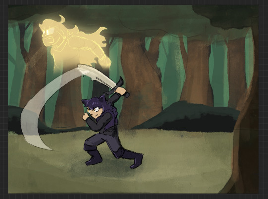
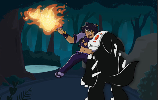
HOWDY EVERYONE- so excited to FINALLY be able to show off my piece for this year's Bumbleby Big Bang!
Unfortunately no accompanying story as of yet- but I really hope you guys get to read it someday! The premise involves Yang cursed to be trapped inside a sword, which was an idea I KNEW I had to make move.
Details and development stuff under the cut!
Lots of fun collaboration with the author, Celeste! We worked together to find the look-of-picture, Blake's outfit, how the Grimm look, the style of the sword, the whole shabang! I'm really happy with how it all turned out!
When I first saw all the prompts, even before claims opened, I got to work on a handful of exploration pieces based on some of the summaries, to decide which of the stories I was interested in would be the best fit. Here's the initial idea for this one I put together over a lunch break:
After showing Celeste, we got to work finding the look we wanted! Went back and forth a bit and found this great look for Blake! Also shoutout to Pinterest boards for visdev inspiration I love you Pinterest boards.

Just about everything stayed to final anim, with the simplification of getting rid of that purple cloth hanging from her belt, (since I already had the rope ends to think about working with), and the light purple strap across the chest, since leaving it out would simplify the linework on her chest.
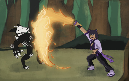
The sword also went through a bit of change! Celeste had the idea of Yang making the sword catch on fire, which I LOVED. I went with a split design so we can see the fire more clearly start from the hilt and grow to cover the whole blade.
And from there we brainstormed animation ideas! I went all over Youtube for video reference of sword work (that would be complex enough to be interesting, but short enough to be manageable). I found something we liked from Motion Actor Inc., a channel I've used LOTS for both personal and professional work (I work in 3D Animation, for those who don't know). I edited this together, to see the action from multiple places at once, which gave me the idea for that camera move that's in the final anim!
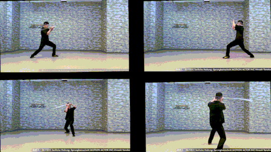
Now for the fun part! Make that badboy MOVE. For the cam turn, the first frame she's in the air I'm referencing the top left video, and the frame she lands I'm referencing the bottom left one. While she's airborne I'm just inbetweening that! No reference for the Grimm, just wanted it responding to her attacks, but I end up tweaking the roughs later on to make the block feel stronger.
Then from there we had to actually figure out Grimm designs! Nimona had just released, and Celeste and I loved it, so she asked if I could take some inspiration from Nimona's shadow form! GLADLY. Here's what I came up with!

I was going between how the movies and comic designed Nimona, really loving the almost liquid shadow of the movie, but also how the comics had this broken up/held together rougher form. Celeste liked the second to last one the best! The original plan was to have it leave a wispy shadow trail like the concept art, but to simplify the animation we left it solid instead!
Next up is tiedown! Basically just getting the roughs more on-model, so the lineart comes out nice and clean. I've also transferred the new Grimm design to the base from earlier, and fire's also outlined orange so it reads clearer. (SPOILER- if you look REAL close here, you can see Yang visible in the fire! I liked the idea of Blake's slash also doubling as Yang throwing a punch. The idea is in the concept art earlier but now it's working with the action.)

Next step- final look of picture!! I asked Celeste for sources of inspiration to draw from when thinking about environment design, and we got Nimona, She-Ra, and Owl House! Used each of those as springboards for shading style, colour palettes, and how the fire would look!

From there, we kept the straight trees/bush/lake/foreground greenery from the first one, the blues from the second, and the fire from the third!
Once I had this frame, it was a matter of working backwards and making the background work pre-camera turn (which was ABSOLUTELY the most challenging part of this process). Learned a lot doing this! Procreate isn't quite equipped to make something like this efficient, but I'm pleased to say that Dreams would make something like this easier in the future (keyframing objects instead of hand-drawing/spacing duplicates by hand, for example).
From then on it was just colouring the lineart, adding shading, and finishing up the background! Beginning-to-end this whole process was beginning of July to end of October!
I had an absolute BLAST putting all this together. Here's to next year where I find a way to do something even more ridiculously complicated!! It's fun!!!
#rwby#bumbleby#bumbleby big bang#bbb2023#blake belladonna#yang xiao long#(technically!!! look at the fire!!)#officialrocketart#officialrocketanimates#greatest hits#HOOO WHAT AN UNDERTAKING#so glad I came up with an idea pretty outside of my comfort zone but having the CLEAREST idea on how to execute it#means things went smoothly it just took a Long Time#AND I LEARNED LOTS#hope you guys can read the story one day!! its dope!!#bonus bonus fact for tag readers i didn't put in the post proper: i showed the rough pass to ANIMATION INDUSTRY COLLEAGUES for feedback#shoutout to ioana and v love you both lots#ioana for tightening up the rough pass and suggesting i smear the sword#and v for notes on my sword smears#okay i hope you guys enjoy!!!#it has been true for ages now but The Bees Motivate Me To Create#and in these trying times i thank them for that
394 notes
·
View notes
Text

(Click the image for better quality)
Yipeeee that Keiki and Mayumi fanart I posted the WIP of is finally done woooo- This piece was a very experimental one that I'm kind of OK on. Maybe because I've just gone insane looking at it for so long and I'm my own worst critic lol.
Artist's Notes;
So I've once again been playing around with my rendering style, mainly because I have been wanting to improve my lighting for a while now and as I was just scrolling through Tumblr, I saw some of the official art for that one webcomic-turned-animated-TV-Show Lackadaisy and was immediately inspired. I also have seen a technique a few times in the past where the lineart and shading are merged together, so I've been meaning to try that for a little while.

I did some experimentation on this one sketch of Keiki I posted in my sketch dump and I really liked the results of it, so I carried those over to this piece.
I ended up scaling up Keiki and Mayumi from the original WIP because I felt like they were both getting lost in the composition, and I'm glad for that because I think it works a lot better. I'm not a fan of how Mayumi's sword turned out at all, but it's not really meant to be the focus of the piece so eh. Overall, I think I could do better with my colours, probably because with Keiki and Mayumi's colours, I did them flat in greyscale and then used a brush on the overlay blend mode to colour all of them over, after which I changed the base layer for their colours from white to yellow and then lowered the opacity so it all went together better. I also decided to use gradient maps for a lot of the background elements, mainly to experiment with getting in my values first to make them pop out more. I ended up finding a really nice sky gradient on Clip Studio Paint that I really liked, and that kinda helped to establish the colour scheme of the background a lot. I think the whole "start in greyscale then colour" thing really works better with painterly styles rather than more illustrative ones, and while it is good at making sure your values are more readable, I honestly don't think I have the skill level to pull that off yet. Honestly, I think I've been looking at this drawing too long or maybe I added too much to it, but I wish I could've made the colours less monochromatic, but I'll just save that for the next piece I do.
I do love how the flame (...well it's more of a weird space rift than anything in this piece) and the lighting turned out, those were fun to do. I was initially struggling with the flame and how Mayumi is positioned in front of it before realizing "Oh wait! This is a weird abstraction of a weird creature! I don't have to follow the laws of anatomy!" and just dislocated it's flamey bottom jaw from the main body. I also changed the colours of it since I was really not liking how incredibly bright it was when it had lighter colours. Again, the gradient maps served the more painterly style of the flames well.
I also love how Mayumi turned out. I could do her sleeves better but that's more of just me needing to study how those types of sleeves fold in that position more. I'm also very happy with the posing, the technique I used for that was taking photos of myself in the positions I wanted, blocking in the silhouette and then modifying that by adjusting it to my lines of action that I drew on top of the original photos, and then sketching over the silhouettes and drawing in the shapes of the hands overtop of the photo if I needed to get the fine details right. As for what I do to take the pictures myself, I use a tall chair I have, prop up my phone with a phone stand, put on a ten second timer and scramble to get in position. Yes, I did have to use a bunch of thin markers I had to try and get the hand positioning on Keiki's pose right, yes I do have a fake sword that I used to get the positioning of Mayumi's arms and hand right, the sword was for an old Halloween costume from several years ago. I really like how both Keiki and Mayumi turned out in this drawing, I'll have to play around with these designs for them more in future drawings.
Also, if you wanna know why I draw buildings like that, when I watched Fantasia 2000 as a kid (One of the Disney movies where they make really beautiful animations to classical music) the way they drew the buildings in the first few sections Rhapsody in Blue segment (the jazz one with the cities) changed my brain chemistry and now whenever I need to draw buildings really quickly, I refer back to that. Since the buildings aren't really the main subject, I didn't put much thought into them.
As you can tell I am very tired of this piece, mainly because I made things harder for myself by overcomplicating the process compared to what I usually do, mainly with the whole "starting in grayscale then adding colour." I'd honestly just prefer having a black layer set to colour that I can just toggle on and off when I need to see the values, but it was good to experiment. And that was mainly the point of this whole drawing, to experiment. I'm definitely going to have to play around with this new style I'm going for, mainly because I liked how it turned out a lot in the augmented Keiki sketch, and also because I want to find ways of making it suit my style more. I also really want to keep experimenting with my lighting like this, it's very fun. Last but not least I am never starting in greyscale again because dear god I do not like the workflow it forced me into. I don't have a problem with the method itself it's mainly just a skill issue lol.
If you wanna read my headcanons for these two, I put them in my WIP post, so you can read them there if you want to. The more I look at this the more I prefer the simplicity of my WIP. I might go back to this and just take away the fancy colours and effects to see what it looks like without all of that stuff and reblog this post with that drawing, but for now, I don't think I can look at this drawing again for a while.
#touhou project#art#fanart#touhou fanart#touhou 17#wily beast and weakest creature#keiki haniyasushin#mayumi joutougu#haniyasushin keiki
114 notes
·
View notes
Text
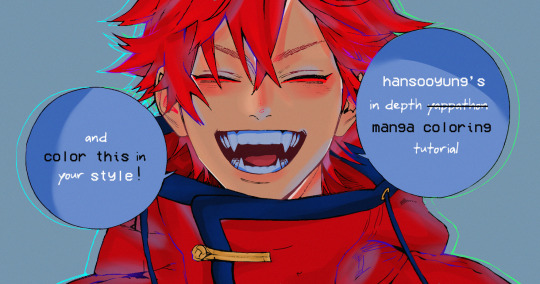
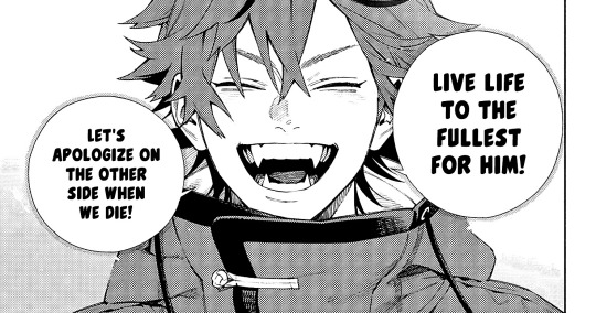
hansooyung's coloring tutorial & ctiys: alma time! 🍒
hello everyone! though i've been meaning to for a while, i've finally gotten around to making my first manga coloring tutorial! i'll be going over cleaning panels and screentones, choosing base colors, and finally shading and lighting.
this will also be a color this in your style challenge, so if you're willing, feel free to post your colored panel and tag me in it!! i'd love to see all the results :)
find details under the cut! 🦋
DISCLAIMERS:
this is just how i personally color! i know for a fact that some of my other friends follow other methods and have such beautiful colorings <33
for colors specifically, i play around a LOT. if you don't like your color scheme for the time being, mess around with it! i don't use psds since i like to mess around by hand with color palettes, but maybe i'll look into it for the future.
i explain a lot just bear with me gang 🙏
TECHNICAL STUFF:
software: ibis paint x (on iphone). i use ibis since it is FREE for all phones and it worked on my chromebook as well.
while this tutorial is made for ibis paint x, everything works on other softwares except the brushes, which i've provided alternatives for below.
brushes: i will be using dip pen (hard) which is automatically included with ibis, and two other brushes i made myself which you can find here and here. for more brushes, @/bkdkdh was incredibly helpful and posted her awesome set here!
for other softwares, you can use similar brushes. dip pen (hard) can just be the default brush, while wet edges is just the default brush on lowered opacity (and more of a rectangle/marker shape?). watercolor pencil is a watercolor brush in the rectangle/marker shape as well. if you can't get the shape, you can always smudge your lines into shape as well, so don't fret too much! a bunch of people only use one brush for coloring everything (which is insane to me, personally, they are so talented!)
fun fact: the first brush listed that i made was originally called "aki tao watercolor smooth" 👍
ok here we go guys!!
STEP ONE: CLEANING THE PANEL
i think of this part as setting up the panel for coloring! usually it's pretty exhausting cuz it's all b&w but it's all worth it i swear. the panel i'll be coloring is this beautiful one of alma from chapter 2:
imgur link here (x)
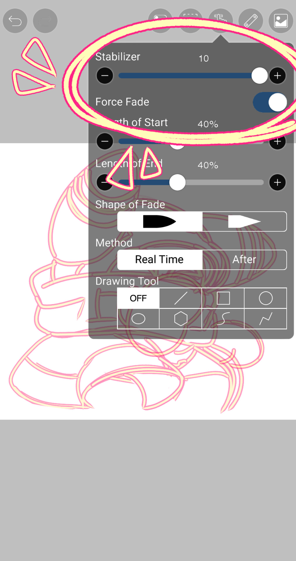
a lot of people redraw their lines to avoid screentones, which is extremely helpful. however, i work on a phone and my fingers are not steady even with the stabilizer turned all the way up T~T. i do it this way, but a different (possibly easier) way may work for you!!!
your first step will be to remove all the white, giving us a transparent background to work with. THIS IS THE NUMBER ONE REASON WHY I USE IBIS PAINT X.
when you upload the image to ibis, a popup comes asking if you would like to "extract line drawing". this creates a lineart of your image. click yes, and your work is like 90% done.
if you're not on ibis, you can redraw your panel, put lineart layer on screen, etc. or you can just extract line drawing from ibis and upload to software of your choice
for those of you not on ibis, i've included the line drawing here (x) if it looks black, don't worry and set your background to white.
omg i was not kidding when i said i explained a lot. ok now onto the three main steps of cleaning the panel:
cleaning background
removing screentones
repainting black lines
for cleaning the background, we're going to clear off all the extraneous stuff. this includes the text in the speech bubble, the gradient screentones behind alma, and the panel line on the left side. just use your eraser tool and go crazy! (i forgot to save the panel at this point of the coloring OTL)
for removing screentones, we're going to remove all those "dots" that mangakas use for shading. these are used to show value for b&w art, but since we're coloring we don't need them—a lot of people have really cool ways of incorporating screentones in their colorings though, and it looks amazing! i used it on nana's hand in my bnha coloring.
remove the screentones from alma's hair and jacket with your eraser tool. this will take time, but it's worth it in the end!
for portions with a bunch of lines, you can create A NEW LAYER and redraw some of the lines. that way, you can erase indiscriminately from the original layer but the lines you drew are still there. again, like i said, my hand is really shaky so i don't do it a lot, but it's extremely helpful for smaller parts where i have control! i used this on alma's jacket, and here's a screenshot of the process:

(i made his jacket purple so i could distinguish between layers easily).
it should look like this when you're done:
for the final step of cleaning, i like to erase all the things colored black (the collar and strings of the jacket, along with the back part of his hair). that way, i can color them in with dark colors and it adds to the whole look of the coloring.
i've circled the parts i'm going to erase below:

and it should look like this when you're done!
ok everyone cheer we're ready to color now!!!!
STEP TWO: BASE COLORS
CROWD CHEERS ok lets go!
this part is the most important to me, because it sets the tone for the whole coloring. i like to use three-four main colors in my colorings, and it's usually background, skintone, hair, and the secret fourth color. the secret fourth color is usually whatever color fits the character's vibe, or if the character's color is the bg, it'll be an accent color.
for example, with my nagi coloring, i used white for the hair, i had my skintone, i had blue as the main coloring vibe (as nagi's color), and black as the accent color.
for alma, i chose his main color to be red! it's the color of his hair and his jacket, so i wanted it to be vibrant and stand out. since blue contrasts red, i went for a greyish-blue shade for the background. (i went for grey rather than solely blue because then it would clash rather than complement).
disclaimer please please please take your device off night mode warm mode f.lux whatever you have. this has screwed me over more times than you may think :(
i like to make my vibrant colors closer to the right end of the color square. for alma's hair, i chose this color:

i dragged it down from the corner a bit but kept the saturation since his hair is kind of dark. we can use vibrant colors to shade it though, so don't worry!
here's his hair and the background together:
now from here, play around with skintones until you find one that matches the hair!
i usually drag around the wheel to the orange-red intersection, and have it on the lighter, more saturated side. here's the color i chose for alma's skintone.
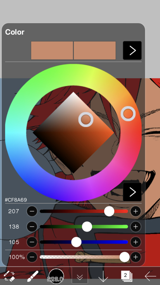
i thought his original skintone looked a bit too orange, so i pulled the saturation back a little bit (moved closer to the left side of the square).
after that, color in his jacket with a bit darker red than hair, choose a gold color for the accents on his jacket, and color in the black parts with a grey-ish color (we will change that later).
here's the base colors!
if it looks a bit bright, don't worry! we can change that with shading. or you might just have to. accept the light.
STEP THREE: SHADING AND LIGHTING
wooo we made it!!!!!!! ok now i lied, we have a bit more of base colors to go. on a layer above the skin, color in your teeth and tongue. for pieces that have a more red feel (like this one), i like to make the teeth and the shading a more vibrant blue color. (for blue pieces, i make it a purple!).
IMPORTANT NOTE: ALL SHADING AND ALL COLORS SHOULD BE DONE ON NEW, CLIPPED LAYER.

i'll then go in and do some light shading with my wet edges brush. i'll use a darker color for hard shadows and then a lighter, more vibrant color to accentuate it.
next up we have blush! a lot of people do this in very different ways but i like to do it directly under the eyes, in a vibrant red shade. make a new layer above the skin and clip it on. color pick alma's hair and drag it to the most saturated shade (red corner). then using the watercolor pencil brush, lower the opacity of the brush and drag a line under the eyes on both sides.
make sure to erase the portion of blush that goes above the eyeline. i also added some lips for alma as you can see, and then added a red line under the eyes! this was back to the regular dip pen (hard) brush on 100% opacity. it may take a few tries to get your blush to the way you want it, so don't worry too much.
now we can start our actual shading!
i break this part up into three steps: skin shading, blue shading, and light shading (highlights?)
for all of them, think about where the light is falling and how it will look on alma.
quick interlude about brushes: i use the watercolor pencil brush for softer, bouncy looks (like blush and noses) and i use the wet edges brush for more hard lines in shading.
again, make a new layer above the skin and clip it on. (i like to have it below the blush, so it doesn't cover it). for skin shading, i take the vibrant red and lower the opacity of the wet edges brush by a significant amount (specifics don't really matter, as long as you're happy with it). i'll trace his neck, from the shadow of his face, shadows of his hair falling on his face, ears, and nose. (for the nose i used the watercolor pencil brush for a softer look).

this is what i have once i'm done!
next we have skin shading part two, where we basically make a new layer on top of our first shading, lower the opacity further, and trace outside whatever we just did to blend it in more.

i used the watercolor pencil brush since it's more softer shading meant for blending! i also added it around the eyebrows for depth.
next up we have our blue shading! this is a technique that i learned from @/bkdkdh's colorings, but adding blue as a shadow really adds to the whole coloring. using the watercolor pencil brush, select a light-ish blue shade (a bit more saturated than background color) and use it to shadow a few more areas than your skin shading. i always make sure to hit the underside of the nose, cuz i think it adds depth!
finally, to wrap up our skin shading we have our lights. i use an orange-ish yellow color, which i set pretty light to not blend into the skin. using the watercolor pencil brush, i'll basically highlight any areas opposite to where the blue was, and highlight different parts. i always highlight one side of the nose as well.
i erased the line around the nose since we now have shading there, and added a darker shade to the teeth since i felt it wasn't shaded enough.
now onto the hair!!! (guys we're almost done bear with me, skin and hair are the two main things and then you can half-ass the clothes)
color pick alma's hair color, then drag the red a bit further down to get a darker yet still saturated color. here's mine:

then, using the wet edges brush, draw lines of shadow wherever clumps of his hair fall or overlap with each other. you can have the opacity set to whatever level you want, i just went with around 90. just try to follow the natural lines and patterns of the original line drawing, and everything should work out fine.

here's how mine looks! then, just like we did for skin shading, place a layer on top and lower the opacity to around 50%. place some more shading to blend it in. you can also shade more parts with this shade for some softer shading. i actually forgot to take a screenshot of this step but you'll see it in the next one!
for our (almost) last part of hair shading, take a layer and place it below both of your shading layers. this is going to be our highlight layer! you can see it below, labeled 49%.

remember how we set alma's hair a bit darker from the corner color? now select that corner color and draw highlights in the center of each hair clump.

lightly visible but it's there!
now here i skipped around a bit bc i was having fun and forgot i was doing a tutorial, but repeat the shading (not highlighting) steps with darker colors for alma's jacket. you should have your base layer, a dark shading, and a softer shading for blending.
we're almost there guys!!!
for the pretty much final step of shading, select a light blue color and do some blue shading with the watercolor pencil brush opposite to wherever your darker shading falls (just like we did on the face). make sure to do it to both your hair and your jacket! here's mine:
now for the black portions, we're going to color the whole thing in a dark blue color. just alpha lock your layer and make a big stroke of dark blue, almost black. for our black shading, we're actually going to go lighter.
select a lighter (but still dark) color and place highlights on the base layer, then take an even more vibrant, lighter blue and place it on the very outside for highlights. a better example of this would be nagi's legs in his blue lock uniform here. then, choose a shade to apply shading to the gold accents on alma's jacket and we're done!
CROWD CHEERS!!!!!
STEP FOUR: FINISHING TOUCHES
we made it guys!!!! for finishing touches, i'll usually do background effects or text or that kind of stuff.
step one is coloring your lines. you can add a new layer and clip it to your lineart, or simply alpha lock your lineart and color directly on top. for hair i like to add vibrant blue/purple lines, along with a few red ones. for skin lines i try to do dark brownish purples, but leaving some black is good too bc it adds flavor!
i colored in the text boxes and added shadows using the wet edge feature, then added some text. for the glitch effect, i duplicated the lineart, dragged the layer below all of my colors (including speech bubbles) and then used the glitch effect with height full from ibis. if you don't have ibis, you can look into features on your software, or you can also just drag your lineart layer a bit to either side and color it in. i also applied just the tiniest bit of noise on top of everything
and there we go!!!!! we made it to the end :)
if you've read all the way til here, thank you so much! if you decide to color this panel of alma (or any other panels!) don't be afraid to post them and tag me for a color this in your style type of thing! (you can also put it in my tracked tag, #user.roy) i'd love to see everyone's works :)
here's the full timelapse: (it stalls for a bit at some times but hey we can't have everything)
#roy colors#tutorials#manga coloring tutorial#useraki#usergojoana#usermica#usernikiforova#tagging some friends <3#alma#gokurakugai
77 notes
·
View notes
Text
How I Color!
Okay, so first: I am an amateur, but I'm very sensitive about my shit 🥺. It may not be the best, or the most technical or complex, but I love it, it's my style, and I'm growing just like the rest of you!
Anyway, I figured that if anyone was curious as to one of a million ways to make art, I could throw mine into the pot. I'm going to use one of my favorites, and recent pieces, for an example.
Step One: Sketch
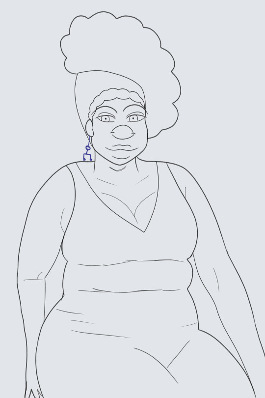
Everyone meet Philomela! She's in her early fifties and she's a bad mama jama. (IGNORE the shitty hand I got lazy!!) I usually draw the head and hair, then body, then face, combine them all and clean up. I sketch using the mechanical pencil tool, just because I like the "roughness". One day I'll try lineart again. I fell in love sketching this. I drew her fat rolls and her thighs and I just... what a beauteous woman 😤. I love her. You should always fall in some kind of love with your work. Bisexuality paused, let's move on.
Step Two: Flat Colors
Pretty self explanatory. Give myself a base. Accidentally drew the music pattern on the wrong layer and said "eh. it works". I create a new layer "underneath" and add hair! If I want to catch texture at the hairline, I go right on the flat.
Step Three: Shading
Now here's where it gets fun- where the life in their bodies happens! I honestly think my favorite part is shading. I just grab the airbrush, click the same color as the flat (usually), and spray! Now here's the thing: for skin, this trick works better (for me) the browner the skin gets. For lighter colors, I will play around to see what works. I also blend where necessary. Notice how I used an orange for her blush and her bottom lip, blending as needed. Now looking back, I missed some spots, but... we live and learn. Funny enough, I started having more fun with shading and lighting when I stopped holding myself to the "perfectly realistic" idea. I just wanted to see a certain "texture", I liked it, and I kept going.
Step Four: Highlights
And then, the lighting! Now, when you have a real well lit picture of brown skin, I've noticed that the edges are going to be darker, while the middle of the surface gets lighter. So that's how I airbrush it! I try to highlight the skin where exposed, and certain parts of the face. Always a lil splash of extra shine for the nose, as an Ice Touch.
And that's it! I hope y'all enjoyed my random art session. I feel a bit vulnerable posting it. 👉🏾👈🏾
71 notes
·
View notes
Text
im so sorry it took me so long to answer these oml but YES i'd be happy to show how i draw and color :)
— SKETCHING
please note that i almost always sketch traditionally first lol it's just a lot easier for me to determine how the drawing is placed that way, but i always go over and re-sketch it digitally
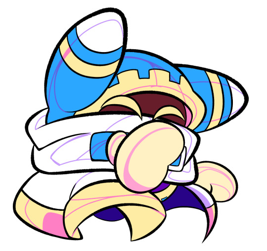
for magolor i always start with a basic egg shape (lmao) and then i add his ears. then I draw the scarf; it's easy to determine the shape and dynamicism based on where the bottoms of the ears are located
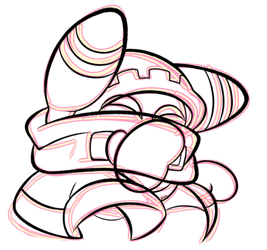
then i usually add the cape and hood together. where and how these are placed and what these look like in general are very important because they're the main area that perspective is directed to (the ears and everything else is important too ofc!! but the hood and cape usually help demonstrate where he is looking and how he is moving the most). then i add everything else, usually his hands last!
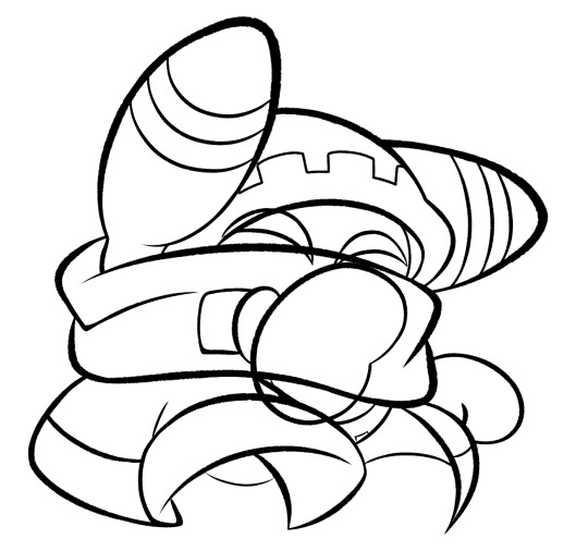
— LINEART
ohhhhhh god my worst enemy. Hope youre sitting down because this will be embarrassing LMAO
lineart is easily what i struggle with most and is more often than not the most time consuming and grating step for me. If i had a choice i would drop it in a heartbeat, but my style is so dependent on thick lines and shapes that it's difficult to 😭 a hole i dug myself into unfortunately ITS FINE THOUGH. ANYWAYS I'm getting sidetracked
i use my finger to draw all my digital art, which means i usually have to use a Heavy stabilizer to avoid shakiness and staggered lines. Unfortunately ibis paint's stabilizer is actually dog water and doesn't even stabilize more than half the time (in which case i have to repeat lines over. And over. And over again until i get it right) but when it does like me and works properly it's very helpful!
i always use the soft school pen bleed brush as my main tool for lineart. This brush has been my best friend for everything, i even use it for sketching idk it just really like the way it looks lol. sometimes i change the aspect if i want the lines to look more ,, chalky?? or smoother depending on the work

i don't really use this tool much but for this specific piece, force fade was my partner in crime
also i think i need to mention that i use so many layers for this. So many layers lol like to the point it's embarrassing. and at the end i merge most of them (except for the gear patterns, rings on his ear, and eyes + hands, which usually need to be by themselves as they're colored separately) Thank you for layers
and i end up with this!
— COLORING && SHADING
yippee yahoo the fun part !!! the part that i love the most
at this point, if i havent already, i always create a folder for convenience in organization because this is the part that i stress the most about what details are on which layers lmao
then i add ANOTHER layer below that for the color, then i put every single color used on their own separate layer!
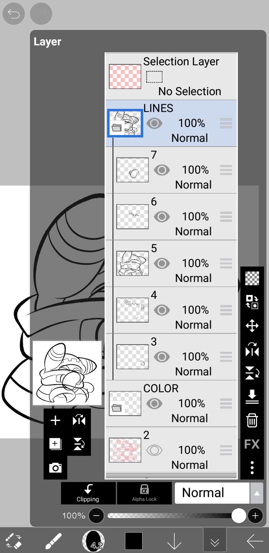
now, for shading, if im working on larger pieces with more complex shading, i'll usually plan it all out. normally when just drawing magolor, i don't really need to do this anymore because i'm so used to it lol, but for funsies i did it here anyways
then i use the bucket tool to fill them all in
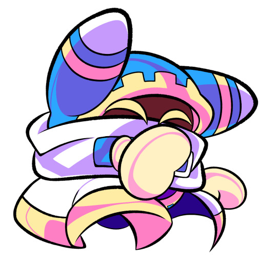
i usually have a set color palette for all the characters i draw (though the way i shade white differs. A lot between my work as you can probably tell fhdfgf). For every color, i have two specific tones that are associated with the shading. for example, indigo + violet are shaded with my blue, pink + light orange (or lighter pink depending on my mood lol) are shaded with yellow, etc.
so, i shade the other areas with the 2nd shading color
a big tip i can give for coloring is to look at a color wheel when you draw. i know that sounds like. Such basic advice LMAO but that seriously was a huge help for me when developing my shading and something i learned while studying — if you notice, in all of the shading in my work, all of the colors used are analogous on the color wheel. note that not ALL combinations will work together like others obv !! but it's a huge step in knowing where to go with it
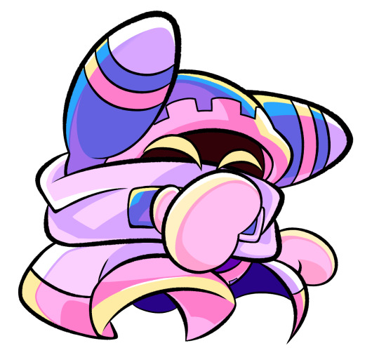
then i add other extra details like extra lighting, halftones (if i feel like it // if it fits the work), glow to his eyes, and color the lines and ta-da!
another tool i use a lot especially with my more recent art are blending modes, especially multiply. i use a clipping layer to add a dark color (usually a dark blue or purple) and set it to multiply, then erase the areas that emit light

and this is the end result! this is a very very basic demonstration of it fhdjg i was a pretty messy with the lighting and erasing in this example but you get the general idea right
and that's how i draw :) i hope this was helpful, and thanks for asking and being so patient with the response!
#ask#magolor#kirby#macdraws#ive wanted to make a tutorial for So long and finally found a bit of time to do it lmao
142 notes
·
View notes
Note
hi dema! i’m learning how to do digital art, would you mind sharing your coloring process? coloring (and lineart) is the hardest thing for me to do T_T… what brushes do you use for coloring and how do you not make it look muddy? i’ve been trying to follow tutorials from different artists on youtube but i find my work to look so muddy… thank u in advance >__<
Hi, and thank you for thinking about me for advice! I'm honoured to share a bit of my process, nerve-wracking as that is for my shy self, and hopefully help you out as much as I can. Forgive me if I don't express myself very clearly—I have a bit of a hard time explaining these things. Now, let's get started, shall we?
I'll be using the first panel of this artwork as an example.
My process is pretty straight-forward for most artworks. Make a sketch, draw the lineart, and follow a self-made guideline for coloring and rendering.
Sometimes I'll throw the guideline to the trash bin and start experimenting with brushes and chiaroscuro and color palettes, but that doesn't happen most of the time and, when it does, it's more a challenge than anything else, and not really what I think you're looking for.
I'll include my usual steps here, however, and like I said earlier, these steps are more like what you'd call guidelines than actual rules.
(I just realized I didn't save the sketch for this artwork. Oops)
This is the lineart!
I tend to think that details bore me and are actually pretty exhausting to do, but then I go and make things as clear and detailed as I can. Because I'm a hypocrite like that.
I did try to keep things simple here, though, mostly because I had to go through three other panels and didn't want to burn out my fuel mid-process.
Base colors! The blush (and Zuko's scar!) I draw in a different layer in case I need adjusting the brightness or saturation later.
It's time for shadows!
Pick a color depending on the atmosphere you want the artwork to have. Is it a cozy, warm scene in a honey-tinted room, or is it a moment shared under the moonlight? The color choice should come as an answer to those questions—deep red for the first one and dark blue for the second.
Choose a color and make it dark and saturated. Then, play with the layer opacity! A darker shadow means harsher light, while less opacity works best for a softer look. See the difference? It's subtle, but it's there.
Of course, this is my personal choice. The way shadows are drawn and color is chosen depends on the artist and the artwork. I choose to play with a more simple coloring style, keeping shadows from blending into each other, but you may like a more realistic approach to shadows and colors.
My best advice? Try doing it every way you can, but in the end choose what works best for you. Whatever feels more comfortable, whatever you enjoy drawing the most. And then work to improve it. Love the little proof that you've gotten better, even if it's subtle.
And talking about subtlety...
I love to play with gradients. I use them mostly to give the artwork some form of atmosphere, and make it look cohesive and whole. A light gradient in the color and direction of the shadows will help the characters blend with the background, as will another gradient in lighter colors for the light.
Get creative with gradients! Use them so the lights feel brighter and the shadows darker.

Now it's time to work with the lineart again.
The pure black lineart makes the artwork look harsher, sharper, so I tend to give it some color to soften its edges and compliment the rest of the drawing. In darker shades as the rest of the colors, growing more saturated as the light comes closer.
I love to make the characters' eyes pop and glow! It's really fun what you can do by just messing a bit with the tones of the lineart.
Finally, I play with the level correction. A high contrast will help your artwork stand out and look brighter. See the difference?
And it's done!
Sometimes I like to add other effects or details, but this is the very, very rough shape of my usual process, and thus what I thought you'd like to see.
Once again, I'd like to point out that this is what works for me, and a large part of improving as an artist is just fooling around and messing up until you find the tools and tricks you're most comfortable with.
So keep drawing those muddy shadows and colors! They're only a step of the process.
#dema answers#zutara#art advice#art process#I hope this helped you anon#Tbh I have zero idea of what I'm doing most of the time#So don't worry if you don't#Worry instead the day you feel like a drawing comes easy and poses no challenge anymore#Always strive to do better to improve to fix that lighting or find a new way to depict a scene or find other filters and effects#No artwork is ever perfect and perfection itself should never be the goal#“Don't trust a song that's flawless”#Don't give up on the strain and the frustration of struggling against your own skills#Never fall out of love with the process#That's where art is
24 notes
·
View notes
Note
chia pop chia reviews, maybe? is there even a better name for those because chia pop chia sounds unwieldy but they aren't all fruit. potato chia pop when
(Note: I already covered a bunch of Chia-specific colours in my Chia review. To avoid redundancy, I'm going to list a few secondary favorites in this colour review so the entire thing isn't a repeat. Also, I'm doing my least favorite colour instead of species for obvious reasons.)

Chia pops are basically just those cheap ice pops where they come in liquid form and you toss them into your freezer. There are a bunch of them and for the most part they're normal food items... except for a few with the handful of "magical". For reasons that have never even been remotely explained in the lore, Chias that eat magical Chia pops change into a matching fruit/veg form, most of which are unique to them specifically. These additional colours give the Chia some flavor (both literally and figuratively) and are their main gimmick.
Conversion is a weird topic for these Chias. The bulk of them got redrawn and put into standard poses for customization (which is a particularly strange choice as they can't wear clothes anyway)... except for some that just didn't, for no clear reason.
Because the conversion was so uneven there's no way to make a judgement call for all colours, but on average I'd say that they looked better pre-conversion, as they tend to just look strange in the default poses—though on the plus side, most of them lost the weird lower lip that Chias used to have. Hopefully TNT will consider doing pet styles for these colours in the future so people can pick and choose what they like best.
(Secondary) Favorite Species:
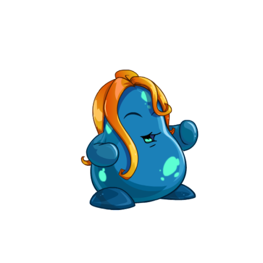
Agueena: Chias that are based on Neopets-specific fruits are always neat, and the agueena was already a good-looking item, so unsurprisingly the agueena Chia also looks pretty good. It's less fruit-like than some, but the cyan-on-blue splotches make for a good pattern that works really well with the orange hair-like "leaves". The shading on this one's also really good.
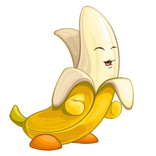
Banana: I like my fruit and veg Chias ridiculous, and this is a ridiculous colour all right. The elongated body is immediately distinct and fun, and I like how its partially unpeeled, which adds a bit more visual interest to it than it would have otherwise.
My only issue with it is that I wish the face lineart was colored so it matched the rest of the design. Also, the arms and legs don't seem to actually line up with the body quite right; I kind of feel like the legs should've been redrawn and the arms dropped entirely ala the onion Chia.
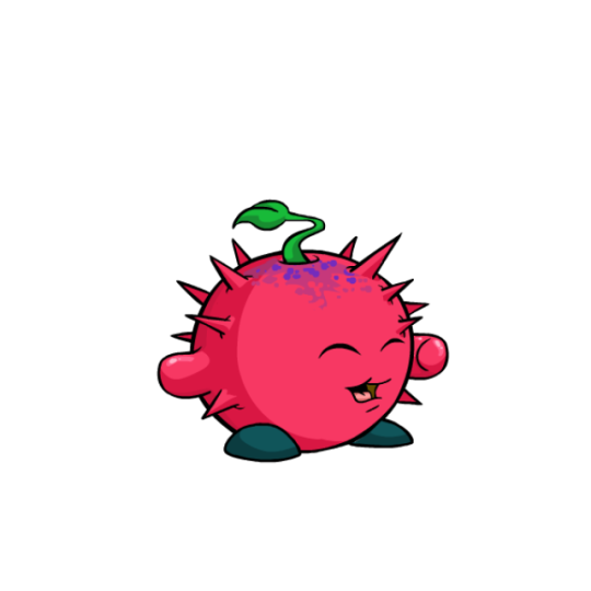
Thornberry: Another Neopets-specific fruit, this design is pretty similar to the tomato Chia, which is its only major drawback. However, I find myself liking the thornberry Chia more, as it has a bit more contrast with the dark feet and the texture at top breaks up the otherwise monocolor body.
This is absolutely a colour we could use a pet style for though, as the unconverted version was much better. Aside from having better face proportions, the variable sizes of spikes really added something to it.
Least Favorite Colour:
Gooseberry: Just kind of a strange pick of fruit to begin with (for those wondering: gooseberries are an actual thing, look it up), nothing about the gooseberry Chia has ever looked good. The colors are drab and low-contrast, the body is weirdly off-kilter and has poor shading, the face placement is odd (it used to be lower down on the pre-conversion art, which was better but not by much), and ironically the thickness of the stripes make it not look much like an actual gooseberry. Honestly, all this does is make me want a watermelon Chia.
20 notes
·
View notes
Note
Ello! ʕっ•ᴥ•ʔっ♥️ Im secretly a big fan of your art work and was wondering if you'll do a tutorial on how you make your art work, I love them all very much 💞
Oh, thank you. 🙇🙇 I’m so glad to hear that! And sure, I can make a tutorial real quick. :))
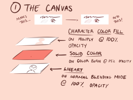
1.) Before I start doing any art, I do this to my canvas. Having a solid fill layer on color burn with low opacity gives a nice outline effect on your pen. As someone who sucks at putting lineweight at the right spots this is a life saver (or if you want to make your linework better, that works too.lol) All color bases and renderings stay above the lineart layer on multiply (I also use clipping mask a lot for rendering.)

2.) I give myself some time to research for poses on Pinterest. If I can’t find anything, I use Magic Poser on my iPad to make all of the poses.
This is a link for the web version.
Here is also the link to the brushes I always use for my drawings.
I’m going to use this old sketch of Ava with his hair short. For this example, I didn’t find a pose. I only referenced the hair style.
Generally I create the basic shapes for everything- the head, wings, body, etc (hair is kinda the exception to this). I don’t go too deep with adding line weight just yet.
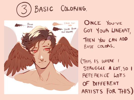
3.) I add the base colors in this step. Sometimes I’ll stop here with my drawings, but with my personal art I continue. I tend to explore a lot of color schemes, so I like seeing how other artists approach this. I can take the longest on this cuz I get so indecisive of what I want. 😅😅
Sometimes if I don’t like my colors overall, I’ll add a solid color layer on Hue at around 30-40% opacity to harmonize every color. This layer stays above all other layers.
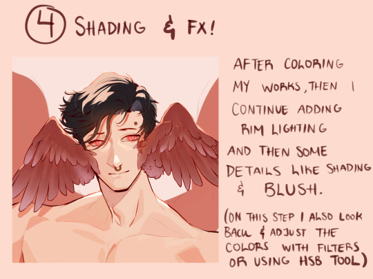
4.) Step 4 is a bit of a continuation from 3. Here I start adding more detail with the coloring, and putting those FX that I want. If I want to, like in this example, I also extend the drawing to show other elements, if I feel like the composition is a bit empty.
After this, I take a step back from my iPad and come back to my drawing the next day. Sometimes doing that helps me find obvious mistakes that I wouldn’t have noticed immediately.
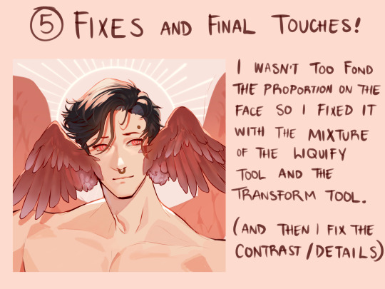
5.) Sure enough, I saw the the mistakes on his face, so I fixed them. I prefer using the liquify over the transform tool when I need to retouch some things; it prevents the linework or coloring from looking “choppy” or torn apart with its resolution.
Once I got the final touches done, I send it off !
Don’t know if this is actually considered a tutorial but maybe seeing this process step by step can help a bit. 👏 good luck, and have fun with what you create!
67 notes
·
View notes
Text
'evil'/anti artstyle meme! inspired by excessive-moisture's post doing this same thing!!! i showed it to my friends and asked them to give out my own art traits and basically a list of things i should not do.
the result is this art style! soft colors, less purples, very round and soft, thin lines + no line weight, no trademark things like how i draw fur and mouths PLUS slightly different desighs to fit the style more! (for example spamton being drawn more like his shop sprite)
i drew several characters i'm known to draw a lot / mean a lot to me just to see them how different they are from when i draw them normally! HURTS to not have an oversaturated drawing, uegugh.... but coloring was the most fun part! i love working with colors! the worst part was the lineart because i got SO BORED. fun challenge anyway!
little explanations on each character under the cut since this is a multifandom + ocs post and i wanna short talk about my silly guys ever (my, what the kids call these days, blorbos,)
since this has multiple characters not everyone may be familiar with, here's a tiny bit of info on everyone
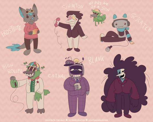
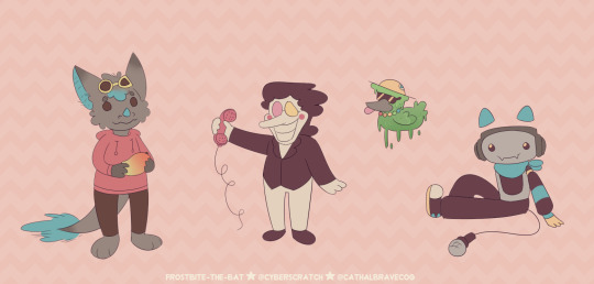
frostbite = my fursona! they're a bat / dragon mix. they're holding a mango! nothing much to say since they're just my sona. me, y'know?
spamton = you know him! it's spamton from deltarune chapter 2 !! he's a shopkeeper and a secret boss in the game where he appears in his 'NEO' form. he's based on scam e-mails and ads!
my freak of a son = toontown corporate clash oc - he's a goopy low baller that i call my son. or rather, toontown version of frostbite and i call him their son. regular frostbite as shown in this image and frostbite are separate. he was made using one of high roller's attacks.
scratch = my deltarune sona and self insert! they're the fourth member of sweet cap'n cakes. they're a dj! they're inspired by cat headphones, soundboards and karaoke machines! they're who this blog is named after :P
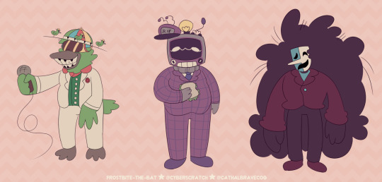
high roller = from toontown corporate clash! he is a cog 'manager' who only appears during a yearly event 'april toons'. she is a show host and a fusion of two characters ('dave brubot' and 'buck ruffler'). it's show is also the boss fight you fight when they're around!
cathal = full name cathal ray toby bravecog aka the multislacker, also from toontown corporate clash. he is a manager you can fight in-game after completing a set of 'kudos' tasks. they are the VP's son and are based on crt tvs! they're known for being 'lazy'.
blank = (full name blank b. addison) a deltarune oc for my big deltarune au named datapack au. he is an addison who got corrupted by a swatchling mask - which is a new concept introduced in my au. he used to sell movie related trinkets and was a stand-up comedian.
#oc art#[frostbite]#[scratch]#[sscc]#my freak of a son#deltarune#toontown#toontown corporate clash#spamton#high roller#multislacker#blank#dpau#datapack au#guz art#[2024]#[January_2024]#<- new system specifying months... makes it a bit easier than the archive for me in the future!!!!#blank b addison#i forgot which tag for him i used... but oh well i want my tags Somewhat organized on my art blog.
66 notes
·
View notes
Text
IF YOU WANT TO SPEND MONEY THIS PRIDE MONTH ON A TRANS GUY'S ART LIKE MESELF SO I CAN GET BACK ON T.... ☝☝☝
So not to get sappy on main, but been very much broke and haven't been on hormones for like 7 months now, so I really need to get back on it plus pay for phones bills and whatnot. I'm really dry this month, a fly flies out of my wallet every time I check it, ya'know how it is.
Here's more information that this animation may or may not has;
FULL BODY ART - €40
Just a simple illustration of any character of your choice, put in a colored void box! However, I can also add simple props and make it any color for free
RENDERED ILLUSTRATION - €100+
So, imagine if I put your guy in a situation. Yeah, what are you going to do about it.
Jokes aside; if you want to see a character of your choice in a setting where they're actually part of, including lighting, shading, everything making sense AND it's fancy, then this one's for you! However, depending on the amount of details asked for it might go up for my own sake :']
ICON - €25
Simply, an icon, yeah. Usually I work within 3000x3000, but if necessary I can always change the size that fits more! Think of it as a headshot commission!
MS PAINT - €30
This is just a 'doodle' commission, I know it's worth more than an icon, however, you get full body art of your character for less AND it's in a fun art style! For easier pre-existing fictional characters it's only €20 (Like Yoshi, Waluigi, Mr. Saturn, you name it!)
EXTRA!
For every extra character (including matching icons) it's +100% of the base commission! So if you were to ask me to draw two characters, just simply full body art, that'd be €80 instead of 40!
WHAT I CAN AND WON'T DRAW!
✔️ Human/humanoids, furries, almost anything, really!
❌ Bigoted art, NSFW/fetish art.
I only do invoices thru PayPal! When the commission is paid for, the commissioner is allowed for any edits/changes before it gets to the lineart stage! Afterwards it'll cost extra to change anything!
All of my customers always get frequent updates on sketch - lineart - then finished product, however, if you want to see anything in between do let me know! I may take some time, but I'm always responsive and will happily communicate about it!
If tumblr's too weird to work with, you're free to send any inquiries via my email: [email protected] or DM me for my Discord!
Any reblobs and word of mouth really do help out a lot 🙏;_;
#commission sheet#animation#commissions open#artists on tumblr#my art#my animation#i really really hope this doesnt flop :'') im on my knees even went as far as animating this thing ghfdsgnfghs#it's even looping if you think about it!! high quality commission sheet if i do say so myself#/jk but also not too jk#trans#trans man#emergency commission
20 notes
·
View notes
Text
How I color manga panels: a tutorial
I'm no expert at doing recolors, I'm simply an artist who's occasionally too lazy to do my own lineart, and uses that of my favorite mangaka's so I can focus on other styles to simply have fun with my colors. I always try and choose panels or pages that are high quality, to avoid too much pixelization. Often I end up sourcing these from scanners or google images.
As far as programs, I use Krita (a free software). This all can be done with the standard brushes and tools that come with the software. But for some of the coloring, I have brushes from brush packs i like to use, as well as a few brushes I have customized myself. The main ones I use are from David Revoy, so if you want a recommendation for a great free brush pack, that's mine.
For this example I'll be using this panel from Chapter 58 of Moriarty the Patriot (I believe this would be Volume 15 of the manga) that I posted earlier here.

I'm not including the step where I crop the image, but I personally chose to remove some of the white borders that are needed for a traditional volume's page borders. Since I'm doing digital art, I don't always include them.
My next step is always to outline and fill the individual base layers. This includes the speech bubbles, each character, any independent props, the panels themselves and the backgrounds. There's no correct way to do this, but personally I use a brush to outline the object, then fill tool to well. Fill it, as well as the rectangle tool for the panels or straight lines I need to do.
For layers, I usually put all of these color base layers in a single group that's set to multiply, and change the opacity of the base panel so that I can fill the blacked out areas with a solid color easily, here you can see I was working with the base panel at 50%, but honestly i just kind of turn it down to whatever I think looks good.
The colors I use for this step are usually brightly saturated rainbow colors so it's easy to tell the different elements apart from each other. So you end up with something that ends up looking rather horrific like this:
From here, I usually create a copy of the base panel to put over the top of the colors. This way I can have transparency for the colors on some of the blacked out parts, but don't loose some of the nuance of the shading entirely. Moriarty the Patriot is a very black heavy cell style, which is the style I find the "panel above, panel below" method works best on. However as I work on the colors, I tend to toggle between having it on or off.
It's about here where I start doing my coloring. Of course this will depend on your coloring style and art habits, however personally, I like to start with the characters. I use those colored layers as the base layer I can clip my coloring layers to.
I will often turn off the layers that I'm not currently using so I don't have to deal with eyestrain, and will change the base layer to something more suitable (often a grey or light tan) so my color theory doesn't get all messed up. The bright colors in previous steps are to make sure they're visually separate. Now they've been established, I don't have to worry about that.

I don't usually label my layers, but for the sake of the tutorial I have to make it clearer which layer grouping is which.
I find in this step because of the multiply layer the colors can be a bit washed out, so I tend to either use much more saturated colors than I usually do, or switch to another layer style like Linear Burn of the overall color group to make the colors pop more. Ultimately though this comes down to personal preference. If your coloring style is very de-saturated, you might not have any problems with it. (I do suggest making your base color white, so the coloring of the base panel isn't off, you'll see in the screenshots above I forgot to when working on Sherlock. Ignore my mistake)
For the parts of the image where it's primarily blacked out (such as Sherlock's hair or coat) I don't bother shading at all, and only do the highlighting, as the black takes care of the darkest tones anyways.
During my coloring, I also add a separate grouping above everything for adding rendering and details above the panels. This includes things like the eye highlights (which I always do in pure #000000 white) and making certain parts of the heavily blacked out areas pop more.
(those refs and paint layer 13 are what I'm using to color pick off of, and keep the shading colors consistent throughout the piece. There's probably a better way to do it, but I just paste them directly into the image and then delete them at the end, paint layer 43 is a color dodge layer, and so has to be outside of the layer grouping to work)
Comparison of the art without:

And with the top details and white highlights:

It's a pretty subtle difference, but I find it's the little things that truly make the piece. Especially with the strands going over the face, they need just a bit more to make them really pop. I also just really like my fancy eyes which is hard to do without the top layer.
Insert several hours of coloring here, and about another hour just trying to figure out what gradient to use for the background, and you end up with the the base colors. From here I usually mess with overlay layers as well to get the colors to all look fancy and nice together without having to do color theory (pro tip /lh).
I forgot to grab screenshots while doing the background, but for the top panel I essentially just used the [deevad 5c screentones] brush and a transparency mask to add a screentone gradient, and totally didn't google "splatter overlay" or something like that and picked something off of google, and added some borders.
Because both the base manga panel and manga panel over the top are both not at full opacity, if there is text in the page or panel (such as this one) I like to copy the just the text part of the panel and add it as full opacity in the "colors" folder to make sure it's legible and matches up the rest of the colors.
And after all that, its basically done. I'll sometimes continue to mess around with certain aspects to make sure I like how it look, but that's essentially it. This is when I add my signature, and then it's queued to post!

#krita#long post#eyestrain#art tutorial#tutorial#digital art#my art#manga recolor#manga edit#manga pannel#manga coloring#sherlock moriarty the patriot#moriarty the patriot fanart#yuukoku no moriarty#moriarty the patriot#james bonde#james bonde mtp#artists on tumblr#art resources#art help#art tips#drawing tips
70 notes
·
View notes
Last Seen Blogs

ukesofhazard-blog
Ukes of Hazard

tony-goldstein-blog
The middle Goldstein

slasher-fucker-and-sucker
Camerolli

mincute
@lesbianjjennie
tony-goldstein-blog
The middle Goldstein