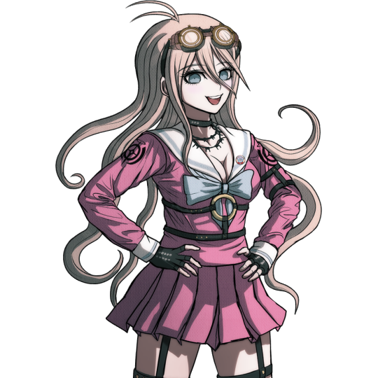
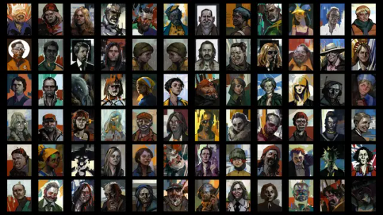
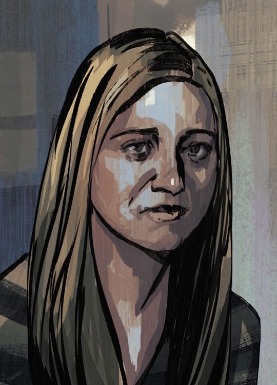
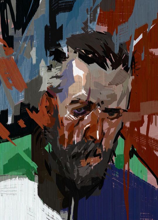
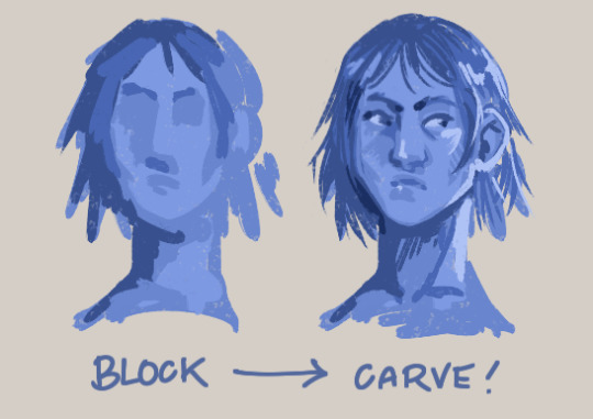
#trying for like. different vibes using similar color palettes
Explore tagged Tumblr posts
Visit Tumblr Blog
Explore Tumblr blogs with no restrictions, modern design and the best experience.
Last Seen Tumblr Blogs


Fun Fact
China blocked Tumblr because of pornography and censorship problems in 2013.
Text


i just really like using green
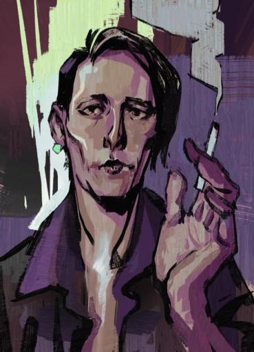
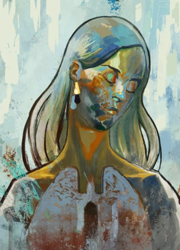
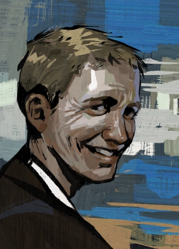
#choose your fighter: medical malpractice vs federal burglary#quick stuff i made between paneling the first chapter...which is taking me way longer than it should#project nova#kokoart#art#webcomic#oc#oc art#original character art#original character#character art#trying for like. different vibes using similar color palettes#obviously rowan's one of my favorite characters to draw but he's also probably my favorite to write along w/ amelie and august#i put this guy through way too much. sorry rowan you'll get your justice trust
182 notes
·
View notes
Text
This is a post I'm interested to be seen by people who either do not play Magic: the Gathering or engage with it rather casually. If that's not you, feel free to reblog to reach a wider audience, but the exercise in here will not be as useful.
A few months back, the game released a new Base Set of cards called Foundations. It is meant to be a new batch of hundreds of cards that will always be available, that are simpler on average (though not necessarily less powerful) to be a point of entry for new players. Something else it does wonderfully is be a palette of the many worlds, aesthetics and vibes within the game. This is where you come in:
This is the important bit below
Take a look at the cards in the set! You don't even have to read them, there are many, many of them. If one of them or more catches your attention, reblog this post with an image of it, and if you want to learn anything more about it! Be it the world it depicts, its history within the game, or even the mechanics if they are what intrigues you.

This is the important bit above
Some of the cards are either generic or from worlds we haven't visited yet, but the vast majority fit within a larger whole, and there might be more like them to point at! I will try to elaborate on what you want to learn, and maybe even point you towards similar cards or entire card sets on the world or subject you took note of.
In case you're totally unfamiliar with the game, I'll put a short summary under the cut:
Magic: the Gathering is a fantasy trading card game that's over thirty years old. People are invited to create their own deck of cards out of a pool of nearly 30,000 different cards at this point. The gameplay has been summed up many times as being something that sits in between Chess and Poker as far as overall appeal, though the actual action-by-action game is unlike both of them. Just like with playing cards, though not as extreme, there are different ways to play with the cards too, varying which are legal, or the exact rules they're played under.
It is a deep game that can be enjoyed at many levels of engagement, and will take exactly as much time and money out of you as you're willing to give it. From $0 free to play gaming on arena or occasional board game night engagement, to spending hundreds regularly to keep up with a tournament metagame, to spending thousands if not tens of thousands on super rare collectible cards.
In the past few years, Magic has started collaborating with other franchises to make cards for their properties. Lord of the Rings, Fallout, Doctor Who, and plenty more, though it keeps making cards for its own worlds and lore.
That lore can be summed up as a magical multiverse full of very different worlds, each with their own aesthetics, magics, factions and struggles. They are interconnected by rare mages that are able to travel between them, and a major event recently started connecting them further, allowing the layperson to be able to travel between them using less practical ways to do so. Within those worlds, stories happen, sometimes through the cards themselves, sometimes through written fiction, be them novels, online stories or even comic books. Magic cards are divided into five different colors of magic, each with its own associated philosophy, elemental associations, mechanics, aesthetics. Those five colors can then combine and interact to form complex characters, factions, spells and more.
#mtg#magic#fantasy#lore#trading card game#Foundations#wizard stuff#If this post explodes I might have to get some help#but that'd be a good problem to have#realistically I don't expect to reach much out of my usual crowd#this is a bottomless rabbit hole btw
236 notes
·
View notes
Note
I saw you answered how you came up with your design for yellow.
how did you think of a design for Kaynebesides the traits we already know about?
Like how did you pick a face shape, skin tone, hair, color and all of that?
Most of them are really just vibes based- like when I hear a characters voice and their mannerisms I can picture a pretty consistent visual in my minds eye. So when I go to draw em, I try n stay as close to that as possible.
I think that’s why my old Kayne design and my new one still have a lot of similarities, like the general face shape, hair, and suit style. The one major change being the color palette, and ofc he’s now Egyptian. I also felt like he was more broad and hefty, but gave into the fandom twinkification because yknow those designs are still really cool. I kinda wanted to bring that initial vibe out more with his new design, but have yet to actually sketch that out thoroughly.
I think the color palette choice is specifically funny tho- bc I was working on a commission for my dad at the time and was working out different color palettes for the design. The colors I used for Kayne’s suit are from one of those variants I didn’t use, but still really loved. (Here’s that design btw and Kayne for comparison, which I think makes the recycled color palette even funnier.)

#he still looks too thin there but I’ll work it out I swear#ask#the majority of my designs are just what I see in my head#and then I fill in the gaps with what makes the most sense#although don’t ask me about Oscar something happened there#and i don’t actually invision him the same why I draw him. it’s like a slight difference but it’s Noticeable#and it freaks me out
225 notes
·
View notes
Text


ISAT color headcanons? Yeah I got them!! Have quite a bit of thoughts about them actually. Though they do contain spoilers so if you want to hear them then they'll be under the cut. :)
It is very very important to me that Sif's palette stands out from the rest of the party. And so, in my hc, that manifests as all of the party sans Siffrin having warm color cohesion, while Sif is (almost) alone with cold colors. I chose purple for him (possibly because subconscious ace impulses and also the space connection) but he could also have blue.
Mira is pink because I personally cannot see anything else for her. But I really like the idea that she'd have yellow/orange somewhere too to tie back to mirabelle plums.
I've seen a few people use yellow for Bonnie which I agree with! It's a young, happy, energetic, color!
Isabeau is probably the one I have the least thoughts for color-wise but, yeah I do think he has brown hair. I do also like orange being his color (maybe because he reminds me a bit of Peeta Mellark). I was trying to stay as value accurate to the og sprites as possible so that's why Isabeau is so monochrome, but I do think he'd be a colorful lad.
Odile's shirt (for whatever reason) has always had very very strong red vibes for me (probably because it reminds me of chinese cheongsam), which I do like for her! It's a very strong and commanding color, which she can definitely be when the situation calls for it. Her cardigan was probably the hardest thing for me to figure out because I knew I wanted the shoulder pads to have a cold color, and for the rest of it to be warm so that she didn't get oversaturated with the cold color (Just a touch of cold! Only a touch! It's important!). The beige felt very cardigan-esque and although it isn't a perfect fit with the blue/violet, I think it WORKS because a little bit of color discoordination in her design is FUN and CUTE and can be telling of her character!! :)) Characterization through design my beloved!
NOW ONTO THE COLD COLORS.
THEY ARE IMPORTANT because it visually symbolizes the difference between Sif and the rest of the party in regards to their backgrounds. Everyone has Vaugarde that they can relate to each other with. Except for Sif. Sif is other. Odile is also other, which is why she has a touch of blue, but she also has Vaugarde and Ka Bue. She has homes to come back to. Sif talks quite a few times in the game about how everyone realizes they're not from around here. In universe that can be explained by like physical attributes. Accent. Mannerisms possibly. But if this was like a tv-series, the audience, who are just getting acquainted with the world and know nothing about it's norms, wouldn't pick up on any of that. And that's why the visual short hand of "similar colors" and "opposing colors" is really important to me in this instance. It's another layer to add to these characters and try to communicate something about them! tldr; Everyone has warm colors to set them apart from Siffrin who has cold colors, showcasing how they are fundamentally different when it comes to their backgrounds.
#in stars and time#isat siffrin#isat odile#isat isabeau#isat mirabelle#isat bonnie#fanart#my art#odile is red and mira is pink and no one can change my mind#also hey first isat art wowowowo#love this game to death ahahjaahsjk#play it!!!#it's so good!!!!!!#also also#I fear I might've peaked with mira's and sif's headshots ngl-
103 notes
·
View notes
Note
how do you imitate the danganronpa style so well?? it's always so good!!
Great Question!
First, having a somewhat decent grasp on anatomy (which is something I still need to practice lol) or “the basics” of character art is always a must imo. Having a good understanding of forms is our starting grounds for further stylization. Think of it as the “skeleton” of any style. Moreover, the Danganronpa style comes in various forms, all with different characteristics/visual characteristics.
However, and I think this is a very important distinction, I try to study Rui Komatsuzaki’s overall style as opposed to just Danganronpa. In other words, Rui Komatsuzaki, like any other creative, has his own personal stylization and artistic evolution throughout his career as an illustrator.
In DR1, Komatsuzaki’s style included much thinner lineart, bigger heads, and more gradients with the softer shading. The vibe is very much more “grounded” compared to later titles. (Example: Toko!)
In contrast, DR2 has slightly modified proportions (like bigger hands), simplified shading, and much more vibrant color palettes. The line art during this time was also streamlined with less lines and thicker pen pressure. It makes the sprites pop out a bunch! (Example: Mahiru!)
Of course, with UDG, we see these two styles somewhat overlap, resembling his later stylization. Here we see the modified proportions and color preferences from DR2 with the thinner linework and detail of DR1. (See Toko Again!)
Finally, we see this similar style philosophy continued in V3, only with even more contrasting colors, reflecting the hyper bright/attention grabbing palettes of serialized work. The shading is much darker than previous titles, and somewhat colder too. (See Miu this time.)
Of course, with all of this in mind, taking notes is imperative! Especially if you want to replicated a specific entry’s stylization. You can draw over some of the dr sprites just to get a general feel of the proportions. I can probably post more latter down the line, but this was the most recent thing I’ve done. See below! (I was trying to get a sense of how “high” the hair sits on top of dr)
Now, for his splash art work, Komatsuzaki’s began his process by blocking out his pieces in bluish hues before the polishing phase. he most likely applied a mix of “color”, “multiply”, or “color dodge” once we finishes rendering for finalizing colors. (As depicted below.)
You can also see how Komatsuzaki simplifies clothing and the like. He very much uses thicker brush work for these types of illustrations as opposed to the lines of his 2D work during this point in his career. Future points show how he plans his stuff with more thin line work. From here he most likely did the same thing. Focusing on the forms before getting to the hues and values
Sorry for going on a bit of a tangent, I have A LOT of thoughts on DR and Komatsuzaki’s artwork in general. I really love seeing his process, so I hope this brief overview can provide as a decent introduction! If more people want me to go over specific aspects of the style, I’d be more than happy to share my own thoughts! Thank you for reading!
#Danganronpa#danganronpa 2#danganronpa v3#Rui Komatsuzaki#danganronpa sprite#r0sie rambles#r0sie asks
43 notes
·
View notes
Note
Can you make a post about how you choose colors plz ? I'm really curious about your process
this is such a difficult question to answer bc really the way i approach colors is mostly reliant on what I find interesting and I do struggle with them, but i'll try my best to answer!
before I even start working on my piece, I like to gather a bunch of refs and think about the vibe I want to achieve since colors and values change the piece drastically. personally, I like to play around with purple a lot so usually I start with a light purple for the undertone/sky background color and I find that it helps a lot to work above that rather than the white of the canvas, it also helps me bring purple back into the shadows! I think my "secret" to why my paintings are so colorful is that I start by blocking in as many colors/shapes as I can using a brush with the color dynamics setting on, I find that it creates a good base fast without having to manually pick every single hue by hand. It's also important to try many different palettes and not be scared of scrapping something and repainting from scratch bc that's how you're able to tell what works and what doesn't! it also creates many ugly stages lol but here's a few screenshots from my process video of Under The Peach Tree as an example of how many times I repainted it
I like to keep in mind what the highlight color will be, for example in this painting I went for a skintone that's closer to the colors of the peaches and the little blanket bc that will tie everything together and make the character feel like they belong in the environment. it's similar in other cases too, for example if the grass is more cool toned then I'd go for some red pink flowers. there's a tool in photoshop that's called selective color which I use a lot as well as curves or color balance, they're all used to adjust the colors that you already have like if I feel that the yellow is not quite right then I try to change it up through those tools and see what's better. it's really a lot of trial and error and just trying things out and seeing what you end up liking, it also ofc comes with practice and learning compositional values.
I hope this helps 💗 I do upload my process on my patreon, and I've been planning a video specifically on how I paint skin since it's an interesting topic!
81 notes
·
View notes
Note
On your chibi drawings or drawings with thicker "lineart", you seem to vary the color of the lines a lot. How do you decide where to place the different line colors? Do you have a system, or do you just kind of feel it out?
I apologize for such a delayed response!
I really had to think about this ask, as the easiest response is to say that it's "vibes" based. I don't think I have a particular system but I will try my best to use words to describe the vibes based process haha.
The most important thing I think is to use colours that create a harmonious palette in the end, like complimentary or analogus colours, which is actually almost all colours if used in appropriate spaces (also appropriate hue/shades)


For example this chibi drawing I'm working on, the primary colour I used is green and pink. I could either use green (darker saturation less hue) or purple (dark hue high saturation) for the shoe.

if I used a really light blue here it would be a bit more confusing-- breaking up the shape of the shoe. And it also because it's on such a dark colour it clashes with what's meant to be the lightest colour of the overall piece.
It's similar to when you first learn to colour lineart because it adds dimension to the figure/object you're portraying opening a whole new world of possibilities...!
37 notes
·
View notes
Text
I tried to make a mock-up of my own alternative take On My Little Pony: Generation 5.
I had a lot of fun designing these, I won’t lie. The main idea was to bring back the mane (main) cast of characters all having drastically contrasting, strong personalities and color palettes. I think that was what G4 succeeded best at, and would probably (I’m no expert) increase marketability and make people want to buy the toys more.
I took inspiration for the new art style direction from an MLP G4 manga cover , not sure if it’s official or not, but I like that style a ton, I think it’s super cute and would be a good direction for a new show. This is of course operating under the assumption the new generation would just stay 2D instead of branching to 3D animation. I tried my best to mimic the style , I don’t think I did the best at that, but that art style on the manga cover is what I think they should go for. Maybe with a more pencil-textured brush for the outline. Feels unique from G4, but still cute in my opinion.
Instead of Friendship or Unity, the unifying theme tying all the characters together would be Artistic creativity and using it to express yourself. All the characters would represent a different form of art. The main villain being a bat-pony with wings and a horn, a mad scientist type who builds robots and gadgets to fight the main cast with the goal of stealing their art and feeding it through big, industrial machines to pump out hodge-podge mashed together copies and create her own art museums to profit off of them. They have to fight to take back their art and create works that express who they are without it being stolen or mass produced by machines and robots. She’s kind of inspired by Opaline but I tried to give her an alternative design. I also took a bit of inspiration from Dr. Eggman from the Sonic franchise. In general my take on this generation is kind of inspired by Sonic with these animal characters fighting against robots and industrialization. Specifically the Sonic Boom Cartoon with the beachy setting and vibes.
We also have the main character, Aqua Seastar, a yellow unicorn who’s got a very curious, inquisitive, detective type personality, ( very clearly my version of Zipp from the Make Your Mark Cartoon, because I actually liked the personality they gave her there, a lot) she’s constantly trying to solve all the mysteries that crop up around the island and poking around to learn new things. She’s also an aspiring animator who wants to make a cartoon about a detective squirrel inspired by her own adventures.
Speaking of characters from G5 I’ve based these characters on, Cloudy skies is basically my version of Izzy. A very similar personality, ( particularly how she’s characterized in the movie A New Generation, I think that’s where she’s at her best) just with the added twist of her being the motherly one of the group and a bit protective and neurotic about other’s safety. Also inspired a bit by Wammawink from Centaurworld or Ragatha from TADC. She’s the arts and crafts pony , with yarn and sewing needles in her hair. She’s also a Pegasus and I swapped her mane and coat color cause I figured we needed a blue pony.
Shellda is basically my answer to Sparky, a baby sea turtle who was orphaned and no one in the sea cared for her because she couldn’t keep up and would just “slow them down” . She eventually gets adopted by the main cast as a little sister figure and starts off shy but really comes into her own over time, gaining more confidence and becoming a watercolor painter. Also she can talk. She’s more of a toddler than a newborn.
I tried to imagine this setting as playing into being on a beach / island way more . Maybe coral reefs instead of trees on the surface , mythical creatures the ponies could encounter like in G4 , but specifically based on sea and marine animals. Like crabs made of rock or something. A stage in the center of town for GlimGlam Hot-Trot to perform on that looks like a giant clam. Whenever they travel off the island they could do it on a big pirate ship instead of a hot air balloon or a plane. Stuff like that.
This generation would also have modern tech but mainly for the sake of creating art, like art tablets and programs . As well as Dr. Nightwing and Terra Byte being inventors who create gadgets.
Overall , I have way too many ideas to go over in one post but I put a lot of thought into this and I hope you guys like it. What are your thoughts ? Do you have any questions about any specific characters or anything ? Let me know, cause I love MLP especially G4 and I had a lot of fun making this. Might be using these characters again sometime, soon.
If you would like to support me , feel free to check out my Kofi page , I offer commissions and you can also just donate if you’d like to , but please don’t feel pressured. I hope you enjoyed the art and have a good rest of your day ! 💕🧡
#my little pony#my litte pony friendship is magic#my little pony make your mark#mlp fim#mlp g4#mlp mym#mlp g5#my art#artists on tumblr#digital art#art#artist on kofi#pony oc#pony ocs#oc#original character#ponies#mlp#mlp art#mlp oc#mlp redesign#mlp g5 redesign#pony redesign#redesign
26 notes
·
View notes
Text
ok! so!!
I have my small little sketch ideas for Sugarglass Cookie!!
They’re all fairly different and pretty much REALLY rough drafts for how I’d imagine them. I’ll also describe them better here in case you can’t understand my horrid writing (it’s been so hard ever since my pen broke 😔)
FROM LEFT TO RIGHT:
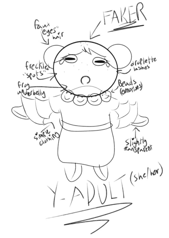
1 . Gives off more pure and wholesome vibes, but is actually pretty manipulative using her childish looks (similar to how cloud haetae cookie was cutesy and nice at first before showing her true colors). She has large beads (frog eggs?? or just regular large beads) around her neck that depicts her emotions (ex. Smiley when happy, frowns when sad, you get the idea). Just above her dress (small frill/ruffle sleeves and straight dress) you can see she has another shade as her “underbelly” like how some frogs do. This also applies to the palms of her hands and bottom of feet/inner legs. And of course, the part that makes it a Glassfrog she is semi-transparent and has freckles on her face/shoulders (maybe back too) to depict their spots. Give her frog eyes (of course) and I was thinking of making her hair two buns in the back to give “fake eyes” kinda look. Normal cookie mouth, and her color palette will likely consist greens, blues, and yellows
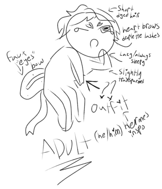
2 . Honestly I have very little idea what to do with him, I kind of hate this design. But hey, still putting it out there in case I change my mind. Has short wavy hair with a dyed “dots”, he’s mostly just a lazy cookie who doesn’t care/isn’t fazed by much (the only one that can get him to do anything is eternal sugar, and even then he’ll try and get out of it). Again, frog eyes and transparent skin of course, normal cookie mouth, and different tones underbelly. I had to think long and hard for his outfit and the best I could come up with was something like the Greek God Hermes (gold and white simplistic robe, mini wings on either side of head) because it felt somewhat close to eternal sugar’s design. To make them match a bit more too though, I added a bow to his back that would be pinkish with dots (like a Glassfrog’s back) to give “fake eyes” look. I thought small heart shaped eyebrows would be pretty cute too since eternal sugar also has hearts in her design. Color palette would consist of white, golds, pink, greens and yellows
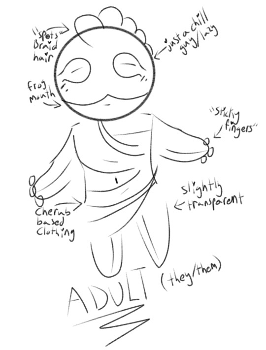
3 . They’re probably my favorite one. With no distinct gender, they are just a chill guy™. Loves to laze about but don’t be fooled by their relaxed nature (like poison mushroom cookie) ! Leaned a lot more into the frog look, giving them a frog mouth, eyes, transparent, different toned underbelly, and the lil finger balls (they have “sticky fingers” hehe). Their clothing (just a simple white robe) is cherub inspired, which I think really goes well with eternal sugar’s angel wings/halo and devil tail look. Their hair is big ball braids along the top of the head (not sure how long I’ll make it) as a glassfrog’s spots. Which, they’ll also have “freckle” spots on its shoulders and back too. Color palette would consist of pinks, greens, white, and yellows
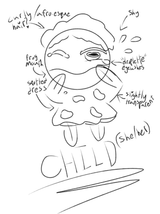
4 . Is probably the one I’m most neutral (?) about. She’s a child, raised by eternal sugar herself. Instead of being lazy or deceitful, she’s much more curious but very shy. Being raised by eternal sugar since she was an egg, she was manipulated instead by her master and is why she’s much different from the rest of the ideas (how different? Not very sure, we need more about eternal sugar until I know). Just as loyal of course, if not the most loyal. Could probably jump the highest, ribbits nervously when she’s being untruthful (she’s very bad at being bad). Like the rest, she has a frog mouth, eyes, transparent body, and different toned underbelly. I figured she looks cutest with very curly/afro-like hair?? Idk why, just fits her I guess. Her dress is a lil simple one with dots (like a Glassfrog’s spots) all over. Since she’s very young still, she still has a very tiny tadpole tail that barely peeks out. Her color palette would consist of greens, yellows, blues, and a bit of browns
I will be making a poll bc I want to know what you guys think of them!! Any ideas are totally welcomed!!!!!
Oh and also someone said that there is a Sugarglass Cookie in crob??? I didn’t know lol, but they said I should probably change my ocs name so I thought of Sugarglass Frog / Sugarfrog cookie? What do you guys think?? I might just keep it as Sugarglass though bc this is for crk not crob but lmk
ok love yall bye 🫶
#I mightttt do 3#But honestly I’d probably make the final final decision once we learn more about eternal sugar#Last two totally have frog tongues bc of the mouths heheh >:3#rey rambles#rye-draws#Sugarglass Cookie#oc#crk#cookie run kingdom#cookie run: kingdom#crk fanart#cookie run#cookie run fanart#cr kingdom#cookie kingdom#crk oc#crk kingdom#crk art#Oc sketch#beast yeast#crk eternal sugar#eternal sugar cookie#eternal sugar crk#crk oc art#poll#polls
9 notes
·
View notes
Note
OMG I LOVE YOUR INK DESIGN PLS TELL ME ABOUT THEM ‼️‼️‼️‼️‼️
So first of all
THANK YOU THANK YOU THANK YOU THANK YOU SO MUCH FOR ASKING !!!!!!
Now, basically this is the design I’ll use for Ink for his reimagined version! I have this little project of reimagining some of the most popular AUs and make a few comics with em!
So I didn’t reimagined Ink’s backstory yet but I do know the changes I want to make to his personality and behaviors! So he is still a cheerful menace (as he should be >:3) but I want him to be a little more of a madman (kinda) and more desperate? Since he relies on the fandom to remember he and his multiverse exists he’d basically do anything to attract the fandom’s attention. That’s why contrary to cannon Ink’s ‘no interference with a AU’s story line’, this reimagined version causes drama and mischief on purpose! He never stick to being on either side of a conflict, he just makes sure that conflict never gets boring, which also means he’ll find ways to resolve those conflicts if they start to drag on.
Now as a person, he really isn’t mean at all, just pretty selfish and detached from ‘reality’ at times. He is very sociable and can get along with pretty much anyone (somehow). Also he is still a Fell!Sans fanboy because it’s the OG most important character trait, everyone knows that x3
Now I go over the design concepts and yap some more :3


So those were actually the oldest drawings and I ended up really liking those that’s why my newest is almost the same design. It is very similar to the original’s design because the original is literally perfection and you can’t convince me otherwise. I was mostly focused on the shapes and the practicality of the outfit, that’s also why I gave the pants pockets because I imagine he’d stuff it with art supplies, sketchbooks, notes, and random stuff. Also I was fixated on giving him makeup, cause I mean it’s artistic expression ig :p

So I tried here to lean more into the queer madman vibe (queer in both sense xp) and you can definitely tell I was listening to Will Wood and Lemon Demon ^_^’
I’m definitely going to reuse this sometime for funsies :3


So the one on the left was just trying a different look for his swirls and makeup. On the left is the bag I decided he’d carry around (more storage for random stuff YAY)
Regarding Ink’s soullessness: he does rely on his vials to feel but his emotions, reactions, care and wants are genuine, the vials work kinda like medications. I can’t really say more than that because that would kinda spoil his story but yeah he’s going to go through some existential horror moments •~•

And finally here’s the drawing of my previous post without any shading and multiply layers so you can better see the current design :3
I warmed up the color palette, made his sleeves shorter to show off the swirls and yes now his scarf is fading into rainbow paint.
Again thank you so much for asking! Have an amazing day, week, month, year, and life <3
And everyone else? Don’t be afraid to share your thoughts no matter how basic or dumb you think they might be! Makes my day to see people interact with my stuff !!!!
13 notes
·
View notes
Note
hey sun! sorry to bother you, but I'm currently doing a commission for a guy who wants a portrait made in the disco elusium style and I've never drawn in that style before ^^;
any tips, especially how to color?
not a bother at all! and while i'm not an expert on the disco elysium art style since i don't think i've done enough studies on it to say that i'm confident on saying what to do, i'll try my best to list out the things i've noticed while mimicking the art style. i'll split this into two parts, the composition of a portrait and the rendering and technical stuff behind it
i'll keep it under read more bc some of these portraits i'll be talking about are spoilers! whoops!
COMPOSITION
there's like, an unbelievable amount of variety when it comes to the portraits of disco elysium! personally, when i'm trying to mimic the art style, i try and look at the portraits in the game and see which of these characters are the most similar personality-wise to the character i'm trying to draw, and then i reference
1. PERSONALITY AND GROUNDEDNESS
let's compare the portraits of these two characters, ok? we have sylvie and idiot doom spiral. right off the bat, TOTALLY DIFFERENT VIBES, and that's good because we can instantly tell what kind of people these characters are supposed to be! and that's something disco elysium is excellent at.
sylvie's portrait is very simple; a very limited palette is used and the rendering on her is rather exact even with the rough-esque rendering that disco elysium's art uses. idiot doom spiral's portrait, on the other hand, is a lot more chaotic. there's more disorder to his portrait with how the paint strokes in the background seem to mix in with his face, there's a disheveled quality to how he's rendered.
ask yourself, how grounded is this character you're drawing? on a scale of sylvie to idiot doom spiral, how normal does their portrait look?
now, i'm not done with this klavier but i think it's pretty obvious that i heavily referenced smoker on the balcony's portrait because they have very similar vibes and role: pretty boy npc who your protagonist may or may not be a little infatuated with pftt (there's just something so different about them! i can't put my finger on it...)
2. WHAT DO THEY STAND FOR/THE ABSTRACT

ok! besides personality, they also have a knack for just doing some gorgeous portraits that truly reflect just, the history of a character and their role in the story. now i'm not the best at analysis so these are just gonna be some very simple observations about kim and dolores dei's portraits pftt.
the big white circle behind kim's face, besides doing an excellent job of framing kim, is very reminiscent of a nimbus which we typically see in religious art. it makes kim look like a very important figure, someone you should listen to. it's also kind of like a nod to how kim is like the few people who's like, civil and even nice to harry after his whole mind-breaking bender.
for dolores dei, GODDD i can rave about this portrait forever, it's such a favorite of mine. first, the rendering of her skin, she's like an opal or a golden statue; it's otherworldly, which makes sense because that's what harry thinks of her. and then, the splotchier and messier rendering below her, it's like she's fading away, she's just a distant memory of the past.
i'll use this very quick doodle of apollo in the de style to explain my point about symbols better. what is it that you want to emphasize about your character? are there any motifs you'd like to show?
i definitely wanted to portray apollo as determined and even heroic-looking in this portrait. leaning into his name, added that rim-lighting as if the sun was shining on him. emphasized his badge by giving it this exaggerated shine on it and lastly, made the background like the one he has when he perceives.
3. LOCATION
for backgrounds, i feel like you can go either three ways: abstract colors, political alignment, and location.

(i'm not happy that i have to use gary as an example here but he's the most blatant example of the second type of background AKSKSKS orz)
ok! so harry's bg, pretty funky, pretty fun. gary's bg, he's a fascist, that's the fascist flag in de. moving along trant's bg looks like a very abstract version of the wall in the building he's seen gazing at, heck, the way he's head is turned to you looks like you just called out his name and he quickly turned around to look at you but he is still very much facing the building.
more examples of those three things! garte: colors. titus: that red block is present on all union members. dicemaker: facing the window in the darkness of her workshop.
RENDERING
de has fairly very realistic looking faces, so brush up on your knowledge of the anatomy of a face or collect many faces/portraits that look the character you're trying to draw and reference the SHIT out of them!
1. BRUSHSTROKES

you're gonna be needing some brushes that have a texture to them ok. you're gonna need to slap those bad boys in that digital canvas and go wild ok. you can still do lineart kind of not everything is like rendered RENDERED bc some portraits make heavy use of smoother-looking black strokes to indicate lineart. ok i love you
2. PALETTES
think back to personality and symbolism, what colors are strongly associated with your character, and how grounded are they. the more normal they are the more minimal colors are used but if there's something going on with them you can go so so so wild
and also, you can eyedrop tool the colors from any of the de portraits, makes life easier pftt
3. HOW TO RENDER? HELP?
i'll go ahead and put my drawing of butch!kim here bc i basically just did a study of kim's portrait pftt. the art style is very painterly so i'm so sorry to say that you're gonna have to paint 😔 i know... i'm so sorry...
so block your colors! block your shadows and chip away on that thang, give it dimension! don't zoom in on your canvas in the earlier stages bc you'll end up fixating on one tiny part instead of the whole painting itself, and that's gonna make the duration of your drawing so much longer lol
ok i've been writing this for way too long and i can't think anything more to add so if there's anything else you want to know that i didn't mention here, feel free to ask me again. now good luck 🫡
#again not a bother at all i'm just terrible at answering asks quickly FDGHJD orz#sunnysidetutorials#sunnysideanswers#marchmay-may#described#id in alt text
63 notes
·
View notes
Text
More Cyberpunk au details + details of the RGB desings + earlier concept drawing
(Before that please let me know if you want more info on the au because I have a couple drawings planned but with school and stuff I can't draw much and Idk if I can stay motivated that long. So my next posts could be mostly au lore with maybe some sketches, tell me if you'd like that)
In general terms, to give the Cyberpunk aesthetic to all of their designs I try to avoid symmetry by adding belts or patterns to break it. And for the colors, I focused on darker hues and neon tones. This way, the designs have a “punk”/dystopian-ish vibe while representing the high-tech elements of their society (which is like Cyberpunk in a nutshell).
As for the young versions of RGB, each one has their own color palette: Kai's is Red and orange with shades of black; Nya's is Blue, pinkish red and light shades of gray; and Lloyd's is light Green and also dark blueish green. Kai and Nya get a few details (shoes, arm or jacket) of each other’s main color as a wink ;).
Kai's outfit is meant for moving around comfortably both in the city and outside, Nya's is like a mechanic uniform for tinkering, and Lloyd's is for running as fast as possible; he also has a puffy sleeve similar to Kai's (le wink again). All three of them have a letter of RGB in some part of their outfit and share a tech pattern, each positioned differently (Kai in his inside shirt, Lloyd in his sweatshirt and Nya in her leggins)
As for Kai's eye:
One day, when they were exploring around the danger zone of the outskirts of the city, Kai accidentally activated a trap set by one of the last survivors of the Outside that unexpectedly still lived there (a paranoid rancid sociopath). The violent trap had become infested with Red plants with time and made Kai get in contact with it too: it instantly dug its roots deep within his right eye socket and Kai was unable to pull it off. Since it was such a sensitive spot where the plant was sucking all the nutrients out of him, he was so weak that Nya had to slowly and painstakingly carry him back through the ruined suburbs to get help inside the city walls. After getting around the border control with the plant still stuck to Kai’s eye, all thanks to Echo’s help (who also carried the kid the rest of the way), they got to the doctor’s. Luckily, he was able to cure Kai, but he was forced to remove the affected area, which were his eye and part of the skin of his face; however, if he had waited any longer the plant's roots would have reached his brain and killed him.
Nya then started looking for a biomechanic while Kai rested with little Lloyd, who’d followed his sister all throughout the loaded trip back but could do nothing but keep her company due to his size. However, when the girl finally found one who agreed to make the prosthetic eye for them, a fellow demon named Ronin, he set them the condition to seek out a strange artifact for him as payment, giving them a total of eight years to find it. With no money and no choice, they were forced to accept, but Nya managed to get a picture of the prosthetic’s plans; this ensured that she’d be able to fix it and not depend on the guy too much, but four years later they were found out and their deadline was cut down to only another year.
In the end, Ronin will be Ronin, and the mysterious artifact was in fact a collectionist piece of
Garbage.
Apart from that incident though, as kids they don’t really spend that much time in the city, and they generally only come there to visit their friends/acquaintances and sell stuff Nya finds. For example, they do both of those things in Ed and Edna’s junkyard, where Nya trades her scraps for their more useful scraps while visiting their friend Jay. She and her siblings (who always need to stick together inside the city walls just in case) like telling stories about their adventures in the Outside to the oblivious inhabitants, so obviously Jay is no exception. The girl is very energetic and much more of a little unhinged rascal in this au, so her stories are usually really exciting and filled with funny acting for the little boy. Additionally, as they are both mechanics in the making, whenever the siblings come around his parent’s workshop, Nya and him show each other their latest creations and sometimes they even discuss how they could improve on their work.
But the one who most often talks to people, especially strangers, is Kai. Because even though they are feared as demons, the boy is much more chill and charismatic than his siblings, and is usually in charge of being the friendlier face (although he does like staring at the people who get scared of his dragon ears a little too hard hehe). In fact, they use that awkward fear to their own advantage: due to Lloyd’s much more obvious demon features (his ears are even pointier than the other two’s and his eyes are straight up red), he is often the distraction whenever they need to steal food, either in times of need or if they just wanna cause trouble. People just cannot stop staring nervously at the little boy, who is great at drawing the wrong kind of attention, and when the act is up, he’s so fast following his siblings that no one can ever catch him.
Overall, they don’t really give a single damn about society and think too many of them are just as parasitic as the plants in the Outside, so they don’t often bother as kids to get into the city. That, paired with the fact that they are just three tiny outcasts who somehow miraculously keep coming back from the “deadly” Outside, means that people in the city just tolerate and more or less respect them (out of being kinda spooked by them), so they tend to get away with their shenanigans without much repercussion.
But in the future, they do change their habits a little bit.
When it comes to their designs, they do keep the same purpose but with variations in their shapes. Kai still uses casual comfortable wear but his color palette changes a bit, with a more pinkish Red with blue highlights instead of orange, but he does keep the shades of black. His outfit now consists of a thin bodysuit cut at the chest and hips to make sort of a hexagonal fishnet pattern, trousers and boots, along with a ton of new accessories (more slutty in general).
Nya keeps the mechanic vibe but with more of the gray and blue colors and barely any red. She has huge trousers with bigger pockets and her tools attached under her belt, a sports bra (for the ladies ;)) and mech gloves. She keeps her goggles, which are a different color now.
Lloyd has a sports outfit similar to the previous one in the shorts and leggings. He keeps the puffy sleeve on his left arm, although it is now a standalone piece, and has bigger trainers. His color palette is black and white with neon/bright greens. He lost his arm in an accident with plants too: the affected area was on his upper arm so they had to remove the entire thing, and Jay made his prosthesis.
They all have more small details of their other siblings’ colors (for example Lloyd has the pins on his casual vest); also, and instead of having their respective RGB letters on a random part of their outfits they are now matching at the back of the three jackets. Some other details on them are the fire symbol in blue on Kai's bomber jacket and on Nya's military jacket, the label on the chest that reads "samurai", complete with its X on the arm sleeve.
Their more mature personalities make them live around more in the city, although practically nobody knows their true names still, while also not leaving behind the Outside or Echo (in fact, their expeditions tend to be longer now that they have more experience and overall strength and abilities).
Nya (still just known as “Blue”) actually works in her own workshop now, selling her works on her own. However, her stubborn, energetic and blunt personality has now matured into pure badass and she’s constantly looking for a fight, but nobody can touch her or at least seriously hurt her because she’s insanely strong.
Also, even if they do manage to actually harm her she has her brother Kai (“Red”) looking out for her, who can basically destroy anyone’s private life if they mess with any of their siblings through blackmail :). In fact, he’s usually seen hanging around in the Red district (they even mistake him for a prostitute sometimes lmao), which is where most of the juicy information is flung around, so he has no trouble getting sensitive information about anyone and anything in the city. In addition, he’s developed a calm and charismatic personality that lures people into their manipulative tactics to take advantage of virtually anyone he wants, but his temper can be frail sometimes, especially when his siblings are hurt in any way. But, when it comes to them, even though he is more protective of them as the older brother and can explode if they are treated badly, he still fully trusts them and their abilities and they all rely on and fiercely fight for each other like a team whenever necessary.
In contrast to his siblings, though, Lloyd tends to avoid conflict as much as he can: despite looking like a human neon sign with his jacket on, he always manages to scurry out of sight whenever he’s in trouble as the speedy, witty little monke he is. And the reason he gets caught up in so much drama is because he is extremely curious and, as they aren’t kids anymore, people now care about the demon trio’s meddling in their business quite a bit more.
In conclusion, as they grow, Kai, Nya and Lloyd become more intelligent and fleshed out in their own ways, and even though they still have no respect for society as a whole, they do keep some friends close to them. They love each other and Echo as the unique family they are, and always make sure they have each other’s backs no matter the situation.
Here is Kai's early design + scar (TW: gore)
#ninjago#ninjago cyberpunk au#sketch#ninjago kai#kai smith#ninjago nya#nya smith#ninjago lloyd#lloyd garmadon#rgb siblings
136 notes
·
View notes
Note
Would you be able to review the Magmar line, please?
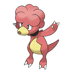
Magby is a cute little thing. What kind of thing is impossible to say, as it's really one of those Pokemon that are just monsters with no real-world inspiration, but it works well as a pre-evo and is really the best out of the three in terms of overall design.
Visually, it looks like it goes with the rest of the line, but is still plenty distinct enough on its own instead of just looking like a smaller Magmar. I like how the weird lumpy head becomes less lumpy as it evolves, and how the underbelly marking does the opposite and becomes more complex. The noot-noot snoot and the perpetually worried expression are also charming.
My sole nitpick is that the shape of the underbelly marking is a bit weird with how angular it is—something more rounded or flame-like would've been better. Everything else is pretty enjoyable.
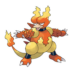
Magmar, much like its pre-evo, is an ambiguous lava monster with no specific inspiration, and I'm always a big fan of those. And there are a lot of things about Magmar I like, such as the duck beak and flame markings, which are mimicked by the flames on its head.
However, there are also a lot of things I don't like. I always felt like the egg-shaped body was too ill-defined, especially with the legs being completely separate (compare to Magby up there, which has a more organic body shape). The ruffled shapes on the hands are interesting, but they feel out of place when they're not used elsewhere in the design—they could've been on the tail or something for balance. The back spikes also feel very extranous. It's got the right idea overall, but those elements hold it back a bit.
Also, it has a butt head. I always saw it more as brows so it never bothered me, but I need to point it out or else someone else will.
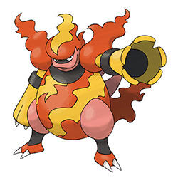
And Magmortar is... okay. I like some parts of it more than Magmar but there's also parts of it I like a lot less. The canon theme with the arms is a good way to work off of Magmar's arm ruffles, and they've been simplified so they no longer look as out of place. It also no longer has a butt for a head, always a plus, and I really like the menacing expression.
However, it still has a few of the same problems that Magmar does, such as the egg-shaped body, which is now even more noticeable because the arms sit higher up on the torso. Same goes for the spikes, which are even more unnecessary here.
It also adds a few problems, such as shortening the beak and changing the color; before it had an interesting duck-like look, whereas now it just kind of looks like it has weird lips. The flames also look very plastic-y.
I also really dislike the random addition of pink into the design. Maybe they were trying to call back to Magby, but it's so low-contrast and similar to the red that it adds nothing yet somehow makes the palette more complex. All the pink areas could've been yellow and nothing would have been lost (the arms could've been red, if that change resulted in too much yellow). Like I said, I like the general idea here and the overall vibe, but the execution just doesn't quite do it for me.
Overall, a refreshingly abstract line of creatures with some interesting albeit sometimes questionable designs. Magby's the best of the bunch, but all three at least work together surprisingly coherently considering they were all designed for different gens.
63 notes
·
View notes
Text

Breaking down Masamegu-san's coordinate from Egg: All Stars
The basic breakdown:
Pink mid-to-high waisted jeans
Brown belt with silver hibiscus buckle
Pink tube top
Platform sandals (with pink accents)
Silver bangles, necklaces and rings
1960s mod-style pink earrings
The key "gyaru" points here are the use of a tropical motif (the hibiscus belt buckle), a bright color (pink), and platform sandals.
Masamegu is wearing Alba Rosa, which is such a well-known gyaru brand that simply wearing their clothing is usually enough to identify you as gal. Alba Rosa's iconic status as a Gyaru Brand (capital G.B.) stems from its utilization of tropical and Hawaiian motifs, which are profoundly embedded in many gyaru substyles. With that in mind, you don't need to own any Alba Rosa to achieve this vibe. Often, a well-placed plumeria will suffice.
To recreate this coordinate, I would start with a pair of jeans and a blouse in matching vibrant colors. Masamegu is wearing a monochrome outfit. While hers is pink, you can produce a similar effect through any number of vivid colors: yellow, orange, lime green, Icee blue... you name it. The great thing about Gyaru is that it has a broad palette. Notably, her top is a shade or two darker than her trousers. It can be difficult to find exact color matches with separate pieces, so creating depth and contrast with different shades of the same color can keep it cohesive while still achieving that monochromatic vibe.


Take note of the shape and style of her top and jeans. She's wearing a tube top with what looks like higher-waisted, straight-legged trousers. If you're not a fan of the monochromatic look, you can achieve this coordinate through form instead by pairing a tube top with straight jeans and a neutral-colored belt. Also, keep in mind where the hem of the top falls: right above the belt. Where a garment falls can also drastically alter the feel of an ensemble.
Masamegu's accessories are typical for any ganguro coordinate: silver bangles, rings, and layered necklaces. In this case, the accessories aren't the outfit's focal point, so you can wear just about any accessory—as long as it doesn't draw attention away from the main point of the outfit. We're trying to maintain the coordinate's visual rhythm.
Let's talk about the shoes. Platforms are pretty standard for any Ganguro fit. In my opinion, the most crucial aspect of the sandals (as they pertain to this coordinate) is their height. Jeans are very forgiving; you can pair them with almost any type of shoe. However, the platform is such a quintessential component of a ganguro outfit that it goes a long way to help the overall coordinate read as gyaru.
♡ read more here ♡
9 notes
·
View notes
Text
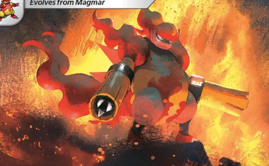
Tayzzyronth & Oroboros: Aeons of Deadly Sins
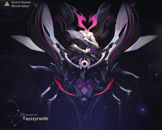
****Honkai star rail spoilers/simulated universe spoilers/swarm disaster spoilers****
*The moment Herta described them as being arch enemies, my mind immediately started falling into a rabbit hole trying to analyze them both & some thoughts have been cooking lol
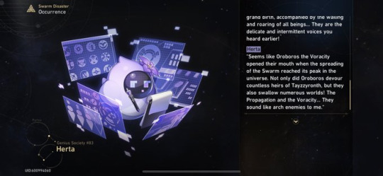
So who are these 2 Aeons? They recently have made more formal appearances (we finally get to see their forms) in the newest hsr patch specifically in simulated universe
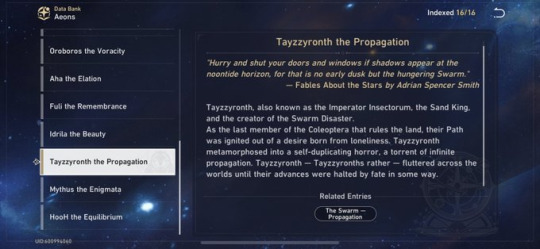
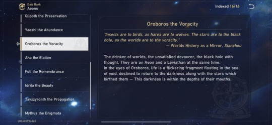
Tayzzyronth is the Aeon of Propagation & Oroboros is the Aeon of Voracity; propagation refers to reproduction while voracity is excessive eating
I’d like to suggest that Tayzzyronth & Oroboros are aeons that represent 2 of the 7 deadly sins: lust & gluttony respectfully
*Note: lust can refer to extremely strong sexual desires but without sexual connotations it simply refers to an extremely strong desire/emotion for something you crave*
Tayzzyronth often self-replicated & the heirs they created eventually became their faction, the Swarm
The reason why they started reproducing was bc they feared being alone since they were the last of the Coleoptera (scientific name for beetle) so they had an extremely strong desire to procreate
As for Oroboros, they devour everything that gets in their way since everything including worlds will simply return to the void in the end
Now that we’ve established how they depict lust & gluttony, let’s look at their dynamic
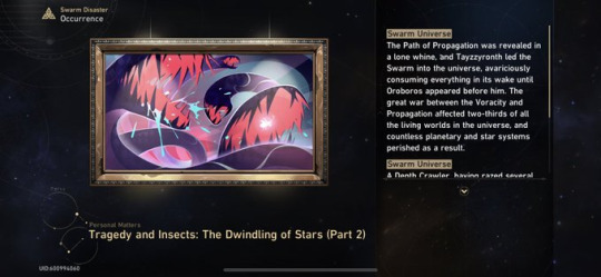
Both are said to have been enemies & it seems that Tayzzyronth died in a war (which involved Oroboros) at the hands of multiple Aeons according to Kafka
What I find interesting is that (like in my analyses of Lan & Yaoshi and Nanook & IX) they have a few similarities
For instance what they do is mindless (all Tayzzyronth & Oroboros can think of/do are self-replicate & consume; I think it’s important to remember that doing mindless tasks doesn’t always equate to intelligence especially when they do it in repetitive cycles; the word mindless usually gets associated w/ low intelligence which Herta implies that Tayzzyronth & the Swarm have)
They may represent different deadly sins but they are different manifestations of greed in essence, all being forms of excessive desires
They also both have similar color palettes where they use cool colors (various shades of purple) which are paired with some reds or blues; to me this is showing that in spite of their differences they do share some similarities/vibes (not evil per se but destructive)
Now to look at their dynamic from a different light, I want to first point to how them being enemies makes sense if we consider what creatures they resemble
Tayzzyronth as we already know is based off insects, the beetle to be more precise, while Oroboros is based off the mythological ouroboros which was usually a tail-devouring serpent; irl snakes & insects are normally enemies & snakes are the ones usually devouring insects although the reverse situation is also possible
Perhaps it is bc both are representative of different aspects of greed that they both would end up being enemies in the end anyway if they are to fight for dominance in this world (going back to the idea of survival of the “fittest”, meaning the stronger concept would prevail in this case)
If that is the case, the end of Tayzzyronth could imply that the desire to devour is stronger than the desire to procreate but I don’t think that’s exactly how it is because there is some irony to be found here
Even though Tayzzyronth has been deceased for some time, the Swarm still remains & they still are a menace to the universe due to the destruction they can cause, all of this while Oroboros doesn’t seem to leave any trace of the worlds they have devoured so I think that even though the Propagation is gone, their concept still has influence in the universe w/ as much “strength”/importance as the voracity
I’m really glad to have seen Tayzzyronth & Oroboros in the swarm disaster mode of simulated universe bc for me it looks like the Aeons have interesting & complex relationships with each other and I can’t seem to get over them 😂 I also like the designs of the aeons
They just have so much in their designs & stories which fascinate me, it’s just really fun chilling in the pool of aeon lore & dynamics :3
#honkai star rail#hsr#honkai star rail spoilers#honkai star rail lore#hsr aeons#hsr tayzzyronth#hsr oroboros#hsr simulated universe#hsr swarm disaster
89 notes
·
View notes
Text
Outfits that I would like to see on Plave members: Hamin (super long post)
I based this post just on my personal taste, not on the concept for comebacks or anything, cause some of this probably won't match the aesthetic and the overall themes they already have so, I'm just dreaming 😂 and VLAST/ dduks probably wont like them
Through the eras, Hamin has always worn a tight fit, and cause of the "streamer/ gamer lifestyle" lol, most of the outfits are kinda too comfy, he looks good ofc, but they're similar, we can see it thanks to whoever made this image:

Now, if we think of the comeback outfits, they're more fashionable (maybe half of them), so that's what I kinda have in mind I guess, cause I already have all the material for this, and some of the stuff he has already worn is not so different from what I want but not quite the same either


Searching for this, I notice that Noah and Hamin are the ones with the lowest neckline, and Noah, if I don't remember wrongly, is the one that has shown his arms completely.

And since their image is kinda friendly... Obviously they do not wear stuff that is too revealing, so in Way 4 Luv, Hamin has this gray/black shirt under the white one, obviously looks like a good outfit but that makes me think of another kpop groups that would not add that, lol, so I'm going for that kind of look
Ok, with time passing, he has gathered even more looks, they're more stylish and fashonable, ofc he always looks good but has the same serious aura unless is a special event, or maybe the members are all wearing something, so in general he may have some color but more as an accent but not as an statement piece (Except in Why? era)

The point is, too neutral, is not bad, but I need more personality, he's not just serious you know, he can be a mood maker, hot, cute and funny too, so...
Most of the outfits I picked are based on one specific person, I want to steal his stylist and ask (beg) dduks too please give us that in a virtual version, and make at least one of my dreams come true lol
The idea of this started with Kai and his comeback, cause I love men in crop tops tbh, so yeah, and since Hamin is an exo-l we're fine 😋


I don't want exactly the same outfits, but it's the vibe, something kinda like that, but not literally all of the pieces. Thinking of Kai's style, I like the boldness, I like crop tops, tank tops, low necklines, and a tight fit at the top, but riped baggy jeans. Hamin is the youngest, I want something more accordingly.
Kai has this versatility of wearing suits or more formal clothes in a way that looks still juvenile, maybe for adding airy sleeves, three-quarters sleeves with no buttons, or maybe some layering. I'm not really expecting a transparent tank top like the one I put there, but Imagine this like a moodboard, there's so many ways to tone it down a little hehe.
The outfit I would love to see as it is, the last one that Kyungsoo is wearing, the white shirt, the tie, the fit, give me that on Him. And I need Hamin with a beret, just cause it would be super cute, just imagining that makes me smile tbh. Cause honestly I don't mind that they don't change styles, speaking about haircuts and hair color, cause i don't think is needed, but seeing them with new accessories is always fun, is it cute? Makes him look cooler, funny, will my sister call it cringe? If it is, then it's actually good cause she knows nothing about cute.
Ofc I would like him to wear a little bit more colors, maybe not suddenly going out of the comfort zone, adding green and blue, and maybe following some palettes that stop them from picking again and again the monochromatic tones 😔
But anyway, Hamin always looks good, even when he glitches, so he can wear pajamas for the rest of his life and I will love the look no matter what, and ofc Im not trying to criticize any design or anything, as always just yapping and dreaming of a Hamin wearing a crop top and a beret 😭
Unexpectedly, I denied that I wanted the outfits that I put here, just 1 was a success, so I'm disappointed in myself lol 💀
This post has taken most time and effort that I have ever expected, but I really wanted to talk about this. So idk when the next member is gonna come, lol
And plz don't say that he wore a beret in that children's day stream, that's not it. And yes, I'm jealous of Bamby's white beret 😮💨
At least I have this (outfit). It would never have been my first pick, but now that I have it. I love it:

3 notes
·
View notes