#trying to emulate watercolors
Explore tagged Tumblr posts
Visit Tumblr Blog
Explore Tumblr blogs with no restrictions, modern design and the best experience.
Last Seen Tumblr Blogs


Fun Fact
The “We are the 99%” Tumblr blog became the slogan for the Occupy Wall Street movement.
Text

a morning stroll 🌻
3K notes
·
View notes
Text
two knights, chillin in the woods, not quite five feet apart..?

Was doing finishing touches as the clock struck twelve so this is officially three days late-- but happy birthday to @scourgefrontiers!! These are their ocs, Rush and Lancelot. GO CHECK THEM OUT AWESOME ARTIST ALERT!!💥💥


#i started this in february and put it on the backburner for a month lol#pro tip yall dont. dont try to do a complicated drawing on watercolor paper without a grid or trace paper or something#itll fucking Get you#apologies that i took a few liberties with lances armor#I DIDNT REALIZE I COULDVE COVERED IT ALL WITH A CAPE 😔😔#by the time i did i was committed to drawing the armor- besides i think it looks better this way anyway#ive been very inspired by bedupolkers amazing style so i tried to emulate it here#other peoples ocs#watercolor#traditional art#waspsart
29 notes
·
View notes
Text
I need someone to lose it with me over this because just like. Look at how this is going look just look
I am so absolutely normal about William being the one crumbling around Henry ahaha (the most obnoxious loud incorrect buzzer ever goes off)

#willry#fnaf#william afton#henry emily#artwork in progress#em draws stuffs#algorithm is a coward so yeah i reposted it#two things#one i have a need to be William in this#two i put some color in the background because the original was just white#and what i did looks like watercolor so i may try to figure out how to emulate thet#henry humbling william is better idc argue with the wall /positive
9 notes
·
View notes
Text

Some more art of kewpie I finished a couple of weeks ago that I forgot to add in my art dump whoops 😅
#she’s a little care bear cousin!!#I love how this came out so much#I was trying to emulate the old watercolor style and I really like how it turned out!#my art#my characters#furry#fairy armadillo
8 notes
·
View notes
Text
thee thing is that usually when I'm trying to figure out some art thing I can conceptualize How to do it just not how to do it Well and I just need to try a bunch of stuff and practice. w this my mind is literally empty I simply cannot grasp how I'm supposed to get this to look how I want it to
#sorry for ever thinking digital art was easier than traditional I'm going to die forever and ever#feel like shit just want her (my watercolors) back#ooiyghhhh I hate not being able to figure out how to do something I hate not knowing stuff. explodes#theres like a very specific style I'm trying to emulate so looking up tutorials hasn't been helpful 😭#maybe I need to eat and take my fucking adderall and then my brain will end up working#ghost posts#text
3 notes
·
View notes
Text
Early mornings
black sharpie and water color
Westwood 1986
Let me try to explain myself.
When I was a young man I loved illustration.
Perhaps the two illustrators who had the greatest influence on me were Aubrey Beardsley and Jean Giraud aka Moebius. Both artist drew with a fine line and I tried to emulate that.
Here's an old drawing of mine.
pencil drawing
Venice CA 1978
So back then I saw myself as an illustrator.
Then sometime around 1980 I was introduced to Abstract Expressionism and I had an epiphany...
Could I approach Abstract Expressionism with an illustrator's line?
A new world opened up to me and I started having fun with my drawing.
And then, for about 35 years I never drew an identifiable object.
No joke.
Still Life
black sharpie
Westwood 1985

Attitude Adjustment
pen, colored pencil and watercolor
Duarte CA 1996
Time never began
black sharpie on bond paper
San Francisco 2003
Dan's drawing
black sharpie
Rosemead 2011
i did a lot of these drawings. And I really enjoyed making them. For over thirty years I completely liberated myself from the rigors of drawing something that had to look like something. And I loved it. But then...
Sometime around 2015 I returned to illustration. Why? I'll be honest with you, I started to miss it.
Call it full circle but that's where I'm at now.
I still treasure my line though.
little boxes
black sharpie on paper
Los Angeles 2019
Thank you Aubrey and Jean.
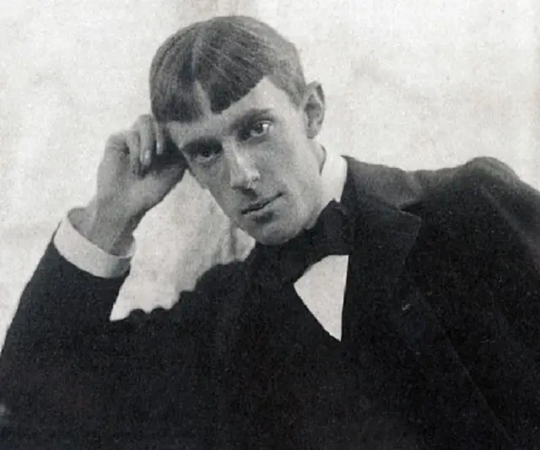
Aubrey Beardsley

Jean Giraud aka Moebius
756 notes
·
View notes
Text

One of the dino guys to ever, Agumon!! :] Made this piece to give to the English VA and make freebies stickers for this weekend at a con. Wanted to try to emulate the background art style with loose watercolor floralss :)
53 notes
·
View notes
Text
Within the writing themes of Spiderverse and on a meta level(which counts as one),Ghostpunk makes more sense than than Ghost.Flower.Important note:I'm not anti G/M,this is simple my meta on why Hobie and Gwen work so well
Gwen went to visit Miles but she thought to put on Hobie's sweater first and he lets her add her own customization to it as seen by the patches on it that were confirmed to be hers and not his.Gwen steals Hobie's clothes as a way to make herself feel safe and even took his chucks too to emulate his style.She did steal Miles' jacket but only way after she did that with Hobie's clothes at multiple points
Miles accidentally forced Gwen to get a haircut and Gwen chose to dye it part pink,the color Hobie turns when he's happiest,notably only after she met Hobie and it brings to mind she wanted to always have something on her that reminds her of Hobie
In the comics,Hobie was a Gwen Stacy fanboy and Gwen was that cool slightly older girl it'd easy for most boys to get a crush on.In the movies,Gwen looks up to Hobie and he's that cool slightly older boy it's easy for most girls to get a crush on.And also in the comics,Gwen owns a The Ramones shirt and Hobie is a The Ramones fan too as seen by his playlist.They're the same......in the important ways
We see Gwen yapping about Hobie first thing as his drop in the movie,to Miles and when he inquires if he's her friend like he is,she replies 'That's different!' and i say oh i'm sure!!!There's hint drops that indicate Gwen might've talked to Spider Society about Miles often but we don't get to actually see it happen like we did Ghostpunk's part so it's hard to believe the former is romantic and completely textual but the latter isn't
Following up that point,Pavitr states in a teasing tone Miles wouldn't know about Hobie from Gwen twice and the implication is obviously that Ghostpunk is romantic in some way and if it's not Gwobie evidence,then 'He must be in love with you!' isn't Gw.iles evidence either as Gwen denied both anyway
Hobie was never trying to make Miles jealous with his way of flirting with Gwen and was made so he could be taken as genuienly crushing on her confirmed by his VA.Hobie also already saved Gwen before Miles did,by letting her crash in his dimension when she was homeless and convincing her to join his band so she could feel like when she was back then before Peter died and giving her the emotional support and fun she needed as she did him by helping him like a real kid post-adultification and even crafted a Watch for her when she needed to save Miles but not before destroying her cop dad's ass and not without forcing him to leave her his love note.The specific 'In case it don't work out' wording used inline with the attempt at a Ghostpunk + Ghost.Flower love triangle reads as a double meaning and in-universe subliminal messaging that's absolutely in-character for Hobie to pull(he pulled Gwen already too)
Self-Love suits Ghostpunk directly rather than mostly just metaphors.Drink too much,think too much,thoughts drownin' me(havin' a laugh at a pub with the mandem),you don't know love you just show love stop doubtin' me(fitting to both Gwen and Hobie's canonical traumas and their coping mechanisms,including them not becoming official purely because their insecurities had them thinking the other could would never love them romantically,at least at first),cuff me told the truth to him he don't trust me(George and Hobie's interaction),hate to see yeah woah money scheme yeah woah(it's a metaphor for capitalism),live and questionable(i'm not a role model + him encouraging her to punk out to her full self with George no longer holding her back),love hanging out say you hate it now(Gwen's Hobie love denials she only used so Pavitr would shut up and never holding back when it's just her and him)
Gwen is pastel watercolors and Hobie is an old school zine but they're both basically human mood rings.They both had scenes of teaching Miles how to use his hands to better Spiderman and standing up against an authority figure as they turned a blue as deep as how much their rage towards the system for screwing them over runs
In every other universe,Hobie Brown is a bad guy or not that important.But in this universe,Hobie Brown isn't actually evil,he's just a good kid who's really troubled because all the adults in his life are either gone or failed him on purpose and despite everything,he rose to be the personification of afropunk and Earth 138's Spiderhero.In his universe,Gwen Stacy is still a ghost and she dosen't haunt him since she wasn't his Gwen.His Gwen wasn't a canon event for him and that plays up his not believing in consitency
And Gwen feeling so comfortable around Hobie she's not afraid to fall for him is proof they should be together,not proof she dosen't love him.How deep their connection goes is up them(direct quote by Daniel Kaluuya,Hobie's va)not canon and that's what Gwen wants.She chose Hobie this whole time


I be writing heartfelt academic papers and and then this is the ship
#ghostpunk#t4t ghostpunk#hobie brown#gwen stacy#hobie is jamaican#hobie is ugandan#black gwen stacy#latina gwen stacy#transmasc hobie brown#unlabeled hobie brown#trans gwen stacy#transfem gwen stacy#autistic hobie brown#autistic gwen stacy#team dad hobie#kidcore!gwen stacy#seapunk lover hobie#catgirl gwen tag#mama's boy hobie#gamer gwen#ace hobie#ace gwen#atsv#spiderman#hobie and gwen are soulmates by choice AND by chance#gummy shark and strawberry pop#💌#food#🍓#summerposting
26 notes
·
View notes
Text
I found this in my Ibis Paint gallery from a plane flight that I got bored on. This is the one of the very few drawings I have on my phone.
Once, I saw a purple Clearsight so I went with that here. Tried out the watercolor brush, sorta got the hang of it. Trying to emulate what I do with color on oils but digitally; it's hard. The drawing is technically incomplete.
I feel as though I made her expression to harsh. Clearsight is softer and more gentle than that. I made her a little floofy. But I'm very happy with the coloring.

(Drawn 7/1/25)
23 notes
·
View notes
Text
Art/Fun/Holiday: 12th Anniversary
It has been twelve years since Sarah & Duck first aired.
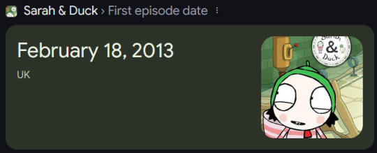
[Source: Google search for "when did Sarah & Duck first air"]

Happy Birthday, Sarah & Duck!
While it may not be as flashy as an anniversary art piece (though I may make a late one depending on how crunched I feel), I will just ramble and talk about things I like about the show to celebrate this milestone. I'll talk about what got me into the show, aspects I like, and some more personal thoughts on the show and maintaining this blog.
Intro
I was introduced to Sarah & Duck by one of my online friends back in the middle of 2022. We watched the first season together (though I only joined in halfway through), and then I found my own way to watch the rest of the show since I felt hooked. Since then, it's become my main special interest and is perhaps as strong as it had been back then. Last year, I rewatched and introduced the series to my closer group of friends, who I'd consider my "best" friends. They loved it. One of them even considered Sarah his "blorbo in law" (a character he cares about because someone else does) before having her graduate to a full blorbo (a character he likes). I'm very glad to be able to speak to fans of the show and talk about it.
Art and Vibes
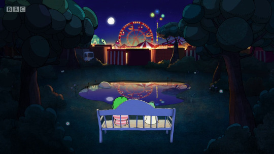
[Source: S1E15 Fairground]
There's something about the show's simplistic and scribbly artstyle that resonates with me. It's somewhat ethereal, and coupled with the mostly low energy happenings and accompanying soft, gentle music, the show builds up a very welcoming atmosphere perfect for the intended demographic of young kids. The style is kind of inspiring to me, and I often try to think of how exactly to emulate or adapt the watercolor-esque nature of backgrounds and scenery. Some of the scenes (like the one above) are pure spectacular and honestly surprised me with how nice looking they were on my first watch.
It's a very nice show for me to zen out to. The first watch-through, I was surprised with some episodes in the first series that they were already over. Those 6.5 minutes go by fast sometimes! In contrast, most of the shows I've watched prior were 20-45 minutes. It's a testament to the show staff that they can hold the attention of me, an adult, for that long. The show as a whole feels somewhat like a dream. An imaginary romp through a kid's life in the U.K. There have been some episodes where I could see myself doing the same pretend games and things that Sarah does if I were a kid. Watching the show felt like peering back into my childhood with nostalgic, rose-tinted glasses.
Characters

[Source: S2E4 Sound Jumble]
Sarah & Duck has quite the colorful cast, both metaphorically and literally. I honestly like how some characters just drop in or drop out of the episode's story sometimes, like Plate Girl showing up in Pond Princess. It gives the world a bit more genuineness; Sometimes as a kid, I'd only give a little bit of time for another friend before moving on with my own thing while playing.
While I do like the main trio of characters (Sarah, Duck, Narrator) the most, it's a tossup between Scarf Lady and Plate Girl for favorite side character. Scarf Lady is so chaotic and Bag balancing her out in exasperation is great, but I love how much of a gremlin Plate Girl can be, like in Garden Gaming.
While it does sort of bug the "character interaction" part of my brain, it's interesting that nothing about the characters or world is outright explained. Why does Plate Girl like plates? Why does Scooter Boy like scooters? Why is Scarf Lady so scatterbrained? Why are kids and bird paired up so often? Why are the Ribbon Sisters so adverse to talking? It provides more to the previously mentioned genuineness to the world. Unless directly asked, people don't really delve into why they are like they are. I think that adds a lot to the notion of personal interpretations.
I love AUs and reinterpretations of characters in shows I like just because I like to see how characters react in situations outside of their universes. Plus little headcanons here and there. As a small examples, I hc that Plate Girl is a collector of plates. I like little things like that, giving a little personal touch to certain aspects of the show. I've written a few fanfics as well just because I would A. Like to see how characters would react to other scenarios, and B. Because I like seeing the characters get up to more wacky shenanigans. You might even see my boy and his bird OC pair make an appearance on this blog, in addition to the humanizations and some other fan-episodes.
I am not okay about this series if you couldn't tell.
Emotions

[Source: S2E40 Duck Flies]
Obviously, it's a kids show, and I don't intend to be all "this show is peak cinema" about it. It is good, I just don't want to seem delusional. Well, more delusional than usual...
But, honestly the show can be really heartfelt and touching at times. I felt bits of sadness and sympathy for Sarah in Duck Flies, as a person that gets very attached to characters/objects very easily, and Ribbon Alvida, made me cry real, actual tears. The message of "Sometimes you don't get to say goodbye to someone" is incredibly sobering and honestly a really good lesson to teach kids. I felt Sarah's pain very vividly, again, as someone that forms attachments easily.
The more upbeat emotional episodes are great as well. I felt a sense of coziness and warmth during Petal Light Picking, Christmas atmosphere is very calming to me.
Of course, I do realize the folly of only watching kids shows. Again, I don't want to seem like the person who exclusively watches kids shows and touts them as better than "real" shows. Doctor Who balances it out a bit. Fantastic series, loved Nine, Ten, and Eleven. Also tune in for a future post about Doctor Who, wink wink!
Personal Stuff and Why I Made its-a-ducky-mess

[Source: S2E27 Pond Prose]
As stated before, Sarah & Duck was and is my special interest. And with my special interests, I obsessively indulge in them in any way that I can, looking over every stone and in every nook and cranny for unique things. That's part of the reason why I catalogued the animation errors and odd tidbits, because I think it's cool to see those things. I also like looking into the inner workings of things, like behind the scenes videos. I find those VERY fascinating to me, and oftentimes I use design philosophies and such to inspire myself.
My "mission statement" with my fixations I suppose is to spread the word and get people to know about them. I hope my passion for what I like is infectious and gets people to see the shows in a similar way that I do. I started the blog just to tell people about the show, and give facts or little tidbits to fans of the show who may not know the things I do. Oftentimes, I feel like I can't properly express or talk about my interests to my friends because they don't have the same level of "care" that I do. I know people will never like the same things you do at the level you do, but it's still something, and I'm trying to work on that.
My blog is also partly fueled by not letting the series "die" or "fade away". A little dramatic, yeah, but look at Sarah & Duck. It's a twelve year old cartoon for kids, and it's kind of obscure in the grand scheme of things. But I have such love for it that I wish it could continue on. And in a way, that's all we can do really. I would love more official Sarah & Duck content, but I am happy with what we got. If the show kept going, there's the chance that seasonal rot could've happened, and that idea sort of scares me. Anyway, the show's "time" is over, and we, the fans, are left to our own devices. That's not to say Sarah & Duck is forgotten, mind you. The social media posts and such, and even the recent event that put the show in theaters shows that the series still has life in it. And I'm okay with that.
Seeing new fanart, stories, other fans posting about the show, and otherwise engaging with it fills me with joy, honestly. To see the show have a fanbase twelve years later is heartwarming. All of your likes, reblogs, comments, questions, those are powerful inspirations to keep making content for the blog. Just recently with the Valentines post, seeing a number of accounts with Sarah in their profile pictures made me smile ear to ear. That's a lot of what I want. To provide for the fans, to make connections with them, to give a sense of togetherness within this little community, dare I say, fandom.
I genuinely don't intend to come across as a "savior" providing content in a drought, or acting high and mighty to seem more important than I am. I just like this little niche show and wish to provide quality content for its fanbase. The show means a lot to me and I wish to display that to anyone that wants.
Alright, I think I've held you for long enough. Thanks for reading and see you next time!
[I originally wanted to make little header art pieces like this for the sections, but in the interest of getting this post out before it gets too late in the evening, I opted for screenshots. Enjoy this one, though!]
18 notes
·
View notes
Note
since we are talking about it. do you have any specific game titles in mind when you think of "amazing pixel art"
OUGH what a question.
Let me start by saying I don't view myself as qualified to talk about what does and doesn't make a good pixel art style so this is mostly just "games I think look nice" but I think what really makes or breaks a pixel style from a player end is how much the environments grab you.
Well I'll say that despite my grievances with them both Sea of Stars and Chained Echoes are very pretty visually. The color palette of SoS and the character models really stand out to me, while I think CE does a great job with the mecha designs and cutscene visuals.
SoS:


CE:


I haven't played them yet but I think that everything I've seen of Chrono Trigger and the OG 1996 Star Ocean show that creating a mood and tone with pixel art environments has been a goal for decades
LoZ Minish Cap does some REALLY cool stuff with its art style and environments since it features a shrinking mechanic. Checked to make sure I was thinking of the right one and. Giant acorns.

I'm a really big fan of pixel art games where the environments try to emulate a painterly shading style tbh.
I might just be biased but I think Pokemon Mystery Dungeon looks really nice. I have a lot of nostalgia for the Fogbound Lake scene (unnecessary screen flash at 1:08 (most important aesthetics are before that and at 3:25 tho)).
Children of Morta's environments are great as well. You can almost feel the like. Overgrown, dirty texture of the world. Both through color palette and details.

Fields of Mistria is like if you took those visual aesthetic mods for Stardew Valley and made it an art style. The palette is vibrant and really creates the cozy fantasy-ish town vibe its going for.


Honorable mention for game I got PURELY cause it's pretty:
Moon Hunters. I tried it, wasn't really vibing with it at the time. But man is it striking with its sort of watercolor pixel art environments.
#girlbob.txt#too lazy to find what i mean with ct or star ocean sorry#but trust that there's some pretty stuff lol
7 notes
·
View notes
Text
2024 writing evaluation :)
thank you lizzzz for tagging me
1. Number of stories posted to AO3: 5!!!
2. Word count posted for the year: 199,325
3. Fandoms I wrote for: One Direction
4. Pairings: Harry Styles/Louis Tomlinson
5. Story with the most:
Kudos: everything of mine is yours
Bookmarks: everything of mine is yours
Comments: where we landed
6. Work I’m most proud of (and why): I'm most proud of everything of mine is yours because it really was just written purely based on what i wanted to write and was full of self indulgence. the writing style is one that i'm always trying to somehow replicate with my other works.
7. Work I’m least proud of (and why): to be honest, i'm not entirely sure. i wish i would've put more time into if we were butterflies but i wouldn't say i'm not proud of it. i love beige as well but there was hardly any thought put into it so maybe that's the one i'm least proud of. but not bc i don't love it haha
8. Share or describe a favorite review you received: any time i get a comment about a reread or someone going to read my other fics because they liked one of them is a different kind of special to me. to be specific though, i got a comment on where we landed from the person who submitted the prompt, and i still go back and read it when i'm struggling with writing. just know if you've ever left a comment or sent me a message about my fics, even if it's the smallest thing, i've held it close.
9. A time when writing was really, really hard: i found writing hard in late spring through the summer. i went really hard the first few months of the year (wrote four fics by may 😃) and i think it burnt me out a bit. there were some things i started and put to the side when i realized i was forcing myself to write them even though they weren't going how i wanted. this is the first year i've been serious and disciplined with my writing so i'm taking that as a learning experience.
10. A scene or character you wrote that surprised you: there is a scene in you, in every color where louis and harry have their first disagreement of the fic that acts as a sort of indication that things are getting rocky, and it was surprising to me how difficult it was to get right. i ended up writing it a few times before i finally felt like in emulated what i was going for. the first draft was a large screaming match which ultimately didn't feel right for the characters.
11. A favorite excerpt of your writing: oh boy, i'm just going to post the first one i can think of lolol. i have nothing to say about it. this is from if we were butterflies
There’s many times in an artist’s life when they must decide whether to savor the moment with their eyes or in their art. To watch a sunset sky turn from purple to pink or to dip a brush in watercolor paint. To snap the picture of a lover lying in the moonlight or to lie with them across cool sheets. To put the pencil down when Harry parts his lips, Louis’ name on his tongue, or to capture his expression forever. “Lou,” Harry says in a voice he’s never heard before, hands shaking in his lap. Louis’ gaze snaps to his, and he must decide—to keep this to himself or to never go another day without the reminder of exactly how Harry is looking at him. And any other time it would feel easy. If it was anyone else, there might be the promise of another moment. But now? With Harry, here, like this, and so, so beautiful?
12. How did you grow as a writer this year: as i said above, this is the first year i've been intentional with my writing, so i think i grew in a lot of ways. most notably, i learned how to outline in a way that works for me which has been HUGE in actually finishing projects. i also learned that writing scenes in order is a lot easier for me and makes it more likely that i'll finish something.
13. How do you hope to grow next year: i'd like to get better at editing. i kind of despise editing after the first read through which leads to sloppiness. i'd like to do better at being intentional with editing and keeping an eye out for specific things.
14. Who was your greatest positive influence this year as a writer (could be another writer or beta or cheerleader or muse etc etc): this is also the first year that i've really had writer friends who i can talk about writing with so everyone that i've done this with has been a huge influence. specificallyyyyyy though, @harruandlou ofc. i've learned a lot from her about the technical side of writing from plotting to editing and everything in between. and obvs she's been incredible in putting up with my whining and scattered ideas during beta reading 🙂↕️
15. Anything from your real life show up in your writing this year: always. the first one i can think of is the place in chicago that harry goes in eomiy are places i also went for a conference during undergrad. i'm always pulling things from real life though, i couldn't possibly tell you all of them.
16. Any new wisdom you can share with other writers: know your characters before anything else. while plot is important, people will come for the plot but stay for the characters so make sure you know exactly who they are, where they came from, and where they're going. i promise you it will make all the difference in how real your writing feels.
17. Any projects you’re looking forward to starting (or finishing) in the new year: i recently finished writing my longest (!!!!!) fic yet (over 100k!!!!) that will come out soon into the new year. i'm looking forward to finishing up editing and sharing it with everyone :) i also do have some things planned that i can't wait to get started on!
18. Tag some writers whose answers you’d like to read.
ik you may have already been tagged but @petitommo @wishingforloushair @28goldens @insightfulinsomniac @louieshalo
8 notes
·
View notes
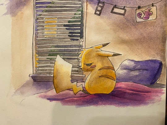
Note
((OOC: Is that art of the Pikachu traditional, or is it digital but meant to look like it’s traditional? If it’s the latter then, from one traditional artist to another, please tell me how you got the picture quality to be so good.))

// Hihi! Always willing to help a fellow artist out!
For the first question, it’s a traditional watercolor piece! With this blog I’m always trying to emulate Sugimori’s gen 1 art style, so I try to use watercolors for the blog whenever I can! I’ve tried doing the digital watercolor made to look traditional before but it just. never really comes out the way I want it? Genuinely its just easier for me to bust out the ol’ watercolors n do that shit irl. I’ll get to those materials in a sec, actually!
For the second question, tbh all I did for the picture quality was take a top-down with my phone and crop it? I CAN tell you that it’s better to take a picture at x1 rather than try to zoom in, as the camera quality dips significantly if you try to zoom in or out.
Here’s the full picture I took. I just cropped it afterwards.
Other tips I can give for picture quality is uhhh
Make sure your area is well-lit! Phone cameras will automatically try to compensate for dimly lit areas by increasing the ISO, which adds visual noise and dips the quality.
Hold the camera still. A moving camera creates blur. Cool for abstract photography, not so much for capturing traditional art lmao
Clean the lens. If you notice that your photos seem a bit fuzzy and… heaven-like? Might be a sign your lens is hella smudged. Run a cloth over that thang.
Try to take the photo from a top-down view! Taking the photo from an angle distorts the art. I know iPhone has a fuckinnnnn feature to fix angle distortions but I’m gonna be so fr w/ you I wouldn’t rely on it to solve this issue.
Be careful not to cast a shadow with you or your phone. If you are, don’t be afraid to take a step back! Remember that you can always crop it later! Crop, not zoom!
And as for the materials! uhhh hold on lemme grab the fucjin.


The watercolors are this Artistro watercolor paint set I got on Amazon. A fellow art student recommended these to me and tbh I love using them when I can. It comes with a watercolor brush that has a water compartment in the brush itself, which is really fuckin neat tbh.
The pens are your standard Micron pens that most traditional artists like to use. The ones I used in the art itself are raised slightly. Don’t mind the dirt or whatever on them, the heat melted the rubber band I used to bind them together and got stuck on ‘em :/
Something to take note of with watercolors is the kind of paper you’re using for it! Different papers will grab onto watercolors differently— you’ll want more thicker, more porous/rougher paper for watercolors. Smoother and thinner paper is harder for the paint to soak into— you risk the paint running or taking longer to dry, or oversoaking and tearing the paper.
If you don’t feel like going hunting for dedicated watercolor paper (aka me), then a safe bet is to use mixed media paper! There’s tons of sketchbooks in fuckin uhhh Walmart or whatever that will say “Mixed Media” on them. Those are always a safe shot since they’re fairly porous and thick.
I’m down to answer any more questions you may have on @turtblurts-pkmnirl-hub!
13 notes
·
View notes
Note
I'm sort of just learning how to use watercolors (or make any art at all) and every time you post some of yours I feel really excited and inspired to try something different, and want to emulate things that you have made 💕💕💕
ahhhh yay!!! I hope you have fun with it!!! 💜
21 notes
·
View notes
Text

sanguine in some weird pseudo-historical garb. i'm planning on giving him a couple levels in bard this time around so it felt appropriate. i feel like he'd love ballet if he wasn't constantly fighting for his life in barovia or the faewilds.
also this is totally inspired by calebisdrawing's art of the CoS npcs, theyre soo gorgeous and i really wanted to try to emulate the digital watercolor look
more sketches/doodles from the last few weeks under the readmore:


1: modern-ish sang in a prom dress looking bored. I feel like those heels are killing him but he's trying not to show it. i call him gayboy lovingly.
2: I just thought his expression in this sketch was cute idk
3: that time sanguine accidentally (fully consciously) murdered an innocent dusk elf boy in cold blood................ oops. in his defense he had recently recovered from dying and became homicidal in the process plus he was lowkey acting out to get his dad's attention.
4: clone high hands of sincerity is so funny to me
5: baby sanguine and his momma!!!!!!! :sob: she raised him on her own before he ran away at 13. she wasn't perfect but she tried her best! kind of imagine a mix between beatrice horseman if she got a divorce & was kinder plus kabru's mother from dungeon meshi. I lowkey dont know how to draw toddlers pls dont hurt me
6: more historical-adjacent outfits, inspired heavily by glossc1's illustrations of ganymede which are starting to become a huge inspiration for him.
8 notes
·
View notes
Note
I look at your art and i cannot even comprehend how you do it. Do you use procreate? what brushes do you use? I’m deeply in love with your work
Hi anon
Thank you so much for your message and for taking the time to contact me. 💗 Sorry about the late reply, I was quite busy in the past two weeks. 😳
Ok! So, to answer your question, I very rarely use Procreate. I used it a bit when I installed it on my iPad one-two years ago: it was exciting and new but I must admit that now, I work mainly on Photoshop. Don't get me wrong, Procreate is an amazing app, you can create tons of effects but I'm much more confortable with Photoshop. However, this artwork and this one were created using mainly Procreate.
More recently (= about 10 days ago 🤓), I bought an app called Rebelle 6 that emulates oil painting and watercolors. I used it on this Sherlock portrait but also on this one on Twitter. If you see this kind of textures in my art from now on, it's thanks to this app.
These were the exceptions, though. As far as the rest is concerned, I use Photoshop CS6 with an Xp-pen tablet. I tried all kind of brushes but the ones I always come back to give my artworks an "old painting" effect are the Mar-ka brushes and the Deharme brushes. (look at this artist's DA page, you have several sets of brushes available). However, sometimes, I change the settings: I add more texture, change the spacing, the brush dynamic, etc…(everything can be found in the PS brush settings). You have to see what works best for you.
On some artworks, I also add a paper texture a bit like the one below, at a low opacity (layer: soft light). Make sure it's a bit grainy and don't hesitate to adjust it using the "brightness/contrast" or "levels" tools.
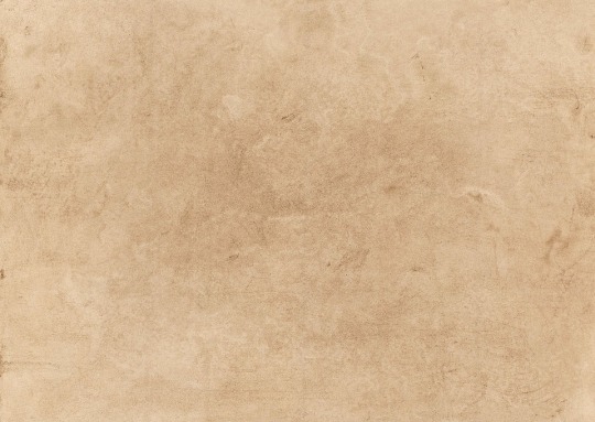
However, the opacity and the paper vary according to the artwork. What can work for one artwork is not going to work for another one because of the lighting, the exposure, the effects you want to give. You'll have to try different textures and opacities to reach the effect you want.
The rest is…my style. 🤓 I did a post HERE about how I draw realistic portraits and HERE about a step by step (it was several years ago though so I don't talk about textures, just how I block colors and how I draw realistically).
I hope I managed to answer your question. Thank you for enjoying my work so much and see you at the end of the week with a Stede Bonnet portrait (and then, I'll go on a break to rest a bit ^^)
81 notes
·
View notes