#tutorial LUT
Explore tagged Tumblr posts
Visit Tumblr Blog
Explore Tumblr blogs with no restrictions, modern design and the best experience.
Last Seen Tumblr Blogs


Fun Fact
130K people were victims of a chain letter scam that affected Tumblr in May 2011.
Text
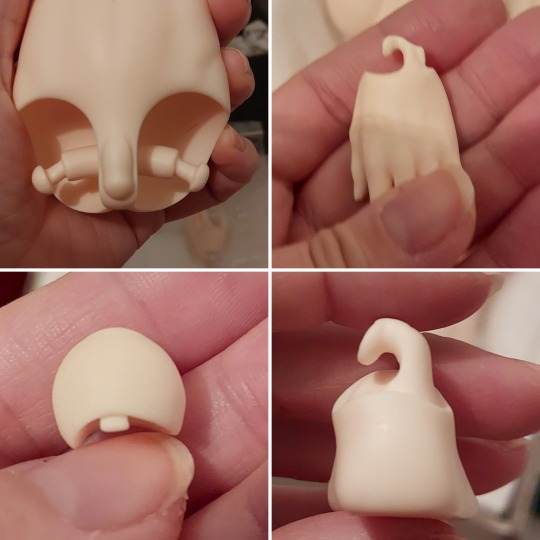
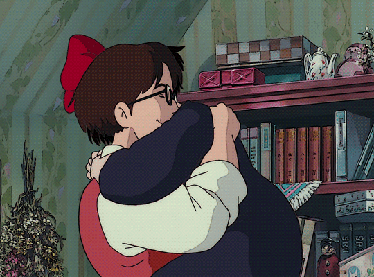
Sister's doll had some heat damage (shipped in summer and sadly cooked too long in a container at the airport), but some hot water and a few minutes later:
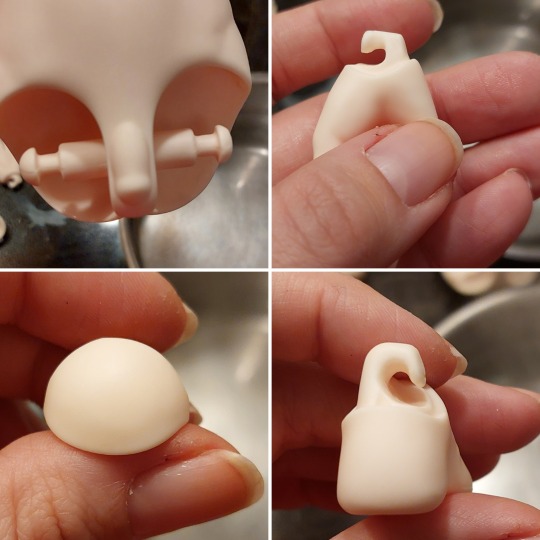
All good again 💕
All the hooks and wrist/ ankle joints took just a few seconds to return to the original form, the hips took ... 2 or 3 minutes, I think? Just cooked everything in some boiling water until it readjusted.
10 notes
·
View notes
Text
Blackmagic Pocket Cinema Camera 4K BRAW Color Grade Before & After | BMPCC 4K 2383 LUT byBoz™
Color grading and editing done inside DaVinci Resolve using the 2383 LUT byBoz™. Get a special 10% discount at dehancer.com using the code: BOZ10 Blackmagic BRAW LUTs Available to Buy & Download Here: https://blackmagic-luts.com/ Works with: Blackmagic Ursa Cine 12K, BMPCC 6K Pro, Blackmagic Pyxis, BMCC 6K Full Frame, BMPCC 4K, BMPCC HD, BMMCC and ALL other Blackmagic Cinema Cameras utilising…

View On WordPress
#best bmpcc4k luts#blackmagic 2383 lut#blackmagic cinema camera 6k#blackmagic design#blackmagic full frame lut#blackmagic pocket 4k#blackmagic pyxis#blackmagic ursa cine 12k#BMCC 6K Full Frame#bmpcc#bmpcc 4k#bmpcc 4k footage#bmpcc 6k#bmpcc LUT#Cinematic LUTs#color grade#Color Grading#Color Grading DaVinci Resolve#color grading premiere pro#DaVinci Resolve Tutorial#pocket cinema camera#pocket cinema camera 4k
0 notes
Text
Free Brownz LUTs - Mad Max / Furiosa Style ...
Free Brownz LUTs - Mad Max / Furiosa Style ...
… die Fortsetzung meiner beliebten DOCMA Reihe! Kostenlos. praktisch. free to use. Du findest die entsprechende .zip Datei hier zum download: https://www.deviantart.com/brownzworx/art/1052160439Die Farblook Dateien sind sowohl als Einstellungsebene als auch in Camera RAW verwendbar. (LR/PS) Zur Erinnerung: Mein kompletter E.campus / Base Camp geht innerhalb der nächsten 14 Tage komplett vom…
View On WordPress
#bildbearbeitung#brownz#brownzart#coloring#composing#freebie#lut#luts#photoshop#schulungen#tutorial#workshop
1 note
·
View note
Text
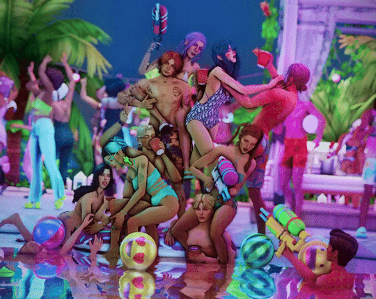
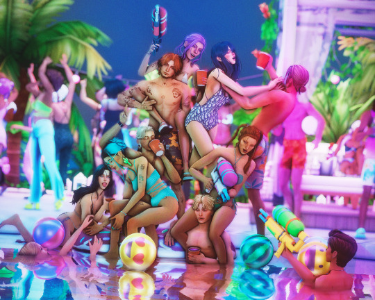
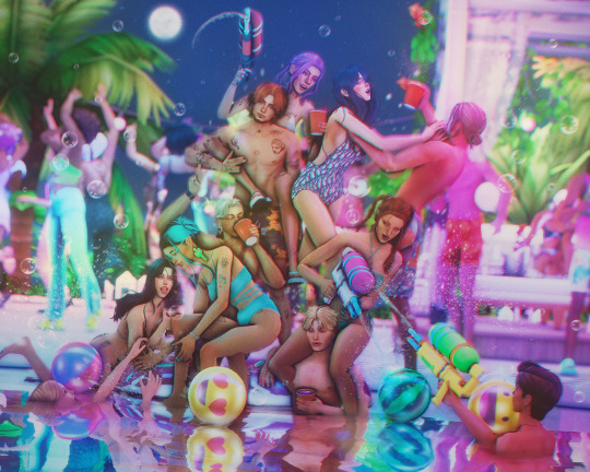
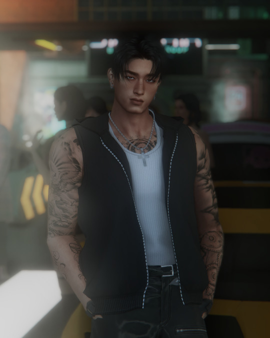
Tutorial: How I edit my pics (Photoshop)
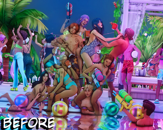
A not so helpful guide by me~
(orig. post)
For the beginning: I use my own Reshade and use only Photoshop to edit. (for videos I use Premiere Pro/After Effects)
Ingame: I use SRWE with the profile 3840x2400 to get it already in a better qualitity. For this pic I also used ReLight.
In Photoshop:
I start with using Topaz Clean with these Settings:
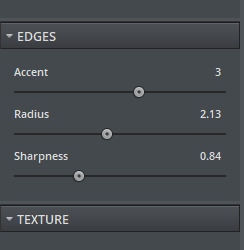
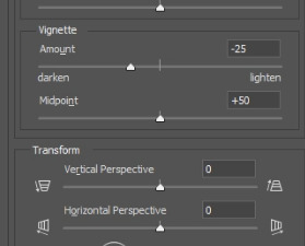
Next I make a Vignette ("Filter"-> "Lens Correction") with these Settings:
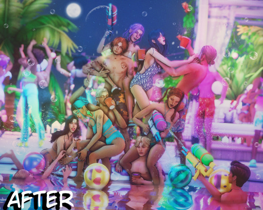
After that, I start making a bloom you can use this tutorial for that: https://www.youtube.com/watch?v=aMxnXfN7ZDg
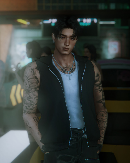
Before and After
Now I put a filmic grain on it . For that I go on "Edit" and click on "Fill"
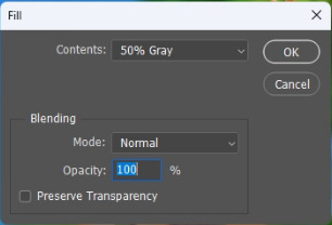
you want it to look like that
The pic will turn gray but thats normal!:)
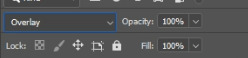
Now I convert it into a smart object by right clicking on the layer.

Next I change the layer to "Overlay"
I continue with going to "Filter" and click on "Noise" -> "Add Noise"
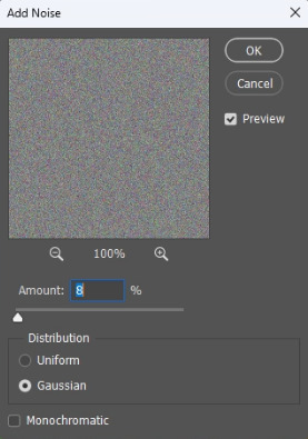
The window will look like that. I like to put the Amount to 8 but that's all preference:)
That's it for the filmic grain. (I made it into an Action so it's faster)
My next step is to put a Curve to make the pic a bit more moody.
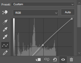
I don't put too much though lol, it also changes depening on the pic.
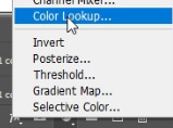
After that, I put a Color Lookup to change the color a bit.
For that I click on the little half moon bottom right.
I like to use on of the first 2 Kodak LUTs (Kodak 5205 or Kodak 5218)

I put the Fill of that layer around 40% to make it less strong.
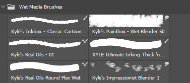
Next I draw hair! (still a noob at it...) I use this Brush "Kyle's Real Oil Round Flex Wet" that comes with Photoshop:

Before and After
For the next step I use 2 Hue/Saturation Layers also on the little halfmoon bottom right.
With that I draw Shadows and Highlights!

For Highlights For Shadows
After that, I click Ctrl+I to invert the Layers and start drawing on the mask layer.

Before and After
The pic is in an area with lots of colored lights, it would naturally reflect on the Sims, so I put some pinkish and blueish colors on highlights like this:

Now to the effects to make it look more fun!
3 of the Sims are using water guns and they splash with it ofc! So I added some water splashes with a brush and put a slight motion blur on it.

and since it's a lot of people, water splashes everywhere. Because of that, in some areas I added some water splashing effects (Photoshop Brush) that are making it look like there is movement.
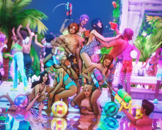
looks way more alive now right?
It still felt a bit "empty" though, so I decided to put a picture of a moon in the sky and added some bubbles (Photoshop Brush) around.
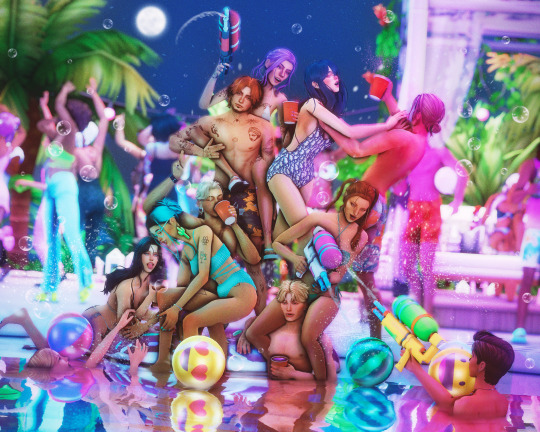
fun fun
Now I put a light leak overlay I found on the internet over the pic.
I put the Fill of that Layer on really low though, so it has a “soft“ effect.
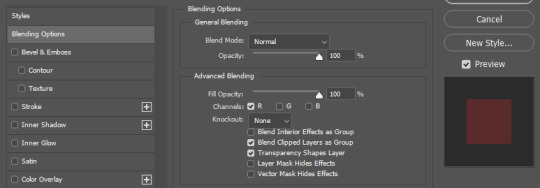
At the end, I made a chromatic aberration (color distortion)
For that I make a Layer copy of the pic and double click the new copy layer and a menu should open.
Under channels uncheck G and B. After that close the window and just resize the Layer a bit.
And that's it! Hope it was helpful somehow:)
155 notes
·
View notes
Note
How do you get your lighting so scrumptious in edits?
Lighting tutorial under the cut (it's long lol) I use photoshop + topaz clean btw :)
This will be our starting pic!! I use @hazelminesims photoshop action (all in one) to get the smoothening and overall base done first.
First step to colograding is using the 'Camera Raw Filter' in photoshop and adjusting the tint and curves tools. I generally like a greener, more cool toned color for pictures.
2. Now for the shadows on the sim! I make a new layer, set to 'Multiply' and use a soft brush at around 25-40% opacity with the color Black. I generally will add shadows to the parts of the body that are being 'covered' (neck, side of the nose, forehead, insides of arms and clothes). *If you use reshade/ gshade and have the mxao filter on, mimic where that filter adds shadows and either enhance it or add it in photoshop!*

3. In a new 'Multiply' layer, I do the same thing with the background. I darken the elements in the back to emphasize that my sim is in the forefront of the shot. TIP: don't add shadow to the light sources (neon signs, lights in the background) ! We actually want to enhance those.
4. Make a new layer, set to 'Pin light' at 100%. Grab a soft brush and highlight those light sources in the back. You can go crazy here, just take the Eyedropper tool to color match the highlights you want to emphasize. It might look a bit much right now, but we can tone this down by decreasing the layer opacity, Gaussian blurring the layer, and erasing any excess highlights if we want.
5. Now we add highlights to the sim. I make a new layer, set to 'Soft light' at 100% opacity, and with the white color, I highlight the sims body and clothes. (Now we want to add light to the 'raised areas' such as the center of the forehead, nose bridge, chin, chest, and arms). I also like to highlight any jewelry (necklace and belt buckle).
On a separate new layer, set to 'Vivid Light', I changed the brush colors to the ones in the background light sources (I used blue, yellow, and purple.) I'll go over the outlines of the sim's body with these colors (shoulders and arms, hair, side of face and neck.)
If you ever feel like you've gone overboard, just lower the opacity of the highlight layers and Gaussian blur them!
6. After you've messed around with the highlights, add the finishing touches. Usually once I merged all the layers I would go over with the Dodge and Burn tools to enhance the contrasts even more. I also recommend downloading and using LUTs for photoshop (I just use any free ones I find online).
103 notes
·
View notes
Text
downloaded a whole new video editing software, updated all my drivers and restarted my computer, watched a bunch of beginner tutorials on it, then watched about color grading and luts,,,, the things i do for this man
#jkdflhsf and im pretty sure these are all simple things but orz#AND THE QUALITY STILL ISNT AS GOOD AS THE SOURCE#i think it may be tumblr and twitter at this point tho...
5 notes
·
View notes
Text
No one asked for it but I think I'm gonna make a tutorial on my photo editing too later! And maybe some links for what LUT mod I use and stuff
3 notes
·
View notes
Note
hi!! sorry if this has been asked but do you have a reshade preset you use? i love the way your pictures look!
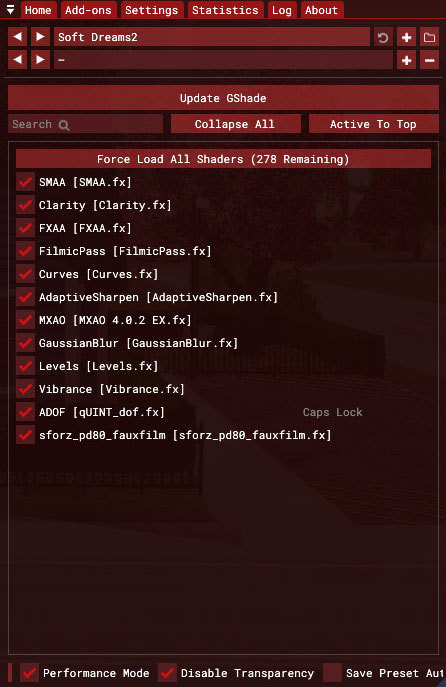
Hey Nonny! Thank you so much, I don't think anyone has ever asked about my ReShade preset, so don't worry! (and if someone did, it was probably a long time ago and my preset had changed since then) I'm currently using @pictureamoebae's stunning Summer Dream preset, with some tweaks to fit my personal preference, of course. These are my current settings:
SMAA
DELC_Sharpen
Prod80's Color Balance (Red: 0.206, Magenta: -0.031, and Yellow: -0.386)
Levels (White Point: 220)
amoebae's Summer Dream LUT (Default) [Chroma: 0.7, Luma: 0.2]
And I add these settings only when I take pictures:
Rim Light
RadiantGI (the settings probably came with their other presets, namely Foundation and Balancing Act)
Cinematic DOF (settings changes depending on the pictures I want to take)
As for ambient occlusion, I don't actually use ReShade. Instead, I used NVIDIA Inspector. You can follow @potato-ballad-sims' tutorial here.
I think it's also worth mentioning that the environmental mods that I use also affects the way my game look. Here are the mods that I use:
@potato-ballad-sims' Clear & Bright Weather 2.0
@simsi45's Improved Environmental Shadows (Darker)
@lazyduchess' Shader Tweaks and Shadow Extender
@simbouquet's Eye Shader Tweaks
I also edit my pictures in Photoshop before I post them here. I hope this helps you, Nonny! 💚
39 notes
·
View notes
Note
I love all your edits!
Do you have any favorite psds that you are willing to share? Or tips on how to make gif colorings looks as nice as yours? 🥹
Hi, anon! Thank you so much! I am really happy that you love my edits. I really appreciate it! (°◡°♡)
To answer your question, I only use one PSD file nowadays for all the edits I make so sharing this one PSD I got for myself would be a bit uncomfortable. I hope you understand. Hehe. ( ̄▽ ̄*)ゞ
But no worries, because I thought of sharing LUT files that you can use as a basis for your color grading. I will only share one LUT file for this post but I might try sharing other LUT files as well in the future. In that way, you can achieve coloring with your own style. I will also be sharing which adjustment layers I use and what are the typical settings I apply.
SOME REMINDERS THOUGH:
I use PS 2021 but all adjustment layers are also available on older versions.
I AM NOT A PS EXPERT. I learned to use PS by reading/watching tutorials. All the things I will include in this post are just my preferences for my coloring. Take anything I said with a grain of salt.
I applied and tested my coloring on anime edits only. You may use it for real-life GIFs/photos but you may want to reduce the opacity or use a different blending mode to make it work.
My coloring deviates a lot from the original coloring most of the time. Some people may find my coloring weird so always keep in mind that this is not the best coloring practice.
ALSO WARNING: BAD ENGLISH AND LENGTHY EXPLANATIONS XD
To start, you may download the LUT file HERE.
This file is basically a compilation of adjustment layers that you may want to apply to other images. So when you use it again on another project, you can simply load this single file instead of the multiple adjustment layers. The disadvantage of using LUT file is that there's no room for further adjustments of the colorings within that file. In my case, I used it as an advantage. You may call it my secret recipe for my coloring. LOL. You can use it but there's a limit to the modifications. Anyways, this LUT file contains multiple layers which is a product of my trials and errors for the past few years since I started editing again.
You may consider using this LUT file as your training wheels. Once you understand further the complexities of the adjustment layers, you may no longer rely on this coloring file. I also did this when I started wanting to develop my own coloring style. And once I understood the basics of the adjustment layers and how to replicate the colors that I had in mind, I got rid of the LUT files and started making my own.
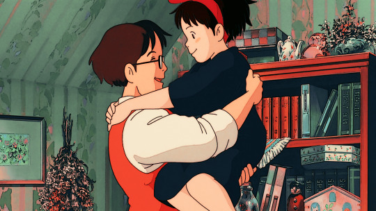
Now, let's use this image for coloring sample:
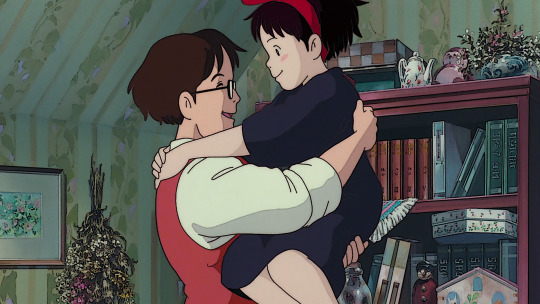
You can also download the image so you can follow my steps easily. This version is already sharpened.
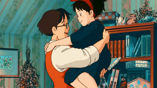
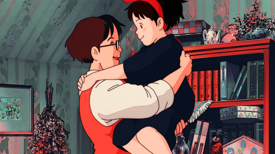
So when I apply the LUT file for this image, this is how it's going to appear.

This color grading has the teal & orange effect. Of course, this is not the final output. This will be the backbone of our coloring as we add more adjustment layers. In my case, I always start with cyan and orange and then make the necessary changes depending on the series and the atmosphere of the image used.
But before we proceed with the adjustment layers, I want to emphasize two things you can explore when it comes to adding adjustment layers. Being aware of these two features of PS actually expands your coloring options exponentially [don't get fooled, I may sound like an expert but this is just really based on my personal experience. XD] Anyways, below are the two:
Opacity - It doesn't have to be black and white when it comes to coloring. You may choose the grey side. If you think the adjustment layer you are trying to add is causing an unpleasant effect on your image, maybe try to lower the opacity first and see if that will help.
Blend Modes - you may want to explore blend modes other than the Normal mode. If you are not used to changing the blend modes, you can check videos posted by Unmesh Dinda on his YouTube Channel. He explains really well when it comes to Photoshop features. I learned a lot from his tutorials and I am now applying these learnings to my current coloring style. You may check this video for starters. He has other videos about blending modes, too.
ADDING ADJUSTMENT LAYERS:
Levels Adjustment Layer - this is always my first adjustment layer but I also modify this in the last part. There are presets available but I am not utilizing those. Instead, I go to Auto Options. This feature is very helpful in heavily dark or bright scenes. Depending on what color correction you used, you may have extremely varying results.
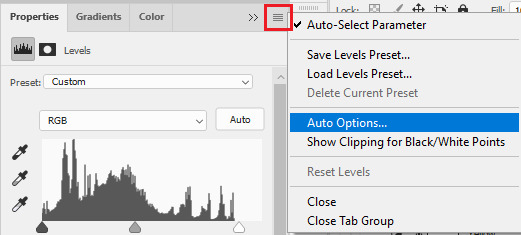
Once you click Auto Options, another dialogue box will appear:
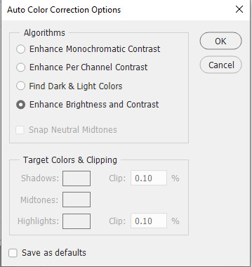
The default option is Enhance Brightness and Contrast. We will choose that option for now then click OK. [We will go back to this layer once we are done with the other layers.]

Color Lookup Adjustment Layer - this is where the LUT file comes in. Once you add the layer, click Load 3D LUT then click Load 3D LUT again on top.
Select the LUT file I shared.
Selective Color Adjustment Layer - for this layer, I always separate my adjustments for different colors and don't do the adjustments for all colors in one layer.
First Selective Color - I will rename the layer as RED and set the following values: CYAN: -100, MAGENTA: -11, YELLOW: -32, BLACK: 15
You can explore the levels of Magenta and Yellow but ultimately, I always set Cyan to -100 and Black is +15. Of course, you are free to change these two but these are my preferred coloring for shades of red. Setting -100 for Cyan gives this warm coloring.

Second Selective Color - I will rename the layer as YELLOW and set the following values: CYAN: -100, MAGENTA: +40, YELLOW: +30, BLACK: 40
Cyan is also set to -100. This adds more warmth to the tone of the image. Then you may change the remaining sliders to your preferred values.

Third Selective Color - I will rename the layer as CYAN and set the following values: CYAN: -60, MAGENTA: +20, YELLOW: +100, BLACK: +40
I don't have a rule for CYAN. This really depends on the color I want to achieve for the shades of blue. Depending on the values, you can make your color look blue/cyan/purple. In this case, I wanted to tone down the brightness of the cyan.

Fourth Selective Color - I will rename the layer as Black and White and set the following values: BLACK: +5
This is just to slightly darken the black shades of the image. I label it Black and White because I sometimes change the value of Black for White but in this case, adjusting the white doesn't help so no changes were made.
Gradient Map Adjustment Layer - I do not use this layer all the time. It really depends on the image. When I wanted to add another shade of colors to the image, that's the time I would use this. And I use a maximum of 2 gradients only.
The image looks okay now to me but let me add some gradient just to show how I use this layer. I use Gray_10 which is one of the preset gradients available in PS. Then I check the Reverse option to emphasize the contrasts of the colors. Then I set Blend Mode to Soft Light, Opacity at 100%.
Then I add another Gradient Map Layer. I use Purple_17. In this case, I didn't check the Reverse option.
Then I set Blend Mode to Soft Light, Opacity at 35%.

Hue/Saturation Adjustment Layer - this one is optional. I use this on my gifs to increase the warm tones of the image.
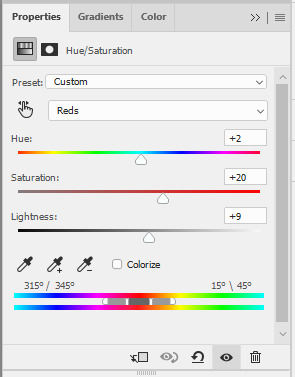
I only change the values of Red for additional warm tones.
At this point, I also wanted to make the cool colors lose saturation, so I added another Hue/Saturation layer. To have a grayish effect on cool colors and make the reds stand out even more.

Brightness/Contrast Adjustment Layer - you can use the Auto function and then just make the adjustments you want.
In my case, I set the Contrast to -50 most of the time, then the Brightness varies. For this example, I set Brightness to +8.

Then last but not least, I made some slight changes to the Levels Adjustment Layer and then adjusted Brightness to -3.
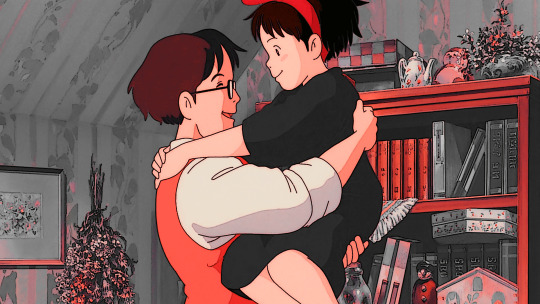
To compare, I will post the original GIF, with LUT file only, and the final GIF coloring respectively:
I hope this helps, anon!
I might create a specific tag for this kind of post and just include it on my master list pinned post so it's easy to find. Also, if you ever use this coloring style or the LUT file as part of your coloring, there is no need to credit but if possible, please tag me in your creations (#userartless) so I can see how you personalized the file and made it your own. ^^
14 notes
·
View notes
Text

Cirilla
An old PS4 gameplay screenshot I had that went through several photoshop filters and LUTS, then more filters from the gallery and fiddled with the noise/sharpness and texture sliders, going waaay overboard until it created this painterly fx.
Can't rightly remember all the steps. Would've been great to make a tutorial out of it :/
#ciri#cirilla fiona elen riannon#witcher 3#the witcher 3#witcher 3 wild hunt#photoshop#photo manipulation#photo edit#virtual photography#TLylaedits/arts
41 notes
·
View notes
Note
terribly sorry to bother, but I've been loving your screenshots since I stumbled on your blog, and like 100% genuinely: how do you get them to look like that? Is it all done in game or is it some combo of mods & shaders? Cause every time I see a cool pose I'm just left wondering how you did it. Obviously I wouldn't ask you to make a massive tutorial just for me, but if there are any resources or general things you'd be willing to share, I'd be eternally grateful!
Hi there! Thank you for enjoying my gposes, and you're not a bother; my ask box is open to get asks after all haha
To answer your question: My gposes are not a product of the vanilla game alone. I'm slapping my explanations under a read more since it's a bit long:
Firstly, I am running reshade, an open source post-processing injector. It's a program that can (in the simplest terms) run various visual filters over a video game in real time. Most everyone I know made the jump from Gshade to reshade last year, so if you look up "reshade for ffxiv" you should be able to find a handful of tutorials. When it comes to finding presets, there are a lot of independent shader devs for ffxiv and generally a quick google search should bring you to a few. Most of the presets I use are outdated holdovers from the GShade days, and I don't know if they are available anymore; so unfortunately I can't recommend any directly, sorry!
In general, I lean towards shaders that enhance the overall brightness and vibrancy of the (imo muddy looking) default graphics. Arsay can quickly get over exposed by the in game 3 point lighting, so putting a shader that boosts the brightness overall really helps preventing that. I set up my lights in gpose at 2, put the character lighting to 100, pick a shader with a LUT that gives me the colours and brightness I want and thats usually enough. sometimes I'll hit the manual brightness in game and mess with that too. I often go into the preset of the shader and muck about with the Depth of field settings depending on what I want. An important note regarding the use of reshade: While reshade does not directly effect in game files or gameplay and it's technically not against TOS (as far as I have read), it is still highly encouraged that screenshots taken with shaders on do not have the ffxiv screenshot watermark visible. Reshade has it's own screenshot button that you can map to any key of your liking that will capture the game and the applied shaders without any watermarks. If you have an nvidia graphics card, I believe you should also have access to the geforce post-process correction tools, and could use that as well to enhance the game visuals. However, I am under the impression it's solely corrective settings (brightness/contrast, vibrancy, saturation, etc.) and you do not have the ability to adjust the depth of field setting, apply LUTs, mess with ambient occlusion, etc. Aka the more in depth rendering stuff that would make your graphic card fan go brrr. I've personally never tried the nvidia filter system so maybe that's incorrect information. Best to do independent research on that!
As well, on the occasion I will bring some screenshots into photoshop and do further, fine tuned, tonal corrections there. Generally this is only when I'm trying to achieve a look that I can't get in game and I try to keep it to a minimum. When I'm working on big photosets or comics, I'll end up doing more corrections just to make sure colours/tones/shading are consistent through out.
On to the second part of the question: the posing. I do all my posing with this tool. It is a tos crime, however it's client-side only and completely undetectable to other players. It gives you full access to character rigs and allows you to not only build your own poses, but export and import poses, outfits, props used by npcs or seen in cut scenes, and character data as well. Tons of people will upload pose files on the various mod archives for others to use, so even people who don't want to mess around with rigs can have fun with their characters. I personally love posing, and it's something I'm very comfortable doing since I have a background in 3D modelling and animation. I do believe in working smarter and not harder though, so what I tend to do is apply an in game animation cycle to my character in question that has a frame or key pose close enough to what I need, pause the animation, turn on posing, and start rotating bones. I never really looked up any tutorials myself tbh, I kinda just messed around with things and figured the tool out as I went along. That said, there are tutorials on youtube if you search for them. "Anamnesis ffxiv guide" or something along those lines should bring up good results.
Anam also gives you further camera control than what is available in game, allowing you to fine tune its position to the .001 degree. You can increase the FOV and zoom range past the typical amount. Bring your character and camera pretty much anywhere on the map too. And you can export your camera setting to use between gpose settings! It's a really great tool, though it has some quirks and can in specific instances crash your game (never change a character while fishing lol)
That's pretty much it! I know this wasn't really much of a guide, so sorry about that. Most of my gposes are a product of seeing a fuzzy image/concept in my head and messing around with various compositions, locations, lighting conditions, ect. until I bring that idea into clarity. It's hard to explain that process in ways beyond "fucking around and finding out (positive)" I suppose to anyone else reading this has specific references in mind, please pass them along to sailor-artemis ! I know being told "just google it lol" isn't super helpful but I really just tend to figure things out on my own ^^;
8 notes
·
View notes
Text
Out with the blue: This is not a tutorial.
If anybody wants to know how to install GShade / ReShade along with how to add custom textures and shaders, there are tons of videos and posts for that.
The following will work with any GShade / Reshade preset!
I always find it funny when I find a solution for a problem when I wasn't looking for one. It is kind of like when I can't find something I'm looking for at a store, then months later the thing I wanted is everywhere. The later is beyond frustrating. I digress.
In this case, it is the blue overcast that comes with TS3.

My example picture is boring, but for a example, it is okay. By adding a shader ,multi lut texture and preset of choice, all of these combined make the meh problem go away.

To accomplish this, you will need to download the pack of luts from quietwaters.
Then you will need to install the shader to your shader folder, and the texture file to the texture folder. Both Reshade and GShade have these.
Once the shader and texture files are installed, open your game and turn on whichever program you use.
Enable the sforz_pd80_fauxfilm shader by clicking on it. Once enabled, you can choose which lut you would like to use. You'll have 17 to choose from. The download comes with preview pics. It is easy to see which take the blue out and which ones don't. These luts were created to fix the blue problem in TS4.

When you click on the sforz shader, the global editing box will open. From there you can choose which lut you want to use using the Lut Selection drop down menu or scroll. In the example above, I used lut number 2.
A simple solution to a PITA problem.
#sims 3#ts3#sims 3 things#I'll add this to my navigation list later if anybody wants to refer to it another time
3 notes
·
View notes
Text
Blackmagic 2383 LUT byBoz™️ | Color Grading BMPCC 6K Pro Footage in DaVinci Resolve
Blackmagic 2383 LUT byBoz™️. Color Grading BMPCC 6K Pro Footage in DaVinci Resolve. Also works with Adobe Premiere Pro, Final Cut Pro X and other .cube LUT software. Get a special 10% discount at dehancer.com using the code: BOZ10 Available to Buy & Download Here: https://blackmagic-luts.yolasite.com/ For ALL Blackmagic Design Color Science Settings (Gen 1/ Gen 3/ Gen 4/ Gen 5). Continue…

View On WordPress
#blackmagic braw to rec709 luts#blackmagic cinema camera 6k full frame#Blackmagic Color Grade LUT#blackmagic full frame#Blackmagic Pyxis Full Frame (Gen 5) 2383 LUT#blackmagic pyxis lut#BMCC 6K Full Frame#bmcc 6k full frame lut#BMPCC 4K Color Grade LUT#BMPCC 6K 2383 LUT#BMPCC Cinematic LUTs#BMPCC Color Grading LUTs#Cinematic LUTs#color grade luts#Color Grading DaVinci Resolve#Color Grading LUTs#Color Grading Tutorial#DaVinci Resolve Tutorial
0 notes
Note
Helloo! I freaking love your edits and wanted to ask you how you edit the lighting, it's fantastic 😱 expecially in your black Madonna post, I'd love to hear about your process :D
HI! OF COURSE! (Also thank you!) 💜 Omg I had a lot of fun with that particular post! From what I can remember, the room I built was lit with one orange light on the floor. I like to utilize relight with reshade and I have like a mini tutorial over here! One thing that I wanted to correct myself on (I’ll probably edit into that post as well) is the load order of reshade and I typically notice, it looks more muddy depending on whether or not it’s below or above a LUT but sometimes the muddiness of relight can work with a photo. oKOKO but anyways back to this edit. I used lightroom in reshade to cool down the photo because it started out warm. I really like orange lighting as a base in the sims because it doesn’t flashbomb my sims but it still adds enough lighting for me. I also find that I can adjust tone of the whole photo a lot more easily with orange i comparison to other lights. Then I started to add in lighting from relight, I picked out the colors blue, green, magenta and orange. On Atlas’s side I leaned towards orange, green and magenta while on Taryn I lit her with blue and green. However because she’s standing closer to the camera while Atlas is a bit further back, the blue on her face collides with the other three colors giving it an almost cyan, whimsical appearance. So the original photo of this was heavily contrasted, sort of neutral/hint of cool tones but when I pulled it into photoshop after adjustments (shadows/more highlights/hair wispies/cropping) I went into camera raw filter and colorgraded the shadows to pull more greens. I’m not sure if I touched highlights or midtones tho! Final step was adding in some scratches, film dust (the contrast helps so it doesn’t get too hazy when adding an overlay) and sharpened it! I’d like to do like a breakdown of how I edit or even a speed edit just to show the process! It’s always ever changing as I try to learn new things or certain photos require different steps. Funnily enough, I was leaning really heavy toward like… The Haunted Mansion in color scheme for this photoset HAHAHA and I think it worked really well here! I hope you enjoyed reading my yapathon LOL and thank you for asking! 💜💙💚
#also fun fact that photo was the first pose i created without a reference except for the book i had to take a picture of how to hold a book#asks#tutorial
2 notes
·
View notes
Note
I'M SO NERVOUS TO ASK THIS BUT. Have you ever done a tutorial on how to navigate the color lookup/how to find colorings? Many thanks!! <3

good color lookups ( LUT ) are NOT that easy to find , most of the color lookups i use are custom , because i love them . so im not really sure on how to find ( good ) color lookups since i either just borrow or share them ( or create them my own ) ^^" I apologize if this wasn't that helpful , but you could find some online if you try !

3 notes
·
View notes
Text
youtube
Learn how to master (Not Boring) Camera app for iPhone and take stunning photos with the best camera app on iPhone with this EPIC TUTORIAL! You will learn everything (Not Boring) Camera has to offer including full manual controls, custom LUT import, photo styles, custom colorway camera skins and much more.
I've really been enjoying this app:
1 note
·
View note