#understandingcolour
Explore tagged Tumblr posts
Visit Tumblr Blog
Explore Tumblr blogs with no restrictions, modern design and the best experience.
Last Seen Tumblr Blogs


Fun Fact
In 2020, 27% of US Tumblr users had an annual household income of over $100,000.
Photo
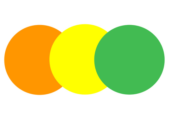
Colour Theory Study Seeing as our project is based around concepts of colour, it is vital that we look into colour theory and the noted effects of our specific colours on viewers. By looking further into these we can gather what people will relate these colours with automatically, and begin to have a deeper understanding on the concept of colour as a whole. It’s important to note that a colour that can evoke one reaction in one person, may evoke the opposite reaction in another. This is due to culture, prior association, or even just personal preference. This is important to understand that our project idea is subjective in this way, it is an abstract concept and different concepts may be taken by different people. This is ok - and in fact in my opinion makes it more interesting. A quick definition of analogous colours (as that is what we are working with; orange, yellow, and green are analogous colours: Analogous colour schemes are colours next to each other on the colour wheel. They match well and create a serene and comfortable design. Often found in nature, analogous colours are harmonious and pleasing to the eye. ORANGE Orange represents joy, enthusiasm, stimulation, energy, vitality, cheer, and excitement. Orange is a vibrant colour, in nature it’s the colour of vivid sunsets, fire, veges & fruits, and flowers. To the human eye, orange is a very hot colour, so it gives the sensation of heat. Nevertheless it is not as aggressive as red. Orange increases oxygen supply to the brain, and produces an invigorating effect, and stimulates mental activity. It is a colour of high visibility, so you can use it to catch attention. Muted forms of orange tend to be associated with the earth and in particular autumn. Because of this association with the changing seasons, orange can represent change and movement in general. Because orange is associated with the fruit, it can be associated with health and vitality. In designs, orange commands attention without being as overpowering as red; its often considered more friendly and inviting, and less in-your-face. For us, orange is representative of the song ‘Te Oranga’. This is because the song to us is excited, it stimulates and is full of cheer and energy. Te Oranga communicates a story of growth, orange as a colour can represent a change in season, movement and change, we think these two concepts work together nicely. If we try and choose a way to represent this energy, it would be excited and energetic. YELLOW Yellow is associated with hope, happiness, sunshine, clarity, enlightenment. It can also represent caution, mourning, or coward-ness. A bright yellow can bring excitement to your work, where softer yellows can be more calming. Yellow is the most visible colour of the spectrum, the human eye tends to process yellow first. Yellow is a creative form from a mental aspect, the colour of new ideas, helping us find new ways of doing things. In the commercial/advertising world, it is often associated with food. The analogous colours of yellow are orange and green, green and orange are not analogous colours of each other so it is important that we keep yellow in the centre of our designs. For us, yellow is representative of the song ‘Little Things’. This is because of the hopeful, calm, and happy energy in the song. To us, the song feels like finding clarity. It feels like taking a deep breath, and seeing things clearer for what they are. If we had to choose a way to define this energy, it would be calm, serene. GREEN Green is the colour of nature. It symbolises growth, harmony, and freshness. Green has strong emotional correspondence with safety. Green is also largely associated with money. Green has a great healing power, it is the most restful colour for the human eye. In road traffic green is the colour of free passage. Green can be associated with ambition, greed, and jealousy. It can also indicate sickness or discord, and is traditionally also the colour of peace. It can represent new beginnings and growth, and signifies renewal and abundance. In design, green can have a very balancing and harmonising effect, and it is very stable. It is appropriate for designs related to wealth, stability, renewal, and nature.
For us, green is representative of the song ‘Home, Land, and Sea’. This is because ‘Home, Land, and Sea’ communicates an energy of vitality and a want for a renewal of nature and land in Aotearoa. It also discusses ideas of greed and wealth. If we had to choose a way to define this energy, it would be through the contrasts of greed and renewal. A want for a renewal away from the sensation of greed.
1 note
·
View note
Video
youtube
Colour in Landscape Design - PART 1 REV F Video
#colourpsycholgy#colorpsychology#colourinlandscapedesign#colouringardendesign#colorinlandscapearchitecture#coloringardendesign#howtousecolourinyourgarden#colorinthegarden#understandingcolor#understandingcolour#howtousecolour#howtousecolor#colourforgardeners#colorforgardeners#secretsofcolor#howweseecolor#howeseecolour#color#colour#understandingcolouringardendesign#artofcoloringardendesign#artofcolor#artofcolour#colorinsoftlandscape#colourinsoftlandscape#colourinhardlandscape#colorinhradlandscape#functionofcolour#colourtheory#colortheory
0 notes
Photo
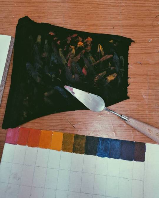
Oil painting = dagha = iktar dagha 🎨🖌️ #vsco #oilpainting #hues #potd #colourchart #understandingcolour (at MCAST Institute for the Creative Arts)
0 notes
Photo
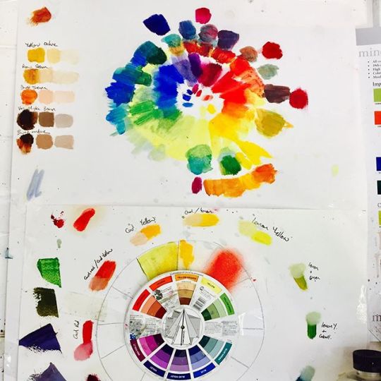
#Colour is everything 🌈🎨🧡⠀ ⠀ #oilpaint #oilcolours #colourwheel #color #Pigment #rainbow #lovecolour #colourchart #understandingcolour #passioncolorjoy https://ift.tt/2YIOnoe
0 notes