#what to watch.com
Explore tagged Tumblr posts
Visit Tumblr Blog
Explore Tumblr blogs with no restrictions, modern design and the best experience.
Last Seen Tumblr Blogs


Fun Fact
Hackers stole 65M passwords from Tumblr in 2013.
Text


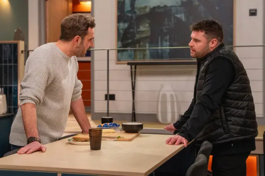
Aaron & John related Emmerdale Spoilers 14-18 April
Monday 14 April
The Milligan family find Steph in the middle of the woods, attempting to dig up Anthony's grave.
Realising that the soil seems undisturbed, they turn their suspicions to John and question whether Anthony is dead after all.
At the woods, Caleb is horrified when he finds Steph frantically digging at the ground where Anthony's body is said to be lying six feet under.
Thrown, the family starts to question whether John's lied about Anthony.
Tuesday 15 April
When Aaron suggests using Chas's bookings for their wedding, Aaron is dejected by John's tepid reaction to the idea. Annoyed not to have been consulted, John storms out leaving Aaron confused.
Aaron's stung by John's lukewarm reaction when he tries to discuss wedding plans with his fiancé. What's up with moody John?

Wednesday 16 April
John apologises to Aaron for yesterday's reaction about the wedding. Aaron is surprised when John seems reflective and eager to talk about his faults in the relationship.
John Sugden's got his work cut out as he tries to make it up to Aaron. With Aaron starting to tire of John's horrible moods, the medic opens up and admits to his faults.
As John admits he has problems with control, is it enough to win round Aaron? Is the wedding still on? And if so, is that wise?
Thursday 17 April
John is awkward when he is put on the spot.
More red flags pop up when Aaron starts asking John about who he wants to invite to their wedding.
When John tries to gloss over his lack of friends and family, will Aaron start to question who he's getting involved with before it's too late?


Friday 18 April
Victoria feels sorry for John. Without him knowing, she formulates a plan to contact some of John's army friends for the stag.
Aaron Dingle's all about wedding plans at the moment and it's causing problems for his fiancé John Sugden who's got a LOT to hide.
As Aaron, his best mate Mack, John and his sister Vic chat in the pub about guest lists and stag dos, the medic tries to stay in the moment, knowing his cupboard is fit to bursting with skeletons and secrets (and no doubt a load more besides).
Seemingly having forgotten how angry John got when he found her poking about in his van when he first arrived in the village, Vic vows to secretly reach out to his old army mates to see if she can cobble together a guest list for her brother.
What will she unearth when she delves into John's past?
Sources : Digital Spy & what to watch
8 notes
·
View notes
Text

2023 was not a year in which I watched a lot of movies. Well, maybe more than some people, but definitely less than other people. And so it goes.
Inspired by pal NathanC, I've been not just blogging movies, but now I do a whole list thing every year, and you can see everything I watched in a single spreadsheet.
In 2023, I watched 172 movies.
For Comparison:
In 2022 I watched 190 movies
in 2021 I watched 302 movies
in 2020 I watched 269 movies
in 2019 I watched 204 movies
in 2018 I watched 179 movies
Percentage difference from prior years:
2022: -9%
2021: -43%
2020: -36%
2019: -15%
2018: -3%
So, of course 2020 and 2021 were prime COVID years and we were:
trapped at home
doing podcasts
doing watch parties
had minimal sports in 2020
less new stuff to watch as Hollywood sorted COVID
In addition to movies, this year I also watched a lot of serial television (post coming), MLS soccer, Women's World Cup, Cubs baseball, World Series, Longhorn Football, and other stuff. There's things on this thing they have called "YouTube" that are okay to look at.
We also left the house, socialized and saw family.
Not least, we had some personal stuff going on, so that kept me from watching a movie or two along the way. But, you know, 172 movies is... a lot. So, it's not that I'm apologizing. I just didn't watch as many as before. And that's okay.
By the way, I think I technically watched 170 movies because I watched two of these twice.
And what were those?
Godzilla Minus One, which was great and I heartily recommend. And Superman IV, which I've seen before and which is not great. It is not even good. And is bad for Lois.
What am I doing with my life?
I also didn't count most Hallmark Movies because it's too hard to remember what I watched and didn't when I don't write a movie up - so I think there's a representative one movie and I discussed Hallmark films a bit in December. But you coould maybe add on 8-10 movies here that could count toward total movies. But are they "movies"? I don't know.
Anyway.
Go to https://signal-watch.com for the full breakdown
0 notes
Text
This review for X-Men: Red has me feeling things.
https://comic-watch.com/comic-book-reviews/advanced-review-x-men-red-1-the-queen-has-arrived-spoiler-free
But as the cover art implies, Storm is the major focus here. As well she should be. As Regent of Arrako, she’s practically and symbolically at the center of the budding Arrakan culture, but more importantly, she’s Storm, dammit, and deserves the spotlight. Storm has been in a near-constant state of being shoved to the background of the X-Men’s world for most of the 21st century so far; writers have been more content to focus on more or less anyone else. But Ororo isn’t just one of the most historically important female characters in x-canon, she’s also one of the strongest, fiercest female characters at Marvel, period. That matters. This is a woman who was once worshipped as a living goddess, and has a presence when she enters a room that always speaks to that. Ororo Munroe doesn’t enter a room; the room comes to her. She has a presence, striking in its gorgeousness but more importantly firm in its authority. She speaks with that authority, too; she isn’t just plain folks. It’s been an ongoing shame that so few writers in the past two decades have been able to figure out what to do with her, but here, now, at last, Al Ewing is giving Storm the moment in the spotlight she’s always deserved. Bravo.
@vague-humanoid @mrchicsaraleo @black-geek-supremacy
#that line right there#also slight spoiler in that review about a certain recently resurrected mutant apparently making this book his home#his presence hasn't been revealed before in any of the other promo material but excited to see what Ewing does with him
52 notes
·
View notes
Text
Solicits for X-Men comics in July are out, including a description for the new X-Men comic that Lorna is on.
THESE X-MEN ARE… FEARLESS!
The heroes of Krakoa are here to save the planet! Things might be complicated between the nation of Krakoa and the rest of the world, but to the X-MEN, things are simple — you do what’s right, you protect those who need protecting and you save the world we all share. Cyclops, Marvel Girl, Sunfire, Rogue, Wolverine, Synch and Polaris are the chosen champions of mutantkind, and they will not shrink from any battle for their home planet. Writer Gerry Duggan (MARAUDERS, DEADPOOL, UNCANNY AVENGERS) reteams with superstar artist Pepe Larraz (HOUSE OF X, X OF SWORDS, UNCANNY AVENGERS) to chart the course of the X-Men in a world of the Reign of X!
48 PGS./Rated T+ …$4.99
7 notes
·
View notes
Text
Preview of New Mutants 13

Pages under a cut to preserve spoilers


So the facade is over and Doug and Warlock are now back as a double act rather than pretending to be one person, and Doug is back to being unsettled and unsure as to what’s going on and what his place in it is, but Warlock is absolute: If his selfsoulfriend needs a sword, then he will be the best damn sword EVER!
God, I’ve missed these two’s relationship.
And look who shows up to help out with training!
Written by Ed Brisson Art by Rod Reis Cover by Mike Del Mundo
Images from
https://comic-watch.com/news/sneak-peek-icymi-marvel-comics-preview-of-cable-5-and-new-mutants-13
1 note
·
View note
Text
Study: Microplastics ‘Hot Spots’ In Oceans Are Bigger Than Ever
You might be surprised to learn that cheap "fast fashion" is a major contributor to microplastic pollution.
If you’ve kept even half an eye on eco-aware headlines in the past twenty years, you’ve seen the word microplastics. What it means is simple: any piece of waste plastic less than 5mm in size, or in other words, smaller than a ladybug or a baby aspirin, is considered a microplastic. And many pieces are much smaller, extending down into plastic particulate too small to be seen with the naked eye.
M…
View On WordPress
2 notes
·
View notes
Text
Ka-Zar Lord of the Savage Land #5 Preview
Ka-Zar Lord of the Savage Land #5 Preview #kazar #savageland #MARVEL #marvelcomics #comics #comicbooks #news #mcu #art #info #NCBD #comicbooknews #previews #reviews #Amazon
Ka-Zar Lord of the Savage Land #5 Preview: THE SLEEPER SERIES OF THE YEAR! AiPT calls it “visually stunning, luminous.” Comic-Watch.com says the series “isn’t at all what fans are expecting, and that’s an excellent thing.” Black Nerd Problems calls it a “subversive but fun book that questions its heroes and unpacks the history behind their rise.” Why are you still reading, True Believer? Get…

View On WordPress
#ka-zar#Ka-Zar Lord of the Savage Land#Ka-Zar Lord of the Savage Land 5#Ka-Zar Lord of the Savage Land 5 Preview#Marvel Comics#Marvel Previews#Previews
1 note
·
View note
Text
Book of the Week
There were so many good books that came out last week, it’s hard to pick, however, I have to go with Pearl.

Written by: Brian Michael Bendis Art By: Michael Gaydos Publisher: DC/Jinxworld
Summary: “She was born into one life, but another is calling to her. When Pearl accidentally meets one of her peers, her doppelgänger from another clan, she starts to dream of a better life. But Pearl has a very special ability that keeps pulling her back into the violent world she is desperate to escape.”
Thoughts: The Art is amazing, Michael did a great job. The story is great so far, you aren’t sure what is happening, not in the way that you are lost, but your mind tries to place everything together.
I am writing a full review for Comic-Watch.Com However I highly recommend this book.
1 note
·
View note
Text


Emmerdale Spoilers 22-25 April
Tuesday 22 April
Victoria goes behind John's back
There's a shock headed Victoria's way when she meets up with her brother John's old army mate Connor.
As they get to talking about John's time in the army, Vic's stunned when Connor mentions Aidan.
Having been told by John that Aidan is dead, Vic reels as Connor explains he's in a coma in a hospital in Leeds.
Needing to check, Victoria later heads to the hospital where she Connor's story checks out.
What will John say when she confronts him? Will he kick off at his sister for poking her nose in? Are his other awful, evil secrets and lies about to emerge?
Needing to check, Victoria later heads to the hospital where she Connor's story checks out.
What will John say when she confronts him? Will he kick off at his sister for poking her nose in? Are his other awful, evil secrets and lies about to emerge?


Friday 25th April
Emmerdale spoilers: Who's attacked Liam Cavanagh? Has evil medic John struck again?
Emmerdale's Liam Cavanagh is fighting for life
Mackenzie is horrified when he discovers a vicious crime has taken place.
The farmhand sees a body on the ground and reels to find it's Liam Cavanagh, the village GP.
As he raises the alarm and alerts the emergency services, Mackenzie calls Chas, Liam's fiancée.
Chas learns her fiancé has been attacked. Who's behind the crime? Is it Aaron's secretly evil fiancé John?
So who's committed the crime?
Has evil medic John secretly nobbled him, adding the doc's attack to a long list of other awful things he's secretly done?
Is Aaron about to find out that John is far from marriage material?
Or has someone else carried out the random attack?
And will Liam survive?
What to Watch / Digital Spy
3 notes
·
View notes
Text
Word For Mac 2016 Font Issues Jan 2018

Office for Mere Mortals helps people around the world get more from Word, Excel, PowerPoint and Outlook. Delivered once a week. free.
Word For Mac 2016 Font Issues Jan 2018 Calendar
Quark 2016 Font Issues
Word For Mac 2016 Font Issues Jan 2018 Printable Calendar
We never share your email address with anyone - never have, never will. Privacy Policy.
After the drawing opens, the command line feedback shows a substituted font(s), such as 'Substituting [simplex.shx] for [archquik.shx]' and when looking at the Text Style dialog box, the font is indicated as missing. Note: In some drawings, the text will disappear because of missing fonts.
I know talking about styles in Word makes eyes glaze over but they are a really useful part of Word (plus Excel, PowerPoint and Outlook).
Today I watched an ‘experienced’ Word user reformatting a document. He laboriously worked through the document, selecting paragraphs, phrases and even individual words then clicking on the ribbon to change the look. It took 10 minutes or more. With styles it would have taken a few seconds.
Authors using Word for Mac 2016 will need to read the Word for Mac2016 User Guide. We have created video documentation to help you through tagging document header, body, and references. We've also provided a video which walks you through the template validation process.
If the font for Heading 1 is changed then the font for Heading 2 will also change due to style inheritance. In a standard Word document, styles can usually be traced back to some base Word styles like Normal and Default Paragraph Font (paragraph and character styles respectively).
Microsoft Word vs Apple Pages review Which is the best word processing option for iPad and iPhone: Microsoft Word or Apple Pages? Our Pages vs Word review tests both iPad and iPhone text editors.
There are typically 2 factors that might create this result. The first is that you do not have WORD set to use the Adobe PDF printer when you are printing (though I do not think this is the issue).
Re: Font spacing goes haywire when Word document is saved to PDF Bill@VT Sep 4, 2011 2:19 AM ( in response to ghumdinger ) Try changing to the press or print job settings before creating the PDF.
Styles have been around for all of Word’s history. They have changed and expanded over the years but the fundamentals are the same.
In this article we’ll explain the different types of styles including at least one that sneaked in without many people noticing. From just one type in the early days of Word, there’s five different style types in Word 2007, Word 2010 and Word 2013.
What is a Style?
A style is a collection of formatting instructions put under a single name.
For example ‘Heading 1’ has these default values in Word 2013 (choose Heading 1 style, right-click and choose ‘Modify Style’.
So ‘Heading 1’ means Cambria font, 14pt, Bold with a color setting, Left justified, 1.15 line spacing and 24pt line space before the text, plus other settings.
Instead of having to apply all those separate formatting options for each main heading, just apply the ‘Heading 1’ style.
Even better, if you decide to change the look of the headings, change the ‘Heading 1’ settings and all the headings with that style will be changed automatically.
Paragraph and Character styles
There are different types of style that can be applied to different parts of a document. Originally there were only Paragraph styles – styles you could apply to an entire paragraph.
That was OK but no help if you wanted consistent formatting for words in a paragraph like a product name Office-Watch.com or just emphasis.
So Microsoft added character styles. These are styles that can be applied to a word or even a single letter. A character style could be called ‘Product Name’ to ensure all references to a product or service look consistent.
Character styles have all the attributes of paragraph styles that are applicable to individual characters. Things like font, size, color, bold, italic etc are in both character and paragraph styles. Line spacing, Left/Right/Center/Justify etc. can only apply to entire paragraphs.
Adding character styles created a new problem. Microsoft discovered that users sometimes had two styles with the same name – one as a paragraph style, the other as a character style. Or people would have two styles such as ‘QuoteP’ and QuoteC’ with the same settings, one for paragraphs and another for word/characters.
Linked styles
So Word 2007 introduced ‘Linked Styles’ which act as both a paragraph style and character style, depending on the situation.
A linked style acts like a paragraph style when a paragraph/s is selected and the style applied.
It acts like a character style when less than a paragraph (a character/word/phrase) is selected and the style applied.
Gone is the need for ‘twin’ styles – now you can have a single style that can applied to any text in a document.
The best example of a linked style is already in Word 2007 or later. All the Heading styles were changed to linked styles. Here’s an example of ‘Heading 1’ style used as both a paragraph and character style at the same time.
Both the paragraph and words were changed to the same style by selecting them and pressing the ‘Heading 1’ shortcut Ctrl + Alt + 1 . The Style Gallery or styles list could have been used to do the same thing.
In the Modify Style dialog you’ll see the style type just under the name.
‘Linked’ isn’t the best choice of terms for this type of style. Most styles are already ‘linked’ to others through style inheritance. ‘Merged’ or ‘Combined’ might have been clearer to most people – but we’re stuck with ‘Linked’.
Which is which?
On the styles list, the three types of style have their own markers.
The lower case ‘a’ next to a character style.
The ‘backwards P’ or Pilcrow is used as an end of paragraph mark in Word and also serves to denote a Paragraph style.
The combined pilcrow and a is, unsurprisingly, for a linked style.
A detailed and independent look at Windows 10, especially for Microsoft Office.
Fully up-to-date with coverage of the May 2019 major update of Windows 10.
This918 page book shows you important features and details for all serious Windows 10 users.
Alas, the Style Gallery on the ribbon isn’t as clear. Among various (ignored) complaints about the Style Gallery is the inconsistent marking.
Paragraph styles (e.g. Normal, Pictures etc.) have the pilcrow next to the style name.
Linked paragraphs (Heading styles etc.) have no marking next to the name.
But neither do the character styles! In the above image there’s no way to know that ‘Subtle Emphasis’ is a character style.
Inheritance
A brief mention of style inheritance.
Styles are normally based on an existing style so only changes from the inherited style need to be made. This lets you apply broader changes to a document a lot faster.
For example, here’s settings for Heading 2
Heading 2 is based on the Heading 1 style, so all the settings for Heading 1 are linked into Heading 2 as a starting point.
The settings like ’13pt, Not Bold …’ etc. are only the differences between Heading 1 and what’s been changed to the look for Heading 2.
If the font for Heading 1 is changed then the font for Heading 2 will also change due to style inheritance.
In a standard Word document, styles can usually be traced back to some base Word styles like Normal and Default Paragraph Font (paragraph and character styles respectively). However you can create a style ‘from scratch’ with no inheritance. Here’s the same Heading 2 style with the ‘Style based on’ removed.
Now you can see all the formatting attributes in detail.
Unlinking styles might seem like a good idea that makes things simpler, but experienced Word users almost never do it. Style inheritance can be a nuisance at times, but its more helpful than a hindrance.
What’s going on?
Sometimes the formatting can get confusing. What’s a paragraph setting, what’s a character style and what is directly applied with no style? WordPerfect had a ‘Reveal Codes’ feature which Microsoft resisted copying but finally added to Word.
There’s two options for exposing what Word is up to. The Style Inspector (Word 2007 and later) and Reveal Formatting. Here’s both in action side-by-side.
As you can see the Style Inspector is a small box that can be dragged around the screen. Open the Style Inspector from the button at the bottom of the Styles pane:
Reveal Formatting has a lot more detail and sits in the right-hand pane. There’s a button for Reveal Formatting on the Style Inspector box.
The Shift + F1 shortcut will open the Reveal Formatting pane. This shortcut has worked since Word 2002 (XP).
Table and List styles
Also added in Word 2007 were two more styles.
Table styles, let you group together all the many formatting options for tables.
Similarly, all the options for list formatting were a nightmare until Word 2007 when List Styles were introduced. Now all the, sometimes complex, choices for lists (numbering, indenting at each level) can be more easily and consistently applied.
Want More?
Office Watch has the latest news and tips about Microsoft Office.Independent since 1996. Delivered oncea week.
We never share your email address withanyone - never have, never will.Privacy Policy.
-->
Symptoms
Word For Mac 2016 Font Issues Jan 2018 Calendar
When you use Microsoft Office programs, you notice that visual features differ from one computer to another. For example, you see animations in Excel when you scroll through a worksheet on one computer, but you do not see the same animations on another computer.
Additionally, you may experience one or more of the following symptoms that reduce the functionality of an Office program:
Quark 2016 Font Issues
An Office program is blurry.
Your screen flickers or flashes.
An Office program is either mostly all white or all black.
Text in your document is not displayed well.
Your Office program crashes.
The performance of an Office program (other than startup and shutdown) is reduced.
In Microsoft Lync, there may be video delays or slowness when you are on a video call.
Cause
You may experience these symptoms if you have a video configuration on your computer that is incompatible with the Office feature set that is responsible for displaying the application and for animations in the application.
Office 2013 and later versions use a more efficient and accelerated method to draw the Office UI and the content. This includes relying on hardware acceleration, which is managed through the operating system. The hardware acceleration function of the operating system relies on up-to-date and compatible display drivers.
Note Hardware acceleration that uses the video card is always disabled when Office is running in a Remote Desktop session, and also when the application is started in safe mode.
Resolution
The resolution varies depending on your version of Windows and the symptom you are experiencing.
For the symptom: Poorly Displayed Text in Office Documents
If your symptom is 'Poorly Displayed Text in Office Documents,' try the following solutions first. Otherwise, skip to the next section titled All Other Symptoms.
Step 1: Use the 'ClearType Text Tuner' Setting
Search for ClearType.
Windows 10, Windows 8.1, and Windows 8: On the Start Screen, search for ClearType.
Windows 7: Click Start, and then enter ClearType in the Search Programs and Files box.
Select Adjust ClearType Text.
In the ClearType Text Tuner, enable the Turn on ClearType option, and then click Next.
Tune your monitor by following the steps in the ClearType Text Tuner, and then click Finish.
If you are still experiencing a problem after you adjust the ClearType settings, go to Step 2.
Step 2: Disable the Sub-Pixel Positioning Feature
Word 2016 and Word 2013 use sub-pixel text rendering by default. While this provides optimal spacing, you may prefer the appearance of pixel-snapped text for a minor improvement in contrast. To disable the sub-pixel positioning feature in Word 2016 or Word 2013, follow these steps.
On the File tab, click Options.
Click Advanced.
Under the Display group, clear the Use the subpixel positioning to smooth fonts on screen option.
Click OK.
If you are still experiencing a problem after you turn off the sub-pixel text rendering setting, re-enable the Use the subpixel positioning to smooth fonts on screen setting, and then go to Step 3.
Step 3: On Windows 7 clients, install the Windows 8 Inter-operatibility Pack
If you are using Windows10, Windows 8.1 or Windows 8, skip this section and go to the steps under the For All Other Symptoms section.
If you are using Windows 7, install the update for improving video-related components that is available in the following Knowledge Base article:
2670838 Platform update for Windows 7 SP1 and Windows Server 2008 R2 SP1
If the previous steps did not resolve the 'Poorly Displayed Text in Office Documents' symptom, continue to troubleshoot your issue by using the steps in the next section.
For all other symptoms
Update your video driver
The best way to update your video driver is to run Windows Update to see whether a newer driver is available for your computer.
To run Windows Update based on your version of Windows, follow these steps:
Windows 10, Windows 8.1 and Windows 8
On the Start Screen, click Settings on the Charms Bar.
Click Change PC Settings.
In the PC settings app, click Windows Update.
Click Check for updates now.
If updates are available, click the driver that you want to install, and then click Install.
Windows 7
Click Start.
Type Windows Update in the Search programs and files box.
In the search results, click Check for updates.
If updates are available, click the driver that you want to install, and then click Install.
If your video-related problems in Office were fixed by when you updated your video driver, you do not have to take any further steps. Go to step 2 if updating the video driver does not fix the problems.
Note
Word For Mac 2016 Font Issues Jan 2018 Printable Calendar
Video card manufacturers frequently release updates to their drivers to improve performance or to fix compatibility issues with new programs.If you do not find an updated video driver for your computer through Windows Update and must have the latest driver for your video card, go to the support or download section of your video card manufacturer's website for information about how to download and install the newest driver.
More Information
Automatic disabling of hardware acceleration for some video cards
By default, hardware acceleration is automatically disabled in Office programs if certain video card and video card driver combinations are detected when you start an Office program. If hardware acceleration is automatically disabled by the program, nothing indicates that this change occurred. However, if you update your video card driver and it is more compatible with Office, hardware acceleration is automatically reenabled.
The list of video card/video driver combinations that trigger this automatic disabling of hardware graphics acceleration is not documented because the list is hard-coded in the Office programs and will be constantly changing as we discover additional video combinations that cause problems in Office programs. Therefore, if you do not see the same animation functionality on one computer that you see on another computer, we recommend that you update your video driver by using the instructions provided in the 'Update your video driver' section. If you still do not see the expected animation on your computer, update your video driver again soon. Microsoft is working with the major video card manufacturers on this issue, and these video card manufacturers will be releasing new video drivers as such drivers are developed.
Note
If two computers have the same video card/video driver combinations, you may still see a difference in the Office animation features between the two computers if one computer is running Windows 7 and the other computer is running Windows 8. On a computer that is running Windows 7, animations in Office are disabled if the video card/video driver combination appears on the incompatibility list. However, the same video combination on Windows 8 does not have animations disabled because of the improved video capabilities in Windows 8.
0 notes
Text
Greta Thunberg Named Time 2019 Person of the Year
A quiet and decidedly non-glamorous teenage girl who started a global movement by simply sitting by the Swedish Parliament holding a sign, gets a hugely important accolade.
In an amazing move that celebrates not only activism but youth activism, Time magazine has named climate activist Greta Thunberg as its Person of the Year.
It’s not hard to see why. This teenage girl has galvanized the world around the message that a climate crisis is coming and political leaders need to have the will to do what’s necessary to stop climate change from destroying our world.
Greta…
View On WordPress
2 notes
·
View notes
Text
GUARDIAN Journalist Posts Racist Tweets, Calls Royal Family ‘White Supremacists’, And Attacks Alleged Meghan Bully Victim
GUARDIAN Journalist Posts Racist Tweets, Calls Royal Family ‘White Supremacists’, And Attacks Alleged Meghan Bully Victim
https://vote-watch.com/2021/03/19/guardian-journalist-posts-racist-tweets-calls-royal-family-white-supremacists-and-attacks-alleged-meghan-bully-victim/ Even though this person has the right to say what she wants she is deluded in her thinking. Calling the BRF racist is like calling all of England racist, they will none of that! What does this cow know anyway? She is damaged after drinking…

View On WordPress
1 note
·
View note
Video
vimeo
Iron Man 3 _ Mambo No 5 TV Spot (Fan Made) from Why We Watch on Vimeo.
This is a fan made ad for Iron Man 3. The original idea was to make something comedic and remove The Mandarin. The comedy was replaced with setting it to music, since there wasn't enough laugh-out-loud footage available.
Copyright Disclaimer Under Section 107 of the Copyright Act 1976, allowance is made for "fair use" for purposes such as criticism, comment, news reporting, teaching, scholarship, and research. Fair use is a use permitted by copyright statute that might otherwise be infringing. Non-profit, educational or personal use tips the balance in favor of fair use. No copyright infringement intended. Footage used is owned by Marvel Studios/Disney and (maybe) ViacomCBS/Paramount. The song is by Lou Bega and Dámaso Pérez Prado, and it's owned by Sony.
Also because I would like to encourage people who haven't tried making one of these before to give it a shot, what's your favorite fan trailer and/or editing resource? Please share it in the comments.
Blog post about this video: why-we-watch.com/2021/02/iron-man-3-mambo-no-5-tv-spot-fan-made.html Review of the movie: why-we-watch.com/2013/05/iron-man-3-no-spoilers.html
Website: why-we-watch.com YouTube: youtube.com/channel/UCMkH194F_1dbR21zJMVijWw Facebook: facebook.com/WhyWeWatch Instagram: instagram.com/why_we_watch/ Twitter: twitter.com/WhyWeWatch1
0 notes
Text
Labour Law Changes for Ontario, Alberta, and British Columbia

Ontario: “A few months ago, the government upended the funding of university and college ‘student unions’ by making most of their fees optional. Premier Ford laid out his case in a fundraising email: ‘Students were forced into unions and forced to pay for those unions … I think we all know what kind of crazy Marxist nonsense student unions get up to. So, we fixed that. Student union fees are now opt-in.’”
“Twenty-eight U.S. states allow employees to opt out of union dues while receiving the pay and other rights that the union negotiates, effectively getting a free ride from their co-workers who choose to pay their dues. The list of “right to work” states has grown to include some, like Michigan, that were previously considered union strongholds.”
”In contrast, Ontario’s Labour Relations Act provides the basis for the “Rand formula” to exist in collective agreements. It is a contract clause that sets out an employer’s agreement to deduct dues from the pay of all employees in unionized bargaining units and to send the funds to the union. It is almost ubiquitous in collective agreements across Canada.”
“Instead of erasing the Rand, the government could just pass a law that would prevent unions from using dues for non-collective bargaining purposes and allow people to opt-out of paying the “non-bargaining” portion if they opposed those non-bargaining purposes. Despite the difficulty of sorting out what is and is not a bargaining related activity, such a law might withstand a Charter challenge. Indeed, this very objective appears in the election platform of Alberta’s recently victorious United Conservative Party“
Ontario News Watch.com, April 22, 2019: “Does Ontario’s PC government have more plans for labour laws?” by Brad James
Alberta: “Kenney is also spoiling for some fights within the province, particularly with unions resisting deficit reduction or rollbacks to labour standards to pre-NDP days. He could have broad support for some of that, as Ralph Klein did a quarter-century ago when debt and deficit were last provincial obsessions. And sagging business confidence is likely to shoot back up with the UCP in charge—not just because there’s a party promising to scrap corporate taxes, hack away regulations, and bring in a $2 discount to the youth minimum wage, but by sheer dint of the New Democrats leaving office in favour of a guy flogging hope in an aerosol can marked Conservative.”
Maclean’s, April 16, 2019: “Jason Kenney’s Alberta: Open war for business: Alberta voters embraced the UCP's constant battle posture, but they may soon find it exhausting—and counterproductive,” by Jason Markusoff
United Conservatives Alberta Strong and Free: Getting Alberta Back to Work (114 pages, PDF)
British Columbia: “The last time significant amendments were made to B.C.’s employment laws, ‘gig economy’ wasn’t part of our lexicon. Outsourcing, job insecurity, low wages and unpredictable scheduling have become the norm for many.”
“The NDP is set to update two core pieces of legislation for the first time since 2002, fulfilling a key promise for the party’s most important supporters. The changes could drastically shift the power balance between employers and employees. In this series, StarMetro Vancouver will break down the issues most likely to be addressed. Find previous installments here.”
The Toronto Star, April 24, 2019: “What’s ahead for B.C.’s labour laws? Baseline employment standards,” by Alex McKeen
0 notes
Text
Nike’s Statement uniforms will have NBA fans talking this season
8:20 AM ET
Paul LukasESPN.com
Close Sports journalism’s foremost uniform reporter ESPN.com columnist since 2004 Also blogs at uni-watch.com
As you’ve probably heard by now, all 30 NBA teams unveiled new alternate uniforms on Friday night. The unveiling was part of the league’s new uniform contract with Nike, which is marketing this new round of alternate designs as “Statement uniforms.”
And just what sort of statement are these uniforms making? In many cases, the statement is “More of the same,” because about half of the 30 new designs are essentially the same alternate uniforms that teams had already been wearing. So if you were expecting to see a new alternate uni from the Hawks, Bulls, Grizzlies, Heat, Bucks, Wizards, or a bunch of other teams, you’re out of luck. Those teams have all chosen to stick with their existing alternate designs (or, in a few cases, have made extremely minor tweaks that most fans won’t even notice).
This is the latest in a series of developments — or maybe non-developments — that have caught many fans by surprise. So it bears repeating: Just because a league has a new uniform outfitter, that doesn’t automatically mean that every team will get new uniform designs. Some teams are perfectly happy with the designs they already have. That appears to have been the case with about half of the NBA teams for this round of alternate designs.
So what about the other half? Here are one observer’s picks for the five best new designs:
1. Warriors
Good view of Warriors’ new “The Town” alternates. Oak tree graphic is also used on Oakland’s street signs. pic.twitter.com/Cr9zWnzAck
— Paul Lukas (@UniWatch) September 18, 2017
Here we have the one clear-cut winner from Friday’s release. The design echoes the Warriors’ classic “The City” design from decades past but swaps in “The Town” (which is the common term for Oakland, where the team currently plays). The oak tree shown on the jersey is the same one shown on Oakland street signs, which in turn are based on the Oakland city flag. Great design concept, great execution, and the latest success for a franchise with a long history of great uniforms (although this one would look even better without the annoying Rakuten ad patch).
2. Nuggets
Comparison of Nuggets’ old skyline/rainbow alternate uniform (left) and new version, which retains skyline but loses the rainbow striping. pic.twitter.com/9EtLTHABdp
— Paul Lukas (@UniWatch) September 18, 2017
It’s long been an article of faith among uniform fans that the Nuggets and rainbow striping belong together. But the team’s new alternate, which retains the outline of the Denver skyline but scraps the rainbow striping, is a revelation. It looks so much cleaner, so much crisper, and the centered uniform number is a massive improvement as well. Early returns on social media indicate that fans don’t like the updated design, but give it a chance — it’s going to look sharp on the court. (And for the record, the Nuggets should still wear rainbow striping, but they should do it on their home whites.)
3. Pacers
The @Pacers Statement jersey. You feeling it? pic.twitter.com/8KjiODiPfV
— SLAM Magazine (@SLAMonline) September 16, 2017
This one’s pretty simple to assess: If you liked the new white and navy uniforms that the Pacers unveiled back in late July, you’ll probably like this yellow version as well. Your friendly uniform columnist thinks the circular chest lettering looks great, and the yellow design is a good addition to what’s shaping up as a very nice uniform set.
4. Knicks
#Knicks Statement Jersey pic.twitter.com/LuQCVpBjqW
— Arn Florendo (@ArnFlorendo) September 16, 2017
Out of the 30 newly released alternate uniforms, this is the only one that’s white. If you’re thinking it looks a lot like the Knicks’ regular white uniform, you’re right. But here’s the thing: The alternate version is actually the superior design, particularly when you compare the trim on the collar, armholes, and waistband. Does it break new ground in basketball uniform design? Not even a little bit. But will it look good on the court? You betcha.
5. Jazz
Make. A. Statement.#NIKExNBA pic.twitter.com/Fu8NOPFTUT
— Utah Jazz (@utahjazz) September 16, 2017
This one seems likely to provoke either a love or hate response in most fans. The feeling here at Uni Watch HQ is that the minimalist design works really well, although it would rank higher on this list if they’d gone with navy or green instead of yellow.
And here are the five worst:
1. Cavaliers
Detailed look at the Cavs’ Nike “Statement Edition” alternate Jerseys pic.twitter.com/PwSg7guQAu
— Heart of NBA (@HeartofNBA) September 16, 2017
Leaving aside the clunkiness of the graphics (the Cavs’ “C” logo and that new number font just don’t work well together), what’s the deal with those diagonal stripes? according to the team, the stripes “invoke imagery of the grain of the sword to represent our team’s toughness on the court.” Even by modern uniform “storytelling” standards, that would be an eye-roller, but the reality is worse: The stripes look like a tire tread, and tires just happen to be the product made by Goodyear, which has an advertising patch on the Cavs’ uniforms this year. Coincidence? Yeah, right. So the season hasn’t even started yet and we already have the worst-case scenario that everyone feared regarding the ad patches: They’re not just cluttering up the uniforms, but they’re driving the designs.
2. Timberwolves
The Timberwolves finally unveiled their Statement uniforms pic.twitter.com/Xnog1SWGCh
— Everything Minnesota (@EverythinginMN) September 16, 2017
This is another one of those designs that almost seem calculated to be polarizing — you’ll either love it or hate it. Either way, can someone please explain how the Timberwolves ended up with something that looks like the Seattle Seahawks’ Color Rush uniform?
3. Trail Blazers
Comparison of Trail Blazers old red alternate uniform (left) and newly released “Statement” version. pic.twitter.com/rijhY8qbn3
— Paul Lukas (@UniWatch) September 18, 2017
Too bad the Blazers weren’t among the teams that stuck with their existing alternates. The new version eliminates all the white and silver trim, causing major legibility issues. A rare misstep for a franchise that usually gets these things right.
4. 76ers
Comparison of chest scripts on 76ers’ new red alternate (left) and recent Christmas jersey. pic.twitter.com/LArjEir2U6
— Paul Lukas (@UniWatch) September 18, 2017
At first glance, the Sixers’ new alternate is a perfectly nice design. But take a closer look at that chest script. Look at how the “i” connects with the “x.” Does that look like “Sixers” or “Suxers”? Come on, people — we all know cursive writing is a dying art, but there’s really no excuse for this, especially when you had a much better script on your recent Christmas jersey design. Remember?
5. Celtics
Here is the new Nike Statement Edition Celtics uniform

what do you think? pic.twitter.com/NKJx5zlMGV
— Wicked Good Sports (@WickedGoodSprts) September 16, 2017
You can say this much for the Celtics’ new black design: At least it’s better than the gray sleeved alternate they’ve been wearing. But not by much.
You can see all of the designs from Friday night’s unveiling here. There will be another round of 30 additional alternate designs released later this fall, after the start of the regular season.
Paul Lukas writes about uniforms for ESPN.com. If you like this column, you’ll probably like his Uni Watch Blog, plus you can follow him on Twitter and Facebook. Want to learn about his Uni Watch Membership Program, check out his Uni Watch merchandise, be added to his mailing list so you’ll always know when a new column has been posted, or just ask him a question? Contact him here.
The post Nike’s Statement uniforms will have NBA fans talking this season appeared first on Daily Star Sports.
from https://dailystarsports.com/2017/09/18/nikes-statement-uniforms-will-have-nba-fans-talking-this-season/ from https://dailystarsports.tumblr.com/post/165483790566
0 notes