Don't wanna be here? Send us removal request.
Statistics
We looked inside some of the posts by ttcox-blog and here's what we found interesting.
Average Info
Notes Per Post
0
Likes Per Post
0
Reblog Per Post
0
Reply Per Post
0
Time Between Posts
20 days
Number of Posts By Type
Text
8
Photo
8
Link
1
Last Seen Tumblr Blogs


Fun Fact
China blocked Tumblr because of pornography and censorship problems in 2013.
Text
Mastery Journal Entry
Mastery: Personal Development --- Mastery did a fantastic job of teaching me how important it is to be a master of my field. The case examples that we read in the “Mastery” book truly inspired me to push further. This class laid the foundation for what would become my final thesis.
Defining Client Needs --- This class was a fundamental step in learning how to best approach the clients that I will inevitably be involved with in my career. Being able to clearly understand what it is that a client wants is so important and is what I took away going into my thesis class.
Brand Development --- This was perhaps one of the more interesting classes taken of the last year. Understanding my target demographic is crucial to good effective design and the effects of this class will forever be seen in my future work.
Effective Copyrighting --- Researching the best approach to design hierarchy in design was an important takeaway from this class. Hierarchy is one of the most important aspects of Media Design and is something I definitely implemented in my thesis.
Design Research --- Perhaps the most design heavy class helped me tone my design skills by understanding the best approaches to research best practices for each specific job. This was a very fun class and could be seen in my thesis by looking at the early draft of it.
Organizational Structure --- This class, in a nutshell, helped me understand how to better convey my work to others. Being able to structure my research into a final product was very helpful and I took cues from this whenever I was researching my thesis project.
Design Strategies & Motivations --- Using effective strategies in design is another crucial element of this field. Strategically using the elements and techniques best suited for the job is imperative to good design. My strategies going into my thesis project was to use strategic practices to make the biggest impact possible.
Design Integration --- Being able to target a specific audience specifically was a big skill taken from this class. Understanding this audience and integrating the best ideas possible is a huge skill to master.
Multi-Platform Delivery --- This class enabled me to hone a lot of the skills and research techniques gained in previous classes. One of the less exciting classes to me personally, this enabled me to focus on actual design and improving on that.
Measuring Design Effectiveness --- This class was full of feedback and critiques from my peers, friends and family. Getting the opinion of others was really fun for me and I actually used a lot of the suggested practices in my thesis project.
Presentation of Design Solutions --- This class was a lot easier than I thought it was going to be going in. I was able to easily create my Wix website and provide the information effectively and cleanly. It was a very proud moment for me, and I truly felt at the end of this class like a MFA graduate.
0 notes
Text
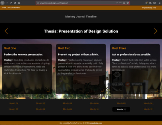
Mastery Reflection: Month 11
This was by far the most intense month of the entire MDMFA program! The class was instructed to collect all of the projects that we’ve done over the past 10 months and choose the most appropriate ones to fit inside of our Masters Thesis Presentation.
While choosing which projects to use for each topic was a task in itself, the real struggle was finding all of my old work! I guess I’m pretty notorious for not being the most organized person to ever use a computer so my folders were strung out among many sections, local and on the cloud. I did find everything I needed, nonetheless.
We were tasked to read the book Stories that Move Mountains by Martin Sykes, A. Nicklas Malik and Mark D. West. In this book, the ideas presented mainly consisted of how to improve a presentation. The major takeaway from this was that the old bullet point style of presentation really doesn’t work in today’s society.
Another takeaway from this book was the fact that the heavy use of visual storytelling is far and wide an important part of gaining an audience’s attention. Great visual storytelling will really go a long way in conveying an idea of a presentation - far better than a simple presentation with heavy bodies of text could every do.
It was nice learning about the CAST model in the book. It’s the chosen model used by the authors to use to create presentations. CAST, which is an abbreviation for Content, Audience, Story, and Tell, is a model that allows a presenter to follow its steps in a way that more clearly conveys the message being presented to an audience.
You can find my final thesis presentation from this month’s class at https://ttcox3.wixsite.com/thesis-presentation/.
References
Sykes, M., Malik, N., West, M., (2012). Stories that Move Mountains: Storytelling and Visual Design for Persuasive Presentations.
0 notes
Photo
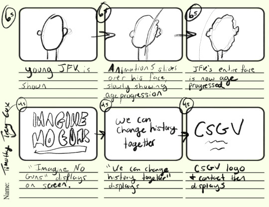
Month 10 Mastery Journal Entry
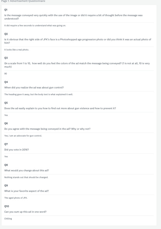
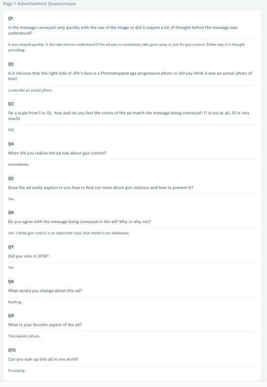
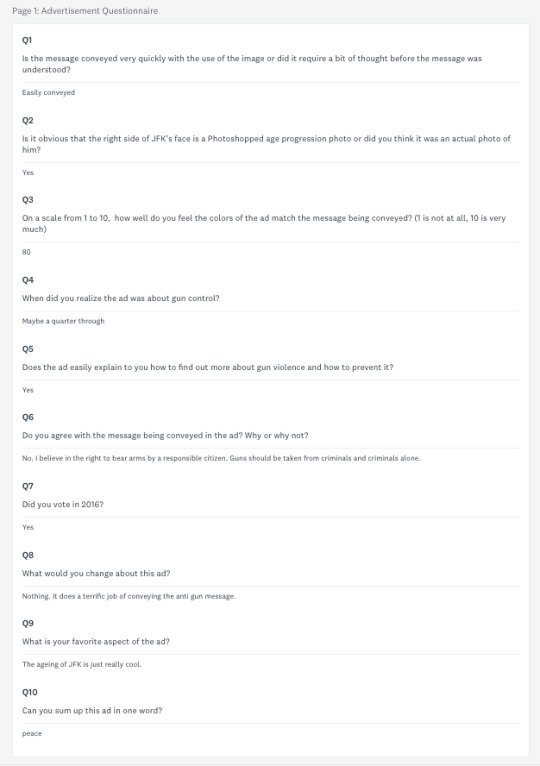
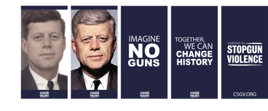
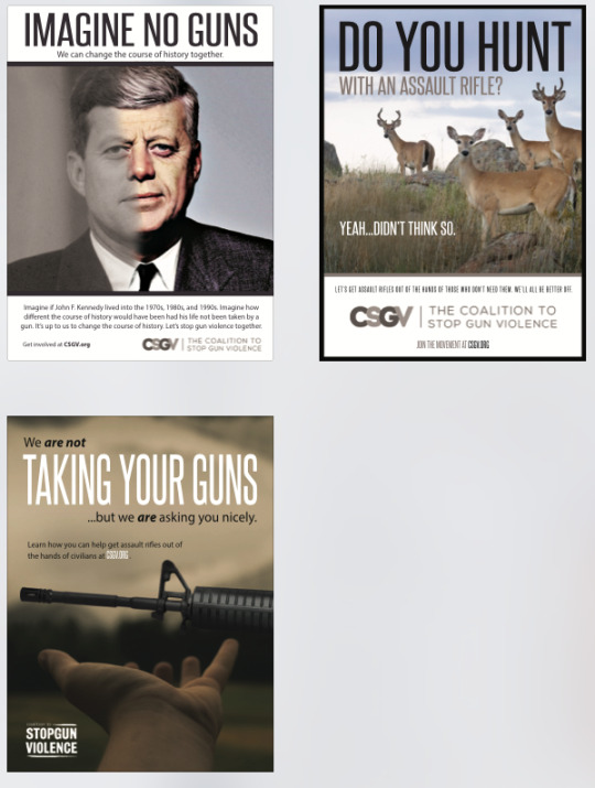
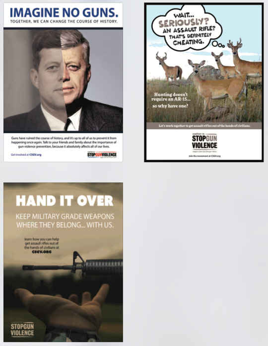
The "Imagine No Guns" advertisement was first created as a school project targeted for a non-profit of my choice. I went with the Coalition to Stop Gun Violence because the topic of gun control has been a hot one for the last few years. The idea to go with John F. Kennedy as the face of the ad was an easy decision. Of the last century, arguably no other assassination has had such a profound effect on the history of the United States than JFK's. The big bold title catches the reader's attention, sending the eyes moving down towards the large image of a half age-progressed face of John F. Kennedy. The idea here is that JFK would have most likely lived to old age, into the 70s, 80s, and 90s, had he not been horribly killed by someone with a gun. Following the image is the body text, which lets the reader know just what the purpose of the advertisement is. This is followed by a call to action that lets the reader know just where to go to learn more.
The images above show the questions and responses gathered during the target audience research. The goal was to gather as much information as possible to help understand just who is affected by the ad in various ways
0 notes
Photo
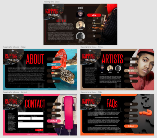
Month 9 Mastery Reflection
This month saw the creation of a web animation for the Coalition to Stop Gun Violence. The animation is based off of a print ad that was created early on in the Media Design Master of Fine Arts degree program at Full Sail. This was a wonderful opportunity to move away from the web design and coding projects that I had been working on for the first part of the revision phase of our program and instead focus on graphic and animation design. It was a joy to work on.
I started out by creating a mockup using my iPad Pro and the app Procreate. This allowed me to sketch a timeline of the animation. The next step was to lay out each frame of the animation and allocate the amount of time each graphic is shown on the view during the animation’s playtime.
The size chosen was a standard web ad size of 300px by 600px. This will allow the animation to be resized as needed on a variety of web site designs and layouts.
0 notes
Photo
This month was an enjoyable one and on of my favorites from the Media Design Master of Fine Arts program. I was able to do research on a number of different topics relating to my design work revisions.
The heaviest research that I conducted was primarily focused on the user interface and color theory fields. As for the user interface research, I learned some of the important qualities of a website design that helps the experience of the site visitors. The color theory research was very helpful, and I was able to better understand the various emotions that colors can invoke in a person.
The primary problem that I was trying to solve in my first assignment was how to make a professional looking web application using popular design and UI techniques from Google and Apple’s design styles. I was able to create a site that I felt was up to par with some of the things that those two companies have released in the past.
As far as design goes, I really didn’t learn anything new in these projects. However, I did indeed learn a ton about the programming side of web development when it comes to manipulating the elements of a page. This skills is apparently very crucial for developers to know, and it a skill that really helps designers do more, yet a lot of designers don’t understand it.
0 notes
Text
Mastery Reflection for September
For my revision assignment this month, I transformed my plain styled Mastery Journal Timeline slideshow into a full fledged web application. I started by sketching a rough draft of the site, then created a wireframe using Adobe XD. I then created a mockup with Adobe XD and Adobe Photoshop. After this, I went to work and coded everything from the site’s HTML markup to the CSS styles and even the Javascript using the jQuery Javascript library.
By taking advantage of the helpful resources on the official jQuery website, the W3 Schools website, and helpful coding resource apps on my iPhone, I was able to build a fully functional web application. The website is actually only one page, but by taking advantage of the powerful tools in jQuery, I was able to create an application that manipulates the elements of the HTML (or the DOM, Document Object Model) without the need for a full page refresh.
I wanted the website to be very user friendly and create a great user experience. By having large navigation elements that loads the information instantly, this helps the experience by taking advantage of both user interface element styles as well as Javascript programming techniques.
By having a web application that loads instantly, the site style is more innovative than others in the industry. There is no need to wait on pages to load on each click, as the entire application is loaded as soon as the page is loaded. When a button is clicked, the information on the site changes instantly, creating a great user experience unmatched by most sites on the web.
I learned hot to use a new text editing program called Atom. It’s very lightweight and is extremely useful when coding a website from scratch. It offers a live reload feature that shows changes to the website instantly in the browser after ever save.
Overall, this is one of the most exciting classes that I’ve had the privilege to take while in the Media Design Master of Fine Arts program.
0 notes
Photo
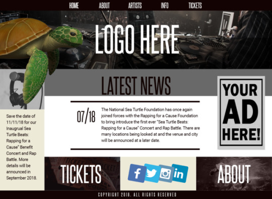
5.4.2 Mastery Reflection: Part 2
So when I began working on this project, I was unsure as to what route I really wanted to take with the layout. I finally decided to go with what I feel typically works best in modern design: smart placement that is instantly readable. The average user doesn’t want to spend more than a few seconds trying to find the necessary information he or she goes to a webpage for. So, in my opinion, it’s imperative to include the most important information front and center on a page. As you can see, the main page includes the latest important news event front and center, the large social media icons on the bottom center, tickets, and information about the event. All of this will be scene on page load, with no scrolling needed on desktop or tablet in landscape mode.
0 notes
Text
5.4.2 Mastery Reflection
I cannot describe just how much fun I’ve had over the past month in my Design Research class. As someone who already works in the media design field, and web design in particular, I can appreciate very much the information that I’ve gained throughout the course. In my current position as a web designer, it is a definite must to be able to keep up with ever evolving web technology, so being able to accurately research the various areas of my design projects will help tremendously now and in the future. It is a great thing to become a master of a field, and I feel that this class has been a super effective step in pushing me to become a true master of media design.
From here, I plan on working more towards expanding my knowledge of more advanced web design techniques. I would like to understand the web programming languages better, those that require more logic skills than design skills in some instances. By being able to better research these skills I should become a more skilled student of the field.
0 notes
Photo
0 notes
Text
Mastery Project Reflection
*SCREENSHOTS IN NEXT POST*
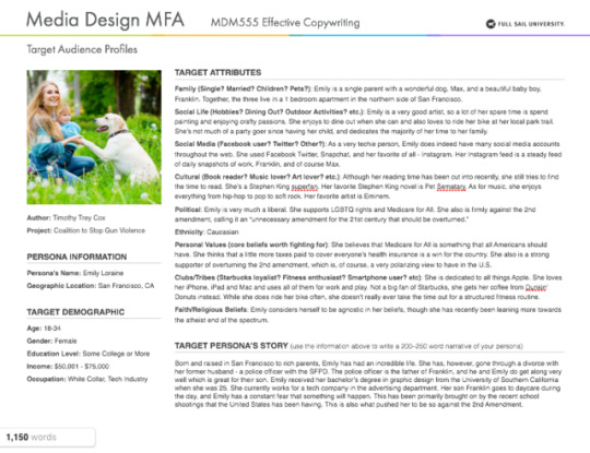
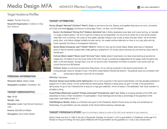
When thinking of the target audience for my project, it was important to be as specific as possible. This goal was easily achieved by paying attention to the reading assignments for the month and the various research done throughout the web. These target audience profiles that were created were based off what was learned in ‘Advertising: Concept and Copy.’ In particular, the chosen target audience influences which items from the “shopping list of needs” that are chosen.
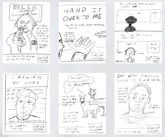
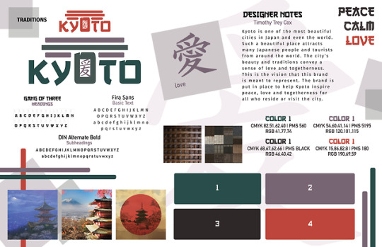
The six testimonial sketches were extremely interesting to create. After brainstorming dozens of ideas, the six finalists were sketched out into what would become advertisement ideas. Felton does a great job in his book explaining the many variations of testimonial ideas. Using a public figure in JFK was one of the first ideas to come to mind. Felton’s list would categorize this as “Historical figures, unread people” because it uses a character from history. The deer hunting sketch ad sketch was influenced by Felton’s “Ironic Testimonials” category in that it makes a joke in the deer’s perception. Ideas using children in schools were rejected primarily because of the already high use of the idea on existing advertising campaigns.
The three strongest concepts were chosen after much debate. Although all six concepts could have probably been successfully converted to a final comp, the three chosen were stronger for a number of reasons. For one, the headlines of these ads were shorter and more too the point. They were made “parallel” as described by Felton in his book. Also, they used a “kicker” to really nail the point to the reader. For the body copy, it was important to write in a way that people speak. It’s never a good thing to sound too unnatural in advertising, so creating a body copy that, again, Felton explains, “sound the way people talk.”
For the three revised comps, the designs were overhauled and cleaned up a lot. The first drafts were merely just good enough to give the general idea of the look and feel of what the final comps would become. The images were cleaned up, the headlines were tweaked to sound more professional and match the tips given by those who critiqued the original versions. The typography was cleaned up to better fit what was necessary for the ads’ target audiences. The resulting comps were very powerful ads that would work great in an advertising campaign for the Coalition to Stop Gun Violence.
The three takeaways that I’ve learned from Effective Copywriting is:
1. Pay attention to the small details. It’s imperative to understand that every word and every piece of chosen typography could make a difference in an ad’s effectiveness or lack thereof.
2. Create ads that are appealing. Take enough time to make your ads make sense. Use headings and body copy that fits the target audience and fits what the ad is trying to convey.
3. Research. It is so very important to do research about the company or organization that you’re creating an ad for. The more you know about the organization, the better you understand who their target audience is, thus making life easier for you.
Felton, G. (2013). Advertising Concept and Copy. W.W. Norton & Company.
0 notes
Text
Week 4 Mastery Final Post
The latest toolboxes posted to my Tumblr are strong enough to be considered final variations. They each sufficiently match the guidelines set forth in the course material used throughout the month. Each has a strong color palette, a unique design, strong typography and graphical elements and images that help convey the meaning behind each brand idea. The designer notes were revised in the last version to better meet the criteria set forth by the instructor, and the name of the brands were added to each worksheet to display which brand is which (geography, modern culture, traditions).
As Lisa Quast stated in the Forbes article:
“The purpose of the personal SWOT analysis is to identify actions you can take to best meet the requirements of the job or promotion you are seeking.”
These actions were sufficiently identified and understood.
Source: https://www.forbes.com/sites/lisaquast/2013/04/15/how-to-conduct-a-personal-s-w-o-t-analysis/#474cc4fa28d8
0 notes
Photo
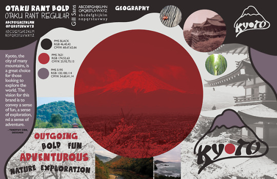
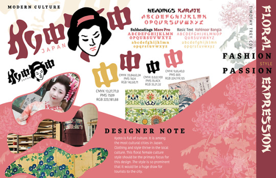
Threats
The primary threats with the toolboxes attached included lack of a clear vision, difficulty with keywords, and creating a large sense of uniqueness. These threats were tackled head on to create three powerful design toolboxes.
Opportunity
There is plenty of opportunity available based off of the three designs. More cultural exploration is a definite possibility. Digging deeper into aspects of Kyoto life and geography would be extremely beneficial for furthering each of these brands.
Weaknesses
The number one weakness was finding very powerful keywords to relate to each brand. While this seems simple at first glance, it’s difficult to really dig deep into what a brand should truly convey in words. This was by far the biggest obstacle in the process.
Strengths
The designs wound up have great unique characteristics about each of them. They’re each unique in style and layout and help define individual brands. Each of them are playful and convey the keywords strongly.
0 notes
Photo
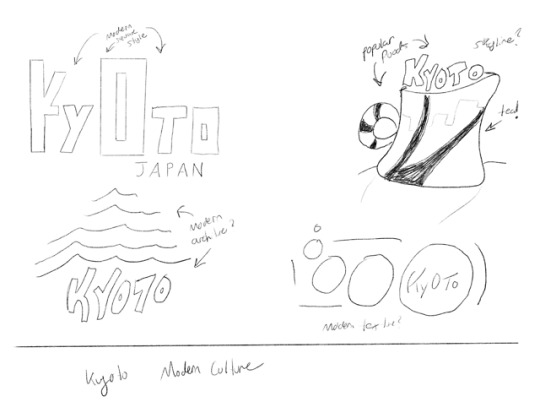
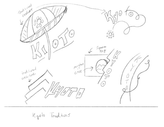
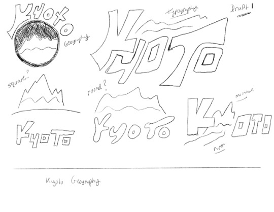
The attached sketches are what I did for this week’s logo research assignment in my Defining Client Needs class. I’ve received some incredible feedback over the past month which will help me go further with my final logo design for the city of Kyoto, Japan. One piece of feedback that really struck me as helpful was the important of using clean, straight lines in the second stage of sketch design. I didn’t go as far as I should have with my second set of sketches, and I could have benefited from creating a more detailed version of the design and the shapes that make it up. I’ll definitely work on this and will improve drastically at my next step of the design process.
0 notes
Text
MDMFA Action Plan
You know, I’ve been excited about my long term goals since the very first day I started class at Full Sail back in September 2015. I’ve learned more about the design field that I could have ever imagined, and to think I’m just beginning my Masters section of the field, I can’t help but be even more excited about what’s to come.
I want to focus on my critical thinking skills. Beyond the design aspects of what I do, I want to know WHY I do the things that I do. I make dozens, perhaps hundreds of decisions for every design that I create, but I want to know WHY I make those decisions. That’s what I want to get out of the MDMFA program, and I honestly feel that I’ll get that. I feel that the more I understand the decisions that I make, the easier it will be to improve or even correct them in the future. What in life influences my design decisions? Why do some people absolutely love them while others aren’t too keen on them? It’s these types of questions that I hope to understand at the end of the program.
0 notes
Text
Mastery Reflection
The journeys of others that I’ve read about so far during my own Mastery journey has been nothing short of amazing. Before beginning this program, I never put much thought into what one might consider achieving “mastery.” After much research, though, I’ve come to the understanding that it’s something different for each of us. One person’s achievement of Mastery is going to be totally different than someone else’s.
My biggest takeaway is that I must create my perfect Mastery journal. What niche am I going for? What about that niche is needed to known for it to be truly mastered? Observing and researching the mastery journey of others has been extremely helpful even considering the fact that their journeys are totally different than mine.
My Masters program in particular is Media Design. Media Design definitely sounds like a really broad term, and I would have perhaps chosen a more targeted Masters degree in the Web Development and Design field had Full Sail offered it. I know this degree is more about the critical thinking and research behind design of all media types, which is great and obviously beneficial to me and my career, but that’s honestly the only concern and slight hesitation that I’ve had of the program so far. Web Design is a section of Media Design, so I do feel comfortable moving forward, and I very much look forward to what’s ahead.
0 notes
Link
My inspirational post for this week is the official W3Schools website. I cannot stress just how helpful this site has been for me during my journey into web design and development. It has some of the most in-depth, easily explained tutorials that I’ve found anywhere on the web. It has truly inspired me to go further with learning advanced techniques in the web design field, particularly when it comes to JavaScript programming. If you need an easy explanation of the fundamentals of HTML, CSS or JavaScript, then you should definitely check out W3Schools. It is simply amazing and inspiring.
#fullsail#fullsailuniversity#fullsailgraduate#fullsailalumni#mdmfa#mar2018#march2018#washingtondc#webdesign#html#javascript#css
0 notes