
Don't wanna be here? Send us removal request.
Statistics
We looked inside some of the posts by tylerhuguesdesign-blog and here's what we found interesting.
Average Info
Notes Per Post
0
Likes Per Post
0
Reblog Per Post
0
Reply Per Post
0
Time Between Posts
24 days
Number of Posts By Type
Text
10
Video
2
Photo
5
Last Seen Tumblr Blogs


Fun Fact
Tumblr was the first site to host the blog for President Barack Obama in 2011.
Text
Motion Design: Spring 2019
Video Co-pilot
I came into this class with prior knowledge of After Effects. I started using it the summer of 2017 at my job, and I grew to love it more and more every day. These tutorials from Video Co-Pilot were some simple but useful refreshers in how to do things in After Effects. Below you can see some quick screenshots of what I did using these tutorials.
These tutorials covered things such as keyframing effects, changing colors, motion tracking, and much more. Some screenshots from these tutorials can be seen below:


(This piece involved changing colors between keyframes. The closer she got, the more the color changed)


(This tutorial went over keyframing the person “blurring” the screen as he opens his arms).


(This involved taking out a green screen background and putting the stunt person over another background)


(This involved motion tracking as the speech bubble followed the person’s head)
All in all while these were helpful, I went into thic class knowing the software already so it was more of a refresher on some things rather than teaching me.
Project 1: Animated Quote
This project was the start of what I knew would be a tough semester. While I knew the software like the back of my hand, I needed to really fully grasp the concept of this project. The idea of taking a quote and animating it in a way that made sense (for everyone) was the true challenge of this assignment.
When I first began, I had the Yogi Berra quote “It Ain’t Over Til It’s Over” in mind to animate. But after many, many disagreements on how I can effectively portray this in a way that made sense, I decided to shift my focus to another quote.

This concept was not strong enough, and for time’s sake, I could not waste any more time hitting dead end after dead end with this quote, which is why I changed my direction after the first week and a half. I had animated drafts but none of them seemed to get the response that I was looking for.
I landed upon the quote from Julius Caesar which stated “Veni, Vidi, Vici”. This is the Latin pronunciation of the famous quote, “I Came, I Saw, I Conquered”. The challenge for this for me was that I had to animate the Latin words while making sure that every action made sense as to why it was moving the way it did. When I began my process, I first played with a few different ideas, then I would just need to focus on the actual movements of the letters. My first attempt had things such as the “I Came” sliding in Latin, and then it would move back in space and then Vidi (I Saw) would zoom I’m from the back and blink as if it were an eye. The only downside about this that I realized after was that it came across as too “flirtatious” and it honestly just did not get the job done. So that was one area that I really needed to work on. So as I worked on improving my concept, I had a lot of work to do in order to make my project as clear as possible. After a few variations of storyboards, which can be seen below, I got it.


I created an animated draft based off of these storyboards and I realized afterward that there were still changes to be made.
One of the big things I came across during my research was that there was an imperial purple that the emperors, such as Caesar, would wear to exert their authority. I wanted to include this element to my piece somehow, especially since the quote itself is so powerful. which is why the I Conquered part because is in purple, to also make it more of an impactful word. Another change I made was to make the font into a Sans-Serif because it just looked cleaner. My final version of this project can be seen below:

https://www.youtube.com/watch?v=l-0Ys-CqIyE&feature=youtu.be
With this final draft, I also created buildup by not only adding the music, and making the font size bigger gradually throughout the video, I also made each font thicker as each word came up. The buildup to the final part really helps add to the impact that I tried to create with the conclusion of the quote.
With this project, I ended with a really strong piece that I utilized build up to create an interesting scene that was created by an increase in word size and the music that I chose for the video, as well as the timing that I did throughout the video. There was a lot that went into this project, and I feel that in the end it was a really strong piece.
Project 2: Song Visualization
I will not sugar coat this, but this project brought out the most frustration that I have had all academic year. This project for whatever reason did not click with me like past projects. It all started with selecting a song to work with. For me, I narrowed it down to the intro of Welcome to the Jungle by Guns N’ Roses, Raining Blood by Slayer, and Save Me by Avenged Sevenfold. I ended up with going with Save Me because there were 3 clear parts of the song, and I felt I could have fun with it. However, what I didn’t realize was that this assignment would push me to my limits because whatever I thought was working, did not work in other people’s minds. The first two drafts of my storyboards can be seen below, which show the two directions I had played with in the early stages of this assignment.

Following the concept development stage, I put my first attempt into full swing. Unfortunately, it was brought to my attention that I was taking this assignment too literally because of the fact that I made it more of a stylized concert video. I had the guitarists in the background faded, while I had abstract graphics representing the rhythm instruments of the song. I made everything syncronized, however, it did not have the “story” to it. So I had to take a hge step back after this attempt, and figure out what I will do to add a story to it. The screenshots of the first version can be seen below:


Once I scrapped this idea, I took my project in a much different direction, but in the long haul, I used too much video. The concept behind this was to represent the death of the person who is the center point of the video, and their journey through a purgatory-like state where they would then come to terms with their death at the end. My concept did not come across clearly enough and I needed to really veer in another direction because I was running out of time on this assignment due to all of the times I had to start back at square one. The second draft of the video and storyboard can be seen below:

https://youtu.be/6mQPq8J7r5s
I feel that this version was me trying to do too much of a music video-like product, so I got carried away with the video effects. I really felt that as I went back and looked at videos that I used as a reference point, I needed to break away from the video element of my project, and move towards a more “photographic” approach to this assignment.
There was one other attempt at the concept stage for me, and the storyboard can be seen below. This attempt was finally going in the right direction, even though I still had a lot of work to still do. The biggest notes that I got was to get rid of the color, and make it all black and white. Also it was asked of me to get rid of the shapes in the middle part, and just flash images or something like that. I was going for a more stylized approach to this assignment with this version, but I still had a long ways to go in order to get a better final result. So I fixed that and well... The final can be seen later in this post.

Another element to this project that I did not mention before was the Music Chart. We just needed to break this song into multiple parts, and also annotate what each part was while also showing the levels of the song. My music chart can be seen below:

I tried to create my music chart in a way that was simple to read, yet accurate to the song. I really feel that this came out well, and I feel that I better understood the many levels of the song after I developed this chart. I honestly never knew this was a thing until I did it for this project. I really enjoyed this part of the project because it was a song that I love, and I felt more connected to it than I did when I did not really listen to each part of the song. I feel this element really helped me grasp this song, and it allowed me to better plan the parts of my video that would go with the parts of the song.
Finally, after many, many hours of looking at a blank screen after being told that I had to rethink everything, I got it. My final draft came together to form a much stronger concept overall. The final attempt can be seen below, and it kept the similar themes of the previous draft, and made them much clearer. I did this by only using pictures and creating a much more dramatic (and edgy) final product. While its still not PERFECT, I came a long way from where I started, and I feel that the concept is much stronger than it was when I first started. It can be seen below:
https://youtu.be/O2I2qQPgJM0
The tension that I created with the eye zooming in and everything really made it better right off the bat. I tried to focus on the drug aspect that lies within this song because the song was written in honor of the drummer who died of drug overdose. While I know that I was crunched for time and could not necessarily make it perfect, I really am happy with how this project came out, and while I know there is room for improvement, I felt a personal satisfaction seeing how far I came during the course of this assignment. I REALLY had to push myself to get the concept to a point where I could easily show the story I was trying to create, and in the end, I feel that the fact that I overcame these obstacles will only help me in my journey to becoming a designer. I was good with the synchronization part, but when it came to the concept of the story, it was hard to come up with something that made sense for everyone.
This assignment pushed me to my limits, and I really, really struggled with this one. I thought that I had a good concept going in, and I could not have been more wrong about that. I will look back at this project and probably end up reworking it in the future to make it more of a portfolio piece, but right now, to be honest, I am just glad that I got something that was clearer than what I started with. I would start, restart, and restart again with my concept, but in the end, I feel that I could go back and revise this much more in the future.
Project 3: Exhibition Promotion
This assignment came much easier to me than other assignments. I chose to work on Andie Airfix who was an album cover for bands such as Metallica, Def Leppard, Led Zepplin, and many others. I found him interesting because throughout my research, I really liked how he made all of his album covers after spending time with these bands, so that he can fully grasp how the band operates so that he can create an authentic piece.
My first Storyboard was not good. I thought too much about associating the bands with the artist, when I should have been focusing on the exhibit itself. Below you will see my train-wreck of a first storyboard in my concept development phase.

The first two weeks of this assignment I had a pretty tunnel visioned approach to this because I was confused by the feedback that I had received. I tried to focus on getting the artwork across, while also getting an interview with the artist in to tease the exhibit. I really liked his method of only dealing with the bands directly, which is why I wanted to make him out to be the unsung hero of these album covers that many people see or listen to on a daily basis. My first two attempts can be seen in the links below:

https://youtu.be/cLJ7ZZeI8kQ (Attempt 1)
After this attempt, it was brought to my attention that I was focusing too much on print design elements, so I had to change how I designed each screen, and then I changed the song to make it a more “flowey” song that would fit the tempo of the commercial better. The interview words conflicted with the audience reading the lengthy paragraphs, so I really made the reviews short and sweet so that it was not to taxing on the readers. I feel that this made the approach I took in the second one much better than the first one.
https://youtu.be/2LAc1OW-Z9o (Attempt 2)
I thought I was going in the right direction, until I was told that it was not clear enough. So I went back to the storyboard and REALLY thought about what I was trying to accomplish with my project. I needed to create a commercial that promoted the exhibition about the artist while also showing off his work. I looked at my research to determine what made his work, “his”, and other things along those lines. The last two attempts really were more of a advertisement of his work. So I took another step back and created a new storyboard that got me back on track, and then I refined that when creating the final draft after the last bit of feedback I got.

I figured out what exactly to do in order to achieve a stronger concept, and I kept in mind that it was about the exhibit. I feel this approach really helped me in coming up with a stronger concept that gets the message across stronger. The Final Storyboard and video can be seen below:

https://youtu.be/F55ay--Cw9U
I am beyond pleased with how this project came out and I really hope everyone else likes it for the right reasons. I really had to push myself to get the concept of the exhibit down before designing anything. I really feel that this project came much more naturally to me because I am fairly familiar with advertising and I really enjoyed this because it reminded me of the project we did in my sophomore year where we had to create promotional materials for a fake exhibit. Who knows? Maybe during the summer I will rework this even more to make it even stronger of a portfolio piece.
BUT WAIT, THERE’S MORE!
I got some last minute edits regarding the placement of the albums, cutting one slide and other minor things. I made the edits, and the updated final, final commercial and storyboard can be seen below!

https://youtu.be/KELPAaSUYfo
While these edits were minor, it made all of the difference with the final product of my project! I am very happy with the way this came out, and I feel that all of the struggle and redoing it was indeed, worth it. I feel that I better understand how to capture the personality of someone and turn it into a design that resembles that personality. I really enjoyed this project overall, and I really hope I get to do more things like this in the future.
All in all, I enjoyed this project the most out of all of them because I grasped the concept of creating a teaser trailer promoting an event much easier than some of the other assignments that we had. I really enjoyed doing this, and while I became frustrated towards the end, my concept development and final execution benefitted from all the changes that I made.
Conclusion
All in all, I really enjoyed this class because it pushed me constantly to get better at something that technically speaking, I was already proficient in with creating motion pieces. I knew the software, and I feel that taking that extra time to come up with things conceptually helped make my assignments better in the end. I hopefully will be able to apply motion graphics to my future job, and I look forward to continue to build on my knowledge to continue to get better. Conceptually on these projects, I needed a little kickstart because there were moments where the projects seemed a little abstract, but once things were clarified, I hit the ground running and did my best to create the best final products that I could, no matter the project.
0 notes
Text
Washing Machine Interface/App Design
Washing Machine Interface/App Design
Part 1: Washer
Introduction/Research
On the day that we received the Washing Machine Interface Design project expectations, I knew I was going to be in for a tough time. This project was much more complicated than I expected it to be. However, in the end, I feel that I learned a lot about what it takes to create a simple interface for something that people use every day or week. It all began with first identifying the problem, and coming up with a persona. Once our group came up with the persona that we would be working with, we then began brainstorming on how we can fix that problem. The first step that we took was that we took a trip to our local Best Buy and Sears. We realized that there were a lot of different machines, that really seemed to all do the same thing for different prices. However, each one of these washers all seemed to have overly complicated interfaces that everyone would definitely not be able to easily understand.
When we went to each store, we asked one of the salespeople what the simplest machine that they had was. And to our surprise, both of the stores gave us the exact same machine. However, even with the simpler knob and button layout, it still had a lot of options that even I didn’t know what each one meant. The model we were looking at was created for an older audience, who did not necessarily need all these fancy washing features. I know that my grandpa has a washer similar to the one that we looked at, and i can say from experience, it is very simple to use, especially once I learned what settings I should use. The overall consensus that we got however was that we needed to create a very basic machine with a few options. Our persona was a 14 year old who is just learning how to do laundry on his own. So the key to doing this is to make a machine that is simple, and easy to understand so that he can learn how to do laundry. All of these things were
Concept Development/Comps
As we began the planning phase of the washing machine interface design, We first had to figure out what features we would utilize, and what a good order would be for the features. We were unsure of how simple we wanted to make the cycle settings, but we wanted to use everyday language to prevent any confusion when doing a load of laundry. Below, you can see some of the sketches that I created to come up with some concepts for the comps phase of my washer designs:
After consulting my sketches and seeing which were the most realistic, I took my thought process to Illustrator where I chose 2 washers to tend to two of my favorite designs that I had in mind. The first washer I chose was a top loader, while the second was a front loader.

For the Top loader, I wanted to focus on keeping everything simple, and make sure that it was easy to follow, before and during the wash. One concept that I had for both of my concepts was that the washer would incorporate a self inserting detergent tank that would dispense detergent levels based on the detected weight of the laundry. The only interactive elements of this interface would be the knobs and the power and start/pause buttons. Everything else would just light up depending on the laundry that was entered in the washer.

For the Front Loader washer, I had the idea of a touch screen where there would be the exact same options as the top-loader, but would just be virtual buttons on a big screen. The only difference was the addition of the gas-gauge-style detergent level. it would show the detergent level at all times so that the user would know when to refill their detergent tank. Both of these designs got rejected however for a few reasons. First, my entire group had to use the same washer, and we all needed to have a set and stone set of cycles between our designs. So we sat down and figured out all of the things that we needed to have figured out before we started designing the next versions of our washers.
Following feedback that we received, I wrote down some things that were reiterated that I already had, and some things that I needed to fix with my concepts:
Detergent Button(Add other detergent based off of other needs)
After we knew what we needed to add, we moved onto the next week with our refined concepts to know which one we would be moving forward with. The refined comps can be seen below.


The next week, we came back with different designs all on the same washer template. These two designs both have similar qualities as the two that I submitted the week prior, except for the fact that I only really added the options that would choose the cycle, and a start/pause button, and then a screen that would show the completion time and would notify the user when detergent is running low, or when the current load is too far n to just open the door. After a lot of consideration, we decided that I would move forward with the second design.

The biggest change from the previous version of this design was the placement of the start/pause button. Other than that there were not many big changes that affected the overall design. This design was originally my final design, but as I developed the app that will be discussed later in this post, I decided to alter some cosmetic elements of the machine itself to make it feel like it is connected to the app design.
Final Design

In the final design, I just altered the color of the drawer, as well as the trim at the bottom, to fit the theme with the blue that I incorporated into my app, which utilizes blues and purples. I felt that for the machine, the blue would be a nice homage to the app’s overall design. I also felt that adding the logo that I created for the app icon would help show that it is part of the same product.
Following the completion of the final washer design, I went on to begin developing the app that would be used in correlation with the washing machine, and would assist the user in working the washer in many different scenarios.
Part 2: App Design
Introduction/Research
As I began the planning for my app, there were a few elements that I needed to prepare for. There were the wireframes, the actual app look and feel, the logo, and the navigation with user flows. I will admit that I was very overwhelmed when I began this project, but as I began to chip away and become better with the concepts of user navigational items, then it began to come more natural to me.
Wireframes and Navigation
Before I could begin thinking about what the app would look like, and how it would work, I needed to think of the content, and how everything connected to one another. Over Thanksgiving break, I sat down and thought of how the content would be spread across the app. Some of my sketches and beginning user flow charts can be seen below:


Clearly, I had a lot of work to do from this point moving forward. So after I took the concepts from my sketches and digitized them while adding some annotations. These displayed the content of the pages okay, except for what I learned from the critique that I did not have enough of a set navigation. The first attempt at my wireframes and edited user flows can be seen below:


While I had the navigation in mind when I was creating the wireframes, I didn’t represent them as clearly as I could have. SO I took a step back and focused heavily on how I would clearly show the navigation in my wireframes. One week later, I had really developed a stronger set of wireframes that showed just how everything was connected. I also did the user flows using the wireframes to show how the users would get from point a-b-c-d and so on. This was a huge step forward for me to figuring out how the navigation would work for my app. I also made sure that I showed where each of the main pages were nested in the hamburger so that their location was as clear as possible. The edited versions of my wireframes can be seen below:


This step was the beginning of what would be the end of my wireframe designs because from this point forward, it was a lot of minor edits that made my wireframes better. One of the biggest changes that I would have to do was to get rid of the dropdowns and make them into buttons. The dropdowns were more of a web element and I needed to alter all of my elements that required a dropdown menu. Aside from some other tweaks that I had to make, I was on my way to completing my Wireframes and User Flows.
The following week, I had a set of finished wireframes and a navigation that really showed multiple ways to get to different areas of the app. And the week after, I only had a minor change in the presentation of the User Flows, and that is the one that is below. The most changes can be found in the user flows because they use the screens that will be explained in more detail later in this post. Everything else are just more refined versions of what was shown before. Another change however is the inclusion of 2 different scenarios for each persona, to show different times the user can use the features that I am highlighting.


On top of everything that I did involving user flows and the wireframes, I also completely verified the navigation of the entire app, and the complete flow charts can be seen below:


App Icon Design
For the App Icon, I wanted to play with a few different ideas, some involving water because its a washer, and some involving blue to give the impression of water. However, there were some problems with each of my original designs.


Once I saw what I needed to fix, I went back and modified them to to all kind of involve high contrast and “Wash” elements. However, out of the edits that I made, The one that I moved forward with for the final stage was the third one on the top. There were some issues that I had to address, but once I made the edits, I think I made a stronger icon than all of my other designs from before.

Once I knew which design I would be moving forward with, I polished it up and shrunk it down to see how it would look on the homepage of a phone. I feel that the finished product of the app icon came together rather nicely, and I can now focus on getting the look and feel of the app together.

Look and Feel of the App
The look and feel of my app was a portion of the project where I had a lot less time with. As opposed to the 3+ weeks we had with the Wireframes, we only really had 2ish weeks to figure out our design direction for the app, because I could not figure out the design, until I figured out what content would be in the app, and how it would all be interconnected. So, once I got all of the navigational and content issues worked out, I decided that i would be using blues and simple designs to compliment the “simple” washer. Some screenshots showcasing my first attempt at the app design can be seen below:

It was brought to my attention that my app looked like it was from the 90’s and had an overall bad design. That was my fault because I honestly spent way too much time on the wireframes and user flows. However, I took advantage of being done with my user flows so that I can focus on making the app look good. I started by creating a more modern feeling by not using drop shadows and making the buttons big so that they filled the screen better. I also just tweaked some things to be more aesthetically pleasing and easy to use. The final version of my App can be seen in the video link below:
https://youtu.be/PwvMYr8Jg_I
I feel that this attempt at my app design was so much better than the previous one. All of the changes that I made were for the better, and I think the final design is much better, and I feel that it creates more of a simple, yet modern feeling.
FINAL EDITS
After the class critique, a couple of things were brought to my attention that I needed to change. The things I needed to change were as follows: - Contrast on App Design - Need black and White version of the logo - Dad User Flow too simple - Add Customization option
These things seemed a lot to fix, but in all honesty, it was not as bad as I expected. I made all the edits and created a stronger piece. The way I solved the customization issue was by adding a quick page to the My Washer tab, that allows the user to alter water temperature and spin cycle settings for the factory settings.This small option for customization adds a new element to my app that makes it stronger than it was before. My updated User Flows, logo, and Prototype can be seen below:


Conclusion
I feel that this project pushed me outside of my comfort zone, and really pushed me to think like an interface designer on my own. I really feel that I am more coherent to what it takes to create a successful navigation and a app as a whole. I struggled throughout this project, but in the end, I feel that I came up with a piece that is totally Portfolio worthy. I have learned a lot during these past couple months, and I look forward to getting even better with everything that I have learned throughout the course of this project.
0 notes
Text
Disney Website Redesign
Concept Development
During the first week, we began a project that I am a little nervous, but excited about. So for this project, we have to take 3 websites (The main site, the Analogous Site, and the Disruptor). The first step to this was developing our own individual ideas that would be voted on by the class. So as I thought of the initial site that I would be redesigning, I eventually thought of ESPN. Once I chose that site, I chose Barstool Sports and Dominos as the other two sites. The analogous site (Barstool) had to be a site with a similar audience, but has a feature that you would want to add to the site you are changing. The disruptor was Dominos, which would include a feature o order pizza for the big game, whatever it may be. I just wanted to create a new version of the ESPN site, that would not only make the overall layout easier to follow, but also make it a one stop shop for anything involving the sports world. The collage came out pretty well, and I feel that the layout worked fairly well. My collage can be seen below:


The next week, after presenting my idea to the class, I learned that my ESPN idea had to be taken out behind the shed. RIP ☠️. However, the idea that was chosen was to redesign the Disney website. With that idea in play now, we decided that the analogous site would be Universal, mainly to play the role of the bundle between Universal and Disney that is present on the Universal Site. While this is only a small feature that we wanted to add, the disruptor which is Twitter, would be the feature we wanted to add the most from. We want to create a new integrative way to utilize Tweets to help whoever is using the website to feel more connected with what they are doing. As we developed the sketches for the wireframes, we had divided up the work and each come up with our own interpretations of how we should lay out the information for our site. My first attempt at the wireframe drafts can be seen below:


Following some feedback that I received about my attempt at the wireframes, I learned that I was not detailed enough with the content/importance factors that I was adding. So moving forward to my next attempt at wireframes, I made sure that the 3 that I did were clearer. I also found out that the formatting of my wireframes were not where they should be, so needless to say, I had a lot of work to do going into the later stages of this project. But the ones below are my second attempt at the wireframes, which still were not detailed enough, content-wise, but are a step closer to making it to where it needs to be.


Once we figured out the direction we wanted to go with how the information was laid out, we moved forward with refining the wireframes, and coming up with the overall look and feel that the site would have. One big idea that we had for the implementation of the Twitter elements was a Hot Spot map. The map would show where the most trafficked areas in the whole area are, and the wait times for certain attractions and characters. This will create a more connected idea to the Disney parks, and allow people to get an idea as to what they are getting themselves into as they head to the parks.
Comps
Based off of the feedback we received about our attempts at the wireframes, we realized that we did them not as detailed as we should have, because wireframes are meant to just convey the information that will be presented on the site. So we made sure that for the next round of wireframes that we were as detailed as possible, and also gave an accurate layout of the site’s information. While looking at what makes a successful wireframe, I came across these images which helped guide me in the right direction with the wireframes for my group. The near-final edits of the Wireframes with annotations can be seen below:
While moving forward with our designs, we tried to implement Twitter, without just placing it there. So as we each worked on how we each felt the website’s look and feel should be, I primarily focused on creating a clean looking model utilizing primary colors, and also another one with blues and more graphic images. Between the two of these, neither of them won. Both had their own different issues, and overall, the one idea that was liked most was done by my teammate. The models of my two directions can be seen below:


As we moved forward with the next phase of the comps, following the critique, we wanted to make sure that we took all of the criticisms that we had received into consideration while working on our designs. This time, we all were working on the one design direction that the class voted on. So, me being proficient with Adobe XD decided to create a working model. Given the time that we had, I was only able to full develop the elements from Magic Kingdom. I feel that this model was a good jumping off point for our final design. some of the ideas established in this one carried over to the final design, while some others were fine tuned or completely changed for the better. But in the end, as we were getting told everything we had to fix, it was more about typographic, and image consistency issues. So as we went back, we just started a new file and began making the adjustments that needed to be made, which led to the final design.
Final Designs
The first thing my group focused on when going into the final stages of this project was the wireframes. We really needed to focus on refining our wireframes to make them as effective as possible. We just tried to focus on making the content as accurate and clear as possible. The final versions of mt wireframes can be seen below:


While I began working with the final tweaks going into the final design, I wanted to focus on having the simple design to it, while also having full functionality. Now that we had the direction we would be going in, we wanted to focus on keeping the consistent look, while also feeling like a complete site. The mock-up can be seen in the images below:


One note that we had received during the comps phase was that there was not any consistency with the type, as well as how the grid was utilized. So that was our main focus going into this final presentation. Once we established the grid on the home page, we kept it consistent throughout the website layout. We also developed the XD model (seen above), which kind of gave it more of a living effect for the viewer, instead of just, let’s say a still image of a long page.
Following our presentation, we were given some last changes to make, in regards to how we took the idea of keeping the look and feel of the home page throughout the whole website a little too literally. We kept the same template throughout, and in all honestly, I completely understood everything that was said to us. We ended up just needing to change a few pages around to make it less repetitive. One page that got the most changes to it was the Tweets page because the tweets should be the most prominent thing, and not necessarily an options page for the tweets. So we fixed that, along with the FAQ page with just getting rid of the big mickey picture, and then WE WERE DONE! The final version can be seen below:


https://youtu.be/o0uwcWRBTQo
Conclusion
After these past 2 months, I feel that I am better with Adobe XD, and have an overall better understanding of how much goes into web design. I learned a lot during this project, and through all of the constant edits and struggles, I learned a lot about myself as a designer and look forward to the next project that we will be doing!
0 notes
Text
Creative Coding
Introduction
This semester, I am taking Creative Coding, which is a class based on learning how to create designs based off of Java. While I have experimented with coding on my own time, this class will definitely make me more literate with the Java language.
Week 1 Homework
This week, we learned the basics of how to create shapes, and place them on a canvas that we size. This was the bare bones of learning how to work with this class. As we began learning this in class, it clicked right away. I never really struggled with the placement and the colors because it all just made sense to me. So for this first assignment that we had to do, we had to recreate a design that we were given, only using the coding that we learned in class.
So, I began with bringing it into Photoshop and resized it to 50% of the original size. From there I got the color codes by utilizing the eyedropper tool and then began placing the shapes around the grid. Once I got the Red square in, everything else fell into place kind of. I just continued to tweak the X/Y Positions until it was just right.

Once I got all of the proportions and positions down, I really began rolling and was able to visualize everything much more easily. After maybe 30 minutes of just playing around and getting everything just right, I finally got a perfect match of the shapes and colors! The final version can be seen below:

This project was definitely a good jumping off point for what we will be doing in this class throughout the course of the semester.
Week 2 Homework
This week, we had a little bit more of a challenging task. We had to do 3 different exercises, that all involved the utilization of the random features, and the usage of variables to create animations trough draws. Firstly, we had learned in class how to make a looping animation of circles on the top half, and squares on the bottom half of the stage. For homework, we had to get rid of the squares, and then add lines that stem from the center point and spreads across the bottom. I am not going to lie, I made this a lot more complicated than it had to be, but I made it work! I just played and made it work! Then I learned a MUCH simpler way to do it and now know how to work with variables. This one was a challenge for me until i figured out a way to make it work correctly. This was a good first step to get to the more complicated codes later during this course. The random generation of this assignment would actually go on to help me 14 weeks later with my final project,

The next assignment that we had to do was to create a drawing program, that would become a bigger stroke size as you moved the mouse faster. This one was a little simpler because it just involved changing part of the code to make it work with the speed of the mouse, rather than just having the line draw wherever you move your mouse like what we did in class. Below, you can see an example of the different weights. Another feature of this was that if you hit a keyboard button, the image would clear and allow you to restart the image you are drawing.

This and the final assignment that we did for this week were both much simpler than the first one. The third and final assignment of this week was to draw a box, and have lines connected from the corners of the box, and that when you move the mouse, the box and the lines will move with the mouse. This one was the simplest of the 3 assignments that we had, and I got this one finished rather quickly. This week really helped me get a good feel for mouseX and mouseY controls, and also put me in a good place for future assignments.
Week 3 Homework
This week, we focused on conditional statements. A conditional statement in coding is, in easier terms, saying “if this happens, then THIS will happen”. The way we do this is by using a statement like, “if (........) {
Then whatever you want to happen will go here
}
This first project involved using an If statement to say, “If the mouse is in a certain quadrant of this image, then the ball will show up in that part of the square. This was really simple coding, and did not take too much to figure out. It was honestly just setting the quadrants in the if statement, and attaching the mouseX and mouseY to it so that the program knew when the mouse was in the designated area.


The next assignment that we had to do involving conditional statements was 4 rectangles and when you roll over the rectangle the rectangle will light up with a different color. It is the same type of code from the previous assignment, which made it another really easy assignment for me.


Finally, for this week of exercises, we had to do something that was reminiscent of the DVD logo that would awe us when we were in elementary school, like that moment when it would hit the corner..... Amazing. However, we coded the same concept using a ball that would change colors and bounce the other way IF the ball touched an edge of the program. This one really was more of an automatic loop and did not require the usage of the mouse to trigger the IF statement, but in all actuality its just the same concepts as before, except adding the mouse functions do not come into play.


Now that I understand IF statements, it is much easier to do projects like this for the future.
Week 4 Homework
This week we only had one assignment to do, as well as a project which was a translator program. What we had to do was building off something that we did in class, which was a ball that would bounce back and forth when it hit the end of the program. It only traveled in a straight line, and we needed to utilize booleans to make the ball start/stopped if the user clicks the mouse. The first element to making the ball move was using xSpeed and booleans to trigger the start/stop. While the screenshot looks just like a black screen with a white circle on it, if it was clicked, the ball would move and bounce back if it hit the end. Its a really simple code that was a good introduction to how booleans work.

Week 5-6 Homework
This was another week where we only had one thing to do. This time we had to create a row of 5 circles, that would become bigger as you roll your mouse over each circle. This was created using the “for” statement and an “if” statement. This one was a little bit of a challenge for me, but once I got the different mouse locations to correlate with the circles growing, then I felt much better about how this worked. This assignment was just a setup for the first mini project of the semester, which would be the concept of this assignment, but with 25 dots and 7 different interactions that would happen with the program.

The 25 dots assignment was truly a test of how much I retained from the previous assignment. The 7 different variations we had to create were 2 tope of gradients, 2 types of size variations(Big vs small variation), Growing and Shrinking with mouseover, and finally just one that is all the same size. All 7 of these required similar coding, except for the fact that while the first 2 were almost identical to the code from the previous assignment, the others involved random size and color. the thing that stays consistent between all of these however was the 5x5 grid that I created to start the project.


Following this project, the projects became a lot less about just doing little tasks, but became more about doing projects. We had done sketches in class that involved Audio, Video and many other things that would possibly help us for our final projects, but they were all done in class. From this point out, I will be detailing the last 2 projects that I did, which were my Generative Poetry project, and my Final Project which was a homerun derby style game.
Translator Project
The translator program was the first actual project of the semester. I really enjoyed it because I knew how booleans worked, and I also finally understood how to map a mouse to areas to trigger an event. The design I went for was more simple, and I feel that in the end I created a clean looking translator program. The way it works is that you click the buttons on the side and the translated sentence will appear in the highlighted area. This assignment for me was much easier now that I understood how to create things like this using code.
The reason I chose this overall design was because I liked the color choice when I was playing with possible colors, mainly because it had good contrast. I also really like how my design came out because its simple, yet clean-looking, and I was really happy with how the functionality came out in the end after I coded everything. The original concept I made came from me just doodling in Illustrator and then I recreated it and made it a reality using the code!

This project went really smoothly and I really enjoyed the final result of this project. I learned a lot and I feel that I am ready to take on more complicated projects down the road.
Generative Poem Project
These two weeks were more focused on creating a generative poem software. We had learned in class how to utilize string text and how to generate coherent sentences using the words we enter into the database. I really enjoyed this project because around the time of this project was halloween time, and I made a “spooky” poem generator. I had a lot of fun creating the words that would generate and I felt that this project came together really well! Whenever you click the screen, a new poem generates, and if you press a button on the keyboard, the app would close and a image would save to your computer. Below are a few screenshots from my program!


One problem that I ran into originally , which turned out to be a really easy fix was that I would have sentences that came out like, “The Victim Stood over the Victim”. For the first slot, I wanted a monster or creepy thing. So I just created a second string text slot that was just for the monsters while the other was just the victims and their names. This small fix helped make my poems make as much sense as possible.
During the course of the next few weeks, we learned some new sketches, and had some days off due to Thanksgiving and other occurrences. During this time, we were working on our final projects, which will be detailed in a little bit.
Final Project
This project had me stumped at first. i had absolutely no idea as to what I would be doing. However, I then thought of 2 things that would fit the criteria of the final project. The criteria that needed to be filled were as follows: - Generative Elements - Sound - Imagery And honestly anything else that we learned that we could apply to a multidisciplinary final project. My two ideas involved a Baseball Homerun derby Arcade game, and a Jukebox. Both would include elements that would fulfill all of the requirements.
So as I began working on these concepts, I tried to put as much thought into everything as possible. However, at the end of the day, the baseball idea won. Little did I realize how difficult this would be. Incorporating all of the elements that I wanted to add to this really became a challenge for me towards the end. Before I got the game worked out, the ball would be hit, even if you didn’t click the ball. That was a big problem. Trying to map the interaction with the ball with the mouse was the first task that I needed to figure out. Once I created my own void, for start game as well as the ball location, I already was stepping in the right direction. Once I had the bat sound effect and the homerun popping up ONLY when the ball was clicked, then I knew I was not going to let this game beat me. So I continuously tried playing with different things to make the ball respawn in a different spot when a button is clicked, and finally, I got it to work. I needed to add a random X and Y value to when you click the ball, so that the program knew to regenerate the ball in a random spot.
This project definitely pushed me to my limits and try things with coding that I did not try before. However, once I got it figured out, it was one of the best feelings ever! I feel that because i was able to figure this out and make it into a game that works the way I had originally intended, that I feel much more confident with my coding abilities, and how I can problem solve some coding issues, whatever they may be. With some playing and basic knowledge of what it takes to fix an issue, anything is possible if you try hard enough. Some Screenshots can be seen below:


Conclusion
This semester of Creative Coding has been challenging yet fun. I never really learned Java before this class, and I feel that this class has made me more knowledgable of what it takes to be a programmer. I feel that with more practice and learning how to do more with code, then I will be able to do more complex programs in the future.
If there was another class that involved coding in the program, I would totally take it because of how much I enjoyed learning how to code, and also I want to get better so that if my future job needs me to code something, that I can just do it and know exactly what I am doing!
The way the class ran, whether it be the the homework assignments or the sketches that we would do in class, I feel that I gained a lot from this class, and I think that this added a skill to my field of knowledge that will definitely help me get a job down the road!
0 notes
Text
Summer Internship 2018

Introduction
This Summer, I had the privilege to work with the PSEG Green Teams, based out of Montclair State University. The Green Teams are 12 different teams of 5 students from 18 different universities. Once the teams are made, the teams are paired with a business or organization based off of the specialties of the students in the specific team.
I got paired with the New Jersey Department of Environmental Protection, and my team’s projects revolved around a program called the NJ Sustainable Business Registry. The NJ Sustainable Business Registry is a program designed for businesses, nonprofits, and educational institutions throughout the state of New Jersey. If they qualify, they register online and will get free consulting and promotion for their sustainable actions. My team was hired to better market the Registry, and attempt to make it more well known to the general public. My specialty to the team was my knowledge of Graphic Design, so I was the one who created the visual elements to the marketing materials that will be seen later in this post.
I felt that this internship really helped me step outside of my comfort zone, in the sense of how I never really realized how much went into the idea of Sustainability, and how people perceive it differently. So one of the biggest challenges that I faced was learning how to market this program that I had never heard about before to an audience that I really did not understand fully yet. During the 10 weeks that this internship has taken place, I have seen myself grow as a worker, and a designer.
Week 1
During this first week of the internship, we hit the ground running once we first met with our representatives. We were given the social media analytics, and all of our deliverables that we were being asked to do during the course of the Summer. Once our first meeting commenced, we were officially started with our work. I was on a team with marketing specialists and a videographer. We had all of the tools to get the job done.
So once we started working and creating the outline for the Summer, I knew that I had some research to do, because all I really knew about Sustainability was that its helping the earth. So as I looked at what exactly Sustainability designs could entail, I felt that I could go in the right direction with creating whatever designs I would end up doing. I just really started looking at other designs, and tried to think of a path to take.
But week 1 was more or less a research and plan development stage, overall. On top of thinking of my future design work, my team and I worked on developing a survey for members of the registry to answer, so that we can come up with a plan to better market the Registry for the future, once we are gone. Another thing that we worked on was just coming up with some initial recommendations for the NJDEP once we had a slight idea of what needed to be fixed to make the Registry more appealing to businesses and consumers.
This week I also assisted in coming up with questions for a survey that we would be sending out to all of the businesses that are on the Registry. The goal of the survey would be to really see what they think of the Registry and to also see how we could better market them. This survey was still in the early development phases, and the results would influence our plans for future marketing tactics for the Registry. The survey was made to pretty much address what businesses thought about the Registry, and how we could better market the businesses and the Registry as a whole.
Initial Research
My research started more focused around what sustainability was about, and what design routes I could go with, because I really was not sure how much went into this idea. When I first started looking into sustainability, I learned that the three main focal points of Sustainability are People, Planet and Profit. Pretty much, that means that building awareness of the ideas behind sustainability will lead to an overall better world to live in. The amount of actions that can be deemed sustainable, really opened my eyes to see how sustainability is all around us, even if we don’t realize it. A few links to sustainability sites that I came across really helped give me insight to what exactly sustainability can be defined as.
Once I finished kind of getting an idea of what sustainability was, I moved onto looking at many design elements that relate to sustainability. One of the biggest trends that noticed was the color green. Green was predominantly the color used in any design that pertains to sustainability. Another thing that I noticed was just the “Earthy” feeling. Some examples can be seen below:


Another aspect of research that was covered was the actual Registry. The website for the Registry is registry.NJSBDC.com. Based off of what the site showed, there are approx. 134 businesses currently on the Registry. Also, some of the measurables that are available to the public that show just how much of an impact that the businesses on the registry have had on the environment. The numbers are pretty impressive, especially since there are only 134 businesses throughout the entire state that are part of this.
We have also learned through information given to us by the DEP that many businesses don’t seem to display the window cling that they receive for registering, nor do they really seem to understand what exactly the Registry entails. That’s where we come in. Our job is to better market the registry, and based off of the social media analytics, as well as the general information we were given, we have a lot of work to do to help make the NJ Sustainable Business Registry more of a household name.

(Photo of 2 of my team members and I at one of the Princeton Sustainable Businesses on the Registry)
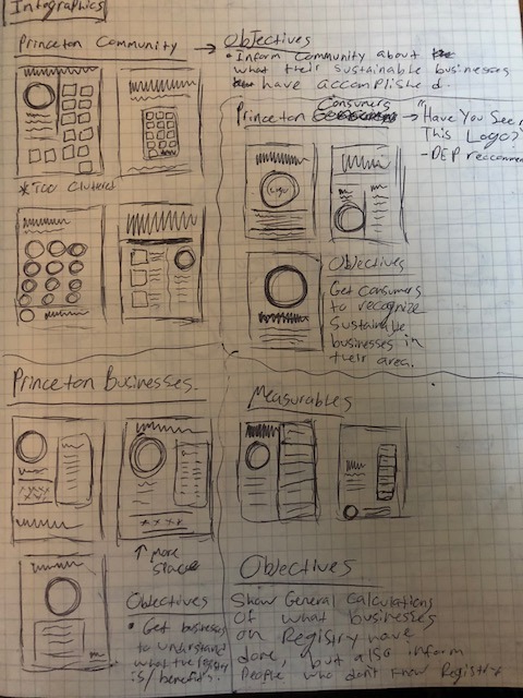
Week 2
This week, once we presented our pre-evaluations and the early recommendations to the NJDEP down in Trenton, I got to work on the planning for the posters. So as I began planning for what the designs would be, I needed to keep in mind what the subject matters had to be. To start off, three of the posters that I had to create had to be targeted directly to Princeton. For those three posters, the target audiences had to be, Consumers, Businesses, and the Community.
Beginning with the consumer poster, the main idea behind it was brought up during the meeting with the company representatives during the week 2 meeting. The idea sparked from when “Have you seen this Logo” was brought up, sparking a thought of something along the lines of a “Have you seen this person” poster. Once that was mentioned, inspiration hit immediately. I pictured a big version of the Registry logo, as well as a short and easy to follow poster for the consumers, because to be honest, if a consumer was really interested in learning more about the Registry, they could look it up online. But the poster gives a general idea of what businesses are on the registry, and can make them feel good about shopping at these local Princeton businesses.
The Business targeted poster, on the other hand, is more involved. This one needs to be more informative to business owners to not only show them the benefits of joining the Registry, but also inform them about what it is, and show them what other businesses are on it.
The community poster is more of a vague idea, so I have been toying with maybe just showing what each business is doing to be deemed sustainable. This is more of a poster that would be brought to events to inform the community about the good that these Princeton businesses are doing for the environment.
Moving onto the three general infographics, at this point I really have just been thinking about what the subject matters could be. I know that I have one idea of just informing what the Registry is to people that may have never heard of it before. One idea that I have, to also correlate with my one learning goal is to take the general poster idea, and turn it into a and make it an animated version. I am thinking of maybe making it like a commercial for the general public, and for the website, as well as the newly pitcher YouTube channel. While I am mainly focusing on the Princeton graphics as of right now, I am beginning to think of what the other General designs can be.
Below are some sketches I created for the Princeton posters that I will be developing:
On top of the progress that I made on the poster concepts this week, we also continued working on the Survey from the prior week, as well as developed the Recommendations for the Registry marketing. What we aimed to do for that were to put together a presentation to present to the DEP about our findings, and what exactly we would do to address the problems that we found. One of the biggest, and best received suggestions that we gave involved creating a tier system for the Registry. The tier system would involve giving special seals to businesses that go above and beyond to promote sustainability in their business. Before we pitched this idea, we realized that some businesses go above and beyond, while others just do the bare minimum to gain access to the Registry’s benefits. So we developed the idea of a Silver, and Gold tier of the Registry. Businesses that do more than just the bare minimum would get Silver, or Gold, depending on the actions that they do.
The initial requirements to join the Registry are 5 Sustainable Actions, 1 Measurable Action, and 1 Cost Savings Action. SO for silver we were thinking of something along the lines of 6-7 Sustainable, 2 Measurable, and 2 Cost Savings, while fold would be near 8 Sustainable, and the other 2 actions would remain the same.
Another idea that we developed was an awards system, so pretty much it would be Most Sustainable Business 2018, or something along those lines. And finally, we decided that a Trailblazer award would encourage new communities to join the Registry. This would go to the first business in a community to join the Registry.
We were thinking of either going with one idea (Tier/Awards), and I created a few mockups based off of their current logo of what COULD be the seals for these ideas. They can be seen below:


On top of the idea of the tier and award system, we felt that the rewards that came with these special acknowledgments should be something that people could use to market their business and the Registry. And after some heavy consideration, we decided that it would also be important to choose items that would embody the ideas behind sustainability. So below while some of the sketches I developed were just promo items, others are things such as reusable straws, bottles, or bags. These were just a few ieas that we had come up with while in this phase. The DEP also liked that idea to encourage businesses to go above and beyond!

Finally, this week we also visited Princeton to do some fieldwork and meet some of the businesses that we would be promoting. I felt that this was a great way for us to get the atmosphere that some of these businesses have tried to create.
Week 3
This week I had begun actually designing some of the posters for the Princeton area. Below is the color scheme that I worked with throughout the course of the internship. On day 1, we were given the colors that they use, and some other general information.
On top of the color scheme, once I started the design process, I had seen that they really liked a font that I had downloaded because it looked drawn but was still easy to read, They felt that it gave it kind of an earthy vibe to it, so for the posters, they wanted me to keep it. The name of the font was No More Lies, and for the videos later on, I used a clean sans-serif typeface called Arial Rounded MT Bold. The way that I would utilize the colors on the posters would be to use the Greens as the main colors, while the yellow or black could be used for emphasis. The following picture depicts the whole color scheme used and the fonts that I decided over the course of the internship.

I had successfully developed the first drafts of the Consumer and Business Owner posters, while also beginning the design process for the community poster. I also began planning for the animated promo video that I plan to have done the following week. I plan to utilize After Effects to create a easy to follow and interesting to look at animation. Some thumbnail Sketches that I have developed can be seen below:


However, looking at my consumer poster, the main objective was to just give a general idea of what the logo stood for, and give consumers the push to go to these local Princeton Sustainable businesses. In total, there are 13 businesses in Princeton that are on this Registry, and at the moment, that is the most any town has that is on the Registry. so I tried to make it as easy to follow as possible. The logo, which is the purpose of the poster, needed to be the focal point to draw the viewer in, while the information is short and to the point so that the reader won’t get too overwhelmed with information. If they are interested in learning more, they can look into the link that is found on the bottom of the flyer.
The second poster, mainly directed to business owners is more informative, however. This poster is made to show the benefits of joining the Registry as well as some general information of what the Registry is about. This is something that the DEP could hand to a business owner at an event, to inform them about the Registry and how they can join. Overall, the DEP really liked the simplicity of the posters and encouraged me to keep that foundation going forward with the other posters.
While planning for the Community, one idea that I had was to focus on the UN Sustainable Development Goals, and how the businesses in Princeton were correlating their sustainable efforts with the goals. Its just an idea, and I will be open-minded to any other ideas that may arise.
Overall, this was the first week of designing was a good cornerstone to what my other designs would be.
This week, we also began thinking of the social media aspect of the marketing materials we had to develop. We came up with hashtags, and post ideas that will help promote the Princeton businesses. We also began to think of what exactly the pictures we would be taking would be, so that we could really try to capture what the businesses were all about. Some of the hashtags that we came up with were, #BeGreenEarnGreen, and #PurchaseWithAPurpose. These, along with many others will help draw in people to shop at these local sustainable businesses.
We also got a very unique opportunity to attend a speaker series event that is sponsored by the NJDEP. It took place at the Campbells Soup headquarters in Camden, and we pretty much listened to sustainability speakers, and business owners. Overall, it was interesting to see how different businesses treat sustainability differently.

Week 4
This week, I mainly focused on completing the Promo video animation in After Effects. While i was waiting on the feedback on the posters that I had presented to the DEP the week prior, I started work on turning the sketches I had developed into a reality. My main focus overall was to use the Registry’s color scheme, as well as just an overall easy to follow design. To start off, I really wanted to make a short, yet simple animation that gave its viewers a sense of what exactly the Registry is, and what it has to offer. It could be for both businesses and regular people who are just interested in the Registry. The video can be seen below:


https://www.youtube.com/watch?v=nqqei75B3K4
I felt that because this video was for a broader audience, that I could maybe break away from the look that I had developed for the Princeton specific posters. The first thing I did to achieve this was to add more color to it. So I added the blue that was in the color scheme that we were given. On top of just adding more color, I also made the font into a clean, and easy to read sans-serif typeface called Arial Rounded MT Bold. Once I did those changes, I felt that I could be more experimental with how I represent the Registry. So I added more detail to the visuals and just tried to focus on making something that could be featured on the social media or the website’s home page.
I feel that the overall video was successful. When I presented it to the NJDEP, they absolutely loved it. Once they saw what I am able to do in After Effects, they asked me to do another one of the required posters as another video. This one however, would be a “How To” video that would educate businesses on how easy it is to register for the program. So as I took a step back to figure out what exactly I would be doing for this one video, I figured the best way to go about creating a how to video would be to… actually look at the form and work through it. I feel that this definitely helped guide me to seeing what exactly needed to be shown to better help business owners to register. I started with sketches, and feel like I created a good jumping off point for the video.
On top of this, I began work on the Sustainable Development Goals poster, but do not have a solid foundation just yet. We more or less just came up with the goals that each business targets so that I can start the design process. The Sustainable Development Goals is a program set up by the UN, which include 17 different goals to help create a more sustainable world. Once i learned about these, I knew that this was a strong jumping off point for my Princeton community infographic. The SDG’s can be seen below:

I feel that this idea could be a good way to show how these businesses are being Sustainable because the SDG’s are becoming much more prominent in our world.
This week, we also continued to work on the social media posts, as well as the Princeton StoryMap element to our deliverables which I will explain in greater detail in a little bit.
So, the Social Media posts that we had been working on involved much more than just words. We also need imagery to capture the personality of these businesses. So as a team, we went back to Princeton and took pictures of the storefronts, products, or actions that make each of these businesses easily recognizable. Once we got some of the pictures taken, we could officially begin with finalizing the Social Media posts, and also work out any errors we may have found. We also needed to return to Princeton to get some more pictures that we were unable to get during our first photography trip.
Finally, the fore-mentioned StoryMap is a one stop shop for tourists, or consumers to discover the sustainable businesses in the Princeton area. Pretty much, this StoryMap, still in beta, will be featured on the Registry Website once all of the kinks are worked out. The way it works is that you would click the business that you would want to view, which would be broken into categories, and as you select each business, you would get a brief description of the business, the address, and a few more things to help identify the business. The screenshots of the in-beta version can be seen below. Sadly, due to government restrictions, we were unable to actually develop the whole StoryMap, but we supplied them with the information, the images, and everything to build the site.
The map was made possible through the usage of GIS (geographic information system) which works kind of similar to how Google Maps works. While I have been exposed to working with it and trying it out through a little mini class we took, I cannot say that I am anywhere near proficient with it. But it was very interesting to learn about. (this screenshot was sent to us later in the internship, but I felt that this could more easily put visuals to what I am explaining)

Week 5
This week I focused on a few things. First, I created a first draft of the How To video, which I ran into a few technical difficulties during. Nothing about my knowledge, but it was just the software starting to glitch and I had to end up ultimately shut everything down multiple times before it fixed itself. However, despite that, I felt that I created a good draft to give to the DEP for feedback. I wanted to create a video in the same style as the promo video, since they liked it so much, so I kept the way the images and texts moved, but made it a little more sophisticated. The screenshots that I used acted as a visual aid to people to see just how easy it is to register their business. The link to this draft can ben seen below:
https://www.youtube.com/watch?v=Ki01dY8Twrw
I was given less than a week turnaround time to get something put together for them, so I did the best that I could with the time that I had.
Also, on top of this video which predominantly took up most of my time this week, I also worked on the SDG poster mentioned in the previous week. I really struggled with this one. It was a lot of information and I just could not visualize it in my head for some reason. While the sketches were there as a visual reference, I still struggled with the overall composition of it. My first draft, seen below was the first attempt that I had for this poster. I showed the DEP this just as an idea that can lead to feedback or an idea change. The UN is very particular with the SDG placement. I had initially looked into the usage of the SDG logos, and the specs were insane, to the point where you need the logo to be in the same spacing for each logo, and the sizing, and a lot of other little specs. When the idea arose, I asked my company reps for their thoughts of incorporating the SDG’s, and originally they were all for it. We figured that if I created my own logos based off what the businesses were, instead of using the SDG logos specifically, that we could use the ideology behind the goals for the infographic to be used to show the community what exactly their sustainable businesses are doing.
But after a long discussion, we all concluded that it might be better to just scrap the SDG idea. We decided that we could possibly go with an idea similar to that, but more general and without the SDG’s even mentioned.

This week, we also began the planning for the video testimonials that we will have to record. We started by coming up with what questions we would be asking the business owners. We are currently waiting on the DEP to assist us in scheduling the business owners, and we should be going to Princeton again next week. We also continued to visit the businesses to get pictures for the Social Media posts.
Week 6
This week I focused on redoing the Princeton Community Poster, while also making edits on the How to Video, as well as changing the music on the Promo Video. This week was also a short week due to the Fourth of July, so following the Tuesday shift that we had, we took the rest of the week off.

Starting with the community poster, I tried to explain what the registry was, while also trying to show the community actions from the businesses. However, The hierarchy was bothering me, a lot. So given that I still had a few weeks to work on that still, I took a step back and began working on the more tight deadlined project of the How To Video.
The edits that I had received involved changes to some of the wording, as well as adding a part explaining the actions that they could do. It was an easy fix, and I took some time to really make sure that the timing was perfect and the visuals seemed to work well together. In the end, I feel that I created a more finished version of the video that I was given a week to create a draft of. The final version of the video can be seen below:
https://www.youtube.com/watch?v=--ZwhcmOM74'
Finally, for this short week, the only notes I had received on the Promo video I had created revolved around the music. They mentioned how it could have been too upbeat, so to maybe change the music a little. I decided to go with a more calming, guitar song to help add to the flowing feeling it has. WIth that change, I feel that it works a lot better as a promo video. It can also be seen below:
https://www.youtube.com/watch?v=tkWQKqHKMdU
Concluding presenting these to the company representatives, the videos got a great reaction, and I feel that with those two big projects out of the way, that I had more time to work on the final 2 posters that I needed to do, and make any edits that may be needed for the other 2 that I had created earlier on (The Princeton Consumer and Business Owner ones).
This week, we began the actual filming of the Video Testimonials. We visited two businesses in Princeton, out of the 5 videos we are supposed to make. The first two businesses were a store called Homestead, and a restaurant called Jammin’ Crepes. The raw footage was collected and we will be waiting to edit until we get the final three businesses recorded next week.
Week 7
One of the other deliverables that I was needed for was the Video testimonial part. The objectives of these testimonials were to introduce some of the businesses on the Registry, 5 to be exact, and just showcase what they do to better promote them. My job in all of this was to create graphics for it.
This week was a week to begin work on the video graphics for the videos. We had a videographer in our group who would initially be doing the video editing and the recording, but I was asked to develop some basic question cards and title slides for the videos. These videos will be featured on the Youtube Channel along with the animated videos that I had created. So Once I created the template for the videos, we quickly collaborated to create these videos, due to setbacks with appointments with the business owners we were recording. So once we got all of the videos together, we were good to send them over for feedback.
Traveling to the businesses to get the testimonials, and doing the editing with the graphics pretty much took up the week. We traveled to Princeton and Trenton every week, but the days in Princeton specifically were long due to the fact that we hit constant schedule changes with the business owners, and just always seemed to run into a problem. Once we got the videos recorded for the videos and everything edited, and the graphics in, we had a good foundation for the Youtube channel.
The links to the videos that we collaborated on can be seen below:
https://www.youtube.com/watch?v=IYGtO8UgDv8
https://www.youtube.com/watch?v=2lZlhRlYdNQ
https://www.youtube.com/watch?v=m-A39h4Nxu8
https://www.youtube.com/watch?v=X4E4m3k7BXI
https://www.youtube.com/watch?time_continue=1&v=kc9SKNmznio
On top of the Video Testimonials, we also began analyzing the survey results that the businesses had been sending in. While it was a small sample size, we learned that a lot of the businesses on the Registry advertise their businesses primarily on Social Media, mostly on Instagram. Also, we learned that a lot of businesses had no idea that the Registry even had social media, and would like for them to post about them more. While there were more questions asked, those responses were two of the biggest takeaways for us.
Week 8
This week we worked on some edits on the videos, one being that the word Registry was not capitalized in the videos. So Once I fixed those easy edits, my teammate began to work on fixing the coloring of the videos, and just some minor changes that she felt that she needed to make. The final videos can be seen below:
https://youtu.be/Vi9N3yaNgMU (Arlees)
https://youtu.be/uQqkzUnjcXg (Jammin’ Crepes)
https://youtu.be/n-RQY4-QFws (Prout Funeral Home)
https://youtu.be/mAOYBzlHcZ8 (Homestead)
https://youtu.be/eCayv78q0p4 (Sustainable Princeton)
Aside from the minor edits, I really focused on finalizing the posters that I had been working on. Overall, I changed the Community Poster to just focus on the actions that the businesses are doing, as opposed to covering more of a broad topic, along with the explanation of the Registry. Once I eliminated all of the extra stuff, the poster seemed to be more clean and not as cluttered. I feel that this final form is a much better representation of the before-mentioned businesses in Princeton. All of the other posters that I had already created were pretty much good to go, and just waiting for any final edits that they may need.

However, despite everything that I had completed, there was one more poster that was needed. The third general audience poster was still needed to be complete for the Registry, So after a long time of contemplating the subject matter of this final poster, we came to the conclusion of having it be about the measurables of the businesses that are currently on the Registry. It is easy enough information to find, and it is just a way to show the public that these businesses are indeed making a difference in the world. Starting with the design of it, I originally had a more graphic feeling to it, which is why I had put the numbers and all the information covering the entire Right side. The first draft of the poster can be seen below: (the text in the bottom box shifted at some point and I missed it originally, and it is fixed in the next version I did).

After some edits that I made on it, I feel that it better fits with the style that the other designs that I had created. I made the information still prominent, but just changed it up a little to feel a little more organized. The edited version can be seen below:

Finally, this week we began to focus on the final report. The report is for the DEP to have record of all of our work this Summer. We also began prepping our final presentation for the DEP, and we then presented our findings to them. Once our powerpoint was completed and presented, the DEP was very impressed with all that we have done. We can now begin preparing for the final presentation that will be in front of the whole internship and special guests from many different companies.
Week 9
This second to last week included me just making a few minor final edits to all of the posters as a whole, some including changing color or whatever, but other than that, my required posters were officially completed. The final versions of my posters can be seen below:


So with time between working on the final presentation and the edits, We also felt that there was one more area that needed to be addressed, even though it was not necessarily one of the deliverables. Going back to the Registry site, the form to create an account really is just a boring looking form. We put website recommendations as one of our recommendations for the NJDEP, so with the free time that I had, I started to create sketches for the Registry page layout, and then decided that I wanted to digitize it.
One of the main objectives with this idea was to work on improving the registration form. The form to register is... just a form. So we felt that if we made it feel more interactive and easy to follow that we could maybe attract more businesses to join!
Below are some sketches I developed for the new possible layout of the website:


I taught myself how to work with Adobe XD to create a possible skeleton of a layout for the Registry website. While I understand that it is just showing them an idea of what it could be, I had the free time before we started the final presentation work, so I felt that I could learn another Adobe software to create one extra thing to send to the NJDEP. A quick walkthrough of the skeletal Registration page can be seen here:
https://youtu.be/Wuyno4hkm2g
This week, we did not do any traveling or really any other outside work. We continued to work on the final presentation that will be this upcoming Wednesday (8/8/18). Compiling all of the findings and work that we have done into one place makes me realize how much we have actually done. It feels so good to see what we have accomplished as a team this Summer.
Week 10
This is the final week of the internship, where we really are just presenting our findings and giving a brief rundown of what we had accomplished this Summer. The overall powerpoint and final report have been assembled and we should be good to present our findings on the last day of the internship this Wednesday!
All in all, this short final week is just about tying up all loose ends surrounding our project. Our final presentation brought everything together, and some screenshots of our findings and recommendations can be seen below:


This whole journey we have taken as a team has been such a great experience, and I have gained much valuable knowledge that will help me wherever I end up in the future.
Conclusion
These past 10 weeks have been some of the most incredible 10 weeks of my life. I have made new friends, new connections, and most of all, gained experience in my field.
Walking into the internship on day 1, I had no idea what we would be doing, let alone where we would be traveling, and what people I would be meeting. I have definitely stepped outside of my comfort zone in how I work. What I mean by that is that I never really thought of sustainability and how much really went into it. On day 1, I knew almost nothing about sustainability, and now here on my final day of the internship, I will take everything I have learned and apply it to my everyday life.
On top of what I have learned about sustainability in general, I also feel that I have seen myself grow as a worker, a designer, and most importantly a person. Working on such a diverse team was destined to have some moments of tension and disagreement. But despite all of the tension and occasional spats that would arise, I maintained my cool and did not let it affect my work ethic. I had a job to do, and I would not let anybody else come between me and me reaching my goal. All in all, working in a diverse setting has taught me how to handle certain situations that may arise while working on a team.
Finally, as a worker, I have seen myself become even more self driven, and have seen myself become more invested in a project than I ever hav before. I would always be thinking of how I could make my ideas stronger in all of my designs. I would even sometime dream about it (yeah, I was that invested). But overall, this has been one of my favorite projects that I have ever worked on, because even though I was developing posters and designs for a statewide program, I am also making a difference by drawing attention to the businesses that are on this Registry, who are helping protect the Earth.
This whole experience has been incredible. I have made new friends, and connections that will stay with me for years to come. I would like to thank all of our contacts at the NJDEP, as well as the Montclair State University PSEG Institute of Sustainability Studies for this great opportunity this Summer. This Summer has been a memorable one, and I really look forward to future opportunities that may become present in my life.
0 notes
Text
KINETIC TYPE SPECIMEN
Research
While I was looking at what kinetic type specimens can be, I was amazed at what they can all entail. There is no set algorithm or method to creating a type specimen, except for that it shows off the font. So if a font’s theme is comic books, the video or type specimen can not just be about comic books. It needs to show off the font, and make people want to use it. Some examples of video type specimens that I really liked can be seen below:
https://www.youtube.com/watch?v=pZEFNfrkv6U (Univers)
https://www.youtube.com/watch?v=wMTneoiP6ik (DIN)
https://www.youtube.com/watch?v=S_63V4UZSgk (Helvetica)
*My research about the concept of type specimens, in general, can be seen in my post about my type specimen*
Another topic that I looked into was Retro Video games, and how their movement was. I felt that if I could bring more of an authentic feel to the characters/game objects, then it would be much more easily recognizable. I looked at the retr games below, in orger to try to make it feel as authentic as possible,
https://www.youtube.com/watch?v=d4EeF_nM0iY (Pacman)
https://www.youtube.com/watch?v=WYSupJ5r2zo
I feel that with everything that I have looked at going into this project, I have enough information to create a successful kinetic type specimen. With everything that I have learned, my eyes have been opened to the endless possibilities for kinetic type specimens. I feel that I am now ready to move onto the next phase of this assignment with full confidence.
3/28
When I first started thinking about my Kinetic Type Specimen, I first had to think back to what I had done for my Type Specimen booklet, given the kinetic version is an animated version of the book. So as I was sketching, I continued to keep in mind the game theme that I was trying to emulate with the book. So looking at my first 15 storyboards, I was thinking of a design that would have a whole bunch of intermingled game references, while also showing off my font. The other one I realized after would be about more showing the font than anything else, and therefore it really would not fit my theme as well. However, the sketches that I made for the first set of storyboards really paved the way for my actual video. If you look at some of the sketches, you can clearly tell where they are in the video. I feel that this might be my best thinking process with sketching because I was really able to picture directions that I wanted to do, right from the start.
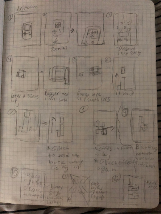
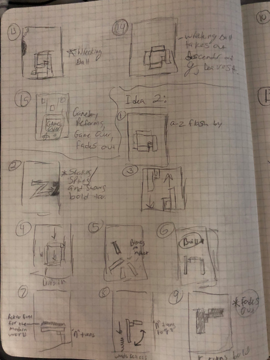
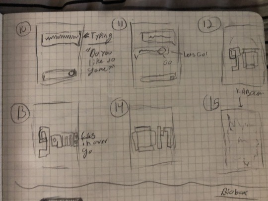
4/4
This week, I was focusing more on getting the assets altogether, and trying to get the overall feeling of the video down. While I played with what exactly I could do for this project, I wanted to really incorporate the game references, while also making it about the font. So, I went into my sketches, and just started digitizing my ideas. By the end of this day, I had created all of the assets that I needed for the time. I did the assets in illustrator and just began playing with timing in after effects. I feel that this was a good start with my project. I was ready to start actually putting the video together for the next class!
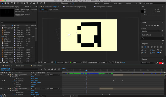
4/11
This week I actually had a put together video ready to show. I feel that this first attempt really captures what I had in my sketches. I feel that this was a good start at what I was trying to accomplish with this project. I kept it simple, with some animations that make the video interesting to look at, and not had the feeling of it being the same scene shot differently. I also, tried to create it so that it didn't feel like too mechanic, or boring. The music I also felt added a nice touch to it, to make it feel more retro. The video of my first attempt can be seen below by clicking the link:
https://youtu.be/-HOk_EScsCo
4/25
The past two weeks, I have worked on improving speed and making the video seem more interesting. I had noticed that there was a part with the letter X and the i’s that really didnt have anything to do with retro video games. So I thought to myself, What can I add? Then it dawned on me. PACMAN! The Pacman I used on the cover of my book helped give me that idea. So I quickly made an animation of the character going up and down the screen, and I feel that it added a whole new level of interestingness to it. I think its just fun to watch, and it also shows off my font. Overall, I feel that this is my best attempt yet. The video of my second attempt can be seen below by clicking the link:
https://youtu.be/zB9fk0uSipk
5/9
Today is the day the project is due. I had gotten feedback about the first part feeling out of place, with the title, because it just did not fit with the theme. So I actually got rid of that idea and put the Game On to start the video. Then, I sped up the Pacman animations, and also just tried to make the whole animation more fluid. Another noticable difference that I made was the inclusion of text throughout the animation. I wanted to tell the viewer about my font, and I feel that the words helped with that. Another minor change that I made from my previous attempt was that the Pacman’s movement was slow, so I sped it up to make it more fluid. Finally, I added the name of my font in the end, in a smaller font, which is also set in my font. I feel that it makes it feel like more of a not about what the font is called. The previous version where the text broke apart just seemed out of place. This way adds a new level of sophistication to it I think.
This project has taught me a lot about what I can do in After Effects without necessarily going crazy with any of the preset effects. The minor edits over the course of this past month has truly made this a portflio piece! I am very proud of where this project ended up, and I look forward to futute projects like this! The video of my final product can be seen below by clicking the link:
https://youtu.be/hiK2cnySBdQ
0 notes
Video
youtube
Project 5 Final
For my Final Video, I wanted to keep a consistency and elegance to my design. I also wanted to Make sure nothing felt imbalanced or just placed. I feel that the video in the end clearly gives a little bit of insight on what has gone on during the history of the Yankees. I decided to split the sections up by 1-3 decades each in order to kind of give a quick taste of what each decade had.
Another choice I made towards the end of the production of this video was the addition of the fog to the opening. I felt that it created a more dynamic intro, and made it more than just a logo and words. The spinning baseballs were also another addition that I made, in order to create more movement on the screen.
I took a lot of inspiration from other documentaries with how I presented the pictures. When it comes down to me looking at the video, and everything that I did to make it as good as it can be, I am very proud of the improvement from when I started compared to where I am now. This project definitely pushed me outside of my normal comfort zone, because I have never taken on a project of this caliber before. I feel that after this, I can now say that I am much more comfortable with using After Effects, and Premiere.
This really was a challenge, whether it be getting the timing down, or getting the graphics to look good on the scene, this took a lot of time, and really taught me the importance of balancing time. I would not have been able to do this last minute. While working gradually on it, I worked out kinks the best I could for the sake of the time we had to do this project, and I feel that it is pretty solid overall.
0 notes
Video
youtube
With my first Comp for Project 5, I really just wanted to create a foundation for how I would present the information that i had gathered. I just so happened to have the footage of Aaron Judge’s 50th Homerun from the 2017 season ready to use for this, so that is what I chose to do for the pre-final stage of this project. As you can see in this short video, there is a blue frame surrounding the video, with a 3D’ish watermark that does not get lost in the craziness of the video. Another thing is how the fact slides in with a slightly transparent box and the white text. I felt that getting that just right was one of the most important parts because it's replacing any dialogue that I might have in the video. Another important thing to notice is how I used the baseball as the bullet points for the tidbits of information. I think that for the final version of this, I may make the balls spin so that it makes it more than just a still image.
Looking at my sketches and comparing them to what I have in the video above, I think that its a good start to achieving what I wanted to do. Another comp that I had was for the way that I would open the video. I had always wanted to open this project with a montage of big hits and plays throughout the years, and this was very close to the finished version of it. I moved one or two around to make the pacing feel a little better between the clips. The video can be seen below:
https://youtu.be/tglPa2YC0tI
With the trial and error things that I did for this project, I feel that I set a good foundation for what I could do going into the final version of the video. I also felt that the music going over the opening montage helped guide me to using music throughout the video to keep the consistency. I think that it worked fairly well, and the video does not feel unbalanced once I stuck to this method. Once I got the timing down, I feel that I coasted along doing the rest of this massive project. There are a few changes that I have made from the original comp, and I feel that they were all for the better.
0 notes
Photo


Project 5 Concept Development
When the project first arose, I really did not know what I would be doing as my medium. I had originally thought of like a coffee table book, that would go over the history of the Yankees, but at this point of the semester, we have already done 2 books, and I wanted to break away from doing books. The whole point of college is to push yourself to try new things and make something that you may have not thought of prior. This semester, I had taken a class that was all about video editing, and After Effects. Even though I was already proficient in After Effects, due to my playing with it over the Summer, I really only used it to create things that lasted 1-2 mins max. I never really took on a large scale project utilizing both Premiere and After Effects. So when the opportunity opened up to maybe make a documentary-style video about the Yankees, I jumped right on board.
When I first started planning for the video, I knew that I wanted graphics to go over the videos to give the facts about each moment I am trying to cover. Given the Yankees expansive, 100+ Year history, It's obvious that I could not fit everything about every season into a 7ish minute video. So I tried to pick out some of the biggest moments from each decade or two to kind of capture what each decade brought to the franchise. As shown in my research post, I selected 4-5 moments/key players fro each decade, and I then went into what each moment was in the history of the team.
Looking at my sketches, I wanted a more simple approach to the facts, so that the screen did not become too busy, which is why I only really utilized the bottom corner with at the time was going to be completely opaque. I also wanted to make all the videos have a consistency to them, and being that they are all from different time periods, they all have a different look to them. So I decided to create a steady frame with a watermark to make it not seem like a jumbled mess of videos. However, as I was thinking about what I could do for the video, I thought about how if it was all video, then it would be much longer. So I decided that I would also add pictures and add motion to them to make it feel more like a documentary. Originally I had the idea of using a film reel for the transitions, but it turned out to not fit as well with the theme that I was going for, which is why I dropped that idea.
As I gathered the pictures and Got the color pallet that I needed, I needed to make one more big decision about the typeface that I would use to capture the “clean cut” look that the Yankees are all about. I played around with a few different fonts, and I ended up choosing Proxima Nova because it was easy to read, and also had a simple, yet elegant look to it. Once I had figured out how I was going to lay my video out, and how the information would be displayed, I was set to move onto the comp phase of my project. Please note that the text in the digitized version would be in white, and be floating in a box on the screen.

Overall, I feel like I had a solid idea of what I could do with this project, once I finished the concept development, There were a lot of different elements to keep in mind, but also, make sure that it captures the elegance, and “cleanness” that the Yankees organization brings to the table.
0 notes
Text
Project 5
Research
While I started my research, I first wanted to start with how documentaries present information. I first started by looking at a Yankee documentary which can be seen by clicking the link below. I felt that this was a good starting point to see how the Yankees present themselves in video format.

https://www.youtube.com/watch?v=RfkLRvzj6no
The Overall consensus that I got from this video was that it utilizes clips and nothing really seems out of place. It is a whole new way of thinking with video. With a piece of printed design, you can look at it as long as you want, and not feel unbalanced. I felt that the pacing in this video really helped make it as enjoyable as possible. Another thing that I noticed was that the graphics did not just feel placed there. They were integrated into the video and really worked well with the footage shown. Also, because the video was actually created by the Yankees, you can see the clear sense of elegance that the presentation brings to the table, in how they show the footage, and how long they spend on one specific topic.
The next area that I wanted to research was how the Yankees present themselves. They are all about the “Clean Cut” and sophisticated look. So I wanted to kind of mimic their simplistic, yet elegant style. As shown below in the Yankees Magazine cover, The type is simple yet legible but is still very appealing to the eye. I feel that the typefaces they chose really helps differentiate the parts of the cover, and also creates a clear hierarchy to it. Also, another thing that I looked into outside of just a doumentary and Yankees promotional items was with how videos in general utilize type. So, what makes a video different from a book is that the viewer will not have as much time to read something as they would, let’s say, a book. So timing is everything, and the type should remain on screen long enough for people to read it, while also not staying on too long so that people lose interest. Pacing is everything, and if you have a consistent pace throughout a video, then it will be a much better experience for the viewer.

Looking at ways that one can present a lot of history into one thing, is how authors will create souvenir books, or brief history books about a topic. In a book that I purchased called “Miracle Moments in Yankee History”, that is a great example of how one can go about taking on over 100 years of history. It was broken yo by time periods, and really made it clear about what happened when. The overall book really was put in everyday language which is another important aspect of a documentary, book, or anything else that people may look to in order to learn something new. Not everyone speaks baseball in this case, so I had to look to see how people put baseball terms into everyday language that people would not be confused by. I feel that simplicity is one of the keys to success with a video because you don't want people getting confused by one topic, and losing interest in the video overall. Clarity is important in all circumstances.
The idea of graphics going over a video can be seen in a lot of places, some being TV, Online, or scoreboards at a game, graphics have become a huge aspect of making videos even more enjoyable. Looking below is a good example of how graphics are used on television. As you can see, the graphic used to show pitching stats below is clear, and goes over the live video. Sure, there are also commentators talking about the jumping off points written in this graphic, but overall, it is clear. Also, these types of graphics are shown at ballparks on the jumbotrons, which in the case of baseball will show stats from the game, or have fun in between innings games utilizing computer generated graphics. The picture also shown below shows Metlife Stadium, which in this case, shows how graphics can be used alone, and not necessarily be over a video. The common theme? The two graphics shown here are easy to follow, and have clear purpose.


All in all, concluding the research of how graphics and video can eb used together, and how video timing should be, I feel that this is a good jumping off point to start thinking about my video. This has given me insight on what exactly goes into television productions, and using graphics to help convey information.
The Following Information is from the book, “Miracle Moments in Yankee History”, as well as MLB.com and other sources.
1900-1919
First Win: April 23, 1903 Against Washington Senators (7-2)
The logo was based off of the design created by Louis C. Tiffany, which was created for a metal to honor a NYC policeman that was shot in the line of duty.

1920-1930’s
January 3rd, 1920, The Boston Red Sox sold Babe Ruth to the Yankees.
The crowds came pouring in to see Babe Ruth play, But the Landlord, the NY Giants, were not happy with having all of the crowds go to the Yankees. This is when the first Yankee Stadium was built.
“The House that Ruth Built”
60,000 seats
Murders Row (1927): Lou Gehrig, Babe Ruth, Earle Combs and Tony Lazzeri
1927 Record: 110-44 (Second best of the Yankees History)
Lou Gehrig: July 4th, 1939, Speech about disease

1940-1950’s
Joe DiMaggio’s 56 Game Hit Streak (Record)
1941 World series title
Mickey Mantle’s Homeruns
1948-1953 World Series Champs, Five-Peat!
Don Larson’s Perfect Game (1956 World Series)

1960-1980’s
Fueled by Mickey Mantle and Roger Maris
Roger Maris Beat Babe Ruth’s Homerun record (61 Homeruns)
George M. Steinbrenner Bought the team for $8.7 Million
Mr. October
Baseball’s Highest paid player in the MLB ($3 Million)
3 Homeruns in game 6 of the 1977 World Series
Captain Thurman Munson
Died on August 2, 1979
1990-Today
1996, 1998, 1999, 2000, 2009 Champs
Jeter 3000 Hits (Homerun)
Jeter Stats
Mariano Stats
Final moments of each of their careers (Mariano End video, Jeter Walkoff)
“Rebuild Year”
1 Game from World Series
91-71

As big of a Yankee Fan that I am, I always like learning things that I may not have known originally. I really enjoyed looking back at the start of the franchise and seeing that they were not always what we know them for being today. Its crazy to think that they were not always the Bronx Bombers. But in the end, we all know what happened. 27 World championships, as well as some of the biggest players in the game of baseball.
0 notes
Text
50/50 Collage
Research
Collages can come in many different forms and can have numerous different meanings. Sure, it is easy to put a jumble of words or pictures, and call it art, but creating a collage can also be about using images to create something with meaning. While I started with looking into what collages can entail, I really was overwhelmed with the many directions that I could have taken with the idea of creating a collage. As I looked at different collages, I really liked how some were more out there and over the top, while others were more of telling a story. For the purpose of this project, we had to create a collage with a hierarchy and also incorporate a balance of type and image, so I definitely looked more into the ones that I found that told stories, or had a good balance to them. The ones that are shown below were some of the ones that I really looked to for inspiration as I started my thinking of what I could do for this assignment. The Instagramer that did these is one b the name of albanesurrealcollagist. These all have a certain balance to them, and especially in the first one below, the skull is subtle enough that the more you look at the person, and the things surrounding it, the more you notice. All of the ones below have a good sense of composition and color, which I definitely wanted to mimic during my creative process.


Also, as I looked at other forms of collage, I came across some other deisgns that stuck with me, which can be seen below. The usage of type and image of the first one below has a good balance, and each piece seems as if it is part of the same design. The one below is a good example of using type to create an image. Optically, your eye fills the area of the bug that is made up of the words. It is important to look at different types of collages, in order to really get a sense of what a collage can entail.


All in all, what I have concluded from my research is that collages do not have a particular formula or clear direction to take. There are many ways to approach one whether it be through subtleties in the placement of things or hierarchy. I feel that what I have seen has been a good starting point to start designing my collage.
4/4/18
Today, we had our first attempt at creating some compositions for this assignment. Originally, this project was supposed to be a one day project, so I tried to put together a collage of things that I would use to describe what I like, which is comics. If you know me, you know that I am the comic collector who also stands in line for hours for the opening night of the superhero movies that come out. So, after I had scanned in some comic related items, I created more of a poster, which turned out to not have enough meaning. However, at the time, my plan was to just create a montage of comic memorabilia, such as my 1929 Superman vinyl record, a Batman Comic, my Batman Belt, and a newspaper comic page. I just really wanted to show that comics were such a huge part of my life. Once I received feedback on what direction I should take with my collage, I knew exactly what I should do for the most part. The advice I was given was to take a more psychological approach to Batman, as opposed to just making my collage about “comics”. Also, I was told to get a more intimidating version of Batman to use to really get the feeling of Batman across. So I took a step back, and really put thought into what exactly the feeling of Batman is.

4/11/18
After going back to the drawing board, I really tried to take a more psychological approach to the topic. As I played with the Possibilities, I still did not really accomplish what I wanted to accomplish. So, that is why there are no pictures associated with today. I really struggled to create a composition that I can use for a successful collage. I am close to possibly having something, but I will definitely still need some more time after class. However, I have the pieces cut out, and I really think that I am going in the right direction. I have decided to break away from the idea of just using Batman, and also include The Joker, becasue I feel that opens much more possibilities than just differentiating between Batman and Bruce Wayne. The pieces that I chose to cut out were all from newspapers, and scans of one of my darker Batman Graphic Novels. Also, the belt from the first attempt was in the scans.

4/18/18
After struggling in class last week with my collage, I went back to my dorm, and forced myself to really think through my issues and fix what I can fix. I was unable to get a lot of feedback on my new approach, but I feel that it is a much, much stronger composition. Starting with the concept, I really wanted to capture the Oppositions of the Joker and Batman. I tried to do this through the use of color and word choice. I feel that in that aspect, it works fairly well! However, looking at it, It felt a little less, “collage” like. I wanted to use the color to symbolize good and evil, and also I wanted to incorporate the Joker Smile that he is so iconic for. Another issue that I faced was that the type just seemed “placed” there. Also, the purpose of the collage was to have it be 50% type and 50% image, and this was definitely more image than type So I had to change that too.
However, while the message comes across fairly easily, of what I am trying to achieve, I felt that I could do better. So Shortly after the completion of this, I rearranged the stuff, and made a design that had more of a collage feel, and also make sure that there is a balance to the usage of text and image.

4/25/18
Today is the due date for the Collage. I tried to fix the errors mentioned in the previous part of this post, and I also tried to have even more of a meaning in the collage. To begin with, one of the more noticeable differences is in the type. I tried to make the words more than just “boxed words” .So after some experimenting, I feel that I have a much better composition overall. However, there is more of a meaning than my previous attempt, in the sense that I am kind of comparing Batman and the Joker to Yin and Yang. This idea I feel makes the design much stronger, and also shows the duality between the two classic rivals. The way that I accomplished this was by giving Batman part of a joker smile, and having the joker have the Batman symbol in his eye. The way that this accomplishes my goal is that it shows that each of them has a part of the other in them. It was important to me that I also made the words more interesting to look at, which is why I also broke up the wording at the top, and also made Justice and Death overlap with one another to make an even stronger connection between the two. Another elimination that I made to the original design was the Faded batman logo and joker smile in the background, because it seemed to take away from the word elements of the collage. However, as I moved them to their new locations, it made a stronger composition overall.
My word choices for this collage are words that I chose to mimic the person that I was describing. I wanted Justice and Death to be the 2 biggest words because I felt that they described the characters’ motives/actions the best. I chose to be more playful with Shadow and Chaos, because it is 2 terms that dig a little deeper into what each of them represent. Finally, the little moments that I added include Orphan and Clown, in the bottom corners of each character. Those are the literal terms of what each character is, and I felt that the little moments helped give personality to these characters, aside from their actions.
I feel that after the many changes that I made throughout the course of this project, I have created a collage that clearly gets the point across, and is not a cluttered mess of images and text. Also, establishing a hierarchy became easier as it went along because I began to see what looked better than other ideas. I feel that in the end, my design has become stronger, both compositionally and thoughtfully, and I now have a piece that I can use as a jumping off point for future collages.
Going into this project, I did not really know what to do with a collage. But in the end, after the research I conducted, and after seeing what exactly I could do for a collage to make it not a total mess of images and text, I feel that I can definitely go into future collages and be more confident and knowing about what I can accomplish through collage.

0 notes
Photo


For my Final Animated Poster, there were two different parts that I had to focus on. The Animated part, and the Silkscreen part. The silkscreen separations worked by blocking out the areas which would have color, and breaking the colors into their own layers, which would mimic the method of silkscreen. The colors go from light to dark and I only used 4 colors total. I feel that this part of the project worked very well because you can see how the figures gradually build from the nothingness that is the first image above. The colors had to be Pantone Coated, and as you can also see above, I tried to keep it monochromatic. Also, another issue that I had encountered earlier on was the idea of the diversity in my poster. I tried to create a gender-neutral figure in the center, and I feel that I accomplished that pretty well. The only other thing that I could have done better to achieve that would have been to make the head a little shorter, so that it could be seen as more of a non-gendered person. Also, I tried to incorporate different people in the background, to create as much diversity as possible. I feel that overall, compared to my first attempts shown in the comps section of this project, this is a huge improvement.
The animation was a whole different story with the struggles I faced. I had originally played with another idea where the figures in the background would become the center point at one point or another. However, I felt that it was not strong enough to move forward with that idea. So as I did the style that is shown above, I completely scrapped the original idea and decided to only move the background. I feel that this version is much better than the original idea I had. It is important to note that if you follow one of the characters, they will always go to the box next to them, and end up where they began. I really tried to create a poster that would be interesting to look at, but still, give the message it is trying to bring across as clearly as possible.
This project definitely allowed me to step outside of my comfort zone, and create a design in a style that I would normally not have attempted. The idea of minimal details is normally not my style, but I kind of like how it turned out.If I were to redo this, I would make the changes on the head as mentioned above, and also maybe make the animation a little different. Overall I feel like I have learned a lot about silkscreen, and animation. I also learned how a more simple design, can still convey a message, almost as clearly as a complex design.
0 notes
Photo


Project IV Comps
For the comps I produced for this project, I started with 2 different directions with 2 different quotes/sayings. I started with “CARPE DIEM”, and then did another one saying “Be a Dreamer”. One was supposed to be more funny, while the other one had more of a sentimental message. When I first started taking the sketches and making them digital, I found that the chick one was good and funny, but the Be a Dreamer one could be another route to take. So I took an extra few steps, and created a whole second idea.
The first idea was more of an illustration that follows my normal style of art. I wanted to go for more of the comedic approach to the project, and I also had to make sure that the Silkscreen aspect of the poster stayed consistent throughout. So as I did my first attempt at a silkscreen poster, I needed to remember a few things. 1) No Gradients, 2) Color, and 3) Separations. I struggled at first to create a design that was flat, yet interesting to look at. After many trial and error attempts, I got a design that could easily be used for a final product. However, with the completion of the first poster, that is when I decided that I would do the second design to have a variety to know which would be best to move forward with. My first attempt at the bird was too much about shapes, so I then redrew it in a way that did not feel like it was done in Illustrator.
My first attempt at the second one, looking back at it now, was really not good. I used the same character models for each character, and therefore, it was not diverse enough. So I went back for my second attempt, and tried to add both men and women to the background. But the center figure was clearly a man, and after a lot of discussion, we had decided that a more gender-neutral approach was the way to go. Another thing that I was not entirely sold on was the typeface I had chosen. I wanted more of a fun font than the first one, I I really took time to make it feel like it was more than type, but part of the design overall. The second design that I had made for the BE A DREAMER poster was more gender inclusive, but still not diverse enough. Also, the center person just looked like a man. So I had to create a more gender-neutral center point moving forward.
The comps I made really helped push me to make my poster the best it could be. I really tried to capture the idea of diversity and everything through my attempts, and i feel that going into my last attempt, I really got it down. The 2 comps I made really help guide me down the right path for this project, because I learned which one would be better to use for this assignment. Going into the final, I worked out many of the problems my comps had, and I feel much better about where my poster ended up.
0 notes
Text
Project IV Concept Development
For my concept development for this project, I really wanted a wide-array of ideas, and not be stuck on one idea for a quote or graphic. Looking at my sketches, I really wanted to play with different quote possibilities, and then I also wanted to really play with what I could do with a simple drawing. I wanted to also break away from my normal style, so that I can expand on what I can do. I was taking a simpler approach with my illustrations, while also making the overall design still feel good. It is important to not only come up with different ideas, but be able to justify each one I make.
So, starting with the first quote I decided to base my sketches off of, I chose, “Don’t let yesterday take up much of today”. I had an idea of making a sun rising, to kind of signify a new day. However, the quote was way too wordy, so I scrapped that idea and eventually moved on from all of my other quotes that are written because they were all about the same length with the wording. However, that did not stop me from developing a few new sketches for those which involved a failing grade on a test turn to an A, and a person climbing a mountain.
It was towards the back where I really started to think simpler with the quotes, and made more detailed sketches which involved more fun approaches to this project. The CARPE DIEM chick and the BE A DREAMER posters were the two that I felt had the most potential to move forward with. Once I had finished sketching, I had originally become attached to the idea of the chick hatching out of the egg, and grabbing the Diem, in CARPE DIEM. So when I started storyboarding, I felt that the CARPE DIEM one would be the only one that I would be moving forward with. I was originally going to have the chick hatching from the egg, then have it throw on sunglasses and a hat, and then grab the diem, thus, Seizing the Day.
I had played with a few ideas, but in the end, I chose to move forward with two of my sketches. I felt that it was important, kind of similar to how I had played with many ideas in my sketches, I wanted to present a couple of them so that I had a solid idea of what I would do for the final version.
Because of my second animation being not as involved, I felt that I could sum up the idea with a few frames, because the front stays stationary, while the background characters just move in an order where they end where they began. But the details of the background and wording would also fade in. I feel that this idea was much simpler, and would also get the message across much easier. I felt as if I would be drawing the same frames over and over.


I had played with a few ideas, but in the end, I chose to move forward with two of my sketches. I felt that it was important, kind of similar to how I had played with many ideas in my sketches, I wanted to present a couple of them so that I had a solid idea of what I would do for the final version.
0 notes
Text
While starting my research for the animated poster project, I wanted to focus on a few different aspects that this project would touch upon. I first started with what we started with when the project first started. The concept of Silkscreen posters, and animated posters. There are many elements that go into this form of design, and it is important to understand every aspect of what is going on before going into the design phase of this project.


To start off, the concept of a silkscreen poster is more complicated than it sounds. People think of printing as you hit “Hit Command P, and the magic happens”. While this is true to an extent, there is much more that goes into printing, let alone, screen printing. Screen Printing, which is the method used in the posters shown below, involves putting layers of ink over others, and utilizing blocked out areas to print the image. Each layer is separated by color, so it is important to keep in mind that the areas with color will be their own part of the poster or shirt. A video of the process can be seen here: https://www.youtube.com/watch?v=IN9XFXfNSgQ. The separations for screen printing can also be created using Illustrator, by utilizing the pathfinder tool, and creating the block outs that would also hold the place of the colors that would go there. Pretty much, screen printing has evolved a lot over the past century.
Screen printing was first invented in ancient china between the years 960-1279 AD. Throughout history it has evolved through the use of different printing methods, and really became what we know it for today in the 1980’s. Silkscreen T-Shirts and posters were amongst the most popular things of that time, continuing to this day. The method now is that there are different types of inks, and ink overlays that gradually build up the image. With famous artists such as Andy Warhol utilizing silkscreen, no wonder it became so big. Some of the more famous silkscreens by Warhol would definitely be his Marylin Monroe prints that he created. People like the style of silkscreen because of the colors, and overall style that is used. The posters shown below are some good examples of how silkscreen has been used in bands, festivals, and clothing.
The next area of research that I chose to look into was the idea of animated posters. With the world of Graphic Design constantly evolving, animation is becoming bigger than ever. The whole idea of animated posters is spreading rapidly. Whether it is an ad for a video game or TV show, or an informational poster, animations are making their presence known. While walking on the streets of NYC about a month ago, I stumbled across new digital street posters near Irving Plaza. I then really began to see how the animation world is combining with the graphic design field. The pictures of some of the screens can be seen below. Another great example of this also involves the city. In Times Square, there is a strong presence of animation on all of the ads that are shown to the many many people that cross through that area on a daily basis. While many may know what Times Square advertising looks like, it is important to see how many different ways that one can use animation in a design. Here are some of the sights of Times Square, and the massive screens that are used to promote shows, and other great entertainment activities: https://www.youtube.com/watch?v=sjnhnCsoUso. On another note, one other use of animations for Graphic Design would be at the baseball stadiums, or any other stadium that utilizes a jumbotron, because the screens are constantly being updated with new scores, stats, and everything in between, and the animations make it interesting to look at, even for people who may not necessarily care about the stats.


Subway posters are meant to serve many purposes, whether it be to convey a PSA, or an advertisement, they should be short, and sweet, because people that are either trying to catch a train, or in a rush off the train, will not want to stop and read a lengthy poster. It is also important to make the poster, whether it be animated or not, you want the poster to stand out from the thousands of others that are around it. With the poster shown below, it is important to note that the Fear the Walking Dead one seems more important than the others because it is not only brighter than the surrounding posters, but because it is bigger or grander.

There are so many different ways one could have approached this project technically, but the next important part was the idea of making someone feel better about their day, through a poster. Some posters that have been done to make people smile sometimes involve animals, or an overall funny picture with a saying to make someone feel happy, or put a smile on their face. Another way to look at this is how companies will use emotion to get people to become interested, and feel vested in the product or service they are trying to sell. Some great examples of this are with Coke, or Bud Lite because of how they show people having fun, and being with the ones they love, and it can stop and make people feel like, “Hey, I want a beer”. one great example of this is the commercial released by Bud Lite, where it follows the story of 2 best friends, and they just are going through life with a beer in their hand. It can be seen here: https://www.ispot.tv/ad/Ahv4/bud-light-between-friends. I feel this same tactic can be used in a poster to make people think, and want to feel something that they might not have felt prior. The cat poster below is a great example of this tactic in use, because i mean, how could you look at the poster and not smile?

The idea of one poster/commercial/or anything else that people can come across in their everyday lives creating a lasting impression on the customer is a sign that the design was successful. It is important that your poster stands out, while also doing the job that it is intended to do. Based off of the research I have conducted, I feel that I have a good jump on the possibilities of what a poster, or animated poster can do.
0 notes
Photo


For my final Text and image book I really just made tweaks that improved my comp designs. I Played with margins, and I feel that my overall design was pretty solid. I am very happy to see how far my design has come, and I think that I learned a lot about how books can be put together. Another change I made was to put boxes behind the page numbers, to make them more visible on each page. I feel that the little changes that I made leading up to the final helped make my design as solid as possible.
While putting the book together, I had some issues with the cutting, because of pages shifting and everything like that. However, after a few attempts, I finally got a successful cut! This project has definitely taught me to look at the little details in whatever I am doing, and it has also helped me gain more experience in InDesign!
0 notes
Photo


Project 3 Comps
For my comps of Project 3, I really wanted to focus on creating spreads from the main book pages. So as I was looking at the sketches I had created, as well as the research that I had conducted, I felt that I was able to create a couple of different, yet interesting layouts for my first attempt. Looking at my first comp, with the orange boxes, I wanted to focus more on the photography aspect of the book. The text would be laid over the images, which would be faded into the background. I wanted to use the images as more of a texture to the background, so that the pages were not just text, but would not be overpowered by the image either. However, I then learned that the method I chose for this one would take up WAY too many pages. So That idea would have had to be altered to be more page efficient either way. Also, I liked having the common pale red color be the only color that I really utilized in my design. I really liked how everything was black and white, except for the one splash of color. I also liked the way that I did the introduction page. I chose to do more of a stamp-like approach to the portrait of the person. I thought it could be a cool way to do more than just show a portrait, and to also add the color that I wanted to have throughout the book.
My second design was more of a stylized approach overall. I had an idea of black low-opacity boxes over colored images, with white text on it. The images were more stylized because I wanted to give the image tracing effect to make it look more graphic. This idea was the main inspiration for me, moving forward onto the final version of this project. The idea also included an introduction page with a portrait of the person kind of faded into the background. I think this design had the most promise to it mainly because it had more of a magazine feel. That was one thing that I had to get through my head while actually putting the spreads together onto InDesign. Full bleeds, and panels that you would want to look at. So as I took what I learned from these two comps and applied it to my final design, I really wanted to utilize traits of both of my comps, and make the book as visually appealing as possible.
As I moved onto the final design for my book, I needed to make sure that I figured out what worked and what did not. I also needed to make sure that there were no typographic errors as I added the text into the text boxes and panels that I created. I also really wanted to keep the idea of black and white, with splashes of color. I feel that my first attempt at this project was a good start, but was far from finished. Once I got going however, I had set the foundation for a successful design moving forward. As I continued to make changes over the course of this past month, I found myself playing with the headings, as well as the text in order to make it as clean looking as possible. Widows and orphans were one of the biggest challenges to fix because of how the text boxes I placed varied in width and height. So it took a lot of time to get it to a point where it was presentable. Also, there was an issue with how I did the table of contents. The TOC was not as easily followable as it could be. I originally had the information alternating colors, (white for name of speaker, then red for title, and then finally white again for the page number, which was in parenthesis. I then realized that it would be better if the page number stood out more, so I then got rid of the parenthesis and made the font size bigger. Once I did that, I had a few other minor tweaks to make. However, these tweaks involved thinks such as making sure all of the text boxes were the same distance from the top and bottom, and making sure the bottom margin stayed consistent throughout the course of the book.


Looking back at my original comps and comparing them to how my near final comps came out, I really can see how I took concepts from both to create a different, yet better design. Consistency was key while making my book, so as I moved on with the edits and everything, I Really had to make sure that the little details were polished perfectly. If something was slightly off, I fixed it right away. After the many, many tweaks that this book went through, I think that the overall layout leading up to the finished design is pretty strong!
0 notes