
Don't wanna be here? Send us removal request.
Statistics
We looked inside some of the posts by v-xnya-blog and here's what we found interesting.
Average Info
Notes Per Post
4
Likes Per Post
3
Reblog Per Post
1
Reply Per Post
0
Time Between Posts
2 days
Number of Posts By Type
Photo
12
Text
5
Last Seen Tumblr Blogs


Fun Fact
Tumblr Inc. has $15.1M in annual revenue.
Photo


For Visual Communication this week I used a series of books called Still Loving You, because I was attracted to the packaging of it at first and how all covers are different but still very cohesive. The content also has a variety of inspirations on how different types can be used in Graphic Design.
0 notes


Photo


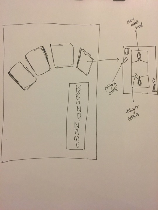


For my image manipulation, we were asked to do a surrealistic advertisement, and I chose to do a fashion advertisent. I got the idea looking at designs that reminded me of something very card-like and wonderland-y. When that concept came to mind the first thing I though of were the Queens and Kings on the playing cards and since then the idea developed. I started out by sketching the composition ideas and after choosing 2, I moved on to the moodboard, to get a general feel and color scheme of the final product I had in mind. I then started out by photoshopping the main object of the card aka the model. Then I added other graphic elements like the checker patterns and the heart in the background. I also replaced the heart on the card to the logo of Vivienne Westwood (who designed the dress on the model) to add subtle branding. Then I proceeded to add the ripped edges to give it some edge and also to allot some space for the text. For the text I also decided to use more medieval fonts to make it look more luxurious and like royalty. After adding the text, I then placed a marble like texture on the background since usually cards are played on tables, and to make it seem more regal I used a marble texture.
0 notes
Photo


For this week the book I’ve chosen are different than the usual books. I chose the psychology book because I wanted to focus on my book assignment and how I can get people to show more interest. Finding out how the brain gets someone to get into a certain topic will help me design my book to have more impact. The second book of SIGN; A to Z is a book on how certain things can be used as symbols and how they can be interpreted differently by different people. Lastly the third book on booklets and brochures show me different variations and inspirations I can use on the packaging/advertising/packaging of my book.
0 notes
Photo


For the character design, my character is based on a mixture of a bat and a cat. I chose a bat because I like the aesthetic of a bat and it’s sense of mystery and darkness, also because I’m kind of nocturnal. I mixed in a bit of a feline sense into it so that there is a sense of femininity and playfulness. For the colour scheme, I didn’t use a wide range of colours as I prefer simplicity over complex, and hence the minimal use of colours.
0 notes
Photo


What is Surrealism
André Breton defined Surrealism as "psychic automatism in its pure state, by which one proposes to express - verbally, by means of the written word, or in any other manner - the actual functioning of thought." What Breton is proposing is that artists bypass reason and rationality by accessing their unconscious mind. In practice, these techniques became known as automatism or automatic writing, which allowed artists to forgo conscious thought and embrace chance when creating art. The work of Sigmund Freud was profoundly influential for Surrealists, particularly his book, The Interpretation of Dreams (1899). Freud legitimized the importance of dreams and the unconscious as valid revelations of human emotion and desires; his exposure of the complex and repressed inner worlds of sexuality, desire, and violence provided a theoretical basis for much of Surrealism. Surrealist imagery is probably the most recognizable element of the movement, yet it is also the most elusive to categorize and define. Each artist relied on their own recurring motifs arisen through their dreams or/and unconscious mind. At its basic, the imagery is outlandish, perplexing, and even uncanny, as it is meant to jolt the viewer out of their comforting assumptions. Nature, however, is the most frequent imagery: Max Ernst was obsessed with birds and had a bird alter ego, Salvador Dalí's works often include ants or eggs, and Joan Miró relied strongly on vague biomorphic imagery. Surrealism grew out of the Dada movement, which was also in rebellion against middle-class complacency. Artistic influences, however, came from many different sources. The most immediate influence for several of the Surrealists was Giorgio de Chirico, their contemporary who, like them, used bizarre imagery with unsettling juxtapositions. They were also drawn to artists from the recent past who were interested in primitivism, the naive, or fantastical imagery, such as Gustave Moreau, Arnold Bocklin, Odilon Redon, and Henri Rousseau. Even artists from as far back as the Renaissance, such as Giuseppe Arcimboldo and Hieronymous Bosch, provided inspiration in so far as these artists were not overly concerned with aesthetic issues involving line and color, but instead felt compelled to create what Surrealists thought of as the “real."
The Surrealist movement began as a literary group strongly allied to Dada, emerging in the wake of the collapse of Dada in Paris, when André Breton's eagerness to bring purpose to Dada clashed with Tristan Tzara's anti-authoritarianism. Breton, who is occasionally described as the 'Pope' of Surrealism, officially founded the movement in 1924 when he wrote "The Surrealist Manifesto." However, the term "surrealism," was first coined in 1917 by Guillaume Apollinaire when he used it in program notes for the ballet Parade, written by Pablo Picasso, Leonide Massine, Jean Cocteau, and Erik Satie. Surrealism shared much of the anti-rationalism of Dada, the movement out of which it grew. The original Parisian Surrealists used art as a reprieve from violent political situations and to address the unease they felt about the world's uncertainties. By employing fantasy and dream imagery, artists generated creative works in a variety of media that exposed their inner minds in eccentric, symbolic ways, uncovering anxieties and treating them analytically through visual means.
SOURCE: http://www.theartstory.org/movement-surrealism.htm
What is Advertising?
Advertising is a means of communication with the users of a product or service. Advertisements are messages paid for by those who send them and are intended to inform or influence people who receive them, as defined by the Advertising Association of the UK. Advertising is always present, though people may not be aware of it. In today's world, advertising uses every possible media to get its message through. It does this via television, print (newspapers, magazines, journals etc), radio, press, internet, direct selling, hoardings, mailers, contests, sponsorships, posters, clothes, events, colours, sounds, visuals and even people (endorsements). The advertising industry is made of companies that advertise, agencies that create the advertisements, media that carries the ads, and a host of people like copy editors, visualizers, brand managers, researchers, creative heads and designers who take it the last mile to the customer or receiver. A company that needs to advertise itself and/or its products hires an advertising agency. The company briefs the agency on the brand, its imagery, the ideals and values behind it, the target segments and so on. The agencies convert the ideas and concepts to create the visuals, text, layouts and themes to communicate with the user. After approval from the client, the ads go on air, as per the bookings done by the agency's media buying unit.
SOURCE: http://economictimes.indiatimes.com/definition/advertising
1 note
·
View note
Photo


Step Seven: ExportWhen you feel confident that your video is where you would like it to be, export your video. Depending on what you would like to use your cinemagraph for, the options for exporting vary. MP4 and Webm are some of the more common web related video exports. Photoshop has no problem exporting an MP4. If you are looking for a WebM version, you will need to consult another resource such as Zamzar.com. Another way to export cinemagraphs is as a .gif file. If you are exporting your video as a .gif you will need to consider the amount of frames (500) you are using and the overall color count (250), as both of these have hard limits. Once you export, your Cinemagraph is complete. Congratulations! Ready to add a touch of magic to your site? Start by finding the perfect visuals in our royalty-free video library.When you have re-ordered your clips, apply the cross-fade transition (found by selecting the Black and White box next to the scissors icon in the timeline window) to the clips and expand as much as your video requires. This will blend the jump cut between clips, making the video loop smoothly. We’ve doubled this process to add some length to our clip.
“Cinemagraph is an image that contains within itself a living moment that allows a glimpse of time to be experienced and preserved endlessly." - x
Step One: Finding Content
The first step to create a cinemagraph is finding the right content to transform into a moving image. While adding motion to a static photo is an option, for simplicity’s sake we are going to focus on working with something already in motion—an awesome clip from our stock video library. The video we will be working with can be found below.
When crafting a cinemagraph, it is important to use video content that is stationary; the camera shouldn’t move. Any movement comes from the actor or background scenery. Now that we’ve selected our video it’s time to begin crafting.
Step Two: Choosing the Moving Pieces
The key to a successful cinemagraph is its simplicity. It’s adding as little movement as possible, while still maintaining a touch of motion. Your selection is very important because you do not want to overwhelm the cinemagraph, and you want to loop the content as easily as possible. Once you’ve decided what pieces of the video you would like to freeze and what pieces you’d like to move, go ahead and import the content into Photoshop. You can achieve this by dragging your content over the Photoshop icon and releasing. Photoshop should open the file as is. Make sure your “Timeline” is selected in the Window tab so that your video shows at the bottom of the project. Now that the video has been opened in Photoshop, we can begin step three.
Step Three: Select and Trim
Congratulations, you’ve finished the longest and hardest part of this process. Selecting the video is typically the most difficult part of this tutorial. Now that your video is in Photoshop, resize and trim your content to the portion you’d like to convert to a cinemagraph. Sizing is important because the raw video is fairly large and will require more of your computer’s RAM to render and process. Sizing will also play into the final export of the video if you are attempting to convert your cinemagraph into a .gif file.
As for trimming the video, you will want to use the timeline window now at the bottom of your screen. If this window is not open, go into your “Window” tab and activate it. Once open, you can trim your clip using the scissor tool. While trimming, you may also consider deselecting the audio track to turn off any sound that will play in the background when you finalize your project. We have decided to work with the portion of the video between the 00:14:00 and 00:17:15.
Step Four: Image Overlay
Now that we have our video segment trimmed and sized correctly, we need to take a still of the content. To do this, find the exact frame you would like to use as your cinemagraph’s main image, then selectCommand + Option + Shift + E (Mac) or Ctrl + Alt + Shift + E (PC). This will create a still from your video. Make sure that this layer sits above your video content layer and matches the time frame. From here, we want to mask out any portions of the image we want to move. For this project, we want the water behind the woman to be our source of motion.
Using the mask tool, mask out the water portion of the image. Once this is complete, watch the rendered video once or twice by pressing the play button beside the scissor icon in the timeline frame. (You can also press the spacebar to activate the play mode.) Make sure your mask only shows the movement you want it to. If any portion of unwanted motion manages to catch your eye, be sure to make adjustments to your main mask layer.
Step Five: Initial Export
If you are content with a single loop of your cinemagraph then your job is done. Export your video in the format of your desire. If you want your content to loop smoothly continue to follow these next few steps.
Export your content as a video file, then re-import it back into Photoshop much like we did in Step Two.
Step Six: Looping your Cinemagraph
Once you have re-imported your initial exported video, find the midpoint of the video. For us, that would be right around 00:01:20. You will want to split your video at the midpoint and reorder your clips so that the second half is where the video starts and the midpoint is where the video ends.
SOURCE
1 note
·
View note
Photo


For this week the three books I chose are the ones shown above.
The book HandJob by Michael Perry is honestly a book about typography but the book itself shows how typography can be used as a graphic element in posters and postcards and such to convey a message
The book 1000 Graphic Elements is a catalogue like book that showcases different graphic elements being used on different mediums and it gave me ideas on what I can do in my works.
The third book Problem Solved by Michael Johnson is a book confronting how to solve problems Graphic Designers face and also common questions in the design world and it did open my perspective more on how to solve common problems.
1 note
·
View note
Photo

For my self portrait I used these three pictures.
The geometric heart represents how I’m an expressive person and that ther are many parts to me.
The paint splats represent how vibrant and explosive my personality can be.
The lock represents how I can be a closed off person and I can be private.
0 notes
Text
10 famous fonts and who made them
1. Helvetica [1957 – Max Miedinger]
2. Garamond [1530 – Claude Garamond]
3. Frutiger [1977 – Adrian Frutiger]
4. Bodoni [1790 – Giambattista Bodoni]
5. Futura [1927 – Paul Renner]
6. Times [1931 – Stanley Morison]
7. Akzidenz Grotesk [1966 – G nter Gerhard Lange]
8. Officina [1990 – Erik Spiekermann]
9. Gill Sans [1930 – Eric Gill]
10. Univers [1954 – Adrian Frutiger]
1 note
·
View note
Text
Grid

Golden Section
No book about typography would be complete without a discussion of the golden section, a ratio (relationship between two numbers) that has been used in Western art and architecture for more than two thousand years. The formula for the golden section is a : b = b : (a+b). This means that the smaller of two elements (such as the shorter side of a rectangle) relates to the larger element in the same way that the larger element relates to the two parts combined. In other words, side a is to side b as side b is to the sum of both sides. Expressed numerically, the ratio for the golden section is 1 : 1.618.
Some graphic designers are fascinated with the golden section and use it to create various grids and page formats-indeed, entire books have been written on the subject. Other designers believe that the golden section is no more valid as a basis for deriving sizes and proportions than other methods, such as beginning from standard industrial paper sizes, or dividing surfaces into halves or squares, or simply picking whole-number page formats and making logical divisions within them.


Multicolumn Grid
While single-column grids work well for simple documents, multicolumn grids provide flexible formats for publications that have a complex hierarchy or that integrate text and illustrations. The more columns you create, the more flexible your grid becomes. You can use the grid to articulate the hierarchy of the publication by creating zones for different kinds of content. A text or image can occupy a single column or it can span several. Not all the space has to be filled.


Designing with a Hang Line
In addition to creating vertical zones with the columns of the grid, you can also divide the page horizontally. For example, an area across the top can be reserved for images and captions, and body text can “hang” from a common line. Graphic designers call this a hang line. In architecture, a horizontal reference point like this is known as a datum.


Modular Grid
A modular grid has consistent horizontal divisions from top to bottom in addition to vertical divisions from left to right. These modules govern the placement and cropping of pictures as well as text. In the 1950s and 1960s, Swiss graphic designers including Gerstner, Ruder, and Müller-Brockmann devised modular grid systems like the one shown here.
Baseline Grid
Modular grids are created by positioning horizontal guidelines in relation to a baseline grid that governs the whole document. Baseline grids serve to anchor all (or nearly all) layout elements to a common rhythm. Create a baseline grid by choosing the typesize and leading of your text, such as 10-pt Scala Pro with 12 pts leading (10/12). Avoid auto leading so that you can work with whole numbers that multiply and divide cleanly. Use this line space increment to set the baseline grid in your document preferences.
Adjust the top or bottom page margin to absorb any space left over by the baseline grid. Determine the number of horizontal page units in relation to the numer of lines in your baseline grid. Count how many lines fit in a full column of text and then choose a number that divides evenly into the line count to create horizontal page divisions. A column with forty-two lines of text divides neatly into seven horizontal modules with six lines each. If your line count is not neatly divisible, adjust the top and/or bottom page margins to absorb the leftover lines.
To style headlines, captions, and other elements, choose line spacing that works with the baseline grid, such as 18/24 for headlines, 14/18 for subheads, and 8/12 for captions. Web designers can choose similar increments (line height in CSS) to create style sheets with neatly coordinated baselines. Where possible, position all page elements in relation to the baseline grid. Don’t force it, though. Sometimes a layout works better when you override the grid. View the baseline grid when you want to check the position of elements; turn it off when it’s distracting.


source: http://thinkingwithtype.com/grid/
0 notes
Text
Type Families
Module: Type Families
A type family is a range of typeface designs that are variations of one basic style of alphabet. There are hundreds – maybe thousands – of typeface families. This module will provide information and insight into the most important
About Typeface Families
When typefaces were first invented, the notion of having a family of type hadn’t occurred to anyone. All fonts were simply roman designs. In the early 16th century, cursive – or italic (named after Italy, where the idea was popularized) – type was introduced. There were still no typeface families; romans were one style of type and italics were another – much like serif and sans serif.
Guide to Typestyles: Didone Typefaces
The term Didone – a combination of Didot and Bodoni – aptly describes Neoclassical (or Modern) typefaces. First popular from the late 18th through the 19th centuries, they have inspired many contemporary interpretations. We showcase a sampling of seven well-designed options we find both useful and versatile.
Guide to Typestyles: Old Style Typefaces
A wide array of popular old style type families is available in digital form today. In addition to old style figures, many of them offer small caps, swashes and other distinctive characters. We present our selection of seven of the most useful and well-designed families.
Guide to Typestyles: Slab Serifs
Slab serif typefaces, with their block-like appenditures, project solidity, style, and confidence. We survey seven that are particularly well-designed, to help you select the best slab for the job.
The Letter A
No one knows why ‘A’ is the first letter of our alphabet. Some think it’s because this letter represents one of the most common vowel sounds in ancient languages of the western hemisphere. Other sources argue against this theory because there were no vowel sounds in the Phoenician language. (The Phoenician alphabet is generally thought to be the basis of the one we use today.)
The Letter B
Many people consider shelter to be the second most important ingredient for human survival. Coincidentally, the second letter in our alphabet evolved from the ancient Egyptian hieroglyph signifying shelter.
The Letter C
For much of their history, the ‘C’ and ‘G’ evolved as the same letter. The Phoenicians named this letter gimel, meaning “camel,” and used it to indicate the sound roughly equivalent to our present-day ‘g.’ They drew the character with two quick diagonal strokes, creating something that looked like an upside-down ‘V’ that is short on one side.
The Letter D
When the Egyptians used the symbol for a hand (their word “deret”) to indicate the sound value of “D,” it served its purpose adequately. However, when the Phoenicians adopted much of the Egyptian hieratic system of writing (a kind of abridged form of hieroglyphics), they didn’t know which objects many of the signs actually depicted.
The Letter E
As any Scrabble player will tell you, ‘e’ has always been an important letter in our alphabet, used more often than any other. In the Internet age, however, ‘e’ has achieved near-ubiquitous popularity, since it can be tacked on at will on to almost any other word to imply the white heat of the technological revolution.
The Letter F
In its earliest years, the letter that evolved into our F was an Egyptian hieroglyph that literally was a picture of a snake. This was around 3,000 B.C.
The Letter G
Generally speaking, there are no launch dates for the letters of our alphabet. For the most part they’ve come down to us through an evolutionary process, with shapes that developed slowly over a long period of time. The G, however, is an exception. In fact, our letter G made its official debut in 312 B.C.
The Letter H
Frankly, of all the letters, the H is the most boring. Stable and symmetrical, with both feet planted firmly on the ground, the H has been predictable in its design and use throughout much of its history.
The Letters I and J
The letters I and J follow each other in the alphabet and look a lot alike. So it comes as no surprise to discover that our ninth and tenth letters started out as the same character.
The Letter K
Some letters are slaves to fashion. They’ll change their images for any number of reasons: to satisfy the whim of some snazzy new writing utensil, or even because they’ve taken up with a different language. The K, however, sticks to the tried and true. It’s remained virtually unchanged for the last three thousand years or so.
The Letter L
The Egyptian equivalent of our L was first represented by the image of a lion. Over centuries, this image evolved into a much simpler hieratic character that became the basis of the letter we know today. When the Phoenicians developed their alphabet around 1000 B.C., the ‘el’ sound was depicted by several more-simplified versions of the hieratic symbol. Some were rounded and some were angular.
The Letter M
Historians tell us that our current M started out as the Egyptian hieroglyph for “owl.” Over thousands of years, this simple line drawing was further distilled into the hieratic symbol for the ‘em’ sound. Eventually, the great-grandparent of our M looked a bit like a handwritten ‘m’ balanced on the tip of one stroke.
The Letter N
The early form of the N was always closely associated with water. When the sign was used by the Phoenicians more than three thousand years ago, it was called “nun” (pronounced noon), which meant fish. Before the Phoenicians, the Egyptian hieroglyph (or picture sign) for the ‘n’ sound was a wavy line representing water.
The Letter O
Some believe that our present O evolved from a Phoenician symbol; others vote for an even more ancient Egyptian heiroglyph as the source. The most fanciful explanation, though, is offered by Rudyard Kipling in his Just So Stories. “How the Alphabet was Made” recounts how a Neolithic tribesman and his precocious daughter invent the alphabet by drawing pictures to represent sounds. After finishing the A and Y (inspired by the mouth and tail of a carp), the child, Taffy, asks her father to make another sound that she can translate into a picture.
The Letter P
New words are being invented all the time to keep up with changes in technology and daily life. This may have been one of the reasons the Phoenicians came up with the innovative notion of a phonetic alphabet: one in which the letters represented sounds. It was an elegant and practical idea, and it’s obviously had a huge impact on the nature of writing to this day.
The Letter Q
For as long as there have been Qs, designers have been having fun with the letter’s tail. This opportunity for typographic playfulness may even date back to the Phoenicians: the original ancestor of our Q was called “ooph,” the Phoenician word for monkey. The ooph represented an emphatic guttural sound not found in English, or in any Indo-European language.
The Letter R
The letter R is a more exceptional character than it first appears. It’s not a P with a tail or a B with a broken bowl; when drawn correctly, the R is rich with subtle details and delicate proportions. It can be the most challenging letter for type designers to create, and the most – dare we say – rewarding.
The Letter S
Any way you look at it, the S is a complicated letter. Not only is it one of the more challenging characters to draw, but the story of its evolution has more twists, turns, and reverses than its shape.
Letter T
Four thousand years ago, just as today, people who could not write used a simple cross to sign letters and formal documents. One might logically assume that this common signature stand-in was the origin of our present X. But what looked like an X to ancient writers eventually gave birth to the Roman T.
Letters U, V, W and Y
The story of U is also the story of our V, W and Y. In fact, the origins of U even have something in common with the F, the sixth letter of our alphabet.
Letter X
Though the origins of this letter are actually somewhat "fishy," the X made its way into our alphabet by way of the usual suspects: the Phoenicians, the Greeks, and the Romans.
Letter Z
Nowadays we can't imagine a parade of letters without a Z bringing up the rear, but our 26th letter almost never made it into the alphabet at all.
Punctuation
Punctuation marks tell us when to slow down, stop, get excited or lift a quizzical eyebrow.
Ampersand
Like many letters in our current alphabet, the ampersand probably began as a convenience. The Latin word et (meaning “and”) was first written as two distinct letters, but over time the ‘e’ and ‘t’ were combined into a ligature of sorts.
Numbers
Roman numerals can be quite attractive in chapter headings, but aren't you glad you don't have to do your taxes with them? Thank the Arabs for that; if not for their numbering system, Western mathematics would be X times as hard.
source:https://www.fonts.com/content/learning/fontology/level-1/type-families
0 notes
Photo


ANATOMY OF TYPE
source: http://typedia.com/learn/only/anatomy-of-a-typeface/
0 notes
Text
Digital Type
With the advent of desktop publishing, type design and manufacturing entered a new era. The “analog” letterforms of metal and photo type were converted to a variety of digital formats. The first generation of technology resulted in “bitmap” fonts – comparable to superimposing a sheet of graph paper over a drawn letter and coloring in the boxes (pixels) that fell within the outline of that letter. Bitmapped fonts had the advantage that they could be carefully edited for quality and readability. They also had, however, the disadvantage of requiring a separate font for each size and resolution, thereby taking up a relatively large amount of memory.
The next, and current, generation of digital font technology provides for “scalable” outline fonts. They are smaller in memory size and faster to process. Analog drawings of letters are plotted with a mouse or stylus to create an outline representation (made up of curves and straight lines). These digitized outlines are made into a font that is installed in a computer operating system.
An application program (such as Microsoft Word or Quark Xpress) will scale the outline font to the requested size (like 12 point) and resolution (a 72 dot per inch [dpi] screen or 600 dpi laser printer, for instance). The outline is then “scan converted” or “rasterized”, which turns on pixels that lie within the area of the scaled outline. The resulting image is then sent to a screen or printer.
The resulting bitmaps at small sizes and resolutions (particularly video display screens) may be of poor quality, due to there being fewer pixels with which to render the fine detail of a letterform. Font technologies in use today (primarily PostScript, True Type, Microtype) have strategies for improving the quality for greater readability. Variously called “hints”, “instructions” or “intelligence”, the intent is to identify key features of the members of the font and ensure they behave consistently when displayed. For example, the widths of the 3 stems of a lower case “m” need to be the same number of pixels to be properly readable at small sizes. Hints improve the consistency of letterform shapes and their alignment when rasterized.
Additionally, the True Type technology allows for a greater degree of control over which pixels are turned on or left off. Sometimes called “delta” hinting or “ESQ” hinting (for Enhanced Screen Quality), specific areas of an outline letter can be addressed at specific sizes and resolutions. An example is the corner of a round shape, which may look too “boxy”. The corner pixel can be turned off, resulting in a smoother, rounder, shape. The spacing of a font can be adjusted as well, adding or subtracting pixels of white space between letters. For more about ESQ hinting, visit the Monotype Imaging site.
The cumulative effect of hinting will be improved color consistency and readability when the font is used on an output device.
0 notes
Text
Type Terminology
Type terminology are the specific words and terms used to describe features and things in the typography industry, and it might mean differently to the actual words used in real life.
Like:
01. Font/Typeface: “A collection of letters, numbers, punctuation, and other symbols used to set text (or related) matter. Although font and typeface are often used interchangeably, font refers to the physical embodiment (whether it’s a case of metal pieces or a computer file) while typeface refers to the design (the way it looks). A font is what you use, and a typeface is what you see.”
02. Character: An individual symbol of the full character set that makes up a typeface; may take the form of a letter, number, punctuation mark, etc.
03. Alternate Character / Glyph: A non-standard (sometimes decorative) variation of a character that comes as an extra option with a font file.
04. Serif: A short line or stroke attached to or extending from the open ends of a letterform; also refers to the general category of typefaces that have been designed with this feature.
05. Sans-Serif / Sans: Literally “without line”; the general category of typefaces (or an individual typeface) designed without serifs.
06. Italic: A slanted version of a typeface (slants from left to right); a true italic is uniquely designed, more than a tilted version of the upright (a.k.a. “roman”) typeface
07. Baseline: The imaginary line on which most letters and other characters sit.
08. Cap Line: The imaginary line that marks the upper boundary of capital letters and some lowercase letters’ ascenders (see Ascender definition in the next section).
09. X-Height: The height of a typeface’s lowercase letters (disregarding ascenders and descenders).
10. Tracking / Letter-Spacing: The uniform amount of spacing between characters in a complete section of text (sentence, line, paragraph, page, etc.).
source: https://designschool.canva.com/blog/typography-terms/
0 notes