
Don't wanna be here? Send us removal request.
Statistics
We looked inside some of the posts by visualwizardsacademy and here's what we found interesting.
Average Info
Notes Per Post
0
Likes Per Post
0
Reblog Per Post
0
Reply Per Post
0
Time Between Posts
3 days
Number of Posts By Type
Text
17
Last Seen Tumblr Blogs


Fun Fact
Forty percent of Tumblr users are between the ages of 18 to 25.
Text
3 Watt Strategy: Transform Your Data Storytelling Skills
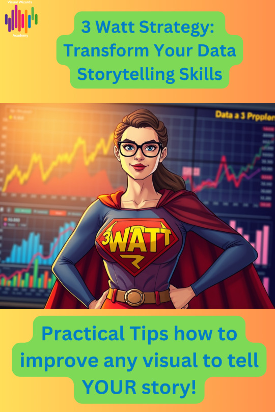
The “3 Watt Strategy”: How to Make Your Next Presentation Unforgettable

What is the “3 Watt Strategy”?
The “3-watt strategy” is a simple yet powerful way to structure your presentation. It draws inspiration from frameworks like “SCR“, which we already talked about. These frameworks are proven to make your message clear, relevant, and actionable.
Here’s how it works:
WHAT: Start by clearly explaining what you’re presenting—the facts, data, or situation.
SO WHAT: Next, answer why it matters. Why should your audience care? What’s at stake?
NOW WHAT: Finally, outline the call to action. What should we do next? What steps should leadership take?
Why Does the “3 Watt Strategy” Work?
Too often, presentations get bogged down in details, leaving leadership confused or unsure about next steps. The “3-watt strategy” forces you to be clear, concise, and compelling. It’s a storytelling framework that connects data to business impact, driving informed decision-making. By answering these three questions, you guide your audience through a logical journey. They move from understanding the facts to seeing the implications. Finally, they take action.
Practical Example: Persuading Leadership to Reduce General & Administrative Expenses

Let’s say you’re a finance leader tasked with convincing your executive team to reduce General & Administrative (G&A) expenses. Here’s how the “3 watt strategy” would work in practice:
To see the practical example, visit my blog.
0 notes
Text
Unlock the Secret Language of Business Storytelling
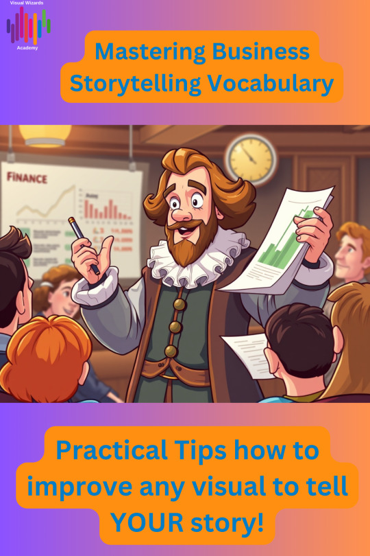
Ever listened to a presentation that felt flat—or read a report that left you wanting more? The difference between “just the facts” and a story that sticks often comes down to the words you choose. That’s right: vocabulary is your secret weapon for making your business ideas unforgettable.
Why Business Storytelling Vocabulary Matters
Whether you’re pitching an idea, presenting data, or rallying your team, the words you use shape how your message is heard—and remembered. Great business storytellers don’t just share information; they use vivid language, emotional triggers, and powerful analogies to connect with their audience and drive action.
Key Phrases That Make Your Stories Pop
Here are a few storytelling phrases and strategies you can use right away: • “Once upon a time…” — Yes, even in business! This classic opener grabs attention and signals the start of a journey. • “Picture this…” — Invite your audience to visualize the scenario, making your story more immersive and relatable. • “In the face of adversity…” — Highlight challenges and resilience, adding drama and inspiration to your message. • “To cut a long story short…” — Keep your story focused and impactful, especially when time is tight. • “To wrap up…” — Signal the end and reinforce your key takeaway.
How to Build Your Storytelling Toolkit
1. Spot Stories Everywhere: Look for real-life moments—both successes and challenges—that illustrate your point. 2. Use Emotional Language: Words like “passion,” “determination,” and “dream” make your stories more engaging and human. 3. Practice, Practice, Practice: The more you use these phrases and techniques, the more natural they’ll become—and the more your audience will connect with your message. Mastering business storytelling vocabulary isn’t just about sounding good—it’s about making your ideas stick, inspiring action, and standing out in a crowded world. Whether you’re a marketer, analyst, leader, or creative, these skills will help you communicate with clarity and confidence.
Ready to level up your storytelling?
👉 Read the full article here and start mastering your vocabulary today
0 notes
Text
Top Tips for Effective Slide Preparation and Timing

Have you ever found yourself racing against the clock while putting together a slide presentation? Or maybe you’ve run out of time during your talk, leaving your audience with more questions than answers. If so, you’re not alone!
Managing your time when creating slides is one big challenge. Presenting them within your allotted time is another. Both are essential for making a significant impact.
Don’t underestimate your skills, and especially the TIME left!
Check out my blog to learn how to prevent it and discover more about the world of Data Storytelling here.
0 notes
Text
Master Data Storytelling: Avoid the Eye Chart Trap
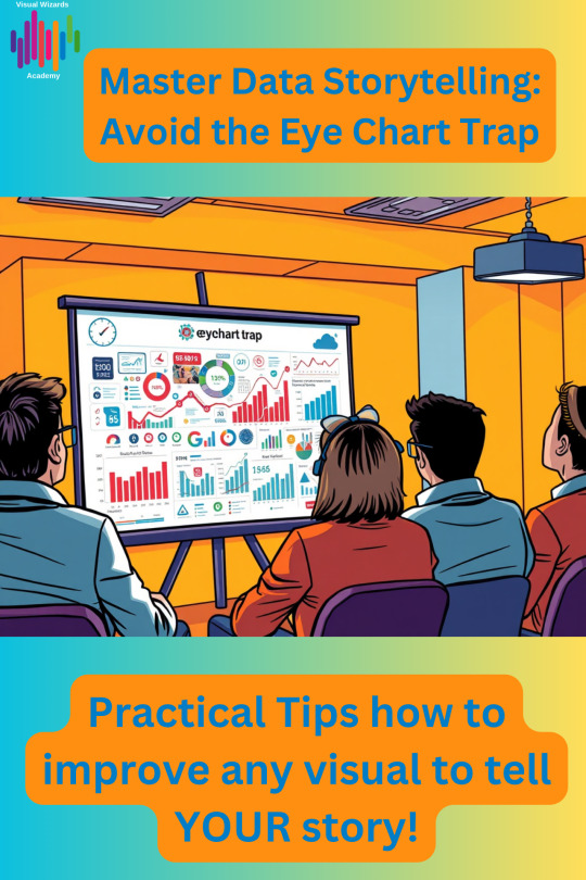
Data storytelling is the art of transforming raw data into a compelling narrative that drives understanding and action. Many presenters make the mistake of overwhelming their audience with overly complex and dense visuals. They often excuse it by saying, “This is a little bit of an eye chart.” This phrase indicates that the slide is overloaded with information. It becomes nearly impossible for the audience to read or grasp the key message.
When a presenter resorts to an “eye chart” slide, it communicates a lack of consideration for the audience. It also shows an inability to distill the data into clear, actionable insights. Instead of informing, these slides often confuse or disengage listeners. The goal of data storytelling should be clarity, not complexity.
If you would like more information on how to avoid the Eye Chart Trap and Essential Tips for quality narrative, please look no further than here.
0 notes
Text
How to Analyze Internal Performance Effectively
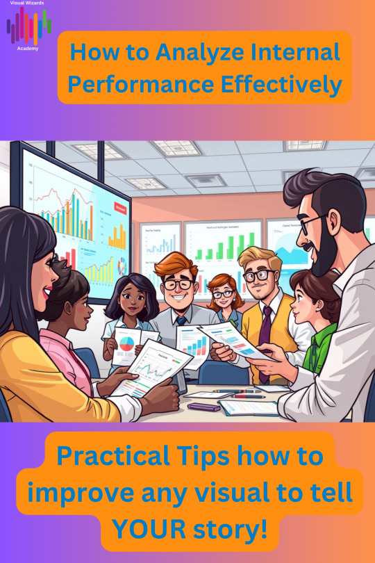
From classic SWOT and gap analyses to modern 360-degree feedback and KPI dashboards, there are so many ways to dig deep into what’s working (and what’s not). The best part? When you analyze your internal performance, you’re not just fixing problems—you’re unlocking new opportunities, boosting productivity, and setting your team up for long-term success.
Want to learn the frameworks, tools, and real-world tips for analyzing internal performance like a pro?
Check out this blog for a step-by-step guide and inspiration: 👉 How to Analyze Internal Performance Effectively
0 notes
Text
Choosing the Right Chart for Effective Data Storytelling
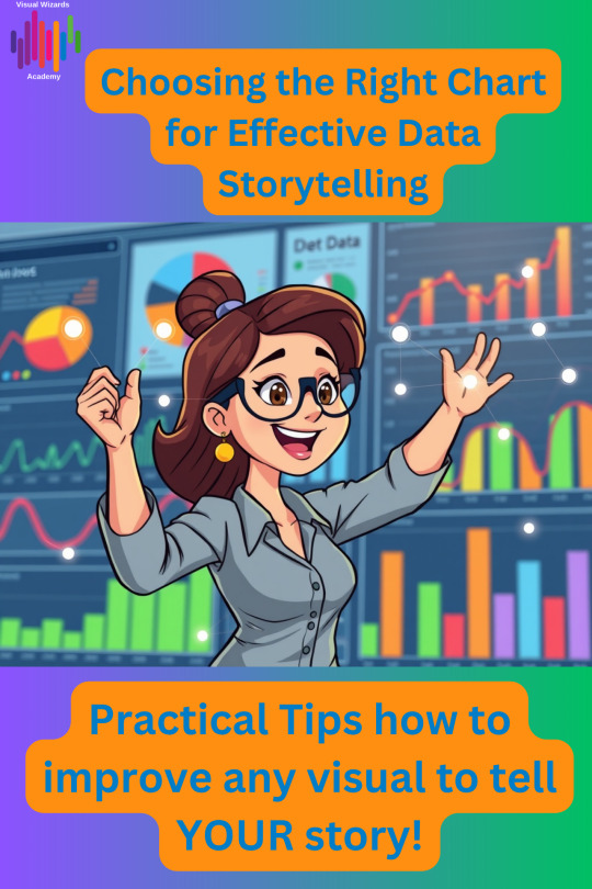
Ever wonder why some charts instantly make sense, while others leave you more confused than before? The secret isn’t just in the data—it’s in choosing the right chart for your story.
This week’s blog from Visual Wizards Academy is your practical guide to picking the perfect visual for every data story. Whether you’re a data pro, a business leader, or just someone who wants their insights to stick, this post will help you transform raw numbers into visuals that actually communicate.
For the full blog with downloadable Chart Tree Decision file, you can click here.
0 notes
Text
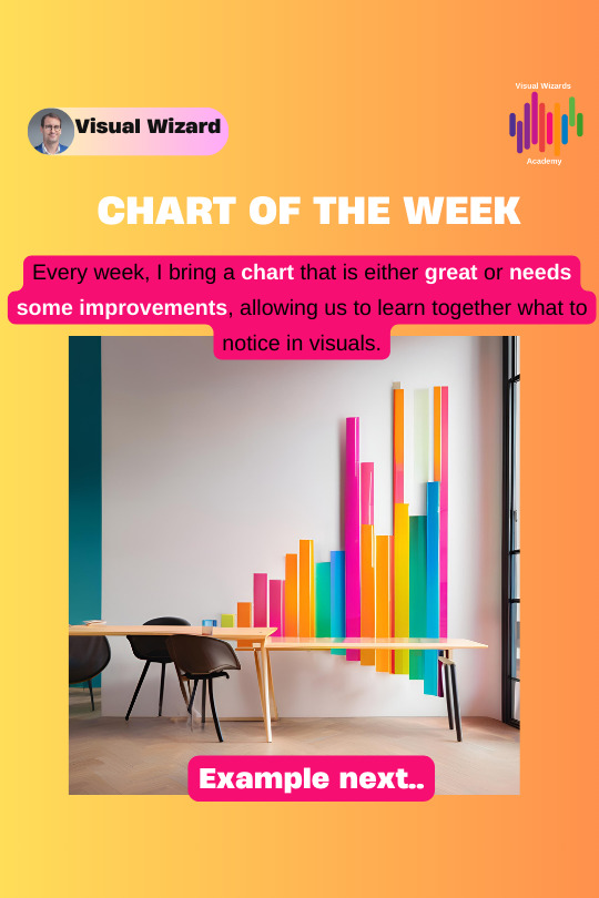
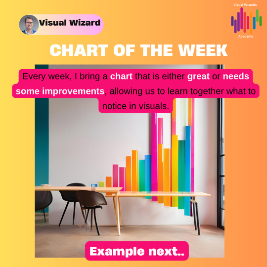
Chart of the Week: See Data in a Whole New Light

What if one chart could change the way you see a problem—or spark your next big idea? The latest “Chart of the Week” from Visual Wizards Academy is here to do just that. Each week, we spotlight a visual that doesn’t just present numbers, but brings a story to life—making insights instantly clear and actionable.
This week’s featured chart is more than just a pretty graphic. It’s a masterclass in how to turn raw data into a visual narrative that inspires, persuades, and drives decisions. Whether you’re a data enthusiast, a business leader, or just someone who loves a good story, this post will show you how a single chart can reveal hidden patterns, highlight trends, and make complex ideas easy to grasp.
What you’ll discover in my post:
• The design choices that make this week’s chart so effective • How to use similar techniques in your own reports, presentations, or newsletters • Why great data visualization is about more than just “looking good”—it’s about making meaning
If you’re ready to see how one visual can transform your understanding, don’t miss this week’s pick.
👉 Read the full article here.
Let your data do the talking. Make your next chart the one everyone remembers.
0 notes
Text
The Importance of Data Visualization and Data Storytelling in Decision Making
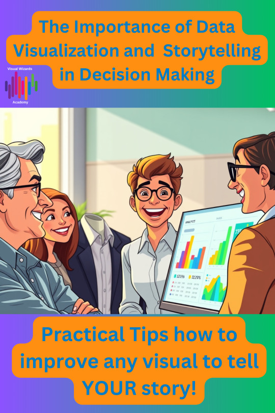
Numbers alone rarely inspire change—but turn them into a story, and suddenly everyone’s paying attention! Learn why data visualization is the key to making your insights stick and your ideas impossible to ignore.
Data visualization is crucial, as shown by extensive research. Recent surveys reveal that data storytelling is gaining importance in various industries. It is also gaining significance in research areas. This practice makes complex information easier to grasp and relate to. And it’s not just in the Corporate world. It’s everywhere in our daily lives. It is making our lives easier. Through it, we understand more. We know things quicker, much quicker.
To learn more, please visit my full post here.
0 notes
Text
What’s my real role here? You need to know your Role and Responsibilities in Data Storytelling!

Ever been part of a big presentation or data storytelling project and wondered, “What’s my real role here?” You’re not alone! Behind every great story—especially in business—there’s a whole cast of characters, each playing a unique part to bring the narrative to life.
🔹 The Creator: You craft the story, design the slides, and set the stage—even if you’re not the one presenting. Your job? Ensure every detail is precise, and leave notes so the presenter shines. 🔹 The Supporter: You’re at the table, but not on stage. You help prep the presenter, anticipate tough questions, and step in with backup if needed. 🔹 The Co-Presenter: You own a section of the story, coordinate smooth transitions, and are always ready to help a colleague. 🔹 The Solo Star: You’re running the show solo, so you know every detail inside and out. You prep for every question, practice your delivery, and make sure the tech works.
Every role is essential—whether you’re behind the scenes or in the spotlight. Want to find out which role fits you best (and how to ace it)? Dive into the full blog for real-world tips and relatable stories from the business storytelling trenches!
👉 Different Roles on the Path of Story Telling full blog here.
0 notes
Text
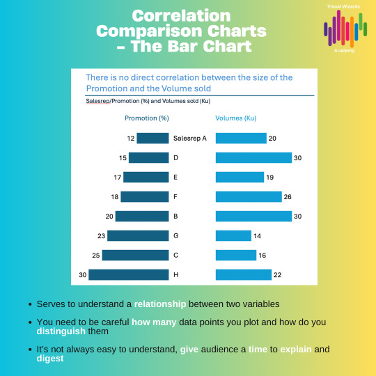
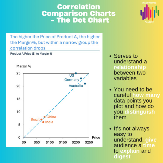
Curious how two things are connected? That’s where CORRELATION comes in.
A powerful tool for uncovering hidden relationships in your data! 📊✨ Correlation comparison in data visualization isn’t just about plotting dots on a scatter plot—it’s about revealing the stories behind the numbers. Ever wondered if higher study hours really boost your grades, or if ice cream sales rise with the temperature? Correlation helps you see these links at a glance, making complex ideas instantly relatable.
Effective data storytelling leverages correlation to transform statistics into compelling narratives. Instead of merely stating “these two things are related,” you can visually demonstrate it, making your insights more memorable and actionable. The best part? You don’t need to be a data scientist to get it—just a good story and the correct chart. Want to see how correlation can take your data stories to the next level?
Check out this blog for fresh ideas and real-world examples: Understanding Correlation in Data Storytelling
0 notes
Text
Chart of the Week: TRANSFORMATION
Ready for a visual that’ll make you rethink how you see data? This week’s “Chart of the Week” from Visual Wizards Academy is a must-see for anyone who loves smart visuals and powerful stories! 📊✨
Discover how a single chart can reveal surprising trends, spark new ideas, and transform boring numbers into something you want to share. Whether you’re a data nerd, a creative, or just here for the aesthetics, this post breaks down what makes a chart truly pop—and how you can use those tricks in your content.
Curious? Dive into the latest Chart of the Week and get inspired to level up your own data storytelling!
👉 Chart of the Week #6
0 notes
Text
Monday Visualization Tips
Ever wondered how two variables move together? 🤔 Correlation comparison is the secret sauce in data visualization that reveals hidden relationships between variables, turning raw numbers into compelling stories!
In data storytelling, showing correlation isn’t just about stats—it’s about making patterns visible so your audience can instantly grasp the “why” behind the data. Remember: correlation can suggest a connection, but it doesn’t always mean causation!

0 notes
Text
Unlocking the Hidden Stories in Your Data: Why Time Series Analysis is the Secret Sauce for Data Storytelling

Ever looked at a chart and wondered, “What’s the real story here?” 📈 If you love uncovering patterns, spotting trends, or just want to make your data-driven posts pop, you need to dive into the world of time series analysis. This week’s must-read blog from Visual Wizards Academy breaks it down in a way that’s clear, visual, and totally Tumblr-worthy.
What Makes Time Series So Magical?
Time series data isn’t just a bunch of numbers- it’s a living timeline! Imagine tracking how your favorite artist’s popularity rises and falls, how daily coffee sales spike on Mondays, or how global events ripple through the stock market. When you plot these numbers over time, you’re not just seeing data- you’re watching a story unfold.
Check out the full blog on Day to Day examples from Time Series, which you don't even realize, see, feel, and touch :-)
My blog here: https://bit.ly/4jTIXwi
#analysis#business#data science#data visualization#data viz#finance#storytelling#charts#timelines#analytics#tumblrreads
0 notes
Text
Daily Encounters with Data Storytelling through Component Comparison.
Anytime your story uses words such as % of Total, Share, components, includes, etc., you can be almost sure that you will use charts in the COMPONENT COMPARE section.

0 notes
Text
A Weekly Take on One Chart and its Remake.
Let's examine a practical application of basic Data Visualization concepts and Data Storytelling. We will look at one existing publicly available chart on the internet, preferably each week. You can take these lessons to your world of Data Storytelling. Apply them at the office or home when persuading your spouse about spending habits :-).
0 notes
Text
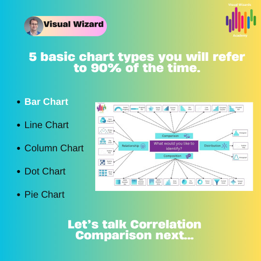
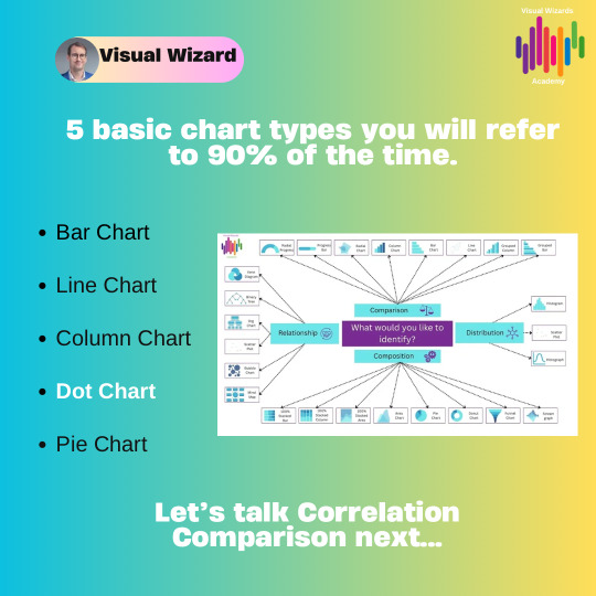
5 Basic charts will cover 90% of your Data Storytelling Needs!
Visit visualwizards.academy for more!

0 notes
Text
Do we find an examples of Data Storytelling in our day to day lives ?

Of course we do!
If you want to find out more about Data Storytelling and the few simple principles, read my blog to speed up your career!
#analysis#business#data science#data visualization#data viz#finance#storytelling#charts#leadership#executive presence#promotion#data storytelling#cfo#vice president
0 notes