
Don't wanna be here? Send us removal request.
Statistics
We looked inside some of the posts by y3pro-develoment and here's what we found interesting.
Average Info
Notes Per Post
0
Likes Per Post
0
Reblog Per Post
0
Reply Per Post
0
Time Between Posts
5 days
Number of Posts By Type
Video
2
Text
14
Photo
1
Last Seen Tumblr Blogs


Fun Fact
Tumblr’s reach among the 26-to-35-year-olds in the US is 11%.
Video
tumblr
PickyDesigns Website Launch
On the night which I decided to launch my website, I created some advertisements using my personal branding for my instagram account. I created both posts and stories to promote it and hopefully gain some more exposure.
Above you will find a video which goes through my stories and posts.
Below you will find screenshots of my instagram profile, which I have designed tiled advertisements for using Adobe XD and an online image splitter.
Image splitter link: https://postcron.com/image-splitter/editor/en/upload-image


0 notes
Text
PickyDesigns New Website
https://pickydesigns.webflow.io
My blog has previously been very long winded and possibly boring in regards to my initial website development posts. I have carried our a major redesign of my website in this second semester and rather than post a thousand blogs describing each little thing, I have instead created a video.
Video
In this video I run through my old website and discuss the issue and why I decided to improve it. I then run through my new website and discuss all the adaptions, how and why. Enjoy, I hope you like it.
youtube
0 notes
Text
Social Media Advertising
Since taking charge of the instagram I decided to turn it into a business account. I listed us as designers and adapted the profile to become more appealing and professional.
Paid Advertisements
I became frustrated at the lack of views and exposure we were getting so I decided to advertise two of the posts. The costs landed at a mere £10 which I was willing to pay. We needed more exposure.
youtube
Return on Investment
Below you can see we have been followed by three design studios/agencies. We have gained an additional 5 followers in the two/four days of advertising. Below you will also find more statistics regarding the boost in impressions and engagement which has skyrocketed.
I would happily pay more with improved advertisements


0 notes
Text
Social Media Takeover
Issue and Importance
Instagram should be our main channel, it hosts the best potential for growth and online exposure. Up to recently it had been neglected. We had no organisation in place for it, no one was requesting or creating content other than me.
Solution
Therefore, I stepped forward and took a lead on it. I had just created the template for the social posts, so I started by setting an example and posting mine. I then began influencing more and more people to fill theirs in so we could get some posts going.


Announcement template
I also used Matty's announcement template which Is massively beneficial to our social page. I have been alternating the posts to keep our branding consistent.
I have used this template and tweaked the content for each post. The original template online contained “1 month to go”. I have created several new pieces of content for the page using the template.
Stories
One way to gain some attention is to post regular stories. I have been reposting our content onto our stories, I have been experimenting with music and text on these stories and it works. I have received very positive feedback from the group. Everyone loves the music, it gives the posts life and our brand more of a personality.
youtube
0 notes
Text
Social Media Template
Sophie created the idea and an initial design. Matty then redesigned the social media template layout and sent it me. I then experimented with the backgrounds and implementing our branded background into it. I also Added more slides to the template so each person had three posts each.
Student Template
I filled it in and messaged the group to try and gain some momentum with this. We needed daily content and with it being a month till our exhibition we could get round the whole class twice if we were consistent.
Black and White template
Below is the black and white template which Matty created. I have then adapted this each day to create more content whilst keeping the same background and style. Consistency is key in this.
0 notes
Text
Industry
Following my extensive work experience with Stein IAS in my negotiated brief last semester, I have today received a job offer. They are offering me a role as an Information Designer, part-time (2 days a week) until June when I finish university. I will then start full time in my role.
The role
Below I have attached the document which breaks down the role, its daily tasks, qualities they are looking for, an the experience they are looking for.
This role is perfect for me, I have all the required skills and personal attributes and I have a basic understanding of all of the daily tasks. I will be trained on all of these tasks further which is perfect.
My contact at Stein informed me that the role has been specifically tailored to me. They have given it additional aspects such as VR/AR and creative technologies which are based on my interests and skills. Making it even more exciting!

Hiring Process
In second year when I initially got in touch with Stein regard work experience, they reviewed my CV and portfolio. Since then I have been regularly meeting with the Head of Creative, I have been showing him my work on a regular basis, talking and discussing my design choices.
Therefore, when offered this job I did not need to provide them with my portfolio or CV as they were already very aware of my abilities and had built up a strong relationship with me. There was one aspect to the hiring process I had to go through, meeting with the CEO.
I met the CEO at very short notice due to his booked holidays, this spontaneous meeting was amazing. We really got on and we had some great chats. We discussed both my personal life and my work aspirations.
At the end of this meeting he offered me the job and thanked me for my time and effort.
Summary
This is the beginning of my career. I am extremely excited to work at Stein IAS, they have a very unique but positive work environment. I have a lot to learn, luckily they support this through their ‘Learn for your Life’ program which will help me develop my skills in all areas. I will be logging my learning and reflecting on a daily basis.
0 notes
Text
Exhibition Website Developments
Page Designs
Following our last meeting where we organised the website and structured a way forward, we both created two layout designs for the student page. We decided to offer the students a range of templates for which would suit their work best.

Connor takeover
Connor has expressed that he would like to design the website and take charge. This is understandable as I realise he wants a more substantial role in the creation of our class exhibition. I have explained that I am here if he needs anything and I have agreed to provide him with the animation for the website and set it up into the correct format.
Website Animation
To import an animation into Webflow you have to use a j.son exporter such as BodyMovin. This helps you transfer basic animations and transforms into .json or Lottie files. These files can then be imported into Webflow and then you can add additional functionalities. In this case the functionality will be to loop.


0 notes
Text
Elastic Social Animation
Development
Following the creation of the animated logo, I then built on this and animated the date of our exhibition using the same technique. The purpose of this was for a social media post. I also experimented with Bens animated background and created a 2 layered animated background using it.
When discussing improvements, Matty pointed out an area which needed adjusting. The ‘S’ in the animation. When it stretched, it curved and rounded, this was not consistent with the rest of the video.
youtube
Final Animation
youtube
0 notes
Text
Elastic Logo Animation
I stepped forward and took on the role of animating the logo. I used After Effects to create the motion graphic. I firstly downloaded the logo design which Matty Created and I created vector shapes out of the logo.
Following this I then stretched the letters in the same style of the logo along a horizontal axis. I set keyframes at each stretch of the letters.
I then created the elasticated effect by tweaking the bezier curves of the keyframes. This allowed me to edit the snapping effect between each stretch.
Below is a time-lapse of the design process.
youtube
youtube
0 notes
Text
Career Roadmap Update
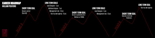
I have taken the time to update my career roadmap with my Picky Designs branding. I felt the old roadmap seemed childish and cartoon like. The content on my roadmap stays the same.
The Content
Here is a quick explanation of the content to strengthen my previous comments. My roadmap was broken down into three plans, in the order of priority to me and my professional development. Each plan has a short term goal which is then followed by long term goals. I feel it is essential to plan in both short and long term, without envisioning these plans you won't be able to materialise them. I have provided more detailed longterm goals in the prioritised plans.
Plan A
Short-term Goal
I have been working with Stein IAS over the past year and my key goal is to secure a job with them prior to finishing university. I carried out my research into Stein throughout my second year at university and secured work experience with them throughout third year. I now see the true beauty of this business and the value they can offer me in experience and training if I was to land a job with them. I am currently still working with them and hope to secure a job with them in the coming month.
Long-term Goal
Following my current experience with Stein I have been able to gain an insight into the management structure and along with other employees paths through the business. From this primary research I have been able to depict my own goals along with some realistic time frames.
Plan B
Short-term Goal
This plan consists of me applying for Trunk. or McCann Erickson which would be my second choices of workplace. I have chosen these two workplaces as the most appealing to me and my career development, both for different reasons.
Both agencies are B2C (business to customer) rather than B2B (business to business) like Stein IAS, so they both have a much different client base than Stein which appeals more to my creative side than B2B.
Trunk. is a small design agency who have services ranging from video game design to football PR media. The work they produce is very appealing, I feel it suits my style of design and that I'd fit into the design team. Through my research I have found that they are a small yet humble agency, the group of employees seem vibrant and energetic. I feel it would be great experience for me but I don't feel like they would educate me like Stein would. Stein have won several awards for training and development of their staff.
Although the major appeal to their work environment, clients, and design work...I still feel Stein IAS would benefit my professional development more and this is why they fall into plan B.
McCann is one of the worlds biggest and best B2C marketing agencies, they're a globally situated company which means they bring in many of the worlds biggest clients. Their HQ is also located 10 minutes from my house. Similar to Stein and Trunk they have a great work environment but for size of their business makes this much harder and therefore much more impressive. A key aspect which draws me to McCann is the career opportunities. They have such a large team that they specialise in every required area. They also invest massively into training and development. Therefore if I was to land a job at McCann I would have a great opportunity to develop as a professional and advance in the ranks.
Although the vast amounts of benefits which both of these offer, my first hand experience with the staff at Stein has proven to me that they should be my primary choice. They offer the best training and development plan, particularly with their new ‘Learn For Your Life’ scheme. They recently won an award for employee progression and promotion, which emphasises their dedication and support to their staff. Since I currently have a foot in the door and have built up a connection with the staff, I feel this has to come as my plan A.
Plan C
Short-term Goal
Finally, my plan C would be to go alone and develop myself as a professional through freelancing and online educative resources. I have already acquired and completed some freelance projects such as UK Tipster and Bethan Longbottom , both of these experiences developed me as a professional and required me to step out of my comfort zone. If I was to follow this path I would educate using open universities and online courses, these are cheap yet effective options which also offer freedom to learn when and where it suits me. The main reason why this is plan C is due to the lack of job security, freelance work can sometimes run into dry patches and the lack of work could cause me financial issues and risks.
Long-term Goal
Running my own agency has always been an aspiration of mine, hence why you will also see this long-term goal in my plan A. This is the end goal for my career because by this point I should have all the education, experience, and contacts needed to launch my own agency and produce a positive working environment and an impressive portfolio of work.
0 notes
Text
Exhibition Developments
Logo Developments
In our last session, our branding group posted each of our designs. We all then took an inital vote on the favourite designs, each person got two votes each. We then followed this up with a secondary vote to decide the final logo out of the favourite designs. Below you can see all of the branding teams logo designs, these were the options in the first round of voting.

Here are my designs which i put forward.

Below were the two favourite designs which went into the final vote. Mine was the one on the left and Matty’s was on the right.

Matty’s design won and I feel it is a great design, we can now move forward as a team and improve it. Aiming to make it a much more effective brand identity for our exhibition.

Website Design
youtube
Me and Connor chose to work on the website design for the exhibition so this week we arranged a video call over Teams. The aim was to get a basic plan together to ensure a successful construction of the website. We begun by agreeing on our chosen platform, we then spoke about the website contents and site plan. You can find these below.

Following this, I then set up a XD project which me and Connor can collaborate on together. We are planning on doing basic site page designs and mock ups.

MIRO BOARD
AGILE WORKFLOW
In this project I have been using Milanote for my workflow but for the exhibition I'm now using Miro where we have a whole group board set up with tasks to ensure everyone is aware of the team progress. I updated our website design workflow by colour coding it, bringing it up to date and then also added more content to the backlog.

I also updated the branding board for the team and will be in contact with the group surrounding Colours and Typography which are key for mine and Connors project.

ORGANISATION AND CATEGORISATION
I decided its best for everyone if I organised the Miro Board as its very confusing, the board has been extremely busy yet messy. I’ve spent the past hour moving all the work and categorising it.
Having a clean workspace is essential to me and I feel it will benefit the whole group in the project.

0 notes
Text
PickyDesigns Instagram Update
I have been designing Banners for both my own profile as well as for my clients instagram pages. I kept them the same style for my instagram page and I placed both clients websites into mock ups for the banners. I think this is extremely effective in advertising, its a very clean and professional way to showcase the websites. I also split the images up into three for the instagram tile effect, therefore I ensured that each individual section contained valuable information on the UK Tipster design.
Below are the two designs...
Below is my instagram account on a computer, as you can see I've split the images. On a laptop you don't get the intended effect due to the gaps. Below that is then the post on the UK Tipster page.

Below is my instagram account on my iPhone, you can now see my intended banner effect over the three tiles.


0 notes
Photo

CAREER ROADMAP
In our previous session we have been understanding what we envision for our futures and how to document/plan our ideas. This is when we begun discussing a career roadmap, which can visually look however I’d like but it usually contains a few different career options, scoping both short and long term goals.
Below are the notes which I took while we understood career roadmaps further. As you can see I had a few different plans along with some short and long term goals.

I then begun sketching out a nice visual I had in mind for my career roadmap. Whenever we spoke about the roadmap I always had this image of a hill or mountain being climbed. I wanted to depict this in my roadmap, I want to convey the feeling when you get to the halfway point of the hill/mountain, the feeling of triumph but the knowledge of the push ahead, time to readapt, refresh and then conquer the next goal. This is great symbolism for the short and long term goals. Below are the sketches.

I then took to illustrator to create a very simple visualisation of my design. It soon turned from simple outlines into a very simple illustration.

Below is the final design. If I was to do this again I may go for a more simple design using the Picky Designs branding and style.
0 notes
Video
tumblr
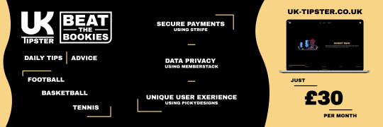
LIVE PROJECT #3 - UK TIPSTER
Website
Above you will find a video walking through the final UK TIPSTER website which is now live. The web address is www.uk-tipster.co.uk. Sadly you cannot view it live unless you pay for a membership.
I felt this website was a great success, the customer is extremely happy. It has made their business much more efficient, they now have a solid platform which then can further build on. The customer insists that I continue working with them in the near future.
At the start of the video you can see that they currently struggle to be found on google searches, social medias and website. I’ve explained why to them and given them the solution. Once my university course has finished I’ve agreed to fully kit them out with SEO on their website and set them up on Google Advertising.
Branding
Below are the final logo design along with a slogan I came up with and designed for them. The logo turned out very clean and recognisable, especially when used alongside the slogan. I’m very proud of this branding, once again the customer is also ecstatic.


Advertisements
Once I had completed the website, they needed to launch their new platform, so they enquired if I could create a selection of social media advertisements. Particularly a video advertisement. I then proposed a few instagram post advertisements.
I outsourced for some help on the video, using Ben McNair, one of my course mates. We always look for any opportunity to work together and this was the perfect chance. The client also agreed to pay more for the additional skill brought to the project. We composed the video together through teams, I mainly directed and sourced the content, e.g. video background, music, fonts. Ben used his after effects skills to compose an effective advert using his knowledge surrounding effects.
youtube
Below is the UK Tipster Instagram which I assisted them when setting up.

0 notes
Text
Live Project #3 - UK Tipster
Project Origins
At the end of January I added a very young business on one of my social medias, their services were offered exclusively through social media, snapchat to be exact.
This option was functional and successful for increasing followers but made their processes much less efficient and conveyed they were missing some professionalism.
They were calling out to their followers for a designer / web designer whom could create websites / advertisements for them. I made them aware that I was taking projects and i'd be happy to help.
They made me aware that they'd already found a web designers so they didnt need my assistance. I had a great logo design idea for them, they were currently missing branding. So, I offered my branding services for cheap and showed them my idea.
They were very impressed and accepted the offer.
UK Tipster Branding
Below is my initial branding sketches for UK Tipster.

Then I digitised the logo design using illustrator. I composed the main structure of the logo first, merging the 'U' and the 'K'.


I then begun playing with colours as you can see below, specifically playing with the British flag colours.


Project Breakdown
Following the creation of the logo, the guys at UK Tipster were really impressed with my logo designs and they also enjoyed talking to me. Therefore, they decided that they would prefer me to design their website and advertisements.
They needed a membership website where content would be hidden unless clients had a paid membership. They also needed a system to post daily tips for their customers. Contact details and advice would also be included in the website. They needed advertisements to go with the launch too.
I discussed this all with them and then asked for a night to research and confirm that I’d be able to do it. I spend the night researching ways which I could do this using Webflow and other software integrations with it.
The solutions I found were:
- Webflows integrations to Memberstack or Memberspace for the membership and payment functionality.
- Webflow CMS is the solution for posting daily content.
- I can do all other aspects using webflows core tools.
I broke my plan down to them step by step as you can see below. They then accepted and I decided to write up a contract for the project.
Below is a text from me to the client which I’ve copied into there...
“Yeah I can do it. To break it down for yous....
-I’ll create and host the website for yous using Webflow.
-I will then add you both as clients, you can then fill out daily forms with the bets and post them.
-It will fill a template which I design for you. (You can ask me to update it whenever)
This will be posted to members only.
-I/you will use MemberStack for the membership system. (Yous will be able to access all the members information etc on a really simple dashboard on their site.
-Users will create accounts on webflow but all the details and payment go through memberStack which stores all the information.
-once the account is created, they log in daily using email and password, they can then see all the hidden content posted daily. (Btw you can have a free content page too)
-Users can see all their information too, I.e when their membership renews/runs out, profile details etc...
-Webflow hosting will be £10 a month
-memberStack memberships range depending on how much income you make per month. “
Client Contract
Below you can see the contract which I wrote up for the project, I used a template for a basic layout and then tweaked it to suit this project.
I then used a website called DocSketch which allows you link sections of a document to be filled out online by your client. They can also add signatures to the document.


Organisation
To organise the project I used the Milanote platform and I used an AGILE workflow to ensure efficiency and maximum quality of work throughout the project. I also had the whole project broken down on one page, I had all my research, tasks, links and other relevant information in one board specifically for this project. By having all the relevant info in one place I could continuously refer back to it whenever I needed to refresh myself on the project goals or styles.


Research
I carried out research into a variety of difference aspects for this projects to immerse myself in the market and the style of betting industry. I also needed to look at it from the customers shoes...Why should I pick the UK Tipster?
I researched areas such as:
- Competition (existing tipster sites)
- Bookies Websites/Branding
- What makes a good tipster
I also did plenty of other research into design aspects as well as plenty of software research when I began developing the website. I had never used memberstack or even heard of it so there was large amounts of research into that.
Client Ideas
The clients sent me this really basic plan of what they're looking for...

I further discussed these ideas with them and spoke about how I can further improve them.
Site Map
I started by producing a site map for the website, just to clarify the plan for the site.

Mock ups
I took to Adobe XD to design some website mock ups. I started by exploring layout ideas and investigating how I could design the daily betting tips. I also added colours and illustrations to the mock ups as I gradually made them more realistic.
The mock ups are from an Adobe XD plug in called UnDraw which I am able to use commercially, I have w=tweaked the positioning, style, and colour of many for the website.


Development
I then began developing the website using Webflow which is an extremely powerful web builder which offers massive amounts of freedom in design as well as offering some great development tools.
I also wrote out all of the content due to the customers being too busy, they just approved it once I did it.


CMS Forms
The daily tips are one of the main aspects of the website, therefore it was essential that I set up the CMS forms to be as simple yet efficient as possible. I had to design all the layouts for the content and then I also had to fill out a form for each page which I then linked each individual form to the text on the template where I wanted it to fill each time.


Logo Improvement and Slogan Design
I still felt there was improvements to be made to the logo and they really liked a slogan which I came up with, so I decided to make them cohesive. Below you can find the developments through variety of different slogan designs. At the bottom you will also see the improved logo along side the final slogan design. I mainly just sharpened the logo, gave it corners rather than rounded edges along with a bold sharp text.


Memberstack Integration
Memberstack was great to use, I did some additional research and watched some tutorials but the checklist on the dashboard made the process much simpler. I then had to add the code from memberstack into each element on my webflow page. It got confusing at times but was definitely worth it.
It works a treat.


Testing
This project consisted of vast amounts of testing. I had to test several aspects but the main ones were the upload of daily tips, sign up and login system using Webflow and then the responsivity of the website on different device sizes.
I had to ensure the CMS Forms which I had set up were all working, below you can see me testing them. I filled out the form with betting information and followed all of the help guidance which I attached to each field of the form. I then published the form and you can clearly see all the information filled out into the correct spots on the page.
I did this for every form which was a very time consuming project I must say.


Below you can see my test accounts as I tested the websites sign up and log in functions.

0 notes
Text
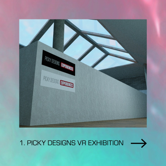
CLASS EXHIBITION
Miro
As a class we are using Miro and video calls to plan and communicate through the creation of our end of course exhibition. Miro is a great resource which allows every member of our course to get involved and share their ideas and thoughts.
Initial Ideas
We began by posting out initial ideas of themes and plans for the exhibition. The main focus of these discussions were the need for multiple plans, for both physical, online and both. Due to our current situation there is no certainty around hosting a physical event. This then makes the planning much harder too.
Our discussions lead to us all agreeing with a mixed approach, plan for both and carry out an online exhibition no matter what. If we can host in person we will and it will be aided by our online resource but if we can't host in person then it will be purely online.
Initial Issues
We then turned to voicing our issues surrounding the project and laying them out in the open. People had major worries about the amount of people working around tis project and the complexity of pleasing all the class. We all had a group chat and put peoples minds at rest. Everyone has agreed to pull their weight and input enough content to make it fair for everyone.

I specifically gave my input into one persons concerns and offered a thought of how we could avoid this. Simplistic design should suit almost anyone, nothing too questionable or over the line.

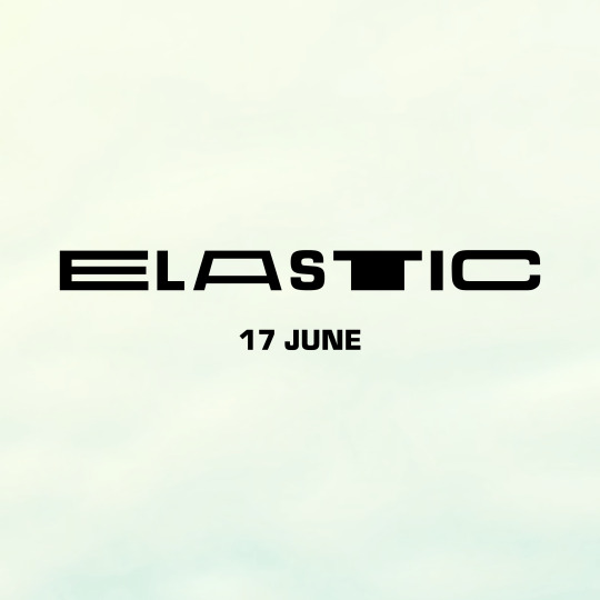
Exhibition Names
We then all took to the board to list our favourite names for the project. My personal contributions were ‘Ascension’ and ‘Transition’.

We then voted on all of these to narrow it down to some final few. Ascension got three votes but didn't quite put it into the final runnings.

These were the final results with Elastic winning.

Project Backlog
We then made backlog of all the elements which were essential in making this exhibition possible. Those included practical elements such as Website design, Branding, Social Media, Advertising, 3D, VR, Motion etc... and then we also had some essential organisational/planning based roles such as Scheduling, budgeting, mailing lists etc...
Role Allocation
To allocate people to these rolls we then filled out these forms each, listing what each person wanted to do and what they didn't want to do.

We then moved over to post its and everyone had the chance to place their name next to the tasks they were interested in doing. We then filled the gaps in things like the budget and mailing list.
I personally wanted to do Website Design and Branding for the project but I also offered to help with the mailing list and helping with certain stages of the VR/3D development.

Workflow
We then begun designing the project workflow, setting tasks for each element of this project. I filled out the initial to do list for me and Conor on the Website and dropped him a few messages to start discussing our plans for it.
I’ve also created a group chat for the Branding team and begun the conversation to get the ideas flowing.

0 notes
Text
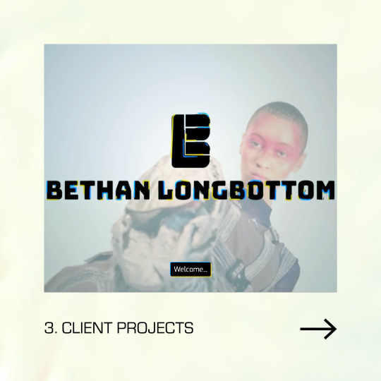
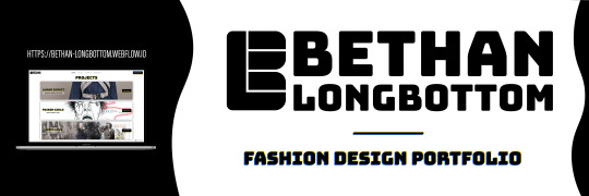
Bethan Longbottom Branding/Website
BRANDING
Below is the final branding for Bethan, I designed the logo and then also changed the font on the full name variation from the previous version. I also implemented the text into website and the Logo Animation which I designed for her last semester. You can view this on the intro video to her website which I will post below.
WEBSITE
Below I've posted a video going through the website start to finish, or feel free to view on your own, the link to the website is:
https://bethan-longbottom.webflow.io
youtube
This is the final website design, I am very proud of it but more importantly I have a very happy customer, she’s over the moon with the website and would highly recommend me to anyone who asked. I may be getting a review off her for my website.
LANDING PAGE VIDEO
If you view the website you will see that I've made some extra touches to give it that edge, mainly the landing page video. Webflow allows me to add a background video to any page on the site without sound, so I made it full view height and width and made it to average screen-size. View the video below if you haven't on the website.
https://youtu.be/fi6TrKCqpYU
To create the video I took to After Effects in the aim to create a funky yet professional looking video to impress audiences at their first touchpoint on the website. Luckily Bethan had a range of video footage from her graduate collection at uni, so I dug in and selected my favourite videos and pieced them together.
I used a variety of new effects which I hadn't learnt before such as Rotobrushing and Radial Wipes. This was very fun yet educational part of the project. I learnt new skills and proved that I can offer the full package in terms website, branding and video to showcase a person or businesses work.


ORGANISATION / WORKFLOW
Through this project I continued to use Milanote as my workflow tool, I kept all the relevant information in one place to keep things efficient. I had a main board which I referenced for inspiration and refreshers on the brief but I also had a workflow board where I managed each individual task.


0 notes