
spam reblogs/likes ok || editing resource blog that mostly reblogs raw stuff uploaded by other users cs using others premade stuff is GAY!! /lh
Don't wanna be here? Send us removal request.
Statistics
We looked inside some of the posts by yutoriblogu and here's what we found interesting.
Average Info
Notes Per Post
30K
Likes Per Post
22K
Reblog Per Post
8K
Reply Per Post
41
Time Between Posts
18 hours
Number of Posts By Type
Text
12
Photo
1
Note
4
Last Seen Tumblr Blogs


Fun Fact
The total number of visits Tumblr.com received during January 2021 is 327 million.
Text


GIF OVERLAYSSSS HEHEHEHEHEHE
sourced from giphy!! no credit needed!!

banner credit
(anyone who is on my dni can use these since i didnt make them, just dont interact w/ my post & ur a-okay!)
#“ an apple? for me? ”#gif#gifs#webcore#cursor#sparkle#sparkles#heart#hearts#messages#computer#old web#decor
1K notes
·
View notes
Text
To avoid tumblr's image posting limit I made a big old folder of resources I've collected on pintrest, free png sites, wikis, official merch stores, or made myself over the years part 3
free to use, do not credit me since a good chunk of these I didn't make, reblogs are appreciated so this can reach more people for them to use 👍 I will remove any of these or give full credit if asked! If something of yours got mixed in please let me know so I can credit you or delete it. The only thing I ask credit for is the deividers I drew which are under sketch. If there are any repeats from part 1 or 2 I apologize. My memory is very bad 😔

Png pack 1
Png pack 2
Miku pack
86 notes
·
View notes
Text
2000 NOTES. THESE ARE ASS WHY IS EVERYONE AND THIER MOMS IN THE NOTES. YOU PEOPLE PLEASE GO TO THE TEXTURES TAG IN THIS BLOG I SWEAR YOU'LL FIND BETTER
hey, yur cool. *drops kickass textures/overlays*


3K notes
·
View notes
Text
Retheme. im not gonna try to look semi-decent. get yutorichaned motherfuckers
@68chan → @yutoriblogu incase someone tries to find this dusty blog
#✿ ͙ talking ׅ#50/50 chance ill return here#more like 30/70 but whatever#well i did start reblogging resources again but not really post anything#well im a resource blog#.... that sometimes posts edits
0 notes
Text

⠀⠀ ⠀⠀⠀⠀⠀⠀⠀⠀⠀⠀⠀⠀⠀⠀⠀︶︶︶ ㅤPNGS ㅤ︶︶︶ ⠀⠀


⠀⠀
⠀⠀⠀⠀⠀⠀⠀⠀⠀⠀⠀ DOODLE PNGS ⠀⠀⠀⠀⠀⠀⠀⠀⠀⠀⠀⠀⠀NO CREDITING + F2U sourced from canva 1 2 3
⠀⠀

9K notes
·
View notes
Photo
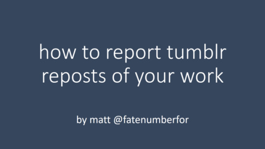
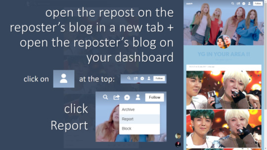


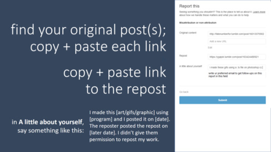

content creators- sick of people reposting your gifs/gfx/art?
now you can introduce CONSEQUENCES for their actions! follow this quick and easy tutorial to find out how.
why reposting is bad | how to determine if a post is an art repost or not | how to image-search (fan)art for its original source on tumblr
remember, everyone! respect content creators and support us by REBLOGGING our work! we make this shit for free.
a text transcription of this ppt is under the cut.
Keep reading
9K notes
·
View notes
Note
could I please have any of the gifs u use often in your edits? tysm!!


➳⠀ transparent gif dump
698 notes
·
View notes
Note
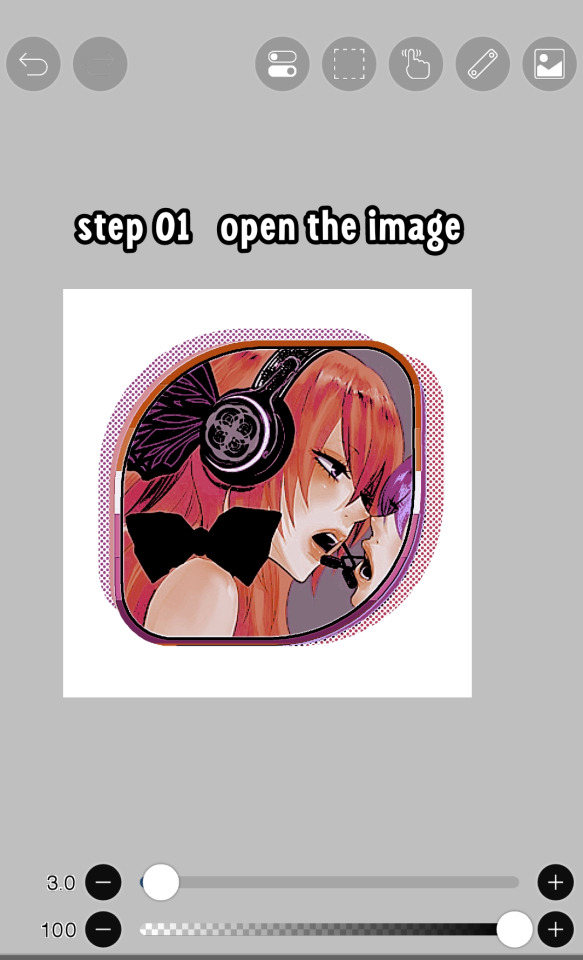
hello! do you have any tips for creating your own psds? right now I'm just sort of throwing things at the wall and hoping it sticks!

Hi hi nonnie! I am NOT the best person for you to ask this (not in a miiile) BUT I tried making this in the most concise way I could and prayed to god it didn't get too confusing since a lot of the times I too just throw things at a wall and call it a day. I'll teach my usual psd making style and a more general one just in case that's what you were looking for! They're under the cut since it probably will get a tiny bit long but I hope it's helpful to you! <3 as always reminder that there is no correct way to make a psd this is just how i do etc etc
This has a lot of text and images so beware of the big scary maica


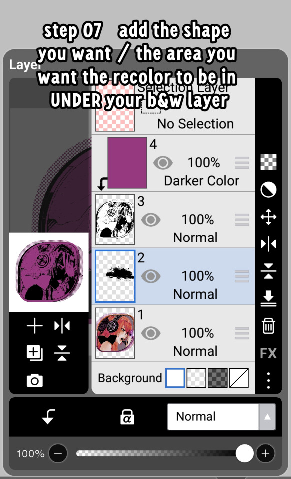
First of all: While you certainly *can* make a psd based solely out of one image or a compilation of your own edits (as i have done on the past), I'd say in general it's more useful and easier to make something when you have more than a singular image to check and a color spread to use. I made this little template in 5 minutes (which is a lie because my photopea crashed at first and so I had to re-do it) and I'll link it here alongside the psd itself so you can poke around and check how I do things! If you want to do your own template or anything, though, here's the color spread I use! :]

It has a spectrum, a bar line and some skin tones so it should be helpful! You can also use Travi3sapsd swatches if you'd like, since I know some people would prefer having a view of the colors before and after the psd to check!
Talking about skin tones, Amemcth also has a nice collage with characters of varying skin tones so you can check how your psd look on different skin tones. I don't think it's obligatory for all psds to look fine with every skin tone, however, I think if you're not doing it for a singular character and are indeed posting that psd for public use, making it work with darker skin tones is something good and that I encourage. If it doesn't work, remember to always indicate it by adding a "Works fine on most skin tones" or "Doesn't work on poc characters". Those warnings can also be useful for other things, like not indicating the usage of the psd on irl pictures, cartoon pictures etc.
So, final thing before we get into psd making itself (if you are using a image mask template to check colors) is adding the images! I always recommend adding characters from different sources and irl images to be sure, and with either varying colors across the spectrum so you can be certain the psd is working nicely OR images that feel similar enough in vibes so you can be certain the vibes of the psd are going towards where you'd like them to. However, it's also important to consider which colors you will be working with to make the psd, since I think it's easier to make a psd for a character when you have something in mind. For my own psds, I usually limit myself to a maximum of three colors + black and white (which I'll mess with to change their tones), so for this tutorial I'll be using yellow, purple and pink! This is the where we start. (I won't be trying to keep skintones working for this since it's all pale characters, but please have the common sense to make psds that work if you're editing a black character. don't make them white and for the love of god don't make them grayish)
Also reminder before anything that if you're editing a card and that card works weirdly with the psd you can always add adjustment layers to the card itself and mess up with the hues on it hashtag editing some characters just are a pain in the ass to edit because of colors being too similar etc so don't be afraid to fight them

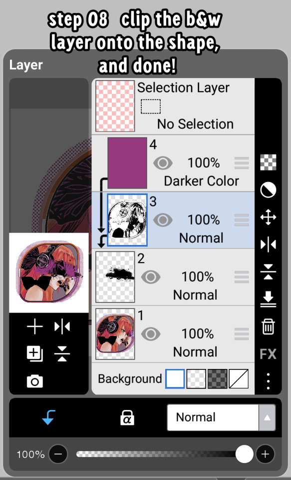
First: Make A Folder for your psd to be built on. It makes things a lot easier to drag around once you have it done and arranged. Name it after the psd name, name it psd folder, whatever, just put your layers under that folder. Onto the layers.
My autistic ass mostly does psds only following one single pattern, but in case you want to mess around and play, feel free to have fun and mess around. A lot of psd making really is just messing around. In my case, these are the main adjustment layers i use: Threshold, Selective Color, Hue/Saturation, Photo Filter, Color Balance, Vibrance and, on occasion, Gradient Map and Curves. You can use others but I am >not< the best person to tell you what they do and how to work with them.
So, you now have your pretty little image layout down and the colors you want to work with in mind (pink purple yellow + bw), so what now? Well, I usually like to think on which direction I want to take this psd towards. People will always have different methods and directions on psd making. Some of them like to make some of the most eyestraining things I've ever seen which somehow work, some of them like to make a pastel so bright I can feel my eyes burning, some of them prefer to make desaturated tones, some of them like to lower the vibrancy of the image so much I almost can't see shit. Everyone has their own preferences and I work w pretty much anything, but for this I'll try to keep a standard bright view, if a little pastel and desaturated, for this.
So now, we have our colors, our images, our color swatches and a direction in mind.
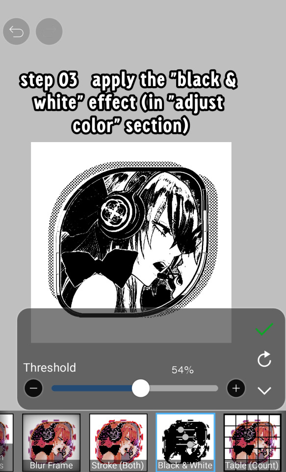
First thing I like to do whenever I'm making psds is to add a threshold layer. However, not in the way I usually see around editblr. When you add a threshold layer, it should look like this

Don't just do that. Go there on that little normal bar and click it. I know people who use others, but I usually settle with either Multiply or Soft Light for it, then lower the opacity down until it's somewhere I'm satisfied with.


So this is where we end up at. I don't let my threshold opacity go any higher than a 30%. threshold basically serves to bring out the shadows on your images and bring out the shapes on them. it helps make the focus on the image clearer yadda yadda yadda. Be careful when using it on darker images, but for brighter ones it sure helps w making everything easier to see.
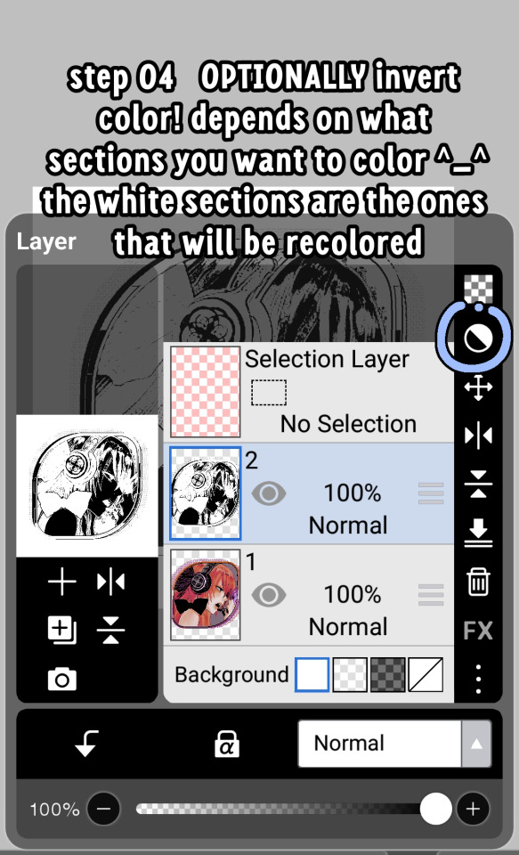
After adding a threshold, I add my Selective Color layer. With this you'll basically be playing around with the sliders until your colors look the way you want them to. This messes *slightly* with the hue without fully changing them (we'll get there soon), so it gives you some chance to balance out the initial shades of the psd. For the current method i'm teaching (focused colors), i usually recommend you to make the colors you >dont< want on your psd brighter or in a shade that still feels coherent with the colors you dont want in it. we'll be dealing with them soon.

So we get there. HOWEVER! don't think we're done once you mess with the main colors. the 1st selective color white is, what i'd say, one of the most important parts of psd making. you know how most anime characters in gacha games these days look pale white? Yeah. this can change it. What i usually do is bring the black slider on the white layer to the right and then increase a bit of the magenta and yellow. Boom.

It's quite tricky to use on images with heavier shadows, but for the standard pale white anime gacha character? it helps give some life to them. its quite subtle, but can help a lot to make the image get more lively. A counter thing to this is that yeahhh this can mess a lot if you want to make, you know, a >white< psd since it will also mess with the white tones themselves, so there's no 100% settled need to mess with it, just keep it in mind in case you wanna make the character a bit more tan or, you know, have a normal skintone. It also helps a lot with defining shadows, so keep it in mind :]
I usually don't mess with the neutral since it can fuck around a lot w skintones and, if i do, i always make sure to keep them on less than 20% for all levels. be careful when playing w it.
Black is a tricky one. I know a lot of you pastel girlies across editblr and psd making communities like turning it all the way down so theres no black but honestly, contrast is important. I usually make sure to bring the black scale to the right and then mess around w the other three so the black is still visible and bringing contrast to the image, but w the help of the other three, make it so the black looks softer and matches the psd itself. So, here we are!

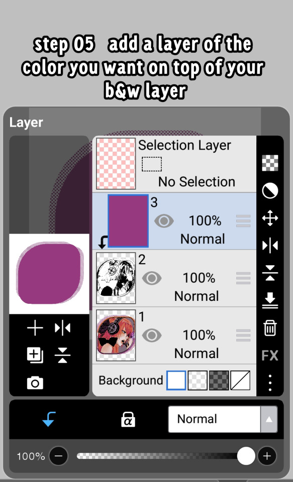
After the selective color in my psd process, that's where we erase any unwanted color and shift the hues to where we'd like them to be. Make a hue/saturation layer and go to the colors you dont want (in our case, green and cyan) and move that hue slider to a color you want babyyy. I encourage to mess around with the color scale on the specific color so you have more power over what colors change or don't, in case it's messing with colors close to it on the scale (cyan messing with greens, greens messing with yellows etc). Be aware that doing this will fuck uppp certain images with those colors, cry about it for a bit, and go back to making your psd

If you're a picky mf just like me, you WILL add 1 or 2 more hue/saturation layers to fully clean that bar of any color you do not want. If you're normal, you'll be chill with how this looks and call it a day, so onto the next step.

After arranging your colors and possibly finding out how green is an absolute shit color to try and erase traces of, we get to color balance which is, well, where you balance the colors. go around and mess w the scale until your colors lean more towards what you want them to look like. I personally don't mess much here and the difference will be suuubtle subtle, this is more if you're just picky with colors like me and want them to look perfect in the idealized version of the psd you hold in your head.

Photo filter will basically bring the whole thing together. It serves as a filter to bring eeevery tone you have going on into a cohesive line. Always remember to lower down the density of it so the other colors are still noticeable. a lot of the time i will add more than one photo filter and play with it until I'm satisfied with how it looks <3

Then this is the time where I'll usually add ANOTHER selective color layer just to mess more with the tones and finally get them down to where I usually stop playing around.

A few more touches and you should be done! I really don't know how to even explain curves and gradient maps so play around with them for a bit and you should at least understand how they work. One thing I do a lot with my psds is make toggles to make colors darker/bring more focuses etc etc, so if you're someone who struggles to make decisions, toggles might be a good thing to add to your psds!
Now... If you don't want to limit yourself to a set number of colors? Quite simple! Simply skip the hue/saturation layer steps or delete them altogether once you're done with your psd and there, a psd that plays with the tones of the image to make them more harmonious while keeping everything cohesive! You can mess around a bit more on the two selective color layers you have if you do this by deleting the huesat layers, but it should generally look pretty nice still!

This should be it! So, to summarize everything Ive been yapping about so far...
Before diving head in, decide if you want to limit your colors or not. Also decide on a set type of psd (bright, pastel, desaturated, dark...) you want to go towards
Use multiple images to make your psd, either with similar vibes so you can ensure it's becoming something you wanted or with varying colors so you can cover your ground
Use a threshold layer with lowered opacity before anything else so the shadows on your images have more contrast
You can use a selective color layer on the white part to darken pale characters skintone and bring some more life to them, but be careful when doing this because of cards with heavier shadows, if you want to keep white as a color on the psd etc
Don't lighten the black part on the selective layer as that messes with contrast and might make your psd harder to comprehend when looking from afar
Try to still make your colors distinct enough so you're able to tell apart shapes if from afar, it can be a difficult thing to do but it helps a lot with readability
Don't be afraid to go back and forth between layers! If you're on a photo filter layer, you can always go back to make a specific color more prominent if you miss it overall
Use hue/sat as a way to change colors you don't want instead of replace color. It's tricky, but it covers more ground
Use photo filter to bring all colors more cohesion and make it so they look more harmonious
Have a headache trying to work around cards with harsher shadows
DO NOT make poc characters gray or straight up orange/red for the love of god
Feel free to make different toggles for your psds if you can't decide on which path to go towards, you can always duplicate layers and make different paths depending on what you want!
If a specific image you're using has difficult shadows or different tones to work around with the overall set, you can always just mess with that image alone and make adjustments to make it work out with the rest of the set
Remember that psds work differently on photopea and photoshop, so make sure to check that out if making them/using them/posting them anywhere and make it clear for which app they were made for!
Good luck with psd making and have fun overall! <3
Here's my psd test yet again if you'd like to mess around with it! Just don't repost and it should be fine ^^
73 notes
·
View notes
Text


skintone variety in 2d media with character names and sources. suggested to be used in combination with the colour spectrum for making PSDs. no credit needed if using as a preview.
backgrounds of varrying lightnesses provided as well, for colour theory stuff.. tried to get a variety of warm and cool tones, but missed out on alot of yellow/neutral tones honestly. highly reccomend scrolling through Dislyte's and ValiDate's characters for more.
#“ an apple? for me? ”#(somewhat???)#“ a shiny quarter .ᐟ ”#poc#diverse skin tones#refrence#psd#psds#psd help#skin tones#skin
53 notes
·
View notes
Note
You've probably answered something like this before but could I ask how u do this... (the recoloring skin thingy ISK HOW TO EXPLAIN)
NO WORRIES im shit at explaining but ermmmm i tried!! i probably made this longer than it should be but WHATEVER!!! i promise its really easy.so.tutorial ujder cut

104 notes
·
View notes
Text
shiny button icons !
pixels were found online, all i did was outline em. none are mine!


Example :

883 notes
·
View notes
Text


♡ ´ ᵕ `) hospital/nursecore pngs ! ~ do not credit me
154 notes
·
View notes
Text
hai everyone, to the best of my ability ive created a font file for the shiny button font ^_^ my only request is that if you use it, reblog or link back to this post somewhere (about, resource rentry, ect) so other people can download it, thank u!


heres the link ^_^
2K notes
·
View notes
Text
graphics side-blog for @teashade
shiny button rentry | full graphics catalog
#“ an apple? for me? ”#“ a shiny quarter .ᐟ ”#this is nyan-nyaX3!#go to the catalog for all their old graphics
7 notes
·
View notes
Text
i made a google doc on how to make different types of web decor
[PT: i made a google doc on how to make different types of web decor /End PT]
content list:
88×31 buttons
blinkies
stamps
userbars
userboxes
web badges
ive been sick over the past few days, so i compiled a 6k word doc on how to make different types of web decor for fun. it's complete with psd & layer folders alongside basic photopea tutorials and others ive been asked how to do over the course of a year of me jumping accounts on editblr (notably nyan-nyax3 & cat-webp). im sure i'll end up adding to it over time, but for now let's consider it version 1.0
anyway, the base disclaimer of the doc has more info, but i made this so that web decor related stuff is a bit easier to get into for anyone new to the scene, so.. enjoy!!
127 notes
·
View notes
Note
suspected npd + being in the editblr community culture is having quit a while ago but now you want to get back into editing because you missed being praised and being appreciated for your work but you genuinely have the shittiest motivation ever and you can’t get yourself to do anything whatsoever and it pisses you off even more because newer editors are making better shit than you and quicker than you do and you know if you come back it wont get enough notes as u need it to be
.
31 notes
·
View notes
Text


Moechu presents... Cutecore pngs! ~ do not credit me, for @terrortowne !
5K notes
·
View notes