
Don't wanna be here? Send us removal request.
Statistics
We looked inside some of the posts by 030615 and here's what we found interesting.
Average Info
Notes Per Post
5
Likes Per Post
5
Reblog Per Post
0
Reply Per Post
0
Time Between Posts
1 month
Number of Posts By Type
Text
17
Last Seen Tumblr Blogs


Fun Fact
1,644 Tumblr posts in 1 second.
Text
Unit 9 Reflective Journal - Lim Lin Year 2 Production Arts for Screen
For the final unit in our second year, we were given the option to choose between a film or game related project. There would be an introduction to SketchUp and AutoCAD for the film project with the final outcome being a set plan and 3D model, while an introduction to Maya and Unreal Engine is given for the game project with the outcome of a combat interaction using the game software. I chose to do the game project as I wanted to improve in 3D animation and needed to learn fundementals in Maya and Unreal Engine. As I want to enter the game industry after graduation, having knowledge in these software would greatly benefit the works I could produce in my portfolio. We were given a introduction to the basics of Maya animation through the graph editor.


After using the graph editor to animate a sphere, we then animated a walk cycle with a premade model of Homer Simpson to familiarise ourselves with using the graph editor to edit keyframes. This exercise helped to show the basics of a walk cycle which can be edited more efficeintly using the graph editor, as compared to animating in Blender, the option to select and adjust individual curves helped in creating a smoother cycle, well as learning how to adjust gradients of the curve for more fluid movement.

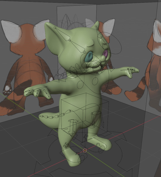
For the animations we would later use for the combat interaction, the AZRI model was used. After adding constraints from the hand to the sword, it was possible to create animations for combat with the weapon attatched.

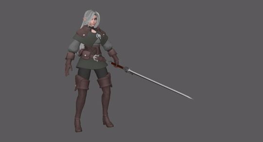
Using the AZRI model, we were shown how to animate the movements needed for the combat interactions. After doing a walk cycle and idle movement, we were then shown how to animate a run cycle and sword swings.


I tried animate hair movement in the first sword swing, but did not have time to do so for the other AZRI animations.
The sword swings and run cycles were difficult to animate as I was unsure of the timing of the actions, especially on how to make the sword movement look more impactful.

For the run cycle, I struggled to make the arm movement look natural, and for the hair to move with the character's head. As such, the end result looked choppy and stiff.
In our introduction to Unreal Engine, we were shown how to use the third person template. While working on the animations on Maya, we instead used premade animations and models on Mixamo.
Using the mixamo animations, we were taught how to use blueprints and create blend spaces for character movement.


Afterwards, we were shown how to export Maya models to FBX for Unreal Engine. After importing the animations, we repeated the steps on the Mixamo models to the AZRI model.


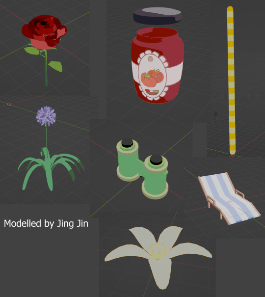
I then downloaded the Urban Warrior model made by Marc with K.
Model: @OtyMark Rig: @kaiakim_art
Using this model, I tried animating the character movements using the AZRI model and Mixamo animations as reference.


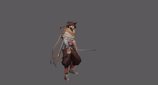


For these animations, I tried to animate the cape behind the character as the player would only see the back view of the model for majority of the gameplay. On hindsight, I should have picked a different model for the playtest as it was difficult for the cape to move fluidly. Even with the run cycle that had more movement with the cape, the result did not look good in the actual gameplay.
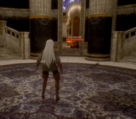
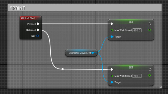
We were also shown how to make an event for the player to sprint on the map by pressing the shift key, and how to use sockets with the skeleton of the mesh. The attack range can also be previewed when testing the game.

After creating the animation blend space, blueprint and montage for the warriot character, a combat test was then done on Unreal Engine then recorded on OBS.
However, even though the imported model was working in the viewport, after importing the animations, there was a glitch on the back of the model's neck. I tried to reimport the mesh and animations but was unable to remove the stretched areas.
Overall, this unit helped us to understand these industry standard software better and I was able to be more familiar with using the graph editor for animation. If I had more time, I would have tried to animate the cape more realistically as well as the other accessories. I hope to conitnue working with Maya next year as it is a powerful software that can be utilised greatly for animation, and to light and render scenes better as I was unable to do so this unit.
ESSAY:
A company I would like to work for is Fortiche Production SAS, a French animation studio best known for their animations in partnership with Riot games. It currently has three locations in France and Spain, with its headquarters in Paris. The studio was founded in 2009 and started with commercials for companies such as Panasonic and MTV. The studio’s incorporation of 2D and 3D elements continue to be shown in music videos produced for artists such as Gorillaz. It is through this creative direction that video game studios began hiring Fortiche to work on game trailers in the form of short films and music videos.
The reason why I want to work for them is because the art direction behind their trailers and music videos have been the inspiration behind my personal projects for years. I first discovered their works through the game League of Legends, as the studio has been creating animations based on the game. Recently, the company has received further recognition for the award-winning Netflix series Arcane. The show has received a critical success for both its retelling of the lore behind in-game characters, and its painterly stylisation of 3D animation. Not only has Arcane given the franchise a wider audience who discovered the characters through the show, it also pioneered a new approach in stylisation along the Spider-Verse movies. The dark and mature themes of the League franchise is also reflected in its environment and character designs which has also influenced my art style. As such, if possible, I would like to work as a 3D generalist or 2D illustrator for their productions. This relates to my overall aspirations as I would like to work in the gaming industry after graduation and would like to specialise in 3D environments.
Based on their previous job postings on both their website and LinkedIn, the company mostly advertises positions available for mid to senior level artists who already have years of experience in the industry. If I were to submit an application, it would have to be done through the “unsolicited application” section of the website. As stated on their page, the studio would require links to the applicant’s LinkedIn profile and portfolio website. The application would be directed to HR for an interview if successful, then interviews from direct managers and creative tests. The applicant is also encouraged to send a demo reel and CV that showcases their skills and experience. While it may not be possible to receive and offer from this company at my current level, I would like to try to apply for a position in the future. Aside from this company, there are also other studios such as Goodbye Kansas Studios and M2 Animation that specialise in game trailers and cinematics. As most of the companies require knowledge in software such as Maya and Houdini, I would need to continue practicing fundamentals on the software I am comfortable with such as Blender, then build on this knowledge on industry standard software, as well as working on digital illustrations that can be used for professional work.
CV pdf: Lim Lin CV.pdf
Portfolio website: https://limlin2563.wixsite.com/digitalvfxportfolio
0 notes
Text
Unit 8 Reflective Journal - Lim Lin Year 2 Production Arts for Screen
Week 1: Blocking
For the first week of this unit, we chosen the animal for this project and gathered as much references as possible.

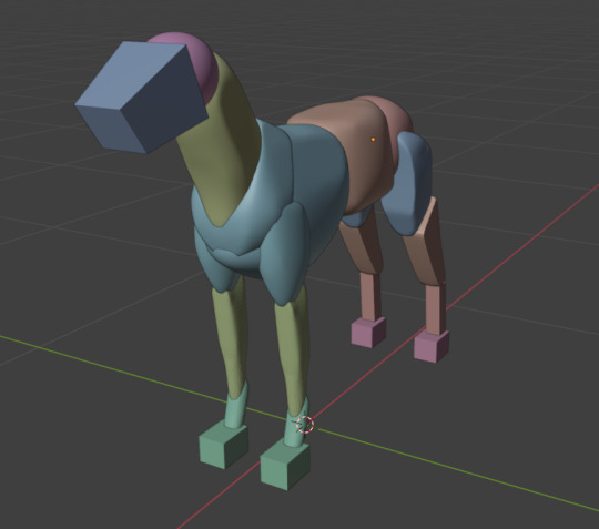
I chose black grey wolves as the key reference because the photographs made them look unique and the fur looked interesting to model. Afterwards, we began to block out the basic structure of the animal. I used dog anatomy drawings for this stage since it had a close anatomical and muscle structure to the wolf.


Week 2: Sculpting
After blocking out the main muscle groups, we remeshed and began the sculpting stage. For the details which I did not include during the blockout, I used the dog models on VFX Grace as reference, as well as close up photographs of wolves.


For the 2D component, we did live drawings of various quadrupeds to be more familiar with identifying main masses for the design stage later, as well as four poses of the animal.


Week 3: Topology
After sculpting, we moved on to topology in which the model is made for the parts to be arranged and interrelated for animation. By adding edge loops at the correct places, it prevents incorrection deformations when the animal moves. The shrink wrap modifier also allows the topology to follow closely with the sculpt.

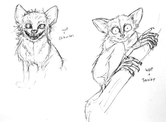
We were also tasked with creating a character design of our chosen animal 5 million years in the future. For this component, I imagined the wolf in an environment that is damaged from climate change and global warming. With the temperature in the day too hot for survival, the wolves have become nocturnal predators that hunt in the dark. Hence, I began looking into other nocturnal mammals as reference for designs. I also tried doing a few sketches based on my idea for the small nocturnal wolves.

Week 4: Fur
Using particle systems, we began adding and grooming fur onto the animals. By splitting the parts of fur into different particle systems, the roughness and clumping of the fur is more manageable.

For the 2D tutorials, we continued to work on live drawings of quadruped with focus on the muscular and skeletal structure.
Week 5: UV unwrapping
For the texturing of the wolf, we did UV unwrapping with UDIMS and the process was made easier with the use of clone stamps, photobashing and stencilling. After this step, the model was ready for rigging.


Week 6: Rigging
We used a premade rig with a blender addon for the animals. Since I was animating a wolf, this step was quite straightforward for me and so the rig was quickly generated.


Week 7
I also did some sketches for the 2D creature design during these few weeks. The final creature would be a small wolf resembling long haired chihuahuas with the adaptation of lemurs such as tarsiers. I continued tweaking the design for the creature to have a more feral and unstable attitude.


Week 8: Motion tracking, light and shadow
After the animal rig was completed, we recorded videos around the campus to use as footage for the final video. I recorded mine at the corridor as I wanted to setup a scene with the wolf running towards the camera and knocking the cameraman over.

We also had a tutorial about light and shadow on Photoshop. Using tarsiers as reference, I drew my wolf easing a lizard using greyscale.
Week 9,10: Animation, character design
The last two weeks were mainly focused on the animation component and final design of the creatures. For my animation, I wanted the wolf to have a dog-like attitude skipping its way to the lockers before inspecting it by interacting with the environment. The keyframes for these scenes was referenced with videos of wolves and huskies.
However, as the running sequence did not turn out well it was removed in the final video. The animation of the first two parts were also slowed down for pacing.
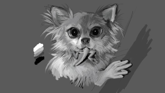
Afterwards, the character design was also finalised with the turnaround and pose sheet. I decided to keep the feral form of a small animal for my evolved wolf, and changed the eyes to one resembling more of cats to give it a fiercer appearance as predators.


For the colour drawing, I decided to depict the wolf caputred by a person's flash camera during sunrise, as if the creature was caught off guard before it hides back into tunnels during daytime.

0 notes
Text
Unit 7 Reflective Journal - Lim Lin Year 2 Production Arts for Screen
On the first week of this new unit, we were given a brief for our assigned projects. I was part of “The Herds” project, in a group with Sena, Olivia and Lizzy. During our first meeting, we decided on the type of production we will be making, to which we agreed to make an interactive QR poster.
The next day, we were given a talk by regarding further details of audience outreach from the client’s requests. Using the example of a mobile app, we were given more information about different phases of production and relevant knowledge needed for research. With the age demographic of youths aged 5-17, we were tasked on creating personas of our target audience based on factors such as age, tech savviness or personal goals. We were also tasked with making a user journey for each persona, as well as storyboards to illustrate certain outcomes.
Afterwards, we worked in our groups to further develop our ideas. Our group decided to write the story about the Bramble Cay melomys, an Australian species that went extinct in 2015, being the first animal to have perished from climate change. The story would include tragic elements made safe enough for our young demographic, while also showing them the realities about climate change and giving them hope at the end of the story with the example of an endangered species still standing. By doing research based on the list of endangered species made by WWF, we agreed to have the red pandas be the animals we will raise awareness about.
The plot outline we created was inspired from a 2021 short film called Migrants, as it similarly explores the topic of climate change in the point of view of two animals driven to extinction.
We also began researching about the environment with the context of modern Australia and the designs of the interior for personified rodents. The main inspiration for our research is “The Tale of Despereaux”, a 2008 animated film. We decided to look into how the environment of this film uses shape language and well-designed props to make the setting look believable to the viewer. Other franchises such as Tinkerbell, Chip and Dale, Tom and Jerry were also used as reference as their target audience falls under the same age range as ours. We also researched games like “It Takes Two” which also included elements that fit the environment we were building.
After writing a brief outline of our plot, we started assigning roles and setting deadlines to follow the production timeline. Olivia and Sena were working on the script while me and Lizzy were making character designs. The scriptwriting team would ask for input in various scenes, while we would ask them for feedback on the sketches to make the final design more appealing and suitable for the personality of the characters.

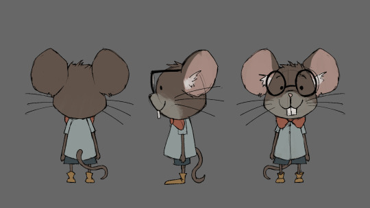

I did some rough sketches of the melomys before working on cleaner designs, however after some feedback realised that the designs looked too mouse-like.
After more revisions, the designs of the melomys were complete with Lizzy working on the baby melomy design and I was working on the adult melomy.


As such, we were able to move on to thumbnailing for the storyboard. During this stage, I also produced a quick layout of the scene for clearer visualization of the character movements.

We continued gathering references for art styles we would approach, taking into consideration the context, target audience and tone of the film. We narrowed down the demographic to young teenagers aged 12-17, as there are many animated films targeted towards this group with their appreciation towards stylised characters and ability to understand more serious topics.
As such, we started doing research on movies such as Teenage Mutant Ninja Turtles: Mutant Mayhem and Spider-Man: Across the Spider-Verse. This new style of 3D animation that uses comic-style shading and 2D visual effects creates a unique look to these films that people of all ages could appreciate, especially our target audience.
The TMNT movie also included many character designs that we found interesting and suitable for the characters we are designing, so we collected screencaps from the movie to use as reference later in 3D modelling. We were then able to complete the thumbnails for the storyboard. The images below are the segments that I worked on.


The week after, our tutors provided further feedback on the storyboard. Lizzy restyled the storyboard for the animatic to be clearer and more consistent, while we cut down the script by half of its length to make the story more concise.
I also did a line drawing for a side view layout of the town for Lizzy to use as reference when refining the storyboard, and a general guide for myself later when doing the digital painting.
Our group also agreed to change the end product of this unit to a pitch bible rather than a completed short film. This gave us more time to work on better concept art and focus on the animatic and sound design, as well as ample time to model the environments during the second half of the unit.
After the formative assessment, we began setting new goals to complete before the winter break. Olivia made colour swatches that were more suitable for the tone of our film, and using the new colour scheme I did the concept illustration for the town.


Lizzy continued refining the storyboard panels while Sena started experimenting on different shaders with Blender, eventually using this painterly shader that we kept for all later 3D environments for style consistency.

Before the break, me and Lizzy also did turnaround sheets for the melomys as our tutor Molly would be helping us in making the base rig.


I also did character designs and turnaround sheets for the red pandas. As we wanted to focus more on the animatic and animated clip of the melomys, the designs for the red pandas were drafted more quickly.


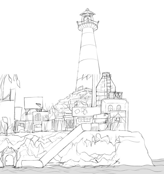
During the winter break, Me, Lizzy and Sena each did a 3D environment for the pitch bible. Lizzy worked on the cave house interior, Sena did the forest environment and I made the town environment. Olivia began working on the sound design and poster graphics.
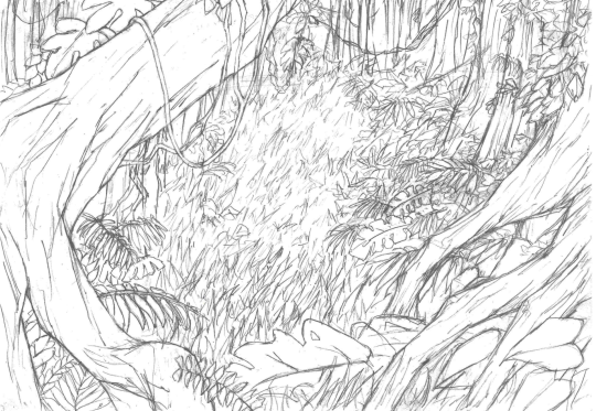
A concept illustration for the forest was also made for lighting and colour reference.


I used the town concept art as reference for the position of the itmes, and the line drawing for details of each object. While the line drawing looks clear enough to idenitfy the forms of each object, they were still changed in the final model with actual photgraphs as reference.


I then used the painterly shader made by Sena for the material for most of the objects and the colour swatch was eyedropped from the concept art. For some elements such as the water and plastic bottle, a mix shader was used to combined the base material with the glass BSDF.

The cross section of the lighthouse was also modelled as we had planned to also animate the stair climbing scene.

Particles were used generiously for this environment for both the glass and piles of debris surrounding the path. Displacement modifiers also helped to make the reflective painterly material have a more organic form.

Olivia helped to time the shots for the animatic and also created original sound design for the effects and music.
Animatic panels by Lizzy, Sena, me
Editing and Sound design by Olivia
CONTINUED IN NEXT POST
0 notes
Text
With the help of our tutor Molly, the lighting of the rendered scene was corrected and there was a stronger sense of danger and appending doom in the environment, which suited the atmosphere of the scene. The bloom effect combined with the fog also made the scene much more intense.


At the same time, Lizzy, Sena and I also started editing Molly's base rig to look like the four characters. Sena worked on the melomys, while me and Lizzy worked on the red pandas. Lizzy did the model for the baby panda and I did the adult model.


We then began splitting the work for animation. Olivia worked on the 2d water animation to achieve the comic-style effect, while we did the 3d animation. The QR poster was also made by Lizzy who rendered a vertical shot of the scene which highlighted the characters and environment through silhouettes.
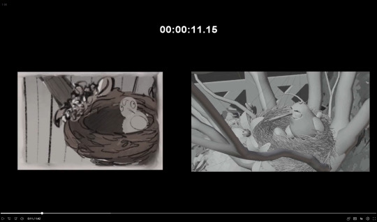
I was animating the running and climbing scenes between 0:05-0:10. However, on hindsight I should have done the shot in 8 frames instead of the default 24 and the difference in frame rates made the climbing movement look like hopping.
By the end of the unit, the work we did was compiled into a presentation for the pitch bible.
Overall, this unit was fufilling as each of us were able to contribute using our strengths and we able to assist one another with various tasks. Being able to update each other on our progress in different tasks also boosted our productivity and morale. We were also able to be more comfortable with animation and managed to manage the time given well.
0 notes
Text
Unit 6 Reflective Journal - Lim Lin Year 2 Production Arts for Screen
For our first unit in the second year, we were tasked to created a 3d environment through three randomly selected prompts. My prompt was an Interior Design Shop in Buenos Aires, Argentina in 1989.

As shown in the slide, there is a significant influence of European architecture in Buenos Aires, especially French architecture. After looking into the different architecture styles seen in the city, I began researching on places that create distinct visual identities for the city.
I first looked into local markets and shopping districts as they are the spots popular among tourists. While the items range from handmade local crafts to international brands, a common feature of these stores is the presence of European architecture in these places.
Unique locations and symbols are also strong indicators of the city which I could use. Caminito is a street that became a tourist attraction due to its vibrant and saturated colours. While this is eye-catching and is an obvious indicator of the location, I chose not to use this street since it will cause the final product to look too sterotypical.
Jacaranda trees are also appealing due to its unusual colour compared to other plants that grow at the side of roads and pathways. As such, I would try to incorporate this visual indicator of Buenos Aires into the scene.


I then looked into trends and movements in the 1980s which I could implement into the design. Bright and saturated colours are prevalent in both fashion and design, one of which included the Memphis group.
A unique feature of the 80s are also neon light installations. Neon lights Made a resurgence in the 1980s. Today, places such as malls would appear dated if strips neon or LED lights are present.
I also did some research into alternative styles in the same time period that greatly contrasts the bright neon aesthetics more commonly associated with the 1980s.

As this is a very tumultuous time period of Argentinians in the 1980s, I would focus largely on how the impact of the economic crisis greatly differs between individuals of different social statuses. The context of 1980s Argentina could be used to create a narrative based on a character owning a retail store during an economic crisis, when the middle class have significantly less purchasing power so sales could be made.


I looked into retail storefronts as they are an iconic feature of 80s malls, it can also be used to design signage and create colour palette for the scene.
Interior design magazines can be used to to indicate time period and trade. It can also be used as image textures for the environment.
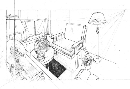
Display racks and furniture create the look of an interior design shop, selecting items that follow the 80s design trend. Brass floor lamps such as the one pictured are expensive, this also shows that this store is selling items only the rich are willing and able to buy. Peace lilies are a popular house plant in the 1980s due to its feature in NASA's Clean Air Study, so I would also include this in my design. As columns were a significant design feature in the 80s, I wanted to add a vintage item that has similar textures and shape, so I added a plaster lamp.
The other furniture for display will be used from the ones shown in the previous slide.

For modelling, I looked into how sci-fi vehicles in animation were designed. Most of which have close proportions to their real life counterpart, however they would have smoother and more curved finishing and reduced details for easier animation.
Although most 80s animation aesthetics that are remembered today feature a dark night sky and city illumination, this strayed far from the warm colours of Buenos Aires. As such, I leaned more into warmer environments like the screencaps in Robot Carnival and The Little Mermaid.
I also did some research on early 80s animations such as early Looney Tunes cartoons, however the minimalistic and simplified style inspired by art deco motifs did not suit the direction I was going for.


I then began designing using the new idea of an interior design shop owner travelling around the city using a camper van.
(Top left to bottom right)
1971 MERCEDES-BENZ T2 L508DG Camper-van: Nice shape and colour, but looks too close to 70s retro aesthetics
1969 MB LO1112 Colectivo: A strong visual indication of Buenos Aires, but clashes with my storyline and colours are too bold
1980 Mercedes Benz 508 D Motorhome: Made close to time period and large enough to practically serve the function as an interior design shop, but not visually interesting
Ex-Police Special Forces Mercedes T2 Camper: The van that gave me the idea of making a store from the outside of a vehicle, however the shape isn’t interesting and the small size makes the functionality hard to believe


The first block out was made using a single mesh, which I then regret because it became very difficult to create loop cuts or use the Boolean modifier. Fortunately, I was still able to use its shape as a guide when redoing the model with separated parts.
As the style I was going for (late 80s sci-fi animation) has relatively normal proportions and simplified details, I did the same for the van as small details were removed, to make the scene less realistic and to save time for this unit.
This also allowed me to use the furniture and display racks I found during research as reference images for the items that will be displayed in the store.
For the store layout, I designed it while modelling as blocking out the areas to place display items while adjusting the camera view gave me more control with the scene composition.

A metallic chrome shader was made using a YouTube tutorial to create "80s Chrome" text. As the intent of the shader was not for large objects, I still had to make many changes for the effect to work on metallic parts of the can. I also recoloured the material for brass objects to create a glossy and clean appearance.
After experimenting with various painterly shaders, I realised painting by hand using texture paint gives a more desired effect since I can control the brushstrokes better and only work on the camera view. I also painted over some images that looked too realistic such as the cardboard boxes. I also drew thes Argentinian austral on price tags to provide context of the hyperinflation and economic crisis in late 1980s
Since this assignment did not require animation, I use the opportunity to draw the foliage on jacaranda trees on Photoshop and added the drawings as planes parallel to the camera view. To create more depth in the trees, I overlapped the images over one another.
For finishing touches, I added a glare node in compositing to recreate the blurry lights seen in vintage photos.


Overall, I was glad I could execute most ideas I had in mind for this project within four weeks and was able to learn how to use the texture paint tool instead of relying on nodes. After completing this unit, I felt that with more time I could push the hand drawn style further with more textured painting.
2 notes
·
View notes
Text
Unit 5 Reflective Journal - Lim Lin Year 1 Production Arts for Screen
For the final unit of this year, we had to recreate a shot from a movie using blender, then using green screen add ourselves into the scene. Parasite (2019) was chosen in the end as modelling the flood scene is an interesting challenge and I wanted to try recreating the different elements seen in this shot, especially the lighting effects and water.

For research, I rewatched the movie to find shots that can be used as references from different angles then added these images as reference for the first block out so that the model is proportional to the actual set.

However, many issues were encountered as the focal length used to match closely with the corridor caused the water in the background to appear distorted from the camera view, not matching the reference well.
For the second attempt, I added the reference image in the camera view background instead of a plane so it would easier to check the perspective of the environment. I also stuck to using a 65mm lens as from an interview from Kyung-Pyo Hong, the cinematographer for Parasite, that was what was used for the filming of the movie. Using this focal length, the water level aligned with the reference image.
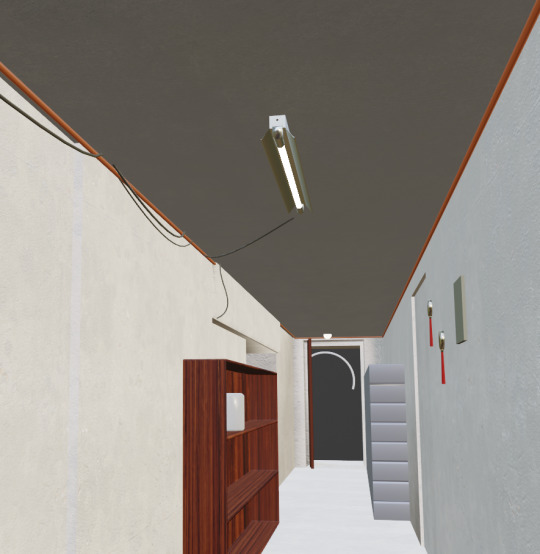
The main drawback of this lens was the distortion in the background, as the corridor was too long and the items at the back have to be scaled heavily to match with the camera view, but I kept using this since the horizon line of the water is more important and the items in the back are mostly hidden from the view. Using weighted normals helped to give the corridor more accurate shading, which would then be useful for the lighting setup.

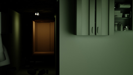
I then moved on to modelling the props, starting with the ceiling lights. From a different scene in the movie, the white light came from a ceiling light with one fluorescent tube and the second was a spherical lamp in front of the door.
A separate blender file was used to model the pantry items, as I wanted to use an image reference to model the props easier.

On the main blender file, the floating objects were modelled. I used the main file for these since the space between the objects was important and it will be difficult to readjust after appending.

Later that week we were given studio time to record the green screen footage. The image below was the old block out used as reference for the lighting. The cupboard and clothes in the foreground were also modelled before I redid the scene, I would later on append those to the new file.
Other than the blender scene, I also wanted to create a prop to look like the one the actor in the movie was holding. Using paper mache and acrylic paint, this was made over a cardboard box. I used a picture from the set as reference for its shape. The colour and overall shape was not exact, but I decided to leave as such since it will not be obvious in the actual footage.
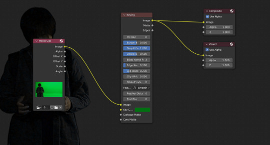
After the greenscreen was recorded with the help of the technicians, we were taught how to do compositing on blender.
While the process of modelling small items shown in the scene was straightforward, texturing required some guesswork and research on Korean brands seen in the picture. I was not able to match the same product but found items that looked similar from a distance. For the textures of these props, I used images of related products online, either from the same brand or items that resemble packaging that I cannot recognise from the photo.


To model other props such as the light switches and ornaments, I used other scenes from the movie as reference for modelling and made simple shapes that have the same properties as the actual items.

For the clothes hanging in the foreground and background, I sculpted the shape then used base colours which matched the reference more in the rendered view. As high contrast settings were used for the render, the base colours of the textures used have to be light for them to not appear too saturated or dark in the final render. This also applies to the walls, ceiling, and other large spaces.

This also affected the reflectiveness of certain props such as the frame seen on the left, as adding a glass pane or lowering the roughness of the image texture would result in the object appearing too dark. Hence, I decided to instead opt for increasing the roughness for the value to match with the reference image.

The pipes and cables on the ceiling were then added, along with furniture blurred in the background. I did not add much detail for the obscured props since it was hard to see, and I plan to add depth of field to blur the background. For the view from the door, I used the reference image as texture for the plane.
To recreate water shown in the scene, an ocean modifier is added onto a plane. This was the hardest part of the environment as it was not an accurate fluid simulation but was more suitable for this project. To make the objects float on its surface, each prop had constraints to a different plane with the shrink wrap modifier applied. The influence of the constraint was also lowered so the floating of the props appeared less erratic in the animation.

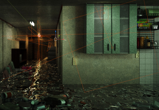
Various area lights were added across the environment to replicate the cross shape seen in the reference. The radius, strength and colour were done using trial and error to find settings that give the closest result. When setting up the material for the water, the viewport render worked but after using the recommended render settings the scene lighting was heavily affected. I struggled a lot with the material setup as during the first attempt at rendering, the water looked like this image below.
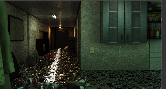
Many changes had to be made, such as redoing the water material, adjusting the scale of the ocean, and changing various settings that caused the simulation to be too rigid. The water setup I first used was based on a YouTube tutorial I watched for the material for the second unit, but it caused many issues with the scale of the noise texture, so a quicker method with principled BSDF was used instead.
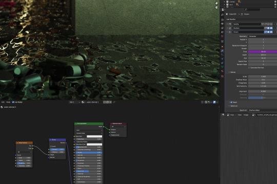
This was the setup used to match the render closest to the viewport. The size of the ripples was caused by the ocean modifier, but after adjusting it the floating objects’ speed was too fast and the animation looked unnatural, so the constraints were adjusted accordingly afterwards. After adjusting the water texture, I began timing the flicking of the lights based on the greenscreen footage.
Depth of field was also added to the camera to replicate the blurred background seen in the reference. While this helped to make the background resemble the scene closer, I also should have put less detail on objects that are obscured by the effect, such as the pills in the foreground and washing liquid in the background.

Final touches were then made to the scene by adding more image textures to the items and fixing the bevel of the cupboard for sharper lighting. More lights were also added to the environment to correct dark spots that were not shown in the reference.

Afterwards, sound effects of a thunderstorm were added to the video with Premiere Pro as well as the VFX breakdown. Overall, I was able to learn a lot about VFX and postproduction and thought this was a fulfilling conclusion for our first year. After watching the render, I feel the water physics and chroma key could be further improved, as so I would continue looking into different features of 3d modelling in the following year.
1 note
·
View note
Text
Unit 4 Reflective Journal - Lim Lin Year 1 Production Arts for Screen (WEEK 1-5)
Week 1
For this unit, I was in Group 8 with Marina, Franciska, Jing Jin, and Daisy. Before the start of this unit, we were given time to create a logline and synopsis to plan for the story of the animation project. I tried to make a story about a food critic and a waiter.
During the first group discussion, we quickly decided on a story to use for the animation, to which Daisy’s story was chosen. The main idea of the logline was about a baby bird flying out of its nest. Afterwards, we moved on to brainstorming ideas and details for the script.
The script was later finalised by Marina, in which the story was about the bird learning how to hunt for worms. After getting a better idea of the storyline, we began to research the art direction we will be following for the project. In the shared Pinterest board, we all had the same general agreement that the story would take place in a lush garden with cartoonish style characters. In the end, we narrowed it down to a Disney and Ghibli inspired style and decided to look for environments with open skies and warm colours that are suitable for the mood of the animation. We intended to create an animation that appeals to young audiences, and a flat illustrative style appears to appeal to this demographic based on our research.
Week 2
After finding ample references, we started producing sketches for character designs based on the art styles of the images we found on Pinterest.

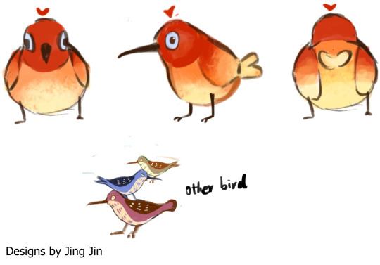
We decided to follow the design made by Jin as it was simple yet effective, and she also made the turnaround sheet which will later be used for the 3d model.

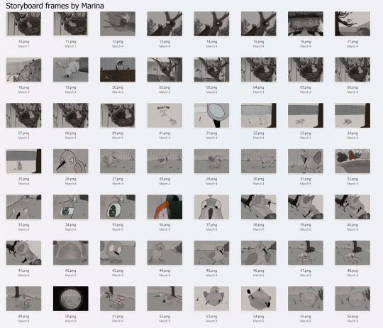
Once the character design was decided, Franciska began doing the rough storyboard on paper and Marina cleaned the frames digitally.

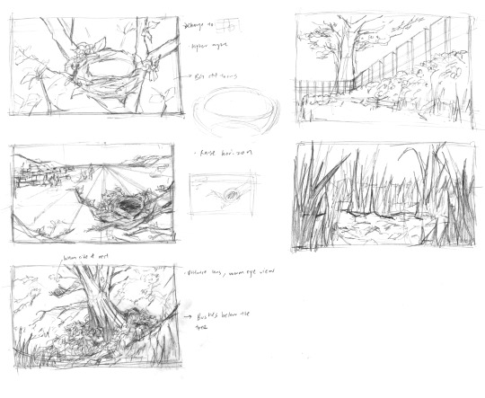
I used those weeks to do environmental concept art and experiment with blender shaders. I first did some sketches using photo references, then the sketches were used for shots in the storyboard.
As the concept art we used as inspiration was very stylised, I spent some time watching YouTube tutorials to familiarise myself with toon shaders.
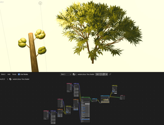
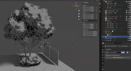
The above image was made with simple shapes on the left, and the sapling gen addon on the right. While the shaders worked, the problem instead was the structure of the trees as it did not fit with the illustrative style we were going for, as it was either too minimalistic or realistic in comparison to the bird.
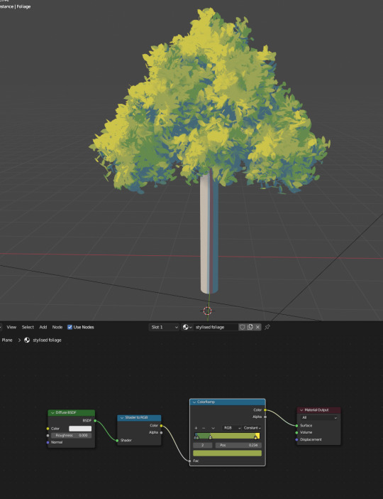
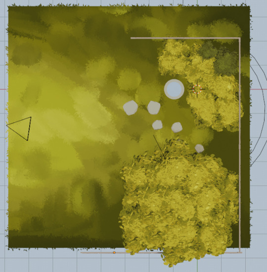
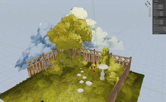
To make the 3d environment consistent with the character, I found a ghibli style foliage tutorial and learnt how to create a 2d effect on blender with custom normals and particles.

A tip that was useful in the Ghibli trees tutorial was to duplicate collection instances instead of the object itself for Blender to operate more smoothly. After following the video step-by-step, I tried remaking it again with the leaves modelled. The main issue now is the trunk that did not fit the style of the foliage.
Week 3
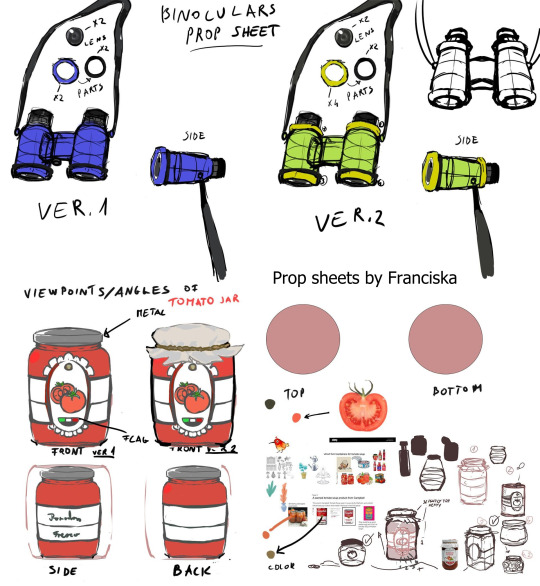
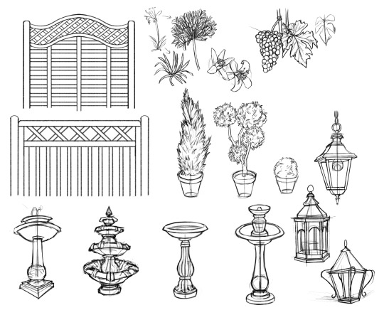
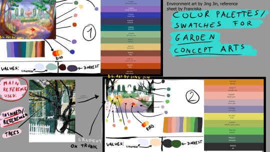
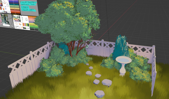
For this week, we did further research on the props needed for the environment. We were given advice from one of the tutors to set the garden in a certain location to add more detail, and we settled for an Italian inspired garden. As such, props such as cypress trees, stone paths and orange trees were added to the scene. After doing research and collecting references, Franciska made prop sheet references for interactive props, and I made a prop sheet for the non-interactive props. However, as the prop sheet I made was not stylied, Jin helped to make more stylised versions of the plants, props, and fountains. Marina continued with the storyboarding and Franciska compiled the storyboard frames into a premiere pro file.
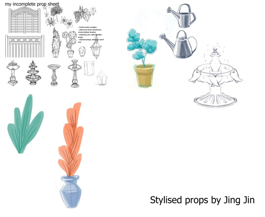
The feedback given was that the stylised props appeared too flat, so we had to find a style that was somewhere between.
We also began experimenting with different colour schemes and styles to make the environment consistent. I tried making a greyscale illustration of the environment with the objects we decided to include in the scene.

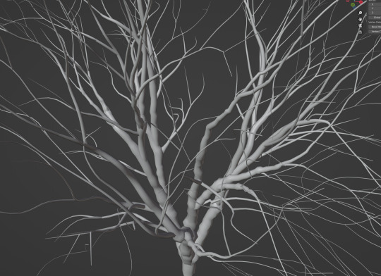
For the tree model, I used the same Ghibli method again but used the sapling addon for the trunk and branches. I also modelled some fences, but it appears too detailed and proportional for the direction we were going for.
As the sapling generated with the addon were too smooth, I converted them into a mesh to manually tweak each branch for a more organic look.
Week 4
In week 4, we worked on looking for a suitable colour scheme that complements the design of the bird. While the colour scheme we chose was aesthetically pleasing, it was unsuitable for the lighthearted tone of the film. As such, me and Jin did more style explorations to find a more vibrant colour scheme.

Daisy also made an expression and turnaround sheet for the character and Franciska made more reference sheets for the environment and secondary characters. I painted a shot from Marina's storyboard for our group to picture what the scene may look like in colour.


I also started modelling the props using the line drawings as a guide. I changed the proportions of the details on the fence to follow the style of the animation.

I tried stylising some of the props, but ended up only using the lamp from these drawings.
The nest and lamp were also modelled, with the nest made using a particle system. On hindsight, I should have used larger sticks for the nest as it looks too detailed in comparison to the rest of the tree.

The props were later textured using a toon shader

Jin also created many of the interactive props needed for various shots.
Week 5
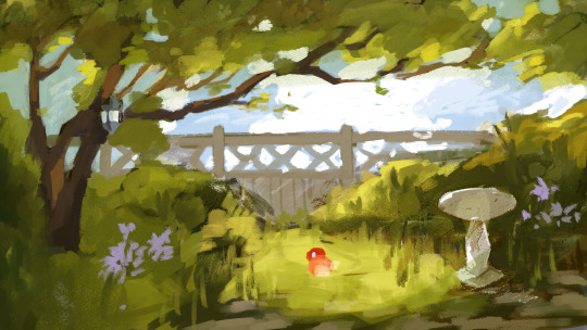
Before Easter break, I added grass to the scene using particle modifiers and drew a simple texture on photoshop for colour variation. A rock path was also added for extra detail. I also changed the colours of the material for an alternate version of the colour scheme. In the end, we chose to continue with the original colour scheme as the greens contrast with the red bird well.
Marina was able to fix the frames which had to be corrected by this week, and Franciska helped to compile everything in premiere pro. As such, we were able to start looking for sound effects. As we were able to finish the tasks on time, we used the remaining time to look for sound effects and background music for the animation.
CONTINUED IN POST BELOW
0 notes
Text
Unit 4 Reflective Journal - Lim Lin Year 1 Production Arts for Screen (WEEK 6-10, Creative Research)
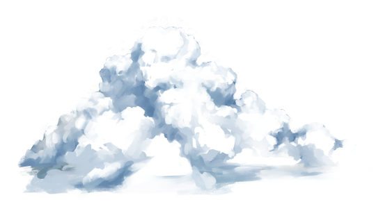
Continuing from the previous post, I appended the flowers modelled by Jin into the scene and tried drawing a cloud using a Ghibli film still as reference, however the result of the clouds did not turn out well due to the shadows casted by the tree.

Week 6
After the Easter break, we showed the tutors the current progress of our project. Franciska was able to edit the animatic with sound effects and the result was shared. The main issue the tutors had was the timing of the shots and certain camera angles. They suggested the animatic to have longer pauses and the inclusion of more frames.
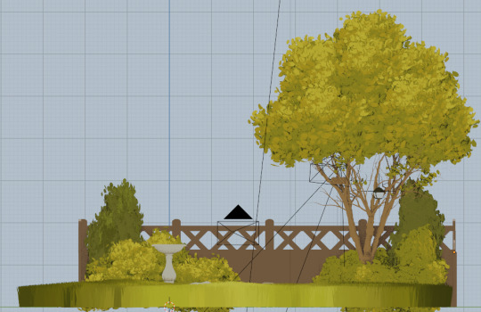
For the environment concept art, we were told that the garden did not resemble an Italian garden as the tones were not warm enough and we missed certain elements that should have been made to make it loom authentic. Instead, we were told to make it a British garden.
The feedback given for the 3d environment was the textures and length of the grass particles. For the corrected version of the scene, I shortened the length of the particles and changed the shaders of the fence. As the image texture clouds looked off, I also replaced them with a HDRI which worked much better with the environment. The texture of the fence was also changed for the noise to be more prominent as to be more consistent with the rest of the scene. After making those changes, the fixed environment looks like this.

Daisy helped in designing the supporting characters and Jin modelled them with colour variations.


Week 7
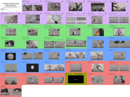
As the bird had yet to be rigged, we decided to work on the Previs instead to get the blender files for each individual shot confirmed, making the workflow easier once we began animating. The Previs and animation work were split between me, Franciska, Jin, and Marina. I did shots 1-11, and 36-42. Although we had to add an extra step in the pipeline for a placeholder of the bird model, this was useful in organising the shots and setting up the camera angle.
Week 8
The Previs was complete, and Franciska helped to create a side-by-side reel to check the timing of the shots.
For the animation, the work was also split between the four of us as shown below, with my section marked in blue.
The bird rig was also sent to us, however there were some problems with the eyes. I eventually realised the main problem was with the modifiers, as the mirror modifiers were not applied before the model was sent to Molly, and the separate eyelids were hidden so it was not moving with the armature, but there were still some issues with the hips and joints so we spend most of this week on shots that require little to no change in the bird's movement.
Week 9
By this time, the rigging of the bird had been fixed and we continued working on the animations. As the time taken to render the shots was too long, our tutor Paul told us to render the viewport animation instead to review the entire animation rather than individual shots. This was my personal favourite shot as I didn't expect the animation of the eyes popping out of the binoculars to work.
After most of the shots were animated, Franciska compiled all the viewport renders onto the animatic which was then reviewed by Paul. He gave us feedback on the timing and camera angles of certain shots, as there were a few continuity and flow issues with the scenes. Once those shots were fixed, we began fully rendering the project.
However, the main thing that disappointed me was the rendered grass particles as they looked different from the viewport. I assumed the grass particles looked okay through the material and rendered view and proceeded to do the Previs with the viewport render. The main problem was how it looked in the actual rendered scenes, as for some reason it appeared more rigid and unnatural with many objects clipping into each other. As I had already uploaded the file as the final environment and everyone had completed their section of the Previs, it would be unfair to fix the environment and make the other members redo the camera and object placements.
Week 10
The last week of this unit went smoothly, given we chose a simple story and had an effective production pipeline. The key issues we had in the final lap was the rendering quality of the shots, as we had to redo most of the renders to a 4k resolution to reduce the number of artifacts in each shot. Given that we decided to render everything in a large resolution, it took much longer than expected. This also made me realise how badly optimised the main file was since there were too many calculations made outside the camera view that were still being processed in the render. Fortunately, we did manage to render all the shots before the deadline and Franciska helped with adding post editing effects as well as the transitions.
Overall, I am thankful to be put in a group of people who have vastly different skills and worked in the areas we were strong in. Marina helped to lead out group not only by doing tedious portions of work such as the storyboard, and making sure that we stay on task and meets the goals of each week. Franciska contributed a lot in the planning stage of the production through the prop and character sheets, then helping us with her great expertise in 3d software and video editing. Jin gave us unique ideas in stylisation and modelled many of the props that needed to be interacted, with incredible attention to detail. Daisy also helped in giving us the idea for the story itself and created many 2d illustrations that gave life to the characters.
I hope to do more in the early stages of production such as storyboarding in future projects and will learn from the mistakes I made this time to create a better quality work for my groupmates in the future.
Creative Research
For this unit's creative research portion, we were given a lecture on researching objects. There are varied reasons to research an object and a general definition of an object in this unit's context. The idea that objects are “relational” guided me in understanding this topic as strong storytelling could be done through the physical items. After each lecture, we were also given time to discuss what was covered through seminars. I found the seminars to be useful in helping me understand the content of the lectures at a better level, as well as allowing us to develop our own opinions about what was taught.
A lecture that helped me greatly for my research topic was about researching makers. This was interesting to learn more about as the discussion about the "Death of the Author" has been prevalent on social media, and learning different ways to perceive a creator's authorship of their work especially in collaborative media, as well as the importance of being critical towards the actions of a maker.
For essential readings, the few that stood out to me as engaging and eye opening. Ursula Le Guin's 'Carrier Bag Theory of Fiction'. gives a unique perceptive of fiction that I had yet to consider. The idea of fiction as a "container" and the "botulism" of narratives stuck with me throughout the discussion. Edward Said's 'Orientalism' also made me more aware of the level of otherness which is placed involuntarily of those from different cultures and ethnicities, and is also an informative reading due to current tragedies of the world and the global reaction to the situation. These seminars and lectures have genuinely helped me in analysing the texts I read more critically and these skills would be useful not just for school essays but with the media seen in everyday life.
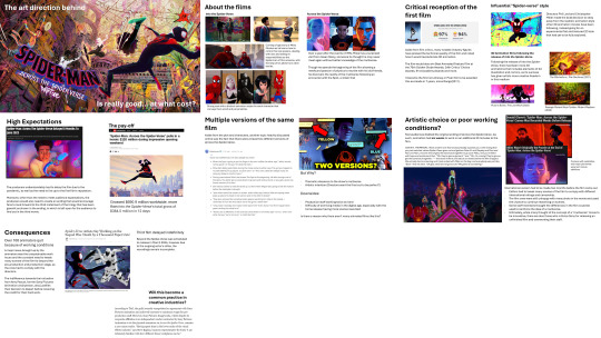
After the weeks of lectures and seminars, the topic I decided to choose was the production behind the Spider-Verse films. This topic interested my greatly as this franchise had one of the greatest impacts on me as an aspiring artist, and I distincly remember the disappointment I felt hearing about the mistreatment and harsh working conditions behind one of my favourite sequels and films of all time. I ended up using a lot of online articles as research as I found those to be the most useful in obtaining direct sources from producer interviews and recounts from the production staff.
0 notes
Text
Unit 3 Reflective Journal - Lim Lin Year 1 Production Arts for Screen
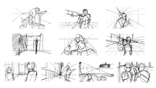
This unit introduced us to storyboarding and previsualization. The same script was given to everyone, and we had to break it down and create quick thumbnails for each scene. For my storyboard, I wanted to go for a more comedic tone for most scenes.
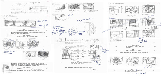
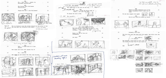
After the first rough sketches, I noticed many issues with perspective and staging in the shots drawn. Moreover, when looking at things from afar, many of the shots looked staged or repetitive. A bigger issue was the 180-degree rule which I struggled with, making some panels hard to follow.
For the tutorials, we were given quick exercises to draw different frames from various films in minutes using Photoshop. The horizon line and perspective were important to place subject matter in the frames correctly, and the goal for these exercises was to draw fast and to not go into detail. As I am slow at drawing, I struggled to do the first few exercises as the thumbnails were not clear enough and kept redrawing parts, then ended up not having enough time to finish.

The next week, we focused on figure drawing. Emphasis was placed on gestures rather than the anatomy of the models shown on the screen. We were reminded frequently to draw with the line of action and avoid focusing too much on the muscles. Using the line of action, a figure can be drawn faster and quicker with energy and movement.
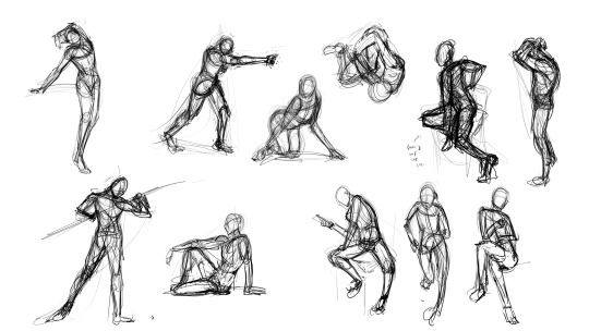
The drawing gets built up with structure and form and supported by paying attention to the areas of tension and structure of the form. An advice that helped me a lot was the guideline that the angle of the shoulders and hips should be the opposite of each other, though there were some photographs which had the angles hard to identify. Drawing from the feet upwards also helped me balance the figure more but it is still hard to achieve.
We also did another gesture drawing exercise traditionally using charcoal. Using a physically larger canvas gave me a clearer idea of how to make poses look less rigid.

After more practice, I began to work on the storyboard drafts. By drawing on larger spaces on the paper, I was able to draw the panels clear enough to trace on Photoshop.

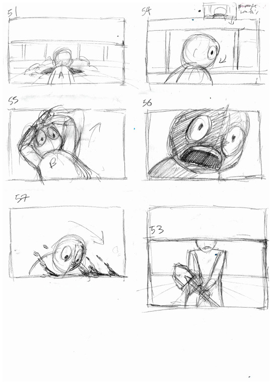
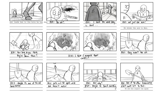
For the first scene, to make the monologue less repetitive, made the camera zoom in and out of Ash more often. However, the part where he puts down the spade and picks up the arm seems out of place. For the final animatic, two more panels are added in between to create a better flow.

On paper, the walking shot from his point of view seemed okay but after adding it to premiere pro I realised the timing was too short so I added another panel of him walking to slow the pace down to create suspense. For the last few shots of this scene, I wanted to make the angles more dynamic. The scene of him dropping the arm out of fear is titled to show his shock and fear, and the part where he runs into the house is shot from a wide high vantage point to make him appear smaller as if overwhelmed by the environment.
The next scene has more comedic lines and mainly focused on the two character's dialogue so the compositions are flatter and closer shots are used to focus on their upper body language and facial expressions.
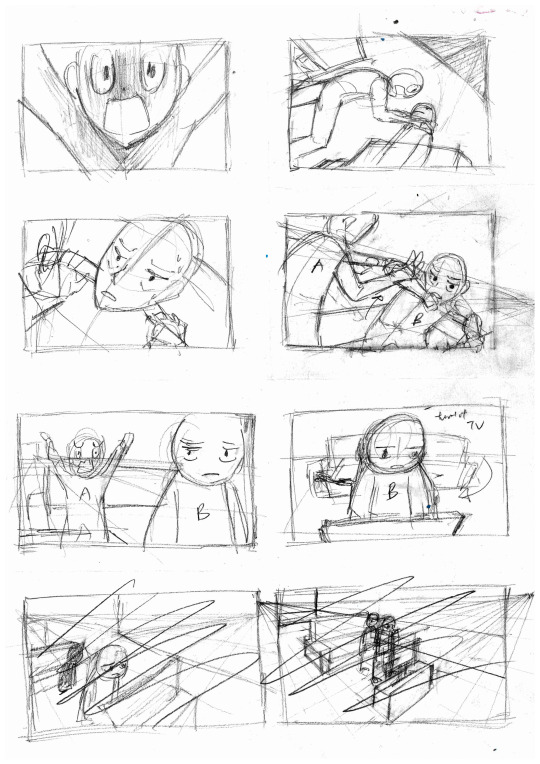
The exception of this was the point when Ash desperately pleads Bex to take him seriously as she seems indifferent towards the morbid idea that a dead body is in their garden.

The scene ends with Ash dashing out of the house to show Bex what he discovered.
For the third scene, I already started on the animatic and cleaned the previous scenes digitally, so I did not have time to fix the rough storyboards on paper and instead worked on the remaining panels on Photoshop. As such, I also included the formatted storyboard for the last scene in this blog.
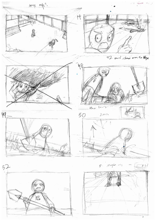

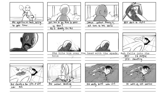
I tried using as many dynamic angles as possible as well as sharp shapes with the spade. I didn’t really use many references from other films for this unit but did so for the last scene as I needed to learn how to create suspense and action. Because the story is mainly lighthearted, I decided to use implied violence. Thus, the part where Bex hits Ash with the spade was referenced from this scene in American Psycho.
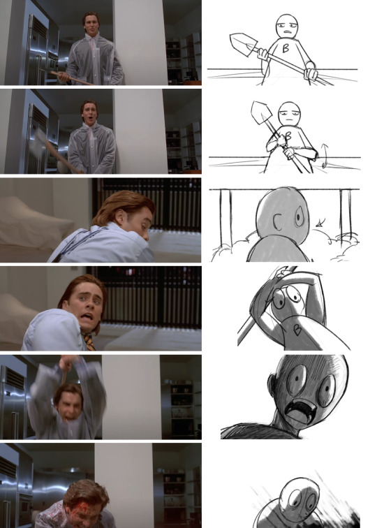
I thought this worked well with the storyboard as it follows a similar context of an oblivious person not aware of the murder setup of the more dominant figure, in my case Ash and Bex respectively.
For the hand-in, we were given a brief introduction to premiere pro as it will be the video editing software used for the animatic and previs. The main thing to keep in mind was the organisation of files as it is easy to lose media when transferring files across devices, which I experienced multiple times because of wrong file locations.
The Previs is to be made using blender as there are several things to take note of for the process to be done quickly. The shots made in 3D are meant to be throwaway art that is easy to make, so we were told to keep things simple and only model what is visible. What should be focused on is the shot's composition, clarity and timing. Like premiere pro, it is also good practice to make collections and to keep things in groups. Every single shot is a separate blender file, and the timeline is the number of frames in each shot.
For most scenes, I used a focal range between 35-15mm for more dynamic angles. I also used the sapling tree gen addon for the leaves, which helped a lot to make the lighting more effective for the setting of a garden.
The result looked like this when comparing the previs with the animatic for scene 1. To create the establishing shot, I used after effects and blender keyframes then imported the video files back into premiere pro.
Animatic: https://artslondon-my.sharepoint.com/:v:/g/personal/l_lin0320231_arts_ac_uk/EY_ypRbvIwFBki4taSGtOaIBNeLFT2Ro5l1go4EiA1VqNg?e=9amh7F
Previs: https://artslondon-my.sharepoint.com/:v:/g/personal/l_lin0320231_arts_ac_uk/EemLgbhE-29NlVcD5_AGvS0Bhi1cmr7oJtFlUNFCGOR07Q?e=SW38pW
In case the OneDrive links won’t open, I have also uploaded them below on this blog.
Overall, If I had managed my time better, I would have wanted to use more references and created character designs to distinguish the two figures better. On the other hand, I felt that this unit helped me to address a big problem in my work which is my drawing speed and clarity which I think had improved over the month. I hope I would be able to work more efficiently in future animation units.
1 note
·
View note
Text
Unit 2 Reflective Journal - Lim Lin Year 1 Production Arts for Screen
For the next unit, we are introduced to designing and making. For the next five weeks, I will be recording my progress and reflections for both the 2D and 3D components of this project.
During the first lesson of the 2d component of this unit, we were taught how to convey storytelling in a scene, in which the setting allows the audience to know the story. Several factors such as the angle, atmosphere and shape language create a scene in which the character, personality and time can be shown. An important part to take note of is to ensure that the viewer knows what the drawing is about, and to do so we should plan the artwork with a story in mind and use different design elements to create context and meet the audience's expectations through the medium. For the practice we had this lesson, we had to redraw a child’s bedroom into one of a spiteful 90-year-old.

I decided to change the bed frame to a hard metal frame, replaced the small tv with a larger one, removed the posters while leaving marks of it that were stuck to the wall, and added a few old storage boxes to imply that the elderly person has grown out of their past hobbies. I also tried to show the age of the elderly person with several other changes such as changing the furniture to more antique ones and adding props like the floor fan.
The next tutorial for 2d drawing taught us how to create appealing and leading compositions. A point heavily emphasized was that the environment provides a stage for the action. The practice given tasked us with doing a room drawing with all the props given, while making the fishbowl the focus of the composition.
Although it was not obvious in the rough sketches I made, the different props ended up appearing very cramped in the final drawing, so the fishbowl did not appear as the focus of the shot. I would have to consider when working on the final hand in's line drawing component.
The third tutorial was for the drawing practice which involves outdoor compositions. For environments consisting of organic forms, finding the horizon line is important when drawing them and take note that the large land masses are still on the ground. For this practice, we had to draw an image of a forest given in another camera angle.
For this drawing, I started with the closer trees as a frame then struggled when working on details such as the grass and weeds. I should have controlled the number of details in different areas of the shot to lead to eyes to the centre of the image.
Lastly, to make the settings appear more charming to the audience, our tutor explained ways to make the backgrounds look more captivating rather than informational. To do so, the advice given is to have solid perspective drawing and to research on details, as well as to vary line weight to create a sense of depth. I realised after this tutorial that many of my previous perspective drawings have this issue as the ones with many geometric forms appear too mechanical. As such, I tried following the guidelines given when working on the line drawing, then cleaned it digitally for the final hand in.

The second part of this unit was the 3d component and it began with an introduction to blender. For the next 3d tutorials throughout the unit, we were guided on how to model a realistic eyeball which will then be used for the final 3d render. I tried using blender a few times in the past but struggled a lot because I was not sure how the different tools work. These tutorials helped to familiarise me with several functions that are used often in modelling, such as proportional editing and extrusion. The types of texture maps used were explained clearly and this later helped me a lot when creating my own materials.

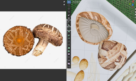
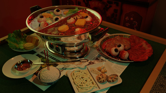
For the “Eyeball Soup” project, I wanted to create a scene which depicts a cannibalistic family having a hotpot dinner. The inspiration of this came from various horror games which have this storyline as a reason for body parts to be found in meals. I also wanted to play with the cultural aspect of this project as I find the many ways to incorporate this grotesque subject matter into Chinese superstitions to be interesting to research on.
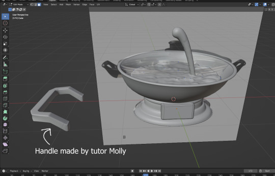
The first items I modelled besides the eyeball are simple items such as bowls, plates, and trays, then working on more complex objects like the hotpot. While they are all made of similar shapes, I struggled a lot with modelling the bottom half of the hotpot as I was still not familiar with using the extrusion and other editing tools. I had to redo the modelling several times before ending up with this result.

The handle was also challenging to model. The use of the mirror and subdivision surface modifiers made it difficult to bevel the edges of the handle. I decided to try working on other parts first, so I started looking up fluid simulation tutorials for the soup broth. I wanted to use a fluid simulation for this as I wanted the soup to appear as if it was boiling.

On a separate blender files, I began to model the mahjong table and food items that I want to include in the scene.
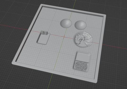
For tubular forms such as the organs and noodles, I used the Beizer curve tool to make the process more efficient. While the noodles were made without textures, I struggled to map out the texture for the organs. I ended up using the “Project from view” function to make the texture appear less out of place.

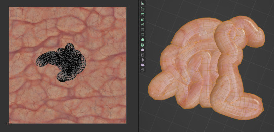
For more complicated organic forms such as lettuce leaves, I followed a tutorial to learn how to create believable folds using sculpt mode. By adjusting the radius and origin offset of the boundary forms, I was able to create a shape that resembles the references I used.

UV mapping was more challenging as I had to fit the mesh into the image texture.

After a while, I was able to familiarise myself with modelling objects and adding textures. The key issues I had were still the accuracy of the models and the quality of the textures I used. Although the image quality was not obvious in this project, I would have to consider this in the future when modelling items that require close-up shots.
I also wanted to add a rice bowl with chopsticks sticking into it as this act is seen as a major taboo across Asian countries, since it resembles incense used in funerals and offerings. To create the rice, I followed a rice modelling tutorial and adjusted the amount of rice on the sphere.

A tedious step I had to do was to split the fluid domain in half. I ended up needing to redo the fluid simulation twice on two separate “bowls” in the hotpot. While it was very time consuming, I was still thankfully able to finish it in time and converted the domains to mesh for the material setup. I also added a few planes with newspaper as textures as it is common to use newspapers to prevent broth from spilling onto the table.
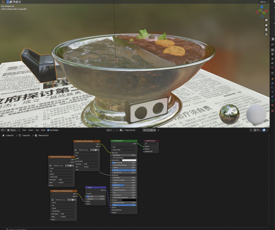
For extra detail, I also added text into the switch panel and added small spheres which emit red light.
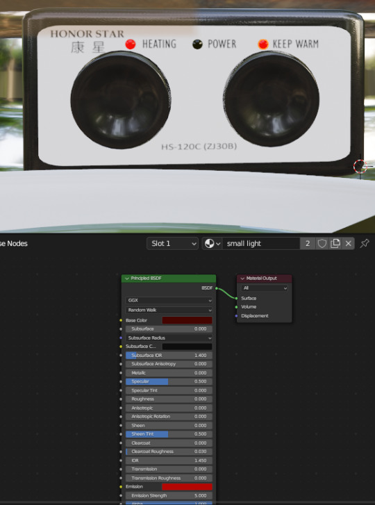
The handle was also fixed with more precise use of the bevel tool.

After a while, I was finally able to finish modelling all the objects and adding textures onto them, then appended them together into one blender file.

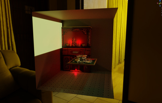
Afterwards, I modelled parts of the room that are visible in the shot and added lighting to the scene. I used a tile pattern for the floor and added a “window” which emits light. The altar was an image UV mapped into a cuboid as I had no time to model the entire thing but added some lights and roughness map to make it look more believable.

The last step was to set up the HDRI and adjust the rendering settings for the final render. The alternative angles and close-up shots I chose for the final submission are in the file uploaded to Moodle.
Overall, I was satisfied with the result as I managed to work outside of my comfort zone for this unit. I would like to use what I learned in the 2d component to have a stronger foundation in perspective drawing and hope to learn more about blender and 3d modelling for future projects.
0 notes
Text
Reflective Journal - Lim Lin Year 1 Production Arts for Screen
Leaving Singapore to a new country, and then starting classes the next day had made me disoriented and lost as a stranger in a foreign land. On the other hand, this transitional period has also shown me the promising pathway for a new door I had opened.
The identity lecture gave me a closer look at an individual’s sense of self in the modern world. With various analogies and thought experiments, we were taught different interpretations of this idea. A concept I thought was interesting is the way identity is linked to our contemporary society. We were asked to question how identity can be maintained in a vulnerable and unpredictable world. As someone who enjoys the sci-fi genre, the idea that many of these stories can be viewed as a metaphor for addressing current societal concerns was intriguing.
An example from the lectures that struck me was the real-life “brain worm” incident. A woman had a parasitical infection that caused a worm to grow in her brain and led her to become extremely ill. This non-fictional unnatural violation of the human body shocked me as a horrifying reality to live in could happen from a mundane situation of physical contact with nature. Not only was it unpredictable and terrifying, but it also confirmed fears of the inability of man to live in harmony with nature. This also acts as a real-life metaphor for broken natural boundaries, and the trespassing of personal space.
For the film project, we were tasked to film and edit a two-minute film using the theme of Identity. Although I had little experience with filming, I was thankful to be in a group of talented people who helped me along the way. We brainstormed several ideas and narrowed them down to personal experiences with identity. Our film was titled “Overload” which used a first-person point of view to convey the experience of autistic individuals. I learned a lot from my groupmates who have more experience in filming, such as different editing techniques and art direction that I had never thought of before.
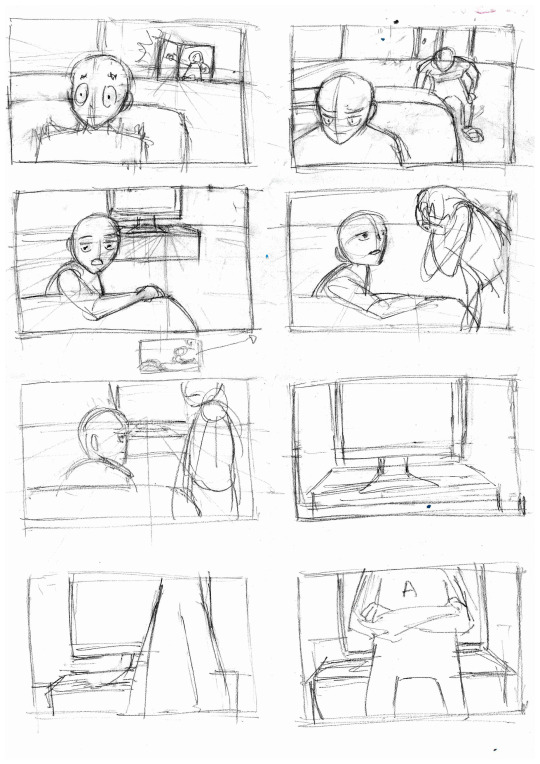
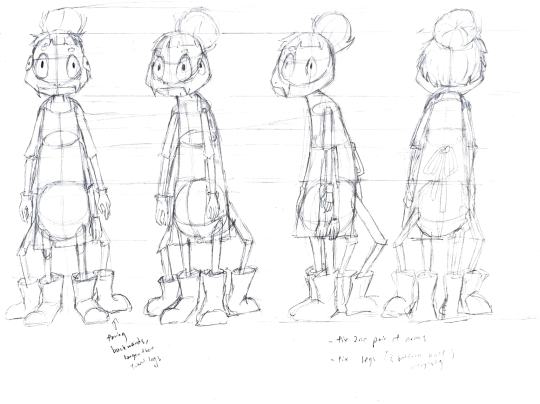
After those two weeks, we resumed our course tutorials and the first unit commenced. We were tasked to create a character with the prompt “What's Behind The Door?”. The main struggle I had during this stage was to make the character believable. Initially, I wanted to create a grotesque man-eating creature as I like horror games. However, this led to a conflict I was unable to solve, as I did not know how to justify why a character would behave this way. The creature acted as a mindless killing machine, so I decided to start over with a new idea.
On my second attempt, I focused more on the personality of the character than its setting. Using the list of questions provided in the tutorial, I created a spider housekeeper who spends most of its time cleaning the room behind the door.

The above image shows concept sketches I made after writing the description of the character. I wanted to base the creature off a spider as the contrasting volume of the compact body mass and thin legs makes it appear more fragile, adding to its frantic personality. The second design was chosen, and the next tutorial allowed me to understand ways to convey a character’s personality through their body language. We were tasked to draw our character in four different poses representing different emotions.

A problem I encountered was the stiffness and awkwardness of the way I first drew the lying pose. This was because I used textual descriptions rather than visual references to draw the character, so this tutorial has taught me the importance of using photos when depicting body language. As such, for the rest of the task, I made sure to use visual references that effectively convey the mood and personality of the character.
Afterward, we were taught how to do three-dimensional drawing. This involves three main elements; simple volumes, basic perspectives, and overlapping forms. I found this lesson to be extremely useful for backgrounds as using these rules to create depth and structure achieves the illusion of 3D on a flat surface. This can also be applied to organic forms, such as foreshortening when drawing body parts. For this tutorial, we were tasked with drawing different objects from three different perspectives.

In hindsight, I should have given myself a larger space to do this exercise as gridding the paper into nine parts caused most of the drawings to appear too cramped or overly exaggerated. I was disappointed with the outcome as I could not fit the three-point perspective drawing of the piano in the last grid as it will look extremely distorted with that scale. The details on the objects are also inaccurate, so I would have to work on these problem areas when doing more perspective drawings in the future.
Another exercise related to improving our structure was the practice used for drawing human heads. As someone who is used to making photo studies with loose guidelines and editing the proportions during the rendering stage, I was not used to the methods used to break down features of the head. While drawing the basic forms was manageable separately, applying these steps to a face is challenging as you would also need to consider the proportions of the person.
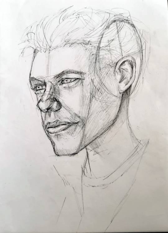
While drawing Matt Damon’s face, I tried to follow the structure and created this portrait. The key issues I had were the proportions and the lower half of the face.
The following tutorial gave us pointers when designing characters and finding an art style for them. Drawing how the characters will be like rather than appear like would aid in creating a being capable of thought. We were recommended to use primary and secondary research and to base the character on something rather than to create one out of our imagination. We were also reminded to exaggerate the line of action while drawing with references and to consider how it affects the angle of hips, shoulders, and head.
Related to the technical aspects of drawing, we were taught how to draw clothing that belongs to the character. The lesson's outcome is to draw fabric that enhances the character's three-dimensionality rather than flatten it. To do this, the key point is to focus on structure and observation as it gives believability to the characters who should also have surface and form.
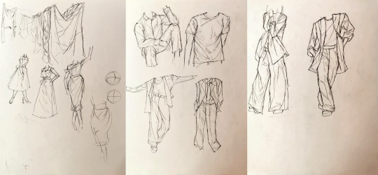
Some of the fabric I drew looked stiff as I either drew too many folds or did not follow the curve of the body. With the help of my tutor's drawing shown in the bottom right of the first page, I was able to make the fabric complement the form of the person more.
When drawing facial expressions, we were given points to take note of for more effective drawings. The expressions should convey the personality of the character, and this can be achieved by following design rules and establishing consistent structure and volume.
I faced many problems trying to exaggerate my character’s expressions. As the mouth was placed at the lowest point of its skull, it was difficult to create an “open mouth” expression without obscuring the eyes. Moreover, when trying to make the eyes expressive, distorting its size made the character not look like itself. In the end, I managed to convey its emotions by changing the length of the jaw and adjusting the height of the eyeballs.

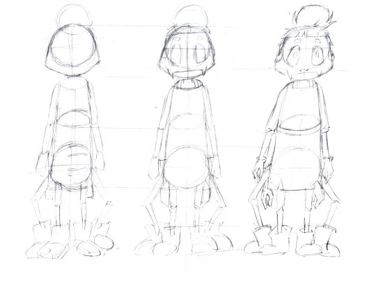
The last practice we had in this unit covered the attitude of a character. With a simple prompt, a character’s audience appeal could be evoked with attitude. This can be achieved by giving characters a thought process, reflecting it with their design, and making the way they carry themselves consistently. Establishing the character’s point of view creates an expectation in the audience and reveals the person in the design. Afterward, we were given time to work on our character designs, so I worked on the turnaround and construction sheet during this time and digitalized these sketches for the final hand-in.
At the end of this unit, I was able to learn new rules of character design that helped me to communicate my ideas better to an audience. This has also helped to improve my technical skills in drawing and I will continue to practice more in the future to achieve better results in my art and storytelling.
0 notes
Text
The Urban Artist (Essay Submission)
In an unpredictable world, some may assume that identity has become synonymous with our position in society. The urban man becomes increasingly disoriented in dense populations, yet still creates his own self in this complex world. By engaging with the concept of identity, Dede Eri Supria’s oil painting “Urban Class” can be interpreted in the context of the identity of an artist as the conscience of society.

Figure 1: Dede Eri Supria, Urban Class (1997)
By using himself as a recurring motif, Dede Eri Supria defines his identity as an artist. “Urban Class” depicts Supria and his studio in the foreground, positioned in front of a monumentally sized painting. His self-image is rendered realistically to instruct the viewer to see him as his outer self. A surrealist element is added to this painting as Supria uses illusionistic techniques to create an impression of himself emerging from a painting of an urban slum, suggesting that he has transcended his social background to become a critical observer. Moreover, unlike other contemporary Indonesian artists, Supria depicts man without the influence of folklore. The human subject matter is forced to confront social realities stemming from cultural change, with the rich-poor disparity and American hegemony eroding traditions that once gave them comfort in the spiritual. (Wright, 1994) Hence, Supria reinforces his identity as an Indonesian artist his concerns and approach to the subject matter are unique to the socio-economic state of Jakarta.
Supria depicts his surroundings in extreme detail to force viewers to examine their fears and anxieties of a rapidly evolving society. Inspecting the monumental painting behind the artist, a slum is rendered with painstaking detail. To achieve this, Supria collages various magazine excerpts to create multiple visual planes. This distorts the man’s surroundings, while the overall realistic style alleviates the viewer’s suspension of disbelief, creating an uncanny perception of modern Jakarta. Moreover, the use of magazine references gives his artworks a commercial sheen, with the consumerist nature of the subject matter emphasized by his use of saturated colors. Hence, the technique used to create this work is also unique to his personal identity and upbringing. His hyperrealistic style was influenced by his background as a photographic draftsman and gave him a position amongst the New Art Movement, consisting of contemporary Indonesian artists.

Figure 2: S. Sudjojono, Rest (Ngaso). (1964)
Supria’s approach to social realism crafts both a personal and social identity. The return of realism among young Indonesian artists was met with a different origin from when it first appeared in Indonesia. The previous wave of realism showed Sudjojono’s works inspired by French social realism that aimed to confront the realities of the working class. In contrast to the naturalistic tone of the former, Supria uses a more satirical style of commentary. (Chua, 2018) Incorporating an Avant Garde direction into his social reality, Supria ingrains the flaws of his society into his identity. Unlike Sudjojono’s portrayal of citizens fighting for a better future, Supria depicts them indifferently while presenting the situation as disorienting and hopeless. (Jurriëns, 2021) The uncomfortable reality of defeated individuals confronts the viewers with a new juxtaposed form of art that mocks urban Jakarta, yet this response conversely gave Supria a notorious reputation in the Indonesian art scene, even effectively conveying his idea that artists have a role in expressing social concerns. As such, Supria cemented his identity as a new-age social realist painter.
As a Southeast Asian, I resonate with his concerns about rapid urban development and cultural erosion. Singapore’s government attempted to build a national identity by enforcing Asian values to the everyday man for citizens to survive in a fast-paced environment. To rapidly improve the living conditions of locals, demolishing heritage buildings for infrastructure and discouraging dialects for a shared language was inevitable. (Ortmann, 2009) Thus, having an artist who is willing to confront and express subconscious insecurities from the public allows Supria to be renowned for his identity as both a social critic and an artist.
References
Supria, D.E. (1997). Urban Class. Oil on canvas, 200 × 100 cm. Jakarta, Indonesia.
Wright, A. (1994). Soul, spirit, and mountain: preoccupations of contemporary Indonesian painters. Kuala Lumpur; New York: Oxford University Press
Chua, K. (2018), Courbet after Sudjojono. Art History, 41: 292-317. https://doi.org/10.1111/1467-8365.12333
S. Sudjojono (1964). Rest (Ngaso). Oil on canvas, 140 × 100 cm. Jakarta, Indonesia: Museum of Modern and Contemporary Art in Nusantara (Museum MACAN).
Jurriëns, E. (2021). Urban transition through Indonesian art: from the Generation of ‘66 to the Millennials. World Art, 11(2), pp.229–254. https://doi.org/10.1080/21500894.2021.1893806.
Ortmann, S. (2009). Singapore: The Politics of Inventing National Identity. Journal of Current Southeast Asian Affairs, 28(4), 23-46. https://doi.org/10.1177/186810340902800402
0 notes